The little engine that could…and other fairy tales

“I think I can.  I …..think ….I…. can, I………… think……… I…………… can” said the little blue engine”

It was almost to the top.

“I——-think”

It was at the top.

“I ———can.”

It passed over the top of the hill and began crawling down the opposite slope.

‘I ——think——- I—— can——I—– thought——I——-could I—– thought—– I—– could. I thought I could. I thought I could.¨ I thought I could.”

And singing its triumph, it rushed on down toward the valley.

“The Little Engine That Could” is a heartwarming childhood tale, about hard work and a willingness to give anything a go.    Perhaps the Prime Minister once read the story to his kids.  But…….it is a story.   Technical capacity, not willpower, determines whether engines can pull loads, get over hills etc.   However, the Prime Minister now appears to have adopted the storybook as the basis for his latest, rather desperate, defence of his government’s immigration policy.

At his post-Cabinet press conference on Monday, the Prime Minister appeared to be –  as NBR put it –  practising his election lines.

Answering questions about New Zealand’s capacity to handle current levels of population growth caused, in part, by very high net migration, English appeared to practice attack lines for the forthcoming election campaign, saying he believed the ability to cope with these challenges was “going to be a key issue in the campaign”.

“We believe New Zealand can adjust to be a growing economy with a growing population,” he said. “Our political opponents think New Zealand isn’t up to it, it’s too hard and the solution is to shut down the growth by closing off international investment, getting out of international trade, closing down migration and settling for a kind of grey, low-growth mediocrity where the best thinking of the early (19)80s sets our political direction.”

and, from another account (which I will draw on but can’t link to)

English said that National unashamedly believes in New Zealand’s capacity to be a growing economy and that its political opponents unashamedly think New Zealand is not up to it.

Belief is one thing.  Evidence is (much) better.    Winning elections might be a different matter, but whether, and to what extent, large-scale immigration is providing long-term economic benefits to New Zealanders isn’t something to be determined by whose swagger is most convincing; who can put on the most macho stance, or who is most ready to kick sand in the face of the weedy doubters.  Wishing for benefits won’t make them happen.   Instead, it is a matter of calm balanced analysis and an assessment of the evidence of New Zealand’s experience.  We’ve had plenty of experience.   And that must be a point of some difficulty for defenders of the current large-scale non-citizen immigration policy, presumably including the Prime Minister.

After all, 100 years ago, on the best available measures, New Zealand had among the very highest material living standards anywhere.   Some combination of abundant land, a temperate climate, dramatic reductions in transport costs, and refrigerated shipping had required more people to take advantage of the new opportunities, and enabled just over 1 million people to flourish in what was, by international standards, a highly-productive economy.  There were new opportunities here, and it took new people to take earliest and greatest advantage of them.

On some measures, even as late as around 1950 we still had some of the highest material living standards around.  There hadn’t been many more new opportunities specific to New Zealand in the previous few decades.  But, on the other hand, we’d avoided wars and revolutions at home.  It wasn’t much of a surprise that we were still wealthier than almost anywhere in continental Europe.

But mostly since then we’ve been slipping down the rankings, whether measured by productivity (the better measures) or average per capita income (which can always be boosted by working ever more hours).   After World War Two, large scale immigration, actively promoted by successive governments resumed.  Even then, leading New Zealand economists were sceptical.   All manner of arguments were run for actively pursuing increased population.  There were defence arguments, there were arguments about redistributing Britain’s excess population to the land-rich Dominions, there was the apparently-reasonable argument that opportunities and incomes were just better here.

But whatever the arguments, any economic gains just seemed to keep failing to show up.  Of course, we did lots of daft things during the post-war decades.  Trade protection meant that, for example, in the early 1960s we had twenty television factories in New Zealand, and we made or assembled here all sorts of stuff that would never have passed a market test.  In the late 70s and early 80s we poured money down the drain in the absurdly expensive energy Think Big projects (while being spared Roger Douglas’s ambition for 16 state-promoted carpet factories).   But strip all that stuff away –  as we did –  and we’ve still done badly.

Productivity growth lagged that in other advanced economies in the 1950s and 60s.  Since 1970, data suggest that among advanced economies only Switzerland and, perhaps Mexico, have done worse than us.  And even since all the reforms of the late 80s and early 90s, we’ve still brought up the rear when it comes to productivity growth.  On average, we just keep slipping further behind those other advanced countries we were once so much better off than.

My friends on the right will emphasise how high taxes are, how much wasteful government spending there is, and how pervasive poor-quality regulation is.  And I have a great deal of sympathy with many of their individual points.   But the median OECD country isn’t really any better or worse than us on those scores (on some we do rather better than the median, on others quite a lot worse).   We could all do better, but the explanation for New Zealand’s continuing disappointing performance simply can’t rest in those traditional pro-market verities.

A much more plausible story is one that recognises that New Zealand’s wealth was largely built on able people, and good institutions, making the most of our natural resources.    It shouldn’t really be controversial; you can see it in our trade data.    As it always was, so it is today – the overwhelming bulk of our exports are the fruits of the land or sea (and I’ll count tourism in those numbers, since that it mostly what tourists come for).   Of course, there is small number of successful outward-oriented firms in quite different industries, but strip away the subsidised ones (export education and the film industry) and the numbers are really pretty small.

And not only are no new natural resources being made, but in New Zealand for many decades there hasn’t even been any really large new discoveries of usable natural resources that were hitherto unrecognised (or idiosyncratic shocks that strongly favoured New Zealand production from natural resources).  It is, surely, the big difference between the post World War Two experiences of New Zealand on the one hand, and Australia and Norway on the other.  The prosperity of all three countries rests largely on the natural resource products their able people, with good institutions, can sell to the rest of the world.  Norway and Australia were able to bring to market whole new resources that, while always there, were previously unknown or uneconomic to tap.  New Zealand has had nothing similar.  No new land, no new sea and –  so far –  oil/gas and mining activities that are of fairly peripheral scale.    If we’d known that difference 50 or 60 years ago, few people (if anyone) would have thought it would make a lot of sense to import lots more people to New Zealand.   Combining many more people with a key fixed factor (“land”) is simply a recipe for making it much more difficult than necessary to support top-notch living standards for the people who were already there.    And that is so even if one can get lots of productivity growth in the land-based sectors.

Of course, the standard pushback is along the lines of “but that is all old economy stuff; ideas and new technologies are the way of the future, and one can develop those industries anywhere –  all that matters is the people, the people, the people”.  Which would be fine, but the evidence seems to be against it.  When it comes making physical stuff, global value chains have become ever more important, and it is really hard for many firms located at the end of the earth to be part of such value-chains (whereas it is quite easy if you are in Slovakia or Korea).  And when it comes to ideas-based industries, counter-intuitive as it might seem, personal connections and proximity (to suppliers, markets, specialist resources, clusters of knowledge) seems to have become more important than ever.    All sorts of firms can be set up by people in New Zealand –  or in Patagonia, Port Stanley, or Windhoek.  But those firms, and those people, will usually command more value relocated nearer those global centres –  be they in Europe, North America or East Asia.   Wishing it was otherwise –  like believing I can fly –  simply doesn’t make it so.

New Zealand’s strength is its people, among the most skilled in the world, its institutions (absence of much corruption, rule of law etc) and its natural resources.    The latter are crucial –  that isn’t something of ideology, or old-school thinking, but of hard numbers –  and are, for practical purposes largely fixed.  (Add in our (self-chosen) climate change objectives and those natural resource opportunities could almost be argued to be shrinking.) But our disadvantage, and it is a severe one, is distance/location, and at least before teleportation is mastered, that disadvantage isn’t changing –  it is a land so remote that until perhaps 200 years ago, there simply was no foreign trade.

Against that backdrop, it is simply crazy to keep letting the central planners (politicians and bureaucrats) try to drive up the population.   New Zealanders know it in their own choices.   There is nothing shameful about a fairly flat population, whether in a country – plenty of rich European countries have had them for decades –  or a city.  But it seems almost heretical in New Zealand.  It makes sense that cities, or countries, grow when new opportunities abound.  The evidence to date strongly suggests they aren’t abundant here.   Some might think that a shame –  in some ways I do too –  but believing otherwise doesn’t make it happen.

Is there 100 per cent conclusive evidence?  No, in this life there hardly ever is.  But lets look at some of the straws in the wind:

  • among the very worst productivity growth in the OECD throughout the post World War Two period,
  • an export share of GDP that has stagnated and even gone backwards (in a country that once had among the very largest per capita exports anywhere),
  • a major city that has incredibly rapid population growth over decades, and yet of which even Treasury now observes “we are not seeing the agglomeration effects we would expect from Auckland’s size and scale.”

I’m for evidence-based policy.  If we’d seen more and more New Zealand firms successfully establishing themselves in international markets, and the export share of New Zealand’s GDP rising (as it typically does in successful catch-up economies), if we’d seen a decade of productivity growth materially outstripping that of the other OECD countries so that we were finally catching up, if we are seeing evidence that GDP per growth in Auckland was consistently far-outstripping that in the rest of the country (as we find in many other countries centred on knowledge-based industries) then (a) we could all celebrate, and (b) it might make sense to think about whether we should open our doors to lots of migrants.   As it is, we see none of those things.  And that with one of the largest (per capita) legal immigration programmes anywhere in the world.   It is madness; ideology (“big New Zealand” more than theoretical arguments typically) over experience.

But the Prime Minister and the National Party still “believe” apparently.  Perhaps they could show us their evidence?

I don’t like to make too much of the last few years’ experience.  Apart from anything else, data revisions could mean that stories that look good today eventually disappear like the morning mist.     But, for what it is worth, the last few years don’t do much to instill confidence.

There is the dysfunctional housing and land supply market for example.  Sure, you can argue that it really has nothing to do with immigration policy, but if you can’t or won’t fix up the land supply market –  and neither this government nor its predecessors have –  don’t give us the nonsense that New Zealand can cope with his immigration policy.   Even if there aren’t large productivity costs from those land-use restrictions (I’m open-minded on that in New Zealand) the distortion to real house prices, that makes purchasing a home more and more difficult in our cities is a standing reproach to our leaders.

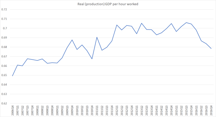
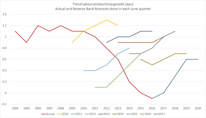
And then there is productivity.  I’ve repeatedly showed charts of real GDP per hour worked in New Zealand, where the data suggest we’ve had no growth at all in the last five years (even though the dogma suggests large immigration should be generating positive productivity spillovers).  It is often hard to get timely cross-country comparisons, but earlier this month the Conference Board released their latest annual estimates of real GDP per hour worked.    Here is how New Zealand has compared over the last five years (2011 to 2016) with a sample of 40 or so other advanced countries (the group I often use –  EU members, OECD members, plus Singapore and Taiwan).

2011 to 2016 growth in real gdp phw

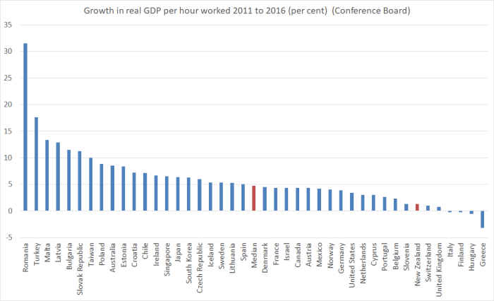
And it isn’t just because those other countries were recovering from deeper recessions.  Our labour productivity growth also lags behind the median of these countries for the whole period since 2007 (just before the recession).  It is just the same old story of underperformance.   Are there mitigating factors?  Probably always to some extent.   The Canterbury rebuild inevitably dragged resources away from other uses.  On the other hand, relative to our worst decade of economic underperformance –  the 1970s –  the terms of trade have mostly been pretty good this decade.

With the export share of GDP drifting further backwards, it looks more and more like an economy that exists on building for each other.  Nothing wrong with that in one sense –  people need houses, offices, roads etc –  but it isn’t how economies successfully catch-up with those richer and more productive than them.  That typically involves finding more and better things to successfully take to world markets.

In his post-Cabinet news conference, the Prime Minister was also making much of the contribution to the net migration numbers of the decline in the outflow of New Zealanders to Australia.    That, he claimed. “was a vote of confidence in New Zealand”.   Perhaps it sounds good politically to say it, but lets face reality.  New Zealanders have gone to Australia is fewer numbers mostly because the Australian labour market is tough – the unemployment rate and underemployment rates linger high, and there is increasing awareness of how much on their own New Zealanders are in Australia if things don’t work out well.     And even though the labour market is tough, look at Australia’s productivity growth (from a much higher starting point) relative to ours in the previous chart.  It isn’t so much a vote of confidence, as an unexpected loss of an escape valve.   That makes things even tougher for New Zealand, especially when the government keeps on bringing in much the same number of non-New Zealanders as ever.   In the short-term it gives the economy a boost –  demand effects exceed supply effects in the short-term –  but in the longer-term it just keeps worsening New Zealand’s relative performance on the sorts of economic measures that matter.

The Prime Minister was also at pains to stress that he believed New Zealand –  government and private sector – could and would invest enough to handle the rapid growth in the population.  The evidence has long been against him on that one.  Despite having had one of the faster population growth rates in the OECD, we’ve long had one of the lower rates of business investment among OECD countries.   In a well-functioning economy with high productivity growth etc you’d expect it to be the other way round –  more people should need more investment, of all sorts.

My arguments are generally specifically focused on New Zealand –  opportunities in Ireland or Belgium may well be different than in, say, New Zealand, Tasmania or Nebraska.   But for what it is worth, here is a scatter plot, using IMF data, of population growth rates and investment as a share of GDP for the countries the IMF classifies as advanced.  I’ve used data since 1995, simply because that is the period for which the IMF has data for all countries.   Recall that one really should expect investment as a share of GDP to be higher in countries with faster population growth than in those with lower population growth, all else equal.

But

IMF scatter plot

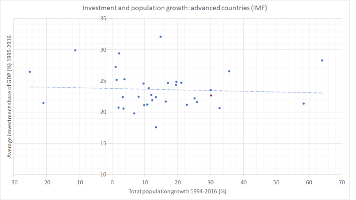
There is almost no relationship at all – and certainly not the expected upward-sloping line.  If anything, the relationship is slightly negative.  And New Zealand –  the red dot above 30 on the horizontal axis –  doesn’t stand out from the pack.  Since people do have to live somewhere, it looks a lot like rapid increases in population tend to crowd out (rather more price sensitive) business investment.    Perhaps it isn’t surprising then that many of the advanced countries with the strongest growth rates in productivity also have flat, or even falling, populations?  But, whatever the wider story, there isn’t much reason in the international data to believe the Prime Minister’s wishful thinking that enough will be invested and all will be fine.  And when your country already has some of highest real interest rates, and a persistently overvalued exchange rate, it is probably safer to believe that all won’t be just fine.

I could go one, but I just wanted to make two final brief points:

  • in his comments quoted earlier the Prime Minister suggested that somehow the alternative to continuing very high immigration targets involved “settling for a kind of grey, low-growth mediocrity where the best thinking of the early (19)80s sets our political direction”.   Personally, I’d say the very best thinking from the early 80s –  that of reformers at Treasury and Reserve Bank for example –  was very much to the point.  But even setting that to one side, the Prime Minister’s attempted slur might well rebound.  I checked out productivity growth for the nine years to 2016, compared to the nine years to 1984.  In those 9 years of Sir Robert Muldoon’s stewardship, growth in real GDP per hour worked was (according to the OECD) 9.0 per cent.   Not great.  But on the Treasury’s preferred measure of real GDP per hour worked (and even correcting for the break in the series last year), productivity growth from 2007 to 2016, totalled about 5.5 per cent.    The Prime Minister was Minister of Finance for most of that period.   (Yes, sure there were plenty of other imbalances, bad choices etc then, as well as terrible terms of trade….but they still achieved faster productivity growth).
  • I could commend to the Prime Minister a column in The Australian yesterday from Australian labour economist Judith Sloan (there are extracts and commentary on it here).   Notwithstanding Australia’s stronger productivity growth, and overall higher incomes, she slams the Australian government’s substantial immigration target (just slightly smaller, in per capita terms, than New Zealand’s), noting in particular the ‘cynical charade’ in professing concern about house prices while doing nothing about immigration (land supply –  a major problem in Australia too –  isn’t under federal government law).  Sloan isn’t just any economist.  She led the Australian Productivity Commission 2006 inquiry into Australian immigration.  And in many respects, she is about as “right-wing” as they come (to the extent such slogans have meaning), so much so that she was nominated by ACT and the Business Roundtable, and then appointed by the government, to serve on our own 2025 Taskforce a few years ago, where she was instrumental in ensuring that that Taskforce did not champion New Zealand’s immigration policy.   She doesn’t write about New Zealand these days, but it would be surprising if her conclusions about our policy were les stridently expressed than those about Australia’s

The Prime Minister can “believe” all he wants. He can attack Opposition parties all he wants (and we have yet to see specifics of what either Labour or NZ First propose), he can diss a former leading figure of the business and economic establishment, Kerry McDonald, he can ignore the counsel of someone as able in this area as Judith Sloan.  But what he seems unable to do is offer any evidence that his immigration is, or ever will, work for the benefit of New Zealanders.

Treasury on immigration, productivity and real wages

I’m still under the weather with the after effects of a bad cold, so this won’t be a long post.

Treausry has long been a champion of New Zealand’s large scale non-citizen immigration programme, going all the way back to when the system was opened up in the earlier 1990s.   But more recently, there have signs of some differences of view even within the organisation.  in 2014, they published (consultant) Julie Fry’s working paper on migration and macroeconomic performance in New Zealand, which was a pretty sceptical, but careful, assessment of whether there had been any material gains to New Zealanders.  Fry’s conclusion was that any gains had been “modest”.     There was, I gather, quite a difference of view within the organisation as to whether the paper should even be published.

Treasury has also been on record as having some concerns about possible adverse labour market outcomes for lower-skilled New Zealanders from, for example, the big increase in the number of working holiday schemes New Zealand has signed up to.  They noted, in a presentation released last year,

Our key judgment is that migrant labour is increasingly likely to be a substitute for local low -skill labour, and this is an impact that we should try and mitigate.

But they have remain upbeat about the potential contribution from genuinely highly-skilled immigrants.

And at the top of the organisation, the public view on New Zealand’s immigration from the Secretary to the Treasury, in a succession of speeches and interviews, has been relentlessly positive –  and equally relentlessly devoid of evidence.

In the Treasury’s Long-Term Fiscal Statement released late last year they were apparently torn between creedal statements, and a grudging engagement with the evidence, notably a recognition that “we are not seeing the agglomeration effects we would expect from Auckland’s size and scale”.

So I was interested to see that in the Budget Economic and Fiscal Update last week, Treasury looked at a scenario in which the overall net migration inflows stay even larger for longer than Treasury’s central projection.   As it is, their central projection numbers are already high: after growth in working age population of 2.4 per cent in the year to June 2016, they expect to have seen growth of 2.7 per cent in the year to this June, and 2.4 and 2.1 per cent increases for the next two years.

The scenario is as follows

This scenario illustrates the impact of higher migration on the economic and fiscal outlook when capacity constraints arise. In this scenario, net migration is assumed to remain around its current level of 70,000 per annum through to the end of the forecast period.

The results include

In this scenario, stronger population growth drives faster growth in household consumption, residential investment and business investment. Stronger domestic demand is reflected in faster employment growth. However, in the construction sector, it becomes increasingly difficult to access labour and materials. As a consequence, there is additional upward price pressure on construction costs, which leads to higher headline inflation. The policy interest rate rises earlier and the exchange rate is higher as monetary policy seeks to stabilise inflation.

So far, so conventional in many ways.  This is the standard experience in New Zealand when there are large migration inflows.  There is nothing here of the lines the Reserve Bank has been running for the last year or so, in which increased net migration somehow eases overall inflation pressures.

But what really caught my eye was the next sentence

Reflecting these conditions, growth in labour productivity, real wages and real GDP per capita is more moderate than in the main forecast.

They didn’t need to include that observation at all.  The scenario would have made perfect sense without it.  But here is the government’s premier economic advisory telling them –  and us –  that if net migration remains at current levels it would be expected to have detrimental effects on productivity (and wages).      I wonder what the Secretary to the Treasury makes of that?

After all, it is not as if there has been much productivity growth for the last few years.  Treasury uses a measure of GDP per hour worked that simply uses production GDP (I usually use an average of the two GDP measures in charts here).  Here is what their measure looks like.

tsy productivity measure

No growth in labour productivity at all for the last five years (the last year’s drop is largely just a series break in the HLFS hours worked, consequent on survey question changes).

Perhaps coincidentally, that happens to have been the period over which we’ve had big increases in, and persistent very high levels of, net PLT migration (much of it a reduction in the annual outflow of New Zealanders).    And, as I noted, the other day, on Treasury’s own estimates, there have been no economywide capacity constraints at play in that period –  the output gap is estimated to have been (and still to be) negative.  For enthusiasts for large scale migration, it should have been a good time for seeing lots of productivity growth.

For some reason, in their central forecasts Treasury expects quite an increase in productivity growth from about now.  They never explain what (about the economy or policy) is changing that will end now the run of five years of zero productivity growth.  These are their central forecasts (on page 6 here) for labour productivity growth.

Forecast annual growth in labour productivity,

June years

2018 1.3
2019 1.9
2020 1.1
2021 1.1

Perhaps as puzzling, are their real wage forecasts.  Even though Treasury expects the unemployment rate to fall, and the rate of productivity growth to accelerate, these are the real wage growth forecasts.

Forecast annual growth in real wages, June years
2017 (est) 0.0
2018 0.7
2019 0.6
2020 0.0
2021 0.0

Five years and a forecast growth in total real wages of  only 1.3 per cent.  It is enough to make one glad not to be in the paid workforce.   Workers will surely be hoping that Treasury’s alternative immigration scenario –  with those adverse productivity and real wage effects they talked about –  don’t come to pass.    (And I am a little surprised that no Opposition party seems to have pointed out how bleak the outlook for workers’ incomes is under the central Treasury forecasts.)

It would be interesting to have an updated honest and considered assessment from Treasury as to what our immigration policy is doing for New Zealanders.  I suspect there is still a tension between the textbooks and the “ideology”, and the growing accumulation of reasons to doubt that, in these remote islands, in an age when personal connections matter more than ever, simply piling up more people here –  many of the newcomers not even being that highly-skilled –  is making us better off, not worse off.   It is a strategy that is great for owners of business in the non-tradables sectors –  more people means more demand –  but not for the economy as a whole.  Our living standards depend heavily on the ability of firms here to find ever more ways of successfully selling stuff to the rest of the world.  That simply hasn’t been happening on anything like the necessary scale, and the absence of aggregate productivity growth is just one reflection of that.

A cathedral and property rights

The fate of Christchurch’s Anglican Cathedral has been hitting the national media this week.  It was all over John Campbell’s Checkpoint on Radio New Zealand, and this morning Martin van Beynen’s column on the subject is even run in the Dominion-Post, newspaper of what is surely the New Zealand capital of secularism.

It is an extraordinary column.  There is, we are told, only one way ahead.  His way.  The rights and interests of Christchurch Anglicans are simply irrelevant, and the church should simply “bow to the will of intelligent people”.  Like him presumably.

Why am I writing about it here?  Partly because it cuts across two of my interests: economics and public policy on the one hand, and Christianity on the other.   And also because I’m Christchurch born, most of my family still lives in Christchurch (they lost homes, a business and more).  It remains my favourite place (“home” in some sense).  Family tradition in fact claims –  I’ve never been sure how credibly – that one set of my earliest New Zealand ancestors were offered farm land in or around what is now Cathedral Square, but turned it down on the grounds the land was too swampy.  And I’m torn between Anglican and Baptist traditions, which also seems to reflect family history: a document in box of old family papers I have records that one of my 19th century ancestors was a worshipper at the Christchurch’s Anglican cathedral, but one morning was running late for church, so went in to the (closer) Baptist church service instead, was invited home for lunch, and in time met and married another of my ancestors and the rest is history.  I’ve worshipped in the Cathedral –  the last time was a wonderful, if long, Midnight Service on the last Christmas Eve the building was open.

So I will be a little sad if the old cathedral is no longer there.  My own tastes run in the direction of the older style of building.  The building was a symbol of the city, and of its English, and Anglican, heritage.   Choral worship, of the sort undertaken in cathedrals great and small, has been one of the glories of our English heritage.  And great cathedrals have typically cost astonishing amounts of money.  A place of great beauty in which to worship is a privilege, and one of ancient lineage in our Judeo-Christian traditions (read the accounts of the temple King Solomon built).

None of this is relevant to van Beynen, who claims

The church might be the registered proprietor of the land but the city owns the building in everything but the documentation.

and

We need to arrest the fiction the church has any real say in the matter.

In fact, the city doesn’t own the cathedral at all.  Unless, as seems to be proposed by van Beynen, and people like the mayor of Christchurch (who says she would favour the Crown seizing the property if the Anglican church doesn’t do what she wants), the church is to be given no say at all in the future of its own property.   Built and paid for by the Anglicans of Christchurch.   Do property rights mean nothing in van Beynen’s world?


He goes on

we shouldn’t forget the cathedral is a national asset and has a call on national taxpayer funds. It’s not only a Christchurch icon but, like the Church of the Good Shepherd at Lake Tekapo, a national one.

I imagine the parishoners of the Mackenzie Cooperating Parish might have something to say about that.

I have little sympathy when people buy an existing heritage building, and then have to fall into line with the pre-existing restrictions on what they can do with the building.  They bought it knowing the rules, and the purchase price will have been lower than otherwise to reflect the opportunities that the new owner can’t pursue.   But that simply isn’t the case here.   The old cathedral was always owned by the Anglican church in Christchurch.  The building’s purpose was, as it has always been, as the seat of the bishop, the chief church of the diocese, and as a centre for Christian worship.That makes it very different from the other “heritage buildings” (in public ownership anyway) that are being restored in Christchurch, the Arts Centre and the Provincial Council buildings.  The latter lost their original purpose in 1876, and the former –  originally the university –  in the 1970s.    They are monuments, put (at least in the case of the Arts Centre) to some modern use.
Van Beynen seems to want to appropriate the Anglican cathedral as another monument.  It isn’t clear what he would do with it once he got hold of it.  Another concert venue I suppose.   But the Christchurch ratepayer is already spending vast amounts of money restoring the severely damaged Christchurch Town Hall and associated concert facilities.In truth, van Beynen clearly has no time for churches generally.  He is really just interested in monuments, and perhaps reshaping Cathedral Square.  He compares the Anglican cathedral in Christchurch –  home to a living breathing (if depleted) community, both the local congregation and the diocese –  to the Parthenon, a building not used for the cult for which it was erected (that of the goddess Athena) for around 1500 years now.  Does the difference mean nothing to van Beynen?
I might have some sympathy for van Beynen’s perspective had the diocese proposed to demolish an undamaged Cathedral.  Less suited as the building might be to today’s concepts of worship than it was when first built, it nonetheless seems unlikely that scenario would ever have occurred.  Churches exist amid communities –  even if, in biblical terms, as aliens and stranger to the non-believing communities surrounding them.     But this is a building that has already largely been destroyed by nature, in a city where so many buildings –  beautiful and ugly –  have also been destroyed.  For the Anglicans. it is an oppportunity to start again, and on a realistic footing that takes account of the limited financial resources of the Anglican church (and Cathedral parishoners) to meet not just construction costs –  the figures often bandied around –  but the ongoing heavy maintenance costs that a reconstructed traditional stone building would entail.  And which takes account of modern Anglican conceptions of worship spaces and ministry.
Again, perhaps the views of people like van Beynen might warrant more weight if Christchurch was teeming with Anglicans, and the church was growing stronger and larger by the year.  It isn’t.  For the time being at least –  Christians long for and pray for revival –  Christian congregations in the West, and in New Zealand, are in decline.  And although there are thriving Anglican congregations in Christchurch, overall the Anglican denomination is in decline.    And –  never mentioned in any of these debates –  it is a denomination that could yet tear itself apart in the next few years over theological differences that manifest in issues like disputes over same-sex “marriage”.  How responsible would be it for the diocese to take on a massive restoration project, for which it doesn’t have the money –  either to build the building, or to maintain it in future?It is all very well to talk of fundraising, and even coerced contributions from ratepayers and taxpayers.  Perhaps it would even be enough to meet the construction costs.  But it is unlikely to meet the ongoing costs, and even if (perchance) central or local government agencies were willing to provide ongoing support, it would most likely involve pressure on the Anglican church not to upset the funders.  The Christian gospel, by contrast, is supposed to be a radical counter-culture, standing against sin whereever it is found (including among the powers that be).

Perhaps in the end, the Anglican diocese will decide to take the repair and restoration route.  That –  or the alternative –  should be their choice.   If they decided –  without coercion –  to repair and restore, in some ways I’d be as delighted as anyone, at an act of breathtaking faith.   But that is very different from being coerced – whether by mayors threatening to withhold demolition permits, or other grandstanding politicians and advocates many of whom never darken the door of a church between weddings and funerals.   It is the Anglican church’s land.  It is the Anglican church’s money.   It is a building, first and foremost, for the worship and ministry of the Anglican church of Christchurch.

Cities and cityscapes change.  Sometimes in tragic ways –  and the earthquakes in Christchurch was one of those.  But it isn’t the first, and won’t be the last, cityscape to change.  Greater cathedral buildings, by far, than that of Christchurch have been destroyed by war, and fire and so on.    In time, new buildings, sight lines, and streetscapes that seem jarring and new today will, in some cases, be hallowed features.  Will a new Cathedral fit that bill?  Who knows.  Perhaps not, given the budgetary limitations.  Then again, the Anglicans of Christchurch probably hope and pray for a revival of faith and worship.  If so, in 100 years –  short in the history of the church –  perhaps an even finer Cathedral might one day be built, to the glory of God, and as a centrepiece of the city of Christchurch.

In the meantime, we shouldn’t let the Anglicans be coercively deprived of their rights, no matter how much Martin Van Beynen may dislike them and their bishop.

UPDATE: I have a few more ecclesiastical/theological perspectives, prompted by reading the bishop’s Press column and listening to her radio interview, on my other blog here.

Emissions again

After my post the other day, I pricked up my ears when I heard on the radio this morning that new data on greenhouse gas emissions had been released, and at the same time heard various industry lobby groups calling for more government support (money or regulation”) for this, that or the other mitigating measure.  It is the costs of meeting the New Zealand government’s emissions reduction target that worries me.

(As it happens, I was emitting carbon at the time, driving home from the supermarket in a petrol-fuelled car.  But I had already walked up the (rather steep) hill carrying several kilos of groceries home earlier in the morning.)

Today’s release consists primarily of a 542 page report from the Ministry for the Environment (MfE).  But they also had a convenient eight page summary document.

In my post the other day, I included this chart of GDP per capita for OECD countries, in the most recent year for which there is data, 2014.

emissions per GDP

New Zealand was second only to Estonia in the level of emissions per unit of GDP.

I was interested to see that MfE made reference to this measure in their snapshot report.  Under the heading “New Zealand’s economy is growing faster than our emissions”, they included this chart.

MFE emissions

That looks quite good on first glance.

But how, I wondered, did New Zealand compare to other OECD countries?  You’ll notice that on that chart emissions per unit of GDP fell in 2015.  Since the OECD databases aren’t yet updated for 2015, and we don’t know what happened to other countries in 2015, the following charts use the data only for 1990 to 2014.    (MfE also report a rebasing of the entire series, slightly lowering New Zealand’s estimated emissions over the whole 25 year period.  But relative to the charts below this rebasing would worsen  New Zealand’s relative performance, since the revision downwards for 1990 was a little greater than the revision downwards for the more recent years.)

Here is emissions per unit of GDP for those OECD countries (all but one) for which there is 1990 data.

emissions 1990

In 1990 we were only sixth highest in the OECD.   And by 2014 we were second highest.  I guess the Ministry for the Environment (and their Minister) weren’t too keen on highlighting that point.

Here is the percentage changes in emissions per unit of GDP to 2014 (for a small number of countries only 2013 data is available).  MfE highlighted that New Zealand’s emissions fell by 35.9 per cent from 1990 to 2015.

change in emissions

Only 10 OECD countries had smaller reductions in emissions per unit of GDP than New Zealand over this period.  Of them, one might reasonably think that severe economic stresses (falls in GDP) in recent years might help explain Italy, Spain, Greece and Portugal.  And as Japan’s emissions rose a lot in 2011,  the year of the earthquake/tsunami, the enforced shift away from nuclear power at the time probably explains what is going on there.

Of the five countries that were to the right of New Zealand in 1990, four had among the largest percentage reductions among OECD countries.  Even Australia’s reduction was around the median.  It does leave New Zealand rather standing out.

(Perhaps some of this is covered in more depth the 542 page report.  I went through the Executive Summary and the table of contents and couldn’t see any likely references, but I may have missed them.)

In the snapshot document, straight after the emissions per unit of GDP chart, MfE does have a brief section on

Some of the challenges New Zealand faces when reducing emissions include:

  • a growing population
  • almost half our emissions are from agriculture where there are fewer economically viable options currently available to reduce emissions
  • an electricity sector that is already 80.8 per cent renewable (meaning that we have fewer ‘easy wins’ available to us compared to other countries who can more easily make significant emissions reductions  by switching to renewable sources of electricity).

I was very pleasantly surprised to find the “growing population” as the first item on the list (it isn’t particularly relevant to emissions per unit of GDP, but is very relevant to total emissions –  the variable in terms of which our government’s target is expressed).

It is hard to disagree with them  But it does leave one wondering what advice or research/analysis they have done, and provided to Ministers –  including when the target was being adopted –  about the implications of New Zealand’s immigration policy.  Our non-citizen immigration policy pushes up the population by almost 1 per cent per annum (against an, admittedly unrealistic, benchmark of zero inward migration of non-citizens).  Have they analysed the potential costs and benefits from lowering the non-citizen immigration target relative to other possible abatement (or compensation) mechanisms?  Perhaps there is credible modelling that suggests the overall abatement costs to New Zealanders would be lower through other plausible mechanisms.  But given that population increases appear first, and without further commentary, on their lists of “challenges” it would be good to know if they have done the work.

On reflection, I think I will lodge an Official Information Act request to find out.

(And it still leave me mystified why, when even the government’s own Ministry for the Environment is citing continuing population increases as a constraint on meeting the emissions reduction target, the Green Party continues to support large non-citizen migration inflows.  Migration might only transfer people from one country to another but given (a) the issues around agriculture, and (b) the reasonable notion that New Zealand members of Parliament should be looking out first for the interests of New Zealanders, it shouldn’t be a consideration they can simply ignore in thinking about New Zealand’s ability (and at what cost) to meet the emissions reduction target.)

Another Budget in an underwhelming economy

If people had wanted a centre-left government, one might suppose that they would have voted for the real thing.  Despite the additional redistribution announced in yesterday’s Budget, perhaps they still will.

Still, for all the headlines about money being put (back) in people’s pockets, it is worth keeping the overall numbers in perspective.  Core Crown tax revenue as a share of GDP was 27.8 per cent last year, is estimated at 27.7 per cent of GDP this year, is forecast at 27.5 per cent in 2017/18, and in the final forecast period it is predicted to be 27.7 per cent.  The government isn’t yet shrinking its pre-emptive claim on overall economic resources.  Expenditure as a share of GDP is forecast is gradually shrink, and if that was sustained –  which will be a challenge, including because of the reluctance to act soon on NZS –  it could open the way to future real reductions in the tax burden.

It is sad to reflect that much of the increased spending announced yesterday was simply a palliative for the failures of the government.   The cost of housing is, pure and simple, the fault of successive governments’ land-use regulation.  In a country with plenty of land, and the lowest real interest rates for decades, housing should be more affordable than ever.  That it isn’t, should be something governments are held accountable for (and although governments of both parties have had much the same flawed policies, the current government has now been in power for almost nine years).    And the lack of productivity  growth –  recall that we have had none at all for five years now –  is the biggest single thing that holds back the income growth of working people.    With a well-functioning housing market, and an economy with robust productivity growth, many of the pressures that led to increased spending yesterday would simply have been unnecessary.

As for tax, how many more decades will we have wait before a simple reform like inflation-indexing the income tax brackets is enacted?  Even the United States, with its enormously complex and distorted tax code, manages that one.

Perhaps more importantly, for all the rhetoric about encouraging enterprise –  and more subsidies for favoured uneconomic industries (film, rail and so on), there was no sign at all of action to lower what is probably the most costly and distortionary major item in our tax system –  the company tax rate.   It is curious to reflect that the previous Labour government cut the company tax rate more than the current government has.

I ran this chart a few weeks ago
company tax rates

New Zealand’s company tax rate is in the upper third of OECD member country rates.   For a country that talks a good game about welcoming foreign investment, and supposedly aspires to reverse the decades of productivity underperformance,  it simply isn’t good enough.    Politicians seem afraid of making the well-established economic point that taxes on businesses are typically borne substantially by wage-earners, not by owners of capital.   Less investment than otherwise means fewer high productivity and, thus, high wage jobs.  And if our company tax rates are high, it makes it harder for overseas investors to justify locating an operation here rather than in a lower tax country.   For a country with a pretty disadvantageous location to start with, it is the sort of additional burden we shouldn’t be putting on enterprise.    (I’ve focused this paragraph on foreign investors.  Taxes also discourage domestic-owned business investment, but for owners of those businesses, the maximum personal tax rate is ultimately the important consideration, rather than the company tax rate itself).

Anyone who listened to, or read, the Budget speech itself was clearly supposed to come away with a message about how well the New Zealand economy was doing.  There on the very first page was the Minister’s claim

“Our economy is 14 per cent larger than it was just five years ago”.

Yes, but the population is about 8 per cent larger.  That would leave an annual average growth in per capita terms of 1.1 per cent.  Better than nothing, to be sure, but not the sort of stuff most finance ministers would want to boast about.

And Treasury’s own numbers –  done at arms-length from the Minister –  don’t really back up the Minister’s story, whether cyclically or structurally.

Take the cyclical position first.  Here is Treasury’s estimate of the output gap (positive numbers suggest activity and demand are running a bit ahead of what is sustainable –  “potential GDP” – and negative numbers suggest there is still slack in the economy).

treasury output gaps

On these estimates, New Zealand will have had a negative output gap –  resources being underutilised –  for 10 consecutive years, including the whole of this government’s term to date, and the next year as well.    One can argue all one likes about what governments should or shouldn’t have done to lift potential productivity growth, but these estimates just take for granted what actually happened with structural policy and look at the cyclical position.  And there is really no excuse for putting the economy through such sustained period of resource underutilisation.  I can’t think of any time in modern New Zealand history, when the output gap would have been negative for so long.

Output gap estimates are pretty bloodless things, that don’t necessarily resonate with a wider audience.  They also can’t be observed directly.   But here are the unemployment rate numbers (actual and Treasury forecasts).

Tsy U

Last year, Treasury told us that they thought the

Treasury takes the view that the unemployment rate consistent with full employment (the nonaccelerating inflation rate of unemployment or NAIRU) has also fallen over time, so that…. it would be closer to 4.0%

I’m not sure precisely what number they had in mind, although in a chart included in that 2016 paper, the unemployment rate levelled out at around 4.1 per cent, so I included an indicative NAIRU line in my chart at 4.1 per cent.   But whatever the precise estimate, on official numbers and Treasury estimates we are looking at 10 years (or perhaps 11) with an unemployment rate higher than necessary to keep inflation in check.  The government has consistently presided over less than full employment.  That is simply poor economic management, and since we know that having a job is one of the best ways to secure better life outcomes, it is pretty poor management more generally.

Perhaps such unfortunate results might be excusable in a country that had no discretionary monetary policy leeway left (interest rates were already at or just below zero), or which was in fiscal crisis and had no borrowing capacity left.   Places like Portugal spring to mind.    But not New Zealand.   We have a floating exchange rate and our OCR has never got below 1.75 per cent (and even if that capacity had been exhausted, our public debt has been relatively modest).

It is also easy –  and right at one level – to blame the Reserve Bank.  They do short-term macroeconomic management.  But only as agent for the government and the Minister of Finance.  The Minister sets the targets and is ultimately responsible to citizens for their performance.  I do hope that Treasury, in offering advice to the Minister of Finance (whoever he or she may be after the election) on the appointment of a new Governor, and the design of the PTA, will take seriously the record of underperformance over the last decade.  This isn’t some trivial inside-the-Beltway governance issues.  These are real lives and opportunites that are unnecessarily blighted.

The government also likes to pretend that New Zealand’s economy is doing very well by international standards.   Thus, we are told by the Minister that

“we are at the moment growing faster than the United States, the UK, Australia, the EU, Japan and Canada”

One would certainly hope so.  Our population is growing materially faster than the population in any of those countries/regions.

But what about per capita growth?

I noticed various commentators yesterday suggesting that Treasury’s growth forecasts looked a bit optimistic.  I had some sympathy for that view, but here I’ll just take them at face value.   And I wondered how their forecasts for real per capita GDP growth compared to those the IMF has recently published for each advanced economy.

Treasury forecasts on a June year basis, and the IMF numbers are for calendar years. Over a forecast horizon of four years (Treasury’s horizon), it shouldn’t make much difference.    In the chart below I used Treasury’s forecasts of real per capita growth for the four years to June 2021, and compared them to the average of the IMF’s forecasts for the four years to December 2020 and the four years to December 2021.

IMF forecasts of real GDP pc

If the Treasury numbers are right for New Zealand, our growth in real GDP per capita would be just slightly below that of the median advanced country over the next four years.   I guess that isn’t that bad, but it isn’t much to boast about either.

After all, our per capita incomes are a long way down this list of countries.  On the IMF’s numbers

IMF real GDP pc.png

The aim –  supposedly –  for a very long time has been to catch up again with those top tier countries, almost of whom we were richer than not that long ago.    And catch-up or convergence certainly isn’t unknown, or unexpected, for other countries.   Here is how those Treasury forecasts for New Zealand’s real per capita GDP growth compare to the IMF’s for the 12 countries poorer than us.

IMF and the poor advanced countries

We only manage to beat two of those countries.    In fairness, of course, some of those poor advanced countries are recovering from savage recessions.    But even if one just focuses on the six former eastern-bloc countries, all but one is forecast to not only manage faster per capita growth over the next few years, but also to have achieved faster growth than New Zealand for the whole period from 2007 (just before the global recession) to 2021.  They are catching up. We aren’t.

(Compared with the richest 12 advanced countries, we are forecast to match the median per capita growth rate of those countries over the next four years, but the eastern Europeans are actually catching up.)

In wrapping up his Budget speech, the Minister of Finance claimed that

“we have a strong and growing economy built on a strong economic plan.  We must maintain our focus on growing the economy and sticking to the plan”

Earlier he had claimed that

Under the Government’s strong economic leadership, New Zealand is shaping globalisation to its advantage.  We’ve embraced increased trade, new technologies, innovation and investment.

All this in a country where exports as a share of GDP have been shrinking.  And productivity growth has been all-but-non-existent for years.

The bare-faced cheek of these assertions should be breath-taking.  Sadly, it seems like just another episode in a long succession in which the government simply makes stuff up.


Some Reserve Bank forecast surprises

The Reserve Bank of Australia had an interesting Bulletin article out recently, offering some insights on this chart

rba wage inflation surprises

The RBA’s wage inflation forecasts have been persistently too strong.  Mostly, they’ve forecast an acceleration of wage inflation, and yet actual wage inflation has continued to fall.

I was curious what a comparable New Zealand picture might look like.  The way wage inflation series are calculated differs from country to country.  In our Labour Cost Index, we have two measures of private sector wage inflation –  the headline one, and what is labelled the Analytical Unadjusted series.  The latter seems to be more comparable to the Australian measure in the RBA chart, while the headline LCI series attempts to adjust for changes in productivity (ie capturing only wage increases in excess of  what firms identify as productivity growth).    Here is what the two series look like.

LCI series

The fall in New Zealand wage inflation (between 2 and 2.5 percentage points since 2008) is pretty similar to the fall in Australian wage inflation in the first chart.

The Reserve Bank of New Zealand publishes forecasts of annual wage inflation for the LCI private sector wages and salaries series (the orange line).  I dug out their forecasts published in the June quarter of each year and this is the chart I came up with.

Reserve Bank wage forecasts

It isn’t quite the same picture as in Australia –  they had a genuine business investment boom which had taken wage inflation almost back up to pre-downturn levels –  but the broad picture is much the same.  Each year since 2010, the Reserve Bank has forecast an increase in this measure of wages (notionally at least productivity-corrected) and each year it hasn’t happened.   Perhaps this year’s forecast will prove more accurate?

What I found interesting is that the errors seem not to have been related to productivity surprises (I’ll come back to those), but simply to misreading overall inflation pressures.

Why do I say that?  Well, here is a chart showing the Bank’s furthest ahead forecasts for wage and price inflation.   They forecast three years ahead, so the forecasts associated with June 2017 (and published in that quarter) relate to inflation in the year to March 2020.   Inflation forecasts that far ahead aren’t thrown around by things like unexpected petrol prices changes or weather shocks to fruit and vegetable prices.  They are closely akin to forecasts of core inflation.

rb wages 2

The wage inflation and price inflation forecasts are so close together that it is quite clear that for some years the Bank has simply been forecasting this measure of wage inflation on the basis of an assumption of unchanged real unit labour costs.    Whatever happens to productivity growth, the Bank assumes that over the medium-term, this measure of wages (notionally productivity-adjusted) will rise at around the same rate as CPI inflation.     (That in itself is interesting as throughout this period the unemployment rate has been above Bank estimates of the NAIRU.  I can’t really show you a meaningful chart of their unemployment forecast surprises, because of the historical revisions to the HLFS).

The grey line shows actual inflation outcomes for the period that lines up with those medium-term forecasts.  I’ve used the Bank’s preferred sectoral core inflation measure, not because it is ideal but because (a) it is available, and (b) it is their own preference.   The last observation is sectoral core inflation for the year to March 2017, which is compared to forecasts for that period published in the June quarter of 2014.

What about the Bank’s productivity forecasts?  In many ways, their view on future medium-term productivity growth doesn’t greatly affect their view of inflation pressures (higher assumed productivity growth will tend to raise both potential and actual output).  So the productivity surprises chart is mostly about simply charting the declining performance of the New Zealand economy.

The Reserve Bank publishes forecasts for growth in a trend measure of productivity, and the trend estimates are revised as new data are added.   But here are the forecasts, lined up against their most recent estimates of trend productivity growth (again using the forecasts published in each June quarter).

rb productivity forecasts

The Bank has, again, consistently forecast a pick-up in productivity growth (the first observation on each line is the Bank’s then-current estimate of the most recent actual).  And for some of the earlier years (2009 to 2011) their latest estimates of actual trend productivity growth are higher than they thought at the time (it happens, as new revisions to GDP data come out).    But as their estimates of actual trend productivity growth rates have continued to fall  –  near zero for the last couple of years –  they’ve continued to forecast a rebound.  Indeed, the rebound in the latest set of forecasts –  out just a couple of weeks ago –  is as steep as any of those in recent years.   Perhaps in their shoes I’d also forecast a rebound –  it seems excessively pessimistic to assume zero productivity growth for ever –  but you do have to wonder what they think is about to change that means we’ll see the rebound beginning strongly in 2017/18 –  ie, right now.

This post is probably already excessively geeky for many readers.   But, as I do, the further I got into the data the more fascinated I got.  I could show you a similar chart for output gap estimates and forecasts, but it is hard to read and fairly predictable –  the Bank has fairly consistently over-estimated how much resource pressure would build up over successive forecast periods.  That shouldn’t be a surprise, given the weak inflation outcomes.

But they did get some things pretty much right over this period.    This chart shows two lines.  One –  the orange line –  is their latest (June 2017) estimate for the average output gap for the year ending March of each year.  And the others shows the contemporaneous forecasst done in each June quarter for the year ending March of that year.  Thus, the 2017 observation is the June 2017 MPS estimate of the average output gap for the year to March 2017.  When those estimates are done, the GDP numbers for March 2017 still aren’t known (but the first three quarters of the year are).  Potential output is always an estimate.

contemporaneous output gap forecasts

With one (important) exception, the contemporaneous estimates and the current ones are astonishingly close.   That isn’t so surprising for the last couple of years, and additional data could yet lead to material revisions in the estimates for the output gaps for 2015 and 2016.      But for the earlier years, despite all the revisions to the data, and all the new information, the Bank’s contemporaneous estimates for the then-current output gap hold up very well against today’s estimates.  These are annual averages, not estimates for the output gap in the March quarter itself, but….still…..I was pleasantly surprised.     The forecasts might be pretty hopeless (as I noted last week, and as is typically true of other forecasters too) but the contemporaneous estimates aren’t bad at all.   Simple monetary rules, such as the Taylor rule, encourage central banks to not put much emphasis on medium-term forecasts, but to adjust policy based on how they assess the current situation (output or unemployment gaps, and inflation gaps).

Of course, one observation in that chart does stand out.  In 2014, the Bank thought there was a reasonably materially positive output gap.  They now recognise that there wasn’t.  And that was the time when they made the policy mistake, of raising the OCR by 100 basis points (and talking up even further increases beyond that), only to have to reverse those increases quite quickly.    In any serious post-mortems of that episode (such as they suggest will be coming out shortly), they should be looking hard at how they got that output gap assessment so wrong –  much more wrong than in any of the other post-recession years illustrated on the chart.

Getting the read on the current situation right is hard enough, and medium-term forecasting is typically adding no value, whether in understanding the actual future, or in understanding how the Bank itself might react to its own mistakes.  The Bank would be better advised to focus its energies –  analysis, communications, and policy deliberations –  on what it knows at least something about, rather than on what it (and the rest of us) know little or nothing about.

Budgets, journalists, Switzerland and all that

Last week I wrote about the New Zealand Initiative’s study tour to Switzerland, where (so we were told) a large and high-powered group of CEOs and chairs were seeking to learn from Switzerland’s success.  As I noted, it seemed odd to look for inspiration from the one OECD country that has managed to achieve less productivity growth than New Zealand since 1970.   Even since 1990, Swiss productivity growth has underperformed New Zealand’s own poor record.

I learned about this tour in an article in the Herald, written by veteran journalist (and apparently “Head of Business at NZME”) Fran O’Sullivan.  It was presented as a straight news story, with no suggestion of any Herald involvement with the trip.

But in today’s Herald O’Sullivan devotes her column to Five elements of a good first Budget.  I’ll come back to the substance of the column in a moment.  But in the middle of the column was this

From a distance (in Switzerland travelling with the NZ Initiative to look at how New Zealand can once again become a “rich country”) it is easy to overlook that for some nations – like the Swiss – posting surpluses is mandatory.

So a leading journalist writes about a business lobby-group’s study tour to Switzerland without disclosing that she herself is participating in the tour?   One presumes NZME is paying for her to undertake the tour, but even so.   Wouldn’t it normally be elementary to let readers know of your involvement when you write up the story?  Isn’t it just possible that, in what looked like a straight news story, the fact that the author herself was participating in the tour might colour the angles put on trip, and reports of what it might reasonably hope to achieve?      It will be interesting to hear, in due course, what O’Sullivan makes of the Swiss experience, but how likely is that we will get a balanced and rigorous account when she has gone in with the New Zealand Initiative to do this trip, running their advance lines about “lessons to be learned” etc  (and presumably NZI organised everything, arranged the programme of meetings etc)?      Presumably at a distance, she still hadn’t noticed that while Switzerland is pretty rich, its productivity performance has been shocking, and it has slowly but steadily been dropping down the league tables.

That quote come from item 2 in O’Sullivan’s list of five elements she wants to see in Steven Joyce’s Budget tomorrow.     And yes, the Swiss have changed their constitutional rules to require budget surpluses, but as the chart in my post this morning showed, on net government debt (as a share of GDP), they are virtually identical to New Zealand, and both of us have a bit more debt than Australia.     Perhaps a formal binding surplus rule might make some sense –  although when you don’t have a formal constitution it would be hard – but the case doesn’t seem that compelling in a country that successfully maintains low public debt itself, and yet is exposed to very nasty (and very costly) natural disasters.

What are the five items O’Sullivan looks for?

First –  for G*d’s sake, be bold

Second: Post a surplus?

Third: Budget is the plan

Fourth:  Get economic growth up on a per capita income level

Fifth:  Strip out the smoke and mirrors

Item 1 is the sort of item that helps reinforce conservatives in their conservatism.  Being bold might sound good, but her lead proposal is simultaneously bold and daft.

A bold Budget would unveil a significant long-term investment in the country’s infrastructure. For example, a high-speed railway network to service Auckland from elsewhere in the Golden Triangle (Hamilton, Whangarei, Tauranga).

This generation’s Think Big, if I hadn’t already applied that label to our immigration policy.

The British government is envisaging spending 55 billion pounds –  stop and take in the number –  on their HS2 high speed rail route.   There is plenty of scepticism about that proposal –  and this is country with many many more people, at either end of the proposed routes, than anything we are ever (or even just in our lifetimes) likely to have in northern New Zealand.    If the costs in New Zealand were similar, that would be $100 billion (or around 40 per cent of current GDP).     We do lots of government capital spending badly in this country –  check out the Transmission Gully project –  but an HS2 equivalent would surely take the cake?

Urging boldness on politicians is fine, if there is a strong and well-grounded agreement on what they should be bold about.  Otherwise, it feels a lot like random action because “something must be done” and anything is something.

She poses a question mark around the second item –  post a surplus.  This seems to be because she is tantalised by the idea of using surpluses to fund “major infrastructure to support growth”.  As I noted this morning, government infrastructure may involve ongoing maintenance and depreciation costs, but straight government capital expenditure doesn’t show up in the operating balance.

What of the third item –  the plan.

Does the Government have a plan? New Zealand is at a choke point. There needs to be a credible five-year plan to capitalise on the major influx of immigrants. Ensure New Zealanders can be housed; clean up our waterways … the list goes on.

Joyce has had a lengthy eight-year period as English’s understudy.

That’s more than enough time to come up with a plan.

Hard to disagree that a credible plan would be nice.  After eight years it doesn’t seem likely that one will suddenly be granted us.   And, given the Minister’s penchant for interventions all over the place (universities, student visas, tech schemes etc), it isn’t likely that any such plan now would offer us a credible way forward.  He was, after all, the Minister primarily responsible for the exports target.    Over recent years, we’ve been moving away from that target rather than towards it.

The fourth item –  lifting per capita growth –  is really the same as the third.  It would be nice –  rather more than that actually.    But there isn’t much sign of doing differently things that have given us such weak per capita GDP and productivity growth for the last eight years.

On the fifth item –  smoke and mirrors –  one can only agree.

Joyce – like previous Finance Ministers – will be a fail on this score. He is unlikely to strip out the “smoke and mirrors” which politicians use to overstate government expenditure; particularly on social programmes such as housing.

He’s already been caught out by Labour’s Grant Robertson when it comes to massaging the numbers on an $11 billion investment in infrastructure.

Robertson labelled the $11b figure as “just playing with numbers”.

“When you peel it all back, what you have is National only promising to spend an extra $300 million a year from the promise made in the half-year Budget update.”

Finance Ministers really shouldn’t play this game and Treasury should issue tables which keep a running track of “re-announcements” of spending promises.

It is the sort of reason why Treasury forecasts and fiscal reporting are supposed to be done at arms-length from the Minister of Finance.  Each time ministers do this stuff it erodes, just a little further, what remaining confidence the public might have in our elected leaders.  A cheap (brief) win, and a long-term cost.

In the end, it is a pretty bleak column.  Plenty of stuff to wish for –  much of it quite sensible, provided you forget about the high speed train –  and little prospect of any of it happening.

But I still can’t help thinking that we deserve a lot better from a leading journalist in the country’s largest circulation newspaper than a story writing up and promoting the activities of a lobby group, only to find out 10 days later that the journalist in question is herself a participant in that same (apparently rather misguided) study tour.


New Zealand and Australian public finances

It is the time of year when both New Zealand and Australian governments hand down their budgets.  And these days it seems it is an opportunity for an annual comparison, in which New Zealanders feel rather virtuous about fiscal management here, and many Australians –  perhaps especially people on the right – take a turn breast-beating, regretting that they are not, in this regard, as well-governed as New Zealand.    Particularly florid Australian commentators are prone to invoking comparisons with Greece and other fiscal disasters.

I don’t find the story particularly persuasive.  Both countries had their fiscal blowouts late last decade –  in Australia, much of it was initially intended as active counter-cyclical use of fiscal policy under Kevin Rudd, while here it was discretionary choices to increase spending in the late years of the last boom.  In different ways, both the Australian Federal Treasury and the New Zealand Treasury were culpable to some extent; the former for enthusiastically embracing fiscal stimulus, when there was still plenty of monetary policy capacity left, and the latter for getting the forecasts wrong (they had told the government that big increases in spending would still leave the budget roughly balanced).    In some ways, New Zealand had a rougher time of it: the Canterbury earthquakes were a much bigger adverse hit to New Zealand government finances (a few years back) than anything in Australia.  Then again, Australia had to deal with much bigger volatility in –  and uncertainty about –  the terms of trade.

But what do the numbers show?  For history, I turned to the OECD’s database, where they have lots of fiscal series going back typically to around 1989.   While much of the attention focuses on the Australian federal government finances, it is important for New Zealanders to recognise that state governments are a large part of the overall government mix in Australia.  The OECD numbers are for “general government”, encompassing federal, state, and local government (or, specifically, national and local government in New Zealand).

It is also worth remembering that the size of government is smaller in Australia than it is in New Zealand.  That is so whether we look at revenue.

aus nz receipts

Or expenditure

aus nz disbursements

And government spending as a share of GDP has also been more stable in Australian than in New Zealand.  In fact, last time I checked government spending as a share of GDP had been more stable in Australia, over decades, than in almost any other OECD country.

What about fiscal balances, adjusted for the state of the respective economic cycles.  Here is the OECD’s measure.

aus nz deficits

A remarkably similar pattern really.    Our surpluses have averaged a little larger (and our deficits a little smaller) than those of Australia in the last 15 years, but there really isn’t much in it.  And do note that on this cyclically-adjusted measure, New Zealand is estimated to have been in slight deficit in 2016.

And what of debt?  This chart shows gross general government financial liabilities as a per cent of GDP.

aus nz gross debt

That is certainly a less favourable picture for Australia –  gross debt as a per cent of GDP higher than at any time for decades.   But here is the  –  superior for most purposes –  net debt picture.

aus nz net debt

Australian governments have had less debt than New Zealand through the whole period, and if the gap has closed just a little in the last decade, the change is pretty slight.    From a public debt perspective, Australia doesn’t seem to have much to worry about, with net financial assets (across all tiers of government) of around 10 per cent of GDP.

We won’t see the New Zealand government’s projections for the next few years until the Budget is released tomorrow.  But plenty of commentary focuses on the prospect of rising surpluses for years to come in New Zealand (as if this is somehow a good thing, when debt is already low), in contrast to the projections of deficits in the federal government books in Australia.

But one problem with those comparisons is that they aren’t apples for apples comparisons.  Thus, our government accounts for a long time have focused on the operating balance.  Relative to more traditional fiscal measures –  of the sort typically given prominence in Australia –  our deficit/surplus measure excludes capital expenditure but includes depreciation.  In a country with (a) a positive inflation rate, and (b) a rising population and rising living standards, government capital expenditure will typically exceed depreciation.   That isn’t a problem in itself, but it can make cross-country comparisons harder (the OECD historical numbers in the earlier charts are done consistently).

But here –  taken from the Australian official documents – are the federal government deficit measures done the Australian way (“underlying cash balance”) and something very like the New Zealand way (“net operating balance”).

Underlying cash balance Net operating balance
Per cent of GDP
2015/16      -2.4 -2.0
2016/17      -2.1 -2.2
2017/18      -1.6 -1.1
2018/19      -1.1 -0.6
2019/20      -0.1 0.4
2020/21       0.4 0.8

As they note in the Australian Budget documents

The net operating balance has been adopted for some time by the States and Territories (the States) and some key international counterparts as the principal focus for budget reporting. All the States report against the net operating balance as the primary fiscal aggregate. New Zealand and Canada also focus on similar measures.

One might feel slightly queasy about how the Australian government is raising additional revenue –  that populist bank tax seems to have more to do with utu (the Australian Bankers’ Association appointed a former Labor premier as their Executive Director, much to the annoyance of the Treasurer), and undermining Opposition calls for a Royal Commission into banking, as with principles of sound taxation –  but operating deficits of 1 per cent of GDP simply shouldn’t be a matter of concern, in a growing economy with low levels of public debt and relatively modest (by international standards) overall tax burdens.

But wait, as they say in the TV ads, there’s more.     The Australian Federal Treasury’s background Budget papers point out that

the Commonwealth provides grants to others (primarily the States) for capital purposes (that is, to acquire their own assets). This spending appears as a grant and detracts from the underlying cash balance and the net operating balance.

In 2017/18, the amounts involved are around 3.5 per cent of federal government spending.

Make that adjustment, and this is what the federal government’s operating balance would look like.

Underlying cash balance Net operating balance Adjusted net operating balance
                           Per cent of GDP
2015/16 -2.4 -2.0 -1.5
2016/17 -2.1 -2.2 -1.5
2017/18 -1.6 -1.1 -0.4
2018/19 -1.1 -0.6 0.0
2019/20 -0.1 0.4 0.8
2020/21 0.4 0.4 1.2

The adjustment doesn’t change anything about overall public sector finance in Australia.  The states will, presumably, in future have to account for the depreciation on these federally-funded capital projects.   But if one is looking just at the federal level, it seems like a reasonable adjustment.  On that adjusted measure, the federal operating budget in 2017/18 is projected to be very close to balance.  Of course, unlike the situation in New Zealand, Australian governments can’t count on getting all their budget measures through Parliament, but on the face of it, the endless angst in some quarters about Australian government finances does seem rather overdone.

The other thing that muddies the water in short-term comparisons is differences in rates of population growth.  A few years ago, Australia’s population was growing faster than New Zealand’s –  helped by all the New Zealanders going to Australia.  For now, New Zealand’s population is growing quite a lot faster than Australia’s –  not so many New Zealanders are going to Australia (and we have slightly larger controlled immigration programme per capita than Australia does).   In the short-term, unexpected population growth tends to boost demand more than supply, and specifically tends to flatter the government operating balance measures.   Consumption tax and income tax revenue both rise quite quickly, and operating expenditure tends to lag behind.   Even government capital expenditure tends to lag –  notice the recent announcement of more infrastructure spending here, much of which is to catch up with the unexpectedly fast population growth –  and you don’t have to maintain, and can’t depreciate (depreciation is in the operating balance), an asset that doesn’t yet exist.  That spending pressure will come.

This post isn’t intended as a criticism of New Zealand governments (there are plenty of other grounds for that), or as praise for Australian governments.  It is mostly just about making the point that, when considering overall fiscal management, if one stands back a little the similarities are much more apparent than the differences.  And that is to the credit of a succession of governments on both sides of the Tasman.

Standing back, here is how the OECD countries ranked last year on net general government liabilities as a per cent of GDP.

NZ and Aus net debt

O to be Norway one might reasonably conclude.  But given the choice, I’d take New Zealand or Australia’s cumulative (and current) fiscal management over those of almost every other country in the OECD.  And unlike many of these countries, neither country has huge off-balance sheet (ie not in these numbers) public pension liabilities either.

Productivity (or lack of it) is another story of course.


Densification: not much happening in the US

The government’s housing plans –  and, I presume, the Labour Party’s –  seem to make great play of squashing more people, and more dwellings, into much the same space.    And it is certainly true that many of the older state houses seemed to sit on ridiculously large sections, (especially incongruous when the sections themselves are in otherwise very valuable locations).

Increased density appeals to planners, and perhaps even to people in certain demographics.  I wouldn’t want to stand in the way of people who prefer to live more densely. But that is rarely enough for the enthusiasts.  Instead, much rhetoric is aimed at so-called NIMBYs, people who might be reluctant to see a change in the character of their neighbourhood pushed through by bureaucratic fiat.  There was an article in today’s Herald along exactly those lines.

As I’ve noted here previously, over history, as cities have been richer they have tended to become less dense, not more so.     Space seems to be a normal good.

And so I was interested to stumble this afternoon on an article in the New York Times, with a couple of interesting graphics on changes in density in 51 metropolitan areas (population in excess of one million) in the United States over the last few years.  2010 to 2016 is quite a short period, but –  given history –  the results shouldn’t really be surprising.  I can’t cut and paste the graphics (click through to have a look), but what they highlight is two things:

  • only a fairly small number (10) of US cities saw increased density during that period, and the increases in density were typically small (although Seattle stands out with by far the largest increases)
  • the remaining 41 cities (metropolitan areas) saw a shift towards less density over that period, and many of those falls were quite substantial.

In  the chart, there is also some suggestion that areas with faster population growth were more likely to have become less dense over this period (Dallas, Raleigh, Houston, Nashville, San Antonio and Austin stand out).

It looks a lot like a case where cities spread –  people want more space –  when land use restrictions don’t stop them doing so.   It isn’t obvious why New Zealanders’ preferences would be that much different from those of Americans.   And it is hardly as if New Zealand is short of land either.

Land use restrictions may actually stop cities’ populations growing much –  at least in the US where there are many big cities to chose from (some with tight restrictions, others without).  That would seem to be the message in the latest Hsieh and Moretti paper , which highlights how little population growth there has been in the US cities with some of the tightest land use restrictions (San Francisco, San Jose, and New York) relative to other cities.   By doing so, those restrictions may have imposed substantial real economic costs (lost opportunities to take advantage of high productivity opportunities in those cities).   The case that such restrictions might have had a large real cost here is less strong –  numbers in Auckland has grown very fast even with the restrictions.  Perhaps here the cost is “simply” the shockingly high cost of purchasing house+land, a systematic redistribution against the young, the poor and the credit constrained.

UPDATE: For anyone interested, John Cochrane has a nice post explaining clearly, and in more detail, what is going on the the Hsieh and Moretti paper, and commenting on a couple of other papers in a similar vein.

More people means more emissions. So how about fewer people?

I’ve never had that much interest in climate change.  Perhaps it comes from living in Wellington.   If average local temperatures were a couple of degrees warmer here most people would be quite happy.    And as successive earthquakes seem to have the South Island pushing under the North Island, raising the land levels around here –  you can see the dry land that just wasn’t there before 1855 –  it is a bit hard to get too bothered about rising local sea levels.  Perhaps it is a deep moral failing, a failure of imagination, or just an aversion to substitute religions.  Whatever the reason, I just haven’t had much interest.

But a story I saw yesterday reminded me of a post I’d been meaning to write for a few weeks.  According to Newshub,

In documents released under the Official Information Act, a briefing to Judith Collins on her first day as Energy Minister says the cost to the economy of buying international carbon units to offset our own emissions will be $14.2 billion over 10 years.

In the documents, officials say “this represents a significant transfer of wealth overseas”, and also warn “an over-reliance on overseas purchasing at the expense of domestic reductions could also leave New Zealand exposed in the face of increasing global carbon prices beyond 2030”.

The cost amounts to $1.4 billion annually.

The Green Party says the bill will only get bigger if no action is taken by the Government to reverse climate pollution, and it continues to open new coal mines and irrigation schemes.

Roughly speaking, this suggests we’ll be giving roughly 0.5 per cent of GDP each year to people in other countries, just because of an (inevitably) somewhat arbitrary emissions target.   Many useful economic reforms might struggle to generate a gain of 0.5 per cent of GDP.  These are large amounts of money, inevitably raised at a still larger real economic cost.   And this is on top of the economic costs of domestic abatement policies.

Of course, whatever New Zealand does in this area makes no difference to the global climate.  We are simply too small.  Most people recognise that we sign up to arbitrary targets through some (not unrelated) mix of wanting to be a good international citizen and (perhaps as importantly) being seen as a good international citizen.  If we were regarded as not “doing our bit” there might be a risk of trade restrictions or other adverse repercussions a little way further down the track.

If one is an emissions and climate change zealot, the New Zealand data looks like it could give you grounds for zealotry.   For example, here are total emissions (in CO2 equivalent terms) per unit of GDP (using PPP exchange rates), from the OECD databases.  Why per unit of GDP?  Well, generating GDP takes various inputs, and emissions of greenhouse gases are often one of them.

emissions per GDP

But emissions levels are, at least in part, about geography and industry structure.  They aren’t just a matter of “wasteful” choices.   Thus, steps to reduce emissions might also reduce the number of units of GDP.   (In emissions per capita terms, we don’t rank as far to the right –  being quite a lot poorer than (say) Australia, Canada and the United States).

The self-imposed emissions reductions targets are, I gather, expressed in terms of total emissions.    Again using OECD data, here is how the various countries have done on that score since 1990 (the typical reference date –  and a somewhat convenient one for the former eastern bloc countries, which often had very inefficient heavy industries).

emissions total

But one of the things that marks us out relative to most of the OECD (and certainly relative to those former eastern bloc countries on the left of the chart) is the rapid growth in population we’ve experienced since then.   In fact, New Zealand’s population has increased by more than 40 per cent since 1990.  By contrast, all the world’s high income countries’ population has increased by only around 15 per cent over the same period.   And all else equal, more people tend to mean more emissions  (although no doubt it isn’t a simple one-to-one relationship).

In per capita terms, our greenhouse gas emissions have actually fallen since 1990.  Of course, so have those of most OECD countries.  Here are the data.

emissions pc

Our average per capita emissions have been falling less rapidly than many other OECD countries, but not that much less rapidly than the OECD total.   And all this in a country where I gather –  from listening to the occasional Warwick McKibbin presentation –  that the marginal cost of abatement is higher than almost anywhere in the world.  Why?  Well, all those animals for a start.  And the fact that we already generate a huge proportion of our energy from renewable sources (all that hydro).  And, of course, distance doesn’t help –  aircraft engines use a lot of fuel, and neither a return to sailing ships nor the prospect of, say, solar-powered planes at present seem an adequate substitute.

So you have to wonder how our government proposes to meet its self-imposed targets, without doing so at great cost to the living standards of New Zealanders.

In fact, it seems the government is wondering just that.   A few weeks ago,

The Minister for Climate Change Issues, Hon Paula Bennett, and the Minister of Finance, Hon Steven Joyce, today announced a new inquiry for the Productivity Commission into the opportunities and challenges of a transition to a lower net emissions economy for New Zealand.

The terms of reference are here.    As they note

New Zealand has recently formalised its first Nationally Determined Contribution under the Paris Agreement to reduce its emissions by 30 percent below 2005 levels by 2030. The Paris Agreement envisages all countries taking progressively ambitious emissions reduction targets beyond 2030. Countries are invited to formulate and communicate long-term low emission development strategies before 2020. The Government has previously notified a target for a 50 per cent reduction in New Zealand greenhouse gas emissions from 1990 levels by 2050.

Which does look a little challenging (in 2014 total emissions were about 3 per cent lower than 2005 levels –  30 per cent looks a long way away).  That isn’t too surprising.  After all,

  • the marginal cost of abatement is particularly high in New Zealand
  • the rate of population growth in New Zealand has been rapid, and
  • the rate of population growth is projected, on current policies, to continue to be quite rapid.

In fact, SNZ project another 25 per cent population growth by 2050 –  quite a slowing from here, but still materially faster than the populations of most other advanced economies will be growing.  And, recall, more people typically means, all else equal, more emissions.    The 2050 target, in particular, requires quite staggering reductions in per capita emissions –  actual emissions now are a quarter higher than in 1990 –  if anything like these population increases actually occur.

The terms of reference for the Productivity Commission inquiry go on at  length about all manner of things, including noting (but only in passing) that there may be “future demographic change”.

Recall that New Zealanders are actually doing their bit to lower total emissions. Our total fertility rate has been below replacement for forty years.  And (net) New Zealanders have been leaving New Zealand each and every year since 1962/63.    If New Zealanders’ personal choices had been left to determine the population –  the natural way you might think –  total emissions in New Zealand would almost certainly be far lower than they are now.   Check out the low population growth countries’ experiences in the second chart above.

Instead, we’ve had the second largest (per capita) non-citizen immigration programme anywhere in the OECD (behind only Israel),  a programme that (as it happens) got underway just about the time (1990) people benchmark these emissions reductions targets to.

As I’ve noted repeatedly, neither the government (or its predecessors), nor the officials, nor the business and think tank enthusiaists for large scale immigration, can offer any compelling evidence for the economic benefits to New Zealanders (income and productivity) from this modern large scale immigration.    And when they do make the case for large scale immigration, they hardly ever mention things like emissions reductions targets (I’m pretty sure, for example, there was no reference to this issue in the New Zealand Initiative’s big immigration advocacy paper earlier in the year).    Even if, to go further than I think the evidence warrants, one concluded that the large scale immigration had made no difference at all to productivity levels here (and remember that, for whatever reason, we have actually been falling slowly further behind other countries over this period despite all the immigration), once one takes account of the substantial abatement costs the country is likely to face if it takes the emissions reduction target seriously, the balance would quite readily turn negative.    We would need to have managed quite a bit of spillover productivity growth from our not-overly-skilled immigration programme (and recall that no gains have actually been demonstrated)  just to offset the economic costs, direct and indirect, of meeting emissions reduction targets which are made more onerous by the rapid increase in population numbers.

So I do hope that as the Productivity Commission starts to think about how to conduct their emissions inquiry, they will be thinking seriously about the role that changes in immigration policy could play in costlessly (or perhaps even with a net benefit) allowing New Zealand to meet the emissions reductions targets it has set for itself.  On various assumptions about the economic costs or benefits of immigration, how would the marginal costs of abatement compare as between lowering the immigration (residence approvals) target, and other policy mechanisms that are more often advocated in this area?   It would be interesting to see the modelling work on these issues.  If the Productivity Commission doesn’t take seriously the reduced immigration option, it would be hard not to conclude that ideology was simply trumping analysis.

Of course, reduced population growth through lower immigration isn’t a solution for every country.  On the one hand, people who don’t come here, stay somewhere else.  And on the other, most advanced countries have much smaller immigration programmes than we do.  But if it isn’t a solution for every country,  it looks like a pretty sensible and serious option for New Zealand specifically.  And the interests of New Zealanders should be the primary focus of our policymakers, and their advisers.

It is also brings to mind the old question as to why the Green Party in particular seems to remain so committed to large scale immigration, and the “big New Zealand” mentality, that has driven politicians here (of all stripes) for more than a century.  Not only would a lower population be consistent with New Zealanders’ personal revealed preferences (birth rates and emigration) and actions, it would assist in meeting emissions targets.  Perhaps to idealistic Greens that seems like “cheating” –  it doesn’t reduce global emissions, although it may put the people in places where the costs of reducing global emissions is cheaper than it is here.

But even if so, then what about one of those other pressing Green concerns –  water quality and the pressure on the environment from the increased intensity of agriculture?  There is increasing recognition across the political spectrum that there is a major issue here, and it is an area where New Zealand actions and choices make all the difference.   Cut back the immigration target and, over time, we would see lower real interest rates and a lower real exchange rate.   Against that backdrop it becomes much easier to envisage governments being able to impose much stiffer, and more expensive, standards on farmers (the offset being the lower exchange rate).      With a less rapidly-growing population, the (probable) reduced growth in agricultural output would be less of a concern (economically) and real progress could be induced on the environmental fronts (emissions and water pollution etc), without dramatically eroding the competitiveness of New Zealand’s largest tradables sector.

(Much the same sort of argument can be advanced in respect of congestion and pollution costs associated with growth in tourism: less rapid immigration would result in a lower real exchange rate, making it more feasible (economically and politically) to levy the sorts of charges that might effectively deal with pressures that the sheer number of tourists is imposing in some parts of the country –  in a country where the natural environment is really what draws people.)

It is past time for a serious debate on just what economic gains (if any) New Zealanders as a whole are getting from continued large scale non-citizen immigration.  The emissions reduction target might be seen by some as an arbitrary, even unnecessary, intervention, and is no doubt seen by others as a moral imperative, perhaps the very least we could do. I don’t have a dog in that fight.  But the targets are a fact –  a domestic political reality, and probably an international constraint we have to live with even if we didn’t really want to.  Against that background, and given the high marginal cost of abating greenhouse gas emissions in New Zealand, and with little or no evidence of other systematic gains to New Zealanders from the unusually large scale immigration programme we run, we really should be taking more account of our immigration policy in thinking about how best (most cheaply) to reduce effectively greenhouse gas emissions, as well as the water pollution that increasingly worries many New Zealanders.