The Reserve Bank of Australia had an interesting Bulletin article out recently, offering some insights on this chart
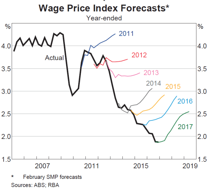
The RBA’s wage inflation forecasts have been persistently too strong. Mostly, they’ve forecast an acceleration of wage inflation, and yet actual wage inflation has continued to fall.
I was curious what a comparable New Zealand picture might look like. The way wage inflation series are calculated differs from country to country. In our Labour Cost Index, we have two measures of private sector wage inflation – the headline one, and what is labelled the Analytical Unadjusted series. The latter seems to be more comparable to the Australian measure in the RBA chart, while the headline LCI series attempts to adjust for changes in productivity (ie capturing only wage increases in excess of what firms identify as productivity growth). Here is what the two series look like.

The fall in New Zealand wage inflation (between 2 and 2.5 percentage points since 2008) is pretty similar to the fall in Australian wage inflation in the first chart.
The Reserve Bank of New Zealand publishes forecasts of annual wage inflation for the LCI private sector wages and salaries series (the orange line). I dug out their forecasts published in the June quarter of each year and this is the chart I came up with.
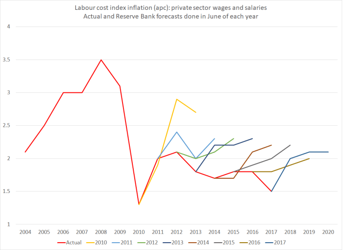
It isn’t quite the same picture as in Australia – they had a genuine business investment boom which had taken wage inflation almost back up to pre-downturn levels – but the broad picture is much the same. Each year since 2010, the Reserve Bank has forecast an increase in this measure of wages (notionally at least productivity-corrected) and each year it hasn’t happened. Perhaps this year’s forecast will prove more accurate?
What I found interesting is that the errors seem not to have been related to productivity surprises (I’ll come back to those), but simply to misreading overall inflation pressures.
Why do I say that? Well, here is a chart showing the Bank’s furthest ahead forecasts for wage and price inflation. They forecast three years ahead, so the forecasts associated with June 2017 (and published in that quarter) relate to inflation in the year to March 2020. Inflation forecasts that far ahead aren’t thrown around by things like unexpected petrol prices changes or weather shocks to fruit and vegetable prices. They are closely akin to forecasts of core inflation.

The wage inflation and price inflation forecasts are so close together that it is quite clear that for some years the Bank has simply been forecasting this measure of wage inflation on the basis of an assumption of unchanged real unit labour costs. Whatever happens to productivity growth, the Bank assumes that over the medium-term, this measure of wages (notionally productivity-adjusted) will rise at around the same rate as CPI inflation. (That in itself is interesting as throughout this period the unemployment rate has been above Bank estimates of the NAIRU. I can’t really show you a meaningful chart of their unemployment forecast surprises, because of the historical revisions to the HLFS).
The grey line shows actual inflation outcomes for the period that lines up with those medium-term forecasts. I’ve used the Bank’s preferred sectoral core inflation measure, not because it is ideal but because (a) it is available, and (b) it is their own preference. The last observation is sectoral core inflation for the year to March 2017, which is compared to forecasts for that period published in the June quarter of 2014.
What about the Bank’s productivity forecasts? In many ways, their view on future medium-term productivity growth doesn’t greatly affect their view of inflation pressures (higher assumed productivity growth will tend to raise both potential and actual output). So the productivity surprises chart is mostly about simply charting the declining performance of the New Zealand economy.
The Reserve Bank publishes forecasts for growth in a trend measure of productivity, and the trend estimates are revised as new data are added. But here are the forecasts, lined up against their most recent estimates of trend productivity growth (again using the forecasts published in each June quarter).
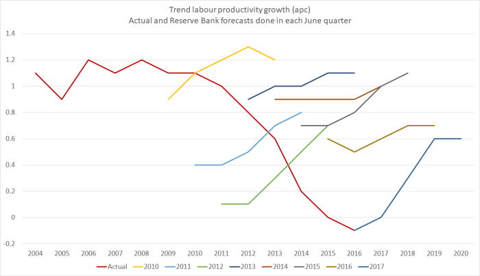
The Bank has, again, consistently forecast a pick-up in productivity growth (the first observation on each line is the Bank’s then-current estimate of the most recent actual). And for some of the earlier years (2009 to 2011) their latest estimates of actual trend productivity growth are higher than they thought at the time (it happens, as new revisions to GDP data come out). But as their estimates of actual trend productivity growth rates have continued to fall – near zero for the last couple of years – they’ve continued to forecast a rebound. Indeed, the rebound in the latest set of forecasts – out just a couple of weeks ago – is as steep as any of those in recent years. Perhaps in their shoes I’d also forecast a rebound – it seems excessively pessimistic to assume zero productivity growth for ever – but you do have to wonder what they think is about to change that means we’ll see the rebound beginning strongly in 2017/18 – ie, right now.
This post is probably already excessively geeky for many readers. But, as I do, the further I got into the data the more fascinated I got. I could show you a similar chart for output gap estimates and forecasts, but it is hard to read and fairly predictable – the Bank has fairly consistently over-estimated how much resource pressure would build up over successive forecast periods. That shouldn’t be a surprise, given the weak inflation outcomes.
But they did get some things pretty much right over this period. This chart shows two lines. One – the orange line – is their latest (June 2017) estimate for the average output gap for the year ending March of each year. And the others shows the contemporaneous forecasst done in each June quarter for the year ending March of that year. Thus, the 2017 observation is the June 2017 MPS estimate of the average output gap for the year to March 2017. When those estimates are done, the GDP numbers for March 2017 still aren’t known (but the first three quarters of the year are). Potential output is always an estimate.

With one (important) exception, the contemporaneous estimates and the current ones are astonishingly close. That isn’t so surprising for the last couple of years, and additional data could yet lead to material revisions in the estimates for the output gaps for 2015 and 2016. But for the earlier years, despite all the revisions to the data, and all the new information, the Bank’s contemporaneous estimates for the then-current output gap hold up very well against today’s estimates. These are annual averages, not estimates for the output gap in the March quarter itself, but….still…..I was pleasantly surprised. The forecasts might be pretty hopeless (as I noted last week, and as is typically true of other forecasters too) but the contemporaneous estimates aren’t bad at all. Simple monetary rules, such as the Taylor rule, encourage central banks to not put much emphasis on medium-term forecasts, but to adjust policy based on how they assess the current situation (output or unemployment gaps, and inflation gaps).
Of course, one observation in that chart does stand out. In 2014, the Bank thought there was a reasonably materially positive output gap. They now recognise that there wasn’t. And that was the time when they made the policy mistake, of raising the OCR by 100 basis points (and talking up even further increases beyond that), only to have to reverse those increases quite quickly. In any serious post-mortems of that episode (such as they suggest will be coming out shortly), they should be looking hard at how they got that output gap assessment so wrong – much more wrong than in any of the other post-recession years illustrated on the chart.
Getting the read on the current situation right is hard enough, and medium-term forecasting is typically adding no value, whether in understanding the actual future, or in understanding how the Bank itself might react to its own mistakes. The Bank would be better advised to focus its energies – analysis, communications, and policy deliberations – on what it knows at least something about, rather than on what it (and the rest of us) know little or nothing about.

It is questionable whether an agricultural based economy with 10 million cows or 70 million sheep could ever have been considered a modern productive economy in the first place. Perhaps productivity measures should exclude livestock based industries that badly skew productivity measures.
LikeLike
Wages and prices all workers can understand. Measuring productivity is harder to grasp. Being replaced by a computer makes NZ more productive. Having both eyes cut open by a laser doubles the productivity of the eye surgeon but I’m happy she worked on only one eye. What effect did the IRD help desk changing response times from minutes a decade ago to hours now have on national productivity?
I am surprised the experts are so consistent in getting things wrong and wrong in the same direction.If their estimates had been correct then would interest rates have been slightly lower and house price inflation even worse? I’m assuming price inflation is closely related to wage inflation in a mainly service economy.
Is the unexpectedly low wage inflation related to the one in eight young unemployed Kiwis? Is it the ease of finding candidates for permanent residency who will do almost anything just to remain in NZ?
LikeLike
You probably shouldn’t be surprised by the expert errors. Economic forecasting, for any material period ahead, is all but impossible. You might hope that at least the errors would be random, rather than one-sided, but the latter just reflects the fact that we don’t have good understandings of what is going on. In prolonged boom periods, the errors tend to be one-sided, the other way.
If the RB (and the RBA) had been right then, broadly speaking, interest rates would have been higher, all else equal. I think the sense that interest rates were so far from what they thought of as normal influenced the erroneous forecasts. If course, if the RB had forecast correctly, then interest rates would have been lower earlier (but might not now be any lower – in fact, there is an argument they might even be a little higher at least in bominal terms.
On your question, i think the lingering high unemployment rate does explain weak wage and inflation outcomes. The RBA is pretty explicit on that, altho the RBNZ constantly tries to avoid the linkage. I’m more sceptical of the immigration connection – immigrants boost demand (including for labour) more than supply in the near-term. A glut of migrants in particular roles may dampen wages in that particular sector or even area, but it probably doesn’t have that impact across the whole economy (except to the extent – different channels – immigration holds back back trend productivity growth). I covered some of that last week
https://croakingcassandra.com/2017/05/16/the-imfs-paper-on-new-zealand-immigration/
LikeLike
Thank you for gently guiding me. Material period: this is like weather forecasting – I have a good idea what tomorrow will be like but a week away is only guessing. The difference is we cannot change the weather but the government can change interest rates, minimum wages, benefit rates, etc so they have tools to help make their predictions come true.
I’ve always been interested in how accountancy is based on a period of a year. It made sense when farming was the dominant business but today many projects require investment now for rewards many years in the future. So if I was head of the reserve bank what period for projections makes most sense? Your graphs project 3 or 4 years into the future – merely a coincidence that is the period between elections?
LikeLike
The Reserve Bank forecasts three years ahead. The logic is that research suggests that monetary policy has its biggest effect on the economy and inflation up to 2 years ahead (exchange rate effects in particular take time), so the longer horizon allows one to see the implications of what they are doing now.
The govt’s Budget documents have Treasury forecasts for four years ahead. That logic is about fiscal planning – trying to keep a fairly medium-term footing.
LikeLike
quote – “Economic forecasting, for any material period ahead, is all but impossible”
Matrices, permutations and possibiities
The economics profession have trapped themselves into a deadly-handshake of their own making – and now they can’t get out of the trap
I have always considered economics a valuable tool for analysing and understanding past events. When it comes to guiding and directing the future path of an economic activity (read economy), it is not a good idea to be too doctrinaire about it. One can prognosticate about possible outcomes of various choices. I gave up forecasting outcomes years ago for the following reasons: (a) An “economy” comprises 1000’s of input components (b) The international card game of bridge, each of 4 players receives 13 cards from a deck of 52. The chance of any player receiving the same combination of 13 cards again is 1 in 635,013,559,600. That’s 635 billion.(c) Take 5 components, and using just one, there are 5 alternatives. Take 5 components and using any 2 together there are 32 possible outcomes. With 20 components the possible outcomes exceed 1 million. At any moment in time. And that assumes each component in each example is applied in fixed measure
I knew this not – until a professor (with a Phd) from Melbourne University pointed it out to me
They didn’t teach that in Economics in my day
More recently it was calculated that in the game noughts-and-crosses with nine 9 positions there are 366,000 possible outcomes
And doh-rag-wearing rugby international Peter Fitzsimons – Mind googoling
Interesting. TFF has been browsing Adam Spencer’ latest book, World of Numbers – which is sort of mathematical quirks and concepts, explained by a geek who can also write bloody well. The one that most stunned me is this. Spencer says that if you truly shuffle a deck of cards, properly, you will have in your hands one of the 52 x 51 x 50 x … x 3 x 2 x 1 =8065817517094387857166063685640376697528950544088327782 4000000000000 different ways you can shuffle a deck. A big number, I know. But what fascinates me is his contention that, “you can be assured that the order of cards you hold in your hands, has never happened before in the history of the universe … and will NEVER happen again! If a billion people, shuffled a billion decks of cards every day for a billion years they would not scrape the surface of the total number of ways a deck can be arranged.” Try adamspencer.com.au for the book
http://www.smh.com.au/comment/enough-already-of-tony-abbott-20151211-gll9j3.html
LikeLike
True big numbers are hard to grasp. It is easy to grasp the difference between say 3 and 7 but a crowd of 30,000 is easy to mistake for 70,000. Relevant to politics is the $26m spent on the flag debate and since the democratic majority decided no change it is held against John Key as if it was the biggest mistake he made while in power. In Auckland it is only 26 average houses. Meanwhile the $1,400million for carbon credits is too big to register with voters. I’m not necessarily against paying for carbon credits but I suspect that when the government signed up for them they were assuming a green heavily forested country would be receiving not paying. See the chapter in Parkinson’s law where they sign off the power station in minutes and then spend hours discussing the cycle shed for the night watchman; understanding the engineering of a power station is rare but we all know about bikes and sheds.
LikeLike
I had that same impressin that we would be a net receipient of carbon credits due to a very low population and huge forests. I did not realise that we had 10 million cows that generated methane gas that was 36 times more potent than carbon dioxide as a green house gas. Nor of the waste production that each cow generates is the equivalent of 20 people.
Also I recently understood some of the horrors of milk production. In order to get a single cow to produce milk, there is a dead carcass of a baby calf extracted and buried somewhere. In other words there are millions of dead and buried calfs rotting and generating methane gas all over our dairy farms.
LikeLike
……higher expected labour productivity could infer lower unit costs (other fixed costs spread over more output) and higher profits assuming stable prices; would’ve thought productivity would be high on the RB list as it relates to inflation? still don’t understand the seemingly lingering ‘wage-price’ spiral concern: why do firms award pay rises? productive performance / skill retention is surely the main driver, else, the shift of policy toward firm level bargaining wasn’t really necessary…
LikeLike
Productivity isn’t high on the list, mostly because they purport to run policy on a medium term basis. If one was confident that productivity growth would be stronger over the medium term, one would also forecast more consumption and investment. In total, one might just assume that the increased supply and increased demand offset each other. It is a bit different if we discover now that productivity over the last year has been faster than we thought, given all else we know about eg GDP. That would lead to revision downwards in the output gap estimates for the current period and, all else equal, would reduce the prospect of interest rate increases.
LikeLike
When one gets caught up in a traffic jam for a long period and starts to reflect on productivity its not a lot of imagination to realize that the more cars we own the lower our productivity.
Would be interesting to plot number of cars versus productivity.
LikeLike
Cars moving = productive, cars jammed = unproductive.
May as well plot time contributing to blogs and productivity. With blog quality mapping to car’s average speed.
LikeLike