The Reserve Bank of Australia had an interesting Bulletin article out recently, offering some insights on this chart
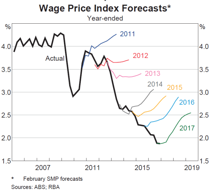
The RBA’s wage inflation forecasts have been persistently too strong. Mostly, they’ve forecast an acceleration of wage inflation, and yet actual wage inflation has continued to fall.
I was curious what a comparable New Zealand picture might look like. The way wage inflation series are calculated differs from country to country. In our Labour Cost Index, we have two measures of private sector wage inflation – the headline one, and what is labelled the Analytical Unadjusted series. The latter seems to be more comparable to the Australian measure in the RBA chart, while the headline LCI series attempts to adjust for changes in productivity (ie capturing only wage increases in excess of what firms identify as productivity growth). Here is what the two series look like.

The fall in New Zealand wage inflation (between 2 and 2.5 percentage points since 2008) is pretty similar to the fall in Australian wage inflation in the first chart.
The Reserve Bank of New Zealand publishes forecasts of annual wage inflation for the LCI private sector wages and salaries series (the orange line). I dug out their forecasts published in the June quarter of each year and this is the chart I came up with.
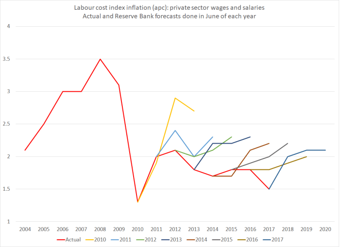
It isn’t quite the same picture as in Australia – they had a genuine business investment boom which had taken wage inflation almost back up to pre-downturn levels – but the broad picture is much the same. Each year since 2010, the Reserve Bank has forecast an increase in this measure of wages (notionally at least productivity-corrected) and each year it hasn’t happened. Perhaps this year’s forecast will prove more accurate?
What I found interesting is that the errors seem not to have been related to productivity surprises (I’ll come back to those), but simply to misreading overall inflation pressures.
Why do I say that? Well, here is a chart showing the Bank’s furthest ahead forecasts for wage and price inflation. They forecast three years ahead, so the forecasts associated with June 2017 (and published in that quarter) relate to inflation in the year to March 2020. Inflation forecasts that far ahead aren’t thrown around by things like unexpected petrol prices changes or weather shocks to fruit and vegetable prices. They are closely akin to forecasts of core inflation.

The wage inflation and price inflation forecasts are so close together that it is quite clear that for some years the Bank has simply been forecasting this measure of wage inflation on the basis of an assumption of unchanged real unit labour costs. Whatever happens to productivity growth, the Bank assumes that over the medium-term, this measure of wages (notionally productivity-adjusted) will rise at around the same rate as CPI inflation. (That in itself is interesting as throughout this period the unemployment rate has been above Bank estimates of the NAIRU. I can’t really show you a meaningful chart of their unemployment forecast surprises, because of the historical revisions to the HLFS).
The grey line shows actual inflation outcomes for the period that lines up with those medium-term forecasts. I’ve used the Bank’s preferred sectoral core inflation measure, not because it is ideal but because (a) it is available, and (b) it is their own preference. The last observation is sectoral core inflation for the year to March 2017, which is compared to forecasts for that period published in the June quarter of 2014.
What about the Bank’s productivity forecasts? In many ways, their view on future medium-term productivity growth doesn’t greatly affect their view of inflation pressures (higher assumed productivity growth will tend to raise both potential and actual output). So the productivity surprises chart is mostly about simply charting the declining performance of the New Zealand economy.
The Reserve Bank publishes forecasts for growth in a trend measure of productivity, and the trend estimates are revised as new data are added. But here are the forecasts, lined up against their most recent estimates of trend productivity growth (again using the forecasts published in each June quarter).
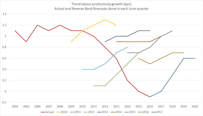
The Bank has, again, consistently forecast a pick-up in productivity growth (the first observation on each line is the Bank’s then-current estimate of the most recent actual). And for some of the earlier years (2009 to 2011) their latest estimates of actual trend productivity growth are higher than they thought at the time (it happens, as new revisions to GDP data come out). But as their estimates of actual trend productivity growth rates have continued to fall – near zero for the last couple of years – they’ve continued to forecast a rebound. Indeed, the rebound in the latest set of forecasts – out just a couple of weeks ago – is as steep as any of those in recent years. Perhaps in their shoes I’d also forecast a rebound – it seems excessively pessimistic to assume zero productivity growth for ever – but you do have to wonder what they think is about to change that means we’ll see the rebound beginning strongly in 2017/18 – ie, right now.
This post is probably already excessively geeky for many readers. But, as I do, the further I got into the data the more fascinated I got. I could show you a similar chart for output gap estimates and forecasts, but it is hard to read and fairly predictable – the Bank has fairly consistently over-estimated how much resource pressure would build up over successive forecast periods. That shouldn’t be a surprise, given the weak inflation outcomes.
But they did get some things pretty much right over this period. This chart shows two lines. One – the orange line – is their latest (June 2017) estimate for the average output gap for the year ending March of each year. And the others shows the contemporaneous forecasst done in each June quarter for the year ending March of that year. Thus, the 2017 observation is the June 2017 MPS estimate of the average output gap for the year to March 2017. When those estimates are done, the GDP numbers for March 2017 still aren’t known (but the first three quarters of the year are). Potential output is always an estimate.

With one (important) exception, the contemporaneous estimates and the current ones are astonishingly close. That isn’t so surprising for the last couple of years, and additional data could yet lead to material revisions in the estimates for the output gaps for 2015 and 2016. But for the earlier years, despite all the revisions to the data, and all the new information, the Bank’s contemporaneous estimates for the then-current output gap hold up very well against today’s estimates. These are annual averages, not estimates for the output gap in the March quarter itself, but….still…..I was pleasantly surprised. The forecasts might be pretty hopeless (as I noted last week, and as is typically true of other forecasters too) but the contemporaneous estimates aren’t bad at all. Simple monetary rules, such as the Taylor rule, encourage central banks to not put much emphasis on medium-term forecasts, but to adjust policy based on how they assess the current situation (output or unemployment gaps, and inflation gaps).
Of course, one observation in that chart does stand out. In 2014, the Bank thought there was a reasonably materially positive output gap. They now recognise that there wasn’t. And that was the time when they made the policy mistake, of raising the OCR by 100 basis points (and talking up even further increases beyond that), only to have to reverse those increases quite quickly. In any serious post-mortems of that episode (such as they suggest will be coming out shortly), they should be looking hard at how they got that output gap assessment so wrong – much more wrong than in any of the other post-recession years illustrated on the chart.
Getting the read on the current situation right is hard enough, and medium-term forecasting is typically adding no value, whether in understanding the actual future, or in understanding how the Bank itself might react to its own mistakes. The Bank would be better advised to focus its energies – analysis, communications, and policy deliberations – on what it knows at least something about, rather than on what it (and the rest of us) know little or nothing about.
