The Reserve Bank’s Monetary Policy Statement (Graeme Wheeler’s second to last) will be out on Thursday. I’m not in the market economists’ game of trying to tell you what the Bank will do and say (although no one expects they will do anything concrete with the OCR this time). I’m more interested in questions around what they should do. In time, what they should do, they usually will do. But sometimes not until they’ve tried the alternatives.
I wrote about last month’s CPI data a few weeks ago, concluding that there had been a welcome, and expected, increase in core inflation (it is what typically happens if inflation is below target and the OCR is cut fairly substantially) but that
With the unemployment rate still above estimates of the NAIRU, and most indicators of inflation suggesting that core is probably (a) still below target, and (b) not picking up very rapidly, it certainly isn’t time for hawkish talk about near-term OCR increases.
Not everyone agrees of course. I noticed the BNZ’s economic commentary yesterday which opened with this confident assertion
There is no excuse for the cash rate to be just 1.75% in New Zealand.
I don’t think I’m unduly caricaturing their record to say that, for at least the last decade, the BNZ economics team has never seen an OCR increase they didn’t like, even – or perhaps especially – those which had to be quickly reversed. But mindful that in the story of the boy who cried wolf, the wolf eventually did come, I thought it was worth having a look at the latest wave of data. Last week, we got the full quarterly set of labour market data (HLFS, QES, and LCI), and the Reserve Bank’s quarterly expectations survey. To cut a long story short, it doesn’t alter my view.
Take the expectations survey first. The headline story was one in which the two year ahead expectations of the inflation rate (of a sample of moderately informed observers – including me) rose quite materially, and now stand at 2.17 per cent (up from around 1.65 per cent in each quarter last year).
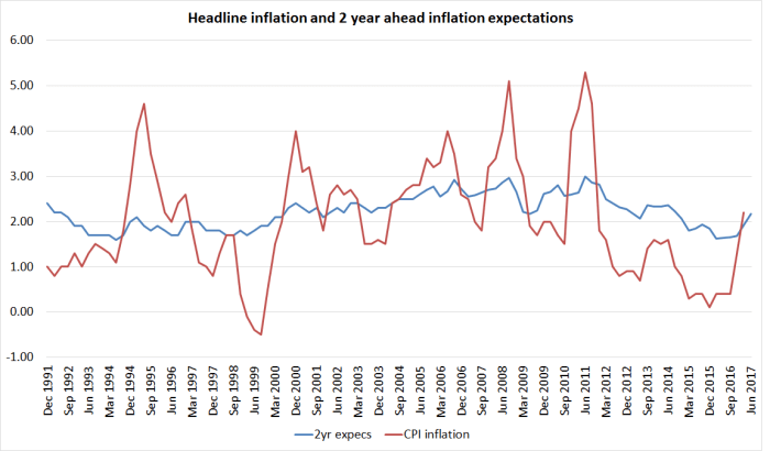
This measure of expectations isn’t typically very volatile, but it is typically somewhat responsive to changes in headline CPI inflation. We’ve just had quite a large change in headline inflation, so some increase in the expectations measure shouldn’t be surprising. It certainly shouldn’t be concerning. After all, ideally, the Reserve Bank wants people to believe, and act as if they believe, that on average over time CPI inflation will average around 2 per cent – the mid-point of the target range, and the explicit focus of the current (but about to expire) PTA.
In fact, no one really knows whether this survey measure captures how people actually think and behave in real transactions in the goods, labour and financial markets. It might be as good a proxy as we have, but (a) we don’t know, and (b) it still might not be good at all. Glancing at the time series, there is a tendency for falls and rise to be at least partly reversed quite quickly.
But if inflation expectations are really in some sort of 2 to 2.2 per cent range, I’d welcome that. With repeated increase in tobacco excises – not some underlying economic process – there is a reasonable case, in terms of the PTA, that headline inflation should average a little higher than the mid-point, and than “true” core inflation. Only if inflation expectations were to rise further from here might I start to get a little disquieted.
In trying to make sense of the inflation expectations numbers, one thing I haven’t seen mentioned is the Labour Party’s monetary policy release. There was a quite a bit of focus last month on their pledge to add some sort of employment objective to the Reserve Bank Act, and concerned expressed in some quarters that that could lead to higher inflation over time. If it was a factor, you’d presumably have to take the probability of Labour leading a new government (call it a coin toss at present?) and multiply that by the probability that the change in regime (and perhaps the sort of people a new government might appoint) would make a material difference over time. I have no evidence one way or the other, but it wouldn’t surprise me if there was a small effect of this sort. (My own two year ahead expectation in the survey was 1.5 per cent – around the current rate of inflation in the Bank’s preferred sectoral factor model).
Not many commentators seem to pay much attention to the rest of the expectations survey, even though its strength is partly the range of macro questions that are asked (although I’ve suggested some modifications to the Bank in their review of the survey).
Take GDP for example. There is no sign of respondents expecting real growth to accelerate. Two years out they expect annual real GDP growth of 2.6 per cent – down on the previous quarter, but not far from the average response over the last couple of years. But the survey also asks for quarterly GDP predictions for the next couple of quarters, and year-ahead predictions. That enables one to derive an implied six monthly growth rate for the second half of the coming year. Here is the gap between the expected growth rates for the first six months and the second six months, going back to just prior to the 2008/09 recession.
 As we headed into the recession there was a lot of expectation of a strong rebound. Even up to around 2012, respondents expected growth to accelerate. For the last few years they haven’t expected any acceleration, and now the expect it to slow. To be specific, respondents expect 1.6 per cent total growth in the first half of this year, slowing to 1.2 per cent in the second half of this year. We don’t know quite why – perhaps they expect immigration numbers to slow – but it doesn’t speak of a sense that things are getting away on the Reserve Bank. Similarly, two years out respondents expected that the unemployment rate would still be 4.9 per cent.
Perhaps these respondents will be proved wrong – they often are, forecasting is like that – but at the moment it doesn’t look like an imminent risk of core inflation rising much further, or to levels that might prove problematic for a flexible inflation targeter focused on medium-term inflation outcomes around 2 per cent.
What of the actual labour market data? We have some problems at present because of the breaks in various HLFS series that occurred when the revised survey questions were put in place last year. I’m still staggered they could have made these changes without running the two sets of questions in parallel for perhaps a year, to allow robust adjustments to be made for the discontinuities. HLFS hours worked measures, employment measures, and probably participation rate measures all seem to have been affected to some extent. We are pretty safe in saying that the number of people employed in New Zealand did not grow by 5.7 per cent last year (as the HLFS suggests).
What of the simplest headline number, the unemployment rate? There isn’t much doubt that the unemployment rate has been falling over the last few years. It is what one should expect after a serious recession, and with the stimulus to demand provided by low interest rates and large migration inflows (given that immigration typically adds more to demand in the short-term than it does to supply, thus tending to lower unemployment and use up spare resources in the whole economy).
But what should be somewhat disconcerting is that the unemployment rate has (a) gone largely nowhere in the last year, and (b) is still well above pre-recession levels (unlike the situation in many other advanced countries with their own monetary policies). In the prevous boom, the unemployment rate got down to around 4.9 per cent as early as the start of 2003. The picture isn’t much different if one looks at the broader (not seasonally adjusted) SNZ underutilisation measure.

There still appears to be some progress in using up spare capacity in the labour market, but not very much at all.
What about the rate of job growth. Fortunately, we have two measures: the (currently hard-to-read) HLFS household survey measure of numbers of people employed, and the QES (partial) survey of employers asking how many jobs are filled. Unsurprisingly, the trend in the two series are usually pretty similar, even if there is a fair bit of quarter to quarter volatility.

Since we know there are problems in the HLFS, and the QES doesn’t look to be doing something odd, perhaps we are safest in assuming that the number of jobs has been growing at an annual rate of around 2.5 to 3 per cent. That isn’t bad at all. But SNZ also estimates that the working age population has been growing at around 2.7 per cent per annum. No wonder the unemployment rate is only inching down.
One can do a similar picture for the annual growth rates in the two (HLFS and QES) hours worked series.

It was pretty clear that there was around a 2 per cent lift in HLFS hours worked from last June, just on account of the new survey questions. It seems safer to assume that total hours worked across the economy might have grown by around 3 per cent in the last year. That is faster than the growth in the working age population, pointing to some increase in effective utilisation, but not a dramatic one. For what it is worth, in the latest releases, the two hours measures were both quite weak in the March quarter.
(And remember that nothing in the expectations survey data suggested pressures were likely to intensify from here.)
And what of wages? There is a variety of measures. The QES measure is quite volatile – there are issues of changing composition – and I don’t put much weight on it. But for what it is worth, average hourly earnings rose 1.6 per cent in the last year on this measure, around the lowest rate of increase seen for decades. The Labour Cost Index measures should get more focus (but have some challenges of their own).
 Perhaps there is some sign of a possible pick-up in the analytical unadjusted series (which doesn’t try to correct – inadequately – for productivity changes) but it is a moderately volatile series, and the most recent rate of increase is still below the peak in the last little apparent pick-up a year or two back.
A common response is “ah, but what about the lags?”. But as we’ve shown, there is little sign of any material tightening occurring in the overall labour market, no sign of expectations that that is about to change, and so little reason to expect much different wage inflation outcomes over the next couple of years from what we’ve seen in the last couple. At best, there might be some slight pick-up in wage inflation (especially if the increase in inflation expectations is real), but any pick-up is going to be from rates of increase that have, over the last couple of years, been consistent with disconcertingly low rates of core inflation.
So where does it all leave me? Mostly content that an OCR around 1.75 per cent now is broadly consistent with core inflation not falling further, and perhaps continuing to settle back where it should be – around 2 per cent. Of course, there is a huge range of imponderables, domestic and foreign, so no one should be very confident of anything much beyond that. But it is worth bearing in mind that the unexpectedly strong net migration over the last few years has been a significant source of stimulus to overall domestic demand (including demand for labour). In the face of typically too-tight monetary policy, it is part of why the unemployment rate finally started gradually coming down again after 2012.
Whatever happens to the cyclical state of the Australian economy, the National government is already putting in place immigration policy changes that should be expected to lead to some reduction in the net inflow of non-citizens, and two of the main opposition parties are campaigning on promises of much sharper reductions than that. If such policy changes come to pass then, all else equal, the OCR will need to be set lower than otherwise. It isn’t something that Graeme Wheeler can or should actively factor into this week’s OCR decision, but it may well be something the acting Governor needs to think hard about (if any decisions he makes are in fact lawful) after the election.