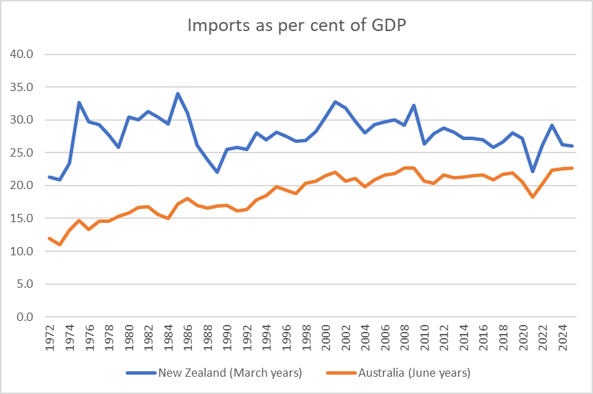
For years now it has been recognised that New Zealand’s foreign trade (share of GDP) is small compared to what one would expect to see in a small country. Small countries generally sell to and buy from firms abroad to a greater extent (relative to the total size of the economy) than larger ones. There is nothing surprising about that: there are simply fewer domestic opportunities in a small country than there are in a large one. The United States, for example (and well before Trump), has exports of around 11 per cent of GDP. But New Zealand’s foreign trade share is small by the standards of small countries, and actually not many large countries now have a smaller trade (exports or imports) share than New Zealand. I’ve done various posts on variations of this issue over the years.
But time passes and I hadn’t noticed that exports from Australia – a country with a population more than five times ours – are now about as large a share of GDP as those from New Zealand. I put this chart on Twitter yesterday, with the observation that Australia itself is hardly a stellar success story.
Even back in the bad old protectionist days, when New Zealand tended to have higher trade barriers than Australia did, the value of exports as a share of GDP was higher in New Zealand than in Australia.
The imports chart is not as stark, but the gap has been narrowing (Australia now has a current account surplus after some decades of having run substantial deficits like New Zealand).
And, of course, from a New Zealand perspective don’t lose sight of the fact that as a share of GDDP both exports and imports are now well below the peaks, themselves well in the past. It isn’t exactly a marker of a successful economy. I’ve made this point numerous times before but I’ll say it again anyway: it isn’t that exports are special, simply that in successful economies it is usual for domestically-operating firms to find more and more opportunities to sell successfully in the rest of the world. You’d certainly expect to see it in any economy that was successfully closing the gaps to the rest of the world. Which New Zealand isn’t.
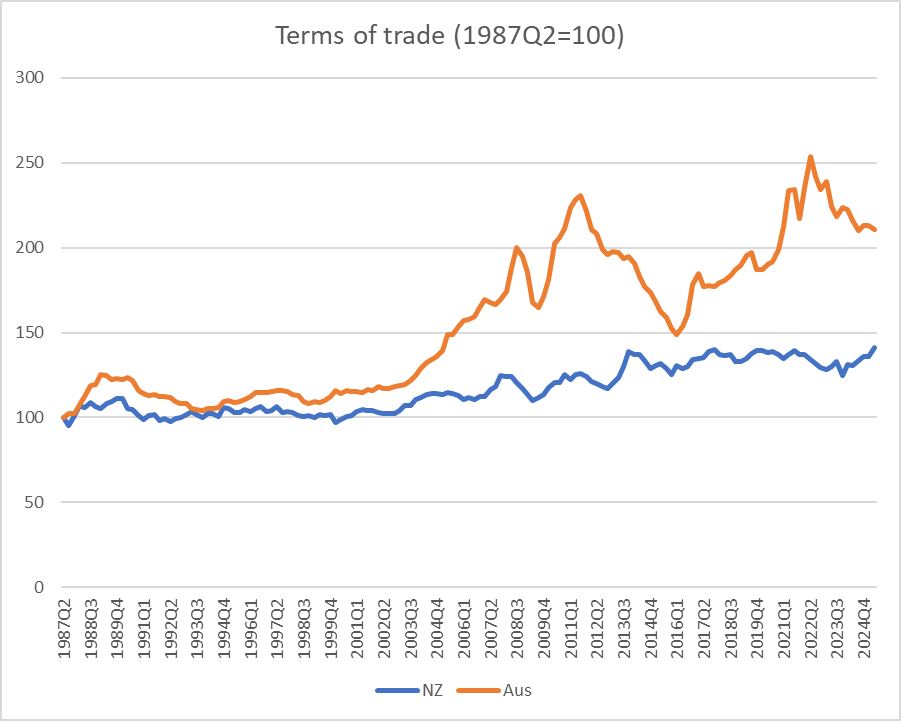
Export revenues result from the mix of price and volume. By wider advanced country standards our terms of trade have been pretty good in the last couple of decades. But Australia’s terms of trade (export prices relative to import prices) have been much more favourable – although also more variable. In the near-term, terms of trade for commodity exporting countries are largely outside their control, but over the longer-run firms presumably invest in anticipation of a particular view of future average selling prices.
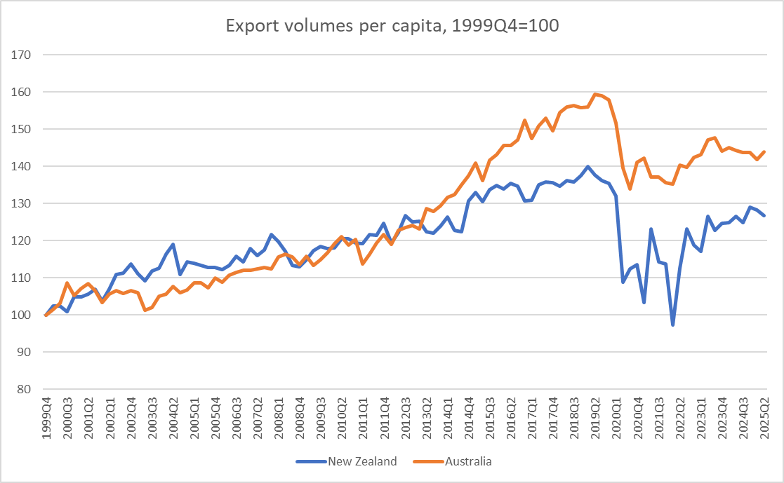
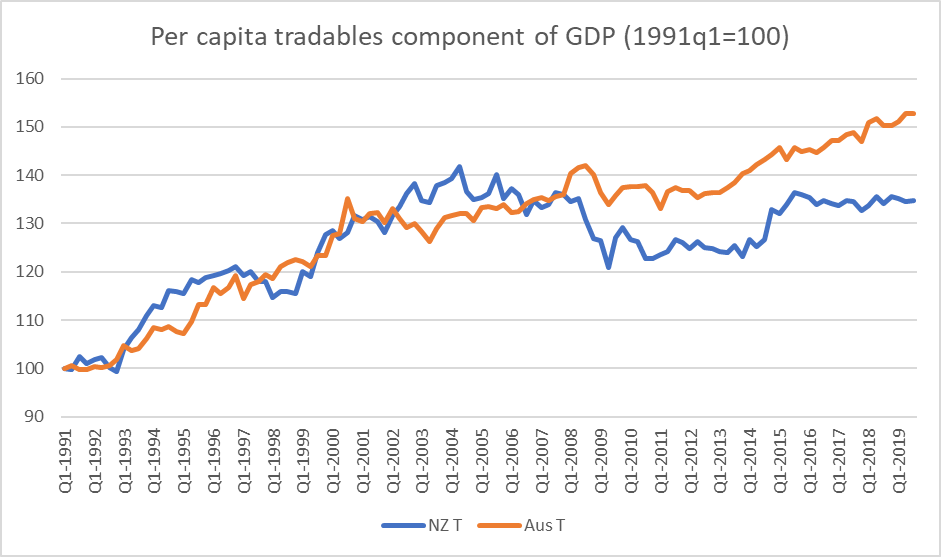
What about export volumes? Using the constant price exports series for each country, here is how the volume of exports per capita has unfolded in the two countries this century.
The two lines don’t materially diverge until the last decade or so,
as the massive Australian mining investment boom translated into materially higher export volumes (and revenues). New Zealand simply had nothing similar.
One sobering snippet I took from that export volumes chart is that New Zealand export volumes per capita are no higher now than they were in 2012, 13 years ago now. As a share of GDP total export revenues are now at a level first reached in 1977.
But the other sobering snippet from that volumes chart is Australian export volumes per capita haven’t grown now for almost a decade (and so the gap between the New Zealand and Australian lines isn’t widening further). But then, as I noted already, Australia isn’t a stellar economic success story – and productivity growth there in the last decade has been next to non-existent – just richer and more successful than New Zealand, and the easy exit option for our people.
Both the New Zealand and Australian economies are very heavily reliant on natural resources for their exports to the rest of the world, and that shows little or no sign of changing. If, as the Australian economy did, firms can bring newly to market a huge swathe of natural resource exports things tend to go better for you, as a very remote economy, than if you can’t or don’t.
That’s the title of a 2024 book by a couple of Australian academic economists, Steven Hamilton (based in US) and Richard Holden (a professor at the University of New South Wales). The subtitle of the book is “How we crushed the curve but lost the race”.
It is easy to get off on the wrong foot with at least one of the authors. Each of them has a Foreword, and Hamilton’s rubs me up the wrong way every time I come back to it (as I did just now). There are 26 “I’s” in 2.5 pages (he notes “I am the first to admit I can be prone to self-congratulation”) and then this moan
I do love Australia but boy do we love credentialism. Australia is a country where time served is taken far more seriously than the merits of an argument. Where, unless you have some postnominals, a regular column writing in a national broadsheet, or went to the right private school, the typical journalist won’t give you the time of day. The policy discussion is fundamentally undemocratic, and the country is poorer for it.
Which seemed a little odd for someone who is an assistant professor in another country and has just had a book, on policy in Australia, published by an Australian university press. In fact, I looked up Hamilton’s bio. It has 7 pages of listings under “Opinion Writing” (130 or so pieces), and the bulk of those articles/columns were published in top Australian newspapers (AFR, Australian, SMH). Not bad for a junior academic living in another country.
The title of the book is a bit of a puzzle. In places, the story is that Australia did some things exceptionally well (thus, low death toll) and other things exceptionally badly (that subtitle about losing the race is about the delays in securing vaccines – and the economic nationalism of trying to promote Australian-produced options – and in moving away from exclusive reliance on lab-processed PCR tests and authorising/enabling extensive use of RAT tests). But then their claim in the concluding chapter is “overall, Australia’s handling of the pandemic was exceptionally good”, notwithstanding their claim earlier in the book that the vaccine delay – similar to New Zealand’s – was “almost surely the single most costly economic event in Australian history”, a claim which itself makes no sense unless they are using some exceptionally narrow definition of “economic event” that isn’t hinted at in the text. And they give very little attention to the Reserve Bank of Australia’s role in pandemic economic management – none at all to the massive losses to taxpayers from ill-judged risky interventions in the bond market, and very little to the worst outbreak of (core) inflation in decades.
My own final take on that “overall exceptionally good” claim was as follows:
In some respects (including the important mortality one) Australia did materially better than most. Arguably the Australian government (like New Zealand’s) got one really big call right (the initial closing of the borders in March 2020 just in time, albeit – and as [the authors] note – later than they should have). Beyond that, the record is really rather mixed. Some of that might perhaps have been inevitable in such exceptional times. But plenty of things could have been done better, as even [the authors] (sometimes grudgingly) acknowledge.
For those tempted to buy the book, if you followed events closely over 2020 to 2022 you aren’t likely to find anything new, and some of the argumentation is moderately detailed, and thus it isn’t entirely clear who the target audience was. But time moves on, people forget too quickly, and before long there will cohorts of policy advisers and even politicians for whom the pandemic period was little more than a hazy teenage memory. For them, perhaps in particular, it is likely to be a useful point of reference.
The editor of the New Zealand economics journal, New Zealand Economic Papers, invited me to write a review of the Hamilton and Holden book, which was published on their website a few weeks ago.
There were a few changes before the final published version but what follows has all the substance.
Review of Steven Hamilton and Richard Holden, Australia’s pandemic exceptionalism:how we crushed the curve but lost the race, UNSW Press, Sydney, 2024, 240pp
Introduction
No one can doubt that 2020 and 2021 were exceptional. COVID-19 was the worst pandemic in a century, and the nature and scale of the policy responses were pretty much without precedent. Those of us who’d assiduously read accounts of the 1918/19 flu pandemic got little real help in what to expect. The discontinuities in the economic data will probably be puzzling students a century hence.
But in their new book two Australian academic economists, Steven Hamilton (George Washington University) and Richard Holden (University of New South Wales), seek to highlight what they believe to have been exceptional about the specific Australian experiences and policy responses – exceptionally good (the economics), and exceptionally bad (sluggish acquisition of vaccines, very slow adoption of RAT tests). Since the overall experience of the pandemic in Australia – policy and outcomes – was very similar to that of New Zealand many of the arguments made are likely to be valid, or not, for New Zealand too.
Both Hamilton and Holden (hereafter HH) had many things to say during the pandemic, and a fair number of the points they were making then were fundamentally correct. And so if the book often has a self-congratulatory tone (and Hamilton acknowledges his tendencies in his Foreword) it isn’t entirely unwarranted.
Judged by deaths from Covid, Australia was one of the group of the best performing advanced countries. As HH recognise, these outcomes were a mix of luck and policy – Italy, for example, felt the full force of the outbreak early, but it could have been any other country, particularly those with lots of travel to and from China.
Using Our World in Data, here are the advanced countries with cumulative death rates less than 1000 per million people (a longer list than you might get the impression of from reading the book).
COVID-19 death rates per million (to 21 January 2025)
Australia
963
Iceland
489
Japan
597
Korea
693
New Zealand
879
Singapore
358
Taiwan
739
In contrast there are the United Kingdom (3404), the United States (3548), and Italy (3344), with a number of central and eastern European EU countries materially higher again.
But how should we assess the wider policy response, in particular the economic side of things?
Assessing policy responses
The authors were among the organisers of an open letter in April 2020, signed by 265 Australian economists, arguing in support of government policy, including lockdowns, and they continue to champion the view that there was no trade-off between public health and economic outcomes in the peak pandemic period. It is a set of arguments that, taken together, never seemed fully persuasive.
HH remind readers of the Goolsbee and Syverson (2021) paper that suggested quite early on, using mobile phone data, that almost 90 per cent of the reduction in movement in the United States was voluntary (was happening anyway independent of legal restrictions being imposed). If so, and given that the legitimate public health goal was to get and keep the replication rate below 1 (ie each case passing Covid on to, on average, less than one other person), was there really a compelling case – that would pass a robust cost-benefit test – for fairly extreme lockdowns? How much difference did the marginal movement restrictions produce (on the health side) and at what economic and social cost? Presumably, on average, the least costly and disruptive reductions in movement occurred first and voluntarily?
Unfortunately, we do not know with any confidence the answers to questions like these. There was little or no evidence of serious cost-benefit analysis being deployed, even in principle, in the New Zealand official advice (and the Productivity Commission ran into significant blowback when it attempted something illustrative) and nothing in HH’s book suggests things were any different in Australia. Unfortunately, there is also no sign of any marginal analysis in this book (or in other post-event evaluations).
Peak lockdowns in New Zealand were more onerous than those (on average across states) in Australia and, for what it is worth, the best estimates of June quarter 2020 GDP in both countries show a materially larger fall in New Zealand than in Australia[1]. Lockdowns were not the biggest part of the economic story, but it is also very unlikely they made only a small difference[2]. Output not generated in one quarter isn’t typically replaced with additional output later, even when there is a very quick recovery in activity to the pre-crisis level. And beyond GDP effects, HH seem largely unbothered by the human costs of the more extreme provisions – funerals couldn’t be held, the dying or bereaved couldn’t be comforted, and so on. Decisionmakers, of course, had to operate under considerable time pressure in early 2020 – although as HH note, they were often slow to grasp the seriousness of what was emerging and so lost valuable time for reflection and analysis.
Hamilton was among those making the case fairly early that in a shock of this sort (not having its roots in initial economic imbalances) fiscal support measures should focus not just on income support but on keeping firms and employment relationships (and the embedded firm specific capital) intact. It wasn’t a new idea (and New Zealand governments had used that model on a small scale in the wake of the Christchurch and Kaikoura earthquakes) but as the magnitude of the Covid crisis belatedly became apparent the scale of any such support (not just dollars but the administrative capacity required) was daunting.
The United States serves as a foil throughout the book to help make the authors’ case for Australian exceptionalism (especially on the economic side of things). The authors correctly note that the American political system (in which the head of government doesn’t control the legislature, and where a large proportion of powers – including around unemployment insurance – operate at the state level anyway) could not realistically have been expected to generate quick and comprehensive whole of government responses, of the sort we saw in Australia and New Zealand. They contrast particularly the Australian JobKeeper programme programme (somewhat similar to the New Zealand wage subsidy scheme, both emphasising retention of existing employment relationships) with the US support programmes (lump sum household grants and the Paycheck Protection Programme).
The way government support programmes were designed is generally recognised as having had substantial implications for the extent to which the reported unemployment rate rose in different countries.
Increase in unemployment rate: end-2019 to peak COVID level (percentage points)
Australia +2.5
New Zealand +1.1
Canada +8.1
United States +11.3
United Kingdom +1.4
Those are stark differences[3], and HH attempt to connect the difference between the US and Australian unemployment numbers to subsequent economic performance. Somewhat surprisingly they do this wholly by reference to the employment to population ratio, which is higher now in Australia (and New Zealand) than pre-COVID, but is lower in the United States, with the suggestion that the JobKeeper type of programme, if not perfect, was better suited to a full and quick rebound in the economy.
As it happens, the United Kingdom (with a very small increase in the unemployment rate) also now has a lower than pre-COVID employment to population ratio, but more importantly there is no mention at all of the respective GDP experiences.
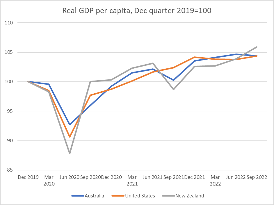
In fact, despite the very different pandemic experiences of Australia and the United States the tracks for real GDP per capita were remarkably similar. Both countries regained the December 2019 level in the same quarter (March 2021) and by the end of the immediate pandemic period the cumulative growth rates had been almost identical.
Since then, of course, US productivity and real GDP per capita growth have diverged (favourably) from those of almost all other advanced economies. The reasons aren’t yet well understood, but there isn’t much evidence that pandemic-related labour market scarring has mattered much at least at an economywide level.
As the authors highlight, Australia could reasonably be considered to have done exceptionally badly around vaccine procurement, and the approval and widespread use of RAT rest. They both devoted many column inches at the time to the breathtaking failure of politicians and officials in Australia to act early and decisively to secure access to vaccines by placing orders or buying options at scale on all the emerging potential vaccines (a New Zealand book would have to grapple with the same failure). No one knew which would emerge as best or be available earliest, and the cost of over-ordering would have been small compared to the costs of additional economic and social disruption if the population remained largely with access to an effective vaccine. The complacency – in the then Prime Minister’s words “this is not a race” – reflects very poorly on ministers and officials, and came at a considerable economic cost. Like New Zealand, Australia eventually achieved very high vaccination rates, but the operative word is “eventually”.
Unfortunately, and inexcusable as those delays were, this is one of a number of places where HH lapse into overstatement. They estimate that the vaccine delays cost Australia (directly and indirectly) A$50 billion and go on to claim that this meant that “Australia’s great vaccine debacle [was] almost surely the single most costly economic event in Australian history”. $A50 billion is a lot of lost output but it was about 2.5 per cent of one year’s GDP. By contrast, during the Great Depression Australia’s per capita GDP averaged almost 15 per cent below pre-Depression levels for five years (so in total something like 75 per cent of one year’s GDP), and the 1890s financial crisis (when it took 15 years for real GDP per capita to regain pre-crisis levels) was even worse. If one wants more recent, and directly policy-related, costly economic choices, one might think of the post-war tariff walls or letting inflation get away in the 1970s.
Macroeconomic policy
HH are firm champions of fiscal policy as a countercyclical stabilisation tool, and spend quite a bit of space in the book revisiting arguments for why there should have been (but wasn’t) countercyclical fiscal stimulus in Australia’s 1991 recession and why they believe such stimulus was both desirable and successful in 2008/09. They are sympathetic to Claudia Sahm’s proposal for additional semi-automatic fiscal stabilisers. I’m sceptical on all three counts (including the associated claim that Australia avoided a recession in 2008/09, when the unemployment rose by 1.7 percentage points and real per capita national disposable income measures fell materially), but the connection to an event like the pandemic is not clear.
In a typical unexpected downturn countercyclical policy aims to stimulate business and household demand and spending. The relative merits of monetary and fiscal policy tools can be debated but the goal is pretty clear. The goal in March 2020 was quite different. The aim wasn’t to stimulate demand or activity, but to tide people and firms over while the economy was more or less shutdown (more or less as a policy goal, through some mix of official edicts and private risk-averse behaviour). That required direct transfers in one form or another, something monetary policy simply cannot do. The fact that programmes like JobKeeper (and the New Zealand wage subsidy) worked – at vast, probably unnecessarily large, fiscal cost[4] – in a unique crisis like COVID tells us almost nothing about how best to handle future conventional (aggregate demand shock) downturns. And nor do the experiences of past conventional recessions shed useful light on how best to handle shutting down much of the economy temporarily for non-economic reasons.
One of the striking omissions in the book is any serious or sustained discussion of monetary policy and the performance of the Reserve Bank of Australia (RBA). Monetary policy wasn’t the instrument that could or should have dealt with the income support and firm-retention goals governments rightly had through COVID. But monetary policy moves last, and is supposed to take into account all the other pressures on the aggregate demand/supply balances, with the aim of keeping inflation near target. Faced with the unique pressures of COVID too many central banks, including the RBA, failed badly. Core inflation reached levels it was never supposed to reach again under inflation targeting. And those same central banks ran up massive losses (tens of billions of dollars in the RBA case) on ill-judged and largely ineffective bond buying programmes. These massive losses to taxpayers are not mentioned at all in the book.
There is a brief discussion of inflation, but HH seem to treat those outcomes as just a price that had to be paid, even describing the inflation (somewhat curiously) as an “insurance premium” (such premia are usually fixed upfront against uncertain losses and are not the unexpected outcome). They, like many central bankers (at least judging by their public remarks), seem utterly indifferent to the huge redistributions of wealth such a severe outbreak of unexpected inflation caused.
Various commentators, including HH, contrast the really gloomy macro forecasts that were widespread in mid-2020 with the actual outcomes. The suggestion is that this is a testimony to policy effectiveness, but surely it is mostly a testimony to forecasting failure? Central banks and finance ministries in the second and third quarters of 2020 knew all about the nature and magnitude of the policy support, but they simply misread the overall macroeconomic implications. Take the RBA Statement of Monetary Policy from as late as November 2020: they forecast trimmed mean inflation at 1 per cent for 2021 and 1.5 per cent for 2022, both well below target. Projections of that sort at that time were not uncommon (those of the Reserve Bank of New Zealand were similarly weak). Those serious misjudgements, not the COVID support interventions themselves, gave us the serious inflation problem that central banks are still now dealing with the after-effects of. Getting the balance between demand and supply effects right, knowing what weight (little, as it turned out) to put on adverse uncertainty effects etc, wasn’t easy, but it was the job central bank experts are paid to do.
Conclusion
Much is made by HH of Australian “state capacity”[5] and at one point they suggest that “if this book is about anything, it’s state capacity”. On recent metrics (eg O’Reilly and Murphy (2022)) state capacity in Australia going into the pandemic was good but didn’t stand out relative to other advanced economies. The authors are clearly right to praise the ability of the Australian Tax Office (ATO) to put in place quickly the JobKeeper programme, itself in part a reflection of efforts to modernise the agency over previous years. But since state capacity is more than just the technical abililty to implement a programme quickly and efficiently under pressure, we can’t – and HH don’t – ignore things like the vaccine procurement and RAT approval issues, both of which were costly failures. And what we saw, in Australia no more or less than most other advanced countries, was monetary policy authorities failing to do their core job adequately when it really counted.
We need many more books and formal studies about all aspects of the pandemic period, national and cross-country. That said, it isn’t entirely clear who the target market for this particular book is. The Australian Treasury (past and present), the ATO, and the then Treasurer Josh Frydenberg will welcome it (they count as the authors’ heroes), and those already inclined to agree with the authors will nod along as they read, but without necessarily learning anything new. In a fairly short account covering a substantial amount of sometimes-complex historical ground perhaps there isn’t room for, and they don’t attempt, fresh in-depth analysis. But memories fade all too quickly, and before long a new generation of junior policy analysts will be staffing agencies with only a hazy child’s memory of the pandemic. The book should be a useful introduction to much[6] about the Australian government response.
Which brings us to the final issue: was Australia’s overall handling of the pandemic “exceptionally good”, as the authors claim? In some respects (including the important mortality one) Australia did materially better than most. Arguably the Australian government (like New Zealand’s) got one really big call right (the initial closing of the borders in March 2020 just in time, albeit – and as HH note – later than they should have). Beyond that, the record was really rather mixed. Some of that might perhaps have been inevitable in such exceptional times. But plenty of things could have been better, as even HH (sometimes grudgingly) acknowledge.
References
Gibson, J. (2022), Government mandated lockdowns do not reduce Covid-19 deaths: implications for evaluating the stringent New Zealand response, New Zealand Economic Papers Vol 56 2022 Issue 1
Goolsbee, A. and Syverson, S. (2021), Fear, lockdown, and diversion: Comparing drivers of pandemic economic decline 2020, Journal of Public Economics 193
O’Reilly, C. and Murphy, R. H., (2022), An Index Measuring State Capacity, 1789–2018, Economica, Vol 89, Issue 355 pp 713-745
[1] Note, however, that measurement of a locked-down economy was much more difficult than usual, particularly in non-market sectors, and outsiders can’t be sure how comparable the (inevitable) assumptions used were.
[2] John Gibson (2022), written in 2020, is also relevant here, drawing on the diverse restrictions in the different parts of the United States..
[3] The United Kingdom had by far the largest peak to trough fall in GDP of any of these countries.
[4] HH tend to play down the validity of ex post observations of this sort (while accepting that there may be cheaper options that could be considered in future), but as it happened I had laid out before the New Zealand lockdown the genesis of an alternative approach that, had it been adopted, would have proved considerably cheaper (Reddell (2020)),
[5] For example (p39), “the sharp contrast with the United States revealed deep reserves of state capacity that we simply had not realised were there”.
[6] But not all. One notable omission from the book was much discussion about the range of different state approaches.
Economic growth – and the lack of the sustained productivity growth that underpins it – is again briefly in focus. 70 years of relative economic decline still shows no sign of being durably reversed, but the last few years have been particularly tough and there is an election next year, and so the government’s rhetorical focus has turned to growth. Time will tell whether it is supported by any serious policy changes equal to the magnitude of the problem.
Over the decades, whenever the conversation has (usually briefly) turned to growth and New Zealand’s fairly dismal longer-term economic performance, advocates of compulsory private savings emerge to some fresh prominence. The late Brian Gaynor used to argue that if only we’d kept on with the 1974 Roger Douglas scheme all would have been well. Other funds manager types refer us to the Australian compulsory savings system. And others champion Singapore (including former NZ Initiative and National Party adviser, Leonard Hong who recently devoted an entire dissertation to it [and whose Herald op-ed is here]). Over the last decade, Roger Douglas and Auckland university economics professor Robert MacCulloch have been championing an overhaul of our entire system of health and welfare (including superannuation) provision, which would involve a lot more compulsory private saving. Just this week, MacCulloch is quoted in the Listener’s (flawed) feature article on New Zealand economic decline putting a big emphasis on lack of national saving, suggesting that the difference between New Zealand and Australian wealth/productivity is substantially explained by the differences in savings policies. On his blog yesterday MacCulloch reminds us of one of those empirical regularities of macroeconomics – the correlation between savings rates and investment rates – and claims that much of Singapore’s economic success is down to their compulsory private savings policy; that without something similar National’s growth aspirations aren’t likely to come to much.
One can be a bit cynical about funds managers championing compulsory private savings – Kiwisaver, after all, has been good for funds managers – but I’m sure all these people believe their stories. I’ve become increasingly sceptical over the years,
I don’t want to focus here on what is the best way to do retirement income policy (let alone the political feasibility of different models). One can mount arguments for a variety of different models. But my focus is on overall macroeconomic performance and outcomes, and my starting point is that the design of your country’s retirement income system is most unlikely to be a dominant factor in explaining your country’s overall economic performance.
Let’s take Australia first. As a reminder, 30 years or so ago the Australian government introduced a compulsory private retirement savings scheme (employer contributions), starting at 3 per cent of income then rising to 9 per cent, and this year getting to 12 per cent. Sceptics note that, as yet, Australia still isn’t spending much less than New Zealand as a share of GDP on public pensions, but the focus here is macroeconomic outcomes.
The first place one might look for evidence of the transformational macroeconomic possibilities is the national savings rate.
Champions of the scheme have occasionally produced papers claiming a positive impact, and the counterfactual is – as almost always – impossible to know, but if there has been a positive effect it doesn’t exactly look transformational.
Thoughtful Australian observers also worry about productivity growth over there (Australia is now richer and much more successful than New Zealand, but average productivity lags a long way behind the OECD leaders). There is always lots more going on in both countries but….there is no sign of Australia catching up with the US in the decades since large-scale compulsory private saving became a thing.
Australia is, by the way, the most culturally and behaviourally similar country to New Zealand in the world.
But what about Singapore? It is a stellar economic success story that has seen real GDP per hour worked in Singapore reach levels not that far behind the most successful European economies and the US (although note that experts reckon that Singapore is one of those economies – like Ireland and the Netherlands – where international tax distortions (not just differences in company tax rates) are flattering the data more recently. No one serious uses headline GDP numbers in Ireland.)
Singapore has also had a compulsory private savings system since colonial times (introduced in the mid 1950s).
But it would be very hard indeed to argue that national savings played any very substantial part in Singapore’s economic emergence.
I couldn’t find a very long-term series for Singapore’s national saving rate but the current account is just the difference between saving and investment.
Investment as a share of GDP took off in Singapore from about 1970, averaging about 40 per cent of GDP for 15 years or so, and translating into rapid growth in the aggregates that count (real GDP per capita, productivity growth etc). Throughout almost all that period, Singapore ran really large current account deficits (ie relied heavily on foreign savings).
The IMF’s WEO database has a (directly observed) national savings series since 1980,
where the peak in the national savings rate (at times in excess of 50 per cent of GDP) came well after the peak in investment in a share of GDP. (As a curiosity, and if one takes the numbers in face value, investment as a share of GDP in Singapore and New Zealand have been roughly the same in the last half dozen years or so.) It looks as though, as one might expect, domestic investment tended to respond to opportunities rather than primarily, or to any great extent, to savings.
And that shouldn’t be in the least surprising, since it was, after all, how countries like our own emerged to around the top of the world GDP per capita tables in the late 19th and early 20th centuries (eg there is an estimate for New Zealand for 1886 in which the net international investment position – net reliance on foreign capital – was almost 300 per cent of GDP). Not only New Zealand, but Australia, places like Argentina and Uruguay, and indeed the freshly settled parts of the US itself. Britain, by contrast, ran massive current account surpluses (national savings far exceeding domestic investment), and its lead in the world economic tables began to fade. There is a vast literature on this sort of stuff. More recently, you can see similar pictures for places like Ireland and South Korea (large account deficits in the early phase of emergence, as high investment rates start occurring, followed by later increases in savings rates).
Robert MacCulloch’s post yesterday makes a lot of the Feldstein-Horiaka “puzzle”, first identified in a paper 45 years ago. Across countries, domestic investment rates (national accounts investment concept here as throughout) tend to be correlated with national savings rates. MacCulloch includes in his post this chart, covering (as I understand it) all countries
I did one just for the IMF’s group of advanced countries covering the last 30 years (the period for which the IMF has comprehensive data). Each dot represents a country
It isn’t a tight correlation (check the range of savings rates for countries with investment rates averaging between 25 and 27 per cent, but it is definitely there. The question is what it means.
The thrust of MacCulloch’s claim is that investment in New Zealand is (national) savings constrained. I’m sure he doesn’t mean it in a tight mechanical sense but the implication is that we couldn’t durably get from 23 per cent of GDP in investment to (say) 27 per cent – the sort of market-led change that would make a huge difference over time – on current policies around saving.
I don’t see it. I’ve already illustrated how some current account balances have swung through enormous ranges over time – Singapore is one of the most glaring examples, now accumulating massive claims on the rest of the world, even as domestic investment rates are no longer anything out of the ordinary. Taking that IMF advanced economies grouping over the same 30 year period in the chart above, the median range within which current account deficits have fluctuated over that period has been 12 percentage points of GDP (over that 30 year period Spain, for example, has had both a 3 per cent of GDP current account surplus and a 9 per cent current account deficit). Several countries have had fluctuations within a range of 30 percentage points of GDP, and there are now multiple advanced countries (Europe and Asia) experiencing persistent and large current account surpluses – national savings well outstripping domestic investment.
A fair amount of that correlation between domestic investment and national savings is likely to be because savings themselves are endogenous. When people think casually about saving rates they often have in mind household saving, or perhaps government saving (fiscal deficits and all that). But actually business saving matters a lot. Most of the series above are gross (ie including depreciation effects). Materially higher business investment is accompanied by higher depreciation provisions which firms need to fund. And economies in which the returns are high, where firms are finding plenty of opportunities, are also likely to be ones where firms find shareholders agreeing to higher rates of retained earnings. Much of the capital stock is either houses (always likely to be predominantly owned nationally, and where an increased stock also draws forth over time increased savings to pay for those houses) or government assets (and governments will tend to own physical assets almost exclusively in their own country), which also tend to be paid for domestically over time.
There are some genuine and interesting puzzles as to why the ownership of firms displays more of a “home bias” than a simple model might suggest. But there isn’t much evidence -historical or contemporary – to suggest that if the opportunities were there a much higher sustained level of business investment could not occur in New Zealand without some step change (voluntary or coerced) in household saving rates. (And if that claim were true then given the Australian experience – see above – we might as well give up now.) One indicator of New Zealand’s ongoing ability to attract foreign capital is that with (a) some of the largest current account deficits (over many decades now, but including that 1995- 2014 period, and b) on average very low government deficits, the real exchange rate has remained very strong (puzzlingly so on some models, given the deterioration in our relative productivity performance).
Opportunities? Some of the discussion around saving – and indeed mention of “capital intensity” from ministers and officials – seems to imply that private firms (ones actually operating here, or potential entrants) are leaving opportunities unexploited, leaving money on the table as it were. Frankly, that seems unlikely. They have strong incentives to produce good returns for their investors (& sharper incentives than those facing ministers and officials in this regard). I list among the reasons why there might be relatively few exploitable opportunities here things like high business tax rates, foreign investment restrictions, restrictions on exploiting natural resources (minerals etc), RMA-type obstacles, distance, and the persistently high real exchange rate.
How might higher national savings help? Take a rather extreme example in which we all woke up tomorrow and decided that we were going to save another 5 percentage points of our income hereafter forever (well, for just the next two or three decades). You would then expect to see the real exchange rate move sustainably lower (still with cyclical fluctuations). That would be likely to make more outward-oriented business opportunities look attractive (although fewer domestically-oriented ones would, because we’d all be spending less, and most of our spending is local). That might well be a good and helpful thing, in response to a change in private preferences. (And if local opportunities really were even worse than I thought then New Zealanders would – like Singaporeans now – be accumulated assets abroad and our future incomes would rise, even if domestic productivity didn’t.)
But changes in private preferences are one thing, while attempted state coercion is another (and these days the state might well first look to itself and close those operating deficits that we’ve been inflicted with all decade now). And if the real exchange rate was really the only macro thing that might be susceptible to changing savings behaviour, wouldn’t we want to first understand why it remains so persistently high before leaping to try (perhaps ineffectually) to attack symptoms? I’ve got a story for that, but ministers and officials hardly ever engage with the stylised fact.
There might be a decent case for a different approach to retirement income – I’m sceptical, although I’d raise the NZS age quite a bit, and change the tax treatment of savings (as part of a better tax system all round, with less emphasis on taxing returns to capital) – but retirement income policy should be approached on its own terms, with a focus on individuals and their own ability to manage retirement (thus I was also very sceptical of Andrew Bayly’s desire to hijack Kiwisaver funds in pursuit some politicians’ growth stories). Perhaps a better retirement income model would have useful macroeconomic benefits, but for decades whenever politicians and officials – and economists – wanted to focus on savings it has so often had the feel of “lets force the great unwashed to do something different with their money, to suit our ends” rather than the hard graft of actually getting the obstacles the growth that governments themselves pose out of the way.
If I have one final summary point it is that higher national savings rates have rarely, if ever, been a prelude to durably higher rates of domestic productivity or investment growth.
Okay, so the weather in Wellington is even less conducive to either being at the beach or in the garden than it was on Friday.
Tomorrow it will be 2025. Once upon a time there was a government that adopted a goal of catching up economically with Australia by 2025. I don’t suppose the Prime Minister of the day – John Key – really cared that much for the goal, although for a while he articulated the rhetoric well enough, and he’d campaigned in 2008 on the continuing exodus of New Zealanders to greener pastures – well, higher incomes anyway, on a dry continent – across the Tasman. The goal, and the associated taskforce set up to advice the government on how it might get there, was more of an ACT win.
Treasury provided the secretariat to the 2025 Taskforce, and since I was working at Treasury at the time, and as the chair was my old boss Don Brash, I ended up working extensively with the taskforce and holding the pen on most of the first report (after I went back to the Reserve Bank, Neil Quigley was contracted to write the second report, and I had less to do with that report). The first report was (very publically) binned by John Key the day before we released it. I later came to conclude that while I agreed with most of the long list of policy recommendations in the first report, they weren’t sufficient and overlooked one important issue in particular, but even if one disagreed with the specific policy recommendations – and Key clearly had no stomach for them – one might have hoped that his government (and those that followed) might be serious about the goal itself and looking for effective policy solutions. After all, as the 2025 Report pointed out in 2009 there had been a long history of politicians talking about catching up again with the best performing countries abroad (just no sustained success in bringing it about). (There is a link to both 2025 Taskforce reports here.)
Here it is worth noting that even in 2008 Australia wasn’t one of the stellar advanced economies, with average real labour productivity (in PPP terms) not much above the median OECD country. Much better than New Zealand of course, and Australia mattered for us both as a natural point of reference in our part of the world (similar disadvantages of distance, similar cultures) and as the place where almost all New Zealanders could readily move if they chose (and hundreds of thousands already had).
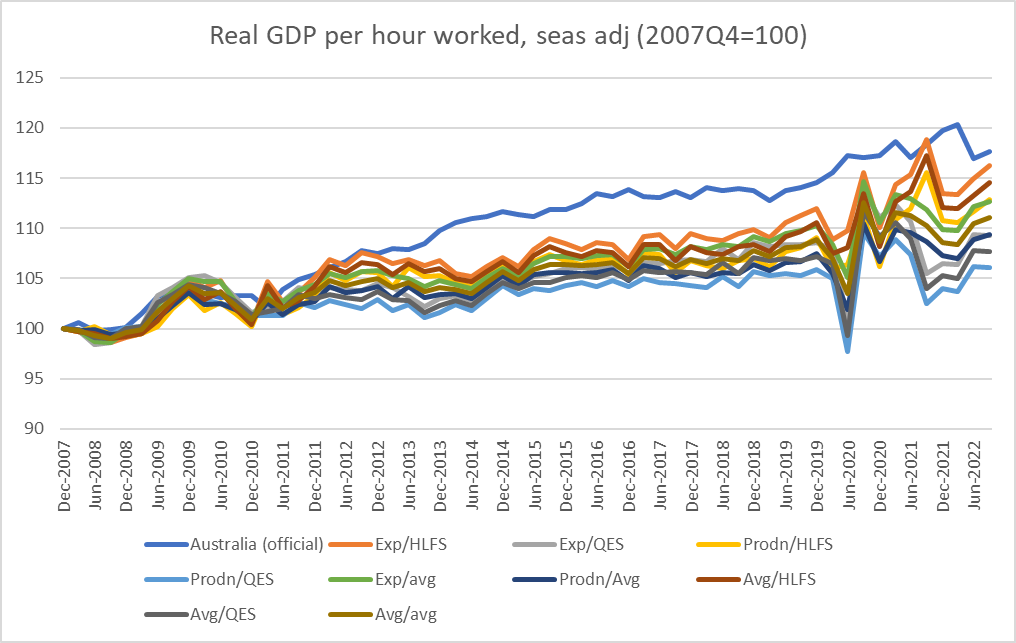
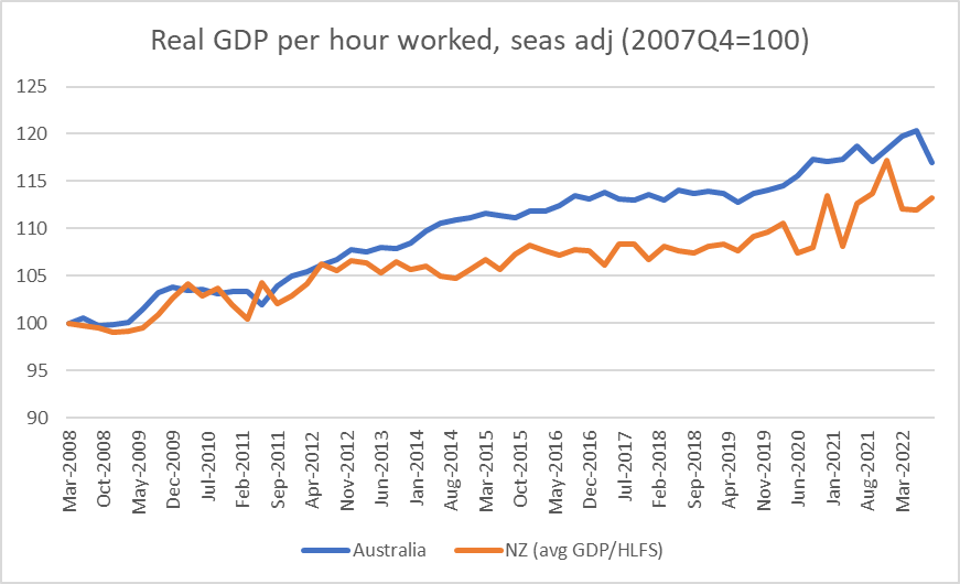
In this chart I’ve shown how things have actually unfolded
Over the full period we haven’t caught up with Australia, we haven’t even begun to close the gap, and instead the gap has widened a bit further again. Both series are noisy and subject to revisions (in New Zealand alone there are levels differences between the income and expenditure real GDP measures), but overall things have gone in the wrong direction. If one wanted to look on the less gloomy side, I guess one could note that whereas Australia has had no productivity growth at all since 2016, we have had a bit, but I wouldn’t put much weight on that myself (including with declining foreign trade shares, weak terms of trade). And although one could generate a bunch of other comparative graphs, it is productivity that ultimately underpins a country’s longer-run average prosperity.
What I find most depressing – and why I have, somewhat gloomily, been anticipating for some years writing this post – is the lack of any apparent sense of urgency in New Zealand about turning things round or actually finally beginning to sustainably close the gaps. And that has been true really regardless of which parties have held office – if Key binned the advice on the 2025 goal and did little or nothing useful instead, Ardern/Robertson refocused the Productivity Commission on distributing the economic pie rather than growing it, and Luxon/Willis show no better than occasional conventional rhetoric on the topic. And all this against a backdrop where Australia has again made it easier and safer for New Zealanders to move across the Tasman.
As it happens – and what reminded me to write the post – in the New Years’s Honours list released this morning, the government chose to honour one of the members of the 2025 Taskforce, the economist Bryce Wilkinson. That’s nice, but if I know Bryce I’m pretty sure he’d much prefer that governments – including this one – had gotten serious about finally reversing 70+ years of relative economic decline. That would have benefits for all of us, and for our children and grandchildren, who might be more interested in staying to build a better New Zealand.
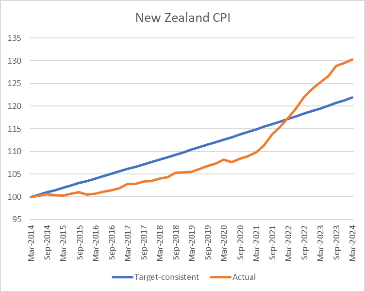
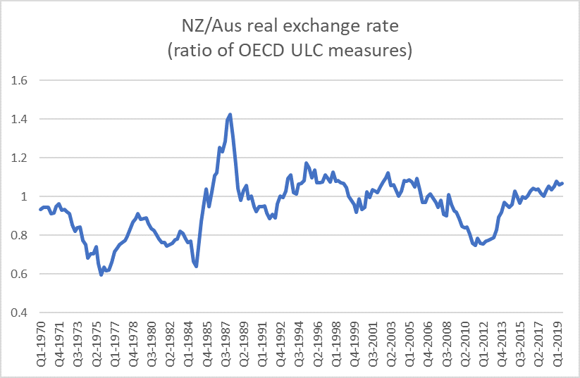
I got curious yesterday about how the Australia/New Zealand real exchange rate had changed over the last decade, and so dug out the data on the changes in the two countries’ CPIs. Over the 10 years from March 2014 to March 2024, New Zealand’s CPI had risen by 30.3 per cent and Australia’s CPI had risen by 30.4 per cent.
And that piqued my interest because the two countries have different inflation targets: New Zealand’s centred on 2 per cent per annum and Australia’s centred on 2.5 per cent.
So I drew myself this chart
Over the full 10 years, the two CPIs have increased by almost exactly the same amount, but they haven’t kept pace with each other steadily over that full period. Up to just prior to Covid, the Australian CPI had been increasing faster than New Zealand’s, as one might have expected given that the RBA had been given a higher inflation target than the RBNZ.
Now, before anyone objects, I should get in and note that in neither country is there a price level target. But if economies are subject to fairly similar shocks over a period of time one should normally expect a country with a higher inflation target to have experienced a higher cumulative price level increase than a country with a lower target.
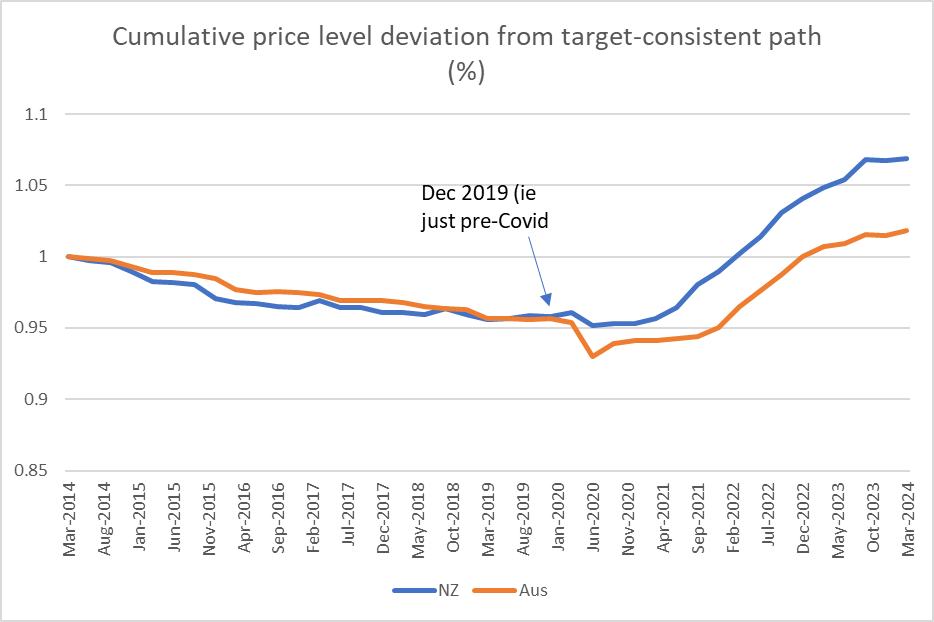
Over the 10 years here is Australia’s CPI relative to the price level that would have been implied by being consistently at target midpoint
and the same chart for New Zealand
And in this chart I’ve put it all together
Over the half-decade or so to the end of 2019, the RBA and the RBNZ had both ended up undershooting (on average) their targets by about the same extent. If you look closely, the RBNZ was undershooting more earlier, and the RBA more towards the end of the decade, but there wasn’t a great deal in the difference.
But where the difference really becomes apparent is in the years (four of them) since Covid hit. Over that period, the RBNZ has generated/tolerated much more of an increase in the price level, in excess of what is implied by their target, than the RBA did. (And for those – like Orr – who like to try distraction with things like oil shocks, wars and rumours of wars, and supply chain disruptions, Australia faced all those too.)
There is a lot of focus in Australia – and apparently reasonably enough – on whether the RBA has yet done enough with monetary policy. It has certainly been puzzling that they reckoned they could get away with materially lower policy rates than in other Anglo countries, in the face of (still) near-record low rates of unemployment and a quite stimulatory fiscal policy. But so far, and overall, they’ve done a bit less badly than the Reserve Bank of New Zealand through the last four years taken together.
It remains somewhat remarkable how little serious accountability there has been for serious Reserve Bank policy errors, for which now pretty much everyone (except them) is paying the price. in one form or another.
(By the way, for anyone interested, the NZD/AUD exchange rate averaged 0.933 in the March 2014 quarter and 0.932 in the March 2024 quarter, so over that particular 10 year period there was no change in the real exchange rate at all.)
I’ve been reading the papers released the other day by Treasury (in one case written jointly with IRD) on the Minister of Finance’s hankering to tax Australian banks more heavily, retrospectively.
The 10 February paper is titled “Windfall gains in the New Zealand banking sector, and responses”, apparently part of something called “Project Cricket”. Retrospective taxes targeted at companies the Minister of Finance doesn’t like and are just considered politically ripe for the plucking are…..really not cricket. But perhaps that irony escaped both the authors and the Minister. The paper is signed by Treasury’s Manager, Tax Strategy, and as tends to be the way with Treasury, when one looks him up he seemed to have no background at all in tax (or banking), and little in New Zealand either. It wasn’t a promising start.
It is a fairly long paper (24 pages)
The Minister already had his enemies in sight but wanted a fishing expedition as well.
The Treasury paper wasn’t a very compelling piece of work. Without any serious analytical framework at all, it (slightly grudgingly, or perhaps just diplomatically) concludes “there is no clear evidence that banks made windfall profits during the recovery from COVID-19”. And instead of concluding strongly that since there is not the slightest evidence of anything that could seriously be called “windfall profits” and thus there was no serious analytical case at all for anything like a “windfall profits tax”, we just get this lame conclusion
as if otherwise it would okay.
As for those other sectors
All based on this
Quite how the agricultural sector “may have derived windfall gains” is left to the reader (and us) to guess. It all seems very loose and incoherent stuff. (Had one been interested in regulatorily-induced windfall profits, surely one place to look might have been the supermarkets that were given a monopoly position during Covid lockdowns at the expense of other food retailers, but….lets not encourage them.)
So lacking in any serious analytical framework is the discussion around “windfall profits” that Treasury apparently never thinks to point out that an unexpected burst of inflation (perhaps a 10 per cent change in the price level, engineered – albeit inadvertently – by the government’s own central bank), came closest to a true set of windfall gains and losses. Who gained – entirely unexpectedly? Why, that would be people with long-term fixed rate debt. And which party has the most long-term fixed rate debt on issue? Why, that would be the government itself. On the other hand, holders of fixed rate financial instruments were subject to fairly marked, close to genuinely “windfall”, losses.
I mentioned there windfall losses. That is more than the Treasury (or Treasury/IRD) advice ever does. Over time, true windfalls, such as they are, are pretty randomly distributed – gains, losses, sectors, individuals. But of course there was no sense here of a coherent or comprehensive approach to the issue, some systematic search for windfalls across the economy that the government might tax (or compensate). No, the MInister had his four Australian banks in target. With not the slightest evidence – even with Treasury doing what it could to try to find it for him – that there was anything that anyone other than the Green Party could seriously consider “windfall profits”.
And in this first paper, officials didn’t even think to point out that retrospective legislation of any sort – but perhaps particular one targeted at four of the king’s (or his Minister of Finance’s) enemies is generally pretty abhorrent. If anything, they seemed to quite like the idea of a retrospective tax (check the table on p15 of the release). On whatever strange definition of “coherence” these officials were using a retrospective tax aimed by four companies, when the advice said there was no serious evidence of windfall profits, also apparently raised no concerns.
(In passing, I would note that the Treasury is quite open in calling the Reserve Bank’s Funding for Lending programme a direct “subsidy” to banks. That is, perhaps unsurprisingly, not language the Reserve Bank has used. But as Treasury notes, there does seem to have been reasonable evidence that the subsidy – put in place as a conscious matter of policy – had mostly been passed on the customers.)
Somewhat surprisingly, when providing the Minister with advice on a tax that would be targeted at four specific Australian-owned companies, there is no discussion at all of the likely reaction of the companies’ owner, or of their government, or of whether and how such an arbitrary tax might raise difficulties in the trans-Tasman halls of financial regulators. Oddly, in all three papers there was not a single mention of the fact that the parents of these four wholly-owned companies also had active operating branches in New Zealand, and what (if any) implications there might be for the future mix between branch and subsidiary business.
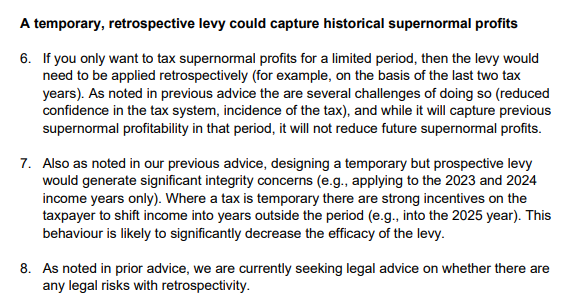
Despite Treasury’s recommendation in that 10 February paper, the Minister of Finance must have disagreed. The 17 February aide memoire ( 2 pages only) sets out briefly options that could be done for the Budget, then only three months away. They were retrospective and prospective levies. This was what they had to say about the former
There seems to be no sense that this would be something of a constitutional outrage. Sure, they say they were checking whether there were legal risks (perhaps anything in CER?), but as they and the Minister know Parliament in New Zealand is sovereign and the government easily has 61 votes for budget legislation.
This paper was for a meeting with the Minister on 20 February. The Minister was apparently undeterred.
The final paper in this suite is joint Treasury/IRD report of 10 March (also referring to “Project Cricket”). The introduction to that paper’s Executive Summary illustrates just how far off the rails the Minister was heading.
It was bad enough that the Minister was seriously considering a retrospective tax restricted to four foreign companies he didn’t like, in the face of official advice that there was no evidence of anything seriously akin to “windfall profits”, but now he was proposing such an arbitrary tax-grab specifically to help cover a cost pressure elsewhere in his budget which had nothing whatever to do with the four companies he wanted to tax or any of their activities. One hopes that privately officials were well and truly rolling their eyes by this point.
One might acknowledge that this advice – or perhaps another captain’s call from Hipkins – finally brought this work stream to a halt, but it simply wasn’t very good advice (at least based on what the government has chosen to release). Mightn’t one, for example, have expected some serious reference to a likely Australian reaction? Mightn’t one have expected some serious discussion of the precedent such an arbitrary tax might establish (actual or perceptions)? There is some reference to it – amid a weird sentence that talks about “the favourable position of New Zealand as an investment destination” – on what metric one might ask? – but it is all very muted. There is no discussion at all of the intellectual incoherence of picking on individual profitable firms ministers don’t like and not (say) responding symmetrically when unexpected sharp falls in profits happen (perhaps officials thought it not worth dignifying this nonsense on stilts?). There is no mention of the branches, or anything serious on the possible reduction in the availability of debt finance to New Zealand households and small and medium businesses (really big businesses can finance globally). We even find abstract comments, no doubt tantalising to the Minister, that “in theory, a one-off retrospective tax will not affect behaviour”. That sort of line might be fine from a traineee analyst fresh out of a basic university course, but this was serious budget advice from responsible Treasury and IRD officials
In what they published (perhaps it was in what was withheld, though there is no obvious reason to withhold_, there is also no reference at all to the New Zealand legislation guidelines, which state
Pretty sure the Minister not liking four particular foreign companies isn’t one of those “limited circumstances” in the final bullet.
What was proposed was an abomination, but – even though they didn’t favour what the Minister was hankering for – you get little sense of that in The Treasury/IRD advice. I’ve seen people responding “ah well, didn’t matter, as he didn’t go ahead”. Donald Trump didn’t go ahead with most of his mad, bad, or evil schemes either, but that is slim consolation. We should expect better from someone who has been New Zealand’s Minister of Finance for 5.5 years.
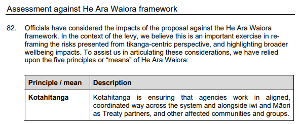
But at this point the advice gets a whole lot worse, losing all touch with reality and descending into some spirit world of officials’ imagining. I’m including the entire section
One wonders if officials are able to opt out of this nonsense on grounds that no one should be forced to practice someone else’s religion. Do other worldviews count? I guess not, at least if this advice is to be taken seriously.
Or which of “our Treaty partners” were consulted on this highly sensitive matter of tax policy, even in a not very material way?
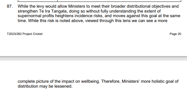
Or look at that footnote 87: a retrospective tax grab from four named foreign companies for purposes unrelated to anything to do with the activities of those companies would apparently “strengthen” “the human domain” (whatever that means). I suppose it would indeed have played to the “concept of power” – power in an arbitrary retrospective way, much more akin to an abusive act of attainder than anything. People would then have known the Minister (and his ministerial colleagues with him) as an unconstitutional thug.
In the end, Robertson didn’t proceed with his egregious scheme and for that small mercy we should be grateful. But we now know that ideas of such egregious grabs do play in his mind – not just an idle fancy, but weeks of work – and who knows when they might return, or which other company or individuals might then be in his sights. It wasn’t exactly Treasury at its best either.
The incoming Australian Labor government last year established an independent review of the Reserve Bank of Australia’s monetary policy functions, structures and performance. The review panel (chaired by a former Bank of Canada Deputy Governor) reported a few weeks ago and their full report is here. Periodic reviews of this sort aren’t uncommon, and are often triggered by episodes of discontent around the performance of the respective central bank (in New Zealand, the 2001 review conducted by Lars Svensson was an example).
There is no clear-cut single preferred way to organise policy functions that society (as represented by government and parliament) wishes to delegate decision-making responsibility to. That is true whether one thinks globally, or just of the subset of advanced economies that countries like New Zealand and Australia usually use as benchmarks or experiences/structures that might offer insight.
If this proposition is true generally, it is no less true of monetary policy specifically. And that shouldn’t really be surprising, including because monetary policy is really quite a recent thing. In New Zealand and Australia the transition to a market-based financial system and a floating exchange rate is not quite yet 40 years old, and even among larger economies floating exchange rates more generally date back only 50 years or so. Modern monetary policy is a cyclical management function (leaning against cyclical macroeconomic fluctuations subject to a constraint of keeping the inflation rate in check), and yet our data sets are really quite limited (since 1984/85 New Zealand has had 4 or 5 business cycles, and the creation of the euro means there are really only perhaps 15 or so advanced-country monetary policy agencies). We simply do not know with any degree of confidence that one form of monetary policy governance etc structure will produce better results over time than another. Instead we (all, including the RBA review panel) argue from small select samples, from specific historical incidents (where multiple influences are always likely to have been at work), and from the mental models we carry round (some likely to have achieved a professional consensus, others not).
None of which is to suggest that such reviews should not take place. Of course they should, and with good people and a government that is interested in good future structures (as distinct, say, from just being seen to having had the review – there were dimensions of the latter around the review then then New Zealand government commissioned from Lars Svensson) useful insights, outcomes, and reforms can often emerge. There will always be aspects of current practice or legislation than benefit from someone standing back and concluding that it is really time for an update, even if in practice the old arrangements were working tolerably adequately.
But one should also be cautious about expecting too much from any particular review or any particular set of reforms.
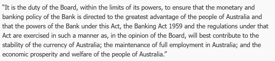
The current RBA model is not one anyone would prescribe today if they were setting up a central bank from scratch. A fair bit of the legislation dates back to the founding in 1959, including this
It has been interpreted, stretching language and concepts to a considerable extent, as encompassing the way monetary policy has been run for the last few decades, but really it was written for an age of (among other things) fixed exchange rates. No one would write it that way now.
And the governance? The Reserve Bank of Australia Board makes the monetary policy decisions (back in the day in practice the Treasurer did) and is much as constituted decades ago. The Governor, Deputy Governor, and the Secretary to the Treasury are ex officio members and there are six non-executive directors appointed by the Treasurer. The non-executive members have typically been (often quite prominent) business figures, but over recent decades it has been normal for one of the six to be a professional economist. It is a very unusual model these days for the conduct of monetary policy, although note that the sort of people appointed as non-executive directors is a matter of political choice (successive Treasurers) and I can’t see anything in the legislation that would have prevented six technical experts being appointed.
If the relevant bits of the legislation haven’t changed a lot over the decades, practice has. Monetary policy decisions are clearly made independently by the RBA, in pursuit of a target that is in practice agreed in advance with the Treasurer, they are announced transparently, there are minutes of a sort published, as well as the quarterly Statements on Monetary Policy. Senior managers appears before parliamentary committees and have fairly extensive and serious speech programmes. The RBA is a modern inflation targeting advanced country central bank, but operating on quite old legislative foundations. As an organisation, over the decades it has had considerable strengths, including typically a strong bench of very capable senior managers, and people coming up behind them. Successful organisations in many fields tend to promote mainly from within: that has been the RBA approach (and is very much in contrast, say, to the RBNZ). Note here that promoting from within is not itself a basis for a successful organisation, simply one feature that already successful organisations, continually refreshing themselves, often display.
I was an admirer of the RBA for a long time, and 20+ years ago when the Svensson review was underway (when I was both part of the small secretariat and a senior manager at the RB) thought that New Zealand should look to adopt elements of the structure and culture of the Reserve Bank of Australia. They tended to produce more stable outcomes, produce better research, communicate more effectively, and have a stronger sense of legitimacy than our “Governor as sole decisionmaker” system had achieved (or than Svensson’s preference, of a small internal decision-making committee (of which the position I then held would have been a member) was likely to be able to achieve. The RBA on the other hand saw us as somewhat strange, not always entirely fairly. I recall a time when Glenn Stevens as Assistant Governor and he came over to observe our monetary policy and forecasting week leading up to an MPS (shortly after we had started publishing forward interest rate projections), and he emerged from the week genuinely surprised that our approach was far less mechanical, nay mechanistic, than he had been led to expect. Or a visit from David Gruen, then head of research at the RBA, suggesting that the fact that our interest rates averaged higher than those in Australia suggested we had monetary policy consistently too tight (in fact prior to 2009 New Zealand inflation typically averaged in the top part of the target range).
Over recent decades, Australia has enjoyed a reasonable degree of macroeconomic stability (the review report includes a table showing the standard deviation of real GDP growth less than for any other country shown), this in any economy exposed to very big swings in the terms of trade. As noted above, the samples are small but there is nothing obvious to suggest that overall the Australian approach to monetary policy has delivered worse than other advanced country central banks. But there have been troubling episodes, notably including the one in the years running to Covid when Australian core inflation ran consistently well below target (much more so than anything seen at the time in other countries, including New Zealand where core inflation by then was getting close to the target midpoint). There are also more recent episodes of concern – about specifics of the RBA Covid response and latterly about the sharp rise in core inflation – but through that period it is perhaps hard to differentiate the RBA’s failure (underperformance) from that of a wide range of other advanced country central banks (themselves with a wide range of governance models).
This was one of the things that troubled me about the review report. The first substantive chapter is focused specifically on these recent episodes. It is easy to highlight areas where things could have been done better in (almost any) specific episode – and some of the material cited is pretty disconcerting – but that is almost certainly true of every central bank, and there is no attempt I saw in the report to illustrate that anything would have been very much different with a different governance/committee structure. We might hope it would have been, but the panel offers little reason (and realistically they couldn’t offer more) that it would have been. New Zealand, after all, has introduced a committee, and the panel notes favourably (too favourably) the expertise of its members relative to RBA external board members, but many or most of the same mistakes or weaknesses the panel highlight in Australia over the last three years were also evident in New Zealand – as far as we can tell, as less material has been released here than there, us not having had a recent external review and the Reserve Bank’s own review was largely defensive and unenlightening in nature). Should there have been a proper cost-benefit analysis, and serious questioning from the Board, before the RBA bond-buying programme was launched? No doubt (and the review report is properly critical about the absence, and the likely weak case) but there is no evidence of anything even slightly better in New Zealand. Or, as far as I’m aware, in any or many other advanced countries. Perhaps the RBA case was less excusable, since they started bond buying a lot later, rather than in the heat of the crisis, but the practical difference ends up being slight.
The review panel proposes a new model with these important features
monetary policy decisions would in future be made by a Monetary Policy Board (with a separate RBA governance board, and the existing Payment Systems Board),
the MPB would have nine members, the Governor, the Deputy Governor, the Secretary to the Treasury, and six expert non-executives appointed for non-renewable terms of five years, extendable for up to one year)
non-executive members would be expected to devote about one day a week to the role (around eight monetary policy decisions a year)
there would be a press conference for each decision,
votes would be disclosed but not attributable (ie a decision might be made 7:2, but the two would not be identified by name)
non-executive members would be expected to do at least one public engagement or speech a year,
non-executive vacancies would be advertised, but recommendations to the Treasurer (who would make the final appointments) would be by the Governor, the Deputy Governor and a third person (presumably to be chosen – altho by whom, Treasurer or the officials? – from time to time).
If you were starting from scratch, one could think of worse systems. But this proposal seems to have a number of weaknesses and reason to suspect that unless a strong political consensus developed early around making things work really differently (rather than differently in appearance) it is far less good a system than could have been devised. Even then, I would not be overly optimistic. More generally, my impression is that the report tends to underweight the relative importance of the Governor and very senior management to how central banks operate.
Starting with the small stuff, as the report notes it is highly unusual for the Secretary to the Treasury to be a full voting member of a central bank monetary policy decision-making body. It was one thing in 1959 – at that time New Zealand also had the Secretary to the Treasury as a full member of the (largely toothless) central bank board – but it is 2023. Other countries – including the UK and New Zealand – have preferred the model of a non-voting Treasury observer, which seems bit suited to (a) the desire to ensure at the highest levels that information flows freely between monetary and fiscal agencies) and (b) the Secretary’s own primary responsibilities and loyalties. The report proposes amending the legislation to make clear that the Secretary is voting his/her own judgement, but if so that tends to defeat the purpose of their place on the Board (being there solely ex officio), and in times of tension – and one should build system for resilience in tough times, not for when everyone is getting on fine and everything is going swimmingly – will likely complicate the Secretary’s own position (including as adviser to the Treasurer in holding MPB members to account for performance).
In general I am in favour of a model in which external members outnumber executives, but 6:3 in a nine person board doesn’t feel right (even if it parallels current numbers). 4:3, with the third executive being the Assistant Governor responsible for economic policy, seems a better size overall, and also more realistic about the ability of the system to continue to generate a steady stream of able people to fill (only) five year non-executive terms. And a 7 person committee is more likely to limit the risk of free-riding by individual non-executives.
It is difficult to see how a “day a week” model is likely to work IF the goal really were one having a powerful role, including as expert counterweight to staff, if non-executives were devoting only one day a week to the role. I am not aware of any precedents for such a small contribution, which seems to sit closer to the current RBA Board model (might such board members devote 2 days a month to the role, one to the meeting, one to the papers?) than to other advanced country MPCs. At the Bank of England MPC, probably still the best model, non-executives are paid for 3 days a week work, and at a rate that (least by academic standards would be a reasonable fulltime income). On a day a week model, not only is the actual amount of time any member can devote to RBA matters limited, but the remuneration would that for any non-retired person it would have to be just one part of the member’s employment/income. Most plausibly, they would be current academics, who might otherwise not spend a vast amount of time keeping track of data or of the literature in the specific fields relevant to central banking. We might assume that people will not be disbarred (as is NZ) for doing ongoing research in relevant fields, but even in Australia the numbers of such people are not limitless. One day a week looks like a recipe for an ongoing dominance of management and staff. Consistent with this, while the report suggests that externals should have direct access to staff, if they do not have dedicated analytical support staff of their own their ability to make a difference and shape what is in front of the MPB is likely to be limited. This is, incidentally, one argument for a quite different system – as in Sweden or the US – in which outsiders become full insiders while they are MPC members.
The appointment process is also a concern. One of the weaknesses of the New Zealand MPC system is that the Governor exercises considerable effective control on who serves on the MPC. A really good Governor would have a strong interest in promoting genuine diversity of view and real ongoing intellectual and policy challenge. Real world bureaucrats, running their own bureau, perhaps less so. No doubt there will be arguments about “fit” etc, but the value of outsiders is often in the extent to which they are willing to bring fresh thinking and not be easily deterred by management flannel and weight of paper. With a strong “third person”, perhaps it would work out okay, especially if a Treasurer was clearly committed to viewpoint diversity, challenge etc, but many potential “third persons” might be inclined just to defer to the perceived expertise of the Governor and Secretary.
Accountability does not appear to be a key element in the RBA reform proposal. That seems unfortunate – perhaps especially coming hard on the heels of the massive financial losses central bankers have run up and the scale of their inflation forecasting and policy mistake. If as a society we delegate great discretionary power to unelected officials – and that is what we do in MPCs – accountability is a key counterbalance, including in maintaining the long-term legitimacy of the model. At very least, MPB members should be required to have their named votes recorded and disclosed. Ideally – but it is probably only an ideal – people should be able to be removed from office for non-performance. In fact, one of the other weaknesses of the proposed single term model for externals is the complete absence of accountability. Their views don’t have to be disclosed, their votes don’t have to be disclosed, and since they can’t be reappointed, there is really no accountability at all. Lack of accountability doesn’t exactly encourage members to devote intense energies to getting things right. Some no doubt will, but it will be all too easy to defer to management and treat membership of the MPB as a prestige appointment (like being on the RBA Board now), this time narrowed down to being for economists, rather than a role in which one will make a difference and expect to be held to account.
As I said earlier, there is no one ideal structure. In the end, one is trying to combine technical expertise, experience, judgement, ability to communicate, and something around accountability to produce good policy outcomes taken in ways consistent with our open and democratic societies and under structures that are resilient to bad times and to bad people All in a field where uncertainty is pervasive.
Many of these requirements might well be met with no outsiders at all. You won’t see it highlighted in the review report but the Bank of Canada is one in which, formally and legally, the Governor himself wields the monetary policy powers (akin in that feature to the RBNZ system pre-2019). But in practice the BoC has built a strong internal culture and an effective system where a Governing Council of senior internal managers makes monetary policy decisions by consensus. I don’t think it is ideal – there is no individual accountability except (presumably) to the Governor – but the BoC has built partially compensating mechanisms with extensive research programmes, self-review programmes, and extensive engagement with academic and other wider communities. Indeed, the Bank of Canada model – which I do not champion – highlights just how important the quality of staff and internal processes are. It isn’t necessarily a problem if decisionmakers typically defer to staff and management expertise – in fact it is what you would expect in a normal corporate board – so long as those decisionmakers can continually assure themselves that staff and management have robust and resilient processes in place, including those that encourage, generate and accommodate, genuine diversity of view and openness to alternative perspectives. In that sort of context, some expert external MPC members can be very helpful (especially if they are familiar with, engaging with, perhaps contributing to) emerging literature, but they aren’t the only type of member who could add value. The willingness to actually ask the idiot question, and never to be content with management bluster, is valuable in any governance context. Thus, in an RBA context, one might wonder whether it is really worth having a whole new Board (especially when the RBA is not a “full service central bank” (doing prudential supervision)), when one could have left the RBA Board responsible for monetary policy but with a requirement say that several members should have directly relevant professional expertise. One could argue that being a board member, responsible for all the RBA functions and governance, might make for a person better able to contribute effectively as a monetary policy decisionmaker (and note that there is plenty of role for outside expert advisers anyway, and the report does suggest a more active macro research programme for Australia generally). And of course, in all our systems Ministers of Finance – rarely very expert at all – make major contentious economic policy decisions in climates of extreme uncertainty, drawing on expert advisers but rarely handing decision-making power to such experts.
Overall, I can’t help feeling that if the Australian government goes ahead and legislates all these changes, none of them (not all taken together) will matter quite as much as who gets appointed as Governor, and the sort of internal culture and people, the Governor (and his/her successors) build. That is a critical choice – in Australia, in New Zealand, probably anywhere – and is likely to far outweigh any potential difference that a few day-a-week academics, cycled through the decisionmaking system on five year terms, might make. A great Governor (and we can’t build systems that assume one) will build and maintain a culture that delivers most of what the review panel (often rightly) seems to be looking for.
This post has gone on long enough. It is about someone else’s country so why my interest? Two reasons I think. First, it is a significant report on a central bank in the midst of troubled times, and there are few of those yet. And second because the choices Australia makes are always likely to be an important backdrop to any future reforms in New Zealand. We have had extensive reforms, clearly designed to look different rather than be different, and any new government needs to look to do over quite a few of the aspects of the New Zealand model.
I was going to engage specifically with the AFR article last Friday by Ian Macfarlane, former RBA Governor, criticising the review (and I thank the two readers who sent me copies). Time and space is limited, so I won’t. It is worth reading, and he makes some fair points (some less so), but it is perhaps worth remembering that Macfarlane was Governor at the peak of the RBA’s past standing. The starting point now is less favourable.
Finally, one of the background papers for the review was commissioned from Professor Prasanna Gai at Auckland University (and ex BOE). Gai currently serves on the FMA board, but probably should be one of those considered for our MPC, but……he would be disqualified by our Governor and Board on the grounds of an ongoing active interest in areas the MPC would actually be responsible for. Anyway, his paper is quite a good read on international models around the governance of monetary policy, and he pulls few punches about the weaknesses of the New Zealand model.
The Reserve Bank of Australia yesterday left its policy rate unchanged at 3.6 per cent. The Reserve Bank of New Zealand’s MPC is generally expected to today raise its OCR by another 25 basis points to 5 per cent.
In the broad sweep of decades it isn’t an unusually large gap. Most of the time, New Zealand short-term nominal interest rates are at least a bit higher than those in Australia (Australia’s inflation target is a little lower than New Zealand so the real interest differential tends to be a bit larger).
Sometimes economic circumstances in the two countries are very different. Thus, that period a decade or so ago when the RBA cash rate was higher than the RBNZ OCR coincided with the later stages of the Australian mining investment boom, for which there was nothing comparable in New Zealand.
But over the last two or three years, the similarities have seemed more evident. Both countries of course went through Covid, with overall quite similar virus/restrictions experiences. Prolonged closed borders affected both countries, notably the important tourism and export education sectors. Both had very expansionary macro policies. In the scheme of thing, both opened up at about the same time. Both have been characterised by labour shortages and very low rates of unemployment. And both have seen inflation sky-rocket, whether on headline or core measures.
There are differences of course. Take commodity prices as an example. If world prices have recently been falling for both countries, relative to levels just a couple of years back Australian incomes are still being supported much more by the high level of commodity prices.
What of the respective unemployment rates? Both are very low, but if anything Australia’s seems lower relative to (a) history and (b) likely NAIRU. Australia’s current unemployment rate is a half percentage point lower than the previous cyclical low, and has not yet shown any sign of lifting.
New Zealand’s unemployment rate (quarterly only) seems already to be off its trough and is now about the same as the unsustainably low level reached late in the 00s boom.
One can’t make much of that difference – and the unemployment rate isn’t the only relevant labour market indicator – but the comparison doesn’t obviously point to the RBA needing to do less than the RBNZ. As far as I can see, business survey measures suggest that difficulty of finding labour may have been easing a bit more in New Zealand than is yet apparent in Australia.
What about (core) inflation measures themselves? Bear in mind that the Australian inflation target is centred on 2.5 per cent and the New Zealand one is centred on 2 per cent.
Here is the annual trimmed mean measure of core CPI inflation for the two countries
And here are the annual weighted median measures
Core inflation started higher in New Zealand than in Australia (the RBA had been badly undershooting the target in the late 10s) but on both annual measures (a) New Zealand annual core inflation appears to have levelled out and (b) Australian core CPI annual inflation now appears to be higher than that in New Zealand. The differences between the two countries core inflation rates in the most recent quarter are more or less in line with the differences in the respective inflation target.
What about the quarterly measures? Here there is some difficulty because the ABS produces seasonally adjusted measures and SNZ does not. Eyeballing the New Zealand series there appears to be some seasonality, although not terribly strong.
Here are the quarterly trimmed mean inflation rates
and here are the weighted medians
The latest observations for the two series for Australia are quite similar (1.6 and 1.7) but there is quite a divergence in the two NZ series (0.9 and 1.3). But in both series there are signs the NZ peak has passed (if you worry about seasonality, even the latest quarterly observations are lower than those a year earlier), while there is no such sign in the Australian quarterly data. And while one can’t meaningfully annualise these data, the differences in the quarterly inflation rates look like more than is really consistent with the differences in the respective inflation data.
I’m not here running a strong view on whether one of these two central banks is right and the other wrong. But it remains a challenge to see how both can be right at present. The two central banks tend to articulate somewhat different models (I’m always surprised at the weight the RBA appears to continue to place on wage inflation, in rhetoric that sometimes seems misplaced from the 1980s), central banks are shaped by their past (the RBA was badly undershooting the inflation target pre-Covid), the political climates are now different (the RBA Governor’s term expires shortly, and governance reforms are in the wind) and there are other material differences in the demand pressures in the two economies that I’ve not touched on here (eg New Zealand has had a bigger housebuilding boom and may be exposed to a deeper bust).
Neither central bank has handled the last three years particularly well – or we wouldn’t have that unacceptably high core inflation – and I am far from being the RBNZ’s biggest fan, but for now my sense is that they are probably closer to right than the RBA is. That may, of course, mean that the near-inevitable recession is nearer at hand here than in Australia.
In a couple of weeks it will be 2023. And then in a couple of years it will be 2025.
Those with longish geeky memories may recall that there was once talk of closing the gap between New Zealand and Australian incomes/productivity by 2025. Without any great enthusiasm no doubt, the incoming National government led by John Key agreed to ACT’s request for a (time and resource-limited) official 2025 Taskforce that would offer some analysis and advice on what it would take to achieve such a goal. The Taskforce’s first report had been dismissed by the Prime Minister before it was even released and after the second report the Taskforce was quietly disbanded. I held the pen on the first report and had some input on the second one (itself written by the current chair of the Reserve Bank Board), and since the reports were written when my kids were very young and I still held some vague hope that they might grow up into a first world country that goal of catching Australia has stayed with me, as has the disillusionment with our political and bureaucratic classes who, no doubt comfortable themselves, seem to have lost all interest. It need hardly be repeated – I’ve made the point often enough – that, despite all its mineral riches, Australia is not a stellar productivity performer, so aiming to catch them was hardly reaching for the stars.
My preferred summary metric for such comparisons is real GDP per hour worked. It isn’t the only meaningful national accounts measure but (for example) it isn’t thrown around by the vagaries of commodity price (terms of trade) fluctuations which, especially in economies like ours, are exogenous variables our governments can’t do a lot about. In 2007, just prior to the last recession, OECD estimates have Australian real GDP per hour worked about 23 per cent higher than that in New Zealand.
What has happened since? On that same (annual) OECD metric the gap last year was about 31 per cent.
The ABS produces an official quarterly series of real GDP per hour worked. SNZ does not, but it does publish two measures of real GDP (production and expenditure) and both the HLFS hours worked series and the QES hours paid series. Over time the various possible New Zealand productivity growth measures tend to converge (as they should), but at any point in time the estimates for the most recent few years can and often do diverge quite substantially. Here is a chart with the most recent data.
Covid has probably only compounded the situation, both because measuring what actually happened to GDP over the disrupted last three years is more than usually challenging and because hours worked and hours paid series will have diverged in ways that make sense but hadn’t really been anticipated. In doing charts like this I used to simply work on the basis that the two were just roughly the same thing, each measured noisily and so averages would usually be the least bad way to go. But then governments compelled people to stay at home (often not able to work) and yet funded employers to enable them to be paid. Hours paid held up in lockdowns even as hours worked fell away. More recently of course there is a lot more sickness than usual – for much of which people will have been paid, but may not have worked.
I still don’t have any particular reason to favour one GDP measure over the other, but the HLFS hours actually worked (self-reported) seems a better denominator for labour productivity estimates at present. Here is that line, together with the official Australian series.
And here is the same chart just for the Covid period
The New Zealand series is much more volatile, but count me a bit sceptical for both countries. Go back one chart and it looks as if productivity growth in both countries has been faster during the Covid period than in the previous half-dozen years, and that doesn’t make a lot of sense. There are plenty of puzzles about how the economy has performed over the last three years – starting with what everyone missed and got wrong on inflation – but if “true” labour productivity growth really accelerated over the Covid period that should spark a lot of future research papers.
I remember back in 2020 people suggesting that (eg) that lift in reported productivity in Australia in June 2020 might have been because (eg) the shock to tourism saw a lot of very low wage workers not working, so simply averaging up productivity for the rest. But a couple of years on both countries have very high labour force participation rates and very low unemployment rates (relative to history Australia even more so than New Zealand). And we’ve had huge (probably largely inevitable) policy and virus uncertainty, and it isn’t many years since economics commentary used to full of talk of the damage that increased (policy) uncertainty would cause. And when supply chains have been disrupted, and people haven’t been able to foster face-to-face connections globally, it isn’t usually a climate considered most conducive to productivity growth. It isn’t as if productivity growth in these estimates has been stellar, but it is a bit puzzling. Perhaps where we are now the numbers are just flattered by overheated economies. Perhaps it will all end revised a way anyway, but for now at least (a) both countries have had a bit more productivity growth in the data that might have been expected, and (b) over the Covid period, the gap between New Zealand and Australia does not appear to have gotten any wider.
As I noted earlier, for commodity exporting countries, fluctuations in the terms of trade are largely exogenous. But, unfortunately for New Zealanders, whether one starts one’s comparison 15 years ago just before the last big recession or focuses just on the last couple of years, Australia’s terms of trade has performed better than New Zealand’s.
Indications from the Australian government that it is going to make it easier for New Zealanders to move to Australia is great for young New Zealanders, opening up higher income opportunities that have been harder to access in recent years. It isn’t so good for a community of people who choose to dwell in these islands. But there is no sign either main political party actually cares enough to think hard about overhauling policy here in a way that might one day mean New Zealand might offer the world-matching living standards it did not that many decades ago.
Continuing on with updating my regular charts in light of the national accounts revisions released last month, I got to the one distinguishing (indicatively) between real growth in the tradables and non-tradables sectors of the economy. Recall that for these purposes the primary sector (agriculture, forestry, fishing, and mining) and the manufacturing sector count as tradable, together with exports of services. The rest of GDP is classed, loosely, as non-tradables. As I’ve noted in an earlier post
The idea is to split out those sectors which face international competition from those that don’t. It is no more than an indicator, and people often like to point out the components of “non-tradables” where, at least in principle, there is international competition. But as a rough and ready indicator, it serves its purpose. It was first developed by a visiting IMF mission about 15 years ago to help illustrate how one might think about the impact of a lift in the real exchange rate.
Here is the latest version of the chart, with both series expressed in per capita terms.
In per capita terms, there has been no growth at all in (this indicator of) the tradables sector since about 2002. That is 17 years now. The economy is increasingly concentrated in the non-tradables sector, the bits (generally) not very exposed to international competition.
One can – people do – quibble about adding up these components, so here is a chart of the individual components of the tradables sector measure. It starts from mid-2002, when the tradables aggregate first got to around the current level.
None of these sectors has done particularly well, The best performer – oft-cited hope of the future – services has averaged per capita growth of 0.6 per cent annum. The mining sector is smaller than it was, and agriculture, forestry and fishing (taken together) has managed no per capita growth since 2012.
Perhaps there is no connection at all between this performance and developments in the real exchange rate
but I doubt many detached observers would think so.
It can get a little repetitive making the point, so this time I decided to put together – for the first time in some years – the comparable charts for Australia.
Here is the aggregate chart for Australia
Australia’s tradables sector had also gone more or less sideways for a while, but no longer. Here is how the two countries’ tradables sectors look like on the same chart.
The 1990s were pretty good for the tradables sectors of both countries. And although Australia has again been performing better in the last few years, even that growth is slower than Australia experienced in the 1990s. As for New Zealand….well, no growth at all.
Here, for completeness, are the non-tradables sectors of the two countries.
Our non-tradables sector has been growing a bit faster than Australia’s in recent years. That looks to be mostly because we’ve had a period of faster population growth – rapid population growth tends to require more resources devoted to non-tradables sectors (notably construction).
And what about the breakdown of Australia’s tradables sector?
It is very different from the New Zealand picture in almost every respect. The mining line didn’t surprise me – it was the story I expected to be telling – but the others did, including the continued strong growth of services exports. Back in 2014 and 2015 it looked as though something similar was happening on both sides of the Tasman, but no longer: services exports here (per capita) have simply stagnated again.
New Zealand and Australia have both enjoyed pretty strong terms of trade in the last couple of decades (Australia’s more volatile than ours). But over the decades, New Zealand average productivity (real GDP per hour worked) has kept dropping further behind Australia’s – roughly 42 per cent ahead of us now, compared to about 25 per cent in 1970. And yet OECD data suggest our real exchange rate has risen relative to Australia’s over that half-century.
It isn’t that much of a rise – around 15 per cent – but the longer-term economic fundamentals pointed in the direction of a fall at least that large. Policymakers here have, unwittingly (although that isn’t much of an excuse after all this time) delivered a climate – a combination of factors – that mean it is very difficult for the tradables sector to grow much in New Zealand. Unless that changes it is difficult to envisage New Zealand not continuing to slip further behind, not just Australia but other advanced countries as well.
If the government were at all serious about responding to the productivity failings, these are sorts of imbalances they’d be instructing the Productivity Commission to investigate and make sense of.