When it comes to Long-term Insights Briefings (LTIBs) I sympathise with the public service, I really do. The requirement to produce these documents was introduced by the previous government in fiscally expansive times (core government agency staffing growing rapidly). Even then, it was a fairly flawed idea but if agencies were awash with cash I guess they might as well try to do some analysis. These days, even if the fiscal deficit is not being cut, core government department spending is under considerable pressure, and we have a track record in which the LTIBs that have been produced have rarely added much value. I gather the current amendments to the Public Service Act will eliminate the requirement to produce LTIBs but…..for now government department CEs and acting CEs still have to comply.
A year or so ago MBIE and MFAT decided to get together and produce a joint LTIB this time round. As the law requires they consulted on the proposed topic
I put in a short but fairly sceptical submission on the topic
Anyway, the bureaucrats have beavered away and last month come up with a draft LTIB (on which submissions close next Monday). They must have refocused their efforts somewhat following consultation on the topic as it is now presented this way.
Having made a submission last year they’d included me on their general email inviting submissions on the draft. I’ve been away and otherwise busy and hadn’t really intended to even look at the thing, but there was another reminder yesterday so I took an initial look. It was the “accelerate the growth of high productivity activities” that prompted me to look a little further: the focus apparently was not economywide productivity and policy settings but the sort of “smart active government” stuff MBIE has long championed, involving clever officials and politicians identifying specific sectors to focus on and specific interventions to help those sectors. And, of course, lots of preferential trade, investment, etc agreements (the ones MFAT likes to call Free Trade Agreements). On a day when the dysfunctions of our public sector were on particularly gruesome display it seemed even less appealing and persuasive than usual. In a month when the government had been a) buying a rugby league game, b) increasing (again) film subsidies, and c) subsidising expensive New Zealand restaurants (via the Michelin corporate welfare), all in the name apparently of “going for growth”.
So I decided to sit down and read the draft document after all. It isn’t that long (45 pages or so excluding Executive Summary, glossary, references etc), reflecting no doubt the fact that LTIBs are a compliance cost for agency CEs rather than really core top priority claim on resources. Before reading it I heard on the grapevine last night of a smart person who had opened the document, read the first page, rolled their eyes, and closed the document again. But I persevered….and there is 25 minutes of my life I won’t get back.
Sadly, but perhaps not surprisingly, the draft report is unlikely to be any use to anyone looking for illumination rather than support (the old two uses of a lamppost line).
On New Zealand, we get a fairly long list of symptoms of our relative economic failure, but no serious attempt at analysis of the causes. If you don’t understand the causes, including the roles (positive or negative) of past policy interventions/choices, it is really difficult to see how you tell a compelling story about solutions, unless the document is just a prop for a longstanding predetermined narrative and set of policy preferences.
They then introduce a series of four small advanced economy “case studies” – a page each on Denmark, Finland, Ireland, and Singapore. Not only do they not engage with a really important difference between New Zealand and these countries – ie extreme remoteness – but there is no attempt to understand what drove the successes of these economies either. In each case there is a list of types of interventions that have been or are being used in these countries but no effort at all to assess what role (positive or negative) these interventions have played in contributing to medium-term productivity growth. It certainly isn’t impossible that some might have been helpful, some will almost certainly have been harmful (just consider the range of interventions our governments have tried over the decades), and perhaps many will have just been ornamental or redistributive – not really making much difference at all to the productivity bottom line. And I’m pretty sure that not once in the entire document is there any suggestion of the possibility of government failure, capture etc.
Then the draft report moves on to four domestic case studies (this time roughly two pages each), looking at the dairy industry, space and advanced aviation, biomanufacturing, and the Single Economic Market (mostly Australia but also beyond) with a focus on sector-specific interventions. None of it seems to display any scepticism, only a sense that we (governments) haven’t been sufficiently focused or willing to persist with particular sector supports. Strikingly, in the dairy “case study” there is no mention of the rather large role the government played in enabling the creation of Fonterra, and how the results have, to put it mildly, not exactly lived up to the promised hype.
And the whole document ends with a question that shouldn’t even be being asked by government departments.
But perhaps it is all music to the ears of governments that like specific announceables from week to week? (Whether MBIE or MFAT like those specifics is another matter – quite possibly not, but their mindset and fairly shallow analysis in documents like this helps provide cover for governments more ready to paper over symptoms, toss out some cash to favoured firms/sectors, and avoid insisting that the hard structural issues are identified and addressed).
And this sort of stuff helps keep lots of officials busy and feeling useful.
To any MBIE/MFAT readers, no I won’t be submitting, but I’m sure you get the gist. The sooner the LTIB requirement is removed from the law the better, but eliminating that won’t change the mindset. As far as MBIE is concerned, my ongoing unease was only reinforced when on the page with the consultation document on it, this was the list of tabs/items down the side of the page under the heading “Economic Growth”.
I hadn’t had a look for a while at the OECD labour productivity (real GDP per hour worked) data, but the release of the latest OECD EconomicOutlook the other day prompted me to spend some time in the (less user-friendly than it was) OECD database.
It takes a while for all the data to come together, and it is only annual, so the most recent near-complete data set is for 2023. On the OECD’s estimates – using national data, but converted at (estimated) PPP exchange rates – New Zealand stood 29th out of the 38 OECD countries (remembering that the OECD now has four Latin American “diversity hires” – all much poorer and less productive than the rest of the “club”).
Treasury highlighted a few years ago that the absolute level of reported New Zealand labour productivity may be understated (because of technical issues around how hours worked numbers are calculated/used, relative to the approach used for a number of other countries). The difference isn’t small but, as they noted, what is involved is largely a level-shift, and doesn’t affect materially comparisons of growth rates (of productivity) over time. Nor, of course, does it make any difference whatever to actual wages or living standards.
It is now quite well-recognised that productivity growth has been quite poor in many countries over the last decade or so (and the contrast between the US and some of bigger European economies has been remarked on often). Productivity growth in the typical high productivity OECD country has not been great – for example, for the eight years from 2015 to 2023, the median total growth in labour productivity for the top 10 countries [excluding Ireland and Luxembourg, for international tax reasons] was 4.9 per cent.
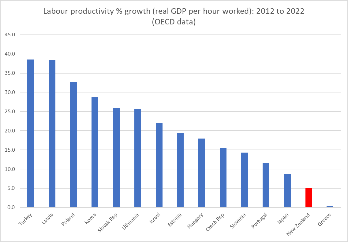
But much as we might like to catch up again with these high productivity countries, perhaps the most relevant comparators for us are the countries either side of us on the league tables, well behind the global productivity frontiers. In 2015, the start of our period, these were the countries with real GDP per hour worked already within 20 per cent either side of New Zealand’s. There are big gaps both above Slovenia and below Latvia (and, thus, even if the hours issue is fixed up, and there are no changes for any of these other countries, we wouldn’t even come close to the next country above Slovenia),
How has our labour productivity growth compared against these countries over 2015 to 2023?
The median productivity growth rate for this group of middle-to-lower (levels) countries was 17 per cent. New Zealand, by contrast, managed 3.5 per cent growth, not even managing to keep up with the median growth rate of the group of highest productivity countries (see above).
It really is a woeful record. And in case you are wondering if perhaps 2024 might have made all the difference, on national data (GDP per HLFS hours worked) average productivity in 2024 was about half a per cent higher than the average for 2023, so no, not really. Just possibly SNZ data revisions might lift our past productivity growth a bit, but (a) these 2023 estimates should already include last year’s SNZ updates, and b) even at the most hopeful, it is doubtful any revision would lift our past productivity growth even to Japanese rates. It seems pretty likely that we were in fact better only than Greece among this mid to lower productivity group of countries.
People tend to push back and say “yes, but so many of those other countries are in Europe”, and sure, about two-thirds are. But it isn’t as if being next to the US has done much for Canada’s recent productivity growth (productivity growth over this period was a touch worse than New Zealand’s, and the level of Canadian productivity is far below that of the United States), and quite a few of these countries border either Russia or Ukraine (Estonia appears to have taken quite a hit), and Israel has been fighting a war (there is 2024 data for them, no higher than the 2022 numbers). And to the extent geography matters, and it almost certainly does, it is a binding constraint we have to live with, not an excuse for perpetual underperformance (we were, after all, even in my lifetime – just – still in upper tier of advanced countries). It is a reflection of a series of poor policy choices, and the evident growing indifference of our politicians (and bureaucrats?).
And worse, there is no sense of urgency, about outcomes that shape the lives and options of this generation and the next. The glib “oh, they can always go to Australia” – itself not a stellar performer – is no decent basis on which to build a country.
There were good things in the Budget. There may be few/no votes in better macroeconomic statistics and, specifically, a monthly CPI but – years late (for which the current government can’t really be blamed) – it is finally going to happen.
I went along to the Budget lock-up today (first time ever), mostly to help out the Taxpayers’ Union with their analysis and commentary.
At least from my (macroeconomist’s) perspective there were two areas to focus on when we were handed the documents at 10:30 this morning:
productivity and growth-oriented policy measures,
fiscal deficit etc adjustment
On the former, the government chose to title its effort today “The Growth Budget”. The Minister spoke today against a backdrop emblazoned repeatedly with that label.
You might remember that back in January the Prime Minister made a big thing of the need to accelerate growth in productivity and real incomes, not just on a cyclical basis. The Minister of Finance in announcing the Budget date in late January went further
They did not deliver.
There was a single growth-oriented initiative in the Budget; a provision under which firms will be able to write off 20 per cent of the cost of new investments in the first year, on top of the regular tax depreciation allowances. Whatever the substantive merits of the policy, the best Treasury estimate is that it will lift GDP by 1 per cent, but take 20 years to do so (the forecast gains are frontloaded, but even in five years time they reckon the level of GDP will have risen by only 0.5 per cent relative to the counterfactual). If that looks small, bear in mind that Treasury’s number seem to assume that this measure may actually worsen overall productivity as the Minister’s press release says they estimate the capital stock will rise by 1.6 per cent and wages will rise by 1.5 per cent (at her press conference she said this was because more people would be employed).
And that’s it. This in an economy where there has been no multi-factor productivity growth now for almost a decade (chart from Twitter this morning)
and, where as regular readers know, to catch up to the labour productivity levels of the leading OECD bunch (US and various countries in northern Europe), we’d need something like a 60 per cent increase in productivity.
It is simply unserious.
Things were no better on the fiscal side. Here, for today, I’m largely just going to rerun the notes I wrote for the Taxpayers’ Union and which are already in their newsletter
“This year’s Budget represents another lost opportunity, and probably the last one before next year’s election when there might have been a chance for some serious fiscal consolidation. The government should have been focused on securing progress back towards a balanced budget. Instead, the focus seems to have been on doing just as much spending as they could get away with without markedly further worsening our decade of government deficits.
“OBEGAL – the traditional measure of the operating deficit, and the one preferred by The Treasury – is a bit further away from balance by the end of the forecast period (28/29) than it was the last time we saw numbers in the HYEFU. There will be at least a decade of operating deficits, and even the reduction in the projected deficits over the next few years relies on little more than “lines on a graph” – statements about how small future operating allowances will be – that are quite at odds with this government’s record on overall total spending. Core Crown spending as a share of GDP is projected to be 32.9 per cent of GDP in 25/26, up from 32.7 per cent in 24/25 (and compared with the 31.8 per cent in the last full year Grant Robertson was responsible for). The government has proved quite effective in finding savings in places, but all and more of those savings have been used to fund other initiatives. Neither total spending nor deficits (as a share of GDP) are coming down.
“Fiscal deficits fluctuate with the state of the economic cycle, and one-offs can muddy the waters too. However, Treasury produces regular estimates of what economists call the structural deficit – the bit that won’t go away by itself. For 25/26, Treasury estimates that this structural deficit will be around 2.6 per cent of GDP, worse than the deficit of 1.9 per cent in 24/25 (and also worse than the last full year Grant Robertson was responsible for). There is no evidence at all that deficits are being closed, and the ageing population pressures get closer by the year.
“Some things aren’t under the government’s direct control. The BEFU documents today highlight the extent to which Treasury has revised down again forecasts of the ratio of tax to GDP (which reflects very poorly on Treasury who rashly assumed that far too much of the temporary Covid boost would prove to be permanent). But, on the other hand, the forecasts published today also assume a materially high terms of trade (export prices relative to import prices), which provides a windfall lift in tax revenue. Forecast fluctuations will happen, but the overall stance of fiscal policy is simply a series of government choices. Unfortunate ones on this occasion.
“A few weeks ago the IMF produced its latest set of fiscal forecasts. I highlighted then that on their numbers New Zealand had one the very largest structural fiscal deficits of any advanced economy (and that we were worse on that ranking than we’d been just 18 months ago when the IMF did the numbers just before our election). The IMF methodology will be a bit different from Treasury’s but there is nothing in this Budget suggesting New Zealand’s relative position will have improved. We used to have some of the best fiscal numbers anywhere in the advanced world, but as things have been going – under both governments – in the last few years we are on the sort of path that will, before long, turn us into a fairly highly indebted advanced economy, one unusually vulnerable to things like expensive natural disasters.”
With just a few elaborations/illustrations
First, here is the chart of tax/GDP
Even allowing for fiscal drag, quite how Treasury thought so much of the lift in tax/GDP was going to be more or less permanent is lost on me. They don’t really say.
Second, here is Treasury’s estimate of the structural (OBEGAL) balance as a per cent of GDP, showing recent years, and the forthcoming (25/26) financial year on the Budget announced today
The government seems to have become quite adept at rearranging the deckchairs (cutting spending that they consider low priority and increasing other spending) but they are choosing to make no progress at all in reducing the structural deficit. There were big savings found in this Budget, but none were applied to deficit reduction. Sure, the forward forecasts showing the structural deficit shrinking – never closing, even by 28/29 – but that is based on wishful “lines on a graph”, suggesting that the government intends to cut core crown expenses by a full 2 percentage points of GDP over the following three financial years, when on today’s forecasts expenditure as a share of GDP in 25/26 (32.9 per cent), will be a bit higher than in 24/25, and very slightly lower than in 23/24. The Ardern/Robertson government got by on 31.8 per cent in 22/23.
Finally, a reminder from Monday’s post
Depending on your measure we were (based on HYEFU/BPS numbers) worst or close to worst in the advanced world. Today’s Budget will have done nothing to improve that ranking. It should have.
The Budget is a lost opportunity, both on the fiscal and the productivity front. A couple of journalists at the lock-up asked for a summary label for the Budget. Some people had snappier versions, but mine was simply the “Deeply underwhelming Budget”.
Economic growth – and the lack of the sustained productivity growth that underpins it – is again briefly in focus. 70 years of relative economic decline still shows no sign of being durably reversed, but the last few years have been particularly tough and there is an election next year, and so the government’s rhetorical focus has turned to growth. Time will tell whether it is supported by any serious policy changes equal to the magnitude of the problem.
Over the decades, whenever the conversation has (usually briefly) turned to growth and New Zealand’s fairly dismal longer-term economic performance, advocates of compulsory private savings emerge to some fresh prominence. The late Brian Gaynor used to argue that if only we’d kept on with the 1974 Roger Douglas scheme all would have been well. Other funds manager types refer us to the Australian compulsory savings system. And others champion Singapore (including former NZ Initiative and National Party adviser, Leonard Hong who recently devoted an entire dissertation to it [and whose Herald op-ed is here]). Over the last decade, Roger Douglas and Auckland university economics professor Robert MacCulloch have been championing an overhaul of our entire system of health and welfare (including superannuation) provision, which would involve a lot more compulsory private saving. Just this week, MacCulloch is quoted in the Listener’s (flawed) feature article on New Zealand economic decline putting a big emphasis on lack of national saving, suggesting that the difference between New Zealand and Australian wealth/productivity is substantially explained by the differences in savings policies. On his blog yesterday MacCulloch reminds us of one of those empirical regularities of macroeconomics – the correlation between savings rates and investment rates – and claims that much of Singapore’s economic success is down to their compulsory private savings policy; that without something similar National’s growth aspirations aren’t likely to come to much.
One can be a bit cynical about funds managers championing compulsory private savings – Kiwisaver, after all, has been good for funds managers – but I’m sure all these people believe their stories. I’ve become increasingly sceptical over the years,
I don’t want to focus here on what is the best way to do retirement income policy (let alone the political feasibility of different models). One can mount arguments for a variety of different models. But my focus is on overall macroeconomic performance and outcomes, and my starting point is that the design of your country’s retirement income system is most unlikely to be a dominant factor in explaining your country’s overall economic performance.
Let’s take Australia first. As a reminder, 30 years or so ago the Australian government introduced a compulsory private retirement savings scheme (employer contributions), starting at 3 per cent of income then rising to 9 per cent, and this year getting to 12 per cent. Sceptics note that, as yet, Australia still isn’t spending much less than New Zealand as a share of GDP on public pensions, but the focus here is macroeconomic outcomes.
The first place one might look for evidence of the transformational macroeconomic possibilities is the national savings rate.
Champions of the scheme have occasionally produced papers claiming a positive impact, and the counterfactual is – as almost always – impossible to know, but if there has been a positive effect it doesn’t exactly look transformational.
Thoughtful Australian observers also worry about productivity growth over there (Australia is now richer and much more successful than New Zealand, but average productivity lags a long way behind the OECD leaders). There is always lots more going on in both countries but….there is no sign of Australia catching up with the US in the decades since large-scale compulsory private saving became a thing.
Australia is, by the way, the most culturally and behaviourally similar country to New Zealand in the world.
But what about Singapore? It is a stellar economic success story that has seen real GDP per hour worked in Singapore reach levels not that far behind the most successful European economies and the US (although note that experts reckon that Singapore is one of those economies – like Ireland and the Netherlands – where international tax distortions (not just differences in company tax rates) are flattering the data more recently. No one serious uses headline GDP numbers in Ireland.)
Singapore has also had a compulsory private savings system since colonial times (introduced in the mid 1950s).
But it would be very hard indeed to argue that national savings played any very substantial part in Singapore’s economic emergence.
I couldn’t find a very long-term series for Singapore’s national saving rate but the current account is just the difference between saving and investment.
Investment as a share of GDP took off in Singapore from about 1970, averaging about 40 per cent of GDP for 15 years or so, and translating into rapid growth in the aggregates that count (real GDP per capita, productivity growth etc). Throughout almost all that period, Singapore ran really large current account deficits (ie relied heavily on foreign savings).
The IMF’s WEO database has a (directly observed) national savings series since 1980,
where the peak in the national savings rate (at times in excess of 50 per cent of GDP) came well after the peak in investment in a share of GDP. (As a curiosity, and if one takes the numbers in face value, investment as a share of GDP in Singapore and New Zealand have been roughly the same in the last half dozen years or so.) It looks as though, as one might expect, domestic investment tended to respond to opportunities rather than primarily, or to any great extent, to savings.
And that shouldn’t be in the least surprising, since it was, after all, how countries like our own emerged to around the top of the world GDP per capita tables in the late 19th and early 20th centuries (eg there is an estimate for New Zealand for 1886 in which the net international investment position – net reliance on foreign capital – was almost 300 per cent of GDP). Not only New Zealand, but Australia, places like Argentina and Uruguay, and indeed the freshly settled parts of the US itself. Britain, by contrast, ran massive current account surpluses (national savings far exceeding domestic investment), and its lead in the world economic tables began to fade. There is a vast literature on this sort of stuff. More recently, you can see similar pictures for places like Ireland and South Korea (large account deficits in the early phase of emergence, as high investment rates start occurring, followed by later increases in savings rates).
Robert MacCulloch’s post yesterday makes a lot of the Feldstein-Horiaka “puzzle”, first identified in a paper 45 years ago. Across countries, domestic investment rates (national accounts investment concept here as throughout) tend to be correlated with national savings rates. MacCulloch includes in his post this chart, covering (as I understand it) all countries
I did one just for the IMF’s group of advanced countries covering the last 30 years (the period for which the IMF has comprehensive data). Each dot represents a country
It isn’t a tight correlation (check the range of savings rates for countries with investment rates averaging between 25 and 27 per cent, but it is definitely there. The question is what it means.
The thrust of MacCulloch’s claim is that investment in New Zealand is (national) savings constrained. I’m sure he doesn’t mean it in a tight mechanical sense but the implication is that we couldn’t durably get from 23 per cent of GDP in investment to (say) 27 per cent – the sort of market-led change that would make a huge difference over time – on current policies around saving.
I don’t see it. I’ve already illustrated how some current account balances have swung through enormous ranges over time – Singapore is one of the most glaring examples, now accumulating massive claims on the rest of the world, even as domestic investment rates are no longer anything out of the ordinary. Taking that IMF advanced economies grouping over the same 30 year period in the chart above, the median range within which current account deficits have fluctuated over that period has been 12 percentage points of GDP (over that 30 year period Spain, for example, has had both a 3 per cent of GDP current account surplus and a 9 per cent current account deficit). Several countries have had fluctuations within a range of 30 percentage points of GDP, and there are now multiple advanced countries (Europe and Asia) experiencing persistent and large current account surpluses – national savings well outstripping domestic investment.
A fair amount of that correlation between domestic investment and national savings is likely to be because savings themselves are endogenous. When people think casually about saving rates they often have in mind household saving, or perhaps government saving (fiscal deficits and all that). But actually business saving matters a lot. Most of the series above are gross (ie including depreciation effects). Materially higher business investment is accompanied by higher depreciation provisions which firms need to fund. And economies in which the returns are high, where firms are finding plenty of opportunities, are also likely to be ones where firms find shareholders agreeing to higher rates of retained earnings. Much of the capital stock is either houses (always likely to be predominantly owned nationally, and where an increased stock also draws forth over time increased savings to pay for those houses) or government assets (and governments will tend to own physical assets almost exclusively in their own country), which also tend to be paid for domestically over time.
There are some genuine and interesting puzzles as to why the ownership of firms displays more of a “home bias” than a simple model might suggest. But there isn’t much evidence -historical or contemporary – to suggest that if the opportunities were there a much higher sustained level of business investment could not occur in New Zealand without some step change (voluntary or coerced) in household saving rates. (And if that claim were true then given the Australian experience – see above – we might as well give up now.) One indicator of New Zealand’s ongoing ability to attract foreign capital is that with (a) some of the largest current account deficits (over many decades now, but including that 1995- 2014 period, and b) on average very low government deficits, the real exchange rate has remained very strong (puzzlingly so on some models, given the deterioration in our relative productivity performance).
Opportunities? Some of the discussion around saving – and indeed mention of “capital intensity” from ministers and officials – seems to imply that private firms (ones actually operating here, or potential entrants) are leaving opportunities unexploited, leaving money on the table as it were. Frankly, that seems unlikely. They have strong incentives to produce good returns for their investors (& sharper incentives than those facing ministers and officials in this regard). I list among the reasons why there might be relatively few exploitable opportunities here things like high business tax rates, foreign investment restrictions, restrictions on exploiting natural resources (minerals etc), RMA-type obstacles, distance, and the persistently high real exchange rate.
How might higher national savings help? Take a rather extreme example in which we all woke up tomorrow and decided that we were going to save another 5 percentage points of our income hereafter forever (well, for just the next two or three decades). You would then expect to see the real exchange rate move sustainably lower (still with cyclical fluctuations). That would be likely to make more outward-oriented business opportunities look attractive (although fewer domestically-oriented ones would, because we’d all be spending less, and most of our spending is local). That might well be a good and helpful thing, in response to a change in private preferences. (And if local opportunities really were even worse than I thought then New Zealanders would – like Singaporeans now – be accumulated assets abroad and our future incomes would rise, even if domestic productivity didn’t.)
But changes in private preferences are one thing, while attempted state coercion is another (and these days the state might well first look to itself and close those operating deficits that we’ve been inflicted with all decade now). And if the real exchange rate was really the only macro thing that might be susceptible to changing savings behaviour, wouldn’t we want to first understand why it remains so persistently high before leaping to try (perhaps ineffectually) to attack symptoms? I’ve got a story for that, but ministers and officials hardly ever engage with the stylised fact.
There might be a decent case for a different approach to retirement income – I’m sceptical, although I’d raise the NZS age quite a bit, and change the tax treatment of savings (as part of a better tax system all round, with less emphasis on taxing returns to capital) – but retirement income policy should be approached on its own terms, with a focus on individuals and their own ability to manage retirement (thus I was also very sceptical of Andrew Bayly’s desire to hijack Kiwisaver funds in pursuit some politicians’ growth stories). Perhaps a better retirement income model would have useful macroeconomic benefits, but for decades whenever politicians and officials – and economists – wanted to focus on savings it has so often had the feel of “lets force the great unwashed to do something different with their money, to suit our ends” rather than the hard graft of actually getting the obstacles the growth that governments themselves pose out of the way.
If I have one final summary point it is that higher national savings rates have rarely, if ever, been a prelude to durably higher rates of domestic productivity or investment growth.
The Prime Minister’s speech 10 days or so ago kicked off a flurry of commentary. No one much anywhere near the mainstream (ie excluding Greens supporters) questioned the rhetoric. New Zealand has done woefully poorly on productivity for a long time and we really need better outcomes, and the sorts of policy frameworks that would supports firms and markets delivering better material living standards for New Zealanders.
The Prime Minister asserted that “2025 will bring a relentless focus on unleashing the growth we need to lift incomes, strengthen local businesses and create opportunity”. Assuming that these are shorthands for measures intended to durably and substantially lift economywide productivity growth (I saw a nice quote the other day from the Canadian Leader of the Opposition to the effect that no one talks about productivity per se except economists and friends of economists), one could only respond “good if true”.
We have been promised a “rolling maul” of new policy measures as the year unfolds. And the Minister of Finance (now rejoicing in the rather absurdly named additional title of Minister for Economic Growth -albeit perhaps no more absurd that the Economic Development title it replaced) went further in her press release announcing the Budget date and promising
It is a distinctly different emphasis than in her Budget-date announcement press release last year.
Nothing like building up expectations….and one hopes journalists will keep an eye on this set of promises.
I’d give this government credit for a number of steps that, at the margin, may help boost growth, productivity, and efficiency of the New Zealand economy. But it is hardly a case of everything working in the same direction: last year, for example, we had increased business tax rates (re building depreciation), increased taxes on inbound tourists, more restrictions of bank mortgage lending, passing up chances to overhaul key personnel at the Reserve Bank, and of course a Budget that, taken together, slightly widened the structural fiscal deficit. And it wasn’t as if the growth rhetoric wasn’t around last year (eg this quite respectable, as far as these things go, speech from March 2024).
Perhaps this time they really will deliver “bold steps” in May. I’m open to being convinced – and in this case would love to be wrong- but count me sceptical.
For various reasons:
For all the rhetoric from the PM and Minister of Finance there is no specific goal which they are willing to use as a stake in the ground (even John Key for a short time would run the line that “our vision is to close the gap with Australian by 2025”),
There was nothing in the National Party’s campaign material in 2023 that suggested either a deep understanding of the issues or a policy agenda equal to the sort of challenge New Zealand faces (and that was so even when there were some specifics I thought made sense),
We are now 14-15 months into the government’s term – the election is next year – and not much has been done so far, no compelling narrative has been developed, no key government agencies have been overhauled and made fit for the challenge etc,
Where are the advisers? It isn’t obvious that there are first-rate productivity-focused political advisers in ministers’ (or the PM’s) offices, and what about MBIE and Treasury? MBIE is a bureaucratic behemoth run by a former Air New Zealand HR senior manager (no, before Luxon’s time) and in appointing a new Secretary to the Treasury, and despite more fine words from Willis last year, the government ended settling for a recycled former Deputy Secretary, who is certainly skilled at managing upwards but would never have been mistaken for a bold and innovative policy reformer (or leader of such people/processes). Oh, and the Ministry for Regulation is headed by a non-policy recycled public sector chief executive, who didn’t seem to be particularly well-regarded in her previous chief executive role.
The Budget is now a mere 3.5 months away. Based on standard timings Treasury will be finishing their economic forecasts by the end of next month and the Budget is unlikely to incorporate anything not decided by the end of April. Without excusing bureaucratic sludge, good policy processes take time, perhaps especially in a coalition government.
And, of course, none of the three measures announced in the last 10 days look to add up to very much (Invest NZ – one wonders why this spin-out from NZTE is needed at all, and what private sector advisers can’t provide – the re-organisation of the CRIs, and the digital nomad visa)
There is, of course, some stuff in train that should in time prove helpful (for example, the RMA overhaul, although with the best of intentions it is likely to be years until we can be confident just how helpful – the original RMA having been understood at the time as a liberalising reform).
One can only assume that the word has gone out from the offices of Luxon and Willis to all ministers, and then all public service agencies, to pull together whatever they now can – and perhaps hold off on other announcements for a while – to enable a set of Budget announcements that can be dressed up as passably resembling “bold steps”. No doubt there is stuff in the works – there almost always is – so perhaps the net effect will even be positive (though with enough confidence to lift Treasury’s assumptions about real per capita potential GDP growth?) but I wouldn’t be holding my breath that it will be the real thing, or even begin to get to grips with the magnitude of the challenge. But – Trump ructions permitting – quite probably there will be some cyclical rebound in GDP growth in time for next October (for which the government will deserve no more credit than it deserves blame for the monetary policy induced recession last year),
On that note, the Sunday Star-Times yesterday ran an op-ed from Don Brash and me, prompted by some combination of memories of that goal of catching Australia by 2025 (Don chaired the taskforce and I provided analytical and drafting support) and the PM’s speech, trying not be to be particularly partisan (the failure – and the rhetoric, in varying volumes – has been common to all governments for decades). We ended the column this way.
For anyone interested, the full text follows:
When Don was young and Michael’s parents were young, New Zealand had among the very highest material standards of living in the world. It really was, in the old line, one of the very best places to bring up children. But no longer.
For 75 years now, with no more than brief interruptions, New Zealand has been losing ground relative to other countries. Australia and the UK pulled ahead of us, previously poor places like Singapore and Taiwan caught up and overtook us, and increasingly now the former eastern bloc countries (Slovenia, Estonia, Poland, and so on) are catching and overtaking us.
Don’t get us wrong: material living standards here are still well ahead of where they were in the 1950s, but if we were once a leader we are now a laggard. All too many of our people have seen better opportunities across the Tasman for themselves and their kids and have made the move. That’s good for them, of course, but a poor reflection on economic performance and policy back here.
For 40 years, successive governments have talked a good game about reversing that relative decline and closing the gaps that were opening up. In the earlier part of the period there were far-reaching policy reforms, which probably helped slow the rate of relative decline. In more recent decades, the ratio of talk to action has very much favoured talk. And that is so whichever of our main political parties has led the government.
In late 2008, nearly 17 years ago now, as part of a post-election agreement with ACT, the then government led by John Key announced a goal of catching up with Australia by 2025. A Taskforce was set up to advise the government on policy options that might enable aspiration to be turned into solid economic achievement. Don chaired that 2025 Taskforce and Michael wrote much of the Taskforce’s first report.
The report wasn’t well-received by the then government – in fact, the then Prime Minister openly dismissed it even before it was released publicly – but that didn’t alter the facts: New Zealand was lagging far behind Australia (and Australia itself wasn’t, and isn’t, a stellar economic performer).
It is now 2025 and over the intervening years – under successive governments, led by both main parties – no progress at all has been made in closing the gaps to Australia. If anything, and as measured by labour productivity (output per hour worked), the gaps have widened a bit further. Recently the Australian government has made it easier, and more secure, for New Zealanders – any of us, skilled or unskilled, young or old – to cross the Tasman. It isn’t that Australia has done particularly well economically in recent years – rather the contrary – it is just that New Zealand hasn’t even managed to match their underperformance consistently. Productivity growth – the only secure foundation for material prosperity – here dropped away further from about 2012.
This month we’ve heard a lot from the Prime Minister about the importance of economic growth. It is fine rhetoric and we entirely endorse his argument. Material prosperity – whether it is private consumption or better and more public services – rests on restarting sustained economic growth, which in turn rests on accelerated sustained growth in productivity.
This isn’t just about the ups and downs of the business cycle. Economic activity has been particularly weak in the last 12-18 months as the Reserve Bank has been getting on top of the inflation it inadvertently generated with too easy monetary policy during the Covid period. Now that inflation is falling and interest rates are dropping, we should expect a cyclical recovery. But a near-term bounce isn’t anything like enough; what we need is, say, 20 years of 2-3 per cent per annum productivity growth. Over the last decade, actual productivity growth has averaged not much more than 0.5 per cent per annum.
The Prime Minister announced a couple of small reforms in his speech this week. They may well be individually helpful, but small changes aren’t what will produce really big differences in outcomes.
We’ll watch with interest the promised “rolling maul” of reforms but aren’t confident that this government, any more than its National and Labour predecessors this century, is likely to respond on the scale equal to the challenge.
Sadly, it isn’t obvious either that the government has a public service with the energy, intellectual ferment, and concrete ideas that a willing government could pick up and run with. But some of the options that should be considered are pretty obvious: economics literature suggests that most of the burden of heavy taxes on business is actually borne by labour (in the form of lower wages than otherwise), and yet New Zealand – plagued by decades of low levels of business investment – has one of the highest company tax rates in the OECD, and takes a higher percentage of GDP in corporate income tax than almost any OECD country. Foreign investment in New Zealand remains harder than it should be, and is taxed more heavily than it should be.
We can choose to continue to drift, with just incremental reforms, as successive governments have done for 30 years even amid the fine talk. But if we do, more and more New Zealanders are likely to conclude rationally that there are better opportunities abroad, and for those who stay aspirations to first world living standards and public services will increasingly become a pipe dream.
It is a multi-decade challenge under successive future governments, but as the old line has it the longest journey start with the first step. We hope the Prime Minister’s bold rhetoric signals the beginning of a willingness to lay things on the line, to lead the debate on serious options, to spend political capital, for the serious prospect of a much better tomorrow for our children and grandchildren.
ENDS
NB: Since I saw a BusinessDesk column this morning claiming that 1950-type cross-country comparisons are unfair (much of continental Europe was still recovering from the war), it is worth pointing out that exactly the same could have been said of 1939. New Zealand had among the very highest material living standards among advanced economies throughout the first half of the 20th century.
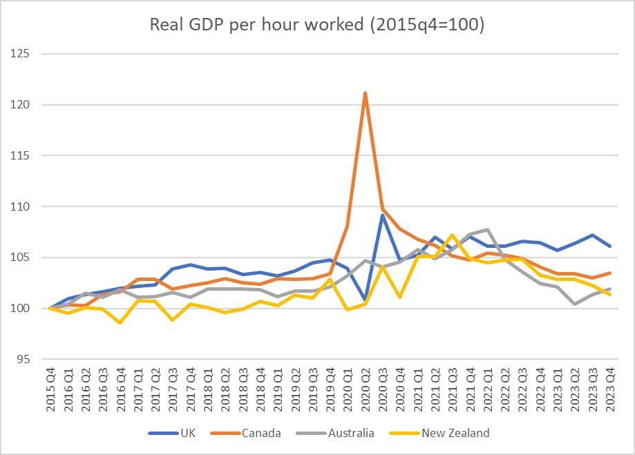
In my post last week on The Treasury’s recent note on productivity, I highlighted that the weak labour productivity growth evident in New Zealand over the last decade wasn’t something we’d shared with the OECD countries that were around our level of average productivity. This chart was from that post.
But as I also noted, it might have been worth Treasury having a look at Australia and Canada (richer and more productive than us, but with some important structural similarities, and neither in recent decades having been productivity growth star performers).
For many countries it is quite difficult to get whole-economy quarterly labour productivity data. But Australia, Canada and the UK publish such series, and I’ve done so for New Zealand (using the average of the two real GDP series and HLFS hours data). The data are all available to 2023Q4, although in all cases no doubt with the caveat of being subject to revision as fuller data emerge for the most recent periods.
First, a quick quiz. Which of the four Anglo countries do you think is which in this chart (I went back to end of 2015 to start from before the Brexit referendum)? Note that none of the lockdown period numbers are likely to be very reliable, and may just reflect differing assumptions the various statistical agencies made. But in all four countries, lockdowns are now well in the past.
The answer? And somewhat to my surprise…..best of a poorly performing bunch of countries over this eight year period was the UK, Brexit and all.
And how about the period since just prior to Covid (there is some noise in the quarterly data so I’ve used the 2019 average as the base)?
I’d usually highlight New Zealand in a different colour, but….it is hard to highlight (exceedingly close to) zero.
Given the potential for revisions I wouldn’t put much weight on it, but……for what the data are worth…..there is no reason to doubt that the recent productivity performances of New Zealand, Australia, and Canada have been rather similarly poor, and especially so since Covid.
It is worth making these comparisons for various reasons, but including because it is all too easy for partisans to highlight their own country’s experience, blaming everything on the rhetorical predilections and headline choices of whoever happens to have held office in this period. Over the full Covid period (in the chart just above), we had a Labour government, Canada had a government that seemed similarly “left wing”, but then for much of the period Australia had a centre-right Coalition government, and the UK…. has had the Tories (who sometimes appeared very similar to Ardern, but are notionally at least of the centre-right).
But lest you are tempted again by thought that everyone is just as bad as each other and global forces mean productivity growth was just impossible over this period, consider the US
They don’t produce whole-economy real GDP per hour worked data, and you’d expect the business sector to do better than the economy as a whole (ie including government). But I had look at how large the differences might be (using the annual US GDP per hour worked estimates from the OECD) and it is pretty clear that the US economy as a whole – an economy very much closer to the productivity frontier – has managed materially faster labour productivity growth over recent years than the 4 Anglos focused on in this post.
Countries can still manage robust productivity growth. Perhaps especially countries that are well behind the productivity frontier (see first chart in this post), but….apparently not with the policy mixes of the New Zealand, Australian, and Canadian governments.
Late last week The Treasury released a new 40 page report on “The productivity slowdown: implications for the Treasury’s forecasts and projections” (productivity forecasts and projections that is, rather than any possible fiscal implications – the latter will, I guess, be articulated in the Budget documents). In short, if (as it has) productivity growth has slowed down a lot then it makes sense not to rely on optimistic assumptions about rebounds in productivity growth based on not much more than hopeful thinking. Fortunately, “wouldn’t it be nice if productivity were to grow faster” does not seem to be The Treasury’s style.
It was a slightly puzzling document though. The global (frontier) productivity growth slowdown has been around for a couple of decades now, and so is hardly news. There isn’t much (if anything) new in what The Treasury writes about that. But there also isn’t much new on New Zealand, and although there are a few interesting charts in the paper, there is very little attempt to get behind them and think about the fundamental economic factors that might be influencing those trends in the data. As an example, we are told “increasing business R&D raises the prospect of productivity benefits”, but there is little sign of any analysis of what it is that leads firms to choose (or not) to undertaken R&D spending (or spending now classified as R&D) in New Zealand. Much the same goes for business investment more generally. The decline in foreign trade as a share of GDP is noted, but it seems to be treated as some sort of exogenous event that just happened, with no attempt to offer an economic (or economic policy) interpretation. More generally, it was striking that neither the nominal nor real exchange rate gets even a single mention in the entire document.
Treasury seems to have been at pains to point out that this 40 page paper wasn’t intended as a policy document, or to address at all the much bigger issue of the huge and decades-long gap between New Zealand’s average labour productivity and that leading and highly productive economies. But they are, as they like to boast, the government’s premier economic advisers. And although they refer readers to their recent Briefing for Incoming Ministers, suggesting that “The Treasury’s Briefing to the Incoming Finance Minister outlines the Treasury’s strategic advice on the opportunities to lift productivity”, it is thin pickings there too. I hadn’t previously read the BIM (low expectations of such documents these days) but when I checked it, the main substantive document amounted to fewer than 30 pages (including lots of charts and full page headers) covering all areas of policy. There was, I think, two pages on productivity. Perhaps they tailored their product to the perceived interest of the customer (few recent governments have shown any serious interest in addressing the productivity failure) or perhaps the premier economic advisory agency just had little of substance to say.
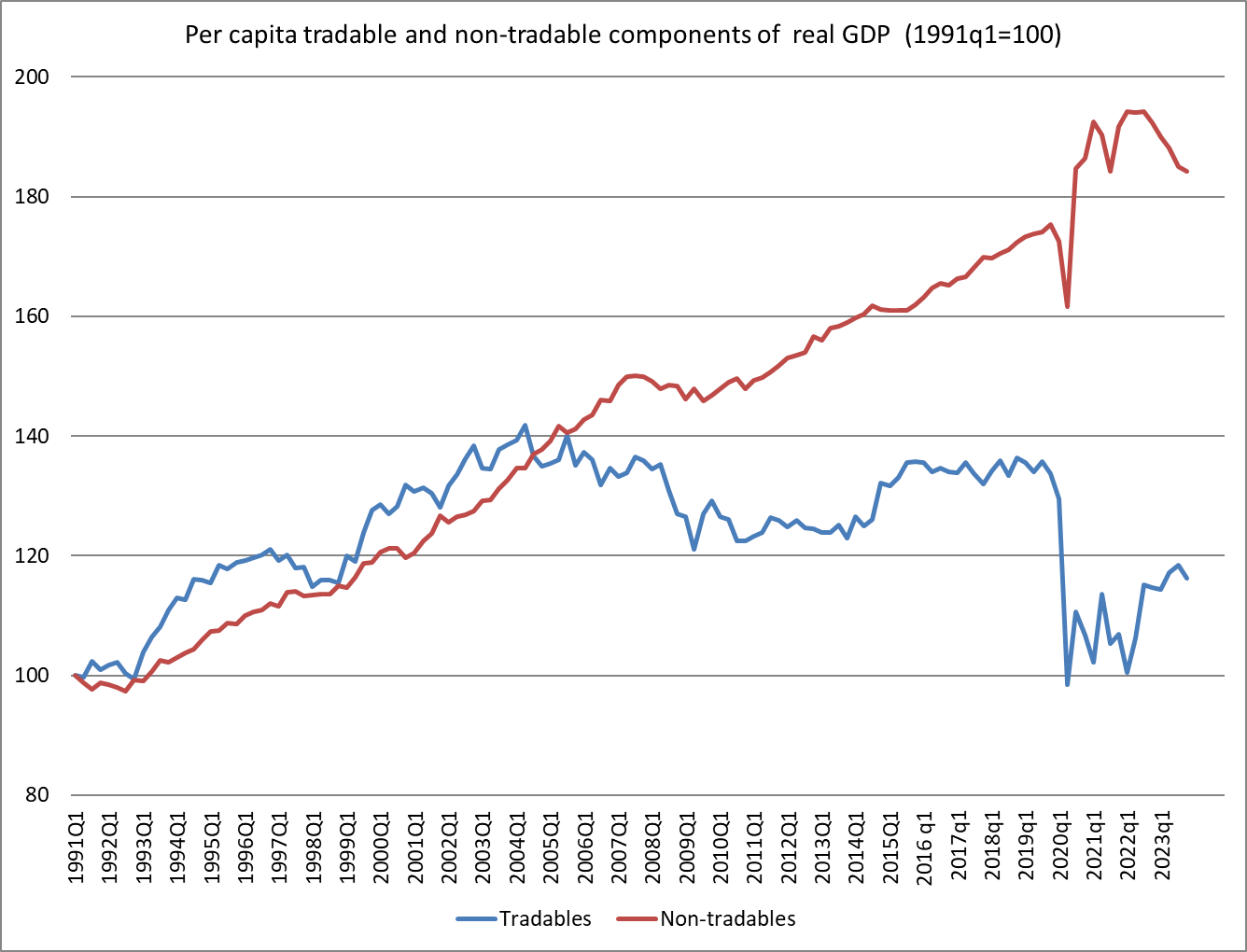
One of my favourite (if depressing) charts over the years has been this one (where tradables here is primary and manufacturing components of GDP plus exports of services). It is doubly depressing because when I first saw it – devised by a visiting IMF mission – was in about 2005, when per capita tradables output had only just started going sideways.
This increased inward-looking nature of the New Zealand economy – across successive governments – gets very little attention in The Treasury’s document.
But perhaps what struck me most – and prompted me to write this post – was the near-complete absence of any discussion about productivity performance in those advanced economies that weren’t at the frontier (there is plenty of international discussion about the frontier, since the countries concerned are the US and a bunch of EU countries) but were or are about New Zealand’s level of average productivity. In fact, I suspect the impression a casual reader would get from Treasury’s document is that everyone has experienced slower productivity growth together.
And that is really, at best, only part of the story.
These were the group of OECD countries that had moderately close average levels of labour productivity to that of New Zealand at either the start or the end of the period. The period itself was simply a round number: the most recent decade for which there is complete OECD data.
And New Zealand has done really badly over that decade, so badly in fact that of these far-from-frontier economies, only Greece did worse than New Zealand. And these were all countries that, being far from the frontier, had – in principle – significant catch-up or convergence opportunities. More than a few of them realised those opportunities. New Zealand languished.
(Nor is there any mention/discussion of how the experience of Australia and Canada – both richer than us, but otherwise with some similarities around policy experiments and economic structures – have also had woefully bad productivity performance in the last five or so years. Perhaps there are lessons to be learned, insights to be gained?)
I’m not really sure what The Treasury’s purpose was in writing and publishing the productivity document was. But we – and I include ministers here – deserve better from the government’s premier economic advisory agency. The government having – sensibly in the circumstances – scrapped the Productivity Commission, we really need more than ever a high-performing Treasury. It isn’t obvious that we have one, or that it is being led by someone with the interest in or capacity to deliver excellence. Her term expires shortly
In my post on Monday I drew attention (again) to the fact that New Zealand has made no progress at all in reversing the decline in relative economywide productivity (relative to other advanced countries) since what was hoped to be a turning point, with the inauguration of widespread economic reforms after the 1984 election. If anything, the gaps have widened a bit further, and more countries (most former Communist ones) have entered the advanced country grouping, first matching and now overtaking us. Despite being so far behind the OECD leaders there are also clear signs that labour productivity growth has slowed further in the last decade or so.
All that discussion proceeded using simple measures of labour productivity (real GDP per hour worked). The data are readily available for and are more or less comparable across a fairly wide range of countries, and there is meaningful levels data. Labour productivity is a common measure in such discussions, even though total (or multi) factor productivity (TFP or MFP) is the in-principle preferred measure. It is the bit of growth in output or output per capita that can’t be explained just by the addition of more inputs (labour or capital). Some decades ago the late Robert Solow, recently deceased, observed that in modern economies perhaps 80 per cent of the growth in output per capita had been attributable to TFP.
It is a line that should be taken with several pinches of salt since in practice (a) TFP is an unobservable residual, and b) much of the innovation and new knowledge often thought of as the basis for TFP growth is probably embedded in better human and physical capital and the disaggregation is a challenge (to say the least). Thriving economies are likely to have better smarter people, better tangible and intangible capital, all used in better smarter ways etc.
But with all these caveats I thought it might still be worth having a fresh look at the OECD’s MFP data for the last few decades. They only have MFP (growth) data for a subset of (24) member countries (mostly the “old OECD”, and including none of the central European countries). For New Zealand, the first MFP growth data is for 1987, and with the annual data available only to 2022 that gives us 36 years of data.
There is a lot of year to year noise in the series, but for illustrative purposes I simply split the data in two, to compare the record for the 18 years to 2004 with the 18 years to 2022. As it happens, the global slowdown in productivity growth in leading economies (US and northern Europe) can be dated to about 2005.
New Zealand averaged annual MFP growth of 0.9 per cent in the first 18 year period, and only 0.2 per cent per annum in the second 18 year period to 2022. It is a pretty dire picture. (All data in this post use arithmetic averages, but using geometric would not make any material difference.)
Now, champions of the reform story might be tempted to look at that simple comparison and say something like “yes, you see. In the wake of the decade of far-reaching reform New Zealand made real and substantial economic progress, but then after the reform energy faded and drift took hold it all faded away to almost nothing.
Unfortunately for that story, here is how New Zealand MFP growth record compares (on the OECD’s particular methodology) for New Zealand and (the median) for the other countries (most of them) for which there is a complete set of data.
We all but matched the average growth performance of those other advanced OECD economies in the earlier period, in the wake of our reform process, but even then didn’t do well enough to begin to close the large levels gaps that had opened up in earlier decades. And then in the more recent period, we’ve done worse again: the comparator group (typically richer and more productive, nearer the productivity frontiers) slowed markedly, but we slowed a bit more still. When you start so far inside productivity frontiers there is no necessary reason why New Zealand could not have made some progress closing the gaps even if the frontier countries themselves ran into difficulties. But no. (Over that second 18 year period when New Zealand averaged 0.2 per cent per annum MFP growth, South Korea - also well inside productivity frontiers on an economywide basis – is estimated to have averaged 2 per cent per annum MFP growth).
It is only one model, and only one set of comparators but there is simply nothing positive in the New Zealand story. There is, and has been, no progress in closing those gaps, and our living standards suffer as a result.
And what of Solow’s 80 per cent? In New Zealand real GDP per capita increased by an average of 1.7 per cent per annum between 1987 and 2004. MFP growth averaged 0.9 per cent over that period. For the period 2005 to 2022 average annual growth in real GDP per capita increased by an average of 1.4 per cent per annum, but over that period MFP growth averaged just 0.2 per cent per annum. (The comparisons are no more flattering if one uses the OECD “contributions to labour productivity growth” table as the basis for comparison.)
Whichever measure of productivity one looks at the New Zealand performance is poor. Champions of reform 40 years ago would, I think, have been astonished if they’d been told how poorly New Zealand would end up doing. I hope they’d be even more alarmed at the indifference to that woeful record that now seems to pervade official and political New Zealand.
[And since I’ve already had one past champion of the reforms objecting to my characterisation in this post and Monday’s post, I’m equally sure that all serious observers now - ie excluding our political leaders and officials - have their own story about what else should (or in some cases shouldn’t) have been done over recent decades. That doesn’t change the fact - on my reading and my memory – that if asked in say 1990 most would have envisaged several decades of catch-up growth as the decline of the previous decades was slowly reversed. It is quite clear from the documentary record that that was the goal, and the intense political disputes of the era were not about that goal.]
Earlier in the week a journalist asked me for some thoughts on which political party in government had managed the economy better – in overall macroeconomic terms – over the years since we moved to MMP.
My initial response was that the answer would be pretty dull. Pressed to write something anyway, I outlined briefly why really there was not a great deal between them, at least without a great deal more in-depth study. And that shouldn’t be very surprising. After all, external shocks happen (overseas, or physical/climatic ones here), and cyclical macroeconomic management has been outsourced to the Reserve Bank over all that period, with very similar targets set by successive governments. Crude partisans might point out that (core) inflation went outside the target zone at the end – or so it appears likely – of both Labour governments over that period, but those failures are first and foremost on the Reserve Bank. Other crude partisans might point out that unemployment has been at its lowest right towards the end of both Labour governments, but……since that is basically the same phenomenon as the overheated economies that gave rise to the inflation problem, you are back with it being the Reserve Bank’s mistake again. One can argue, say, that the current government should have done more to sort out, punish, or even support (via fiscal policy) the Reserve Bank, but…..it is a sample of one event.
When I wrote something a bit fuller on this topic a few years ago, I noted that fiscal policy had also largely been a bipartisan success story. We might not have had a very successful economy, but when deficits have emerged governments of both parties have restated their commitment to surpluses, and had delivered. You could argue that National deserves a better rating there, having inherited large deficits in 2008 (as I’ve argued here before Labour had been badly advised by Treasury and did not think it would be leaving deficits) and returned to surplus. But actually if you look back at the 2009 and 2010 Budgets, contemporary Treasury estimates were that – starting from a deficit – they were expansionary. I’ve been quite critical of this government’s fiscal stewardship over the last couple of years, but…..nothing much in the campaign suggests any more urgency for or conviction about a return to surpluses from the other side.
But the backdrop to it all was that while, until quite recently, New Zealand – under governments led by either party – had done reasonably well on the stabilisation side of things (monetary and fiscal, and even with structural policies that kept the non-inflationary rate of unemployment fairly low), productivity (or the lack of it) was the elephant in the room. It has been for a long time, and still is (or should be).
We don’t have an official quarterly labour productivity series, but it is easy enough to construct one’s own. In this chart, I’m showing the average of production and expenditure GDP measures, divided by hours worked from the HLFS, all normalised and expressed in log terms. Expressing things in logs means that a slowdown in the growth rate is mirrored in a flattening of the curve. We don’t have long runs of official historical data in New Zealand, but this goes back to 1987Q2.
If you can easily see any great difference from governments of one party to governments of the other you are more eagle-eyed (or perhaps “motivated”) than I am.
But I did check anyway. One could go from the last quarter of the previous government to the last quarter of the next one, but….there is clearly noise and measurement error in the data, and nothing is that precise, so although I checked both, this little table uses annual data (eg average change from 1990 (last year of that Labour government) to 1999 (last year of that National government) and so on. Now, no one really believes that changes of government make a difference immediately, so this is illustrative more than anything.
Average annual growth in real GDP per hour worked (%) 1990-1999 National 1.1 1999-2008 Labour 1.4 2008-2017 National 0.9 2017-2023 Labour 0.7
Much the biggest story isn’t the difference between the parties, but the difference over time. Productivity growth in the last decade or more – under both governments – has been materially lower than it was earlier in the period – under governments of both parties. This is consistent with the factoid I’ve thrown around a few times in recent weeks: in OECD league tables for labour productivity we dropped six places – in a club of only 37 – in the last decade.
Here is the deterioriation illustrated graphically. Eyeballing the data it looked to me as though there was a break around mid 2010. So what I’ve shown is (a) the actual data per the previous chart, and (b) an extrapolation to now of the trend in the data from 1987 to 2010.
Roughly speaking the gap between the two lines as of now is equivalent to a 10 per cent loss of productivity (growth we would have seen if the previous trend had continued).
Note that all of this is simply New Zealand data. I have repeated often charts showing our deterioriation – or at best lack of catch-up – relative to other advanced countries. But this is us. And remember that we are so far behind the productive frontier economies – it would take perhaps a 60 per cent increase to catch them – that even to the extent world productivity growth slowed down (and it did, in the US from about 2005) there is no necessary reason why New Zealand productivity growth needed to slow. Our slowing was about New Zealand policy choices, passive or active.
It is depressing how little serious attention has been paid to these failures – and challenges – in the election campaign, and since politicians mostly display little interest our bureaucratic institutions don’t bother doing or supplying the hard analysis. Some are simply emasculated to that end – one could think most notably of what the current government has done at the Productivity Commission. Productivity really matters for our future material living standards, and even for the shiny baubles both main parties try to woo us with.
I’m not an ACT supporter – on quite different grounds – but here I would give that party some credit. Their policy document on productivity evinces a degree of seriousness about the issues that nothing from any of the other parliamentary parties has even hinted at. I don’t agree with all the specifics, and would probably disagree substantially on some, but….they write as though it matters. And that isn’t nothing (even if it can’t overcome my scruples about the party leaders’ values etc). In fact, a week or two back a reader not otherwise known to me got in touch and asked who I thought they should vote for if it was housing affordability and productivity that mattered most to them. Making clear that I was definitely not an ACT supporter myself, I nonetheless gave them an analyst’s answer: probably ACT, on both counts.
I had to check up a specific productivity number this morning and noticed that it had got to the time of year when the OECD finally has a complete set of real GDP per hour worked (labour productivity) data for 2022. Data for 2020 and 2021 had been messed around by Covid disruptions, and measurement challenges around them, but if the illness was still around in 2022 the direct disruptions mostly weren’t.
Anyway, here is how the chart of labour productivity levels looks across countries
If you want, you could ignore the countries at the very top (notably Ireland, where the data are badly messed up by international tax distortions) and the Latin American OECD diversity hires at the very bottom. But it is not an encouraging picture for New Zealand.
Last year, the Secretary to the Treasury commented on some measurement work that Treasury and SNZ had been doing that suggested, on plausible grounds, that our hours worked numbers may overstating how they would look on a properly internationally comparable basis. She suggested that if such an adjustment was made – and it was for a variety of other countries last decade – it could lift GDP per hour worked by up to perhaps 10 per cent (wouldn’t change GDP per capita or wage rates of course). If we were to add 10 per cent to the New Zealand number in the chart above we’d be around where Slovakia, Slovenia, Japan and Israel are now.
But if there is something to that point – and there appears to be – any such adjustment would affect all the historical data as well, so that the growth rates over time won’t be materially affected, or (thus) comparisons of how New Zealand has or has not dropped down the OECD league tables.
A little arbitrarily, I wondered how New Zealand had done on that count over the last 10 years. Ten years is a nice round number, but it also happens to encompass a period half governed by Labour and half by National
Here I’ve shown the (ranked top to bottom) levels of real GDP for 2012 and 2022, and in the final column I’ve identified where a country has changed by more than two rankings over that decade.
Most of the material movements are in the bottom half of the table. There are some stellar performers, most notably Turkey and Poland. And there are some really really mediocre ones: Portugal and our own New Zealand. We’ve dropped six ranking places in a club of only 37 members in just a decade. It took me a little bit by surprise, and I think partly because the New Zealand debate (such as it is) rarely focuses on the countries that are now most similar to us in productivity terms.
Just as context, I then dug out the numbers for 2000. As it happens, the New Zealand ranking in 2012 was exactly the same as it had been in 2000. It is over the last decade that the decline down the OECD league tables has resumed.
Productivity growth is, ultimately, the basis for so much that people want for themselves and from their governments. “Productivity” isn’t the language of the focus groups or polls that seem to drive our politicians these days, but it is a critical New Zealand failing. We aren’t getting poorer in absolute terms, but we drift behind more and more advanced countries in the wages we can support, in the public services we can offer our citizens, in the private goods people can afford to purchase and enjoy.
But there is no sign that either of our major parties (well, or the minor parties) care, or have any ideas, any credible narrative, to reverse our economic decline. It is followership at its worst: competing in the race of “I am [aspire to be] their leader; I must see where they are going and follow them”. Real leadership would be something quite different than just rearranging the deck chairs, competing as to who can offer the best handouts.
I’m occasionally inclined to defend our politicians on the basis that our economic agencies don’t have much to offer them, but (a) those agencies have been degraded by much the same sort of politicians (in some cases, one lot did it, and the other lot keep quiet), and (b) real leadership seeks out, draws out, invites, examines, tests, scrutinises ideas and evidence, drawing around him or her advisers who could inform a better way, that a leader might champion, persuade and so on.
But neither Hipkins nor Luxon – or most of either’s predecessors – seem cut from that sort of cloth, perhaps not even interested or aware of what they don’t do or offer. Both seem content to preside over drift, just so long as they and their mates get to hold office rather than the other lot.