Doing so is more than usually challenging right now. We had the huge disruption of the draconian national lockdown last year, and some more limited sets of restrictions since then. Some of the economic aspects of that were impossible to measure accurately, although no doubt in many areas SNZ will continue to try valiantly to refine their estimates. Largely-closed borders continue and thanks to the ill-judged decision of politicians and bureaucrats to scrap departure cards a few years ago we are now flying quite blind around recent net migration estimates (SNZ use a model, but – like any model – their model struggles to cope with a dramatic regime shift). Some of the difficulties are amplified by New Zealand’s long-term underinvestment in good economic statistics – a choice of successive governments, sometimes aided and abetted by SNZ management.
New Zealand has two measures of quarterly GDP. The expenditure and production-based approaches are both trying to estimate the same thing (as will the forthcoming income measure) but data collection challenges mean that it isn’t for several years that the two series are more or less reconciled (and even then not always that well).
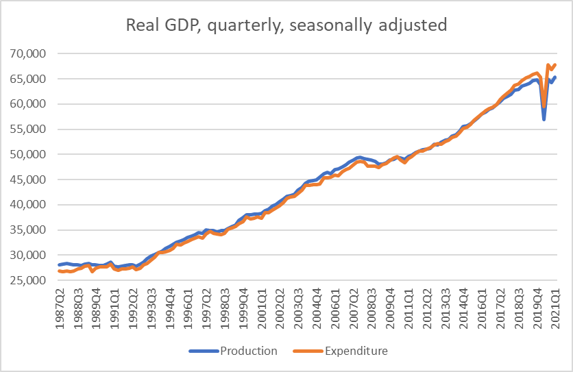
But if the two series are, eventually, more or less reconciled that isn’t much consolation now.
Here is the more recent period, this time per capita and indexed to 100 in 2016q3, the last date for which the current estimates of the two approaches are almost identical.
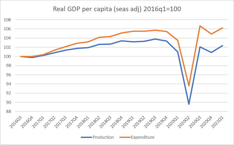
Over 4.5 years a gap of 3.7 per cent has opened up between the two series. And there is no good ex ante reason to prefer one estimate over the other.
In per capita terms – using the current SNZ official population estimate – that is the difference between 2.4 per cent and 6.2 per cent growth in real per capita GDP over the period shown. One of those numbers is not too bad, the other is pretty dire. For the Covid period – so since the last pre-Covid quarter in 2019q4 – it is the difference between a 0.9 per cent fall in real per capita GDP and a 0.7 per cent increase. I usually simply average the two approaches, so a best stab in the dark is probably that we are back to around pre-Covid levels, but really who knows.
And it is complicated by the fact that the population estimates themselves are a moveable feast. SNZ’s official estimate – using their 12/16 model-based rule. They estimate that the resident population has increased by 6500 over the year to March on account of immigration. But one of the few hard numbers we know is the number of people coming and going from New Zealand (in total, for whatever reason) and those numbers show a net outflow of 56446 people between 1 April 2020 and 31 March 2021. It is at least possible that as the 12/16 estimate converges to hard numbers (SNZ know with confidence what happened 16 months later) that we end up with a rather low contribution from net migration in the last 12 months or so?
A revision along those lines might sound like a good thing – if the resident population was smaller then given GDP average per capita real GDP was higher. But I doubt it is as simple as that because many of the components of the GDP estimates themselves will have been estimated, from sample surveys, that have behind them a view on the population. Revise down the population and it is likely that the subsequently-reported GDP estimates will also be a bit lower.
One of my favourite charts over the years has been on real GDP per hour worked. My normal approach is to use the two GDP estimate and the two estimates of hours (QES and HLFS), index all the series and simply use the average that results. Here is the chart for the last 10 years
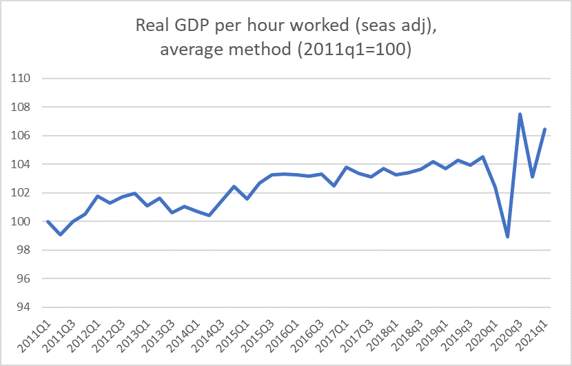
The decade was mostly pretty bad, but who knows what has gone on in the last 12 months. Some of the apparent noise reflects differences in the two hours series: the HLFS estimates hours worked and the QES hours paid. Usually they are much the same thing, but not in the midst of a lockdown with a wage subsidy. But that was mostly a problem for the June and September quarters last year.
No one is going seriously argue that Covid has been good for productivity, so even if the latest estimate looks quite appealing it is unlikely to endure. Now, of course, you’ll recall the divergence in the two GDP measures, so I could show you are a chart with really big differences in the productivity estimates depending which GDP measure one uses.
Perhaps you think that the lift in productivity shown in the chart is mostly a compositional effect. When hours worked dropped it is often the lowest paid, lowest productivity hours that drop off first. But even there our two surveys report quite different things: QES hours in March were (seasonally adjusted) 1.8 per cent lower than they had been in December 2019, but HLFS hours were 1.4 per cent higher. There is, inevitably, noise in these series, but it does leave analysts somewhat at sea at present. And not even sure where the errors, and future revisions, might be. I’m pretty confident that labour productivity has not really increased by 2 per cent in the last 15-18 months, but what that means for the component estimates I don’t know.
I’ve sometimes shown comparison with Australia, especially for real GDP per hour worked.
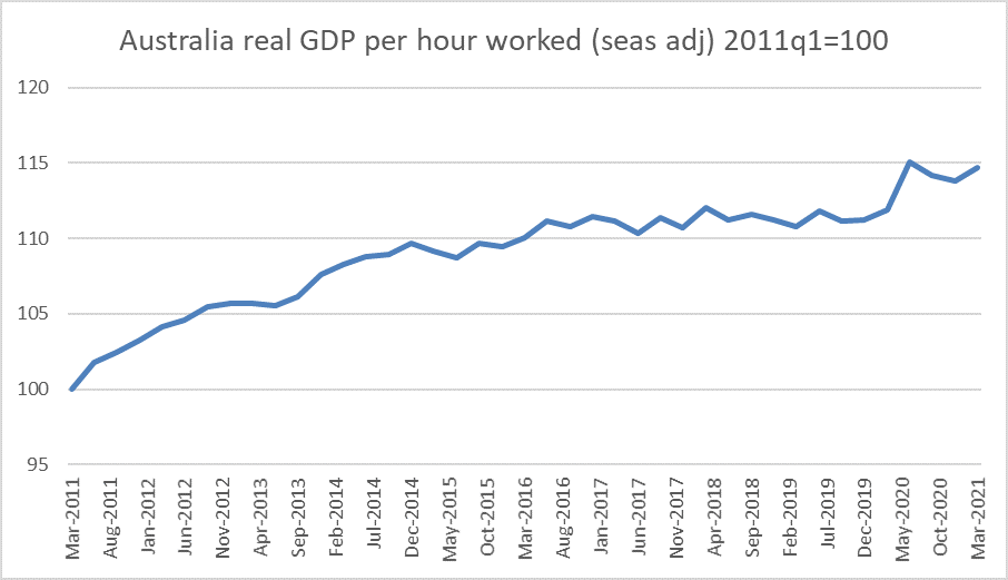
There is much, much less volatility than in the New Zealand estimates. Of course, it also seems unlikely that underlying productivity per (stratified) worker has stepped up through Covid, but…..hours worked in Australia are estimated to have been 3.4 per cent lower in the March quarter than in the December 2019 quarter, so there is a a somewhat plausible composition story there. In fact this is what happened in Australia in the 2008/09 recession.
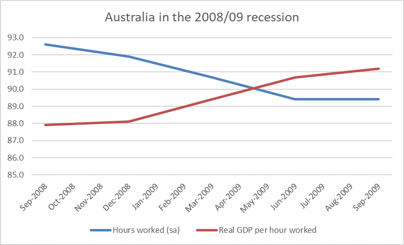
And as the labour market recovered, productivity fell back to trend.
Some of the measurement challenges are unavoidable, but it does look as if the (highly regarded) ABS is making a better fist of things than SNZ.
We can be confident that the economy is in much better heart than it was last June, but – per official statistics anyway – that really is about all. Fortunately, we have business opinion surveys because perhaps more than usually we really rest on them for anything much of a sense of where the economy is right now. And for some things that matter longer-term, notably productivity, we really are just flying blind at present, backed perhaps by basic theory that whatever good shutting borders has done for public health (a real gain) it is almost certainly at least somewhat bad for productivity.

It was interesting to watch China’s latest Space station which can house 3 astronauts comfortably. This is to be followed up with a Lunar base camp in cooperation with the Russians. Compare that with a European International Space Station headed for the scrap pile soon and the USA with nothing on the horizon. It took 11 space rocket launches to assemble the Chinese Space Station. The US can only launch 2 rockets every 12 months. This means that it will take at least 5 years for the US to even catch up with China.
Watch NASA increasingly have to rely on NZ which has 2 weekly launch windows. Space industry in NZ is going to just boom already $2 billion in GDP and employ 5000 people and rising.
LikeLike