The recent quarterly national accounts data prompted me to update a couple of charts that I used to run here regularly, one of which I hadn’t bothered updating since the start of Covid.
The first is for labour productivity. In New Zealand, we don’t have an official series (level or index) of economywide labour productivity (real GDP per hour worked) but it is easy enough to construct one (or several) using the two quarterly measures of real GDP (production and expenditure) and one or both of the HLFS hours worked and QES hours paid data. I used to simply turn all the series into indexes and divide the average of the two GDP series by the average of the two hours series.
Covid messed up those estimates. For example, under the wage subsidy scheme a lot of people were being paid (as a matter of policy) for hours they were forbidden to, or were otherwise unable to, work. And on a more enduring basis, we now have a higher baseline level of sickness, which comes and goes with waves of Covid, and so for the time being I’m just using the HLFS measure of hours (since it is measuring the hours people tell SNZ they were actually working for). It also then allows for a more-direct comparison with the official ABS real GDP per hour worked series for Australia.
With series for both countries indexed to 100 in 2019Q4, the last pre-Covid quarter, this is how the productivity indicators have done over the last few years.
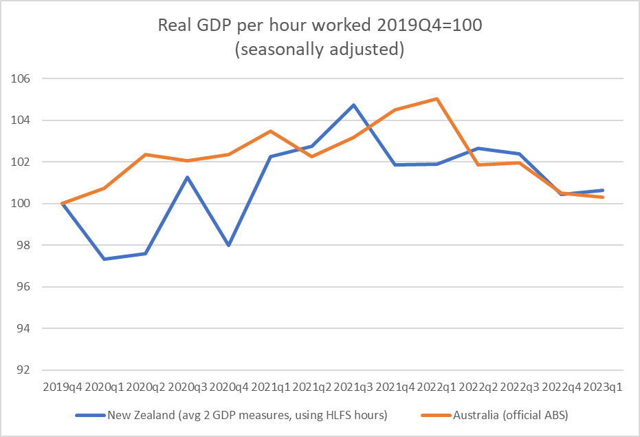
There is quite a lot of “noise” in the New Zealand numbers, and I still have very little confidence in the any of the numbers for lockdown quarters themselves (in early 2020 and late 2021), but taken over the entire 13 quarters (from before Covid was on any horizons in either country, to now where there are few/no regulatory disruptions) both countries end up with – on current estimates – next to no productivity growh at all over the full Covid period.
I don’t find that particularly surprising (although who knows what the numbers will eventually be revised to) – Covid was a really big disruption and costly dislocation in all sorts of ways – and was much more puzzled by the earlier indications that a reasonable level of productivity growth had been maintained (even allowing for compositional points – eg low productivity motel cleaners and cafe waiters were some of the disproportionately most likely to have lost their jobs in 2020). Perhaps too there is now some cyclical and compositional effects at work: both labour markets have recently been substantially overheated and almost anyone who wanted a job could get one, probably averaged labour productivity a bit downwards.
But they are hardly numbers to be complacent about. For what it is worth, UK official numbers on growth in economywide real GDP per hour worked are (a bit) less bad than these Australian and New Zealand numbers, and US non-farm labour productivity (thus not strictly comparable) while weak in recent quarters still looks to be not far from a pre-Covid trend line.
My second chart has, over time, raised more hackles. Almost 20 years ago a visiting IMF mission team were looking at how the (then newly) rising exchange rate was affecting the economy, and one of their people put together a chart crudely illustrating the relative performance of the tradables and non-tradables sectors of the economy. Tradables here was represented by the production GDP components for the primary and manufacturing sectors, to which was added (in a way that makes statisticians wince, but which isn’t without meaning) exports of services from the expenditure GDP accounts. They were, loosely, the bits of the economy either producing for exports or facing direct international competition. The non-tradables component was the rest. I think I later hit on the idea of expressing the series in per capita terms, to cope with longer runs of time.
This is roughly what the chart looked like around the time it was devised.

If anything, the tradables sector had been growing faster than the non-tradables sector in the 1990s and early 00s, which was sort of what the opening-up narratives had led people to expect. But after about 2002, activity in (this proxy for) the tradables sector seemed to be going sideways. All else equal that might not have been too surprising for a cyclical rise in the exchange rate (back then, the New Zealand real exchange rate experienced really big cyclical swings).
This is what the chart looked like the last time I bothered updating it, just prior to Covid
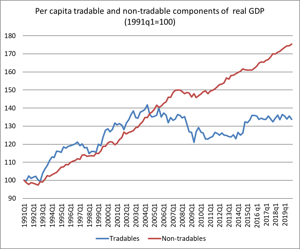
The non-tradables sector had continued to grow quite strongly (in per capita terms), while this proxy for per capita tradables sector output had had its ups and downs but was by the end of 2019 no higher than it had been in 2002. A common narrative on this blog through its first few years was that the economy had become increasingly inward-focused, even though sustainably successful economies tend to be ones with rapidly growing tradables sectors (not, to repeat myself for the umpteenth time, because exports are special, but because there is a big global market out there and successful competitive firms will tend to find global customers).
I stopped looking at the data for several years because when the government says people can’t travel then of course services exports (notably tourism, but also export education) were going to dip quite sharply, and all it was doing was reflecting the priority placed on Covid control, nothing about underlying competitiveness issues.
But now things are returning to normal. We don’t have restrictions on people coming, and nor do most countries, and even China is opening up (for outbound travel) again. So it seemed worth coming back to my indicator chart.
I was quite surprised by what I found.

Non-tradables real per capita output has still been running well above trend, consistent with an overheated economy (high inflation, large current account deficit), as we’d seen on a smaller scale in the mid 00s. But the proxy for the real per capita output of the tradables sector hasn’t yet recovered much at all, and is only about 10 per cent higher than it was 32 years ago.
Something didn’t seem right. After all, there were a lot more tourists around.
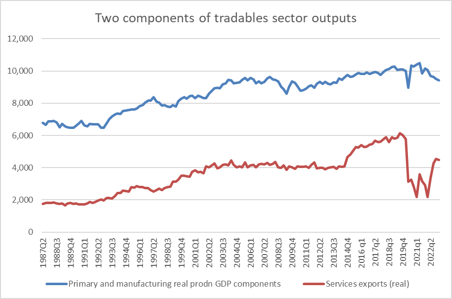
And sure enough the data (seasonally adjusted but not per capita here) show that services exports have recovered a lot as the Covid restrictions were lifted. But notice the blue line, the GDP components of the primary and manufacturing sectors. It has its ups and downs but the level of the latest observation was first reached in 2004Q1 (when the population has only just passed four million).
It is an increasingly inward-focused economy, where policy (such as it is) is only tending to reinforce such developments. It doesn’t have the feel of the foundations for a prosperous and highly productive economy for New Zealanders – this generations, or our children and grandchildren.
But while the big political parties fight over the keys to the Beehive offices and cars, it would be most surprising if one sees any serious or sustained engagement with data like these (or the policy choices that have given them rise) in the election campaign over the next few months.

There are no easy answers to these problems but certainly freeing up land to bring down housing costs and house prices (before they start rebounding again), as you have advocated previously, would help.
LikeLike
“An increasingly inward-focused economy”… has the right feel when one travels our urban centers….people just taking in one another’s washing. It seems our economy is a slow moving train wreck with productivity low, crime up massively (despite statements from on high), education achievement falling rapidly, and government sucking up ever larger resources.
You may be a ‘voice in the wilderness Michael, but keep it up.
Perhaps you might like to focus on tourism as the wonder drug to offset our desire to further limit primary production. The late Sir Paul Callaghan said that…” if want to be poor promote tourism” And yet we are told of the huge inflow of international sums which it contributes, and almost every local authority uses future tourism as its “go to” to justify expenditure on sports arena, conference centers, port development et al.
I would suspect that many tourists, especially groups pay for airline travel, hotel accomodation, internal bus travel & even purchase of tourism ventures, mostly foreign owned, back home in their local currency.
I remain sceptical about the role of tourism in helping reverse our foreign trade imbalance.
LikeLike
Just wondering the impact of natural disasters of which Covid was only one on GDP.?
Usually such disasters can have a vey positive effect on GDP numbers?
Interested in your comments
Thanks
Rosecevans
LikeLike
SNZ reckon the March quarter storms slightly dampened GDP that quarter. The repair and rebuild process will add to demand over the next year or two,but all else equal monetary policy will be a bit tighter than otherwise to offset this additional demand.
LikeLike
[…] It is an increasingly inward-focused economy, where policy (such as it is) is only tending to reinforce such developments. It doesn’t have the feel of the foundations for a prosperous and highly productive economy for New Zealanders – this generations, or our children and grandchildren. – Michael Reddell […]
LikeLike