Economic growth – and the lack of the sustained productivity growth that underpins it – is again briefly in focus. 70 years of relative economic decline still shows no sign of being durably reversed, but the last few years have been particularly tough and there is an election next year, and so the government’s rhetorical focus has turned to growth. Time will tell whether it is supported by any serious policy changes equal to the magnitude of the problem.
Over the decades, whenever the conversation has (usually briefly) turned to growth and New Zealand’s fairly dismal longer-term economic performance, advocates of compulsory private savings emerge to some fresh prominence. The late Brian Gaynor used to argue that if only we’d kept on with the 1974 Roger Douglas scheme all would have been well. Other funds manager types refer us to the Australian compulsory savings system. And others champion Singapore (including former NZ Initiative and National Party adviser, Leonard Hong who recently devoted an entire dissertation to it [and whose Herald op-ed is here]). Over the last decade, Roger Douglas and Auckland university economics professor Robert MacCulloch have been championing an overhaul of our entire system of health and welfare (including superannuation) provision, which would involve a lot more compulsory private saving. Just this week, MacCulloch is quoted in the Listener’s (flawed) feature article on New Zealand economic decline putting a big emphasis on lack of national saving, suggesting that the difference between New Zealand and Australian wealth/productivity is substantially explained by the differences in savings policies. On his blog yesterday MacCulloch reminds us of one of those empirical regularities of macroeconomics – the correlation between savings rates and investment rates – and claims that much of Singapore’s economic success is down to their compulsory private savings policy; that without something similar National’s growth aspirations aren’t likely to come to much.
One can be a bit cynical about funds managers championing compulsory private savings – Kiwisaver, after all, has been good for funds managers – but I’m sure all these people believe their stories. I’ve become increasingly sceptical over the years,
I don’t want to focus here on what is the best way to do retirement income policy (let alone the political feasibility of different models). One can mount arguments for a variety of different models. But my focus is on overall macroeconomic performance and outcomes, and my starting point is that the design of your country’s retirement income system is most unlikely to be a dominant factor in explaining your country’s overall economic performance.
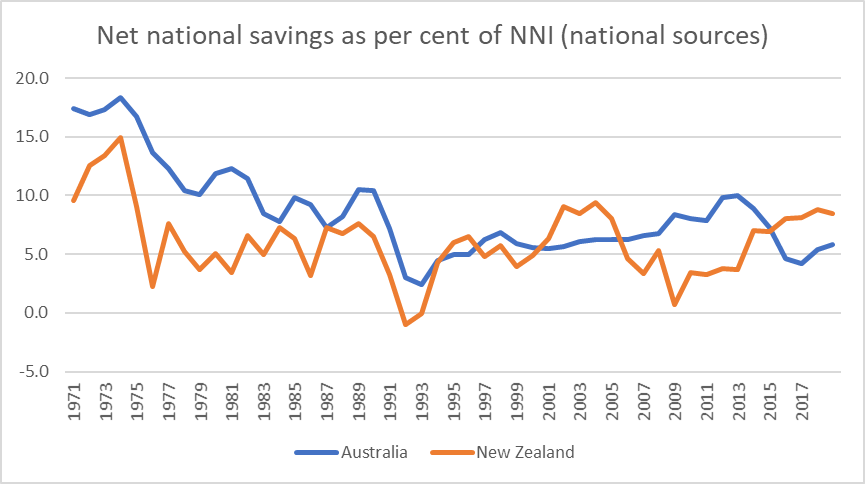
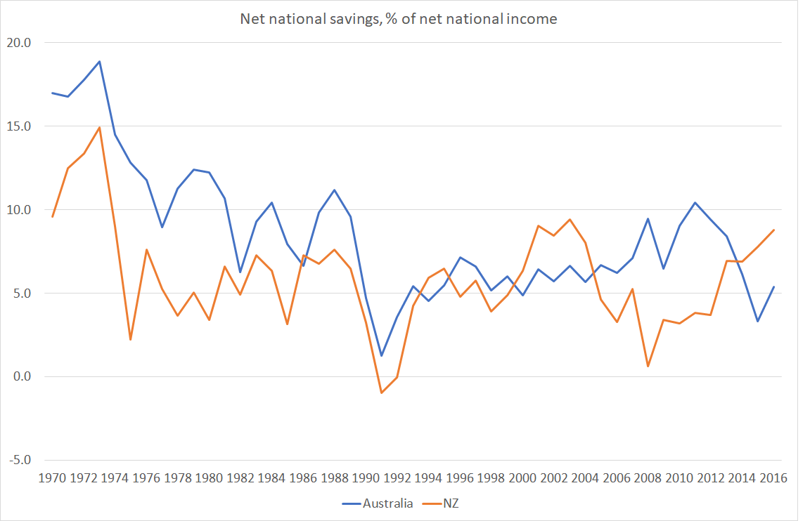
Let’s take Australia first. As a reminder, 30 years or so ago the Australian government introduced a compulsory private retirement savings scheme (employer contributions), starting at 3 per cent of income then rising to 9 per cent, and this year getting to 12 per cent. Sceptics note that, as yet, Australia still isn’t spending much less than New Zealand as a share of GDP on public pensions, but the focus here is macroeconomic outcomes.
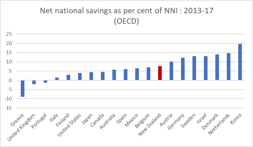
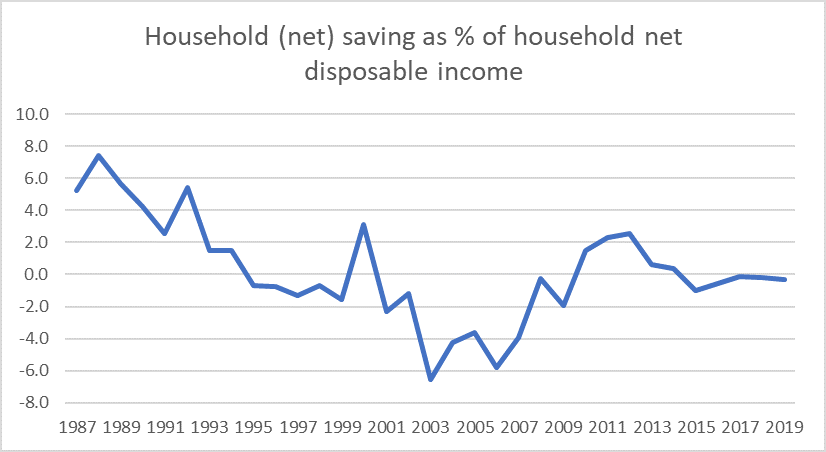
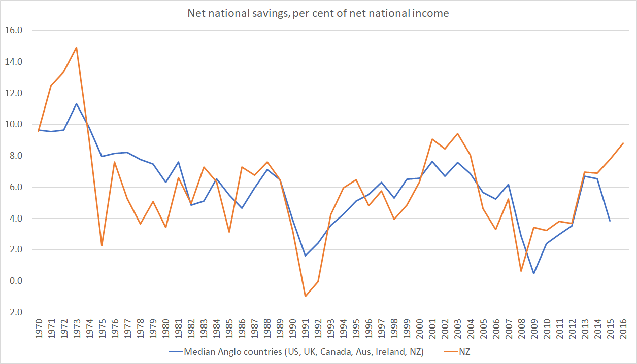
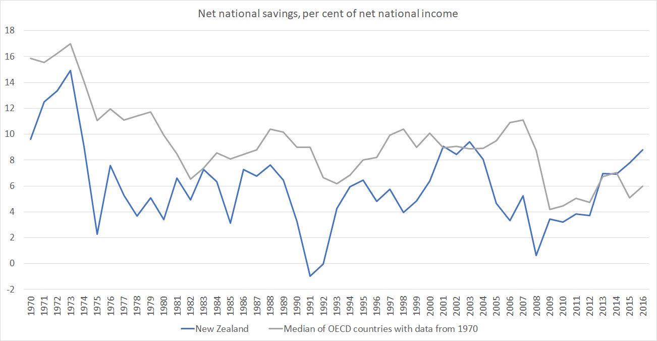
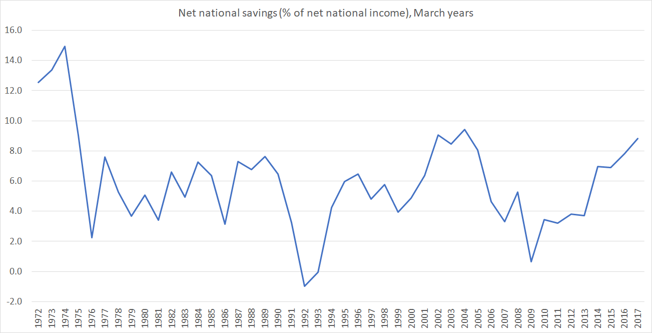
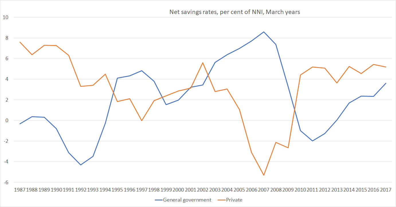
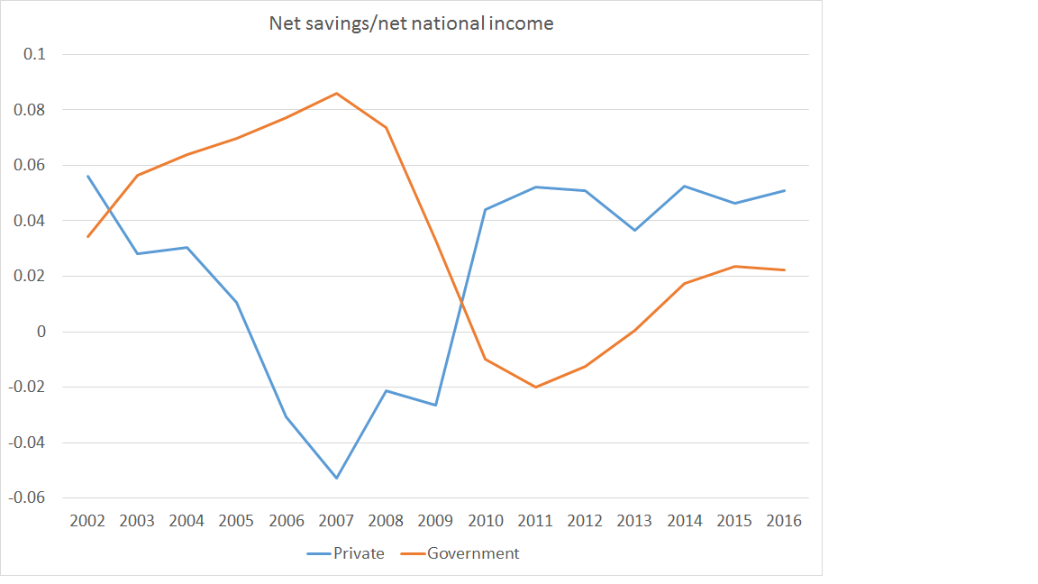
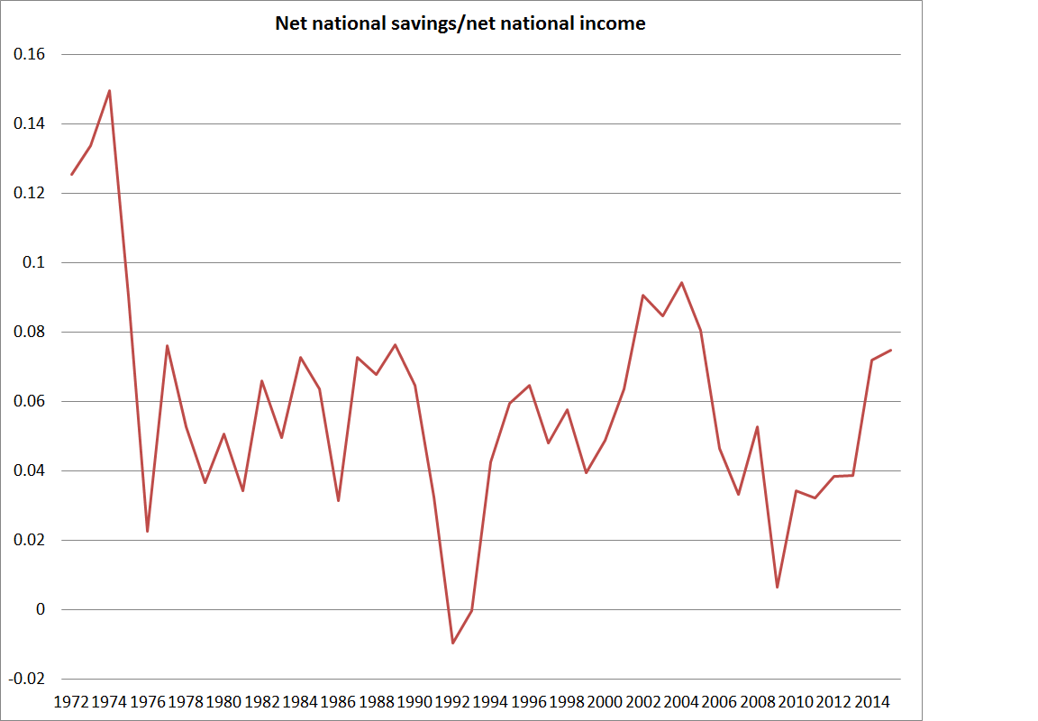
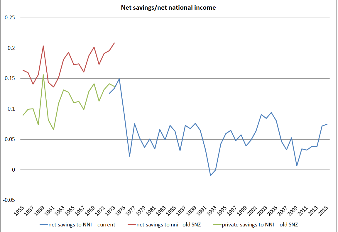
The first place one might look for evidence of the transformational macroeconomic possibilities is the national savings rate.

Champions of the scheme have occasionally produced papers claiming a positive impact, and the counterfactual is – as almost always – impossible to know, but if there has been a positive effect it doesn’t exactly look transformational.
Thoughtful Australian observers also worry about productivity growth over there (Australia is now richer and much more successful than New Zealand, but average productivity lags a long way behind the OECD leaders). There is always lots more going on in both countries but….there is no sign of Australia catching up with the US in the decades since large-scale compulsory private saving became a thing.

Australia is, by the way, the most culturally and behaviourally similar country to New Zealand in the world.
But what about Singapore? It is a stellar economic success story that has seen real GDP per hour worked in Singapore reach levels not that far behind the most successful European economies and the US (although note that experts reckon that Singapore is one of those economies – like Ireland and the Netherlands – where international tax distortions (not just differences in company tax rates) are flattering the data more recently. No one serious uses headline GDP numbers in Ireland.)
Singapore has also had a compulsory private savings system since colonial times (introduced in the mid 1950s).
But it would be very hard indeed to argue that national savings played any very substantial part in Singapore’s economic emergence.
I couldn’t find a very long-term series for Singapore’s national saving rate but the current account is just the difference between saving and investment.

Investment as a share of GDP took off in Singapore from about 1970, averaging about 40 per cent of GDP for 15 years or so, and translating into rapid growth in the aggregates that count (real GDP per capita, productivity growth etc). Throughout almost all that period, Singapore ran really large current account deficits (ie relied heavily on foreign savings).
The IMF’s WEO database has a (directly observed) national savings series since 1980,

where the peak in the national savings rate (at times in excess of 50 per cent of GDP) came well after the peak in investment in a share of GDP. (As a curiosity, and if one takes the numbers in face value, investment as a share of GDP in Singapore and New Zealand have been roughly the same in the last half dozen years or so.) It looks as though, as one might expect, domestic investment tended to respond to opportunities rather than primarily, or to any great extent, to savings.
And that shouldn’t be in the least surprising, since it was, after all, how countries like our own emerged to around the top of the world GDP per capita tables in the late 19th and early 20th centuries (eg there is an estimate for New Zealand for 1886 in which the net international investment position – net reliance on foreign capital – was almost 300 per cent of GDP). Not only New Zealand, but Australia, places like Argentina and Uruguay, and indeed the freshly settled parts of the US itself. Britain, by contrast, ran massive current account surpluses (national savings far exceeding domestic investment), and its lead in the world economic tables began to fade. There is a vast literature on this sort of stuff. More recently, you can see similar pictures for places like Ireland and South Korea (large account deficits in the early phase of emergence, as high investment rates start occurring, followed by later increases in savings rates).
Robert MacCulloch’s post yesterday makes a lot of the Feldstein-Horiaka “puzzle”, first identified in a paper 45 years ago. Across countries, domestic investment rates (national accounts investment concept here as throughout) tend to be correlated with national savings rates. MacCulloch includes in his post this chart, covering (as I understand it) all countries

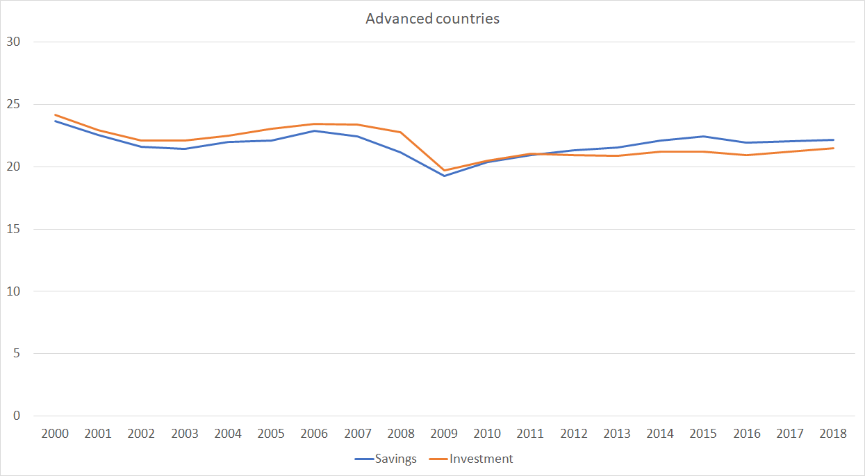
I did one just for the IMF’s group of advanced countries covering the last 30 years (the period for which the IMF has comprehensive data). Each dot represents a country

It isn’t a tight correlation (check the range of savings rates for countries with investment rates averaging between 25 and 27 per cent, but it is definitely there. The question is what it means.
The thrust of MacCulloch’s claim is that investment in New Zealand is (national) savings constrained. I’m sure he doesn’t mean it in a tight mechanical sense but the implication is that we couldn’t durably get from 23 per cent of GDP in investment to (say) 27 per cent – the sort of market-led change that would make a huge difference over time – on current policies around saving.
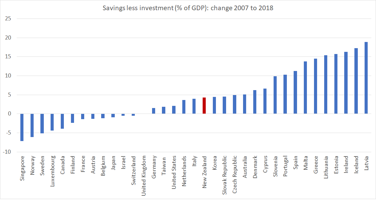
I don’t see it. I’ve already illustrated how some current account balances have swung through enormous ranges over time – Singapore is one of the most glaring examples, now accumulating massive claims on the rest of the world, even as domestic investment rates are no longer anything out of the ordinary. Taking that IMF advanced economies grouping over the same 30 year period in the chart above, the median range within which current account deficits have fluctuated over that period has been 12 percentage points of GDP (over that 30 year period Spain, for example, has had both a 3 per cent of GDP current account surplus and a 9 per cent current account deficit). Several countries have had fluctuations within a range of 30 percentage points of GDP, and there are now multiple advanced countries (Europe and Asia) experiencing persistent and large current account surpluses – national savings well outstripping domestic investment.
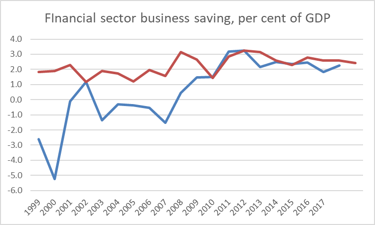
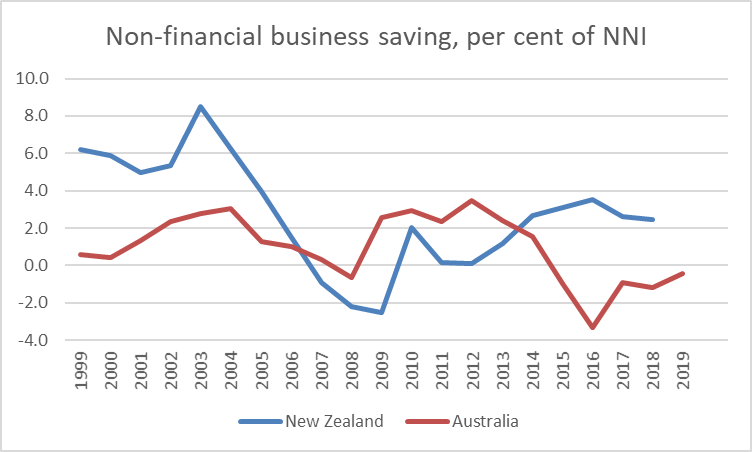
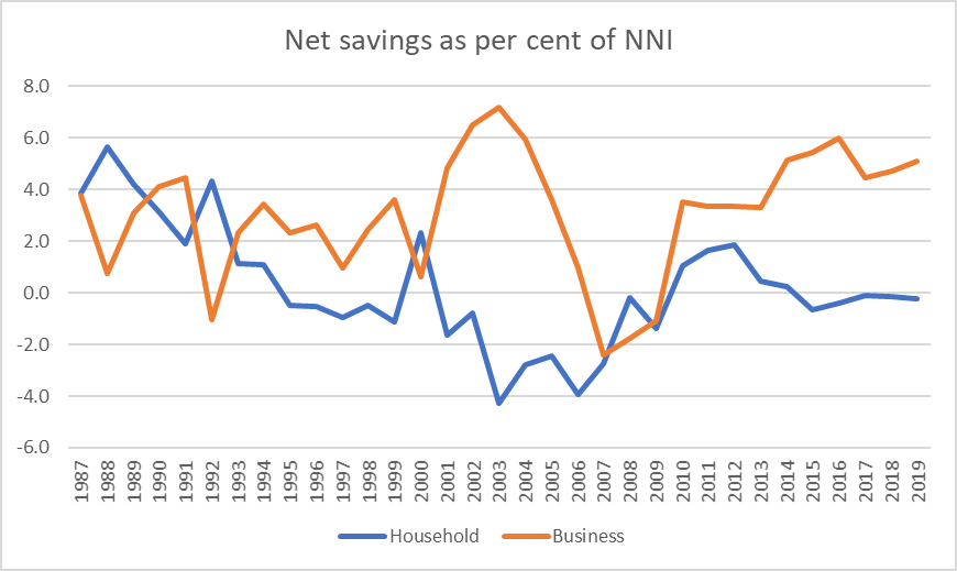
A fair amount of that correlation between domestic investment and national savings is likely to be because savings themselves are endogenous. When people think casually about saving rates they often have in mind household saving, or perhaps government saving (fiscal deficits and all that). But actually business saving matters a lot. Most of the series above are gross (ie including depreciation effects). Materially higher business investment is accompanied by higher depreciation provisions which firms need to fund. And economies in which the returns are high, where firms are finding plenty of opportunities, are also likely to be ones where firms find shareholders agreeing to higher rates of retained earnings. Much of the capital stock is either houses (always likely to be predominantly owned nationally, and where an increased stock also draws forth over time increased savings to pay for those houses) or government assets (and governments will tend to own physical assets almost exclusively in their own country), which also tend to be paid for domestically over time.
There are some genuine and interesting puzzles as to why the ownership of firms displays more of a “home bias” than a simple model might suggest. But there isn’t much evidence -historical or contemporary – to suggest that if the opportunities were there a much higher sustained level of business investment could not occur in New Zealand without some step change (voluntary or coerced) in household saving rates. (And if that claim were true then given the Australian experience – see above – we might as well give up now.) One indicator of New Zealand’s ongoing ability to attract foreign capital is that with (a) some of the largest current account deficits (over many decades now, but including that 1995- 2014 period, and b) on average very low government deficits, the real exchange rate has remained very strong (puzzlingly so on some models, given the deterioration in our relative productivity performance).

Opportunities? Some of the discussion around saving – and indeed mention of “capital intensity” from ministers and officials – seems to imply that private firms (ones actually operating here, or potential entrants) are leaving opportunities unexploited, leaving money on the table as it were. Frankly, that seems unlikely. They have strong incentives to produce good returns for their investors (& sharper incentives than those facing ministers and officials in this regard). I list among the reasons why there might be relatively few exploitable opportunities here things like high business tax rates, foreign investment restrictions, restrictions on exploiting natural resources (minerals etc), RMA-type obstacles, distance, and the persistently high real exchange rate.
How might higher national savings help? Take a rather extreme example in which we all woke up tomorrow and decided that we were going to save another 5 percentage points of our income hereafter forever (well, for just the next two or three decades). You would then expect to see the real exchange rate move sustainably lower (still with cyclical fluctuations). That would be likely to make more outward-oriented business opportunities look attractive (although fewer domestically-oriented ones would, because we’d all be spending less, and most of our spending is local). That might well be a good and helpful thing, in response to a change in private preferences. (And if local opportunities really were even worse than I thought then New Zealanders would – like Singaporeans now – be accumulated assets abroad and our future incomes would rise, even if domestic productivity didn’t.)
But changes in private preferences are one thing, while attempted state coercion is another (and these days the state might well first look to itself and close those operating deficits that we’ve been inflicted with all decade now). And if the real exchange rate was really the only macro thing that might be susceptible to changing savings behaviour, wouldn’t we want to first understand why it remains so persistently high before leaping to try (perhaps ineffectually) to attack symptoms? I’ve got a story for that, but ministers and officials hardly ever engage with the stylised fact.
There might be a decent case for a different approach to retirement income – I’m sceptical, although I’d raise the NZS age quite a bit, and change the tax treatment of savings (as part of a better tax system all round, with less emphasis on taxing returns to capital) – but retirement income policy should be approached on its own terms, with a focus on individuals and their own ability to manage retirement (thus I was also very sceptical of Andrew Bayly’s desire to hijack Kiwisaver funds in pursuit some politicians’ growth stories). Perhaps a better retirement income model would have useful macroeconomic benefits, but for decades whenever politicians and officials – and economists – wanted to focus on savings it has so often had the feel of “lets force the great unwashed to do something different with their money, to suit our ends” rather than the hard graft of actually getting the obstacles the growth that governments themselves pose out of the way.
If I have one final summary point it is that higher national savings rates have rarely, if ever, been a prelude to durably higher rates of domestic productivity or investment growth.