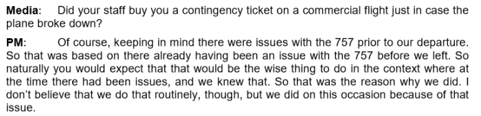
That was the title of a speech Jacinda Ardern gave in Melbourne a couple of weeks ago. For the short trip to Melbourne, the Prime Minister had eschewed commercial flights and taken an RNZAF plane instead, only to have the plane break down. It later emerged (page 11) that her office knew how badly this bit of New Zealand’s government was run
There must have been some wry chuckles in parts of the Australian government and public sector.
The “progressives” who turned out to hear Ardern (it was an ANZSOG event, so I presume lots were public servants and academics) appear to have loved her. Stuff reported that
The event on Thursday night attracted more than 2000 people. Ardern appeared to rapturous applause, and was told that she had put fire in the belly and power in the hearts of Australians.
In The Guardian one particular left-wing Australian academic, a former adviser to Julia Gillard, lost all sense of reason and perspective, claiming Ardern as “one of the world’s great leaders”, and hankering for something different, for New Zealand type politics and reform.
In more recent times it seems that for every policy success achieved by New Zealand, Australia has suffered an equal and opposite failure.
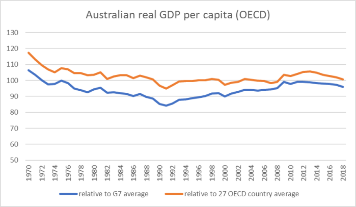
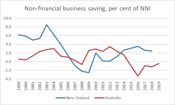
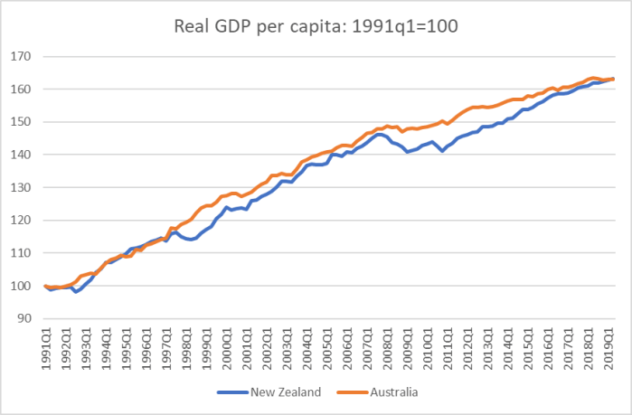
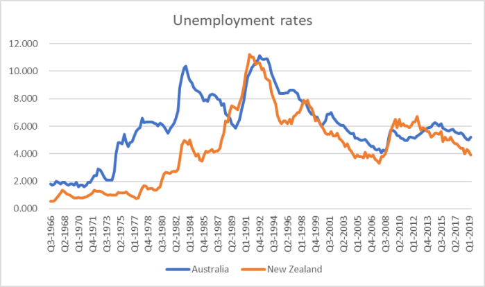
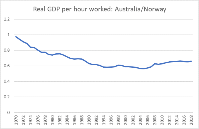
Which is, no doubt, why so many hundreds of thousands of New Zealanders have migrated to Australia and so few Australians to New Zealand (even though we make it easier for them to come, than it is for us to settle in Australia) and why when our two countries were once more or less economically level-pegging, Australia is now so much richer and more productive than New Zealand is. Don’t take it from me: as Australian Labor MP Andrew Leigh put it in his recent article, productivity makes a real difference, and creates real opportunities and choices.
For a time there was a strange phenomenon whereby people on the right in Australia tried to talk up John Key and Bill English as great leaders and economic managers (mostly, it seemed, in reaction to people they didn’t like in Australia – whether Rudd, Gillard, Abbott or Turnbull). Curiously, this particular left-wing academic manages to embrace that strange line as well – Jacinda Ardern is great and so was John Key (“exceptional leadership”). Going by results, could we perhaps trade these stellar figures for someone Australians think is less impressive, but who might actually address some of the serious New Zealand problems and failures?
But the real point of this post was about the Jacinda Ardern’s text. When I first heard the title (“Why does good government matter?”) my immediate reaction was along the lines of “how would she know?”, but I guess it is possible to recognise what good government might be even if, as a serving Prime Minister, you aren’t presiding over such a beast. A good start might be recognising that as Prime Minister you might perhaps be thought of as chief executive of the government but not – contrary to the PM’s suggestion in her text – of “the country”.
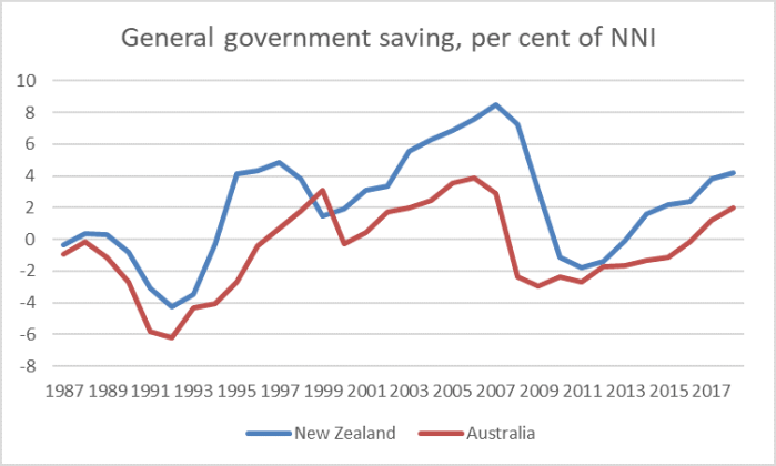
I’d have thought the question of why good government matters was pretty straightforward. Governments exercise enormous power – actual and potential (the latter especially in a country like New Zealand with few formal checks and balances) – take an enormously large share of our incomes (equal to more than 30 per cent of GDP), and any agency that powerful needs to be kept in check, and we need assurances that those in charge of the goverment are operating efficiently, effectively, compassionately, honestly, openly, knowing their own limitations, and so on. Good goverments can do some good. Bad governments can be incredibly dangerous and damaging. Look, after all, at the productivity or housing records in New Zealand – or at the 10 per cent of working age adults living on welfare.
But there is little sense of any of this in Jacinda Ardern’s speech. I guess she is a socialist – former president of the International Union for Socialist Youth – speaking to an audience of people with pretty similar beliefs about the desirability of a big and active government, with little emphasis on how – time after time – governments mess things up.
Ardern’s imperial mindset is on display early in the speech
Good government matters, because government affects everything.
Breathtaking. The love of husband for a wife (and vice versa). Of a parent for a child? Our core beliefs – those under the label of religion and others – that shape what we value? Friendships? Whether or not the All Blacks win the World Cup?
I suppose you could mount a defence of the Prime Minister along the lines of bad governments can interfere even in these things, but there is not even a hint of that in her address – no sense at all of the appropriate limits of government or of the failures of even the most capable and well-intentioned governments. In fact in the very next sentence she – I guess she is a Socialist – goes on to suggest that this “government affects everything” line is something “we” (she and the smart active government types) “perhaps take for granted”. She tells us, quite seriously, that she was “gutted” that an old school friend had no interest in politics: but then Ardern has never known anything but politics, and that simply isn’t (fortunately) the case for most people. But she really wants to a better class of citizen to be worthy of people like her.
She goes on with unsupported stuff
Around the world, democratic values and institutions are under threat in a way that many of us never expected to see in our lifetimes.
It would perhaps be good if she were a bit more specific. Perhaps she had the PRC in mind, and the way she and her colleagues repeatedly defer to PRC interests and pressures, allow PRC regime/Party-affiliated individuals to serve in our Parliament? But I’m guessing not.
Perhaps she isn’t too keen to Vladimir Putin (neither am I) or Viktor Orban (not ideal either) but most adults are old enough (“our lifetimes”) to remember when these places were far far worse. She surely can’t mean Brexit – which was, after all, the choice of the British voters in a hotly-contested energised referendum? And yet I fear she might, because in the next sentence we read
Nationalist sentiment that closes off the possibility of countries working together is surging.
Except that it doesn’t, does it. Free and independent nations often choose to work together on specific items of mutual interest (eg no sign of the UK pulling out of NATO). Aren’t Australia and New Zealand proudly independent countries – doesn’t the PM tell us at every opportunity about her “independent” foreign policy? – and yet we work closely together and are still able to disagree, and not subsume ourselves in one combined “New Australasia”.
Strangely, in her paean to good government, the Prime Minister talks of how
Norms that we in New Zealand and Australia take for granted – the rule of law, the peaceful transfer of power, freedom of expression – are being challenged in new and more explicit ways.
Must have been the PRC she was talking about again surely? But I guess not.
I’m old enough to remember when military coups in various African and Latin American countries were the regular fare on Morning Report, and when from the Fulda Gap eastwards few had the benefit of the rule of law, freedom of expression, and Party rule was something akin to the end of history. Things are better now in so much of the world. And 23 Democrats are lined up across the political spectrum to try to defeat Donald Trump in an open and contested election.
But she also mentioned “freedom of expression” – the same Prime Minister whose government is beavering away on plans to restrict that freedom in New Zealand, whose government made mere possession of the manifesto of Brenton Tarrant an offence punishable by many years of imprisonment.
To this point she seemed to be merely warming up with some generic tropes for his left-wing audience. And then it was into the red meat with a strong denunciation of the reforms of the 1980s and early 1990s – all this from a Prime Minister of the same party that did many of the reforms.
In many countries, while the very wealthiest have grown consistently wealthier, the rest have seen little or no real rise in their incomes or their living standards – over decades.
Inequalities that deepened with the great deregulating reforms of the 1980s and 90s have become a permanent feature of these economies – not a brief moment of pain.
That is certainly the case in New Zealand.
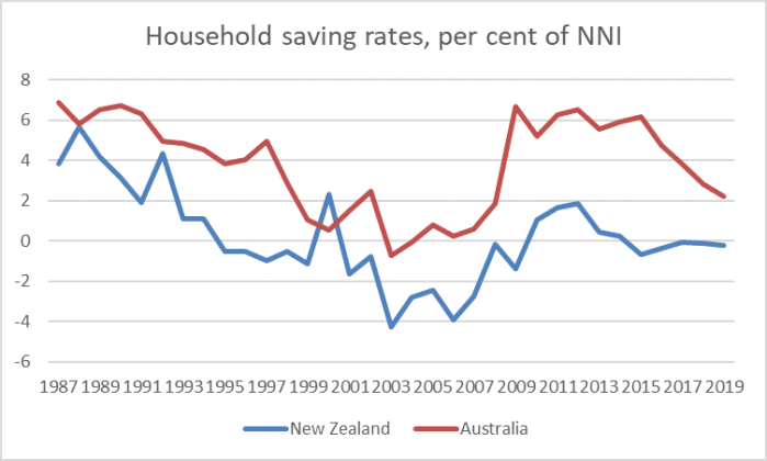
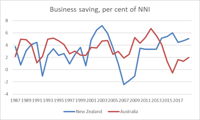
Except that very little of that stacks up against the evidence. In New Zealand wages have been rising faster than the capacity of the economy to pay (growth in nominal GDP per hour worked), income inequality hasn’t widened for decades, and to extent there have been issues in New Zealand they have to do largely with housing – where successive governments have presided over grossly over-regulated urban land markets.
And look at her try to distance herself from and disown all sorts of reforms (notice that “said to”)
Starting in 1984, through to the 1990s, we removed regulations that were said to hamper business, slashed subsidies, transformed the tax system, dramatically cut public spending and massively reduced welfare benefits paid to the sick, those caring for children and the unemployed.
Now we can argue whether those regulatory reforms were necessary, but regardless the numbers speak for themselves.
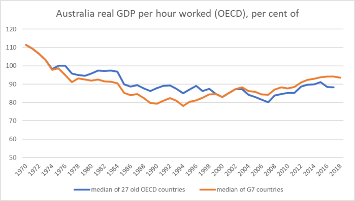
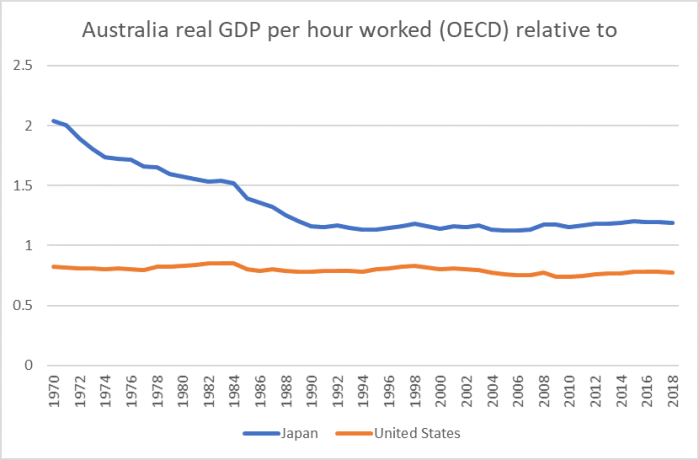
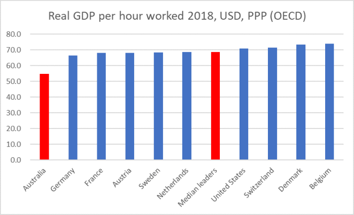
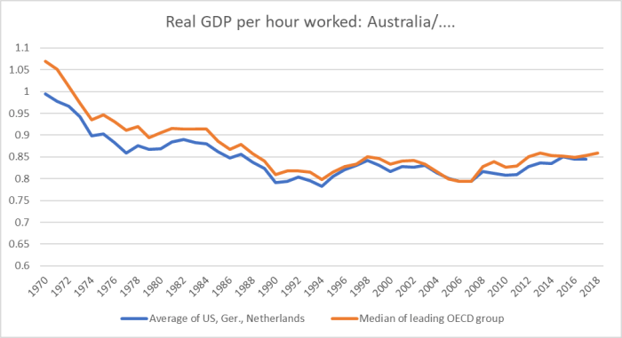
And yet she shows no sign of even understanding the numbers, repeating the same line she took into the 2017 election, claiming that in aggregate the economy did well, but the “right” distribution didn’t happen, as if oblivious – or uninterested – in the continued widening gap between the level of productivity in New Zealand and that in leading advanced OECD economies (and than in Australia).
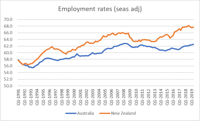
She does go on to devote a paragraph to housing markets, but shows no sign of actually understanding the issues, suggesting that low interest rates are the cause of the problem. Similarly she laments technological advance putting “people out of work” (it is called productivity – doing more with less), seemingly oblivious to the incredibly high labour force participation (and employment) rates we actually have in New Zealand (higher, for example, than in Australia).
And in a line of (stunning) naivete, we read this
Stunningly, our most connected generation in New Zealand, has also been found to be our loneliest.
And in the next line (emphasis added),
what does good government look like, not for us but for the very people who are turning away from us?
The Prime Minister of the ANZSOG (public servant and academic) audiences, “people like us”.
And so she goes on
Domestically, some have chosen to reject the independent and expert public service and the possibility of a mutually respectful and diverse nation.
Could we perhaps have one of those “independent and expert public services”, instead of the degraded (for example) Treasury we currently have in New Zealand?
Abroad, they reject the international institutions that they paint as responsible for both economic and cultural problems when they aren’t necessarily at fault.
One of my old bosses used to jump up and down when we (unspecifically) tarred unnamed individuals. She might be a fan of the EU, but there is no reason why the British public should be, or why them choosing the pull back from the push for a federal Europe should be any sort of marker of societal failure or decline. And if the IMF, the World Bank, the UN etc do little harm, they don’t do much good either. And if she wants to criticise the US over the WTO, perhaps she should say so directly – or perhaps even live the view that free trade benefits most those who take off restrictions on their people, and take a lead and remove New Zealand’s remaining tariffs and import restrictions.
And then
So this is one answer that is available to people – and that some are signing up for. After all, fear and blame is an easy political out.
Except that some people – parties and individuals, Labour included – are to blame for our housing disaster, our dreadful productivity performance. That blame should be sheeted home.
We get several mentions in the speech of high rates of GDP growth but (I think) not a mention of immigration – which the PM and the ANZSOGers love – and not a hint of per capita income growth, let alone the (lack of) productivity growth. Productivity creates possibilities and options, eases hard choices etc. But Ardern seems to prefer not to know.
And we get stories about “social and economic inequality” driving deprivation, poverty and crime, but nothing at all about cultural failures (a point Winston Peters was making this week), family breakdown, or choices and individual responsibility. Free societies can’t flourish without strong and functioning families and cultures.
As she was talking to public servants, there is several pages of talk about public services reforms – but nothing about transparency, nothing about accountability, nothing about excellence, nothing about (say) fixing a system in which the head of the State Services Commission largely exonerates his buddy the outgoing Secretary to the Treasury after a monumental stuff-up, revealing an inability to operate under pressure at the very top of our public sector. Once upon a time Labour talked of being the “most open and transparent government ever”. Now even people on the left just scoff and make fun of the claim. And if the public service is in such good shape (as she claims) doesn’t it make it very clear that responsibility for the severe ongoing policy failures really lies with her (and her colleagues, and people elected before her from her party and others).
The speech ends with the claim that “Good government need not be an oxymoron”. At one level that is obviously true, and yet at another it invites the reaction “and yet surely in New Zealand in recent decades it has proved to be so”. And if it weren’t for the ideological blinkers of her audience (for whom her main appeal seems to be that she is the “not Scott Morrison” or the “not Donald Trump”, you’d have to marvel at the presumption of the Prime Minister offering lectures on good government to a country that is so much richer and materially more sucessful than New Zealand is, to which so many New Zealanders have moved in recent decades, and when her government has done so little.
For those – as many do – who praise Jacinda Ardern as a great communicator it was also striking to read the speech and not find a single fresh or interesting idea, not even a fresh or startling way of making an old point. It was as if some public servant or PMO staffer had simply turned the handle and churned out a set of cliched notes, empty of almost any substance, with nothing to leave people thinking. Is there anything to this alleged communication skill, beyond the level of individual empathy – not an un-useful quality in a Prime Minister, but hardly the foundation for any sort of transformative government.
In his Herald column last week, Matthew Hooton brought me up short with this summary
The Ardern Government is the emptiest and most incompetent in living memory,
But it is hard to disagree (despite some competition for the title) and the problem starts at the top. So much of what the Prime Minister says is vacuous – almost devoid of content – and it has been matched by an absence of any serious steps to deal with pressing failures (or utter failure in, for example, an actual initiative: KiwiBuild), in turn presumably built on no compelling narrative about what has been done wrong in the past, and what might make a material difference in the future. Endless blather about wellbeing doesn’t change that failure.
For those who doubt the “vacuous” charge, consider finally this
Someone I debate these things with, perhaps inclined to making a few more allowances than I am, observed “even I have to agree that is pretty vacuous”.
We really need good – disciplined, rigorous, courageous, open, self-aware, limited – government. We don’t have it.