Last year there was an interesting new book out, made up of 29 collected short papers by (more or less) prominent economists given at a 2023 conference to mark Floating Exchange Rates at Fifty. The fifty years related to the transition back to generalised floating of the major developed world currencies in 1973 (think USD, JPY, GBP, and the West German deutschemark, plus the Canadian and Swiss currencies). It was quite an interesting collection and even has some discussion of emerging markets. What was striking, reading it at this end of the world, was the almost complete absence of any discussion of the experience of smaller advanced countries – this isn’t just a matter of places like New Zealand or Norway or Israel or Iceland, but not even Australia gets a mention in the index.
As it happens, this weekend marks 40 years since New Zealand floated our exchange rate. It was announced at 10:30am on Saturday 2 March 1985 (timing set for after the Friday close of the New York foreign exchange market), and trading commenced on Monday 4 March.
I was working in the Monetary Policy Section (all 3 or 4 of us) of the Reserve Bank’s Economics Department at the time but although there had been talk of floating for months (pretty much since the devaluation in July 1984) and real policy challenges around maintaining the fix, the actual timing of the move was successfully kept very tight (I was never quite sure even whether my boss had known), and I learned of the news when later that afternoon I wandered down to the Hataitai dairy to buy my Evening Post.

It was the same day as David Lange’s Oxford Union debate on nuclear issues, and the Reserve Bank’s Deputy Governor, Rod Deane, had had to fly to London to brief Lange and secure his final agreement to the move (my diary the following week records him telling us that he had been most impressed with Lange’s questioning etc).
The Evening Post’s journalists must have been pretty busy as they’d managed to get comment from all manner of people in the couple of hours they had. Some of them are still commenting today

Bob Jones was another whose views were reported, claiming that by floating “New Zealand has now joined the rest of the world as a sophisticated economy” which wasn’t really true as by this point there were still lots of smaller advanced countries who weren’t floating at all (Australia had done so only a year or so previously), and many of the European countries were running their collective Exchange Rate Mechanism, designed to severely limit fluctuations.
The comments in that old paper that most caught my eye ((bottom right story in the first photo above) were from my old macro lecturer Merv Pope who was very critical, stating that in his view “the economy would suffer severely”.
There are books and articles that discuss the politics and bureaucracy of the period leading up to the float, and I know there are some people who read this blog who were closely involved in it all (who are welcome to add comment/context), so I’m not going to attempt to cover that.
The journey to floating mainly dates to the events around the July 1984 devaluation and the early days of the 4th Labour government. The establishment view in early-mid 1984 was that the New Zealand dollar was seriously overvalued in real terms, and in that sense the mid 1984 devaluation had been welcomed. All that said, as was perhaps necessary in the market circumstances, the extent of the devaluation – 20 per cent – had been set to eliminate the likelihood of further downward pressure, and thus to some extent probably represented an adjustment larger than the medium-term macroeconomics might have warranted.
Going pretty much hand in hand with the devaluation was the removal of the interest rate controls that the previous government had put in place over the past year, combined with a new willingness to fund the government’s deficit primarily by wholesale domestic debt sales, taking whatever price the market charged. With the prospect of rising inflation (if only from the devaluation itself) and large fiscal deficits, it had the makings of considerable difficulties in achieving effective monetary control. Exchange controls on capital transactions were still in place but they were porous (and more designed to limit outflows than inflows) and one of my tasks in August 1984 had been to sift carefully through the records of foreign exchange inflows looking for evidence of capital inflows drawn by the combination of high interest rates and a, possibly, undervalued exchange rate. A fixed exchange rate meant that we – the RB – were committed to buying whatever foreign exchange was offered at the fixed (against the TWI) rate, and all those purchases immediately added to domestic liquidity.
In an earlier post some years ago I noted
One of the starkest memories of my first year at the Reserve Bank, fresh out of university, was being minute secretary to a meeting in late 1984 attended by the top tiers of the Reserve Bank and The Treasury. It was a just a few months after the big devaluation that ushered in the reform programme: senior officials were explicitly united in emphasising how vital it was to “bed-in” the lower exchange rate, and ensure that the real exchange rate stayed low.
The risk was that if we didn’t succeed in getting monetary conditions under control, all the pain of the devaluation might go for nothing (ending up with no real devaluation at all, as in a number of past devaluations here and abroad). And yet with high market-determined interest rates, it was going to be difficult to stop capital coming in. We still had tools like reserve ratios but (a) the goal was to move away from them not become more reliant, and b) they became much less effective in a deregulated interest rate market. We sold government debt aggressively, aiming to mop up the excess liquidity, but the more debt we sold, the more tended to come in (those yields were attractive, and the exchange rate was fixed).
Among the various Ministers of Finance (Douglas and associates) there was a desire to float, but when? It didn’t make a lot of sense to contemplate floating the exchange rate while exchange controls were still in place (although the UK had in the 1970s), and exchange control removal didn’t happen until the Friday before Christmas 1984. And no one really had a good sense as to what the market would deliver (particularly in terms of liquidity and volatility) when the float happened (I’m pretty sure no countries as small as New Zealand were floating were by then, and although Switzerland wasn’t hugely larger it was home to a fairly major banking and financial centre).
Short-term interest rates began 1985 in the mid-teens (the Reserve Bank’s data has the overnight cash rate at 13.4 per cent and the 90 day bill rate at 15.3 per cent in early January. Capital inflows tended to dampen rates, while our monetary policy actions sought to underpin them or push them up (the medium-term goal being to consolidate fairly low and stable inflation, after 10-15 years of high and volatile inflation).
But the backdrop turned fairly quickly. This is from the Bank’s June 1985 review

Pressures built further in February and by 15 February short-term rates had increased by another full percentage point. But it was in the final week of February that things culminated, with significant foreign exchange outflows, reflecting at least in part a sense that a float was likely sooner rather than later, and that when it happened the exchange rate was likely to fall. As the Bank’s Bulletin article records, foreign exchange outflows had been particularly heavy on 28 February and 1 March, transactions due for settlement two working days later. By Friday 1 March, overnight cash rate were at 38 per cent and the 90 day bill rate was at 25 per cent. If you really thought the exchange rate was going to depreciate quite a bit in short order, paying interest rates of under 10bps a day to fund a position taken on the back of that view wasn’t too much of a problem.
(Meanwhile in the Monetary Policy Section we were hard at work devising projections and policies designed to keep inflation in check, all based on a continuation of a fixed rate.)
While the exchange rate was fixed, the Bank was committed to buying and selling whatever it took to maintain the rate, and each such transactions had counterpart domestic liquidity consequences (the Bank was not then doing routine daily open market operations to stabilise the level of settlement cash). Those fx outflows just prior to the float sharply lowered liquidity in the banking system. And once the float happened, the door was closed.
On the first day of trading (4 March) the exchange rate did fall (down around 2 per cent against the USD, which itself was stable against the JPY and DEM) but the dynamic changed pretty quickly. Those liquidity pressures really started to bite, and anyone who wanted to bring funds back to New Zealand needed to find a market seller of NZD, rather than a fixed price central bank. Short-term interest rates skyrocketed

and although the official data has a peak cash rate of 265 per cent, my memory (and my contemporary diary records) suggests peaks in excess of 500 per cent (still only around 1 per cent day per day). Within a couple of days the NZD exchange rate was 4 per cent higher than it had been just prior to the float, and probably would have jumped even further had the Bank not eventually intervened. By 20 March, short-term rates were down to about 24 per cent. It had been a wild ride.
Could the float have been avoided back on 2 March. Most likely it could have. The big problem in July 1984 had been a combination of a) perceptions that the exchange rate was fundamentally overvalued, b) perceptions that Roger Douglas, likely finance minister if Labour won, wanted to devalue, and c) the fact that interest rates were controlled, and so sales of foreign exchange by the Bank had no countervailing interest rate effect. But the broad direction of economic policy was to free up financial market prices, and so there would have been little good reason to delay further.
It is interesting to ponder what might have happened had the government decided instead to a) liberalise interest rates, and b) remove exchange control but c) to keep on with a fixed exchange rate, at the post July 1984 level. The monetary policy trilemma says that in the world you lose control of domestic monetary conditions (and thus the ability to control your own inflation outcomes). By 1984/85, the inflation rates in most major western economies were already more or less in check (think UK, US, West Germany, Japan), and with a fixed exchange rate we might have been expected to have seen New Zealand converge in time to around the average of our trading partners. But I suspect it would have been a wild ride, and would not have ended well. For example, in March 1985 the effective Fed Funds rate was 8.5 per cent and three month rates in Germany were about 6 per cent. With those sorts of interest rates in New Zealand through that period – and that is what a credible exchange rate peg would have delivered – the credit boom, commercial property boom, sharemarket boom etc might well have been even larger, and ultimately messier to resolve, than what we were actually to experience a few years later (the Nordics, for example, went that sort of route, only to float some years later). (It also isn’t wildly different that what Ireland and Spain experienced in the 00s, except that – in adopting fit-for-Germany interest rates they may have been less badly prepared than New Zealand firms/banks might have been in the mid 80s.)
This isn’t a post to review New Zealand’s experience with floating. Perhaps I will attempt something like that over the next few weeks. There have been persistent critics, even beyond the Day 1 ones cited above, perhaps most notably the economist Brian Easton. There were endless debates in the late 80s under the broad heading of “sequencing”: there were models under which things might have been less messy if the order of liberalisation had been different: external trade and labour markets before financial markets (and particularly the capital account and exchange rate). We’ll never know, although (as just one illustrative example) it was never plausible that even the 4th Labour government was ever going to lead with labour market reform, so perhaps there was never a real choice.
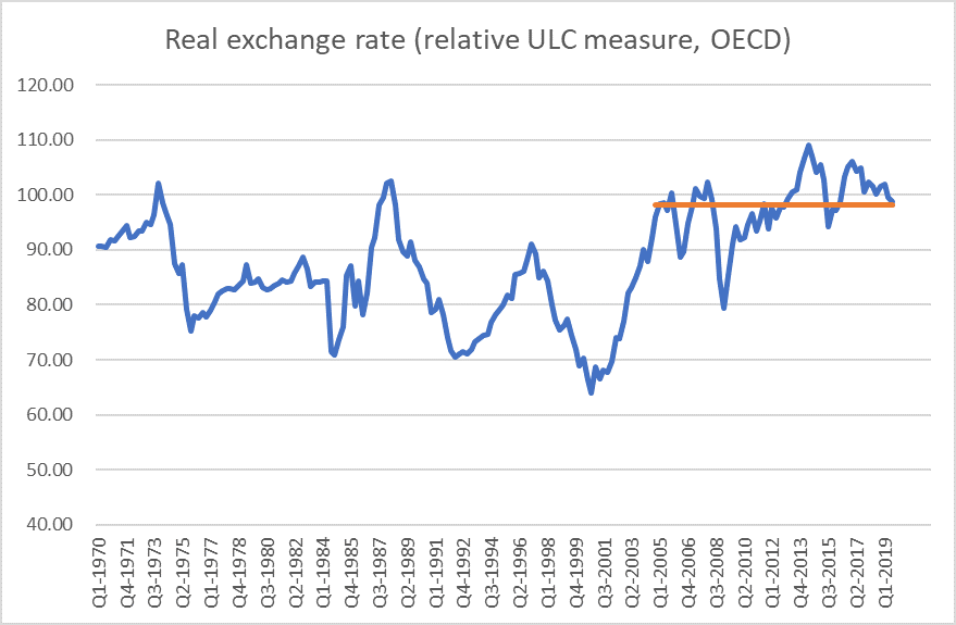
Back in one of those early quotes, Rob Campbell commented critically about the increased room for “speculative moves” around the New Zealand dollar. I suspect that many of those who broadly supported the move to floating will still have been taken by surprise by the amplitude of the cyclical fluctuations in the exchange rate, and the incidence of large single day movements over the following few years. Then again, another mystery of the New Zealand experience is why an exchange rate that was so variable until about 15 years ago hasn’t been since. Perhaps that will be the topic for another exploratory (because I don’t think I know the answer) post
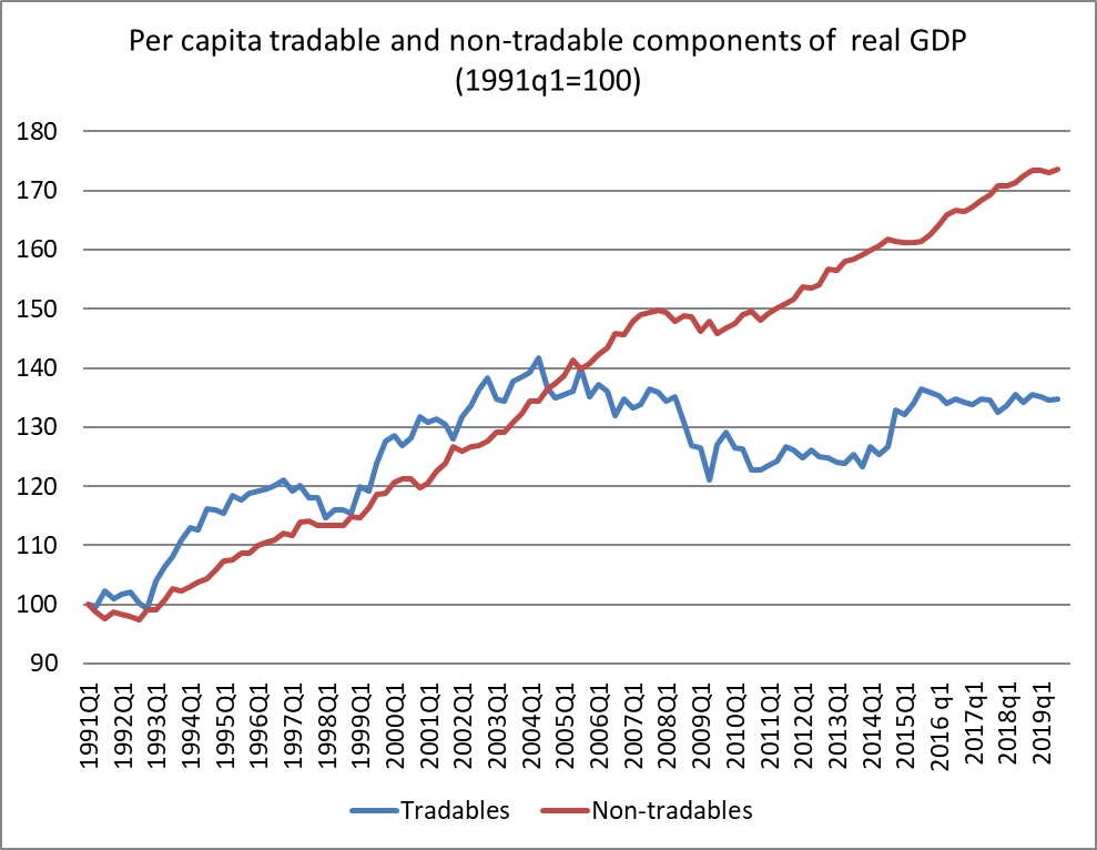
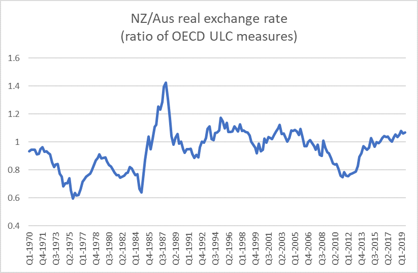
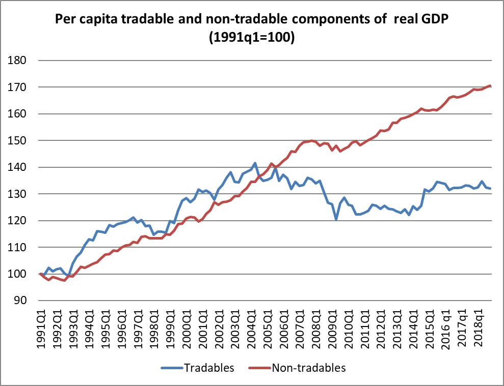
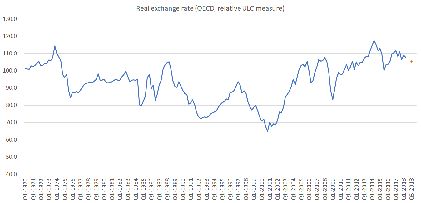
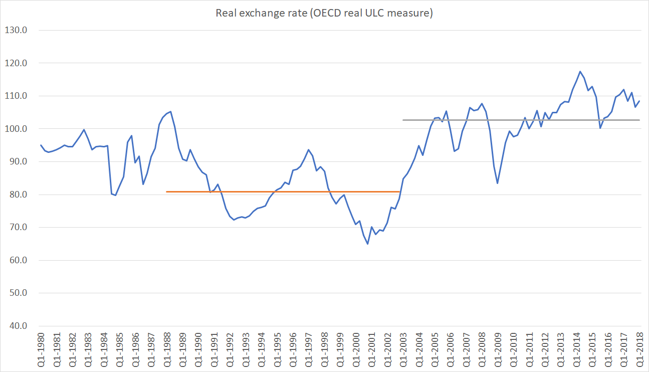
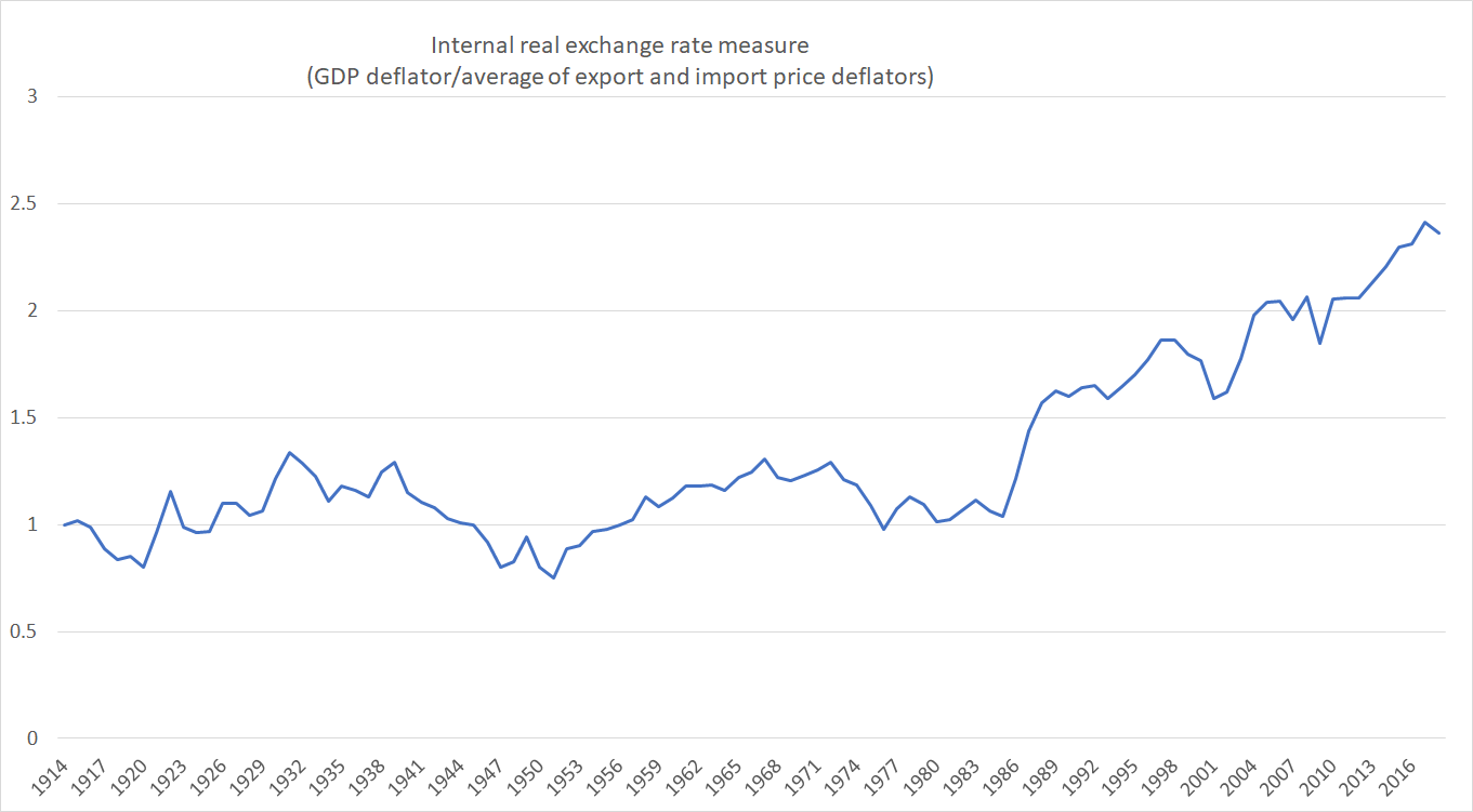
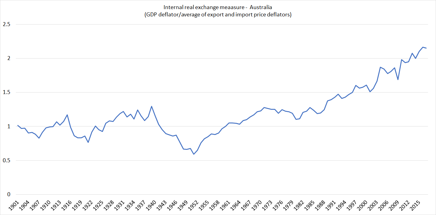
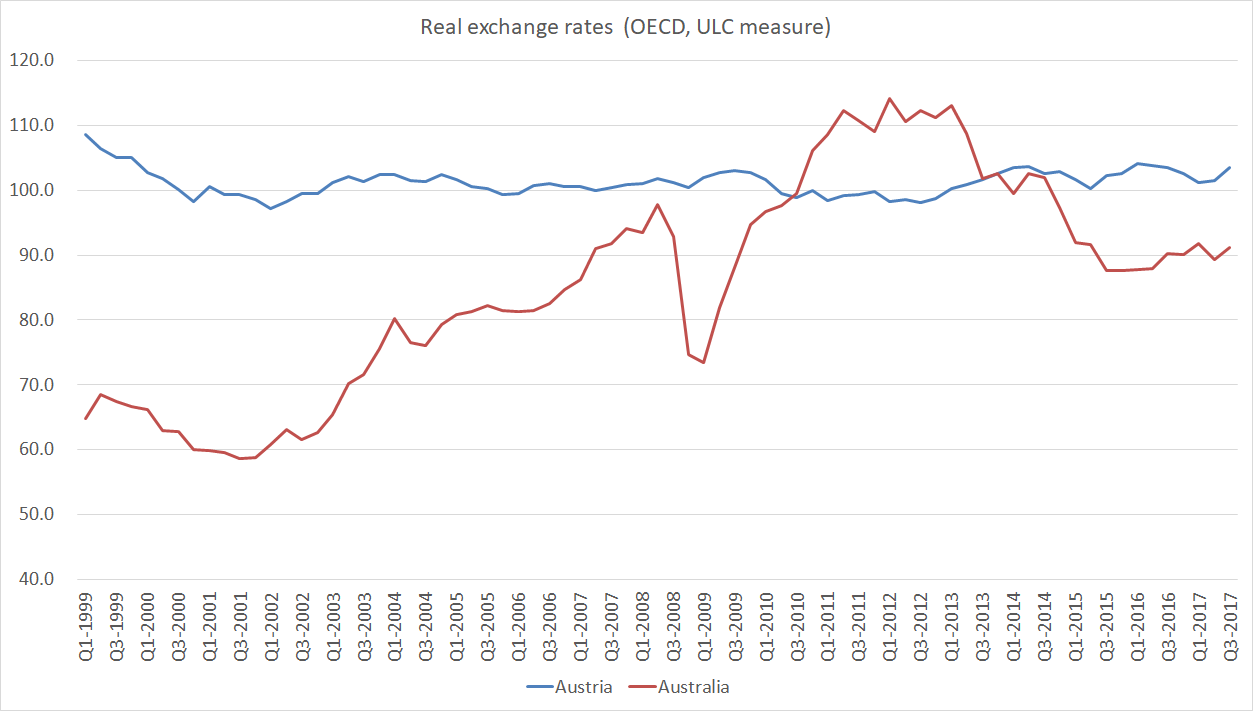
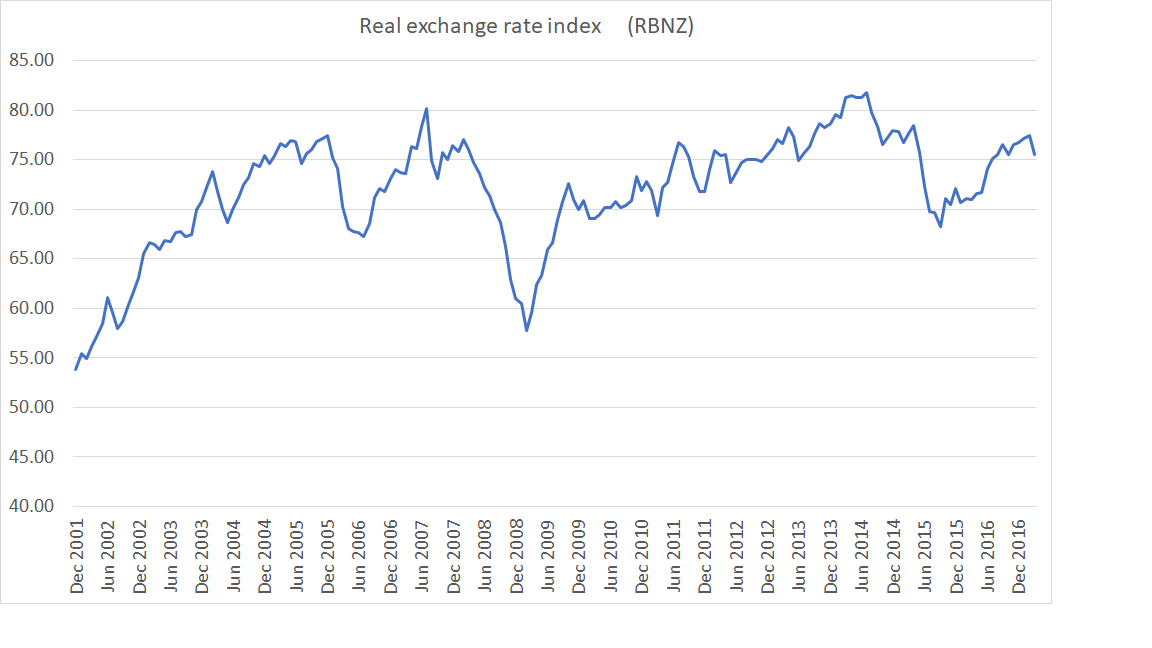 Real exchange rates aren’t things that ministers or governors directly control. They reflect the balance of (tradables vs non-tradables) forces in the economy. That balance here – still – makes it hard to manage much export volume growth from New Zealand.
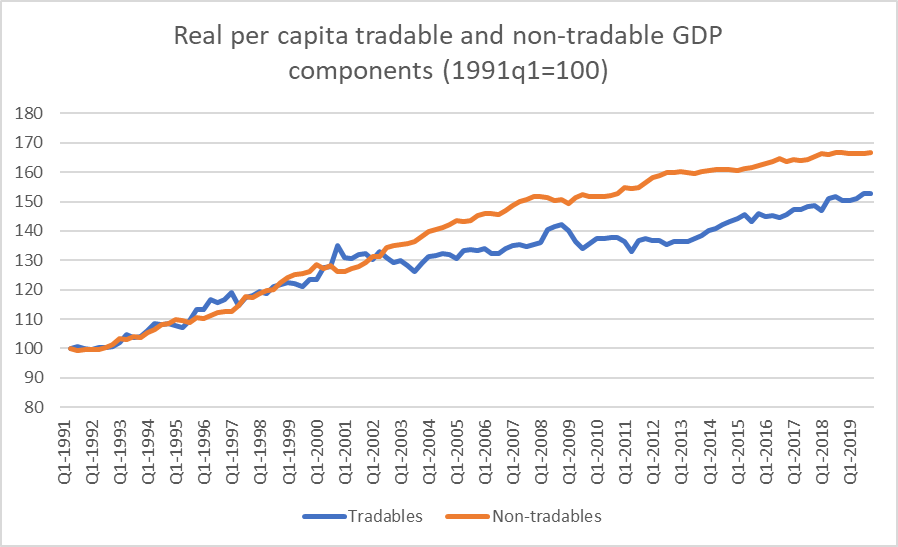