Brash vs Gould vs Brash

Former UK Labour MP (and academic administrator) Bryan Gould, and former Reserve Bank Governor (and political leader) Don Brash have been engaged in a fairly robust exchange of views in the op-ed pages of the Herald.

Gould began it a couple of weeks ago with a column, initially prompted by some combination of the initiatives from both the Minister of Finance, and the Labour Party, that may lead to governance reforms at the Reserve Bank, and Sonny Bill Williams’ Islam-inspired objections to interest, and hence to sponsorship by the BNZ.   The politicians being not very radical at all, Gould pointed us to Williams.

Sonny Bill, however, has succeeded, if we are thoughtful enough to recognise it, in throwing a spotlight on the entire role of the banks in our economy and our society.

Gould’s specific concern?

It is the willingness, not to say keenness, of the banks to lend on mortgage that provides the virtually limitless purchasing power that is constantly bidding up the prices of homes in Auckland and, now, elsewhere.

It is the banks that are fuelling the housing unaffordability crisis, a crisis that is leaving families homeless and widening the gap between rich and poor.

Gould isn’t keen on operational autonomy for the Reserve Bank, whether on monetary policy or banking regulation, at all.

Why should the Government be able to hide behind the Governor of the Reserve Bank and duck responsibility for a policy of the greatest importance to so many Kiwis? Why should ministers not be held to account in Parliament and to the country for failing to deliver outcomes they were elected to deliver?

And actually, I have some sympathy with him on that.   Banking regulation should be administered by the Reserve Bank, but approved by the Minister of Finance or Parliament itself.

But Gould’s argument isn’t some abstract one about the optimal assignment of powers within the Reserve Bank Act.     His concern is that banks create credit, and in so doing create new deposits, as a profit-making business.

They lend you money that they themselves create out of nothing, through the stroke of a pen or, today, a computer entry.

The banks make their money, in other words, by charging interest on money that they themselves create. Not surprisingly, they are keen to lend as much as possible.

In fact, most businesses are keen to increase volume, at least for as long as they can make money on the marginal addition to their sales.   Supermarkets are typically keen on selling you more groceries, health food shops on selling you more health food, fashion outlets on selling you more clothes etc.  But Gould’s bugbear is banks (and, presumably, other lending institutions).   To read Gould, you’d think that banks crammed money down the throats of unwilling borrowers.  There doesn’t seem to be any role for demand in his story (let alone for the regulatory restrictions that artificially inflate urban land values).  Banks, as currently structured, don’t appear to serve any socially useful purpose.

As you might expect, Don Brash –  a former Governor, a former ANZ director, and currently chair of one of the small Chinese banks in New Zealand –  disagreed.   Writing of Gould he notes

He then goes on to blame this money creation for the housing affordability crisis which Auckland now finds itself in, and to attack the Government for washing its hands of this aspect of the housing crisis.

Mr Gould is not alone in peddling this nonsense, but that certainly doesn’t make it correct.

Don Brash isn’t disputing the rather obvious point that the banking system, in the course of lending, also create deposits.  As he says

The banking system does create money.

But at this point he rather veers away from the substance of the issue (Gould’s claim that bank credit creation at the root cause of the housing affordability problems – dismissed by Brash as “peddling this nonsense”) to make a correct, and useful, but in this context perhaps subsidiary, point.    What is more or less true of the system as a whole, just isn’t true for any individual bank.

If individual banks really could create money by “the stroke of a pen or a computer entry”, as Mr Gould contends, why do they bother paying interest on deposits, why do they borrow funds from parent banks overseas, why do they borrow funds in the international market, why do they need to hold some funds in government securities as a liquidity reserve, why do some banks occasionally run out of money when customers lose confidence in them?

….I now chair the small New Zealand subsidiary of the Industrial and Commercial Bank of China….. It would certainly make life very much easier if we could, “by the stroke of a pen or a computer entry”, simply create the money which we lend out to New Zealand borrowers. Unfortunately, we can’t.

Individual banks, and their managers and boards, have to worry (sometimes a lot) about the funding side of their balance sheets.  If Don Brash’s bank increases lending to New Zealand borrowers, that process will indeed create new deposits for the New Zealand banking system as a whole.  But there is no guarantee any of those deposits will come back to his bank.  In the immediate term,  if one bank increases lending more than other banks do, that will lead to a loss of liquidity from the lending bank.  In boom times, it might be easy to fund such rapid lending growth.  In times of crisis, funding can be almost everything.  I was heavily involved in these issues in the midst of the 2008/09 financial crisis, and recall banks telling us then that no matter what initiatives the government or the Reserve Bank took, they’d be reluctant to increase lending if they couldn’t count on secure on-market funding.  Their Boards just wouldn’t let them.

But in a way, Brash’s response didn’t actually deal with Gould’s point –  that for the banking system as a whole, deposits don’t usually constrain lending. Rather the two typically grow as part of a simultaneous process (with some exceptions about changes in the current account deficit etc).  If so, perhaps the credit creation process could be the root cause of the (housing) problem?

Gould returned to the fray in a column in yesterday’s Herald.   But, oddly, he doesn’t attempt to defend his view that banks are the cause of the housing problem.  Rather he tries to teach the former Governor to suck eggs, offering lay lessons in monetary economics, and suggesting that Brash doesn’t really know what he is talking about.

In fact, he first misrepresents what Brash said

…..I said the vast majority of new money in circulation is created by the banks “by the stroke of a pen”, and they then make their profits by charging interest on the money they create.

If this is “nonsense”, the “peddlers” include some very distinguished economists.

But, as you can see from the quotes above, Brash seems to be mostly using the “peddling nonsense” phrase to respond to the housing affordability argument.  Moreover, he explicitly states (see above) that the banking system creates money  (personally, I’d prefer he’d used “deposits” rather than “money”).

In fact, in the entire latest Gould column there is not a single mention of the housing issue.  Instead, there are extensive quotes from a very good –  but entirely conventional –  Bank of England Bulletin article from a few years ago on how the credit and deposit creation process actually works, and how that process is quite different from the very stylised approach that often lingers in elementary economics textbooks.     In fact, our Reserve Bank made many of the same points in an article in their Bulletin a few years earlier.  A (then) Reserve Bank senior manager was making these points in a speech 15 years ago.  But the Bank of England article is very good.    Then again, recall that the Bank of England runs things pretty much exactly the same way our Reserve Bank does.    There simply isn’t any stunning fresh insight in the BOE piece to up-end how best to think about monetary policy and banking regulation.

So when Gould quotes the BOE piece

They then go on to say, “Another common misconception is that the central bank determines the quantity of loans and deposits in the economy by controlling the quantity of central bank money – the so-called ‘money multiplier’ approach…[but that] is not an accurate description of how money is created in reality.”

They go on. “Banks first decide how much to lend depending on the profitable lending opportunities available to them – which will, crucially, depend on the interest rate set… It is these lending decisions that determine how many bank deposits are created by the banking system.

Anyone who knows anything about this stuff is simply drumming their fingers, and going “yes, yes, tell us something we didn’t know”.   But do notice the mention of interest rates in that second paragraph.  The way central banks choose to manage the monetary system these days relies on adjusting an official interest rate, not on attempting to directly manage quantities (of base money, lending, deposits or whatever).   Demand for credit matters quite a lot, and the interest rate is a key rationing device.     When overall demand is weak at any given interest rate –  as has been the case for the last decade –  interest rates tend to fall, and official interest rates are typically cut.  Banks can’t just generate new demand out of thin air.

Gould concludes

But the capacity they [banks] have is hugely important. I concluded by asking whether it was wise to entrust such wide-ranging powers – so significant in their impact on the whole economy – to the banks, and then to arrange that the only person able to regulate that impact was himself a banker – the Governor of the Reserve Bank.

Reasonable people can differ on the extent to which banks should be regulated, and even on who should do the regulation (one should always cautious about the risk of capture, of bureaucrats/ministers by those they are supposed to be regulating).

But in his two articles put together, Gould has done nothing (at all) to substantiate his claim that banks are the prime (or even just a key) source of the housing affordability problems.    Simply describing the way in which credit and deposits are created, across the banking system as a whole, contributes little.

I would grant one point.  If banks could not create credit – in the process (simultaneously) allowing young generations to borrow from older ones – house price cycles would look rather different.  Perhaps house prices would be a little lower.  But the biggest change would probably be not in the level of house prices, but in who owned the houses.   Even more young people would be unable to purchase their own home, and more of those homes would be owned by those not constrained by access to credit (be it the evil “investors”, cashed-up foreigners, or institutional vehicles such as pension funds).  Systemic credit risks might be lower, but at what cost to individual families etc?  The fundamental factors that create (artificial) scarcity  –  land use restrictions running hard into rapidly rising population-fuelled demand –  wouldn’t have changed at all.

And for believers in the idea that the banking system is the source of the problem, it is often worth pointing them to the United States.    It has the same sort of banking system we do –  the banking system simulataneously creates loans and deposits –  and yet vast swathes of the country, including big cities often with quite rapid population growth, have had no problems with unaffordable house prices (as a resource on this, try this excellent interview with leading US housing academic Joseph Gyourko, which almost deserves its own post).  The private banking system isn’t the problem.  Land use and housing supply restrictions are.    The banking system certainly enables some people who would otherwise be squeezed out completely to purchase (in fact that is what it always did for first home buyers –  whether the “bank” was a private one, or the State Advances Corporation).  If house prices ever do fall back a long way, some borrowers might well regret having borrowed.   But in all sorts of areas of life, hindsight is like that. For now, they’ve made the best decisions they could for themselves, with the information they have,

Monetary reform ideas have a long tradition –  sometimes advocated by some pretty prominent economists (eg Laurence Kotlikoff, who came through New Zealand a few years ago).  Usually, there is (a lot) less there than the advocates make out.  Sometimes – as with Social Credit –  the analysis is simply misconceived, or even straight-out nutty.  I suspect Gould is in the former camp.  We could, if we wanted to, have a quite different system of monetary management.  I think we’d mostly be worse off if we did.  And since our system is the same system adopted now across virtually the entire world, the burden of proof should surely be on the advocates of change to demonstrate that the outcomes of their alternative visions would be demonstrably superior.  Gould hasn’t done that.  And it is no use simply going ‘but the 2008/09 crisis was so awful, anything has to be better’ without a great deal more supporting analysis, of the causes and consequences of those crisis episodes, than is on offer here.


When Australia’s unemployment drops, more people will go there again

I had things more interesting (at least to me) to write about today, but I heard the Minister of Finance on Morning Report talking up the alleged strength of the New Zealand economy, noting that we were now – in some way or another –  doing what south-east Queensland had done previously, becoming all that we always wanted to be, and so New Zealanders weren’t fleeing the country any more.  He was careful not to suggest that the diaspora is coming home –  they simply aren’t, and haven’t at any time in the 40 years since the large trend net outflow began.    As if it is somehow relevant to current New Zealand immigration policy debates – and recall that immigration policy is about non-citizens – he and others keep telling us “but they could”.    It can happen.  It did to some extent in Ireland, but it happened there after they structurally transformed their economy and successfully lifted their productivity performance.  There is no sign of such a successful transformation here, whether under this government or the long run of its predecessors.

I’ve run this cartoon before
richardson

As I noted, since this was first run in early 1991

…. we’ve had Bill Birch, Winston Peters, Bill English, Michael Cullen, and Bill English again, and although we’ve had plenty of cyclical ups and downs, never at any time have we looked like successfully or sustainably reversing our relative economic decline.

And now we can add Steven Joyce to the list.

But what about those net migration flows to Australia that the Minister was talking about?

net PLT to Aus

Going back 1978/79, I’ve shown three different measures of net outflow here:

  • New Zealand citizens only
  • New Zealand and Australian citizens (the group not requiring specific approval to move trans-Tasman)
  • all citizenships

Mostly the patterns are all but identical, and dominated by fluctuations in the movement of New Zealand citizens.  That makes sense: New Zealanders are free to move, and New Zealand has been materially poorer than  Australia throughout this almost 40 year period.     And over that period, there is no very obvious change in the trend –  just large average outflows, but very large cyclical fluctuations in those net outflows.

It is interesting that right at the end of the chart there is some divergence.  Over the last year, for the first time in 40 years, there has been a net inflow of around 2000 non New Zealand/non-Australian citizens from Australia.  I’m not quite sure why that is, but it is broadly consistent with the theme of this post.  Given a choice between going to Australia or staying in New Zealand, not many people tend to go when the Australian labour market is weak.     Over the last 12 months, a net 4206 New Zealanders left for Australia, but that is a lot lower than the average of around 25000 in a typical year.

In that chart above there have been five episodes when the net flow to Australia (on any of the measures shrunk a lot for a period).  The peaks were around:

  • 1982/83
  • 1991
  • 2002/03
  • 2009/10
  • the present.

And here is a chart of Australia’s unemployment rate.

Aus U

It  shouldn’t be any great surprise that all those temporary reductions in the net outflow to Australia coincided with periods of increased unemployment in Australia.  If anything, the Australian unemployment rate looks more important as an explanatory factor than, say, the difference between the New Zealand and Australian unemployment rates.   In 1991, for example, both countries had very high unemployment  –  and at present both countries have unemployment rates well above pre-recession levels.

The greater importance of the Australian unemployment rate shouldn’t be a surprise.  New Zealanders don’t need to have a firm job offer, or advance approval, to move to Australia.  They can do so “on spec”, looking for work once they arrive.   But a typical person will be much less likely to take that risk if the search process in Australia is going to be long and arduous and might fail altogether.  And the risks have increased over the years, as Australian first tightened access to welfare for New Zealanders living in Australia, and then as people become more aware of the rather limited entitlements New Zealanders have there, even if they have been in Australia for some years.

It isn’t a mechanical relationship of course.  And the Australian unemployment rate now –  at around 6 per cent –  is a lot lower than it was in those 1983 and 1991 peaks.  But since the wage gaps between New Zealand and Australia haven’t narrowed at all, and the productivity gaps have continued to widen,  it seems only prudent to assume that as and when the Australian labour market improves, the net outflow to Australia will resume in something like full historical numbers.

In the repeated burble from the government about the alleged strength of the New Zealand economy, it is often overlooked that while our unemployment rate is not high in absolute terms it is still well above what we experienced pre-recession, and more so than is the case for most other advanced countries that have control of their own monetary policy.   And Australia is in much the same position,

U rates in floaters

And even most of these countries largely ran out of conventional monetary policy room.  Neither New Zealand or Australia did.   Neither labour market is that strong.  Against that backdrop it shouldn’t really be surprising that the outflow to Australia has temporarily slowed.   It doesn’t reflect any credit (or discredit for that matter) on our government.  It looks like mostly a cyclical issue in Australia.  An easier stance of policy by the Reserve Bank of Australia  –  which would have been warranted with inflation persistently below target – would probably have seen rather stronger outflows even over the last couple of years.

UPDATE:  Just to reinforce the point about Australian unemployment, here is an ABS chart from a few months ago highlighting how their underemployment measure has not fallen even as the official unemployment rate has.

Graph 1, Unemployment and Underemployment rate, November 1980 to November 2016
Graph: Graph 1, Unemployment and Underemployment rate, November 1980 to November 2016


France and some near-neighbours

After a run of posts on immigration, or indeed on Reserve Bank issues, I often feel like something completely different.  No doubt that is a relief to readers, but it also helps remind me that I intend to write about what takes my fancy and interests me, and not primarily pushing particular causes.

And it is not as if I want to weigh in to the Herald vs Winston Peters contretemps, in which (at least on my reading) the Herald was using numbers that were accurate but seriously misleading (whether with an agenda, or just because they weren’t famliar with the better data, or some combination of the two, I have no idea), while Winston Peters was also, as far as I can tell, factually accurate but really rather distasteful.

But France is coming towards the end of a fascinating election campaign, which (for political junkies) has meant lots of fascinating articles about French politics, French society, and so on.   It has resolved to a race between two unconventional candidates, neither with strong parliamentary support, and so potential challenges in governing.  And if, as seems likely, Macron wins, the challenge to the “globalist” establishment seems unlikely to go away any time soon.

No doubt there have been some articles around on the French economy, but I must have missed them.   So I decided to download some data, mostly from the IMF World Economic Outlook database, and amuse myself by looking at a few comparisons between France on the one hand, and Belgium, Netherlands, and Germany on the other (with a sideways glance at the rather different UK economy from time to time).  They seem like good comparators for France, as Australia often is for New Zealand.    References to New Zealand will be few and far between, but just note that these are all countries with materially higher real GDP per capita than New Zealand has.   And the productivity gaps –  using real GDP per hour worked –  are much larger again.    For those four continental countries, the OECD estimates that average GDP per hour worked is now more than 60 per cent higher than that in New Zealand.

First up is a comparison of real per capita GDP growth, in national currency terms (although of course all four continental countries use the same currency now) since 1990.

real GDP pc growth Fr etc

Over that full period, France has been clearly the worst performer, but interestingly that has only been clear since about 2010.   Until then, on this measure Germany and France had been tracking very closely together.

And some of the difference with Germany may still “just” be cyclical (things that economists put “just” in front of can still matter quite a bit in elections).  Here are the IMF estimates of the respective output gaps.

output gap fr

There is materially more excess capacity in France than in the other four countries.

Consistent with this, the unemployment rate is materially higher in France than in the other countries.  It is about 10 per cent in France, compared with a range of 4 to 6 per cent for Germany, Netherlands and the UK (with Belgium in the middle). France probably has a higher NAIRU.    But here is the IMF estimate of this year’s unemployment rate, less the actual unemployment rate for 2007, the last year of the previous boom.

U rate France
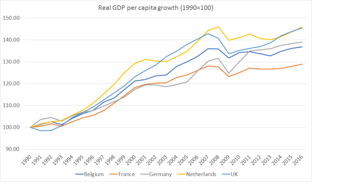
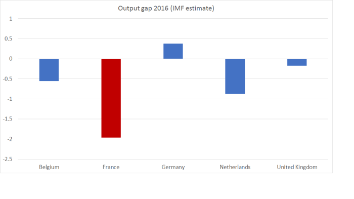
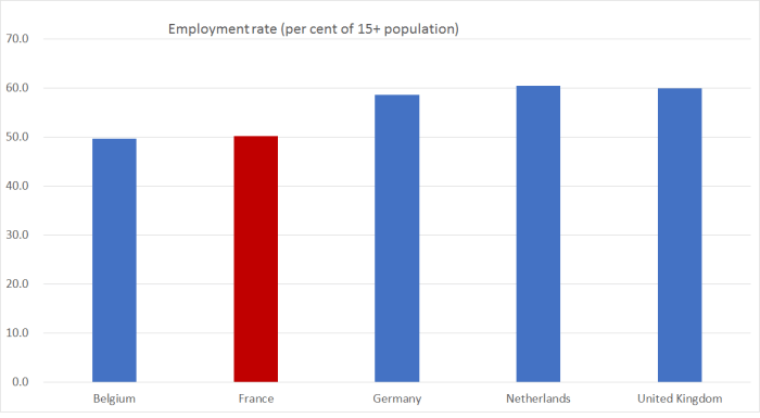
France is, again, the worst performer.

The government debt position is pretty poor too (although not that much worse than the UK’s).

govt debt fr

I’m never quite sure why people think Germany should increase government spending and increase its government debt –  especially in a country with little or no population growth.   France’s numbers –  among the very highest in any advanced country –  don’t look like something to emulate, no matter good the resulting school lunches might be.

govt spending france

Current account numbers aren’t that easy to interpret without lots of context, but even for an advanced economy with modest population growth, surpluses the size of Germany’s (or the Netherlands) look, at very least, anomalous.   There isn’t anything inherently virtuous about France’s near-balance position, but it typically wouldn’t be an indicator of serious trouble either.

CAD Fr

With a bit more demand and a stronger cyclical position – hard to engineer with such high public debt, and no national monetary policy – the current account deficit would no doubt be a bit wider.

It isn’t all a bad news story.  Here, for example, is total investment as a share of GDP.

investment fr

The investment share of GDP in France last year was higher than that of any of these countries –  far higher, for example, than in cyclically more-stretched Germany.   At least some of those big, really successful, global French companies must have been seeing some good opportunities at home.

Despite all that government spending and generous welfare provision, nothing really stands out about the French national savings rate either.

savings fr

Even within common currency areas, real exchange rates can move – at times quite considerably. We saw that a lot in the run-up to the crisis, with real exchange rate appreciations in peripheral countries (such as Ireland) relative to core euro countries. Perhaps such movements help explain, or mitigate, France’s disappointing relative performance?

These are the BIS’s broad real exchange rate measures for France and Germany.

exch rate fr

The two countries’ real exchange rates have moved all but identically ever since the creation of the euro.    It isn’t clear why there hasn’t been more movement (especially in recent years) but it isn’t hard to suspect that if the franc and mark were again different currencies, we wouldn’t have seen anything like as strong a common trend.

Over the longer-term, it is hardly as if France is some hopeless case.   If we look at meausures of labour productivity, real GDP per hour worked (in PPP terms)  in each of France, Belgium, Netherlands and Germany are among the highest anywhere, averaging something very similar to the US numbers  (the UK is quite a bit lower).   The OECD’s series for that data goes back to 1970.  Here is how France has done relative to the other three continentals.

fr real gdp phw
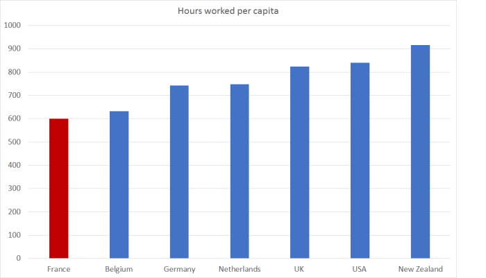
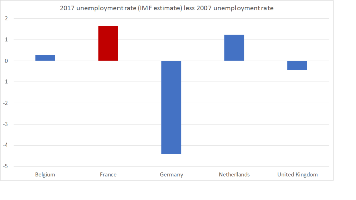
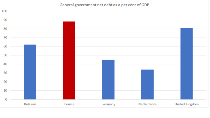
France caught up over the first few decades and has largely held its own since, at least relative to these comparators.
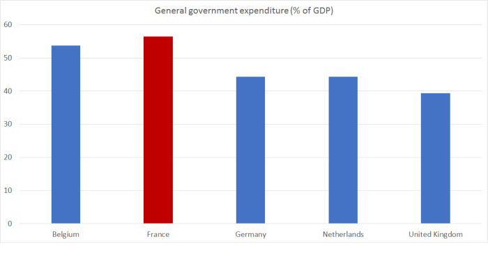
Of course, one of the striking things about France is how little labour input is used.

employment rates fr.png

Since, as we saw above, the French unemployment rate is higher than usual, the picture is slightly exaggerated at present.  but the difference between France (and Belgium) and the other three countries is stark.      (In New Zealand, by the way, the employment rate in the same quarter was 66.9 per cent, while the US is similar to Germany, Netherlands and the UK.)

The differences are just as stark, if not more so, if we look at hours worked per capita.  Here I use the Conference Board’s Total Economy database.

hours worked per capita Fr

The average French person –  man, woman, child, young middle-aged and old –  worked around 600 hours last year.  The average New Zealander worked more than 50 per cent more –  and still managed clearly the lowest real GDP per capita of any country in this chart.   So little output for so much input.

There are lots of stories about the possible connections between hours and productivity.  If, for example, you impose tough regulations and make employing labour very expensive, firms will have to adapt such that the people who are employed are highly productive (they have to earn their keep).   The less productive firms and people are simply priced out.   But higher taxes –  certainly than somewhere like New Zealand –  and provisions of retirement income policies also play a part in discouraging French working hours, and not just from the unproductive.  Plenty of very capable people have long holidays, shortish work weeks, and relatively early retirements.   As a result, French GDP per capita is lower than those of the other continentals in this sample, even though productivity per hour worked is very similar.

I don’t have strong lessons to draw from this post –  it was a discursive tour, as much out of curiosity as anything.  But I’ve long been a sceptic of the euro and –  disruptive as a break-up or withdrawal inevitably would be –  it isn’t obvious that French voters could look on the single currency as any sort of unalloyed blessing for them, and their country, especially in the years since 2007.

There are good reasons to be glad not to be in France –  Islamic terorism among them. But when one looks as these data –  not just for France but for each of the continental countries here –  from a New Zealand perspective, aware of all the regulation and high taxes etc in France, it is a reminder of how much location really does seem to matter.  I’m in the middle of reading a wonderful new book by a leading academic expert on trade, convergence etc –  which I expect I will write about here soon.  As he notes, technological innovations made extensive trade in goods possible from the 19th century, and then trade in ideas (all that ICT), but if anything face-to-face contact now seems to matter more than ever, and firms and global economic activity seems increasingly concentrated in cities and regions like those of northern Europe (or east Asia, or North America), not in the isolated peripheries.


Which countries did Essential Skills visa grantees come from in the last year?

As I’ve said, MBIE do release approvals data monthly, but it is hard to use (at least for a lay person with a spreadsheet). The temporary approvals spreadsheet is some half a million lines long.

But I decided to brave it anyway.  The spreadsheet contains approvals up to the end of March 2017.  And I was curious as to whether there was anything in the Essential Skills approvals (those for some of the more –  supposedly –  skilled roles) to back the suggestions being made by the Herald and Professor Paul Spoonley.  To minimise my effort –  and the last column of this little table took the best part of an hour –  I focused just on approvals of people from the 10 countries that were top of the list in the latest summary MBIE data (that for the year to June 2016).

There is some overlap in the last two columns.  The first two columns are June years (the basis of MBIE’s summary data) and the final column is a March year (seeing as it is still April now).

Essential skills visas granted, by country
2006/07 2015/16 12mths to Mar 17
Philippines 1695 5,408 6174
India 1943 4,812 4904
UK 4692 3,686 4086
Fiji 2145 1,973 1756
China 2749 1,823 1801
South Africa 2003 1,382 1807
Ireland 481 969 824
Brazil 1376 923 1066
South Korea 1145 828 767
United States 1493 820 837
Total all countries 31015 31766 32775

But there isn’t much sign of the patterns having changed in the most recent year.  Of the European countries, UK approvals are up a bit, but still below where they were a decade ago, and Irish approvals are down a bit, but still above where they were a decade ago.  And by a clear margin, approvals of people from the Phippines and India top the list.

Two other things caught my eye.   Total approvals haven’t changed much  –  in the last year, or in the last decade (although they did dip during the recession).  And approvals for people from China have been tailing off.  The peak year for Chinese approvals was, in fact, 2004/05.


Work visas outstanding – a simple chart

To repeat my point in my earlier post, I don’t greatly care which country our economic immigrants come from.  The skills and ideas they bring are what matter most in terms of the prospect of economic benefits to New Zealanders.  The data suggest that typical skill level is a lot lower than successive governments have suggested.

But in this chart I simply take the annual MBIE data on the country of citizenship of holders of outstanding work visas (all types of work visas, but not including students here on student visas but with work rights) and group the countries by continent.   The data are all from MBIE’s Migration Trends and Outlook tables.

share of work visas

Over those years, the number of outstanding work visas increased from  94,370 to 132,781.

The advantage of these data is that they show outstanding stocks, so remove all those who have come and then gone again.   The disadvantages are that:

  • the most recent data relate to the year ending last June.  However, as the chart suggests, the patterns don’t seem to change that much from year to year.  The chart is unlikely to be misleading about the current position,
  • the chart includes people on working holiday visas.  Ideally, we would look at them separately, but for those focused on the Asia vs other split the working holiday vias numbers are dominated by European countries (UK, Germany, France, with only South Korea and Japn in the top 10, well behind the big three)
  • the chart doesn’t include those here on student visas exercising their legal rights to work.    Those numbers will be totally dominated by people from Asian countries.

To repeat again, I’m interested in the policy settings, and the overall (including distributional) economic effects.   But it is still worth clearing away attempts to muddy the water, and the Herald’s suggestion, using inadequate PLT data, that temporary migrants on work visas are not dominated by people from Asian countries, is misleading at very best.

Questionable Herald analysis

I wasn’t going to write about immigration  today at all, but a radio station rang up last night and invited me to go on their show this morning to discuss an article in today’s Herald that runs under the headline Top source countries for migrant workers are not Asian.

Since I had to get up early anyway, and since the article gives me the chance to make two points, I thought I’d respond.

Perhaps my key point is that flawed articles like this really should reinforce the message to MBIE, that I made in a post the other day,  that while MBIE’s annual immigration approvals data are good and useful, they are only available with a long lag,  and the monthly data they provide is limited, little-known, difficult to use, and therefore largely overlooked.    If people can’t readily use that – accurate, official, adminstrative –  data they will use what they can easily get.  In this case, that is the permanent and long-term migration data derived from arrival and departure cards, and reliant on the self-reported intentions of people when they cross the border.  It is published monthly and hogs the headlines, but for actual analysis of immigration policy (which affects non-citizens) it just isn’t very good at all.

The Herald builds an article around this opening

A rise in work visas has been the driving force behind record immigration numbers but the main source countries are not from Asia.

A Herald analysis into immigration data found work visa arrivals increased from 16,787 in 2004 to 41,576 last year.

The top five source countries for work visas last year are the United Kingdom, Germany, Australia, South Africa and the United States of America.

They get those numbers not from data on the number of work visas issued, or outstanding, but on the basis of PLT arrivals data.   When people arrive at the airport they complete an arrivals card, indicate whether (at that time) they intend/expect to stay 12 months or more, and the reason for their visit.    The “reason for visit” isn’t tightly mapped to the various different visa classes, and all the non-New Zealand arrivals are grouped under four main headings (Residence, Student, Visitor or Work) and a small “Other” category.

So these data are correctly reported by the Herald, but:

  • SNZ only publish the data by previous country of residence, not country of citizenship (although they must have the latter data).   The Herald should have been a little wary when they noticed Australia high up on their list, since Australian citizens don’t need work visas to live and work here.  Published data don’t let us work out which country (citizenship) those people were actually from, but if someone worked in Australia for a couple of years and then came on to New Zealand there is no meaningful sense in which they are “Australian”.
  • The PLT data only attempt to capture the visa people held at the point they crossed the border.   Huge numbers of people change their visa while here –  more than 70 per cent of residence visas are granted to people who were already living here.  Perhaps more importantly in this context, many people who come on student visas –  probably almost all of those in the PLT (more than 12 months) category –  now have work rights while they are here.  And when they complete their qualification, many can acquire a “study to work” work visa.  So if we are trying to understand which country the migrants (temporary or permanent) who are working here come from, the PLT numbers are barely any use at all.

In fact, MBIE knows exactly who has an outstanding work visa (which doesn’t include students working while on a student visa), and which country those people are citizens of.  They now publish the data each year.  Here are the top 10 countries as at 30 June last year.

Outstanding temporary work visas by country, as at 30 June 2016
India 25,479
United Kingdom 15,040
China 12,192
Philippines 11,980
France 6,126
Germany 5,011
Fiji 4,912
United States 4,431
South Korea 3,443
Japan 3,102

The UK is still important, but it is swamped by people from India, and China and the Philippines aren’t far behind the UK.   We only have this particular data since 2009, but back then the UK was the largest source country for people with outstanding work visas.  Since then the UK numbers have only increased a little, while the Indian numbers have more than trebled.     And all that is so even though these stock numbers include the numbers here on working holiday (work) visas, where European countries (Germany, UK, and France) dominate the annual approvals numbers.

What about approvals data?  Here are the top 10 countries of people granted Essential Skills work visas in 2015/16.

Essential skills visas granted, by country, 2015/16
Philippines 5,408
India 4,812
United Kingdom 3,686
Fiji 1,973
China 1,823
South Africa 1,382
Ireland 969
Brazil 923
South Korea 828
United States 820

A decade ago, the UK was clearly the largest source country.

And here are the top 10 countries of people granted Family work visas (note, work visas –  these aren’t the residence approvals).

Family work visas granted, by country, 2015/16
India 7,720
China 4,012
Philippines 3,216
United Kingdom 2,566
Fiji 1,895
South Africa 1,407
United States 1,186
South Korea 865
Brazil 643
Sri Lanka 584

Again 10 years ago the UK was the largest single source country.

MBIE don’t provide this breakdown for those granted “study to work” visas, (even though the number of those visas granted has increased from around 6000 in 2005/06 to around 22000 last year.   And since student visa numbers are totally dominated by people from Asian countries

Student visas granted, by country, 2015/16
China 25,931
India 19,920
South Korea 4,888
Philippines 3,996
Japan 3,604
United States 2,914
Thailand 2,176
Brazil 1,961
Fiji 1,886
Germany 1,850

…we might reasonably assume that almost all of the study to work visas have gone to citizens of Asian countries.

And finally, of course, there is the residence approvals programme.     The overwhelming bulk of these approvals are granted to people already living in New Zealand, who arrived on one or other of the temporary visas programmes and eventually qualified for residence.  Here are the top 10 countries, for 2015/16 and for 2005/06 , 10 years earlier.

Residence approvals by source country
2005/06 2015/16
China 6,773 9,360
India 3,334 8,498
United Kingdom 14,674 4,934
Philippines 1,252 4,614
South Africa 4,033 2,970
Fiji 2,366 2,230
Samoa 2,188 2,156
United States 1,838 1,288
South Korea 2,260 1,125
Pakistan 140 882

Total approvals didn’t change much over that decade, but the composition (by source country) did.  One forgets I suppose, but I was a little surprised to realise that even 10 years ago the UK was still far and away the largest single source country.

Which country our temporary or permanent migrants come from isn’t a big concern of mine, and has never been a focus of my analysis of the possible connection between immigration and economic performance.  I don’t much care where migrants come from, but about what skills and talents they bring.   That said, I was interested in the new study by Harvard researchers that I linked to a few weeks ago, suggesting that if there were economic benefits from immigration (and that particular study reckoned there were) they were most evident when the migrants were from countries that are richer than the recipient country, or from countries with a degree of cultural similarity to the recipient country.   Perhaps that result won’t stand up to close scrutiny over time, but it does make quite a lot of intuitive sense.   On that residence approvals list, only the UK and the US are richer than us.

And as a final note, I repeat my plea to MBIE to markedly improve the availability of such summary data on immigration approvals (and outstanding visas).  They hold all the data, and there is no reason why these data could not be available, and easy to use, on a monthly or quarterly basis within a few days of the end of the relevant period.     Debate about immigration policy is often difficult enough, but it is made more so when the good timely data just aren’t made easily available, and people fall back on what they can find, inadequate for purpose as it often is.

Immigration thoughts over 40 years

Readers might suppose that I have always been sceptical of large scale immigration to New Zealand.  It would be more accurate to say that for most of my life I never gave it much thought.

I first remember being aware of immigration as a political issue when I was at intermediate school in Auckland in the early-mid 1970s  That was a period of very high immigration, and about the time of the big policy change initiated by the Kirk Labour government which removed from British citizens the automatic right they had previously had to settle here.  Pacific island immigration was also an issue.  But despite being a bit of a political nerd even then, my only perspective on it was that of a South Islander reluctantly resident in Auckland: I recall advocating a cap on Auckland’s population and forcing incomers to move elsewhere in the country.

There wasn’t much non-citizen immigration to New Zealand over the following 15 years, although the developing exodus of New Zealanders was an issue.   And even as policy changed in the late 80s and early 1990s, the high rate of unemployment still meant that non-citizen immigrant numbers were low.    As late as 1992 there was a net inflow of only around 13000 non-citizens.    I don’t recall immigration data ever getting much discussion around the Reserve Bank Monetary Policy Committee table, although the modellers had interesting equations to explain, in particular, the trans-Tasman flow.    I was the manager of the Bank’s forecasting team for a while, and I also don’t recall us ever paying much attention to immigration data then either (anyone else who was there can correct me if my memory is faulty).

I went overseas for a couple of years and when I came back we were in the midst of the first big inward wave of non-citizen migrants since liberalisation.     Those flows put a lot of pressure on house prices, especially in Auckland, and also on the economy’s real resources.    We were a bit slow to understand what was going on, but eventually appreciated (as our predecessors had in earlier decades) that the demand pressures from increased immigration typically exceeded the boost to supply, at least in the short-term.  Being the Reserve Bank we didn’t have much interest in (or any responsibility for) the longer-term issues, and certainly didn’t have an institutional view on whether in the longer-term large non-citizen immigration was of economic benefit to New Zealanders.

It was the 21st century before the issue came back to the fore again, with the sharp increase in non-citizen immigration numbers around 2002/03 –  some of it the increase in foreign students in response to the exchange rate.    The Bank was a bit gun-shy by this time, at having made some material monetary policy mistakes in the late 1990s, and I remember arguing (I wince at the memory) that there was a case to “look through” the net excess demand effects of increased immigration, because they were likely to be ‘one-off” in nature.  I certainly didn’t have a view, or much of an interest in, the longer-term issues.    Being a central banker, I was probably only interested in the monthly PLT numbers, and wasn’t even aware there was a residence approvals programme and a numerical target/”planning range”.

To cut the story short, I had little interest in the issues until I was involved with the 2025 Taskforce, set up to advise the government on why the large income and productivity gaps to Australia had opened up, and to recommend a policy programme that might close the gaps over the following 15 years.   I was seconded to Treasury at the time, and there was also quite a bit of interest there in why New Zealand’s interest rates were so high (relative to those abroad).   The 2025 Taskforce did not –  as readers might expect –  come out in favour of high rates of immigration.  One of the Taskforce members was the Australian economist Judith Sloan, who had lead the Australian Productivity Commission’s 2006 report on immigration.   She persuaded the Taskforce to adopt a line, consistent with that earlier report, suggesting that immigration was unlikely to offer much, if anything, in boosting medium-term GDP per capita (or productivity).

I came away from involvement with the Taskforce pretty supportive of the list of measures, and way of thinking about things, that they proposed.     But the more I reflected on the issues, the more it started to seem like a list of measures that, while useful, was unlikely to make a large enough difference to close the gap.   And as our exchange rate rebounded after the 2008/09 recession, I began to focus again on trying to understand why our real interest rates were still so high (relative to the rest of the world), noting that as a result of those high interest rates, the real exchange rate had averaged far higher than relative productivity underperformance might lead one to expect.   I was involved with a Treasury working paper published during this time arguing that the explanation for the high interest rates seemed most plausibly to lie in things affecting aggregate savings and investment preferences (demand for and supply of savings) in New Zealand.

It was only out of all that experience –  mostly down to the good fortune of the secondment to Treasury –  that my current way of thinking started to develop.  That was as recent as 2010.   I was fortunate enough that the Savings Working Group – another government appointed working group –  got interested in an early version of the ideas, and reflected some of them in their report.   And I was able to push them a little further in discussant comments, and then in a paper, in two conferences on macroeconomic and exchange rate issues sponsored by the Reserve Bank and Treasury.    But it wasn’t an issue that was of much interest, or importance, to the Reserve Bank (reasonably enough), and in fact the Bank became increasingly uneasy about my involvement in the area.  Immigration policy inevitably had political dimensions, and it wasn’t an issue the Bank was ever likely to take a preferred policy position on.

Through this period, my focus was very high-level and macroeconomic in nature.  I kept being told –  by Treasury and MBIE – that our immigration programme was one of the best in the world (and there were papers to prove it).   I didn’t have any reason to disagree (I didn’t have the detailed knowledge and my background was macroeconomics), but as I always stressed, if my argument/analysis was valid, it was so broadly speaking regardless of the quality of the individual immigrants.   Persistent excess demand pressures, in an economy with a pretty moderate savings rate, would put pressure on real interest rates and the real exchange rate and skew the economy away from business investment more generally, and that in the tradables sector more specifically.  It was simply cleaner to take as given the received notion among public sector economists that the quality of the immigration programme was pretty high.

The last couple of years, outside the public sector, have certainly been an eye-opener for me, on just how mediocre our immigration programme has actually been.  It may well be that our average non-native born worker has among the highest skills of any of those in the OECD.  It may even be that our immigration programme is better than those of most  –  in many ways it should be, as we have full effective control of our own borders.  But it simply isn’t very good.  Even on those OECD numbers, the average non-native born worker (immigrants past and present) has skill levels below those of natives (the latter being among the most skilled in the OECD).   There have been many very able migrants, but averages are averages, encompassing the excellent and the poor.  The average isn’t impressive.

We’ve seen quite a bit of that over the last few years:

  • only around 60 per cent of our residence approvals are to skilled or business migrants (and their spouses/partners/children), and all too many of those granted approvals in recent years have been in occupations that don’t strike most people as particularly highly-skilled –  not what people think of when they hear that MBIE sees our immigration programme as a “critical economic enabler”,
  • there were fairly large numbers of approvals granted to middle-aged and elderly parents and siblings of other migrants (people whose skills/qualifications would not qualify them directly), unlikely to make much contribution to New Zealand economic performance.
  • then there has been the big upsurge in student arrivals, concentrated in the lower-level private training establishments, the timing not coincidentally related to increased work rights for students in New Zealand.   Again, relative to our universities, the PTEs aren’t typically training the people most people have in mind when they think of highly-skilled foreigners.

And the disillusionment –  stripping away of the old illusions and official stories –  has continued even in the last week or two.

At a broader policy level, MBIE released data last week showing that

The Ministry undertook a random sample of more than 600 Skilled Migrant Category applications being considered as at 1 March this year. We found that 42.5 per cent of applicants earned over the New Zealand median income of $48,859 a year while 14 per cent of applicants earned over $75,000. These results have a margin of error of plus or minus 5 per cent.

57.5 per cent of those applying for residence under the Skilled Migrant category –  the most skilled bit of the residence approvals programme –  were earning less than $48859 per annum.  No doubt some of them would have been turned down, but the rejection rate of applications that get to this stage isn’t high.    On policy to date, a huge proportion of the so-called skilled migrants can’t even command that much income in the New Zealand labour market (and recall that 80 per cent of all residence approvals are granted to people already onshore, and I suspect that share is higher for the SMC category).

Perhaps I’m naively optimistic, but a week or so after these data came out, I’m still shocked at how low a skill level they reveal.   Our ministers and officials have repeatedly grossly misrepresented the programme and the number and sort of “skilled” people New Zealand is granting residence to.   If it were similar data on any other policy or economic topic, I suspect it would be front-page news in our media.

One of my readers (thanks Bob) took the huge unwieldy spreadsheet MBIE releases monthly and produced a summary of residence approvals over the 12 months to March 2017.  This table is in much the same format as MBIE uses in their annual Migration Trends and Outlook publication.

Residence Approvals: Year ended 31 March 2017
Application Substream Application Criteria Number approved
Skilled Migrant Skilled Migrant 25,357
Work to Residence Talent – Accredited Employer 1,464
Investor Category Investor 2 Category 1,404
Entrepreneur Category Entrepreneur category 740
Work to Residence Long Term Skill Shortage List Occupation 527
Investor Category Investor 1 Category 154
Partnership Deferral Skilled Skills/Business deferral 142
Work to Residence Religious Worker 122
Work to Residence Talent – Sports 27
Employee of businesses Employees of businesses 3
Business / Skilled Sub-total 29,940
Refugee 1,902
Samoa Quota 1,008
Pacific Access 607
Other Ministerial direction 295
Other Victims of Domestic Violence 28
Section 61 Section 61 133
International / Humanitarian Sub-total 3,973
Family Tier 1 & 2 Family Parent Tier 1 2,555
Parent Family parent 457
Sibling Family sibling 397
Adult Child Family child adult 47
Sibling Family sibling 2
Parent Sibling Adult Child Stream Sub-total 3,458
Partnership Partnership 9,439
Dependant Child Family child dependent 1,861
Partnership Partnership – Partner of an Expatriate 1,247
Parent Retirement Parent Retirement 37
Partnership Deferral Family Partnership deferral 23
Dependant Child Family Child dependent – Dependants of an Expatriate 11
Partnership Partnership 3
Uncapped Family Sponsored Stream Sub-total 12,621
Residence approvals Total 49,992

We now know how low the apparent level of skills has been in the skilled migrant category.  And that is the most skills-focused on any of these residence categories.  We can reasonably assume that the average skill levels across the other categories will be, perhaps materially, lower.

Of course, in some of the line items that shouldn’t be a concern.  We take refugees for humanitarian reasons, not domestic economic reasons.  But by and large our immigration programme has been sold as having an economic focus –  intended to lift productivity across the economy and benefit New Zealanders as a whole.    Standard economic theory will tell you that if the skill level of the migrants is low –  typically lower, especially at the margin, than the new native worker –  it could only benefit New Zealanders (on average) by driving down wages for relatively unskilled labour in New Zealand.    The evidence on whether it has done so is contested, but if it hasn’t, New Zealanders simply can’t have benefited.  And if we stand back and look at our productivity performance, business investment patterns, and tradables sector performance, there is no sign of such systematic benefits at all.

It looks increasingly like a costly sham.  New Zealanders have been sold the policy on one basis but –  whatever the merits of the policy they’ve been told we were running –  the actual policy looks to have been far worse than we were told.  And, I suspect, far worse than the people who first designed the more liberal immigration policy thirty years ago would have had in mind.

People will differ on how all this came to pass.  I’m not a conspiracy theorist, and suspect it mostly developed with the best of intentions all round (rather than, say, a deliberate attempt to drive up Auckland land prices and drive down lowly-skilled wages).   But good intentions don’t excuse shocking outcomes.  We simply don’t really have a skilled migration programme at all.  There are, and no doubt always will be, a few very highly-skilled people among the migrants –  and the issue here isn’t the migrants themselves (pursuing the best for themselves and their families) but the policymakers in successive governments –  but all too many have little to offer to benefit New Zealand.  For a country that hasn’t been doing that well economically for 50 years –  although there are cyclical ups and downs –  that simply isn’t an approach we can afford, if we want to offer our people some of the best material living standards in the world.  Perhaps it is partly a reluctance to accept that New Zealand just isn’t that attractive to very many of the sort of extremely able people we might genuinely benefit from.

And perhaps even more shocking than the skilled migrant applicant income data, was the news yesterday that our government is allowing someone who gained residence approval only five years ago, and has since committed several sexual offences, been in prison for them, made little apparent effort to rehabilitate, and remains (according to the experts) at high risk of reoffending, to remain in the country.  I’m not usually strongly sympathetic to “victims advocates” etc, or to those wanting to lock up even more people for longer, but I simply can’t believe that the government had let this chap stay.   Since such offenders don’t usually start offending in their 50s, you have wonder about the initial screening, but even set that to one side, how is this decision at all consistent with promoting the best interests of New Zealanders?   Individual decision it might be, but it looks too like a mentality in MBIE –  and their ministers? –  that simply doesn’t put the interests of New Zealanders first (whether in the economic aspects of the programme design and implementation, or others).      The specific decision might have been made by an official, but that person was operating only under the delegated authority of the Minister of Immigration.  The Minister now claims he’d have made a different decision, but if so perhaps he could release to us the guidelines he had laid down, that his officials were supposed to be working to when they made this egregious decision.    I’m quite sure Afghanistan would be an unpleasant place to be sent back too.    But Mr Akbari made his choices, breaking our law (and not simply traffic offences) not once but several times.  It isn’t clear why we owe him any further consideration, or why our people should be exposed to the risk of his further re-offending.   I don’t suppose Michael Woodhouse personally will be compensating future victims –  and of course with the best will in the world, he won’t be able to  put back together a life shattered by a further instance of such abuse by Mr Akbari.   Deportation then will be scant comfort to the victim.

As I like to stress, I try to be an equal opportunity sceptic.  Immigration policy has, for 30 years, been pretty much common ground between National and Labour.     The Donghua Liu case shouldn’t be quickly forgotten.

“Whichever is less”

I’ve done a few posts over the last couple of months about the lawfulness of the Minister of Finance’s decision to appoint an acting Governor of the Reserve Bank for six months after the expiry, just a couple of days after the election,  of Graeme Wheeler’s term.  As a reminder, I had several times argued that making a substantive five year appointment, to commence just after the election would be inappropriate –  indeed, as Treasury officials advised, it would also be inconsistent with the long-established conventions that govern behaviour in the period close to a general election.  As a further reminder, I have no particular concerns about Grant Spencer; if the appointment is lawful I’m sure he will mind the store capably until a permanent appointment is made by the incoming government.

This post was written on the day the acting appointment was announced, this one following responses to my OIA requests for information relevant to the appointment, and this one from last week on an appeal to the Ombudsman, on the grounds that the public interest (including because of the extent of the powers that rests with any appointee) should lead to the release of any legal advice the Minister, the Board, and officials received on the legality of the appointment.

And there I would have left it, with perhaps a repeat post the day Spencer took office.  My main concerns were about (a) the lack of transparency about an unusual appointment (even if it is lawful), and (b) about the importance of laws being followed, even if the legally questionable appointment was, on the face of it, quite a pragmatic response to the clash of dates (election, and end of Governor’s term).   But they weren’t necessarily points of general interest.

But then a reader got in touch.  The reader wasn’t sure, reading the legislation, whether or not Spencer’s appointment looked lawful, but pointed out that the Reserve Bank Act vests all the powers of the Bank in the Governor personally.  Thus, if there were doubts about the validity of the appointment of a Governor (or in this case an acting Governor), that would appear to raise doubts about the validiity, and potential enforceability, of any actions taken by the Bank during the term of the acting Governor.  That got my attention.

After all, the Governor wields a great deal of power.  He sets the OCR, he sets much of prudential regulatory policy, he authorises enforcement actions against regulated entities, and the Bank –  under his authority –  undertakes large volumes (and values) of financial transactions in domestic and international financial markets.  All delegations to staff are delegations directly from the Governor.   And those are just the routine activities of the Bank.  But a big part of why we have a Reserve Bank is about crisis management –  whether in foreign exchange markets, the economy more generally, or some or all parts of the financial system.   Many of the crisis powers rest with the Minister of Finance.   But many of the operational bits rest with the Bank, in which, as already noted, all powers are vested in the Governor.  That is what a single decisionmaker structure means.  It was a deliberate and conscious choice by Parliament.   Of course, in any particular six month period –  the term of the acting Governor – one hopes the crisis management powers aren’t needed at all.  But crises can flare up quickly, and the last thing one wants is doubts about the powers of the Bank, or the authority of those purporting to exercise such powers, in the middle of a crisis.  Let alone legal action afterwards seeking to invalidate some or all interventions by our central bank.

So I want to go slowly and carefully through the reasons why I think

a) it is not lawful for the Minister of Finance to appoint an acting Governor when the full term of a previous Governor has expired, and

b) why any defects in the appointment of a Governor/acting Governor appear to raise serious doubts about the validity and enforceability of any actions take by the Reserve Bank during the term of any acting Governor.

And I will suggest two possible practical solutions.

The Reserve Bank Act clearly allows for an acting Governor in some circumstances.

Section 47 of the Act allows for the case where the Governor is absent or incapacitated.   If the Governor is on holiday, or indeed seriously ill, the deputy chief executive can act automatically.  But if both the Governor and the deputy chief executive are absent or incapacitated, an acting Governor must be appointed by the Minister on the recommendation of the Board.    There is no limit to the term of such an appointment, although by implication –  since it is to cover an absence of an appointed Governor –  it could last no longer than the expiry of the Governor’s own term.    This section of the Act has never been used, and is not relevant to the current appointment.

Section 48 of the Act covers a vacancy in the office of Governor.    The key bits read as follows

If the office of Governor becomes vacant, the Minister shall, on the recommendation of the Board, appoint….[a person] to act as Governor for a period not exceeding 6 months or for the remainder of the Governor’s term, whichever is less.

The critical phrase here appears to be “whichever is less”.      When Don Brash resigned as Governor in April 2002, there was about sixteen months to run on his term.  The then Minister appointed Rod Carr to act as Governor.    He could be appointed for as long as six months, because there was still sixteen months to run on “the Governor’s term”.  By contrast, on 26 September this year there will be no days left on the Governor’s term.  Graeme Wheeler’s term will have expired at midnight the previous day.   So an acting Governor can only be appointed for…….. zero days, since there are no days left on “the Governor’s term”.  In other words, the Act simply does not appear to allow an acting Governor appointment along the lines of the (purported) Spencer appointment.

This is all consistent with the fact that the Act makes no provision for a Policy Targets Agreement with an acting Governor (it isn’t needed within a Governor’s term, since there is already a PTA in place), even though the PTA is central to the monetary policy parts of the Act,  and that the Act requires all new appointments of a Governor to begin with a five year term.   The Minister and the Board can’t just appoint someone for a succession of short terms –  no matter how well-intentioned the reason –  and thus compromise the effective independence of that person.

It is also, perhaps, worth noting that the previous (1964) Reserve Bank Act –  the one in place when the policy and drafting decisions on the current law were being made  –  also made no provision for the appointment of an acting Governor after the completion of a Governor’s term  (section 18 here ).  Under that legislation there could be an acting Governor only during the term of an appointed Governor (if the Governor and Deputy Governor were absent or incapacitated).  And Governors had to be appointed for five year terms.

In other words, the drafting looks conscious and deliberate.   The 1989 Act explicitly added provisions allowing for an acting Governor when the Governor resigned or died, leaving a vacancy during his term.  But the Bank’s legislation has never, in at least 50 years, allowed for an acting Governor to be appointed to commence after the end of the previous Governor’s term.  But that is what the Minister of Finance, on the recommendation of the Reserve Bank Board, purports to have done (the Minister having received no advice from the Board on the legality of such an appointment).

Does it all matter?    Sometimes laws contain provisions stating that any problems in the appointment of an officeholder, or doubts about the validity of the appointment, don’t affect the validity of enforceability of the actions/decisions taken by that person.

In fact, the Reserve Bank Act has one of those provisions.    For the Board.  Under section 54(4)

The validity of any act of the Board is not affected by—

(a) any vacancy in its membership; or
(b) any defect in the appointment of a director; or
(c) the fact that any non-executive director is disqualified from appointment under section 58.

But there is simply nothing comparable for the Governor.

Curiously, there is protection for the Deputy Chief Executive when exercising delegated authority from the Governor.   Under section 51

The fact that the Deputy Chief Executive exercises any powers or functions of the Governor shall be conclusive proof of the authority to do so, and no person shall be concerned to inquire whether the occasion for doing so has arisen or has ceased.

But there is nothing like it for the Governor, or any acting Governor.  There is simply a requirement on the Board and the Minister to make a proper appointment, and to have that person in place once the previous Governor’s term ends (and presumably an expectation that Governor appointments are sufficiently high profile, and as all powers of the Bank rest with the Governor, no questions should ever arise about the authority of the Governor him or her self to make decisions.

(Again, it is perhaps worth noting that there are also no such protections in the 1964 Act – the one in place when the 1989 Act was being drafted.  The drafters presumably made conscious choices about what to add and what not to.)

Perhaps some legal expert has an authoritative interpretation of these statutory provisions suggesting that

  • an appointment like that of Spencer is legal, and
  • even if there are any doubts, nonetheless there would be no basis to question the legality of the actions of the Bank during his term as “acting Governor”.

If so, surely they now owe it to us to release that advice, or even a summary of the argumentation that led the Minister to conclude that, under the existing statutory provisions, he could appoint Spencer as acting Governor.  Failure to do so appears to leave real doubt about the authority for any actions the Bank takes, or purports to take, during Spencer’s term.     It isn’t a remotely satisfactory situation for such a powerful agency, especially when –  since many routine decisions could simply be deferred –  a big part of the Bank’s responsibility is crisis management.  That uncertainty should unsettle financial market participants here and abroad, it should unsettle Parliament’s Finance and Expenditure Committee (charged with monitioring the Bank), it should unsettle entities regulated by the Bank, and –  given the pervasive reach of many of the Bank’s powers –  it should unsettle citizens more generally.  It simply isn’t a satisfactory situation.

But it is a relatively easily remediable one.    The first option would have been simply to have offered Graeme Wheeler a six month extension on his term.  There are no restrictions on the term of any reappointment of the Governor.  It is a common way to deal with difficulties –  whether logistic or political/constitutional –  in appointing a new chief executive.     Had this option been taken there would have been no doubts about the invalidity of any of the Bank’s actions during that term.   We don’t know whether the Board/Minister refused to countenance another six months of Wheeler, or whether Wheeler simply wanted to be out as sooon as possible.  Given the legislative restrictions, and the election-related constraints, neither would –  on the face of it – seem to have been a particular responsible, public-spirited stance.  Presumably the Wheeler extension option is no longer available, but if it is it should be revisited urgently.

The second option would be for Parliament to act.  With the agreement of the Opposition parties it would be easy and quick to pass a single substantive clause amendment allowing for the appointment of an acting Governor to cover the period 26 September 2017 to 25 March 2018 (the period envisaged for the Spencer acting appointment).   In this case, the acting appointment is a pragmatic solution, but done without legal authority.  So don’t rush to change the legislation permanently –  it looks likely to be back in the House next year whoever wins the election –  but the acting “appointment” itself could easily be validated. It might be a little embarrasing to do so, but it would be a one day wonder, and a small price to avoid any doubts about Bank actions during the acting Governor period.

Of course, the other way would be to appoint Spencer to a five year term as Governor, on the implied expectation that he would resign after six months.   But that is how we got into this situation in the first place.  The conventions around election periods strongly discourage making substantive appointments to powerful public offices, when the appointee would take up the position close to, or shortly after, a forthcoming election.

(This is one of those issues on which I would really like to be wrong.   But I’m increasingly uncomfortable that an error was made by the Minister of Finance and the Bank’s Board.)

Reducing non-citizen immigration by “tens of thousands”

Debate around New Zealand immigration policy continues to heat up.  That is what one should not only expect, but hope for, in an election year, especially in a country where non-citizen immigration is such a significant economic instrument, contributor to population growth etc, and even more so where –  despite all the talk of a skills-led immigration programme to lift overall New Zealand productivity – our productivity performance remains woeful.   And it isn’t as if the Think Big immigration experiment is a new thing, so that the gains might be just over the horizon (“the cheque is in the mail”).  Rather, the last few years have just been a somewhat intensified version of a strategy adopted for almost 30 years now.   Serious debate is long overdue.

Of course, some want to pretend that to pose any questions, raise any doubts, propose any cutbacks, about one of the most aggressive immigration programmes anywhere in the world is somehow “xenophobic”.  That’s just nonsense.  No doubt there are all sorts of reasons why some are in favour of large scale migration –  I’ve read New Zealand perspectives along those lines from libertarians and  from Marxists –  and all sorts of reasons why different people might now have some significant doubts.    Lack of any good robust evidence that New Zealanders have benefited economically from the large scale non-citizen immigration is only one of those reasons.     But when an experiment hasn’t shown clear signs of working after almost 30 years, it is almost a definition of insanity to expect different outcomes in future from keeping on doing the same thing.  And, while house prices shouldn’t be the main issue, for all the talk from the pro-immigration people that we should just “build more houses” (or free up the land) –  which I happen to agree with –  there is no sign at all of it happening to any great extent.  And it hasn’t in other places that got themselves into the mire of “town planning” and land use restrictions.

The government is keen to suggest that much of the high net migration numbers is about a return of New Zealanders from abroad.  In fact, of course, all that has happened is that the net flow of New Zealanders has slowed down (to near zero) at present.    Basically, all the 71000 or so net arrivals over the last year have been non-New Zealand citizens.   Here is the chart I’ve run many times before.

plt by citizenship apr 17

Over the last three months there has been an annualised net inflow (seasonally adjusted) of 75280 non-citizens, on a PLT basis.    (Relative to history it isn’t quite as high as it looks –  later SNZ research showed that in the 2002/03 boom there were more net permanent and long-term arrivals than the self-reported arrival/departure card estimates suggested –  but it is a large number, and large as a share of the population). That is around 35000 per annum more than were coming in, on average, in the decade prior to around 2012/13.       Almost all those non-citizens who come here require a discretionary decision by the New Zealand government (the exception being Australian citizens, for whom there is a long-term New Zealand government decision to allow free access).

Too few commentators focus on these non-citizen numbers.     Each of the main opposition parties seem to talk in terms of targeting the overall net PLT inflow.  NZ First talk in terms of, I think, 10000 to 15000, the Greens talk of 1 per cent of population, and now it appears that Andrew Little is talking of a target net inflow of around 20000 to 25000.      As I’ve noted before, and as many others have also argued, it is all but impossible, and not very sensible, to try to target the net PLT flow, and certainly not on a year to year basis.  The decisions of New Zealanders –  in turn heavily influenced by the state of the Australian labour market –  often play the largest role in fluctuations in the PLT numbers, and we don’t, can’t and shouldn’t try to control what New Zealanders do.

It is relatively straightforward, as a technical matter, to materially reduce (even by “tens of thousands”  –  Little’s language)  the net and gross inflow of non-citizens.  I outlined my own preferred approach in a post a week or two back.    Frankly, I’m a little sceptical that you could make quite that much difference if one focused narrowly on work visas, but even they offer a lot of potential.

The centrepiece of our medium-term immigration policy is the residence approvals programme.    Current policy is to offer around 45000 residence approvals each year.   Most of those approvals are offered to people who are already in New Zealand –  either on work or student visas  –  but over time it is the number of residence approvals on offer that largely determines the contribution of immigration policy to population growth (and, in the absence of good supply side policies) and to the pressure on roading infrastructure, house prices etc.    Many people only seek work or student visas to help them get points for residency.  If fewer residency places were on offer, there would be many fewer applicants for short-term positions.

The residence approvals target was reduced a little (from a range centred on 47500) last year.  But if I’ve done my calculations correctly on MBIE’s very unwieldy spreadsheet, 57623 people were approved for residence in the year to end of March 2017.     (UPDATE: I hadn’t done the calculations correctly, and the actual number seems to be 49991.  Readily accessible summary statistics – as we have in the rest of the economy –  would avoid such slips.)

Sometimes MBIE officials like to tell stories about being overwhelmed with good applicants in good times, whom it might be a shame to turn away.  But we now know, from MBIE’s own data, that that simply isn’t the situation.    Of the people applying for the most skilled stream in the residence approvals programme, more than half weren’t able to command an income as high as $49000 –  roughly what a starting primary school teacher earns – in the New Zealand labour market.    Our migrants might be more skilled than those in many other countries, but they aren’t very skilled at all, and most of them simply aren’t likely to be making a positive difference to the economic fortunes of New Zealanders (as a whole).

So let’s cut the target.  And in my view this is the nettle that the Labour Party really should grasp –  the key on which the whole programme turns.  If they want to look to their own past and their own traditions, it was one of the icons of the Labour movement, Norman Kirk who led the government that sharply cut back on non-citizen immigration, easing pressure on house prices and wider economic performance, in the mid 1970s.  Kirk did it by limiting open access for Britons.  In today’s term, the relevant metric is the residence approvals target (or “planning range”).

I’ve proposed pulling that target down to a range of 10000 to 15000 per annum.   But one doesn’t need to go that far to make a big difference.    For example, an incoming government could direct MBIE to ensure first that residence approvals for a year are capped at the upper end of the range (that would now be 47500 per annum).  Then they could, to provide a degree of certainty all round, announce that the target range would be reduced by another 20000, phased in evenly over a first electoral term, so that by the end of that term, the residence approvals target would be centred on 25000 people per annum.    That would still be getting on for twice as many approvals, per capita, as the number of green cards issued for US permanent residence.   It would be a thoroughly mainstream thing for a responsible centre-left party to do.    (As part of trying to refocus the programme on genuinely highly-skilled people I’d review and probably terminate the Pacific Access categories –  if we are serious about a skills-led economic programme we need to be hard-headed, but I don’t suppose a Labour Party with a big Pacific base could really do that.)

Of course, changing the residence approvals numbers doesn’t affect actual arrivals on day 1.  Even people approved overseas take some time to arrive, and I’m not suggesting cancelling approvals already granted.   But over time the reduced number of approvals will make a lot of difference (“tens of thousands” in fact) to the expected net inflows, even if all other visa programmes were unchanged.

But there are plenty of other changes that should be made.  We put far too much emphasis, in offering residence points, on people already having a job, or a firm job offer, in New Zealand.   Being at the ends of the earth, that isn’t always easy if you haven’t been willing to take the big risk and first relocate yourself and family to New Zealand (it isn’t exactly like moving from Brussels to Paris, or Dublin to London).  We probably do miss out on really skilled and innovative people who might otherwise come.  If we are going to give residence points for people already having a NZ job, or job offer, do it only for pretty highly paid roles –  perhaps those paying $100000 or more (you could age adjust it a bit too –  older people who are likely to be of real value as permanent residents should probably be earning rather more than that; younger people perhaps a bit less).    Again, changes like this will reduce the appeal of New Zealand work visas –  to what they should be (something where there is a specific short-term labour market need –  eg a temporary surge in demand like earthquake repairs).

What of short-term visas themselves?   A lot of government rhetoric has claimed that a huge upsurge in student numbers is a big part of the surge in net PLT immigration.    First, what we’ve seen in the last few years around students is as nothing compared to what saw 15 years ago.   Between 1997/98 and 2002/03 the number of people granted student visas increased by 70000.  Between 2012/23 and 2015/16 the increase was only 27000 (and MBIE data show that the number of valid student visas outstanding didn’t increase over the 12 months to February 2017).    As importantly, no one seriously questions that much of the increase in student visas –  mostly via lower-level PTE courses –  isn’t about the quality (or even cost) of our export education offerings, as about the residence points that such courses offer, both directly, and by providing access to a post-study “study to work” visa, which allows those completing these lower-level courses to work in any job they can find, no matter how relatively unskilled.      Severely cut back the ability of foreign students to work while doing lower-level courses, remove any residence points offered for such courses, and cut back on the “study to work” options and (the export incentives would drop away and) foreign student numbers would quite quickly fall back a long way.   One doesn’t even need to cut for every programme –  one can treat lower-level PTE courses differently to university degree courses, and even within university programmes treat post-graduate courses rather more generously.  We are happy to take –  even want –  really able people.  We shouldn’t be taking people who can’t even command $49000 per annum in the domestic labour market.

There were 25000 valid student visas outstanding earlier this year for PTE courses (and another 13000 or so for polytechs).  Halve those numbers and you make a material contribution to reducing the inflows of people (many of them working in quite lowly-skilled roles) by ”tens of thousands”.   It will be tough for those running the providers (the PTEs etc).  It was tough for many firms in the 1980s when export incentives and import protection were stripped away.  But they are changes that really need to be made.  Give some notice, sure, but many of the rule changes that facilitated the big inflows are themselves quite recent, so there shouldn’t be any sense of obligation to phase these concessions out very slowly.

I could go on, but won’t.   But as one last immigration thought for the day, I was rather puzzled by Fran O’Sullivan’s column in the Herald this morning.  Headed Forget immigration –  let’s talk wages, it was something of a mixed bag.    She seemed to recognise that immigration historically mostly raised total GDP and total population, and hadn’t been any sort of answer to New Zealand’s long-term productivity underperformance.    But her alternative was one that I suspect both pro-immigration economists like Eric Crampton, and sceptical ones like me, would both look at rather askance (to put in politely)

But if New Zealand is to evolve as a highly skilled economy it needs to set the bar higher, and pay decent wages which will also spur employers to take initiatives to drive greater movement on the productivity front.

This requires a major reset of the NZ economy – not simply using immigration to spur economic growth, then screwing the taps down when the cost of running things too hot becomes a political negative.

Where Labour is on point is with addressing the “Future of Work”.

Raising wages –  whether by government fiat (as in “pay equity” deals, or simply from employers swayed by the rhetoric) without the pre-conditions for growth in productivity is just a recipe for more unemployment (for New Zealanders), and the sort of insider/outsider bifurcated labour market that has given Spain what has long been one of the worst unemployment records anywhere.     We all want a high-wage high-productivity economy, but for everyone not just those who keep their jobs, and there is little evidence that putting the cart before the horse in the way O’Sullivan appears to suggest has ever worked on any sort of widespread basis.   The structural problems New Zealand faces aren’t mostly about bad choices by New Zealand firms (or indeed, foreign firms investing here) –  mostly they do their very best in the environment governments deliver to them –  but about that wider macro environment.

Higher real wages is a highly desirable outcome –  and on offer from policies that lead to closing the gap between New Zealand and world real interest rates (which, to be clear, has nothing to do with monetary policy) and allowing the real exchange rate to finally fall back to the sorts of levels that our dismal productivity performance suggests should have been warranted.  I hope that whatever Labour has in mind on the “future of work” it doesn’t involve leading with higher wage increases.  Rather, when they happen, consistent with low sustainable unemployment rates, it will be sign that we’ve got right much more of the rest of the policy mix.


What to make of the CPI?

The media headlines make a lot of the fact that yesterday’s CPI puts annual headline inflation above the 2 per cent target midpoint (and contractural focal point) for the first time since 2011.  The Governor has almost completed his five year term, so it is a first sight for him.

Of course, current headline inflation isn’t the focus of monetary policy.  The almost-expired Policy Targets Agreement (PTA) explicitly tells the Governor to focus on “future” inflation, and the “medium-term”.  In longstanding words:

For a variety of reasons, the actual annual rate of CPI inflation will vary around the medium-term trend of inflation, which is the focus of the policy target. Amongst these reasons, there is a range of events whose impact would normally be temporary.

There are almost always plenty of those.  There are genuine market prices that are quite volatile – oil/petrol prices and fresh fruit and vegetables are the two most obvious examples.  There are discretionary government charges –  eg ACC levies –  developments in which have very little to do with underlying pressures in the economy.  And there are straight out consumption taxes that appear directly in the CPI, but again have little or nothing to do with real resource pressures (or even rates of money and credit creation).   GST changes – we’ve had them about once a decade –  are the best example, but the repeated large increases in tobacco excises this decade are another.  Exchange rate changes can also muddy the waters.

As I noted in a post a few months ago, monetary policy works –  which shouldn’t surprise anyone, but apparently does –  and we’ve seen this as part of the explanation for an increase in inflation over the last year or so.   Some increase should be very welcome, since the various core measures had been dropping further below the target midpoint, and people appeared to becoming more used to treating as normal inflation outcomes well below 2 per cent.  Reversing the ill-judged OCR increases of 2014 seems to have dealt with that problem/risk for now –  although we (like most other advanced countries) remain quite exposed when the next recession hits.

Quite how much core inflation has really increased is a bit of an open question.   In various previous posts I’ve highlighted a selection of six possible measures.  Here they are again for the year to March 2017.

Annual inflation rate
Yr to March 2017
CPI ex petrol 1.7
Weighted median 2.2
Trimmed mean 2.2
Factor model 1.8
Sectoral factor model 1.5
CPI ex food and energy 1.6
Median 1.75

The sectoral factor model measure was the Governor’s avowed favourite measure.  A year or so ago, it was the highest of the six measures of core inflation.  Right now, it is the lowest.     Historically, it tends to be the most stable of all the measures, and although prone to revisions as new data are added, it probably does deserve more weight than the other measures.  That measure of core inflation picked up about 18 months ago, but has been steady at 1.5 per cent for the last year or so.

I am sensitive to the suggestion of cherry-picking data.  From memory, I was inclined to de-emphasise the core inflation number a year ago, so I don’t want to suggest now that it is the only variable that matters.  But in many countries, quite a bit of attention is paid to CPI ex food and energy measures as a proxy for core inflation, and the picture isn’t much different there.    It would be interesting to understand quite why the trimmed mean measure – one given quite a lot of attention in Australia – has moved around so much.  It was as low as 0.4 per cent (annual inflation) as recently as the end of 2015.

But if core inflation has picked up a bit, there is little in the data that suggests it is, or is about to, race away.    When I opened up the SNZ CPI tables, a few things caught my eye:

  • on the first page, I noticed that quarterly non-tradables inflation (and non-tradables tends to be more persistent, and hence attract more policy focus) had been 1.0 per cent.  That was exactly the same rate as in the March quarter of 2016, and a little lower than in the three previous March quarters.  (Non-tradables inflation is high in the March quarter because of the succession of tobacco tax increases.)
  • one of my favourite series is non-tradables inflation excluding central and local government charges and tobacco taxes.  March quarter inflation there was 0.6 per cent, lower than in the March 2016 quarter (and also lower than in the September and December quarters).
  • construction costs look like a potential pinch-point in the economy, and yet the seasonally adjusted data on construction cost inflation (and, in fact, property maintenance costs) both showed quarterly inflation rates for March quite a lot lower than we were seeing for much of last year.

Wage inflation measures are probably also relevant here, not so much through some sort of “cost plus” model of inflation, but because developments in the labour market will also be a good reflection of overall resource pressure (and the wage aggregates aren’t so affected by tax changes, government charges and similar one-offs –  although they will be affected, in future, by arbitrary policy interventions like “pay equity” settlements).   In some ways, wage measures might be a better (if politically infeasible) policy target for monetary policy.

Here is a chart of the Labour Cost Index (LCI) inflation, using the raw “analytical unadjusted” series.

LCI analytical

There isn’t evidence of much, if any, pick-up there, and perhaps especially not for the private sector.   The headline LCI numbers aren’t much different and the (volatile) QES data are even weaker.

We’ll get another round of labour market data in early May.  Perhaps there will be more signs of an acceleration in wage inflation, or even a material drop in the unemployment rate (suggesting that excess capacity is dissipating and, hence, future inflation risks may be rising) but for now probably the best one can say is that macro outcomes are suggesting that the OCR set at current levels might have been about right.   With the unemployment rate still above estimates of the NAIRU, and most indicators of inflation suggesting that core is probably (a) still below target, and (b) not picking up very rapidly, it certainly isn’t time for hawkish talk about near-term OCR increases.

I’ve noticed some market economists talking of altering the timing for their first expected OCR increases.  I guess it is an occupational hazard for them having to make such calls, still mostly about the far future.  But such are the uncertainties –  about the global environment, the domestic economy, the inflation process, let alone about who will be Governor (or MPC) and what the PTA will look like –  that it seems something of a fool’s errand.  It would, in many ways, be good if the next warranted OCR move were to be an increase, but such are the limitations of our knowledge that probably the best we can say at present is that the current OCR is probably the best prediction of the OCR for the next year or two, with reasonably wide confidence intervals around even that prediction.

Finally, Paul Walker at the University of Canterbury had an interesting and useful post yesterday on his blog highlighting the way that relative price changes muddy reported headline measures of “inflation”.   As he notes, and I have already noted here, getting at the “pure” inflation rate is both important but not necessarily that easy.

Walker links to an old paper by a couple of US academics highlighting the possibilities of factor analysis to distill the underlying trends, the “pure inflation”.  That is much the same approach used in the Reserve Bank’s preferred sectoral core factor model.  Here is Walker.

Using US data Reis and Watson found that

… most of the movements in conventional measures of inflation like the Consumer Price Index (CPI), its core version, or the GDP deflator are due to relative-price changes. Only around 15-20% of the movements in these measures of inflation correspond to pure inflation.

Given that they had measures of relative price changes and pure inflation Reis and Watson could look for evidence of money illusion in their data. They found that once they controlled for relative price changes, the correlation between (pure) inflation and real activity is essentially zero. So,

… when we see that high inflation typically comes with low unemployment or high output, this is indeed driven by the change in relative prices hidden within the inflation measure. When there is pure inflation, that is when all prices increase in the same proportion independently from any relative price changes, nothing happens to quantities.

Which would be fine (and it is a while since I looked at that paper), but here is a chart for New Zealand showing the Reserve Bank’s sectoral factor model measure of core inflation, and the unemployment rate.

U and P

Of course, there are other things going on in both series (including changes in inflation targets and inflation expectations).   And the sectoral core measure probably isn’t a perfect representation of core inflation.  But it is pretty clear that, in New Zealand, there is a (expected) short to medium term relationship between real activity measures (indicators of excess capacity) and developments in inflation even when many (if not all) of the “pure” relative price changes are stripped out.