After my post the other day, I pricked up my ears when I heard on the radio this morning that new data on greenhouse gas emissions had been released, and at the same time heard various industry lobby groups calling for more government support (money or regulation”) for this, that or the other mitigating measure. It is the costs of meeting the New Zealand government’s emissions reduction target that worries me.
(As it happens, I was emitting carbon at the time, driving home from the supermarket in a petrol-fuelled car. But I had already walked up the (rather steep) hill carrying several kilos of groceries home earlier in the morning.)
Today’s release consists primarily of a 542 page report from the Ministry for the Environment (MfE). But they also had a convenient eight page summary document.
In my post the other day, I included this chart of GDP per capita for OECD countries, in the most recent year for which there is data, 2014.
New Zealand was second only to Estonia in the level of emissions per unit of GDP.
I was interested to see that MfE made reference to this measure in their snapshot report. Under the heading “New Zealand’s economy is growing faster than our emissions”, they included this chart.

That looks quite good on first glance.
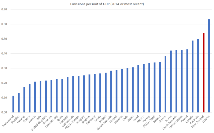
But how, I wondered, did New Zealand compare to other OECD countries? You’ll notice that on that chart emissions per unit of GDP fell in 2015. Since the OECD databases aren’t yet updated for 2015, and we don’t know what happened to other countries in 2015, the following charts use the data only for 1990 to 2014. (MfE also report a rebasing of the entire series, slightly lowering New Zealand’s estimated emissions over the whole 25 year period. But relative to the charts below this rebasing would worsen New Zealand’s relative performance, since the revision downwards for 1990 was a little greater than the revision downwards for the more recent years.)
Here is emissions per unit of GDP for those OECD countries (all but one) for which there is 1990 data.

In 1990 we were only sixth highest in the OECD. And by 2014 we were second highest. I guess the Ministry for the Environment (and their Minister) weren’t too keen on highlighting that point.
Here is the percentage changes in emissions per unit of GDP to 2014 (for a small number of countries only 2013 data is available). MfE highlighted that New Zealand’s emissions fell by 35.9 per cent from 1990 to 2015.

Only 10 OECD countries had smaller reductions in emissions per unit of GDP than New Zealand over this period. Of them, one might reasonably think that severe economic stresses (falls in GDP) in recent years might help explain Italy, Spain, Greece and Portugal. And as Japan’s emissions rose a lot in 2011, the year of the earthquake/tsunami, the enforced shift away from nuclear power at the time probably explains what is going on there.
Of the five countries that were to the right of New Zealand in 1990, four had among the largest percentage reductions among OECD countries. Even Australia’s reduction was around the median. It does leave New Zealand rather standing out.
(Perhaps some of this is covered in more depth the 542 page report. I went through the Executive Summary and the table of contents and couldn’t see any likely references, but I may have missed them.)
In the snapshot document, straight after the emissions per unit of GDP chart, MfE does have a brief section on
Some of the challenges New Zealand faces when reducing emissions include:
- a growing population
- almost half our emissions are from agriculture where there are fewer economically viable options currently available to reduce emissions
- an electricity sector that is already 80.8 per cent renewable (meaning that we have fewer ‘easy wins’ available to us compared to other countries who can more easily make significant emissions reductions by switching to renewable sources of electricity).
I was very pleasantly surprised to find the “growing population” as the first item on the list (it isn’t particularly relevant to emissions per unit of GDP, but is very relevant to total emissions – the variable in terms of which our government’s target is expressed).
It is hard to disagree with them But it does leave one wondering what advice or research/analysis they have done, and provided to Ministers – including when the target was being adopted – about the implications of New Zealand’s immigration policy. Our non-citizen immigration policy pushes up the population by almost 1 per cent per annum (against an, admittedly unrealistic, benchmark of zero inward migration of non-citizens). Have they analysed the potential costs and benefits from lowering the non-citizen immigration target relative to other possible abatement (or compensation) mechanisms? Perhaps there is credible modelling that suggests the overall abatement costs to New Zealanders would be lower through other plausible mechanisms. But given that population increases appear first, and without further commentary, on their lists of “challenges” it would be good to know if they have done the work.
On reflection, I think I will lodge an Official Information Act request to find out.
(And it still leave me mystified why, when even the government’s own Ministry for the Environment is citing continuing population increases as a constraint on meeting the emissions reduction target, the Green Party continues to support large non-citizen migration inflows. Migration might only transfer people from one country to another but given (a) the issues around agriculture, and (b) the reasonable notion that New Zealand members of Parliament should be looking out first for the interests of New Zealanders, it shouldn’t be a consideration they can simply ignore in thinking about New Zealand’s ability (and at what cost) to meet the emissions reduction target.)