Parker, taxation, and that IRD report

It must be relatively unusual for a political party in office to change tax law, and provide extra budget funding, to enable research to be done towards that party’s next campaign manifesto. But such it appears to be with the High-wealth Individuals research project, the report on which was released yesterday, loudly championed by the Minister of Revenue, David Parker. Not many government department research papers – and that, we are told, is all it is – get a Foreword from a senior Cabinet minister.

Whether or not there was a strong case for doing the research in the first place using the coercive powers of the state, and whether there is – in the broad – anything very surprising in the report (I don’t think I’ve yet seen/heard anything), no doubt there will interesting tables and charts that flesh out our understanding of the selected facts at least a little.

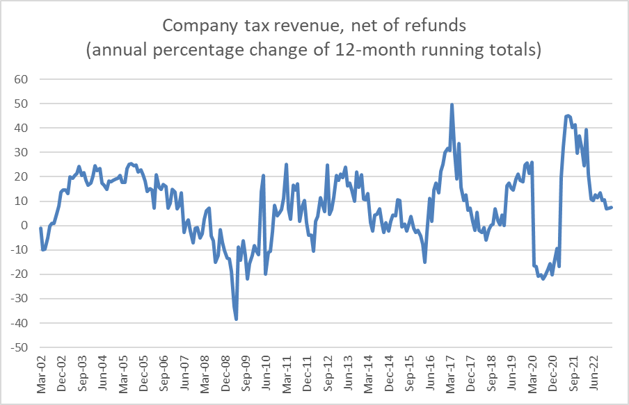
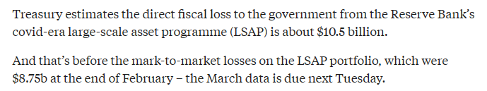
Perhaps the first snippet worth paying attention to is this

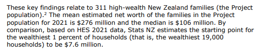
That is quite a lot of money in total – measured, by chance, at the very peak of a huge asset price boom – but what struck me was that only 155 families had estimated net worth in excess of $106 million. Quite possibly no readers of this blog fit that category, but in the grand scheme of global wealth NZ$106 million (measured at the peak of an asset boom) was if anything less than I might have expected.(By contrast, at his talk yesterday Parker told us he’d asked some of his rich mates to guess what the average number would be and none had gone for a high enough number).

Perhaps not unrelatedly, it is worth remembering that we don’t tax families, we tax individuals, and most of the families studied in this report included two spouses/partners. The median individual wealth is going to have been quite a bit lower than $106 million.

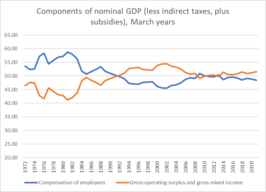
All of which seems consistent with the fact that the New Zealand economy has not exactly been a staggering success in recent decades. Setting the tax debate to one side for the moment, in a successful economy one might have hoped that there would be many more really wealthy families, at least if that wealth had arisen from the creation and development of new businesses/products. Few begrudge Bill Gates the wealth created via Microsoft.

But there is some important stuff that wasn’t in the report, or in the political framing of it. Thus, David Parker made much of the poor put-upon wage and salary earner who pays tax on every dollar of earnings, in contrast to the 300 rich families. It was all such an evidently unfair system we were told.

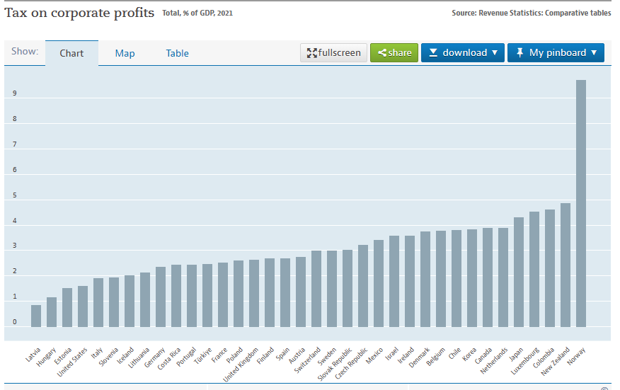
There were some comparative OECD charts in the minister’s presentation. These two weren’t among them

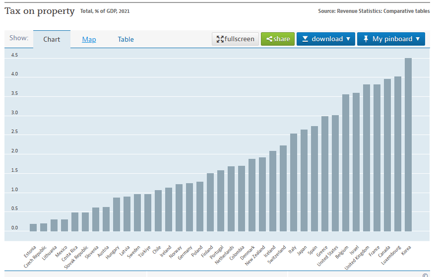
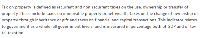
Tax on property – as a share of GDP a bit above the OECD median – is defined here as

This chart was also missing (NZ second from the right). It includes any tax levied on business capital gains.

And, of course, in the minister’s framing there was no mention of the fact that New Zealand over the decades has had relatively low rates of investment (relative to OECD averages for countries with our sort of population growth) in land development, in building new houses, and in business investment more generally. What one aspires to have more of one generally should not seek to tax more heavily. And IRD even seems to recognise in the report that what one taxes more heavily one will get less of, noting in the Summary

For the Project population, much of their income is derived from business entities that they control. Failing to tax forms of income that are earned predominantly by those who are better off …… is also likely to impose other economic costs through influencing the pattern of investment in the economy.

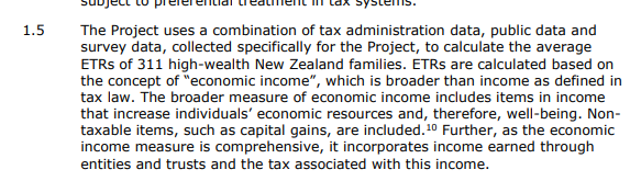
The IRD is keen to assert that what they are doing in this study is measuring “economic income”, in their own words “items…that increase individuals’ economic resources and, therefore, well-being”

In principle that is fine. I have no problem with the notion that unrealised real capital gains add to the economic resources and future purchasing power of the owner (whether or not those gains should be taxed is quite another question). But increases in asset values that simply keep pace with general inflation do not add to future real purchasing power and are in no meaningful economic sense (including the Haig-Simons approach IRD is fond of) economic income. We don’t have an inflation-indexed tax system at present, but the point of this study was not to describe the current system, but to use analytical tools to get a sense of real gains to purchasing power.

Now, most capital gains in the period under study were well in excess of the general CPI inflation rate, and inflation itself was relatively modest (but inflation cumulates, and even 2 per cent per annum inflation is about 22 per cent in total over a decade), so adjusting for inflation – which could relatively easily have been done – might not have changed many of the headline-grabbing numbers very much. But it was just knowingly dishonest of IRD not to have made the adjustment and to have presented as real income what no economist will regard as real income. But it will have suited their political masters (and perhaps reflected their longstanding institutional unease with an indexed tax system). And, as readers will be well aware, inflation will have made a great deal bigger difference to the numbers for 2022 and 2023.

David Parker’s approach to tax is – perhaps in line with prevailing New Zealand orthodoxy in recent decades – that all forms of real economic income should be taxed alike (at his talk yesterday he even seemed attracted to a capital gains tax on unrealised gains, something I’m not aware that any country does on any sort of comprehensive basis). If you believe in that approach, I guess yesterday’s research results will be troubling (or grist to your political mill).

I don’t, and to the extent it matters (if one cares about productivity and wider economic performance over time) generally economic theory tends not to back such an approach either. Not only do I think there is a good case for taxing returns to labour much more heavily than returns on capital (one example of my advocacy is here) but there is also a good case for a consumption-focused approach to tax (tax people on what they spend not on what they produce/earn, ideally through a progressive system). Frame your research in terms of tax as a percentage of “economic income” and you will get one set of answers, but frame it as a percentage of consumption and you will get quite another. If I was looking for a “tax switch” in New Zealand – David Parker implied that he was, rather than looking to increase total revenue – I’d be looking to substantially reduce New Zealand’s ranking on that taxation on corporate income chart above (and yes, I do know about dividend imputation, so this isn’t a statement of detail but of direction – but more foreign investment, and foreign investors are most affected by NZ company tax rates, would generally be a good thing).

For all that, I am not one of those who is adamantly opposed to a capital gains tax in principle. It wouldn’t affect me personally, I don’t mix in the circles of the 300, and I fully accept that there are elements of a “fairness” argument to be had. I’m certainly not someone who would change my vote on the matter. In general, I summarise my CGT position as one of profound ambivalence. One could be put in place, but a well-designed and politically realistic one would not raise much revenue over time, all while adding to the structural procyclicality risks around fiscal policy (sucking in most revenue when revenue is abundant and drying up almost completely when times are tough and other revenue is depleted). And since most of the political angst around capital gains in New Zealand is not about the likes of Bill Gates (or Rod Drury) but about escalating land values, those issues could – and should – be dealt with directly by systematically freeing up land usage and collapsing the artificial scarcity central and local government restrictions have created. As it happens, in this government the minister of land use rules in also the Minister of Revenue, but does one hear David Parker advocating policies that would collapse peripheral urban land prices to the best alternative agricultural use price? No, he (and opposition parties) will run a mile for the very idea) and experts tell us that the legislation he is now piloting through the House may actually worsen the situation. The rigged land market is scandalous, a true moral evil. But governments refuse to fix that.

And then there is the political conundrum. Most real-world CGTs emphasise realised gains, but if you do that then the people you hit are the asset holders most likely to be forced to sell at some point. As Parker himself recognised, the richer you are – and the bigger vehicles you hold your wealth in – the more likely you are to be able to defer a CGT almost indefinitely. In his younger days, Adrian Orr used to regale us with tales of mates of his who were firemen (or the like) with a couple of investment properties. A realisations-based CGT – actually like the extended brightline test – will catch them, but it will bear much less heavily on Parker’s 300 families.

Perhaps that means Parker will be trying to get his Labour colleagues to run with a wealth tax or death or inheritance taxes. They don’t have the particular problems that go with a CGT, but they have others (personally, I have no real problem with a moderate inheritance tax with fairly high thresholds, but I’d be really surprised if such a tax were to raise much money – although perhaps for advocates the revenue would not be the point).

Rather than run through afresh all the issues around good CGTs – loss-offsetting, double-taxation, efficient markets approaches to asset pricing etc – I’m going to end by cutting and pasting from a 2017 post, which I also used when the TWG reported in 2019.

Rather the block quote it, all that follows to the end of this post is direct from that 2017 post:

Going through some old papers to refresh my memory on capital gains tax (CGT) debates, I found reference to a note I’d written back in 2011 headed “A Capital Gains Tax for New Zealand: Ten reasons to be sceptical”.  Unfortunately, I couldn’t find the note itself, so you won’t get all 10 reasons today.    But here are some of the reasons why I’m sceptical of the sort of real world CGTs that could follow from this year’s election.  Mostly, repeated calls for CGTs – whether from political parties, or from bodies like the IMF and OECD –  seem to be about some misplaced rhetorical sense of “fairness” or are cover for a failure to confront and deal directly with the real problems in the regulation of the housing and urban land markets.

Anyway, here are some of the points I make:

  • in a well-functioning efficient market, there are typically no real (ie inflation adjusted) expected capital gains.    An individual participant might expect an asset price to rise for some reason, but that participant will be balanced by others expecting it to fall.  If it were not so then, typically, the price would already have adjusted.  In well-functioning markets, there aren’t free lunches.    It also means that, on average, capital losses will be pretty common too, and thus a tax system that treated capital gains and losses symmetrically wouldn’t raise much money on average over time.   A CGT is no magic money tree.   And there is no strong efficiency argument for taxing windfalls.
  • if you thought, for some reason, that people were inefficiently reluctant to take risk, there might be some argument for a properly symmetrical CGT.  In such a system, the government would take, say, a third of your gains, but would also remit a third of your losses (the overall risks being pooled by the state).    The variance of an individual’s private after-tax returns would be reduced, and they might be more willing to take risk.   But, in fact, no CGT system I’m aware of is properly symmetrical –  there are typically tough restrictions on claiming refunds in respect of capital losses (one might only be able to do so by offsetting them against future gains).  There are some reasonable base-protection arguments for these restrictions, but they undermine the case for a CGT itself.
  • All real world CGTs are based on realised gains (and losses to an extent).   That makes it not a pure CGT, but in significant part a turnover tax –  if you never trade, you never pay (“never” isn’t literal, but tax deferred for decades discounts to a very small present value).    And that creates lock-in problems, where people are very reluctant to sell, even if their circumstances change or if a new potential owner could make much more of the asset, for fear of crystallising a CGT liability.  In other words, introducing a CGT introduces a new inefficiency to asset markets, making it less likely that over time assets will be owned by the parties best able to utilise them.
  • Basing a CGT on realised gains will also, over time, bias the ownership of assets subject to CGT to those most able to avoid realising the gains.  A long-lived pension fund, or even a very wealthy family, will typically be better able to  count on not having to sell than, say, an individual starting out with one or two rental properties, or some other small business, where changed circumstances (eg a recesssion or a divorce) might compel early liquidation.  Large funds are also typically better able to take advantage of loss-offsetting provisions.  The democratisation of finance and asset holding it certainly isn’t.
  • CGTs in many countries exclude “the family home” altogether.  In other countries, they provide “rollover relief”, enabling any tax liability to be deferred.  Most advocates of a CGT here seem to favour the exclusion of the family home, even though unleveraged owners of family homes already have the most favourable tax treatment in our system.  Again, a CGT applied to investment properties but not owner-occupied ones would simply trade one (possible) distortion for another.
  • In practice, most of the arguments made for a CGT in New Zealand have to do with the housing market.   But, on the one hand, all major (and minor?) parties claim that they have the fix for the housing market (various combinations of RMA reform, infrastructure reforms, changes to immigration, restrictions on foreign ownership, state building programmes or whatever).  If they are right, there is no reason to expect significant systematic real capital gains in houses.  If anything, real house prices should be falling –  a long way, for a long time.    Of course, prices in some localities might still rise at some point, if unexpected new opportunities appear.  But “unexpected” is the operative word.   Enthusiasm for a CGT, at least at a political level, seems to involve a concession that the parties don’t believe, or aren’t really serious about their housing reform policies.
  • Oh, and no one I’m aware of anywhere argues that a realisation-based CGT applied to (a minority of) housing has made any very material difference to the level of house prices, or indeed to cycles in house prices.
  • In general, capital gains taxes amount to double-taxation.    Think of a business or a farm.  If the owner makes a success of the business, or product selling prices improve, expected profits will increase.  If and when those profits are achieved, they would, in the normal course of affairs, be subject to income tax.  The value of the business is the discounted value of the expected future profits.  It will rise when the expected profits rise.  Tax that gain and you will be taxing twice the same increase in profits –  only with a CGT you tax it before it has even happened.   Of course, at least in principle, there is a double deduction for losses, but as noted above utilising losses (whether of income, or capital) is a lot more difficult.    If you think that New Zealand has had less business investment than might, in some sense, have been desirable,  you might want to be cautious about applauding a new tax that would fall heavily on those who took business risks and succeeded.
  • Perhaps double taxation of expected business profits doesn’t bother you.  But trying reasoning by analogy with wages.   If the market value of your particular skills has gone up, your wages would be expected to rise.  When they do you will pay taxes on those higher wages.  But by the logic of a CGT, we should capitalise the value of your expected future labour income and tax your on both that “capital gain” and on the later actual earnings.  Fortunately, we abolished slavery long ago, but in principle the two cases aren’t much different: if there is a case for a CGT on the value of a business, it isn’t obvious why one shouldn’t have one on the value of a person’s human capital.
  • (I should note here, for the purists, that there are other concepts of double-taxation often referred to in tax literature, none of which invalidate the point I’m making here.)
  • Real world CGTs also tend to complicate fiscal management?  Why?   Because CGT revenue tends to peak when asset markets and the economy are doing well, and when other government revenue sources are performing well.  CGT revenue doesn’t increase a little as the economy improves and asset markets increase, it increases multiplicatively.  And then dries up almost completely.  Think of a simple example in which real asset prices had been increasing at 1 per cent per annum, and then some shock boost asset prices by 10 per cent.  CGT revenue might easily rise by 100 per cent in that year (setting aside issues around the timing of realisations).  And then in a period of falling asset prices there will be almost no CGT revenue at all.   Strongly pro-cyclical revenue sources create serious fiscal management problems, because in the good times they create a pot of money that invites politicians to (compete to) spend it.  If asset booms run for several years, politicians start to treat the revenue gains as permanent, and increase spending accordingly. And if/when asset markets correct –  often associated with recession and downturns in other revenue sources-  the drying up of CGT revenue increases the pressure on the budget in already tough times.     It is easy to talk about ringfencing such revenue (mentally, if not legally) but such devices rarely seem to work.

None of this means that I think there is no case for changes in elements of our tax system as they affect housing.  The ability for business borrowers to deduct the full amount of nominal interest, even though a significant portion of that interest is simply compensation for inflation (rather than a real cost), is a systematic bias.  It doesn’t really benefit new buyers of investment properties (the benefit is, in principle, already priced into the market) but it is a systematic distortion for which there is no good economic justification   Inflation-indexing key elements of our tax system is highly desirable –  at least if we can’t prudently lower the medium-term inflation target –  and might be a good topic for a tax working group.  In the process, it would also ease the tax burden on people reliant on fixed interest earnings (much of which is also just inflation compensation, not a real income).

Of course, at the same time it would be desirable to look again at a couple of systematic distortions that work against owners of investment properties.  Houses are normal goods and (physically) depreciate.  And yet depreciation is no longer deductible.  Perhaps there was a half-defensible case for that when prices were rising seemingly inexorably –  but even then most of the increase was in land value, not in value of the structures on the land –  but there is no justification if land reform and (eg) new state building is going to fix the housing market.    Similarly, when the PIE system was introduced a decade or so ago, it gave systematic tax advantages to entities with 20 or more unrelated investors.  Most New Zealand rental properties historically haven’t been held in such entities.  There is no good economic justification for this distinction, which in practice both puts residential investment at a relative tax disadvantage as a saving option, and creates a bias towards institutional vehicles for holding such assets.  Institutional vehicles have their own fundamental advantages –  greater opportunities for diversification and liquidity –  but it isn’t obvious why the tax system should be skewing people towards such vehicles rather than self–managed options.  As noted above, any CGT will only reinforce that bias.  Funds managers, and associated lawyers and accountants, would welcome that. It isn’t obvious why New Zealand savers should do so.

I see that there are more than 10 bullet points in the list above.  I’m not sure it covers all the issues I raised in my paper a few years ago, but it is enough to be going on with.

And in all this in a country where we systematically over-tax capital income already.  I commend to readers a comment on yesterday’s tax post by Andrew Coleman, of Otago University (and formerly Treasury).  As Andrew noted:

“Somehow, New Zealand’s policy advising community decided it would restrict most of its attention to the ways income tax could be perfected rather than question whether income taxes (which are particularly distortionary when applied to capital incomes) should be replaced by other taxes. It is almost as if we have the Stockholm Tax Syndrome – fallen in love with a system that abuses us.”

A broad-based capital gains tax would just reinforce that problem.

Profits and inflation

There is an op-ed on the Herald website this morning on “The role of corporate profits in inflation”. It is written by Max Harris, a lawyer and political activist. He was campaign manager for Efeso Collins in the Auckland mayoral race last year, which should give you a sense of how far to the left he sits on the political spectrum.

Harris is a smart guy, and it is evident from the article and his tweets that he has read a number of papers that have emerged recently from overseas academics and some central bankers suggesting that corporate profits might have some distinctive role in explaining the recent surge in inflation. I say “distinctive” because in the same way that nominal GDP can be decomposed into price and volumes, it can also be decomposed into returns to labour and returns to capital. In a demand-driven surge in inflation it would entirely normal to see all four of those items growing at above-average rates. And since both wage rates and employment tend to be stickier (slower to adjust) than profits – which are the residual, what is left over after other business expenses have been met – it shouldn’t be unexpected to see profits rising and falling earlier and more markedly than, say, wages. That wouldn’t tell you that profits were “to blame” for the inflation in any meaningful sense.

I’m not going to devote this post to unpicking the entire literature on profits and this cycle. Instead, I just wanted to present a few New Zealand charts.

One of the few things I agree with Harris (in this article) on is that New Zealand economic data is not really fit for purpose. There are significant gaps, in coverage, frequency, and timeliness, which really should be remedied. There aren’t (m)any votes in good economic data but it is the sort of thing good governments should be spending on nonetheless.

All that granted, it was striking that there was only one New Zealand specific number in Harris’s article

Now, to be fair, op-eds don’t provide for a limitless word count. But it isn’t hard to do much better than that one number.

I found a description here as to what Ed Miller had done (note that his calculation was done nine months ago) and replicated his number. Using the Treasury monthly tax database, sure enough you find that company tax revenue (whether including or excluding refunds) for the year to March 2022 was 39 per cent higher than it had been in the year to March 2021.

But here is some context

For the 12 months to February 2023 net company tax revenue was up 7.5 per cent on the 12 months to February 2022. The most recent nominal GDP data is only up to December 2022, but nominal GDP in the 12 months to December 2022 was 8.5 per cent higher than in the 12 months to December 2021.

But perhaps the key point is that company tax revenue is very volatile (in the 12 months to April 2017 the annual growth had briefly reached 50 per cent), with deep troughs and high peaks. That isn’t just because profits can be volatile, but also because of loss carry-forward provisions (when your firm makes a loss one year IRD won’t send you a cheque, but you can credit those losses against future profits (if/when your firm returns to profit). When those losses are exhausted, revenues can jump up very quickly even if profits themselves are less variable.

In this specific case, of course, the year to March 2022 (which Harris cites) followed the year to March 2021, a year in which net company tax receipts had been down 17 per cent.

We could dig a little deeper on the same Treasury spreadsheet. Treasury breaks out income receipts from NZSF and GSF, which are really just branches of the central government itself.

NZSF (the big dollars here) was only set up 20 years ago, so the initial figures were mostly small. These days it is large and has quite volatile returns (and, it appears, tax liabilities). Here is what the corporate tax line looks like with NZSF and GSF income tax removed (which is one of the adjustments Treasury does to get to core Crown measures of tax)

The recent peaks and troughs are even larger. (Note that when, as they did in the 12 months to March 2021, tax revenue from this source falls 30 per cent it then needs to rise by about 42 per cent just to get back to the starting level ($m).

Strangely, we rarely hear much from people like the Green Party when company tax revenue is falling sharply.

One of the gaps in New Zealand’s macroeconomic data is a full quarterly income measure of GDP. However, SNZ has made steps in that direction in recent years, and we now have a quarterly nominal income measure of GDP and a compensation of employees component of quarterly nominal GDP.

As context, here is the annual data showing both compensation of employees and operating surplus/mixed income up to the year to March 2021

The labour share of GDP (at least the bit going to employees) has fallen a bit in the last decade, but then it has risen a bit more in the previous decade (profits and mixed income share vice versa).

The quarterly data only start in 2016 but are right up to date (December 2022 quarter)

The Covid wage subsidies muddy the picture (sharp shortlived dips in both 2020 and 2021) but over 2022 as a whole the compensation of employees share of (adjusted) nominal GDP was higher than it had been pre-Covid. The picture may be clearer simply as a share of nominal GDP

That isn’t particularly surprising. It isn’t that wage rate growth has run ahead of general inflation or nominal GDP growth, but that the number of people employed, the number of jobs, has increased very rapidly, and the labour market has been running very tight (really on whatever measure you choose to look at). As a reminder if the wage share of nominal GDP has risen a bit amid the inflation surge, that means the other components of GDP (profits and mixed income) have…..shrunk a bit as a share of nominal GDP.

None of this to suggest that pro-competition reforms would not be welcome in New Zealand. They would (although in many cases we could expect the Green Party to oppose them), but the presence or absence of such restrictions is unlikely to materially explain developments in inflation of the scale we – and many other countries, many with more liberal competitive markets – have experienced in the last couple of years. Prima facie, responsibility still looks to rest – as it usually does when such things happen – with monetary policy, either having actively poured fuel on the fire, or (more usually) not having recognised and responded to emerging demand-led inflation anywhere early or aggressively enough.

Readers might also find useful a new column on The Conversation by a professor of economics at Waikato. He puts more weight on that brief Treasury analysis than I did (see previous post), but ends up in a very similar place.

Occam’s razor isn’t always the most useful approach, but when one has had highly expansionary monetary and fiscal policy and have had unprecedentedly low unemployment rates (and general difficulties finding staff), the onus would appear to be on those who want to explain anything very much of New Zealand’s core inflation (in particular) by factors other than the conventional macroeconomic ones. Harris’s column doesn’t credibly make such a case, or point to other New Zealand specific work that does. But, yes, in demand-led booms (especially the early stages) profits will tend to be strong. That doesn’t shift the responsibility off central banks, any more than would be the case when there is a surge of wage inflation, again reflecting unsustainable excess demand for labour.

UPDATE:

To be clear, I am not (repeat, not) suggesting that all of the rise in company tax revenues in the year to March 2022, as cited by Miller, was simply a reversal of the fall in the previous year. About half of it was (company tax revenue was down 17% in the previous 12 month period). My wider point that is an unexpected surge in demand – and it was totally unexpected by macro forecasters – will show up first in profit growth.

As a grossly oversimplified illustration: the local fish and chip shop might have half a dozen staff rostered on on a Friday night. If a lot more people turn up than usual for a Friday night, (not only will wait times be longer but) profits for the day will rise a lot. Wage costs won’t have changed – rosters and wage rates were set in advance – rent won’t change, lighting costs won’t change, but there will be an increase in the cost of goods sold (materials – fish, chips, perhaps oil). If demand remains stronger for longer, you might expect more people to be rostered on, perhaps their wage rates to rise, and so on. Revealed preference suggests workers generally prefer to shift short-term risks – upside and downside – onto firms, and profits will fluctuate accordingly.

The OIA, the RB, and the MPC

One comes to take for granted the gross inadequacies of the Official Information Act, including the systematic under-resourcing of the Ombudsman’s office, which just reinforces the incentives on officials to play fast and loose with the spirit of the law, banking on the fact that if their agency ever loses at the Ombudsman it will be so far down the track that most people – possibly including the requester- will have lost interest in whatever it was the agency didn’t want to release.

But just occasionally it still gets to one. No doubt many requesters have this sort of experience.

I had an email this afternoon from the Ombudsman’s office

It didn’t sound like much of an update – “we are writing to tell you that we have still done nothing about your complaint and have no idea when we will”. I couldn’t even remember what I’d made a complaint about or when. On checking, I found that my complaint was lodged on 3 February. This was the complaint

The original request had been lodged with the Reserve Bank on 10 November 2022

10 November was the day the Reserve Bank released its first five-yearly review of the conduct of monetary policy. They took the best part of three months themselves to withhold almost everything deemed relevant. They did release three documents, which contained almost nothing of substance (that being the point), including this one

which doesn’t really appear to be in scope at all.

As a reminder of the context, this five-yearly report came out amidst inflation having burst well beyond the target range, the MPC having lost taxpayers the best part of $10 billion on the LSAP, and as the MPC was racing to raise the OCR to get inflation back in check.

As I noted in my complaint, one of the oddities of the five-yearly review provision in the Act is that the Bank (management, and I suppose the Board) get to do the review, and yet the MPC is the entity that sets monetary policy, and the MPC includes the three external members who don’t formally answer to the Governor. We know from the finished report what the Governor thinks of the MPC’s stewardship – and as a reminder management has the majority of the votes – but we know almost nothing at all about what the external MPC members thought. Did they reflect differently on the Covid period than management did? Or did they perhaps not reflect very seriously at all? Did their views or input (if any) have any impact on the substance of management’s report?

You might have thought that disclosing MPC members’ views, or input to the report, might be the very least sort of effective public accountability for the considerable power they helped wield, the considerable and hugely costly the mistakes they helped make.

Perhaps one day we will get an answer. But the Reserve Bank – like so many government agencies around town – knows that it only needs to say no, and if the requester can even be bothered complaining that it could be 12-18 months or more before there is any hope of the Ombudsman getting round to addressing the complaint. Meanwhile, the external MPC members (and management) go on wielding their power and collecting their salaries.

But it does remind me that I had overlooked lodging a complaint with the Ombudsman about the Bank’s bare-faced obstructionism in the matter of the appointment of the chair of the majority owner of a large bank being appointed to the board of the Reserve Bank, an appointment almost certainly done with the acquiescence (or worse) of the Governor.

Keeping track of the LSAP losses

This is mostly a follow-up to my post last Saturday on the LSAP losses.

In that post I noted that while the LSAP was still running, the monthly line item on the Reserve Bank balance sheet recording the Bank’s mark-to-market claim on The Treasury under the indemnity was a reasonable proxy, on prevailing market prices, of the direct fiscal losses the LSAP programme would result in. And it was an official number.

The Reserve Bank published its monthly balance sheet for the end of March. The Bank’s claim under the indemnity as at 31 March stood at $7821 million.

However, as I also noted in Saturday’s post, this number is no longer even an approximate estimate of the direct fiscal losses from the LSAP programme. It is still a best guess, on market prices, of the unrealised losses on the bonds the Bank is still holding.

But the Bank’s holding of bonds are now much lower than they were at peak. In the programme as a whole, the Bank purchased government bonds with a face value of $53480 million and LGFA bonds with a face value of $1735 million. All of those purchases were covered by the indemnity.

However, since July last year the Bank has been selling back to The Treasury each month government bonds with a face value of $415 million. Total sales to date – most recently a parcel on Monday – total $4150 million. The resales programme is starting with the longest-dated (most risky) bonds, on which the largest percentage losses will typically have been made. As those bonds are sold back to The Treasury the Reserve Bank’s losses are realised, and their claim on the indemnity is met each month by The Treasury. (In addition, as the table below records, there were some payments from the RB to Treasury in the period before resales began, which may represent higher coupon payments to the Reserve Bank exceeding the Reserve Bank’s (OCR) funding costs during the very low OCR period.)

There appears to be no easy place to find the monthly indemnity payments (I have suggested to Treasury that in the interests of transparency it would be good if they or the Bank provided such a table), but there were some hard numbers, and some indications, in a November 2022 Treasury paper that I drew from in Saturday’s post

Actual market rates have changed since then, but the total payouts to date could be almost $2 billion.

In addition to the sales back to The Treasury, some of the bonds the Reserve Bank purchased have matured in their hands.

On the LGFA side, $216m (face value) matured in May 2021, $250m in April 2022, and another $250m this month.

In respect of government bonds, $1300m matured in May 2021 (and on those bonds the Crown appears to have roughly broken even from having done the LSAP purchases – the OCR, the Bank’s funding cost, having been 0.25 per cent throughout the period the May 2021 bonds were held), and another $7471 million (face value) matured a few days ago, 15 April 2023.

As a reminder, here is what the Reserve Bank is indemnified for

Whatever claim the Reserve Bank had in respect of the April 2023 bonds will presumably drop out of the reported indemnity claim balance sheet item in the next balance sheet and will have been met by Treasury in their monthly payment.

Total LSAP bond purchases were $55215 million (face value). Maturities and resales mean that the face value has been reduced by (face value) $9487 million [correction $13637m – the original number was just maturities]. The monthly reported indemnity claim item on the Reserve Bank’s balance sheet captures only the market-implied loss on the bonds still held. But the total direct fiscal losses on the programme – not reported very transparently – include the substantial realised losses already settled by The Treasury. Each month – while market bond rates remain high – the realised losses will mount and the indemnity claim item (while fluctuating from month to month) will be trending down. When the last bonds mature or are sold (several years away yet on current plans), the Reserve Bank balance sheet indemnity item will drop away to zero. But large losses will have been met by the taxpayer – on what we know at present, probably something like $10bn of them.

Sources of inflation

I was on Newstalk ZB this morning to talk about the ASB recession forecasts and this article on the Herald reporting some recent statistical analysis from Treasury staff that attempted to provide another perspective on what has caused New Zealand’s high inflation rate.

I don’t want to add anything on the ASB forecasts other than to say that (a) their story and numbers seem quite plausible, but (b) macroeconomic forecasting is a mug’s game with huge margins of uncertainty and error, so not much weight should be put on anyone’s specific forecast ever (with the possible exception of a central bank’s forecast, which may be no more accurate than anyone else’s but on which they may nonetheless act, with consequences for the rest of us).

The Treasury staff analysis was published a couple of weeks ago as a 2.5 pages Special Topic in their latest Fortnightly Economic Update. You can tell from the Herald headline why one of their political journalists might have latched onto this really rather geeky piece

But there is less to the analysis than the headline suggests. The term “government spending” doesn’t appear in the Treasury note at all (I think “fiscal policy” gets one mention). The focus of the paper is an attempt to better understand the relative contributions of demand and supply factors to explaining inflation, and while fiscal policy is one (at times significant) source of demand shocks and pressures, there is no effort in the paper to distinguish the relative roles of fiscal and monetary policy (or indeed, to distinguish either of those policy influences from other sources of demand pressures). That isn’t a criticism of the paper. The technique staff used, introduced for those purposes a few months ago by a Fed researcher (his paper is here), isn’t designed for that purpose.

Loosely speaking, the technique uses time series modelling techniques to look at both prices and volumes for (most of) the items included in the CPI. When there are surprises with the same sign for both a price and the corresponding volume that is (in their words) suggestive of a demand shock (increased demand tends to lift prices and volumes) and when the surprises have opposite signs this is taken as suggesting a supply shocks (disruptions in supply tend to see lower volumes and higher prices go together). It is a neat argument in principle.

But it doesn’t look to be a very good model in practice. Here is The Treasury’s summary chart. the source of the line that (on this analysis) demand and supply shocks may have contributed roughly equal amounts to inflation over the last year, and that demand shocks were more important back in the early stages of the surge).

Not only is a large chunk of recent inflation not able to be ascribed to either demand or supply shocks, but there have been periods even in the quite short span shown here when the identified demand and supply shocks don’t explain any of the then-current inflation at all (eg 2019).

This is even more evident with some of the sub-groups they show results for. Thus, home ownership (which in the CPI is mostly construction costs)

For most of the decade, neither (identified) demand or supply shocks explain the inflation, and that is so again in the most recent data. And if the model suggests that sharp rises in construction cost inflation in recent times have little to do with demand at a time when house-building has been running at the highest share of GDP in decades, so much the worse for the model.

Services make up a large chunk of the economy, and a fair chunk of the CPI too. Here is the chart for that group

Not only are there periods when neither demand or supply shocks (as identified by the model) explain any of services inflation, but how much common-sense intuition is there is the idea (which the chart suggests) that for most of the period what services inflation can be explained is all either supply shocks or demand shocks and not some combination.

The Treasury paper notes some overseas comparisons, in particular that for the US

The results for New Zealand show lower supply-side contributions to inflation than estimates for the US and Australia. In the US, supply-side drivers account for about 60% of the annual change of the PCE deflator that the model can explain (Figure 7).4

(the footnote is to the original Fed paper)

and they show this US chart which I assume comes from the same model

Note, first, that the PCE deflator has a materially different treatment of home ownership – using imputed rents – than either the NZ or US CPIs.

But perhaps more importantly, in the original Fed paper there is this line

And here is a relevant chart from the same paper (grey-ed periods are NBER recessions)

Not only does it show the entire period since 1990 (one of my uneases about the New Zealand work by Treasury is showing only the last 10 years), but it also illustrates that, as defined for the purposes of these models, both supply and demand factors are large influences, almost always positive, over the entire 30+ years. In other words, if there is anything unusual about the current situation it is not the relative contributions of supply and demand influences but simply that inflation is high (both demand and supply influence). It simply doesn’t seem to add much value in making sense of why things unfolded as they did over the last couple of years. (Although it is interesting how different the last 10 years of the chart look for the US, as opposed to New Zealand in the first chart above.)

What these US charts also illustrate is that supply and demand shocks/drivers here don’t mean the same as they typically do when thinking about monetary policy. Monetary policymakers will (rightly) talk in terms of generally wanting to “look through” supply shocks – the classic example being spikes in world oil prices, which not only flow through to the CPI almost instantly (faster than monetary policy could react) but also make us poorer. The focus instead is on whether these headline effects flow through into generalised inflation expectations and price-setting more broadly. Climate-induced temporary food price shocks (from storms or droughts) are seen in the same vein.

Those sorts of shocks are generally thought of as being as likely to be negative influences on headline inflation as positive ones. Oil prices go all over the place, up and down. Much the same goes for fruit and vegetable prices. These are the two main things excluded in that simplest of core inflation measures, ex food and energy. Some of the Covid-related disruptions are probably more one-sided: there aren’t really obvious favourable counterpoints to severe supply disruptions (even if such disruptions themselves generally unwind over time). But even taken altogether they aren’t the sorts of things that will produce positive influence on core inflation over single year for over 30 years (as in the US core inflation chart immediately above).

When macroeconomists think of inflation they often do so with a mental model in their heads in which this period’s inflation is a function of inflation expectations, some influence from the output/employment gap, and then any residual (supply shock) types of items. Those supply shocks can run in one direction for a couple of years in succession (and probably did in the last couple) but the expected value over long periods of time is generally thought to be pretty close to zero. Monetary policy determines core inflation – monetary policy shapes expectations and influences and responds to developments in the output (or employment) gap. Of course, monetary policy takes account of trend supply developments – adverse shocks may not only raise headline inflation, and risk raising inflation expectations, but can lower both actual and potential output (many positive supply shocks work in the opposite manner).

I don’t want to be particularly critical of The Treasury. We should welcome the fact that their analysts are trying out interesting different approaches and keeping an eye on emerging literature, and even that they are making available some of that work in generally low-profile publications. That said, Treasury is not some political babe in the woods, and I’d have thought there should have been some onus on them to have provided a bit more context and interpretation in their write-up. For example, whereas the US is often treated as a closed economy, New Zealand clearly isn’t. I don’t have a good sense as to how general imported inflation – or that reflecting exchange rate changes – is going to affect this sort of decomposition. If, as I believe, a wide range of central banks made very similar policy mistakes, we’ll be seeing more inflation from abroad (if our Reserve Bank takes no steps to counter it) not tied to demand pressures in particular domestic sectors. I’m also not really clear how the lift in inflation expectations that we observe in multiple surveys fits into this sort of decomposition exercise.

Oh, and it was perhaps convenient that of the CPI groups Treasury showed, motor fuels was not one of them. Headline inflation currently is held down quite a bit by the NZ Cabinet shock – holding down petrol excise taxes etc.

My own approach to the question of where the responsibility lies for core inflation (and note that Treasury focuses on headline not core) tends to be simpler. When this century the unemployment rate has dropped below about 4 per cent core inflation has tended to become quite a serious problem (mid-late 00s and now). The Reserve Bank itself has been quite clear in its view that employment is running above the “maximum sustainable employment” (itself determined by other government policies), and thus, by implication, the unemployment rate – at near-record lows is below sustainable levels. That is a function of excess demand relative to the ability of the economy to supply. Core inflation – the bits we should most worry about, because we could usefully do something about them – is an excess demand story, risking spilling over into embedded higher inflation expectations.

And when ZB’s interviewer asked me this morning whether Mr Robertson or Mr Orr was to blame (fiscal or monetary policy), I was quite clear that the answer was monetary policy (Orr and the MPC). That isn’t because monetary policy loosenings in 2020 were necessarily the biggest source of stimulus to demand, but because the model is one in which (a) fiscal policy is transparent, and (b) monetary policy moves last, with the responsibility to keep core inflation at/near target. You might think (I certainly do) that less should have been done with fiscal policy, but it isn’t up to the MPC to take a view on that, it is their job simply to have a good understanding of how the whole economy, and the inflation process in particular, works, and to adjust monetary policy accordingly. In extremis, fiscal policy can overwhelm the best efforts of central banks, but that wasn’t an issue or a risk here, or most other countries, in recent years. Central banks simply got things wrong. (They had company in their mistake, but they were/are paid to get these things right.)

Understanding LSAP losses

There was an article on Business Desk yesterday that led with the suggestion that the LSAP losses now totalled almost $20 billion.

As soon as the article appeared I emailed the author and pointed out that the two numbers she was using could not be added together and that the best estimate of the direct fiscal losses were still around $10 billion. We had a few email exchanges and a telephone conversation, by which point she accepted that her number was wrong, but didn’t fully understand why she was wrong (apparently several other journalists were also confused), and indicated that there would be a further article forthcoming, using quotes I (and others?) had provided. I didn’t have the time for anything in depth yesterday but suggested I might write a post today that attempted a fuller and more intuitive explanation.

Unfortunately I didn’t print off the original piece and the article online has now been changed. The original opening has been modified to remove the explicit $20 billion assertion (it is still in the heading but with a question mark) and this note has been added at the start.

As it stands, the article now begins

But it isn’t “before” it at all. Instead, the number labelled as the mark-to-market losses on the LSAP portfolio is just, in effect, a subset of the Treasury estimate referred to in the first paragraph.

Note that everything in this post, in Jenny Ruth’s article, and in the Treasury papers referred to, deals only with the direct fiscal losses to the taxpayer from the LSAP programme. It does not deal with any possible offsetting savings by lowering general Treasury issuance costs or with possible macroeconomic benefits (or costs), not because either of these might not be important, but simply because the issue at hand is about the direct fiscal costs only.

Jenny Ruth’s article drew on the Treasury paper to the Minister of Finance, dated 6 December 2022, which I discussed (together with a follow up note from the Reserve Bank) in this recent post on the idea of tiering returns on the current very large level of settlement cash balances. The paper itself is included in the huge recent OIA release from the Minister of Finance, hosted on Treasury’s website. So too is one other Treasury paper I will draw from.

Here is the $10.5 billion number from the Treasury paper Ruth draws on

Note that there is a footnote at the end of that sentence. Here is the footnote, some of which was withheld

This, on its own, really should have been enough to suggest to any reader that the two numbers were approximating to the same thing, and thus could not be added together. (All that said, this paper was about tiering and so did not go into any great depth on how the various LSAP loss numbers were derived.)

But here it is worth taking a step back.

For the last 18 months or more I have been banging on about the rising scale of the direct fiscal losses associated with the LSAP. To illustrate that point I regularly used, both here and on Twitter, a chart of the line item on the Reserve Bank’s monthly published balance sheet of the Bank’s claim under the Crown indemnity the Minister of Finance has given them for any LSAP losses. I used that because (a) it was available monthly, and it was an official number and (b) because, while there were no realisations (bonds sold off again) it was a reasonable best estimate (the market price) at the time of what the actual direct fiscal losses were.

But, as I have pointed out, and as The Treasury itself has frequently pointed out, the indemnity claim itself does not represent the cost to the wider Crown finances. The indemnity claim is just a transfer from the Treasury to the Reserve Bank. Had the indemnity not been given, the Reserve Bank could still have done the LSAP. Instead of a large claim on The Treasury for the indemnity it would instead be showing large losses itself and deeply negative equity (as is the situation with the RBA, which did large scale bond buying, without an indemnity). Either way, taxpayers are worse off but they are worse off because of the LSAP (and subsequent movement in market prices for bonds) not because of the indemnity. The Reserve Bank balance sheet is consolidated into the Crown accounts, and transfers among entities included in that consolidation don’t make us taxpayers any worse (or better) off. They are really just intra-group transfers.

It is also worth noting – as many early sceptics did in their responses – that if the LSAP bonds were to be held to maturity by the Reserve Bank no indemnity claim would have been payable at all. The market price of the bonds approaching matiruty would have tended towards the face value of the bonds.

But that is not the same as saying there would have been no direct fiscal losses from the decision to do the LSAP.

What matters in assessing the direct fiscal costs is not the flows between the Reserve Bank and the Treasury (intra-group transfers) but the flows between the government as a whole (here, Treasury and Reserve Bank combined) and the private sector. The LSAP changed the private sector’s lending to the government from bond holdings to settlement cash balances at the Reserve Bank. This is the story I’ve been telling for ages that the LSAP is just a big asset swap. Treasury says the same thing (from that same 6 December paper)

In what follows, I’m treating the Reseve Bank and Treasury as one consolidated entity (whole-of-Crown). In decision making terms it doesn’t work that way (the RB MPC made independent decisions to do the LSAP), but I think the substance may be clearer if I do.

Take a very simplified example in which these are the only transactions whole-of-Crown does:

Step 1

  • the government issues $50 billion of long-term bonds to the private sector to finance $50 billion of spending,
  • the net effect of those two transactions is no change to the level of settlement cash balances (spending boosts settlement cash, but issuing bonds drains those balances)
  • in this scenario, the government now has $50 billion of long-term debt outstanding and no extra (RB) settlement cash balances outstanding

Step 2 (the LSAP)

  • the Reserve Bank (branch of government) buys back the $50 billions of bonds on the open market,
  • paying for its purchases boosts the total level of settlement cash by the full purchase price (for simplicity, assume also $50 billion)
  • having done this, the government (whole of Crown) now has a) no long-term debt outstanding (one division might have issued the debt while another has repurchased it, but they net to zero) and (b) $50 billion of extra settlement cash liabilities outstanding.

The government could have financed that $50 billion at the market interest rate on the long-term bonds.  Instead, it is now financing itself with settlement cash balances (in economic substance, borrowing from banks) on which its Reserve Bank arm pays the full OCR interest rate, reviewed every six weeks or so.

The direct fiscal cost of the decision to do the LSAP is the difference in the debt servicing costs in these two scenarios (how much whole-of-Crown pays the private sector).   Transfers between the government and the Reserve Bank themselves don’t add to or subtract from those numbers at all.

When the LSAP was underway, the Reserve Bank was probably buying back the bonds at yields to maturity of around 1 per cent.   In other words, the Crown was giving up, say, 1 per cent fixed rate financing and replacing it with variable rate financing.  Had the OCR averaged below that (approximate) 1 per cent over the remaining life of the bonds, there would have been a net direct fiscal saving.   If that seemed unlikely even in 2020, it wasn’t impossible (for the first year or more the OCR was 0.25 per cent).

But it hasn’t happened (or, to be strictly accurate, since we do not know what disasters might lie just around the corner, it now seems most unlikely to happen).  The OCR is now 5.25 per cent.  From here, in its latest OCR review the Reserve Bank indicated it isn’t sure where the OCR will go next.   The market is looking towards rate cuts at some point, but the market does not expect anything like an average of 1 per cent or less.  There will, almost certainly, be substantial net direct fiscal costs from the LSAP programme.   

That number was what The Treasury was estimating (reporting in early December) at about $10.5 billion.  Bond yields, changing from day to day, encapsulate implicit market expectations of future short-term rates, including the future path of the OCR over the remaining life of the relevant bond.  Thus, the mark-to-market value of a bond position is going to approximate to the estimated net direct fiscal losses from a decision to purchase those bonds (as Treasury notes in the first quote above).  They are two ways of looking at the same thing, not different losses that can be added together.

Current market bond yields are a little below those at the end of October, so Treasury’s best estimate now of the net direct fiscal losses would probably be a little lower.   Since we don’t know exactly the date as at which they came up with the $10.5 billion or the precise details of their methodology we can’t be quite sure how much lower, but $10 billion or perhaps a touch below look to be about right.  Those estimates too will, in principle, change every day.

As Jenny Ruth’s article notes, the Reserve Bank balance sheet for 31 March will be published on Tuesday, and we will get an update on the Bank’s claim on the Treasury under the indemnity.   However, the claim under the indemnity no longer approximates the total expected net fiscal direct losses (or the Reserve Bank’s own losses).  That is (mostly) because some of the LSAP bonds have been sold (back to Treasury), under a steady announced monthly programme, crystallising some of the Reserve Bank’s losses, and triggering payments from the government to the Reserve Bank under the indemnity (some of the shorter-term bonds have also been held to maturity).   I am not aware of where we might find an up-to-date time series of these payments, but in that big Treasury OIA release there is a 24 November 2022 paper to the Minister of Finance on monthly indemnity payments.  It includes a table of actual indemnity payments to date

indemnity 1


and one of expected payments over the followng year (on market rates prevailing when the estimates were done)

indemnity 2

Jenny Ruth reported (correctly) the Bank’s outstanding indemnity claim as at the end of February of around $8.75bn. But to get the total Reserve Bank losses under the indemnity one would have to add to that (a) the $438 million of known indemnity payments already made, and (b) any other indemnity payments between November and February, estimated in the Treasury papers then at another $1.1bn or so. In other words, a total a bit over $10 billion. Note that the entire interest rate yield curve for medium to long term bonds is lower now than it was in Oct/Nov (or in February) so accurate estimates now would be a bit lower – probably a touch below $10 billion.

If I think back to yesterday’s conversation I think one issue that may be playing on people’s mind is “yes, we know about the settlement cash payments you describe, but…..surely there are still those mark to market losses showing on the RB balance sheet”.

And that is true, but if the Treasury were to engage in full mark to market accounting of the value of its debts (which few entities do, or are required to be accounting standards, but which is nonetheless the economic substance), what would have happened to the market value of the debt Treasury had issued? It would have increased massively – low interest outstandings are very valuable when the market rate is so much higher. In fact, the market value of the increased value of the Treasury’s liability in respect of the LSAP bonds would be equal to the reduced market value of the Reserve Bank’s holdings of those LSAP bonds. The two net out – reverting to my oversimplified scenario it is as if the whole-of-Crown no longer has that debt outstanding at all.

The indemnity (claim and payments) matters a lot to the Reserve Bank. It doesn’t much matter to us, or to the Treasury. We face whatever gains (or losses) the LSAP gives rise to whether or not there was an indemnity. The remaining claim – latest estimate out on Tuesday – is (from our perspective) little more than an intra-group memo item. But as taxpayers we don’t care much about either the RB or the Treasury finances individually, but about the consolidated financial position, which is what determines the losses we ultimately have to bear.

Finally, because some LSAP bonds are being held to maturity (and there are losses arising from them, albeit often smaller) there will never be a single government accounts line item capturing the full net direct fiscal costs of the LSAP programme.

I hope this post has made things a bit clearer. I’m happy to engage with anyone on the points in it, or any that are relevant that I may have missed.

UPDATE (17/4): Jenny Ruth’s follow-up story written on Friday is here. Note that this line she was given by Treasury is wrong or at best misleading.

If the Reserve Bank sold the LSAP bonds on-market that would certainly and automatically drain settlement cash levels. If the Reserve Bank sold the bonds back to the Treasury that transaction alone would not affect banks’ settlement account balances at all (it would just deplete the government’s account at the RB). The effect on settlement cash would arise only as and when the Treasury issued new bonds on-market to replenish the government’s account and (in effect) replace the bonds the RB had sold back to them.

It is a small point, but since the Treasury line is now on the public record and there is evident lack of clarity in some quarters about the LSAP issues it is worth being as clear as possible. As per the post above, transfers/flows between the RB and Treasurydo not directly affect banks or the wider public. For many purposes (but not all) there are just intra-group transfers among branches of whole-of-government.

Reading the regional GDP data

A few weeks ago SNZ published the annual regional GDP data. These data don’t tend to get much coverage, partly because of the (probably inevitable) long publication lags (the headline data are for the year to March 2022, the sectoral data by region for the year to March 2021) and partly because the numbers are for nominal GDP only. One might also have feared that Covid lockdown and border closure effects would further muddy anything that could be taken from the last couple of years of data.

But the data are worth persevering with, and there are all sorts of interesting snippets one can find.

First, here is how the regional shares of GDP have changed this century to date (the first data available are for the year to March 2000). Bay of Plenty’s share of total national GDP has increased from 5.2 per cent in 2000 to 6.0 per cent in the year to March 2022.

The high placings of Waikato and Bay of Plenty weren’t a surprise, but I hadn’t expected to see three South Island regional council areas in the top six places, or that the South Island’s share of the national economy has actually increased this century. Most of the laggards are in the bottom half of the North Island, perhaps most notably Wellington – an area not only sustained by government spending and employment, but with local authorities and related lobby groups who’d like you to believe that Wellington was some sort of cool tech hub, and thus well-positioned for the 21st century.

(Eyeballing the data, Covid didn’t seem to have affected the rankings materially – numbers to March 2022 being much the same as those to March 2020).

Wellington’s decline has been fairly unbroken

On the other hand, here are a couple of idiosyncratic stories: big temporary lifts for Taranaki (Tui oil) and Canterbury (earthquakes make you poorer but generate a lot of (gross) new activity in the repaid and rebuild phase).

What about population shares?

Here, a positive number means population in that region has grown faster than the national average (eg Auckland’s population has grown from 31.0 per cent of the total to 33.2 per cent). Almost all the above-average growth has been in the North Island, with some contribution from Tasman/Nelson, and Canterbury more or less holding its own. The bottom half of the North Island has again lagged behind. (At a regional council level, no area has had a fall in population over the century to date).

Of the bigger urban areas, Wellington has had the slowest rate of population growth (behind even Otago).

What of GDP per capita? The good news is that all the places that had GDP per capita above the national average in 2000 (Auckland, Wellington, Taranaki) were closer to the national average by 2022. and apart from Northland and Hawke’s Bay all the region with average GDP per capita in 2000 were at least a bit closer to average by 2022. Southland, which includes Queenstown, now has GDP per capita just a bit above the national average. Convergence…..it isn’t really that common these days. But it has happened here.

The biggest, by far, chunk of the population is in Auckland. Here is what has happened to average GDP per capita in Auckland this century relative to the national average.

My story on this data is that (a) it is quite heavily influenced by construction cycles (a smaller boom in the mid-00s and rising to record levels of construction now), but that (b) if anything the underlying trend is downwards. That second strand might seem a bold claim, but construction really has been at unprecedented levels in the last few years and GDP per capita relative to national average still isn’t back to 2000 levels. It will be fascinating to see what happens to this series over the next few years.

(More generally, and I have written on this before, the margin between GDP per capita in Auckland and the rest of the country is very small compared to what we see in almost all European countries’ biggest cities, and in places like New York and San Francisco in the US. All that talk of “one global city” etc simply isn’t reflected in the economic outcomes).

But if the Auckland story is underwhelming – not much sign of leading edge productivity growth etc – here is the same chart for Wellington

Yes, average GDP per capita is higher than in Auckland (now just), but look at the magnitude and sustained nature of the decline of the century. And a big chunk of Wellington’s GDP isn’t really subject to market tests.

The sectoral GDP data by region lag by a year and the latest data are for the March 2021 year. But here is a time series chart for a couple of key sectors, and one other.

Wellington has become more dependent on core government functions this century, and the category where you might expect to find all those high-tech industries (included the taxpayer subsidised film industry) has shrunk quite considerably as a share of regional GDP (almost as much of a shrinkage as in the share of manufacturing).

That tech-y looking sector has been shrinking as a share of GDP everywhere, and it is still a larger share in Wellington than in Auckland or the rest of the country, but it doesn’t seem like the sort of story the Wellington boosters would like to tell.

And if Wellington is more of a professional services sort of place than Auckland or the rest of New Zealand (lots of public sector consultancy services being sold?) nothing much about the experience this century stands out either.

And for those interested, here is the construction sector share of (nominal) GDP

There aren’t any big messages from this post (mostly just the fruit of fossicking in the data) except perhaps the continuation of the regional economic story of this century, the unbroken relative decline in Wellington – whether population, GDP, or GDP per capita, all accompanied by increasingly unaffordable housing, and all despite things like film subsidies and an increasing size of government. Without those twin subsidies, would Wellington have anything more going for it than Dunedin?

How much attention was paid to this?

I obviously haven’t seen, or read, the best advice expert commentators have been providing to their wholesale market clients over the last 24 hours but in what I have heard and read I’ve been struck by how little attention seems to have been paid in the more popular/accessible part of the market to this from the MPC’s statement (emphasis added). Looking at some of the changes in market prices, it isn’t clear how much weight markets have put on it.

Below, by contrast, are the “bias statements” (comments about what might happen next) from the OCR decisions back to August 2021. Yesterday’s statement – for all the gung-ho 50 basis point move – ends on a very different note. They seem genuinely open minded on whether the next move might be up or down, and whether any such move might be soon or far away. The MPC are no better at forecasting than anyone much else, but since they get to set rates what they think might happen next, and what they do next (whether with hindsight those are the right views or calls) matters. It is a curious change of direction, without a full set of forecasts, and with no real idea what has happened to inflation or unemployment more recently than as at mid-November. But a change of direction it appears to be.

The statutory provisions governing MPC members

Now that was a boring title wasn’t it?

There was a mistake in Monday’s post about the Reserve Bank’s MPC external member Caroline Saunders’ term (and I am grateful to Brad Olsen of Infometrics, on Twitter, for pointing me back in the right direction).

Saunders’ 4 year term, from 1 April 2019, expired last Friday. She is eligible to be appointed for one more term (the law sensibly limits external members to no more than two four-year terms) but she has not, it appears, been reappointed (by contrast, the other two externals were reappointed when their first terms expired this time last year).

As I noted in Monday’s post, the Minister of Finance has the ability to extend the term of an MPC member (each of the clauses referred to here are from Schedule 3 of the Reserve Bank Act)

Any such extension to a first term sensibly counts against the total time a member can be appointed to a second term for (so extensions can’t be used to lengthen the total time a first term MPC member is appointed for).

Any such extension has to be notified in the Gazette and given the significance of the MPC you might expect either or both the Reserve Bank and the Minister to put out a press release informing people, including markets, of any such extension.

The extension provisions make a lot of sense in principle, especially when elections roll round quite frequently and the convention is that new permanent appointments should not be made close to, or to commence even after the time of the election. (Interestingly, given that MPC members can only be people nominated by the Bank’s Board, there seems to be no requirement for the Minister to consult the Board – perhaps reasonable since only a maximum of a six month extension seems to be envisaged.)

There is no sign that Saunders’ term has been officially extended either (I checked again just now and there is still no mention of an extension on the Bank’s page detailing all the MPC members and their terms).

And so I assumed that Saunders would not be able to participate in yesterday’s OCR decision. And that is where I was wrong. She could, and she did. On did

And on could

In other words, having put in the law an explicit provision for formal notified (ie transparent) temporary extensions, deliberately designed not to add to the total term if the member is latter formally reappointed, they also slipped in a clause a bit further down the Schedule that lets the Minister of Finance leave in place any MPC member indefinitely (in the case of internal members only as long as they remain Reserve Bank employees – clause 21), with no formal actions, no consultation with the Board, no transparency, and at best greatly diminished accountability. It seriously undermines the idea of fixed terms or term limits (both of which were sensible innovations adopted by this very same Minister of Finance). It is also corrodes the role of the Board – not something I’m opposed to either in principle or (with current membership) in practice, but it was this Minister who decided to retain the central role of the Board in determining membership of the MPC.

There is simply no need for this provision once a formal temporary extension provision was in place, and its use undermines just a bit more any confidence in the MPC regime.

A fair bit of the way the New Zealand MPC model was designed (strengths and weaknesses) was taken from the Bank of England model. That isn’t too surprising and the Bank of England model is, I think, generally regarded as one of the better models around (the main weakness in it, replicated here, is the in-built majority for Bank of England staff, although the appointment processes in the UK mean that is less troublesome and risky than here). But the Reserve Bank version – law and practice – is a pale shadow of the British model, from designers who liked the form of the Bank of England and the substance of the RBA.

Recall that the Governor, Board chair and Minister here have got together to blackball as potential externals anyone with current or potential future research and analytical excellence in macroeconomics and monetary policy.

Recall too the practice under which the externals neither record their views in the minutes nor – except on the rarest, hardly seen at all, occasion – give speeches or interviews.

By contrast the Bank of England has had many able, informed, energetic, active, and open expert external MPC members, whom we hear from.

In the UK, external MPC members front up at the relevant (Treasury) select committee and are expected to answer questions on their views. As importantly, although the select committee has no veto rights, MPC members are expected to appear before the Treasury select committee for a pre-commencement hearing before their term starts. In at least one case such a hearing resulted in an appointee not taking up their position.

In New Zealand, nothing is heard at all from these not-very-expert – in one case appointed mostly because of her sex – external members at any point ever. We know nothing of their views, nothing of their contribution, little or nothing of their capability for and in the role. And whereas the UK goes through a pretty open selection process, with the Chancellor advised by The Treasury making the final calls, in New Zealand there is little sign Treasury has any substantive involvement (OIA evidence suggested none when reappointments were done last year) and the formal power largely rests with the Reserve Bank Board – a bunch of lightweight non-experts apparently appointed mostly to meet diversity criteria.

But at least, or so it appeared, when their term was up they’d be gone – or formally reappointed with appropriate paper trail. After eight years at worst, we could be sure they were gone (unless, say, promoted to Governor). That is how the UK legislation works.

From the relevant schedule of the Bank of England Act 1998

In the UK, members are limited to two three year terms. I don’t have too much problem with New Zealand’s two four-year terms approach – at least if we were going to have actual expert external MPC members – given the smaller pool of potential people here (although three year terms here would minimise election year reappointment issues).

Note also that in the UK legislation – clearly the model for New Zealand – the Chancellor is explicitly restricted to extending a term for a particular individual only once. That seems a prudent restriction – otherwise the Chancellor could extend a person indefinitely (six months at a time, all the while holding a whip hand over the individual to vote the way the Chancellor might prefer). But that restriction has not been carried over to the New Zealand law (see above), and one is left wondering if read strictly the New Zealand law may actually allow repeated six month extensions, I’m no lawyer, but might a court interpreting the New Zealand law look to the UK model and suggest that ministers and Parliament made a conscious choice not to impose such a prudent restraint?

And there is no suggestion anywhere else in the Schedule that any member can just remain in office indefinitely so long as the Chancellor does nothing. As you would expect, because in a well-run system there is no need – officials and ministers get on with making permanent appointments and if for some rare reason, eg election timing, it isn’t appropriate or possible to make an appointment immediately there is a tightly-limited and transparent provision for one time-limited extension.

It isn’t clear what was going on here when the law was drafted. Was it an oversight to have both formal and transparent time-limited extension provisions and a default non-transparent indefinite right to remain provisions. Perhaps, but if it was a deliberate choice, what possible good reason did the Minister and his advisers have?

It also isn’t clear quite what is going on now. There is no obvious reason why a proper appointment – or reappointment of Saunders – could not have been made (they managed it last year). There is no obvious reason why, if some spanner got in the bureaucratic works, Saunders could not have been formally extended for six months (it is entirely in the Minister’s power). And there is no evident reason for letting her simply remain indefinitely, with no notice or transparency (and it seems particularly odd in the current context, drifting ever closer to a tight election where the Minister may lose his ability to appoint a permanent MPC member). There must be an answer – for a position involving on paper a major macro policy decisionmaker at a time when monetary policy is rightly under a lot of scrutiny – but none of the public are favoured with the facts.

(I idly speculated that perhaps there had been some run-in with the Minister’s appointees on the Board. Perhaps they want someone, or some type (race/sex/whatever) of person, and the Minister doesn’t? But even if there was something to that there is still nothing to stop the Minster having given Saunders a formal extension for up to six months.)

Neither the law nor the practice are very satisfactory at all. This MPC member has exercised considerable power (at least on paper) through several years of serious monetary policy mistakes, and not only has there been no public or parliamentary accountability at all, but now we find that the Minister can, by doing nothing, just leave her in place indefinitely, with no transparency, no accountability, and no end date at all. The same option exists for Peter Harris’s second term which expires on 30 September. There should be some clarity from the Minister as to whether – in view of the proximity then of the election – he proposes to extend Harris (the appropriate option in the circumstances) or simply do nothing and let him stay in office.

It is yet another example of how the New Zealand MPC model – law and working practice – needs overhauling, and should be a matter of some focus for any incoming Minister of Finance. Yes, there are always going to be more pressing issues, but getting the governance of monetary policy right isn’t a trivial or unimportant matter either.

(For those wondering about the Governor – and taking some heart from the fact that he is term-limited and, having begun his second term last week, now has less than five years to run in office – his term as Governor can be extended for six months (same provision as for MPC members) BUT I can’t see any provision allowing him to remain in office by default if the then Minister takes no action to appoint a new Governor.)

Two countries

The Reserve Bank of Australia yesterday left its policy rate unchanged at 3.6 per cent. The Reserve Bank of New Zealand’s MPC is generally expected to today raise its OCR by another 25 basis points to 5 per cent.

In the broad sweep of decades it isn’t an unusually large gap. Most of the time, New Zealand short-term nominal interest rates are at least a bit higher than those in Australia (Australia’s inflation target is a little lower than New Zealand so the real interest differential tends to be a bit larger).

Sometimes economic circumstances in the two countries are very different. Thus, that period a decade or so ago when the RBA cash rate was higher than the RBNZ OCR coincided with the later stages of the Australian mining investment boom, for which there was nothing comparable in New Zealand.

But over the last two or three years, the similarities have seemed more evident. Both countries of course went through Covid, with overall quite similar virus/restrictions experiences. Prolonged closed borders affected both countries, notably the important tourism and export education sectors. Both had very expansionary macro policies. In the scheme of thing, both opened up at about the same time. Both have been characterised by labour shortages and very low rates of unemployment. And both have seen inflation sky-rocket, whether on headline or core measures.

There are differences of course. Take commodity prices as an example. If world prices have recently been falling for both countries, relative to levels just a couple of years back Australian incomes are still being supported much more by the high level of commodity prices.

What of the respective unemployment rates? Both are very low, but if anything Australia’s seems lower relative to (a) history and (b) likely NAIRU. Australia’s current unemployment rate is a half percentage point lower than the previous cyclical low, and has not yet shown any sign of lifting.

New Zealand’s unemployment rate (quarterly only) seems already to be off its trough and is now about the same as the unsustainably low level reached late in the 00s boom.

One can’t make much of that difference – and the unemployment rate isn’t the only relevant labour market indicator – but the comparison doesn’t obviously point to the RBA needing to do less than the RBNZ. As far as I can see, business survey measures suggest that difficulty of finding labour may have been easing a bit more in New Zealand than is yet apparent in Australia.

What about (core) inflation measures themselves? Bear in mind that the Australian inflation target is centred on 2.5 per cent and the New Zealand one is centred on 2 per cent.

Here is the annual trimmed mean measure of core CPI inflation for the two countries

And here are the annual weighted median measures

Core inflation started higher in New Zealand than in Australia (the RBA had been badly undershooting the target in the late 10s) but on both annual measures (a) New Zealand annual core inflation appears to have levelled out and (b) Australian core CPI annual inflation now appears to be higher than that in New Zealand. The differences between the two countries core inflation rates in the most recent quarter are more or less in line with the differences in the respective inflation target.

What about the quarterly measures? Here there is some difficulty because the ABS produces seasonally adjusted measures and SNZ does not. Eyeballing the New Zealand series there appears to be some seasonality, although not terribly strong.

Here are the quarterly trimmed mean inflation rates

and here are the weighted medians

The latest observations for the two series for Australia are quite similar (1.6 and 1.7) but there is quite a divergence in the two NZ series (0.9 and 1.3). But in both series there are signs the NZ peak has passed (if you worry about seasonality, even the latest quarterly observations are lower than those a year earlier), while there is no such sign in the Australian quarterly data. And while one can’t meaningfully annualise these data, the differences in the quarterly inflation rates look like more than is really consistent with the differences in the respective inflation data.

I’m not here running a strong view on whether one of these two central banks is right and the other wrong. But it remains a challenge to see how both can be right at present. The two central banks tend to articulate somewhat different models (I’m always surprised at the weight the RBA appears to continue to place on wage inflation, in rhetoric that sometimes seems misplaced from the 1980s), central banks are shaped by their past (the RBA was badly undershooting the inflation target pre-Covid), the political climates are now different (the RBA Governor’s term expires shortly, and governance reforms are in the wind) and there are other material differences in the demand pressures in the two economies that I’ve not touched on here (eg New Zealand has had a bigger housebuilding boom and may be exposed to a deeper bust).

Neither central bank has handled the last three years particularly well – or we wouldn’t have that unacceptably high core inflation – and I am far from being the RBNZ’s biggest fan, but for now my sense is that they are probably closer to right than the RBA is. That may, of course, mean that the near-inevitable recession is nearer at hand here than in Australia.