I was on Newstalk ZB this morning to talk about the ASB recession forecasts and this article on the Herald reporting some recent statistical analysis from Treasury staff that attempted to provide another perspective on what has caused New Zealand’s high inflation rate.
I don’t want to add anything on the ASB forecasts other than to say that (a) their story and numbers seem quite plausible, but (b) macroeconomic forecasting is a mug’s game with huge margins of uncertainty and error, so not much weight should be put on anyone’s specific forecast ever (with the possible exception of a central bank’s forecast, which may be no more accurate than anyone else’s but on which they may nonetheless act, with consequences for the rest of us).
The Treasury staff analysis was published a couple of weeks ago as a 2.5 pages Special Topic in their latest Fortnightly Economic Update. You can tell from the Herald headline why one of their political journalists might have latched onto this really rather geeky piece
But there is less to the analysis than the headline suggests. The term “government spending” doesn’t appear in the Treasury note at all (I think “fiscal policy” gets one mention). The focus of the paper is an attempt to better understand the relative contributions of demand and supply factors to explaining inflation, and while fiscal policy is one (at times significant) source of demand shocks and pressures, there is no effort in the paper to distinguish the relative roles of fiscal and monetary policy (or indeed, to distinguish either of those policy influences from other sources of demand pressures). That isn’t a criticism of the paper. The technique staff used, introduced for those purposes a few months ago by a Fed researcher (his paper is here), isn’t designed for that purpose.
Loosely speaking, the technique uses time series modelling techniques to look at both prices and volumes for (most of) the items included in the CPI. When there are surprises with the same sign for both a price and the corresponding volume that is (in their words) suggestive of a demand shock (increased demand tends to lift prices and volumes) and when the surprises have opposite signs this is taken as suggesting a supply shocks (disruptions in supply tend to see lower volumes and higher prices go together). It is a neat argument in principle.
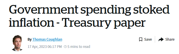
But it doesn’t look to be a very good model in practice. Here is The Treasury’s summary chart. the source of the line that (on this analysis) demand and supply shocks may have contributed roughly equal amounts to inflation over the last year, and that demand shocks were more important back in the early stages of the surge).
Not only is a large chunk of recent inflation not able to be ascribed to either demand or supply shocks, but there have been periods even in the quite short span shown here when the identified demand and supply shocks don’t explain any of the then-current inflation at all (eg 2019).
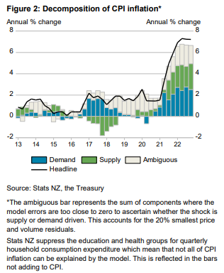
This is even more evident with some of the sub-groups they show results for. Thus, home ownership (which in the CPI is mostly construction costs)
For most of the decade, neither (identified) demand or supply shocks explain the inflation, and that is so again in the most recent data. And if the model suggests that sharp rises in construction cost inflation in recent times have little to do with demand at a time when house-building has been running at the highest share of GDP in decades, so much the worse for the model.
Services make up a large chunk of the economy, and a fair chunk of the CPI too. Here is the chart for that group
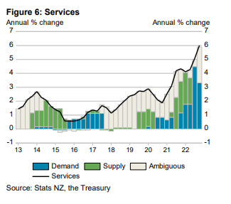
Not only are there periods when neither demand or supply shocks (as identified by the model) explain any of services inflation, but how much common-sense intuition is there is the idea (which the chart suggests) that for most of the period what services inflation can be explained is all either supply shocks or demand shocks and not some combination.
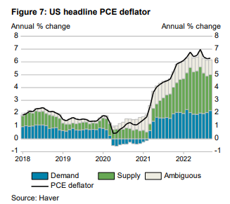
The Treasury paper notes some overseas comparisons, in particular that for the US
The results for New Zealand show lower supply-side contributions to inflation than estimates for the US and Australia. In the US, supply-side drivers account for about 60% of the annual change of the PCE deflator that the model can explain (Figure 7).4
(the footnote is to the original Fed paper)
and they show this US chart which I assume comes from the same model
Note, first, that the PCE deflator has a materially different treatment of home ownership – using imputed rents – than either the NZ or US CPIs.
But perhaps more importantly, in the original Fed paper there is this line
And here is a relevant chart from the same paper (grey-ed periods are NBER recessions)
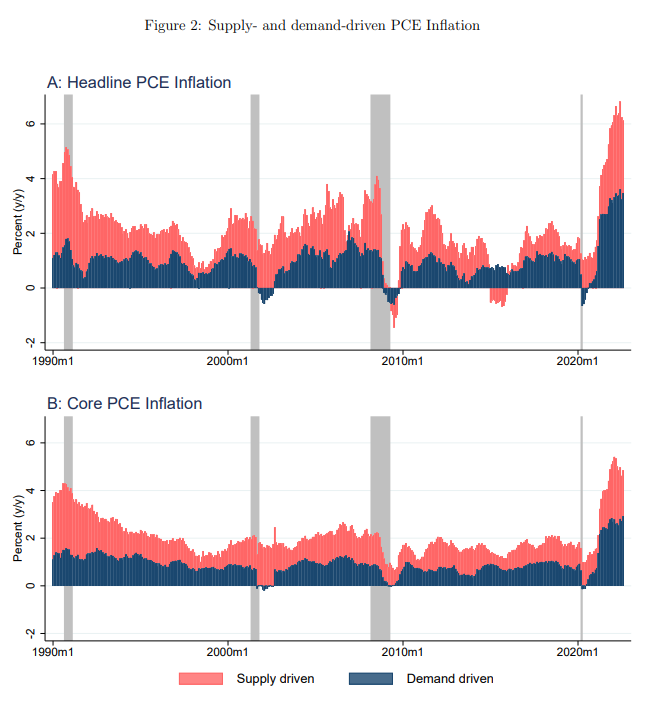
Not only does it show the entire period since 1990 (one of my uneases about the New Zealand work by Treasury is showing only the last 10 years), but it also illustrates that, as defined for the purposes of these models, both supply and demand factors are large influences, almost always positive, over the entire 30+ years. In other words, if there is anything unusual about the current situation it is not the relative contributions of supply and demand influences but simply that inflation is high (both demand and supply influence). It simply doesn’t seem to add much value in making sense of why things unfolded as they did over the last couple of years. (Although it is interesting how different the last 10 years of the chart look for the US, as opposed to New Zealand in the first chart above.)
What these US charts also illustrate is that supply and demand shocks/drivers here don’t mean the same as they typically do when thinking about monetary policy. Monetary policymakers will (rightly) talk in terms of generally wanting to “look through” supply shocks – the classic example being spikes in world oil prices, which not only flow through to the CPI almost instantly (faster than monetary policy could react) but also make us poorer. The focus instead is on whether these headline effects flow through into generalised inflation expectations and price-setting more broadly. Climate-induced temporary food price shocks (from storms or droughts) are seen in the same vein.
Those sorts of shocks are generally thought of as being as likely to be negative influences on headline inflation as positive ones. Oil prices go all over the place, up and down. Much the same goes for fruit and vegetable prices. These are the two main things excluded in that simplest of core inflation measures, ex food and energy. Some of the Covid-related disruptions are probably more one-sided: there aren’t really obvious favourable counterpoints to severe supply disruptions (even if such disruptions themselves generally unwind over time). But even taken altogether they aren’t the sorts of things that will produce positive influence on core inflation over single year for over 30 years (as in the US core inflation chart immediately above).
When macroeconomists think of inflation they often do so with a mental model in their heads in which this period’s inflation is a function of inflation expectations, some influence from the output/employment gap, and then any residual (supply shock) types of items. Those supply shocks can run in one direction for a couple of years in succession (and probably did in the last couple) but the expected value over long periods of time is generally thought to be pretty close to zero. Monetary policy determines core inflation – monetary policy shapes expectations and influences and responds to developments in the output (or employment) gap. Of course, monetary policy takes account of trend supply developments – adverse shocks may not only raise headline inflation, and risk raising inflation expectations, but can lower both actual and potential output (many positive supply shocks work in the opposite manner).
I don’t want to be particularly critical of The Treasury. We should welcome the fact that their analysts are trying out interesting different approaches and keeping an eye on emerging literature, and even that they are making available some of that work in generally low-profile publications. That said, Treasury is not some political babe in the woods, and I’d have thought there should have been some onus on them to have provided a bit more context and interpretation in their write-up. For example, whereas the US is often treated as a closed economy, New Zealand clearly isn’t. I don’t have a good sense as to how general imported inflation – or that reflecting exchange rate changes – is going to affect this sort of decomposition. If, as I believe, a wide range of central banks made very similar policy mistakes, we’ll be seeing more inflation from abroad (if our Reserve Bank takes no steps to counter it) not tied to demand pressures in particular domestic sectors. I’m also not really clear how the lift in inflation expectations that we observe in multiple surveys fits into this sort of decomposition exercise.
Oh, and it was perhaps convenient that of the CPI groups Treasury showed, motor fuels was not one of them. Headline inflation currently is held down quite a bit by the NZ Cabinet shock – holding down petrol excise taxes etc.
My own approach to the question of where the responsibility lies for core inflation (and note that Treasury focuses on headline not core) tends to be simpler. When this century the unemployment rate has dropped below about 4 per cent core inflation has tended to become quite a serious problem (mid-late 00s and now). The Reserve Bank itself has been quite clear in its view that employment is running above the “maximum sustainable employment” (itself determined by other government policies), and thus, by implication, the unemployment rate – at near-record lows is below sustainable levels. That is a function of excess demand relative to the ability of the economy to supply. Core inflation – the bits we should most worry about, because we could usefully do something about them – is an excess demand story, risking spilling over into embedded higher inflation expectations.
And when ZB’s interviewer asked me this morning whether Mr Robertson or Mr Orr was to blame (fiscal or monetary policy), I was quite clear that the answer was monetary policy (Orr and the MPC). That isn’t because monetary policy loosenings in 2020 were necessarily the biggest source of stimulus to demand, but because the model is one in which (a) fiscal policy is transparent, and (b) monetary policy moves last, with the responsibility to keep core inflation at/near target. You might think (I certainly do) that less should have been done with fiscal policy, but it isn’t up to the MPC to take a view on that, it is their job simply to have a good understanding of how the whole economy, and the inflation process in particular, works, and to adjust monetary policy accordingly. In extremis, fiscal policy can overwhelm the best efforts of central banks, but that wasn’t an issue or a risk here, or most other countries, in recent years. Central banks simply got things wrong. (They had company in their mistake, but they were/are paid to get these things right.)
