Thinking Big still

Just before I went on holiday I wrote sceptically about the “five point economic plan” speech given by the then National leader Todd Muller.

We were promised then a series of major speeches fleshing out the framework Muller enunciated.  Among the five points was this

Delivering infrastructure had this promise

Before the end of this month, I will announce the biggest infrastructure package in this country’s history. It will include roads, rail, public transport, hospitals, schools and water.

My heart sank somewhat.  A new and different Think Big? But lets see the specifics.

Of the five points Muller had outlined, this seemed to be one where they were investing any hopes they might have of lifting New Zealand’s medium-term economic performance.

New leader Judith Collins started on the details with a speech given on Friday and some supporting documents.    This announcement had (a) some big headline numbers for spending over the next decade, (b) the “roads, rail, public transport” components for the North Island north of Tauranga, several of which are mainly about periods well beyond the next decade, and (c) some material on how they propose to replace the RMA, and to fast-track some of these projects in the meantime.  I think there had already also been a promise to build an expressway between Christchurch and Ashburton.

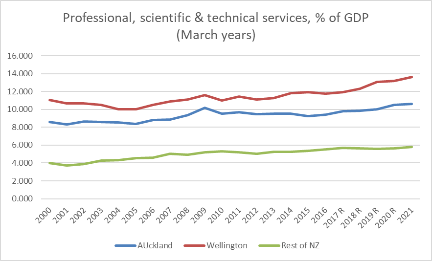
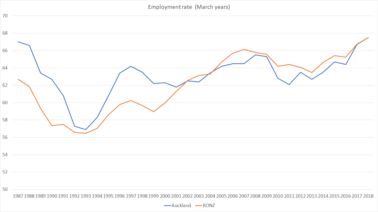
I don’t have any particular problem with building more and better roads where they make sense.  Same goes for rail within cities, again where such proposals make robust economic sense.  (I’m much more sceptical of things like cycleways, whether across the Waitemata Harbour or locally.)  And clearly congestion is a major issue in Auckland and –  for what is really a pretty-tiny city by international standards – to some extent in Wellington too.  Congestion has real economic and welfare costs.  National’s leader referred to one estimate of those costs in Auckland (presumably this one) at around $1 billion a year –  and since the study was done a few years ago, perhaps it would be reasonable to use a higher estimate now.

But we have tools that can deal with congestion.  Pricing.  It is a tool that seem to work when tried in other countries/cities.    Of course, simply pricing congestion doesn’t mean building no more roads ever, but it (among other things) helps give a better steer as to what the real price of congestion – and the value people put on avoiding it – and it deals with the congestion directly in the meantime.    Even the current government’s Minister of Transport has been on record suggesting that congestion pricing is “inevitable” at some point, just not now.

And what is National’s stance, to address what Collins calls a “congestion crisis”?

Looking further ahead, if we and Auckland Council ever look at congestion charges in the future, my Government will insist they are only ever revenue neutral, with other fuel taxes reduced to compensate.

“If we ever”….Not exactly a ringing endorsement, looking to shift the ground in the debate.  Perhaps congestion pricing isn’t easy electoral politics, but it is the direction we need to be heading.  It might actually make a material difference within five years, unlike (as far as I can see) most other things in the National plan.

Instead the focus seems to be a flinging around some big numbers, not being too bothered about how robust any analysis supporting the mooted projects is, and all with little or no sense of decent mental model of what has gone wrong with New Zealand’s economic performance,   And yet it is, supposedly, “the Plan that New Zealanders –  including Aucklanders –  have been waiting for, for generations”.

Pretty sure that last sentence isn’t true.  Collins, for example, talks up the “if onlys”, in her case around Sir Dove-Myer Robinson’s “rapid rail” proposal, that got lots of attention in Auckland in the early 70s.  We moved to Auckland about that time, but I was 10 and can’t claim to have given it huge attention.  But here’s the thing: the population of the Auckland urban area then was about 650000, the birth rate had been dropping for a decade, and the new government was just about to markedly tighten up on immigration access, a policy that carried through for the following 15+ years.  And even with all the New Zealand tendencies to boosterism, neither central nor local government was persuaded that Robinson’s scheme made economic sense.  Nor, most likely, did it.  Collins also talks up the City Rail Link project, the costs of which have escalated greatly since the government she was a part of first signed off on the project, which didn’t look very economic even then.

The promise seems to that this big infrastructure spend-up is going be pretty transformative in economic terms.  There are these quotes

This city is broken by congestion. Every Aucklander and every visitor to Auckland knows it. Congestion costs Aucklanders over $1 billion per year. That’s the strict economic loss. It represents lost production, lost productivity, lost opportunity.

But congestion is far worse than that. Congestion means unreliable journey times. It means frustration at sitting idle on the motorway. It means goods being delivered late to our ports. It means Mum being late to pick up the kids from rugby practice. It means a tradie only doing two, rather than four, cross-town trips per day. That’s fewer jobs for him; less income, and less economic activity.

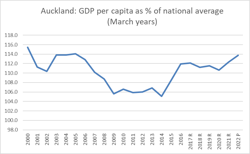
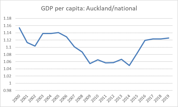
I guess $1 billion per annum is supposed to sound like a big number.  In fact, it is about 1 per cent of Auckland’s GDP.   Fixing the problems is probably worth doing, but 1 per cent of GDP is tiny in the context of either Auckland’s gaping economic underperformance, let alone that of New Zealand as a whole (recall that the productivity leaders are more than 60 per cent ahead of us).

And yet, according to Collins, there are really huge gains on offer.

National’s approach to infrastructure is simple: Make decisions, get projects funded and commissioned, and then get them delivered, at least a couple of years before they are expected to be needed. That is the approach that transformed the economies of Asia from the 1960s.

Quite possibly, some east Asian cities/countries did infrastructure better than New Zealand has, but I’d be surprised if National can cite any authoritative development studies suggesting that the catch-up of that handful of successful east Asian economies was primarily about moving things/people more easily around their own countries.  They are typically regarded as outward-oriented, tradables-sector led, growth stories, perhaps with improving infrastructure going hand in glove with those flourishing outward-oriented opportunities.

But, as least as far as we can tell from this speech, or the framework one Muller gave, National’s policy approach is now primarily inward-looking?  That has long been the practical effect of the policy approach they (and Labour) have adopted over 25+ years, but it isn’t usually so blatantly put.

Collins went on.  Build these roads, rail etc and

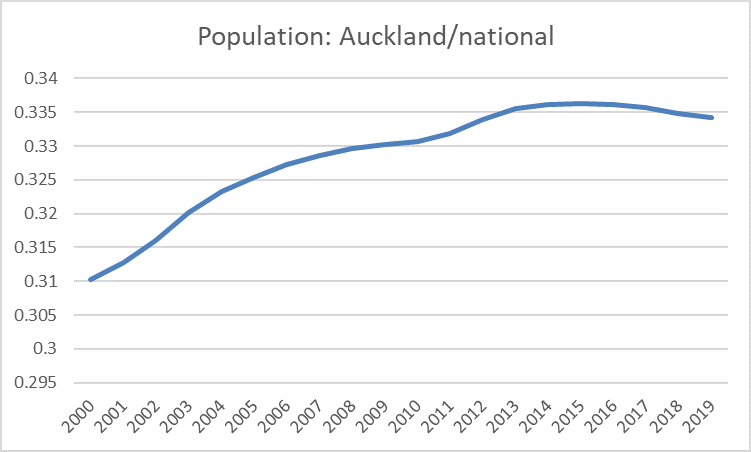
Half of New Zealand lives in the Upper North Island region. We want a genuinely integrated region of 2.5 million New Zealanders. Our vision is to transform the four cities to be one economic powerhouse. We will unlock their potential so that the upper North Island becomes Australasia’s most dynamic region.

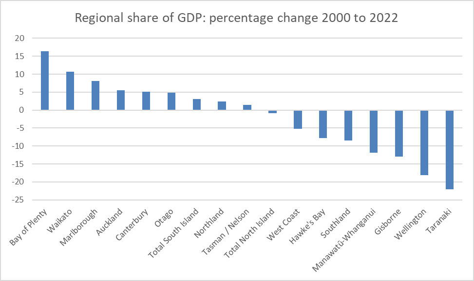
Recall that the expressway to Whangarei, complete with possible tunnel under the Brynderwyns, is –  even on this plan –  well over a decade away.  And recall that in the regional GDP per capita data, Northland has the lowest per capita GDP in the entire country, suggesting that if Whangarei has any part in some future “Australasia’s most dynamic region” it has a very very long way to come.      But even forget about the Whangarei bit of the fairytale for now, do the National caucus have any serious idea how far behind key bits of Australia productivity levels in New Zealand actually are (and Australia is no great OECD productivity success story)?   As a hint, that 1 per cent of GDP Collins talked about fixing won’t even begin to make a visible dent in the productivity gap –  a gap only likely to continue to widen for the next few years, even if Collins plan did eventually make some small helpful difference.

National –  like Labour really –  seems to have no idea at all what has gone wrong with the New Zealand economy, what has taken us from among the very richest and most productive countries on earth to be some slightly embarrassing laggard, increasingly unable to offer the best to our own people.   But they’ll just fling some more cash at things –  as Labour does, just a slightly different make-up – in the hope of getting elected, and the vague sense then the something must be done, and anything is something.

Here is the Collins approach to project evaluation

The economists will tell you we should build projects only when they’re needed. My sense from my time in politics is that you just want the government to get infrastructure projects built. You just want them done. And you want them done ahead of time.

My Government will be informed by processes like NZTA’s Benefit-Cost Ratio analysis, and by advice from the Infrastructure Commission. But we will not consider that analysis or that advice to be holy writ when making decisions about major transformational projects. Think about all of the Roads of National Significance the National Government built.

I don’t think Transmission Gully passed a decent cost-benefit test, even when it was going to be operational by now.

Now I’m not about to suggest that officials and appointees to government boards should be making the decisions, but any well-done cost-benefit analysis should be a key hurdle in any proposed commitment of large amounts of public money.  Perhaps there are reasonable arguments about methodology or about specific assumptions used in the calculations.  All that can and should be debated, but a project that cannot return a decently positive benefit-cost ratio is one the public should be very sceptical of.  Simply waving your hands and talking about “major transformational projects” should be no more acceptable now than ever.     And having projects in place “ahead of time” –  when few projections about the future, including about population, are that robust –  also has significant economic costs, even at today’s lower public sector discount rates.

One other questionable aspect of National’s plan is what they call “intergenerational funding”.  This is fancy language for borrowing, in this case off the core Crown accounts and having NZTA borrow instead.  As far as I can see there is almost nothing going for this particular approach –  one already indulged in by Labour, with Housing New Zealand now borrowing on-market.  It will be a (a bit) more costly than the central government borrowing itself, with no more likelihood the debt will be defaulted on, it is less transparent,  and unless the government is proposing to delegate all final decisions on projects to officials (which they –  rightly in my view –  show no sign of) there is no reason to think it will either tap new sources of capital (the NZ government not being debt-constrained) or introduce new disciplines on Crown capital spending.  There is, or can be, a place for government borrowing, but decisions on that are better taken, and managed, centrally.

So there were big numbers in the announcement, some big projects (which may or not be economic, may or may not ever happen even if National winds), but little or no sense of a credible economic model lying behind it, grounded in the specifics of New Zealand’s underperformance.  And if there is such a model at all, it just seems to be more of the same –  rapidly growing, but quite volatile, population – the strategy that has so comprehensively failed for the last few decades.      More and better roads aren’t going to materially change that.  Nor –  although it should be done as a matter of priority –  are the sorts of land use reforms that might make house prices more affordable. The new Leader of Opposition suggests a National government might do something there.  But we’ve heard that story before – whether from National in Opposition in 2008 or from Phil Twyford in Opposition in 2017.  Perhaps this time really would be different, but I’m certainly not counting on it.

Regional economies

Some months ago, when all was coronavirus, Statistics New Zealand released their regional GDP data for the year to March 2019.  I didn’t even open the spreadsheet at the time, but went looking for some data the other day and remembered I hadn’t written about the regional GDP numbers this year.

SNZ has been publishing the regional GDP data, by regional council area, for some time now.  The first data are for the year to March 2000, meaning that we now have 20 annual observations.

Here is how per capita (nominal) GDP for each of the regions relative to national (nominal) GDP per capita has changed since 2000.

regional GDP 20 yrs

I suppose it is convergence of sorts.  Even in the very poorest region –  Northland – per capita GDP has increased very slightly relative to the national average, while the three highest GDP regions (Auckland, Taranaki, and Wellington) have all dropped back relative to the national average.    The gap between the South Island and the North Island has more than halved and –  if one is to believe the numbers –  GDP per capita in Marlborough now isn’t much behind that in Auckland.

I’ve discussed previously the relative underperformance of Auckland.   There aren’t many OECD economies where the biggest city has per capita GDP only about 12 per cent above the national average (let alone where that gap has narrowed this century).  But it is only fair to note that Auckland had been staging something of a recovery. Here is the time series chart of Auckland’s per capita GDP relative to the national average.

auckland GDP

Population surges and associated building tend to be good for Auckland –  but there is no sign of productivity leadership, when per capita incomes in Auckland are still a bit lower (relatively) than they were 20 years ago.  I think it was the economist Andrew Coleman who suggested, only slightly tongue in cheek, that the business of Auckland was building Auckland.  Here is construction as a share of GDP for Auckland (these data lag another year behind).

auckland construction

Having said that, I was a little surprised to stumble on this chart.

akld popn

Of course, if the Auckland economic performance this century has been underwhelming –  especially relative to the rhetoric and political capital invested in talk of our “one global city” (the one just a bit smaller than Columbus, Ohio) it is as nothing compared to the relative decline of Wellington, despite all the puffery from the Wellington City Council, its “economic development” agencies, and the like.  Here is GDP per capita for the Wellington Regional Council area (largely greater Wellington).

Wellington GDP

Recessions might be good for Wellington’s relative position –  not many public servants get laid off in downturns (including the current one) – but otherwise it is a pretty stark and consistent decline.   Wellington’s share of the national population has also been falling steadily – albeit perhaps more slowly than the decline in per capita GDP might suggest was warranted.

At least if you live in Wellington, one often hears talk of the Wellington IT sector and, of course, the heavily-subsidised Wellington film industry.  The regional GDP breakdowns don’t show either directly, but the red line in this chart remains somewhat sobering.

wgtn sectoral

Last year SNZ decided to discontinue its annual screen industry statistics –  claiming (no doubt fairly) budgetary pressures, although it must have been convenient for the government (this one, like its predecessors) keen to talk about the alleged economic benefits of their massive subsidies to the film sector, even as what evidence there is rarely offers much support for their claims.     The last such data came out a year ago for the 2017/18 year.  Here is a snippet from the gross revenue table, by region.

gross film revenue

And here is the same snippet for 2012 and 2013.

gross film rev 2012

So gross revenues of Wellington production and post-production facilities/services –  mostly feature films (unlike Auckland) in the most recent year were not even three-quarters of what they’d been in 2012.

(There is a longer series of earnings for jobs in the total production and post-production sector – including the domestic-oriented bits – of the screen industry: relative to GDP it was no higher at the end of the period than when the series started in 2005. And estimated number of jobs in the sector has gone from 20400 to 20300 over the same longer period.   It looks like a classic infant industry  –  remaining infant and kept going by massive subsidies that keep the rest of us poorer.)

All this is, of course, against a backdrop in which national-level productivity growth remained very weak, and New Zealand continued to drift behind more and more countries that, not too long ago, we never even thought of as relevant comparators.

queen 4


Regional differences and economic underperformance

I noticed Bernard Hickey drawing attention to the chart in this tweet, observing “New Zealand third worst on the list”.

I think that (the Hickey take) is almost totally the wrong way to look at things.

Here is a chart of GDP per capita by regional council area (the only subnational data there is here) for New Zealand in the year to March 2015 (ie basically the same period as the OECD chart).  GVA per worker is a different measure than GDP per capita, but they are related and the difference doesn’t particularly matter for the point I wanted to make.

regional GDP

Average GDP per capita in Taranaki is a great deal higher than the national average.   But only 115000 people lived in Taranaki in 2014/15, about 2.5 per cent of the population.   GDP per capita in Taranaki is so high, relative to the rest of the country, because of the oil/gas production (much of the benefit of which accrues to the providers of capital to develop/maintain those fields, rather than to the citizens/workers of Taranaki).

By contrast, in most of the countries in the OECD chart, the city with the highest GVA per worker (or GDP per capita) is the biggest city.   That is true of Britain, France and Poland (to take countries at the left of the chart) and of (say) Finland, Denmark, and Austria (at the right of the chart).    I’ve shown a chart making a similar point in an earlier post.

gdp pc cross EU city margins

Particularly in the smaller countries, the largest city/region makes up a large share of the total national population, which (mechanically) reduces the difference between the richest/most productive city and the average for the country as a whole.  But even in the relatively larger countries like Britain and France, the biggest city accounts for a much much larger share of the workforce than is the situation in Taranaki.

So the issue here isn’t why there is such a big gap between Taranaki and the country as a whole (or even between Taranaki and the laggards) –  oil and gas and a small population will do that – but why Auckland (far and away our biggest city/region) does so badly, and what the implications of that might be.  (And, of course, why the whole country does so poorly.)

I’ve argued that it is because, given constraints of distance etc (at least as real as ever) the global income-earning opportunities in New Zealand are mostly about natural resources (and getting better at getting more from a fixed resource).  That makes it a very different economy to those of the UK or the Netherlands (although quite similar in that respect to Australia.)   And yet policymakers –  National and Labour, Greens and New Zealand First –  just insist on pulling more and more people into Auckland (primarily) every year, where there aren’t many really high-yielding opportunities.  The natural resources aren’t there, even if they were we aren’t getting any more of them, and the process of keeping on driving up the population (in a modest savings economy) continues to skew the real exchange rate, making it harder for the more outward-oriented regions to succeed.

Meanwhile policymakers –  and National and Labour, Greens and New Zealand First are all about equally guilty –  keep on trying to do patches and quick-fixes, subsidies and similar intervention, trying to steer people to the regions (we saw another example just this week with the post-study work rights policy) without really understanding (or deliberately avoiding the implication of realising) that the problem lies with the insane (not fit for New Zealand purpose) economically damaging immigration policy they insist on pursuing.  Revise that policy along the lines I’ve advocated and (a) the regions would probably make up a larger share of the population, and (b) both the regions and Auckland would probably be materially better off economically.

(None of which means I have any sympathy with the Prime Minister welcoming the latest fall in the exchange rate –  and despite the headlines it is a fairly modest fall (and was about this level three years ago).  It is beyond nonsensical to claim (emphasis added) that

The lower New Zealand dollar is good for exporters and a sign the economy is heading in a more productive direction, says Prime Minister Jacinda Ardern.

when the exchange is falling because markets increasingly think the economy isn’t doing that well, and the prospects for OCR cuts are rising.    The delusion that cyclical falls in the exchange rate are the start of something structural and permanent has afflicted politicians and central bankers for decades –  actually I recall Adrian Orr and I trying to persuade Don Brash to the contrary in 1999/2000.  You need to change structural fundamentals to change (helpfully) the structural level of the real exchange rate.  So far, this government –  like its predecessor –  has consciously chosen to avoid doing so.)

Auckland labour market outcomes: do any political parties care?

Among the various arguments advanced for why we should expect that large-scale government-led non-citizen immigration will prove economically beneficial to New Zealanders are claims about the labour market.

There are, for example, suggestions that the unemployment rate will tend to be (a bit) lower than otherwise, because ready access to offshore labour facilitates better skill-matching.  Larger labour markets  might work in the same direction –  easier for people displaced, or new entrants, to find jobs in a deeper more diverse market.

And there is the suggestion that average GDP per capita is likely to be raised just because the average immigrant is more likely to be of working age (few countries let in many 75 year olds). On this telling, even if there were no productivity gains (ie lifts in, say, GDP per hour worked) from large scale immigration, average incomes would be raised simply because of the implied higher rates of labour force participation.  In fact, this argument was run only a matter of weeks ago in an official Australian government document, a defence of Australia’s large-scale immigration programme published by the Federal Treasury and the Department of Home Affairs (the department directly responsible for immigration matters).  From page 27

After trending upward for almost three decades, Australia’s labour force participation rate declined from the early 2010s through to 2016 (Figure 22). This decline coincided with a large cohort of baby boomers reaching retirement, which weighed on Australia’s participation rate. Yet evidence shows that migrants, particularly skilled migrants, have helped curb the ageing of the population by boosting the labour force. Without the contribution from migrants, all else being equal, Australia’s participation rate would be lower than at present.

Many of these claims had initially seemed plausible enough to me.  In fact, in a major modelling exercise done for one of MBIE’s predecessor departments a decade ago –  and widely touted at the time –  the only overall economic gains from immigration resulted from this assumed higher participation rate.

But a while ago I noticed that the unemployment rate in Auckland hadn’t been any lower than that in the rest of New Zealand.  This chart uses annual data, up to and including the latest release last week.

U rate akld and RONZ

Auckland is a good place to focus on. Not only is it by far the biggest labour market in the country, but it also has by far the highest proportion of foreign-born residents, and receives a disproportionate –  but not surprising –  share of the new migrants, temporary and permanent.    Labour market laws apply nationwide, but you might think that some would be a little less binding in Auckland than elsewhere –  for example, there is a nationwide minimum wage, but average productivity is higher in Auckland than on average in the rest of the country.  All else equal, again one might expect Auckland’s unemployment rate to have been a little lower than that in the rest of the country.

And yet over the 32 years for which we have the data there is no sign that unemployment rates in Auckland have been lower than those elsewhere.  There might be a bit of a cyclical pattern –  Auckland does worse in downturns (see early 90s, and the period from 2008 until recently), and better in periods of strong economic growth (and that cyclicality may itself be exacerbated by the large New Zealand cycles in net migration) – but there is no sign of much beyond that.

What about employment rates (calculated as the share of those aged over 15 in paid employment)?

E rates akld and ronz

Interestingly, employment rates in Auckland used to be quite a bit higher than those in the rest of New Zealand, but they aren’t now.    Perhaps the difference in the earlier period reflects differences in how the economic restructuring and reduction in trade protection affected different regions –  it seems plausible (although I’m happy to see any confounding evidence) that the initial job losses might have been more heavily concentrated outside Auckland, with the gap closing again over time.  Whatever the explanation for the earlier period, average Auckland employment rates have struggled to match those in the rest of the country over the last 15 years or so (periods encompassing two big waves of non-citizen migration).

And as I thought about it, this chart started to puzzle me more.  After all, the denominator is the population of working age, which includes all the elderly, and yet as the recipient of the largest share of migrants wouldn’t one expect Auckland’s working age population to be concentrated in the age ranges with the highest rates of labour force participation?   And there are the persistent stories of old people moving out of Auckland –  the money tied up in the overpriced house goes further in the provinces.

And, sure enough, here are the official estimates of the share of the working age population aged over 65 in 2017 (the numbers aren’t materially different from the firmer numbers from the 2013 Census).

over 65s wap

Auckland has by far the lowest share of its working age population aged over 65.  Across the country, those aged over 65 have an average employment rate of about 24 per cent, while for the working age population as a whole the employment rate is more like 68 per cent.    And yet, despite having so many fewer old people the overall employment rate in Auckland is no higher than in the rest of New Zealand taken together.

There isn’t a great of information about labour force status disaggregated by both age and regional council, but I did find some data for the last few years comparing Auckland and the Wellington and Canterbury regional council areas.

e rates by age and regional council

Even among the older cohort, employment rates in Auckland have been a little below those in Wellington and Canterbury (in not a single year was the Auckland rate higher than in either Wellington or Canterbury –  despite the smaller number of over 65s).  But in the younger cohorts the differences are quite a bit larger.   Perhaps some of the difference among the 15-24 cohort reflects the presence of foreign students (although many of them are working), but in the prime age cohort (25 to 54) the average employment rate in Auckland over the last eight years has been, on average, a full four percentage points lower than that in Wellington and Canterbury.

To be clear, this is a not a comment on the employment rates of recent immigrants (which may well be quite – even very –  high).  The HLFS simply doesn’t have that sort of data.  It is an estimate based on the Auckland economy as a whole.   And quite what explains it, I’m not quite sure.   For anyone wondering if the ethnic composition of Auckland’s population is part (cause or consequence) of the story –  whatever factors result in lower Maori and Pacific participation rates – here are the average participation rates for the last decade by ethnicity for Auckland and the rest of the country.

partic rate by ethnicity

European participation rates have actually been higher in Auckland than in the rest of the country.   But Maori and –  especially –  Pacific participation rates average materially lower.

Whatever the explanation, it isn’t obviously a story in which one of the largest non-citizen immigration programmes anywhere in the world, over decades, has produced an Auckland labour market that seems to be functioning in a way that might suggest economic gains across the board.  Unemployment rates are no lower than in the country as a whole, employment rates are materially lower once one allows for the much smaller number of old people in Auckland, and there might be straws in the wind (that final chart) suggesting that the ethnic groups that typically do most poorly in New Zealand anyway are even less likely to be engaged in the labour market in Auckland than in the rest of the country.

Throw in the data I mentioned the other day –  average GDP per capita in Auckland lower relative to that in the rest of the country than it was at the turn of the century, and the internal migration data suggesting that (in modest numbers) New Zealanders (net) are leaving Auckland – and it should leave the champions of current immigration policy very much on the defensive.  Unwilling or unable to fix the housing/land market, and with no obvious productivity or labour market gains to show for their Auckland-focused strategy, it increasingly looks like a Think Big disaster of a severity and pervasive effect (including on many of our most disadvantaged) that makes the 1980s version (the shockingly uneconomic energy projects) look like a mere bagatelle.

But, remarkably, no political party –  major or minor –  seems bothered.

(And before anyone pops up to remind me that I often point out that employment is an input not an outcome –  not, in itself, a measure of economic success –  that is, of course, true.  Nonetheless, there aren’t particularly good reasons to suppose that working age Aucklanders have stronger leisure preferences than otherwise similar people in the rest of the country –  faced with, eg, the same tax rates –  and some reason to suppose it might be the other way round (eg the sheer cost of purchasing a house).)

New Zealanders leaving Auckland

Last month The Treasury published some new research aimed at providing better information on the population changes in each territorial local authority (TLA) between censuses.   At present we only have a census every five years –  and in some quarters there seems to be a push to reduce that frequency – and subnational population estimates between censuses have often been pretty poor, only to be updated and revised when the next census results finally appear.  At present, the published subnational population numbers are anchored to the 2013 Census, adjusted for estimates of the overseas net migration flow and data on  births and deaths.  In New Zealand we don’t have to tell some specific government agency when we move house or city.

Except that, as The Treasury observes, in practice we often do end up telling some government agency (or government-funded agency) or other –  in fact, are coerced to do so –  and the government has collated all that data in a single (anonymised) database.   That opens up enormous possibilities to use that data to, for example, update subnational population estimates in a way likely to be more accurate (albeit not very timely).   You might worry, as I do, about governments getting their hands on all that data combined, by some mix of coercion and seduction (eg have the slightest accident and you get into the ACC system) and worry that it might be used for ill as much as for good.  But, like it or not, the data are there and The Treasury is using them.

This chart from their paper gives you the picture of the data they are using

tsy popn

But my interest is less in the details of how they calculate their estimates, as in some of the bottom line results, and particularly those around estimated internal migration.

There are some interesting snippets.  The results suggests that New Zealanders’ rates of internal migration (one TLA to another) have been pretty stable, but that of immigrants has increased quite a lot.  The author offers no ideas about why that might have been (and I don’t have any to suggest either).

tsy popn 2 
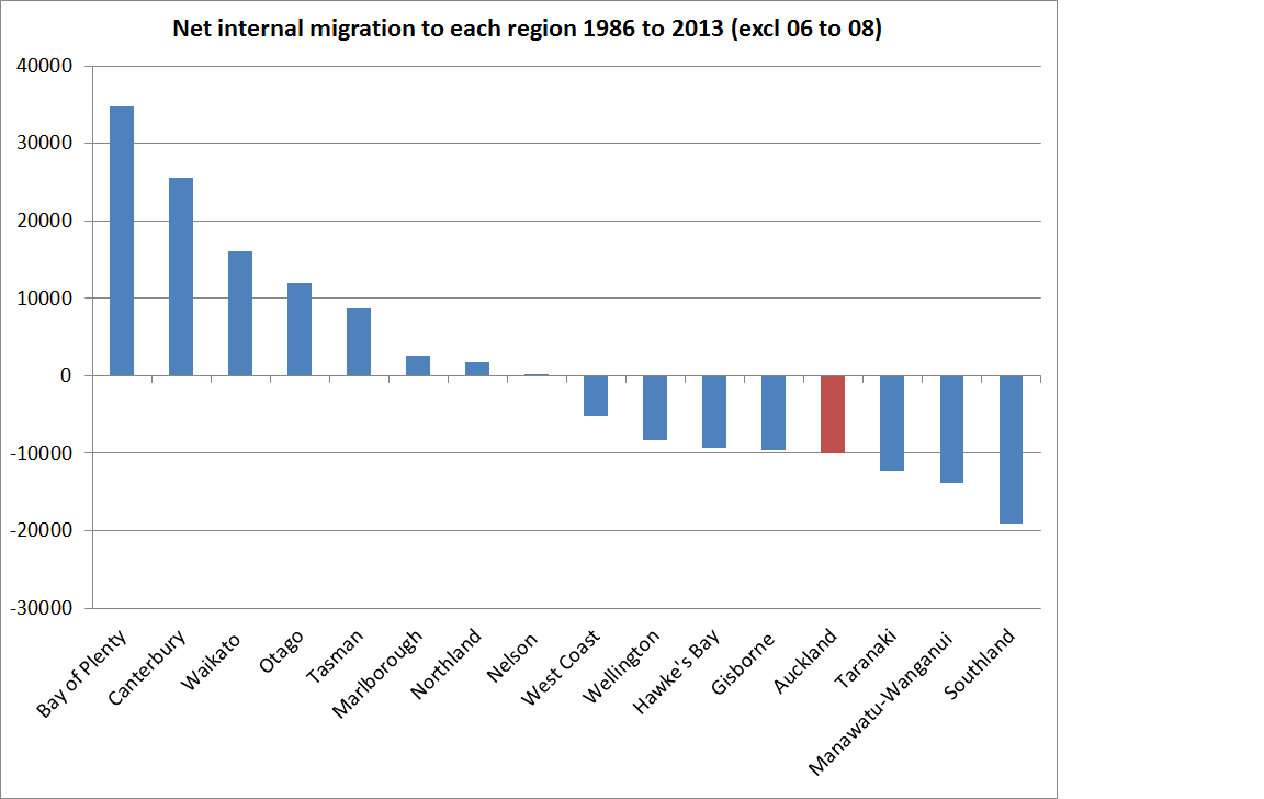
There is a fascinating picture of Christchurch following the earthquakes, including the continuing losses in recent years to neighbouring Selwyn and Waimakariri.

tsy popn 3

And then there is Auckland

tsy popn 4

There was a slight move into Auckland from elsewhere in New Zealand (mostly from Christchurch, see previous chart) in 2011, but otherwise the net flow of New Zealanders has been away from Auckland.  In fact, in the final year of the chart, the net outflow of New Zealanders (this is a NZ-born measure) was larger than the natural increase, so that the entire increase in Auckland’s population is (estimated to have been) due to international migration.

Readers with long memories may recall that I touched on the outflow of New Zealanders (as captured in Census data) in an earlier post.

This was the picture from the five years from 2008 to the 2013 Census.
internal migration 08 to 13
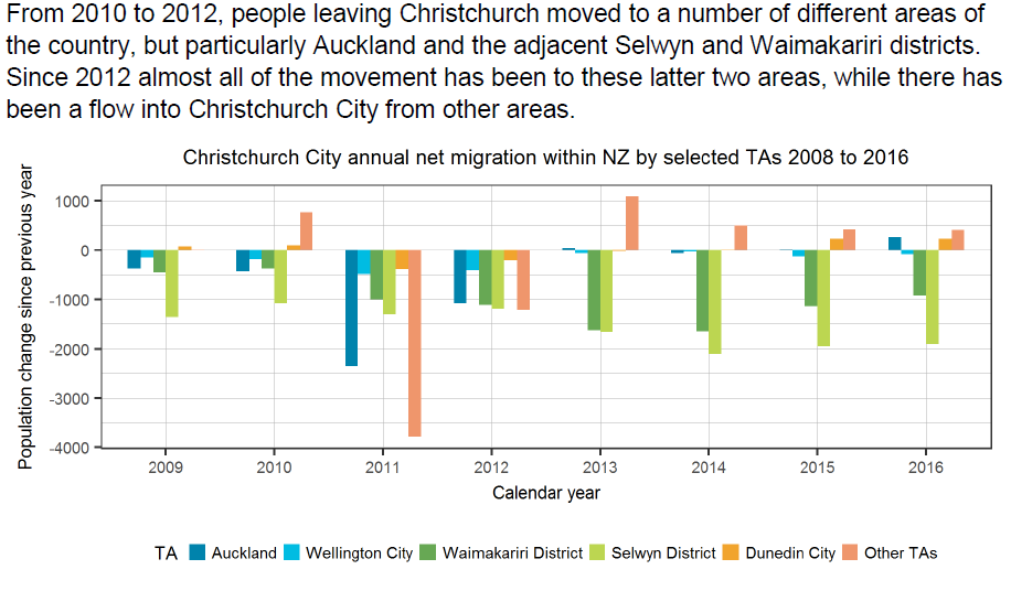
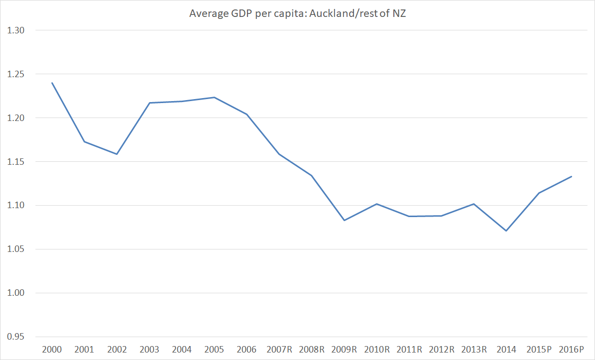
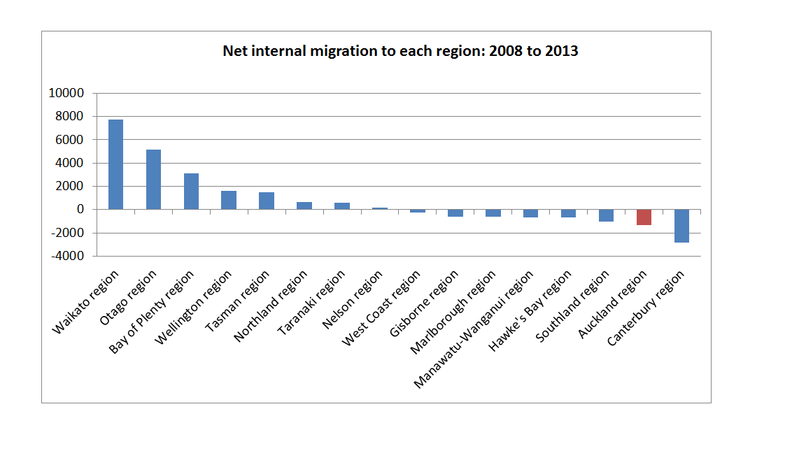
As I observed then, we didn’t know what had happened since 2013.   Perhaps things had turned around?    But the new Treasury estimates suggest that if anything the outflow – still modest each year – may have accelerated.

We have the data going further back. Here is the extract from the earlier post.

SNZ has compiled this data back as far as the 1986 to 1991 five-yearly period. The last five yearly period in which Auckland experienced a net inflow of people from elsewhere in the country was from 1991 to 1996.

Here is chart which covers the estimated net internal migration to each region for the period 1986 to 2013 (with the two years 2006 to 2008 missing, because they weren’t captured by any of the censuses).

internal migration 86 to 13.png


None of this should be very surprising.   After all:

  • Auckland house prices have become impossibly high,
  • Traffic congestion problems, if temporarily relieved now by Waterview, seem continually pressing, and
  • The gap between Auckland incomes and those in the rest of the country, never large, has been narrowing.

But it must be an inconvenient truth for boosters of the Auckland story, including bureaucrats in MBIE, the Secretary to the Treasury, assorted past and present ministers (recall John Key on “quality problems”).  The people who know Auckland best  –  the opportunities for themselves and their families –  are, at the margin, leaving the place.   People in the rest of New Zealand aren’t (net) flocking to the big city.   It simply doesn’t seem to offer them better opportunities than staying where they are (or going to Australia).

The latest issue of the London Review of Books turned up in the mail yesterday.   In one of the reviews –  of a new book by Richard Florida –  I found this

The new urban inequality has two distinct and related aspects. First, superstar cities have moved ahead of the nations they’re found in.  The trend is clear in the US, where cities like New York have become richer relative to the country as a whole. But it is most pronounced in the UK.  In the 1970s and 1980s, London’s GDP per head was around one and a quarter times that of the UK as a whole.  Today it’s one and three-quarters.

It isn’t just London or New York.   I’ve shown previously a chart looking at GDP per capita in EU countries, looking at the ratio over time of that in the biggest city relative to GDP per capita for the country as a whole.  Over this century there has been a clear upward trend.

As for Auckland, in 2000 GDP per head in Auckland was 15 per cent higher than for the country as a whole, but by last year it was only 9 per cent higher.   I’ve shown previously (a couple of years ago) this chart of how small the New Zealand gap is between GDP per capita in the biggest city and that for the country as a whole, by comparison with many other advanced countries.

gdp pc cross EU city margins

There are, perhaps, some good dimensions to the New Zealand story.   We don’t have whole swathes of the country being left behind as the metropolis powers ahead.  On the other hand, the metropolis isn’t powering ahead at all –  just getting more and more people, in a city which is underperforming a country with weak (almost non-existent in recent years) productivity growth.

It is well past time for a rethink, and for our politicians and officials to start focusing on the specifics of the New Zealand experience.   In terms of economic success, Auckland bears not the slightest resemblance to London or New York (or Paris, or perhaps even Bratislava).   And yet the growth strategy (perhaps flattering it to use the term “strategy”) has seemed to rest almost entirely on a wishful belief that if only we tried really hard, and poured more and more people into Auckland, it just might be.  But one of the lessons of economic geography is that location matters.  Ours –  Auckland’s –  is exceeedingly unpropitious.

That LRB review I mentioned earlier notes that trends in recent decades have turned out to be very good for “established global cities in particular”, in ways that few anticipated.  That particular discussion ends thus

The business districts of San Francisco, New York, and London are ludicrously prodigious. The Borough of Westminster produces as much wealth as all of Wales.

I can’t vouch for that final statistic, but it does leave one thinking that it is more likely that Auckland is a Cardiff or (moving north) Glasgow, than that it is a coming London or New York.

Ruminating on Auckland

Perhaps not many other long-term residents of Wellington share my taste, but I’ve always been fond of Auckland.  Partly that might just be good memories from five years there in my youth, but there is also the great physical location, a better (and certainly warmer) climate, deciduous trees, flourishing citrus trees in so many suburban gardens, and so on.   We’ve just had a family holiday there, and I was reminded again of what I liked about our largest city.  By contrast, I’ve always regarded Wellington as the public’s revenge on the public service.

Of course, as holidaymakers we didn’t have to grapple with the horror of the housing market, and between reduced school holiday traffic, the new Waterview tunnel, and largely avoiding the rush hour, not even the traffic was too problematic for us.  Coming from cramped Wellington, we were staying just off a not-overly-busy road that seemed wide enough that a whole new subdivision could have been constructed down the middle of the road.   We were mostly being tourists, but a curious and analytical 14 year old prompted discussions around the absurdities of housing supply restrictions –  explaining the oddities of the isolated high rise apartment blocks on Jervois Road, or Stanley Point, or Remuera Road, sticking out now just as those same buildings did when I was his age in the 1970s.

But staying in an older part of town I was also reflecting more generally on both past and present Auckland. 100 years ago, Auckland was the largest city in one of the two or three wealthiest countries in the world.  By the standards of the day, it must have offered ordinary working people some of the best material living standards on offer anywhere.  And if Auckland was our largest city then, it certainly wasn’t a dominant one.   In the 1911 census, the total New Zealand population had just crept above 1000000 (1008468).  And here were the total populations of the main urban areas (encompassing surburban boroughs, not just the respective city council areas).

Greater Auckland 102,676
Greater Wellington 70,729
Greater Christchurch 80,193
Greater Dunedin 64,237

Auckland’s population was just 10 per cent of the total.  At the same time Hamilton borough had a population of 3500, and Tauranga a population of 1300.

These days, Auckland makes up almost 35 per cent of the total population.   These days, with New Zealand GDP per capita around 30th in the world (depending which list one uses), there are likely to be many many cities (perhaps 100 or more, given that big countries such as the US, Germany, Japan, France, and the United Kingdom are richer than us, as well as many small countries) offering better living standards to ordinary working people than can be found in Auckland.  That would be true even on metrics like GDP per capita, with the problems accentuated by the disastrously unaffordable housing market.

Of course Auckland’s relative decline is largely part of the overall stark relative decline of New Zealand.    I’m sure we’ll see plenty of bluster from the current government in the election campaign that is getting underway, but I dug out the Prime Minister’s campaign statement from the 1911 election campaign published in the Herald on 6 December 1911.  It is partisan of course, but when Joseph Ward asserted that

The Liberal Government can claim without fear of contradiction to have made New Zealand in every department of social activity the most advanced country in the world.

Present and Future. New Zealand’s prosperity is solid and beyond question. Its population today is greater by 400,000 people than in 1893 and obviously the work of the Government has greatly increased. In the history of every country there are periodical fluctuations, seasonable ups and downs. We are influenced by the conditions ruling in other parts of the world. We cannot be always on the crest of the wave. But look round on the other countries. Mark what vicissitudes and oppressions they have passed through. Familiarise yourselves with the facts regarding the rich and resourceful United States of America, and then decide whether I am not justified in my reiterated assertion that New Zealand to-day is the most prosperous country in the world.

It is hard not to think that, even with the benefit of hindsight and the best efforts economic historians can do to compare living standards across countries, Ward was speaking the truth.   (It didn’t do his party much good, as they lost office –  after 20 years –  shortly afterwards).

These days we get fatuous comparisons of growth rates across countries, rarely adjusted for rapid population growth, but no one dares to claim New Zealand is even close to the most prosperous country in the world.

Wandering around Auckland was also a reminder of the extent to which Auckland’s economy is largely about supporting its own rapid population growth.  Check out the names on the high rises in the central city and you’ll struggle to find many New Zealand owned brands or companies (the banks and insurance companies, eg are almost all foreign-owned), and especially not if one is looking for firms making it in the international markets.  I’m all for foreign investment, but in a thriving economy it would be a two-way street –  not only would we have much more inward foreign investment but there would be a lot more offshore foreign investment too, as successful New Zealand firms took themselves to the wider world.  The pictures are never entirely black and white.  There are success stories like Air New Zealand (although with majority state ownership and the constraints of that industry who knows if it would still be New Zealand owned and run in a fully competitive market).  On a (much) smaller scale, I noticed billboards for ACG, which has taken its educational offerings abroad.

And there is, of course, the export education industry.  But even the reputable bits of that industry have the ground skewed in their favour by “industry subsidies” –  whether it is cheap access to PhD programmes for foreign students, or the way export education is bundled with preferential access to work rights and residence options in New Zealand.  And then there are the less reputable bits.  We took the kids ice-skating in Aotea Square and while they skated I contemplated the prominent building across the street with the big Cornell name and crest.  Not, surely, we thought the top US university with an operation here?  And no, it was the Cornell Institute of Business and Technology about which the authorities (and former staff) seem to have some pretty serious questions.  It was the most prominent tradables sector building I noticed in Queen St.

And yet, this is the city in which the hopes and dreams of the New Zealand agglomerationists are invested.   If the strategy –  putting more and more people into Auckland, even as New Zealanders have been leaving –  was any sort of economic success, surely we’d be seeing a succession of strong outwardly-oriented private sector businesses increasingly dominating the Auckland skyline?   But there is simply no sign of it.   Perhaps these successful firms are skulking in the suburbs and industrial areas?  I’m sure there are some highly successful examples, but there is no sign of it happening on the sort of scale needed if a non-natural resource based economy, successfully taking on the world and winning, is to develop in ways that would support top tier living standards for many more people.    If the model were correct, Auckland should be leading the way.  But it isn’t.

Really successful cities internationally, in economies that have gravitated away from dependence on (fixed) natural resources, tend to have GDP per capita a long way above that in the rest of the country.  And, typically, that gap is widening.

I ran this chart last year

gdp pc cross EU city margins

Here is the Auckland chart for the years since the regional GDP data began in 2000.  It shows average GDP per capita in Auckland relative to that in the rest of New Zealand (so the margin is larger than in the chart above, which uses the relationship between the biggest city and the whole country –  the biggest city typically being a large chunk of the country).

Akld GDP pc

The ratio does appear to be somewhat cyclical.  Probably what is going on is that when there is a big surge of immigrants (as in the early 2000s and recently) there is a big increase in the activity required simply to accommodate the new arrivals (building houses, roads, schools etc), but the trend is downwards.  Average incomes in Auckland are higher than in the rest of the country, but the margin is small and has been shrinking.

In the annual regional GDP data, SNZ also provide an industry breakdown.  As regular readers know, I’ve highlighted previously the pretty dismal state of the New Zealand tradables sector –  the main bits (agriculture and mining, manufacturing, and exports of services (mostly tourism and export education)) that compete with the rest of the world.   In real per capita terms, there has been no growth in that measure since around 2000.

We can’t do that calculation at a regional level.  But here is another proxy.    In this chart, I’ve included agriculture, forestry, fishing, mining, manufacturing, and education and traning as a loose proxy for Auckland’s tradables sector.  Of course, lots of education is totally domestic-focused, but export education is probably the main export sector centred in Auckland.   It has grown quite a bit in recent years.

akld tradables

There will be successful internationally-oriented Auckland-based firms lurking in some of the other services sectors, but (I’d assert) not many and not very large.   This simply isn’t what one should be expecting to see if the Auckland-focused (de facto, since that is what a large immigration target amounts to in practice) Think Big policy were working for New Zealanders as a whole.

It is close to a tragedy.   A deeply misguided policy, however well-intentioned, has reduced what was once one of the richest cities in the world to a rather mediocre mess: with few industries successfully competing internationally (in a small country the only long-term basis for prosperity), economic activity doing well only when a lot has to be built to accommodate yet another huge surge of new people, and houses so expensive that ever-fewer of the inhabitants can afford to buy.   It is still a great location and a wonderful climate but think how much better material living standards Auckland might offer its ordinary working people if, say, in a country of 3.5 million people, we had an Auckland of perhaps 750000.  Quite plausibly, that is how things might have played out with less overall population pressures –  deferring to the wisdom of the New Zealanders leaving, rather than superimposing politicians’ and bureaucrats’ judgements –  and a much lower average real exchange rate.

It isn’t too late to fix up New Zealand, but it does require a pretty dramatic change of course.  Wouldn’t it be wonderful if in thirty years time some campaigning Prime Minister could once again honestly make the sorts of assertions about economic and social success that Joseph Ward was making in 1911?  Sadly, judging by the political rhetoric this year none of our politicians is interested.


House prices and population

I wrote the other day about the role that population growth, including that accounted for by immigration policy, plays in influencing house prices, at least in places where regulatory restrictions on land use or construction impair the responsiveness of housing supply.  More demand, in the face of lagging supply, seems fairly ineluctably to put upward pressure on prices.

The latest QV house price data, for January 2017, also came out the other day. They produce data at an individual TLA level, which in conjunction with SNZ TLA population estimates, enables us to have a look at whether there has been a relationship (albeit crude and bivariate) between population growth and house price inflation.

In the chart below, I’ve focused on the period since 2007.  2007 was the peak of the last house price boom, and a period for which QV has supplied house price data for each TLA.  The population growth data is the percentage increase in population from June 2007 to June 2016 –  the most recent SNZ estimates.      It is worth remembering that in periods since the last census, population estimates are approximate at best, but these estimates are the best SNZ can do and they presumably use a consistent methodology across the country.

house-prices-and-popn-growth-by-tla-since-2007

Given that we have pretty pervasive land-use restrictions, it isn’t very surprising to find that areas with the greatest (lowest) population growth also tend to be the areas with the largest (smallest) real house price increases over this period.    It isn’t a mechanical, or one-for-one, relationship of course.  One factor is likely to be differences from TLA to TLA in how practically constraining the land-use rules are.  All else equal, a TLA where land use restrictions are less constraining will see less real house price inflation for any given population increase than a TLA with more-binding restrictions.  (I’m not aware of any good land-use restrictions indexes for individual New Zealand TLAs).

The observation on the far right of the chart might be an illustration of this point.  That dot represents Selwyn district, on the outskirts of Christchurch.  It has experienced a huge population increase –  in excess of 50 per cent in nine years –  especially since the earthquakes.    Some observers argue that the local authority has been relatively liberal in facilitating new housing and business development.  Perhaps (I was a little sceptical here), but one other factor is that, at the margin, people considering buying in Selwyn are likely to be considering developments in the rest of greater Christchurch too –  and over this period real prices in Christchurch city and Waimakariri only rose 10 and 14 per cent respectively.

The other obvious outlier is the observation at the top of the chart –  that for Auckland.  Real house prices in Auckland have risen 61 per cent since the 2007 peak.  Auckland has had considerable population growth over that period (16.1 per cent)

But the population growth in these TLAs wasn’t that different from Auckland’s experience

Kaipara
Waikato
Hamilton
Waipa
Tauranga
Hurunui
Ashburton
McKenzie

and they all experienced much less real house price inflation (these are the dots more or less directly below Auckland’s on the chart)

There could have been a variety of factors at work explaining how much Auckland prices have risen (even given population growth):

  • perhaps Auckland’s land use restrictions are just that much tighter than those in other places,
  • perhaps Auckland prices are being influenced by expectations of continuing strong population growth (which isn’t likely in all of those other TLAs),
  • perhaps Auckland prices were being influenced by the non-resident purchasers (of whom we have heard so much, but don’t really have good data on).

On the other hand, factors that aren’t likely to explain the difference include:

  • interest rates, which are the same across the whole country,
  • tax policy, which is the same across the entire country.
  • (and, for that matter, immigration policy which is much the same for the entire country)

Sometimes people will try to ascribe strongly rising house prices in particular localities to the state of the specific region’s economy.   But since 2007, Auckland’s average GDP per capita has grown no faster than that in the country as a whole.

akld rel to nz gdp pc

and the unemployment rate in Auckland has mostly been a touch higher than that in the country as a whole.

u-rate-akld-and-national

The other thing that struck me from the scatter plot above was just how many parts of New Zealand still have real house prices lower than those at the peak of the previous boom.   Some have had falling populations, but one or two have actually had faster population growth than Auckland  (eg Carterton, for some reason unknown to me).   These are the places where real house prices are still more than 10 per cent lower in real terms than in 2007.

Clutha
Taupo
Southland
South Taranaki
Westland
Masterton
Central Hawkes Bay
Tararua
Whanganui
Kaikoura
Gisborne
Rangitikei
Buller
Opotiki
Ruapehu
Grey   (-27.2 per cent)

It is easy for people in Auckland and Wellington to be dismissive of some of these places, but as I’ve already illustrated, it isn’t as if Auckland’s economic performance over the last decade has stood out as noticeably better for the average person than that of the country as a whole.

On which note, real house prices across the whole country are now around 6.4 per cent higher than they were in 2007.  With Auckland accounting for a third of the country, and with real prices up 61 per cent there, average real house prices in the rest of the country are still, fortunately, lower than they were at the peak of that previous boom.


What’s wrong with Auckland and Wellington?

Having not lived anywhere else in New Zealand since I was 10, I’m not quite sure.

Yesterday I was filming an interview in which one of the questions the interviewer asked was whether Auckland house prices could be explained, at least in part, by an influx of New Zealanders, whether returning from overseas or moving to Auckland from elsewhere in New Zealand.  I noted that the data actually still showed a net outflow of New Zealanders from Auckland to other countries in 2016 (albeit much smaller than in earlier years), and that Census data had suggested a modest net outflow of Aucklanders to the rest of New Zealand since the mid 1990s, and that that pattern seemed unlikely to have changed in the years since the last census.

All of which got me curious.  If New Zealanders were still (net) leaving Auckland for abroad, what was happening in other regions of the country.  Were there places where there was a net inflow of returning New Zealanders?   As it happened, the answer proved to be most of them.

plt-by-region

Auckland and Wellington were, in fact, the outliers.

Here is a  more aggregated look at the same data.

plt-by-agg-region

New Zealanders (net) came back last year to the rest of the North Island, and to the South Island, but not to Auckland or Wellington.

I wouldn’t want to make too much of it.  It is, after all, one year’s data, and has all the pitfalls of the PLT data (self-reported intentions and all that).

But it did bring to mind some analysis from The Treasury that I highlighted a couple of weeks ago

As agglomeration and clustering theory predicts, our more urban services-based regional economies (Auckland and Wellington and to a lesser extent Christchurch) are relatively more productive and generate higher incomes than our more resource-based regional economies.

Our Treasury preference is usually to encourage or permit the continued concentration of economic activity in key centres (forces of agglomeration) where returns are expected to be greatest.  Resources and activities should be allowed to flow betwen regions over time.

New Zealanders don’t seem to have been convinced by our officials’ analysis of the prospects and opportunities within New Zealand.

What about over a longer period?   Here is the average annual net outflow of New Zealand citizens from each regional council area, as a per cent of that region’s population each year, for the period 1996 to 2014 (ie from when the data start to just prior to the current sharp reduction in the overall outflow of New Zealanders).

plt-net-flow-96-to-14

Wellington and Auckland were losing just over 0.6 per cent of their population each year as New Zealand citizens left those regions for abroad.  But so were the Bay of Plenty and Gisborne.    (What is, perhaps, more striking is how much lower the net outflow rate abroad was from the South Island).    And in the last year, New Zealanders flowed into Gisborne and the Bay of Plenty, and they still flowed out of Wellington and Auckland.

I can think of various stories why this might be.  Auckland, presumably, has the highest share of naturalised citizens, and perhaps there is more of tendency for those new citizens to leave, than for natives?  But if so, it doesn’t explain the previous 20 years of Wellington, Bay of Plenty or Gisborne.   And while house prices are ruinously high in Auckland, they are nowhere near so bad in Wellington.   Perhaps there is something in a story about Auckland and Wellington people being more “internationally connected” – but again, over almost 20 years, the outflow rates were the same in the Bay of Plenty and Gisborne.   And perhaps, for all the talk of agglomeration opportunities, and a focus on Auckland and Wellington, the economic opportunities, and overall prospective living standards, just aren’t really there in Auckland and Wellington.   The regional per capita GDP data certainly support that story for Auckland.

Perhaps the patterns will change again this year –  and there is quite a bit of year-to-year variation in the regional outflow rates –  but for now, despite all the talk of “problems of success“, or “quality problems“, the migration data suggest New Zealanders when deciding whether to stay or go, and where to come back to if they do, don’t seem to share the sense of Wellington and Auckland as success stories.

Other interpretations/perspectives most welcome.

Cities

I was participating in a debate the other day with a prominent economist and a leading business person.  Both seemed keen on actively growing New Zealand’s population further –  the economist in particular calling for a “population policy”, and appearing to argue that a much larger population was a critical element in improving New Zealand’s productivity outcomes.  The principal channel that he appeared to have in mind was better physical infrastructure, notably (because he explicitly mentioned them) high speed trains between our major cities.  Both my interlocutors seemed keen on a much larger population for Auckland –  to which my response was along the lines of “what, and dig an even deeper hole than we’ve already dug”, given the economic underperformance of Auckland relative to the rest of the country over the last 15 years.  None of this advocacy for an active policy role in growing population further appeared to give any recognition at all to

  • the economic underperformance of Auckland
  • the lack of any evidence that countries with smaller populations tend to be smaller or less productive than those with larger populations, and
  • the lack of any evidence that small countries have been achieving less productivity growth than large ones.

As far as I can see, the only OECD country where there might –  just might –  be a strong case for an active government role in trying to grow the population is Israel, surrounded by much more populous hostile states.  And even then, Israel’s survival so far  –  I remain a little sceptical that it will last longer than the Crusader states of earlier centuries – is more down to technology, organisation, institutions, and embedded human capital than to numbers of people.

But what prompted this post was a comment from the economist that not only should Auckland’s population be markedly further increased –  and the residents urged into apartments –  but that governments should be actively aiming to increase the population of our other cities and regions.  The specific aspiration that caught my attention was the suggestion that our second biggest city –  at present, Wellington and Christchurch have similar populations –  should have a population around half that of Auckland.  I was somewhat taken aback and responded “but that isn’t typically how things are in other countries”, to which the confident response was “oh yes it is”.  So I thought I had better check the data.

I set aside very large countries, and extremely small ones.  Most of Malta, for example, is Valetta.  Even among the large countries there is quite a range of experience: Britain, France and Japan have single dominant city, while Germany, Italy, and the United States don’t. But I found 22 advanced (OECD or EU) countries each with a total national population of between 1.3 million (Estonia) and 17 million (Netherlands), and I dug out the data, as best I could, for the populations of the largest and second largest urban areas in each of those 22 countries.  20 of the 22 countries are in Europe, and Israel and New Zealand are also in the sample.

Here is the share of the total national population accounted for by the largest city in each country.

cities-1

Among these smaller advanced countries, our largest city’s share of total population is a bit above the median, but nowhere near the highest share.  Of course, as I have noted previously, except for Israel (Tel Aviv), our largest city has grown faster than any of these countries’ largest cities in the post-war decades.

But what about the specific point at issue: the size of the second largest city relative to the largest city.  Here is that chart.

cities 2.png

There is huge range of experiences even among this group of relatively small advanced countries –  from Latvia and Hungary where the second city is tiny relative to the largest, to the Netherlands and Switzerland at the other end.  In those two countries, the largest city is quite small relative to the total population.  There isn’t an obvious correlation between economic success and the relative size of the second largest city.  Ireland and Denmark are much richer than New Zealand, but so are the Netherlands and Switzerland.  And Latvia, Hungary, Slovakia, Portugal and Bulgaria are poorer than us.  New Zealand’s number isn’t much different from the median country’s experience.

One thing worth bearing in mind in this sample is that in most of these countries, the largest country is also the capital.  That isn’t so in New Zealand, Israel, or Switzerland – or, for practical purposes, the Netherlands.  All else equal, one might hypothesise that Wellington would be smaller if it were not the capital –  but that might just have left Christchurch as the clear-cut second largest city.

Since there is a wide range of experiences across similarly wealthy countries in the relative size of largest (and second largest) cities, it might be wise to be rather cautious in concluding that government policy should be actively directed to altering the relative size of some or other groups of cities.  Patterns across countries are likely to reflect some mix of history, geography, and economic opportunities.  In some countries, outward-oriented economic activity is heavily concentrated in big cities (one might think of London), in others it derives largely from non-urban natural resources (one might think of Norway).

As it happens, as a matter of prediction rather than prescription, I do think that a successful reorientation of policy in New Zealand would increase the relative size of second and third tier cities relative to Auckland.  But it would do so because (a) Auckland’s population would no longer be supercharged by an aggressive immigration policy, and (b) because, as a result, overall population growth would be lower, there would be less pressure on real interest rates and the real exchange rate, and the outward-oriented economic opportunities, which are at the heart of the provincial economies, would be more attractive, and would see more business investment taking place.

If, instead, governments persist with large non-citizen immigration programmes then, for all the talk of the attractive lifestyle the regions offer, it is a recipe for even more of the same.   Why wouldn’t that happen –  doing the same thing again and again and expecting a different result doesn’t, to put in mildly, make much sense.    For the last few decades, Auckland’s population has grown rapidly relative to that of most of the rest of country.  And its relative economic performance appears to have languished –  there is  certainly lots of activity to keep up (more or less) with the needs of a growing population, but little productivity growth.  Indeed, the large productivity margin one might normally expect to see in the data for largest cities is quite small in Auckland, and has been shrinking further.  There is no sign of some critical tipping point being reached in which –  say – high speed trains are about to transform our economic prospects.

As for the regions, one hears enthusiastic talk from time to time of encouraging migrants to the provinces –  and last year the rules were further tweaked in that direction.  But that is simply a recipe for further undermining the quality of the migration programme –  less able people who are desperate to get in will go to the provinces, to pick up the additional points on offer.  We want people to move to Invercargill or Napier –  if they do – because the business opportunites there are sufficiently good to attract people, not because the government puts points “subsidies” on offer, which simply mask the serious structural imbalances in the economy.  The best path to better provincial performance –  not an end in itself, but probably part of a more successful New Zealand –  is likely to be the removal of the distortions and policy pressures that have given us such a persistently overvalued real exchange rate for so long.  Using policy to simply bring in lots more people won’t do that –  any more than it has for the last 25 years.

The Treasury on Auckland and immigration

The Treasury yesterday released its latest Long-Term Fiscal Statement.  These documents, in some form or other, are now required under the Public Finance Act to be published at least every four years.  I was once a fan, but I’ve become progressively more sceptical about their value.  There is a requirement to focus at least 40 years ahead, which sounds very prudent and responsible.    But, in fact, it doesn’t take much analysis to realise that (a) permanently increasing the share of government expenditure without increasing commensurately government revenue will, over time, run government finances into trouble, and (b) that offering a flat universal pension payment to an ever-increasing share of the population is a good example of a policy that increases the share of government expenditure in GDP.  We all know that.  Even politicians know that.  And although Treasury often produces an interesting range of background analysis, there really isn’t much more to it than that.  Changes in productivity growth rate assumptions don’t matter much (long-term fiscally) and nor do changes in immigration assumptions.  What matters is permanent (well, long-term) spending and revenue choices.     And from a purely technocratic perspective – and Treasury are supposed to be technocrats, not politicians – the headline out of yesterday’s release should probably really be “there is no great urgency about doing anything much over the next 20 years”.  In this chart, from the report,  in 2035 spending as a share of GDP, on historical patterns and existing laws, is only around where it was in 2010.   ltfs

John Key –  the Prime Minister who refuses to do anything about NZS – almost certainly won’t be in office that long.

There were several interesting background papers Treasury released yesterday.  If I get time over the next few weeks, I might write about some of them here.  For now though, I simply wanted to highlight some interesting material in the main report on a couple of my favourite topics: Auckland’s economic (under)performance, and immigration policy.   I’m not entirely sure why either section was included in the report –  which is about fiscal projections – but there they are.

First, Auckland.  Here there are some encouraging signs that Treasury is finally recognising the problem.  A few months ago I was quite critical of a cheerleading speech about Auckland given by the Secretary to the Treasury.  And in the LTFS, the text starts off quite upbeat

akld text.png

I was drumming my fingers at this point, but then I got to the second half of the paragraph.

akld-text-2

There was much more that could have been said, but for Treasury to acknowledge quite openly –  the plain statistical fact –  that Auckland incomes have been falling relative to those in the rest of the country, despite the huge infusion of additional people (“most skilled migrants anywhere in the OECD” as I heard Steven Joyce say again this morning) should be seen as pretty damning.  There is something very wrong with the model: as they add “this suggests we are not seeing the agglomeration effects we would expect from Auckland’s size and scale”.  Perhaps there is no guarantee –  or even reason to think –  that putting an extra million people or so (the increase in Auckland’s population in the last 50 years or so)  in a remote corner of the South Pacific would generate particularly favourable productivity results.

As I’ve noted previously, not only is Auckland’s GDP per capita less high relative to the rest of the country than it was even 15 years ago –  the point Treasury now acknowledges –  but that margin is small compared to what we see in other countries.  I ran this chart, looking at other large cities, in a post a few months ago.

gdp pc cross EU city margins

Auckland does poorly.  To me, that isn’t surprising.  This is a strongly natural resource based economy.  There is no sign –  and no sign Treasury points to –  that it has needed lots more people, and especially not in Auckland.

But Treasury, while clearly a bit troubled, isn’t willing to abandon the faith just yet.  The section on Auckland goes on.   There are a couple of anodyne paragraphs on Auckland as gateway (people and goods), and Auckland’s transport system,  and then we are right back to credal statements.

akld-text-3

Perhaps diversity does bring advantages, but in the specific case of Auckland, there is just no evidence of solid economic gains.  As Treasury notes, Auckland has a fast-growing population, a young population, a culturally diverse popuation, and a very high proportion of people born overseas.   But it has a disappointingly poor-  and worsening –  relative economic performance.  In my hard copy of the report I had scrawled next to the comment about London “just a shame, we don’t have their GDP performance”.  In the chart above, you can see the contrast between London and Auckland.    We really should expect more than faith-based claims from the government’s premier economic advisory agency.  As Treasury knows, for example, there is no evidence of a causal relationship between immigtration to New Zealand and growth in innovation, productivity or exports.

(For those interested in the Auckland underperformance issues, the October issue of North and South magazine had a nice article on  The Delusions of Aucklanders (and perhaps those advising governments). The article is now available on the new Bauer Media website, Noted.)

Some pages on from the Auckland discussion, Treasury has a page on immigration.  It also starts off with a strongly credal tone –  keep the faith.

akld-text-4

After finishing guffawing at the rather desperate “Auckland as a city of global significance” –  had the 9th floor of the Beehive requested that touch, or did they not need to ask? – we might simply ask for some evidence.  You might think it would trouble Treasury, even a little, that with one of the largest immigration programmes in the world –  of people who, by world standards, are not that badly skilled –  we’ve had 25 years of one of the lowest rates of productivity growth in the world.  Even Treasury acknowledges that failure.  Perhaps there isn’t a causal relationship.  Perhaps the productivity performance would have been even worse without the immigration.  But not a hint of doubt is allowed into this discussion from our premier economic agency.

But then the drafting gets a little more cagey.

akld 5.png

Note very carefully the “can”.  Yes, in principle, a good immigration policy can support productivity etc in the right places/circumstances.  But Treasury can, and does, advance no evidence that it has, in fact, done so in New Zealand.   They really want the public to believe in the programme, while being skilful enough drafters not to allow themselves to be pinned down to have made claims that the economic performance of New Zealanders is actually better as a result of the large scale immigration programme.   There is no hint of any evidence that using immigration policy in “addressing short-term skill shortages” makes any difference to longer-term per capita growth and productivity (and I’ve seen no literature on that point internationallly either).  And actually, Treasury’s own scenarios suggest that immigration also makes very little difference to the longer-term fiscal challenges.

They conclude, perhaps a little uneasily, reverting to rather more jargon-ridden text.

akld-6

Be very wary of bureaucrats proposing “integrated system responses”, when markets have ways of dealing with issues.  Typically, when demand for additional labour and human capital is high, returns to that sort of labour rise, which attracts more people into those jobs, and to developing those skills.  “Skill shortages” –  or even “workforce planning” – just aren’t some sort of a chronic problem governments need to address.  Excess demand for labour is either a sign that monetary policy is a bit loose, or that wages (for that sector or industry, or across the board) should be rising.   And if Treasury –  or MBIE or ministers –  could produce strong evidence that our immigration policy really had boosted productivity and the material living standards of New Zealanders, that would be one thing.  But they can’t –  and don’t.   And don’t forget, that the same OECD survey Steven Joyce was citing again this morning shows that native New Zealanders already have some of the very highest skill levels in any OECD country.

Overall, I guess one gets a sense that Treasury is slowly losing confidence in bits of its story.  They now are prepared to acknowledge (at least part of) the sustained underperformance of Auckland.  They have raised some doubts about excess reliance of some industries on immigrants.  And they still can’t cite any real evidence of sustained gains in the living standards of New Zealanders from the large scale non-citizen immigration programme.  But rather than openly addressing the genuine uncertainty – and in what seems a slightly desperate attempt to keep spirits up, and encourage people to “keep with the programme”  – we are left with what are little more than slogans, simply asserting the alleged economic gains to New Zealanders from diversity and high rates of non-citizen immigration.  A reasonable response should be “well, show us the evidence”.

At the session Treasury hosted yesterday for the release of the LTFS, we were informed that the Productivity Commission is releasing next Monday its “narrative”, in which they will attempt to explain why the New Zealand economy has underperformed for so long, and (presumably) some thoughts on how best to reverse that.  I will look forward to that document –  there aren’t enough developed competing narratives around a really important issue – and I will no doubt be writing about it here.  Given the Productivity Commission’s statist tendencies, I’m not optimistic, but I will be particularly interested in how they deal with the immigration policy and Auckland issues, both in explaining the underperformance of the last few decades, and in contemplating a better way ahead.