Massive losses, for nothing

All sorts of items of public spending have attracted attention since March 2020 when the Covid-related spending really began. Some of the things money has been spent on – the wage subsidy for example – were large but necessary and appropriate. Some things, often quite small in scale, were pure waste. Others were dressed up under a Covid label but were really just poor-quality (but quite large scale) spending.

One of the items that has had almost no attention is the huge losses that have resulted from the Reserve Bank’s Large Scale Asset Purchase (LSAP) programme. I guess it is a bit harder to report on, since neither the Bank nor the government puts out press releases boasting of losing $4bn or so.

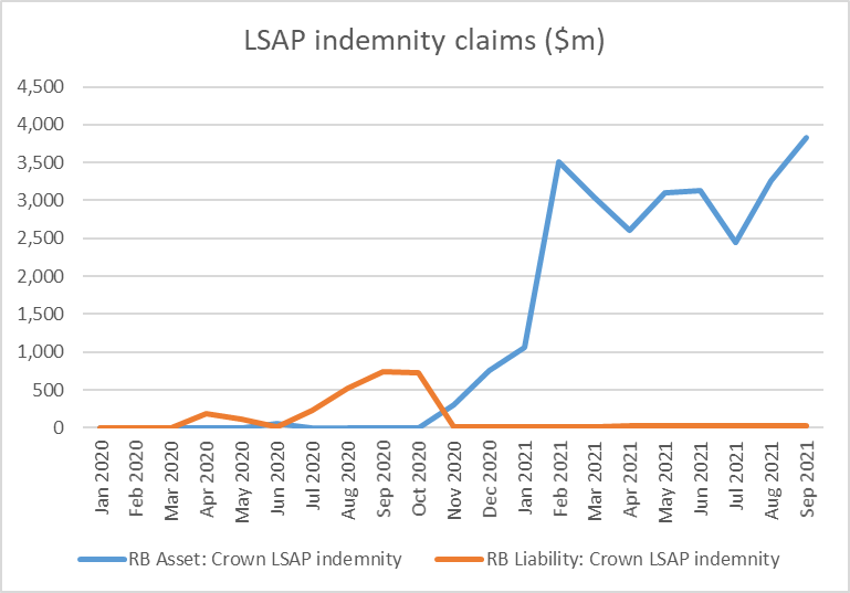
The government has, with no parliamentary authorisation or scrutiny, agreed to idemnify the Reserve Bank for any losses it incurs on the LSAP. That, at least, has the merit of encouraging/requiring some transparency. On the Reserve Bank’s balance sheet there are two line items, show in this chart

LSAP indemnity claims

To be honest, I’m not quite sure what the orange line is, since as I read the indemnity the liability is one-way only (Crown pays Bank if Bank loses) but it looks like it may reflect periods early on when the LSAP bonds were valued at more than they had been purchased at (lower yields than is). In any case, it is irrelevant now as the remaining number is tiny. The blue line – the Bank’s claim on the Crown – is where the focus should be. That claim was almost $4 billion at the end of September, and nominal yields have risen further this month.

Since the Bank discloses all its purchases, in principle someone could go through and identify the losses on each and every purchase undertaken over the period (more than a year) that purchases were undertaken. But for our purposes here, suffice to say that government bond yields are a lot higher than they were. Here are few medium-long term government bond yields

govt bond yields

Recalling that bond prices move inversely with yields, September/October last year would have been a great time to have been selling bonds (top of the market and all that). But the Reserve Bank went right on buying more bonds (albeit at a slower pace), all of which will now be valued at less than the Bank paid for them. They were still buying (lossmaking) government bonds right through the June quarter – when core inflation was already above the target midpoint, and unemployment was back at pre-Covid levels – not finally stopping the purchases until mid-July.

Accounting for the LSAP isn’t simple. In some quarters, there is a tendency to say “well, since the bonds are (almost) all government bonds and the Bank is owned by the government it is all a wash, and nobody is any the worse off”. That is simply wrong, as I will demonstrate shortly.

But it is also wrong to simply look at the indemnity claim (blue line in the first chart above). If all the bonds were held to maturity – in some cases 19.5 years from now – the indemnity claim would come back closer towards zero (since, whatever the market value of a bond now, eventually it will pay the full face value). But it would also be quite wrong to deduce from that correct observation that if only the bonds are held long enough no one is any worse off. Bottom-drawing doesn’t address the issue. (It is worth noting that a few of the bonds the Bank purchased have already matured).

Instead, we need to think about what difference has been made to the overall Crown finances as a result of the independent choices of the Reserve Bank and its Monetary Policy Committee. Assume the rest of the government would have made exactly the same choices they did – spending, taxes, bond and Treasury bill issuance- and assess the marginal financial impact of the Bank’s choices and actions.

The government, of course, did quite a lot of spending and quite a lot of borrowing through the course of the Covid crisis. The Reserve Bank publishes tables of the monthly influences on settlement cash (deposits banks hold at the Reserve Bank). There is a weirdly long lag (for data which really should be available next day), but for illustrative purposes between March 2020 and August this year the government issued domestic debt (bonds and bills) on market, net of maturities, that raised $73.2 billion of cash. Over the same period, its cash outgoings exceeded cash revenue by $33.6 billion. In other words, the government issued a great deal more debt than the net spending it needed to fund. As a result, the balance in the government’s account at the Reserve Bank went up sharply. The balance used to be kept just modestly positive, but this is how things have unfolded since the start of last year.

CSA balance

Mostly the government issued so much debt because it expected to need the cash. Tax revenue came in a lot stronger than the fiscal forecasts had allowed, as the economy rebounded more strongly than forecast (and inflation came in stronger than forecast). But the debt issuance plans were about fiscal policy. As it happens, the Crown ended up issuing a lot of debt earlier than it needed to, at yields that were mostly attractive. The gain to the taxpayer arises from the fact that the bonds were issued last year at, say, 0.5 per cent rather than this year (or next year?) at 2 per cent.

But as far as the Reserve Bank was concerned, all that was a given.

And, incidentally, it is also why a large part of the huge increase in the size of the Reserve Bank’s balance sheet since Covid began is also a given, largely outside the Bank’s control.

When the government overfunds (raises more than its net outgoings) all else equals that reduces the balances commercial banks hold at the Reserve Bank. The net of tax payments, settlement of bond purchases, and government disbursements results in money flowing from the private sector (who bank with commercial banks) to the Crown.

But when Covid began, aggregate settlement cash balances held by commercial banks were about $7 billion, and had been so for some years. A net $40 billion drain to the Crown (see numbers above) needed to be funded somehow.

In normal times, if there were to be a persistent drain it would typically be countered by (funded by) a large buildup in the stock of short-term Reserve Bank loans to the financial system (typically fx swaps or repurchase agreements. Those loans would be rolled over quite often, until the underlying imbalance (government borrowing more than it needed to) was remedied. Doing so would have been pretty much of a wash all round: the Bank would be paying something like the OCR on the Crown Settlement Account, and earning something close to the OCR on its short-term collateralised loans. There would have been little or no market risk or credit risk (the loans would have been well-collateralised) and short-term interest rates would have been kept near the OCR. Most likely, the Bank would have made a small profit (monopoly provider of settlement cash is a position of some strength).

But nothing like this happened.

Instead, we had the LSAP. Now, to be clear, the LSAP was not launched with the intention of filling a hole in system settlement cash. No doubt at the time the Bank assumed that the government would, more or less, be borrowing as required to fund its own deficit, and that if anything, borrowing might be a bit less than the deficit at least while the programme was scaled up (recalling the global bond market illiquidity pressures in March 2020). The Bank’s primary intention – this isn’t a matter of dispute – was simply to lower market interest rates, buying bonds and driving (as they expected) a long way up aggregate system settlement cash balances. Had the government more or less funded just what it was spending over the last 18-20 months, then all else equal settlement cash balances now would be a lot higher than the $37 billion they were last Friday. Recall too that the Bank changed its policy in March 2020 such that all settlement cash balances – without limit – now earn the OCR (previously there was a quota system in which the Bank really only fully remunerated banks for the balances they “needed” to hold for interbank settlement to operate smoothly).

The intent of the policy was to take a big punt on interest rates (that is why they sought and obtained a Crown indemnity). The intent was to buy tens of billions of dollars of long-term fixed rate bonds to which the counterpart would be tens of billions of floating rate settlement account deposits. The Bank initially expected that all those deposits would be held by banks, but because the government overfunded the real counterpart is now in the much-increased balance in the Crown settlement account. But it was a large scale asset swap, which would turn very costly if bond yields went up rather than down. It represented a staggering amount of market risk, assumed by unelected (and not very accountable officials) on a scale with no precedent in New Zealand central banking history.

Views will differ on whether the LSAP made (or is still making) any material sustained difference to (mainly) long-term government bonds rates, and whether even if so that made (or is making) any material difference to New Zealand macroeconomic outcomes. I’ve been consistently somewhat ambivalent on the former, although my reading of the international experience with QE leaves me fairly sceptical. But since long-term interest rates do not matter in the transmission mechanism here in a way they do in (in particular) the United States – since very few fix mortgages for more than a couple of years, and most corporate borrowing is swapped back to floating – I’ve been consistently sceptical that the bond-buying programme (heavily focused at the long end) was making any material macro difference (the more so once the Bank decided to pay OCR on all settlement cash balances, actively preventing one possible transmission mechanism from working). Even if I did – which I do not concede at all – that usefulness ended long ago now (given what we know of the subsequent inflation outcomes and the push to raise the OCR quite aggressively now).

Whatever useful macro impact the Bank might sought last year – simply exploring the hypothetical – could as readily have been achieved by cutting the OCR further, including into modestly negative territory. And using that mechanism would not have involved big financial risks for the taxpayer

And instead now they are stuck with tens of billions of dollars of bonds, many with very long-term maturities, sitting on the Bank’s balance sheet, while the cost of funding (the counterpart liability) looks set to rise quite rapidly further.

In the end, what the MPC has done in effect is to neutralise or reverse the gains the Crown would otherwise have made through the good luck (mostly) of issuing so heavily last year when interest rates were so low, over and above what they were spending then. The Crown will borrow less in the next (more expensive) couple of years and the CSA balance wil no doubt over time be returned to more normal levels. Because more than all the excess bond issuance was, in substance, reversed through the Reserve Bank’s action, bringing tens of billions of long-term bonds back onto the wider Crown balance sheet. If they were to sell the bonds now (or in a scheduled programme over the next couple of years) the loss would be crystallised. That might be a good thing, to help sharpen debate and accountability. But whether the bonds are sold back now or held to maturity, the loss has already occurred. (This is not to say that rates might not go lower – perhaps even much lower – again in future, but that is just another bet at the expense of taxpayers, and no more likely than that bond yields rise further from here, deepening our (taxpayers’) losses.

But it as well to keep the choices by two parts of government separate, reflecting the different sets of decisionmakers. In borrowing as it did (and probably largely by luck re the revenue rebound) the government’s overfunding programme saved taxpayers a lot of money (for which there is no line item in the government accounts). By contrast, the Reserve Bank’s choices — quite conscious and deliberate ones – have cost the taxpayer a great deal of money.

The LSAP simply was not necessary, and it clearly was not well thought through. If there was an arguable case for some action in March 2020, that need quickly passed, and any bonds purchased then could relatively easily have been offloaded back to the market – probably at a profit (crisis interventions should generally be profitable) – by late last year. One might blame the Minister of Finance for providing the indemnity, but the main responsibility rests with the (supposed) technical experts at the Bank and on the MPC (albeit appointed by Robertson). It has cost us billions of dollars already – a $4bn loss is $800 per man, woman, and child, and most families could think of better things to do with such money – and the Bank now sits with a huge open market risk position, the value of which fluctuates by the day.

Having outlined my story – on which I will welcome comments – it is worth pondering why this hasn’t been an issue elsewhere or previously. A lot of bonds have been purchased by central banks in the decade after the 2008/09 crisis. Most likely there will have been two reasons. The first may be around transparency. It is great that we have the indemnity claim is reported each month.

But the much bigger factor must surely have been the continuing decline in global bond yields over the decade. This chart shows long-term bond yields for some of the more significant places where central banks reached effective lows on policy interest rates and engaged in large-scale asset purchases.

long bonds

When yields just keep trending downwards, having built up a portfolio of long-term bonds is (a) profitable, and (b) much less likely to be controversial. Who knows how much this was a subconscious backdrop to Reserve Bank (and Treasury/Minister) thinking here.

Finally, throughout this post I have treated government and Reserve Bank choices are separable and assumed both parties would have done what they did pretty much regardless of what the other did (around debt issuance and bond purchases). That seems sound for the most part, although the extent of the Crown overfunding is such that it is conceivable that without the LSAP – pouring huge amounts in settlement accounts – pressure (including from the Bank) might have mounted on the government to wind back the borrowing programme more aggressively than it did. But even if there is something to that argument, it is unlikely it would have become salient for several months – it took quite a while for the extent of the economic rebound to be fully appreciated, and by that time the bulk of the LSAP purchases had already been done.

As for where to from here, the losses from the LSAP have already occurred – the mark to market estimates largely capture that – but that is no excuse for the Bank continuing to maintain a large open position in the bond market. The bonds can’t be offloaded very quickly, but there is no reason not do so in a steady predictable preannounced way over the next year or two (say $2 billion a month). Given the extent of the CSA balance, there could even be merit in considering a partial government repurchase of the LSAP portfolio (say half of it). Doing that would not change the substance, but would put duration choices around the public debt and overall Crown liabilities back more nearly where they belong, with The Treasury and the Minister of Finance.

Participating in the labour market

Yesterday morning I was skimming through the online database for the OECD’s recently-released latest Economic Outlook when I noticed that their table for the labour force participation rate was for ages 15-74. Often tables and charts for the “working age population” are done for ages 15-64 but as a growing proportion of those 65 and over have continued working the 15-64 numbers have become increasingly unrepresentative. So I downloaded the data and had a quick look, resulting in this tweet. (2019 because last year’s numbers were thrown around for every country and aren’t necessarily that representative.)

I was a little surprised – not that we were towards the right-hand end of the chart, but that New Zealand was now highest.

But there I might have left it, except that Stuff’s Susan Edmunds got in touch. We had a bit of a chat, and she produced this article. The headline suggests that high house prices might be the explanation (but as I’d noted to the journalist a variety of factors will have affected a range of different demographics).

It is worth stressing here that a high participation rate is neither good nor bad in its own right. It depends. I’m not in the labour force these days, and since I’m fine with that and I’m not a burden on the taxpayer it isn’t really a matter for anyone other than me and my family. My mother was in the labour force for perhaps only two or three years of the 60 years between her wedding and her death. On the other hand, if people are deterred from working by very high effective marginal tax rates or by “overly-generous” welfare provision or highly inflexible labour markets that might be more of an issue. And in wars, states sometimes compel people into the labour force – there might be reasons of state for that, but it is hardly a first-best state of affairs.

But I was still a bit puzzled so dug about a bit more data. First, this chart showing (since 1986 when our HLFS began) the 15-74 participation rate for New Zealand relative to (a) the median OECD country, and (b) the highest participation rate of any country in each year.

OECD partic rates since 86

(Technical note: it is only since 2002 that there is complete data for all today’s OECD countries. Using a fixed sample of the countries for which there is data for the entire period takes out much of the dip in the median after 1990, but converges back to the orange line in the last half dozen years.)

So we now have the highest 15-74 participation rate of any OECD country, but that is quite a new thing. Over the entire period our participation rate has been at or above the median (which was probably my impression), but the closing of the gap is striking. Note that back in 1986, the universal age pension (NZS) was paid from age 60, so from that change alone it is not surprising that our participation rate is now materially higher than it was 35 years ago (in 1986 32 per cent of 60-64 year olds were in the labour force, while about 74 per cent are now).

But where does this highest participation rate show up once we dig a bit deeper, by age and by sex?

It turns out that it is nowhere in particular. For not one of the age/sex breakdowns I looked at did New Zealand score highest in 2019.

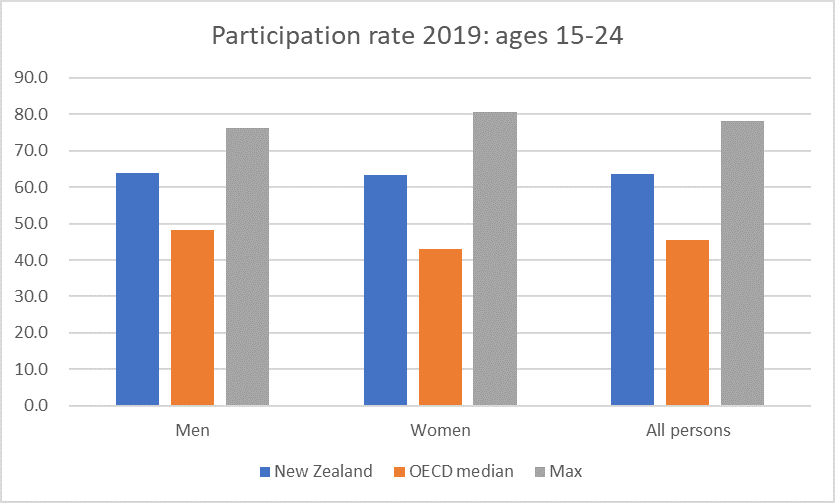
Here are the young people, aged 15-24

15-24

Well above the medians but also quite a bit below the highest participation rates, whether for men or women.

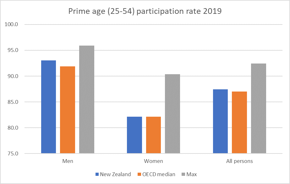
This chart, for what is often referred to as “prime [working] age” people (25-54) took me a bit by surprise.

prime age

Not only are the New Zealand numbers not that near the maximum but for women of this age New Zealand was the median country in 2019. So much – it would appear – for the high house price story (at least as it is often applied, with both parents “having” to work even though they might prefer one to take more time out). Of course, house prices are high in some other OECD countries as well, but hardly any have quite the price/income ratios of New Zealand.

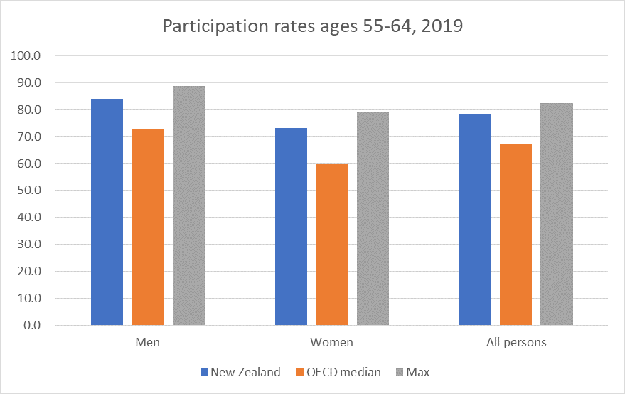
The next age group is the last before NZS eligibility now kicks in.

55-64

Here both male and female participation rates are well in excess of OECD medians, and not far off the highest rates (Japan for men, Sweden for women).

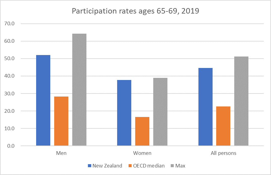
What about the 65-69 age group?

65-69

Again, well above the OECD medians for both men and women. but with a few countries higher than us especially for men.

And finally, the entire 65+ age group.

65+ partic

With much the same picture.

So standing back (and assuming the OECD did the 15-74 calculations correctly) we end up with the highest overall labour force participation rate for this working age band not by having spectacularly high participation rates for any particular age or sex sub-category, but from being well above the median in almost all categories, and at the median in a single sub-category (women 25-54).

(Note too that these are participation rates rather than employment rates – simply because that was the OECD table I started with – but note that New Zealand unemployment rates are typically below average among OECD countries.)

What should we take from all this? There are no doubt people who have dug into some of this stuff in more depth than I have here, but a few things strike me:

  • There is no single cause, factor or policy that explains New Zealand’s current participation rate being the highest in the OECD,
  • The high house price story seems unlikely to be that compelling, at least yet. For example, our working age participation rates are not particularly high (especially not for women), and today’s 65+ generation were already at least in their mid-30s 30 years ago (which is when real house prices really began to take off),
  • Our NZS regime is relatively supportive to labour force participation (since there is no income-testing or abatement), but as other countries raise their state pension ages, the income effect will tend to dampen labour force participation here among the 65+ age group, relative to some other OECD countries,
  • Much as I am not a fan of our high (absolute) rate of people receiving working age welfare benefits, or of the fact that our minimum wage is now high relative to median wages in New Zealand, it is only fair to note that our labour force participation rates are at or (mostly) above those in most OECD countries for every demographic shown here.

In the original tweet (above) I contrasted the high rate of labour force participation in New Zealand with the dreadful record on average labour productivity. In 2019 it would have taken a 68 per cent lift in average New Zealand real GDP per hour worked to have matched the leading bunch in the OECD (the US and some northern European countries). But by putting in more labour inputs (some mix of being employed and hours per job) we keep rather closer to the first world on average per capita incomes. The comparisons with the UK – not one of the highest productivity countries – is illustrative. UK average labour productivity is about 40 per cent higher than that of New Zealand, but UK real GDP per capita is only about 10 per cent higher than that here (both on OECD estimates). The UK does not have a low participation rate, but their participation rate (see first chart) is far lower than New Zealand’s (as are average hours worked per capita).

Sometimes the story is portrayed as one of employed New Zealanders working long hours. There is something to that story – working hours per worker in New Zealand tend to be in the upper quartile for advanced countries (only Lithuania was higher in 2019 among OECD countries – although Singapore, Korea and Taiwan are all materially higher). Some of that, in turn, doesn’t reflect long hours each week, but shorter annual leave entitlements than in many European countries. But equally important is long hours over a lifetime – our young people and our old people are simply more likely to be in the labour force than in the rest of the OECD, for a mix of reasons that can’t simply be dismissed as “good” or “bad”.

To the extent those reasons are “good” just think of the per capita incomes that could be sustained here if policies were ever adopted that once again delivered average productivity getting even close to the leading bunch in the OECD.

Labour share of income

I’m out of town today so just a short post.

I’ve written various posts over the years looking at the labour share of income and how that has changed over time in New Zealand, and how what has gone on in New Zealand compares with other OECD countries (eg here).  My story –  just using the official data –  has been a relatively positive one, if labour shares actually tell one much (one can envisage an alternative set of outcomes in which productivity growth has been much faster, the labour share of national income was lower, but most people were still better off than in the actual underwhelming economy we’ve lived in).

We don’t have these data quarterly, so the annual national accounts release a few weeks ago gave us the once a year update.   Here is total (economywide) compensation of employees as a share of three measures of the size of the economy.

labour share 2019.png

(The indirect tax and production subsidies adjustment is because, say, raising GST raises nominal GDP/GNI/NNI, but doesn’t generate any more production/value in the economy to share around.)

The picture no longer seems quite so encouraging.  When I first did charts of this sort three years or so ago, I focused on the share of GDP.  There had been an increase in the labour share and things now seemed to be holding steady.  For example

COE

But with subsequent revisions to the data to 2016, and the new provisional data for the more recent period there has been some slippage even in the labour share of (adjusted) GDP.    But GDP isn’t a good measure of effective income available to New Zealanders.   It includes depreciation, which is simply about maintaining the existing capital stock.  And includes the portion of the economy’s production that accrues to foreigners (mostly interest and profits).

It seems to me that the ratio of compensation of employees to net national income (NNI), adjusted for indirect taxes and production subsidies, is probably the most sensible whole-economy measure.  And on that measure there had been a pretty substantial increase in the labour share of New Zealanders’ net income in the 00s, but quite an unwinding again this decade.

I’ve previously shown charts illustrating that New Zealand wage rates appear to have been rising faster in New Zealand than nominal GDP per hour worked (the best quarterly proxy for the economy’s overall “ability to pay”). I argued that that was consistent with –  another way of expressing – the idea of a high, fundamentally overvalued, real exchange rate.   Since the quarterly GDP series is being substantially revised late next week, there is no point updating that chart right now.  But it will be interesting to have another look –  including at the annual version using, eg, the NNI data –  when the GDP data have been released.  Most likely, those data will show a bit more productivity growth in the last few years, but the “a bit more” is likely to pale in comparison with the extent of the productivity underperformance over decades.

Fix that –  which might involve the government, Opposition, and official agencies taking the problem seriously –  and most New Zealanders would be materially better off, whatever the aggregate labour share.

Championing social democracy not productivity

Not unlike the OECD, our Productivity Commission tends to lean left.  Not usually in some overtly partisan sense, but in a bias towards government solutions, a disinclination to focus on government failures as much as “market failures”, and a mentality that is often reluctant to look behind symptoms (which government action can sometimes paper over) to look at deeper causes and influences.

Sometimes the cheerleading for the left becomes more overt.   There was a streak of that evident in their climate change report a year or two back, but it seems particularly evident in their latest draft report out this morning.    Reflecting the change of government, the political complexion of key personnel of the Commission, the Commissioners –  while each individually capable –  appears to have shifted leftwards.

The Productivity Commission’s inquiries are into topics selected by the government of the day.  The current Minister of Finance has been keen on his “future of work” theme for years, dating back at least to when he became Labour’s Finance spokesman.  Now that he is Minister of Finance he is able to get the taxpayer to cover work in this area.  Here are the terms of reference for the current inquiry into “Technology disruption and the future of work”.

Apparently prompted by the government, the Commission appears to have begun releasing draft reports in stages.    This seems a useful step forward: potential readers or submitters might be faced with a series of 100 page drafts, not the single 500 page behemoths that the Commission often used to produce.  The draft report released last night (“Employment, labour markets and income”) is the second of five as part of this inquiry.

What it boils down to, amid various reasonable insights, is a push for a much bigger welfare state, allegedly in the cause of lifting average New Zealand productivity (and sustainable wages), without a shred of evidence or careful considered analysis connecting one to the other.    It is the sort of thing you might expect a political party to come out with –  the Labour Party conference, for example, is meeting shortly –  but not so much independent bureaucrats supposedly focused on productivity.

This, from the Commission’s press release, is the gist of what they are about.

flexicurity 1.png

I heard Sweet on the radio this morning playing up the contrast –  beloved of people championing flexicurity-  between “job security” and “income security”, claiming that New Zealand has the former (“a bad thing”) but not the latter.

The mental model that appears to be driving the Productivity Commission in this draft report is one in which we have an excessively rigid labour market, with people (and society) reluctant to face job change, and that this in turn is a big part of the reason why business investment has been low, and productivity growth has fallen far behind.  There is little or evidence adduced to support these claims, let alone the next leap that if only people were given more money more readily when they lost their jobs we’d be well on the way to solving our productivity failings.

Here is the Commission’s summary of the good and the bad, as they see it, of New Zealand’s labour markets (from p21 of their report)

flexicurity 2.png

It isn’t obvious that low labour productivity is particularly a labour market issue, but setting that to one side for now, I wouldn’t disagree with any of those bullet points.  But I’d look at the first group (“the good”) and be inclined then to suggest that this wasn’t the area to be looking if I was trying to do something about (a) economywide productivity growth or (b) adoption of new technologies by firms.  Our labour market looks pretty flexible and responsive. The Commission itself says so.

So why then the push for much higher welfare payments (call them “social insurance” if you like) to people who lose their jobs, less means-testing etc etc?  It can’t be economics –  facilitating ready movements of people from one job to another etc –  so it really has to politics; a view on a different set of income distribution arrangements.  That is stuff elections should be fought over.  But it simply isn’t that credible that the absence of these very general northern European approaches is causally connected to the failures of productivity here  (except perhaps in the reversed causation sense that richer and more productive countries may choose to be more generous).

The Commission is dead keen on us following the example of Denmark, the Netherlands, and Sweden.  These are all highly productive economies (which appear in the grouping of top tier countries –  northern Europe and the US – I often use here in productivity comparisons).  But it isn’t obvious that their labour markets function betters than ours does.  I’ve shown some comparisons re Denmark previously, when Grant Robertson in Opposition was touting the Danish “flexicurity” approach.   In that post, I concluded

I imagine that life on the unemployment benefit is a bit more pleasant in Denmark than in New Zealand, but it isn’t obvious that the Danish structure, as a package, is producing, over time, better outcomes than what we have here.  And their model is vastly more expensive, and more heavily regulated, consistent (of course) with Denmark’s position as the OECD country with the third largest share of government spending as a per cent of GDP (57 per cent).  New Zealand, by contrast, has total government spending of around 41 per cent of GDP

Perhaps more regulation and more spending was Robertson’s point.  I guess we have elections to debate such preferences, but it seems a stretch to believe it would be an approach that would make our labour market function better.  It isn’t obvious Denmark’s does.

But lets update the comparisons and extend them to include the Netherlands and Sweden as well.

First, take a look at the OECD’s indicators around employment protection legislation.  Recall the Commissioner claiming New Zealand has “job security” and suggesting we need to move further away from that.   Well, here are the comparisons.

The OECD indicators on Employment Protection Legislation
Scale from 0 (least restrictions) to 6 (most restrictions), last year available
Protection of permanent workers against individual and collective dismissals Protection of permanent workers against (individual) dismissal Specific requirements for collective dismissal Regulation on temporary forms of employment
Denmark 2013 2.32 2.10 2.88 1.79
Netherlands 2013 2.94 2.84 3.19 1.17
Sweden 2013 2.52 2.52 2.50 1.17
New Zealand 2013 1.01 1.41 0.00 0.92

New Zealand’s legislation around employment protection is more liberal on each measure than any of these flexicurity countries –  quite materially so in most cases.

Or unemployment rates, not just a one year snapshot but a glance back over this century to date.

flexicurity 3.png

Most of the time, most years, New Zealand’s unemployment rate has been lower than that in the median flexicurity country.  The differences aren’t always large, and aren’t even always same-signed, but it isn’t an obvious advert for the alternative model.

And what about employment rates?

flexicurity 4

Sweden has employment rates very similar to those in New Zealand, but taken together this group isn’t necessarily a great advert for an alternative income support model.  Of course, in richer and more productive countries more people can afford to work less etc, so I’m certainly not suggesting the whole difference is down to the presence/absence of flexicurity. Perhaps there is a political “income distribution” case to be made –  that’s one for political parties – but I’m struggling to see reasons why, evidence that, flexicurity offers potential labour market/productivity gains.

And to emphasise that flexicurity in these countries is just one component of a radically different approach to the role/size of government, here is a chart showing government spending.

flexicurity 5.png

The Commission even concedes (page 60) that materially higher income replacement rates when people become unemployed seems to be associated (in a cross-country relationship) with higher rates of (long-term) unemployment.  As they note, it isn’t an ironclad relationship –  there is always a lot of other stuff going on, which needs much more careful analysis to distinguish.   But why they would jeopardise one of the more impressive economic achievements of New Zealand this century (low averages rates of unemployment, especially long-term unemployment) isn’t clear.

Much of it comes down to this alleged “attitudes to technology” issue, even though the Commission makes no attempt at all to show that fears about technology or job displacement is somehow a major factor –  a factor at all for that matter –  in low rates of business investment in New Zealand.

They begin one section late in the report this way

flexicurity 6.png

So even though the Commission itself has concluded (reasonably, or so it appears to me) that “fears of mass job losses from automation [are] unsubstantiated” one public opinion poll is enough to suggest there is some widespread systematic structural problem.

One might well wonder whether (a) it was not ever thus (except perhaps in the hyper full-employment period of the 1950s and 60s, and (b) whether those fears are not being fed by people like the Minister of Finance.  Without evidence that any such fears are (a) much greater than usual, (b) causally connected to weak business investment in technology, and (perhaps) (c) evidence that such fears are lower in the flexicurity countries, it isn’t a great basis for proposing far-reaching policy change.

Following on from that extract we get this

Bredgaard and Daemmrich (2012, p. 2) described the Danish “flexicurity” system (Box 3.2) as a strategy for “economic competitiveness and sustainable national prosperity”.
Firms in Denmark gain competitive advantages from a mobile labour force and government funding of public services and infrastructure, while workers benefit from domestic employment opportunities and continuing training.

Well, perhaps, but I”m sure one can find champions for any country’s appraoch, but where is the systematic cross-country evidence, including relative to New Zealand (a country with lower average unemployment rates, lower long-term unemployment, higher employment).

And then there is this

flexicurity 7

But, as already noted, New Zealand not only has fewer job security protections than France –  the bad example cited here –  but fewer than those in Denmark, Netherlands, and Sweden.    And one might remind the Commission that correlation is not causation, especially when it isn’t supported by any independent argumentation to make the case that (a) flexicurity produces these poll results, and (b) more importantly, flexicurity increases the rate of uptake of new technologies across economies as a whole.   The Commission offers nothing on either point.

One could go on. The Commission notes that one “could” introduce “portable redundancy accounts” as, apparently they do in Austria. But makes no real case for doing so, and never seems to engage with (for example) the tax inefficiency (to the individual) of having various pots of money tied up in various places, all while (typically) having a mortage on the other side of the balance sheet.  They toy with ideas of mandatory redundancy, but again without any attempt to demonstrate a connection to productivity or business investment.  They worry about the ability of people who lose their jobs to service a mortgage, but never seem to adequately connect that concern to the fact that if there is a system that generates little long-term unemployment, most people are usually relatively readily able to find new jobs, and can self-insure (both formally, through mortgage protection insurance, and informally –  it isn’t common for both members of a couple to lose their jobs at once).  Mortgages in New Zealand are, of course, highly burdensome, but that is a reason to fix land supply and get the price of houses down, not to greatly enhance the welfare system.

Changing tack, I was also interested that the Commission did not touch on three other dimensions that might seem relevant to discussions around the sorts of schemes they propose:

  •  the fiscal automatic stabilisers in New Zealand tend to be quite muted.  That reflects the twin facts that our tax system isn’t highly progressive and that our unemployment benefit system is modest and pays a flat rate.     What the Commission proposes would strengthen the automatic stabilisers, but at the price of increasing the cyclical amplitude of cycles in the government’s budget balance.  There are pros and cons to such a change, but they didn’t seem to be mentioned at all,
  • the Commission rather overdoes the point about social insurance and how different New Zealand and Australia are to the rest of the world, but there is one important dimension they didn’t touch on.  In other countries, the social security systems are typically partly funded by social security taxes on wages.  That means tax rates on wages are typically higher than those on capital income.    This is a relatively attractive feature, given that business investment (especially foreign investment) tends to be quite sensitive to expected after-tax returns (and people like Andrew Coleman and me have been making this point for years).    Even if we did not increase welfare payments to the unemployed there would be a good case to lower income tax rates and raise the lost revenue through a social security tax on labour incomes.  This wasn’t a dimension the Commission touched on and while, considered politically, that might not be surprising, it is quite a gap analytically.

In sum, there is no sign that the current Productivity Commissioners have any sort of robust defensible model for thinking about New Zealand’s long-running productivity failures. In particular, they show no sign of having thought hard about why firms operating here –  and who might operate here –  have proved so reluctant to invest more heavily over long periods of time.   There is no evidence offered that excessive rigidity in the labour market, or fears of workers, is any part of the issue at all.

And yet they jump to champion quite radical changes in our welfare system, even including near the end of the report a folksy politicised cartoon

flexicurity 8.png

The economic case just is not made.  Sure, it would be great to have a highly productive economy, but the Commission simply has not made a serious effort to demonstrate any sort of causal connection between their (apparent) personal political preferences around unemployment benefits/social insurance and any sort of plausible path to much better productivity outcomes in New Zealand.   (And here one might note that places like France and Belgium –  with quite restrictive labour laws, much more so than the flexicurity countries –  have similarly high average rates of labour productivity.)

If they want to champion such a model –  and reasonable people can debate the merits of some aspects of it in its own right – there is an election next year. Perhaps the Commissioners might consider standing for Parliament instead of using taxpayer resources to champion a different answer to inherently political questions.


Participation rates for older people: kudos to SNZ

In my post yesterday on labour force participation rates I included this chart

p rates old

There has been some increase in participation rates for those aged 70 and over, but the really striking movement has been in the 65-69 age group.   More than half of men, and almost 40 per cent of women, in this first NZS recipient age group, are still in the labour force. (Interestingly, the gap between male and female participation rates for this age group hasn’t materially changed over the 30+ years of the chart.)

I went on to observe, relevant to NZS policy, that (emphasis added)

If you are able to work and are financially able not to, that is almost entirely a matter of individual/family choice, but you (generally) shouldn’t be eligible for long-term state income support.  New Zealand’s experience suggests that the overwhelming bulk of those aged, say, 65-67 are well able to work (we don’t have the data, but presumably –  given what happens from 70 on (see above) –  participation rates of those 68 and 69 are materially lower than those for people 65-67).   Against that backdrop, there is something just wrong about having a universal pension paid to them –  well, me not that many years hence on current policy –  simply on the basis of having got to that age.

My post caught the eye of someone at Statistics New Zealand who dug out the data by each year in the 65-69 age range, and sent me the following chart.

alex snz 2

The standard errors on some of these estimates are quite large, so don’t pay much attention to the year to year changes in each series. But it was good to see a consistent monotonic pattern in which –  beyond the NZS eligibility age –  the older you are the less likely you are to be working.

Using the data she sent me, here are what the participation rates look like for men and women separately at ages 65 and 69 (also for September years).

65 and 69

So almost 70 per cent of men aged 65 –  almost all of whom will be recipients of NZS –  were still working (or, in small numbers, actively seeking work).  In some cases, of course, that work will be part-time only (being employed, in HLFS terms, means a minimum of an hour’s paid work in the reference week), but even a half-time minimum wage job would pay as much or more as a single rate of NZS.

As interesting perhaps is that even at 69 40 per cent of men were still active participants in the labour force.   Since women have a longer life expectancy than men, presumably the materially lower female number is a reflection of past cultural practices and expectations –  or perhaps even a  stronger preference to spend time with grandchildren or in community activities –  rather than physical incapacity.

I don’t often praise SNZ but today I offer only unmitigated kudos

(Well, perhaps mitigated only in this sense that if the annual data are readily available, and they are happy for people to use them –  as they told me they were –  why not make them routinely available on Infoshare?)


Participation rates

A passing comment in a post the other day about the labour force participation rates of older people prompted me to pull down the fuller data and see what we could see about various participation rates over the decades since the HLFS began in 1986.   As it happens, the unemployment rate in 1986 averaged 4.2 per cent, exactly the same as the current unemployment rate, so cyclical factors shouldn’t materially mess up long-term comparisons.

Here are the quarterly participation rates (employed plus unemployed as a percentage of the working age (15+) population.

p rate q

From which I’d make only three quick observations:

  •  how stable the male participation rate has been since the end of the 1980s (even through a couple of very nasty recessions),
  • the strong upward trend in the female participation rate, and
  • while there is some modest cyclicality in the overall participation rate, it isn’t a stable or reliable cyclical indicator (eg the peak in the 00s was a year after the recession started, while the 90s peak was a year or so before the recession started).

But aggregates can mask a lot of interesting patterns, and around participation rates that has been particularly so for men (the female participation rates are just dominated by the strong upward underlying trend).   From here on, I’m using annual data (years to September), as there is less noise and more data reliability for some of the small age groupings.

Here is the data on participation rate for what you often see referred to as “prime age” people, those aged 25-54.

prime age total

Prime-age male participation isn’t back to where it was in the 1980s but over the last couple of years it has been higher than the 2000s peak.

What about the two youngest age bands?

partic youth

In the 1980s (until 1989), people could leave school at 15, but I was interested –  and a bit surprised –  in the further step down in the participation rates of the 15-19 year olds ver the last 15 years or so.  Presumably there is some mix of factors at work: kids being less likely these days to have after-school jobs that was once the case, minimum wage changes, and……  Given the cost of tertiary education now (relative to say the 1980s) it still surprises me though.

Perhaps the bigger surprise though (at least to me) is that only around 80 per cent of 20-24 year olds are in the labour force.  You only need to have done one hour’s paid work in the reference week, or to have actively looked for work, to be included in this measure.

What sparked the post initially was participation rates of those in the older age groups.  Here are those for the 55-64 age.

p rate 55-64 Participation rates for this age group are much higher than they were for both men and women.   When the data start, the full rate of New Zealand Superannuation was available at age 60 (at, if I recall correctly, a higher rate relative to wages than is the case now).  I was a little surprised to note the dip in participation rates in the last couple of years: for this group of women the latest observation was lower than in any year since 2013.

And what about the participation rates of those 65 and over, almost all of whom have been eligible for NZS throughout?

p rates old

There has been some increase in participarion rates for those aged 70 and over, but the really striking movement has been in the 65-69 age group.   More than half of men, and almost 40 per cent of women, in this first NZS recipient age group, are still in the labour force. (Interestingly, the gap between male and female participation rates for this age group hasn’t materially changed over the 30+ years of the chart.)

And here is the comparisons between those aged 60-64 and those aged 65-69.

p rates NZS transition

In my post last week, I noted that the participation rates of those now aged 65-69 were higher than those for people aged 60-64 when the survey started, at a time when the NZS eligibility age was still 60.    I see this as a fact buttressing the case for raising the NZS eligibility age now (to, say, 68, and life expectancy indexing beyond that).  By some mix of revealed preference to work, and of need, large proportions of the population went on working for some years after being eligible for a universal pension, suggesting not only that they were physically capable of doing so, but that many of their peers who chose not to work would also be physically capable of doing so.

However, the comparative story over time is complicated at least a little by changing norms and expectations around female participation.  In 1987 under 20 per cent of women aged 60-64 were in the labour force: these were women born in the 1920s, (mostly) mothers of the first baby boomers at a time when female prime-age employment wasn’t that common.  Now almost 40 per cent of women 65-69 are in the labour force, almost as high a share as for the 60-64 year old males in the late 80s.    The increase in participation rates among males – today’s 65-69 year old compared with 1987’s 60-64 year olds is real, but less dramatic  –  up from just over 40 per cent to just over 50 per cent.

And just to end, a couple of international comparisons charts re participation rates for those aged 65-69.

Here is the participation rate in 2018

partic rates OECD 65 to 69.png

It really is an astonishing range.   It isn’t correlated with prosperity (there are poor performers at either end of the chart) or, that I could see, with life expectancy or health status.  I suspect –  but haven’t checked –  it is pretty strongly correlated with the abatement regimes (if any) around state pension.   One of the best things about the New Zealand system is that although NZS provides an income effect encouraging people to think about stopping work, there is no relative price or substitution effect: as an older person you can work as much as you like and it doesn’t affect how much NZS you receive.  In many countries, the rules aren’t like that; it often isn’t economically attractive to go working.

And what about the change over time in the proportion of those 65-69 in the labour force?  The OECD has complete date only since 2002 so here is the change since then.

chg in partic rates 65 to 69

What I found interesting about that statistic for New Zealand is that that further large increase in the 65 to 69 participation rate has been exclusively in the years since the NZS eligibility age got to 65 (in 2002).  You can see in the chart above that our participation rates for those 60-64 also increased markedly over that period.

I’m not one of those inclined to celebrate (paid) labour for labour’s sake. I don’t think I was when I was in the paid workforce and I’m certainly not now.  But when the alternative is state income support then I do take a harder line view.  If you are able to work and are financially able not to, that is almost entirely a matter of individual/family choice, but you (generally) shouldn’t be eligible for long-term state income support.  New Zealand’s experience suggests that the overwhelming bulk of those aged, say, 65-67 are well able to work (we don’t have the data, but presumably –  given what happens from 70 on (see above) –  participation rates of those 68 and 69 are materially lower than those for people 65-67).   Against that backdrop, there is something just wrong about having a universal pension paid to them –  well, me not that many years hence on current policy –  simply on the basis of having got to that age.

Fans of a Universal Basic Income will, of course, not agree.  I am not a fan, having both practical and moral objections to a UBI.


Nurses, pay equity, and the real structural problems

I’ve heard or read a couple of strange stories in the last day or so about the nurses’ trade union making the case for a “pay equity” settlement for their members.

Of course, the very notion of “pay equity” settlements is bizarre, fit only for somewhere like the old Soviet Union.  Some government officials decree that job x should be paid the same as job y, as if the price of a banana should be adminstratively and arbitrarily set equal to, say, the price of a kiwifruit because the two might have (say) similar nutritional value.

But what interested me were two lines being used by the nurses in support of the view that they were underpaid (neither line seemed to have much to do with the false equivalency of “pay equity”, but were rather intended to support the claim that nurses were –  absolutely –  underpaid).

The first, reported here, was this

“In Australia, nurses can be paid as much as $90,000 as a base rate with penal and on-call rates as well. The limit in New Zealand sits around $68,000.”

Last I looked, real GDP per hour worked in Australia (in comparable – PPP –  terms) was 41 per cent higher than in New Zealand.  That is the best aggregate measure of labour productivity.  You’d expect wages and salaries for most jobs to be higher in Australia than they are in New Zealand.   That appears to be so for nurses.   A larger share of New Zealand’s population is in paid employment than is the case in Australia, so the difference in per capita income is a bit smaller, but still just over 30 per cent.  In material terms, Australia is now a richer and more successful country than New Zealand is.  Those gaps keep (slowly) getting wider.

Because of the somewhat-common labour market between the two countries that creates some specific problems for New Zealand.  Plenty of people will look across the Tasman, weigh up the pros and cons of the heat, the snakes and spiders, and the challenges and opportunities of big cities, and move.    Since our somewhat-common labour market applies across the board (not just, say, to public sector nurses), it isn’t a problem we can fix by simply agreeing to all pay ourselves more.  Those sorts of outcomes have to be “earned”  –  not about individuals working harder, but about the economy as a whole finding better and remunerative opportunties, lifting earning possibilities for everyone.  Do it enough, and one day that might even be a net flow of New Zealanders coming back from Australia (Ireland managed it, it can be done).

I’m sure the Nurses Organisation is better connected to people at the top of the government than I am, so I can only urge them to suggest to their friends and allies who currently hold office that economywide productivity might be elevated quite a long way up the list of government priorities (in the Labour Party “Our Plan for New Zealand” brochure dropped in my letter box the other day it featured not at all).  Remind them, perhaps, that for decades New Zealand has been failing on this count, reducing successive governments to pretending to a success that just hasn’t been achieved.  In consequence, wages are much lower than they really should be, and we’ve been more limited than anyone would have liked in dealing with all sort of other social problems.

(Of course, from a Nurses Organisation perspective the strategy I’m proposing would fail any sort of cost-benefit assessment: neither National nor Labour show any sign of being seriously interested in doing what it might take to generate much better productivity and incomes, and (by contrast) the nurses seem to have the government wrapped around their little finger on the pay-equity path to improving their own position. But I’m sure nurses are public-spirited people, and they have children too, not all of whom will choose to be nurses.)

The other strand of the nurses’ argument was a bit closer to home. A Wellington hospital nurse was quoted as saying

Only a quarter of the nurses she worked with lived within walking distance of their hospital.  The result was that only a quarter of the nurses Ms Hopkinson worked with lived within walking distance of their hospital.

“We can’t afford to live in the communities we nurse in, we’re priced out of these neighbourhoods.”   12 years ago when she started, nurses lived in the central city, but that was no longer the case.

“They’re commuting from Featherston, from up the Kapiti Coast, Upper Hutt; they’re a long way away and they won’t be able to make it to us after an earthquake.”

Even in Wellington, it did seem a bit of a stretch to argue for a pay rise so that nurses could walk to the hospital when the 1 in 300 year earthquake hits.  The present value of the cost of that possible post-quake complication will be pretty small indeed.

Now, as it happens I do live within walking distance of Wellington hospital. It is a pleasant middling suburb, and when I was younger I knew lots of nurses who lived in the neighbourhood, attended our church etc etc.  It was close to their work and convenient.  As I’ve noted previously, I bought my first (three bedroom, 30 year old) house in this same suburb 30 years ago –  actually bought it from a teacher who was moving to Wanganui where housing was more affordable (it was near the peak of the then-boom).  The Reserve Bank’s inflation calculator tells me I paid about $296000 in today’s money for that house.

Real wages and productivity have increased since then.  Real GDP per hour worked has risen by a third, so roughly speaking spending $400000 on a house today would bear a similar relationship to incomes as $300000 then.

You cannot buy any house in Island Bay –  still less a three bedroom house, 30 year old, decent-sized section, garage etc – for $400000.  As it happens, earlier this week a real estate agent sent me a several page list of sales in the area in the last few months.  The cheapest property sold was a unit with no land at all, and 60 square metres of house: that went for $400000.  The next two cheapest ($507K and $570K) were also units and had 60 and 70 square metres respectively.  The cheapest house that looks roughly comparable (size, age, but much smaller section) to that first house of mine went for $805000.   The median price across those particular 37 properties was $960000.

It is insane.  No wonder nurses can’t afford to buy anything decent reasonably close to Wellington Hospital (there are slightly cheaper suburbs, but they’ll all have had much the same escalation).   It is not that nurses are underpaid.  And it isn’t just the nurses.  Anyone in a moderate-income job –  especially if there is only one income, or one fulltime and one part-time income –  will really struggle.  And, much as I quite like Island Bay, it isn’t Fendalton or Remuera or St Heliers –  yes, we have a beach too, but even with warming sea temperatures the sea is always more ‘refreshing’ than inviting.

It simply isn’t an issue about nurses, or nurses’ pay.  It is a straightforward consequence of vicious choices that a series of central and local governments have made to mess up urban housing markets.  Government has failed, very badly.  And if it perhaps doesn’t impinge too terribly on the children of the wealthy, it greatly restricts the options of most everyone else looking to get into the housing market, nurses included.  They are, to put it, colloquially, stuffed.  And if that isn’t you or your children yet, it will be mine in a decade’s time.  (Rents are not my primary focus, but in an age in which real interest rates are at record low, real rents should also be lower than ever.)

I’m sure the Nurses Organisation is better connected to people at the top of the government than I am, so I can only urge them to suggest to their friends and allies who currently hold office that fixing the urban land market might be elevated quite a long way up the list of government priorities (in the Labour Party “Our Plan for New Zealand” brochure dropped in my letter box the other day it featured not at all).   Nice Mr Twyford appeared to understand the issue when he was in Opposition, but there has been as little action from him in government as there was from the class enemies of the Nurses Organisation, the previous government.   Remind him, perhaps, of those fast-growing cities across swathes of middle America where good houses really are still affordable.  There is no shortage of land in New Zealand, not even in Wellington (except to the extent the Nurses Organisation friends at the Wellington City Council make it artifically so.   Do not just paper over the cracks, but fix the problem at source.

(Of course, from a Nurses Organisation perspective the strategy I’m proposing would fail any sort of cost-benefit assessment: serious land-use reform from either National or Labour still seems like a long shot (by contrast) the nurses seem to have the government wrapped around their little finger on the pay-equity path to improving their own position. But I’m sure nurses are public-spirited people, and they have children too, not all of whom will choose to be nurses. All of whom will eventually want houses.)

From any sensible policy perspective, so-called pay equity is just daft.  From the perspective of any particular group of workers, perhaps it is the fastest path ahead –  zero-sum game (well, worse) across the whole economy, but beneficial for those particular individuals. But, probably without really being aware of it, the Nurses Organisation put their finger on two really big symptoms of policy failure in New Zealand –  productivity/earnings and housing – that affect almost everyone.   While pursuing their own short-term self-interest, I would urge them to add their voice to the call for serious structural reform in these two areas.   They need it.  We all need it.  Political parties, meanwhile, keep on failing to deliver.

Working hours

The other day, for some reason, I was looking back at the records of this blog, and got curious about which posts had had the most specific views.  It turned out that for some reason (I think it got linked to overseas) this early post – about how New Zealand’s economy had done relative to other advanced countries since 2007 – was the “winner”.  Rereading the post, I lit upon this chart

hoursanglo

As I noted then

Hours worked are an input (which comes at a cost) not an output, so higher hours worked aren’t automatically a good thing.  There are good dimensions to it, if (for example) people are coming off long-term welfare back into the workforce, or older people are keen and able to stay in the workforce.  Hours worked per capita also gets affected by different demographic patterns –  they will be lower in countries with lots of under-15s or over 70s.  But, equally, part of the story of New Zealand in the last 25 years is that we have managed to limit the deterioration in our GDP per capita, relative to that in other countries, by working more.  Productivity would be better.

Over the full period since 1990, here is the change in hours worked per capita for New Zealand and the other Anglo countries, countries with reasonably similar demographics to our own.

1990 was the year just prior to a recession in many countries, including New Zealand, and is a not uncommon jumping-off date for looking at the experience of New Zealand since the reform era.

Since the post was almost four years old, I was curious whether anything much had changed.     Here is the same chart, using data from the Total Economy Database maintained by the Conference Board.

hours per capita 2019

Something of a recovery in Ireland, but otherwise not much.     The difference between New Zealand and the other countries in the chart isn’t mainly a cyclical story, but even in the last decade a larger proportion of New Zealand’s per capita GDP growth has come from working more hours (per capita).

hours per capita 2019 2

(Interestingly, the UK labour productivity growth record over that decade has been even worse than that of New Zealand.)

I had a quick look at a wider group of advanced economies (OECD + EU + Singapore and Taiwan).   For the full period since 1990 there isn’t complete data for all countries (gaps mostly the former Communist countries of central and eastern Europe), but of the 32 countries for which there is data, hours worked per capita dropped by 1 per cent for the median country (up 16 per cent in New Zealand).    For the more recent period, where there is full data, the median country spent 2 per cent fewer hours per capita working, while in New Zealand median hours per capita increased by 2 per cent.

(For those interested, there is a group of countries  (Singapore, Hungary, Israel, Chile, Mexico, Poland) where hours per capita have increased materially more than in New Zealand over the last decade.)

I am not trying to draw any particular policy conclusions from these numbers, just to highlight them.  And it is not as if New Zealanders had been leisured people at the start of the period and were only now getting back to advanced country norms.  In fact, by 2017 we had among the highest hours worked per capita of any of the 40+ countries in my sample (Singapore is off-the-charts high, and South Korea comes second).

As a reminder, hours worked are an input not an output.  High (or increasing) hours worked is generally not some achievement to be celebrated, although there can be some caveats to that.

If the unemployment rate had been particularly high at the start of the period, one might genuinely welcome it dropping. Involuntary unemployment is, almost by defintion, a bad thing.  But when my comparisons started (in 1990) New Zealand’s unemployment rate was about the middle of the pack for the Anglo countries in the charts (by 2007 we had the lowest unemployment rate of any of them).

If you are uneasy that the welfare system accommodates too many people not working who should be providing for themselves, then successful welfare reforms might increase average hours worked per capita and that might then be regarded as a good thing –  whether fiscally, socially or whatever.  The proportion of working age adults on welfare benefits (ie including the unemployed) did drop quite bit in the 1990s and early 2000s.   But it was 10 per cent in 2007 and it was still 10 per cent in 2018.

Tax system provisions (or the interaction with pension rules) can also deter people from working when they might otherwise choose to.  New Zealand has a public pension system that specifically does not deter people from staying in the workforce after age 65 if they so prefer, and between 1990 and 2007 we increased the NZS eligibility age by a whole five years.  Personally, I think that was a desirable change, but the fact remains that high and rising hours worked per capita has not been a complement to some stellar productivity performance and improving opportunities.

In aggregate, more New Zealanders have been working more hours to –  in effect –  offset some of the relative income loss that our disappointing productivity performance would otherwise have led to.    As a country, our tenuous grip on upper-income status (really not much more than upper middle-income these days) is sustained only by working ever harder. That might be, in some sense, an appropriate second-best (for the individuals making those choices, reluctantly or otherwise). It is not obviously any sort of first-best outcome.

Terms and conditions surely?

With various media reports around – and numerous annoyed locals –  about Wellington public transport operators failing to deliver contracted services (cancelling services) because they haven’t (note the choice of word) recruited and retained sufficient drivers, perhaps it is time to haul up from the archives a couple of posts I wrote early last year on these and related issues.  Those posts were focused on bus drivers, while the latest stories feature both buses and commuter trains.  I see that, once again, there is talk of overseas recruitment.

This was my first post, sparked by reports that one company was wanting to recruit abroad to fill its vacancies.

Extracts:

What prompted this post was the story this week about a bus company – Ritchies –  wanting immigration approval to recruit foreign bus drivers.  Bus drivers don’t make the list MBIE released of occupations for which there were more than 100 (so-called) Essential Skills visas issued last year, but these occupations were some that did.

Essential skills visa approvals 2016/17
Truck Driver (General) 400
Winery Cellar Hand 396
Waiter 345
Sales Assistant (General) 320
Personal Care Assistant 289
Massage Therapist 259
Baker 231
Painting Trades Worker 220
Builder’s Labourer 185
Kitchenhand 181
Fast Food Cook 118
Farm, Forestry and Garden Workers nec 116
Bar Attendant 102

On the face of it, such roles don’t seem notably more (or less) taxing than being a bus driver.  It is a responsible role, but not one requiring huge amounts of skills or training (according to the story I linked to above 6 to 8 weeks training suffices).    It isn’t the sort of role one naturally thinks of when officials and ministers talk about skills-focused immigration programmes.

The case Ritchies make is that they can’t find locals –  New Zealanders, or people already here –  to fill new roles.

Auckland Transport awarded Ritchies Coachlines the contract to run buses on the North Shore from September.

But the company said so far it had not been able to find enough drivers locally and had asked Immigration New Zealand if it could bring in 110 of them from overseas to plug the gap.

And I’m sure that is correct.  If you pay low enough wages, it is hardly surprising that people with other New Zealand options aren’t lining up to work for you.

At least on the union’s telling

“The problem with Ritchies is that they pay over a dollar an hour less than the industry so their retention rates are minimal. People get trained up then they’ll go to other bus companies where the rates are better. Again Ritchies brings it upon themselves.

On the face of it, it looks like another case of a service contract won largely on the basis of (assumed) low labour costs.

The company more or less acknowledges the point

Mr Todd said the company would continue trying to recruit locally but only had until late June before it would need to look overseas for drivers including in Fiji, Samoa and the Philippines.

He admitted the $20.20 an hour it paid drivers would be difficult to get by on in Auckland but said this was the budget it had to work with.

“Lets face it, any job in the world, if you pay enough, you’ll get people to do it but…those costs will have to be passed on.”

I don’t really see the specific company as the bogey-man here.  They are operating in an environment –  bidding for public contracts –  where the overall level of funding seems to implicitly rely on access to very cheap labour (in this case, according to the company, from Fiji, Samoa, and the Philippines –  the jobs presumably not being attractive to bus drivers from the advanced world, since New Zealand is now a low income advanced country).

The same goes, more or less, for some other public-funded industries. Rest-homes, for example, rely heavily on immigrant labour from poorer countries: the existing level of rest-home subsidies constrain their options pretty severely.  No individual firm has a great deal of market power.  But the overall market is nonetheless skewed by policy choices successive governments have made about access to immigrant labour to fill what are mostly quite modestly-skilled roles.

It is why we need not small tweaks at the margins –  should or shouldn’t bus drivers (waiters, kitchenhands, or whatever) be on the approved list – but an overhaul of the entire immigration system.

But as part of that we should:

  • establish a strong presumption against use of unskilled immigrant labour (which mostly –  although not entirely –  competes with and tends to drive down returns to domestic unskilled labour), and
  • get ministers and officials out of the game of determining which specific roles people can and can’t hire short-term immigrant workers for.

To that end, I’ve argued previously for a system in which Essential Skills visas are granted on these terms:

a. Capped in length of time (a single maximum term of three years, with at least a year overseas before any return on a subsequent work visa, with this provision to apply regardless of skill level).

b. Subject to a fee, of perhaps $20000 per annum.


And this was the follow-up post from a couple of weeks later.

Extracts

In a typical market, there aren’t sustained physical shortages –  the price adjusts.  If in this case the price (driver wages) wasn’t adjusting –  if anything there was a suggestion Ritchies would be paying less than the previous operator –  it suggested the plan was to close the gaps another way (bringing in more relatively unskilled people from abroad.)    Ritchies has moral agency in that –  they made a choice to bid that way, and should live with the consequences if it doesn’t work (if, for some reason, MBIE turns down their application to bring in relatively unskilled workers from abroad).   But I didn’t want to focus on the individual company, since they are responding to incentives set up by various arms of government –  Auckland Transport offering the contracts, and even more so MBIE (as part of the New Zealand government) in making immigrant labour relatively readily available for what are really quite unskilled roles.    And it isn’t as if Ritchies is the only company operating this way.   Another operator has won most of the bus routes in Wellington, to take over in July, apparently operating on very similar assumptions about access to new immigrant labour.

I had some comments directly from people involved in the industry, on both sides.  In substance they were making quite similar points.  As one observed, demand growth (in this case for bus drivers) can always be met by expanded capacity (immigration) or higher prices (or wages).  They went on to argue that the ability of some companies to import drivers meant they won contracts, and that it was as clear a case of immigration driving down wages as you could find.

Of suburban driver jobs, I observed last week

It is a responsible role, but not one requiring huge amounts of skills or training (according to the story I linked to above 6 to 8 weeks training suffices).    It isn’t the sort of role one naturally thinks of when officials and ministers talk about skills-focused immigration programmes.

One driver confirmed that training story noting that his employer

…took me on with just a car licence. They spent about 8 weeks training me up and paid for the costs of getting a heavy traffic licence and a P endorsement (essentially a “fit and proper” test.)

In terms of (price-based) evidence of labour market pressures, this driver observed that over five years or so his basic hourly rate has increased by only around 1 per cent per annum (if so, that would be less than the average rate of CPI inflation, so a reduction in real wage rates).

There seem to be a variety of ways to spin the story as to how much bus drivers are being paid, and what the new entrants (Auckland and Wellington) are offering or planning to offer.   …..[But] there doesn’t really seen to be much dispute that the new operators –  claiming an inability to find sufficient local labour –  are not offering drivers more than the current operators.  Indeed, the general sense seems to be that pay for equivalent effort would be less than at present.

And in a typical, well-functioning, market, when demand exceeds supply –  and not just for a day or two  –  the price of the product or service in question will rise (not fall).   Quite how much the rise will be will depend on the elasticities of supply and demand –  maybe a lot more potential drivers would emerge for slightly higher wages (or maybe not), and maybe bus patronage would drop away sharply with slightly higher fares (wages are by far the largest component in bus company costs) or maybe not.  But you wouldn’t expect to see the relevant price –  bus driver wages –  under downward pressure when there is incipient excess demand for drivers.

(It is not as if the outgoing operators have had abundant labour.  As one correspondent noted “Go wellington have about 340 drivers for the current contract but even with huge active recruitment and training from scratch they only get 100 new per annum which is as many as they lose”.)

In fact, the way the bus driver labour market exists seems to be possible only because our governments –  present and past –  have opened up a channel through which supply can be increased, at or below the current price.  Open up incipient excess demand at current –  or lower –  than prevailing wages, and then get in workers on a (so-called) Essential Skills visa.

Bus drivers aren’t an occupation that appears on the official “skill shortage list” (if they were there would no further labour market test involved for any firm wanting to hire foreign labour).  Occupations such as bricklayers, plasterers, bakers, and jockeys are on the list.   But not being on the list doesn’t mean bus companies can’t hire foreign drivers.  There are just more hoops to jump through –  which is why employers who think they might have multiple vacancies (like the bus companies) are strongly urged (by MBIE) to seek an “approval in principle”.

MBIE’s employer guide is here.   You’ll see that for unskilled or modestly skilled jobs, part of the required test is to check with WINZ as to whether there are New Zealanders seeking work they can refer to the employer.   Bus drivers are in that category…….

That looks mildly encouraging.  You can’t just offer the minimum wage (for a job in New Zealand typically paying $5 an hour more than that) and expect to get your approval in principle to bring in foreign workers.   But if your wage contract is a little different from other operators (perhaps base rates are a bit higher, but other payments are lower?)  or even if you can find one other company somewhere in the country paying the same overall rate, you have to wonder (based on total numbers approved if nothing else) how rigorous MBIE is in enforcing the test.  And why, for example, it isn’t given more prominence in their guide to employers?

Because, you see, MBIE is really keen that firms hire foreigners.    In fact, they have whole website pages devoting to extolling the virtues of immigrant labour –  so much so that one has to wonder whether they really see themselves working in the interests of New Zealand citizens.    Employers are told

“Hiring migrants is a great way for you to maintain and grow your business”

And then the first item under that “Why hire migrants?” employers are told

Migrant workers can do more than just fill a gap in your staffing. They bring with them an international perspective and connections, provide support to up-skill local employees, add diversity, and generally can help businesses to stay ahead of their competition.

The “international perspective and connections” being oh so important for bus drivers, bricklayers, or even the cafe or retail managers or aged care nurses (occupations topping the work visa approval list).    There is no hint for example that there might be any disadvantages –  eg lower returns to New Zealanders in similar occupations, or the simple fact that, in aggregate, migrants add more to demand pressures (including for labour) than they do to supply in the short-term.

If we are going to have government officials administering something like a mass market Essential Skills visa scheme, and deciding who does and doesn’t get approval, surely a key aspect of any labour market test should be something along these lines?

“has the effective wage or salary rate for this occupation risen materially faster than wages and salaries more generally in New Zealand over the past couple of years?”

If not, how can you seriously use the term “skill shortage”?    Even if wages in a particular occupation have risen faster than the norm, it takes time for locals to respond and shift occupations, so one wouldn’t necessarily want to jump at the first sign of a bit of real wage inflation in a particular occupation, but if after a couple of years the pressures were persistent then some sort of Approval in Principle for temporary migrant labour –  at wages at or above those now prevailing in the domestic market – might make some sense as a shock absorber.  But MBIE seems perennially averse to markets adjusting in ways the generate higher real wages, even though that outcome is one core part of what we look for from a successful economy.  Successive Ministers of Immigration –  from both main parties –  seem to buy in to the story, and believe that central planning by them and MBIE bureaucrats is going to work better than the price system.  It wasn’t a good system in the Soviet Union, and it isn’t here.

I can’t see a reason why we should be giving Essential Skills visas for suburban bus drivers, and we shouldn’t be creating a system where firms are encouraged to bid in the expectation that they can use that system, rather than pay a market-clearing wage for New Zealand resident workers.

More generally, I don’t think there is particular merit in a system in which officials are picking and choosing which firms can and can’t hire short-term workers.   As I noted in my previous post I favour something along these lines

To that end, I’ve argued previously for a system in which Essential Skills visas are granted on these terms:

a. Capped in length of time (a single maximum term of three years, with at least a year overseas before any return on a subsequent work visa, with this provision to apply regardless of skill level).

b. Subject to a fee, of perhaps $20000 per annum.

If an employer really can’t find a local hire for a modestly-skilled (or unskilled) position, they’d be able to get someone from overseas, but only by paying (to the Crown) a minimum annual fee of $20000.  It is pretty powerful incentive then to train someone local, or increase the salary on offer to attract someone local who can already do the job. If you can’t get a local to do a job for $40000 per annum, there might well be plenty of people to do it for $50000 (and still cheaper than paying the ongoing annual fee for a work visa employee).

There are lots of operational details that would need to be refined, but as a starting point it seems like a pretty attractive system.  In the current situation, if bus companies really can’t find New Zealanders to drive, they could hire foreigners, but would have to pay an additional annual fee to the Crown of $20000 for each approval (but also wouldn’t otherwise have to jump through bureaucratic hoops, legal fees etc).  I’d be really surprised if there were any bus drivers then on Essential Skills visas or –  reprising the list from my previous post – kitchenhands, waiters, or massage therapists.  But, you never know.   If the market price adjusted that much that it was still better to hire a foreigner, that price adjustment might be a pretty compelling argument for a rather more genuine “skill shortage” than what we have now.

Perhaps in the end, MBIE won’t allow the bus companies to hire immigrant labour to fill the vacancies.  I’d welcome that, but the bigger issue isn’t any particular role, but how the system as a whole is designed and operated.

That’s the end of the extracts from last year’s posts.  There are lots of words there, but surely the bottom line is that for any modestly-skilled occupation for which there isn’t a sudden totally unexpected change in demand (and the number of people wanting to use public transport just doesn’t fluctuate that much), persistent “shortages” tell you more about the wages and other terms and conditions being offered than they do about any real sense of unavailable labour?  People will typically pursue the best opportunities available to them.  Make bus (or train) driving somewhat more attractive –  which is what the market signals are suggesting should happen –  and some more people will be interested in, perhaps even keen on, driving a bus or a train.

And lets not allow the immigration system to be used to avoid responding to domestic labour market signals, especially in non-tradables parts of the economy.  There is a place for immigration –  a reasonably generous approach to refugees, and an openness to some really highly-skilled people who might want to settle here (probably quite a small modest number given distance, modest income relative to other advanced countries, and the revealed preference experience –  only a small proportion of our actual migrants have been particularly highly-skilled).

(And, to be clear, the overall wage effects of high immigration are ambiguous, in part because in aggregate immigration boosts demand more than supply in the short run, and there are repeated waves of migrants, and thus repeated short-runs.  I am not one of those arguing that immigration policy is driving wages systematically down.  This post is about the impact in specific localised markets, and even more about the rules regarding labour market tests.)

Breathtaking indifference

On TVNZ’s Q&A programme yesterday, the Minister for Workplace Relations, Iain Lees-Galloway was interviewed.

The Minister and his government are keen to increase union membership and are putting in place further significant increases in the minimum wage.

From his interview yesterday, here is part of the Minister’s story

….all the evidence from around the world shows us that when you have more people covered by collective agreements, that helps to drive wages up. It also helps to drive productivity, and yes, we’re a government that’s focused on transforming our economy into one that’s productive, more sustainable.

It almost invites one of those Tui ads.  We’ll come back to wages in a moment, but just consider for moment that claim that there is causal relationship between steps to increase union membership (and collective bargaining) and higher (economywide) productivity.  It is a shame the interviewer didn’t push the Minister on the point, but his comments suggest that he really has little idea what productivity is.   It is about businesses, old and new, finding new products, new markets, new ways of doing things, new ways of combining capital and labour in ways that successfully take on the world.   I’m not suggesting that unions can never play a constructive role –  although they can also play a destructive one.  But the Minister offers no credible story for how a greater role for unions in New Zealand will make any material positive difference to the ability of firms operating in New Zealand to take on the world from here.

That is especially so because he is quite open that his goal to shift the balance in the labour market, so that a larger share of GDP flows to labour.

CORIN So the purpose of these changes is to boost union power.

IAIN Well, it’s to get a better share of the economy. We’ve talked about having an economy that’s more inclusive, where working people can actually bargain for a fair share of a prosperous economy. That’s what we’re trying to achieve.

I’m not going to debate what is “fair” here, but as a matter of arithmetic, more for one side means less for the other, unless somehow the size of the cake itself increases faster.  And since firms are the ones making the investment and location decisions, it isn’t self-evidently obvious that increased union power would lead to faster rate of real GDP growth.

In support of his claims, the Minister attempted to use the example of Australia.

If you look at the wage gap between us and Australia, that has broadened over the last 30 years. Australia didn’t dismantle their collective bargaining framework in the same way that New Zealand did. That’s part of the story, but absolutely, we’re strongly of the view that people not being in a strong bargaining position has meant they haven’t been able to make the demands on the employers.

Reading that, I had hazy memories of some posts last year (eg here) drawing attention to an increase in the labour share of GDP in the last 15 years.    But what about the comparison with Australia?

Here is the change in the labour share of GDP (less net production taxes and subsidies) since 1990.  Why 1990?  Well, the Minister talked about the last 30 years, but also explicitly highlighted the labour market reforms most of which date to 1991.   I’ve shown the numbers not just for New Zealand and Australia, but also for the other three Anglo countries.

lab share may 18

New Zealand is the median country.  The labour share of income fell a bit less here than in Australia.   If one takes the comparison just over the terms of the last two governments, so starting from 1999, the labour share of income here has increased – and in each of these other Anglo countries, it either fell or increased less than the increase in New Zealand.

I don’t want to make very much of pretty small differences.  But the numbers just don’t seem to support the Minister’s case.  And to revert to productivity, Australia has had one of the faster rate of productivity growth (real GDP per hour worked) among the older OECD countries since 1990.  I’m not aware of any evidence suggesting that collective bargaining and the role of unions has been a material (positive) part of that story.   A rather more common story is to emphasise the role of the rapid increase in Australia’s mineral exports.

The interviewer moved onto minimum wages

CORIN You talk about balance. How fair is it for a business, let’s say a business making a product that’s sold globally, with 25 staff, to now face the higher minimum wage; they lose their fire-at-will rights; they’re going to face much stronger unions, more compliance costs; they are operating in a global marketplace; they’ve lost their flexibility; how fair is it for that business?

IAIN I don’t think they’ve lost any flexibility at all. And operating in a global market means that businesses need to be resilient. They need to be able to work with the different market forces. Now, if a small change to the minimum wage is going to be that detrimental to them, they don’t sound resilient, and so what we actually need is to signal to businesses, as we have done, what our plans are for the minimum wage and for our other industrial law changes, give them an opportunity, if they don’t feel like their business model can operate in those in that environment–

CORIN So tough luck if they can’t make that work?

IAIN To give the opportunity to transition. Because we need businesses to transition into an environment where in a high-skill, high-wage economy, they are able to operate.

CORIN I think there’ll be plenty of people watching this morning who run small businesses, very frustrated and will be yelling at the TV, saying their margins are small; they’re battling away; they’re trying to employ Kiwis. They will see these changes, and certainly Business NZ is arguing that this week, as being unfair and unreasonable.

IAIN Look a lot of businesses come and go, regardless of any changes the government makes. So, yeah, most start-ups, for instance, don’t actually last beyond a couple of years. That’s the nature of doing business. What we as a government have to do is make sure there is an environment in which new businesses can develop; new jobs can be created; and as thing change for people, new opportunities become available for them. That, I think is the most important thing – that we have a strong economy where if businesses do come and go over time, which they do, that there are new opportunities for people to take up.

Now, no one is going to dispute that firms come and go, that is the nature –  the desirable nature –  of a market economy.  But the indifference of the Minister here is all but breathtaking.   His attitude appears to be that somehow we don’t want firms that can’t manage to turn a profit paying what has already been one of the highest minimum wages (relative to median wages, or to the overall productivity of the economy) anywhere.

He mightn’t, but the people who hold those jobs at present might have a rather different attitude.  Sure, they’d prefer a higher wage, all else equal.  Who wouldn’t?  But that isn’t the scenario the Minister paints.  It isn’t even the usual line the advocates of higher minimum wages run, that somehow hardly any jobs will be lost.  The Minister seems to recognise that some firms will be forced out of business, and he just doesn’t care.  Because amid all the blather about “new opportunities” and the earlier rhetoric about “transforming our economy into one that’s productive”, there is nothing in what the Minister is saying –  or what his leaders and colleagues have been saying –  to give anyone any confidence that government policy is about to transform our underwhelming productivity performance.

It is true, of course, that there might be some small measurement effects from big increases in the minimum wage.  If some people are priced out of work altogether they will tend, on average, to be the least productive workers.  Average productivity of those who remain may be a little higher as a result. But that is no comfort to anyone, and doesn’t earn New Zealand as a whole better opportunities in the wider world.   In some cases, firms may even respond to higher minimum wages by mechanising more, but again that isn’t a gain for New Zealanders as a whole –  but rather a second-best response (not the production process they’d have preferred, and which market opportunities would have warranted) to a direct government intervention.    Pricing some people out of the labour market is no way to improve opportunities (and incomes) for all.

It is also not as if the increases in minimum wages are small.  The minimum wage was set at $15.75 last April, and under coalition agreement it is to reach $20 per hour in April 2021.  That is a 27 per cent increase in four years.  There will be some inflation over that period.  But on the Reserve Bank’s forecasts the other day, that will total only 6.7 per cent over four years.  In real terms, minimum wages are rising by 19 per cent in only four years.

All of which might be fine if there was productivity growth to match.    Over the last five years there has been only about 1.5 per cent productivity growth in total.

real GDP phw may 18

Perhaps the next few years will be different?  But there is nothing in the Minister’s remarks offering any sort of credible explanation as to how, or why we should expect something better?  Most likely, some firms –  not very resilient, in the Minister’s terms –  will be forced to close, to downsize, or to adopt production patterns that are less efficient than market opportunities and market prices would lead them to prefer.

Those losses are more likely to be concentrated in the outward-facing tradables sectors of the economy.   Domestically-oriented firms don’t have unlimited pricing power, but they often have some –  especially when across the board regulatory changes like this are put in place.  Most outward-oriented firms –  whether in tourism, export education, farming or wherever –  have very little, if any.

And it is not as if the economy has been successfully becoming more outward-oriented over recent years either, even before this latest scheduled lift in the real (unit labour cost) exchange rate.

export share may 18

One mark of a successful economy tends to be an increasing share of the economy accounted for by exports and imports –  local products and services successfully taking on the world, enabling locals to consume the best the world has to offer.

Perhaps the Minister wishes for a world of abundant home-grown high-performing, high margin businesses.  It might even be a worthy aspiration, but wishing doesn’t make it so, and there is no sign that government has any credible story as to what might make it so.

Changing tack, as I noted in my post on Saturday, I did an interview with Wallace Chapman for yesterday’s Sunday Morning  programme on Radio New Zealand.   Later in the same programme, Chapman had an interview on population issues with Massey university sociologist Paul Spoonley (he runs the government-funded immigration advocacy research programme CADDANZ) and with environmental economist Suzi Kerr, of Motu and Victoria University.

It was a slightly unnerving discussion, at least to anyone who counts children as a blessing.  Kerr seemed set on encouraging people to have fewer children for the “sake of planet” (observing that she and all the people she worked with had chosen to have two or fewer), observing that adjustment to climate change would be easier with fewer people.  In the course of the discussion, she was careful to disavow any particular expertise in immigration –  and didn’t come across as a particular immigration booster (countering Spoonley’s arguments in a couple of placs) – but never once did she suggest that if we were concerned about reducing the number of people here that immigration policy –  affecting non-New Zealanders –  would be an obvious place to start.  Non-citizen immigration is, after all, an increasingly large share of New Zealand’s population increase, and the total fertility rate here is already below replacement, reaching a record low last year.    I suspect she isn’t much interested in New Zealand specifically and is more interested in “saving the planet”, including talking of redistributing people round the world.  It was a little disconcerting given that she has just been appointed as a member of the government’s new Climate Change Commission (a fact Radio New Zealand failed to point out in introducing her).  One hopes that in her new official role she will think rather harder about the easier options –  if not ones necessary welcome to the political masters to whom the owes her appointment –  open to New Zealand to ease the cost of adjustment to the government’s carbon targets.

As for Spoonley, he asserted –  of my comments on immigration (lack of NZ specific evidence of benefits) in the earlier interview –  that I was partly right and partly wrong.    If he remains convinced of the economic benefits of immigration to New Zealanders as a whole, perhaps he could engage with some of the indicators I’ve referred to in various recent posts (eg here and here) –  the underperforming Auckland labour market, the outflow from Auckland of New Zealanders, the way in which the margin by which real GDP per capita in Auckland exceeds that in the rest of the country is small and shrinking, all in an economy with an underwhelming overall productivity performance, and a shrinking share of the outward-oriented sectors.  Spoonley’s apparent preference –  to encourage/incentivise immigrants to move to places other than Auckland – is no (economic) solution either, just transferring the problems to even less productive places.