Productivity and GDP

Tomorrow morning we finally get Statistic New Zealand’s first guess at June quarter GDP. If I’m being critical in that sentence, it is through the use of the “finally” – emphasising just how long (unusually long internationally) the delays are in producing national accounts data – rather than in the word “guess”. I don’t suppose SNZ will use the term itself, but I think everyone recognises just how difficult it has been for statistics agencies to get an accurate read on what went on in the second quarter this year, when so many economies were so severely affected by some mix of lockdowns and private cboices to reduce contacts/activities. There are likely to be big revisions to come, perhaps for some years to come, and most likely we will never have a hugely reliable estimate – scholars may continue to produce papers on the topic for decades to come. That is also a caveat on the inevitable comparisons that will be made tomorrow, in support of one narrative or another, about how well/badly New Zealand did relative to other advanced countries. Most/all of them – and their statistical agencies – will have had similar measurement and estimation problems.

We do, however, have some aggregate data on the second quarter, including estimates from the Household Labour Force Survey (HLFS) and the Quarterly Employment Survey ((QES) on, respectively, hours worked and hours paid. Each of these surveys – one of households, one of firms (in sectors covering most of the economy) – had their own challenges in the June quarter.

Over time, the growth in hours worked and hours paid tend to be quite similar (unsurprisingly really). From 2014 to 2019, the quarterly growth in hours worked averaged 0.74 per cent per quarter, and quarterly growth in hours paid averaged 0.65 per cent. From quarter to quarter there is quite a lot of variability, which also isn’t surprising given the way the data are compiled (as an example, my household was in the HLFS for a couple of years and I would answer for all adult members of the household: for hours, I’d give them a number for my wife’s hours that broadly reflected my impression of whether she’d had a particularly taxing time in the reference week or not, but it was impressionistic rather than precise). Partly for that reason, when I report estimates of quarterly growth in labour productivity, I use both an average of the two measures of GDP and an average of the two measures of hours.

But in the June quarter there was a huge difference between HLFS hours worked (-10.3 per cent) and QES hours paid (-3.4 per cent). Some of that will be measurement problems and natural noise. But quite a bit of it will, presumably, reflect the wage subsidy scheme. The wage subsidy scheme ensured that most people who were employed stayed employed during the June quarter – although by the end of the quarter the unemployment rate had risen quite a bit – but many of those whose incomes were supported by the wage subsidy may have been doing much reduced, or barely any at all, hours actually worked during the reference week (when they were surveyed). For some components of GDP the QES series had typically been used as one of the inputs, which would have been quite problematic for the June quarter (and, to a lesser extent) in September.

Statistics New Zealand has published a guide to the sorts of adjustments it is going to make to produce its first guesstimate of GDP tomorrow. They seem to be making a significant effort in a number of areas, and presumably this information – and direct contact with SNZ – is what has led private bank forecasters to converge on predictions that GDP will (be initially reported to) have fallen in the June quarter by something like 11-12 per cent (by contrast, in its August MPS the Reserve Bank expected a fall of 14.3 per cent, and that seemed to be a fairly uncontroversial estimate at the time).

I don’t do detailed quarterly forecasts so I do not have a view on what the initially reported estimate of the GDP fall will be, let alone what the “true” number towards which we hope successive revisions will iterate might be.

I have, however, long been uneasy – and think I wrote about this here back in April – but how, for example, SNZ were really going capture the decline in output in the public sector. Output indicators for the core public sector are a problem at the best of times, but there are plenty of stories of government departments that didn’t have sufficient laptops for all staff, or didn’t have server capacity to enable staff with laptops to all work from home simultaneously. And that is before the drag reduced effectiveness and productivity – if it were generally so productive everyone would have done it already – and the inevitable distraction/disruptions of young children at home. All these people were paid throughout, and were no doubt recorded as “working” – in an hours paid sense – but skimming through the SNZ guide I see no indication of any sort of adjustment for this sector. And in respect of public hospitals – much less busy than usual, with elective surgeries cancelled etc – there is also no sign of a planned adjustment to the measured contribution to GDP.

And this note from the guide

  • The method for school education will not be changed. Activity is assumed to be unchanged, with remote learning assumed to be a direct substitute for face-to-face learning.

didn’t strike me as entirely consistent with (a) changes to the requirements for getting NCEA passes this year (reduced number of credits students are required to achieve, (b) reports of the difficulties many students had (or the fact that the government was still trying to dish out free routers to poor households – allegedly mine – as recently as a couple of weeks ago, or (c) my observations from my kids about how relatively little many of their teachers seemed to do during the period. Some kids – including a couple of mine – have even have learned more during time at home than time at school but (a) I doubt that generalises, and (b) it certainly won’t show up in more NCEA credits, since schools actively reduced the number of credits they offered.

So those are just a few straws in the wind that leave me suspecting that whatever is published now is probably something of an overestimate of value-added in the June quarter.

I’m also a bit uneasy when I think about what sort of monthly track (implied) is required to have generated “only”, say, an 11 per cent fall in GDP during the June quarter, bearing in mind that real GDP had already fallen 1.6 per cent in the March quarter as a whole.

There was a pretty strong view back in April/May that during the so-called “Level 4” restrictions economic activity was likely to have been reduced by almost 40 per cent below normal (the Reserve Bank’s 37 per cent estimate was here, and I think The Treasury’s estimate was even weaker).

But even if one assumes that in May and June economic activity was right back up to the level prevailing on average during the March quarter (in much of which there must have been little or no Covid effect, even though by the last few days of the period the “lockdown” was in place), April (almost all of which was in lockdown) must have been no weaker than 67 per cent of the March quarter average level to generate an 11 per cent fall for the quarter as a whole.

And that just doesn’t really ring true. We know, for example, that there were no foreign tourists arriving in the June quarter, and levels 2 and 3 restrictions were in place for quite a while. We know too the firms that swore they met the legal requirements for the extended wage subsidy.

If instead, and for example, we assume that May and June were back up to 95 and 97 per cent respectively of March quarter levels of economic activity – which sounds more or less plausible – then April has to have been no weaker than 75 per cent of the March quarter to generate an 11 per cent fall for the June quarter as a whole. And that doesn’t really square with any contemporary estimates about how binding the so-called Level 4 restrictions were. Perhaps they were all wrong and things just weren’t so badly constrained at all, but count me a bit sceptical for now. We’ll see, but in and of itself tomorrow’s release may not shed much light we can count on.

And on the other hand, there is the question of the implied change in labour productivity (defined as real GDP per hour worked). Assume that the HLFS is a somewhat reasonable representation of hours actually worked during the quarter and one is working with a reduction in hours of 10.3 per cent.

Suppose then that the bank forecasters (I looked at ANZ, Westpac, and ASB) are right and GDP is reported to have fallen by 11-12 per cent. That would produce a “headline” – well, there are no headlines, because SNZ does not report this measure directly – drop in labour productivity of perhaps 1 or 1.5 per cent for the quarter.

That might, on the surface, sound plausible. All sorts of things must worked less efficiently under voluntary or regulatory restrictions around the virus. If anything across the range of sectors that normally involve extensive face-to-face contact it might sound like a reasonable stab – albeit perhaps on the small side – as a representative drop. Remember that even in places where gross output was maintained, often slightly more inputs will have been required to keep up output.

But what do we see in other countries? Finding quarterly productivity estimates for most other countries isn’t easy. The UK publishes an official whole economy series, but with a fair lag (so the Q2 estimates are not yet available, even though they publish monthly GDP). Australia does publish official estimates of real GDP per hour worked in the same release as the GDP numbers. The initial ABS estimate is that real GDP per hour worked rose quite sharply in the June quarter.

aus covid productivity

The US does not report official whole economy productivity, but labour productivity in the non-farm business sector is estimated to have risen by 10.1 per cent. In both cases, output fell, but hours worked fell even faster. Canada also reports a significant rise in average labour productivity in the June quarter even as real GDP also fell sharply.

What is going on here? It isn’t that Covid is suddenly making everyone, or even whole swathes of industry, materially more productive – the longed-for elixir of renewed productivity growth. Almost certainly what is going on is compositional change: the people who were working fewer hours (or not all) will have tended to be disproportionately in relative low wage/low labour productivity sectors/roles. One can think of bar staff, waitresses, office and motel cleaners, barbers and so on. On the other hand, a fairly large proportion of higher-paying jobs could be done, more or less effectively, with little or no face to face contact. And in Australia, for example, the hugely capital intensive resources sector will have been hardly affected at all by the Covid restrictions. Most individual sectors/roles might have maintained – more or less – their productivity, but for many lower paying ones the effective demand (and output) was just no longer there. Averaging those who were still producing/working one ends up with higher average productivity even if no individual is any more productive than ever.

Each country’s restrictions, and underlying economic structures, were/are a bit different. But on the face of it, it is a little hard to construct a story in which average labour productivity hardly changed in New Zealand when in other advanced economies it rose a lot. We were very stringent on shops and cafes/restaurants/bars. We had a large tourism sector that was very hard hit, and typically isn’t a hgh paying sector.

Now perhaps that HLFS estimates of hours worked (-10.3 per cent) is itself all wrong – although presumably other countries must have had similar issues – but if GDP comes out tomorrow with a reported fall similar to the reported fall in hours worked, it will be just another puzzle to add to the mix – and to hope for some significant revisions down the track. Of course, if (a) HLFS hours is a reasonable guide, and (b) other countries’ productivity estimates are a reasonable guide, then all else equal one might have expected a fall in GDP even less than the one those private forecasters are picking. And – even amid the great uncertainty – that really would be a surprise.

Business investment and SNZ

The calendar says it is summer, but “summer” seems to have bypassed Wellington.  We’ve been back for 10 days and on not one of them has it been warm enough for a swim.  Right now, my phone says it is warmer in Waiouru than in Wellington.  And so, between driving lessons for my son, I’m still pottering in the national accounts data released late last year, although this will be the last such post for now.

At the end of November, I ran a post here on investment and capital stocks, drawing on the annual national accounts data released a few days earlier.  One of the central charts was this one

What about business investment?   SNZ don’t release a series for this –  but they could, and it is frustrating that they don’t –  so this chart uses a series derived by subtracting from total investment general government and residential investment spending.  It is a proxy, but a pretty common one.

bus investment to marc 19

Business investment as a share of GDP has been edging up, but it is still miles below the average for, say, 1993 to 2008, a period when, for example, population growth averaged quite a lot lower than it is now.  All else equal, more rapid population growth should tend to be associated with higher rates of business investment (more people need more machines, offices, computers, or whatever).

So common is this proxy for business investment that for a long time it was how the OECD was doing things, including in cross-country comparisons where New Zealand mostly did poorly.    Note that none of this approximation would be necessary if Statistics New Zealand routinely published a business investment series.  There is no obvious reason for them not to do so –  no individual institution confidentiality is being protected (as an example of one reason SNZ sometimes advance for non-publication).

My working assumption has long been that government-owned business operations designed to make a profit (notably SOEs) were not being included in “general government”.    I didn’t just make up that assumption; it is a standard delineation advanced by the OECD themselves.  Here is their own definition

Definition:
General government accounts are consolidated central, state and local government accounts, social security funds and non-market non-profit institutions controlled and mainly financed by government units.

In other words, “general government” would include government types of activities, including things –  even semi-commercial things –  mainly funded by government units (whether large losses, or direct subsidies or whatever).   Core government ministries would count.  State schools would count as part of “general government”, but fully private schools would not.  And nor, on the standard interpretation would the investment of New Zealand SOEs (required to aim to generate profits for the Crown) or fully market-oriented trading companies that might happen to have a majority Crown shareholding.    Such trading companies are mostly funded by their customers (and private debt markets) not by the Crown.

But it turns out that this isn’t how SNZ has actually been doing things in New Zealand, at least as regards the “sector of ownership” data I’ve used (and which the OECD has typically used for New Zealand).

I learned this because of a pro-active outreach by an SNZ analyst, to whom I’m very grateful.  This analyst emailed me noting that he had enjoyed my posts on the annual national accounts, but…

In that post you include a chart showing general government investment as a share of GDP. It appears that for your analysis you have utilised the sector of ownership and market group breakdown of our GFKF data, combining both market and non-market activities of entities with central or local government ownership. I wanted to make you aware that this includes state owned enterprises – market orientated units with government ownership. As a result your government investment figures will include, for example, Air New Zealand’s investment in aircraft and electricity units with government ownership.

I suppose it makes sense when one thinks about it (Air NZ and most of the electricity companies are majority government owned, and SNZ confirmed that they do not pro-rate).

As it happens, help was at hand.  The SNZ analyst went on

An alternative source for general government investment data is our institutional sector accounts which include GFKF for each institutional sector.  In recent years we have adopted a new sector classification – Statistical Classification for Institutional Sectors (SCIS) – to give more visibility to the roles of the various sectors in the economy. SCIS sector 3 (General government) GFKF is held under the series SNEA.S3NP5100S300C0 . We are currently expanding the range of sectoral National Accounts that we regularly compile and disseminate on both an annual and quarterly basis.

The following chart compares the sector of ownership basis with the SCIS basis for general government investment as a share of GDP.

poole 1

This then goes on to impact the presentation of business investment as you have calculated it:

poole 2

What are the implications?  “True” general government investment is lower than in the chart I’d shown (the blue line in the first SNZ chart).  But it also marks even more stark how stable the share of GDP devoted to general government investment has been (over 20+ years) despite big swings over that period in the rate of population growth).

On the other hand, business investment as a share of GDP is higher (over all of history) than I have been showing it.  But the extent of the recovery in business investment is even more muted than I had been suggesting.  Despite rapid rates of population growth, business investment in the most recent year was little higher than it was 6-8 years ago, and not that far above the lows seen in the 1991 and 2008/09 recessions.

The helpful SNZ analyst went on to note that SNZ could do things better.

I acknowledge your point that we can improve our presentation of investment data. We are looking at what we can do to improve this, particularly in giving more prominence to the government and business investment dimensions that your post highlights. We do want to support a consistent basis for the monitoring of government and business investment. Our development work to expand our sector based accounts will support this and allow us to improve both our annual and quarterly presentation. Note that the institutional sector accounts have a shorter time series available, but as we work through this we will consider extending the length of the SCIS based GFKF time series.

A quarterly “business investment” series should be treated as a matter of some priority.

The other aspect of my proxy that had bothered me a little over the years was the possibility of an overlap between residential investment and general government investment.  If the government itself was having houses built that should, in principle, show up in both.  I could, therefore, be double-counting my deductions.  I was less worried in years gone by –  the government itself wasn’t having many houses built –  but the current government has talked of large increases in the state house building programme.

SNZ’s analyst suggested I didn’t need to bother.

Apart from needing to make a choice over how to define general government investment as discussed above, the proxy you are using for business investment seems fit for purpose in the interim.

  • There is very little overlap between residential building investment and government investment, so subtracting both from the total is not doubling up on the subtraction much.
  • We represent households ownership of investment properties through separate institutional units to the households themselves. These units are classified to SCIS class 121 (non-corporate business enterprises). There is not a lot of business sector investment in residential property outside of this SCIS class, so subtracting all residential investment in your proxy is fit for purpose.

And yet I was still a little uneasy and went back to him

Thanks too for confirming that there is little overlap between residential building investment and government investment.  That had been my clear impression in the past –  and I know the OECD has done “business investment’ indicators the same way I was doing them –  but had been a little uneasy that with building of state houses ramping up again the overlap might be increasing.  If there still isn’t much overlap is that because (say) the construction only moves into Crown ownership when it is completed?

To which he responded

With regards to your question about the state housing ramp-up and whether that is causing the overlap between government (sector of ownership) investment and residential investment to be increasing… conceptually we should be capturing the state housing under government ownership. This is below our published level, and I’d want to look into the data sources and methodology used before being confident in the quality of the government residential investment data. But based on what I can see, Government residential investment does look to be a small share (typically around 1-2%) of total residential building investment, and there is not a clear trend of change in the share over the last 15 years. The values involved are not large enough to alter your interpretation of business investment in the way that you have derived it.

I was still a bit uneasy –  1-2 per cent didn’t really seem to square with talk of thousands more state houses –  but would have left it for then.  Except that the SNZ analyst came back again

A colleague has reminded me of our building consents release in February (https://www.stats.govt.nz/news/40-year-high-for-home-consents-issued-to-government) where we said:

Home consents issued to central government agencies reached a 40-year high in the year ended December 2018, Stats NZ said today.

Central government agencies, including Housing New Zealand, were granted consent for 1,999 new homes in 2018, which is the highest number since the year ended November 1978 when 2,105 were consented.

“There has been significant increases in new home consents issued to central government agencies in the last few years, with levels approaching those last seen in the 1970s,” construction statistics manager Melissa McKenzie said.

However, private owners (including developers) accounted for 94 percent of the 32,996 new homes consented in the year ended December 2018.

Partnerships between the government and private developers to build new homes may not be reflected in the central government numbers as the results depend on who was listed as the owner on the consent form.

Now, the building consents data then forms the basis for the compilation of our building activity statistics, through a combination of survey sampling and modelling. There is a lag between consent and building activity. So the timing is uncertain, but we should expect the higher consents to flow through to increased building activity. As the last paragraph notes, there are some practical aspects that may impact on the quality of the sector to which the building activity is assigned.

The building activity statistics are a key data source for our residential investment statistics in the National Accounts, but I’d want to look into the National Accounts methodology more to understand whether there are any other aspects impacting the quality of the government residential investment data.

So there seem to be a few problems to be sorted out at the SNZ end, leaving users of the overall investment data –  and particularly anyone looking for a timely business investment proxy –  somewhat at sea.   It probably isn’t a significant issue for making sense of the last decade or two, but if the state is going to be a bigger player in having houses built for it the data for the coming years will be murky indeed.

Unless, that is, Statistics New Zealand treats as a matter of priority the generation and publication of a timely “business investment” series.  They are only agency that can do so, that has access to the breakdown of which government-owned entities are investing, and what proportion of residential building activity is for government.

I guess this is just one among many areas where we see the results of SNZ not really being adequately funded, over many years, to do core business (even as they have funding for extraneous purposes, notably the collation of wellbeing indicators, some sensible, some barmy).   There aren’t many votes in properly funding such core activities, but it doesn’t make them less important.

I really do appreciate the pro-active amd helpful approach of SNZ’s analyst.  I hope his managers are receptive to the need to improve the quality of the investment data SNZ is publishing.

And the bottom line?  So far as we can tell, business investment has remained very weak, and quite inconsistent with what one might have expected in the face of the unexpected surge in the population over the last five years.  Firms, presumably, have not seen many profitable opportunities.

Participation rates for older people: kudos to SNZ

In my post yesterday on labour force participation rates I included this chart

p rates old

There has been some increase in participation rates for those aged 70 and over, but the really striking movement has been in the 65-69 age group.   More than half of men, and almost 40 per cent of women, in this first NZS recipient age group, are still in the labour force. (Interestingly, the gap between male and female participation rates for this age group hasn’t materially changed over the 30+ years of the chart.)

I went on to observe, relevant to NZS policy, that (emphasis added)

If you are able to work and are financially able not to, that is almost entirely a matter of individual/family choice, but you (generally) shouldn’t be eligible for long-term state income support.  New Zealand’s experience suggests that the overwhelming bulk of those aged, say, 65-67 are well able to work (we don’t have the data, but presumably –  given what happens from 70 on (see above) –  participation rates of those 68 and 69 are materially lower than those for people 65-67).   Against that backdrop, there is something just wrong about having a universal pension paid to them –  well, me not that many years hence on current policy –  simply on the basis of having got to that age.

My post caught the eye of someone at Statistics New Zealand who dug out the data by each year in the 65-69 age range, and sent me the following chart.

alex snz 2

The standard errors on some of these estimates are quite large, so don’t pay much attention to the year to year changes in each series. But it was good to see a consistent monotonic pattern in which –  beyond the NZS eligibility age –  the older you are the less likely you are to be working.

Using the data she sent me, here are what the participation rates look like for men and women separately at ages 65 and 69 (also for September years).

65 and 69

So almost 70 per cent of men aged 65 –  almost all of whom will be recipients of NZS –  were still working (or, in small numbers, actively seeking work).  In some cases, of course, that work will be part-time only (being employed, in HLFS terms, means a minimum of an hour’s paid work in the reference week), but even a half-time minimum wage job would pay as much or more as a single rate of NZS.

As interesting perhaps is that even at 69 40 per cent of men were still active participants in the labour force.   Since women have a longer life expectancy than men, presumably the materially lower female number is a reflection of past cultural practices and expectations –  or perhaps even a  stronger preference to spend time with grandchildren or in community activities –  rather than physical incapacity.

I don’t often praise SNZ but today I offer only unmitigated kudos

(Well, perhaps mitigated only in this sense that if the annual data are readily available, and they are happy for people to use them –  as they told me they were –  why not make them routinely available on Infoshare?)


Failing statistics

I’ve had a series of points about New Zealand official statistics running round in my head and the list finally got long enough I thought I’d turn it into a post.

Most prominently, of course, there is the 2018 Census debacle.  Almost 16 months on there is still no data published, as the SNZ efforts to compensate for their own systematic failures by trying to fill in the gaps go on.   We still have to wait another two months before we begin to see some results at last.    Consistent with the deeply attenuated nature of public sector accountability in New Zealand, no one has resigned, no one has been sacked.  No one has even offered a genuine and heartfelt apology.  It should be simply remarkable that the Government Statistician, Liz McPherson is still in her job.  Instead, when the nature of the debacle was already apparent, McPherson was reappointed to a second term.   If she knew there were going to be problems –  eg underfunding – she had a moral obligation to have made that clear and to have considered resigning and going public if the issues weren’t dealt with.  If she didn’t know, she shouldn’t be in the job anyway.

There doesn’t seem to have been a parliamentary inquiry into what went wrong, and we still haven’t even had the report from the reviewers that McPherson herself appointed to review how her organisation has handled things (due to SNZ this month, although who knows when we  –  the public  – will see it).   One wonders if the reviewers will note SNZ’s apparent greater focus on various right-on political causes than on doing the basics well.  Probably not –  it isn’t the way to get future review-type appointments.

(Here I will largely skip over questions about whether it is really appropriate for the coercive powers of the state to compel us all to tell the state whether we are able to wash or dress ourselves.  I am seriously contemplating a rare act of civil disobedience at the next census, simply refusing to answer such grossly intrusive questions.)

But, having mentioned the SNZ priority on trendy causes, there is the Indicators Aotearoa New Zealand project I wrote about here.   Dozens and dozens of indicators about New Zealand (reminder to SNZ “New Zealand” is the name of the country), some perfectly sensible and already published, and others strange, vacuous, almost impossible to measure meaningfully (in one or two cases all three).   You might recall this extract from the table

indicators

where, for example, only Maori “spiritual health” (whatever it is) seemed to matter.  Or where if descendants of Croatian immigrants don’t speak Serbo-Croat that is somehow a problem for New Zealand, the New Zealand government, or (indeed) those individuals.  Or where our statistics thinks a ‘strong sense of belonging and connection’ to New Zealand is something they should measure.  I was born here, most of my great-grandparents were born here, and I don’t need Ms McPherson to try to tell me whether or not I’m a proper New Zealander –  even though being “a New Zealander” is not, and never will be, my primary “identity”.

Eric Crampton captures some of the lunacy of it all in a recent tweet

A couple of weeks ago a reader drew my attention to an International Monetary Fund graphic about which countries were meeting which international statistical standards (collection, publication etc).   Here is the summary chart

SDDS.png

drawn from this page.    The two most advanced standards are SDDS (Special Data Dissemination Standard) and SDDS Plus.    There are some lower level standards (the two shades of green) and then there are the countries outside the standards altogether.  Eyeballing the map, that would be (of independent countries) Cuba, North Korea, Turkmenistan, South Sudan, Somali, and…….New Zealand.   You can read all about SDDS here –  76 countries have signed up to it since 1996.

I have some history on this issue.  When SDDS was first launched, in the internal bureaucratic discussions on such matters I never regarded New Zealand signing up as a priority, and said as much.  At the time, from memory, it was mostly for advanced countries, and we were  (a) small, (b) having no trouble attracting international buyers for New Zealand dollar securities, and (c) these were still the days in the immediate wake of our far-reaching reforms.  Why would we need to sign up to such international agency bids for relevance (might have been the gist of my sentiment). At the time, from memory, I probably still adhered to the official RB view of “who wants a monthly CPI; there are more important priorities”.  In those days, we could not subscribe to the standard because, unlike most OECD countries, we had neither a monthly CPI nor a monthly industrial production series.  We still don’t (I’m not sure if the entry rules have changed though).    Both represent fairly significant gaps, and more recently (perhaps five years ago) even the Reserve Bank came round to the view that a monthly CPI would be desirable.

At one level, our continued failure to meet the requirements for these international standards doesn’t matter very much.  No one supposes we are, say, Zambia or Tajikistan.  Our statistics are honest, even if there are significant gaps.  We still don’t have problem selling New Zealand dollar securities.    But when –  as they do –  governments and officials parrot on about “rules-based orders”, the importance of international standards, it does look at least a little embarrassing not to be part of these, not very onerous, international standards.  And economic analysts would actually use data like a CPI or an industrial production series.

And then, of course, there are other weaknesses in this area. Our quarterly national accounts numbers –  which themselves have material gaps (no quarterly income measure of GDP) –  are released more slowly than those of almost any OECD country (and, of course, are still subject to significant revisions even then).

Talking of the IMF and statistics, another reader pointed out to me recently that New Zealand seems to have been reduced to accepting technical assistance from the IMF on some aspects of our financial statistics.   Not a big issue in its own right perhaps, but I was a bit surprised nonetheless –  technical assistance (foreign aid) from the IMF has usually been something for underdeveloped and emerging countries –  especially as I knew the Bank had had a temporary secondee from the IMF a few years ago, who seemed to do a lot of work on these specific areas.  Just seems symptomatic of the not-overly-job New Zealand is doing these days around official statistics.  I guess decades of poor productivity growth really does show up in choices –  whether about cancer treatments, and things nearer to public goods such as official statistics.

My final statistics gripe for the day relates to the immigration statistics. You will recall that last year SNZ, together with Customs, MBIE, the government, and no doubt under pressure from airlines/airports etc, got rid of departure cards.  With them went one of the key short-term economic indicators (PLT migration numbers) analysts have used for decades to track short-term economic developments.  Not only is migration more important here (larger, as share of population) than in most advanced countries, but there are big cyclical fluctuations in migration (of the sort not seen in most advanced countries), largely because of the relatively free access New Zealanders have to Australia.

SNZ led the official chorus trying to tell us that the new world would be better for everyone.  It was never going to be, and I pointed this out in several posts before the final decision was made.  Sure, using passport data to work out whether or not people actually stayed (or left) long-term would produce better long-term indications of actual movements, but only with a very long lag, and in the meantime we would lose all useful short-term information on the movements of New Zealanders.  Their model estimates for the short-term were always going to have such large margins of error –  perhaps especially around turning points –  that any signal was going to be very hard to discern from the noise.  SNZ tried to tell is it wasn’t so, and when the new data starting coming out a few months ago, they continued to release prominent monthly commentaries, emphasising the signal.  And they did the same thing in each successive month even as the inevitable substantial revisions threw the numbers around.

But they seem to have finally realised that there is a problem.  On Thursday evening, I received a consultative document from SNZ inviting comment on “options for release of international migration data”.  It is a rushed affair –  they want comments within a week, much faster than normal official consultations.  I couldn’t see the document on their website but there was no indication they wanted it kept confidential either.

As I have noted to SNZ in my response, there is little sign (still) in the document that they recognise the importance of immigration changes in the short-term economic developments in New Zealand (the official who sent out the document is a demographer and the main interest seems to be in the needs of fellow demographers).

Anyway, they are now toying with dropping monthly data altogether, with releasing data only quarterly (even if there was monthly data in each release), and with dropping high frequency commentary on the net migration numbers (the latter is a move I would support –  SNZ commentary to date has fed an inappropriate reliance on highly questionable numbers).     Fortunately, they do note that they are not looking at options such as only releasing data with a six months plus lag (when the revisions have started to settle down), or release data only annually –  good of them, but extraordinary that such options even get a mention, in a country where migration data makes such a difference (including in the political debate), and where good and timely data should have a priority.

(For what it is worth, I have gone back to them urging them to keep monthly data, released monthly, with a short lag, but released straight onto the website without commentary.  The data may be poor –  and that is SNZ’s responsibility –  but there is no good reason for them to sit on data which could be made available, for analysts to make of it what they can, even recognising that the signal to noise ratio is very low.)

I could go on –  there is, after all, the breathless enthusiasm for the IDI, with little apparent thought about where such tools might lead – but won’t today.

The bottom line looks like a mix of problems.  There probably has been underspending on official statistics over the years (public goods have few vested interests to champion them), as well as some misplaced priorities (whether coming from ministers or officials). which in turn encourages a champing at the bit for apparently smarter, apparently cheaper, alternatives –  be it the Census or the migration data or whatever.  But before thinking about throwing more money at the problems, there needs to be some real accountability –  the Government Statistician in particular, but also successive Ministers of Statistics.  If we are going to do government well, two aspects of that should be serious accountability –  if you stuff up badly at the top, and especially if there is no contrition –  you should lose you job –  and doing official statistics excellently.   New Zealand is failing on both counts (and, of course, the failure on accountability runs much more broadly than SNZ),


Speech, schools, and data

Not many things bother me (get inside me and really churn me up) that much.  But an email yesterday did, and in truth still is.  It demanded $1000 of so in Bitcoin within 48 hours or our “secret” would be revealed, in lurid video detail, to everyone (all contacts from all media, all accounts), sent from our very own family email account.  Our “secret” apparently was some pretty sick pornography that we had allegedly been watching, and had (so it claimed) been recorded watching.   When I consulted some tech people the advice was that it was (probably) pure scam –  demanding money with menace, but with nothing actually (creatively concocted of course) to back it up.   I certainly hope so, but in the unlikely event that people receive such icky emails tomorrow……..well, there are some sick people, capable of evil acts, out there.   Some “speech” should be illegal, and is –  not that I expect the Police to be able to do anything about this extortion attempt.    (Meanwhile, the economist in me couldn’t help reflecting on the pricing strategy –  surely almost anyone who actually had this stuff to hide would be willing to pay a lot more than $1000 to prevent exposure?)

Today I wanted to write about a short piece the New Zealand Initiative published 10 days or so ago as a contribution to the debate around the proposals the government is considering for reform of the governance of our schools.  Their short research note got a lot of media coverage, although to me it posed more questions than it really answered, and I wasn’t entirely sure why the reported results had any particular implications for how best to govern (state) schools.  I’d had the report sitting on my pile of possible things to write about for a few days, but I noticed yesterday that the Initiative’s chief economist, Eric Crampton, had devoted a blog post to the report (mostly pushing back against some criticisms from Brian Easton).   That post provided a bit more detail.

I’m not heavily invested in the debate about school governance.  As I noted to one reader who encouraged me to write about it directly, my kids are now far enough through the system that whatever changes the government finally makes and implements aren’t likely to materially worsen the education system for them.    And if I’ve found little to praise in the schools we’ve had kids at (one has been mediocre –  on good days –  since friends were first “forced” to send their kids there 30+ years ago), nothing persuades me that more centralised control would be for the good (of kids, and of society, as distinct from the officials and politicians who might get to exercise more power).  And my predisposition is to be suspicious of anything Bali Haque is involved in, and that predisposition was provided with some considerable support when I read a commentary on the report of the Tomorrow’s Schools Taskforce, by the economist (with long experience in matters around education policy) Gary Hawke.

But I was still left not entirely persuaded that what the Initiative had published really shed much light where they claimed it did.   Perhaps things will be clearer when the fuller results are published later in the year, but for now we can only work with what we have.

The centrepiece of the Initiative’s research note is this set of charts

initiative schools

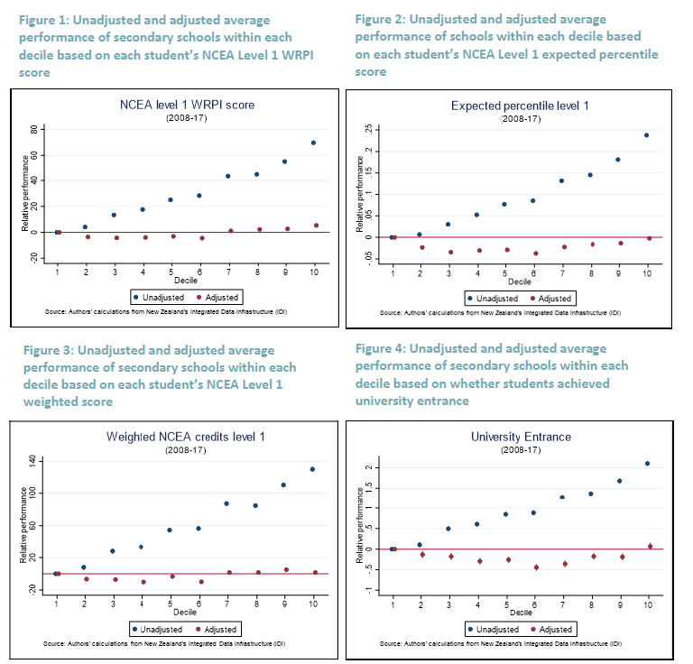
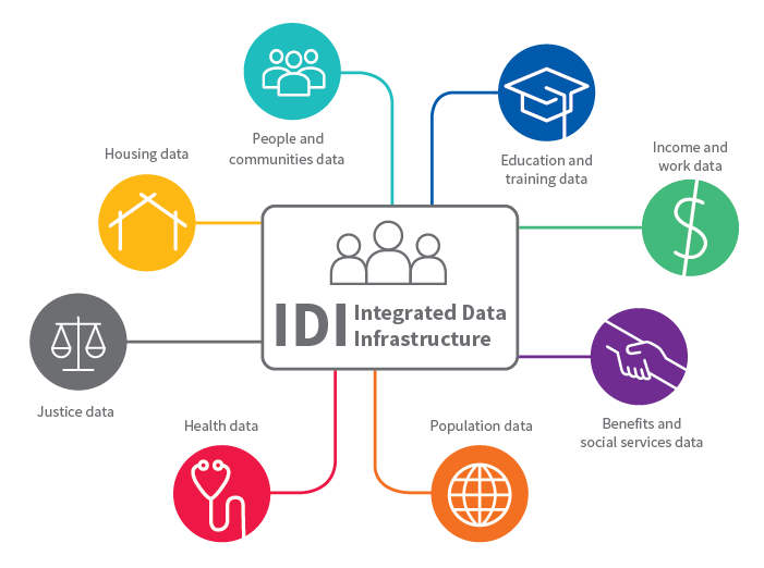
They’ve taken various measures of NCEA academic outcomes (one per chart) and shown how school outcomes vary by decile with (red dots) and without (blue dots) correction for the “family background” of the student.     “Family background” is the fruit of the highly-intrusive Statistics New Zealand Integrated Data Infrastructure (IDI) –  which researchers love, but citizens should be very wary of –  and in Eric Crampton’s less formal note this quote captured what they got

For the population of students who completed NCEA from 2008 through 2017, there’s a link through to their parents. From their parents, to their parents’ income. And their education. And their benefit histories. And criminal and prison records. And Child, Youth, and Family notifications. And a pile more. Everything we could think of that might mean one school has a tougher job than another, we threw all of that over onto the right hand side of the regressions.

The results are interesting, of course.  They summarise the result this way

initiative 2

But this does seem to be something of a straw man.   Should we be surprised that kids from tough family backgrounds achieve worse academic results than those that have more favourable family backgrounds?  I doubt anyone is.  And I have no problem with the idea that a decile 1 school might do as good a job “adding value” as a decile 10 school, but these charts don’t show what I would have thought would be the rather more interesting difference (at least if governance is in focus): what is the range of outcomes within each decile.  Quite probably there are excellent decile 6 schools and really rather poor ones, and which school fits which category is likely to change over time (leaders and leadership make a difference).

Take, for example, the school my son now attends, and where I also had the last couple of years of my schooling.  60 years ago it was mediocre at best, then a long-serving  headmaster dramatically lifted the performance on a sustained basis, only for the school under yet new leadership to slip back so badly that when our son was born we were contemplating exceedingly-expensive private school options (an option for us, but not for many).  Fortunately, there has been another revitalisation over the last decade and my impression now is that the school does as well as any in adding value.   But, as far I can see, what was reported so far of the Initiative’s work sheds no light on this divergences within deciles at all.     And yet surely questions of governance are at least potentially relevant here: could a plausible and credible different governance model have prevented some of that across-time variance in outcomes for Rongotai College?  If it could have, it would surely have to be seriously considered.

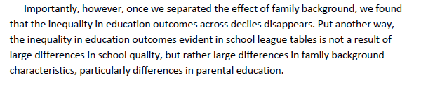
Having noted that it is hardly surprising that kids from homes with more favourable factors emerge from school with better results than those from less favourable backgrounds, I was intrigued by just how flat those red dots are across deciles in each of the charts above.  The message was simple –  adjust for family background and there is no systematic difference across school deciles in the average academic results the students achieve.  And yet, doesn’t the government put in much more money (per student) to low decile schools than to high decile schools?   Is it all for naught?   It would be uncomfortable if true, but that is what the results appear to say.   Perhaps in the end the answer is that the funding differences, although appearing large when translated to the “donations” higher decile schools expect, really aren’t that large (or large enough?) after all?  Perhaps there is something in the possibility that lower-decile schools struggle to get enough capable parents in governance roles (I know both my father and my father-in-law, both Baptist pastors, ended up serving as coopted board of trustee members in low decile schools) or even to attract the best teachers.  Whatever the answer, I hope the Initiative looks into the question as they write about their fuller results.

The other question I was left wondering about was whether what the New Zealand Initiative has produced is really adding much value over and above the less-intrusive, more rough and ready, approaches to assessing school quality that people have used for years.  Here, I don’t mean that straw man suggestion that people think higher decile schools are better academically –  perhaps there are a few who believe that, but I doubt they are many.  My approach to schools for years has been to take the NCEA results, and compare how an individual school has done relative to others (total, and distinguished by sex) of the same decile.  Plot all the schools in Wellington, and I could get a reasonable sense of which had students achieving better results than one might have expected for their decile.   Add in things like ERO reports, and talking to people who’ve had personal exposure to a school, and one gets quite a bit of information.   And people will, rightly and reasonably, want to consider things other than just academic value-added in making the (rather limited) choices they have about schooling for their children (be it sports, arts, behavioural standards, uniform, single-sex vs coed, ethos or whatever).

In the end, however, my biggest concern remains the IDI itself.  It is curious to see the New Zealand Initiative championing its use in evaluating schools (and they are researchers, and researchers are drawn to data as bees to honey) when the Initiative has historically tended to emphasise the merits of genuine school choice.  It is something I strongly agree with them on.    But decentralised markets, with parents deploying purchasing power, wouldn’t have (at least naturally) the sort of highly-intrusive joined up information that IDI provides.

And nor should government-provided school systems.    I’m not sure how Statistics New Zealand matches my son, enrolled at a local school where we provide only our names, phone numbers, and street addresses, to the education levels of my wife and I, let alone our marital status, (non-existent) benefit histories or criminal records or the like.  It is none of the school’s business, and it is none of the government’s business.  As citizens, we should be free to keep bits of our lives compartmentalised, even if all this joined-up data might be a blessing to researchers.

I touched on some of these issues in a post late last year.

Statistics New Zealand sings the praises of the IDI (as does Treasury –  and any other agency that uses the database).  I gather it is regarded as world-leading, offering more linked data than is available in most (or all) other advanced democracies –  and that that is regarded as a plus.   SNZ (and Treasury) make much of the anonymised nature of the data, and here I take them at their word.  A Treasury researcher (say) cannot use the database to piece together the life of some named individual (and nor would I imagine Treasury would want to).   The system protections seem to be quite robust –  some argue too much so – and if I don’t have much confidence in Statistics New Zealand generally (people who can’t even conduct the latest Census competently), this isn’t one of the areas I have concerns about at present.

But who really wants government agencies to have all this data about them, and for them to be able link it all up?   Perhaps privacy doesn’t count as a value in the Treasury/government Living Standards Framework, but while I don’t mind providing a limited amount of data to the local school when I enrol my child (although even they seem to collect more than they need) but I don’t see why anyone should be free to connect that up to my use of the Auckland City Mission (nil), my parking ticket from the Dunedin City Council (one), or (say) my tiny handful of lifetime claims on ACC.  And I have those objections even if no individual bureaucrat can get to the full details of the Michael Reddell story.

The IDI would not be feasible, at least on anything like its current scale, if the role of central government in our lives were smaller.   Thus, the database doesn’t have life insurance data (private), but it does have ACC data.  It has data on schooling, and medical conditions, but not on (say) food purchases, since supermarkets aren’t a government agency.   I’m not opposed to ACC, or even to state schools (although I would favour full effective choice), but just because in some sense there is a common ultimate “owner”, the state, is no reason to allow this sort of extensive data-sharing and data-linking (even when, for research purposes, the resulting data are anonymised).   There is a mentality being created in which our lives (and the information about our lives) is not our own, and can’t even be stored in carefully segregated silos, but is the joined-up property of the state (and enthusiastic, often idealistic, researchers working for it).   We see it even in things like the Census where we are now required by law to tell the state if we have trouble “washing all over or dressing” or, in the General Social Survey, whether we take reusable bags with us when we go shopping.    And the whole point of the IDI is that it allows all this information to be joined up and used by governments –  they would argue “for us”, but governments’ view of what is in our good and our own are not necessarily or inevitably well-aligned.

In truth my unease is less about where the project has got to so far, but as to the future possibilities it opens up.  What can be done is likely, eventually, to be done.   As I noted, Auckland City Mission is providing detailed data for the IDI.  We had a controversy a couple of years ago in which the then government was putting pressure on NGOs (receiving government funding) to provide detailed personal data on those they were helping –  data which, in time, would presumably have found its way into the IDI.   There was a strong pushback then, but it is not hard to imagine the bureaucrats getting their way in a few years’ time.  After all, evaluation is (in many respects rightly) an important element in what governments are looking for when public money is being spent.

Precisely because the data are anonymised at present, to the extent that policy is based on IDI research results it reflects analysis of population groups (rather than specific individuals).  But that analysis can get quite fine-grained, in ways that represent a double-edged sword: opening the way to more effective targeting, and yet opening the way to more effective targeting.  The repetition is deliberate: governments won’t (and don’t) always target for the good.  It can be a tool for facilitation, and a tool for control, and there doesn’t seem to be much serious discussion about the risks, amid the breathless enunciation of the opportunities.

Where, after all, will it end?   If NGO data can be acquired, semi-voluntarily or by standover tactics (your data or no contract), perhaps it is only a matter of time before the pressure mounts to use statutory powers to compel the inclusion of private sector data? Surely the public health zealots would love to be able to get individualised data on supermarket purchases (eg New World Club Card data), others might want Kiwisaver data, Netflix (or similar) viewing data, library borrowing (and overdue) data, or domestic air travel data, (or road travel data, if and when automated tolling systems are implemented), CCTV camera footage, or even banking data.  All with (initial) promises of anonymisation –  and public benefit – of course.  And all, no doubt, with individually plausible cases about the real “public” benefits that might flow from having such data.  And supported by a “those who’ve done nothing wrong, have nothing to fear” mantra.

After all, here the Treasury author’s concluding vision

Innovative use of a combination of survey and administrative data in the IDI will be a critical contributor to realising the current Government’s wellbeing vision, and to successfully applying the Treasury’s Living Standards Framework to practical investment decisions. Vive la révolution!

Count me rather more nervous and sceptical.  Our lives aren’t, or shouldn’t be, data for government researchers, instruments on which officials –  often with the best of intentions –  can play.

And all this is before one starts to worry about the potential for convergence with the sort of “social credit” monitoring and control system being rolled out in the People’s Republic of China.    Defenders of the PRC system sometimes argue –  probably sometimes even with a straight face –  that the broad direction of their system isn’t so different from where the West is heading (credit scores, travel watchlists and so).   That is still, mostly, rubbish, but the bigger question is whether our societies will be able to (or will even choose to) resist the same trends.  The technological challenge was about collecting and linking all this data,  and in principle that isn’t a great deal different whether at SNZ or party-central in Beijing.   The difference –  and it is a really important difference –  is what is done with the data, but there is a relentless logic that will push erstwhile free societies in a similar direction  –  if perhaps less overtly – to China.  When something can be done, it will be hard to resist eventually being done.    And how will people compellingly object when it is shown –  by robust research –  that those households who feed their kids Cocopops and let them watch two hours of daytime TV, while never ever recycling do all sort of (government defined –  perhaps even real) harm, and thus specialist targeted compulsory state interventions are made, for their sake, for the sake of the kids, and the sake of the nation?

Not everything that can be done ends up being done.  But it is hard to maintain those boundaries, and doing so requires hard conversation, solid shared values etc, not just breathless enthusiasm for the merits of more and more linked data.

As I said earlier in the post, I’m torn.  There is some genuinely useful research emerging, which probably poses no threat to anyone individually, or freedom more generally.   And those of you who are Facebook users might tell me you have already given away all this data (for joining up) anyway –  which, even if true, should be little comfort if we think about the potential uses and abuses down the track.   Others might reasonably note that in old traditional societies (peasant villages) there was little effective privacy anyway –  which might be true, but at least those to whom your life was pretty much an open book were those who shared your experience and destiny (those who lived in the same village).   But when powerful and distant governments get hold of so much data, and can link it up so readily, I’m more uneasy than many researchers (government or private, whose interests are well-aligned with citizens) about the possibilities and risks it opens up.

So while Treasury is cheering the “revolution” on, I hope somewhere people are thinking harder about where all this risks taking us and our societies.

Some thoughts anyway.  Not all that can be done should be done, and the advance of technology (itself largely value-neutral) opens up many more things that can be done that shouldn’t be done.

Indicators galore

The Government Statistician can’t manage a census competently, and won’t tell us (let alone MPs) just how bad the situation is (about a census taken more than a year ago), but today – aiding and abetting the government’s Wellbeing Budget branding – she was out with the final list of indicators to be published in this brave new world.   It goes under the label “Indicators Aotearoa”, and in addition to not being able to run a census, she seems –  in common with many public servants –  to have forgotten the name of the country: New Zealand.

Among the list of indicators –  many of which are already published (and thus you wonder what value there is in one set of bureaucrats prioritising them and putting them in one place) –  was this snippet.

indicators

I don’t have too much problem with suicide rates.  They are reasonably hard and somewhat meaningful data (but comparisons across time and across countries are hard).

But the other three made almost no sense.

Take that “spiritual health” indicator –  well, there is no indicator yet, but an aspiration to have one.  Real resources are being wasted on this stuff.    Who knows what business it is of the government to be measuring “spiritual health”, whatever it means?  And, strangely, it appears that the Government Statistician believes that only the “spiritual health” of Maori people (or was that “Maori society”?) matters.  Are we back in taniwha territory again, or perhaps the Governor of the Reserve Bank is helping with his enthusiasm for the tree god (although I gather the Governor isn’t Maori so his affinity presumably doesn’t count).  As readers know, I’m a Christian, of a fairly orthodox variety.  The General Confession of the Church of England’s 1559 Book of Common Prayer –  Anglicanism having been the most prominent religious strand in New Zealand for most of its history –  reads (emphasis added)

ALMIGHTIE and most merciful father, we have erred and straied from thy waies, lyke lost shepee we have folowed to much the devises and desires of our owne hartes. We have offended against thy holy lawes: We have left undone those thinges whiche we ought to have done, and we have done those thinges which we ought not to have done, and there is no health in us,

It goes on to talk of restoration and penitence, but “there is no health in us” is pretty basic to orthodox Christian belief. Our hope is only in grace.

Now, perhaps, not being Maori, my lack of spiritual health won’t bother the Prime Minister and the Government Statistician, but what about the Maori Anglicans?

The whole thing is absurd, lacking content.  Simply pandering in a way that makes even more of a joke of the framework –  itself, in part a way of distracting attention from decades of economic failure.

Then there is the language development and retention one  –  again, no actual indicators only aspirations.   Apparently it is a problem for the Government Statistician and the Prime Minister if an ethnic Chinese New Zealander whose ancestors came 100 years ago doesn’t speak Chinese.  Or a descendent of a Dalmatian immigrant who doesn’t speak Croatian?  Isn’t that a matter of (a) probably, assimilation, and (b) choice?   What business is it of the governments?  Isn’t the ability to speak English much more important?

What is this nonsense?

And then we have the “sense of belonging” to New Zealand which –  according to the Government Statistician –  is an “important aspect of being a New Zealander”.  Except that….if you were born here and have lived here all your life, you are unquestionably a New Zealander, however you might answer an SNZ survey.    I haven’t lived here all my life, but I have no other citizenships (or rights to them) but how would I answer the question?  I don’t know.  “New Zealand” certainly isn’t my first loyalty, I feel a fairly strong affinity for the wider Anglo world, and I’m a minority in New Zealand but an adherent to a faith that transcends national, ethnic or whatever boundaries.  Globalists –  of whom I’m not one –  will probably (rationally) tell the interviewer they identify with “the world”.  And what of it?   Sure, a number emerges from the survey, but it will mean almost nothing, and its place in this suite of indicators will encourage officials and politicians to think it is something they should try to use policy to influence (all sort of daft interventions might “work”, but to what end?).

Couldn’t the Government Statistician just get on with doing the basics right?   And if the government were to take seriously doing something about reversing the longrunning decline in our relative productivity performance, it would open up options to improve all sorts of things that, individually or collectively, we care about.  Probably wouldn’t do much for (Maori) spiritual health, should they ever be able to “measure” it.


The IDI and government data linking

Browsing on The Treasury’s website the other day, it was the title that caught my eye: “Talkin’ about a revolution”.   I’m rather wary of revolutions.  Even when –  not always, or perhaps even often –  good and noble ideas help inspire them, the outcomes all too often leave a great deal to be desired.   There are various, quite different, reasons for that, but one is about the failure to think through, or care about, things –  themselves initially small or seemingly unimportant – that the revolution opens the way to.

This particular “revolution” – billed as “a quiet and sedate revolution, but a revolution nonetheless” – was sparked by Statistics New Zealand’s Integrated Data Infrastructure (IDI).   Here is the Treasury author

The creation of Stats NZ’s IDI (or Integrated Data Infrastructure), a treasure trove of linked data, sparked the revolution, and its ongoing development drives it along. The IDI doesn’t collect anything new. Instead it gathers together data that is already collected, links it together at a person level, anonymises it, and makes it available to researchers in government, academia, and beyond.

The author goes on

Since 2013, its growth has been far more rapid. From a handful of users in its early years, there are now hundreds of people using IDI data to help answer thorny questions across the full range of social and economic research domains. The IDI is incredibly powerful for research, and has a number of important strengths.

  • Longitudinal – Providing a picture of people’s lives over time, crucial for understanding the effect of policies and services.
  • A full enumeration – Incorporating administrative data for almost all New Zealanders, enabling a focus on minority groups and small geographic areas.
  • Accessible – By making data available to researchers at relatively low cost, agencies are no longer gatekeepers of the data they collect, and a culture of sharing in the research community is encouraged.
  • Cross-sectoral – Allowing researchers to explore the relationships between different aspects of people’s lives that may be invisible to individual agencies.

There is a breathless enthusiasm about it all.

Stats NZ’s new online research database highlights the huge breadth of research underway for the benefit of all.

It is never made clear quite how the Treasury author gets to his conclusion that all this research benefits us all.

And here is the SNZ graphic illustrating the range of data they have put together (and linked)

IDI

I’m a bit torn about the IDI (and its business companion, the LBD).   As an economist and policy geek, I’m fascinated by some of results researchers have been able to come up with using this new database.  A few months ago I wrote (positively) here about how Treasury staff had been able to derive new estimates on internal migration.   Here is a chart I showed then on the various databases linked together that enabled those estimates.

tsy popn
And here is a more-detailed SNZ graphic on what data are in the IDI at present (and more series are still being added).

IDI 2

More details are here.

Note that it is not even all government data –  for example, the Auckland City Mission is providing data on people it assists.  Specifically

Auckland City Mission data

Source: Auckland City Mission
Time: From 1996
What the data is about:  Income, expenses, housing status, and household composition of Auckland City Mission clients, and the services these clients use. Auckland City Mission is a social service provider in Auckland CBD, that helps Aucklanders in need by providing effective integrated services and advocacy. Note: data dictionary available on the IDI Wiki in the Data Lab.
Application code: ACM

Even if in 1996 those individuals gave their consent for their (anonymised) data to be used, few people in 1996 would have had any idea of the practical linking possibilities in 2018.   (And at a point of vulnerability how much ability did they have to decline consent anyway?)

It is researcher heaven.  But it is also planner’s heaven.

Statistics New Zealand sings the praises of the IDI (as does Treasury –  and any other agency that uses the database).  I gather it is regarded as world-leading, offering more linked data than is available in most (or all) other advanced democracies –  and that that is regarded as a plus.   SNZ (and Treasury) make much of the anonymised nature of the data, and here I take them at their word.  A Treasury researcher (say) cannot use the database to piece together the life of some named individual (and nor would I imagine Treasury would want to).   The system protections seem to be quite robust –  some argue too much so – and if I don’t have much confidence in Statistics New Zealand generally (people who can’t even conduct the latest Census competently), this isn’t one of the areas I have concerns about at present.

But who really wants government agencies to have all this data about them, and for them to be able link it all up?   Perhaps privacy doesn’t count as a value in the Treasury/government Living Standards Framework, but while I don’t mind providing a limited amount of data to the local school when I enrol my child (although even they seem to collect more than they need) but I don’t see why anyone should be free to connect that up to my use of the Auckland City Mission (nil), my parking ticket from the Dunedin City Council (one), or (say) my tiny handful of lifetime claims on ACC.  And I have those objections even if no individual bureaucrat can get to the full details of the Michael Reddell story.

The IDI would not be feasible, at least on anything like its current scale, if the role of central government in our lives were smaller.   Thus, the database doesn’t have life insurance data (private), but it does have ACC data.  It has data on schooling, and medical conditions, but not on (say) food purchases, since supermarkets aren’t a government agency.   I’m not opposed to ACC, or even to state schools (although I would favour full effective choice), but just because in some sense there is a common ultimate “owner”, the state, is no reason to allow this sort of extensive data-sharing and data-linking (even when, for research purposes, the resulting data are anonymised).   There is a mentality being created in which our lives (and the information about our lives) is not our own, and can’t even be stored in carefully segregated silos, but is the joined-up property of the state (and enthusiastic, often idealistic, researchers working for it).   We see it even in things like the Census where we are now required by law to tell the state if we have trouble “washing all over or dressing” or, in the General Social Survey, whether we take reusable bags with us when we go shopping.    And the whole point of the IDI is that it allows all this information to be joined up and used by governments –  they would argue “for us”, but governments view of what is in our good and our own are not necessarily or inevitably well-aligned.

In truth my unease is less about where the project has got to so far, but as to the future possibilities it opens up.  What can be done is likely, eventually, to be done.   As I noted, Auckland City Mission is providing detailed data for the IDI.  We had a controversy a couple of years ago in which the then government was putting pressure on NGOs (receiving government funding) to provide detailed personal data on those they were helping –  data which, in time, would presumably have found its way into the IDI.   There was a strong pushback then, but it is not hard to imagine the bureaucrats getting their way in a few years’ time.  After all, evaluation is (in many respects rightly) an important element in what governments are looking for when public money is being spent.

Precisely because the data are anonymised at present, to the extent that policy is based on IDI research results it reflects analysis of population groups (rather than specific individuals).  But that analysis can get quite fine-grained, in ways that represent a double-edged sword: opening the way to more effective targeting, and yet opening the way to more effective targeting.  The repetition is deliberate: governments won’t (and don’t) always target for the good.  It can be a tool for facilitation, and a tool for control, and there doesn’t seem to be much serious discussion about the risks, amid the breathless enunciation of the opportunities.

Where, after all, will it end?   If NGO data can be acquired, semi-voluntarily or by standover tactics (your data orno contract), perhaps it is only a matter of time before the pressure mounts to use statutory powers to compel the inclusion of private sector data? Surely the public health zealots would love to be able to get individualised data on supermarket purchases (eg New World Club Card data), others might want Kiwisaver data, Netflix (or similar) viewing data, library borrowing (and overdue) data, or domestic air travel data, (or road travel data, if and when automated tolling systems are implemented), CCTV camera footage, or even banking data.  All with (initial) promises of anonymisation –  and public benefit – of course.  And all, no doubt, with individually plausible cases about the real “public” benefits that might flow from having such data.  And supported by a “those who’ve done nothing wrong, have nothing to fear” mantra.

After all, here the Treasury author’s concluding vision

Innovative use of a combination of survey and administrative data in the IDI will be a critical contributor to realising the current Government’s wellbeing vision, and to successfully applying the Treasury’s Living Standards Framework to practical investment decisions. Vive la révolution!

Count me rather more nervous and sceptical.  Our lives aren’t, or shouldn’t be, data for government researchers, instruments on which officials –  often with the best of intentions –  can play.

And all this is before one starts to worry about the potential for convergence with the sort of “social credit” monitoring and control system being rolled out in the People’s Republic of China.    Defenders of the PRC system sometimes argue –  probably sometimes even with a straight face –  that the broad direction of their system isn’t so different from where the West is heading (credit scores, travel watchlists and so).   That is still, mostly, rubbish, but the bigger question is whether our societies will be able to (or will even choose to) resist the same trends.  The technological challenge was about collecting and linking all this data,  and in principle that isn’t a great deal different whether at SNZ or party-central in Beijing.   The difference –  and it is a really important difference –  is what is done with the data, but there is a relentless logic that will push erstwhile free societies in a similar direction  –  if perhaps less overtly – to China.  When something can be done, it will be hard to resist eventually being done.    And how will people compellingly object when it is shown –  by robust research –  that those households who feed their kids Cocopops and let them watch two hours of daytime TV, while never ever recycling do all sort of (government defined –  perhaps even real – hard), and thus specialist targeted compulsory state interventions are made, for their sake, for the sake of the kids, and the sake of the nation?

Not everything that can be done ends up being done.  But it is hard to maintain those boundaries, and doing so requires hard conversation, solid shared values etc, not just breathless enthusiasm for the merits of more and more linked data.

As I said earlier in the post, I’m torn.  There is some genuinely useful research emerging, which probably poses no threat to anyone individually, or freedom more generally.   And those of you who are Facebook users might tell me you have already given away all this data (for joining up) anyway –  which, even if true, should be little comfort if we think about the potential uses and abuses down the track.   Others might reasonably note that in old traditional societies (peasant villages) there was little effective privacy anyway –  which might be true, but at least those to whom your life was pretty much an open book were those who shared your experience and destiny (those who lived in the same village).   But when powerful and distant governments get hold of so much data, and can link it up so readily, I’m more uneasy than many researchers (government or private, whose interests are well-aligned with citizens) about the possibilities and risks it opens up.

So while Treasury is cheering the “revolution” on, I hope somewhere people are thinking harder about where all this risks taking us and our societies.

A stuff-up by Statistics New Zealand

Many readers will recall the fiasco of the leak of an OCR announcement back in March 2016.  It turned out that the Reserve Bank’s systems were had been so lax for years that people in the lock-ups they then held could simply email back to their offices (or to anyone else) news of the announcement that was supposed to be being tightly held.  This weakness only came to light because someone in Mediaworks emailed the news of this particular OCR announcement to their office, and someone in that office emailed me (from memory I was supposed to go on one of their radio shows later that morning).  I drew the matter to the Bank’s attention.

In the wake of that episode, the Bank (rightly in my view) cancelled the pre-release lock-ups for journalists and analysts.  But other government agencies went right on, relying on trust more than anything else.   One notable example was Statistics New Zealand, which produces and publishes many of the most market-moving pieces of economic data.    When asked about any possible changes to their procedures (outlined here) following the Reserve Bank leak in 2016, they responded

Statistics NZ has not undertaken any reviews or made any changes to the department’s policy for media conferences following the Official Cash Rate leak at the Reserve Bank of New Zealand and the subsequent Deloitte report into that leak released last week.

and

While Statistics NZ has never had a breach, if that trust is abused and an embargo is broken, offenders and their organisation would be barred from attending future media conferences.

As I noted back then

Unfortunately, that was probably the sort of discipline/incentive the Reserve Bank was implicitly relying on as well.

Unfortunately, after the confusion the Prime Minister gave rise to earlier in the week, confusing the crown accounts and GDP (which had some people abroad worried that the Prime Minister actually had had an advanced briefing), there was apparently more trouble this morning.  But this time, the fault was entirely with Statistics New Zealand, and not with those in the lock-up.

The embargo for the lock-up on gross domestic product (GDP) for the June 2018 quarter, held today, 20 September 2018, was lifted about one minute earlier than the planned time of 10.45am.

The lock-up is held in Stats NZ’s Wellington offices from 10am to 10.45am, to allow key financial media, bank economists, and other government agencies to understand the information and ask questions about GDP, before the embargo is lifted. It is held under strict embargo conditions.

Stats NZ staff in the lock-up check official New Zealand time on the Measurement Standards Laboratory of New Zealand (MSL) website.

However, a computer script (JavaScript) bug meant that the official time clock website that appeared on the staff member’s phone picked up the phone’s own time setting, which was slightly fast.*

In other words, those in the embargoed lock-up had the data –  and could communicate it to their dealing rooms – a minute earlier than anyone not in the lock-up got the data.     And it seems to have mattered.  GDP was higher than expected and the exchange rate jumped.   People who were in the lock-up got the jump on that.  I’ve heard that the exchange rate moved before 10:45 (the official release time), which isn’t surprising if people in the lock-up had been told the embargo had been lifted.

What is striking about the statement SNZ put out –  and it wasn’t exactly distributed widely (say, to all the people who got the GDP release itself) –  is that there is no mention at all of these possible early trades, which (in effect) distributed money/profits from one group of people (those not in the know) to another (those in the know).  Unlike the 2016 Reserve Bank leak, there seem to have been real financial consequences to this mistake.  And it isn’t clear that Statistics New Zealand is taking it that seriously.   When I asked about any investigation being undertaken, the implication of their reply was that there would be no further investigation or review beyond the narrow technical statement I linked to earlier. I hope that is not correct (and I hope, for example, the Reserve Bank is insisting on something more).

Writing about these data lock-ups in 2016 I noted of the SNZ situation

Is Statistics New Zealand that different?  There is, obviously, no policy message SNZ is trying to put across with its releases, and so no risks of different messages getting to different people.  But the security risks are the same.  Perhaps it is simply more efficient to have everyone in the same room, to clarify key technical points, but couldn’t the same end be achieved –  on a more competitively neutral basis (to analysts based abroad, say) –  by a dial-in (even webcast) conference call held a bit later on the day of the release?

That still seems right to me. I cannot see the case for a pre-release lock-up (and I can see a case for a technical conference call later in the day).   Mistakes will happen while they keep on with lock-ups.   The reliance on trust seems to be as strong as ever, and (as far as we know) that has been honoured.  This time, the stuff-up was by Statistics New Zealand themselves.   It was unnecessary, and it will at the margin (and especially in conjunction with the political contretemps earlier in the week) damage confidence in our statistics agency and the integrity of our data.

On our disappearing migration data

Having written here earlier in the week about the reckless and irresponsible way in which the government and Statistics New Zealand are degrading the quality of our very timely net immigration data (itself a major, and quite cyclically variable, economic indicator), I noticed a couple of comments that prompted me to dig out some numbers for this post.

The first, in a comment here, was that the self-reported intentions-based PLT measure probably couldn’t be counted on as very accurate anyway.  And the second, in someone else’s commentary, was that at least we will still (I hope) have monthly reporting of total passenger movements (tourists, business travellers etc as well as the permanent and long-term movements) from which a reasonable steer might be gleaned.

The best way of looking at whether the PLT measures are reasonable is to compare them with the new 12/16 method numbers –  available with a long lag, but which involve looking back, using passport records, and checking which people actually came (or went) for more than 12 months ((the threshold for the PLT definition).   Unfortunately, SNZ is still not publishing seasonally adjusted estimates for the 12/16 method numbers, so one can only really do the comparisons using rolling annual totals.   On this chart, I’ve shown the rolling 12 month totals for (a) the 12/16 method, (b) the PLT series, and (c) total net passenger movements for almost 30 years (although the 12/16 method data are only available this century).

migration 31 Aug

All the cycles are pretty similar, at least if one takes a broad sweep of the data.  That isn’t surprising, as most short-term visitors go home again pretty quickly, leaving something like an underlying trend of permanent and long-term movements.   And it confirms that the PLT numbers have been a useful –  although not perfect –  indicator of the actual permanent and long-term movements (captured in the 12/16 numbers).  Importantly, the turning points tend to be very similar.

One wouldn’t expect those two series to be the same, as they measure different things: the PLT numbers are about intentions, and if plans change so will behaviour.  If lots of people come to New Zealand (or leave for Australia) and things don’t work out and they change their mind, ideally we would want to know.    The divergence that looks to have opened up between the grey and orange lines at the end of the (grey) series might prove to have been something like that.  But in future we won’t know because (a) we won’t have the PLT data at all, and (b) the grey line will only be available with a reasonable degree of certainty with quite a long lag.   As a reminder, here is the new SNZ chart I included in the post the other day, illustrating the huge error margins around the timely estimates SNZ proposes publishing using their new (unpublished and untested) methodology.

Provisional-and-final-net-migration-estimates2

But the other thing worth noticing is how noisy the blue line is.  There is a great deal of volatility, which makes distilling any signals (about permanent and long-term movements) very hard on a timely basis. That was why the PLT numbers have been so useful.  The blue line is thrown around in particular by big sporting events: eg the Lions tours in 2005 and 2017, and the Rugby World Cup in 2011.    There are big additional net arrivals, and then big additional net departures a month or two later, with mirror effects in the annual numbers a year later as well.  I have found the total net passenger arrivals data useful in the past –  in both 2002 and 2011 they pointed to something larger in the permanent and long-term movements than the PLT numbers themselves were reflecting, and that sense was later reflected in the 12/16 numbers (much larger net inflows in 2002/03, and somewhat larger net outflows in 2010/11).

What of the monthly seasonally adjusted data (the stuff designed for high frequency timely monitoring)?  Here is a chart of the PLT and total series, with scales set so as not to allow the flows associated with the Rugby World Cup (in particular) to dominate the chart.

migration mthyl sa

At a monthly frequency, the noise in the total passenger (orange) line totally dominates any signal, while the volatility in the monthly PLT series (that we are soon to lose altogether is very small).    What should perhaps be more concerning –  and is a bit perplexing –  is why the volatility of the total passenger series is itself quite variable across time, even outside the months associated with major sporting events.   Right now, for example, the volatility in the monthly series is quite extreme.    Here is the same chart for just the last four years or so.

migration mthly

The Lions Tour is very evident in mid-2017, but the heightened volatility goes well beyond that.

All of which leaves me not quite sure what to make of the very first chart.   The blue line (annual net inflows of all passengers) has fallen back a long way already (down from around 80000 to around 40000), and similarly-sized falls in the past have often been coincident with, or perhaps a little ahead of, large falls in the PLT numbers (and the 12/16 numbers).  There are some reasons to think we might see something similar now.  Fortunately, for the next couple of months we will still have the PLT data

PLT mthly

But after that –  thanks to government and SNZ choices –  we will be flying blind.    We’ll have good information eventually on what actually happened, but it will be available with such a lag as to be more use to economic historians than to people trying to make sense of, and respond to, contemporaneous economic developments.  And the net total passenger movements data is sufficiently noisy that it probably won’t give us much of a steer (and even then with big error margins) before the lagging 12/16 data do.

This is simply reckless behaviour around a major set of timely economic data.

Do they expect to be taken seriously?

I don’t really have time for this today, but….

I wrote again yesterday about how getting rid of departure cards seems set to degrade the quality of our timely net migration data (currently some of the best available anywhere in the world, which we need since our net migration flows are large and volatile).  SNZ has previously promised that future PLT estimates

will be generated through a probabilistic predictive model of traveller type (ie short-term traveller, or long-term migrant), based on available characteristics of travellers. Such a model will provide a provisional estimate of migration, which we can then revise (if required) as sufficient time passes for us to apply the outcomes-based measure.

In media commentary yesterday, the Minister of Immigration was heard to suggest that under the new system the data will be better than what we’ve had now.

That seemed unlikely, but later yesterday morning SNZ put out a media release including this

Moving to the new methodology means it will be 17 months before final migration estimates are available. That’s because someone has to be in the country for 12 months out of 16 before they can be classified as a long-term migrant.

“A delay of that length would have been unacceptable to those who rely on migration data for planning and analysis, so we are developing a statistical model that will provide a provisional estimate of migration. A first look at provisional external migration estimates will be released tomorrow,” said Mrs Theyers.

In future, statistics for New Zealanders travelling overseas will be largely based on when they return. Some variables – including occupation and country of next residence – will no longer be available.

That statement itself confirmed one of my points –  some important data is going to be lost altogether (eg data on net outflows to Australia will in future have to be inferred, rather than available directly –  and while I’m sure that isn’t the motivation, that will be convenient for governments).  But there was a promise that they would reveal more today.  I was hopeful we might get a proper discussion paper, with details of their modelling techniques, and the results of backtesting, and (for example) the identification of key periods (especially around turning points –  a key focus of macroeconomic analysts) where the new procedure worked well and when it hadn’t.

But no.

What was released this morning was three charts and a page of text.  There is nothing about methodology, nothing about backtesting, nothing about the identification of turning points, in fact nothing that any serious analyst is likely to find useful.

We are told

To mitigate the impacts of such a delay, we are developing a statistical model that gives provisional estimates of migration to give a timelier statistic. The first provisional migration estimates are now available.

“Preliminary data presented today gives our customers their first glimpse of what migration statistics will look like once the outcomes-based approach becomes the official way we measure migration in New Zealand,” population insights senior manager Brooke Theyers said today.

But nothing at all about the model.

But here are results they are happy to show us

Provisional-and-final-net-migration-estimates2

(I presume that these numbers are not seasonally adjusted, which probably accounts for some of the jumping around in the median estimates from month to month).

Recall that under the 12/16 methodology, the numbers from 17 months ago become final (and are, in many –  but not all – respects better quality than the current PLT numbers).  But the latest monthly data has huge margins of errors –  even a 50 per cent confidence interval looks to be about 3000 people wide (on a monthly basis –  and bearing in mind that the average monthly inflow in recent years has been about 6000 people).

But to repeat:

  • no model,
  • no series as to how the estimates have evolved over time with the addition more data,
  • no backtesting,
  • no analysis of turning point information

Almost nothing at all.  And none of this is being consulted on, instead the government and SNZ are simply junking one of our best high frequency sets of economic data, about a variable which adds considerable volatility to the New Zealand economy.   We should expect a lot more, especially from a notionally independent national statistics agency.