New immigration data from Statistics New Zealand

One can, and does, grizzle about the range and quality of New Zealand’s official statistics.  But last Friday saw a small but welcome step forward.

On various occasions I’ve written about the limitations of the permanent and long-term migration data.  Those data are based on the self-reported intentions of travellers at the time they cross the New Zealand border, and people can and do change their minds.  That is as true of New Zealand citizens coming and going as it is non-citizens.

Prompted by the Reserve Bank, in late 2014 Statistics New Zealand published a paper containing some experimental work they had done trying to estimate the actual permanent and long-term movements (ie allowing for the ability of travellers to change their minds and their plans).    That work confirmed that, while the broad patterns were similar, on occasions the differences between the published PLT figures and the results using the follow-up methods could be large.   In the 2002/03 episode, the published PLT numbers materially understated the extent of the actual permanent and long-term inflow.

Graph, Comparison between net recorded PLT and alternative net PLT migration methods, year ended June 2000 to 2013.

At the time Statistics New Zealand published that paper they indicated that they had no budgetary resources to update this work regularly, or make it part of the suite of official statistics.  And so when I wrote a post a few weeks ago on which migration data to use for which purposes I noted

Use the overall PLT numbers by all means for some short-term purposes (is the rate of population growth right now accelerating, slowing or holding roughly steady), but it is crucial to recognise the limitations of those data.

Perhaps the new Minister of Statistics could look at securing some budgetary funding for Statistics New Zealand, to enable them to move those alternative methods into becoming a regularly-published and updated part of the suite of official statistics?

Little did I know that Statistics New Zealand  had already found some funding.  Because last Friday, they put out a press release (together with some background material) indicating that they have settled on a particular methodology, providing updated estimates using that methodology, and indicating that they will shortly commence regular updates of this data.    That is good news.    Anyone who wants details on the new “12/16 month rule”…

Any traveller with at least one border movement in a given month has their resident status reviewed. The combined information on the assumed resident status at the start of the month, the direction of the last movement in the month, and the 16-month follow-up travel history, determines the traveller’s final migrant status.

…can consult the SNZ background paper.   As SNZ notes, the 12/16 method is also the one used by the Australian Bureau of Statistics.

There are several things to remember:

  • anyone interested in analysing immigration policy (ie how many non-citizens we let on and on what bases) should still focus on the MBIE approvals data.  It is hard data from the agency actually granting the approvals,  Sadly, the user-friendly data is only available once a year, with quite a lag, but the patterns of approvals don’t change that much from one year to the next.  But perhaps the SNZ lead might prompt MBIE to improve the accessibility of their own monthly data?
  • the new SNZ series will be only be available with a lag of at least 18 months  (in this release they’ve provided data to March 2015 –  16 months after that was July last year).  It is going to be useful for making sense of history, rather than for high-frequency timely analysis.  That is true of plenty of official data (and isn’t a criticism).
  • in terms of getting a sense of how many people need a roof over their head, neither the PLT data nor these new 12/16 data quite fit the bill.   Short-term visitors need accommodation just as much as long-term settlers do  (although they might want different types of accommodation).  (Volatile) total migration data remains of some use for that purpose.
  • sometimes intentions matters, not just outcomes.    If, for example, lots of young New Zealanders head off to Australia, intending to never come back, only to find a few months later that Australia is hit by a very severe labour market downturn, many of those same New Zealanders might come back again quite quickly.  Analysts will want to know both that they went intending to stay away, and that having got to Australia they were caught by a change of circumstances and didn’t in fact stay away (for more than the 12 months PLT threshold).   In other words, when there are material differences between the aggregate PLT numbers and the aggregate new 12/16 numbers, both are likely to offer some useful insights as to quite what is going on.  That is particularly so as regards the movements of New Zealand citizens.
  • But what do the new statistics actually show?  Here is SNZ’s summary chart

    plt and 12 16 rule

    The orange line is the previously-published PLT numbers and the purple line is the new 12/16 series.

    As highlighted previous, there is a very big difference between the two series in the 2002/03 period.    But the pictures are also quite different around the 2008/09 recession.  On the PLT numbers there was a big increase in net inflows in 2009, which then more than reversed over the following couple of years.  But on the new 12/16 numbers, net permanent and long-term actual inflows had been pretty steady for several years (from 2004 to 2009), and then fell away very sharply over 2010 and 2011.   Fortunately, in the last couple of years of the new data, the two lines are very similar but –  since plans can change –  there is no guarantee that will be consistently the case in the future.   This is a genuine improvement in the provision of data on an ongoing basis, not just something to deal with a one-off anomaly in 2008/09.

    Over this particular period, the net inflow over the full 14 years was a bit higher than the PLT numbers had suggested.  That wasn’t a surprise –  we already knew it from the experimental numbers a couple of years ago.  But it is also important to stresss that the changes of plans can run either way; there is no a priori reason to suppose that one method will typically understate or overstate the actual net inflows.

    Before showing you a few of my own charts, I wanted to reproduce one more of the SNZ charts

    As I’ve noted repeatedly in recent months, the PLT data showing the visa type people held when they arrived in the country isn’t very enlightening for anything much at at all.  The immigration system is set up in a way that encourages many people to change their visa type once they are here (eg most people who get residence visas do so while already living here, many people move from a student visa to a work visa while here).  That is why I urge people to focus on the MBIE approvals data if you want to understand immigration policy decisions etc.  And this chart from the new SNZ paper really just reinforces the point.

    Graph, Migrant arrivals and departures by selected border entry visa type, by 12/16-month rule and PLT measures, December 2001 to 2014 years.

    There are huge differences in all four categories between what the PLT numbers showed, and the new 12/16 method numbers.  For most purposes, both are less useful than the MBIE approvals data.

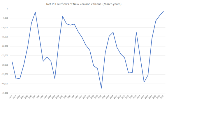
    One area where the new 12/16 data are a real boon is around the permanent and long-term movements of New Zealanders.  New Zealanders don’t need permission to come or go, so (at least between censuses) we are totally reliant on the migration statistics for an accurate sense of the net flow of New Zealanders.   The PLT data have recorded a huge net outflow of New Zealanders (and actual outflows every year since 1962/63).   My hunch has been that the PLT numbers overstated the outflow (and that, net, some people who went intending to stay away long-term came back quite quickly).     The new 12/16 data are available by citizenship (although not yet in a terribly user-friendly format).  Here is the chart showing the two methods, on a March year basis.

    outflow of nZers plt and 12 16

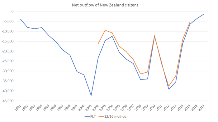
    In no individual year have the differences been very large.  That is reassuring for short-term analysis, but over the full 14 years for which SNZ have provided the new data, those moderate annual differences add up.    On the PLT data, a net 341000 New Zealand citizens left between January 2001 and March 2015.  On the 12/16 rule data, 300000 left.   Both are large numbers, but the actual outflow of New Zealanders appears to have been around 10 per cent less than the PLT numbers had suggested.   That is a big part of the reason why the overall net inflows to New Zealand have been a bit larger than the PLT numbers had suggested.

    For other citizenships, SNZ has only provided the data at an aggregated level.  But here is the chart showing the net inflows, on the 12/16 method, for various groups of citizenships for the full period the new data are available for.

    plt by citizen 12 16 method

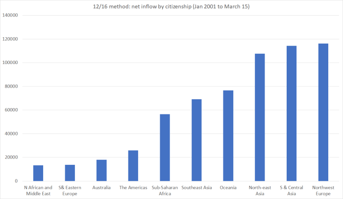
    As I’ve stressed previously, if you want to look at immigration policy choices, look at the MBIE approvals data. But these data, even if not very timely, do have the advantage of capturing not just those who got approval and came, but also those who left again.

    Australian citizens don’t need advance approval to come.  The numbers who do come are pretty small, but out of interest here is the net flow of Australian citizens, both on a PLT basis and on the new 12/16 method.

    aus citizens

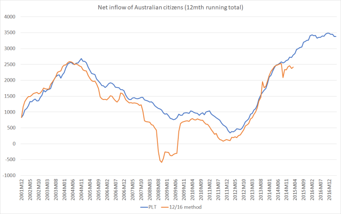
    The divergence between the two series over 2008/09 looks like a possible example of a case where both lines tell us something interesting.  Although the net inflow of Australian citizens had been falling, it was still positive (on the PLT numbers).  But in 2008/09, the New Zealand economy went into an unexpected recession and the unemployment rate rose quite sharply.  Presumably, a large proportion than usual of the Australians who came here changed their minds fairly quickly and went home again.

    And one last chart from the new data.   One of the stories around the divergence between the PLT numbers and the other methods in 2002/03 had been that much of it reflected Chinese (in particular) language students, who ended up staying for longer than they had indicated on their initial arrival card.     This chart, of net arrivals from north-east Asian countries (the SNZ grouping) seems consistent with that.

    north asia PLT.png

    There was a huge surge, on this better method, in 2002/03, significantly balanced out by net outflows of north-east Asian citizens several years later.   Actual residence approvals granted to people from these countries were much steadier throughout the period (for Chinese, the number of residence approvals fluctuated between 4800 and 8000 per annum).

    To be boringly repetitive, if you want to talk about immigration policy, it really is best to look at the MBIE approvals data.  If only they would make them readily available, in user-friendly form, every month it would be lot easier to encourage people to consistently do so.

    Well done to Statistics New Zealand for publishing this new data.   It will help shed more light on the activities of New Zealanders (and the typically small flow of Australians), and enable us to see better –  albeit with a bit of a lag –  how the overall movement of people in and out of New Zealand has been contributing to the population change.  For some purposes, the PLT data themselves remain useful, but it is always important to remember that they are only an estimate of what is really going on.

    New Zealanders’ population choices

    The other day Statistics New Zealand released the annual data on New Zealand birth rates.  There was some coverage of the continuing drop in teen birth rates (it was what SNZ highlighted), but the chart that caught my eye was this one.

    TFR NZ SNZ

    I’d been under the impression that New Zealand’s birth rate was at, or just above, replacement (roughly 2.1 births per woman, thus allowing for early deaths).   And, according to this summary indicator, it was for a few years not that long ago.    But that is no longer the case.

    But what most interested me –  and it isn’t data I’ve ever paid that much attention to –  was the longer-term averages.  It turns out that for forty years now, New Zealand’s birth rate has averaged below the replacement rate (1977 was the last year the TFR had been persistently above 2.1).

    This is how we compare with other OECD countries.

    tfr OECD

    New Zealand is still towards the right of the chart.  But note that only two OECD countries now have total fertility rates in excess of replacement –  one (Mexico) just barely.  The country that really stands out is Israel, with a TFR of 3.1.   New Zealand hasn’t been that high for 45 years.

    (Diverting off topic for a moment) the gap between Israeli and New Zealand birth rates has been there for a long time.

    TFR is and NZ

    At one stage, the high Israeli birth rates were all about the Arab population, but apparently the Jewish and Arab-Israeli birth rates are now equal (Arab rates falling and Jewish rates –  especially among the orthodox –  rising.   (Israel also has a lot of immigration –  together they explain the very rapid population growth I highlighted yesterday – but that is a topic for another day.)

    For forty years, New Zealanders in aggregate have been choosing to have slightly fewer children than would, all else equal, maintain the population.  But over that same period, there has also been a very large outflow of New Zealanders moving permanently to other countries (especially Australia).   In the forty years to March 2017, the estimated net outflow (as recorded in the PLT data, with all their limitations) of New Zealand citizens was 845,520.

    plt since 78

    There is a lot of cyclical volatility, but in not a single year in that period has the flow of New Zealand citizens been back to New Zealand.  In fact, the last time the data record a net inflow of New Zealand citizens was the year I was born.  By international standards, it is a staggering loss of our own people (more than 20 per cent of the average total population over that period).  I can’t think of any other functioning democracy in the last 100 years that has had such a large percentage outflow of its own people.

    These New Zealanders have presumably been making their own choices and assessments about the opportunites for themselves and their (actual or potential) children.  Not only have they chosen to have not quite enough children to maintain the population, but many of them (us) have also decided that the opportunities abroad are simply better than those here.  Not all of them will necessarily have made the right choice, but average we should presume that it was a rational choice.  These aren’t simply patterns based on a single year’s whim, a single year’s bad news.

    So New Zealanders’ own choices, about their own lives, would have set in train a process that would see a gradually falling population in New Zealand.   Immigration policy, regarding the access of non-citizens, dramatically reversed that, and has in fact given us one of the fastest population growth rates in the advanced world over recent decades.  You have to wonder what insights, and wisdom, our politicians and officials are blessed with that leads them to run a policy operating directly to undermine the effect of the choices of individual New Zealanders.  Perhaps they might share that wisdom, that research, with us one day, before they further worsen the prospects of the New Zealanders who chose to stay living here.

    Declining populations do create some issues, as fast-growing ones do.  Over history –  even modern New Zealand’s short history –  many places have grown, and then faded away.  On the whole, it might be better to live in place that had so many opportunities, it could maintain strong productivity growth and offer those gains to more people (at least if transport and housing messes could be sorted out).  But one doesn’t fix the fundamental economic challenges –  that lead people individually to take actions that mean New Zealand’s population wouldm’t be growing –  just by going to a bunch of poorer countries and telling their people they can come here, in large numbers, if they want.   But, as I say, perhaps our political leaders could share with us their apparently superior insights and research results, which back their decisions to place their own preferences above the considered choices of New Zealand individuals.


    Two improbable outposts

    Monday afternoon’s post was prompted by news of the New Zealand Initiative’s business leaders’ study tour to Switzerland.  Switzerland is materially better off than New Zealand, but as I illustrated over the last 45 years it is the only advanced country to have managed lower productivity growth than New Zealand.

    The news of the Swiss trip reminded me of a story I’d seen a while ago, and had meant to write about, about another business study tour (involving at least some of the same people), to another laggard OECD economy, Israel.  Even the Prime Minister’s chief science adviser went along.  That trip was promoted by the Trans-Tasman Business Circle.   You can read about it here in a story written by a journalist who was invited along on the trip (or there is an Israeli perspective here).

    Most people have heard of Israel’s high-tech sector, which was the focus of this New Zealand mission.   Somehow, there is an impression around in many circles –  I recall first encountering it at The Treasury –  that Israel is an economic success story.   Here are a couple of snippets from the Herald story

    The mission will visit leading Israeli companies and institutions.

    This includes Start-Up Nation Central, which connects companies and countries to the people and technologies in Israel that can solve their most pressing challenges.

    Start-Up Nation Central was inspired by the 2009 best-selling book Start-Up Nation: The Story of Israel’s Economic Miracle, which explores the roots of Israeli innovation. The book continues to generate enormous demand from around the world for access to the people and technologies of Israel’s innovation ecosystem.

    and

    Why Israel? Moutter reckons while there are obvious differences, New Zealand shares many things with Israel. “We are both relatively young countries, with a culture and heritage of innovation, as well as some similarities in terms of market scale – from our perspective Israel is a more comparable point of reference for New Zealand than larger innovation ecosystems such as Silicon Valley or Shanghai. How has this small nation, less than 70 years old, with less natural resources than New Zealand, in one of the most volatile regions in the world, become widely known as the Start-Up Nation? I believe it will be invaluable for New Zealand to have greater insight into this journey.”

    Sounds good. It is a shame about the hard data.

    In the modern sense, both Israel and New Zealand are young countries.   And they are both somewhat improbable outposts.    New Zealand was the last major land mass settled by humans, and was so remote that until the 19th century all economic activity had to occur within these islands. Foreign trade wasn’t possible, or economic.   Technology changed that and for a time –  after the land was taken more or less by force and the indigenous culture displaced – an economy grew here that supported some of the highest material living standards in the world, for a pretty small number of people.  We remain physically remote, and that still seems to matter rather a lot.

    As for Israel, the land itself has been close to where major civilisations grew and prospered long ago. Ancient Israel itself was, for a time, a rich kingdom.   But in the 19th century there wasn’t much high value economic activity there.   Through some mix of ideology, religious convictions, the horrors of Nazi Germany, and other later push and pull factors, a mass relocation of Jewish people has occurred.  In a land taken more or less by force, in the process something fairly remarkable has been built –  a relatively rich democratic society, in a region with little or no tradition of democracy and where modern prosperity has otherwise been achieved only in some of the countries with oil windfalls.  Physical distance isn’t such an issue for Israel.  It is surrounded by countries with hundreds of millions of people.    Unfortunately for Israel, many of the regimes of those countries (or popular movements those regimes suppress) would like nothing more than the destruction of the state of Israel.   Sixteen countries, apparently, ban altogether people on Israeli passports, and most of those countries are quite physically close.  So, mostly, economic and social ties aren’t close.  In an age when distance seems to matter rather a lot.

    As I did with my Swiss post the other day, I’m going to start my comparisons from around 1970 where possible.  For us, it was just before Britain entered the EU and before the dislocations of the collapse in the terms of trade in the 1970s.  For Israel, it was 20 years after independence, when the country had achieved reasonable size (the population then was very similar to New Zealand’s, at just under three million), and it was few years after Israel’s greatest military success.

    Unfortunately, not all of the Israeli data goes back that far (especially in the OECD databases).  As I showed the other day, in 1970 New Zealand’s labour productivity (real GDP per hour worked) was just a touch below that of the median OECD country (in company with the larger European countries).     I couldn’t find good comparable data for Israel for 1970 (whether for GDP per hour worked or real GDP per capita) but it looks as though Israel had outcomes pretty similar to New Zealand, perhaps just a little below.   On the earliest OECD data I could find, Israel’s real GDP per capita was around 5 per cent less than New Zealand’s in 1977, and the few years leading up to 1977 were bad ones for New Zealand.

    The OECD has real GDP per hour worked data for Israel from 1981.   This chart shows how New Zealand and Israel have done relative to the median of the OECD countries for which there was 1970 data (ie mostly those who were really prosperous and democratic back then).

    israel real gdp phw

    Israel’s outcomes, at least on this score, look a lot like New Zealand’s.      New Zealand’s have been pretty poor.    The median real GDP per hour worked for that group of country (mostly the rich countries in 1970) is 42 per cent above New Zealand’s 2015 number.

    From 1981 to 2015. the median OECD country achieved growth in real GDP per hour worked of 72.7 per cent.  That was around the sort of increase the US and the UK experienced.    But here are bottom five growth rate countries over that period

    Growth (%) in real GDP phw 1981-2015 Level in 2015 (USD, converted at 2010 PPPs)
    New Zealand 56.5 37.5
    Netherlands 54.0 61.5
    Israel 52.3 35.1
    Italy 39.9 47.7
    Switzerland  37.5 56.5

    New Zealand wasn’t the worst, and neither was Israel.    But both New Zealand and Israel started out materially less productive than the Netherlands, Italy and Switzerland, and we still languish well down the field.   For all its problems, even Italy manages much higher average labour productivity than either Israel or New Zealand.

    The picture doesn’t change much if, say, one starts the comparison from 1990 (after many of our reforms had been done).    We and Israel still managed labour productivity growth in the bottom quartile of OECD countries.

    What about foreign trade?  It is now better realised that New Zealand’s export (and import) share of GDP has been going nowhere for quite some time.  By contrast, world trade as a share of GDP has been trending strongly upwards over the decades.  And while exports aren’t some panacea –  governments can always subsidise them and get more of them –  in successful highly productive economies, an increasing share of foreign trade (again imports as well as exports) is usually part of the mix.  In fact, I’m not aware of any country that has successfully closed the economic gaps to the leading economies, without export success playing a material part.

    So here is a chart of exports as a share of GDP, for Israel, New Zealand and for the OECD as a whole, since 1971.

    israel exports

    Being small countries, you would expect both Israel and New Zealand to do more foreign trade than larger countries.  As the chart shows, both countries used to export a lot more (share of GDP) than did the OECD countries as a whole (in which, of course, the US is a large share).   That is no longer so, despite (in Israel’s case) that vaunted high-tech sector.  Firms in both countries  –  remote in their own ways –  find it more difficult to be a part of global value chains than, say, contiguous European countries (in something approaching a single market) do.  But whatever the full set of reasons, it isn’t an encouraging picture.

    One factor, so I hypothesise, might be relatively rapid population growth.  As I noted, in 1970 Israel and New Zealand had similar populations.  Now Israel is getting on for double New Zealand’s population.

    Using the United Nations population data, here is a chart of population growth since 1990.

    israel popn

    High-income countries in total have had population growth or around 16.5 per cent over that period.  New Zealand’s population has increased much faster than that (at around 35 per cent), and Israel’s population has increased much more rapidly still, up by around 79 per cent.

    If there are lots of great new opportunities in a country, population growth needn’t impede productivity growth. In some cases, it might even help it.  Australia, for example, has also had rapid population growth, but seems to have had enough new opportunities (all those minerals) that its overall productivity and per capita income performance hasn’t been bad (although far from top tier).

    What of New Zealand and Israel?  There don’t seem to have been many new high value opportunities in New Zealand –  in fact, in the article on the mission to Israel one thing that struck me was how many of the listed participants were from domestic-focused firms.   For Israel, one might have supposed it was different (all those high tech firms).

    I’ve argued for some years, that rapid population growth can crowd out other business activities.  The basic logic is pretty simple.   New people –  whether born or migrant –  need new capital stock.  A modern economy requires rather a lot of (physical) capital per person (houses, roads, offices, schools, shops, machines etc) and real resources that have to be devoted to meeting the needs and demand of the new people, can’t be used for other purposes.  It is often those “other purposes” that seem to get squeezed out –  in particular, investment in the tradables sector.  People have to live somewhere, so that demand is often more inelastic (insensitive to changes in price) than is potential investment in support of new business opportunities

    It needn’t happen.  A country with a fast-growing population could also have a higher than usual savings rate.   That would free up resources to meet both potential needs.  Over time, one might expect that.  And a country with a fast-growing population might also meet some of its needs by running a current account deficit (drawing on resources from the rest of the world).  But while you import a car, you can’t import non-tradables.  So current account deficits can help, but they don’t relieve all the pressure.

    What do the summary data suggest? The IMF publishes data on the savings and investment rates for each advanced country back to 1980.  Over that period, both Israel (in particular) and New Zealand have had materially faster population growth than the median advanced country.   All else equal, that should have been reflected in a higher share of GDP having to be devoted to investment in both New Zealand and Israel than in the typical advanced economy.

    But here are the data

    israel I 
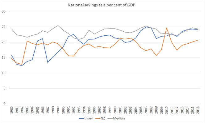
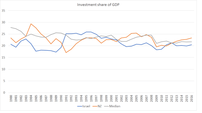
There is plenty of cyclical variation, but in both countries on average over this period, the share of investment spending in GDP has been a bit lower than advanced country median.     Given all the resources that needed to go to meeting the needs of the fast-growing populations (simply maintaining capital per person), there will have been materially less “left over” for capital deepening, or for new businesses and ideas.  It isn’t a mechanical rationing process, but just a response to the opportunities and the relative prices.

    And here is the same comparison for national savings rates.

    Israel savings

    Again, despite the much more rapid population growth rates, both countries have had lower national savings rates than the median advanced country over this period.

    I don’t know enough detail about Israel to be highly confident about quite what mix of factors is important in explaining its sustained underperformance (relative to other advanced, and key emerging, economies).  But the underperformance is pretty clear.  Israel’s productivity, like New Zealand’s, languishes towards the lower end of the OECD (and certainly of those OECD countries that were market economies a few decades ago).  Perhaps there are some specifics in the Israeli high-tech sector from which visitors can learn.   But if, to some extent, Israel’s sheer survival (so far) might be loosely termed a “miracle”, it isn’t clear that its economic performance is anything of the sort.   Very rapid population growth looks like it might have been part of the story (whatever it has done in terms of boosting the number of future IDF soldiers).

    Has the Reserve Bank shrunk the country and not told us?

    In the press release (and in the full text) for Reserve Bank Assistant Governor, John McDermott’s speech the other day we were told that

    the economy is populated with thousands of households and businesses responding to their own particular circumstances and opportunities,

    In fact, there are well over 1.5 million households, and many hundreds of thousands of businesses.  There are plenty of uncertainties the Reserve Bank has to grapple with, but that shouldn’t be one of them.

    It is often not entirely clear why the Reserve Bank chooses to make some of the on-the-record speeches it does.    Sometimes there is a specific and important message they want to get across.  But often, at least when I was still there, it seemed that the Governor was keen to give his senior managers a bit more public profile, and so they gave speeches (and published them) even when there wasn’t very much to say.

    McDermott’s speech on forecasting seems to be in that category.   There seem to be a couple of substantive points: a brief attempt to defend how well the current monetary policy decisionmaking process works (even as both major parties are considering the possibility of change), and an even briefer bid for a monthly CPI.  I happen to agree with them that a monthly CPI would be welcome (so would monthly unemployment data, a gap that also stands out in cross-country comparisons).  It is, thus, a shame that 15 years ago the Bank pushed back against Lars Svensson’s recommendation, in his inquiry conducted for the then Minister of Finance, that New Zealand should have a monthly CPI.     Having said that, I think the Bank’s chief economist is fooling himself if he really believes, as he claims in his speech, that “this is likely to be a fruitful avenue for future improvement that would greatly improve the Bank’s forecasting ability”.      Incrementally useful is probably a more accurate summary.

    As for the rest of the speech, it would have been better not delivered at all.   It is a curious mix of bits and pieces from a couple of popular recent books on forecasting, and a convoluted attempt to defend what the Reserve Bank does as, it would seem, the very best it can do, and just the right approach to adopt.

    When speaking abstractly, McDermott is happy to talk about the importance of acknowledging mistakes.  Thus, and for example

    To learn from our errors, we need to recognise that they are errors.

    Hard to disagree with that.  But in the entire course of the speech, McDermott never once describes any stance the Bank has taken, or forecast it has made, simply as an “error”.   He devotes almost two pages of the speech to 2014 increases in the OCR which had subsequently to be more than fully reversed.  But the only evaluative word used in the entire two pages is “correct” –  that to describe the point where they realised that it didn’t make sense to keep on increasing the OCR as much as they had previously been suggesting they would.    But human beings make mistakes.  We all do.   It doesn’t speak well of the Bank’s senior management that they are still so reluctant to even use the words, applied to themselves.

    As McDermott notes, to some extent, forecasting is an inevitable part of much of what we do in life.   There are the mundane things.  If I put a tin full of cake mixture in the oven at 180 degrees, I do so implicitly forecasting that in an hour or so it will be cooked.  Those sort of examples could be multiplied endlessly.

    But monetary policy is today’s topic.   Forecasting isn’t an inevitable part of monetary policy.  One could, for example, simply peg the exchange rate (as we did for many years) or fix the money base.  I don’t recommend either approach, but neither requires much in the way of forecasting.

    Much more conventional approaches also needn’t require much forecasting.    Decades ago, US economist John Taylor illustrated that a simple rule, in which monetary policy responds to changes in the current inflation rate (deviation from target) and to changes in the output gap (or, similarly, to changes in an unemployment gap) pretty well described how the Federal Reserve had actually run monetary policy.   Estimating a Taylor rule might take quite a lot of ongoing analysis (you need estimates of the neutral interest rate and of the output gap) but it needn’t involve any active forecasting at all.   Because monetary policy works with lags, there is an implicit forecast involved in using a Taylor rule, but it is very different from the sort of forecasting McDermott is talking about.

    Our Reserve Bank goes beyond that in two ways:

    • it publishes numerical forecasts for a range of key macroeconomic variables (including inflation) for about three years ahead, and
    • it publishes forecasts of what it itself will do with monetary policy over that same period ahead.

    The first leg of that is quite common.  Most advanced country central banks now publish economic forecasts in some form or another.

    The second leg is quite uncommon.  The Reserve Bank of New Zealand was the first central bank to do so 20 years ago (without a great deal of debate at the time) and not many have followed us.    The OCR forecasts are, of course, subject to change (and we often preferred to call them “projections”) but at the time they were published they were really close to the best unconditional forecast by the Bank (or more specifically the Governor) of its own future actions.

    And when you read, as we do in the Bank’s press release for McDermott’s speech, that forecasting  is “helping the Bank plan for the future” and that “forecasts also help people form expectations of the future and therefore guide current actions” you might suppose that the Bank thinks it knows something about the future.     If so, silly you.   Because we are also told that

    Forecasting is not supposed to be prophecy

    Setting aside the quasi-religous connotations of the word “prophecy”, the OED suggests I should take it as meaning a prediction of the future.

    If you can’t predict the future, your predictions can’t help you plan, and they can’t help anyone else plan either.   The Reserve Bank really can’t have it both ways.  Of course, forecasts don’t have to be 100 per cent accurate to help you or others plan, but if they have no information at all about the future they are also no use at all.  Indeed, if your forecasts end up biased one way or another, and you actually think they are telling you something about the future, they can lead you (and anyone else who took them seriously) quite badly astray.

    (As it happens, it is less than a year since the Reserve Bank was out touting evidence of the accuracy of its forecasts. I wrote about that work here.)

    There is none of this is McDermott’s speech.  And while he claims that through the Reserve Bank’s particular approach

    the predictability of monetary policy decisions is enhanced and policy uncertainty is reduced.

    he offers no evidence of this.  Is there, for example, evidence of less monetary policy uncertainty in New Zealand than in other countries?  I’d have thought not, but the Bank doesn’t even try to back its claims.   As we are the only advanced country to have initiated two tightening cycles since the 2008/09 recessions, only to have to reverse them both, a detached observer might reasonably be sceptical.

    There isn’t even an attempt to distinguish between the various possible forecast horizons.  As I understand it, for example, the Reserve Bank isn’t bad at forecasting inflation and GDP one quarter ahead (although even these claims are relative –  on the eve of the GDP release we were often reminded that the actual number could easily be +/- 0.5 percentage points different than our forecast).

    At the other extreme, when (as they did last  week) they forecast the OCR itself for the June 2020 quarter, there is no information value at all about the future.  The right OCR for June 2020 will, in their way of thinking and allowing for the lags, depend on inflation pressures in 2021 and 2022.  No one has the foggiest idea what those pressures will look like.   The Reserve Bank’s forecast accuracy work (linked to earlier) highlighted both the huge errors and the biased nature of those errors, for periods even two years ahead, let alone four to five years ahead.

    And then there are the in-between periods.  Perhaps very good forecasters might be able to add a little value in forecasting inflation and GDP a year ahead,    But even then, that value might be quite small, and subject to huge error bounds.

    But there is none of that sort of differentiation in McDermott’s speech either.

    To be clear, my criticism is not (mostly) that the Reserve Bank is bad at forecasting.  Everyone is.   My concern is that they show little sign of even recognising the limitations of what they are doing (and not much ability to even maintain a consistent story about the role of forecasts from one year to the next).

    The fallback line is that even if forecasts tell one nothing about the future, they help guide people (presumably especially financial markets) on how the Bank might change policy if the data come out differently than the Bank expected.   By publishing forecasts, one could better understand the mental “model” the Bank had in mind, and one could get a sense of the “reaction function” (ie how the Bank responds to a particular inflation outlook, and changes in that outlook).     But even this point is vastly overstated, for a variety of reasons:

    • it doesn’t apply at all to, say, the Bank’s current forecasts of the OCR in 2020.  By then, there will have been another dozen or so sets of forecasts out.
    • it doesn’t even really apply to forecasts of inflation or GDP a year hence.  By the time we discover whether those forecasts are correct, there will have been another three or four sets of forecasts published.

    There is a case that published forecasts of the very next round of quarterly data might be helpful.  If the Bank thinks the next quarter’s GDP data will show an increase of 0.4 per cent, and the actual outcome is 0.9 per cent, then (all else equal) markets are likely to think the Bank is a bit more likely than previously to tighten a bit sooner than previously.     But even then, it is never that simple.   After all, there is noise in the actual data.    But that is where McDermott’s case is strongest, which has nothing to do with the medium-term forecasts.

    The line, which pervades the speech, that it really doesn’t matter if forecasts are right, because they still have useful information, would probably be true in one very specific set of circumstances.

    If the Reserve Bank had, through hard work, divine insight or whatever, uniquely acquired the perfect “model” of how the economy works, but simply didn’t know what new shocks might hit the economy, then the model –  and the associated forecasts –  would have some use.  If a shock hits out of the blue, everyone can be clear how much that shock will affect the forecasts and, hence, how the Reserve Bank will optimally react.

    But to write that down is to expose just how unlike the real world that is.  Typically forecasters have only at best only a vague approximation to the correct “model”, and when data come out that surprise them, it often isn’t a genuine shock – a new event arising outside the system – but rather something that challenges the “model” of the economy the forecasters (or central bank) have been using.    To a considerable extent, that has been the story of the last decade –  not just for the Reserve Bank of New Zealand, but for all of us here and abroad.    It also isn’t a criticism (of the Bank or anyone else), just a description of the limitations of our knowledge.    What is worth criticising is the pretence that the forecasts are offering more.

    A common benchmark is whether a forecast (whether by judgement or a formal model, or some combination) can beat a random walk –  a simple model in which the best prediction of the next period is the actual outcome for the last period.   If not, there really is no point in doing forecasts, since the forecasts are just adding noise.   Over the last eight years, the Reserve Bank’s medium-term OCR forecasts have clearly been worse than a random walk forecast, and they’ve been biased too.  It is harder to do on the other variables (since, for example, they don’t publish core inflation forecasts), but there is little in the evidence to suggest that the medium-term forecasts in particular are adding any value at all.  And yet, as McDermott notes, they take a lot of resources to produce.

    To be clear, I’m not denying that markets and commentators pay some attention to the Reserve Bank’s OCR track all the way out to 2020.  But they do so not because that track has any substantive information about what the OCR will actually be in 2020 –  their guess is probably as good as the RB’s, and both are typically terrible –  but simply because it has become a communications device.  If the Reserve Bank wants to communicate a more hawkish stance, it will typically choose to revise up that forward OCR track (and I’ve sat in many meetings where Governors didn’t want to communicate a hawkish stance and forecasters were told to go away and flatten out the track).   But from a substantive perspective, it is unlikely that there is any more useful information than was contained in this simple sentence from the front page of last week’s MPS.

    Developments since the February Monetary Policy Statement on balance are considered to be neutral for the stance of monetary policy.

    Agree with them or not, there really wasn’t much more to the document –  for all its pages – than that.

    There is a great deal in McDermott’s speech about how helpful the Bank finds its forecasting –  indeed, it must surely be a first for the word “precise” to appear twice in a Reserve Bank press release.  But if (a) you know almost nothing about the future, and (b) you can reasonably confident you don’t even have the right model, it is really all sound and fury, signifying nothing, akin to the ritual incantations of some ancient tribe.

    Almost all the value in the economic analysis the Bank does is in understanding the past and the present.  That is no small challenge in itself.  Making sense of what the output gap (or unemployment gap) is right now, making sense of what explains current inflation or unemployment, is plenty enough to keep lots of smart analysts occupied (after all, look at the revisions to the historical estimates).  There may well be a useful role for some short-term forecasting –  the next quarter’s GDP or CPI outcomes –  and even perhaps for scenario analysis, but anything else should be of almost no value to policymakers –  who will mostly update their OCR decision on the next set of actual outcomes –  or to anyone else.   When we say that we can meaningful forecast medium-term economic developments, we deceive ourselves, and the truth is not in us.

    Finally, McDermott is at pains to try to stress how open to scrutiny and challenge the Bank is –  and repeats the claim that the Reserve Bank is one of the most transparent central banks in the world.    Again, you can’t really have it both ways.  If the forecasts don’t tell the future (as the Bank today wants to claim), there isn’t really any information in them.    It is akin to being transparent about a set of random numbers.   As I’ve noted before, the Bank ranks well on transparency about things it knows almost nothing about –  the future –  while being highly secretive about the stuff it does know about.    We don’t see the background papers the Governor considers in coming to his published forecasts, we don’t see even summaries of the advice the Governor receives on the OCR, we see nothing of the minutes of the Monetary Policy Committee or the Governing Committee and so on.  And it is not as if the Bank could really justify secrecy on the basis of the old line “trust us, we know what we are doing”.   Demonstrably, they haven’t convincingly passed that test for some time.  Instead, they hide behind all this talk of “precise” thinking, detailed processes, alleged openness to new ideas, encapsulated in ongoing updates to the forecasts.  The unnerving thing is that McDermott at least appears to believe it.

    I popped into the Wellington Public Library’s annual book sale yesterday and came away with an interesting little book by a Princeton academic, The Road to Delphi: The Life and Afterlife of Oracles.  Flicking through it, I couldn’t find a good quote that was both apt and fair to apply to the Bank, but it isn’t hard to think that the Bank’s forecasts may play more of quasi-oracular role, with all the actual forecasting capability of the oracles of Delphi or modern astrologers (for which there is clearly a revealed demand), than a substantive economic one.

    And since readers often respond with “so what would you do?”,  I would

    • stop publishing OCR forecasts at all,
    • restrict published economic forecasts to the year ahead, and
    • re-orient the analytical (and particularly) the communications effort much more squarely on making sense of where we are now.  That is quite hard enough, and without a good fix on that, everything else is largely sailing blind.


    One of the more idiotic headlines I’ve ever seen

    Of course, there is plenty of competition.  But this isn’t the latest on Kim Kardashian or Prince Harry, or whatever.  It is about house prices.   And this time one can even, sort of, excuse the media outlet concerned

    According to the Herald,  New Zealand housing market 40% chance of going bust, says Goldman Sachs.  

    Sounds bad.  Or perhaps promising if you care about the prospects of your kids being able to buy a house.

    But quite what does “bust” mean here?  Well, not quite what you or I might think of us as a bust.

    Goldman, Bloomberg said, defines bust as house prices falling five percent or more after adjustment for inflation.

    A five per cent fall in real house prices is a “bust”???  In what sort of alternative universe?   If the Reserve Bank does its job and keep annual CPI inflation around 2 per cent, unchanged nominal house prices for 2.5 years is a real fall of around 5 per cent.

    As recently as 2008/09 –  no one’s definition of a house price “bust” in New Zealand –  nominal house prices fell by 9.1 per cent in year to March 2009.  The total nominal fall was a bit larger than that, and the real fall was a bit larger again.   In serious ‘busts” abroad, real house prices have fallen by 50 per cent (most of that nominal). In the late 1970s in New Zealand, real house prices fell by 40 per cent.

    But, of course, the worst of it isn’t Goldman Sachs fishing for headlines with ill-chosen labels for modest corrections, but politicians who fall over themselves to suggest that, no matter how awful and unaffordable current house prices are, we can’t possible have house prices falling.

    Last month it was Andrew Little

    But asked if he welcomed signs Auckland house prices were falling, Little said no.

    Today, Phil Twyford seems to be running the same line

    Labour housing spokesman Phil Twyford said a housing bust could be just as bad as skyrocketing prices.

    (In fairness, even though this quote appears in the “bust” article, it is possible Twyford has something more in mind than a 5 per cent real fall when he talks of a “bust”).

    Flat nominal house prices might be an improvement on what we’ve had, but as I illustrated in a post last month

    Depending on how optimistic you are, [with flat nominal house prices] it could take 40 to 50 years to get house price to income ratios back to around three – the sort of level sustained over long periods in well-functioning US cities (and in many other places before land use regulation became the fashion). Perhaps you are sceptical New Zealand could get back to three. It would take 20 years or more just to get back to five.

    Of course, it isn’t as if other political parties are really any better.

    If Amy Adams had been asked, at today’s launch of the plan for the government to build lots of houses, if she was hoping to see house prices fall, I wonder what she would have said?

    The Green Party co-leader,  Metiria Turei, did once call for a slashing in Auckland house prices.  But that was a year ago, and nothing more has been heard of that call.

    Last year, Arthur Grimes called for a 40 per cent fall in house prices.  That was greeted by the then Prime Minister with the label of “crazy”.  As I noted at the time

    It betrayed a fundamental lack of seriousness on the part of the Prime Minister and the government about making housing affordable, and in fixing the dysfunctional market that they –  and their Labour predecessors –  have presided over.

    Arthur noted that no politician has been willing to give a a straight answer on how much they wish house prices to fall and suggested

    I suggest that this simple question should be asked every time a politician (of any stripe) talks on the subject. One can then see if they are really serious about making house prices in Auckland affordable for ordinary people.

    Indeed.

    Big changes in relative prices can be disruptive.  They already have been, on the way up.  But as I noted last year

    if some people will suffer in house prices fall, that is only the quid pro quo for relieving the pressures (“suffering”) on whole classes of people who find it desperately difficult to afford a house at all, especially in Auckland –  the younger, the less well-established, the newer arrivals, those without wealthy parents to fall back on.

    It amused me last year when someone passed on a report of a talkback caller who had insisted that I couldn’t be a real economist because I favoured a fall in house prices.   I think what caller had had in mind was the sort of fall in house prices that results from massive overbuilding, and reckless lending.   Severe recessions are often associated with those sorts of gross mis-allocations of resources.

    But we’ve had no sign of overbuilding (if only…) and not much sign of reckless lending either (if banks had been inclined to, successive waves of LVR controls have made it that much harder).  Instead, we could fix up the housing market by freeing up land supply (because the biggest underlying issues –  for all the talk of building houses –  are land, not the house on the land).   And we could help by taking off some of the population pressure, even if only temporarily.    People who had bought in the last few years, might well find themselves in a difficult position.  People who haven’t been able to buy or build would be much much better off.  And for most of us, it wouldn’t make a lot of direct difference at all –  the mortgage you were planning to pay off over 30 years, would still be being paid off over 30 years.   There wouldn’t be an economic recession in consequence, rather than would be a new wave of optimism and opportunity as land –  not exactly naturally scarce in New Zealand –  was once more affordable.


    The IMF’s paper on New Zealand immigration

    The International Monetary Fund (IMF), like their counterparts at the OECD, tend to be big fans of immigration.  And if some is good, more is generally better.  If immigration in some times or places make a lot of sense, it probably should do so in all times and places.  Or at least that is the sort of tone that often pervades their documents.   There is, no doubt, a variety of reasons for these stances –  some good, some less so – but it can’t hurt that these organisations are made up largely of highly-paid economists who have themselves left their own countries to ply their trade in some of the richer and more comfortable capitals of the world.   Theirs is, typically, a migrant’s perspective, rather than that of a citizen of a recipient country.  And no one doubts that migration typically, or an average, benefits the migrant.  If it didn’t, then mostly they wouldn’t move.

    Last year, the IMF was out championing the potential gains from immigration in one of their flagship publications, the World Economic Outlook.    I wrote here about the work they were highlighting –  some empirical estimates suggesting some rather implausible things.

    If this model was truly well-specified and catching something structural it seems to be saying that if 20 per cent of France’s population moved to Britain and 20 per cent of Britain’s population moved to France (which would give both countries migrant population shares similar to Australia’s), real GDP per capita in both countries would rise by around 40 per cent in the long term.  Denmark and Finland could close most of the GDP per capita gap to oil-rich Norway simply by making the same sort of swap.    It simply doesn’t ring true –  and these for hypothetical migrations involving populations that are more educated, and more attuned to market economies and their institutions, than the typical migrant to advanced countries.

    Come to think of it, the model also implies that if 20 per cent of New Zealanders moved to Australia (oh, they already have) and an equivalent number of Australians moved to New Zealand, we could soon be as wealthy as Australia is now, simply by exchanging populations.   Believe that, as they say, and you’ll believe anything.   (Since the New Zealand Initiative also drew on this IMF work in their advocacy piece on New Zealand’s immigration policy, I also touched on the Fund research here.)

    Last week, the IMF released their Article IV report on New Zealand.  In the main text, there is a pretty typical, but not very specific, tone around the generally beneficial effects of high rates of immigration to New Zealand.    The Fund’s Board happily went along, noting among other things.

    Directors agreed that measures to lift potential growth should focus on leveraging the benefits from high net migration and interconnectedness.

    As I noted last week, there was no hint of what these benefits might be, or how they might be “leveraged”.

    But buried deep in the package of papers released with the Article IV report was an annex with some interesting empirical research on the economic effects of immigration. It can be found starting on page 39 of the report document.     These annexes, or what used to be called “selected issues” papers, involve someone on the Fund staff team doing some more in-depth work on a topic of relevance to the specific member country.  Topics are usually agreed with, and may be suggested by, the national authorities (in practice, the Reserve Bank and Treasury).   I commend those agencies for asking for, or agreeing to, this work.

    In opening, the paper notes

    Over 1990-2014, net migration measured as annual net flow of foreign born
    population averaged about 0.9 percent of previous-year population, which is around twice the OECD average

    and

    In New Zealand both inflows and outflows fluctuate markedly over time, which has a resulted in more volatile net migration compared to most other OECD countries.

    The IMF’s own starting presumptions are clear.

    The educational attainments of New Zealand’s migrant population suggest that
    migration policy has contributed to raising human capital

    They include a chart showing that, relative to other OECD countries, a larger proportion of New Zealand’s migrant have a university degree, but appear unaware of the OECD skills data that shows that, even so, the average skill level of immigrants has still been lower than the average skill level of natives.

    But the focus of the paper is on two quite separate pieces of empirical analysis, one focused specifically on cyclical effects in New Zealand, and the other focused on longer-term growth and productivity effects, but not specific to New Zealand at all.

    The modelling of the cyclical effects appears to be very similar to some research work published by the Reserve Bank a year or so ago (the paper is here, and my discussion of it is included in this post), which distinguished between net migration flows between New Zealand and Australia, which are heavily influenced by what is going on in the Australian labour market, and other net migration flows.

    For the “other” migration they find exactly the sorts of results one would expect, and which researchers in New Zealand have pretty much always found (going back many decades).   For these migration shocks, the demand effects tend to outweigh the supply effects in the short to medium term,   This is a point that seems to be repeatedly lost in the current popular debate on immigration.  Migrants aren’t just workers, they are consumers (and need new capital stock).  So in the short to medium term immigration shocks tend to lower unemployment (and increase the “output gap”).  All else equal, in the short to medium term, they increase inflation pressures.

    Both the IMF and the Reserve Bank’s researchers find something a bit different for migration between New Zealand and Australia that is associated with Australian labour market shocks (proxied by changes in Australian unemployment).    Reduced net flows to Australia are associated with slightly higher unemployment (and lower employment) in the short-term –  and, thus, presumably weaker inflation pressures.

    Unfortunately (and perhaps they were pressed for space), the IMF left out the critical point that the Reserve Bank’s researchers had acknowledged

    the Australian unemployment shock could capture other indirect demand effects. There are common drivers of labour market movements in Australia and New Zealand, and these common drivers mean that the Australian and New Zealand unemployment rates typically co-move. A high Australian unemployment rate is reflected in higher unemployment in New Zealand, but also high net immigration.

    In other words:

    • similar international shocks often hit both New Zealand and Australia.  When they do, Australian unemployment rises, and (net) fewer New Zealanders go to Australia, but New Zealand unemployment also rises, not because of the change in the immigration numbers but because of the international adverse shock itself.
    • Australia is also the largest trade and investment partner for the New Zealand economy.  Thus, any downturn in Australia (whether home-sourced or global) will reduce demand for New Zealand goods and services, and perhaps investment in New Zealand by the many Australian companies operating here.  All else equal, those effects will weaken demand and employment, and raise unemployment, in New Zealand.  At the same time, (net) fewer New Zealanders will be moving to Australia.  The estimates in the Reserve Bank and IMF models capture the combined effects of all this, not just the effects of a change in immigration flows between New Zealand and Australia.

    On my reading, the safest conclusion remains –  as it always has –  that increased net migration inflows (especially if they arise from things exogenous to the New Zealand market –  whether global events or New Zealand policy changes) increase pressure on local resources in the short to medium term. But if, at the same time, demand in one of our major markets is also weak, the overall effect (of the weak international demand and the increased immigration) will not necessarily be to require higher interest rates.  If we could have one without the other, there would be a cleaner test.  With the Australian flows, no one has yet done the research to enable us to do so.

    The second half of the IMF paper looks at “how migration affects growth, factor accumulation, and productivity in a sample of OECD countries”.      This is similar to what the IMF did in the paper they published last October (see above), and relative to that paper it has some pros and cons.

    The downside is that it uses a smaller sample of OECD countries (this time only 14, whereas the earlier paper used 19).  And whereas in the earlier paper, all the countries were already advanced market economies in 1990 (when the data start), this one includes Hungary.   Unlike the earlier paper, this paper also includes Luxembourg, which complicates things because a large proportion of Luxembourg’s workforce doesn’t actually live in Luxembourg, so making sense of their data is harder than usual (there is, for example, a very large gap between GDP –  stuff produced in the country –  and GNI – income accruing to residents of the country).

    On the other hand, the earlier paper only looked at GDP per capita, and simply hand-waved about where the large suggested gains from migration might be coming from, suggesting that we might expect to find a boost to total factor productivity (TFP) growth.  By contrast, in this exercise for the New Zealand Article IV the Fund’s researchers look specifically at productivity measures, both labour productivity and estimates of TFP.

    The modelling exercise does not produce results for any individual country; rather they are average results across this pool of very different countries.   Here is the summary table from the IMF’s paper

    imf migration results

    Tables like that can be a bit hard to read.   On GDP per capita, the results suggest that over this period and for these countries on average

    “a net migration flow of 1 per cent of total population is associated with an increase in output of nearly 1.5 – 2 per cent, driven by an increase in both employment and the capital stock”

    That sounds good (and, if still implausibly large, not inconsistent with the results in the earlier IMF paper).   But note that there was no mention of productivity gains in that quote.   We’ve seen these sorts of results, in different types of models, in Australasia before.   Since migrants tend to be relatively young they, for example, tend to have a higher average labour force participation rate than natives (not too many 80 year migrants).   One can get a boost to GDP per capita, at least for a time, even if there are no gains in productivity, and if there are no gains in productivity there are no long-term gains to natives.  This was the sort of result the Australian Productivity Commission suggested in its recent report on immigration.

    So what did this particular IMF cross-country empirical exercise suggest about productivity effects?

    For labour productivity, you can compare the two lines ‘output” and “hours”.  On one specification, output and hours increased almost identically (so no labour productivity effects at all, and in the second specification of the model, output increases less than hours (1.54 vs 1.72).   We don’t know if that difference is statistically significant, but lets assume not.  At best, immigration produced no gains to labour productivity, across these particular 14 countries, in the last 25 years.

    And what of TFP?  The authors report those results directly.  In both specifications, the coefficients are negative, but not statistically significant.  Again, at best, no TFP gains from immigration across this pool of countries over the last 25 years.

    I’ve previously showed simple scatter plots suggesting that the correlation coefficient between immigration –  using the immigration data in the previous IMF study – and TFP growth, cross-country, is negative –  the outlier in the top right is Ireland, and as this post illustrated, Irish immigration growth came several years after its TFP surge.

    imf-mfp

    As I said, this new IMF work isn’t a New Zealand specific result.  But it might have been nice if the IMF authors, in a New Zealand focused paper, had included a chart or table highlighting how New Zealand’s experience compares to the average finding.  For example, of the countries in the study, only Luxembourg had higher net immigration (as a share of population) over the same period, and over the period we’ve had moderate per capita income growth, very weak labour productivity growth (third lowest of these countries over this period) and pretty disappointing TFP growth by international standards.  You would have to suppose that we look like an outlier (relative to this model, over this period).      Of course, there may be others things at work –  a relatively simple model like this can’t capture everything –  but if you are an international agency wanting to use international research findings to buttress a policy choice of a New Zealand government, surely you owe it to readers –  whether interested citizens, or officials and politicians –  to provide some detail on how New Zealand’s experience looks to compare to the general results of your model.

    As I’ve said repeatedly, I’m quite comfortable with the idea that migration at some times and in some places will benefit natives of the receving country/region.  These particular results aren’t that encouraging on the score (no productivity gains on average), even for the larger group of advanced countries as a whole in modern times.  But if migration benefits natives economically in some times and places –  as it no doubt did in 19th century New Zealand –  there is no reason why that automatically translates to a conclusion that all cross-border migration anywhere and at any time is beneficial.  In fact, even in this study, a finding of no productivity gains (labour or TFP) across the whole sample must mean that, even if the model is robust, some countries will have had positive experiences and others negative.  My suggestion is that New Zealand’s has been negative.  Nothing in the IMF results challenges that.

    Having said that, it was good to have the work done.  I hope the authors considered extending or refining it, and if they are still working on New Zealand issues to drawing out more explicitly how New Zealand’s experience is best explained.

    If NZ was like Switzerland…productivity growth might be even slower

    Reading the Herald over lunch, I was interested to learn that the New Zealand Initiative is leading a study tour (of 40 chief executives and chairs) to Switzerland to see what we have to learn from them.  According to the Herald’s account,

    At the heart of a one-week study tour organised by leading think tank the New Zealand Initiative is a quest to examine the role “localism” plays in the Swiss economic success story.

    The online version of the story even had a graphic,

    Switzerland

    Many of those items seem quite attractive.   Nonetheless, when the story was framed around Switzerland’s economic success, I couldn’t help wondering if the Initiative’s members might not be heading to the wrong place.

    Once upon a time, Switzerland had either the highest or second highest measured productivity (real GDP per hour worked) in the advanced world.  The Conference Board has estimates back to 1950 – when Switzerland was just behind Luxembourg.  But in this post, I’ll use OECD data, which goes back to 1970.

    As recently as 1970, Switzerland still held that sort of rank (as it did for nominal GDP per hour worked –  in some ways a superior measure, but good timely estimates for the current situation aren’t available).    These are the OECD countries for which there is 1970 data.

    switz 1970

    We weren’t doing too badly either –  just slightly below the median for example, and in the middle of the big European countries (Spain, UK, France, Germany and Italy).

    But here is the cumulative growth in this measure of labour productivity for the full period 1970 to 2015.

    switz 70 to 15

    Beaten even by New Zealand.  It is a pretty woeful Swiss productivity performance.    Even over the last 25 years when both countries have done a little better relatively (we beat six of the OECD countries), Switzerland still came in behind New Zealand.        Over the decades, they don’t even have the excuse of agricultural protectionism, or being remote in an age when personal connections have become more important.

    And what about the present?  Here are the levels of real GDP per hour worked in 2015, for the now much larger OECD.

    switz 2015

    Switzerland is, of course, still a productive and prosperous economy.  But over the last 45 years, it has slipped a long way down the league tables.    As for us, of the countries on the first chart who had lower productivity than New Zealand in 1970, only Turkey, Portugal and Korea still do.    (I hadn’t really noticed previously that if they don’t shoot themselves in the foot, even Turkey will soon go past us if these numbers are to be believed.)

    I’m sure there are many good things about Switzerland.  It is a much richer, and in many ways more successful, country than New Zealand.  But I’m not sure I’d be looking to them, or their governance models (fascinating as they are in many respects), for lessons on what New Zealand should do to lift its relative economic and productivity performance.

    Labour on housing

    There was nothing positive to be said about the previous Labour-led government’s approach to housing and house prices.  There is nothing positive to be said about the current National-led government’s approach.  The rhetoric while they were in Opposition had been encouraging.  The substance of reform has been almost non-existent, all the while cloaked in fairly brazen, even offensive, rhetoric from both Prime Ministers (Key and English) suggesting that it was all a mark of success, a quality problem, and so on, along with suggestions that the government’s approach was working.    By that standard, I hope I don’t live to see a failed housing policy.

    There have been some hopes, in some circles, that the Labour Party, if they were to lead a new government after this year’s election, might be different.  Their housing spokesman seems pretty impressive, and seems to understand the issues.  In a no doubt mutually beneficial move, he and Oliver Hartwich, head of the business-funded New Zealand Initiative, even did a joint op-ed on freeing-up the market in urban land.   Places where landowners can use their land pretty freely tend not to have the sorts of grossly dysfunctional housing markets New Zealand (and Australia, and the UK, and much of the US east and west coasts) have, even if those places are big and fast-growing.

    I’ve liked the talk, but have been a bit sceptical that it will come to much.  In part, I’m sceptical because no other country (or even large area) I’m aware of that once got into the morass of planning and land use laws has successfully cut through the mess and re-established a well-functioning housing and urban land market.  In such a hypothetical country, we wouldn’t need multiple ministers for different dimensions of housing policy.  I’m also sceptical because there is a great deal local government could do to free up urban land markets, but even though our big cities all have Labour-affiliated mayors, there has been no sign of such liberalisation.    The Deputy Mayor of Wellington for example leads the Wellington City Council ‘housing taskforce”.  Paul Eagle is about to step into a safe Labour seat.   His taskforce seems keen on the council building more houses, and tossing more out subsidies, but nothing is heard of simply freeing up the market in land.  Or even of looking for innovative ways to allow local communities to both protect existing interests and respond, over time, to changing opportunities.

    I first wrote about this last October, when Phil Twyford had put out a substantial piece on Labour’s housing programme.   There was a five point plan.  Reform of the planning system appeared on the list, but briefly and well down the list.    As I noted then

    It has the feel of a ritual incantation –  feeling the need to acknowledge the point –  rather than being any sort of centrepiece of a housing reform programme.

    Yesterday, my doubts only intensified.  Labour’s leader, Andrew Little, devoted the bulk of his election year conference speech to housing, complete with the sorts of personal touches audiences like (although he didn’t mention the tasteful lavender out the front of his current house, which I walk past each day).  Media reports say the speech went down well with the faithful.

    This time there was a four point plan.  It was a lot like Twyford’s plan from late last year, with one omission.   The continuing features were:

    • the state building more “affordable” houses,
    • restrictions on “overseas speculators” buying existing houses,
    • making “speculators who flip houses with five years pay tax on their profits,
    • “ring-fencing” losses on investment properties.

    But in the entire speech –  and recall that most of it was devoted to housing –  there was not a single mention of freeing up the market in urban land, reforming the planning system etc.  Not even a hint.    I understand that giving landowners choice etc probably isn’t the sort of stuff that gets the Labour faithful to their feet with applause.   But to include not a single mention of the key distortion that has given us some of the most expensive (relative to income) house prices in the advanced world, doesn’t inspire much confidence.     Planning reform isn’t going to be easy.  Few big reforms are under MMP.  It probably isn’t something the Greens are keen on.  And if the putative Prime Minister isn’t on-board, hasn’t yet internalised (or even been willing to simply state it openly) that this is where the biggest problems lie, it is hard to believe that a new government would really be willing to spend much political capital in reforming and freeing up the system, no matter how capable, hardworking and insightful a portfolio minister might be.

    Probably reforms of this sort don’t play well in focus groups (although surely there is some responsibility on political leaders to help shape the debate, and change what people respond positively to?)   On the other hand, presumably the data suggest that people react well to attacks on “speculators”, “loopholes”, “subsidies”, which appeared numerous time in Little’s speech.

    The headlines around the speech were around the leader’s official confirmation that Labour will prohibit people from offsetting tax losses from investment properties against other non-property income.   This is, apparently, to “close a loophole” to stop “speculators” receiving “subsidies”.     In fact, it is nothing of the sort.

    For better or worse, New Zealand has a comprehensive income tax system in which different types of factor income are treated much the same, and taxed at much the same rate.  There are various exceptions, and lots of devil in the detail (thus, for example, the establishment of the PIE regime a decade or so gave an advantage to funds in widely-held entities over individually-held assets).  It has long been pretty fundamental to that system that one tots up all the gains and losses over the course of the year, and then pays tax only on the overall net income.  It would be absurd, for example, to take a business with five operating divisions and tax them on the basis only of the lines of business that made profits, even though several of the other divisions may have made large losses.    Since time is money, it wouldn’t be much consolation to say “oh, don’t worry, you can offset those losses against future profits in those particular operating divisions”.

    But that is just what Labour proposes to do.    There is no “subsidy”, there is no “loophole”.   There is simply a conventional comprehensive income tax system at work.  If you lose money on one activity, you can offset it against gains on other activities.

    And, if you are concerned about favourable tax treatments then, within the comprehensive income tax model, the clear and unambiguous feature of the tax system that favours one group of potential house purchasers over another is the non-taxation of imputed rents on owner-occupied houses.    Relative to other potential purchasers, this feature provides a big advantage to unleveraged owner-occupiers (ie mostly those in late middle age and the elderly).   This isn’t some idle Reddellian claim.  You can see the calculations worked out carefully in a Reserve Bank discussion paper, The tax system and housing demand in New Zealand, from a few years ago, showing how the features of the New Zealand tax system affect what different types of potential purchasers will be willing to pay.

    Within a comprehensive income tax system, I’m at a loss to understand the economic logic behind Labour’s proposed policy.  Presumably it will be fine to buy a farm (or shares in a farm) and offset losses on that investment against labour income?  Presumably it will still be okay to set up a small sideline business which makes losses for several years in the establishment phase, and to offset those losses against labour income?   But not for residential investment properties (or, one assumes, for shares in companies mainly devoted to holding such properties?)   Even though setting oneself up as the owner of an investment property, renting a house to tenants, is a small business.  In fact, it is a way that many people get into business, taking risks to get ahead.

    Much of the discussion in the time since Little gave his speech has been on what sort of people will be affected –  whether it is the evil “speculators”, as opposed to “Mum and Dad”.  I’m not sure if there is much data available on that in New Zealand, but they are having a very similar debate in Australia, and I was interested to see a list from Australian Tax Office data published on the ABC website as to who had claimed rental losses in Australia, by occupational group.  People can make of it what they will.  The occupational groups most likely to claim rental losses in 2013/14 were anaesthetists (28.7 per cent of them).  But 22 per cent of Police did as well.

    I’m opposed to ring-fencing, if we are going to have a comprehensive income tax system.  And, I’m doubly opposed to singling out housing for ring-fencing.   If there is an economic logic to ring-fencing, apply it more generally or leave it alone.  As it happens, we tried something similar before.  From 1982 to 1991, there were restrictions put on loss-offsetting against labour income for “specified activities” (at the time, the bugbear was people investing in things like kiwifruit orchards).  Even then, loss-offsetting was limited to $10000 per annum (rather than zero).

    Are there problems with the current tax treatment?  Arguably so.  Some would claim that the absence of a full capital gains tax is such a distortion, allowing people to run operating losses in the expectation of future capital gains.     As it happens, Labour proposes to address that by, in effect, imposing a capital gains tax on any sales of investment properties within five years (presumably these are typically the “speculators”).  But even if they weren’t, the argument still fails.  In even a moderately efficient market, there are no rationally-expected real future capital gains on offer across the market as a whole.  If there were, people would bid up the prices further now to take advantage of (and thus eliminate) those gains.     There are windfalls –  gains and losses –  from large actual changes in capital values of assets, but it isn’t a systematic distortion in the system.     (In principle, I don’t have too much problem with a capital gains tax that (a) applies only to real (inflation-adjusted) gains, (b) applies on a valuation basis rather than a realisations basis, and (c) treats gains and losses symmetrically.  In practice, no such systems exist).

    Where there is a systematic distortion in the system is around the treatment of inflation.  In an ideal system, there would be no systematically expected inflation.  In practice, we have an inflation target centred on 2 per cent annual inflation.  As a result, roughly speaking, nominal interest rates are around 2 percentage points higher than real interest rates, and real assets should be expected to increase in value by around 2 per cent per annum, even if there is no change in their real value.      The two percentage point component of interest rates that is just inflation compensation isn’t real income (no one is better off as a result of receiving it; no one’s purchasing power is improved).  And yet it is taxed as real income.  And for those borrowers who can deduct expenses, interest is fully deductible, even though the inflation compensation component doesn’t reduce the borrower’s real income.   That is a systematic advantage to such borrowers, and one for which there is not a shred of economic logic.

    In my preferred approach, the inflation compensation component of interest income would not be taxed.  And the inflation compensation component of interest expenses would not be tax deductible for anyone.    As the Reserve Bank discussion paper I linked to earlier showed, this change alone would make quite a substantial difference to how much highly-geared investment borrowers would be willing to pay.  And it would be a genuine improvement in the comprehensive income tax system as well, without singling out on class of purchasers of one class of asset.

    But it is worth bearing in mind, that none of these issues can explain anything about house price inflation behaviour in the last 10 or 15 years.  Over that period:

    • the loss-offsetting rules have been much the same,
    • the introduction of the PIE system disadvantaged individual holders of investment properties relative to, say, holders of financial assets in PIE vehicles,
    • in 2005, the tax depreciation rules were tightened,
    • from 2010, depreciation on properties was no longer tax deductible,
    • the inflation target was raised in 2002, but for the last eight or nine years, inflation expectations have been trending down again,
    • maximum personal income tax rates were also cut in 2010 (reducing the value of deductibility and loss-offsetting).

    Any of these “distortions” should be capitalised into the price pretty quickly once they are announced and understood,  The only new measures in the last decade or so have reduced the relative attractiveness of property investment  (and that is before even mentioning LVR controls).  It typically takes shocks to displace markets.  In principle, the advent of non-resident foreign purchasers could have been an example (in the presence of supply constraints), but we don’t have good data.  So could unexpected population growth.

    We should probably also be sceptical as to how much difference ring-fencing, as Labour propose, might make.  When I was at the Reserve Bank we came and went in our views on tax issues around housing.  But the one consistent observation over the years was to point out that many different countries had quite different regimes for the tax treatment of housing.  Some allowed loss-offsetting, some didn’t.  Some had capital gains taxes, some didn’t (and all those who did had various different rules).  Some had differential income tax rates for capital and labour income. Some even made a stab at taxing imputed rentals.  But it wasn’t obvious that the differences in tax treatments explained much about the levels of house prices, or about cycles in them.    And in a well-functioning land market, land –  the asset value that is, in principle, affected by tax system changes –  is only a fairly small component of a typical house+land price.

    What tax rules do is affect who owns which assets.  Thus, for decades our tax system has tended to treat all owners of investment properties pretty equally.   Loss-offsetting was part of that.   But so was the fact that we didn’t give favourable tax treatment (generally) to insurance companies and superannuation funds.  In many countries, assets held in those sorts of vehicles are more lightly taxed.  Not surprisingly, managers of those vehicles can afford to pay more for the assets, and a larger share of the assets end up in such vehicles.

    Ring-fencing rules can be expected to have similar effects.     If “Mum and Dad” with one investment property can’t offset a bad year’s losses against other income, but have to carry it forward and wait for a good income year from property, while a superannuation fund with lots of investment properties can (either because it is less leveraged or because losses on some properties can be offset against profits on others) more properties will be held in such vehicles.  It isn’t clear what the public policy interest is in such an outcome?  More generally, the change will disadvantage people starting out in the rental services businesses relative to those who are better-established and have larger equity.

    In the end, so-called “speculative” opportunities, on any sort of widespread scale, arise mostly because governments got themselves into the land market, and by regulatory interventions, disabled the market from working smoothly to increase supply in response to increases in demand, or changes in tastes.   Wouldn’t it be better, more in the interests of middle New Zealand (and economic efficiency) to address the problem at source –  fix the regulatory failures –  rather than falling back on rhetoric about speculators and subsidies, which at best in tackling symptoms, not grappling with causes?

    Fix up the planning system and all this will be yesterday’s issue.  Fix up the inflation distortion and you’ll also have a better tax system.  But if the planning system isn’t fixed then, whatever other short-term stuff Labour does (including immigration changes) will only provide temporary relief, and in a few years time we’ll be back with the same old housing affordability problems.  What a lost opportunity that would have been.

    PS.  I see that Labour is invoking the Reserve Bank in support of ring-fencing.  Perhaps the current Governor does favour such a change –  although we’ve not seen any economic analysis in support of it from them –  but if so, it is an example of a proposal which the Bank was against before it was for.    In 2005, at the request of the then Minister of Finance, a group of senior Reserve Bank and Treasury staff was asked to review policy options for dealing with house prices.  I was part of that group (as was Adrian Orr, and incoming acting Governor Grant Spencer, and the current Chief Economist at The Treasury).  There is a nice treatment of the ring-fencing issues on pages 19 to 22 of our report.


    A questionable indicator of the labour market (geeky)

    The Reserve Bank has long been averse to too much focus on the unemployment rate.  Some of that was political.  Opposition MPs back in the 1990s would try gotcha games, trying to extract estimates of a non-accelerating -inflation rate of unemployment (NAIRU) with the aim of then being able to tar us with lines like “Reserve Bank insists full employment is x per cent unemployment” [at the time x might have been 7 per cent or more] or “Reserve Bank insists on keeping x per cent of New Zealanders unemployed”.   So there was an aversion to using the concept, and most certainly to writing it down.  If you don’t write things down, it is hard to have them OIAed.

    But for decades there has been something a lot like a NAIRU embedded in successive versions of the models the Bank uses as a key input to the forecasting process.   But there was still an unease.  Some of it was those old political concerns.  Some of it was the aversion to being pressured into any sort of dual objective model –  even though discretionary monetary policy was only ever introduced to allow short-term macro stabilisation together with medium price stability.

    In the last decade or so, it seemed to be some mix of things.   In 2007, the unemployment rate was down at around 3.5 per cent, but the official view at the time was that the overall economy was more or less in balance (as I noted yesterday the output gap estimates then were positive but quite small).  So, the unemployment rate tended to be discounted.   To the extent there were NAIRU estimates implicit in the thinking, they had been trending down for 15 years.  Perhaps, some felt, 3.5 per cent unemployment wasn’t much below a NAIRU at all.

    In the years after the 2008/09 recession, there seemed to be two problems.  The first was a quite genuine one.  The HLFS unemployment rate numbers were quite volatile for a while, and while it was clear that the unemployment rate was still quite high, it was hard to have much confidence in each new quarterly observation.    The rise in the unemployment rate in 2012 only further undermined confidence among some of my then colleagues.  The economy seemed to be recovering.

    U 2006 to 13

    So there had always been a tendency to discount the unemployment rate.  Odd short term developments in the series itself reinforced that, and then as the recovery began to develop the Bank kept convincing itself that the output gap had all but closed.  If the output gap  –  which tended to be central focus for much of the analysis, even though it was something of a black-box, and prone to significant revisions –  had really closed, then surely the labour market must also be more or less in balance?  If the unemployment rate appeared to suggest otherwise, so much the worse for that particular indicator, which many at the Bank had never much liked.    When the Bank started the ill-fated tightening cycle in March 2014, they thought then that excess capacity had already been used up for a couple of years.  This is the output gap chart they ran then.

    output gap mar 14 mps

    At the time, the unemployment rate was still 5.6 per cent

    (Contrast that output gap chart with the one from yesterday’s MPS, which I included in yesterday’s post.  At first glance, they look quite similar, but whereas in 2014 they thought excess capacity had been exhausted in 2011/12, now they think it was only exhausted in 2013/14.)

    Various people had various ideas for how best to look at labour market data.  But mostly the unemployment rate was just ignored.

    A year or two back, some US researchers had done an interesting exercise, trying to combine formally the information in a whole variety of labour market indicators, to distill an overall picture.  And somewhere along the line, someone got the idea of doing something similar for New Zealand.  And thus was born the Reserve Bank’s Labour Utilisation Composite Index, with the pleasing acronym of LUCI.

    One day last April, Reserve Bank Deputy Governor Geoff Bascand gave a major address on monetary policy matters, Inflation pressures through the lens of the labour marketAs I noted at the time, it was little odd for him to be giving the speech –  as his day job was mostly responsibility for notes and coins, and the Bank’s corporate functions.  Then again, his ambition for higher office was pretty apparent, and earlier in his career he had led the Department of Labour’s Labour Market Policy Group.   Geoff on labour market matters should have been worth listening to.

    The broad thrust of the speech was that high immigration wasn’t going to put much pressure on demand (contrary to the usual experience, and past Bank research), and that the labour market was pretty much operating at full capacity.  In support of these propositions, the Bank simultaneously released not just the speech, but three new Analytical Notes.    Since I had been harrying the Bank about its change of view of immigration, I focused then on the two immigration research papers, and identified a number of issues with them.     At the end of a long post I noted

    There is a more material on other topics in Bascand’s speech, and another whole Analytical Note on other labour market issues which I haven’t read yet. I might come back to them next week.

    But I never did.  Other things presumably distracted me, and thus I never got round to reading the Analytical Note introducing LUCI.   I didn’t until yesterday afternoon – I’d heard the Governor, or the Chief Economist, mention it at the press conference, and it was a wet afternoon, so I went and downloaded the paper.

    The Reserve Bank has given quite a lot of attention to this brand new indicator.  In the Deputy Governor’s speech, it gets three whole paragraphs

    Over the business cycle, a key driver of wage growth is the balance of supply and demand, or labour market ‘slack’. However, the unemployment rate is an inadequate indicator of labour market slack, particularly when the participation rate fluctuates. Researchers at the Bank have recently constructed a labour utilisation composite index, or LUCI, to help address this problem. Such indices combine the information in a large number of labour market variables into a single series of labour market tightness, and are used internationally to help gauge labour market pressures. The New Zealand index uses official statistics such as the HLFS and survey measures of the difficulty of finding labour, such as the QSBO.

    By construction, the LUCI has an average value of zero. A LUCI value above zero indicates greater labour market tightness than usual – a value below zero indicates greater labour market slack than usual. Our research shows that, historically, a higher LUCI has been associated with stronger wage growth.

    The LUCI suggests there was a large degree of slack in the labour market at the trough of the 2008-09 recession. The LUCI then gradually returned to zero, and has been around that level since early 2014 (figure 7). This movement is consistent with the range of the Bank’s suite of output gap indicators.

    This wasn’t just some speculative new tool dreamed up down in the engine room by smart researchers, but still needing road-testing.  The Deputy Governor (presumably with the approval of the Governor and the Chief Economist) seemed sure it was action-ready.

    Consistent with that approach, a chart of LUCI has appeared in all but one of the five MPSs since that speech.    Here was LUCI as she appeared yesterday

    LUCI may 2017

    On the Deputy Governor’s telling

    A LUCI value above zero indicates greater labour market tightness than usual – a value below zero indicates greater labour market slack than usual.

    In other words, on that particular interpretation, labour market tightness was now more severe than it had been in 2007 (just prior to the recession), and almost as severe as at the peak of the series in around 2004.

    And, of course, Geoff Bascand didn’t just make up that interpretation.  It was what the researchers had said in their Analytical Note, almost word for word.   It was also what the footnotes on the LUCI charts in the MPSs said.  At least until yesterday.     In yesterday’s MPS, slipped in so quietly, the interpretation of LUCI had changed rather materially.   The chart was still there, it still looked the same as ever.  But below it, it has these words written

    Note: a positive value indicates a tightening in labour market conditions

    Lay readers may not immediately notice the difference, but it is substantial.  When the indicator was launched, with some fanfare (there are many clever new indicators, and not many get three paragraphs in a Deputy Governor speech), a positive value was interpreted as the labour market being tighter than usual (thus the pesky single indicator, the unemployment rate could keep on being largely ignored).   But now a positive value simply means that the labour market is a bit tighter than it was last quarter.    If there was lots of slack last quarter, it simply doesn’t matter to the indicator –  all that matters is the direction of change.

    The Bank didn’t draw this to readers’ attention at all.  They didn’t change the heading on the chart either.  It was a bit naughty really.       What it means is that whereas we once had an indicator –  using 16 different variables –  that might have suggested the unemployment was completely misleading as a measure of slack, what we actually have now in LUCI saying similar things to the unemployment rate.  The unemployment has been edging down, and LUCI has been positive.   But that LUCI number is now felt to tell us nothing at all about the absolute level of labour market slack (or even the level relative to a long run of history).

    I don’t quite know how the Bank fell into this –  except, perhaps, for the wish (for a labour market measure suggesting the market was at full capacity –  in line with the output gap estimates) getting the better of hard-headed challenge and scrutiny.

    The approach they used to construct LUCI was very much the same used to construct the sectoral factor model of core inflation.  In essence (there), get the rates of price increases for all the CPI components, and look for a common theme (or “factor”) that runs through them all.    It seems to work quite well there.  All the variables are expressed the same way (percentage changes).      But LUCI is a bit different.     Here is the list of all the variables used.

    LUCI components

    They take each variable and standardise it relative to its own mean.

    But it is an odd mix of variables.   There are annual percentage changes mixed in with levels.  And some of those levels measures (eg the QSBO ones) are the outcome of questions that are actually technically expressed in change terms.  It is also a mix of quantity measures and price (wage) measures.   When I looked through the list, the first real oddity that struck me was that unemployment itself is not expressed as a percentage rate.  Rather, they take the number of people unemployed and calculate the percentage change.   If, then, every single person was fully employed –  so the labour market was very tight –  this component  (used in calculating LUCI)  would be showing a zero percentage change.  They’ve done the same thing to all the quantity variables, so it should have been obvious from the start that what they were doing (at least for that half of the inputs) was looking at variables that would produce a change indicator, not a levels one.

    I understand why they did it.  The unemployment rate trended down for 15 years or so.   The gap between the actual unemployment rate and the average unemployment rate wouldn’t be a very meaningful indicator.   But it meant, almost inevitably, that the new indicator couldn’t be an indicator of absolute labour market tightness, only (at best) an indicator of changes in tightness.

    But there are other problems.  Think about what would happen if (to be deliberately extreme) the population doubled, and yet there was no change in “true” labour market tightness.    That isn’t far from the Reserve Bank’s story about the recent immigration shock –  they told us again yesterday that, contrary to past common experience, they think the demand and supply effects have more or less offset each other.

    But if the population doubled, and there was no change in “true” labour market slack,  we would still expect to see employment, numbers unemployed, the number of short-term unemployed, numbers underemployed, the number of filled jobs, hours worked, the working age population, the number of job ads, and the number of registered job seekers all increase (that is roughly half the variables in LUCI).   The unemployment rate (%), for example, might stay the same, but both the numerator and the denominator would increase a lot.  Since LUCI uses annual percentage changes, it seems highly likely that such a shock would show up as a big increase in LUCI in the year the population shock happened  (in my extreme examples, the APCs would go to 100 per cent that year), even if there had been little or no actual change in labour market tightness.

    It seems astonishing that, for a variable launched by a Deputy Governor in a speech playing down the net demand effects on a large immigration shock, this issue never seems to have occurred to them.

    There are other, probably more minor and mundane, problems too.  These ones  probably weren’t foreseeable in April last year, but probably still should have been highlighted as they became apparent.  The revised HLFS was introduced in June last year.  It is pretty clear that the modifications to the questions have led to material step changes in the HLFS measure of hours worked and of employment (you can see the anomalies in the charts in this post from earlier in the week).   (For some reason, they don’t even use the QES measure of hours in LUCI).     Perhaps a distortion of this sort to only two of the component variables won’t have affected the common factor that the model is trying to identify.  But we don’t know.  I hope the Reserve Bank does.   This particular problem will wash out of the data in the next HLFS release (since a year will have passed, and LUCI uses annual percentage changes), but for now it is another reason not to have much confidence in LUCI as any sort of indicator of labour market tightness (level or changes).

    I did put some of these points to the Reserve Bank yesterday, mostly just to check that my understanding of the technical points was correct. I had a helpful response this afternoon which essentially establishes that they are (obviously I’m not associating the Bank with the interpretations I’ve put on those technical points).

    Overall, it isn’t a case of the Reserve Bank at its best.  I have no problem at all with them doing the research in the first place.  We should always be looking for new or better ways to understand what is going on, and how best to combine sometimes conflicting bits of data.      But it doesn’t have the feel of something that was at all well road-tested before being launched as a major indicator variable.  And then, when they did finally realise that it was much more like an indicator of changes in labour market pressure rather than the level of pressure, that recognition was sneaked through without even an explanatory note, leaving anyone who had taken the earlier use of LUCI at face value none the wiser unless they were a particularly assiduous reader (and I’m usually not, when it comes to changes in footnotes on charts).

    We now have a recognition that LUCI isn’t a measure of overall pressure on the labour market.  It may be, loosely speaking, an indicator of changes in labour market pressure, but even then that reading is made more difficult when you get large population shocks (of the sort that NZ is prone to, with quite variable large immigration flows, in a way that many other countries are not), and when the Reserve Bank repeatedly assures us that its overall interpretation is that this particular population shock isn’t putting additional net pressure on demand, and may even be easing capacity pressure in the labour market.

    We really should expect better from our central bank.  Speeches like Bascand’s, and documents like the MPS, will have had heavy involvement from all the members of the Governing Committee –  the Governor himself, the incoming acting Governor, the incoming Deputy Chief Executive, and the long-serving Chief Economist.   One can’t help thinking that they’d have been better served taking the unemployment rate –  actually designed directly as a measure of excesss capacity –  and wage developments rather more at face value.   And of recognising that, contrary to LUCI, no serious observer thought that the labour market was at its tightest in 2004.   It isn’t much harder than that.

    Some puzzles about the Monetary Policy Statement

    After the last OCR review I noted that if I was going to go on agreeing with the Governor, there might not be much point in writing about the OCR decisions.  I agree with him again today.

    Writing earlier in the week about what the Bank should do I concluded

    So where does it all leave me?  Mostly content that an OCR around 1.75 per cent now is broadly consistent with core inflation not falling further, and perhaps continuing to settle back where it should be –  around 2 per cent.   Of course, there is a huge range of imponderables, domestic and foreign, so no one should be very confident of anything much beyond that.

    And I was pleased to see how much emphasis the Governor placed today on the inevitable uncertainties around the (any) forecasts and projections.   Trying to project where the OCR might appropriately be a year or two from now is mostly a mug’s game.  Getting the current decision roughly right is towards the limit of what the Bank can actually usefully do.  I think they have today, although only time will tell.

    I also liked the continuing emphasis on how low core inflation is globally.  This is my chart making that point, taking the median of the core inflation rates of the places in the OECD with their own monetary policy (so that the euro-area counts as one observation, and individual euro-area countries don’t count at all).

    OECD core inflation

    But there were some puzzles and some unsatisfactory aspects in both the statement itself and in the press conference the Governor and his chief economist just hosted.

    First, it is quite remarkable that there is no mention at all in the document of the forthcoming hiatus.  After 25 September, we’ll only have an acting Governor for six months (itself a questionably lawful appointment), and we won’t have a permanent Governor until next March.   The Policy Targets Agreement expires with the Governor, and there won’t be a formal Policy Targets Agreement in place during the interregnum.   The Reserve Bank Act requires that the Monetary Policy Statement address how the Bank will conduct monetary policy over the following five years.  Given that we also have an election approaching in which most of the opposition parties are promising some changes to monetary policy, there is more than usual uncertainty about the path ahead –  the people and the law/PTA to which they will be working.    It isn’t the Bank’s place to take partisan stances, but it would be only reasonable –  in a genuinely transparent organisation, complying with the law –  to touch on these issues, if only briefly.     At a trivial level, the PTA has been reproduced in the MPS for decades, reflecting the central role PTAs have in New Zealand short-term macroeconomic management.  What will be done in the November and February MPSs?   

    Rather more importantly, although I agree with the Governor’s current stance, I’m not sure I’d be taking the same view as him about the outlook for monetary policy if I shared his economic forecasts.

    Here is my puzzle.   This is the Reserve Bank’s chart of their estimate of the output gap.

    output gap may 2017

    They now reckon it has been pretty flat around zero for the last two to three years.  I’d be surprised if there has been quite so little excess capacity –  and in fairness, they do explicitly highlight the quite wide range of estimates they have  –  but it is their current central view.   But then look what happens starting now.  They expect quite a material positive output gap to emerge.     And they think that will translate into quite a lift in wage inflation.

    wage inflation may 17

    Now, it is quite true that they need to see a lift in wage inflation if core inflation, across the economy, is to settle near 2 per cent, the target the Governor has committed to.    But if I really believed that things in the wage-setting markets were likely to turn around that much that quickly, I’m not sure I’d be running with such an “aggressively neutral” (ANZ’s words) stance right now.  Perhaps it doesn’t really matter to the Governor –  the sole decisionmaker –  because he won’t be there?

    I’m a bit puzzled as to why they expect such a material increase in capacity, and wage, pressures.   They expect to see real GDP growth accelerate a bit.  Over the 18 months to the middle of next year, they expect quarterly growth to average 0.9 per cent.  By contrast, in the last couple of years, on their preferred production measure, real GDP has grown by only 0.6 per cent a quarter on average.

    It isn’t that clear why they expect such an acceleration (which we’ve seen forecast before).  Perhaps it is partly the lagged effect of last year’s fall in the OCR?  But then, as they note, bank lending standards appear to have tightening, and funding margins risen, which will offset some of the effects of the OCR cut.   Dairy prices have certainly increased, which will provide some support to spending.  The exchange rate has come down a bit recently (more so this morning) but the level the Bank assumes –  a TWI above 75 for the next year or so – isn’t much below the average for the last couple of years.

    And then there is immigration.    Here are the Bank’s projections.

    immigration may 17

    They expect the net immigration numbers to start falling over very sharply, starting now.    As the Governor noted, they (and other people) always get their immigration forecasts wrong.   But any significant reduction in immigration –  and this is a halving in the next couple of years –  is a material reduction in both demand and supply for the whole economy.   It is more than a little surprising that the Bank believes we will see both an acceleration in total real GDP growth and a sharp slowdown in net immigration.

    The Bank appears to still believe the story that, at least this time round, high net immigration has eased overall capacity pressures.  If they are sticking to that story –  and they appeared to in the press conference –  then perhaps that is why they think we should be expecting a sharp pick-up in wage inflation starting now.    It doesn’t ring true to me –  and it has never been how New Zealand immigration cycles have worked in the past –  but if that is part of their story, something they genuinely believe, then –  as I already noted – I’m a bit surprised by the “aggressively neutral” policy stance.  On my own reading of course, any material slowdown in net immigration (unless it is accompanied by a big Australian economic rebound) will weaken near-term demand more than supply, as it has typically done in the past.

    Two other points that came up in the press conference seemed worth commenting on.

    Bernard Hickey asked the Governor what the Bank’s definition of full employment was.  The Governor was quite open, if a little tentative, in suggesting something around 4.5 per cent.  That is lower than the actual unemployment rate has been since the first quarter of 2009 –  eight years ago.     But, as Hickey noted, it is still above the Treasury’s published estimate of near 4 per cent.     The actual unemployment rate now still stands at 4.9 per cent.

    The Bank’s chief economist and Assistant Governor, John McDermott, then picked up the question.   The gist of his response was that it was a silly question.   At some length he tried to explain how the Bank relies on the output gap for its assessment of overall capacity pressures in the economy.  He went to argue that labour market variables were so slow to respond that if one waited to evidence from them before moving it would almost certainly be “too late”.    Doubling down, he argued that in a New Zealand context it was “almost impossible” to estimate any sort of NAIRU, and that any attempt to do so was just ‘guessing”.

    In a way, I wasn’t surprised by these arguments.  He used to run the same lines to me when I worked for him.   But familiarity doesn’t make the arguments any more convincing.  For a start, everyone recognises that inflation targeting is supposed to work by focusing on the forecast outlook, perhaps 12-24 months ahead.  Monetary policy works with a lag.  In principle, waiting to see actual outcomes –  on whatever measures –  will typically mean acting too late.

    But, on the one hand, this is the very same central bank which set a new world record this cycle, by twice beginning to increase interest rates (in 2010 and 2014) only to have to quickly reverse themselves.  It is quite a while since they were too late to tighten (and McDermott was the Bank’s chief economist in both instances).

    And what of the output gap the Bank wants us to put our faith in?  Here was one of the leading international experts  (and a former practitioner) on inflation targeting, Prof Lars Svensson writing on measures of excess capacity (LSRU is the long-term sustainable rate of unemployment, the bit not influenced by monetary policy)

    What does economic analysis say about the output gap as a measure of resource utilization? Estimates of potential output actually have severe problems. Estimates of potential output requires estimates or assumptions not only of the potential labor force but also of potential worked hours, potential total factor productivity, and the potential capital stock. Furthermore, potential output is not stationary but grows over time, whereas the LSRU is stationary and changes slowly. Output data is measured less frequently, is subject to substantial revisions, and has larger measurement errors compared to employment and unemployment data. This makes estimates of potential output not only very uncertain and unreliable but more or less impossible to verify and also possible to manipulate for various purposes, for instance, to give better target achievement and rationalizing a particular policy choice. This problem is clearly larger for potential output than for the LSRU.

    He summed it up recently even more succinctly

    My experience of practical policymaking made me very suspicious of potential output, essentially an unverifiable black box, and consequently of output gaps. Instead, it made me emphasize the (minimum) long-run sustainable unemployment rate and consequently the unemployment gap.

    And it is not even as if McDermott’s point about lagging labour market data has much obvious validity relative to measures of the output gap.  I had a look at the peak of the last (pre 2008) boom.

    The unemployment rate troughed in the September and December quarters of 2007.

    The output gap –  as estimated today – peaked in the September quarter of 2007.

    But that caveat (“as estimated today”) matters hugely.  At the time, there was huge uncertainty about, and significant revisions to, estimates of the level of the output gap.   In the December 2007 MPS, for example, there isn’t a chart of the quarterly estimated output gap.  But the estimate for the average output gap for the year to March 2008 was 0.6 per cent.  At the time, they (we) thought the output gap had peaked in 2005.    The Bank’s current estimate is that the output gap in late 2007 was around 2.5 per cent.    Those aren’t small differences.   And they are pretty inevitable.      By contrast, there has never been any doubt that the labour market was at its tightest in late 2007.

    No one is going to disagree that it is hard to estimate a NAIRU –  or Svensson’s LSRU – with hugely great confidence.  But much the same –  typically only more so –  can be said of almost any of the concepts the Bank uses in its modelling, forecasting and policy assessments (eg neutral interest rates, potential output, and equilibrium exchange rate).  And, relative to output gap measures, the unemployment rate is a directly observable measure of excess capacity, easily comprehended and prone to few revisions.   And unemployment is something that citizens care directly about.

    In McDermott’s shoes, I’d have said something like “we really don’t know, but we are pretty confident it is lower than the current 4.9 per cent unemployment rate.  Treasury’s estimate of around 4 per cent might not be far from the mark, but we won’t really know until we get nearer.  The fact that the unemployment rate is, with quite a high degree of confidence, above the NAIRU is consistent with wage and price inflation having been pretty subdued for a long time, and is consistent with the Bank’s stance, of keeping interest rates below our estimates of neutral for the time being”.    It wouldn’t have been hard to have run that line.

    Perhaps people (eg FEC) might like to ask the Bank why it appears to put so much less weight on direct measures of unemployment than, say, their peers in the United States (or most other central banks) appear to.  None takes a mechanical approach, none assumes the NAIRU never changes, none assumes they know it with certainty.  But they seem to think it matters –  and might matter to citizens and politicians to whom they are responsible –  in a way that simply eludes the Reserve Bank.  It is partly why I’ve come to the conclusion that some form of what the Labour Party is promising –  a more explicit statutory focus on unemployment in the documents governing the Reserve Bank and monetary policy –  is the right way ahead for New Zealand.   Concretely, I’ve suggested that the Bank be required by law to publish periodic answers to Bernard Hickey’s question –  what is full employment, what is the (estimate) NAIRU?

    Finally, I was interested in the Governor’s evasiveness when asked about possible statutory changes to the provisions in the Reserve Bank Act that currently make the Governor the sole legal decisionmaker.    It is fine to emphasise that in practice monetary policy decisions have always been made in a collective environment –  whether the Official Cash Rate Advisory Group in the past, or the current mix of the Governing Committee and the Monetary Policy Committee.   But we don’t have rules and laws for good times and when things are working well.   And, as it happens the Bank and Governor haven’t covered themselves with glory in the last seven or eight years.

    The Governor simply avoided answering the question of whether the law should be changed, even if only to cement in the collegial practice.  Since (a) the Governor is leaving shortly, and (b) the Minister of Finance has commissioned advice on the issue and Labour (and the Greens) are campaigning for change in this area, it is hardly as if letting us know his views would tread on taboo territory.   Perhaps to do so would have been to acknowledge that in no other central bank does one unelected person –  a person selected other unelected people –  have so much power, not just in monetary policy but in financial regulatory matters.  It is something where change is well overdue.

    Challenged as to whether legislative reform in this area might not enhance transparency (eg publication of minutes, or even the airing of alternative views), the Governor fell back on his old claim that the Reserve Bank is one of the most transparent central banks in the world.  That simply isn’t so. It scores well, as I’ve put it previously, when it publishes material on stuff which it knows little or nothing about (the outlook for the next few years, where its guess is as good as mine, and none of the guesses are very good).  But it is highly non-transparent when it comes to the stuff they do know about.  Thus, we don’t see any of the background papers that go into the OCR deliberations (although I did once use the OIA to get them to release 10 year old papers), we see no minutes of the deliberations, no record of the balance of the advice the Governor receives.  And competing views (on the inevitably uncertain outlook, and the right policy stance) are not aired at all.    That is a quite different situation from what prevails in many other advanced country central banks (although of course there is a spectrum, but we are at one end of it).

    As another telling example of how untransparent thiings are in New Zealand, I was reading the other day a piece by John Williams, the very able head of the San Francisco Fed, and a member of the FOMC.    In the US system he is a pretty senior guy –  not Janet Yellen, but not just a Reserve Bank chief economist ever.   His widely-distributed article was devoted to advocate a material change in how US monetary policy is done –  abandoning inflation targeting in favour of price-level targeting –  to provide greater policy resilience in the next serious downturn.   I’m not persuaded by Williams’ case, but what struck me is how open the system is when such a senior figure can openly make such a case.  The markets didn’t melt down. The political system didn’t grind to a halt.  Rather an able senior official made his case, and people individually assessed the argument on its merits.

    The other bit of the paper that struck me was this

    Now that we’ve gotten the monkey of the recession off our backs, we have the luxury of being able to look to the future. This presents us with the opportunity to ask ourselves whether the monetary policy framework and strategy that worked well in the past remains well suited for the road ahead.

    Such introspection is healthy and constitutes best practice for any organization. In fact, the Bank of Canada has already shown us the way. Every five years, they conduct a thorough review of whether their policy framework remains most appropriate in a changing world. This is an exercise all central banks should undertake, including the Fed.

    I’ve made this point myself previously.  The Bank of Canada is very open about these reviews they conduct.   By contrast, in New Zealand, it is still a struggle to get from the Reserve Bank and Treasury papers relating to the lead-up to the 2012 PTA, and all the (limited) deliberations then took place behind closed doors.   We will have a new PTA early next year, and we know –  from other documents Treasury has released –  that Treasury had some sort of review underway and almost completed before the Minister decided to delay the appointment of a permanent Governor. But given that PTA is the guide to the management of the key instrument in New Zealand short to medium term macro policy, it would be both appropriate, and more truly transparent, for much of the background thinking and research to occur openly.  It is too near the election now, but a jointly hosted conference every five years reviewing the experience with the PTA and looking at alternative options (even if none ends up adopted) would be one feature, in our system, of meaningful transparency.  We have very little of that at present.

    (And, sadly, we’ve never seen anything from our Reserve Bank on the possible challenges if the practical limits of conventional monetary policy are exhausted in a future severe downturn).

    It will be a challenge for the new government to lift the performance of the Reserve Bank in future.  It would be easier to make a strong start in that direction by legislating first to make the appointment of the Governor a matter for the Minister of Finance (and Cabinet)  –  as it is in most other places –  not something largely in the hands of the unelected faceless Reserve Bank Board (which doesn’t even seem to manage well basic record keeping).