Monetary policy communications and the lack of transparency

The Reserve Bank’s Assistant Governor for monetary policy and financial markets, Christian Hawkesby, went off to Sydney earlier this week to talk to some investors about New Zealand monetary policy communications.  Hawkesby now has tenure and independence –  at least in principle – as a statutory officeholder, a member of the Monetary Policy Committee, appointed directly by the Minister of Finance.

It was perhaps telling that (a) the speech was delivered on a New Zealand public holiday, (b) the text wasn’t released for another 24 hours, and (c) we have no record of what Hawkesby actually said, including in response to questions.  That is no way to do monetary policy communications.

Perhaps while he was in Sydney Hawkesby dropped in on his peers at the Reserve Bank of Australia.   The RBA has about 45 speeches/presentations from senior managers showing on its Speeches page for 2019.   For all but three of them –  and none of those three on topics that appear market-sensitive –  there is video, audio or a Hansard transcript (several of the Governor’s appearances were to parliamentary committees).  It doesn’t seem to make any difference to the RBA whether the speeches etc are given overseas, out in the provinces in Australia, or in downtown Sydney or Melbourne: the standard they set for themselves is that when they say something, it is made generally available.    Anything else poses a risk –  actual or in appearances –  of unequal access to potentially market-moving, or just insightful, official information and perspectives.  That is just one aspect of communications on which the Reserve Bank of New Zealand falls a long way short of best practice.  There are 12 speeches from senior managers on the Reserve Bank of New Zealand’s Speeches page for 2019, and for only of them is there video footage (that a puff piece by the Governor –  which I wrote about here).

Hawkesby’s speech came in two parts.  The first was devoted to repeating longstanding Reserve Bank spin about how transparent it is, supplemented by some Orr-esque lines about how surprising the market is no bad thing (the second part was defensive play around the surprise August 50 bps OCR cut).  There were no fresh insights or arguments, which in itself was a bit disappointing from so senior a figure, relatively newly returned to the Bank  –  despite the relatively junior-sounding title, Hawkesby is, in effect (and in Wellington public service lingo) a deputy chief executive responsible for half the Bank’s core functions.  Anywhere else in the world he’d carry a Deputy Governor title.   Those are the standards his speeches should be held to.

The Reserve Bank (longstanding) main claim to being highly transparent is that it publishes a future track for the policy interest rate (the OCR) for a period two to three years ahead.  We were the first central bank to do so, in 1997.  As Hawkesby notes, despite 22 years experience, only a handful of other central banks  (four small advanced country ones) have followed our lead.  Reasonable people can debate whether publishing a forward interest rate track is the best way to do things (I’ve never been convinced myself) but when none of the world’s leading central banks have taken that path –  and all will, quite seriously, proclaim a commitment to transparency –  it probably isn’t something to put quite as much weight on as the Bank has done (through successive Governors/staff).

I’ve characterised the publication of the forward interest rate track as being highly transparent about something the Bank (now, at least formally, the MPC) knows almost nothing about.  Economic forecasting is a mug’s game, and there is little evidence that anyone can usefully forecast economic developments more than perhaps a quarter or two ahead….and yet, monetary policy works with a lag, so a medium-term OCR projections (for, say, 2.5 years ahead) implicitly requires –  to be meaningful – some intelligent view of inflation prospects perhaps four years hence.  No one can do it in a way that has any useful substantive information.

And if the Reserve Bank is pretty transparent about the stuff it knows almost nothing about –  and has to divert scarce resources to generating such tracks –  it is really quite strikingly non-transparent about the stuff it does know more about.  For example:

  • we have a Governor, clearly the most important player in the system, who has not yet given a particularly substantive speech on monetary policy, the economy, and inflation (which would otherwise offer insights on his thought processes, his mental models, his ability to process and analyse data etc),
  • we have a Chief Economist –  also a statutory appointee as member of the Monetary Policy Committee –  who has not given a speech or said a substantive word in public since he was appointed,
  • as above, the Bank isn’t particularly transparent around the speeches it does give (and especially around answers to questions),
  • we have three non-executive members of the Monetary Policy Committee from whom not a word has been heard since they were appointed.  We know nothing about how any of them think about the policy targets towards which they are working, about how economic developments are unfolding, or about the “reaction functions” they use  (and this is so even though the rules allow them to speak), and
  • the Bank is totally untransparent about the background analysis produced to support monetary policy decisionmaking.   The current government –  not naturally particularly transparent –  has adopted a practice of pro-active release of Cabinet papers, many Budget-related papers have long been pro-actively released, but ask for any background papers re monetary policy decisions –  even with quite a lag –  and the Bank will simply refuse (and, sadly, they have the ineffectual Ombudsmen –  over several appointees – wrapped around their little finger in clasping this taxpayer-funded analysis tightly to their chest).  Perhaps it is lawful, but it simply isn’t transparent.   (A few years ago, after many months of trying, I managed to get them to release background papers for an MPS from 10 years previously –  but no one supposes they would release such material from, say, two years ago.  If there is a decent argument for any confidentiality around this material, it could only credibly mounted for the period from one MPS to the next –  ie three months or so – at most.)

That isn’t good monetary policy transparency, nor is good open government (the latter not being a consideration that ever weighed much with the Bank).

Hawkesby attempts a defence of the Bank’s preferred practice, in which only the Governor speaks about monetary policy (no speeches of course, just MPS press conferences) and to the extent that underlings like Hawkesby speech they largely parrot the Governor.   This is the best he can manage

A third limitation of transparency is the noise that it can create – an example of this is how to capture the diversity of views of individual members of a committee tasked with setting interest rates.

An example of this is how to capture the diversity of views of individual members of a committee that sets interest rates. Each individual member regularly sharing their views on the economic and policy outlook can make it harder for financial markets to interpret the reaction function of the collective group. While I worked at the Bank of England, I always remember the head of communications bemoaning the cacophony of voices. More transparency around the perspectives of individual members could also create incentives for those individuals to hold on to a previously published position even as new information emerges, for fear of being seen as ‘conceding’ their position.

A paradox of these limitations is that greater transparency does not necessarily equate to increased clarity for market participants and the general public. Just because more information is available does not necessarily mean the audience will have a greater understanding of how and why central banks make decisions.

But there isn’t much there.  Of course Communications managers are keen on message discipline –  always have been, always will be –  and at the Bank of England management was long not very keen on the independence of the external MPC members anyway.  But isn’t it striking that whereas the Reserve Bank seems to believe that New Zealanders –  public, markets –  can’t cope with a diversity of views (about a highly uncertain business), the national central banks for the largest advanced economies –  the US, Japan, and the UK –  in fact do cope quite well with having MPC members explicitly voting against a majority view, or articulating a model or analytical insights a bit different from that of others on the relevant committee.   Sweden is a succesful small country example.  The ECB is a bit different –  and there are some reasons why, around minimising pressure on members to act for their own country’s national interests –  but even in the ECB there is plenty of open recognition of differences of view among the monetary policy decisionmakers.   It isn’t as if central bankers know from year to year –  often not from quarter to quarter –  what they are going to do: events happen, interpretations evolve, and particular hypotheses are openly challenged and scrutinised (including those of monetary policy decisionmakers, when we are allowed to see them).

So, no, the Reserve Bank of New Zealand really isn’t particularly transparent at all.  And the newly published minutes really represent not much of a step forward at all.

One of Hawkesby’s points is that the Bank is keen to learn from outsiders –  yes, even “bloggers”.

When private sector economists, analysts, commentators or bloggers don’t agree with our policy decisions or our projections for the economy, it can be an uncomfortable message to hear. But it is an invaluable exercise to test our assumptions and reasoning, even if we don’t agree with their conclusions, we inevitably learn something along the way and strengthen our analysis of the issues.

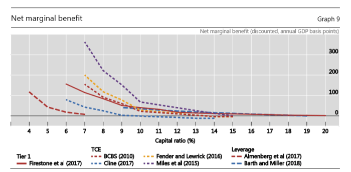
Good to know (although it is a bit to take seriously when we see how the Governor responds to challenge, criticism, or alternative perspectives on another of those highly complex and uncertain issues –  appropriate bank capital requirements).

But this line is really used to buttress a rather silly line the Governor has run on a few occasions about the (alleged) dangers of the markets paying too much attention to trying to guess what the Bank is up to, in turn (allegedly) reducing the information the Bank itself can get from market prices.   This is, we are told, one reason why it is just fine for the Bank to do things that take markets totally by surprise (notably, the 50 basis point OCR cut in August).

It really is a nonsense argument, even if he can find a couple of footnotes to attempt to buttress his case. In fact (and in effect) he more or less concedes later in the speech when he highlights things like falling medium to long-term inflation expectations (including from the indexed bond market –  a welcome Hawkesby innovation to have the Bank even acknowledge the indicator) that were concerning the MPC when they made their decision.  Almost certainly those indicators –  eg from 10 year bonds – would have been just as they were whether markets thought the Bank was going to cut 50 bps in one go, surprising almost everyone, or (say) spread the cuts over two 25 bps cuts.

I’m not one of those who think that monetary policy decisionmakers should always deliver on market expectations. But usually if market expectations are very wrong (not –  eg –  just 10 expected a cut, 12 expected no change) it is the fault of the monetary policy decisionmakers themselves.   In those circumstances, they add noise and volatility that is simply unnecessary and has no redeeming societal merit.

And as I noted at the time of the August MPS, the 50 point cut looked a lot like a rather rushed last minute decision, that wasn’t really supported by other the numbers (they themselves produced) or the MPS text.

And what makes it a bit more concerning is that it is pretty clear the Bank itself wasn’t intending to move by 50 basis points even a few days ago.  The projections they published yesterday were finalised on 1 August (last Thursday).   On those numbers, the projections for the OCR (quarterly average) were:

September quarter 2019    1.4 per cent

December quarter 2019     1.2 per cent

March quarter 2020            1.1 per cent

With the next OCR review in late September and the following one in md-November, those projections –  adopted by the whole MPC – clearly envisaged not getting to a 1 per cent OCR even by the end of the year.

The bulk of the Monetary Policy Statement itself is written in the same relatively relaxed style, with no hint of a change in policy approach, and thus no proper articulation of the reason for it, or (hence) for how we should think about how the Committee will react, in principle, at future OCR reviews.   The Bank has added to uncertainty around policy, not reduced it.    In a similar vein, there is a new two page Box A in the statement on “monetary policy strategy”, intended to run each quarter, which is so general as to add nothing to the state of understanding of what the MPC and the Bank are up to.

And you will look in vain for any real insight from the minutes of the MPC meeting.   We are told

The members debated the relative benefits of reducing the OCR by 25 basis points and communicating an easing bias, versus reducing the OCR by 50 basis points now. The Committee noted both options were consistent with the forward path in the projections. [a claim that demonstrably isn’t true –  see above] The Committee reached a consensus to cut the OCR by 50 basis points to 1.0 percent. They agreed that the larger initial monetary stimulus would best ensure the Committee continues to meet its inflation and employment objectives.

But nothing about the considerations Committee members took into account in belatedly lurching to a 50 point OCR cut, or how they think about the conventions and signalling around using 25 point moves vs 50 point moves (when things aren’t falling apart here –  and it was the Governor yesterday who announced, oddly, of New Zealand that “the country is in a great condition”).

That wasn’t good or effective monetary policy communications.  It wasn’t a transparent insight on how the Committee is operating, the sort of reaction functions members are using, their view of MPS reviews vs the other OCR reviews.    It was –  or came across as –  a lurch (even if, like me, you thought that the OCR needed to come down quite a bit, quite quickly).

I’m going to end with two more examples of a lack of serious transparency.  Near the end of his speech Hawkesby observes

There are plenty of communication challenges ahead, especially if monetary policy in New Zealand moves into a less conventional territory, and we end up adopting new tools and approaches.

These will need to be explained clearly to both financial markets and the people of New Zealand.

No doubt, but would be an open and transparent central bank, wanting to build and maintain confidence in (a) its potential instruments, and (b) its actual decisionmakers and their advisers want to be much more open than the Reserve Bank has actually been?  Wouldn’t discussion documents outlining potential issues and options be a good idea?  Wouldn’t seminars and workshops with outside experts and market participants be a good idea?  Apart from anything else, at least in principle (as the Assistant Governor said) the Bank learns something from such engagement, challenge, and critique and in the process improves its own understanding and analysis.  It isn’t as if anyone is suggesting they pre-commit to when particularly instruments might be used, so this stuff shouldn’t really be market-sensitive, but it is quite important, potentially to us all (and was we know the Bank’s own research capability has been gutted this year).  And it isn’t as if the Bank’s background analysis on other matters –  bank capital again –  should fill us with confidence and willingness to simply “trust us, we know what we are doing”.

And on a smaller note, the next Monetary Policy Statement  and OCR decision is on 13 November.  As the Assistant Governor highlighted, inflation expectations are quite a significant influence in Bank thinking at present (rightly or otherwise).  And yet the main inflation expectations series –  the two year ahead measure in the Bank’s own survey –  isn’t scheduled for release until 12 November.   I participate in that survey.   Responses were due by midday last Tuesday (22nd). It is an electronic survey and if the results are not already in the Bank’s hands, they assuredly could be (it is pretty simple survey with fewer than 100 respondents, taking a matter of hours to compile at most).  And yet the Bank is sitting on this information until the very last minute.  By the time we get it, their decision will have been all-but-finally made, their MPS document completely written. If they were really serious about the desire to listen and learn, from markets, commentators, nay even “bloggers”, they’d have made sure the information was compiled and published quickly, allowing the Bank itself to listen to the response of outsiders in processing the significance of such important (to them) economic data.

If they were really serious…..instead, they mostly seem interested in fending off critics and keeping to themselves the stuff they know, while distracting us with their transparency about the stuff they don’t know much about at all (and where most central banks have not thought it advisable to follow the New Zealand lead).


Lighthouses warn people away from the rocks

In a few weeks time Christians will begin to mark the season of Advent.  One of the texts often read in liturgies in that season is from the prophet Isaiah.

The people walking in darkness have seen a great light; on those living in the land of deep darkness a light has dawned.

At The Treasury yesterday, a visiting academic proposed such a vision for New Zealand’s place in the world, as the Pharos state.

Bernard Cadogan is a New Zealander now living in Oxford.  According to his bio

Dr Bernard Cadogan has his doctorate from Oxford University on Empire Studies and constitutional theory. He served Hon Bill English (1996-1999, 2005-8), the National Party Opposition (1999-2003), Hon Trevor Mallard (2003-5). He lives at Oxford UK with his wife and three children.

He was also, apparently, a foreign affairs adviser to Bill English in the latter’s brief stint as Prime Minister and has been a consultant to The Treasury on various occasions and issues.  He is formidably well-read, very fluent, often stimulating….and yet, so it seems to me, much better on history than on contemporary politics/policy, and really rather at sea when it comes to economics and economic policy.

I thought I’d written about his previous, extraordinary, Treasury guest lecture in 2016, given just a week after the Brexit referendum (a topic on which he had been providing consultancy services to Treasury), but it seems I never got round to it.    My notes record talk of “pogroms by ballot box”, of an EU that is “virulently alive” while there is “something dead in the British Isles”, comparisons with the Glorious Revolution of 1688, a summary remark along the lines of “darkness won: the fog has rolled back in”, the Brexiteers as “sons and daughters of the counter-enlightenment”, depriving young people of “a second European homeland so that some might have a Narnia”, and so on.   As it happens, the text of that earlier address is still on Treasury’s website –  which enables me to quote in its full “glory” this quote, only the gist of which I’d managed to jot down at the time.

Irrational romantic nationalism and the archaic narratives of historians and of the nationalist culture industry have prevailed over rational economic argument. Grub Street and Grub Street politicians from “Spectator-land”,  with the prose skills of another era, have worsted the experts and the technocrats, and rendered nugatory the best quantitative techniques.

You get the sense that Dr Cadogan wasn’t very keen on Brexit.

In yesterday’s address there was none of that tone at all.  It was quite a remarkable transformation, especially when Brexit still hasn’t happened –  if I heard correctly that might have something to do with consultancy services Cadogan is now offering to parts of the UK government.  But it seemed to be there by counterpoint, in his theme that in this troubled and turbulent world

Throughout his talk Dr Cadogan uses the image of the great lighthouse of Alexandria to represent New Zealand’s personality in global affairs, as a source of hope and comfort to countries and peoples sailing turbulent waters.

It was bringing to mind more of Isaiah

40 Comfort ye, comfort ye my people, saith your God.

Speak ye comfortably to Jerusalem, and cry unto her, that her warfare is accomplished, that her iniquity is pardoned: for she hath received of the Lord‘s hand double for all her sins.

The voice of him that crieth in the wilderness, Prepare ye the way of the Lord, make straight in the desert a highway for our God.

Every valley shall be exalted, and every mountain and hill shall be made low: and the crooked shall be made straight, and the rough places plain:

It was, and is, more than a bit of a mystery as to why anyone much –  at least in the advanced world –  should look to New Zealand for anything, let alone “hope and comfort”.  Cadogan never did address that point, apart from some quick passing reference to questions he gets abroad –  presumably from people within his own ideological bubble – about “how does New Zealand do it?”.  “It” here also never being defined, but I presume it had something to do with the popular adulation, in a few quarters abroad, for our current Prime Minister (shorn of any actual policy programme).

The lecture began with a painting by Nicholas Poussin in which the (small) servant Cedalion guides the giant Orion towards the sun, and healing.  Small nations may, Dr Cadogan asserts, have special powers –  at least if they can avoid getting stomped on by giants.   And New Zealand….oh New Zealand,

  • that radical democracy (the “most radical”)
  • exemplary in so many respects
  • admired for our democracy, values, responsibility, human rights, decency
  • a successful market economy,
  • excellent institutions,
  • where the Treaty of Waitangi combines utopianism and justice,
  • and where there is no hatred, no contempt, no ideologues (he seemed particular exercised here about some UK former junior minister, now ennobled as Lord Freud).

(He claimed that Henry Kissinger had once said that law was New Zealand’s greatest gift to civilisation. I’m not sure if someone was getting confused with Solon, or even Coke or, say, Blackstone.)

We, in Cadogan’s view, have a story to tell the world, we could be a “moral realist” “force multiplier” to the world.

There have been times in our past when a good number of serious people abroad have looked to New Zealand as some sort of exemplar.  Like them or not, the reforms of the Liberal governments in the 1890s attracted many visitors and attempts to explain the New Zealand story over the next couple of decades.  Probably not entirely unrelatedly, New Zealand was also among the handful of most prosperous places on earth.

There was a somewhat similar effect in the wake of the reforms of the late 80s and early 1990s.  Like them or not, they were adopted with energy, verve, vigour, rigour and with some genuine innovation. By this time, people –  here and abroad –  knew that New Zealand had fallen well behind (economically, and in terms of what a strongly performing economy could offer) and the reforms were some sort of beacon of hope, that would put New Zealand back on a high-performing path.  You still find the occasional residue of that sort of sentiment –  although mostly from people who haven’t looked at any data for the last 25 years.     In that period there was, at least among some on the left, some admiration for the New Zealand ban on nuclear ships –  some genuinely hoping that it would show the way to other countries (typically it didn’t).

But quite what are we to suppose that people –  elsewhere in the advanced world – should look to us now and admire or envy?  I’m at a loss.  A questioner in yesterday’s seminar pointed to the disgrace that is our housing market, the rise of homelessness etc.  I’d, of course, frame the issue more broadly, and highlight our continued relative economic decline.  In 1900, you might have missed great art and architecture, museums etc if you came to New Zealand, but at least average incomes would be as high as on offer anywhere.  Now, you face distance, a pretty thin representation of the best of our civilisation, and you get to be materially less well-off than you’d be in most other advanced countries.   Are we “leading the way” on climate change, or any other left-wing causes?  Not that I’d noticed.   No doubt there are niche areas where New Zealand people are well-regarded (one hears it re trade negotiations, but then again why not unilateral free trade?) and few people are ever likely to express much angst about New Zealand (a threat to no one).  But a light to the world?  Really?  Who is looking?  Who cares?  Where, for that matter, are these “values” Cadogan talks of –  none that are admirable on display re the PRC (and for a lecture supposedly on geopolitics, there was almost no mention of China).

Another questioner noted that for all Cadogan’s praise of our democracy, actually there were few checks on the executive, great concentrations of power, and little effective accountability.  It more or less stumbles on, but to what end?  And how resilient would it prove to be if really put under pressure?  The questioner might have added specific points about how weak the media generally is, the limited range and poor quality of much of the public debate, the weak role academics and think-tanks play here, and the degradation of the capability of the upper reaches of the public service.

Yet another sceptical questioner –  Prof Girol Karacaoglu from Victoria University –  noted that for all Cadogan’s talk about New Zealand exceptionalism, he (Karacaoglu) was reminded of a line from a book he’d read –  John Gould’s  The Rake’s Progress – soon after coming to New Zealand 40 years ago, suggesting that things in New Zealand both good and bad tended to follow, perhaps 15 years behind, trends from abroad.

Are there valid points in what Cadogan was saying?   Yes, although some probably don’t carry much substance.  Are we a great power or a small player?  A small player.  Ever was and probably ever will be.  Do small countries survive the rise and fall of great powers?  By and large, yes.   And are there areas in which it is more likely that we can learn from other small countries –  and perhaps work effectively with them – than from very large countries?  No doubt.

Cadogan urges a peripatetic “colloquy” of small countries –  he listed Norway, Sweden, Finland, Denmark, Netherlands, Portugal, Switzerland, Ireland, Australia and Canada (the latter two far from small) and “perhaps” Uruguay.  This grouping could, he suggested, learn from each other.   It is hardly a new idea, and of course in many areas of policy there are just such groupings (eg a “small inflation targeters” grouping of central banks).     But it wasn’t really obvious what New Zealand had to offer or –  at least on some key issues –  learn.    Our strategic position is very different from almost all these countries.  Which is a variant on the point that our geography is very different –  incredibly remote –  and there are few/no relevant national comparators (and not very encouraging subnational ones) when one contemplate the implications of that remoteness.    Perhaps Uruguay fits the bill, but for all its relative success in the last decade or so, it remains materially poorer and less productive –  with less of a record of political or economic stability – than New Zealand.

Cadogan seemed very taken with Ireland –  he’s an Irish citizen too apparently – but showed no sign of appreciating that for all of Ireland’s exaggerated GDP per capita, once you look at the bit of economic activity benefiting the Irish people, Ireland’s story (prosperity) is nothing out of the ordinary: it is a fairly prosperous (but not first rank) European economy, and if there are lessons for New Zealand they are mostly about what we can’t do (not being a short distance from hundreds of millions of other very prosperous people).

There was upbeat talk about what a difference a New Zealand Nokia –  a big brand signifying New Zealand –  might make: Cadogan saw such a brand as a “sports lifestyle” one that would “walk through the walls that ideology imposes”.  Perhaps, but isn’t this just wishful thinking?   A bit like the talk, inspired by mention of the top Swiss universities, of what a difference it might make if New Zealand had two really good universities, one in sciences and one in humanities.  And yet, starting relatively poor and very distant, there was no hint of how this alternative world might come to be.

There are plenty of places in the world worse than New Zealand. But the notion of the world –  advanced world –  looking to New Zealand as some sort of lead, exemplar or guiding light seems little more than ludicrous in our current diminished state.    If anything, we might be a bit of an embarrassment –  the nice little country, that did so many reforms, and yet look at them now, still drifting  ever so slightly further behind, without even a political system or civil society to insist on something better, to set a different course.  And so remote that we don’t ever matter much to most of the rest of the world.  Sure, we don’t have Donald Trump –  but, fortunately, neither does anyone else.     But we have a (former?) CCP member, former member of the PRC military intelligence system in Parliament (chairing a Select Committee no less), and no one in the establishment here says a word –  at least in the US there is disquiet, and more, about Trump.

Lighthouses –  grand or otherwise –  warn sailors off rocks.  I noticed in the NZ History Twitter feed that yesterday was the anniversary of a dreadful maritime disaster here in 1894 (one of the two or three worst days, per capita, for the peacetime loss of New Zealanders in history) –  no mention of a lighthouse in the write-up.  If New Zealand is any sort of lighthouse to the world –  on these rocks pointed at the heart of Antarctica –  it is perhaps in the form of the salutary lesson: don’t do as we did, don’t end diminished as we now are.

Fluent and stimulating as Cadogan can be, it might also be a bit more encouraging if our Treasury itself showed signs of leading the way towards a much better-performing economy.  Perhaps we never again can lead the world –  as we were doing 100 years ago –  but whether it is economic policy, housing, or just the quality of our diminished government institutions themselves, we have to be able to do better than we are now.


Two years on

The weekend newspapers had several articles highlighting the second anniversary of the New Zealand First choice that led to the creation of the current government.  There was, for example, the double-page spread  in the Herald devoted to a not-at-all-searching interview with the Prime Minister and the Minister of Finance.  And there was another double-page article in the Dominion-Post looking at the government’s performance under a range of policy headings.  Since the government’s term is now two-thirds over –  likely to be in full campaign mode (say) nine months from now –  it seems not unreasonable to take a look at performance.

The Stuff political stuff divided up nine policy areas between them and wrote short reviews of the government’s performance in each of them.  On my reading, they tended towards a generous assessment.  All governments do stuff –  sometimes even just things in the works under a previous government – and where this government has done most (education notably) there isn’t a huge amount of evidence that there were real problems that needed fixing, or that their fixes were dealing with whatever real problems there were.

Take housing, for example, where the Stuff journalists summarise thus

Two years into the Government’s term, housing is far from Labour’s strong point, but it is not an area of total failure.

So house prices are still rising, rents are still rising (even in a low-interest rate world in which provision of rental housing could/should have been cheaper than ever) and there has been no legislation to free-up urban land markets, or to compel local authorities to operate a more liberal approach.   Set against that, a foreign buyers’ ban was largely irrelevant, and there is little reason to suppose that building a lot more state houses will increase the overall effective supply of housing (certainly won’t deal with the land issues).  For what was declared to be a “crisis” –  I’ll just settle for disgrace –  what has been done, or accomplished, is astonishingly little.  And it isn’t as if markets are pricing in better outcomes in future either.

But what really caught my eye was that there was no discussion of the government’s economic policy performance.  One might reasonably grant them a pass mark on fiscal stewardship –  but on anything beyond that the best reason why Stuff might have chosen to overlook this key area of policy is that there just isn’t much there at all.

Back when they were in Opposition we would, occasionally, here about the lack of any decent productivity growth, talk about growing export sectors, and so on.  Even today, the mantra of a “productive and sustainable” economy gets rolled out from time to time…..but with almost nothing to back it.

Actual productivity growth still languishes – running at no more than 0.5 per cent per annum, slower than in most other OECD countries. (It is fair to note here that there could be material revisions to a large number of macro series over the next couple of months, consequent on the census (and subsequent creative efforts) results, but there is no obvious reason to anticipate material improvements.)

There is no sign that the external orientation of the economy has strengthened (eg exports and imports as a share of GDP). no sign of robust business investment, and of course we all know that business confidence results are in the doldrums.  Interest rates have had to be cut further and the real exchange rate remains pretty high.

And what response has government policy made?   The government seems to have made quite a fuss about the new research and development tax credit. But they’ve produced no sustained analysis illustrating why this will make a great difference – and no sustained either looking at why firms didn’t regard higher rates of R&D spending here as offering attractive risk-adjusted returns.  And that really is about it.

And on the other hand, we have the government sitting idly by while the Reserve Bank Governor pursues his whim of making credit less readily available and more expensive, a halt to most new road-building even as the population continues to increase rapidly (and not, even, say, a congestion-pricing regime that might help reconcile the two), a ban on most oil and gas exploration, looming new regulatory restrictions around water.  Oh, and immigration policy –  for which there is no evidence of systematic economywide gains, in a country where (fixed) natural resources underpin prosperity –  is, if anything, becoming more liberal.

The government keeps telling us it has a plan.  I wrote here at the start of the year about an economics speech the Prime Minister gave, concluding

If there is any sign of a plan, it isn’t one that is going to do anything to lift our economic performance, in the short or longer-term.   All indications are that the Prime Minister doesn’t care. 

And then last month the government released something they did call an “Economic Plan” – in fact a thirty year one.  Notwithstanding all the glossy pictures and long lists of points, it sank without a trace, barely even reported at the time, even with a supporting op-ed from the Prime Minister herself (my take was here).

Once upon a time, I wondered (perhaps naively) if perhaps they –  upper reaches of the Labour Party – really did care.  They should.  After all, it is their traditional voters –  the poorer people, the working classes, the younger –  who suffer most from the decades-long failure of successive governments to improve New Zealand’s woefully poor productivity performance.    But all the evidence from their time in office is that any care is superficial at best.  Sure, they’d probably welcome a much better performing economy if it suddenly dawned fresh and shiny.  But they seem to have no real ideas, no compelling narrative, for how to markedly re-orient our economic performance, and they is no apparent interest in finding answers, or ensuring that our economic policy and analytical institutions are delivering them serious advice, grounded in the actual experience of New Zealand, on policy approaches that might really make a difference.

It is an utter abdication of responsibility.  No one made them run for office, no one forces them to stay in office, but when they take office they have responsibilities for the future prosperity of New Zealanders that they show no sign of taking at all seriously.

An academic economist left this comment on one of my weekend posts

With this in mind, I must confess that I always threaten to fail my Otago students if they don’t migrate to Austalia, because it shows they haven’t learnt anything from me; but the university doesn’t allow me to deliver on the threat. Still, most would be financially better off if they took this advice, and migrated to a place where better firms are located, and sought jobs there.

Sadly true.  And what a sad commentary on decades of policy failure here: Labour ministers currently hold all the key portfolios (Prime Minister, Minister of Financem Minister of Economic Development) and it is their failure now.


Falling population shares: a highly-productive big city

Writing about Wales the other day I included this chart

wales 1

The comparable chart for Scotland is even more stark (16 per cent of the Great Britain population in 1801 and just over 8 per cent now).

But what really caught my eye when pulling together the numbers was this chart.

london 19.png

I guess part of my brain knew that greater London’s population had fallen for several decades, but that bit never quite connected with the bits thinking about world cities, agglomeration and so on and so forth.  London is one of the great world cities, a key financial centre in an age when capital is more mobile than it was for decades after the war.  There is no other really great city in the UK, the UK’s population hasn’t increased that rapidly by New World standards, and yet the share of the UK population resident in greater London is less now than it was for decades prior to World War Two (true even using the orange dot –  for which there is no time series – the estimate of the population of the (defined by contiguity of population rather than local authority boundaries) of the greater London urban area.

(As it happens, on checking one finds that the New York metropolitan area population is also lower now, as a percentage of the total US population, than it was several decades ago – I could only see data back to 1950.  But the US is different  –  there are multiple very large cities and the spread of air-conditioning greatly affected the liveability of many of those places.)

As you may recall from Saturday’s post, estimated GDP per capita in London is 188 per cent of that of the EU as a whole (and about 180 per cent of the UK as a whole).  The only other (Eurostat-defined) region that comes even close to London is (close to London) “Berkshire, Buckinghamshire, and Oxfordshire” (at 151 per cent of EU as a whole).

These have the feel of places where if more people were able to live there more people would be better off.  The whole of the UK might even be better off on average (a larger proportion of the population able to do more highly-productive jobs), even if the London premium over the rest of the country narrowed somewhat.

And yet, of course, as everyone knows London house prices are really expensive –  price to income ratios similar to those in Auckland (with incomes higher), typically for small houses and small sections.  You can tell similar stories about San Francisco/San Jose or New York (where GDP per capita are well above those of the US as a whole).   Rigged housing and land markets really seem to have visible consequences in pricing people out of working in highly productive cities.

Where the story is much less compelling is in Auckland (or Sydney or Melbourne). I wish it were otherwise –  I’m a strong supporter of land use liberalisation –  but

(a) on the one hand, the populations of those cities (urban areas) have actually increased very substantially as a share of national population (especially Auckland: 8.5 per cent of the population in 1901, and about 33.5 per cent now), and

(b) in none of the Australasian cities do the estimates for GDP per capita show up with any very substantial margin over the rest of the country (see, by contrast, London above).  People who just don’t earn that much (or produce that much) have found a way to live in those cities anyway.

Fixing the New Zealand urban housing markets is, or should be, a matter of dealing to one of the grosser injustices in our economic system, but it is far from obvious that there is a compelling case in issues around productivity and wider economic performance.  If anything, there are probably already more people in Auckland – and perhaps Sydney/Melbourne –  that there really are highly-productive opportunities that are either waiting for them now or would spring up were housing once again as affordable as it should be.


Rygbi

My 12 year old daughter has been teaching herself Welsh –  a recent birthday present was a good Welsh-English dictionary – we’ve recently been watching a rather bleak Welsh detective series together, and this year she has also become (unlike her father) a bit of a rugby (“rygbi” in Welsh apparently) fanatic so I promised her that if Wales made the World Cup semi-finals I’d do a Welsh-themed post.  That’s economics rather than rugby though.

One of the themes of much modern economics literature is things about cities, location, agglomeration, distance and so on.  According to Eurostat data, London has the one of the very highest GDPs per capita of any region in the EU¹.  The two largest cities in Wales –  Cardiff and Swansea –  are each less than 200 miles from London.  And yet estimated GDP per capita in Wales is only about 40 per cent of that in London and 75 per cent of that in the EU as a whole (71 per cent of the UK as a whole).  Productivity in Wales (GDP per hour worked) might be about that of New Zealand.

And yet Wales has much the same policy regime as London.  Much the same regulatory environment, same income, consumption, and company tax rates, same currency (and interest rates and banks), same external trade regime, same national government (and as I understand it the Welsh regional administration doesn’t have control of very much), and the same immigration regime.  Most of the people are native English speakers (even many of those who also speak Welsh).

Huge populations are free to move to Wales.  There are 66 million people in the UK who face no regulatory obstacles to doing so.  They could set up firms in Wales.  So –  for the moment –  could people in most of the EU, and all legal migrants to the United Kingdom (with no particular ties to any other UK region) could move to Wales.  It isn’t open borders but in practical terms it is much closer to it than almost any sovereign state.

And yet……by and large they don’t.  The population of Wales today is only 50 per cent larger than it was in 1900 and only about 5 per cent of the population is born outside the British Isles.  Here is the share of Wales in the total population of the Great Britain.

wales 1

Wales used to have things going for it: plenty of room for sheep (wool and meat were two of our big exports to the urban population of the UK), the world’s largest slate industry,  and coal (lots of it) and the associated iron and steel (the latter booming from the start of the 20th century) industries.

But not, it appears, very much at all these days.   There is some tourism, some electricity exports (to the rest of Britain) and, of course, a variety of other industries.  It all generates tolerable living standards. albeit supported by significant inward fiscal transfers.  Unemployment is low, and (by New Zealand or London standards) house prices are fairly low –  Swansea (second biggest city) has median house prices around $350000.  But people in the rest of the UK, migrants to the UK, and –  importantly – actual/potential entrepreneurs don’t seem to find it terribly attractive.  Perhaps it would be different if it were an independent country –  the Irish company tax regime is apparently eyed up by some. But as it isn’t, one gets a cleaner read on the pure economic geography effects.

It is interesting to wonder what might have happened to Wales if it were an independent country and, all else equal, had had control of its own immigration policy.  What if they’d adopted a Canadian or New Zealand immigration policy –  or something even more liberal –  20 years ago?   Since there are plenty of places in the world much poorer than Wales (or New Zealand), and Wales itself is a small place, presumably they’d have had no trouble attracting people –  at least modestly qualified people from places poorer, or less safe, again: China, India, South Africa, the Philippines (to name just four significant source countries for New Zealand).   Even if many of the migrants initially saw Wales as backdoor entry to England, if New Zealand’s experience is anything to go by (become a citizen here and you can immediately move to much wealthier Australia) most wouldn’t.  Presumably the Welsh building sector would have been a lot bigger, but it isn’t obvious that many more outward-oriented businesses would have chosen Cardiff or Swansea over London or Paris or Amsterdam, even with the rest of Europe more or less on the doorstep.

Tasmania is another interesting example.  Like Wales, it shares essentially the same  policy regime (taxes, currency, external trade, most regulation) with the sovereign country it is a part of, in this case Australia.  There is unrestricted mobility for people within Australia, and external migrants –  including those from New Zealand –  can as readily settle in Tasmania as anywhere else in Australia. Hobart always looks like a really nice place.

Oh, and the population share of the total country is also small.  But the fall in the population share has been much sharper than for Wales.

wales 2

People –  and firms –  could choose to go to Tasmania but, by and large, they choose not to.  It is, after all, quite a way from Melbourne, and you can neither drive nor take a fairly-speedy train.   And unlike Wales, Tasmania is close to nothing else: Cardiff is much to closer to Dublin, Paris, Brussels, Amsterdam or even Frankfurt than Hobart is to Adelaide or Sydney.  Perhaps even more than Wales, the economic opportunities seem to be mostly in the natural resources (and no big new developments there in recent decades) and a few niche industries that might be there because the founder happens to like living there.   GDP per capita in Tasmania is just under 80 per cent of the whole of Australia average.

One could also do an interesting thought experiment as to what might have happened if Tasmania had been an independent country and had its own immigration policy.  Even had they just adopted the same policy as Australia did, almost certainly their population today would be materially larger than it now is (Tasmania now has three times the population it had in 1900, while Australia as a whole has more like seven times the 1900 population).  Being even smaller than Wales they’d have had no trouble attracting people.   But –  even more so than for Wales –  you are left wondering how many more outward-oriented businesses would have chosen to stay based in little Tasmania (few enough outward-oriented businesses are based in even the big Australian cities).

Are there lessons for New Zealand.  Our population has increased almost sixfold since 1900. In that time, we’ve fallen from (roughly) the highest GDP per capita anywhere to somewhere badly trailing the OECD field –  and maintaining even that standing only by work long hours per capita.

wales 3

It looks great to the strain of “big New Zealand” thought that has been around since Vogel at least.  But to what end, for New Zealanders?

Think of one last thought experiment.  What say we’d agreed a completely common immigration policy with Australia and held that in place for the last few decades?  More or less exactly the same number of people would probably have come to Australasia in total, but what do we supposed would have been the split between Australia and New Zealand.   It seems only reasonable to assume that a much larger proportion would have gone to Australia (than did).  After all, even those who went to Australia had a choice of Tasmania if they wanted cooler climes and a slightly slower pace –  but, to a very large extent they didn’t.  And we know what New Zealanders themselves –  who had ties to this physical places –  were choosing over the last 50 years, as hundreds of thousands left for the other side of Tasman.

And had that happened –  and perhaps New Zealand’s population was 3 million not almost 5 million –  is it likely that any fewer market-driven outward-oriented businesses would be based here than are today.   The land, the water, the minerals and the scenery would all still be there.  And how much else is there?

As a best guess, if by some exogenous policy intervention there had been another two million people –  of moderate skills etc – put in Wales, or another half million in Tasmania, it is difficult to have any confidence that average real incomes in either place would be any larger than they are now.  Most probably, they’d be worse off –  as say, the residents of Taihape probably would be if some exogenous intervention put another 5000 people there.  Having put an extra couple of million people in New Zealand – more remote than Tasmania, much more remote than Wales –  and not seen the outward-oriented industries, based on anything other than natural resources growing – we might reasonably assume we (New Zealanders) are poorer as a result.

Smart people are almost always a prerequisite to high incomes, but globally the top tier of incomes seems to focused on industries located in or near big cities, near big population concentrations, or on (finite) natural resources.   You can earn a very standard of living from finite natural resources –  it is the edge Norway has over the rest of Europe – but it looks pretty insane to confuse the two types of economies (when you have no realistic hope of transitioning from one to the other) and spread natural resource based wealth much more thinly by using policy to actively encourage rapid population growth.

From a narrow economic perspective –  and it isn’t of course, the only one the matters – the best thing for people from a lagging economic performance area is to leave.  It is what people did from Taihape or Invercargill, from Ireland for many decades, and (more recently and on a really large scale) what people did from New Zealand as a whole.   Governments can mess up that picture. In a way the Welsh are fortunate to have a rugby team but not an immigration policy, at least had they had the misfortune to have had policymakers like New Zealand’s.


  1.  Technically Luxembourg tops the table, but since a very large chunk of Luxembourg’s workforce doesn’t live there the numbers aren’t particularly meaningful (sensible comparisons need to take account of all the  – typical modest-earning –  support services populations need/use where they live).

Productivity (lack of it) and other things

When I was writing some comments last week on Reserve Bank Deputy Governor Geoff Bascand’s speech in Australia I was playing round with some comparative data and stumbled on this chart.

nzau 1

Over the entire period (since 1991) real GDP per capita has grown at exactly the same rate in Australia and New Zealand.   And I haven’t even cherrypicked the starting point: my chart starts when the SNZ quarterly GDP per capita series starts.

Of course, even in 1991 we were materially less well off than Australians, but should we take some comfort from having kept pace over now almost 30 years?  I’d say not.

Here’s why.   Look at the employment rates in the two countries

nzau2

You might be among those who think the more employment the better but (a) working is a cost (an input) to the employee and (b) wouldn’t it have been much preferable, even if you think higher employment rates are some great thing, for it to have resulted in more growth in average per capita income than in the country where employment rates didn’t increase as much?   Australia’s unemployment rate is a bit higher than ours, and that is a mark against them, but it is only a small part of the difference in the employment rates.

And here is a chart that is perhaps even more stark.

NZau3

Across the whole population, the average Australian is now working 5 per cent more hours than in 1991, while the average New Zealander is working 22 per cent more hours.

And yet the bottom line, growth in average real output per capita, is the same.

The difference is productivity – or, more specifically, in our case the lack of anywhere near enough productivity growth.

I’ve got other things on today, so that is it for original content.  But earlier this morning I was rereading my submission to the Reserve Bank consultation on the Governor’s plans to require large increases in bank capital.   There wasn’t anything in it I would now resile from.  I also skimmed through former colleague, and expert in bank capital modelling, Ian Harrison’s papers (here and here) and I doubt he would resile from anything in there.

But what remains striking is how little engagement there has been from the Governor on his proposals.    He has only given four on-the-record speeches this year, not one of which has involved a serious sustained attempt to make his case, let alone engage with alternative perspectives.  The only attempts I’ve seen to respond to alternative perspectives seem to simply involve suggesting that anyone who disagrees with him is somehow bought and paid for, and therefore their views aren’t worthy of serious notice or scrutiny.

At one level, it shouldn’t be surprising, given Orr’s personality and intolerance of challenge or disagreement –  and the fact that, formally at least, he doesn’t have to convince anyone but himself (since he is prosecutor, judge, and jury in his own case, and there are no rights of appeal). But as matter of good governance, in a democratic society, it reflects very poorly on him, on his handpicked senior managers, and on the Bank’s Board and Minister of Finance who are paid to hold the Governor to account but in fact act as if there role is to simply get out of the way and let the Governor get on with it, poor as the process and substance have been, poor as Governor’s conduct increasingly seems to have been.

And so I’ll leave you with some of the unanswered points from my submission

An unbiased observer, looking at the New Zealand economy and financial system, would struggle to find a case for higher minimum capital ratios.   Among the factors such an observer might consider would be:

• The fact that the New Zealand financial system has not experienced a systemic financial crisis for more than hundred years (and to the extent it approximated one in the late 1980s, that was in the idiosyncratic circumstances of an extensive and fast financial liberalisation which left neither market participants nor regulators particularly well-equipped),

• Our major banks – the only ones that might pose any serious economywide risks – come from a country with very much the same historical record as New Zealand,

• Despite very rapid credit growth in the years prior to 2008 (increases in the credit to GDP ratios among the larger in the advanced world, spread across housing, farm, and other business/property lending), and a severe recession in 2008/09 and afterwards, the banking system emerged with low loan losses,

• Since then, banks have not only increased their actual capital ratios (and been required to calculate farm risk-weighted assets more stringently) but have also substantially improved their funding and liquidity positions (under some mix of regulatory and market pressure).

• Over the decade, bank credit growth (relative to GDP) has been pretty subdued and there has been little or no evidence (in, for example, Reserve Bank FSRs) of any serious degradation of lending standards.

• The balance sheets of the large banks remain relatively simple, and there has been no sign (per FSRs) of the sort of financial innovation that might raise significant doubts about the adequacy of existing models.

• In terms of the wider policy environment, government fiscal policy remains very strong, we continue to have a freely-floating exchange rate, and there has been neither legislation nor judicial rulings that will have materially impaired the ability of banks to realise collateral.

• And the Open Bank Resolution option for bank resolution has been more firmly established in the official toolkit (note that if OBR were fully credible then, in the absence of deposit insurance, there would be little case for regulatory minimum capital requirements at all).

• And repeated stress tests –  over a period when the regulator had no incentive to skew the tests to show favourable results –  suggested that even if exposed to extremely severe adverse macro shocks, and associated large price adjustments for houses, farms, and commercial property, not only would no bank fail, but no bank would even drop below current minimum capital requirements.

• Consistent with this experience – also observed in Australia, the home jurisdiction of the parents of our major banks – the major banks operating here continue to have strong credit ratings (consistent with a very low probability of default), and the ratings of the parent banks are even higher.

• There has been no change in the ownership structure of our major banks, or in the implied willingness of the Australian authorities to support the (systemically significant) parents of the New Zealand banks were they ever to get into difficulty.

Add into the mix indications that New Zealand banks CET1 ratios, if calculated on a properly comparable basis, would already be among the highest in the advanced world –  in a macro environment with more scope for stabilisation (floating exchange rate, strong fiscal position, little unhedged foreign currency lending) than in many advanced countries –  and there would be a fairly strong prima facie case for leaving things much as they are.

But the Reserve Bank’s consultative document – and associated material, including speeches and interviews – engages substantively with almost none of this context.

And

It is grossly unsatisfactory that throughout months of consultation the Bank has made no effort to illustrate how its proposals for minimum CET1 ratios and the associated floors around the calculation of risk-weighted assets, compare with those planned by APRA for the Australian banks.

Such an exercise should have been relatively straightforward, especially if the Reserve Bank had done what most New Zealanders might reasonably have expected, and worked closely together with APRA in formulating its proposals.  Of course, New Zealand is a sovereign nation and the Reserve Bank (regrettably) has final decision-making powers in New Zealand but:

• APRA has a considerably deeper pool of expertise, including at the top of the organisation, than the Reserve Bank of New Zealand,

• The nature of the risks in the two economies and markets is quite similar (including similar legal institutions, and similar housing markets),

• If anything there is a case for thinking that APRA minima would be ceilings below which New Zealand requirements for our large banks should be set (since we have the benefit of strong parent banks, and well-regarded supervisor of those banks, whereas the parents  – and parents’ supervisors – themselves are on their own, and we have also chosen to have the OBR as a frontline resolution option),

• For the institutions that might pose potential systemic issues in New Zealand, any substantial increase in capital requirements can reasonably be seen as an attempt to grab group capital for New Zealand.  Why not work these things out together?

The onus should, surely, be on the Reserve Bank of New Zealand to demonstrate – make the case in detail – why the New Zealand subsidiaries of Australian banks should be subject to more onerous capital requirements than the parents, and banking groups as a whole, are subject to.  But not once has the Reserve Bank attempted to make that case.

I ended

New Zealanders deserve better than they have had in the poor process and weak substance that together made up this consultation.

To which one can only add that the repeated reports  –  some of things in public, others less so –  of the way the Governor has handled himself, his own conduct, through this episode are deeply disquieting.  There is little sign of the sort of character and temperament we should expect from a senior public servant exercise so much barely-trammelled power.  The Minister of Finance may declare that he has full confidence in the Governor.  The public should not, and if the Minister continues to sit on the sidelines doing nothing but expressing full confidence that should probably raise more questions about the Minister himself.

Meanwhile, one wonders what our new Australian Secretary to the Treasury makes of her first encounters with national policymaking and advice.

The Governor’s “independent experts”

Several months after going public with his plan for really large increases in capital requirements for locally-incorporated banks, and apparently feeling under a bit of pressure, the Governor of the Reserve Bank selected some foreign academics –  anyone local, he claimed, had been bought and paid for – to each write a report on aspects of the multi-year bank capital review.  I wrote here about the appointments, the terms of references the three selected people were working to, and what we might reasonably expect from them.

Their role was tightly-drawn, wasn’t primarily focused on the current (most contentious consultation), and they were only supposed to talk to anyone outside the Bank with the advance approval of the Reserve Bank.  Their focus was supposed to be on the Bank’s documents, not on (for example) the submissions the Bank had received in response.   And while there was talk of looking at the New Zealand specific context, none of the invited academics had any particular knowledge or, or background in, New Zealand.

This is what I wrote about what we might expect

I’m not impugning the integrity of the independent experts.   But they have been chosen by the Governor, having regard to their backgrounds, dispositions, and past research –  a different group, with different backgrounds etc, would reach different conclusions – and the Governor is well-known for not encouraging or welcoming debate, challenge or dissent.  Quite probably the experts, each working individually, will identify a few things the Bank could have done better, but it will all be very abstract, ungrounded in the specifics of New Zealand, and the value of their reports is seriously undermined in advanced because of who made the appointment, and the point in the process where the appointment was made.  This is the sort of panel that, at very least, should have been appointed a year ago.  Better still, it would not have been appointed by the Governor.

The three reports were released a few weeks ago and the visitors pretty much delivered for the Bank –  as, no doubt, having carefully selected them, the Bank was pretty sure they would.   There were, as I suggested, a few apt suggestions and questions but very little sustained engagement with the deeper issues, with the New Zealand context, or with the process.   The experts appear to have been let out to talk to a few (commercial bank) people outside the Reserve Bank but –  as per their terms of reference – there is no sign of systematic engagement with the range of expert submissions or submitters.  One declared himself comfortable that the Bank had answers to all the points raised by submitters, which may have been comforting for him but –  and this report was written months ago –  not so much for New Zealanders who’ve had no engagement from the Bank.

A Bank summary of the three report is here.  The Bank has claimed full-throated endorsement from the experts they selected.  Personally, I was a bit surprised how limited the reports were: offering more support (from people already strongly disposed to think more capital “a good thing”) than illumination.

I’m going to step through the reports one by one but I’m only going to talk about their comments on the current consultation on the minimum level of bank capital (for some –  and reasonably enough given the terms of reference –  that makes up only a fairly small portion of the report).

The first of three was by James Cummings, now of Macquarie University and formerly a researcher at APRA.    His report was quite long, but there wasn’t much insight offered relevant to the current consultation. There is a lot of reportage. For example, he simply channels –  without examining – the Reserve Bank’s claim about the greater vulnerability of New Zealand.  And despite being (a) Australian, and (b) previously from APRA he offers no thoughts on how robust the case might be for minimum core capital ratios here being material higher than those in Australia.  Then again, neither has the Reserve Bank.  There is no discussion about the trans-Tasman nature of the big four banks and the possible implications for the design of a sensible capital regime.  He mentions the Bank’s stress tests but – again simply, and briefly, channelling the Bank – to downplay them.

Cummings makes what appears to be a reasonable point that the Bank may have over-estimated the cost of equity in the Australasian banking sector (I presume that is one of the points the Bank will be having a look at).  But that is really about all the value he adds on the current consultation.  He is clearly highly sympathetic to the idea of the Australian banks listing their New Zealand subsidiaries locally and reducing their 100 per cent ownership of the subsidiaries. That will have been music to the ears of Messrs Orr and Bascand –  Orr in particular appears to have been pursuing that outcome as some sort of “New Zealand nationalist” goal, quite unrelated to his statutory mandate.  Cummings is correct that issuing equity locally could get round the fact that the imputation regime, although operating domestically in both New Zealand and Australia, doesn’t operate trans-Tasman.  But he doesn’t engage at all with the likely costs to selling down ownership and local listing (if they were non-existent, for example, the tax argument might already have led to partial local floats of the subsidiaries).  Those costs might well include a less strong ability to rely on the parent in the event of a crisis.  You’ll recall that really serious crises are supposed to be the focus of the capital review.

The second report is by David Miles of Imperial College, London (who spent a term on the Bank of England’s Monetary Policy Committee).  Miles has published some past research (unsurprisingly, given his selection) pretty sympathetic to higher capital ratios.  His (shorter) report is almost entirely focused on the current consultation.

He appears keen to be supportive of the Bank, and he begins his report by pushing back against the claim –  made by various critics –  that the Governor’s 1 in 200 year risk appetite stake in the ground was really just plucked out of the air.    And yet the Bank itself released a paper –  dated a mere six weeks before the release of the Bank’s proposals –  written by one of their internal experts, which adds the 1 in 200 year risk appetite possibility  (ie a 0.5 per cent annual probability of crisis) almost as an afterthought.

guthrie.png

Presumably the Governor latched onto 1 in 200 and they were off.  Much of the subsequent supporting analysis and modelling was only done, and released, after the Governor had already nailed his colours to the mast and published his radical plans.

Miles is actually somewhat sceptical about several of the assumptions the Bank has made in its modelling, and Ian Harrison – expert submitter on the modelling etc who neither Miles nor the others show any sign of having engaged with –  plausibly argues that Miles show signs of not fully understanding the modelling framework and thus being less critical than he should be.   One of the parameters (R, around correlations) was based on a particularly shoddy piece of “analysis” –  Miles, being more diplomatic, observes simply “but this evidence is quite weak and not a firm basis to be confident that a higher value of R [than used conventionally] is justified.”.

By background, Miles is a macroeconomist and you might therefore have supposed that he would something insightful to offer around the scale (in GDP terms) of the sort of severe crisis the Governor’s plans are designed to avoid.  The Bank uses quite a high number – 63 per cent of GDP –  in turn based on remarkably little analysis (several sentences in this paper).  Miles reckons this is quite possibly a “serious underestimate” and “seems optimistic”.   His argument for this appear to rest on nothing more (you can check –  page 14 of his paper) than a thought experiment in which he posits the possibility that the entire extent to which UK GDP now is below the pre-2008 trend is a) all due to a financial crisis, and (b) permanent then the cost of crisis might be 330 per cent of GDP.    As indeed it might, but Miles provides no discussion for why we should interpret even UK GDP that way, no mechanism for how these huge effects (more costly than World War Two?) might arise, no distinction between GDP lost because of poor lending and borrowing in the boom (costs which crystallise later) and those actually related to the banking crisis itself, and no engagement with (for example) comparisons between the output paths of countries which had financial crises with those that did not.  I’ve argued – it was in my submission –  that something more like 10-20 per cent of GDP might well be more reasonable.

You might also have supposed that the macroeconomist among the experts might also thought about discount rates.    As we typically have the highest real long-term interest rates among advanced countries, the appropriate long-term discount rate here should also be higher (making taking insurance against even a costly future crisis rather less valuable than it might be in some other countries).  Even the Reserve Bank noted that point (even if it changed nothing in their analysis) but not the Bank’s macroeconomic expert adviser.

Miles’s offering is pretty abstract and doesn’t engage with the specifics of New Zealand (or the trans-Tasman nature of our large banks) much at all (although he does note the difficulty the Governor’s proposal may pose for our capital-constrained local banks).  Given his background, that isn’t really surprising –  and is more a reflection on the Bank than on him.

But a couple of his concluding remarks are worth highlighting.   He is quite dismissive of the issue that I and others have raised as to whether there is a robust case for setting New Zealand core capital requirements so much higher than those in Australia or than in most other advanced countries.    There is, in his view, no information value whatever in such judgements by other authorities, when set against a “careful” Reserve Bank of New Zealand analysis.  That analysis really should pose questions not for New Zealand citizens etc but for other countries, who perhaps just haven’t done enough of the Bank’s sort of analysis.  He makes a fair point that we don’t want the same speed limits on all roads –  it depends on the risk –  but offers not a scintilla of reason to suppose that macroeconomic risks, and exposure to severe shocks, is more severe in New Zealand than elsewhere.

And then there is his final, distinctly two-handed, defence of the Bank’s stance.  As far as I’ve seen, his final –  perhaps delicately worded –  swipe at the New Zealand regime has had no coverage.  Here is what he has to say.

The RBNZ has adopted a principle of being conservative as regards bank capital to offset possible risks from its light-handed approach to supervision. That is a choice and one partly based on the view that having very large resources devoted to intrusive oversight of banks is not the most efficient road to go down. That is a conclusion that engineers and safety experts often apply when dealing with the design of structures. There is a choice between building bridges many times stronger than you expect them to need to be OR you having large teams of inspectors who pay frequent visits to examine all bridges and monitor flows of traffic over them.  It is clear that nearly all countries follow the first strategy.

That may be a useful guide for bank supervision.

Ouch.  On the Reserve Bank’s own numbers, the Governor’s capital proposals involve an annual loss of GDP of $750 million.  You could buy a really large (by New Zealand standards) number of new bank supervisors and regulators for even a 10th of that amount.  I’m sceptical there even is much of that sort of trade-off in New Zealand, at least for the big 4 banks, given that they are, in effect, subject to APRA’s own more hands-on supervision.  But 30 more supervisors might be cheap compared to the costs and distortions of the Governor’s current proposal –  even allowing for the old maxim, about the devil making work for idle hands.

It was striking that neither Miles nor Cummings devoted any space at all to the sectoral and distributional effects of what the Governor is proposing –  and thus did not point out that the Bank’s consultation papers have not done so either.     Thus, no mention of the fact that the rules would apply to locally-incorporated banks, but not to (a) other banks, (b) non-banks, whether deposit-takers or otherwise, or (c) to market-based funding mechanisms (eg securitisations or bond finance directly).    Or, thus, that the burden of the policy will fall very unevenly –  those with easy access to alternative sources of finance will face no material impact at all, and those without could be hit quite severely (whether in terms of cost, credit standards, or competition among credit providers).

The third of the experts, Ross Levine, a US academic –  with no particular background in policymaking or bank regulation, but with an impressive publications record across a range of areas –  does touch on alternative sources of finance.  Indeed, it is one of the main themes of what is really an essay on incentives, risk-taking and so.  It is quite a thoughtful essay  – with some suggestions of issues the Bank might have discussed but didn’t – but it isn’t really clear what bearing it has on the merits of the Governor’s proposals or the quality of the analysis and argumentation supporting them.

Levine’s deep conviction is that banks are heavily subsidised, prone to recklessness, and that anything that reins them in, reducing their relative importance, is prima facie a good thing.    Those aren’t his exact words, but a paraphrase they seem to capture his view pretty well.   Well, fine, but some evidence would be nice, perhaps especially when you are dealing with (a) a pretty vanilla banking system, (b) in a country largely free of a track record of serious systemic financial crises, and (c) where the country’s vanilla banking system is owned by banks based in, supervised in, another country with a similarly strong track record of financial stability.   Remarkably, despite the focus on issues around incentives, Levine does not discuss at all how his thinking about the issues facing New Zealand might be affected by the fact that the big 4 banks are themselves owned by other (foreign) banks, subject to group capital requirements.  He suggests the Bank should assess some of these issues –  and it is a fair enough criticism that it hasn’t –  but offers no perspectives of his own. If the New Zealand subs remain wholly owned by the parents, for example, it is unlikely that any New Zealand capital requirement policies will affect the incentives on managers of the New Zealand operations, who operate largely as part of wider banking groups.

Because Levine is keen on a reduced reliance on banks, he thinks the Reserve Bank should have put more weight on how non-banks might respond.   He is keen that they should do so but it isn’t clear if he is aware that (a) the last (small) financial crisis in New Zealand was among non-banks or (b) that non-banks are subject to a lighter (materially so if the Orr proposal proceeds) regulatory regime than banks. Nor, it seems, has he given much thought to the implications of potential bank lenders not covered by the proposed new requirements.

His conviction is that banks are heavily subsidised and thus that capital requirements are generally too low. But he shows no sign of having engaged with, for example, indications regarding the sort of capital ratios found to work (for shareholders and creditors) in financial intermediaries where there is no credible prospect of a government bailout.  I touched on this in a post earlier in the year: as yet, we have no deposit insurance, and yet TSB, Heartland, and SBS each operate with actual risk-weighted total capital ratios of around 14 per cent. while the Governor wants to insist on 16 per cent minimum core capital ratios for the big 4 banks.  But I guess that sort of perspective would muddy the rhetorical story.

Levine doesn’t get into at all the issues around the actual economic cost of crises, the marginal reductions in those costs from the last few percentage points of capital requirements, discount rates or the myriad of other relevant angles. In fairness, he claims not to be taking a strong view on whether what the Governor is proposing is too high or too low, but his priors pervade his paper –  priors the Bank knew very well when they hired him.

The reviewers reports are generally pretty positive on the Reserve Bank analytical staff involved in the technical aspects of this project.  That is good, but not particularly surprising or new.  The issues here are more about senior management –  the Governor in particular –  and reluctance to engage more broadly or on a wide range of angles and perspectives.  The Governor has recently been attempting to deflect criticism of him by suggesting it is all about his staff –  “you are all beating up on my wonderful staff”  –  when no one is criticising them much if at all.  Staff have to deliver for senior management, and the Bank’s technical staff seem to have done the best they could to provide support for the Governor’s whims and priors.    It is the Governor and senior management colleagues who refuse to engage, refuse to look wider, and fail to provide any sort of robust defence of a proposal to impose much higher core capital requirements here than in most other places and, in particular than in Australia.

As I said at the start, for handpicked reviewers, chosen at a time when the Governor had already put his stake in the ground, the reports were much what one should have expected.   The Bank seems to have taken the reports as reassuring support –  but that is why they hired these particular people, known for particular predispositions –  but I suggest you don’t.  Many of the bigger picture questions simply haven’t been engaged with, adequately or at all.

And, somewhat to my surprise, I didn’t see any mention at all of the paper that came out three months ago, from a working group of major central banks, looking at issues around appropriate minimum capital requirements, working within the academic framework these reviewers are comfortable with.   I discussed that paper here and  highlighted this chart and these issues

On my reading, this is the bottom line chart in the BCBS paper.

bcbs chart.png

They report the net marginal economic benefit (slightly lower GDP each year, offset against savings from a less serious crisis decades hence) from higher bank capital ratios, drawn from a series of studies.    On these models there were really big gains in lifting capital ratios, up to around to around 9-10 per cent.  If there are gains at all –  and they don’t report margins of error around these estimates –  they are looking extremely small beyond about 13 per cent.    Perhaps that doesn’t sound too far from the 16 per cent number the Reserve Bank is proposing for the big banks but (among other limitations, many made inevitable by data limitations):

  • this modelling is done on actual capital ratios, not regulatory minima (a 16 per cent minimum ratio is likely to see banks aim for something between 17 and 18 per cent actual ratio), and
  • none of this modelling takes account of differences in accounting and regulatory treatment across countries: conventional wisdom, (backed by estimates done by PWC) suggest that effective capital ratios in New Zealand (and Australia) would be far higher if things were measured the same way they were done in various other advanced countries, and
  • none of it takes account of the regulatory floor in how risk-weighted assets are calculated.  As the Bank is quite open about, a significant part of what is proposing is that in calculating risk-weighted assets, the big banks will have a floor of 90 per cent of what the standardised rules would generate (the more normal floor is, as I understand it, about 72 per cent).  A 17.5 per cent headline actual capital ratio would, on RB proposed rules, be akin to something like 20 per cent in the sort of framework the BCBS authors are looking at.

Nothing in this paper suggests any reason for confidence that effective capital ratios of, say, 20 per cent of risk-weighted assets would be generating net economic benefits, even on the (overly pessimistic) macro assumptions the authors are using.  But that is what the Reserve Bank claims to believe.  The onus, surely, is on them to show us, and to engage on their assumptions and analysis – in open dialogue – well before decisions are made.

There were other problems in this paper – for example, to my reading of the experiences of other countries they use too-high estimates of the cost of crises –  but those will do to be going on with.  Neither the Bank nor their independent reviewers have engaged with the challenges this paper –  not by some lone academic or iconoclast, but from within the hallowed halls of central bankers and supervisors –  poses to the Governor’s plans.


Productivity growth (or lack of it)

In yesterday’s post I included this chart of multi-factor productivity growth data for the 23 advanced countries the OECD produces estimates for.

king mfp

One always has to be a bit careful about MFP estimates, which are only as good as the model (and labour and capital input estimates) used to calculate them.   But when I looked at the OECD labour productivity growth data –  same countries, some period –  the picture was strikingly similar.

GDP phw 23

There is, perhaps, more of a suggestion that productivity growth was already slowing before the events of 2008/09, but still a fairly sharp fall-off in the last decade as well.

I used 10 year average data in these charts because (a) Lord King appeared to be focusing on the pre and post crisis periods (it is now roughly 10 years since the crisis), and (b) because, at least for some countries, there is quite a lot of year-to-year noise, which probably only signifies measurement error.  But out of interest, here is what those lines look like calculated as five year averages.

productivity 0ct 19

There is some sign of a bit of a rebound in productivity growth, especially for MFP.  But (a) most recent periods are probably prone to revisions, and (b) even the latest observations are nowhere near the growth rates being recorded 15 or 20 years ago.

Over the most recent five year periods, New Zealand ranked 4th to last for labour productivity growth, and simply last for MFP growth.    We managed 0.0 per cent average annual growth in labour productivity (on this measure) over the five years. By contrast, the median average annual growth rate for labour productivity over that period for the eight former eastern bloc members of the OECD was 2.3 per cent.

The OECD MFP data begin in 1984.  That just happens to be when the decade of far-reaching economic reform began in New Zealand.     When that reform process started New Zealand was already lagging badly behind the advanced members of the OECD: the OECD doesn’t have MFP levels data, but in terms of real GDP per hour worked, ours in 1984 was only about 75 per cent of the median for the 25 countries for which there is data.   The reform process was supposed be about catching-up again.  (There are a few people who will dispute that last claim, suggesting that it was only really about ending the decline or even slowing it.  But even if some of those individuals really were pessimists even then –  perhaps because they think the reforms were not nearly far-reaching enough –  it was not the way the story was sold, whether by local politicians or international agencies. Here was the Minister of Finance in 1989.)

caygill 1989 expectations.png

So how have we done since 1984?  On MFP growth

MFP since 84

There are (a few) countries that have done worse than us, but not many (and not mostly ohes that represent much to boast about).  You’ll either recall, or have read about, the rank inefficiencies in the New Zealand economy in 1984,  But since then we’ve lost ground relative to the typical other advanced OECD countries.

It is only one estimate.   Labour productivity –  GDP per hour worked –  is less model dependent and thus a bit more reliably estimated.

real GDP phw since 84.png

We do a bit less badly on this measure.  But the median of these advanced countries –  already materially richer/more productive than we were – managed average annual growth of 2.2 per cent per annum over this period while we managed only 1.6 per cent annum.  Over 35 years, that amounts to drifting a long way further behind.   We are now about 65 per cent of the GDP per hour worked of the median country for which the OECD has data for the whole period.

And one last chart: labour productivity growth since 2000 (when there is data for all of them) of the former eastern-bloc countries and New Zealand.

e europe oct 19.png

All of these countries were not-very-market-at-all Communist regimes in 1984 (three weren’t even separate countries).  Three of the eight now have average productivity levels equal to or exceeding New Zealand (and the worst only lags us by about 15 per cent).  But their growth rates are still much faster than ours.

I’m not here to refight the wars over the broad direction of the reforms New Zealand undertook from the mid 80s to the mid 90s. Most of those reforms were sensible –  although I’d nominate three important exceptions.  But the fact remains that, appropriate or not, decades on we have made no systematic progress on convergence and catch-up, and are actually drifting ever further behind.

But is there any real sign either of our major political parties care, let alone be willing to identify and initiate changes that might finally turn things around?  Not that I can see.

There are global problems and failings –  where this post began – and we can’t do anything about fixing those.  But we could –  and should – be doing much better for our own people, starting (as we do) already so far behind.

Disagreeing with Lord King

Mervyn King was successively chief economist, Deputy Governor and Governor of the Bank of England over 20+ years.  Now in private life, with all the honours the UK can bestow (as Lord King, and a Knight of the Garter). he periodically offers his thoughts –  lucidly, rigorously, and respectfully (a model, in that regard, for any central bank Governor) – on various economic policy issues.   There was. for example, his book The End of Alchemy a few years ago (which I wrote about here).  There is a new book, with another respected UK economist John Kay, due out early next year.

Over the weekend, at the IMF/World Bank Annual Meetings, King delivered the prestigious Per Jacobsson Lecture in Washington DC (video rather than lecture text).  His lecture has had quite a lot of media coverage (for example here), with an emphasis on the idea that we are “sleepwalking towards a new crisis” and with various ideas and emphases for reform.

There are things to agree with and to disagree with in the lecture. He is clearly right to be expressing concern about the likely economic and political consequences of any new severe downturn, with little conventional monetary policy capacity at the disposal of the authorities. If/when such a downturn happens it is going to be very difficult to navigate successfully.  That message needs to uttered loudly and often, to alert the public and (perhaps) galvanise some policymakers.

Where I’m rather more sceptical is around Lord King’s expressed enthusiasm for the idea that the disappointing growth performance over the last decade or so is primarily a problem of a shortfall of demand.  Of course, it is likely that there is a demand (and monetary policy) element to the story –  in most places, inflation has undershot targets and as central banks (and markets) have been repeatedly surprised by the fall in market interest rates, they’ve had a bias to hold policy rates higher than they probably should have been.

But King’s story is a much more radical one than that.

One of the ways he set up his story was by analogy with the last great period of macroeconomic disappointment, the Great Depression.   He notes that in most advanced countries now real per capita GDP is well below the level implied by the trend in the decades running up to 2008.  Here is a New Zealand version of the sort of chart he has in mind.

King NZ

And then he moves on to assert (a) that similar charts could have been produced in the mid-late 1930s, extrapolating trend growth in real per capita GDP for the 20th century up to the Depression and yet (b) by 1950 actuals had returned to the pre-Depression trend.  So, he argues, we should not jump too readily to the conclusion that what we are seeing now is fundamental, grounded in supply-side problems.  It might simply be an insufficiency of demand and with the right policies we too might find ourselves, 20 years on from the 2008/09 recession, back on the long-term trend line.

King’s story of the 1930s holds very well for the United States, where (for example) the unemployment rate was savagely high throughout the 1930s (a notable contrast to the situation today).   I’ll illustrate that in a moment. But it isn’t a story that generalised even then.  Here, for example, is UK real GDP per capita for the first half of the 20th century.

king uk.png

The first few decades of the 20th century hadn’t been great for the UK, but then the UK experience of the Great Depression was fairly mild and by 1937/38 the economy was running above the pre-Depression trend (and remained so all the way through to 1950).

Rather than illustrates dozens of different countries, in this chart I’ve shown the situation for the US and for Maddison’s grouping of 12 larger Western European countries.

king us.png

You can see King’s point very starkly for the US, but for the Western Europe grouping it isn’t there at all – the picture is more like that for the UK (above).   (For what it is worth, New Zealand was also above the trend line by 1937/38 –  a overheating economy running towards a fresh crisis –  and Australia was a bit below its pre-Depression trend line.)

So the general story just doesn’t seem to stack up very well at all.  There were significant demand (and monetary issues) associated with the Great Depression, but mostly they were dealt with within a few years.  The US was the glaring outlier –  a country that then managed to have another pretty severe downturn in 1937/38 as a result of its own demand (mis)management choices.

As is now widely recognised, global productivity growth has slowed very substantially.  Here is one illustration, using the OECD’s multi-factor productivity data for 23 OECD countries (the “older” OECD countries –  none of the former eastern bloc OECD members are yet included).   I’ve calculated rolling 10 year average growth rates for each country and then taken the median of those growth rates.

king mfp

Being a median measure, you can tell that almost half these advanced countries had (typically slightly) negative annual average MFP growth over the last decade. In the decade to 2007 (say) only two did.

By contrast, here are leading economic historian Alexander Field’s estimates for multi/total factor productivity in the US in decades past.

The period when overall economic activity lagged behind trend so badly, which pretty much everyone agrees was largely down to demand shortfalls, was also the period of very strong underlying TFP growth.

In a similar vein, here is table from a 2013 CBO report on TFP growth in historical perspective (which also draws on Field).

king us 2

Historical estimates get reworked, and I’ve seen some revisions to some of these numbers. But they don’t change the story of strong underlying TFP growth in the 1930s –  all it took was enough demand to translate those new possibilities into higher per capita GDP (back to the longer-term trend line in the charts above).

What about other countries?  Here is chart from a speech given a couple of years back by the Bank of England’s chief economist

king UK mfp.png

It is harder to read, but there is no sign of any slump in TFP growth in the 1930s there either (then again, as illustrated above, demand didn’t look to lag badly for long at all in the UK).

There is a story, that King also tried to tell, that somehow the incipient productivity gains now simply can’t be realised –  let alone translated into higher GDP per capita –  because the demand isn’t there and because of heightened policy and trade uncertainty.  But that doesn’t ring true either.  After all, equity markets have been strong, real borrowing costs have been low (unlike the 1930s), and –  if anything –  the IMF is worrying about corporate sector overborrowing and vulnerabilities associated with it.  That borrowing might not have been funding much new investment, but business credit conditions haven’t exactly been very tight for years now.

And as for uncertainty, yes we all now that the general policy and trade policy indexes are quite high at present, but (a) trade policy uncertainty has really only become a big issue since the start of 2017 and the economic underperformance was well in place before then, and (b) consider the 1930s…..the demise of the Gold Standard, ongoing sovereign debt defaults (including the US and the UK), Smoot-Hawley and all the associatred/subsequent trade protection, the rise of Hitler, Japan’s invasion of China, the growing fear of war.  I’d have thought all those made for much greater uncertainty than we see today, but even if you read things differently, it was hardly a decade that made for a stable and certain political or business climate.  And yet…..consider the realised TFP growth, consider (outside the US) the return to pre-1929 real GDP per capita pathways, contrast it with what we’ve seen in the last decade, and you should doubt that the 1930s provides much useful insight on our current situation.

I don’t have a compelling story for why the productivity slowdown has been so stark and sustaine among countries at or near the frontier.  But a demand-based story doesn’t yet seem very credible, and if such a case is to be made it is going to need to rest in argumentation, theory and evidence, based on something other than parallels with the 1930s.

(And, of course, whatever the frontier story none of it should be of much relevance to New Zealand, starting from average productivity levels so far behind those of the frontier economies.)

America and Argentina

A couple of weeks ago I saw, somewhere or other, a link to a short column (“America’s Argentina Risk”) by the prominent economist Kaushik Basu.

Kaushik Basu, former Chief Economist of the World Bank and former Chief Economic Adviser to the Government of India, is Professor of Economics at Cornell University and Nonresident Senior Fellow at the Brookings Institution.

In his column he tells us that he migrated to the United States in 1994.  But you don’t have to read the column to get the impression that he isn’t overly taken with the direction of his new country –  with rare exceptions (I’ll mention one below), Argentina is usually only invoked these days (indeed for most of the last century) with a “don’t become like Argentina”, or “we are all heading to the dogs, like Argentina” sort of tone.   Of the making of books and articles about Argentina there is, it seems, no end (I have a large pile of them on my shelves).

My own first impressions of Argentina were the military regime tossing dissidents out of planes over the ocean and then the invasion of the Falklands.  Not all its modern history has been quite that bad, but it doesn’t seem to have much to its credit whether on broader governance or economic performance.   It isn’t, say, Somalia or Zimbabwe.  But that isn’t saying much.  On the IMF metrics, Argentina’s real GDP per capita (PPP terms) now slots in between those of Mexico and Belarus.  In another few years even the PRC might have caught up.

It wasn’t always thus.  And that is Basu’s starting point.

During the first few decades of the twentieth century, Argentina was one of the world’s fastest-growing economies. It also had talent flowing in, with more immigrants per capita than virtually any other country. As a result, Argentina was among the world’s ten richest countries, ahead of Germany and France.

To illustrate the Germany and France point

arg 1

France and Germany were big and powerful countries, but they weren’t exactly top of the top tier per capita league tables.  Here is a chart from one of last week’s posts.

1900 GDP pc

And here is how Argentina compares to the United States, from when the annual data begin through to (almost) the present.

arg 2

There is short-term volatility and probably still some measurement issues in the earlier decades (you can safely ignore that blip up in the early 1890s (around the time of a massive credit boom and nasty bust, one that almost brought down Barings Bank)).   Argentina was managing about 80 per cent of the incomes in the US from the mid-1880s until about World War One.  Thereafter, there were really only a succession of steps further downwards every few decades.  These days, Argentina is barely a third of the US. It is sufficiently bad that its real GDP per capita is now only about half New Zealand’s.

As Basu puts it –  with a similar tone to the one I noted earlier

What followed was not so much a recession as a slow-motion slowdown, the scars of which are visible even today. Argentina thus became a cautionary tale of how a wealthy country can lose its way.

Thus far, no real argument.

But according to Basu this is all the result of an anti-immigrant mentality in Argentina since the 1930s and the US risks heading towards Argentina-like outcomes because of Trump “stoking fears of immigrants and foreigners”.  Basu’s is a model in which very high rates of immigration caused Argentina’s decades of quite impressive economic success and, at least by implication, any turning away from such a model threatens all such good outcomes.   (He does mention tariffs in the 1930s once, but clearly doesn’t see that as a major party of the story, since there is no mention for example of Trump’s use of tariffs in his jeremiad about the US).

There is rather a lot that is questionable about this story.

But perhaps most obviously, Basu’s story about the decline in immigration to Argentina was more or less mirrored in the United States.  Here is a couple of charts from a 1990s journal article (summarised here) reporting a historical immigration policy index for a range of countries (not including New Zealand).  Positive scores mean an active bias towards immigration (aggressive promotion, subsidies etc), zero means neutral (in this case, open doors but no active policies one way or the other) and negative scores involve increasingly intense restrictions.   Here are the charts for Argentina and the United States.

On this metric, policy in the US was consistently less encouraging than that in Argentina, Argentina’s immigration policies had become progressively less positive even in the decades of greatest economic success, and the tightening in policy from World War One was greater in the US than in Argentina.

The slowdown in immigration to Argentina was real.  Here is the foreign-born share of the population

250px-Non-native_population_in_Argentina.png

And in the United States in the 1970 census the foreign-born share of the population was just under 5 per cent.

Here is a chart of migration to the US

US migration.png

Net migration to the US plummeted after World War One and remained low for decades (and if you are impressed by the subsequent rise, recall that US population now is more than three times what it was in 1914).

And yet…..was it not in the decades after World War One that the US continued to move to its leading position in the world economy.   Were not the 1930s –  for all their other problems –  the decade in which the US recorded the strongest TFP growth ever (on that measure, the 1920s was the second fastest)?

I am not, repeat not, arguing that markedly slowing immigration to the US was in any sense the cause of those US economic outcomes, but it is somewhat staggering to find a leading economist suggesting that (lack of) immigration was a major explanation for Argentina’s decline when, writing about the US, he pays no attention to the sharp decline in US immigration at much the same time, when the US went on to be the only New World economy still in the very top tier of economic performers today (and even today –  whether under Bush, Obama or Trump – immigration to the United States is pretty modest in per capita terms).  Here is another chart from last week’s post.

GDP phw 2018

Whatever you might think of Trump –  and I’m no fan on any count –  it is hard to see the US yet being pushed down the ladder.

(Argentina’s real GDP per hour worked is 27.)

As it happens, Basu also appears to be unaware that Argentina now has one of the most open immigration policies of any country in the world.   It is all laid out here.   It is pretty easy to migrate lawfully and as for those who arrive unlawfully there is no discrimination re the provision of things like health and education services, and it seems that you have to do something really rather bad to be deported, and the government is keen to offer opportunities to illegal migrants to regularise their status (and stay).  As the open borders advocates who wrote the description note

“Argentina does not have truly open borders, but it comes remarkably close”.

This regime has been in place for 15 years now.

And yet very few people migrate to Argentina.  An OECD study last year looked at the role of immigration in Argentina, but noted

The number and characteristics of immigrants in Argentina suggest that their current economic impact is positive, but not large. As immigrants represent less than 5% of the population, their role in the country’s economy is certainly less pronounced than it was during the first half of the 20th century.

Net migration to Argentina remains exceedingly low.  I’m not sure why –  there are worse places in the world –  but a reasonable hypothesis might be that migrants flock towards success (which is a pretty sensible approach for them and their families) rather than being determinative of that success.   Argentina hasn’t found the model of economic success.   (It is an interesting question why, say,  economic migrants from Africa don’t try Argentina, but then one might reasonably wonder whether the liberal approach (whether to residence or welfare entitlements) would last long if there really were such a substantial influx.)

One could take various tacks from here.  One could illustrate the way most –  but not all – of the more successful economies in the last century haven’t been ones that consistently encouraged large-scale immigration.  Or that flat or even falling populations and/or absence of much immigration, don’t seem to have held back the various countries (from South Korea, Malaysia, the Baltics, Romania, Chile, Uruguay that 15 years ago had similar average levels of productivity to Argentina –  of those countries, only Venezuela and Mexico have done worse than Argentina.  Even Russia –  also similar average productivity-  has done better.

And there are various other questionable bits in Basu article – eg he seems to be championing holding up global interest rates. But I think I’ll leave the article here.  There is much to dislike about Trump, much to worry about in the wider world, but the economics behind the claim that the US is at risk of heading Argentina’s way just don’t seem to stack up.