Writing about Wales the other day I included this chart

The comparable chart for Scotland is even more stark (16 per cent of the Great Britain population in 1801 and just over 8 per cent now).
But what really caught my eye when pulling together the numbers was this chart.
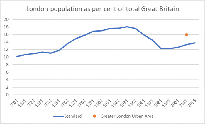
I guess part of my brain knew that greater London’s population had fallen for several decades, but that bit never quite connected with the bits thinking about world cities, agglomeration and so on and so forth. London is one of the great world cities, a key financial centre in an age when capital is more mobile than it was for decades after the war. There is no other really great city in the UK, the UK’s population hasn’t increased that rapidly by New World standards, and yet the share of the UK population resident in greater London is less now than it was for decades prior to World War Two (true even using the orange dot – for which there is no time series – the estimate of the population of the (defined by contiguity of population rather than local authority boundaries) of the greater London urban area.
(As it happens, on checking one finds that the New York metropolitan area population is also lower now, as a percentage of the total US population, than it was several decades ago – I could only see data back to 1950. But the US is different – there are multiple very large cities and the spread of air-conditioning greatly affected the liveability of many of those places.)
As you may recall from Saturday’s post, estimated GDP per capita in London is 188 per cent of that of the EU as a whole (and about 180 per cent of the UK as a whole). The only other (Eurostat-defined) region that comes even close to London is (close to London) “Berkshire, Buckinghamshire, and Oxfordshire” (at 151 per cent of EU as a whole).
These have the feel of places where if more people were able to live there more people would be better off. The whole of the UK might even be better off on average (a larger proportion of the population able to do more highly-productive jobs), even if the London premium over the rest of the country narrowed somewhat.
And yet, of course, as everyone knows London house prices are really expensive – price to income ratios similar to those in Auckland (with incomes higher), typically for small houses and small sections. You can tell similar stories about San Francisco/San Jose or New York (where GDP per capita are well above those of the US as a whole). Rigged housing and land markets really seem to have visible consequences in pricing people out of working in highly productive cities.
Where the story is much less compelling is in Auckland (or Sydney or Melbourne). I wish it were otherwise – I’m a strong supporter of land use liberalisation – but
(a) on the one hand, the populations of those cities (urban areas) have actually increased very substantially as a share of national population (especially Auckland: 8.5 per cent of the population in 1901, and about 33.5 per cent now), and
(b) in none of the Australasian cities do the estimates for GDP per capita show up with any very substantial margin over the rest of the country (see, by contrast, London above). People who just don’t earn that much (or produce that much) have found a way to live in those cities anyway.
Fixing the New Zealand urban housing markets is, or should be, a matter of dealing to one of the grosser injustices in our economic system, but it is far from obvious that there is a compelling case in issues around productivity and wider economic performance. If anything, there are probably already more people in Auckland – and perhaps Sydney/Melbourne – that there really are highly-productive opportunities that are either waiting for them now or would spring up were housing once again as affordable as it should be.
