Time to reform the governance of the Reserve Bank

[Here is the link to the coverage of my paper on governance in the Sunday Star Times]

This post had its origins in an earlier OIA stoush –  not mine, but that of one of the Green Party’s parliamentary staff.

For at least 15 years, I’ve thought that the way the Reserve Bank was governed should be changed and that we should move away from the situation (unusual internationally and anywhere else in the New Zealand public sector) where a single unelected official makes all the policy decisions (in the Reserve Bank case, on monetary policy and financial regulatory matters).  Other countries don’t do it that way.  New Zealand doesn’t do it in any other field of policy.

In late 2011, I was filling in time in the office between Christmas and New Year.  Alan Bollard’s second term was coming to an end, and while he hadn’t confirmed he was going it was widely (and correctly) expected.  I’d been saying to people for some time that a change of Governor was the best time to try to trigger discussion on the issue.  So I decided to write a brief internal discussion note making, in writing, the case I’d been making in conversation for years. I didn’t propose a detailed alternative model, and simply urged that change be considered, and that the Bank think about getting in front of the issue.     I wrote the note, and sent it round to only perhaps 10-12 of the Governor’s senior advisers on monetary policy.  I went on holiday, and when I got back word came down that the Governor was not all happy that the discussion note had been written.

Some months later, I took the opportunity to revise the note, and to take on board some useful comments I had received.  By this time, it was confirmed that Alan Bollard was going, but no decision had quite yet been announced as to who would be the new Governor.  Since no one could then think the paper was in any way a criticism of any individual, I sent it around a wider group of the Bank’s policy and analytical staff.  When Graeme Wheeler joined the Bank I sent him a copy, and had an appreciative response.

At some stage in 2013, the Green Party became aware that the paper existed (because the Bank had released another paper under the OIA, and my note was included in the list of references).  Their staffer asked for the paper, and was turned down.  He pursued the matter to the Ombudsman, who accepted the Governor’s argument that if this paper were released he would not be able to allow free and frank debate among staff.  I didn’t have a strong view on whether it should be released –  internal debate is important, and my note had been intended only as a contribution to that.  But it wasn’t a very recent paper, hadn’t even been written when the current Governor was in office, was not on a topic that was under active review, and the Governor’s argumentation was perhaps a little chilling.

Anyway, had the 2012 paper been released a couple of years ago, I probably wouldn’t have done anything more on the issue.  But I had continued to think about the issues, and particularly to think about them in the context of the much wider ranges of responsibilities and powers the Bank now exercises.  The result is this paper.

time for Parliament to reform the governance of the Reserve Bank online version

My preamble is partly to make clear that this is an issue that I have been thinking about for a very long time.  As people occasionally remind me, some of my comments on this blog could be seen as (but are not) motivated by grudges against current Bank management.  As Don Brash will confirm, I was running (less-developed forms of) the argument fifteen years ago.  The best Governor in the world simply should not have the extent of power any Reserve Bank Governor now has.

As important are two things:

  • The Reserve Bank does not write its legislation, Parliament does.  The Bank, and its Governor, operate within laws that Parliament has passed. The responsibility for legislation in this area rests with the Minister of Finance and Parliament.
  • To his credit, Graeme Wheeler seems to have recognised some of the weaknesses of the current system.  I suspect he and I would not agree on the solution (I don’t think staff should make the sorts of decisions the Reserve Bank is responsible for), but what matters at this stage is to get a good discussion and debate going, and to have a careful examination of the pros and cons of various possible models.

As it happens, I’m not sure if anyone is now particularly wedded to the current model.  The Treasury favoured a review in 2012, and they reported that many or most of the market economists then favoured change.  The Governor appears to recognise the risks and deficiencies of the single decision-maker model, and several political parties have also at times talked of proposing change.

This isn’t an issue that should divide people on any sort of ideological lines.  I’ve taken as given the current powers and objectives of the Bank.  Perhaps some of them should be looked at again, but this paper is just an attempt to prompt some discussion about how best to organise and govern a powerful New Zealand public agency, carrying out the wide range of functions that Parliament has assigned to it.

As ever, I’d welcome thoughtful comments and alternative perspectives.

The first page of the paper, an introduction and summary, is here:

Introduction and summary

When Parliament passed the new Reserve Bank of New Zealand Act in December 1989 a key, and innovative, feature of the Act was that the powers of the Reserve Bank were to be exercised by the Governor, and the Governor alone.  The legislation provided substantial operating autonomy to the Reserve Bank, and the establishment of a single decision-maker was seen as a way of providing effective accountability. If things went wrong, the Governor would have been responsible for any decisions, and the Governor could be dismissed, for cause, by the Minister of Finance.

But the model is out of step and out of date.  It is out of step with international practice in respect of monetary policy and of financial system supervisory and regulatory policy.  As importantly, it is out of step with approaches to governance used in the New Zealand public sector more generally.

The Reserve Bank governance model was developed, in part, to parallel reforms to core government departments that were going on at much the same time.  Those reforms themselves have since been considerably modified.  But even if that were not so, the conception of the Reserve Bank that the 1989 legislation reflected has not been borne out by reality.

The 1989 governance model might have been thought appropriate (if still unusual) for a very simple and uncontroversial most-monetary-policy agency.  Today’s Reserve Bank is a complex, multi-functional, organisation, exercising much more policy discretion in a range of areas, that are all characterised by considerable risk and uncertainty, than was envisaged in the 1980s.   Vesting all that power in a single unelected person is too risky, and is inappropriate.  It is not the way we do things in New Zealand.

In this note I will take as given both the range of functions the Reserve Bank has, and the allocation of powers between the Minister of Finance and the Bank.  Aspects of both issues should probably be revisited, but here I focus simply on the weaknesses in the governance model given the responsibilities that Parliament has assigned to the Reserve Bank.

The rest of this note outlines the key aspects of Reserve Bank governance and explains the background to the governance choices made in the 1989 Act.  It then focuses on how different things are today and why, even if it was a suitable model in 1989, it no longer is today.  I outline some alternative options and conclude by outlining my own preferred option.  Key aspects of any reforms should be (a) a move away from having policy decisions made by a single unelected official, and (b) the establishment of collective decision-making bodies which clearly distinguish among the main functions the Reserve Bank undertakes.

Compulsory enrolment in Kiwisaver

I’m puzzled.

Fresh from removing the sign-on bonus for new KiwiSaver members, Bill English is now talking about compulsorily enrolling everyone (well, all employees I assume) in KIwiSaver.  This was National Party policy to do at some stage, when the government’s books were in surplus, but it has now got cheaper to do because people could now be forced to join, at no upfront cost to the government.

It is far from clear what problem the Minister of Finance thinks he would be addressing.   Everyone who has started a new job since 2007 has already been auto-enrolled, and many others have chosen to enrol.  My guess would be that at least half of those who were in labour force in 2007 have changed job since then, and a large number have entered the labour force for the first time. All those people were auto-enrolled.   Most of those who have never joined, or have opted out, or subsequently taken a contribution holiday, have presumably made a considered choice.  Perhaps they can’t afford to be in the scheme now.  Perhaps paying off the mortgage is a higher priority.  Perhaps they are among that large group for whom NZS will already more or less maintain their pre-retirement standard of living.

I had hoped that the government might now leave KiwiSaver to wither on the vine.  After all, there is not much evidence that the scheme so far has boosted national savings, and there isn’t an elderly poverty problem.  Enhancing the retirement income of the relatively comfortable doesn’t seem like an obvious public policy priority.

The Minister did once regard New Zealand’s relatively low rate of national savings as a problem, but Google throws up no references along those lines in the last 3-4 years.  If he no longer regards national savings as a policy problem,  I happen to agree with him (I’ll get to savings as I carry on discussing the reasons behind NZ’s high interest rates).

Surely provision for retirement savings can’t be the problem either?   After all, this government has ruled out any change to the age of eligibility to NZS, and if they have not ruled out lowering the rate or means-testing they have certainly shown no appetite for doing anything.  And, as is well-known, New Zealand’s rate of poverty among the elderly is low, absolutely and by comparison with other countries.  Of course, high house prices may make that picture less rosy in a few decades’ time, but the government knows that freeing-up housing supply is the answer to that one.

And, in any case, although it is proposed to auto-enrol all employees, they could still choose to opt out.  Indeed, given that it is almost exclusively people now over 25 who have not been auto-enrolled already, one might reasonably assume that a large proportion of those who would be compulsorily enrolled if the Minister’s proposal went ahead might choose to opt out.  Yes, I know all the “nudge” literature, but recall that this experiment would not be on the population as a whole, but on a self-selected group of whom many had already deliberately chosen not to join.

And if income adequacy in retirement were really the concern, surely (a) compulsory contributory membership (not just initial enrolment), and (b) something that encompassed the whole population (business owners, welfare beneficiaries, stay-at-home parents) not just employees, would be the way to go.  But, fortunately, that doesn’t seem in prospect.

The National Party’s website says that it believes as follows:

The National Party seeks a safe, prosperous, and successful New Zealand that creates opportunities for all New Zealanders to reach their personal goals and dreams.

We believe this will be achieved by building a society based on the following values:

  • Loyalty to our country, its democratic principles, and our Sovereign as Head of State
  • National and personal security
  • Equal citizenship and equal opportunity
  • Individual freedom and choice
  • Personal responsibility
  • Competitive enterprise and reward for achievement
  • Limited government
  • Strong families and caring communities
  • Sustainable development of our environment

At least three of those values –  “individual freedom and choice”, “personal responsibility”, and “limited government” look inconsistent with auto-enrolling everyone in KiwiSaver.  Perhaps they might justify it under “personal security”, but I’d assumed that has to do with crime, and anyway, as noted already, elderly poverty just is not a major problem in New Zealand.

Compulsory enrolment of all employees in KiwiSaver smacks of something from The Treasury, and its “living standards framework”. But last time I looked, that framework put no independent value on things like individual freedom and choice, except insofar as they served some other end.

The Minister also appears to be using the dubious argument that Kiwisaver is an excellent investment.  If it were really so, you would think that after eight years most people might have got the idea.  But in fact, it is true only on very shaky assumptions.  Certainly, for the time being there is an annual government subsidy of up to about $500.    That is worth having, but it is hardly transformative.  In fact, for most people with a mortgage and contributing to Kiwisaver, it won’t even cover the tax wedge.  So the Minister’s claim is true only if the employer’s contribution to Kiwisaver would not otherwise be paid to the employee.  In the short-term, for any particular job or employee that might be true –  that (and the subsidies) was the main reason I joined Kiwisaver.  But in the medium to long-term surely the Minister of Finance does not believe that returns to labour will be materially affected by whether people take their income in the form of Kiwisaver contributions or in straight wages and salaries?

So New Zealand

  • Does not have a national savings policy problem (although the national savings rate does raise some interesting questions)
  • Has little or no evidence that KiwiSaver so far has made any material difference to national savings anyway
  • Does not have an elderly poverty problem
  • Has a government which is firmly committed to the current NZS system.
  • Has most people already in KiwiSaver, while  those in the workforce who aren’t in KiwiSaver will already mostly have made an active choice to stay outside.
  • Has a governing party that proclaims commitment to personal responsibility and individual freedom and choice.

And for most people in their middle years, Kiwisaver involves a very nasty tax wedge.

So quite why would the Minister of Finance think it was good policy to compulsorily enrol the rest of the employees in the country in KiwiSaver?

If it is almost everything, we really haven’t done well

The old line is that if productivity isn’t everything (about economic performance) it is almost everything in the long run.  And multi-factor productivity (or total factor productivity) is typically seen as the best type of productivity (ie not just throwing more inputs into production, but getting more from them).  At least, that is, when it is not just measurement error (and there is inevitably some of that).

In the last few days the Conference Board released the annual update of its productivity estimates.  The Conference Board data are really useful because they use a common methodology across a very wide range of countries.   There might be better estimates for many individual countries in national data, but there are valuable insights in cross-country comparisons.  Many of you may have seen the Financial Times feature on productivity a few days ago (it is reprinted in today’s Herald)

I’ve only had a quick look at the latest data.  For cross-country comparisons, when I can I like to cast the net widely and capture as many advanced countries as possible. In this case, I’ve taken all EU countries, all OECD countries, and added Singapore and Taiwan.  That gives a good range of advanced countries both richer and poorer than New Zealand, and a reasonable number of commodity exporters too.

This chart just looks at MFP growth since 2007, in other words since just before the global recession.  MFP growth has been lousy over that period –  only a small number of these countries recorded any growth at all.  In fact, MFP had been slowing even before the recession, but here I was just interested in the cross-country perspective: who did relatively well, and who did relatively badly.

mfp

As you can see, New Zealand has not done not very well – we are in the lower half of the sample.  On the other hand, we did do better than most of the other commodity-exporting countries (beating Australia, Norway, Chile and Mexico).  The thing that struck me in looking at last year’s version of the chart was how relatively well the United States had done.  The US had been at the epicentre of the initial crisis, and had had multiple failures of financial institutions and disruptions to the intermediation process.  And yet, over these seven years, only six countries did better than the US.  A little surprisingly, half the countries in the euro did better than New Zealand on this measure (although not on actual GDP per capita)

I’ll be writing more on some of this data over the next few weeks. I’ve been intrigued for some time as to why New Zealand, which has had such a good terms of trade, and had no serious home-grown financial crisis has not done better over the last few years.

Can the foreign debt explain New Zealand interest rates?

(This is a long post.  The short answer is “no”.)

Yesterday I showed  that the gap between  New Zealand real and nominal interest rates and those in other advanced economies has been large for a long time..

There is quite a bit of debate about why.  I want to deal quite quickly with several stories that have been run at times:

  • Some argued that high interest rates are mostly down to monetary policy.   But even if monetary policy is a bit tight right now, over the last 25 years as a whole inflation has averaged a bit above the midpoint of the successive inflation target ranges.  And if the early inflation target was low by international standards, at least since 2002 a target centred on 2 per cent has been very internationally conventional.  Monetary policy isn’t the answer. .
  • Some have argued that a small country would almost inevitably have higher interest rates (all else equal) than countries with lots of public debt on issue (eg the US, Germany, Japan, or Italy).  Perhaps, but in the data any effect of this sort looks to be very small –  Sweden has borrowed at much the same rates as the United States, and New Zealand’s bond yields have also been well above those of the typical small, floating exchange rate, advanced country.
  • For a while it was suggested that our nominal bond yields were higher than those abroad because people were less confident that low inflation would last than they were in other countries.   But there is no external evidence to support the idea.  And although we don’t have long time series of inflation indexed bond yields, what data there are suggest that real interest rates here have been well above those in other advanced economies.

These days the main debate is between a story (which I think the Reserve Bank generally agrees with) in which domestic resource pressures explain our interest rates, and one in which high New Zealand interest rates reflect the high level of net international liabilities owed by New Zealand resident entities.  Today I want to explain why I find the latter story unpersuasive.

The story goes that international investors look at the stock of debt, worry about the risk that it poses, and charge New Zealand (dollar) borrowers higher interest rates accordingly.  There are number of possible lines of argument:

  • The direct one just mentioned: high debt means high risk, and lenders charge a premium (just as a bank might charge more to a highly leveraged borrower)
  • A story based on incomplete mobility of capital.  According to this story, we can borrow a great deal of money at “the world interest rate”, but our high NIIP means we run up against the limits of the number of investors who might be interested in having New Zealand exposures, and the net effect is a higher cost of credit at the margin.
  • A story based around exchange rate crisis risk.  In this story, it isn’t the debt itself that is necessarily risky (and the evidence is that highly rated NZ USD borrowers haven’t typically paid much more for debt than similar US USD borrowers) but rather NZD-denominated debt,  because of the exchange rate risk.  Specifically, even if the New Zealand dollar trades pretty normally in normal times, a country with lots of foreign debt is exposed to considerable rollover risk.  In times of crisis, the exchange rate could fall a very long way.  To compensate themselves for this risk of a NZD foreign exchange crisis, investors demand a higher return on NZD assets than they would on comparable assets issued in the currency of a less indebted country.

In the abstract, these can sound like plausible stories.  And there certainly have been cases of countries with very high levels of debt where yields have sky-rocketed, or who have even been cut out of funding markets altogether.  The risk of being cut off by funding markets played on the minds of New Zealand policymakers for decades, dating back to the 19th century.

But I don’t think these risk premia stories (which is how I will collectively describe them) can really explain what has gone on in New Zealand in recent decades.

Is there, for example, any sign that investors and offshore lenders have been particularly concerned about New Zealand’s international investment position?

The short answer is “not really”.  And that shouldn’t really be surprising.  By international standards, the net international investment position of New Zealand is quite large, at around 70 per cent of annual GDP.  Historically, it has swung through huge ranges – probably nearer 200 per cent at peak in the late 19th century, and perhaps only around 5-10 per cent of GDP in the early 1970s. The net external liabilities ran up rapidly in the late 1970s and early-mid 1980s.   That mostly reflected the very substantial increase in public debt that occurred at the same time.  New Zealand’s historical statistics aren’t good, but the points in the previous two sentences aren’t really contentious.

But what is sometimes forgotten is that the net international investment position (as a share of GDP) has now been basically flat for 25 years.  Here is the chart, with data as far back as the official SNZ series goes.  The NIIP wobbles around a bit, and is a bit lower than usual at present on account of all the reinsurance claims that crystallised following the Canterbury earthquakes, but has not gone anywhere for 25 years.

niip

In itself, that is interesting, because public debt has changed  a lot. In the late 1980s, net public debt was large, and one could think of the NIIP position as being largely accounted for by the government’s debt (large operating deficits over too many years, and the Think Big debacle).  Foreign lenders might have been a bit worried, and there were some signs of that: the threat of a double downgrade, and Ruth Richardson’s hasty trip to New York to fend off that threat.

But government debt subsequently fell steadily for 15 years, and one year the government even had slightly positive net assets (this is data from the Treasury’s long-term tables).  Debt has certainly increased a little over the last few years, but there is no sign from anyone (investors, rating agencies etc) that our public debt is a concern.  It isn’t the lowest in the advanced world, but it is towards the lower end of the range.

But as government debt shrank, private borrowing moved in to take its place.  By contrast, in Canada when the government got on top of its fiscal problems –  impelled in part by a crisis of investor concerns around Quebec –  in the mid 1990s, the reduction in public debt was matched by a significant reduction in Canada’s (then) large net international investment liabilities.

The fact that our net international investment position has stayed large and negative, even as the government finances have been put into pretty good shape is one straw in the wind suggest that our interest rates aren’t high because of worried foreign investors.    When lenders got worried about the financial health of borrowers, and increase the cost of finance accordingly, rational borrowers tend to wind back their debt.  Corporates do it.  Households do it.  Governments do it.  New Zealand didn’t.

The other straw in the wind is that the exchange rate has stayed persistently high. To be sure, it has gone through quite large cycles, and people can debate whether it is “overvalued” or not, but I’m pretty sure I’ve not heard anyone argue that the NZD has been consistently undervalued over the last 25 years.    The much more common line has been to note how high the exchange rate has been, and to think that it really needs to go down.  That has been a line from the IMF and from domestic officials.  And it shows up in things like Cline and Williamson’s fundamental exchange rate estimates, which have consistently suggested that the NZD has been one of the most overvalued currencies in the world.

Academic papers often model the effect of investor concerns by adding a term (a “risk premium”)to the interest rate. They do so largely for reasons for analytical tractability.  In fact, overseas investors have no way of adding a premium to New Zealand’s short-term interest rates.  The Reserve Bank sets the OCR, based on domestic pressures on local resources.  Foreign lenders  getting concerned about the level of debt New Zealand entities have doesn’t increase resource pressures.  If anything, such concerns might diminish resource pressures a little (eg a bit less greenfields foreign investment).

Long-term bond yields are freely traded.   We saw that yesterday in the spike in the yields some of the European crisis countries faced in 2011 and 2012.   But over 25 years, the gap between New Zealand and foreign long-term interest rates has been less than gap between New Zealand and foreign short-term rates.  Again, it doesn’t suggest some unusual risk premium related to the high level of NZ’s external debt.

Of course, the interest rate is not the whole of the foreign investor’s return.  A foreign lender buying a New Zealand government bond outright has to think about two factors:  the interest rate on the bond, but also the change in the exchange rate between when he purchases the bond and when he finally sells it and repatriates his money.  The investor doesn’t know how much the exchange rate will change,  but he needs to form an expectation (actual or implicit).

Long-term interest rates are largely determined by expected short-term interest rates, and short-term interest rates are largely determined by domestic pressures on resources.    But nothing of that sort anchors the level of the spot exchange rate.  Foreign lenders don’t need to purchase, or hold, New Zealand dollar bonds.  If they were ever to become particularly concerned  about New Zealand they might look to sell, or reduce their purchases, of New Zealand dollar assets.    That selling might raise domestic bond yields a little, but it would certainly be expected to lower the exchange rate.  In an economy with heightened investor concerns and a floating exchange rate, the exchange rate would be expected to fall to the point where the combination of the interest rate on the domestic bond and the expected future appreciation in the exchange rate together provide sufficient return to cover the investor’s perception of risk[1].

If this all seems a little odd to readers, think of a parallel with equity markets.  If investors become concerned about the risks on an individual share or on the market as a whole, they will want a higher return to compensate themselves for that risk.  The typical response is not to demand higher dividends (which could be thought of as parallel to a higher interest rate on a debt instrument).   Even if corporate boards agreed, higher dividends would be only likely to further weaken the companies’ financial positions.  The operating businesses can’t readily usually quickly generate more cash-flow – indeed, if they could the concerns probably would not have arisen in the first place.  Instead, what typically happens is that the share price falls (the “equity risk premium” is said to rise).  How far do share prices fall?  Well ,they need to  fall far enough that in combination the dividends and the expected future increase in the share price together provide enough return to investors for them to be comfortable continuing to own the shares.

In a similar way, a country which lenders regarded as having too much debt for comfort, and from which they wanted a higher return, would tend to be a country with a weak exchange rate not a strong one.

As I put it in a paper a couple of years ago:

If sustained heightened external investor concerns about the New Zealand NIIP position had ever developed they would, most probably, have been reflected in a sustained period of exchange rate weakness. And an adjustment of this sort would have been an example of self-stabilising properties of the economy at work. A fall in the exchange rate provides the signal that shifts resources away from meeting domestic demand, towards (net) production for exports. That shift of resources in turn and over time reduces the build-up of net external liabilities, lowering the NIIP/GDP ratio back towards some more comfortable/sustainable/normal level. As the NIIP ratio returns to a more comfortable level, foreign investor concerns should ease expected required returns would fall, and the exchange rate might be expected to recover some ground.

We have seen no sign of that sort of pressure on any sustained basis at any time since at least the early 1990s. If anything, the concern at times was around over-exuberant capital inflows.   There is no sign that external investor concerns have driven our interest rate differentials.  Instead, it is the domestic pressures on resources, generated by  firms, households and governments savings and investment choices that explain most of it.

Of course, persistently high New Zealand interest rates don’t mean there is a free lunch on offer to foreign investors.  Recall that an investor’s total return is the interest rate on the New Zealand dollar asset, and the change  in the exchange rate.  When interest rates here look particularly attractive to foreign investors, the exchange rate tends to rise to the point where the expected future depreciation just offsets the additional returns on the NZD security.  The critical word in that sentence is “expected”.  Expectations drive behaviour.  In New Zealand’s case, a lot of expectations have been consistently misplaced.  Over a long period, investors have expected the gap between New Zealand and foreign yields to close.  And it hasn’t –  not on any sustained basis anyway.  And when our interest rates got particularly high, investors have usually expected the exchange rate to depreciate before too long, and invested accordingly.   Ex post, people buying and holding New Zealand dollar assets look to received windfall high returns, but in fact they took a great deal of risk to secure them.  Had the market’s expectations about interest rate convergence  come right, they would have ended up not consistently better off than if they had kept their money at home.

So my argument is that New Zealand interest rates have averaged so much higher than those abroad because of domestic resource pressures.  Those on-going pressures have helped keep the NIIP position large (unlike Canada). The nature of those pressures is not that well understood (probably why markets have been persistently surprised).   Before too long, I’ll do a post or two looking at some of the factors that might lie behind those surprisingly strong pressures.

In the meantime, I covered this material on pages 42 and 43 of this paper (which also has the references to various papers that make the risk premium case).  The paper itself outlines the resource pressure arguments more fully.

But the key point to take away is that stories about investor concerns imply a low exchange rate, perhaps puzzlingly low from a New Zealand perspective, not a high one.  Don’t take my word for it –  as Charles Engel, one of the leading scholars in the field. put it “a currency whose assets are perceived to be risky….should be weaker ceteris paribus”.

Perhaps we would have seen that sort of pressure in the late 1970s and early 1980s if we had had an open capital account and a floating exchange rate.  But we’ve seen nothing of the sort, for any prolonged period, in the last 25 years.

[1] It is different in a fixed exchange rate country (such as the eurozone countries in the 2011/12 crisis) where the pressure must go into domestic interest rates.  But New Zealand has long had a floating exchange rate.

What can the Reserve Bank do about the exchange rate?

(This isn’t the follow-up post on real interest rates.)

A commenter on interest.co.nz , referring to my piece on the exchange rate the other day, posed the following question:

It is gratifying to see an apparently reputable NZ economist such as Reddell explain the long term effects of an overvalued exchange rate, and that the NZD is still overvalued. I had thought NZ economists, perhaps for political reasons, remained in denial on this point. Does he have a view, do we know, whether the Reserve Bank could be more active in encouraging the exchange rate down, other than occasionally attempting to talk it down?

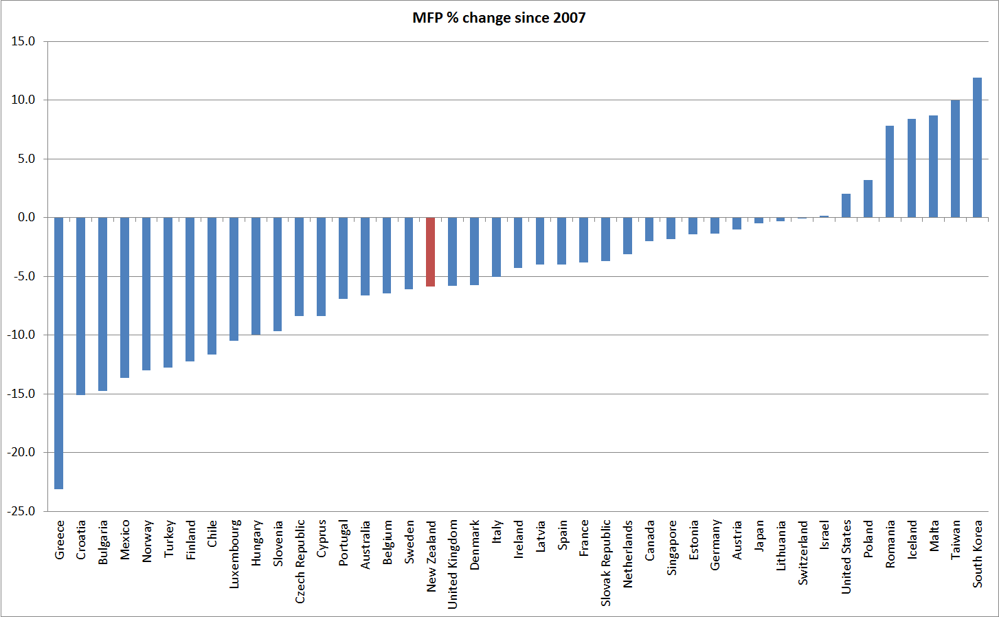
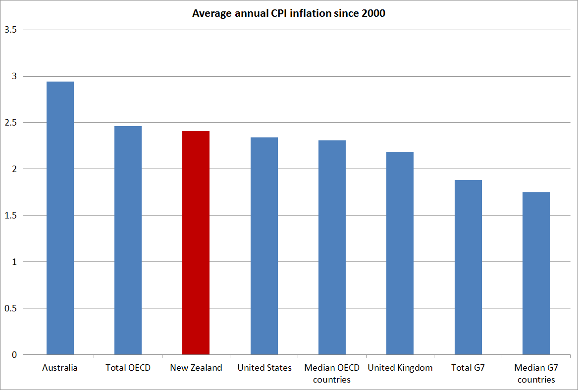
I think the second sentence is a little unfair, although it does depend what people mean by “overvalued”.  Most prominently, Graeme Wheeler routinely highlights that the exchange rate appears out of line with long-term fundamentals.

On the question the commenter poses, I do have view and the answer is “typically not”.  At present, I think the Reserve Bank has the OCR set too high, and will need to lower it.  At the margin, the overly tight monetary policy in recent years has left the exchange rate a little higher than otherwise.

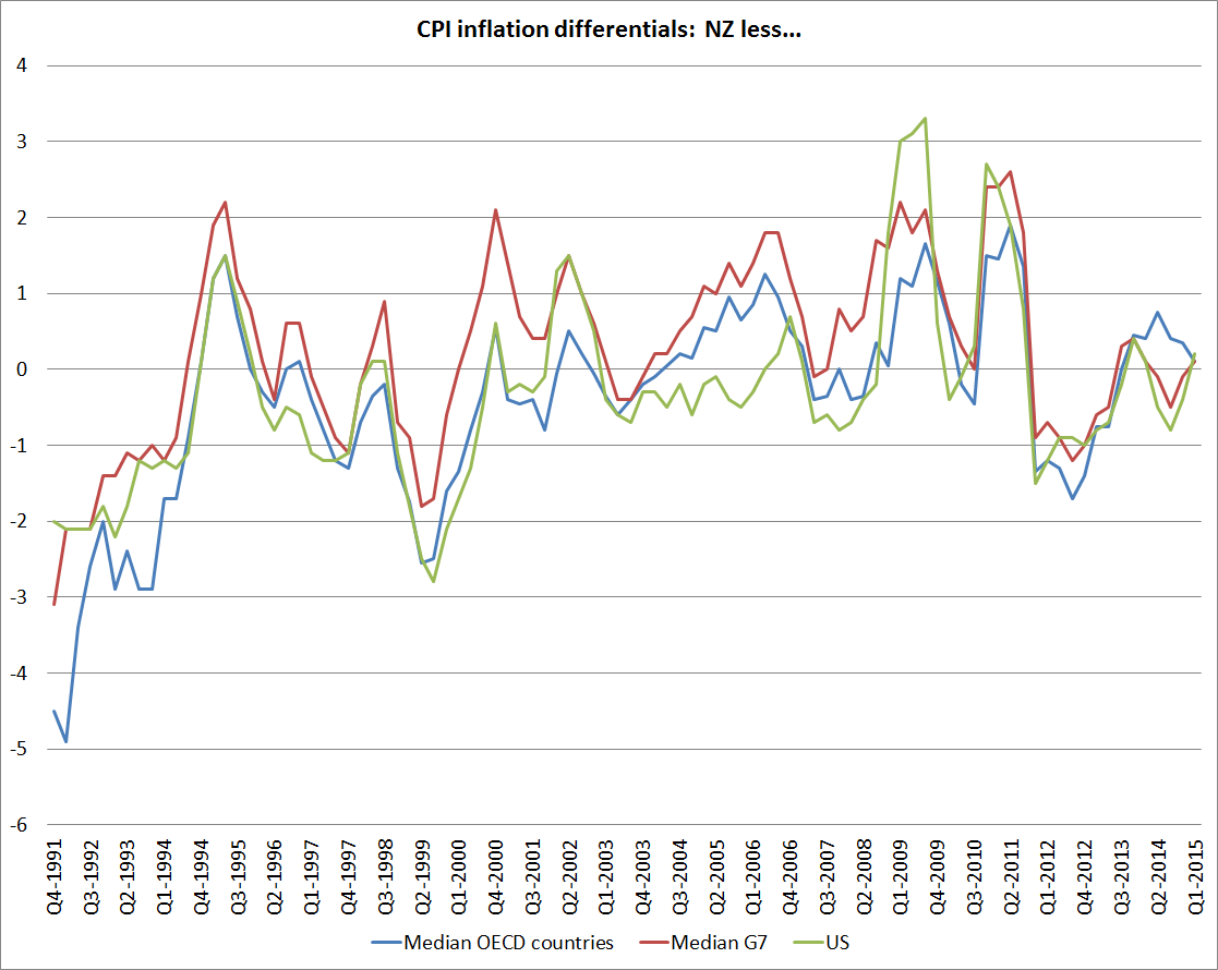
The other instrument the Reserve Bank has at its disposal is foreign exchange intervention.  I have come and gone over the years on whether the Bank should be able to do such intervention, but no one believes it can make any material or sustained difference to the sorts of real exchange rate misalignment I was talking about in the earlier post.

Central banks can do things that make a difference to the real exchange rate for short periods of time.  Monetary policy makes more difference than intervention.   But sustained misalignments, over decades, are real phenomena, not monetary ones.  To understand those sorts of sustained pressures, one needs to look to what drives differences in real interest rates over long periods.  And, again, the answer isn’t monetary policy (as the Bank explained here).  Regulatory policy doesn’t make much sustained difference either, although there are some intriguing suggestions to the contrary here.

Long-term bond yield differences

I wrote the other day about the way that New Zealand’s real exchange rate had become (not just recently, but in the last 20-30 years) out of line with changes in our terms of trade and in our relative productivity performance. In that post I suggested that the large gap between New Zealand’s real  interest rates and those in other advanced countries was a big part of the explanation.  Not, of course, that interest rates are an independent factor just imposed on us, but that if we could understand what had driven such a wedge between our interest rates and those of the rest of the advanced world, we would be on the way to understanding what was resulting in such a persistent (albeit rational) misalignment of the real exchange rate.  In that post, I simply noted the current very large gap between the real yields on inflation-indexed bonds issued by the New Zealand and US governments respectively.  That gap is around 1.5 percentage points.  Over 20 years, that looks like a huge difference in expected returns.

Interest rate differentials can move around quite a lot.  Even for long-term bonds, cyclical differences in the health of the respective economies can make quite a difference[1].  Risk factors can matter too –  at times of heightened global risk, for example, US Treasury bonds still tend to be an asset of choice. My focus is not really on short-term movements in those differentials, but on what has happened on average over time, and that is the focus of this post.

The OECD publishes data on long-term bond yields for each of its member countries.  “Long-term” here generally means something close to 10 years, the usual benchmark for such comparisons.  The data are nominal, and of course over time differences in inflation rates should explain quite a lot about differences in nominal interest rates across countries.  So I restricted myself to the period from the end of 1991.  For New Zealand, that was the first quarter in which inflation had fallen inside the new inflation target range, and  most other of the older advanced countries had also broken the back of the high inflation of the 1970s and 1980s by then.  But I’ll come back and look at trends in inflation a bit later.

In this first chart, I’ve shown long-term bond yields for New Zealand, for the US and for the medians of several groups of countries.  I’ve looked at the median of all OECD countries (but at the start of the period there is no data for many of the former communist countries, and by the end of the period, half of all the countries were in the euro), of the G7 countries individually, and of a grouping of G7 currency areas (Canada, the US, the UK, Japan, and the euro-area).  Most of the time it does not much make difference which measure one looks at.  I’ve included them all so that you can see that I haven’t been cherry-picking.  My preferred series to compare New Zealand against is probably the G7 currency areas one.

interest1

Of course, the dominant story of the last 25 years is the dramatic fall in the level of interest rates everywhere.   Part of that is the fall in actual and expected inflation –  even in the G7 countries, inflation still averaged 4 per cent at the end of 1991 – but real interest rates have also fallen markedly.

But my main interest is in the differentials: how have New Zealand bond yields behaved relative to those of these other advanced countries.  It was notable in the first chart how the gap between New Zealand and other countries emerged over time.

Well, here is the chart of the differentials.  This time, to make the chart easier to read, I’ve shown only two series: New Zealand less the median of all OECD countries, and NZ less the median of the G7 currency areas.   It is easy to forget how low New Zealand interest rates were at the start of the period, relative to those abroad  (I was running teams at the Reserve Bank advising on monetary policy and doing the Bank’s macro forecasts, and I had forgotten).  At the start of the period, we were just emerging from two decades of very high inflation, and were only a few months on from the much-publicised threat by rating agencies of a double-downgrade to New Zealand’s sovereign credit rating.  We did, however, at the time have a very low inflation target –  even if political support for that target was fragile at best.

But I’m really interested in more recent periods.  Again, I partly started back in 1991 just to provide context.

interest2

Throughout the 1990s, there was a very strong expectation that New Zealand short-term and long-term interest rates would converge to those of the rest of the world[2]  Once we had low and stable inflation, much stronger fiscal accounts, and people were confident those things would last, then having become  integrated with global capital markets, it seemed a reasonable story.  Sure, there might be small differences – small New Zealand markets might always be less liquid –  but the differences weren’t thought likely to amount to much, especially when comparing us against other small advanced economies.

But that convergence has just never happened, and the fact that it has not happened –  that the interest gaps have been so large, through booms and busts – is one of the most striking features of what has happened in New Zealand in the last 20-25 years.  Day-to-day what happens internationally is a key influence on changes in New Zealand bond yields, and there is clearly a common factor at work in the long-term decline in real yields, but the levels remain completely different.

It is interesting to note where the two lines diverge materially, both in the period since 2007.  Nothing very interesting happens in the differential between New Zealand and G7 bond yields since 2007, but both during the 2008/09 recession, and again –  more starkly –  at the height of the 2011/12 euro-crisis, New Zealand bond yield differentials fall sharply relative to the median OECD country.   It is easy to see that effect in this chart, simply comparing New Zealand against a group of eight crisis countries (Iceland, Ireland, Greece, Spain, Portugal, Italy, Slovenia and Hungary).

interest3

As I noted earlier, differences in actual and expected inflation can affect the interpretation of nominal bond yield differentials.  We don’t have consistently-compiled cross-country measures of inflation expectations (and in most countries, indexed bonds are too recent or too patchy  –  the NZ story –  to provide much of a time series).  And so people tend to fall back on comparing actual inflation rates over time.  It has to do, since it is all we have, but it is worth remembering that even CPIs are compiled differently across countries, and across time even within individual countries.  In New Zealand, for example, until 1999 CPI inflation rates included the direct effects of interest rates, and section prices.

interest4

This chart just shows the average inflation rates for New Zealand, for a couple of individual countries, and for various country groupings since 2000.  New Zealand’s inflation rate has averaged a bit higher than inflation in the G7 countries, by around 0.6 percentage points, but has been very similar to that among OECD countries as a whole, and that in the United States.  At least since the mid 1990s, it doesn’t look as if there has been any particular change in the relativities, and at present New Zealand’s inflation rate is almost identical to that in the rest of the advanced world.

interest5

Historical differences in inflation outcomes might be thought to have warranted nominal bond yields in New Zealand perhaps 0.5 percentage points higher than those in the rest of the advanced world.  Looking ahead, however, New Zealand’s inflation target is very similar to those in the rest of the advanced world: our target is centred on 2 per cent, and while Australia’s in a touch higher, and the euro-area’s is a touch lower, taken as a group there isn’t much difference.  And yet our nominal bond yields have still been averaging 2 percentage points higher than those abroad.

What does explain it?  A common story is risk around the high level of net international indebtedness of New Zealand entities.  I don’t find that story persuasive at all, and will explain why in my next post.

[1] Using implied forward rates (the yield implicit in the second five years of a ten year bond) is a good way around this, but such data are less readily accessible).

[2] I documented this in a paper I wrote a few years ago for a Reserve Bank and Treasury workshop.  I would quite like to post it, but it would no doubt take at least 20 working days to extract it from the Bank.

Being an engaging central bank

Last week the Reserve Bank released the latest issue of the Bulletin.  This issue, by Head of Communications, Mike Hannah, ran with the slightly twee title of “Being an engaging central bank”.   The article consisted of two things:  it reported the results of a fairly extensive survey of the Bank’s engagement with the public and other so-called stakeholders, and articulated and  defended the Bank’s communications approach.  Appended to the article was the 80 page report from the consultants the Bank hired to do the engagement study. I haven’t seen  any  media coverage of article, so perhaps this mention will help generate some readers.

The Reserve Bank has long had a self-image of being quite a transparent organisation.  And it has made significant efforts in that regard.  Fifteen years ago, the Bank might reasonably have been considered a leader.  The Bank makes much of the modest increase in the number of speeches it is doing, but older readers may recall Don Brash’s roadshows around the regions in earlier years.  There isn’t anything very new about what has happened in the last year or two.

As readers will know, I have highlighted a number of areas in which the Reserve Bank is currently very far from best practice when it comes to transparency, around both monetary policy, financial stability, and the Bank’s market operations.  I have also pointed to areas where they don’t even seem to comply with the provisions of their Act as regards communications (re both the Monetary Policy Statement and the Financial Stability Report) and, as recently as this morning, I have highlighted the Bank’s cavalier attitude (in common with many other public agencies) to the provisions of the Official Information Act.  So, I thought I really should read the Bulletin article.

There is interesting material there and (as often with these sorts of things) the research report is more interesting than the Bank’s public take on it.  It was nice, for example, to learn how many visitors the Bank’s website gets (just over 2000 a day last year, which frankly seemed surprisingly low).  Both bits, however, are riddled with PR-speak (“future-state” vision,  “a partner in the economic infrastructure space” , “further inside the future-vision tent”).

On the questions posed, the Bank emerges relatively well –  if the general public (a rather important group) don’t have much trust in the Bank, those who are closer to the institution appear to, and to generally be reasonably positive about the Bank’s engagement with them.  That covers modest samples of people from regulated entities, the business community, researchers, the media, and other government agencies.    The results are good news, as far as they go.

As regards, the Bank’s relationship with central government, both the consultants and the Bank seem a bit confused, describing the Bank as “both a partner and a constituent”.  Surely, most of all, the Bank is a creature of Parliament, funded by Parliament, and directly accountable to Parliament and to the Minister of Finance?    If one wants to adopt the jargon, perhaps “adviser” and “service provider” might better describe the Bank’s relationship with central government.  Perhaps the authors only had other government departments in mind, but part of effective engagement is clear communication.

As I noted, the article also engages in a bit of defence of the current limits of transparency.    One line that was a little concerning was the suggestion that “different degrees of transparency are appropriate for different stakeholder groups”.  I think I understand what they are trying to get at, but this expression of the point seems really quite dangerous.  We will be more transparent to the people who get on with us?  To people who agree with us?  To “people like us”?  To economists in lock-ups, more than to the public?  It is quite a dangerous path to go down, and is part of the reason why the country needs an effective Official Information  Act.  Transparency is not just about what a government agency wants to communicate –  which, in fairness, is probably the focus of the external engagement work –  it is about the ability to scrutinise public agencies even when they don’t want to be scrutinised, or when it is uncomfortable or even embarrassing to be scrutinised.  That is the difference between, say, a private firm, and a government agency.

The article also suggests that publication of interest rate projections is as informative as “the minutes of our monetary policy meetings”.  That may well be true, although since no one has seen the minutes of the Governing Committee or the Monetary Policy Committee they have no way to know.  More to point, those documents are about two quite different things.  Interest rate projections are the Governor’s current best view of where interest rates are likely to go in future.  Good monetary policy minutes abroad convey much more of the richness of the sorts of factors, and debates,  that went into reaching the current OCR decision.  Given a choice, good minutes offer more real information than projections  –  it is that distinction between things we know very little about, and things we know a lot about, that I wrote about a couple of weeks ago.  The Bank is quite good on the former, but very weak on the latter.

Which brings me to my final point.  The consultants use, and Hannah picks up, the phrase “the paradox of transparency”, in which allegedly too much transparency by the Bank could “threaten  the certainty” that respondents value.    It is a convenient phraseology but it is largely misguided.  The Governor does not know where interest rates will be year from now.  He does not even know what lending controls might be in place by then.  There is very little certainty in anything around this business.  Greater transparency (both historical transparency OIA style), and perhaps a range of public views from members of a formal decision-making committee, would be likely to reflect the real uncertainty we and they face, rather than create it.

I could cover a lot more points, but you might consider reading the material yourself and seeing what you think.   I’m not sure that in good conscience I could recommend it as a wise use of anyone’s time, but more data is almost always better than less.  It is great that the Bank has pro-actively published the material, although I am left wondering how long it might have taken to get it out of them under the OIA had the results been seen by Bank management as less favourable to them.

The Reserve Bank and the Official Information Act

(for anyone who is bored with this subject, feel free to read no further).

I have mentioned various Official Information Act requests I have lodged with the Reserve Bank, and the difficulty the Bank seems to have with the proposition that its information is public information and that, unless there is good statutory reasons for withholding the information, it should be released as soon as reasonably practicable, and in any event no later than 20 working days after the request was lodged    Agencies are funded to cover their statutory responsibilities, including those under the OIA.

It would be tedious to readers to run through all the responses I have had, so I will highlight three.

In this post, I discussed a request I had made for a limited range of papers that fed into the March 2005 Monetary Policy Statement (ie 10 year old papers).  On the last working day of the originally available 20, the Bank extended the request for up to another 20 working days,  I’m still waiting, and will no doubt hear something next week.  As a reminder to that Bank, that “as soon as reasonably practicable” is the law of the land.

I also asked the Bank for papers around the 2012 PTA.  As I noted earlier, they came back wanting to charge me for it.  I asked how I could usefully narrow the request to expedite the matter, and (as they are required by law to assist requesters) we had a helpful conversation in which it was agreed that I would revise my request to those (five or six apparently) documents held in the relevant folder in the Bank’s document management system.  I had hoped that might be a matter of only a few days.  I’m looking forward to the final response.

As I was winding up my time at the Bank I lodged an OIA request, asking for clearance to quote historical papers that I had written while I was at the Bank.  In the last decade, those have mostly been opinion pieces.  As I noted to the Bank, I had looked through most of them recently, in the course of clearing my desk, and couldn’t see anything particularly sensitive or likely to cause trouble under statutory OIA grounds.  I suggested that perhaps for older papers they could consider a blanket waiver, and then could have someone look through things I had written in the last three years or so. (I knew that there was one 2012 paper that the Governor had already persuaded the Ombudsman to withhold, and I indicated that I would not be unduly bothered if the Bank still wanted to withhold it, even though the paper was now several years old).

I got a response, again near the end of the 20 working days, saying that the Bank could not give any blanket waivers, and suggesting that if they had to go through the papers it would cost $100000.

Accordingly, I revised my request.   A month ago, I asked only for the papers I had written in a single year, and was very specific that I only wanted papers lodged in the Bank’s document management system, not emails or the like.  As it happened, in the year concerned –  2010 –  I was only working at the Bank for six months.  I don’t know how many papers there are, but I was simply not that productive (and had other things to do).  And these are five-year-old pieces of opinion or analysis[1].

Yesterday, again almost right to the end of the 20 days on this request, I had a response from  the Bank.

Meeting the original 20-day time limit would unreasonably interfere with the operations of the Reserve Bank. Accordingly, and under the provisions of section 15A(1)(a) of the Official information Act, the Reserve Bank is extending by 20 working days the timeframe for a response to your request.
 

It would be almost laughable, if it were not serious.  The Reserve Bank is a very powerful public agency, and the Official Information Act is a key element in open government.  The Reserve Bank seems not to regard obeying the law as a matter of importance.  It is a good example of why, on the other hand, the Ombudsman’s review of the Official Information Act, currently underway, is so important.

If it is of any relevance, which it should not be, I can assure the Bank that my only agenda, in each of these requests, has been transparency.  There is no single document that I desperately want to get hold of and post to make a point, to embarrass the Governor, or anything of the sort.    But if there was, the law is still the law, and information must be provided as soon as reasonably practicable.

[1] Although it occurs to me that the Bank might have interpreted the request as including any advice to the Governor on specific OCR decisions.  I never lodged those pieces in the document management system (the committee secretary did), and am not after those.

100 years of the New Zealand/Australia exchange rate

Yesterday I looked briefly at some of the recent indicators of relative economic performance for New Zealand and Australia over the last few years.  New Zealand hasn’t done that well.

One item I didn’t mention was the exchange rate.  The fevered talk of parity parties has, fortunately, receded once again, although who knows for how long.  It will probably happen eventually –  after all, New Zealand’s inflation rate averages a little lower than Australia.

We’ve been at parity before of course.  Indeed, for all our history until 1972 a New Zealand dollar (or pound) had been worth as much (or more) as an Australian dollar (pound).  Until 1914 that was all about common gold convertibility, and neither country had a central bank.  This chart starts in 1911.

exchrate1

In the long long run, changes in the exchange rates of similarly wealthy countries should broadly reflect differences in the inflation rates of the two countries (relative purchasing power parity). My reading of the literature suggests that empirical support for this long-term proposition has been growing.    But here is what the chart looks like for New Zealand and Australia  (my data source for Australia, Measuring Worth, has a missing observation in 1922).  When I first did the chart a few years ago I was pleasantly surprised by the way the two lines moved broadly together.  When our nominal exchange rate appreciated against Australia’s –  as it did most enduringly in 1948 – it was associated with a rise in Australia’s price level relative to ours.  And, of course, as our high inflation (relative to theirs) became an increasing issue from the mid-late 1960s, our nominal exchange rate fell substantially relative to theirs.  The troughs were in the mid 1980s.

exchrate2

What if we combine the two lines into a real exchange rate series?   Two things strike me?  The first is just how relatively tight a range that bilateral real exchange rate has fluctuated with in over a century.  And second is the way the real exchange rate appeared to be falling in the 1970s and early 1980s, only to step up and subsequently fluctuate around a new materially higher level.  The last observation is for 2014 (annual averages), but the current level would not be much different.

exchrate3

At one level, that higher real exchange rate might look like a good thing.  After all, it means we can buy stuff abroad more cheaply, lifting the purchasing power of our incomes.    The problem is that we have to earn an income before we can spend it.  And there our performance relative to Australia has not been good.

People often point out that the higher terms of trade has lifted the ability of New Zealand firms to compete profitably internationally.  All else equal that should be consistent with a higher real exchange rate.  The problem with that story here is that we are doing a NZ vs Australia comparison and New Zealand’s terms of trade have done less well than Australia’s.

We only have consistently national acccounts deflator for both countries back to 1987, but actually all the differences in the two terms of trade are in that recent period.  This chart shows merchandise terms of trade for the two countries back to the 1920s.  They are remarkably similar until the last decade or so.

2025 TOT

And this chart is the SNA terms of trade for the two countries, drawing from the national accounts export and import price deflators.  Despite the difficulties of the last couple of years, Australia has still experienced the much larger increase in the terms of trade than New Zealand.  All else equal, we might have expected our real exchange rate to have fallen relative to Australia’s.  It hasn’t of course.

TOT since 87

There is also good reason, and some cross-country supporting evidence, for the idea that real exchange rates tend to move to reflect longer-term trends in relative productivity.  That makes sense.  A country with poor productivity growth is likely to need to see its real exchange rate fall, to “compensate” for the impact of poor productivity –  enabling its tradables sector firms to remain competitive, and increasing the relative cost of imported consumption items.

And what is the New Zealand vs Australia story.  We don’t have productivity data back to 1911, but we do have estimates of per capita real GDP, and over the long haul differences in growth rates will mostly reflects changes in relative productivity.  Using Angus Maddison’s estimates, spliced with Conference Board estimates for more recent years, this is the relative GDP per capita picture.  There is quite a lot of year-to-year noise in the earlier period, but painting with broad brushstrokes one could characterise the last century as one of a first half where New Zealand and Australian real per capita GDP growth were very similar (and levels, on these estimates, were pretty similar too).  But since the mid 1960s, the traffic has been almost all one way: New Zealand real GDP per capita has fallen very substantially, and pretty steadily, against Australia’s.  Maybe the worst of the falls are now behind us, but there is no sign of any sustained reversal.

nz vs au since 1911

The Conference Board estimates GDP per hour worked for the two countries since 1956.  No doubt there are some heroic assumptions behind the New Zealand estimates in particular (Australia has official quarterly national accounts data back to 1959) but they are the best we have for now.  And the picture is much the same: a sharp decline over the full period, which continues more recently (I showed yesterday the quarterly chart of real GDP per hour worked for the period since 2007).  And the decline in much the same whether one uses the measures calculated on 1990 prices (also the basis for the Maddison GDP estimates) or 2013 prices.

nz vs au since 56

And so we have this somewhat paradoxical position of quite a high real exchange rate (last 20-30 years) relative to Australia, even though our terms of trade have done much less well than Australia’s, and our labour productivity and growth performance have been materially less than Australia’s.  Consumption of tradables is made relatively cheap, while producing for the international market – a key element in longer-term prosperity –  is expensive.  It is perhaps not that surprising that our export share of GDP has remained so weak, and our aspirations to close the income gaps to the rest of the advanced world have shown no sign of being met.

After spending years reflecting on the issues, I’m convinced there is nothing much wrong with New Zealand’s economy that a real exchange rate averaging 20-30 per cent lower for a few decades could not resolve.  Perhaps issues around size, distance, and agglomeration mean we will never again be the richest country in the world, but we can do a great deal better than we have done in recent decades.

Views differ on why the real exchange rate might have been, on average, so strong over the last few decades.  My story emphasises the high average real interest rates that have been needed to balance demand and supply (keep inflation near target) in New Zealand relative to those abroad.  As just one example, the yield on a 20 year New Zealand government inflation-indexed bond has been around 2.2 per cent this month.  The yield on 20 year US government inflation indexed bond has been around 0.7 per cent.  Persistent differences in returns like that, which don’t appear to reflect differences in riskiness, have really big (and quite rational) implications for the exchange rate.

But, to be clear, this is not a monetary policy story.  Long-term real interest rates reflect the pressures on real resources that result from government and private choices.    They are real phenomena, not monetary ones.

For those who haven’t come across my story in this area before, much of it is elaborated in this paper. I included there some charts suggesting that the strength of the real exchange rate, relative to underlying economic performance, is not just an issue for comparisons against Australia.

A transformed country. Really?

I suppose Ministers of Finance don’t always get to approve the promotional material for their speaking engagements.

Yesterday, I got to the end of last week’s Spectator.  I don’t usually notice the back cover, but this time I couldn’t really miss the half page photo of Bill English, with the caption “This man runs harder than Sonny Bill”.  It was a promo for a Menzies Research Centre function next month: for A$220 a ticket our Minister of Finance, “co-architect of their resurgent economy” will “offer some insider tips on their game plan, because rugby isn’t the only thing the Kiwis are good at.  Tips that transformed the country”.

I’ve noted previously my puzzlement at this line from the right wing of the Australian commentator/think-tank community, who talk up New Zealand’s economic reforms, and policies.   I presume it is designed to exert some sort of leverage in Australia (“if even the Kiwis can do it, surely we can”).

Perhaps the rhetorical strategy works.  Perhaps it has a “feel-good” aspect to it.  Perhaps it just enables people to vent some frustration at their Senate. There was something a bit similar in late 80s and early 90s, when policy reform here was more extensive, and perhaps better-grounded in economic principles, than that in Australia.  I well remember that I was to pass through Sydney the Monday after the 1993 federal election.  The Liberals were widely expected to win, and I was lined up to do a lecture at the RBA about the Reserve Bank of New Zealand reforms in anticipation that John Hewson would soon do something similar.  Journalists were even invited.  And so it was all a bit awkward when Keating pulled off a late victory.

Back then perhaps there was a plausible story that we were doing reform better than they were.  Fans of compulsory savings would no doubt disagree.  There are still plenty of areas where I’d rate quality of regulation here better than there –  taxis are my favourite.   But the numbers favour them.  But to anyone looking into the numbers, all this talk now of New Zealand as a “transformed country” over recent years must seem almost completely wrongheaded.

There is one, non-trivial, dimension on which New Zealand might reasonably be judged to be doing better than Australia: our budget deficit is smaller than theirs.   But bear in mind that general government net debt, as a percentage of GDP, is still higher in New Zealand than in Australia (gross debt is identical).  The differences aren’t large, and neither country looks either that great or that bad by international standards.
nzau govt debt
If Australian deficits are still larger than ours, that partly reflects the timing of the respective terms of trade cycles.  Australia had a big boom over recent years that we did not really share in.  The terms of trade went sky high, as did business investment (which also means lots more depreciation expenses to offset against taxable incomes).  Their unemployment rate undershot ours for a while (that doesn’t usually happen) and their policy interest rates went above ours for a while (again, that is pretty rare).   Their terms of trade peaked in 2011, and now are almost back where they were in late 2007 (2007q4 is the conventional date for the last quarter prior to the recession).  New Zealand’s terms of trade didn’t go up so much (but exports are a larger share of GDP in NZ than they are in Australia), and peaked only last year.  Current revenue has until very recently been reflecting those peaks.  There are plenty of optimists around suggesting NZ commodity prices are just about to rebound.  Perhaps they’ll be right, but optimists were taken by surprise in Australia too

tot

I’ve shown before the chart of productivity (real GDP per hour worked) for the two countries.  New Zealand has done really quite badly in the years since 2007 (absolutely and relative to Australia).
ausnzgdp

Neither country’s government has much influence over the respective terms of trade (I’d say none) but for what it is worth, here is the chart showing the real per capita real income measures (that capture the direct effects of the terms of trade) published by the ABS and SNZ.  Each country measures a slightly different thing, but for these purposes they are close enough.

rgndi

Sure enough, using a base of 2007q4, New Zealand is now just a little higher than Australia.  That reflects the way our terms of trade, as at the end of last year, had not yet fallen very much in comparison to the fall in Australia.  But the end-point difference is trivial, and even if the two countries’ terms of trade level peg from here it would take a lot of years for NZ to make up for the loss of income relative to Australia in the previous 5-6 years.  And there is plenty of reason to expect our terms of trade to fall further.

In the end, as I’ve said, before I don’t really understand this Australian meme that somehow New Zealand has been managing itself much better than Australia.  The dominant story of the last 50 or more years is of how New Zealand has fallen behind Australia.  Nothing this government (or its predecessor for that matter) has done so far seems to have made much difference to that picture.  Some Australian commentators laud the 2010 tax package, but even then it is worth remembering that that package raised the effective tax rate on capital income (don’t take my word for it, it was in the Treasury numbers).  If anything, our productivity performance looks to have been drifting even further behind.

The net outflow of New Zealanders to Australia seems, at least temporarily, to have almost ended.  In itself that is encouraging, except that it probably reflects the fact that the unemployment rates in both countries are now quite high – historical relativities have been more or less restored.  And recall that post-1999 New Zealanders in Australia can’t now get welfare benefits when the Australian labour market turns down.

I don’t understand the meme, but perhaps it sells tickets.