I’ve had a couple of questions about risks around the dairy debt, and since the sector intrigues me – and my wife’s family has quite a few present or former dairy farmers – I dug around a little more.
The Reserve Bank publishes agricultural debt data monthly, but debt by agricultural sub-sector is only available annually, as at the end of each June. Last June there was $34.5 billion of dairy farm debt. In the year to the end of March 2015, agricultural debt grew by 6 per cent. If that was representative of dairy, there will be around $36.5 billion of dairy farm debt by the end of this June.
As I noted last week, the rate at which new dairy debt has been taken on (and made available by lenders) has slowed markedly since around 2009. Dairy debt grew at an average annual rate of 17 per cent from 2003 to 2009, and by around 4 per cent per annum in the six years since then. Last week I showed the chart of dairy debt to total nominal GDP – it rose sharply until 2009/10, and since then has fallen back a bit.
A commenter reasonably pointed out that nominal GDP (incomes of everyone in the country) doesn’t service dairy debt. That is quite true – although any aggregate debt ratios (except perhaps those involving government debt) have somewhat similar problems. My household’s income isn’t servicing any mortgage debt either, and yet charts of household debt to GDP or to disposable income are quite common. And people who have debt are different, in a variety of ways, from people who don’t have debt. For some purposes, these sorts of ratios are useful, but sometimes they can mislead. Micro data are great when they are available – and I commend the work the Reserve Bank has done in using the data that are available for dairy. As everyone recognises, dairy debt is very unevenly distributed: plenty of farmers have no material debt at all, while others – often the most aggressive and optimistic industry participants – have huge amounts of debt. A net $25 billion has been taken on in only 12 years. Unsurprisingly, there were some nasty loan losses in the 2008/09 recesssion.
But sticking with aggregate measures, what about some other denominators? This chart shows dairy debt as a percentage of annual dairy export receipts.

The last observation is an estimate – using the 6 per cent debt growth for the year to 2015, and assuming that the June quarter’s dairy export receipts bear the same relationship to the June quarter of 2014, as the March quarter of 2015 bore to the March quarter of 2014. It will be wrong, but any error won’t materially affect the picture. The stock of dairy debt this year will be just under 2.5 times the latest year’s dairy export receipts (industry sales, if you like). Note that that is less than the average for the 12 years for which we have data. That just reflects the fact that the fall in global commodity prices takes a while to feed into actual dairy export receipts. On present trends – including another fall in the GDT price yesterday – dairy receipts will fall a lot in the coming year, unless the exchange rate were to fall sharply. But it is hard to envisage, at this stage, that the fall in dairy receipts will be enough to take the ratio of dairy debt to exports above the previous peak. At a time when there was a lot of very new debt, reflecting exuberant attitudes among lenders and borrowers alike, that previous peak generated a nasty fall in rural land values, and some material losses for lenders, but no systemic threat.
Statistics New Zealand produces annual data on the GDP and gross output of the dairy sector. Unfortunately, it is only available with a considerable lag. Fortunately, dairy export data and dairy sector gross output data line up quite well.
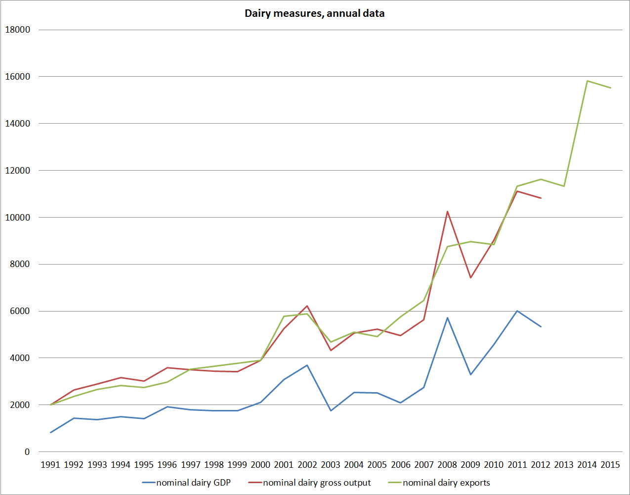
When the data are available, we will no doubt see that dairy sector gross output and GDP rose quite sharply over the last couple of years. The year to March 2015 will no doubt be a record high (in as much as record levels of nominal variables mean very much). And then it is likely to fall back. But again, on international dairy prices as they stand now, and the exchange rate as it is, it seems unlikely that nominal gross output or GDP for the dairy sector will fall much below the previous peaks – $10 billion gross output, and $6 billion of GDP. If so, again it is difficult to see where material banking system stresses could arise from – even though it will no doubt see some more exits, and quite a bit of nervous hand-holding by the banks.
It is worth briefly reflecting on the $6 billion of dairy GDP. That does mean that dairy farmers on average have $6 of debt for every $1 of GDP they generate – and among the indebted farmers that ratio will be much much higher. That would be much higher than the ratio of household sector debt to household sector income, but then much of the household debt is supporting consumption not production.
So what could go really wrong? The usual story around dairy debt is that if New Zealand’s export commodity prices collapse then the exchange rate should also be expected to fall sharply, mitigating the adverse impact on New Zealand dollar prices, and probably on local rural land values too. That hasn’t happened so far. There are some obvious reasons, including the Reserve Bank choice to hold policy interest rates above the level that was required to have kept inflation on target. And weak as dairy prices are now, our overall terms of trade still don’t look likely to fall to any sort of historically low level this year. But if global dairy prices don’t fall much further, and the exchange rate hangs around current levels, or falls, there isn’t likely to be any systemic threat arising from the dairy debt. The nightmare scenario is one in which, for some reason, the exchange rate rises sharply from here, even as commodity prices stay weak. One possible scenario we toyed with a couple of years ago was a very disruptive new euro-area crisis, in which somehow currencies like the NZD and AUD became seen as some sort of refuge in the storm. It isn’t likely, but then tail risks matter. The experience of 2008/09 also argues against it: then both the NZD and AUD fell very sharply as speculative risk appetite unwound, even though the crisis had nothing directly to do with our two economies. It would seem likely that, eg, a disorderly break-up of the euro would be at least as large a trigger for hunkering down, and a quick flight to safety, that didn’t involve a surging NZD TWI.
I noted last week that deflation remained the biggest (if remote) medium-term threat to the stability of the New Zealand financial system, as its loan books are structured currently (debt ratios pretty flat, debt stocks growing slowly). But the dairy sector debt should be relatively immune to that threat. I think it is pretty common ground that if the OCR were ever cut to zero, or slightly negative, the NZD TWI would fall sharply, The main attraction in holding NZD assets over the years has been yield pick-up, and when that vanished- as it did in 2000, when the Fed funds rate briefly matched the OCR – so does any strength in the NZ exchange rate. Of course, during the Great Depression deflation did pose huge problems for New Zealand’s farm debt, but getting a downward adjustment in the exchange rate then was a much more difficult and political process. The then Minister of Finance resigned in protest when the government finally imposed a devaluation – these days if things went badly a sharp fall in the exchange rate would seem much more likely to be welcomed.
And, finally, one of the more sobering graphs I’ve seen in recent years ( there are many to choose from). This is real agricultural sector GDP, which is available quarterly (albeit prone to considerable revisions), shown alongside total real GDP.
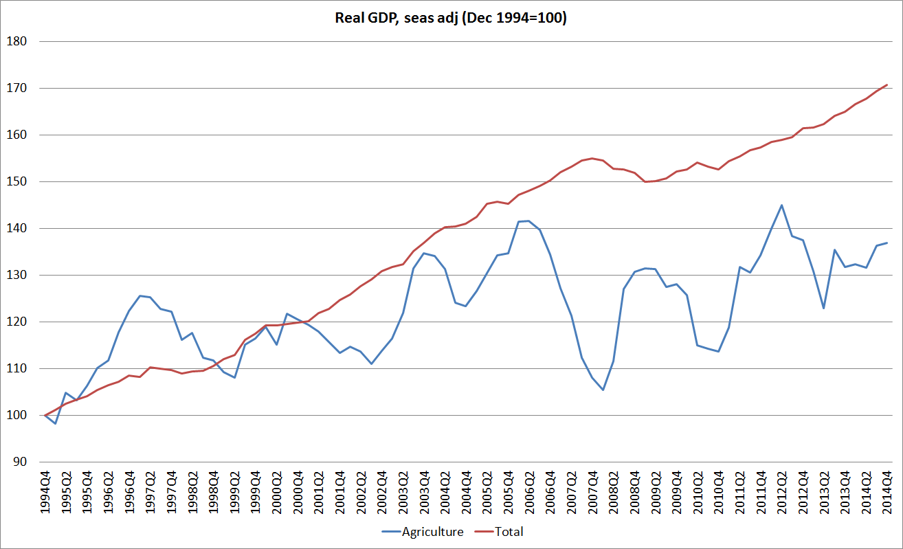
There is quite a bit of variability of course – droughts etc – and this is the whole agricultural sector, not just dairy, but over the 10 years or so that the terms of trade have been strong there has been almost no growth at all in real agricultural sector GDP. Representatives of the manufacturing sector are prone to lament how manufacturing activity has been squeezed out, but actually even farm sector GDP has been tracking well below growth in total real GDP. In some respects, things might be a little better than the picture suggests. High dairy prices have encouraged greater use of more intensive production systems – more irrigation and more supplementary feed. Those inputs allow the production of more outputs, and the outputs can be sold for a higher price than previously. In other words, more money might be being made in dairying, even if the real (constant price) value-added in the diary sector hasn’t changed much. Ultimately it reflects the fact that there has not been much business investment taking place in recent years in response to the higher terms of trade – a very different picture from what was seen in Australia. If commodity prices settle back at pre-boom levels that may be no bad thing[1] – fewer wasted resources – but if, as the optimists believe, the long-term prospects for global agriculture, and the sorts of products New Zealand produces in particular, are very good then it might end up looking like something of a last opportunity. Daan Steenkamp wrote up some of this material at more length in a Reserve Bank Analytical Note last year.
Nasty financial crises usually follow fairly hard on the heels of periods of exuberance – surging asset prices, surging credit stocks, downward revisions in credit standards, and so on. In respect of dairy, all of those things were present in 2008, but they haven’t been in the last couple of years. That suggests that the systemic risks associated with the high level of dairy debt are low. Yes, an overhang of high debt stocks could still cause severe problems if a particularly unusual set of circumstances were to arise – there is always a hypothetical shock which could, in the extreme, prove too much for an indebted industry – but that is simply to say that all business, in a competitive market economy, involves taking risk. As consumers, we should not want it any other way.
[1] And the dairy component of the ANZ Commodity Price Index (expressed in USD terms) is now only around 10% higher in real terms than it was when the series began in 1986.
