Yesterday I looked briefly at some of the recent indicators of relative economic performance for New Zealand and Australia over the last few years. New Zealand hasn’t done that well.
One item I didn’t mention was the exchange rate. The fevered talk of parity parties has, fortunately, receded once again, although who knows for how long. It will probably happen eventually – after all, New Zealand’s inflation rate averages a little lower than Australia.
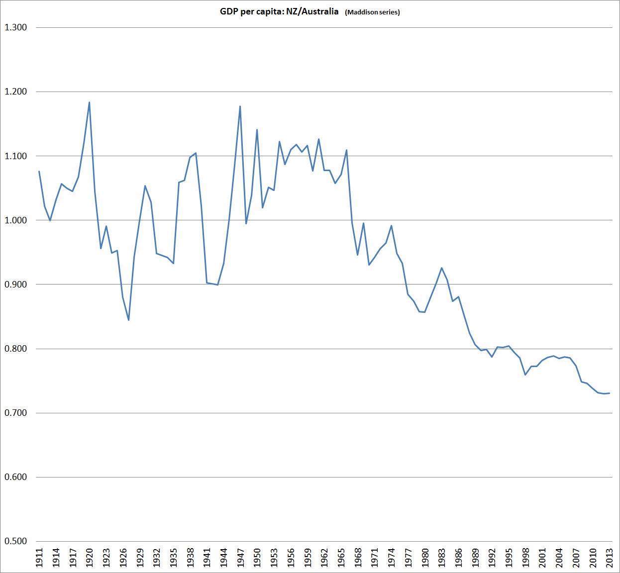
We’ve been at parity before of course. Indeed, for all our history until 1972 a New Zealand dollar (or pound) had been worth as much (or more) as an Australian dollar (pound). Until 1914 that was all about common gold convertibility, and neither country had a central bank. This chart starts in 1911.
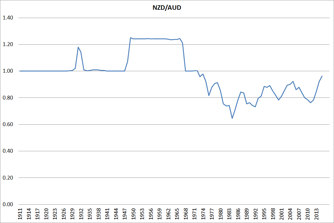
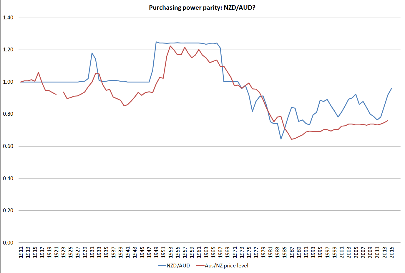
In the long long run, changes in the exchange rates of similarly wealthy countries should broadly reflect differences in the inflation rates of the two countries (relative purchasing power parity). My reading of the literature suggests that empirical support for this long-term proposition has been growing. But here is what the chart looks like for New Zealand and Australia (my data source for Australia, Measuring Worth, has a missing observation in 1922). When I first did the chart a few years ago I was pleasantly surprised by the way the two lines moved broadly together. When our nominal exchange rate appreciated against Australia’s – as it did most enduringly in 1948 – it was associated with a rise in Australia’s price level relative to ours. And, of course, as our high inflation (relative to theirs) became an increasing issue from the mid-late 1960s, our nominal exchange rate fell substantially relative to theirs. The troughs were in the mid 1980s.
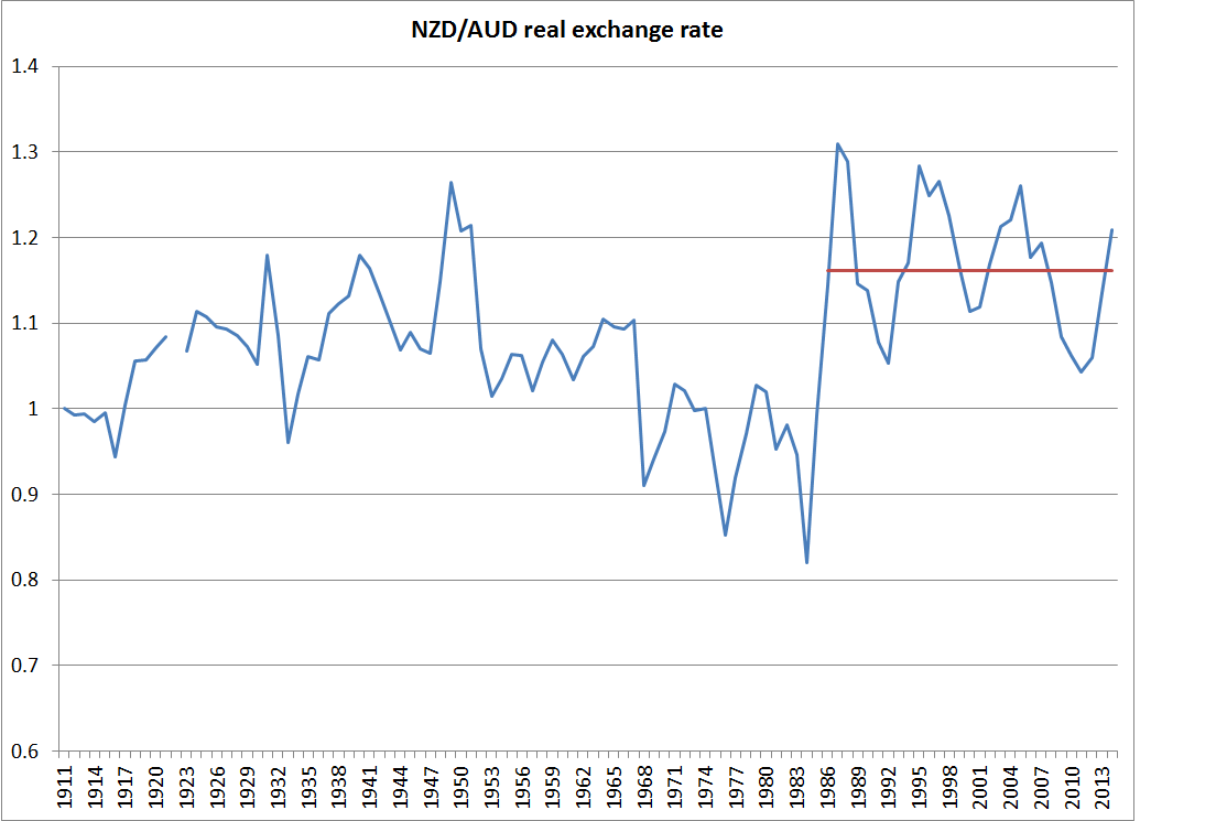
What if we combine the two lines into a real exchange rate series? Two things strike me? The first is just how relatively tight a range that bilateral real exchange rate has fluctuated with in over a century. And second is the way the real exchange rate appeared to be falling in the 1970s and early 1980s, only to step up and subsequently fluctuate around a new materially higher level. The last observation is for 2014 (annual averages), but the current level would not be much different.
At one level, that higher real exchange rate might look like a good thing. After all, it means we can buy stuff abroad more cheaply, lifting the purchasing power of our incomes. The problem is that we have to earn an income before we can spend it. And there our performance relative to Australia has not been good.
People often point out that the higher terms of trade has lifted the ability of New Zealand firms to compete profitably internationally. All else equal that should be consistent with a higher real exchange rate. The problem with that story here is that we are doing a NZ vs Australia comparison and New Zealand’s terms of trade have done less well than Australia’s.
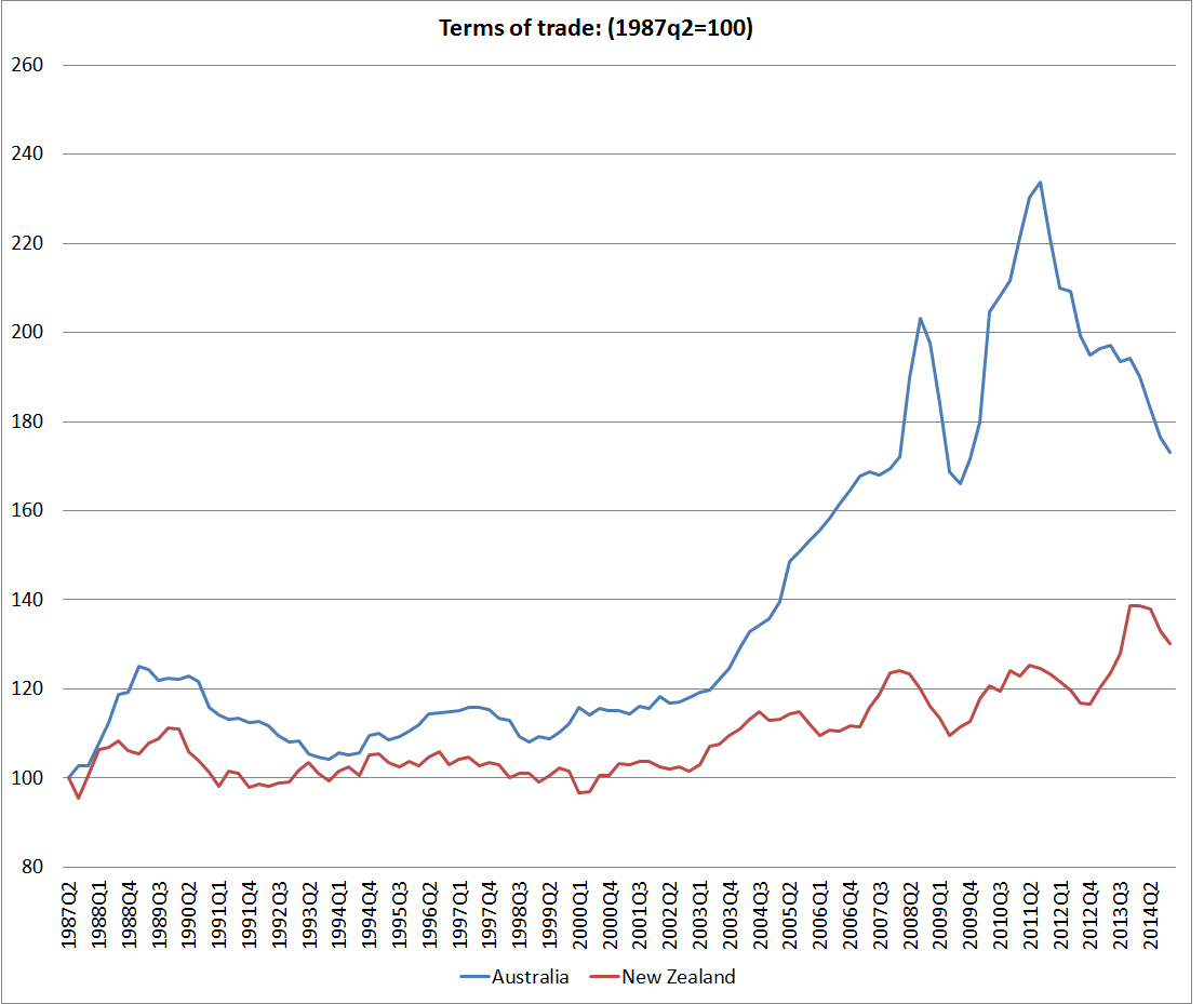
We only have consistently national acccounts deflator for both countries back to 1987, but actually all the differences in the two terms of trade are in that recent period. This chart shows merchandise terms of trade for the two countries back to the 1920s. They are remarkably similar until the last decade or so.

And this chart is the SNA terms of trade for the two countries, drawing from the national accounts export and import price deflators. Despite the difficulties of the last couple of years, Australia has still experienced the much larger increase in the terms of trade than New Zealand. All else equal, we might have expected our real exchange rate to have fallen relative to Australia’s. It hasn’t of course.
There is also good reason, and some cross-country supporting evidence, for the idea that real exchange rates tend to move to reflect longer-term trends in relative productivity. That makes sense. A country with poor productivity growth is likely to need to see its real exchange rate fall, to “compensate” for the impact of poor productivity – enabling its tradables sector firms to remain competitive, and increasing the relative cost of imported consumption items.
And what is the New Zealand vs Australia story. We don’t have productivity data back to 1911, but we do have estimates of per capita real GDP, and over the long haul differences in growth rates will mostly reflects changes in relative productivity. Using Angus Maddison’s estimates, spliced with Conference Board estimates for more recent years, this is the relative GDP per capita picture. There is quite a lot of year-to-year noise in the earlier period, but painting with broad brushstrokes one could characterise the last century as one of a first half where New Zealand and Australian real per capita GDP growth were very similar (and levels, on these estimates, were pretty similar too). But since the mid 1960s, the traffic has been almost all one way: New Zealand real GDP per capita has fallen very substantially, and pretty steadily, against Australia’s. Maybe the worst of the falls are now behind us, but there is no sign of any sustained reversal.
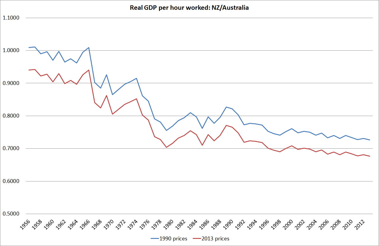
The Conference Board estimates GDP per hour worked for the two countries since 1956. No doubt there are some heroic assumptions behind the New Zealand estimates in particular (Australia has official quarterly national accounts data back to 1959) but they are the best we have for now. And the picture is much the same: a sharp decline over the full period, which continues more recently (I showed yesterday the quarterly chart of real GDP per hour worked for the period since 2007). And the decline in much the same whether one uses the measures calculated on 1990 prices (also the basis for the Maddison GDP estimates) or 2013 prices.
And so we have this somewhat paradoxical position of quite a high real exchange rate (last 20-30 years) relative to Australia, even though our terms of trade have done much less well than Australia’s, and our labour productivity and growth performance have been materially less than Australia’s. Consumption of tradables is made relatively cheap, while producing for the international market – a key element in longer-term prosperity – is expensive. It is perhaps not that surprising that our export share of GDP has remained so weak, and our aspirations to close the income gaps to the rest of the advanced world have shown no sign of being met.
After spending years reflecting on the issues, I’m convinced there is nothing much wrong with New Zealand’s economy that a real exchange rate averaging 20-30 per cent lower for a few decades could not resolve. Perhaps issues around size, distance, and agglomeration mean we will never again be the richest country in the world, but we can do a great deal better than we have done in recent decades.
Views differ on why the real exchange rate might have been, on average, so strong over the last few decades. My story emphasises the high average real interest rates that have been needed to balance demand and supply (keep inflation near target) in New Zealand relative to those abroad. As just one example, the yield on a 20 year New Zealand government inflation-indexed bond has been around 2.2 per cent this month. The yield on 20 year US government inflation indexed bond has been around 0.7 per cent. Persistent differences in returns like that, which don’t appear to reflect differences in riskiness, have really big (and quite rational) implications for the exchange rate.
But, to be clear, this is not a monetary policy story. Long-term real interest rates reflect the pressures on real resources that result from government and private choices. They are real phenomena, not monetary ones.
For those who haven’t come across my story in this area before, much of it is elaborated in this paper. I included there some charts suggesting that the strength of the real exchange rate, relative to underlying economic performance, is not just an issue for comparisons against Australia.
