Interest rates

The Reserve Bank Monetary Policy Committee has had an unchanged membership for its life so far, but tomorrow’s decision (and MPS) will be the last for this group. The Deputy Governor Geoff Bascand moves on in January, the Chief Economist moves out in February, and the terms of two externals expire shortly thereafter (although one or both could be reappointed). On those changes, interest.co.nz had an interesting article yesterday which more or less confirms that the chief economist had been restructured out as the Orr permanent-revolution (at least until he finds a suitable mix of lackeys) rolls on, reports on Orr openly insulting a fellow speaker at an event they were both speaking at, even as it ends up (seemingly) trying to retain at least a little RB favour/access with this line

Nonetheless, Orr is community-minded and isn’t afraid to stand up to those with corporate interests, who spinelessly try to discredit their regulator by attacking his personality.

In days gone by surely a sub-editor might have questioned the unqualified unsupported used of a term like “spinelessly”, especially when it is well known that Orr has been on record abusing people who criticise his approach or policies, including those with no “corporate interests” whatever.

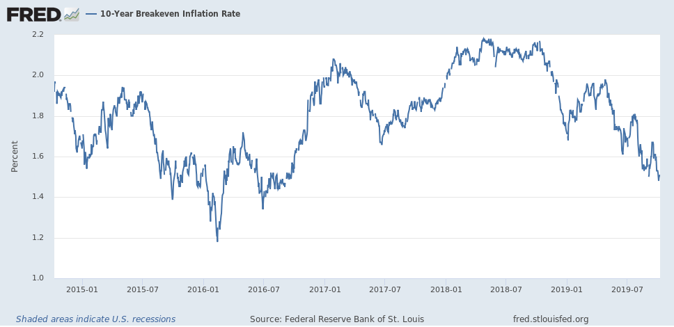
Critical as I am of Orr (in particular) and the upper levels of the Bank more generally, I continue to more or less expect them to do “the right thing” on basic monetary policy stuff. It won’t be well done, it won’t be well-communicated, it won’t typically be supported by robust or insightful analysis, but this group don’t seem like the sort who are going to wilfully let core inflation get away on them. That must be a pretty common view, because although shorter-term inflation expectations (measured in the Bank’s survey of semi-experts etc) have increased markedly, five-year ahead expectations are little changed from where they were 3 or 4 years ago.

Were I in their shoes I would increase the OCR by 50 basis points tomorrow. There are really two reasons for that. The first is simple: there is not another review until February (because a few years ago the Bank rashly decided to give its monetary policy function a long summer holiday). With two reviews during that period perhaps it might have been okay to have done two 25 point moves (not that there is any particular problem with 50 point changes, especially when the possibility is openly being canvassed). But there is also the underlying macro situation. Core inflation took the Bank by surprise a lot over recent months, and if it is not now outside the 1 to 3 per cent target range, neither is such an outcome that should be contemplated lightly. And inflation expectations measures have moved up a lot. There is no guarantee that the numbers reported in surveys are actually the numbers firms and households have in mind when they themselves are transacting, but it wouldn’t be wise to jump to the conclusion otherwise. Here is the two year measure.

2 yr ahead nov 21

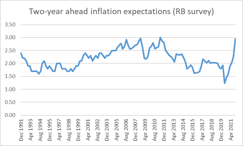
The level of expectations is back to around the peaks in the 00s (prior to that the target itself was lower) and the increase over the last 12-18 months has been sharp. Early last year we needed lower nominal interest rates just to stop real rates rising. Now, we need rising nominal rates to stop short-term real rates falling – such falls would be undesirable in a climate of full employment and high/rising core inflation. One of the basic precepts of inflation control is that, all else equal, short-term rates need to be increased (decreased) as least as much as any rise (fall) in inflation expectations. Since even a 50 basis point increase tomorrow would only take the OCR back to where it was at the start of last year, and on almost every measure expectations are materially higher than they were then – and core inflation itself is much higher – the prudent response would be a substantial increase in the OCR now.

And I say that as someone who is quite open-minded about where the OCR gets to next year and beyond. As a matter of general principle I don’t think forecasting beyond the next quarter or two makes much sense, and the pandemic uncertainties here and abroad only compound that (we still have no firm take on output losses in the September quarter and it will be December next week). But not all the straws in the wind necessarily point in the direction of repeated or substantial further increases. It isn’t obvious that the wider global environment is persistently different – in ways that would support higher neutral real interest rates – than it was two years ago (and recall that global policy rates were being cut in 2019), fiscal policy (here and abroad) seems more likely to be a contractionary influence (fiscal impulse) than an expansionary one over the next few years, and for New Zealand reopening borders could still be more of a drag on domestic demand than a boost, at least for as long as it is very difficult for Chinese tourists to travel. Government policy generally is hardly set to promote a sustained acceleration in productivity growth (and associated investment) – if anything, we will be lucky to avoid a worsening set of outcomes. And if you believe in housing wealth effects – I don’t at an aggregate level – there could be some drag from that source next year. And so on. 50 points now and then approach each review next year with a genuinely open mind seems to me the most sensible, and prudent, approach.

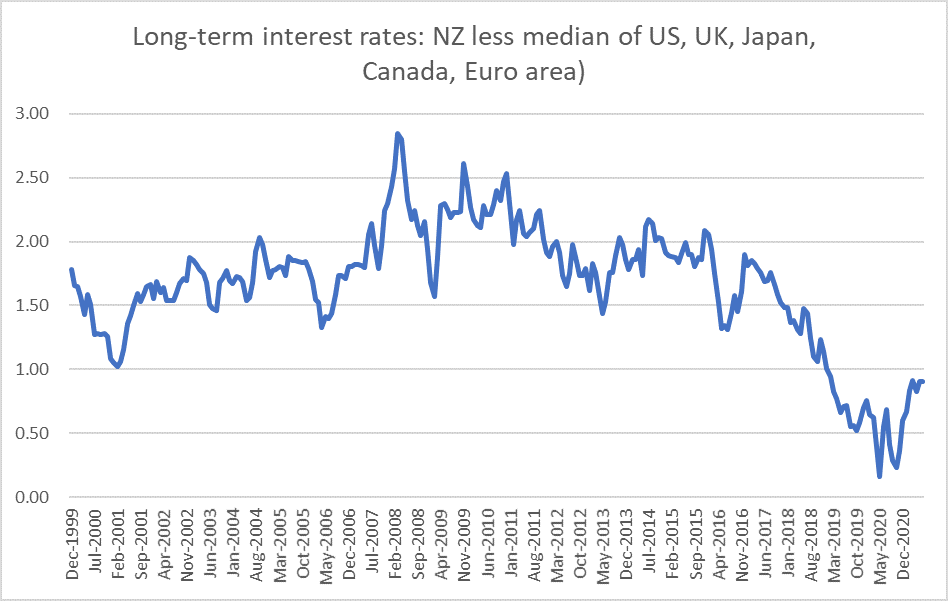
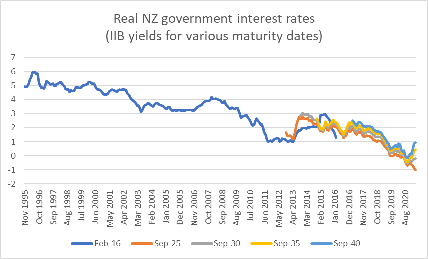
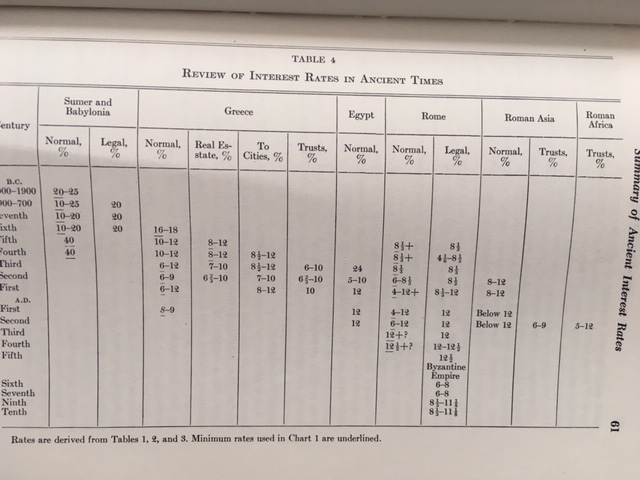
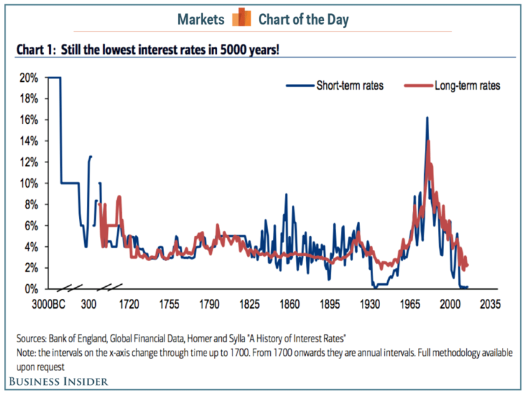
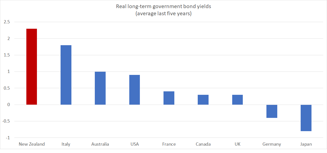
For all the talk of how low interest rates are at present, it is worth remembering that New Zealand rates remain high by international (advanced country) standards. Very long-term interest rates – one silver lining to the higher government debt is that we now have a few more indicators – are the best place to look, abstracting from short-term cyclical effects.

As of yesterday, our 30 year government bond rate was 2.93 per cent. The comparable US rate was 1.91 per cent. The inflation targets in the two countries are all-but identical (over horizons like that) and the US has a far worse public debt position – actual and outlook than New Zealand. And the US is, by advanced country standards quite a high interest rate country: the German government 30 year bond yield is about 0.0%.

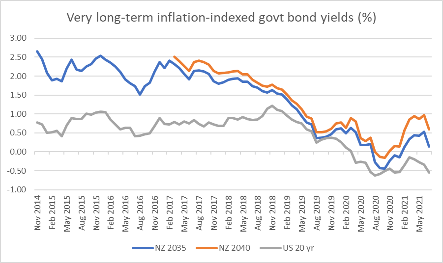
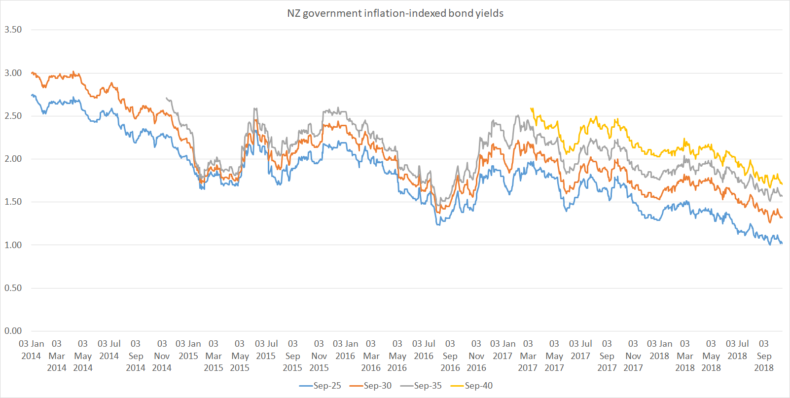
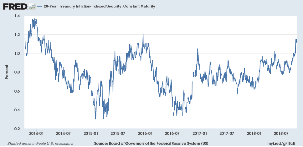
What about real interest rates? The market in inflation-indexed bonds is less deep but the amounts on issues are not now small. The longest New Zealand indexed bond has 19 years to maturity, and yesterday was yielding 0.71 per cent. By contrast, a US 20 year inflation-indexed bond was yielding about -0.71 per cent (30 year indexed bonds were yielding -0.52 per cent). But, to repeat, by advanced country standards the US is a high interest rate country. Germany has a 30 year inflation-indexed bond currently yielding -1.98 per cent.

These are really large differences, which have implications for how we think about the exchange rate: expected risk-adjusted returns tend to equalise across countries through the exchange rate, and whether the difference is 100 basis points (on a 30 year nominal bond) or 140 basis points (on a 20 year indexed bond) they point towards an overvaluation relative to the USD of perhaps 30 per cent, and something even larger relative to the euro. You’ll recall that New Zealand exports and imports as a share of GDP have been increasingly sluggish this century. There is a connection.

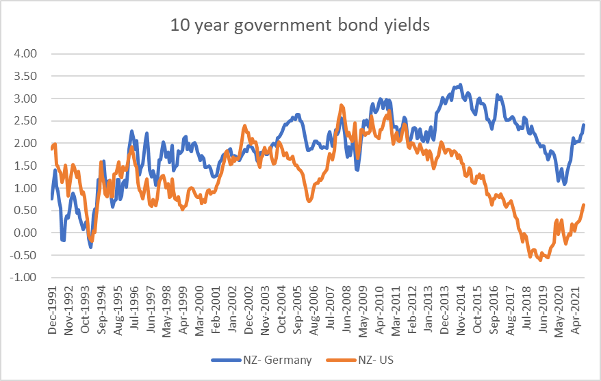
The bond yield differences have been around for a long time and show little sign of closing on any sort of sustained basis. You might think there was some evidence to the contrary for the US, at least if you look just at the most-common comparison, that of 10 year nominal bond rates.

us and germany

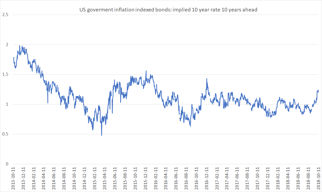
But for some years now both countries have had 20 year inflation-indexed bonds (the US numbers are the US 20 year constant-maturity yield, and for New Zealand the closest of the 2035 and 2040 bond yields).

20 yr yields

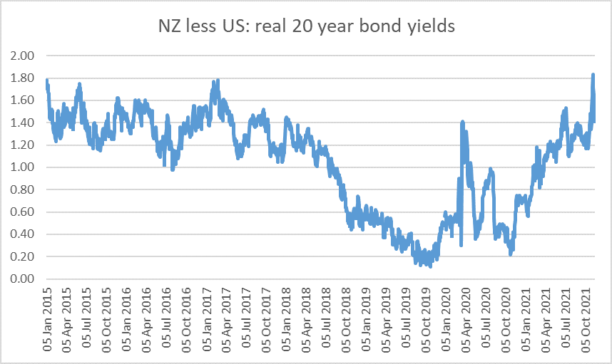
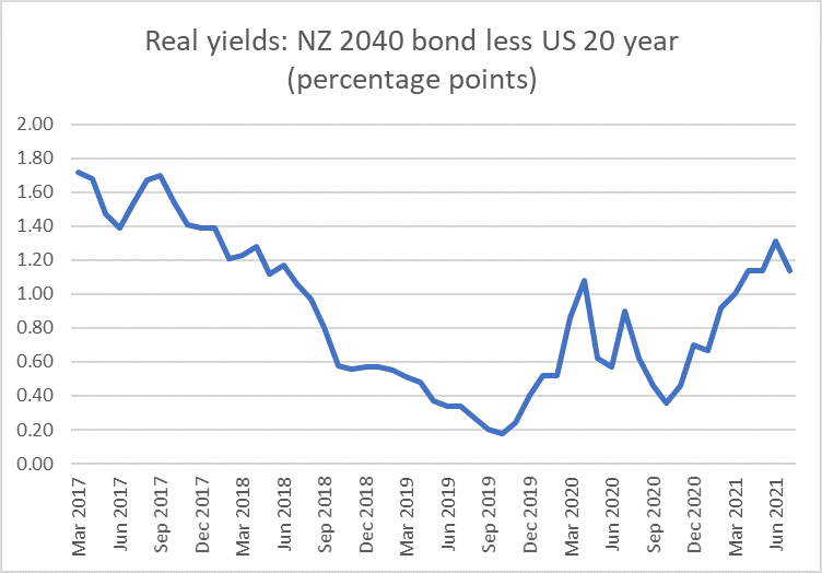
Our rates did look to be converging on those of the US for a time – by the time we went into Covid US short-term rates were much higher than those in New Zealand (and even more so relative to most other advanced economies). But as emerge, the gap now seems to be right back to where it was (the last observation on the chart is a spread of 1.41 percentage points). It is a really large difference, and not at all out of line with differences (New Zealand rates higher) than we’ve experienced over most of the last 30 years.

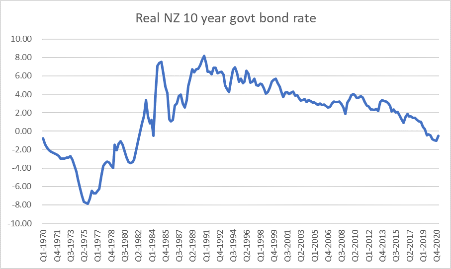
These are differences that cannot reflect default risk or (credibly) inflation risk. They seem to reflect differences – actual and expected – in the savings/investment pressures in the two economies, which in turn explain the respective neutral interest rates (ie rates consistent with inflation being at target while the economy is fully employed).

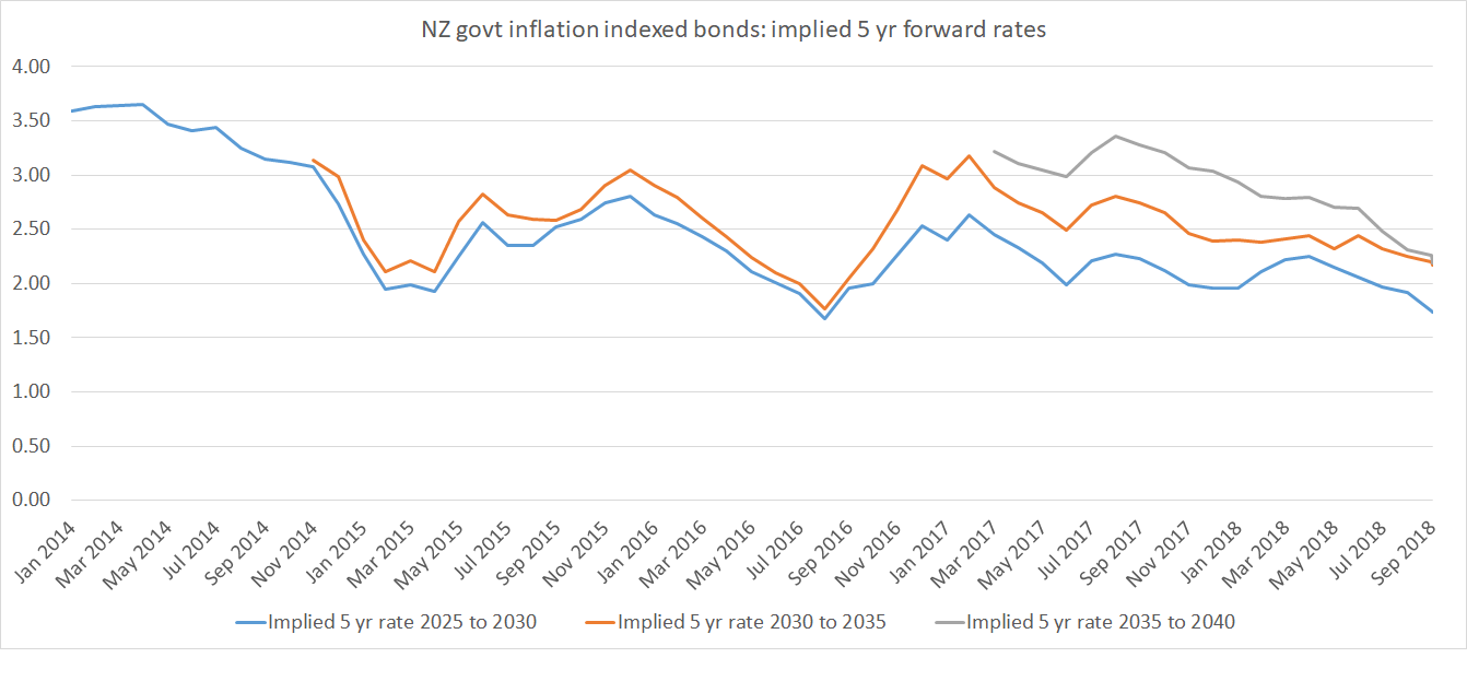
Finally, a chart that intrigued me when I generated it, but in which I don’t place much confidence. One advantage of a wider range of government bonds is that one can back out of the resulting yield curve implied forward interest rates. Thus, with 2035 and 2040 indexed bonds, one can back out the implied 5 year real rate for the period between 2035 and 2040 (ie far into the future, and not influenced – in principle – by current cyclical pressures, or even current members of the MPC or current government ministers).

Yields on both bonds look very low at present (0.56 per cent and 0.71 per cent yesterday), but what about that implied five year forward rate? Here is that chart for the last few years.

implied forward 5 year rate

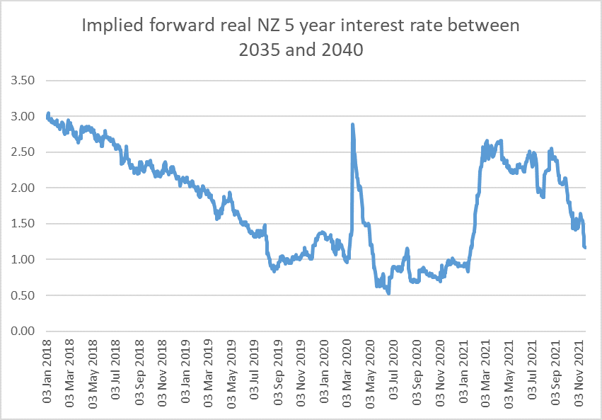
Earlier in the year it might have looked as though the “new normal” might have been expected to involve much higher real rates in the medium-term future. But as things stand right now, the implied forward rate is just a bit lower than it was in early 2020. I’m reluctant to put very much weight on this – thin market, quite sensitive to small changes in individual 2035 and 2040 yields etc – but for what it is worth – and for now – markets seem to be pricing a medium-term return to the sorts of real interest rates (strangely low, in many ways) we had a couple of years ago.

Markets have, of course, been known to be wrong (often), but I don’t feel blessed with the insight to offer a view on whether this implied view is right or wrong, let alone whether if it were to be wrong, in which direction any error might be. Used as we are to positive real interest rates, there is nothing natural or inevitable about them.

Checking the gap

Back in the very early days of this blog, in a post about the gap between New Zealand interest rates and those in other advanced countries, I ran this chart constructed from OECD data.

int diffs to 2014

There had been no sign of the large gap between our long-term interest rates and those abroad systematically narrowing. These were nominal interest rates, but as another chart in the same post illustrated the gap between our inflation rate and those in other advanced countries had also been quite stable, suggesting that the story held for real interest rates as well. Unless your economy is recording stellar productivity growth year after year, large positive gaps between your real interest rates and those in other countries are usually not thought to be “a good thing”.

In recent months all the focus locally has been on the low absolute level of interest rates. In fact, globally there were stories in just the last few days of some key international real interest rates reaching new long-term lows.

But what has been happening to the gap between our interest rates and those abroad?

The gap between our policy rate (the OCR) and those in other advanced countries has certainly narrowed – New Zealand is just a touch higher than policy rates in the US, UK, and Australia, and even among the countries with negative policy rates the gap to Switzerland (-0.75 per cent) is now only 100 basis points. When I wrote the 2015 post, our OCR was 300+ basis points higher than policy rates in most of these countries.

Of course, if you believe the market economists, those gaps are about to start widening again. New Zealand won’t be the first OECD country to raise policy rates (Iceland and Mexico have already done so this year) but most don’t seem likely to move for some time yet.

But what about longer-term interest rates, which typically embody expectations about future short-term rates?

In this chart, I’ve updated the red line from the previous chart (New Zealand 10 year rates relative to G7 ones) up to June

int rate diffs to 2021

The gap is now a lot smaller than it was for most of this century (albeit quite a bit larger than it was at last year’s lows, when the OCR was expected to stay very low, or be taken lower, for quite a few years to come). At current levels, the gap is a bit higher than it was at the end of 2019 before anyone had heard of Covid.

But what are markets saying about the very long term, beyond Covid and the immediate economic challenges, and focusing on real yields from the inflation-indexed bond markets?

Without a Bloomberg terminal, time-series data aren’t readily available for lots of countries, but here are the yields for New Zealand and the United States (we have two specific bonds, while the US publishes a constant maturity 20 year series). The first chart shows the levels of respective rates, and the second the gap between the yield on the New Zealand 2040 bond and the US 20 year.

real 2021 1

real 2021 2

The absolute levels of all these rates are very low (in the US near record lows), but the gap between New Zealand and US long-term real rates has opened right back up again, and is now around where it was at the start of 2018.

That is just the US of course. But the thing is that, in OECD terms, the US these days is a relatively high interest rate country- highest 10 year bond rates of any of the G7 countries.

Here is a chart of the yields on the German government’s 2046 maturity inflation-indexed bond.

german indexed bond

Even allowing for the fact that the New Zealand government bond matures in 2040 and the German one in 2046, there is gap in yields of something a bit over 200 basis points.

These are really big differences. And they have nothing to do with the policy stances for the time being of respective central banks – which can affect expected real interest rates over the first few years of an indexed bond. but are lost in the wash over 20 years (when people, institutional structures, and central bank mandates change anyway). These differences are about real economy phenomena.

There are, of course, conventional suspects. These are government bonds so what about the respective levels of government debt. But, of course, New Zealand has lower government debt (as a share of GDP) than most OECD countries, including both Germany and the United States. Most probably, we are expected to continue to keep government debt well in hand. If the market were pricing much sovereign credit risk across these economies, the real risk-free gap would be even larger than the numbers I’ve shown here.

Perhaps the real interest rate gaps are now a bit narrower than they were five or six years ago. Even then, however, we should be cautious about welcoming the change without understanding it better. It could, for example, represent (implicitly) a reduction in long-term expectations about relative economic growth and the demand for real resources that business investment gives rise to – and if so we might interpret differently an implicit reduction in expectations about relative productivity growth and an implicit reductions in expectations of relative population growth. As it is, it is simply too early to tell.

Markets tend not to leave free lunches on the table though. And if New Zealand government bonds are offering unusually high local currency yields for a stable low-debt country, the counterpoint is likely to be in the exchange rate. Economists have a model known as Uncovered Interest Parity (UIP) in which the difference in two countries’ risk-free interest rates is equal to the expected change in the exchange rate between those two countries over the period in question. It isn’t a proposition that actual exchange rates (ex post) reflect those initial interest rate differences – all sorts of shocks intervene almost every day – but something like an equilibrium condition ex ante.

If, for example, New Zealand real interest rates for a 20 year maturity are 150 basis points higher than those in other economies, that would be consistent with an implied expectation of a 35 per cent reduction in the real exchange rate over that 20 year period.

Of course, as I’ve shown here, New Zealand interest rates have averaged quite a lot higher than those abroad (even in real terms) for a long time, and although the exchange rate has at times been volatile (less so in the last decade than in the previous couple) we have not seen that sort of sustained fall in the real exchange rate, so there have (ex post) been windfall gains to those who bought and held New Zealand bonds. But that doesn’t change the indications that serious imbalances are still present in our economy (not just this year, not just about Covid, but something deeper and more persistent): persistently higher real interest rates than those abroad, a real exchange rate that has not adjusted structurally lower, weak business investment, low productivity growth, and feeble external trade performance (exports and imports flat or falling as a share of GDP.

(But, to anticipate comments, it has nothing whatever to do with house prices. Repeat after me, over the decades we have built fewer houses – and freed up much less land – than our population growth would have suggested was warranted. It is the commitment of real resources – physical building of houses, subdividisions etc, that (all else equal) puts pressure on real interest rates, not house price developments – lamentable outcomes of other policy choices that they are.)

(a) real interest rates, and (b) NZers’ migration

No, I’m not getting back into some routine of daily posts, and on this occasion the two topics don’t even have anything to do with each other, but are just a couple of a leftovers from things I was looking at over the last couple of days.

In my fiscal posts this week I’ve noted that the government is consciously and deliberately choosing to run cyclically-adjusted primary fiscal deficits in the coming year larger (probably much larger) than we’ve seen at any time since the end of World War Two. I noted in passing that although people are conscious of stories of large fiscal deficits under Robert Muldoon’s stewardship, in fact a large chunk of those deficits was interest payments, and this in an era when inflation was high, sometimes very high. When nominal interest rates are high just to reflect high inflation, the resulting “interest payment” is really more akin to a principal repayment. Back in the day, various people – especially at the Reserve Bank – did some nice work inflation-adjusting various macro statistics.

But just to check my point I put together this graph

real NZ bond yield since 70

What have I done here?

  • got the OECD’s series for long-term nominal bond rates that goes back to 1970 (this will mostly be 10 year bonds or thereabouts, although for a time in the late 80s we were not issuing bonds that long),
  • for the period since 1993, subtracted the Reserve Bank’s sectoral factor model measure of core inflation,
  • for the period up to 1993, subtracted a three-year centred moving average of the CPI inflation rate.

So for almost entire period prior to 1984 real New Zealand government bond yields were negative.

This is, of course, not testimony to different patterns of desired savings and investment, but (mostly) to financial repression. Until 1983 government bond yields were administratively set and – much more importantly – most financial institutions were simply compelled by law to buy and hold government securities (often 25 per cent of more of total deposits). The costs were borne by depositors.

It is also worth noting that pre-1984 the government was also borrowing, at times heavily, directly from the retail market, at times offering real interest rates well above those shown here. And the government was also borrowing, again at times quite heavily, from abroad. In some of those markets, inflation was a big chunk of the headline interest rate, but in none of the major borrowing markets were government borrowing rates by then as repressed as they were still in New Zealand.

Finally, note that in the chart I have compared a 10 year bond yield to a one year inflation rate. But at least since 1995 we have had a direct read on real government bond yields through trading in government inflation indexed bonds. As this chart shows, the pattern over that period is very similar,

IIB yields since 95

Developments in the last few months are interesting, but that is something for another day.

My second brief topic this morning was sparked by a strange quite-long article in the New York Times yesterday headed “New Zealanders are Flooding Home: Will the Old Problems Push Them Back Out”. A lot of work seemed to have gone into it, and some of the individual anecdotes were not uninteresting (and in the small world that is New Zealand, one of the recent returnees was even someone I’d once worked with) but…….no one (do they have factcheckers at the NYT?) seemed to have stopped and checked the numbers. It took about two minutes to produce this graph that I put on Twitter yesterday.

NZ citizen migration

Using the official SNZ estimates, the problem with the story was that arrivals of New Zealanders had not really changed much at all – a bit higher than usual in the March 2020 year, and then lower than usual in the most recent year. There has, of course, been a big change in the net flow of New Zealand citizens but……..that is mostly the very steep fall in the number of New Zealanders leaving. That reduction – over the March 2021 year – is, of course, not surprising in the slightest given (a) travel restrictions to Australia for much of the year, and (b) travel restrictions and/or bad Covid in much of the rest of the world.

But, on official estimates, there simply is no flood of New Zealanders returning home. None.

This morning I looked a little more closely, and dug out the quarterly (seasonally adjusted) version of the data.

nz citizen migration quarterly

It is, of course, much the same picture, but what surprised me a little was the upsurge in (estimated) arrivals back in late 2019, pre-Covid. Here it is worth remembering that until a couple of years ago our PLT migration data was based on reported intentions at the time of arrival, but the 12/16 approach now used looks at what actually happened. It looks as though some New Zealanders who had come to New Zealand in late 2019, probably not intending to stay, ended up doing so, voluntarily or otherwise, once Covid hit. So they are now recorded as migrant arrivals in late 2019 even though at the time they would not have thought of themselves as such.

But it does not change the picture: there is no flood, or even a little surge now, in returning New Zealanders. A problem with the 12/16 approach is that the most recent data is prone to quite significant revisions (and that is particularly a risk when the normal patterns the models use aren’t likely to be holding, but there is nothing to suggest there is a significant influx of returning New Zealanders happening.

There will be always be natives who’ve spent time abroad returning home. It happens even in rather poor and downtrodden countries, and it happens here – always has, probably always will. That adjustment isn’t always that easy, plenty of people often aren’t sure for a long time that they’ve made the right choice. Covid means a few different factors have influenced some of those choices for some people. But there is no “flood”, just a similar to usual (or perhaps now smaller than usual) number of returnees, coming back to a New Zealand of extraordinarily high house prices and productivity levels and incomes that increasingly lag behind a growing number of advanced economies. Those persistent failures – and the indifference of our main political parties – should be worth a story. But not the non-existent flood.

Interest rates

There was a quite odd paper released yesterday by the New Zealand Initiative –  the business-funded think tank, that has done quite a range of work on coronavirus-related policy issues –  on monetary policy, fiscal policy, interest rates, and asset prices.  I know some of my readers will agree with at least some of Bryce Wilkinson’s paper.  I disagree with it almost entirely, unlike the previous paper on some related macro issues the Initiative released under Bryce’s name (where my reaction was my along the lines of “yes, but…” or “perhaps, but that isn’t the whole story”.  On Bryce’s telling in this latest paper, central banks appear to be little more than wreckers and debauchers, driving the world inexorably towards its next (real) economic and financial crisis.

If I were fully well, I would devote a lengthy post (or two) to the paper.   Bryce is a smart guy and there is a range of material there that really should be carefully unpicked and scrutinised.  As it is, for today there will be just something brief.

Bryce seems to hold it against our Reserve Bank that it has cut the OCR to 0.25 per cent.  This is from pages 7 and 8

First, the sharp reductions in policy discount rates are an active response to hurtful economic shocks rather than a passive response to secular trends. Think of it as a response to signs of financial market stress – falling share prices, rising bond yields, a ‘dash for cash’ and market turnover drying up – causing step reductions in policy discount rates, with limited reversals for fear of triggering renewed signs of stress.

Second, policy discount rates still differ considerably around the world. They are the lowest by far amongst European and Scandinavian countries, Japan, the UK and the US. Outside that group, the Bank of International Settlements shows only Israel has a policy interest rate lower than New Zealand and Australia’s 0.25%. Of the 38 central banks in its dataset, half had policy discount rates in April of 1% or more.

and this footnote appears a page or so earlier

The Bank of International Settlements database shows that in April 2020 the policy rates of 29 of 38 central banks around the world were higher than for these four central banks. Israel, with a policy rate of 0.1%, was the only non-European central bank to be below New Zealand and Australia’s 0.25%. Almost one third of the central banks had policy rates of 2.5% or higher in April.

The first paragraph is mostly just out of step with the actual historical record.  Policy rates around the world have not been cut this year mostly because of financial market stresses –  which didn’t even really appear until mid-March –  but in response to rapidly deteriorating economic situations and emerging downside risks to inflation.

But what of those policy rates?  Here is the chart of nominal policy interest rates from the BIS.

policy rates BIS

(I capped the scale at 10 per cent –  Argentina actually has a policy rate of 38 per cent, but I guess Bryce won’t be commending their example to us.)

One can quibble about precisely which policy rate to use –  most reckonings for the ECB would probably use the deposit rate of -0.5 per cent, and although New Zealand and Australia are shown here as having the same rate in fact the effective rate in Australia is 15 basis points lower than it is here.   One could reasonably delete a couple of entries from the chart altogether –  Hong Kong and Denmark have long-term fixed exchange rates, and Croatia describes its monetary policy as keeping the exchange rate to the euro stable.  Korea cut by another 25 basis points last month.   But these are small institutional details: the main point is that pretty much the entire group of advanced economies have nominal interest rates of less than 1 per cent.  In almost all those cases, real interest rates –  which central banks do not control –  are negative.

On the other hand, Bryce is right to note that there are still countries with higher rates.  In fact, I could link to a longer list with many more countries with higher interest rates (Pakistan 8 per cent, Uzbekistan 15 per cent, Ukraine 6 per cent, Zambia 9.25 per cent).

But it is hard to see what is appealing about almost any of those countries’ macro management.    Quite a few have higher inflation targets (Turkey, for example, has a notional target of 5 per cent, and actual outcomes last year of almost 12 per cent).  Of all those higher interest rate countries,  only Iceland really counts as an advanced economy and it is the country in the chart with (by far) the largest cumulative fall in its policy interest rate since just prior to the 2008/09 recession (where, on the Wilkinson telling, the rot really began to set in).    There’s China of course, but (a) interest rates aren’t a key part of the transmission mechanism in the PRC, and (b) whether it is public or private credit one worried about, China took the great-debauch path more than most.

I don’t know all those countries to the right of the chart at all well, but I can’t think of a single one that I’d exchange for most of the countries on the left of the chart, New Zealand included, whether it was macro management or political stability (often somewhat connected) that I had in view.  In fact, even Japan and the US –  for all their faults and all their debt –  easily look a better (nominal) bet than any of those on the right of the chart.

And although one wouldn’t really know it from the New Zealand Initiative piece all the OECD countries with the lowest net government debt are also bunched towards the left hand end of the chart.

2019 govt net debt (% of GDP)  (OECD)
Finland -48.9
Luxembourg -47.6
Sweden -33.5
Estonia -24.2
Switzerland -12.4
Australia -11.5
New Zealand -2.8
Denmark -2.5
Czech Republic 8.8
Latvia 9.9
Lithuania 12.4

Plus Norway of course, with huge net financial assets.   Any of them could readily borrow more –  much more –  with no central bank hand on the scale, but they (probably responsibly) chose not to.

Two final brief thoughts.

First, what I always find striking among the critics of central banks from the side Bryce comes from is how powerful they seem to think central banks are over very long-term real interest rates.  I think central banks have quite a degree of influence over economic activity over perhaps a 1-3 year horizon, but beyond that their only real influence is on inflation.  I’m pretty sure that would probably have been the view of a younger Wilkinson –  Muldoon might, as the story went, juice the economy in the short-run for electoral purposes, but before long all we’d be left with was higher inflation.  Thus, Bryce declares himself scandalised that in its LSAP programme the Reserve Bank bought long-term inflation-indexed bonds at negative real interest rates but (a) long-term real interest rates have been falling for decades (I always recall the funds manager who for years afterwards proudly boasted of having bought New Zealand inflation indexed bonds at a real yield of 6 per cent) and (b) market real yields for New Zealand indexed linked bonds first went negative in August last year, way before there was any talk of RB asset purchases.   There are deeper forces at work –  real savings and investment preferences –  which Wilkinson’s paper seems not to address at all.

Second, related to this Wilkinson appears to have a hankering for deflation.  I’m not unsympathetic –  although not wholly persuaded –  by the case that if there was rapid trend productivity growth it could be attractive to take the gains in a lower general price level rather than higher nominal wages.   But that bears no resemblance to the world in which we actually live today.    Productivity growth in the frontier economies has slowed materially – and on many reckonings was slowing even before 2008/09 –  and, of course, the New Zealand productivity record has been particularly dire.   And there tends not to be a huge demand for investment when firms don’t perceive substantial profitable –  often productivity-enhancing –  investment opportunities.   When investment demand is weak and savings preferences are relatively strong, real interest rates will be very low, perhaps even negative.  There is no iron-law of nature that says that the market-clearing price for using savings need be positive (in nominal or real terms).  That doesn’t saving unwise or imprudent at an individual level –  one of Wilkinson’s concerns –   but does suggest you can’t expect much, if any, of a low-risk return to such savings.  That is, of course, true of many prudent things we do in life (insurance most notably).


Expecting low inflation, and interest rates

The Reserve Bank Governor has been heard in recent months expressing concern about the possibility that inflation expectations –  what people think will happen, which in turn can influence how they act – will drift lower.   It might seem like a rather abstract concern, but there are real world consequences.  If everyone used to expect inflation would be 5 per cent and now expect it to be 2 per cent then, all else equal, nominal interest rates will have to be set 3 percentage points lower than previously just to get the same degree of monetary policy bite/stimulus.  All else equal, if inflation expectations –  the ones that genuine reflect behaviour –  are falling then real interest rates are rising.

Lower inflation expectations has been the trend in New Zealand for more than a decade now.  The Reserve Bank surveys households and perceptions of the current inflation rate and expectations of the future inflation rate are both quite a lot lower than they were prior to the last recession.  Term deposit rates are now perhaps 500 basis points lower than they were in 2007, but in real terms that reduction is perhaps no more than 300 to 350 basis points.  On the more-widely quoted survey the Bank does of somewhat-more-expert observers, medium-term inflation expectations are also about a full percentage point less than they were in 2007.   In those days we took as pretty normal inflation of around 2.5 per cent.  No one –  try some introspection on yourself –  thinks of that as a normal New Zealand inflation rate now.

Some of that reduction in inflation expectations hasn’t been unwelcome.   The Reserve Bank had tended to be rather too accommodating of inflation in in the top half of the target range (some mix of forecasting mistakes and a cast of mind that wasn’t too bothered) and the range itself had been pulled up a couple of times by governments.   Expectations –  of the sort that shape behaviour –  genuinely centred on the target midpoint, 2 per cent inflation, would be a “good thing”.  More recently, across the range of surveys, expectations look to have been drifting down again.   With nominal interest rates already so low, that isn’t a good thing.  For example, when one thinks of the extent of Reserve Bank OCR cuts this year, the moves look quite large : 75 basis points.

But here are the three retail interest rate series the Reserve Bank publishes, showing the changes since the end of last year (and December last year wasn’t some abnormal month, but roughly where rates had been all last year).

SME new overdraft rate                                   -37 basis points

New residential first mortgage rate              -59 basis points

Six month term deposit rate                           -47 basis points

Deduct say 15 or 20 points more for a decline in inflation expectations and you really aren’t looking at much of a decline in real short-term interest rates (facing firms and households) at all.   By contrast, a 20 year indexed government bond rate (ie a very long term real interest rate) –  set freely in the market –  has fallen by about 120 basis points.

What is striking about the Reserve Bank’s treatment of inflation expectations is that they hardly ever –  change the Governor, change the chief economist and still they choose to ignore it – refer to the market-based indicator of implied inflation expectations from the market for government bonds.     There are all sort of quibbles people can mount about the numbers, but the fact remains that it is the only market-based measure, reflecting actual choices and dollars, not just answers to a survey question.

Here are latest inflation breakevens for New Zealand: the gap between the 10 year nominal government bond rate and a 10 year real government bond rate (linearly interpolated from the yields on 2025 and 2030 inflation-indexed government bond rates).  The last observation is the chart is yesterday’s data.

breakevens 0ct 19

It is old news that the last time these “breakevens” or implied inflation expectations were last at 2 per cent almost six year ago.  Not since then have financial markets been trading as if they believe the Reserve Bank will do its job over the coming 10 years.  This measure of expectations fell away sharply over 2014 to mid 2016, when the Bank was messing things up –  tightening when no tightening was necessary and then being grudging in their cuts (as Wheeler became ever more defensive).  There was something of a rebound, but it hasn’t lasted and since the end of last year the breakevens have been dropping away again.  Right now, markets are trading as if the average inflation rate over the next ten years could be as low as 0.87 per cent.  The OCR cuts this year have not been enough to stabilise, let alone reverse, the series.

Some of the patterns are global.  Here is the comparable US series

US breakevens oct 19

But the levels are national.  If current US breakevens should be uncomfortable for the Fed, at around 1.5 per cent they should be nothing like as troubling as the 0.9 per cent we have in New Zealand.    And, for once, going into any serious downturn our central bank has less conventional monetary policy leeway than the Fed does.

Throw in the slope of the yield curve – this chart from a few weeks ago, in which each time this variable has been at current levels it has been followed by a recession –  and there is a pretty good case for the Reserve Bank doing more than it has done.

nz yield curve 2.png

Inflation expectations have already been falling.  Given how little conventional policy room most central banks have –  and the distinct limits of unconventional policies – if there were to be a recession (here and/or abroad), few people then would rationally expect monetary policy to do its usual work.  A rational response would be for inflation expectations to fall away quite a bit further, driving real interest rates up (all else equal) at a time when the capacity for further nominal interest rate cuts is all but gone (unless/until governments finally do something about the effective lower bound).  That really would be a bad outcome.

In putting together this post, my eye was drawn to the array of current nominal New Zealand interest rates –  for any term at all now less than 1 per cent.  Here are some comparisons across a range of dates (12 years ago was in the months prior to the last recession –  and for anyone interested 30 years ago all the rates were in double figures).

Conventional government bonds
90 day bill 1 year 2 year 5 year 10 year
22 years ago 7.63 7.33 6.75 6.61 6.59
20 years ago 5.00 5.55 6.14 6.78 7.06
12 years ago 8.75 7.04 6.98 6.70 6.28
10 years ago 2.77 4.15 4.91 5.56
Five years ago 3.68 3.50 3.98 4.06
Current 1.04 0.78 0.69 0.76 0.99

Perhaps what is easy to lose sight of is that the steepest fall in New Zealand long-term actual and expected interest rates wasn’t in the wake of the last recession, but in the last five years (when our political parties squabbled over an allegedly healthy economy).

Whatever the Governor claims, these extraordinarily low interest rates are not normal by any standard, recent or historical.  And yet, at very least, they are necessary and unavoidable, in response to all else –  public and private –  going on in national and international economies.


Monetary policy and the yield curve slope

A month or so ago there was a great flurry of media coverage when the US interest rate yield curve “inverted”.  In this case, long-term government security interest rates (10-year government bond yield) moved below short-term government security interest rates (three month Treasury bill yield).   This was the sort of chart that sparked all the interest.

US yield curve

The grey bars are US recessions, and each time the long rate has been less than the short-term rate a recession has followed.   This chart only goes back to 1982 but it works back to at least the end of the 1960s.    There haven’t been any recessions not foreshadowed by this indicator, and there haven’t been times when the yield curve inverted and a recession did not come along subsequently (sometimes 12-18 months later).   Who knows what will happen this time.  It is, after all, a small sample (seven recessions, seven inversions since the late 1960s), and there is nothing sacrosanct (or theoretically-grounded) in using a 10 year bond rate.  Use the US 20 or 30 year government bond yields and right now the curve wouldn’t even be (quite) inverted.

But there are good reasons why changes in the slope of the yield curve might offer some information.  A long-term bond rate isn’t (usually) controlled by the central bank or government and might have a fair amount of information about what normal or neutral interest rates are in the economy in question. By contrast, short-term rates are either set directly or very heavily influenced by the authorities.    When the short-term rate is unusually far away from the long-term rate one might expect things to be happening to the economy, whether by accident or design.

Back in the day, when we were trying to get inflation down in New Zealand (late 80s, early 90s), the slope of the yield curve was for several years, off and on, a fairly important indicator for the Reserve Bank.  At times we even set internal indicative ranges for the slope of the yield curve (at the time, the relationship between 90 day commercial bill yields and five year government bond yields), and for a while even rashly set a line in the sand of not allowing the short-term rate to fall below the long-term rate.      We used this indicator because neither we nor anyone else had any idea what a neutral rate (nominal or real) would prove to be for New Zealand, newly liberalised and then post-crash, money supply and credit indicators didn’t seem to have much content, and we didn’t want to take a view on the level of the exchange rate either.  But whatever the longer-term interest rate was, if we ensured that short-term rates stayed well above that long-term rate, we seemed likely to be heading in the right direction –  exerting downward pressure on inflation and, over time, lowering future short-term rates as well.

But what about the New Zealand yield curve slope now?     Here is the closest New Zealand approximation to the US chart above, using 90 day bank bill yields and the 10 year (nominal) government bond yield.  I’ve shown it the other way around – 90 days less 10 years –  because that is the way we did it here (partly because of the long period, until 2008/09, when short-term interest rates were normally higher than long-term ones, rather different to the US situation).

nz yield curve 1

I can’t easily mark NZ recessions on the chart, but there were recessions beginning in 1987, 1991, 1998, and 2009, and each of them was preceded by this measure of the yield curve slope being positive,  But, for example, the slope was positive for four years in the 00s before there was a recession.    Against this backdrop, there isn’t really much to say about where we are right now (just slightly positive).   And take out whatever credit risk margin there is a bank bill yield (20 basis points perhaps?) and the slope of the curve would be dead flat.

But what about a couple of other possibilities.  Unlike the 90 day bill rate, term deposit rates  and bank lending rates directly affect economic agents in the wider economy, and as I’ve shown previously the relationship between the 90 day bill rate and term deposit (and floating mortgage) rates has changed a lot since 2008/09. margins

In this chart (constrained by data availability to start in 1987), I’ve taken the six month term deposit rate (from the RB website) and subtracted the 10 year government bond yield).

nz yield curve 2.png

That starts looking a bit more interesting.  The level of this variable –  even after the recent Reserve Bank OCR cuts –  is close to a level which has always been followed by a recession.   (It is a small sample of course; even smaller than in the original US chart).

What about the relationship between the floating residential first mortgage interest rate and the 10 year bond rate?  Here is the chart.

nz yield curve 3

The only times this indicator has been higher than the current level –  even after the recent OCR cuts are factored in, as they are in the last observation on the chart – have been followed by pretty unwelcome economic events (the 1991 recession wasn’t strongly foreshadowed by either this indicator or the previous one).

It is a small sample, of course, and there are no foolproof advance indicators.   But if I were in the Reserve Bank’s shoes right now, I would take these charts as yet further warning indicators.

On which count, it is perhaps worth keeping a chart like this in mind.

NZ yield curve 4

We’ve had 75 basis points of OCR cuts this year but only about 45 basis points of cuts in the indicative term deposit rate (latest observations from interest.co.nz).  It is not as if these retail interest rates are at some irreducible floor –  retail deposit rates in countries with much lower policy rates are also much lower than those now in New Zealand.  It is a reminder that, against a backdrop of a very sharp fall in New Zealand long-term interest rates (real and nominal) –  even after the recent rebound the current 10 year rate is still more than 100 basis points lower than it was in December –  monetary policy adjustments have been lagging behind.   Long-term risk-free rates have fallen, say, 110 basis points (almost all real), and short-term rates facing actual firms and households are down perhaps 40-60 points (floating mortgage rates nearer 60).

The Reserve Bank cannot (especially after a decade of persistent forecast errors) have any great confidence in any particular view of neutral interest rates for New Zealand.  With inflation still persistently below target and (as the Governor and Assistant Governor have recently highlighted) falling survey measures of inflation expectations, there isn’t a compelling case for the Bank to have lagged so far behind the market, allowing short-term rates to rise further relative to long-term rates.   The Governor has appeared to suggest that the Bank will only seriously look again at further OCR cuts at the next Monetary Policy Statement in November.  I reckon there is a much stronger case than is perhaps generally recognised for a cut at the next OCR review next week.


Current interest rates really are unusual

Here is a chart of current 10 year (nominal) government bond yields for a selection of advanced economies

current 10 year.png

The median yield across those bonds/countries is about 0.4 per cent.  For two of the three largest economies, long-term yields are negative.  Only Greece –  which defaulted (or had its debt written down) only a few years ago and still has a huge load of debt – is yielding (just over) 2 per cent, closely followed by highly-indebted Italy, which could be the epicentre of the next euro-area crisis.

Of course, you can still find higher (nominal) yields in other countries –  on the table I drew these yields from, Brazil, Mexico and India were each around 7 per cent –  but for your typical advanced country, nominal interest rates are now very low.    One could show a similar chart for policy rates:  the US policy rate is around 2 per cent, but that is now materially higher than the policy rates applying in every other country on the chart.

For a long time there was a narrative –  perhaps especially relevant in New Zealand –  about lower interest rates being some sort of return to more normal levels.  Plenty of people can still remember the (brief) period in the late 1980s when term deposit rates were 18 per cent, and floating first mortgage rates were 20 per cent.    Those were high rates even in real (inflation-adjusted) terms: the Reserve Bank’s survey of expectations then (1987) had medium-term inflation expectations at around 8 per cent.

Even almost a decade later, when low inflation had become an entrenched feature, 90 day bank bill rates (the main rate policy focused on then) peaked at around 10 per cent in mid 1996.  And the newly-issued 20 year inflation indexed bonds peaked at 6.01 per cent (I recall an economist turned funds manager who regularly reminded me years afterwards of his prescience in buying at 6 per cent).

But 90 day bank bill rates are now a touch over 1 per cent, and a 21 year inflation-indexed bond was yielding 0.53 per cent (real) on Friday.

So, yes, interest rates were extraordinarily high for a fairly protracted period, and –  once inflation was firmly under control – needed to fall a long way.  But by any standards what we are seeing now is extraordinary, quite out of line with anything ever seen before, not just here but globally, not just in the last 50 or 100 years but in the last 4000.

A History of Interest Rates: 2000BC to the Present, by Sidney Homer (a partner at Salomon Brothers), was first published in 1963, and has been updated on various occasions since then (I have the 1977 edition in front of me). It is the standard reference work for anyone wanting information on interest rates from times past.  It is, of course, rather light on time series for the first 3700 years or so, and it is western-focused (Sumeria, Babylon, Egypt, Greece, Roman and on via the rest of Europe to the wider world).   But it is a wonderful resource.  And you probably get the picture of the ancient world with this table –  the individual numbers might be hard to read, but (a) none of them involves 1 per cent interest rates, and (b) none of them involves negative interest rates,

ancient

(This brief summary covers much of the same ground.)

All these are nominal interest rates.  But, mostly, the distinction between nominal and real rates was one that made no difference.  There were, at times, periods of inflation in the ancient world due to systematic currency debasement, and price levels rose and fell as economic conditions and commodity prices fluctuated, but the idea of a trend rise in the price level as something to be taken into account in assessing the general level of interest rates generally wasn’t a thing, in a world that didn’t use fiat money systems.   In England for example, where researchers have constructed a very long-term retail price index series, the general level of prices in 1500 was about the same as that in 1300.  In the 16th century –  lots of political disruption and New World silver –  English prices increased at an average of about 1 per cent per annum (“the great inflation” some may recall from studying Tudor history).

But what about the last few hundred years when economies and institutions begin to become more recognisably similar to our own?   I included this chart in a post the other day (as you’ll see, the people who put it together also drew on Homer)

500 yrs

How about some specific rates?

Here is the Bank of England’s “policy” rate –  key short-term rate is a better description for most of the period (more than 300 years).

BOE policy rate

And here is several hundred years of yields on UK government consols (perpetual bonds)

consols.png

And here –  from an old Goldman Sachs research paper I found wedged in my copy of Homer –  US short-term rates

US short-term rates

Harder to read, but just to make the point, a long-term chart of French yields

Fr bonds

The lowest horizontal gridline is 3 per cent.

And, in case you were wondering about New Zealand, here is a chart from one of my earliest posts, comparing consol yields (see above) with those on NSW and New Zealand government debt for 20 years or so around the turn of the 20th century (through much of this period, the Australian economy was deeply depressed, following a severe financial crisis)

NZ bonds historical

UK nominal yields briefly dipped below 2.5 per cent (and systematic inflation was so much not a thing that UK prices were a touch lower in 1914 than they had been in 1800). In an ex ante sense, nominal yields were real yields.

And in case you were wondering what non-government borrowers were paying, the New Zealand data on average interest rates on new mortgages starts in 1913: borrowers on average were paying 5.75 per cent (again, in a climate of no systematically-expected inflation).  That may not seem so much higher than the 5.19 per cent the ANZ is offering today but (a) New Zealand rates are still quite high by global standards (UK tracker mortgages are under 3 per cent, and (b) the Reserve Bank keeps assuring us that inflation expectations here are around 2 per cent, not the zero that would have prevailed 100 years ago.

As a final chart for now, here is another one from the old Goldman Sachs research note

GS short rates

In this chart, the authors aggregated data on 20 countries.  Through all the ups and downs of the 19th century and the first half of the 20th century –  when expected inflation mostly wasn’t a thing –  nominal interest rates across this wide range of countries averaged well above what we experience in almost every advanced country now.

Systematic inflation started to become more a feature after World War Two, but even then it took quite a while for people to become accustomed to the new reality.  And in the United States, for example, as late as 1965 the price level wasn’t even quite double that of 1925 –  the sharp falls in the price level in the early 1930s were still then a fresher memory than (say) the high inflation of late 1970s/early 1980s New Zealand is now.     Here, Homer reports average New Zealand long-term bond yields of 3.74 per cent for the 1930s, 3.18 per cent for the 1940s, and 4.13 per cent for the 1950s (1.1 per cent this morning).

Partly as a result of financial repression (regulation etc) and partly because of a new, hard to comprehend, era, we went through periods when real interest rates were zero or negative in the period of high inflation –  but, of course, nominal interest rates were always then quite high.

I’d thought all this was pretty well understood: not so much the causes, but the facts that nominal interest rates and expected real interest rates across the advanced world (now including New Zealand, even though our forward are still among the highest  in the advanced world) are now extraordinarily low by any historical standard –  going back not just hundreds, but thousands of years.   Term mortgages rates in Switzerland, for example, are now under 1 per cent –  and rates which have been low for years are, if anything, moving lower.  And all of this when most advanced economies now have something reasonably close to full employment (NAIRU concept) and have exhausted most of their spare capacity.

It is an extraordinary development, and one for which central banks deserve very little of the credit or blame: real interest rates are real phenomena, about the willing supply of savings and the willing demand for (real) investment at any given interest rate.  Across an increasingly wide range of countries more new savings (household, business, government) is available at any ‘normal’ interest rate than the willingness to invest at that ‘normal’ interest rate, and so actual rate settle materially lower.  I don’t have a satisfactory integrated story for what is going on.  Sure, there are cyclical factors at play –  which together with “trade wars” –  get the day to day headlines.  But the noise around those simply masks the deeper underlying puzzle, about something that is going on in so many economies (it isn’t just that we all get given “the world rate”).  No doubt demography is part of the story, perhaps declining productivity opportunities, perhaps change in the nature of business capital (needing less real resources, and less physical investment, and there must be other bits to the story.  I find it very difficult to believe that where we are now can be the permanent new state of affairs –  5000 years of history, reflecting human institutions and human nature (including compensation for delaying consumption) looks as though it should count for something.  But can we rule out this state of affairs lasting for another 20 or 30 years?  I can’t see why not (especially when no one has a fully convincing story of quite what is going on).

Thus central banks have to operate on the basis of the world as they find it, not as they might (a) like it to be, or (b) think it must be in the longer-run.  There is the old line in markets that the market can stay wrong longer than you can remain solvent, and a variant has to apply to central banks.  For much of the last decade, central banks kept organising their thinking and actions around those old ‘normal’ interest rates and that, in part, contributed to the sluggish recovery in many places and the weak inflation we now experience (relative to official targets).  They need now to recognise that where we are now isn’t just some sort of return to normal from the pre-inflation era, but that we are in uncharted territory.

My impression is that most central banks are still no more than halfway there.  Most seem to recognise that something extraordinary is going on, even if there is a distinct lack of energy evident in (a) getting to the bottom of the story, and (b) shaping responses to prepare for the next serious economic downturn.

Late last week I had thought that the Reserve Bank of New Zealand had got the picture.  Whatever one made of the specific 50 basis point cut –  my view remains that 1 per cent was the right place to get to, but that doing it in one leap, without any obvious circumstances demanding urgency or any preparation of the ground, only created a lot of unnecessary angst –  I was struck by the way the Governor talked repeatedly at the press conference of having to adjust to living in a very low interest rate world.  As I noted in a post on Thursday, that was very welcome.

And so, when I saw what comes next, I could hardly believe it.   I’d still like to discover that the Governor was misreported, because his reported comments seem so extraordinarily wrong and unexpectedly complacent.   Over the weekend, I came across an account of the Governor’s appearance on Thursday before Parliament’s Finance and Expenditure Committee to talk about the Monetary Policy Statement and the interest rate decision. I can’t quote the record directly, but the account was from a source that I normally count on as highly reliable (many others rely on these accounts).  The Governor was reported as suggesting although neutral interest rates had dropped to a very low level, that MPs should be not too concerned as we are now simply back to the levels seen prior to the decades of high inflation in the 1970s and 1980s.

I almost fell off my chair when I read that, and I still struggle to believe that the Governor really said what he is reported to have said. I’m not the Governor’s biggest fan –  and he has never displayed any great interest in history –  but surely, surely, he knows better than that? He, and/or his advisers, must know better than that, must know about the sorts of numbers and charts that (for example) I’ve shown earlier in this post.

I get the desire not to scare the horses in the short-term (though it might have been wise to have thought of that before surprising everyone with a 50 basis point cut not supported by his own forecasts), and I agree with him that an OCR of 1 per cent does not mean that conventional monetary policy is yet disabled: there is a way to go yet.    But what we are seeing, globally and increasingly in New Zealand, is nothing at all like –  in interest rate terms – what the world (or New Zealand) experienced prior to the 20th century’s great inflation.  Real interest rates are astonishing low –  and are expected to remain so in an increasing number of countries for an astonishing long period –  and interest rates and credit play a more pervasive role in our societies and economies than was common in centuries past.    We all should be very uneasy about quite what is going on, and in questions around how/whether it eventually ends.

And central banks –  including our own –  should be preparing for the next serious recession with rather more options than those they had to fall back on last time when nominal short-term interest rates then reached their limits.  Those limits are almost entirely the creation of governments and central banks.  They could, and should, be removed,and could be substantially alleviated quite quickly if central banks and governments had the will to confront the extraordinary position we are now in –  late in a sluggish upswing that has run for almost a decade.


Interest rates

Interest rates are in focus this week as we look to the Monetary Policy Committee (minus anyone who might ever do macro or monetary policy research) OCR decision, and accompanying Monetary Policy Statement on Wednesday.    No one seems to doubt that the Reserve Bank will cut the OCR this week  (on the radio this morning I heard one of the historically most hawkish of the market economists being interviewed – who only a year ago was articulating the case for a higher OCR – and sounding quite relaxed about two more OCR cuts this year), so the real focus will be on the messages the MPC tries to send about what they might do in future if (unlikely event, as ever) things unfold as they expect.   And perhaps on which risks and issues they choose to emphasise.  I wonder if they will acknowledge that their relatively upbeat GDP forecasts earlier in the year relied on a strong acceleration in KiwiBuild –  of which there is little or no sign.

As week succeeds week, interest rates have generally been moving lower. But it is easy to lose sight of just how large the change has been.  I mostly use the Reserve Bank’s tables, and latest spreadsheet covers the period –  only 19 months –  since the start of 2018.    At the start of last year, the New Zealand 10 year government bond rate was 2.77 per cent.  Today, it is about 1.31 per cent.    That fall was almost as large as what we observed in New Zealand over the course of 2008.

10 year interest rate swaps have also fallen very sharply, with yields down 150-160 basis points over the period.

And it isn’t that inflation expectations have been collapsing.  Here are the yields on the three longest maturity New Zealand government inflation indexed bonds.

2030 maturity 2035 maturity 2040 maturity
3-Jan-18 1.53 1.76 2.03
2-Aug-19 0.40 0.61 0.78

Over the course of 2008 the then only (8 years remaining) indexed bond dropped only about 40 basis points in yield.

With two (or more) maturity dates, one can back out an implied future short-term rate at some point in the future.  Thus, for example, the Reserve Bank publishes rates for 10 year and 15 year interest rate swaps, which enables one to back out a implied five year rate in 10 years’ time (ie the period between the 10 and 15 year maturities).  At the start of last year, that implied forward rate was 3.89 per cent.  On Thursday (the last date for which the Bank has published numbers), it was 2.42 per cent (and the 10 year swap looks to have fallen another 15 points since then, most of which is likely to be reflected in the implied forward rate).    Something no higher than 2.3 per cent –  allowing for term premia perhaps something nearer 2 per cent – now looks like the best market guess at the long-term future OCR, when all the short-term cyclical factors are stripped away (no one forecasts cyclical factors 10 years plus ahead).

Incidentally, while those New Zealand yields are low by our standards, and have fallen a very long way over the last 18 months or so, they still look quite high by international standards.   Without a Bloomberg terminal (or something comparable) swaps data can be hard to find, but as far as I could tell 5 year forward rates 10 years ahead are still higher than those in Australia, the US (even though they currently have a higher policy rate), the euro area, Japan, Switzerland, Sweden or Norway.     That has been the New Zealand story for decades – our yields are typically higher than those in other advanced countries, for reasons not including commensurately faster productivity growth.  Low as our rates are now, and are expected to be, those gaps to other countries haven’t closed, and aren’t expected to.

We can do the same implied forward exercise using the indexed bonds on issue.    With a 21 year bond and a 16 year bond, we can back an implied 5 year rate in 16 years time: on Friday that would have been about 1.33 per cent down from 2.9 per cent at the start of last year.   That is a huge fall for an implied rate so far in the future.

With the 11 year maturity and the 21 year maturity, we can back out an implied 10 year rate in 11 years time.   That rate is 1.2 per cent.  The roughly comparable rate in the United States (implied 10 year rate in 10 years time) on Friday was 0.66 per cent.  Long-term real interest rates have fallen a long way in New Zealand, but are still well above those in the United States (and the US is a relatively yielding market internationally).

There was interesting, quite stimulating, article in the Financial Times last week on interest rates, headed “Profoundly low interest rates are here to stay“.   I wasn’t fully persuaded by all the author’s arguments (perhaps partly because he didn’t dig deeply into the question of why interest rates are so low in so many countries), but he ended with a couple of very useful points that are often lost sight of. First

this is not some perverse plot by Fed chair Jay Powell and ECB president Mario Draghi [or Adrian Orr for that matter]  to make life miserable for the world’s savers. The long-run real interest rate balances the desire to save and demand to invest. Central banks are its servants not its masters.

There are structural issues at play that are not adequately understood, perhaps around savings preferences, perhaps around demography, perhaps around productivity potential, perhaps aroud the optimal capital intensity of future production structures, perhaps…..(each of which have different implications).

I’m still sceptical of the idea that rates will remain low for ever: history would appear to be against that proposition

500 yrs

But the FT author’s final point is exactly right, and one too few central banks –  and probably market participants as well –  have heeded enough

it is time to stop waiting for rates to recover and face the world as we find it.

Including the fact that on current technologies, short-term official interest rates cannot be taken much lower in most advanced countries, and can’t even be lowered much in historically high interest rate countries such as New Zealand.

Interest rates: US and New Zealand

There is a bit of a story afoot that, somehow, the days of low interest rates are almost over.  There was even an editorial to that effect in the Herald yesterday, which seemed to hanker for higher interest rates here (without, for example, linking that preference to any good things –  much faster productivity growth –  that might make rather higher interest rates a welcome complement to greater economic success).

The idea that interest rates will soon be rising has been something of a constant (across much of the world) this decade.  Like the stopped clock, that line will no doubt eventually be proved correct.  But so far this decade, it seems to have been right (about policy rates) mostly when either:

  • there is some sort of crisis, in which domestic authorities are fighting a lower exchange rate (eg Turkey and Argentina), or
  • temporarily, when over-enthusiastic central banks misjudge inflationary pressures (eg New Zealand (twice) and a couple of other countries (eg Sweden and the ECB), or
  • on the back of massive, unsustainable, late-cycle fiscal stimulus (the US at present).

The Federal Reserve has now raised its short-term interest rate target quite considerably.  Then again, the US 10 year bond rate –  3.16 per cent as I type – is barely above the levels it reached at the end of 2013, five years ago.   And here is a chart that decomposes a 10 year yield into two parts, and using a 5 year yield, calculates the implied second half of that 10 year bond: a five year implied rate in five years time.

US 5x5

That rate has edged up a little recently, but is still a long way below where it was five years ago.   Markets recognise that short rates have risen, but seem to have no greater confidence that they are going to stay very high for very long.

What about New Zealand?  Here is much the same chart for New Zealand, drawn from the data on the Reserve Bank website.

NZ 5x5

No sign of any rebound at all.    The series isn’t at its (2016) low but –  as has been the case all decade –  each peak is lower than the one before.  Five years ago when the markets and the Reserve Bank were convinced the OCR was going up a long way, this implied forward rate was in excess of 5 per cent.  Yesterday it was 3.27 per cent.

Both charts so far have been of nominal interest rates?  What about real, inflation-indexed yields?   The New Zealand government now has a variety of maturities on issue, and this is how the yields have performed since the start of 2014.

IIBs oct 18

There is some volatility in the series, but the trend is pretty clearly downwards, even if one focuses just on the last 18 months or so.   With the passage of time each specific maturity has a shorter remaining time to run (in 2014 the 2025 maturity was an 11 year bond, and now it is just under a 7 year bond), but even adjusting for that the trend is still downwards.

Here is a chart showing the implied five year forward real rates from those indexed bond maturities.

implied forwards NZ IIBs

The continued downward trend evident in the previous chart isn’t so clear in this one.  But there is no sign of any trend rise in real long-term New Zealand yields at all.   And if we take the very longest of these series –  the grey line, which represents and implied five year real rate roughly 20 years from now (and which thus shouldn’t be much influenced by very short-term expectations of the OCR or the state of the economy) the implied forward yield has dropped by around a full percentage point in little more than a year.  Those are big moves for a very long-term security.

What about the US?  Here is the yield on a US government 20 year inflation-indexed bond, calculated as a constant maturity (ie always 20 years ahead, not fixed maturity dates as in my first NZ indexed bond chart above).

constant maturity 20 year iib

And here is the implied yield on a 10 year US indexed bond 10 years ahead (using the 10 and 20 year constant maturity series).

US 10 year implied

There is some sign of these very long-term implied US yields rising.  But even they aren’t setting new highs, or even surprising local highs of just the last few years.  Even with all that new government debt being taken on now, and projected into the future.

Perhaps the end of low interest rates really is nigh.  But there isn’t much sign of it in market prices at present –  none at all in New Zealand where, if anything, long-term and implied forward rates have just been keeping on falling.

Personally, my hunch is that yields (nominal and real) over the next decade could average lower –  not higher-  than those at present.   Mostly because when the next serious recession comes –  and there are plenty of things which could cause or compound it –  most advanced countries (and many emerging ones now) will have little capability, and perhaps even little willingness for some time, to do what it might take to get economies back on a firmer footing.   Look at how long it took last time round, even though going into that serious recession almost all countries had much more policy capacity –  and perhaps even political cohesion – at their disposal.

Later this morning, we’ll have the CPI data which may, at the margin, colour expectations about the near-term outlook.  But whatever those details, they want materially alter the picture of medium-term vulnerability, here and abroad.


Real interest rates

It is a while since I’ve done a real interest rate post, so here goes.

You’ll see stories from time to time about how low the New Zealand government’s borrowing costs are.

But it is still worth reminding ourselves of New Zealand’s long track record of having among the very highest average real interest rates in the advanced world.   Here, for example, are New Zealand, Australia, and the G7 countries for the last five years (the period chosen a bit arbitrarily, but a different set of dates wouldn’t substantially alter the relative picture).  I’ve just used average bond yields and average CPI inflation, from the OECD databases, but using (say) core inflation also wouldn’t materially alter the picture.

bond yields

Among these countries, we have one crisis-ridden hugely indebted euro-area country (Italy), one country with new substantial political and economic uncertainty –  and quite a lot of debt (the UK), one with extremely high levels of public debt (Japan), and one with recklessly large fiscal deficits and rising debt (the US).  And our real long-term government bond rates have been higher than all of them.

If we look at the situation today, the picture isn’t a lot different.  Italy has gone shooting past us, which should be no consolation to anyone (crisis pressures re-emerging there).  The gap between New Zealand and US real interest rates has narrowed quite a bit, as one might expect from the sequence of Fed interest rate increases in turn driven partly by unsustainable late-cycle fiscal expansion, but a 10 year US government inflation indexed bond was trading this week at 1.04 per cent, and a 10 year NZ government inflation indexed bond is trading at about 1.25 per cent.   Even that gap is substantially larger for 20 year indexed bonds.

As a reminder, our interest rates don’t average higher than those abroad because of:

  • superior productivity growth rates (we’ve had almost none in recent years),
  • macroeconomic instability (we have low stable inflation and low stable public debt),
  • public sector credit risk (see above –  and of the countries in the chart only Australia has comparably strong public finances),
  • weak banking systems (the Australian banks and their NZ subs have some of better bank credit ratings in the world),
  • risk around high levels of external indebtedness (not only is much of the external indebtedness on bank balance sheets –  see above –  but the New Zealand exchange rate has been persistently strong, not a feature you expect to see when risk concerns are to the fore).

Oh, and of the small OECD countries with floating exchange rates, over the last five years only Iceland (recently emerged from serious systemic crisis) and Hungary (IMF bailout programme as recently as 2008) had higher real interest rates than New Zealand.

At the heart of any explanation for this persistent real interest rate gap –  which has been there, on average, for decades –  must relate to factors influencing pressure on resources in New Zealand.   At some hypothetical world interest rate, there is  some mix of more demand for investment (housing, business, government) and a small supply of savings (households, business, government) than in most other OECD countries.    That incipient excess demand on resources is absorbed by having a higher domestic interest rate than in most other countries, and a higher real exchange rate.    That mix of adjustment will then squeeze out some of the incipient excess demand.  Global evidence suggests that overall savings rates aren’t very sensitive to changes in expected real returns.  Governments tend not to be very responsive to price signals, and people have to live somewhere (so although residential investment is highly cyclical, in the end everyone gets a roof over their head).  Much of the adjustment pressure is felt around genuinely discretionary, and market sensitive, investment spending: business investment, and especially that in sectors exposed to international competition.   It is the stylised story of New Zealand: moderate savings rates (overall), quite high rates of government and residential investment, modest rates of business investment, and a tradables sector which has managed little per capita growth for decades, and where international trade shares of GDP are stagnant or falling even a period when world trade blossomed.

And that is where my immigration policy story fits in.   Savings and investment pressures are aggregates of all sorts of forces and preferences, and so one can never say that a single factor “explains” the whole picture.  But if one is looking for areas where government policy – a non-market or exogenous influence –  plays a part, then New Zealand immigration policy over decades seems likely to be a significant part of the story.  Lots more people means lots more demand for investment just to maintain existing capital/output ratios.   New people need houses, and schools and roads and so on.  If this were a country where domestic savings (flow rates) were abundant –  and domestic savings are different from foreign savings because the act of saving domestically takes some pressure off domestic resources (incomes generated here not spent here) – it wouldn’t be a particular issue.  But that isn’t so in New Zealand.  Government policy choices may have influenced those outcomes to some extent –  I certainly favour a different tax treatment of savings –  but my reading of the international evidence leaves me sceptical that reforms in that area would make very much difference to desired savings rates (if only because income and substitution efforts tend to offset).

Instead, conscious and deliberate government policy drives up ex ante investment demand (at the world interest rate), and in the process tends to drive out the sort of investment that might have enabled those of already here to achieve better material standards of living.

(In a very small sample, it is perhaps worth noting that there are four OECD countries where policy is set to favour high rates of immigration.  They are New Zealand, Australia, Canada and Israel.  It should at least prompt a moment’s reflection among the immigration champions, that not one of those countries has been a stellar OECD productivity performer –  Australia and Canada have done better than New Zealand and Israel, but are nowhere near the OECD frontier, despite the abundance of fixed natural resources those two countries have.)