An overnight commenter on yesterday’s fiscal post made this suggestion
I wonder if some improvement in the PREFU could help. As you say, the Health budget has been increasing by $6-700m for the last couple of years, but is forecast to change by only minor amounts in future years. No one seriously believes that do they? Why not have assumptions for GDP, population, inflation, interest rates, demographics etc included in the PREFU numbers (maybe they are), and adjust the future years costs/incomes accordingly. So rather than having flat-lining health numbers, adjust for population, (health) inflation, demographics etc. I would hope that this would allow us to get a better sense of how promises stack up relative to a ‘normal’ expectation of what might happen. If someone wants to ‘deliver a modern health system’, but they aren’t going to increase the health budget, at least it would hopefully be apparent.
It may be far from perfect, but should at least be a bit more realistic?
I have a lot of sympathy with what the commenter suggests. It is, more or less, what Treasury already do for the medium-term fiscal projections (beyond the four year budget window), and it wouldn’t be hard for them – or an independent Fiscal Council – to do something similar for the four years of the PREFU numbers (in addition to what is done now, rather than in substitution). The numbers would be illustrative, and one might need to provide some ready reckoners to allow for different assumptions, but illustrative scenarios can still help to illuminate debate.
In that spirit, how would one look at the Health budget? As I noted yesterday, in Labour’s fiscal plan they expect to spend $2361 million more on health in 2020/21 than the (basically flat) PREFU numbers. To be clear, those PREFU numbers do not reflect what a re-elected National government would expect to spend; they just reflect what has already been allocated.
The Labour Party has claimed that their numbers allow for cost increases that would result from continuing inflation and population growth, as well as making provision for the various policy measures they have promised. In the plan document they summarise this as
Reverse National’s health cuts and begin the process of making up for the years of underfunding that have occurred. This extra funding will allow us to invest in mental health services, reduce the cost of going to the doctor, carry out more operations, provide the latest medicines, invest in Māori health initiatives including supporting Whānau Ora, and start the rebuild of Dunedin Hospital.
The language suggests quite a lot more of an increase in spending than would be implied simply by inflation and population increases from here.
As it happens, we do have some insight as to how they think those inflation and population pressures should be allowed for. After yesterday’s post a commenter sent me a link to a June 2017 press release from then-leader Andrew Little, which in turn linked to some work Infometrics had been commissioned to do for Labour on whether health spending had kept up with inflation and population pressures over the term of the current government. In the tables in that short piece of work, Infometrics use CPI inflation and they allow for demographics pressures (ie the combination of an ageing population and a growing population) using (a) actual population growth and (b) some Treasury numbers that weight the population by its demand for health services. With an ageing population that seems to lead to a demographic increase in demand for health services about half a percentage point higher than the population growth rate (a bit more in years of low immigration – migrants on average are younger and have less short-term demand for health services).
If we take the Treasury projections for CPI inflation and population increase (from the PREFU), and apply the same sort of ageing population factor that Treasury and Infometrics have previously used, this is what we get.
| CPI Inflation – Tsy forecast | Population % increase – Tsy forecast | Total demographic % increase | Implied % increase in health budget to keep pace | $m increase | |
| 2018/19 | 1.7 | 1.5 | 2 | 3.7 | 608 |
| 2019/20 | 2.1 | 1.3 | 1.8 | 3.9 | 665 |
| 2020/21 | 2.1 | 1.1 | 1.6 | 3.7 | 655 |
If this approach is roughly right, the health budget (total Crown basis) would have to increase from the PREFU estimate for 2017/18 of $16432 million to $18360 million by 2020/21 just to keep pace with inflation and demographic pressures that are expected/forecast but haven’t yet happened. In Labour’s fiscal plan, they expect to spent $18757 million on health in 2020/21.
On this basis – a methodology we know they used quite recently – there is some margin between the expected (fiscal plan) numbers and those required simply to keep pace with future cost pressures. That margin is $397 million in 2020/21. But they argue – the numbers are in the tables – that the health budget has been underfunded just for cost and demographic pressures during the term of this government to the tune now of almost $300 million per annum, and if one goes to their Health policy the first additional specific policy promise – around GP fees – is itself estimated to cost $259 million a year, starting next year. (Of course, National has made a similar promise in this area.) It looks likely to be very difficult to deliver all those promises, and cover the basic inflation and demographic cost pressures, within that $18757 million. That isn’t really surprising because, as I illustrated yesterday, the numbers suggest that health spending as a share of GDP won’t be changing – and will be lower than it has been for most of the last decade.
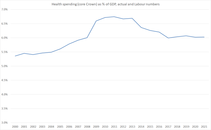
My actual interest in health policy and the health budget is quite limited (although my wife tells me I’m getting old and so should be more interested), but it is worth noting that Infometrics (and Labour apparently) used CPI inflation as a measure of the cost pressures. Ideally, one would want to use a specific index relating to health system costs. I’m not aware that we have one in New Zealand – certainly not one widely available – but I did have a quick look at the CPI components data.
| % increase since 08/09 | |
| CPI | 13.2 |
| Dental services | 27.9 |
| Paramedical services | 29.1 |
| Hospital services | 32.3 |
Perhaps there might be some reason to worry that the CPI understates health inflation pressures (although it is true that the item “therapeutic appliances and equipment” – one of those low inflation tradables – increased by only 2.6 per cent). Even 1 percentage point more health inflation in total over three years would make considerable inroads into the margin Labour seems to have to deliver more medical services (or the same ones at cheaper prices to users).
In a sense, my larger point in yesterday’s post was about how plausible it is to expect to see government operating expenditure falling further as a share of GDP. That is what both parties are promising. Here is a chart of core Crown spending as a share of GDP, stripping out finance costs, and simply looking at the things governments are purchasing and the transfers they are making.
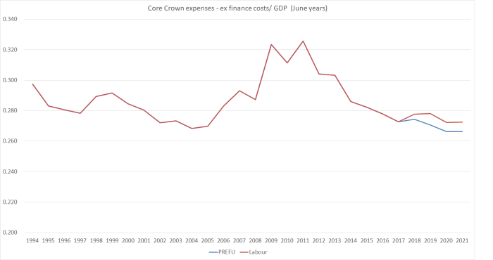
The data only go back, in this form, to around 1994. But government spending as a share of GDP – again excluding finance costs – hadn’t been any lower than shown in this chart (and was mostly higher) in the previous 20 years.
So the National Party’s proposed spending numbers would be smaller as a share of GDP than at any time in the last 40 years, and Labour’s would be smaller than at any time except for two years in the last Labour government that were (a) only very slightly lower, and (b) proved unsustainable, with big increases in spending over the following few years. Grant Robertson and Steven Joyce: both tougher than Ruth Richardson.
A small government person might well look at these numbers with pleasure, and assume that the government was getting out of whole areas and handing responsibility back to citizens. I recall discussions with the late Roger Kerr who talked of how an advanced economy could have a basic safety net welfare state and still keep spending perhaps 10 percentage points lower than shown in this chart. But he didn’t have in mind, for example, relentless increases in the share of GDP devoted to NZS (as both parties promise for the next two decades). Or moves towards fee-free tertiary education. Or real increases in welfare benefit rates. Or……
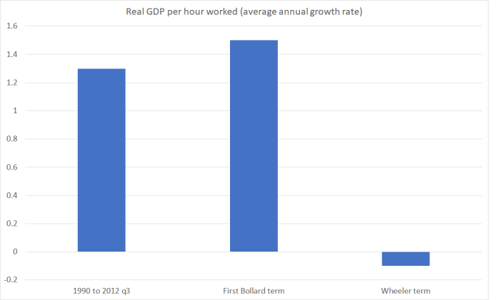
If we compare what the state was spending on things 10 or 12 years ago and what either main party wants to spend on things over the next few years (Labour more than National of course, but in historical perspective the differences are small), how credible is it that the spending share of GDP will be able to be held so low? Yes, the burden of some spending programmes has been wound back, but it isn’t easy to think of things the state has simply decided to stop doing, and it easy to see areas (in the current electoral auction) where there is pressure to do more. And it is not as if, in recent years, productivity gains (non-existent for five years now) have been giving us “free lunches”.
I’m not taking a view here on what the appropriate level of spending (or taxes) should be. My own biases would be to lower both selectively (but also run smaller surpluses). It is simply a point about the realism of the numbers both parties are campaigning on, given what they say they want to be able to deliver.
But I am still a bit perplexed, as I said yesterday, about why an opposition party campaigning against serious sustained underfunding in various key areas of government spending, and wanting to do some big new things, would also be campaigning on cutting government spending as a share of GDP – just smaller cuts than the current governing party is promising. Perhaps it would make some sense (economically) if we were in some sort of fiscal or debt crisis – all those debates in the UK about the appropriate pace of “austerity” – but we aren’t. Net core Crown debt (properly measured) in the last financial year was 9.2 per cent of GDP. Quite what the political imperative, or the economic narrative, is for further reductions from there is a bit beyond me.

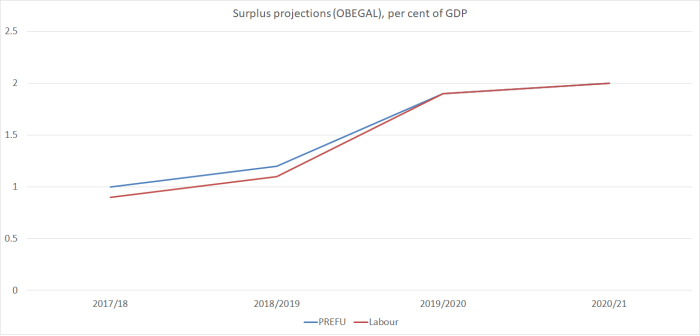 When net core Crown debt is already as low as 9.2 per cent of GDP – not on the measure Treasury, the government and Labour all prefer, but the simple straightforward metric – what is the economic case for material operating surpluses at all? With the output gap around zero and unemployment above the NAIRU, it is not as if the economy is overheating (the other usual case for running surpluses). Even just a balanced budget would slowly further lower the debt to GDP ratios. One could mount quite a reasonable argument for somewhat lower taxes (if you were a party of the right) or somewhat higher targeted spending (if you were a party of the left, campaigning on structural underfunding of various key government spending areas).
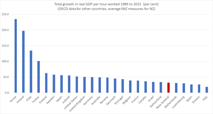
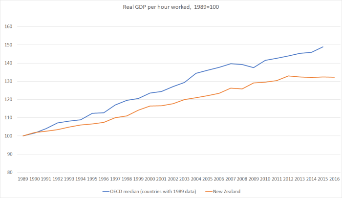

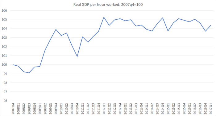
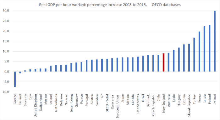
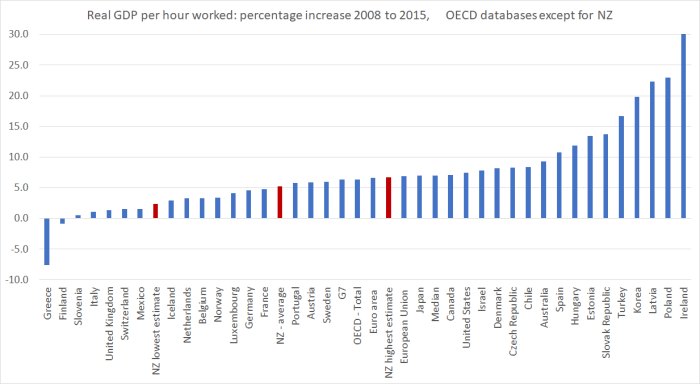
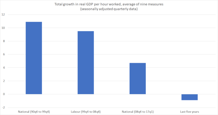
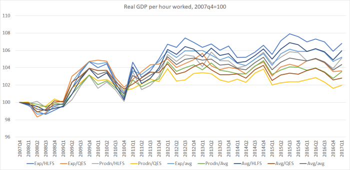
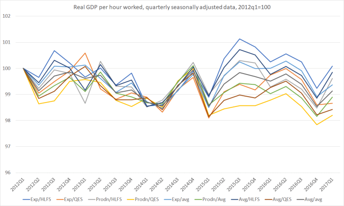
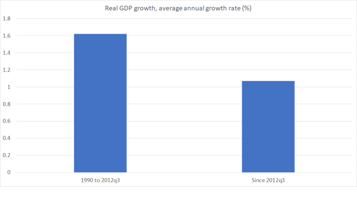
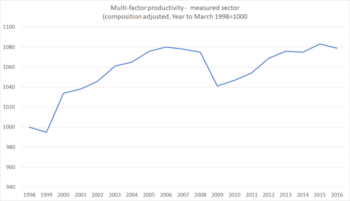
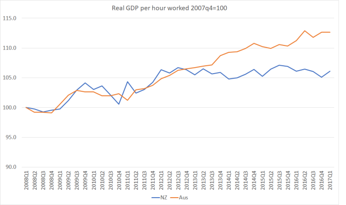 Not only have we had no labour productivity growth for five years, but our near-neighbour Australia – which the government was once willing to talk about catching up to – has gone on generating continuing labour productivity gains. Yes, there has been a productivity growth slowdown in much of the advanced world, dating back to around 2005. But our additional and more recent slowdown – well, dead stop really – looks like something different, and probably directly attributable to New Zealand specific factors. Things New Zealand governments have responsibility for responding to.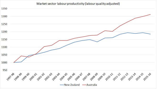
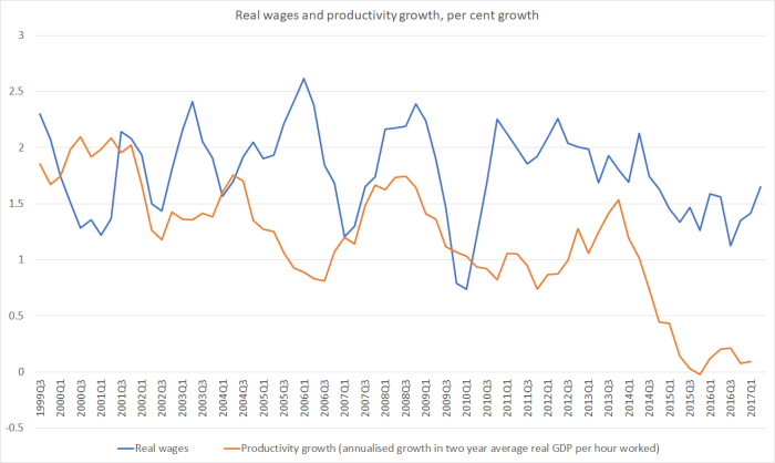
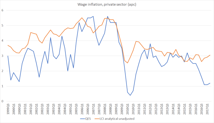 No economic analyst thinks wage inflation is anything like as volatile as the blue line – in fact, wage stickiness, and persistence in wage-setting patterns is one of the features of modern market economies.