Wages and the economy

Getting back to taking a look at the revisions to the national accounts data published just before Christmas, I thought it was about time to update my chart about how wages rate have been doing relative to the underlying performance of the economy.    There isn’t, and sbouldn’t, be anything mechanical about the relationship between the two series, but looking at how wage rates have moved relative to movements in GDP per hour worked at least opens the way to some further questions and analysis.

In this exercise I am looking at:

  • the analytical unadjusted series of the Labour Cost Index (available for both just the private sector and for the whole economy).   This series holds itself out as measure of changes in wage rates before any adjustment/deduction for productivity growth. and
  • nominal GDP per hour worked.  Nominal both because official wages series (including the LCI) are nominal, and because nominal GDP captures the direct effects of terms of trade changes.  In a country where the terms of trade move about quite a lot, those changes make a difference in understanding changes in returns to investment and, over time, capacity to pay labour.

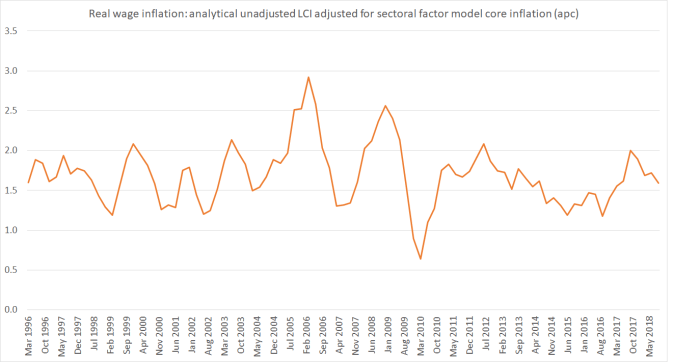
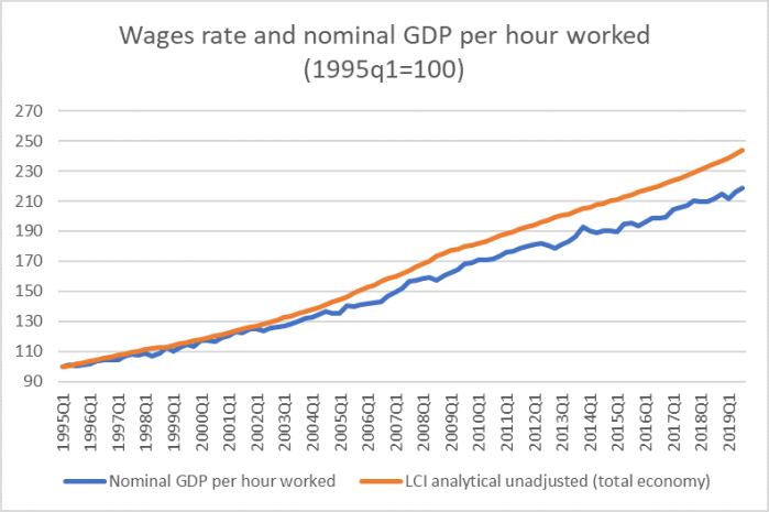
There is general inflation in both series, of course.   Here are the two individual series starting from 1995q1 (when the LCI series starts).

wages 2020 1

And in this chart, I have shown the changes in the ratio of wage rates (this measure) to nominal GDP per hour worked.   A rising line indicates that, on these measures, wages have risen faster over the period in question that GDP per hour worked.   Doing so strips out the effects of general inflation (in both numerator and denominator) and enables us to better see when changes in the ratio of wages to economywide “productivity” or earnings capacity happened.  The blue line is the quarterly series, and the orange line is the four-quarter moving average of that quarterly series.

wages 2020 2.png

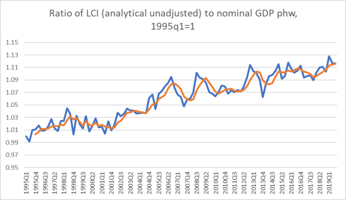
Over the almost 25 years of this data series, wages rates have risen about 10 percentage points more than nominal GDP per hour worked.    Even over the period since the last recession begain (the peak of the previous business cycle was 2007q4), wages rates have risen in total 4-5 percentage points more than nominal GDP per hour worked.  It isn’t the smoothest series in the world, and there are measurement challenges in quite a few of the underlying components, but the overall direction of movement –  over quite a long period now – is pretty clear.  (And it isn’t just a public sector wages story –  private sector wages have, over time, risen faster than public sector ones.)

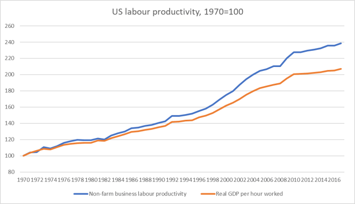
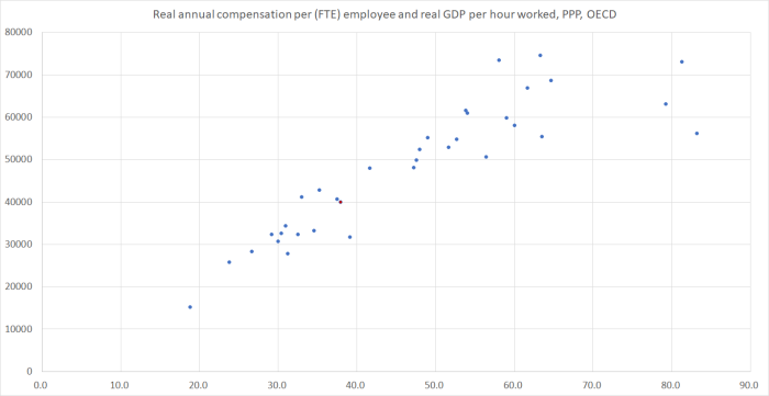
In and of itself, this series is neither good nor bad news, regardless of whether you are “a worker” or “a capitalist”.     After all, as is well-known, New Zealand’s productivity performance has been poor for a long time.  One could readily envisage an alternative world in which there was much stronger productivity growth, and really rapid business investment growth associated with those opportunities, in which wages (real and nominal) rose materially faster than they did over history, and yet a bit slower that nominal GDP per hour worked grew.  A comparable chart for Australia (included here) suggests something like that may have happened there.   In New Zealand, however, business investment –  and, in particular, growth in the productive capital stock per hour worked –  has also been pretty weak for a long time.

But to the extent –  pretty feeble as it is –  that the New Zealand economy has grown, wage rates have grown faster.

Here are a few associated series.   Here is growth in real GDP per hour worked, where I’ve shown both the time series and the series of five-yearly averages in the growth rate of labour productivity.

wages 2020 3.png

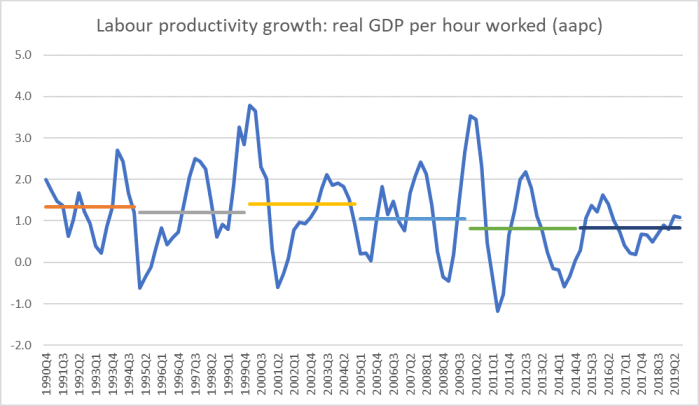
Productivity growth over the last decade has averaged worse than at any time in the history of the series  (yes, that may partly be a global phenomenon, but (a) that is no consolation to wage earners, and (b) remember that we started so far behind leading OECD countries that we should have been looking for some convergence).

And what about the terms of trade, the other component in nominal GDP per hour worked?

TOT 2020

Our terms of trade lifted a long way in the decade from about 2003 to 2013 –  enough to lift average incomes nationwide by about 6-7 per cent.   And yet there was none of the sort of business investment boom one might otherwise expect in a country experiencing such a favourable, exogenous, shift in its external trading conditions.   As it happened, this was however the period in which wages rose fastest relative to growth in nominal GDP –  which again has a somewhat anomalous feel to it.

And here is one last chart: New Zealand’s real exchange rate, using the OECD’s relative unit labour cost measure.  I’ve also shown the average for the last 15 years, and it is easy to see how much higher that average is than the average of the previous couple of decades.

OECD ULC RER 2020.png

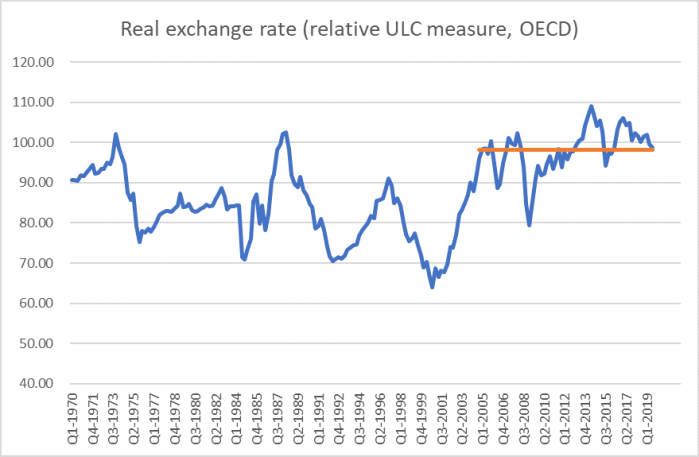
In many respects, the real exchange rate measure is just a variant on the earlier chart, highlighting the relationship between wages growth and growth in the underlying productivity capacity of the economy. But it is more telling, in context, precisely because it introduces an international dimension.    New Zealand has lost a lot of external competitiveness in the last couple of decades, even though the terms of trade performed strongly.

Perhaps not surprisingly, our export sector (and imports) as a share of GDP has been falling and (at best) flat.   Business investment has been pretty weak, and strongly focused inwards.  And productivity growth has been poor.

To be clear, I’m not suggested at all that these outcomes are the fault of workers as workers (as voters it might be another matter).  Wage negotiations –  employers and employees –  occur against a backdrop that neither individual firms nor individual workers (or unions) can do much about.  The overall picture is much more the responsibility of broader policy settings –  at least on my telling very rapid policy-driven population growth into an economy with few things going right for it.  That has had the effect of skewing the economy inwards.  It boosts the demand for labour, and so workers have done ok given the mediocre overall performance of the economy. But that should be no consolation for anyone given that, overall, we kept drifting further behind the leading group of advanced economies and are increasingly being overtaken by former Communist, formerly fairly poor, eastern and central European countries.

A government that was really serious about fixing the productivity failures would be asking the Productivity Commission and The Treasury to focus on these big picture issues and challenges.


Wages have risen faster than output per hour

I have a few other things on my plate today, but I thought I’d just share this update to a chart I’ve run before, showing wage growth (using the LCI analytical unadjusted measure for the private sector) relative to growth in nominal GDP per hour worked.

GDP and wages aug 19.png

When the line is moving upwards, private sector wage rates have been rising faster than nominal GDP per hour worked.  Growth in nominal GDP per hour work can be loosely conceptualised as some measure of the economy’s capacity to pay (average overall domestic production is rising that rapidly, leaving to be resolved the extent to which those gains –  whether from the terms of trade, productivity, or just general inflation –  end up going to labour or capital).

The reason the chart has tantalised me since I first stumbled across the idea of constructing it a couple of years ago, is (of course) that private sector wages in New Zealand do seem to have been rising faster than “the capacity of the economy to pay”.  It has happened in fits and starts, and there is a fair bit of noise in the data, but the trend since about 2001 has been pretty clearly upwards.   (The wages data released this morning give us June quarter numbers for the numerator, and hours worked data, and here I’ve assumed nominal GDP rose 1 per cent in the June quarter.)   The cumulative difference over time –  around 15 per cent now –  is not small.

As a reminder, here is the comparable chart for Australia, which I included in a post last week.

wages in aus

The New Zealand numbers do not, repeat not, suggest that people are in some sense overpaid in New Zealand.  Mostly, wage rates are a market outcome (firms and employees, and the respective opportunities etc), and although policy initiatives like pay equity settlements and large minimum wage increases have boosted the New Zealand line in the last few years, those specific measures don’t explain the longer-term trend to anything like the full extent.

The New Zealand numbers also don’t suggest that New Zealand workers are doing particularly well in an absolute sense.  They aren’t.   New Zealand incomes lag well behind those in leading advanced countries.  But although wages can and do wander away from aggregate economywide productivity for a time, in the longer-term only productivity growth can really underpin a closing of those wage/income gaps.  As I’ve highlighted here before, it would take productivity increases of about 60 per cent here to match the leading OECD bunch.  And we’ve had virtually no productivity growth at all in recent years.   All the data is saying is that workers haven’t done too badly given a badly-performing economy: little or no productivity growth and fairly stable terms of trade.

But most people would still have been better off had we actually managed decent productivity growth, and if the economy were not so badly skewed as to have a substantially overvalued exchange rate and, in association with that, non-tradables sectors doing well, but tradables sectors as a whole typically doing poorly.   Reasonably strong domestic demand can result in high demand for labour, and higher wage rates.  But the associated overvalued real exchange rate deters (crowds out) the sort of investment in internationally competitive industries that might have allowed real productivity gains to have been achieved.

On which note, I’ll end with the OECD’s real exchange rate measure for New Zealand, calculated using relative unit labour costs (ie wages adjusted for productivity).

rel ULcs.png

The orange line is the average for the last 15 years:  far higher than for any sustained period in the history of the series, even as our productivity performance has remained pretty woeful.  And, of course, at the end of the period the series is above even that fifteen-year average.

The Reserve Bank tries to explain wages…..or not

On Friday afternoon an email turned up from the Reserve Bank of Australia with this simple message

Draft copies of papers presented at the Reserve Bank of Australia 2019 Conference – Low Wage Growth – held from 4 to 5 April 2019 have been published on the Bank’s website.

That looked interesting, so I clicked on the link to the papers and found that the very first one was by a Reserve Bank of New Zealand author – not just a junior researcher, but someone who is now manager of their (economic) modelling team.   The paper had the title “New Zealand wage inflation post-crisis” which, of course, immediately grabbed my attention.   I’ve written quite a bit here about wages in New Zealand, including (in recent months) here and here.  My take has been that, if anything, wage growth in New Zealand has been surprisingly strong, given the weakness of productivity growth (most especially in the last five or six years).

There is some interesting material in the Reserve Bank paper, including the use of the highly-disaggregated data available from Statistics New Zealand’s IDI and LBD databases (my reservations of principle about them are here).  For example, the author looks at the possible contribution of industry concentration.  In the US context,

Recent commentary has highlighted the role that industry competition may play in suppressing wage inflation. The hypothesis is that firms in very concentrated industries can act as a monopsony buyer of labour, and therefore suppress wage inflation through their market power.

But

First of all, industry concentration has actually decreased in New Zealand over the past two decades (figure 11). This is in contrast to developments in the United States.

HH index

That apparent reduction in concentration surprised me a little, but it isn’t my area at all.  The author goes on to note

To account for the potential for different characteristics of workers in different industries, we have matched workers in high and low concentration industries across a range of other characteristics. Figure 12 presents the wage growth differential for matched individuals in the 2011 cohort. The figure shows that, when accounting for the different characteristics of employees across industries, those in concentrated industries tend to see slightly higher wage growth than those in more competitive industries.

Interesting, but (as they note) experimental.

But right through even that discussion, the author starts from the presumption that there is a puzzle to explain, in the form of low wage inflation.

As a reminder, this chart shows cumulative increases in New Zealand wage rates relative to cumulative growth in nominal GDP per hour worked.  A rising line suggests that, on this measure, wage rate increased faster than (loosely) the earnings capacity of the economy.

lci wages vs gdp

(Nominal) wages have been rising faster than (nominal) productivity, and there is no very obvious difference between the trend in the years running up to the 2008/09 recession and those since.

Not inconsistent with that is the labour share of total GDP, which has held up considerably more here (in the last 20 or 30 years) than in many other advanced countries.

labour share 2018

But not a shred of this appears in the Reserve Bank’s conference paper.   In fact, the thrust of the paper is such that it appears that they mostly see wage inflation and CPI inflation as the same thing, and so the paper falls back on the lines they’ve been trying to run for years as to why inflation has been so low (hint: because monetary policy was, on average, a bit tight).

This is from the Abstract

Nominal wage and consumer price inflation have been subdued in New Zealand post crisis, particularly since 2012. This paper discusses a number of candidate explanations for these muted nominal wage inflation outcomes. The most notable explanations include: a gradual absorption of spare capacity amongst New Zealand’s major trading partners; sharp declines in oil and export commodity prices in 2014/15; a significant rise in labour supply, and less inflationary pressure stemming from migration; and a change in price setting behaviour, with inflation expectations becoming more adaptive.

Basically, despite the title, it isn’t a paper about wage inflation –  which would surely focus substantially on what happened to wages given all else that had gone on in the economy – at all.

Consistent with this interpretation, I searched the document, and the word “productivity” did not appear at all, and yet in almost any possible story about longer-term wage growth, labour productivity should be one key consideration.     The author shows various charts of elements of the Bank’s forecasts they got wrong over the last decade, but again the productivity forecasts don’t appear.   Government agencies (Reserve Bank and Treasury) have done consistently badly on that score.

Carrying on with the search function, “terms of trade” didn’t appear in the paper, and nor did “investment”.

At the Governor’s speech a couple of weeks ago, a retired academic in the audience asked the Governor how the Bank was going to get away from what he (the academic) characterised as past Reserve Bank tendencies to treat wage inflation as basically the same thing as general inflation and, therefore, something to be jumped on.  The gist of the question seemed to be the (entirely reasonable) point that income shares can and do change over time, and that a changing income share (up or down) is not the same thing as inflation (or deflation).  I was a bit surprised at how the Governor answered –  he basically didn’t.  I’d thought it would be an opportunity for an expansive comment on the rich new research programme the Bank had underway, consistent with the revised mandate (and the rhetoric around it).

But this paper suggests the Bank hasn’t got far at all.  There is clearly some interesting exploratory micro-data work going on, but it appears to be of limited reach at best.  There are reasonable and interesting questions to ask about why inflation has been so low at surprisingly persistently low interest rates  (those are questions we really expect central banks to be answering).  There are important questions about why productivity growth in New Zealand has been so poor (for so long), and about why relative to that poor productivity growth wage rises in New Zealand have been quite strong (perhaps more so than in many other countries).

One can mount a reasonable case that those latter questions aren’t a prime concern of the Reserve Bank –  you can have price stability with high or low productivity growth, weak or strong labour income shares, and so on (inflation being primarily a monetary policy phenomenon).  But when you send one of your senior economists out to the public domain to speak on New Zealand wage inflation in the last decade or so, it is pretty astonishing that none of these considerations even get a mention, and instead you have a whole paper built around a misleading prior, that we should be surprised by how weak wage inflation has been.  To the extent there is a problem in New Zealand, it is more that overall economic performance has been poor, and within that underperformance, wage earners have at least held their own.

But I guess that –  whatever the facts –  isn’t a narrative the Governor would be keen on adopting.


Fruit-pickers, wages, and immigration

I’m not one of those who thinks wage and salary earners as a whole have had some sort of raw deal.  From time to time I’ve run this chart

lci wages vs gdp

suggesting that over the last 15+ years, wage increases in New Zealand (it is different in some other countries)  have outstripped that rate of growth in what I (loosely) term the earnings capacity of the economy: nominal GDP per hour worked, a variable that incorporates productivity growth and gains in the terns of trade.

To the extent there is some sort of “raw deal”, it is one the public has put up with: voting for politicians who, in office, do nothing about removing th roadblocks in the way of fixing our poor rate of productivity growth.  Fix that and we’d be considerably better off.  But across the economy we can’t consistently pay ourselves what hasn’t been earned.

But if wages growth across the economy has been, if anything, surprisingly high given the lack of productivity growth (I say “surprisingly”, but there are decent explanations as to why it has happened), there are still some wages puzzles.

One of them perhaps only puzzles public sector economist types who’ve never themselves had to make a payroll or face a market test for their services.

The Reserve Bank has long run a regular programme of business visits.  I always enjoyed participating (especially in visits well away from Auckland and Wellington) and often came away from the visits with a heightened admiration for the people who have built and maintained businesses, through good and bad economic times.    But there was one question that I never really got a satisfactory answer to.  In periods when the economy was doing well (for example the early 2000s) we would regularly hear from firms we talked to that it was really hard to get decent staff.   We’d nod understandingly, jot that down in our notebooks, and then ask “so what is happening to wage inflation?’ and “so are you increasing the wages you are willing to offer to get people”.  And often there was a look of almost incomprehension (perhaps it was really disdain for Wellington economists), and only rarely would anyone suggest that, indeed, it was really hard to get the right staff, and that they were paying over the odds to get people.  For some reason, a conversation on this issue at a firm in Timaru, probably in 2002, sticks in my memory.

There are strands to a possible good story.  Increase wages materially for new arrivals and before long you’ll have to increase them for everyone.  It is easy to raise wages and hard to cut them (if labour market or business conditions reverse).    Simply bidding more might attract a class of worker more likely to move on quickly if someone else offered a little bit more.  And so on.  So I get that there are reasons why wages move somewhat sluggishly (relative to, say, prices for oil or other commodities).  But I was always surprised at how weak a link managers/owners of private businesses appeared to draw between difficulty hiring and (what an economist would think of as) putative changes in the market-clearing price for such labour.

Which is all by way of introduction to a Stuff story I noticed yesterday about an industry having difficulty getting staff.   I’ve written previously about bus companies and bus drivers, and the bizarre situation in Wellington where the contracted companies get away with endless cancellations (with apparently minimal penalties) because they choose not to pay what it would take to employ the necessary number of drivers.  One might grant that that is a difficult situation –  a government-controlled “market”, in which both fares, operators, and service frequency are all supposed to be simultaneously controlled.

But yesterday’s article was about jobs in a fully private sector industry, with lots of individual employers, and with a significant export orientation: fruit-picking, including “grapes, apples, and kiwifruit”.  The article is quite a substantial piece, including a couple of quotes talking of a “dire” situation finding staff, and repeatedly talk of severe labour shortages.  And, remarkably, not one mention of wage rates.   It must not have occurred to the journalist to ask, let alone to the various employers (and employers’ representatives) to mention it.    Even though, when there is a “shortage” of tomatoes, tomato prices rise –  so that actual quantitity demanded at the going price is roughly equal to the actual quantity supplied.  At present, there is a “shortage” of avocadoes –  it gets a line perhaps somewhere in a newspaper, but prices adjust and so do (potential) consumers.

But not, it seems, in the fruit-picking industry.

The industry seems to think this is a problem for the government (admittedly, this is an approach fostered by successive governments, who also seem to think it is a “problem”, rather than (say) an opportunity for individuals who could capture the premium prices growers might otherwise pay to ensure their fruit was picked).  The article includes a quote from the head of something called the “Central Otago Labour Market Governance Group”, a title that sounds as if it could have been derived from some centrally-planned eastern European economy in the 1950s.

Perhaps there really is some movement in market rates for fruitpicking and the journalist just forgot to tell us. But if so, you’d have thought the industry representatives would have been keen to get the message across –  apart from anything else, it would be free advertising to people in those districts with a bit of time on their hands that there was (unexpectedly good) money to be had.

But again I’m left with a bit of a puzzle –  and perhaps it is only one to city-based macroeconomists – as to why a competitive bidding process isn’t at play.  One can understand the Wellington bus companies not raising wages (temporarily or permanently): they don’t have to, the passengers (mostly) bear the consequences, and entry to the business (Wellington bus routes) is restricted.  But for an individual grower (apples, grapes, kiwifruit or whatever), the situation is surely a lot different.  If there is a incipient shortage of pickers for the whole industry, that doesn’t mean your orchard has to miss out.  Offer better wage rates and presumably people will choose your orchard over another one down the street (on the other hand, choose not to compete and you risk fruit rotting on the tree/vine).  Of course, that invites the other orchards to increase their rates too, but that is how markets work.  And yet, if this Stuff story is to be believed, it doesn’t seem to be happening.  And that is even though much of the picking workforce seems to be itinerant or with no established and committed long-term relationships.  It isn’t obvious why offering more to pickers this year –  if the harvest is particularly early, or particularly good, or labour “shortages” are particularly severe –  need entrench higher rates for all time.

In fact, of course, much of the article channels an ongoing industry push to avoid paying higher wages to New Zealanders to do the job (not just this year, but permanently) by using the immigration system.  You might think that the case for using immigrant labour at times might be stronger than otherwise if there was evidence that wage rates in this industry had been rising particularly stronly (employers putting their money where their mouth is).  But apparently the industry doesn’t see it that way –  and neither (one deduces from their silence) does our current left-wing government, despite its key support base including workers and trade unions.

We are told

Key visa reforms sought by the industry include removing the need for annual reviews once a three-year visa is granted, giving those on three-year visas a pathway to permanent residency if no New Zealand residents are available for the job, and reworking the labour market test to make it more aligned with the employment conditions faced by employers.

It is fruit-picking we are talking about here, not the most skilled of jobs.  And an immigration system that, we’ve been told for decades, is supposed to be skills-focused, contributing to a lift in overall productivity growth, in ways that would raise wage levels for everyone.

As a reminder, there will be few/no/inadequate numbers of New Zealanders offering to work in a particular sector when wages (and overall conditions) in that sector are no longer particular attractive.  In the 1970s presumably our fruit was picked, our old people’s homes were staffed, our supermarket checkouts were staffed, by New Zealanders (whether those of longstanding or more recent immigrants –  but you couldn’t hire people from abroad specifically to fill these modestly-skilled jobs, and in the process keep down wages in that specific sector).

I presume much of what is going on here is that many of these fruit-based industries just aren’t that internationally competitive at current exchange rates. It probably isn’t the case with, say, gold kiwifruit, but for some of the other industries it seems quite conceivable that the economics is pretty tight and it might not be worth being in business if they had to pay materially higher wage rates to pickers.   There are hints of that in the article

“The growers are starting to think whether they are going to invest money because they need to have assurances about labour. It is a bigger issue than probably it is given credit for.”

To which I guess I have two strands of response:

  • first, there are lots of industries that are no longer viable here based on old production technologies (try making a living milking 50 cows by hand) or running a suburban petrol station (in my suburb there were four forty years ago and there are none now).  There might be issues of scale to consider, and/or investment in technology-based solutions, and
  • second, the real exchange rate (averaging more than 20 per cent higher since about 2003 than it did in the previous two decades, despite feeble economywide productivity growth) is a real symptom of the severely unbalanced New Zealand economy.  As a result, our export/import shares of GDP have been shrinking, not rising.    But however attractive the immigration option genuinely looks (and locally is) to an individual employer, on a large scale it exacerbates the economywide problems, not eases them.   For outward-focused industries in particular, a much lower exchange rate –  which would follow directly from substantial permanent cuts in immigration –  would improve NZD returns, and would also make producers in those industries better placed to bid competitively for New Zealand workers to fill their vacancies (or to invest in technological solutions, or the sort that help lift average labour productivity).

Firms simply shouldn’t be able to use immigration to fill positions requiring only modest skills or training without at least being able to demonstrate that the wage rates they are paying for such skills have run well ahead of other wage rates for several years.  But to get bureaucrats and ministers out of the business of picking favoured sectors/firms –  at present, the rewards to lobbying seem quite high – I continue to commend to anyone interested my model for temporary work visa policy.   It is pretty simple

Institute work visa provisions that are:

a. Capped in length of time (a single maximum term of three years, with at least a year overseas before any return on a subsequent work visa).

b. Subject to a fee, of perhaps $20000 per annum or 20 per cent of the employee’s annual income (whichever is greater).

If apple-growers really can’t get workers locally, and are happy to pay a substantial fee to the Crown, on top of a decent wage, I guess I’d be okay with temporary overseas recruitment.  As it is, they seem to simply want to undercut potential returns to New Zealand labour.

Wages and productivity

There has been a longrunning US debate/puzzle around the relationship (or apparent lack of it) between productivity growth and growth in wages/compensation. It was revisited earlier this week in a (very long) post on the excellent Slate Star Codex blog.  The author introduces his post with this chart, pretty familiar to anyone aware of this issue.

wages US

I’ve always found the issue interesting, but been content to do little more than read the occasional summary article.  Arguments often seem to turn on rather arcane measurement issues and I just don’t know the very detailed US data that well.

But as I read through the long post, I noticed something that probably hadn’t struck me previously.  The productivity measures used in this chart (and others like it) are those for the non-farm business sector.   That is the series that gets the most focus in the US, which makes some sense in that it is (a) regularly published by US official agencies, and (b) if you are interested in the performance of the business sector (and not wanting to be thrown around by climatic effects) it is probably natural to focus on.

By contrast, I tend to focus on measures of GDP per hour worked.   That is mostly because (a) it is what is available on a fairly consistent basis for a wide range of countries, and (b) because it is what is readily able to be calculated quarterly for New Zealand, using published data.  And my interests tend to be the economy as a whole.

In the US context it can make quite a lot of difference which series one focuses on.   In this chart, I’ve shown the two series, starting from 1970 (which is when the OECD real GDP per hour worked data starts from).

US productivity.png

It shouldn’t be much of a surprise that whole economy productivity growth is slower than that for the non-farm business sector: incentives (lack of them) and opportunities (types of activities governments do) both tend to work that way.

And then, of course, I noticed that charts like the first one tend to use real variables, which opens up all manner of issues about the “correct” deflator, including issues as to whether the CPI was well-measured in years gone by (there were some fairly significant biases).    But quite recently, I’d compared nominal wage growth in New Zealand to growth in nominal GDP per hour worked, which abstracted from deflator issues (even if it might raise other questions), so I thought I’d do the same for the United States.

I took the compensation per hour series for the US non-farm business sector (official US series) and nominal GDP per hour worked (from the OECD), indexed them all to 1970, and divided one series by the other.  This is the the result.

us compensation

On this measure, US wage growth has lagged a bit behind the growth in the overall economy “ability to pay”.  But it is a hugely smaller gap than is suggested by something like the (widely-used) first chart in this post.

Is nominal GDP per hour worked a reasonable benchmark?  I reckon it is.  Growth in nominal GDP per hour worked captures both real productivity effects and changes in the terms of trade (which have been adverse for the US over this fifty year period).    As ever, there isn’t likely to be some mechanical relationship between labour earnings and GDP per hour worked.  Market pressures shift over time, and so does (for example) the relative importance of capital in generating what growth there is.   Labour shares of the total economy’s output always have, and probably always will, fluctuate over time.   But it seems at least as good a benchmark against which to analyse developments as most others on offer.

Since most of my readers are from New Zealand, two final charts as a reminder of how things are here.

First, a chart comparing real GDP per hour worked with the measured sector labour productivity data.   We don’t have such long runs of data, so this is just since 1996.

NZ productivity measured and total

Unsurprisingly, whole economy productivity growth lags that in the measured sector (that excludes much of goverment activity).

And here is a chart I’ve shown previously showing how wages (the analytical unadjusted LCI series) have grown relative to nominal GDP per hour worked.

wages and GDP

Whatever the story in the US, wage rates in New Zealand have been increasing faster than nominal GDP per hour worked (loosely, “the ability of the economy to pay”).

That might seem quite good for New Zealand employees.  But it is worth bearing in mind that since 1995, we’ve had about 28 per cent growth in labour productivity (real GDP per hour worked) and the US has had about 44 per cent growth in economywide labour productivity.  The windfall of a higher terms of trade has helped us, but if your economy isn’t generating much real productivity growth it isn’t a good outlook for anyone much (workers or owners) in the longer term.


Wages, earnings capacity and all that

There has been a line run in many quarters over recent years suggesting that wage inflation is surprisingly low.   There was a bit of that tone in several articles on such issues in the Sunday Star-Times yesterday, and it even appeared in the Leader of the Opposition’s speech last week

For many New Zealanders, incomes are struggling to keep up with the rising cost of living.

We’ll probably see more such stories when the next round of labour market statistics are released later this week.

As I’ve noted in various posts over a couple of years now (including recently), I’m not at all convinced by this story.

My preferrred measure of wage inflation is the Statistics New Zealand analytical unadjusted Labour Cost Index series.  The LCI is designed to be stratified –  comparing wage inflation for the same jobs (and so not facing the compositional issues the QES measures have) –  and the “analytical unadjusted” refers to the idea that these are straight wage measures, not ones that attempt to adjust for individual job productivity changes (as the headline LCI numbers do).  The series is only available back to the 1990s, but here is the history.

LCI 1

Nominal wage inflation has picked up a little, but is still well below what people got used to in the five years or so prior to the last recession.  But so is inflation for goods and services.

Here is the same wage series adjusted for the Reserve Bank’s sectoral factor model measure of core inflation (I could have used the headline CPI –  the averages don’t change materially, but there is a lot more “noise” in the CPI itself).

LCI 2

Two things caught my eye:

  • first, each and every year real wages (on aggregate across the economy) have risen –  even in the depths of the last recession.   It won’t have been (and won’t be) true for every individual, but it is true –  at least on these measures (generated by our national statistics agency, and the official agency best placed to tell us about core inflation) –  across the economy as a whole.
  • second, real wage inflation this decade looks to have averaged not materially different to what we experienced in the late 1990s and 00s.  There were individual years where faster wage inflation was recorded, but if there is a systematic weakness in real wage increases  this decade compared to what went before, the difference is pretty small.   And notwithstanding talk –  in those SST articles –  that the current labour market is “as good it gets” actually the unemployment rate is still above the lows of the 00s.

All of which is a little strange, because economywide productivity growth has slumped (to basically zero in recent years).  Here is a chart of estimated labour productivity back to 1995 when the LCI series starts. I’ve shown it in logs, so that a less steeply rising line accurately illustrates a declining growth rate of productivity.

lci 3

There is a bit of short-term noise in the series, but the key story is pretty easily visible: growth in labour productivity has been slowing, mostly recently to nothing.   All else equal, it should be a bit surprising if there are persistent gains in economywide real wages when there is little or no productivity growth.

Of course, the other consideration that affects economywide potential is the terms of trade. If the terms of trade increase then even if there is no growth in real labour productivity, the overall pot is bigger and –  all else equal –  it is likely that over time wages will rise to some extent to reflect that improvement.  It is a mechanical process, or a certain one, and there is a variety of possible channels, but in an economy that experiences considerable terms of trade variability it isn’t a factor that can simply be overlooked.

I’ve attempted to take account of the terms of trade in this chart, which I ran in post last month.

lci wages vs gdp

This chart compares how wages have been rising relative to the increase in nominal GDP per hour worked (the latter measure including both productivity and terms of trade effects).   A rising line –  as New Zealand has experienced (on these data) this century –  suggests that wages have been rising at a faster rate than the earnings potential of the economy.      That difference –  perhaps 13 percentage points over 17 years –  adds up to something quite significant.  On its own –  taken in isolation –  it is neither something necessarily good nor something necessarily bad.   There are distributional changes in any economy over time.  But it is something that could not continue at the same rate indefinitely (this isn’t a statement of ideology or sophisticated economic argumentation,  but simply a matter of basic arithmetic).

Here is another way to look at the issue. The chart shows the OECD’s relative unit labour cost measure of New Zealand’s real exchange rate, in this case back to 1980.

rer to end 18

I’ve broken into two the period since liberalisation in 1984.  In both periods –  although especially the earlier one –  there has been plenty of variability in the real exchange rate.  But the average in the second half of the period has been far higher than in the first half.  Since standard theory tells us to have expected exchange rate overshoots temporarily as part of getting inflation down, I could quite legitimately have focused simply on, say, the 10 years after 1991 and compared them to the more recent period.  My point is not that any single point of comparison is somehow the “right” one, simply that in an economy where productivity growth has lagged behind that in most of the rest of the advanced world, there is something anomalous about a real exchange rate as high as ours have been.  Since this is a unit labour cost measure, it fits nicely with the previous chart –  wages and salaries have been rising faster than the economy’s earnings capacity, and to a greater extent than in many other countries.   Consistent with all that, our firms (as a whole) haven’t been able to successfully increase their penetration of world markets (export shares have been flat or falling).

Not this is in any sense the fault of wage-earners, or indeed of individual firms, all of whom are mostly responding to the incentives the economy has thrown up, and how policy has tilted the playing field.  This decade, some of those things were unavoidable (the earthquakes) but others were pure, deeply misguided, public policy choices.   Rapid population growth generates lots of activity and demand for labour but –  at least in New Zealand’s case –  appears to have done nothing to improve the longer-term earnings capacity of the economy.

In the end, material living standards in any economy will largely reflect productivity growth.  And yet, somewhat weirdly –  but perhaps consistent with the increasing political cone of silence around that failure –  as far as I could see not one of the SST articles yesterday even mentioned the productivity failure as the biggest obstacle to sustainably higher wages and material living standards.    For now, we’ve been in a bit of a fool’s paradise –  wages appear to have been growing faster than economic capacity.  But unless something serious is done to reverse the productivity failure, it is hard to see that real wage inflation in the next decade will be able to be as high as it has been this decade.  The bigger question right now shouldn’t be why wage inflation is so low, but why it is still so high.

(None of this is to rule out the possibility of some problems with the analytical unadjusted LCI data, but (a) SNZ has not pointed users to serious problems, and (b) the picture I’m painting doesn’t seem inconsistent with either the labour share of GDP data or the real exchange rate measures.)


How are wage earners doing?

For the last few years –  probably almost since the economy began emerging from the long recession of 2008 to 2010 –  there has been talk about how low average wage increases have been.   Those lines have sometimes been run in discussions of the general rate of inflation –  all else equal, if inflation had been nearer target, average nominal wage increases probably would have been a bit higher –  but more often it seems to have been a real phenomenon people had in mind; some sense of wage earners being “left behind”.

I’ve been increasingly sceptical of that story, and did a few posts  12-18 months ago to illustrate the point.   Some of the data aren’t updated very often, and there are historical data revisions, so I thought it might be time to take another look.

The first series I’ve been interested in is the labour share of GDP –  as approximated by the share of all the value-added in the economy accruing as compensation of employees. To make this comparison, one needs to adjust out for taxes and subsidies on production (all else equal, a shift from income taxes to a higher GST won’t raise wages –  or leave people worse off on average – but will raise measured GDP).  The data are only available annually, and only up to the March 2018 year, but here is the resulting chart.

labour share 2018

There is a little bit of short-term variability in the series, but if (say) one compares the latest observation (year to March 2018) with the last observation before the recession (year to March 2008), the labour share of GDP is still a touch higher now than it was then.  In both cases, it was higher than it had been at any time in the previous fifteen years or so.   As I’ve noted previously, the trough was in the year to March 2002 (on my telling, this was not unrelated to the fact that the real exchange rate had then been around historic lows).

The other comparison I find interesting is to look at how wage rates have evolved relative to (nominal) GDP per hour worked.   Nominal GDP captures both any productivity gains the economy has managed and any terms of trade gains (as well as general inflation).  Over the longer-term one would expect those variables to be the biggest influence on developments in economywide wages.

In putting together this chart, I’ve used the SNZ analytical unadjusted series of the Labour Cost Index, which purports to be the right measure for these purposes (wage rates, rather than just average wages –  the latter distorted by composition changes, and wages before any adjustments for productivity –  the headline LCI series attempts to adjust for productivity gains).    The series doesn’t get wide coverage but –  absent any serious efforts to suggest the data are of unusually poor quality –  should.

Unfortunately, the analytical unadjusted LCI series is only available back to 1995 (the private sector sub-component only to 1998) but even that is now well over 20 years of data.

In the chart I have:

  • indexed nominal (seasonally adjusted) GDP per hour worked (using the HLFS and QES), and
  • indexed the analytical unadjusted LCI series,

both to 100 in the March quarter of 1995, and then taken the ratio of the wage series to the GDP per hour worked series (so that the resulting series is equal to 1 in the March quarter of 1995).

lci wages vs gdp

There is a fair bit of short-term noise, but the trend is pretty clear.  On this data, wages have been rising faster than the overall earnings capacity of the economy.   That was so in the 00s, and has been so –  albeit to a lesser extent – in recent years too.  For anyone inclined to want to debunk the analytical unadjusted series, note that this chart is not wildly inconsistent with the labour share chart I showed earlier: the labour share of total income has increased since the early 00s, with the biggest change occurring in the pre-recession 00s themselves.

So what is the problem?  There are two.  First, general economywide inflation has been unexpectedly low this decade, and below the target midpoint now for years.   Not surprisingly, against that backdrop nominal wage inflation has been lower than it might otherwise have been.

But the second –  and far bigger –  issue is that lack of productivity growth.   Here is my regular chart, last updated just before Christmas

real GDP phw dec 18

There has been no labour productivity growth for the last four years, and very little this decade.  Sure, the terms of trade have been reasonably good, but you cannot expect strong sustained growth in (real) wages if productivity growth is so moribund.   If anything, real wage growth has been surprisingly – and probably unsustainably –  strong given that feeble growth in the earnings capacity of the economy.    It is all consistent with a story of a high and overvalued real exchange rate  –  domestic demand pressures give rise to wage inflation, but in the process squeeze the outward-facing sectors of our economy.  You’ll recall that exports (and imports) peaked as a share of GDP at about the turn of the century, and are no higher now than they were 40 years ago –  even though successful small economies typically see a growing reliance on two-way international trade.

It would be good if our political “leaders” –  and their advisers in The Treasury –  actually focused on these sorts of imbalances and underperformances.  But nothing serious is heard any longer from the Prime Minister about the productivity underperformance.  Taking it seriously might confront them with hard choices, and I guess vapid rhetoric about “wellbeing Budgets” comes more readily.  New Zealanders –  including New Zealand wage earners –  deserve much better.


Consumption, investment and wages (inflation) in New Zealand

After writing yesterday’s post, I noticed another somewhat-confused article on the “low wage” question.  The author of that piece seemed to want to look at after-tax wages, without then looking at the services those taxes might deliver.   Taxes are (much) higher in France or Denmark, but so is the range of government services.

One way of looking at the material standard of living question is to look at per capita consumption, again converted using PPP exchange rates.   Just looking at private consumption –  the things you and I purchase directly –  will also skew comparisons.    Take two hypothetical countries with the same real GDP per capita.  One has much lower taxes than the other, but health and education in that country are totally private responsibilities,  whereas in the higher tax country many of those services are delivered by the government, largely free to the user at the point of use.    Private consumption in the low-tax country will be much higher than in the high-tax country, but the overall actual consumption of goods and services may not be much different  (depending on incentive effects etc, a topic for another day).

For cross-country comparisons, the way to handle these differences is to use estimate of actual individual consumption: private consumption plus the bits of government consumption spending consumed directly by households (eg health and education).  Separate again is “collective consumption” –  things like defence spending, or the cost of central government policy advice, which have no direct or immediate consumption benefit to households.

Here is the data for the OECD countries for 2016, where the average across the whole of the OECD is 100.

AIC 2016

New Zealand does a little less badly on this measure than on the various income or productivity measures.  That is consistent with the fact that our savings rates tend to be lower than those in many other OECD countries and (relative to productivity measures) to high average working hours per capita.  On this measure in all the former communist countries now in the OECD the average person still consumes much less than the average New Zealander does.  Unlike many advanced economies, we have consistently run current account deficits.   Large current account surpluses –  Netherlands for example has surpluses of around 10 per cent of GDP –  open up the possibility of rather higher future consumption.

Having dug into the data this far, I decided to have a look at investment spending per capita.  I mostly focus on investment as a share of GDP, and have repeatedly highlighted here the OECD comparisons that show business investment as a share of GDP has been relatively low in New Zealand for decades, even though we’ve had relatively rapid population growth (and thus, all else equal, needed more investment just to maintain the existing capital stock per worker).   Here is the OECD data, for total gross fixed capital formation (“investment” in national accounts terms) and ex-housing (where there are a few gaps in the data).

investment ppp

You can probably ignore the numbers for Ireland (distorted by various international tax issues) and Luxembourg (lots of investment supports workers who commute from neighbouring countries).  But however you look at it, New Zealand shows up in the middle of the pack.  That mightn’t look too bad –  and, actually, was a bit higher than I expected to find – but when considering investment one always needs to take account of population growth rates.      Average investment spending per capita might be similar to that in France, Finland, or Germany, but over the most recent five years, the populations of those countries increased by around 2 per cent, while New Zealand’s population increased by 9 per cent.  Just to keep up, all else equal, we’d have needed much more investment spending (average per capita) than in those other countries.

Over the most recent five years, only two OECD countries had faster rates of population growth than New Zealand.  One was Luxembourg –  where, as far as we can tell, things look fine (lots of investment, lots of consumption, high wages, high productivity) –  and the other was Israel.  In Israel, average investment spending (total or ex-housing) was even lower than in New Zealand.  And as I highlighted in a post a few months ago, Israel’s productivity record has been strikingly poor.

But how has Israel done by comparison?  This chart just shows the ratio of real GDP per hour worked for New Zealand and Israel relative to that of the United States (as a representative high productivity OECD economy), starting from 1981 because that is when the Israel data starts.

israel nz comparison

We’ve done badly, and they’ve done even worse.

If productivity growth is the basis for sustained growth in material living standards –  and employee compensation –  how have wages been doing recently in New Zealand?

One way of looking at the question is to compare the growth in GDP per hour worked with the growth in wages.  If we look at nominal GDP per hour worked, we capture terms of trade effects (which can boost living standards without real productivity gains) and avoid the need to choose a deflator.  From the wages side, I still like to use the SNZ analytical unadjusted labour cost index series.  Perhaps there are serious flaws in it –  if so, SNZ should tell us – but, on paper, it looks like the best wage rates series we have.

Here is the resulting chart, with everything indexed to 1 in 1998q3, when the private sector LCI analytical unadjusted series begins.

NGDP and wages

When the series is rising, wages (as measured by this series) have risen faster than the average hourly value of what is produced in New Zealand.  A chart like this says nothing about the absolute level of wages (or indeed of GDP per hour worked), but it does suggests that over the last 15 years or so, wage rates in New Zealand have been rising faster than the value of what is produced in New Zealand.  That is broadly consistent with the rebound in the labour share of total GDP over that period.  There is some noise in the data, so not much should be made of any specific shorter-term comparisons, but even over the last five years –  when there has been so much public angst about wages – it looks as though wage inflation has outstripped hourly growth in nominal GDP (even amid a strong terms of trade).    All of which is consistent with my story of a persistently (and, so I argue, unsustainably) out-of-line real exchange rate, notably over the last 15 years or so.

New Zealand is a low wage, low productivty (advanced) country.  We don’t seem to do quite as badly when it comes to consumption, but investment remains quite low (relative to the needs of rapidly growing population) and wage earners have been seeing their earnings increase faster than the (pretty poor) growth in GDP per hour worked.  None of that is a good basis for optimism about future economic prospects, unless politicians and officials finally embrace an alternative approach, under which we might see faster (per capita) capital stock growth and stronger productivity growth, in turn laying the foundations for sustainably higher earnings (and higher consumption).  Most likely, a key component of any such approach would involve finally abandoning the “big(ger) New Zealand” mythology that has (mis)guided our leaders –  and misled our people – for decades.

A low wage, low productivity (advanced) economy

There was an article on Stuff the other day from Kirk Hope, head of Business New Zealand, suggesting (in the headline no less) that “the idea [New Zealand] is a ‘low-wage economy’ is a myth”.   I didn’t even bother opening the article, so little credence have I come to give to almost anything published under Hope’s name (when there is merit is his argument, the case is almost invariably over-egged or reliant on questionable numbers).   But a few people asked about it, including a resident young economics student, so I finally decided to take a look.

Hope attempts to build his argument on OECD wages data.   I guess it is a reasonable place to try to start, but he doesn’t really appear to understand the data, or their limitations, including that (as the notes to the OECD tables explicitly state) the New Zealand numbers are calculated differently than those of most other countries in the tables.

The reported data are estimated full-time equivalent average annual wages, calculated thus:

This dataset contains data on average annual wages per full-time and full-year equivalent employee in the total economy.  Average annual wages per full-time equivalent dependent employee are obtained by dividing the national-accounts-based total wage bill by the average number of employees in the total economy, which is then multiplied by the ratio of average usual weekly hours per full-time employee to average usually weekly hours for all employees.

That seems fine as far as it goes, subject to the limitation that in a country where people work longer hours then, all else equal, average annual wages will be higher.  Personally, I’d have preferred a comparison of average hourly wage rates (which must be possible to calculate from the source data mentioned here) but the OECD don’t report that series  (and I don’t really expect Hope or his staff to have derived it themselves).   Although New Zealand has, by OECD standards, high hours worked per capita, we don’t have unusually high hours worked per employee (the reconciliation being that our participation rate is higher than average) so this particular point probably doesn’t materially affect cross-country comparisons.

The OECD reports the estimated average annual wages data in various forms.   National currency data obviously isn’t any use for cross-country comparisons, so the focus here (and in Hope’s article) is on the data converted into USD, for which there are two series.  The first is simply converted at market exchange rates, while the second is converted at estimated purchasing power parity (PPP) exchange rates.   Use of PPP exchange rates –  with all their inevitable imprecisions –  is the standard approach to doing cross-country comparisons.

Decades ago people realised that simply doing conversions at market exchange rates could be quite misleading.   One reason is that market exchange rate fluctuate quite a lot, and when a country’s exchange rate is high, any value expressed in the currency of that country when converted into (say) USD will also appear high.  Take wages for example: a 20 per cent increase in the exchange rate will result in a 20 per cent increase in the USD value of New Zealand wages, but New Zealanders won’t be anything like that amount better off.  The same goes for, say, GDP comparisons.   That is why analysts typically focus on comparisons done using PPP exchange rates.

But not Mr Hope.   Using the simple market exchange rate comparisons, he argues

OECD analysis however shows that NZ is not a low-wage economy. We sit in 16th place out of 35 countries in terms of average wages.

(Actually, I count 14th.  And recall that it isn’t many decades since we were in the top 2 or 3 of these sort of league tables.)

But he does then turn to the PPP measures, without really appearing to understand PPP measures.

But the OECD analysis also shows that among those countries our relative Purchasing Power Parity (PPP), a measure of how much of a given item can be purchased by each country’s average wage, is lower.

New Zealand is included among a group of countries – Australia, Denmark, Iceland, Norway, Sweden, Switzerland and the UK – where wages don’t buy as much as they could.

That’s right: Australia – where the grass has always been deemed to be greener, and Switzerland – which has long been lauded for its quality of life.

There are several possible explanations for wages in this group being higher than their PPP.

The Nordic countries have high tax rates, which support their social infrastructure but dilute their spending power.

We have lower tax rates – but the costs of housing, as an obvious example, are a lot higher in PPP terms than in other countries.

In PPP terms, the estimated average annual wages of New Zealand workers, on these OECD numbers, was 19th out of 35 countries.   The OECD has expanded its membership a lot in recent decades –  to bring in various emerging economies, especially in eastern Europe (the former communist ones).  But of the western European and North American OECD economies (the bit of the OECD we used to mainly compare ourselves against), only Spain, Italy, and (perpetual laggard) Portugal score lower than New Zealand.  On this measure.

But to revert to Hope’s analysis, he appears to think there is something wrong or anomalous about wages in PPP terms being lower than those in market exchange rate terms.  But that simply isn’t so.  In fact, it is what one expects for very high income and very productive countries, even when market exchange rates aren’t out of line.   In highly productive economies, the costs of non-tradables tend to be high, and in very poor countries those costs tend to be low (barbers in Suva earn a lot less than those in Zurich, but do much the same job).     Poor countries tend to have PPP measures of GDP or wages above those calculated at market exchange rates, and rich countries tend to have the reverse.  It isn’t a commentary on policy, just a reflection of the underlying economics.

Tax rates and structures of social spending also have nothing to do with these sorts of comparisons.  They might be relevant to comparisons across countries of disposable incomes, or even of consumption, but that isn’t what Hope is setting out to compare.

But he is right –  inadvertently –  to highlight the anomaly that in New Zealand, PPP measures are below those calculated on market exchange rates.  That seems to be a reflection of two things: first, a persistently overvalued real exchange rate (a long-running theme of this blog), and second, the sense that New Zealand is a pretty high cost economy, perhaps (as some have argued) because of the limited amount of competition in many services sectors.

But there is a more serious problem with Hope’s comparisons, one that presumably he didn’t notice when he had the numbers done.   I spotted this note on the OECD table.

Recommended uses and limitations
Real compensation per employee (instead of real wages) are considered for Chile, Iceland, Mexico and New Zealand.

Wages and compensation can be two quite different things.   If so, the comparisons across most OECD countries won’t be a problem, but any that involve comparing Chile, Iceland, Mexico or New Zealand with any of the other OECD countries could be quite severely impaired.   In many respects, using total compensation of employees seems a better basis for comparisons that whatever is labelled as “wages” –  since, for example, tax structures and other legislative mandates affect the prevalence of fringe benefits – but it isn’t very meaningful to compare wages in one country with total compensation in another.

Does the difference matter?  Well, I went to the OECD database and downloaded the data for total compensation of employees and total wages and salaries.  In the median OECD country for which there is data for both series, compensation is about 22 per cent higher than wages and salaries.     I’m not 100 per cent sure how the respective series are calculated, but those numbers didn’t really surprise me.   Almost inevitably, total compensation has to be equal to or greater than wages.   (There is an anomaly however in respect of the New Zealand numbers.  Of those countries where compensation is used, New Zealand is the only one for which the OECD also reports wages and salaries.  The data say that wages and salaries are higher than compensation –  an apparently nonsensical results, which is presumably why the OECD chose to use the compensation numbers.)

So what do the numbers look like if we actually do an apples for apples comparison, using total compensation of employees data for each country.  Here I’ve approximated this by scaling up the numbers for the countries where the OECD used wages data by the ratio of total compensation to total wages in each country (rather than doing the source calculations directly).

compensation per employee

On this measure, New Zealand comes 24th in the OECD, with the usual bunch behind us – perpetual failures like Portugal and Mexico on the one hand, and the rapidly emerging former communist countries on the other.  On this estimate (imprecise) Slovenia is now very slightly above New Zealand.  By advanced country standards, we are now a low wage (low total employee compensation) country.

But it is about what one would expect given New Zealand low ranking productivity performance.   Here is a chart showing the relationship between the derived annual compensation per (FTE) employee (as per the previous chart) and OECD data on real GDP per hour worked for 2016 (the most recent year for which there is complete data).  Both are expressed in USD by PPP terms.

compensation and productivity

Frankly, it is a bit closer relationship than I expected (especially given that one variable is an annual measure and one an hourly measure).  There are a few outliers to the right of the chart: Ireland (where the corporate tax rules resulted in an inflated real GDP), Luxembourg, and Norway (where the decision by the state to directly save much of the proceeds from the oil wealth probably means wages are lower than they otherwise would be).    For those with sharp eyesight, I’ve marked the New Zealand observation in red: we don’t appear to be an outlier on this measure at all.  Employee compensation appears to be about what one would expect given our dire long-term productivity performance.

And that appears to be the point on which –  unusually –  Kirk Hope and I are at one.  He ends his article this way

We need to first do the hard yards on improving productivity, and then push for sustainable growth in wages.

If we don’t fix the decades-long productivity failure, we can’t expect to systematically be earning more.  Sadly, there is no sign that either the government or the National Party has any serious intention of fixing that failure, or any ideas as to how it might be done.

Incidentally, this sort of analysis –  suggesting that employee compensation in New Zealand is about where one might expect given overall economywide productivity –  also runs directly counter to the curious argument advanced in Matthew Hooton’s Herald column the other day, in which he argued that wages were being materially held down by the presence of Working for Families.   In addition, of course, were Hooton’s argument true then (all else equal) we’d should expect to see childless people and those without dependent children dropping out of the labour force (discouraged by the dismal returns to work available to those not getting the WFF top-up).   And yet, for example, labour force participation rates of the elderly in New Zealand –  very few of whom will be receiving WFF –  are among the highest in the OECD and have been rising.

And, of course, none of this is a comment on the merits, or otherwise, of any particular wage claim.

Workers in a fool’s paradise

A couple of months ago I did a post highlighting some little recognised aspects of the New Zealand data on wages and labour income.   They suggested that, given the underlying relatively poor performance of the economy, workers hadn’t done badly at all. I was curious how the latest national accounts data had changed the picture.

The first chart that attracted my interest was the labour income (“compensation of employees”) share of GDP.   The data are only available annually, but they suggested quite a recovery in the labour share of GDP in the 00s, which had been sustained this decade to date.

COE

That was the picture on the previous iteration of data.     Here is the updated version.

COE jan 17

The picture is subtly different, and if anything the labour income share looks to have been shrinking gradually this decade, even if it is still well above where it was in 2001/2 (the historical low).

But the other chart, which I found more striking, was one in which I compared growth in nominal wage rates against growth in nominal GDP per hour worked.   I used the Statistics New Zealand Analytical Unadjusted Labour Cost Index series.  It isn’t widely referred to, but relative to the headline LCI series it is a pure wages series, not one in which SNZ has already tried to adjust for productivity, and relative to the QES, it is much smoother (the way economists typically think of wage-setting behaviour) and produces more sensible and plausible series (some of the problems with the QES were illustrated in the earlier post).

When I did the exercise earlier, on the old data, I found that cumulative wage inflation –  particularly that in the private sector –  had run quite a bit ahead of productivity (GDP per hour worked) since around 2002.    Here is the updated version of the chart.

wages and nom GDP phw jan 18

There is a lot of short-term noise in the series –  and wages last year were somewhat “artificially” boosted by the pay equity settlement – but if the extent to which wages have moved ahead of productivity is less than it was in the previous iteration of the data (GDP has been revised up, and wage rate data are unchanged), the trend I highlighted last year is still there.

In my earlier post, I noted that this chart had been done using GDP itslf, and that to be more strictly accurate I should have taken account of, eg, the 2010 change in GST (which boosted GDP but shouldn’t have affected wages).    Data on indirect taxes and subsidies are only available annually, so here is a smoothed (four quarter moving average) version of the chart, this time comparing wages against nominal GDP per hour worked excluding indirect taxes and subsidies.

wages and nom GDP phw ex taxes and subsides jan 18

What has been going on?   One possibility is that the Analytical Unadjusted wages data are just substantially wrong?   But they are series that have now been published by SNZ for more than 20 years, and I don’t have specific things I can point to suggesting that they are wrong.

If the data are picking up something real, what then might be the story?   Here was what I included in the earlier post.

My explanation is pretty simple: the (real) exchange rate, which stepped up sharply about 15 years ago and has never sustainably come down since.    When the exchange rate is high, firms in the tradables sectors make less money than they otherwise would have done.   The usual counter to that is that the terms of trade have risen.  But the increase in the real exchange rate has been considerably more than the higher terms of trade would warrant, and in any case much of the gains in the terms of trade have come in the form of lower real import prices, rather than higher real export prices.

And why has the exchange rate been so high?  Because the economy has been strongly skewed towards the non-tradables sector which –  by definition –  does not face the test of international competition.  Demand for labour in that sector has been strong, on average, over the last 15 years, and it is the non-tradables sector that has, in effect, set the marginal price for labour.  For those firms, in aggregate, the lack of productivity growth doesn’t matter much –  they pass costs on to customers.  But it matters a lot for tradables sector producers, who have to pay the market price for labour, with no ability to pass those costs on (while the exchange rate puts downward pressure on their overall returns).  Another definition of the real exchange rate is the price of non-tradables relative to those of tradables. Consistent with this sort of story, in per capita terms real tradables sector GDP peaked back in 2004 (levels that is, not growth rates).

It isn’t, to repeat, a story in which labour has done well absolutely.  As I illustrated the other day, over the last five years there has been about 1 per cent real productivity growth in total.  For decades, we’ve been slipping backwards relative to other advanced countries.   But given the weak overall performance, labour doesn’t look to have done too badly.   That isn’t a recommendation for the “economic strategy” the last two governments have pursued.  A climate in which firms don’t find investment attractive –  perhaps especially investment in the internationally-competitive tradables sector –  isn’t likely to be one that conduces to generating sustained high performance and strong medium-term income growth.

And here is the proxy for business investment (total investment less housing and government) as a share of GDP

bus inv jan 18

Despite some of the best terms of trade in decades, business investment has been poor this cycle –  following on from several decades when it has typically been well below that of the median OECD country (despite well above median population growth).  The notion that “investment has been weak in lots of countries”, even to the extent true, should be no consolation: we started so far behind there was (and is) plenty of scope for us to have caught up, not being so affected by financial crises, euro-area ructions, zero lower bounds or whatever.

It is a fool’s paradise model: non-tradables focused businesses (of which there are many) do just fine, supported by continuing rapid population growth, but there isn’t much net investment at all outside those sectors as New Zealand proves to be an increasingly unfavourable place to build and base internationally competitive businesses.  Productivity growth remains weak, perhaps even weakens further.   Wages might well outstrip productivity growth, but in the long-run only sustained productivity growth will support high material living standards here.   It isn’t a model that need end in crisis, but rather in mediocrity.  And New Zealanders could do so much better.