As I noted yesterday afternoon, Steven Joyce had put out a press release on productivity. The press release was a mix of policy-based digs at the Labour Party (which weren’t of any particular interest to me) and some statistical claims, some of which seemed more or less reasonable and others not. My post yesterday afternoon briefly responded to some of those points.
The press release made these claims
On one of the key measures of productivity, GDP per hours worked, New Zealand’s productivity has lifted nearly 10 per cent since National came into office. That’s a faster rate than the UK, Canada, the US, the EU, the G7 and the average across the whole OECD.
“The last time Labour was in office, it was the reverse. Our productivity growth was 5.5 per cent over eight years and much slower than all those other economies.
I wasn’t quite sure where the Minister had got his numbers from, but was going to just let the matter lie. After all, the point that people like me have been making for some time, and which the Labour Party had picked up on, was that there has been no productivity growth in New Zealand for the last five years or so. And over the longer run of history, everyone knows our performance has been relatively poor, although for some sub-periods we’ve done better than others – at times more or less matching the growth rates of other advanced economies. And since no one thinks that economies suddenly change, for better or worse, immediately on changes of government – and in recent decades, the policy changes from one government to another hadn’t been large anyway – I wasn’t overly interested in the narrow partisan point as to whether average productivity growth had been better under this government or its predecessor.
But I couldn’t help myself. And a story by Bernard Hickey alerted me to the fact that the Minister had used these numbers, or ones very like them, in answer to a parliamentary question a few weeks ago. With less rounding, the Minister then said that “another measure used by the OECD is GDP per hour worked, which has increased 9.6 percent since 2008”. The answer to the PQ suggested Treasury had probably supplied the numbers, so I was curious as to whether I could work out what had been done.
The most likely source was OECD data, which are only reported on an annual basis. So I found the OECD’s table showing the level of real GDP per hour worked, in real (“constant price”) national currency terms. And, sure enough, on that measure the OECD reports real GDP per hour worked having increased by 9.6 per cent from 2008 to 2016. For quite a few countries (about a third of the total) the OECD doesn’t yet have full year 2016 data for this variable. So the Minister’s observations about how New Zealand has done relative to other countries seem to use comparisons between 2008 and 2015.
And here is a chart of that data.
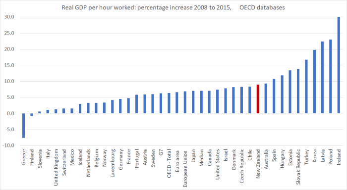
I wouldn’t put much weight on the Irish number (which goes off the chart, having to do with tax-related anomalies in their national accounts), but on this particular OECD-reported measure, over this particular period, only 10 OECD countries did better than New Zealand. Hence Mr Joyce’s claims.
But there are some pretty serious problems with the comparison (even setting aside the fact that it is now mid-late 2017). There is an old line about OECD data – you trust (or at least use) every country’s data except your own. Typically, that is because you know the pitfalls in your own country’s data and not always the pitfalls in data from other countries. But here the problem is a bit different. Specifically, the OECD’s data for productivity growth in New Zealand doesn’t bear much relationship to the New Zealand data itself. From memory, when I’ve tried to do these comparisons before I’ve just replaced the OECD New Zealand data with SNZ data. The OECD don’t have data of their own, and they must do some transformations of the data they get from here, but not ones that are readily open to scrutiny.
As I’ve explained previously, when I do charts of New Zealand productivity performance over recent years I average the expenditure and production measure of GDP, and divide by HLFS hours worked (corrected for the series break last year). But I remembered last night that the OECD prefers to focus on the expenditure measure of GDP. Many New Zealand analysts focus on the production measure (which, a long time ago, was less volatile). And although I use the HLFS, there is also a QES measure of hours. That gives one quite a range of ways to calculate GDP per hour worked, even on an annual basis.
| Percentage growth | |||||
| 2008 to 2015 | 2008 to 2016 | ||||
| Expenditure GDP/HLFS hours | 8 | 7.6 | |||
| Expenditure GDP/QES hours | 4.8 | 5.3 | |||
| Production GDP/HLFS hours | 5.6 | 4.8 | |||
| Production GDP/QES hours | 2.4 | 2.5 | |||
| Expenditure GDP/average of the two hours series | 6.4 | 6.5 | |||
| Production GDP/average of the two hours series | 4 | 3.7 | |||
| Average of the GDP measures/HLFS hours | 6.7 | 6.2 | |||
| Average of the GDP measures/QES hours | 3.6 | 3.9 | |||
| Average GDP measures/Average hours measures | 5.2 | 5.1 | |||
| Average of all these measures | 5.2 | 5.1 | |||
Replacing the OECD’s questionable New Zealand numbers in the chart above with our own data – highest, lowest, and average from this table – makes the chart look like this.
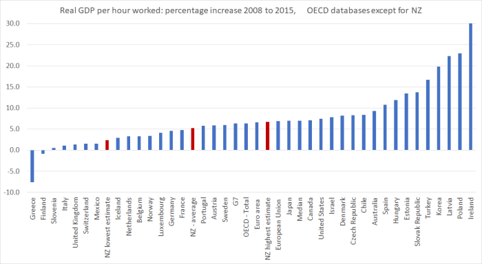
On none of these measures did we quite match the performance of the median OECD country over this period. It is fair to note that over the first half of the period – 2008 to 2012 – we did match, or even modestly exceed, the productivity growth of the typical OECD country.
But here’s the thing: across those nine possible New Zealand annual measures (see table above), not one has shown any growth in productivity at all over the (most recent) four complete years from 2012 to 2016. The estimates are tightly bunched – between a cumulative fall of 0.6 per cent, and a cumulative fall of 1.2 per cent. All those numbers are prone to revisions, mainly as the GDP numbers themselves are revised, but for now they simply reinforce the point I and others have been making for some time: there seems to have been no productivity growth at all in New Zealand for some years now.
But what about the comparisons the Minister of Finance was making with productivity growth performance during the term of the previous government? He asserted that
The last time Labour was in office, it was the reverse. Our productivity growth was 5.5 per cent over eight years and much slower than all those other economies.
So I went to the same OECD spreadsheet he seemed to have taken his productivity growth number from in talking about the current government’s term. On that OECD measure, productivity had grown by 10.6 per cent over the whole period 1999 to 2008, or by 7.4 per cent over the eight years the Minister appears to focus on (2000 to 2008).
But what did the New Zealand data itself show? I went back to the nine different measures (see above). For the full period 1999 to 2008, across the nine measures there was a range from 7.3 per cent to 13.0 per cent growth in real GDP per hour worked. The average of those measures was a 10.2 per cent increase. I couldn’t quite replicate the 5.5 per cent number the Minister quotes for 2000 to 2008, but on one of the nine measures productivty growth in that period had been 5.8 per cent (close enough I guess).
And how did other advanced countries do over the term of the previous New Zealand government? Between 1999 and 2008 the median OECD country had productivity growth of 15.7 per cent. So, as the Minister pointed out, productivity growth lagged that in other advanced countries during the term of the previous government.
The data go back far enough to also look at the experience under the 1990 to 1999 National government. As ever, a reminder that comparisons between the experience in different terms of office have little or no economic meaning. But, for what it is worth, here are the summary results. Because the OECD doesn’t have annual data for quite a few countries past 2015. I haven’t included numbers for the median OECD country for the last two lines.
| Total growth in real GDP per hour | |||
| Range of NZ measures | Average of measures | Median OECD country | |
| National 90 to 99 | 10.7 to 13.4 | 12 | 19.5 |
| Labour 99 to 08 | 7.3 to 13.0 | 10.2 | 15.7 |
| National 08 to 15 | 2.4 to 8.0 | 5.2 | 7.0 |
| National 08 to 16 | 2.5 to 7.6 | 5.1 | |
| Last four years | -1.2 to -0.6 | -0.9 | |
I’ll leave you to draw your own conclusion. My overarching one remains that for 70 years or so our productivity growth has underperformed that of other advanced countries, and there has been no extended period in that time, under any government, when any progress has been made in closing the large (levels) gaps that have opened up between productivty here and that in much of the rest of the advanced world.
To facilitate the cross-country comparisons all the numbers and charts in this post so far have used annual data only.
For shorter-term, and more timely, analysis, one can use quarterly seasonally adjusted data (that is what I usually do when, for example, I’ve shown the chart of how productivity growth performances in New Zealand and Australia have diverged in recent years). I usually use just one of the measures (average of the GDP measures divided by HLFS hours). But again there are nine potential measures, as per the first table above. This chart shows the average growth rate across those measures in each of the periods shown.
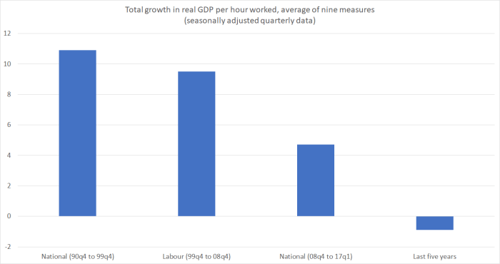
There are no direct comparisons possible to a big group of other advanced countries. But in each of these four periods productivity growth, on this summary measure, has been less than that in Australia.
In this chart, I’ve shown all nine measures indexed to 2007q4. That doesn’t align neatly with political terms, but I find it a more useful dating for economic analysis, starting just prior to the start of the recession (here and abroad).
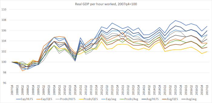
You can see that there is quite a big difference in what the various measures show for productivity growth over the first few years (and in particular from around 2010 to 2012 – by 2012 the lines are a fair way apart). There are some puzzles for people to work through about just how New Zealand did during that period, But, again, there isn’t much difference in the growth rates (or lack) of them over the last five years. That is even more stark if we look just at the last five years, indexing each of the series to 100 in 2012q1 (and noting the compressed scale of the chart).
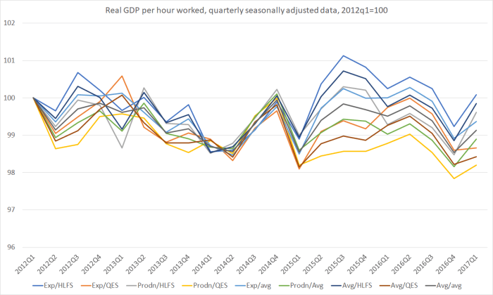
Not one of the measures shows any material productivity growth over the last five years taken together. And although there are some divergences in the last couple of years – while we wait for SNZ to revise, and increasingly reconcile, the two GDP measures – there isn’t any sign of the trend changing even in that very recent period.
Global productivity growth has been pretty weak since around 2005 – ie before the recession and (domestically) the change of government. But having no productivity growth at all here for five years now doesn’t look to be just an international phenomenon. In fact, from the same table the Minister quoted from, productivity growth in the median OECD country in the last four years appears to have been around 0.8 to 0.9 per cent per annum.
So as I suggested yesterday when the Prime Minister claims that “productivity in New Zealand has been growing pretty well”, a response along the lines of “yeah right” seems quite appropriate. The last five years look particularly bad.
(Non-economist readers might well be surprised, or disillusioned, by the wide range of possible estimates of productivity growth in some particular periods. Unfortunately that is the way things are. Measurement is a real challenge, not helped in New Zealand by persistent underfunding of official statistics.)

Interesting. Thanks!
LikeLiked by 1 person
It is a pity that successive governments have made appropriate funding of Statistics New Zealand such a low priority.
Here we are in 2017, nearly 30-years into inflation targeting and we still have quarterly CPI even though much of the CPI regimen is captured on a monthly (or higher) frequency (eg. Food and petrol prices) and much else could be captured with minimal effort (eg education, healthcare, public transport, local authority rates, tobacco prices, insurance prices). On this measure New Zealand (and Australia) stands out. Even countries like Thailand and Philippines manage to capture CPI on a monthly basis.
I’m convinced that more timely monthly CPI data would improve monetary policy decision making with the gains from better policy formulation far exceeding the additional cost of collection.
LikeLike
RB submission to the 2007 FEC inquiry into monetary policy (text by yours truly)
https://www.rbnz.govt.nz/-/media/ReserveBank/Files/Monetary%20policy/About%20monetary%20policy/3075584.pdf?la=en (but even then we went on and pulled our punches around a monthly CPI – something the Bank has never been willing to actually fight for
“significant improvements can be made to New Zealand’s
economic statistics, which would improve the basis for
decision making (including for, but not limited to, monetary
policy) and lift New Zealand’s statistical base closer to
international best practice. Good monetary policy will always
depend primarily on the interpretation of the data, but
better data can help us and others make better and more
timely judgements. The magnitudes at stake if, for example,
monetary policy tightening or easing decisions are taken too
soon or too late, are significant. New Zealand’s annual GDP
is around $160 billion, so if we can make better informed
and more timely decisions then even a slight resulting
improvement in economic performance could easily be
worth $100 million per annum. The total budget of Statistics
New Zealand, for all its statistics, not just economic ones,
is $95 million this financial year. Skimping on spending on
statistics is often a false economy, and we believe that the
Committee should recommend the allocation of additional
resources to improve the overall standard of New Zealand’s
macroeconomic statistics.”
LikeLike
It was suggested a year ago that a “sore-thumb-test” of GDP was the GST collections. The total received closely represents national economic activity. It is known. It could be published. It doesnt require the “survey” and extrapolation method. Similarly monthly and quarterly PAYE receipts would be a mine of quality information such as the number of employees, remuneration, more accurate than the HLFS, but if nothing else would either confirm or deny the “value” of the current “survey” method. Once again information that is or should be available at the touch of a button. Not hard. Why is it not used?
LikeLike
The data are available/published. They are useful in helping construct, or crosscheck, nominal GDP measures, but they don’t really help with productivity estimation, as most of the variables are nominal, not real. PAYE data may well give data on number of employees, but of course the number of self-employed or contracting people means it is still only part of the picture (and the QES picks up most of that information).
LikeLike
I do not share your unwavering enthusiasm for survey data. Both GST and PAYE data are real in that they progressively self adjust for inflation at each print. Both GST and PAYE viewed as trends would provide a serious “sensitivity test”. When viewed as absolutes they probably don’t/cant/wont produce the same magnitude as the survey method. I’m not persuaded that Statistics New Zealand with a seriously constrained budget conducting periodic surveys are doing the job
LikeLiked by 1 person
I think you are misunderstanding me. As I understand it, SNZ use a lot of this data in producing nominal GDP estimates. But the specific issue here is real GDP (which they produce 2 estimates of, and which – not infrequently – there is a gap between at the end of the period, and hours worked. Nominal measures are relatively easy, while volume measures are relatively hard, but for many macro analysis purposes the reals are more important. Some favour nominal GDP or nominal wage targeting partly because such nominal variables are easier to measure.
LikeLike
The dark art of deception
Address an audience and use facts and figures that are obscure and not upper-most in the public-domain and can’t “easily” be fact-checked and you can get away with just about anything
Look at the factoid you are wrestling with and the depths you have had to go to in order to get to its fallacy
John Key was a master of this – his proteges have learnt their lessons well
LikeLike
I see that the gender pay gap is just about nil. Here is an observation about that.
The more that the gender gap for pay has closed the more our productivity has slowed.
Not a statistician but seems like a logical correlation to me. The more women involved in everything the more paper work and less “muscle” effort.
Perhaps someone would like to make a graph of the two?
As anecdote. Was talking to a local vet the other week. He made the observation that Massey is basically training women with very few men now becoming vets. Problem for vet clinics out of town is that they need to respond to farmers etc out of hours, weekends and so on. His comment was that these lady vets do not want to work even what would be considered full time and certainly not out of normal towney hours.
Now I have heard this previously so seemingly there is some truth to it. I also think that it applies to other occupations and possibly not just to women.
Some still work 60 hours a week while many only do 20 and get paid via various social handouts. e.g. parental leave and baby sitting subsidies.
LikeLike
I’m not that persuaded by the suggested correlation. But in any case, bear in mind that the productivity measures I’m using here are output per hour worked. Changes in the mix between eg fulltime and parttime is one reason eg to be wary of using output per person employed measures.
LikeLike
Michael I have written an article on productivity and urbanisation, you might be interested in it.
View at Medium.com
P.S I have already been inform I misspelt Ardern, unfortunately I can’t correct that until I get home later tonight.
LikeLike
Spelling mistake edits fixed and I also made some clarification type edits to a few paragraphs : )
LikeLike