Having done Saturday’s post unpicking some of Steven Joyce’s claims about New Zealand’s productivity performance, I thought it might be worth using the data for a few more charts illustrating something of our performance relative to other advanced countries going back a few decades.
Of the official SNZ data I used in my nine measures of real GDP per hour worked:
- real GDP measures go back to 1987,
- the HLFS goes back to 1986, and
- the Quarterly Employment Survey goes back to the start of 1989.
Thus, using official SNZ data, we can really only do the international comparisons back to full year 1989. The OECD and the Conference Board produce numbers of New Zealand going rather further back (using earlier SNZ data for much of that), and those estimates usefully illustrate our longer-term relative decline. But in these particular posts, I just want to use the official New Zealand sources for New Zealand (and the OECD-reported data for other advanced countries).
Many of the current OECD countries (largely the former eastern bloc ones) don’t have useable data going that far back. So in these charts I’m comparing New Zealand against the 25 OECD countries that have such data all the way back to 1989. That includes all the more “traditional” advanced OECD countries except Austria. But the OECD only has data for all these countries to 2015, so this chart compares total productivity growth across countries from 1989 to 2015.
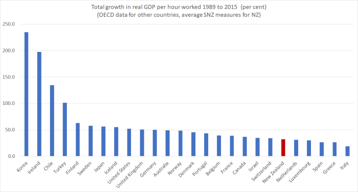
“Pretty dismal” would be my summary of New Zealand’s performance over that entire period. There is a handful of countries that have done even worse. Two are much richer and more productive than us anyway; the others some of the basket cases of the euro-area. And recall that at the start of the period we were in the midst of an economic restructuring programme sold, in part, as designed to reverse the decades-long deterioriation in New Zealand’s economic performance. As a comparisons, in 1989 Ireland is estimated to have had around the same level of real GDP per hour worked as New Zealand.
As I noted in Saturday’s post, there are nine simple ways to combine the various GDP and hours series to produce estimates of GDP per hour worked. In the chart above, I used the average of those nine measures – a 32.4 per cent increase. The range of the nine measures was from 29.0 per cent to 35.7 per cent. At best, we also beat out Switzerland and Israel. At worst, Netherlands and Luxembourg beat us. Over that long period, data uncertainty just doesn’t change the picture much.
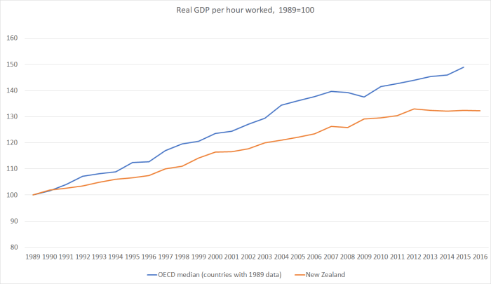
In the next chart, I’ve shown the annual path of real GDP per hour worked for New Zealand (again using the average measure) and for the median OECD country for which there is data throughout the period. In all cases, countries were indexed to 100 in 1989, and so the chart is showing cumulative growth over the period in the two series. The OECD does not yet have data for all countries for 2016.
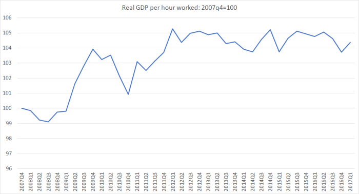
And here is the same data transformed into a ratio: the New Zealand line divided by the median OECD line, again indexed to equal 100 in 1989.

On this chart, I have included an estimate for 2016, by taking the median productivity growth rate for those OECD countries (most of them) that have 2016 data. I’ve also marked the final year of each of the three governments that changed during this period (1990, when Labour lost office; 1999 when National lost office; and 2008 when Labout lost office).
Over the course of these 27 years, the trend has been downwards – we’ve done (cumulatively) a lot worse than these other advanced countries (and the decline relative to those former eastern bloc countries is materially worse).
I don’t regard the dates around changes of government as being particularly meaningful for these economic comparisons: structural policy changes affect outcomes with a lag, and anyway, at least for the last two changes of government (1999 and 2008) there has been a lot more continuity than differences between the economic policies of the outgoing and incoming governments. But in each of the different governments’ terms there have been years when our productivity growth was faster than that of the median OECD country. Under the current government that year was 2009. And so, as I noted the other day, in their first few years in office we actually made up a little ground relative to these other advanced countries. But since then, the picture has been downhill again. Over the last four to five years all those gains have been lost, and more.
It is what happens when your country manages no productivity growth at all for five years or more (illustrated here using the average of the nine measures).
I chose 1989 for the cross-country comparisons for the practical reason that 1989 is when the consistently-compiled New Zealand data go back to. But it was also David Caygill’s first year in office as Minister of Finance. I’ve shown previously this photo in which he was illustrating his aspirations.
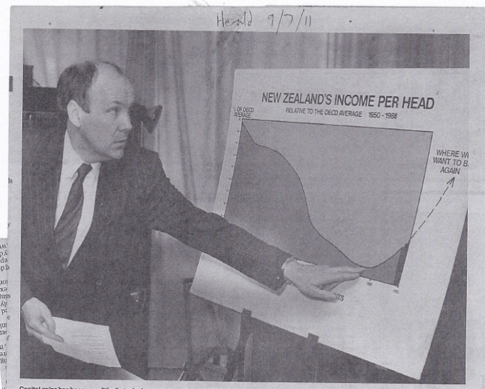
But like his predecessors for several decades before him, and all his successors – including those in the last Labour government and the current National government – he failed. Terms of trade windfalls have help our incomes, but over the longer-term improved living standards – catching up with other countries – depends on improved productivity performance. Our governments have consistently failed that test, and I can’t see anything in the current electoral offerings that seems likely to change the picture in, say, the next decade.
