Back in May when Statistics New Zealand released the first results of their new 12/16 method of calculating net migration, based not on surveyed intentions, but on what travellers subsequently actually did, I was free with my praise. The new data would provide a very useful, if lagged by at least 16 months, additional insight on what migrants were doing. In particular, it offered richer insights on the activities of New Zealand citizens (we have administrative data on visa approvals etc for non-New Zealanders, but of course New Zealanders don’t need approval from our government to come and go).
But it seems that I should have been more suspicious. This morning SNZ released the second wave of the data, bringing the data forward to March 2016 (for which they needed to be able to look at subsequent movements up to the end of July 2017). That’s good, and the data are even available in a more user-friendly format than when they put the first release out.
But then there was this in the SNZ release
“With the pending removal of departure cards, developing the ‘12/16-month rule’ is a part of our work towards ensuring we can measure migration without depending on traveller cards,” population statistics senior manager Peter Dolan said.
“In the near future, the outcomes-based ‘12/16-month rule’ is expected to become a key component in how we determine the number of migrants in New Zealand.”
This is just astonishing. Or perhaps not, but appalling anyway. For a long time there has been a push – presumably from airlines and perhaps bureaucrats – to get rid of arrival and departure cards. I was involved from the Reserve Bank side in pushing back against an earlier initiative to dump them more years ago than I can now remember. We pointed out the value of timely high frequency data on movements of people across the border ((tourists and migrants) for those doing macroeconomic policy and associated forecasting and analysis. Bear in mind that New Zealand not only has some of the largest migration flows (in, out, and net) of any advanced economy, we also have among the most variable migration flows. And cyclical fluctuations matter a lot when your job is cyclical stabilisation (ie monetary policy) – let alone making sense of short-term developments in the housing market. So you’d think it might be a high priority to have and keep high quality high frequency data.
And, as it is, we have some of the very best migration data in the world. Being an island country, we have secure borders. Being a remote set of islands, almost everyone arrives by air, at a handful of secure locations. So it is easy to collect accurate data, and a pretty rich set of data, and to get it out pretty quickly for forecasters, analysts, and even politicians to use.
I’ve explained here previously why the resulting PLT data has its limitations. It isn’t a good basis to use to look at immigration policy itself. Approvals data from MBIE is better for those purposes – and would be better still if they made the information available in an accessible format on a more timely basis. And the PLT data are based on self-reported intentions, and intentions aren’t always what people end up doing. Some people think they are leaving permanently, and are back six months later, and vice versa.. But intentions data isn’t nothing either (just as business surveys capture intentions/expectations and things don’t always turn out as they expect). The patterns – and especially the cyclical patterns, the turning points – in the PLT data tend to match those in the (lagged) 12/16 data quite closely.
There are quite enough gaps (and long lags) in New Zealand economic data as it is – monthly CPIs, monthly manufacturing data, quarterly income measure of GDP just for starters – that I’m just stagggered that key economic agencies are apparently willing to let SNZ/Customs go ahead and consider dropping departure (and arrival?) cards. Where are Treasury and the Reserve Bank on this?
How, specifically, does it matter? Without departure or arrival cards we would, of course, still have immigration approvals data for most non-citizens (other than Australians). In principle, they could be published weekly or monthly with just a day or two’s lag, and be available in quite accessible formats. Since approvals lead actual arrivals, there is certainly useful information in those approvals numbers (it is just that they aren’t made easily available now).
We could presumably also have data on the total number of people crossing the border (gross and net) from passport scanning. I’m not aware that those numbers are published at present, but they could be. And presumably they could be broken down by nationality (or at least by the passport the person happened to be travelling on). That would be useful – relative to having no arrivals or departures data – but not very. If you look at total net arrivals or departures (or net) data it is enormously volatile, and thrown around things like Lions tours – in other words, holidaymaker and other short-term visitor numbers swamp movements of migrants. Using that data alone, we’d have no ability to pick turning points for some considerable time after the turn had already happened.
The gaps would be particularly serious for the movement of New Zealanders, and more than half the variability in the 12/16 measure of net migration has arisen from fluctuations in the movements of New Zealanders. We would have no secure way of knowing if someone leaving was planning to be off for a week’s holiday, or intending to stay away for ever. The 12/16 method would eventually tell us what they did – but there is a lag of almost 18 months on the availability of that information. And even if the new plan involves keeping arrival cards and only getting rid of departure cards, most of the variability in New Zealanders’ migration movements is in the numbers leaving, not the numbers arriving.
Less importantly, without the departure cards we would seem likely to lose the ability to analyse migration (including reflows outwards by migrants who become NZ citizens) by the birthplace of the migrant.
Perhaps someone has done a robust cost-benefit analysis on getting rid of departure (and arrival?) cards. If so, I would be keen to see it, and particularly keen to see how the relevant officials have factored in the loss of some of world’s best migration data to macroeconomic monitoring and forecasting, in a country with some of the most volatile immigration flows in the advanced world (and not a great track record of getting monetary policy, or housing markets, right as it is). And even if one sets aside the macroeconomic analysts interests, it is not as if net migration numbers are one of those issues of no political salience at all. Put an 18 month lag on decent data, and you risk not silencing debate – which some might wish for – but allowing all sorts of misconceptions and concerns to flourish, which no one will be in a position to allay. It would, frankly, seem crazy. Immigration has a economic and political salience here which it might not have in a country with land borders and small permanent inflows/outflows.
In the report they released this morning, SNZ recognise that 17 month lags aren’t exactly ideal. They say they have plans to try to come up with something better, but frankly they don’t seem that confident.
The analysis in this report shows the outcomes-based measure is better suited to estimating migration levels when accuracy is the primary concern. However, a 17-month wait for migration measures is not always appropriate. Stats NZ is prioritising work to address this.
Improving the timeliness of outcomes-based migration measures
The 12/16-month methodology of the outcomes-based migration measure will always carry a minimum associated lag of 17 months.
For this reason, Stats NZ is investigating methods and data sources for a more-accurate estimate of migration than the current PLT measure, but one that is also suitably timely.
These estimates will be generated through a probabilistic predictive model of traveller type (ie short-term traveller, or long-term migrant), based on available characteristics of travellers. Such a model will provide a provisional estimate of migration, which we can then revise (if required) as sufficient time passes for us to apply the outcomes-based measure. The migration statistics series will be extended to include both provisional and final estimates of migrant arrivals and departures.
What we are trying to model
A modelling approach needs to extract the small number of migrant movements from the very large number of overall border movements. For example in the year ending June 2017 there were:
- 131,400 migrant arrivals, of 6.53 million arrivals (2.0 percent of all arrivals)
- 59,100 migrant departures, of 6.46 million departures (0.9 percent of all departures).
This shows the imbalance of the traveller type present in the border movements. This highlights the considerable challenges that exist in achieving the required level of precision when estimating migration through a modelling approach.
In a country where migration flows matter, and fluctuate, as much as they do here, you might hope that they could show that they have techniques that would actually work before talk of eliminating departure cards got going.
Anyway, what do the latest wave of data actually show? In these charts, I’m showing the 12/16 method and the PLT estimates for the various citizenship classes.
New Zealanders
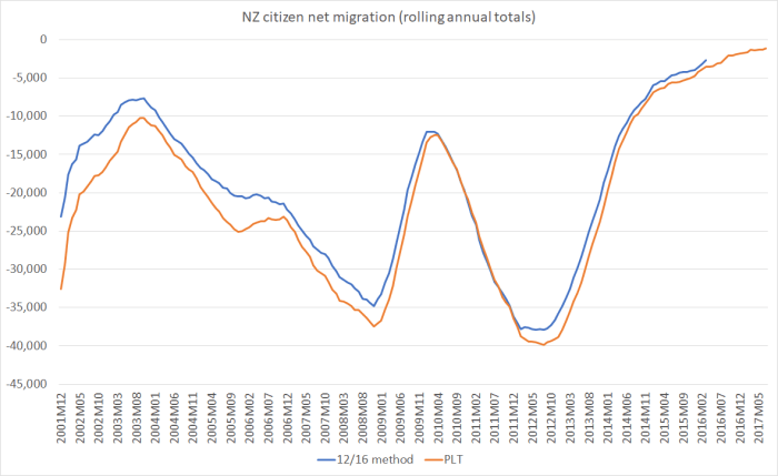
The patterns are very similar (although the cumulative net outflow has been about 10 per cent smaller than the PLT numbers had suggested). But, to reinforce the point above, the PLT data are an excellent indicator of cyclical fluctations in NZ citizen movements. That is greatly jeopardised if departure cards are lost.
And here are non-citizen net migrant numbers.
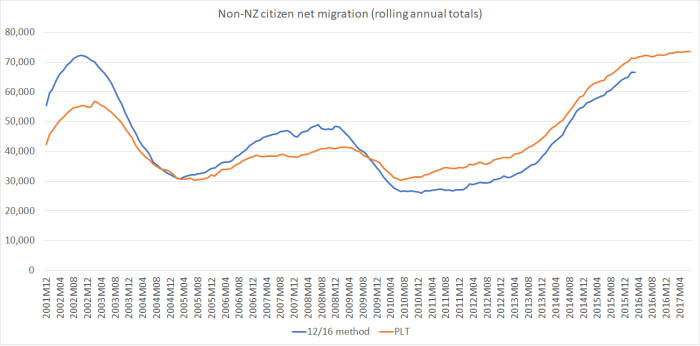
There are, at times, big differences in the two series, but – and this matters for macroeconomists – the turning points are very much the same. There is information in the PLT numbers relevant to, for example, the number of non-citizens likely to need a roof over their heads, and thus to housing market pressures.
The other thing I would note about this chart (and it is a point I’ve made previously) is that the net inflow of non-New Zealanders in the latest year for which we have this data (year to March 2016) is still less than the peak inflow in 2002. And New Zealand’s population today is about 20 per cent larger than it was then. In per capita terms, there are no record inflows (large certainly, but not record).
And here are the total net flows on the two measures
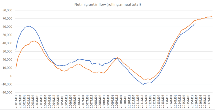
They don’t match up perfectly – one wouldn’t expect them to, and there is information even in the differences (eg what led people to change their plans) – but no analyst would happily give up a series that provided a 17 month lead this (relatively) good on the 12/16 series. (And, as above, in per capita terms the peak inflows look as though they will struggle to reach 2002 peaks- albeit those peaks were shorter-lived).
And finally, here is just the 12/16 data. Behold what SNZ would like you to consider as the official series.
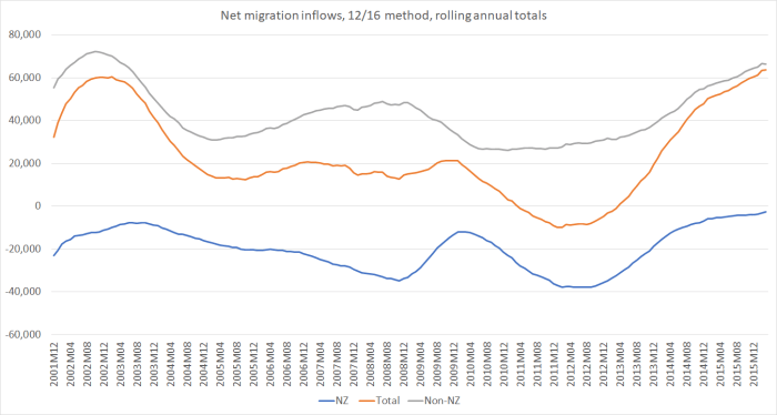
It is good to have this data. But, even together with the administrative approvals data, it can’t replace the PLT data. If that goes – if departure cards are dropped – we risk a new, big, hole, in the New Zealand stock of statistics.
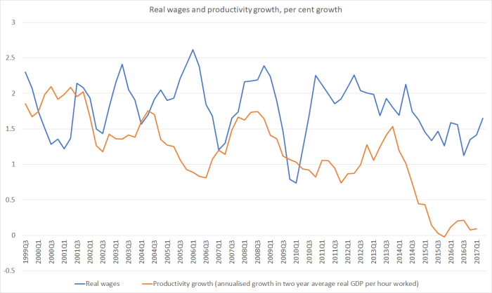
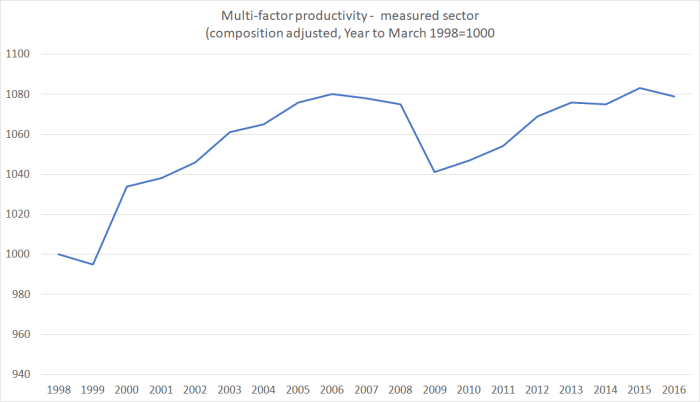
 Not only have we had no labour productivity growth for five years, but our near-neighbour Australia – which the government was once willing to talk about catching up to – has gone on generating continuing labour productivity gains. Yes, there has been a productivity growth slowdown in much of the advanced world, dating back to around 2005. But our additional and more recent slowdown – well, dead stop really – looks like something different, and probably directly attributable to New Zealand specific factors. Things New Zealand governments have responsibility for responding to.
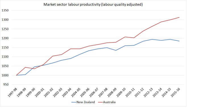
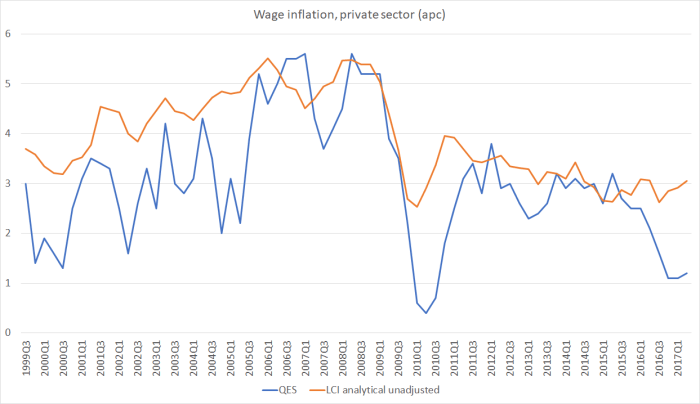 No economic analyst thinks wage inflation is anything like as volatile as the blue line – in fact, wage stickiness, and persistence in wage-setting patterns is one of the features of modern market economies.