With 30 seconds thought it is pretty obvious that if the least productive 10 per cent of our workforce simply dropped out and stayed home, then across the whole economy average GDP per hour worked would increase, all else equal. All else equal, the productivity of any particular individual still employed wouldn’t change – in practice it might well, as someone would still have to do the filing or the cleaning – but the average would.
So far, so uncontroversial. No one thinks it would be a sensible policy approach to lifting productivity to, say, bar such low productivity people from working. Doing so would not only be inhumane, but it would make us, on average, poorer (output is still output, even if productivity of the marginal worker is below average). In practice, of course, high minimum wages (relative to the market median), as in New Zealand, have exactly that effect – pricing some low-productivity people (who couldn’t, at present, command a wage in the market at least equal to the statutory minimum.
But every so often in the last 20 years, as people have tried to grapple with New Zealand’s continuing poor average levels of GDP per hour worked, and the failure to achieve any convergence to the (now) richer members of the OECD, someone pops up with line “ah, but we are more effective than most in drawing in the low productivity members of our community, which will bias our measured average productivity (and productivity growth) downwards.
The latest example was in the Sunday Star-Times business section yesterday.
New Zealand’s track record on labour productivity may look worse than it is because a growing number of Kiwis are in work, the Productivity Commission says.
In fact, this wasn’t reporting any new Productivity Commission work. Rather, one of the Productivity Commission’s senior staff had pointed the journalist in the direction of some interesting work done by able researchers at Motu a couple of years ago. And, despite the implication readers (like me) may have taken from the headlines and the lead sentence (above), the research work related to a period 2000 to 2012, not to the period of nil productivity growth over the last five years.
It suggested annual productivity growth would have been about 70 per cent higher, averaging 0.24 per cent, between 2001 and 2012, instead of 0.14 per cent, were it not for a decline in skills associated with higher employment. Motu estimated last year that the skill level of the average Kiwi worker fell by 1.8 per cent over the period as more people joined the workforce.
Again, despite the hyped lead-in (“70 per cent higher”) do note that the difference in these two (multi-factor) productivity growth rates cumulates over 11 years to a total difference of around 1.1 per cent. Welcome, but not exactly game-changing.
Motu provided a nice non-technical summary (page 3f) on what they’d actually done, using detailed data from the Longitudinal Business Database (LBD).
Productivity estimates are typically based on the quantity of labour used by firms to produce output. However, the characteristics of a firm’s workers also have an important influence on productivity, with different types of labour impacting differently on the technologies that firms adopt and their performance more generally. Because data on individual workers are linked to the data on firms in the LBD, it is possible to construct a measure of the quality of a firm’s labour force and measure the impact of this on productivity.
The measure of worker quality – which is derived from earnings data – reflects the bundle of skills, qualifications and experience of individual workers. As such, it picks up a broader range of worker attributes beyond qualifications.
Based on this measure, the average quality of the New Zealand work force declined slightly by 1.8% from 2001-2012…..
This somewhat surprising decline in the average quality of New Zealand workers reflects the net result of two opposing forces. First, average skills increased due to ageing (ie, greater experience) and rising qualifications. For example, the share of tertiary qualified workers grew from 15% to 25% while the share of workers with no qualifications fell from 19% to 14% between 2001 and 2013. At the same time, full-time equivalent employment increased strongly by around 15% (Figure 1). The large number of new workers who came into the labour market had, on average, lower skills than existing workers. This lead to a dilution in worker quality that more than offset the improvement in qualifications and experience.
They look like nice results.
But since many of the concerns around productivity growth in New Zealand relate to cross-country comparisons – how have we done relative to the rest of the advanced world, and relative to common underyling global trends – it might be worth looking at what has happened in other countries. It would take a pretty big study to replicate the Motu project across, say, the OECD. But we do have readily accessible data on employment to population ratios across the OECD, and we have that data for a longer period of time than just 2001 to 2012.
Our HLFS goes back to 1986. Here is how New Zealand’s employment to population ratio has behaved since 1986.

Over the entire 30 year period, our employment to population ratio increased by 2.4 percentage points, which isn’t a lot. It seems quite plausible that the effect Motu identified was present in the data as the employment to population ratio increases, from the trough in 1992 through to 2007. But most of that effect will have been reversing the opposite effects resulting from the really sharp fall in the employment to population ratio (disproportionately low productivity workers, almost by construction) from 1986 to 1992.
And what about the international comparison? Here is the gap between New Zealand’s employment to population rate and that in the median of the 22 OECD countries for which there is data for the whole period (almost all the “old” advanced OECD countries, and not the former Soviet bloc countries).
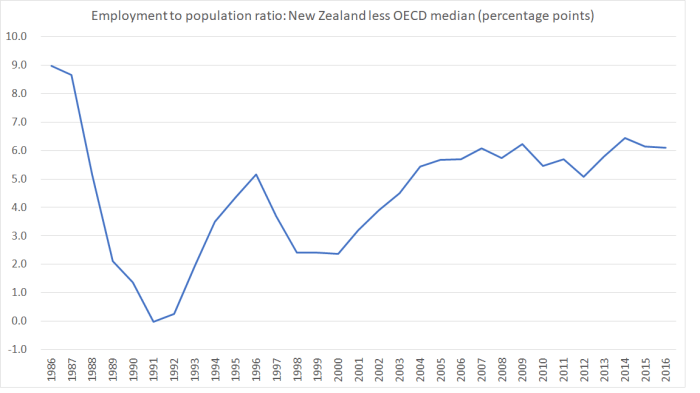
In all but one year, our employment to population ratio has been above that of the median OECD country. That doesn’t automatically mean we have been employing more low productivity people – some systems make labour force participation of both parents of small children easier than others, and some systems penalise older people staying in workforce less than others – but lets grant that some part of the difference may be that we manage to employ more of the less productive groups. At the margin, that might explain a small part of the levels difference between our average productivity and that of these, mostly richer, OECD countries.
But two things to note:
- the gap is smaller now than it was thirty years ago. In other words, even if this “employing the less productive classes” story is some part of the levels explanation, it is almost certainly less of an explanation than it was 30 years ago. And yet the real puzzle people have been grappling with is why, after all the reforms, we haven’t made any progress in closing the gaps over the last 30 years. These compositioneffects don’t look as though they can help over the post-1984 period as a whole (useful as they might be for interpreting data for some individual sub-periods).
- there has been no material change in the gap at all over the last decade, suggesting that this compositional story doesn’t offer any explanation for why from 2008 to 2015 we did no better than middling relative to other OECD countries (not closing the gaps), and since 2012 we’ve been among the very worst productivity performers, with no labour productivity growth at all.
As I’ve pointed out in several posts recently, average real GDP per hour worked in Germany, Netherlands and France is now around 60 per cent higher than that in New Zealand (even though historically all were poorer and less productive than New Zealand). In 2016, employment to population ratios in New Zealand and Germany were identical (while those in Netherlands and France were lower). But here is the chart showing New Zealand’s employment to population ratio less the average of the ratios of each of those three countries.
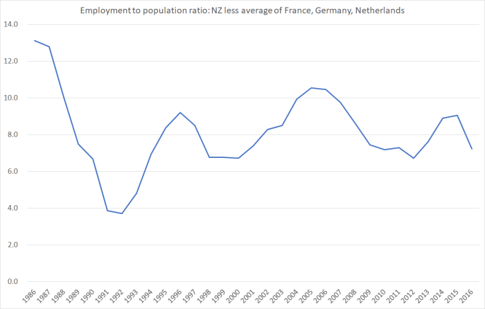
Over the period for which observers have been struggling for an explanation of our poor productivity growth, our employment to population ratios have been falling relative to those in several of the leading, and most productive, European economies.
Compositional effects (around the skill levels of the labour force) just don’t look like a credible part of an explanation for why the level of productivity here is now so much below that in the leading OECD economies, or why no progress has been made in closing the gap, over the last 30 years or the last five.