Various media last weekend (I think this was the first) latched onto a chart in the OECD’s latest Employment Outlook publication which appeared to show that over the last five years New Zealand real wages had not only fallen sharply (down 6.4 per cent) but by more than any other OECD country.
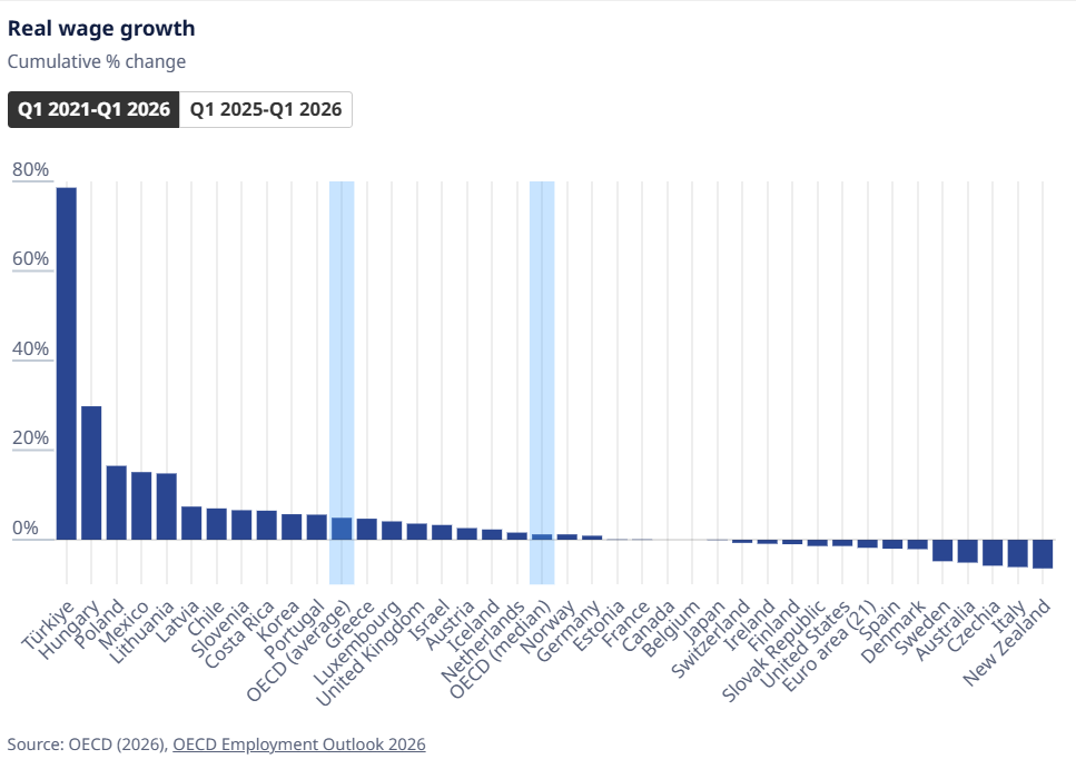
Since then the line has popped up repeatedly in columns and other commentaries (when I looked a few days ago a former Prime Minister’s tweet on the matter had been retweeted 140 times).
Within hours of the first stories appearing various economists, including me, pointed out that the OECD appeared to have used the wrong data for New Zealand, and that if better series were used, New Zealand would have been much more in the middle of the pack (assuming data for the other countries was generally representative). Wage growth comparisons across countries are often fraught because different countries measure things that might sound the same in somewhat different ways.
A few days ago The Post invited me to write a piece for publication on the issue. There is a link here to the online version, but I’ve also included the text at the end of this post.
What went wrong is best captured in this chart which I ran on Twitter several days ago

The OECD used the grey line (the LCI) even though it (by design) is not a measure of wage rates received by workers at all (it adjust for improvements in performance, so that eg over time economy.wide improvements in productivity will tend to flow into wages but should, in principle, end up largely netted off in the LCI). As you can see, over 30+ years of data the real LCI has hardly changed at all (but having increased for a few years it did actually fall 6.4 per cent over the last five years).
There is no ideal measure of real wages, but a much better starting point is provided by either the LCI Analytical Unadjusted series (blue line) or the QES average ordinary time hourly earnings. As you can see, both series increased strongly over the 25 years pre-Covid (broadly speaking reflective of improvements in economywide productivity and terms of trade over that period).
Here is what those two series look like for the period since the end of 2019, just prior to Covid.
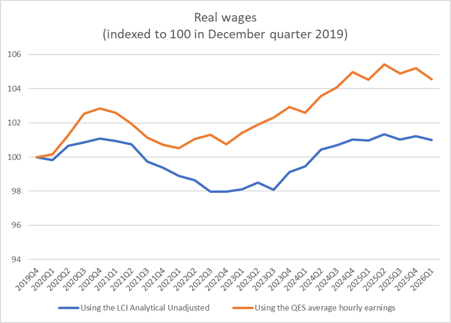
As the OECD did, I’ve deflated both series by increases in the CPI. Then, whether one focuses (as the OECD did) on just the last five years or (as seems more meaningful) over the period just prior to Covid, real wages over the full period have either been flat or have increased a bit. Any improvement in real wages hasn’t been large, but then (as in most countries) the period since Covid began hasn’t been a particularly good one economically. (And perhaps it is worth noting that real wages did fall when the unexpected large outbreak of inflation hit, enabled by poor Reserve Bank monetary policy judgements. But that unexpected lost ground has since been regained.)
Here it is perhaps also worth noting that nothing about my comments here is partisan. It wasn’t the politicians’ fault that the Reserve Bank (like many of its peers) got it wrong, and it isn’t obvious that trend productivity growth is any better now.
When I say the economy hasn’t performed well this is the sort of chart I have in mind.
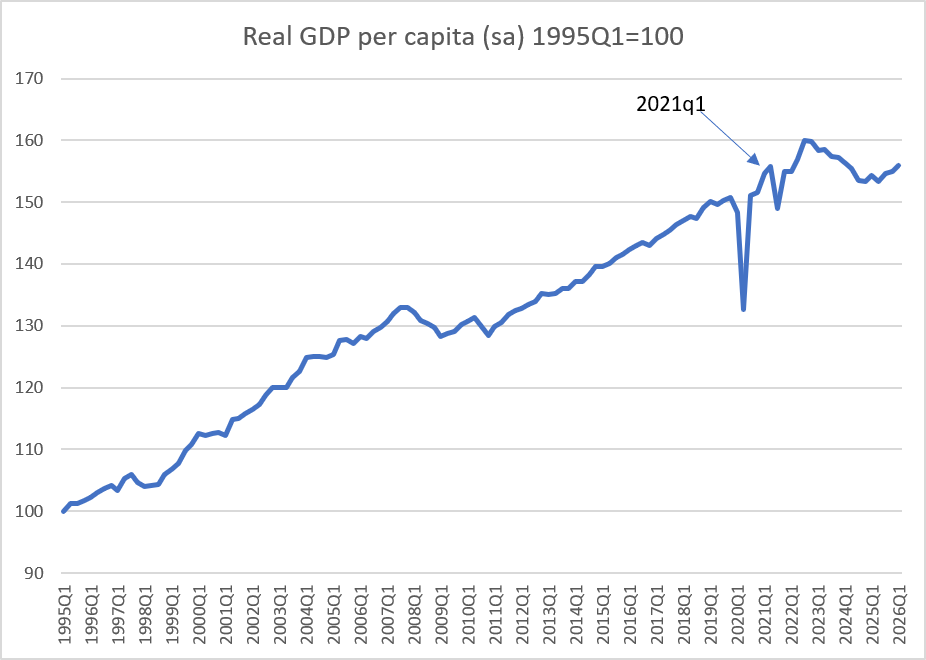
Since 2019Q4, real GDP per capita has increased by only 3.5 per cent (over more than six years). It isn’t surprising that real wages haven’t increased much (if at all). But it would be very surprising indeed had real wages fallen to anything like the extent the OECD was claiming.
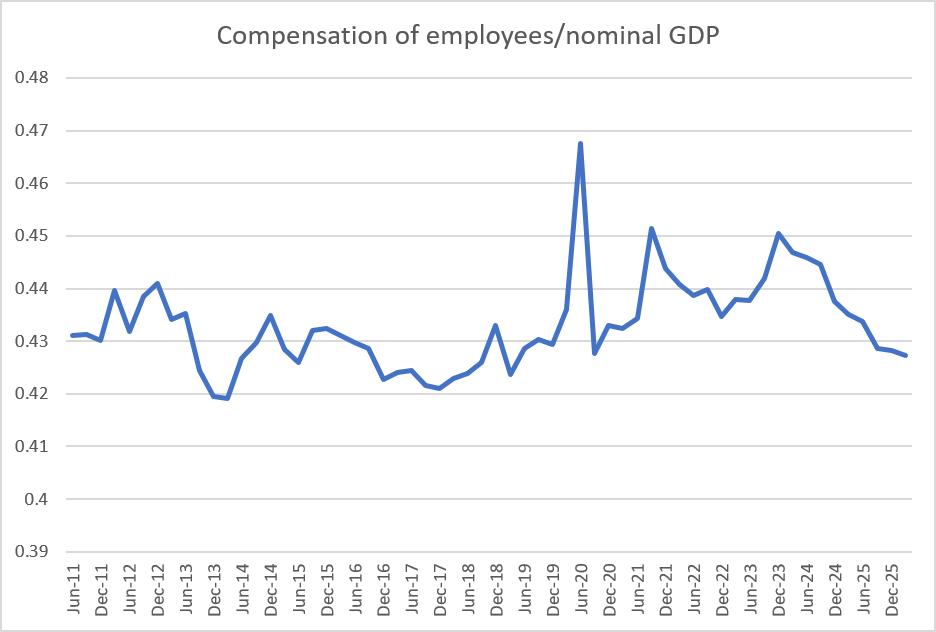
As another cross-check, I took a look at SNZ’s breakdown of nominal GDP, and in particular at the wages (“compensation of employees”) share. It was thrown all over the place by Covid (you can see the extreme June quarter 2020 spike, with the first wage subsidy and the most intensive lockdown), but over the full period since 2019Q4 compensation of employees has barely changed as a share of GDP (marginally down, but then the employment/population ratio has also fallen a bit).
Finally, in some of my initial comments I suggested that, in principle, the LCI was a bit like a measure of Unit Labour Costs. A few people asked if the OECD was intending to use ULC data in its chart, which seemed very unlikely (because they have well-labelled series of their own estimates of ULCs) and, in any case, was at odds with the footnotes on the table behind the OECD chart). In principle, Unit Labour Costs measures the effective cost to employers of labour, adjusting for productivity growth (and thus, one of the OECD’s real exchange rate series is a measure using relative unit labour costs across countries). The series doesn’t get a lot of attention but, for what it is worth, here is what the OECD’s unit labour cost series deflated by the CPI looks like for New Zealand over the last 30 years.
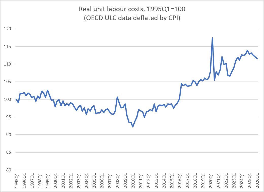
I wouldn’t put much weight on it myself, but at very least it is inconsistent with any sort of narrative about employers profiting at the expense of workers.
None of this is cause for any complacency. New Zealand’s economic performance, under successive governments, has been poor to mediocre for decades (probably at least back to 1950), with gaps opening up to the rest of the advanced world. In absolute terms things have worsened (as in so many countries) in recent years, with little average real income growth. But it is simply nothing like as bad (in absolute terms or – almost certainly – in relative ones) as the OECD made out.
OECD cross-country comparisons can often be very useful. But when a number – in any publication – looks particularly interesting it is always worth stopping and checking whether it is really showing (meaningfully) what it purports to show.
Real wages haven’t fallen 6 per cent
Michael Reddell
Michael Reddell is an economic commentator and former Reserve Bank and Treasury official
Last week the Paris-based OECD released its annual Employment Outlook report. It is a long and often rather dry report, 400 pages long and 130 charts. But just the thing for labour market nerds to pore over on a wet Saturday afternoon.
One chart in that report caught the eye of New Zealand journalists, leading to a succession of stories and columns claiming – with the authority of the OECD – that New Zealand real wages (i.e. after adjusting for CPI inflation) had fallen by 6.4 per cent in the last five years, more than in any other OECD country.
Within hours of the first story appearing various economists pointed out that the OECD appeared to have used the wrong data for New Zealand. If more appropriate data series had been used, the New Zealand experience would have looked much more middle-of-the-pack. But that hasn’t stopped the story running this week. Real wages in New Zealand, we have been told again and again, have plummeted, and we have done particularly poorly. That simply isn’t so.
So what went wrong? In their chart, the OECD used data from the Labour Cost Index (LCI). That might sound like a measure of wage rates but (and by design) it isn’t. Instead, the LCI tries to measure wage costs after adjusting for various things, but particularly for any improvement in the performance of employees. Over time, if labour productivity improves actual wage rates will tend to increase but the Labour Cost Index won’t. For some purposes it can be a useful index (e.g. for analysts looking at whether higher wage increases might put pressure on inflation, which they shouldn’t if productivity is rising too). But it simply isn’t useful as a measure of what is happening to the purchasing power of workers’ wages.
For that purpose, there are two other series. The first, less well known, is the Labour Cost Index – Analytical Unadjusted. That is an ungainly mouthful of a label, but Statistics New Zealand itself describes this series as providing “a more comprehensive picture of wage changes”. Like the LCI it is a stratified index – one not thrown around by compositional changes – but it doesn’t seek to adjust out things like improvements in performance and productivity. It isn’t a perfect measure, but for these purposes it is a lot more relevant than the headline LCI.
And then there is the simple measure of average ordinary time hourly earnings, taken from the Quarterly Employment Survey. It isn’t really a proper index at all, and it is thrown around by compositional changes (e.g. in downturns young people and lower-skilled people are relatively more likely to be out of work). But it is a measure of what was paid to people who were in work, and so has a certain appeal of simplicity.
To get at real wages we have to adjust for inflation. Once we do so, both these measures have increased substantially over the decades. In the chart, I’ve just shown them starting from just prior to Covid. As it happens, whether one looks just at the five years since March 2021 (as the OECD chart did) or at the entire period since 2019, the picture is much the same. Real wages dipped when the surprisingly severe outbreak of inflation hit later in 2021 and 2022, but they recovered and over the full period real wages have either been flat or have increased a bit. That isn’t a great performance at all – few economies have done particularly well in recent years – but it would have put us more in the middle of the pack in that OECD chart.
Quite why the OECD appears to have stuffed up on this occasion isn’t clear. It probably doesn’t help that Statistics New Zealand typically gives high profile coverage in their releases to the LCI, and buries the Analytical Unadjusted series well down the page. As for why the misleading comparisons have continued to be reported, that is probably down to some mix of, on the one hand, the OECD usually being a good source for cross-country data, and on the other, the “biggest fall in real wages in the OECD” sounds like a good headline (perhaps especially in election year).
There is an old cautionary adage that if a number appears particularly interesting it is probably wrong. In this case, the LCI was simply the wrong measure for the purposes of what the OECD was trying to illustrate. It is easy to be gloomy about New Zealand’s long-term economic performance, but not all statistics that look tantalizingly bad will be capturing quite what users think they might be. Always ask questions. Always cross-check.


In 1970 I was a sergeant aircrew in RNZAF
My salary was approx. $7500 PA
Acording to RBNZ wage inflation calculator today that is
$275,592.11
In reality, the current AIrcrew salary is less than
$98,000 (That is the max rate)
Now tell me that wages have not kept pace over the 56 years.
LikeLiked by 1 person
Two thoughts:
1. Using that very RB calculator, wages have increased 35.5 times, while prices have increased 20.75 times, since mid 1970. So even on the aggregate data, real wages have improved considerably.
2. Obviously I don’t know details about the specific job you are talking about, but note that in 1970 $7500 a year would have been a very high wage (average wages were about $2500 a year). As it happens, I asked a couple of AI tools about what a sergeant-aircrew in RNZAF might have been earning in 1970, Both suggested that something like $2500-3000 would have been plausible. I can’t verify that obviously, but for what it is worth. (On more recent RNZAF salaries, I note that NZ defence forces seem to have severe retention problems, so plausibly salaries are too low now).
LikeLike
Thanks Michael.
Another case of AI (not sure which one you used) being reliable for many things.
Unfortunately, my records for that period (I kept a journal of income & expenditure) were lost/destroyed when I moved out of the family home some years ago.
Otherwise, I could have extracted the exact numbers.
Have checked with another surviving member of my crew in 1970.
he cant remember salary 1970 but
When he left the RNZAF in 1980 he was on $11,000 PA.
Went to a Civvy job and started on $20,000 as a shift engineer.
LikeLike
Thank you Michael for challenging my thinking.!!!
I am now at a loss to understand my $7500 number for 1970…..
Using the RBNZ calculator
Working on the 1980 $11,000 is not too different from a top rate currently at $98,000 in 2026.
Working backwards from 1980 $11,000 to 1970 gives me $2,700 in 1970.
My aged brain has now run out of ideas as to why I have been using the $7500 number for the last 40+ years.
Thanks again for challenging my thinking
LikeLike