Why are NZ interest rates so persistently high (Part 1)?

On Friday, I illustrated (again) just how large and persistent the gap between New Zealand’s long-term interest rates and those in other advanced countries has been.   If anything, that gap has been larger in recent years (say, since 2009/10) than it was in the previous decade, but there has certainly been no sign of the gap shrinking.    It is at least as large now as it was 20 years ago.

Previous posts have illustrated that the gap is large and persistent however one cuts the data.  It exists whether one looks just at the big advanced economies (my charts on Friday focused on G7 countries) or just at the small ones (places like Norway, Sweden, Switzerland, and Israel).  Short-term interest rates are more variable than long-term ones, but on average the gap exists in short rates as well as long rates.  (If you aren’t convinced of the relationship between short and long rates, here are the average short and long-term interest rates for the last decade for each of the 18 OECD monetary areas –  ie countries with their own monetary policies, plus the euro-area as a bloc).

short and long term rates OECD

(The country on the far right of the chart is Iceland.)

Today’s post and tomorrow’s are about why those large and persistent gaps exist.  They will repeat material I’ve covered in earlier posts over the years, but readers come and go, old posts can be hard to find, and the issue hasn’t shown any signs of going away.   Much of today’s post is about a process of elimination: clearing away various possible explanations that, on my reading of the evidence, don’t take us very far.

10 years ago, the Reserve Bank wrote a short paper on exactly this issue.  It was part of our submission to the inquiry being undertaken into monetary policy by Parliament’s Finance and Expenditure Committee.   I wrote the paper, but it was of course signed out by the powers that be, including the then Governor Alan Bollard and his deputy Grant Spencer.  Rereading it this morning, I don’t now agree with every word of that earlier document –  partly because my own thinking has gone beyond where we had got to then – but it still does a good job of laying the foundations.  I’d be surprised if today’s Reserve Bank sees any reason to disavow that 2007 interpretation.

In writing the earlier paper, one of our main concerns was to distinguish between things the Reserve Bank could sensibly be held responsible for and things that really had little or nothing to do with us.   In particular, so we argued, the Reserve Bank sets the OCR, and expectations about the future OCR affect longer-term interest rates, but that does not mean that over prolonged periods of time the Reserve Bank gets to decide the average level of real interest rates in New Zealand.

In a mechanical sense, then, if short-term interest rates are persistently higher than those in other countries it is because the Bank put them there. However, the OCR is not set arbitrarily. Rather, the Bank looks at actual inflation outcomes, and at all the data on the outlook for inflation, before setting the OCR with the aim of keeping inflation comfortably inside the target range over the medium-term. If the Reserve Bank was consistently setting the OCR too high, we would expect over time to see inflation averaging towards the bottom end, or perhaps below the bottom, of the target range. In fact, inflation has consistently averaged in the upper half of successive target ranges – this decade, for example, inflation has averaged 2.6 percent. If monetary policy had been set consistently too tight, the solution would be easy. But there is no sign of that.

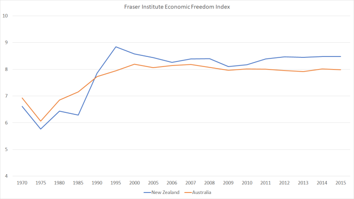
It has, at times, been argued that New Zealand’s inflation target was too ambitious and that this might explain why New Zealand’s interest rates have been persistently higher than those in other countries. In the early years of inflation targeting, our inflation target was lower than those in other countries, but …… our target (midpoint at 2 percent) has been firmly in the international mainstream. The most common developed country inflation target (actual or implicit) is around 2 percent. ……there is no convincing reason why achieving an inflation target of around 2 percent should, over time, be any more demanding in New Zealand than it is in other developed countries.

One thing has changed since then.  (Core) inflation has been averaging a bit below the target midpoint, but even so the average inflation rate here over the last five or ten years has been very similar to that in the typical (median) advanced economy.    Monetary policy settings that have been a bit tighter than necessary can, at most, explain only a small part of the average gap between New Zealand and international interest rates (nominal and real).

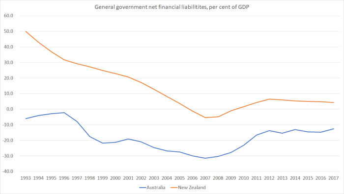
As we pointed out 10 years ago, credit risk wasn’t a compelling explanation either.    That story feels even more robust today than it did then.    Our government finances aren’t the very strongest in the entire OECD, but they are among the best.   And the negative net NIIP position (the net indebtedness of all New Zealand entities to the rest of the world) is smaller, as a share of GDP, than it was 10 years ago.  Plenty of observers worry about high levels of private sector credit but (a) as a share of GDP it isn’t much different now than it was 10 years ago, and (b) the crisis literature tends to worry more about quick increases in debt ratios at least as much as high levels.

(Small) size isn’t really much of an explanation either.   There are a couple of possible strands to a story about size.  The first would be something about secondary market liquidity.  The New Zealand government bond market is tiny in comparison to those of, say, the United States, Japan, France, Italy, or even Germany.   That makes it difficult, or expensive, to offload a very large position, and might (in principle) given rise to an additional “illiquidity premium” in our long-term interest rates.

In practice, it doesn’t seem likely to be a material part of the explanation.  Over the last decade, for example, our real interest rates have been about as much above those of the small well-managed OECD countries as they have been above those of the G7 countries.   And the “illiquidity premium” is a story that should apply to bond rates more than to overnight rates and yet over the last few decades our short-term rates have been higher relative to our long-term rates than has been the experience of most other advanced countries.  Over the last decade, interpreting that relationship has been made more difficult as many other countries had short-term rates near-zero and felt unable to take them any lower even if they’d wanted to.    But even over the last decade, there has been no sign that New Zealand’s long-term interest rates have been surprisingly high, given where short-term rates were.

I covered off another possible small country story in a post last November

There is another possible story which hasn’t really entered the mainstream of the New Zealand debate, but should be covered off for completeness.  It notes that New Zealand is a small country, with quite a volatile terms of trade, and that the currencies of such countries offer less-good diversification opportunities, suggesting that anyone investing here would require a higher return than elsewhere.  It sounds initially plausible, but it has a number of problems.  The first is that our interest rates have been persistently higher than those in other not-large countries with their own currencies ……  And the second is that if this were an important channel, it would suggest that small countries face a higher cost of capital than large ones, which would limit the growth prospects of small countries.  But (badly as New Zealand specifically has done) there is no real sign that small countries typically grow (per capita, or per hour worked) more slowly than large ones.  At present, I don’t think it is a particularly strong candidate to explain New Zealand’s persistently high interest rates.  Apart from anything else, if this were the story, why would New Zealand have accumulated –  and maintained – such a large negative net international investment position (NIIP) (still among the largest of the OECD countries)?

Monetary policy doesn’t explain the gaps, and neither do size or credit risks considerations.  Here was the Reserve Bank summary a decade ago

Standing back, it seems unlikely that factors such as credit risk, size and market liquidity help very much at all in explaining the persistent gap between our real interest rates and those in other developed countries. Apart from anything else, if these factors were (collectively) an important influence, we would expect to see New Zealand firms and household taking on less debt than those in other countries. In fact, of course, one of the well-recognised facts about New Zealand is that our households are highly indebted by international standards, and that the nation as a whole has been unusually willing to borrow, and raise equity capital, from abroad.

Productivity growth doesn’t help as an explanation either.

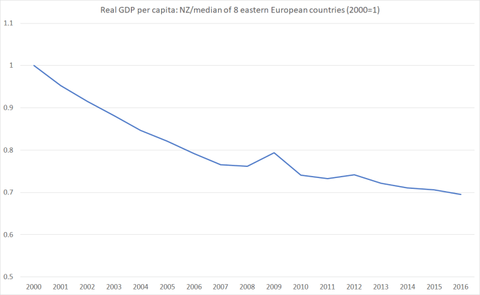
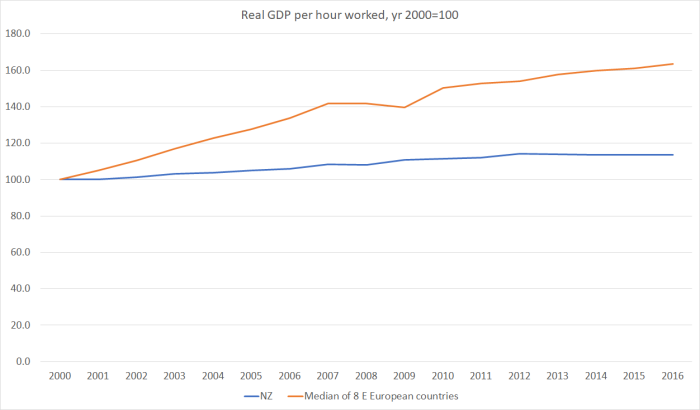
If a country had very strong persistent productivity growth it would, all else equal, tend to have higher interest rates than would be seen in other countries.  There would be lots of profitable investment opportunities in that high productivity growth country, lots of (expected) income growth that people might be consuming in anticipation of, and so on.  And over time, that high-productivity growth country could expect to see its real exchange rate rise.  Unfortunately, high productivity growth isn’t the story of New Zealand in the last few decades.  Indeed, more often rather the reverse.  Over the last five years, we’ve recorded no labour productivity growth at all.  Over the last 10 years, at best we’ve only been around a middling OECD country for productivity growth, and over longer-terms still we’ve had one of the worst records anywhere.      I illustrated a few months ago, the depressing comparisons of productivity growth between New Zealand and the emerging economies of central and eastern Europe.

A more prominent explanation for New Zealand’s persistently high interest rates points to the large negative NIIP position and asserts that the explanation for high interest rates is pretty straightforward: lots of debt means lots of risk, and hence the need for a substantial risk premium on New Zealand interest rates.  Taken in isolation –  if someone told you only that a country had a large negative NIIP position this year –  it might sound plausible.  Once you think a bit more richly about the New Zealand experience it no longer works as a story.

Here was the Reserve Bank commentary on this possible story a decade ago.

But the fact that this correlation exists between net international positions and local interest rates does not explain very much at all. In particular, it does nothing to explain what leads countries such as New Zealand to take on such large amounts of foreign capital in the first place. More specifically (and given that the Crown now has no net debt), what motivates New Zealand firms and households to take the actions that lead to this accumulation of foreign capital? And having accumulated the foreign liabilities (and New Zealand’s, as a share of GDP, have not changed much in a decade), what makes higher interest rates sustainable here for prolonged periods?

First, our NIIP has been large (and negative) for a very long time now –  for at least the last 25 years, and over that time there has been no persistent tendency for the NIIP position to get better or worse for long.  By contrast, 20 years earlier than that New Zealand had almost no net foreign debt.  The heavy government borrowing undertaken in the 70s and 80s had markedly worsened the position.  It is quite plausible that foreign lenders might then have got very nervous and wanted a premium ex ante return to cover the risk. In fact, we know some (agents of) foreign investors got very nervous –  there was the threat of a double credit rating downgrade in early 1991.  But when lenders get very nervous, borrowers tend to change their behavior, voluntarily or otherwise, working off the debt and restoring their creditworthiness.   And in New Zealand, the government did exactly that –  running more than a decade of surpluses and restoring a pretty respectable government balance sheet.  But the large interest rate differential has persisted –  in a way that it did in no other advanced country (including those that went through much worse crises and threats or crises than anything New Zealand has seen in the last 25 years).

As I’ve already touched on, short-term interest rates are set by the Reserve Bank, in response to domestic inflation pressures. But long-term interest rates are set in the markets.  If investors had really been persistently uneasy about New Zealand’s NIIP position, we might not have seen it much in short-term interest rates, but should certainly have expected to see it in the longer-term interest rates. (That, after all, is what we see in various euro countries that have lapsed in and out of near-crisis conditions).   But in one obvious place one might look for direct evidence of such a risk premium, it just isn’t there.

And remember that when risk concerns about a country/currency rise, one of the first things one typically sees –  at least in a floating exchange rate country –  is a fall in the exchange rate.  It is a bit like how things work in equity markets.  When investors get uneasy about a company, or indeed a whole market, they only rarely succeed in getting higher dividends out of the company(ies) concerned.  If the companies were sufficiently profitable to support higher dividends the concerns probably wouldn’t have arisen in the first place.  Instead, what tends to happen is that share prices fall –  and they fall to the point where expected dividends, and the expected future price appreciations of the share(s) concerned, in combination leave investors happy to hold those shares. In that process, an increased equity risk premium is built into the pricing.

At an economywide level,  if investors had had such concerns about the New Zealand economy and the accumulated net debt position, the most natural places to have seen it would have been in (a) higher long-term bond yields, and (b) a fall in the exchange rate (and perhaps a persistence of a surprisingly weak exchange rate). But we’ve seen neither in New Zealand.  Had we done so, presumably domestic demand would have weakened, and net exports would have increased.  The combined effects of those two shifts would have been to have reduced the negative NIIP position, and reduced whatever basis there had been for investors’ concerns.  Nothing in the New Zealand experience over the last 20 years or more squares with that sort of story.

And that is the really the problem with the most common stories used to explain New Zealand’s persistently high interest rates. They simply cannot explain the co-existence of high interest rates and a high exchange rate over long periods.

My story attempts to.  More on that tomorrow.

Wishful Australian thinking

I’ve been fascinated for some time by the way elements of the right wing of the Australian business and political community have sought to lionise John Key and Bill English.      On the day of his successful party room coup, Malcolm Turnbull was at it

“John Key has been able to achieve very significant economic reforms in New Zealand by doing just that, by taking on and explaining complex issues and then making the case for them. And I, that is certainly something that I believe we should do and Julie and I are very keen to do that again.”

As I noted at the time, I couldn’t think of any such “very significant economic reforms”, although there were various useful modest reforms, offsetting other backward steps.

The “look at New Zealand, why can’t we do it like them” theme has endured to the end.  There was a column along those lines in The Australian the other day headed “Bill English, John Key leave NZ a far stronger economy”, by Nick Cater, Executive Director of the Menzies Research Centre, a think tank affiliated to the Liberal Party (his column is reproduced here).

The column was so full of questionable claims and overstatement that it was almost hard to believe it was written by a serious commentator.  Near the start Cater notes

Key and English were described more than once as the quiet achievers. The governments they led as the bore-cons introduced reforms in tax and welfare while balancing the budget without fanfare or fuss. Seldom has the demise of a New Zealand government caused such political shockwaves on this side of the Tasman. In a period of near-universal political volatility, it raises the dispiriting possibility that simply governing well may no longer be enough. The Key and English legacy compares starkly with Australia’s record over the same period.

The first item is his list of achievements is this

In 2008, when the National Party came to power, New Zealand was 24th on the World Economic Forum’s Global Competitiveness Index, six places behind Australia. Since then the positions have been ­reversed. Today New Zealand is in 13th place on the index, eight positions ahead of Australia.

I’m not so familiar with that particular index, and tend myself to use the Fraser Institute’s economic freedom index, partly because there is a long time series of data.

econ freedom

The big story, for both countries, is surely that of a lot of reform and liberalisation in the 1980s and 1990s, and almost nothing material since then.   On this measure, of course, New Zealand does better than Australia, and has at every reading for more than 20 years now.   Perhaps New Zealand policymakers have done slightly better than their Australian counterparts in the last nine years or so but any differences are pretty small.

Cater then turns to GDP outcomes

New Zealanders are still poorer than Australians on average but they are catching up fast. Nine years ago GDP per capita in New Zealand was 30 per cent lower than in Australia, now the gap has narrowed to 19 per cent.

Would that it were true, but it isn’t.    Here is real GDP per capita for the two countries, both indexed to 100 for calendar 2007, just prior to the global recession..

real GDP nz vs aus

Over that time, we’ve done just slightly worse than Australia has.  Cater might argue for starting the comparison from 2008. but I doubt even he is going to credit John Key and Bill English with ending the global recession.

The productivity growth comparisons, of course, are particularly unfavourable to New Zealand, esepcially over the last five years.

aus vs nz ral gdp phw 2

Productivity is something closer to what government policy can usefully and materially influence (although other stuff matters too).

If we assume that governments have the power to control the economy — which incidentally 33 per cent of Australians no longer believe, according to the most recent Australian Electoral Study — then Key and English governed exceedingly well by ­almost any measure.

On the bits governments have a fair influence over we’ve done particularly badly relative to Australia (less badly relative to some other countries).  But there are bits of the economy that national governments have almost no control over whatever.  Commodity prices are perhaps foremost among them.  Our government can’t do anything much about the dairy price and the Australian government can’t do much about, say, iron ore prices.    Fluctuations in the terms of trade affect real per capita income measures even when the volume of production doesn’t change.

TOT aus and NZ

Australia had a huge terms of trade boom up to 2011, and even now if we take the last 15 years as a whole Australia’s terms of trade have increased more than ours have.   But since 2007/08, our terms of trade have done a bit better than Australia’s.  Hard to see how governments on either side of Tasman deserve credit or blame for those developments.

But as a result of these terms of trade swings, on a measure that adjusts for the effects of the terms of trade (real GDI per capita), New Zealand has grown three percentage points faster than Australia since 2007.  A nice-to-have windfall to be sure, but (a) even that gap makes only tiny inroads into the accumulated levels differences between New Zealand and Auatralian incomes, (b) the terms of trade are volatile, and who knows what they’ll do to the income gaps in the next decades, and (c) in the long-run, productivity growth is almost everything, when growth in living standards is in question.

As Cater notes, there has been a big change in trans-Tasman immigration (although even those flows have been quite –  typically –  variable over the last nine years).

The relative change in economic fortunes has changed the migration flow across the Tasman. Inward ­migration from ­Australia exceeded outward ­migration last year for the first time in a quarter of a century.

Of course, that last time –  quarter of a century ago –  was when the Australian labour market was also doing very badly.   New Zealand’s was as well, but when you are looking at moving to another country, conditions in the destination market matter a lot.   Australia has struggled in the last few years, but actually both countries are still among the diminishing number of advanced countries where the unemployment rate is still well above pre-2008 downturns levels.   That reflects no great credit on governments, or central banks, on either side of the Tasman.

Then, of course, there is a fiscal policy.  Personally, I think the outgoing government has done a pretty reasonable job on that score –  as, in fact, its predecessors for the previous 20 years had done.

But even here Cater gets some things quite badly wrong

While treasurer Wayne Swan was doling out cash and spending billions on poorly conceived make-work projects to help Australia survive the 2008-09 ­financial crisis, English gave personal and business tax cuts.

I’m no fan of the Rudd/Swan fiscal stimulus programme, but….. the appropriate comparison here is that we had no active discretionary fiscal stimulus to attempt to counter the recessionary forces.  None.  And the almost accidental stimulus that happened to be in place resulted from the Budget choices of the outgoing Labour government which had put in place tax cuts and spending increases at a time when Treasury was advising them that the government accounts would remain in surplus even after those initiatives.

Of course, there were some tax reforms here  –  in 2010 –  and conventional wisdom tends to count them “a good thing” (I’m less convinced, because the package of measure increased the effective taxation levied on capital income, against the prescriptions of standard economic analysis).   But I’m not aware of any analyst who thinks those changes made a material difference to New Zealand’s economic performance in the last few years.

Cater quotes some debt numbers that I don’t recognise

Today the New Zealand budget is in surplus while Australia is still running deficits. Ten years ago the New Zealand government’s gross debt stood at 25 per cent of GDP while Australia’s sat on 20 per cent. Today the positions are reversed. Australia’s net public debt is at 47 per cent; New Zealand’s hit a peak of 41 per cent in 2012 and has steadily declined to 38.2 per cent.

Here are the OECD’s number for general government net financial liabilities as a share of GDP.

gen govt net liabs nz and aus

Every year for the last 25, Australia’s overall government net debt has been less than ours, and if the gaps between the two countries has closed a bit in the last few years, the change is pretty small and the similarities, in the respective paths, are more striking than the differences.     Of course, we’ve had one nasty shock they haven’t had –  earthquakes.  Then again, they’ve been coping with a really big correction in the terms of trade.

On both the tax and spending sides of the government accounts, we have a slightly bigger government (share of GDP) than Australia –  and more variable one.  None of that has looked like changing over the last nine years.

Perhaps you thought this was just an economic case.  But, no.  Cater is just getting into his stride.

The achievements of Key and English are by no means limited to the economy, however.

Cater appears to be a big fan of the “investment approach” to welfare and related government spending.    I’m still more ambivalent –  the use of data appeals, of course, but big-government joined-up data makes me very nervous (hints of, eg, Chinese social credit scores).   For now, I’m happy to look for evidence of results.  Cater is convinced.

From this thinking flowed a new approach to welfare that has since been adopted by the Abbott and Turnbull governments to great effect.

and

In its second of two [three?] terms the ­National government first halted the long-term trend of rising welfare dependency and then ­reversed it. The number of New Zealanders claiming sole parent benefit has fallen by a quarter as 20,000 single parents found work. Long-term welfare dependency has fallen substantially. In 2012 78,000 New Zealanders had been collecting benefits for 12 months or longer. By June this year the number had fallen to 55,000.

The first sentence is simply wrong.   Here is the MSD data on the number of working-age main benefit recipients as a percentage of the population aged 18 to 64.

benefits 2017

There was a recession in the first term –  welfare benefit numbers rise in recessions –  and then the downward trend that had been in place for the previous decade resumed.   But as of last month, the share of the working age population on these main welfare benefits was only very slightly below where it had been in September 2007.

In a way, that isn’t surprising.  Unemployment is still well above pre-recession levels.   But it should be somewhat troubling, both on that count, and because one component of benefit numbers has dropped away quite sharply.     As Cater notes, the number of sole parents on the benefit has fallen away a lot.  Here is the chart – there is a discontinuity in the series associated with the welfare changes (including labelling changes) in 2013.

DPB

The trend was underway during the decade prior to the recession.  The pace of decline has certainly accelerated since then (at least since 2013), but since the overall number of benefit recipients as a share of the working age population hasn’t changed since 2007, other categories must have increased.

It would also be interesting to see a serious study of just what role policy changes have played even in the decline in sole parent beneficiaries.   After all, teen pregnancy rates have been dropping globally –  for reasons not, I think, that well-understood – and in New Zealand the teen birth rate halved between 2008 and 2016 (but, even so, was still higher than the comparable rate in Australia).  Welcome as that trend is, it seems unlikely that New Zealand government policies will have been a large part of the explanation.

And, of course, over the outgoing government’s term there has been a huge increase in the number of elderly age-benefit recipients (2011 saw the first baby-boomers turning 65).   In the last months of the outgoing government, there was finally talk of lifting the age of eligibility –  something Australia began years ago –  but it was going to happen 20 years hence.  And now –  for now –  it isn’t going to happen at all.

At this point, Cater leaves the numbers behind.

The government’s strategy of taking the public with them on reforms, ­explaining the logic well in advance in language people could follow, adjusting ­expectations and then implementing the promised changes, was remarkably successful until the end.

On what measures I wondered?

And he concludes

For 11 years he and Key had written a counter-narrative to that prevalent in Australia that reform was all but impossible in the era of Facebook and Twitter. While Australia appeared stuck in a policy drought, New Zealand was breaking new ground, discovering new ways to measure government programs by their results and finetuning them accordingly. Feel-good policy, sentimentalism and identity politics were anathema to them.

English and Key proved that centre-right parties were not condemned to be nasty parties, ­focused on numbers rather than people, as they doggedly cleared up their predecessors’ fiscal mess. Devoid of ideology, fiercely pragmatic, self-aware and inspired, the pair stands as inspiration to the rest of the developed world in these anxious and volatile times.

So horrendous house prices, no productivity growth, an export sector shrinking as a share of GDP are the sorts of things that provide an inspiration to the world?  I’m flabbergasted.    The terms of trade have certainly been favourable, and yet even the outgoing Minister for Primary Industries has been heard to talk of the possibilities of “peak cow”.   Where exporters haven’t done badly, it has too often –  export education and dairy being prime examples –  been partly a result of unpriced subsidies and environmental externalities.

Relative to Australia, the story of the last nine years isn’t all bad.  Neither country has been managed that well.    There are some good stories.  Broadly speaking, New Zealand’s fiscal policy is one of them, but too much can be made even of that.  A much lower balance of payments current account deficit is often counted as another good story, except that much of the contraction reflects (a) the slump in global interest rates, reducing the cost of our external indebtedness, and (b) the weakness of investment even years into the recovery phase.   Perhaps we’ve had tidy stewardship, but going nowhere.  A safe pair of hands at the bridge perhaps, but with the ship meandering without clear direction, or any compelling sense of how better outcomes might be achieved.

All of which should not be taken as any sort of enthusiasm for the new government.  No doubt –  like their predecessors –  they’ll do a few sensible things.  But, like their predecessors, at present they (or the constituent parties) show little sign of either understanding the nature of New Zealand’s dismal long-term economic performance, or of adopting the sorts of policies that could at last begin to reverse that decline.  A pessimist might incline to the view that things may even get gradually worse –  and here I’m not thinking of the cyclical pessimism Winston Peters was enunciating on Thursday night.

There have been very few periods in the last 150 years when policy has been much better managed in New Zealand than in Australia.   The last nine do-little-or-nothing years (following on from a similar nine years) hasn’t been one of those periods.   That is to the credit of neither New Zealand or Australian politicians, but of course Australia’s starting point is so much less bad than ours.


Poor returns to tertiary education

Tertiary education was quite a theme in the recent election campaign. In my household – with three kids likely to go to university in the next decade – promises to reduce the direct costs of tertiary education were tempting.  But resisting temptation remains a virtue.

A few days ago I noticed (thanks to Jim Rose) this chart

lifetime benefit of a degree

It isn’t a new result. These OECD data have shown for some time that the economic returns in New Zealand to getting a degree are pretty low relative to those in other advanced countries.   Such results even prompted Treasury to commission some external research on the gap in private returns.

In the chart – from a few years ago – whoever put it together has highlighted two groups of countries: the Nordic and Benelux countries on the one hand, where there are already lots of skilled people, and high income taxes, and former eastern-bloc countries which are now catching up to the rest of the advanced world, and where skills are in high demand, and able to command high returns. I’m, of course, more interested in the contrast between New Zealand and those central European countries.  As I’ve written recently, 25 years ago both we and they were looking to reverse decades of poor performance and catch-up with the other advanced countries. They’ve made progress in that direction. We haven’t.

Since the net benefits are shown in dollar terms (rather than, say, as a per cent of GDP per capita or of lifetime earnings), it is probably reasonable to expect that poorer countries will be bunched towards the left of the chart. And there one finds Turkey, Greece, New Zealand and Italy. But that clearly isn’t the bulk of the story. After all, even though they are now catching up, all six of the former eastern bloc countries shown still have levels of GDP per hour worked and/or GDP per capita similar to or (generally) below, those of New Zealand.

I had a look at a few background documents from the OECD. If anything, as we shall see, the New Zealand numbers may be even worse than what is shown in this chart.

It is important to recognise the distinction the OECD draws between private and public costs and benefits. Some of these things can be easily measured (eg upfront private fees, or direct public grants to institutions or individuals). Others are more approximate. (The other aspect, which I’m not sure any of these particular indicators attempts to account for is the selection bias, in which the typical person who undertakes tertiary study has other traits – eg intelligence – that mean that they would probably earn more in the labour force than the average person who does not undertake tertiary study.)

This chart is from a few years ago, and tries to break down the costs of tertiary education (in this case for a man). In New Zealand, as in most countries, the largest private cost by a considerable margin, is the foregone earnings of the student themselves.

tertiary costs

These OECD indicators assume that students do not work while studying.  In the latest OECD Education at a Glance they show estimates for 15 countries as to how much difference it would make to include reasonable estimates of actual student earnings. For New Zealand, doing so would lift the estimated returns to tertiary education by around 15 per cent, more than for most of the other countries shown. However, as you can see from the first chart above, a 15 per cent lift in returns to tertiary study in New Zealand would not alter our relative position on the chart.

The other aspect of the calculations which often doesn’t get much attention is the appropriate discount rate to use in making these calculations. It matters a lot – the costs are mostly incurred between, say, ages 18 and 22, and the economic benefits accrue over decades. A decision by an individual is a very long-lasting investment project, with significant irreversibilities (the years spent on education can’t be reclaimed).

The OECD at present adopts a very low discount rate.

The NPV results presented in the tables and figures of this indicator are calculated using a discount rate of 2%, based on the average real interest on government bonds across OECD countries. However, it can be argued that education is not a risk-free investment, and that therefore a higher discount rate should be used.

I’d say there was no ‘it can be argued” about it. No sensible government would do a cost-benefit analysis of building more schools or universities using a discount rate of 2 per cent. The New Zealand Treasury, for example, uses a default discount rate of 6 per cent real. And as an economic proposition, an individual’s tertiary education is a pretty risky proposition, with few effective diversification options for most people.

As it happens, in the latest Education at a Glance the OECD presents a table illustrating, to some extent, what difference it makes to use a higher discount rate.

discount rates.png

Using a discount rate of 5 per cent (real) reduces the estimated benefits by around 60 per cent (relative to the 2 per cent baseline) – and these numbers are for a man, and in most countries the net benefits to tertiary education for a woman are (on average) lower than for a man.

This issue matters particularly for New Zealand which has a higher risk-free interest rate on average than any of the other countries in the table. The gap is large. On Friday, the real interest rate on the New Zealand government’s longest (23 year) inflation-indexed bond was 2.39 per cent, while that for the US government’s 20 year indexed bond was 0.77 per cent (and US yields are far from the lowest in the world). A margin of 1.5 percentage points above “world” rates hasn’t been a bad guide for New Zealand interest rates over recent decades.

Even a 5 per cent real discount rate appears too low to evaluate a personal decision to invest in a tertiary education in New Zealand. But if one takes the results for New Zealand in the table above when evaluated at a 5 per cent discount rate, and then compares them against the results evaluated at 3.5 per cent for other countries (to capture that persistent difference in real interest rates), only Latvia would offer lower returns to tertiary education than New Zealand does.

And bump up the discount rate a little more and the estimated net returns to tertiary study will soon be approaching zero or going negative.  And, remember, those estimates are for a man. The average female returns are even lower.

People will have a range of reactions to these sorts of numbers. Some will take them as supporting proposals to reduce tertiary fees or increase student allowances. Such changes might increase the net private returns to tertiary education, but they won’t (of course) change the all-up net returns (someone still has to pay).  Others seem to see tertiary education as some sort of “merit good” that people should have the opportunity to undertake, at moderate expense, whether there is an economic return – to them, or the public more generally – or not.  And, of course, for some people and some courses, a tertiary education is more akin to consumption than investment (which is not intended as a criticism).

For me, I see them as yet another marker of the failure of the economic strategy pursued by successive governments over recent decades.  Our remoteness means it is very difficult to generate consistently high returns to anything much in New Zealand for very many people. The determination of our governments to quite rapidly increase the population here, despite those apparently limited opportunities, just compounds the problem. It does so directly – the limited natural resources (our one distinctive advantage) are spread over ever more people – and indirectly, through a persistently overvalued real exchange rate and high real interest rates.

Returns to tertiary education in New Zealand are probably quite reasonable for those New Zealanders who get an education here, and then leave (but that is probably a poor investment for the taxpayer). For many of those who stay, it looks like a distinctly marginal proposition. Attempting to bring in lots more skilled people from abroad – most of whom aren’t that skilled anyway – just compounds the economic problem, even if the New Zealand taxpayer doesn’t have to pay anything for their tertiary education. There just aren’t the good economic opportunities here for a rapidly growing population, and increasing subsidies to tertiary education would seem likely to further exaggerate the evident imbalances.

In an economy that was making progress towards reversing decades of relative economic decline, there is good reason to expect that returns to investment in tertiary education (like other prospective investment returns) should be consistently high relative to those in other countries. Sadly, those returns appear to be consistently low in New Zealand – especially when evaluated at an appropriate discount rate. And, of course, we are making no progress at all in closing those productivity gaps.

A problem awaiting the new government

Whichever party, or group of parties, gets to form the next government will face the same facts about our disappointing economic performance.  As I noted a few weeks ago, based on the recent PREFU projections, not even Treasury seemed to rate very highly the chances of meeting the National-led government’s export objective.

Here is the share of exports in GDP, showing actuals for the last decade or so, and Treasury’s projections for the next few years.

x to gdp

By the end of that forecast period, there will only be four more years until the goal of a much-increased export share of GDP was to be met.  On these numbers, exports as a share of GDP would by then be at their lowest since 1989, 32 years earlier.  So much for a more open globalising economy.

One of the indicators I like to use is a rather rough and ready decomposition of real GDP into its tradable and non-tradable components, first developed by an IMF staffer looking at New Zealand a decade or so ago.    It assigns the primary sector and the manufacturing sector components of real production GDP, and the exports of services component of expenditure GDP, to the tradables sector –  the bits where New Zealand firms are competing with the rest of the world.  The rest of GDP is classed as non-tradable.    It isn’t a precise delineation by any means: some local manufacturing isn’t really tradable (due to high weight and low value, and thus transport costs) and, for example, the electricity generated for Comalco is, in effect, tradable.   But, broadly speaking, it seems to capture something meaningful about the New Zealand economy.  In the early days of the National government, then Minister of Finance Bill English was quite keen on it.

All economies need firms in both tradables and non-tradables sectors.  So one sector isn’t inherently better or worse than the other.  But countries that are catching up with the world-leading economies tend to be ones in which the tradables sector (exports and import-competers) lead the way.  In such economies, firms are finding more and better, more lucrative, ways to tap the much larger global market.  Of course, we also gain when the non-tradables sector is becoming more productive –  both directly as consumers, and as a reduction in the input costs of tradables sector firms.    But there is a limit to how many cafe meals we can serve each other.  There isn’t really a technical limit on, say, how many smart ideas, translated into appealing products, that firms in a small country could sell to the rest of the big world.

As well as dividing real GDP into tradables and non-tradables components, I’ve also expressed both components in per capita terms.    Over long periods of time, most real economic series trend upwards, and actually it is something like per capita production or value-added that matters most in looking at gains in material well-being.   Here is the latest version of my chart, updated for last week’s GDP release.

t and nt components to jun 17

The series do bob around a bit.  The tradables sector, for example, had a very good June quarter on the back of a couple of tourism one-offs (the World Masters’ Games and the Lions tour) but then it had had a poor year last year.   But what I try to draw attention to is that (a) the peak in the tradables series was as long ago as 2004, and (b) real per capita tradables sector output is now no higher than it was at the end of 2000, almost 17 years ago.  Across the whole terms of two governments, one National-led and one Labour-led, there has been almost no growth at all in the real per capita GDP of the tradables sector. None.

Some economists really don’t like the chart.  So lets look instead at each of the components that make up the tradables sector measure.

tradables components 2

Services exports, in real per capita terms, did very well in the 1990s, growing quite strongly until around 2002.  But, overall, almost no growth since.   The mining sector briefly did very well around 2007/08 when a new oil well came on stream.   And, in per capita terms, the agriculture, forestry and fishing component of production GDP, and the manufacturing component, have gone almost nowhere over 25 years, again in real per capita terms.

What changed 15 years ago?  Well, one of the things that has changed a great deal is the real exchange rate.  Here is a chart of the Reserve Bank’s index, showing an average for the last 15 years (as well as one for the previous few years).

rer to july 17

It is unlikely –  all but inconceivable in fact –  that if we keep on doing what we’ve been doing for the last 15 years or more, in terms of economic policy settings, that we’ll see any sustained per capita growth in our tradables sectors.  It is that old line about a definition of insanity being doing the same stuff over again and expecting a different result.

Even to sustain those sectors at the sort of flat levels –  no growth at all – we’ve had over the last 15 years or more has involved the significant subsidies of (a) unpriced pollution externalities especially around water, (b) significant direct subsidies (to, most notably, the film industry) and (c) significant effective subsidies to the export education industry (by offering a bundled product where students can pay for an education –  in some cases an “education” –  and get preferred access to work and residence visa entitlements too –  that benefit being provided free to the providers by the New Zealand government).

I’d be very happy for a new government, of whatever stripe, to deal directly to any or all of those distortions.  But they, and their advisers, need to bear in mind that exchange rate chart.   Unless the real exchange rate falls quite materially, it is difficult to envisage much growth in other tradables industries to replace the shrinkage in the subsidised industries.  (It was exactly the same issues policy advisers faced when we started liberalising, and stripping away earlier subsidies, in 1984.)   Real exchange rates can’t be managed directly, but they can be materially influenced by removing the sorts of other policy distortions that put intense pressure on domestic resources, and drive up the prices of non-tradables relative to tradables, skewing the economy away from the tradables sector.

I’m not optimistic about prospects, but the good thing about pessimism is that one can, just occasionally, be pleasantly surprised.


Productivity and employment

With 30 seconds thought it is pretty obvious that if the least productive 10 per cent of our workforce simply dropped out and stayed home, then across the whole economy average GDP per hour worked would increase, all else equal.   All else equal, the productivity of any particular individual still employed wouldn’t change –  in practice it might well, as someone would still have to do the filing or the cleaning –  but the average would.

So far, so uncontroversial.  No one thinks it would be a sensible policy approach to lifting productivity to, say, bar such low productivity people from working.  Doing so would not only be inhumane, but it would make us, on average, poorer (output is still output, even if productivity of the marginal worker is below average).    In practice, of course, high minimum wages (relative to the market median), as in New Zealand, have exactly that effect –  pricing some low-productivity people (who couldn’t, at present, command a wage in the market at least equal to the statutory minimum.

But every so often in the last 20 years, as people have tried to grapple with New Zealand’s continuing poor average levels of GDP per hour worked, and the failure to achieve any convergence to the (now) richer members of the OECD, someone pops up with line “ah, but we are more effective than most in drawing in the low productivity members of our community, which will bias our measured average productivity (and productivity growth) downwards.

The latest example was in the Sunday Star-Times business section yesterday.

New Zealand’s track record on labour productivity may look worse than it is because a growing number of Kiwis are in work, the Productivity Commission says.

In fact, this wasn’t reporting any new Productivity Commission work.  Rather, one of the Productivity Commission’s senior staff had pointed the journalist in the direction of some interesting work done by able researchers at Motu a couple of years ago.  And, despite the implication readers (like me) may have taken from the headlines and the lead sentence (above), the research work related to a period 2000 to 2012, not to the period of nil productivity growth over the last five years.

It suggested annual productivity growth would have been about 70 per cent higher, averaging 0.24 per cent, between 2001 and 2012, instead of 0.14 per cent, were it not for a decline in skills associated with higher employment.   Motu estimated last year that the skill level of the average Kiwi worker fell by 1.8 per cent over the period as more people joined the workforce.

Again, despite the hyped lead-in (“70 per cent higher”) do note that the difference in these two (multi-factor) productivity growth rates cumulates over 11 years to a total difference of around 1.1 per cent.  Welcome, but not exactly game-changing.

Motu provided a nice non-technical summary  (page 3f) on what they’d actually done, using detailed data from the Longitudinal Business Database (LBD).

Productivity estimates are typically based on the quantity of labour used by firms to produce output. However, the characteristics of a firm’s workers also have an important influence on productivity, with different types of labour impacting differently on the technologies that firms adopt and their performance more generally. Because data on individual workers are linked to the data on firms in the LBD, it is possible to construct a measure of the quality of a firm’s labour force and measure the impact of this on productivity.

The measure of worker quality – which is derived from earnings data – reflects the bundle of skills, qualifications and experience of individual workers. As such, it picks up a broader range of worker attributes beyond qualifications.

Based on this measure, the average quality of the New Zealand work force declined slightly by 1.8% from 2001-2012…..

This somewhat surprising decline in the average quality of New Zealand workers reflects the net result of two opposing forces. First, average skills increased due to ageing (ie, greater experience) and rising qualifications. For example, the share of tertiary qualified workers grew from 15% to 25% while the share of workers with no qualifications fell from 19% to 14% between 2001 and 2013. At the same time, full-time equivalent employment increased strongly by around 15% (Figure 1). The large number of new workers who came into the labour market had, on average, lower skills than existing workers. This lead to a dilution in worker quality that more than offset the improvement in qualifications and experience.

They look like nice results.

But since many of the concerns around productivity growth in New Zealand relate to cross-country comparisons –  how have we done relative to the rest of the advanced world, and relative to common underyling global trends –  it might be worth looking at what has happened in other countries.    It would take a pretty big study to replicate the Motu project across, say, the OECD.   But we do have readily accessible data on employment to population ratios across the OECD, and we have that data for a longer period of time than just 2001 to 2012.

Our HLFS goes back to 1986.  Here is how New Zealand’s employment to population ratio has behaved since 1986.

employment to popn 25 Sep

Over the entire 30 year period, our employment to population ratio increased by 2.4 percentage points, which isn’t a lot.  It seems quite plausible that the effect Motu identified was present in the data as the employment to population ratio increases, from the trough in 1992 through to 2007.  But most of that effect will have been reversing the opposite effects resulting from the really sharp fall in the employment to population ratio (disproportionately low productivity workers, almost by construction) from 1986 to 1992.

And what about the international comparison?  Here is the gap between New Zealand’s employment to population rate and that in the median of the 22 OECD countries for which there is data for the whole period (almost all the “old” advanced OECD countries, and not the former Soviet bloc countries).

employment 2

In all but one year, our employment to population ratio has been above that of the median OECD country.    That doesn’t automatically mean we have been employing more low productivity people –  some systems make labour force participation of both parents of small children easier than others, and some systems penalise older people staying in workforce less than others –  but lets grant that some part of the difference may be that we manage to employ more of the less productive groups.   At the margin, that might explain a small part of the levels difference between our average productivity and that of these, mostly richer, OECD countries.

But two things to note:

  • the gap is smaller now than it was thirty years ago.  In other words, even if this “employing the less productive classes” story is some part of the levels explanation, it is almost certainly less of an explanation than it was 30 years ago.  And yet the real puzzle people have been grappling with is why, after all the reforms, we haven’t made any progress in closing the gaps over the last 30 years.   These compositioneffects don’t look as though they can help over the post-1984 period as a whole (useful as they might be for interpreting data for some individual sub-periods).
  • there has been no material change in the gap at all over the last decade, suggesting that this compositional story doesn’t offer any explanation for why from 2008 to 2015 we did no better than middling relative to other OECD countries (not closing the gaps), and since 2012 we’ve been among the very worst productivity performers, with no labour productivity growth at all.

As I’ve pointed out in several posts recently, average real GDP per hour worked in Germany, Netherlands and France is now around 60 per cent higher than that in New Zealand (even though historically all were poorer and less productive than New Zealand).  In 2016, employment to population ratios in New Zealand and Germany were identical (while those in Netherlands and France were lower).  But here is the chart showing New Zealand’s employment to population ratio less the average of the ratios of each of those three countries.

employment 3.png

Over the period for which observers have been struggling for an explanation of our poor productivity growth, our employment to population ratios have been falling relative to those in several of the leading, and most productive, European economies.

Compositional effects (around the skill levels of the labour force) just don’t look like a credible part of an explanation for why the level of productivity here is now so much below that in the leading OECD economies, or why no progress has been made in closing the gap, over the last 30 years or the last five.


Investment data again highlight fundamental weaknesses

After an early morning with some boisterous visiting nieces and nephews, there is a certain calm retreat in getting back to some of the details of yesterday’s national accounts release.

I’ve written previously here about the investment numbers.  The state of investment spending is a useful, if never foolproof, indicator of the state of the economy.  Not so much in a mechanical adding-up sense –  a quarter of weak investment probably translates into a weaker quarter for GDP – as in the questions the data can pose about just what is going on more broadly, and the viable opportunities that businesses are finding, and taking up (or not), in New Zealand.

My typical starting point is a chart like this, breaking out investment spending into residential, government, and “business”.  (I put “business” in quote marks because, as the OECD does, it is calculated residually –  subtracting the other two components from total fixed capital formation.)

I shares of GDP june 17

Using quarterly data means living with a bit of “noise”, but not that much, and doing so enables us to see if there are any material changes emerging at the very end of the series.

I don’t want to say much about general government investment spending.   In recent years, that share has been averaging a bit higher than what we saw in, say, the five years before the last recession.  Then again, government (central and local) has faced significant post-earthquakes repair and rebuild expenditure, and the population growth on average over recent years has been a bit faster than that in the previous decade.  If anything, one might have expected the government investment share would have needed to be a bit higher still, at least given the range of functions governments currently take on,

What of residential?   In nominal terms, residential investment spending (new builds and renovations etc) as a share of GDP is now just below the highest levels seen in the history of this series (and actually in the annual series which goes all the way back to the year to March 1972, thus capturing the peak of the building boom in the early 1970s).    Given the rapid rate of population growth –  a little higher, but lasting longer, than the growth rates 15 years ago –  one would expect to see a pretty high share of GDP being devoted to housebuilding and associated activities.   But you will notice that the residential line has fallen a bit in recent quarters, and consistent with that the volume of residential investment spending undertaken in the June quarter this year was about 1.4 per cent lower than such spending in the June quarter of last year.

popn growth apc

In this post, my main interest is in the business investment component (the orange line in the chart).  Strip out the modest quarter-to-quarter fluctuations up and down, and there has been no real change in the share of (nominal) GDP devoted to business investment for almost six years now.   Over the six years, business investment as a share of GDP has been materially lower (around 2 percentage points of GDP) than the average for the 15 years or so prior to the 2008/09 recession.    That is a big change.    And doubly so because of the sustained acceleration in the population growth rate in the last few years (and with it growth in the number of jobs).  Workers typically need capital equipment, even if it is nothing more than a laptop (and associated software) and a place to work.

Ratios of nominal investment spending to nominal GDP aren’t the only sensible way to look at things. In particular, in New Zealand a lot of capital equipment is imported (eg vehicles and most machinery, but not buildings themselves).  A high exchange rate –  such as we’ve had in recent years, but also had to a lesser extent in the last few years of the 2000s boom –  tends to lower the price (in NZD terms) of capital equipment.  The volume of business investment might still be growing quite rapidly, even if the nominal investment spending share of GDP is pretty weak  (of course, for tradables sector firms the high exchange rate is no gain –  capital equipment might be cheap, but the expected returns to any investment are also dampened).

So here is a chart of the annual percentage change in real business investment.

bus i 2

The volume of business investment has been growing, but at a quite modest rate.  In the last five years of the previous previous boom, the annual growth rate was around 10 per cent per annum.  Over the last five years, the annual growth rate in the volume of busines investment has averaged only about 4 per cent (which also happens to have been the growth rate for the last year).

These pictures don’t really surprise me.  They are what one would have expected once one knew of (a) the magnitude of the damage caused by the earthquakes (from day one  at the Reserve Bank we knew this was a large non-tradables shock, which would skew activity away from business investment, especially in the tradables sector, for several years), and (b) the scale of the population increase.   Those pressures have helped hold our real exchange rate up so much and for so long, and reinforced the persistent large margin between our real interest rates and those abroad.  In that sort of environment, total business investment (share of GDP) is less than it otherwise would be, and –  although it isn’t able to be illustrated here –  what business investment does occur will be skewed away from tradables sectors.   Not even very high terms of trade levels were enough to counter-act the downward pressure on business investment growth, and monetary policy held tighter than it needed to be didn’t help either.

Looking back at that first chart, the weak and almost dead-flat business investment line was reminiscent of the productivity chart I showed yesterday.  It is also consistent with the weak export performance I wrote about last week.  The three indicators are causally related: business operating in, or which might have contemplated entering, the tradables sector, and thus taking on the world, simply haven’t been able to find sufficient attractive and remunerative opportunities.

The pressures associated with post-earthquake rebuild expenditure will wane, and probably already are.  But meanwhile, policy continues, year in and year out, to supercharge our rate of population growth, bringing in huge numbers of modestly skilled people, to a location where the successful opportunities for firms to take on the world with great products and services seem to be growing much more slowly than the number of people living here.  The flawed policy –  shared across both main parties and several of the minor ones –  just keeps making it harder than it needs to be for New Zealanders as a whole to get ahead.   Our immigration policy was crazy when lots of New Zealanders were leaving each year, but it is even more deeply problematic when the travails of Australia’s labour market mean that the outflow has (probably temporarily) largely ceased.


Productivity growth still missing in action

It was Paul Krugman, winner of the economics pseudo-Nobel Prize who famously captured one of the fairly basic insights of economics.  When it comes to material living standards in the medium to longer-term, if productivity isn’t everything, it is almost everything.   The terms of trade bob around, but probably won’t do much (harm or good) over the longer term, as they haven’t in New Zealand over 100 years.  But productivity growth –  managing to produce more per unit of inputs – is the basis for improved material living standards.   The best timely and accessible measure of productivity, widely used in international comparisons, is real GDP per hour worked.

Productivity growth in New Zealand has been pretty lousy in New Zealand for many decades, really since around the end of World War Two. We’ve had the odd decent run, but over the decades we’ve had one of the lowest rates of productivity growth of any advanced country.  We’ve slipped down the OECD league tables, and now part of the way we maintain reasonable living standards is by putting many more hours, over a lifetime, than the typical person in an advanced country.

Across the advanced world, productivity growth seems to have slowed from around 2005 (before the financial crisis).  We didn’t need to share in that slowdown, because productivity levels in New Zealand were so far below those of the OECD leaders.  Countries like the Netherlands, France, and Germany –  which historically we were richer and more productive than – now have labour productivity levels around 60 per cent higher than those of New Zealand.  We should have been able to close some of the gap in the last decade or so, utilising existing technologies, even if advances at the technological and managerial frontiers were slowing.  Various other poorer OECD countries –  notably the former Soviet bloc countries that are now part of the OECD – have done so.  We haven’t.

Several weeks ago the Prime Minister and the Minister of Finance were repeatedly claiming that New Zealand’s productivity performance in recent years had really been pretty good.  In fact, they suggested that under their watch we’d managed faster productivity growth than in other advanced economies and that the gaps were beginning to close.

I went to some lengths to unpick those claims.    New Zealand doesn’t have an official measure of real GDP per hour worked (unlike Australia, where the ABS routinely reports numbers as part of their national accounts release).  Instead, we have two measures of real GDP (expenditure and production), and two measures of hours (HLFS and QES).  Instead of just picking on one combination, I calculated all the possible methods, and looked at them individually and on average (nine in total).

For broad-ranging international comparisons, it often makes sense to use annual data, because not all countries have easily accessible quarterly data.  Unfortunately, the annual data are often only available with a lag, and the OECD doesn’t yet have annual data on real GDP per hour worked for all countries for calendar 2016.   But in the years from 2008 to 2015, on not one of the possible New Zealand productivity measures did New Zealand quite manage productivity growth as fast as that of the median OECD country.

This morning Statistics New Zealand released the latest quarterly national accounts, which enabled me to update the various quarterly productivity series.   In this chart I’ve shown the average of the various possible measures, and compared the performance of New Zealand relative to that of Australia (using the official Australian data).  I’ve started the chart in the last quarter of 2007, just before the 2008/09 recession began.

aus vs nz ral gdp phw 2

Over the first few years, through the recession period and in the year or two beyond, productivity growth in New Zealand and Australia was modest, but we more or less kept pace.   But what is striking is how increasingly large and persistent the deviation has been since around the start of 2012.  Over the five years, we’ve had no productivity growth at all, and Australia has managed quite reasonable growth.   And over the last five years, using the average measure for New Zealand doesn’t mask anything: from the second quarter of 2012 to the second quarter of 2017, the strongest of the nine series recorded productivity growth of 0.8 per cent (that is, in total over five years) and on the weakest, the level of productivity fell by 0.6 per cent (in total over five years).  Best guess: zero.

Recall that at the start of the period the average of level of productivity in Australia was already well above that in New Zealand.  That gap has widened still further.  In the early days of this government readers will recall that there was a goal to close those gaps to Australia by 2025, only eight years away now.

It has been a dismal performance.  Productivity isn’t mostly about how hard people work, but is much more about the ability of firms to find opportunities here that generate high incomes, and in particular high wages.  That is very difficult when the real exchange rate is as persistently high as it has been here.  Particularly over the last few years, very rapid population growth has underpinned the strength of the real exchange rate, driving up the prices of non-tradables relative to those of tradables.

And what of the comparison I mentioned earlier with the former Soviet-bloc central and eastern European countries (Slovenia and Slovakia, Poland and Hungary, the Czech Republic, and Latvia, Lithuania and Estonia)?  Thirty years ago, all of them were in a much worse state than New Zealand, but like New Zealand they had an aspiration to reverse decades of economic underperformance and catch-up with the richer countries in the OECD –   in their case, particularly those in western Europe.     But here is how we have done relative to them over the period since 2000, when there is consistent data available for all the countries (and by then all the other countries had got well through the nasty shakeouts immediately after the fall of communism).

eastern europe 3.png

It is a steady and substantial decline in our productivity levels relative to those of these central and east European countries.   The data are only annual, of course, but as you can see in earlier chart, we’ve had no productivity growth at all recently so not incorporating the last couple of quarters won’t help the picture.   Some of these countries –  communist-era basket cases 30 years ago –  now have levels of productivity very similar to New Zealand’s.  Most are on a path that may well take them past us in the next decade or so.  Most, as it happens, have little or no population growth.  They make the most of their opportunities –  which are considerable, being close to western Europe –  with their own people.

To sum up, New Zealand has lagged a bit behind the median advanced country since 2007/08, and has had no productivity growth at all for the last five years.  We continue to drift further behind our closest neighbour, Australia, and now face the likelihood that before too long we’ll be overtaken by countries that, throughout modern history, were never previously as productive as New Zealand was, and which 30 years ago we’d have looked on as pretty hopeless cases.   We could do much better, but there is absolutely nothing to suggest that we will manage to do so pursuing current economic policies.  Sadly, there isn’t much sign that any of the parties competing for your vote on Saturday are offering anything materially different, that might finally begin to reverse almost 70 years of continuing relative decline.   The apparent refusal of our leaders to face the reality, and make steps to change, won’t alter the fact of our continuing relative economic decline.


Employment growth: simply not that spectacular

There was another post on Kiwiblog this morning, attempting to cast New Zealand’s recent economic performance in a particularly good light.   Here was the bit that really caught my eye:

this is not just exceptional job growth locally, but internationally. Here’s the percentage increase in in major OECD countries in 2016:

  1. NZ 5.7%
  2. Germany 2.9%
  3. Ireland 2.9%
  4. US 1.8%
  5. OECD 1.6%
  6. Australia 1.6%
  7. Sweden 1.5%
  8. UK 1.4%
  9. Canada 0.7%
  10. France 0.6%
  11. Finland 0.5%

Now there are at least three problems with this comparison:

  • it makes no allowance for the much more rapid rate of population growth in New Zealand than in almost any other OECD country,
  • it cherry-picks the OECD countries it compares us with (I’m not sure when Ireland and Finland became “major” OECD countries), and
  • it ignores the break in the HLFS hours worked and employment series in 2016q2.  In fairness, the author might not have been aware of the break, but serious economic analysts (including the Treasury) are.

I illustrated the break in the series in a post several months ago.

What about the rate of job growth.  Fortunately, we have two measures: the (currently hard-to-read) HLFS household survey measure of numbers of people employed, and the QES (partial) survey of employers asking how many jobs are filled.   Unsurprisingly, the trend in the two series are usually pretty similar, even if there is a fair bit of quarter to quarter volatility.

employment

Since we know there are problems in the HLFS, and the QES doesn’t look to be doing something odd, perhaps we are safest in assuming that the number of jobs has been growing at an annual rate of around 2.5 to 3 per cent.   That isn’t bad at all. But SNZ also estimates that the working age population has been growing at around 2.7 per cent per annum.  No wonder the unemployment rate is only inching down.

Now that we have 2017q2 data, so a full year on the new HLFS questions, the annual percentage growth rates of the two employment series have indeed converged again.

hlfs and qes E

In other words, one can’t take as meaningful any annual percentage growth in the HLFS employment (or hours) numbers for calendar 2016.

A better way to deal with all three issues is to look at the percentage point change in the employment to population ratio for the whole OECD group.   The most recent period for which we have full data for all countries is 2017q1.  For New Zealand, using growth in employment over the year to 2017q1 would still be distorted by the break in the series, so for New Zealand only I’ve shown the change in the employment to population ratio from 2016q2 to 2017q2.

E to popn last year

And on this – much more useful – comparison, New Zealand ends up as a middling performer, the median country.   There is no stellar New Zealand “job creating machine”, just a huge increase in working age population.     Job growth isn’t to be gainsaid, but it is productivity growth (or the absence of it) that is the key determinant of gains in medium-term living standards.  And did I mention that there had been no productivity growth, at all, for the last five years now?

(To be clear, I would not put much –  if any –  weight on a single year comparison.  After all, all labour force surveys have some sampling error.  But if people want to make sense of employment growth, in international comparison, over just the most recent year, this is really the only sensible way to do it.  As it happens, over that year, our change in the employment to population ratio was the same as that for the OECD as a whole.  It was just a bit less than that for the EU as a whole and for the euro-area –  who, of course, generally had a deeper unemployment hole to climb out of.)

Eastern and central Europe, and us

Eastern and central Europe don’t get much coverage in the New Zealand media, or in New Zealand economic analysis.   But I’m intrigued by the region.    There are multiple levels to that –  religion, other dimensions of culture, battles in two world wars, decades of Soviet repression, and so on.   But what really plays on my mind is that these countries regained their freedom, and the hope that came with that, at much the same time that many senior and influential people here (and young economists like me) were convincing themselves that New Zealand had passed a turning point and our economic prospects really would be looking up.

Here there had been the famous jibe from David Lange, comparing New Zealand’s economy pre-1984 to a Polish shipyard.  At one level of course, it was a ridiculous claim, which trivialised the evils –  and rank inefficiency – of Communism.    But it had also captured something about the mood for change, partly in reaction to the plethora of controls the New Zealand economy had laboured under for decades.   Actually, New Zealand had been been liberalising for decades, but (generally) rather slowly and inconsistently.   And our living standards relative to those in other advanced countries had been dropping for several decades; the inefficiencies the heavy protectionism etc created were compounded by our worst terms of trade for a very long time.  Daft interventions like the Think Big energy projects just reinforced the sense of something having gone very wrong.

And so, over 10 years or so, there was a dramatic –  at times almost frenzied – period of far-reaching economic and institutional reform.  Much of it was admired –  even envied –  abroad, at least among the like-minded.   Outfits like the OECD and IMF praised the reforms, and typically had a few more to suggest, and there really was a belief that nothing much now stood in the way of reversing the decades of relative economic decline.  Productivity growth would, it was assumed, follow smart economic reforms much as night follows day.    There are some people from that era who will now dispute that anyone seriously expected that sort of improvement, but David Caygill was the (very capable) Minister of Finance, and here is how he illustrated the story.

caygill 1989 expectations

No sense there that the reforms –  which were extended further by his successors –  would simply slow our relative decline.

At the time, I was heavily involved in the Reserve Bank’s (small)  part in all this –  achieving and maintaining low and stable inflation.   Medium-term growth and productivity issues weren’t our focus, but a couple of colleagues –  including then deputy chief economist Arthur Grimes –  had been doing some work on exactly those issues.  Their findings were published in mid-1990.    Having established the nature of New Zealand’s relative decline, and identified some of the possible causes (including, in their view, past rapid population growth) they ended their article this way.

grimes smith text

And at around the same time, eastern and central Europe was regaining its freedom.  The Berlin Wall fell, democratic governments were elected in Poland and Czechoslovakia, the Baltic states regained independence, a place like Slovenia emerged peacefully from what was left of hitherto communist Yugoslavia and so on.    They were great days for the cause of human freedom.  But also of economic opportunity.   The former eastern bloc countries didn’t have identical economies, and it isn’t as if there hadn’t been economic progress even during the Communist years.  Some –  notably Hungary –  had started reform and economic liberalisation earlier than others.    But each of them had highly distorted economies, typically insecure property rights, and little in the way of a proper financial system.    Data from this period are pretty patchy – especially for the countries that had been part of other countries up until then – but these countries weren’t dirt-poor: the better of them probably had GDP per hour worked in 1990 similar to, say, that in Korea.    They were middle income countries.   Then again, as far as we can tell, in say the 80 years prior to World War Two none of them had ever been much better than middle income countries either.  Certainly, they’d nothing like the productivity, GDP per capita, or material living standards of New Zealand.

So if we go back 25 years or so, both in New Zealand and in eastern Europe those leading the economic reforms, and those running governments, had serious aspirations of catching up with the richer and more productive advanced countries.    Of course, the mess in eastern Europe was a whole lot bigger than the mess here.  In both countries, unwinding controls and protectionist structures involved short-term losses of output.  Those were moderate here, but savage in some of the eastern European countries.  But in both places there seemed to be great opportunities for catch-up and convergence.

I illustrated the other day how poor our productivity performance has been relative to the other advanced OECD countries over that period.  From a starting point in 1989, productivity levels have slipped another 12 per cent further behind the median advanced OECD country.  In other words, no convergence has happened at all.  That has been so even over the last decade or so when productivity growth in the the “frontier” countries has itself slowed, which might have been an opportunity for some catch-up when we were starting so far behind.

But how do we compare with the eastern European countries?  Seven of them –  the Czech Republic, Estonia, Hungary, Latvia, Poland, Slovakia, and Slovenia –  are now in the OECD, and thus in the OECD statistical databases.  One other –  Lithuania –  isn’t in the OECD but has apparently reached data standards that mean the OECD is reporting their productivity data.   There are other countries not covered –  from Belarus or Moldova at the bleak extreme, to EU countries such as Bulgaria, Romania (which I wrote about here), and Croatia at the other.    There is good data for some of them in other databases, but for today I just wanted to use the same OECD database Steven Joyce was using the other day in talking up New Zealand’s performance.

The OECD data on real GDP per hour worked for these countries starts in various years during the 1990s.  2000 is the first year for which there is data on all eight eastern European countries.  In a way, it is a shame not to be able to start from the late 1980s, as I did in comparing us with the more advanced OECD countries.  On the other hand, by 2000 the worst of the immediate post-communist disruption was well behind these countries (as the initial output losses in our own structural reforms were behind us).    Sixteen years since 2000 (annual data is available to 2016) is a reasonable run of time to see how we’ve done relative to them –  and neither the initial year nor the most recent year is muddied by recessions or financial crises.   Each country has had a recession during this period, and in some cases they were pretty wrenching adjustments, involving IMF support.

Here is the cumulative real productivity growth for each of those countries, and New Zealand, since 2000.

eastern europe 1

The country with the slowest growth – Slovenia –  managed twice the productivity growth of New Zealand over this period, and the OECD estimates suggest that the level of productivity in Slovenia –  30 years ago a province of a communist non-market country –  is now approximately equal to that in New Zealand.

And here is the time series: the level of productivity in each country is indexed to 100 in 2000 and then I’ve taken a median of the eight eastern European countries.

easetern europe 6

You can see that the downturn in 2008/09 was much more severe for many of these countries (especially the ones running semi-fixed or hard-fixed exchange rates).

And here is the ratio of those two series.

eastern europe 3.png

Our rate of decline, relative to the eastern European countries, might slowed a little in the last decade, but there is no sign of things levelling out.

And if defenders of New Zealand’s performance want to argue something along the lines of ‘well, they are still poorer and less productive than New Zealand, so they should be achieving faster productivity growth than we are’,   well we are a great deal less productive than the median advanced OECD country, and yet we’ve not managed to achieve faster productivity growth than them.

In fact, here is a chart showing OECD estimates of the 2015 level of real GDP per hour worked, converted at PPP exchange rates, for the eight eastern and central European countries,  for New Zealand, and for four of the big higher-productivity OECD countries.

eastern europe 4

These days, our productivity levels look a lot more like those of the eastern and central European countries than of the OECD leaders (and Norway and Luxembourg and –  questionably –  Ireland are well above even those countries’ numbers).

At about this point, people often start saying “well, of course…those eastern European countries are close to the industrial centres of western Europe, and have been able to be attract foreign investment in manufacturing and become extensively integrated into the value chains associated with modern manufacturing”.

To which my response is along the lines of “well, yes, that is my point about New Zealand”.  We are poorly located –  for anything other than not being overrun by German or Soviet armies – and not many firms seem to have been able to develop substantial (unsubsidised) businesses selling internationally competitive products and services from here, based on anything other than our (fixed) natural resources.

Which is why it has come to seem so odd that we, as a matter of public policy, are aggressively trying to grow our population –  issuing 45000 residence approvals a year, three times the per capita rate of the US.  In doing so, we simply make it harder for ourselves to prosper here.

In fact, here are the population growth rates of the eastern European countries and of New Zealand since 2000.

eastern europe 5

I don’t think I’d be too keen on living next door to revanchist Russia.  But the five non-Baltic states here are firmly ensconced in central Europe, and over the last 16 years they’ve had an average of zero population growth, while our population has grown by almost 23 per cent.

Countries like that don’t have to devote huge shares of available resources (capital and labour) simply to keeping with the infrastructure needs of a rapidly rising population.    That, in turn, keeps pressure off domestic costs, and keeps the real exchange rate lower than otherwise. Combined with more favourable locations, lower company tax rates (in most cases) and (the perhaps mixed blessing of) EU membership, they’ve been able to lift productivity and living standards for their people in a way that has had no parallel in recent decades in New Zealand.     On typical institutional metrics like ease of doing business and corruption perceptions we score well ahead of any of those countries.  We don’t need marches in the street to protect the independence of the judiciary (as in Poland).  And our people do well on international skills comparisons.  But it isn’t enough if one draws too many people into an unpropitious location.

Until we face up to the evident limitations of our location, and the absurdity of actively importing so many people from abroad into such a difficult location, it is difficult to believe that our underperformance, that has now stretched out over almost 70 years, will even begin to be reversed.    For most of modern New Zealand history, France and Germany and the Netherlands had lower labour productivity than New Zealand did.  Now they are far ahead. Slovakia is already passing us, and it seems reasonable to think that if we and they keep doing the same things we’ve been doing for the last 20 years,  Slovenia and the Czech Republic will also go past us in the next decade.    That’s good for them.  I don’t begrudge their success –  the fruits of freedom and decent policy, in the context of a good location – but what about us?

Here we have one main party that wants to pretend that productivity growth is just fine –  simply ignoring the data.   And another which recognises and is now highlighting the problem –  I was seriously encouraged to see Jacinda Ardern making the “flat-lining at best” point about productivity in last night’s debate –  but doesn’t seem to have seriously engaged with what might produce significantly better and different outcomes in the future.   The scary thing is that if their roles were reversed, Labour might well be pretending there wasn’t a problem, while National still wouldn’t be offering much of a serious solution.   And so, from the apparent refusal of either main party to really confront the presenting symptoms and attempt a serious diagnosis of what has been going on, we seem doomed to slip slowly ever further down the league tables.    There are always many useful reforms to be considered.  But, foremost, we need to markedly cut back that 45000 residence approvals target, and then back our own able people to make the most of the natural resources we have, in the face of the real and –  on curent technology ineradicable – severe disadvantages of our location.


A depressing debate

Watching last night’s party leaders’ debate had its entertaining moments, but mostly if it  was clarifying it was so in a pretty depressing way.    And one of these two will be Prime Minister for the next three years.

There was the sight of both party leaders falling over themselves to disavow any notion that house prices should fall.  Apparently, a $1 million average house price (or the less headline-grabbing but still obscene median price of $800000+) in Auckland is just fine.  I suppose we should be grateful that on the one hand the National Party has moved on from the nauseating talk of how these house prices were a “sign of success” or a “quality problem”, and on the other hand that Labour’s housing spokesman will openly talk of an aspiration to having house prices averaging perhaps 3 to 4 times income.    Perhaps both party leaders really would prefer that Auckland house prices hadn’t increased very substantially in the last five years, but now they both seem content to simply treat it as a bygone –  as if we should simply live with $1 million house prices indefinitely until, some decades hence, a combination of inflation (mostly) and real income growth, might render home-owning in our largest city once again affordable to new entrants.

A couple of weeks ago I showed this chart.  Starting from a price to income ratio of 10 –  roughly that in Auckland now –  it traces out how house price to income ratios would evolve if nominal house prices were unchanged from here on (something both party leaders now appear regard as a good outcome).

house price to income ratio with flat nominal house prices

Just focus on the green line.  If we have inflation averaging two per cent, and productivity growth matching the performance of the last 30 years (quite a step up from where we are now) it would take almost 25 years to get price to income ratios down to even around five times income.     The Prime Minister talked of this being an issue for his kids.  The solution, to the extent there is one, seems to be aimed at his grandchildren.

Ardern seemed to try to have it both ways with the talk of “we just need to build more affordable houses”.   Lay members of my household responded “well, wouldn’t building more houses lower prices, which she just said she didn’t want?”.     Actually, it is unlikely to make very much difference, unless she is serious about freeing up land supply.  Without that, the overall affordability of the housing stock won’t change much, and any new houses built by or for the state will largely displace others that would have been built by the private sector.  And yet, although on paper Labour’s policy on improving land supply looks promising, the current Leader of the Opposition continues in path trod by her predecessor and simply never mentions the land issue –  even though everyone recognises that in Auckland in particular, the price of land is the largest component of a house+land.   Relative to that, further extending capital gains taxes is just a third order distraction.   At any plausible rate  –  in today’s low interest rate environment –  so is a land tax.

Sadly, I suspect there is an element of dishonesty about both party leaders’ responses.  If their housing policies really worked, I can’t imagine that either one would have a problem if house prices fell by, say, 20 per cent all else equal.  That alone would lower price to income ratios in Auckland to eight times.    It seems unlikely that that sort of fall would put anyone much in severe financial difficulty –   not that many people recently have been able to borrow at LVRs over 80 per cent anyway, and servicing capacity mostly depends on continued employment.     Continuing to talk of stable nominal house prices perhaps avoids (a) scaring the many people whose equity would be wiped out if house prices fell by 50 per cent, and (b) leaving themselves open to scare stories about how falling houses inevitably mean terrible economic times.   But it also makes a hard to develop a constituency for the sort of changes that might, in time, make a real difference, and enable this generation of young people  –  ordinary working families – to afford a decent home.

If that was bad enough, Jacinda Ardern’s superannuation pledge was worse.    John Key’s  pledge to resign rather than increase the NZS eligibility age was cynical –  he was quite open to Treasury that the age would rise, just not under his watch – but perhaps almost understandable in the context of the 2008 campaign.   Helen Clark would have run the “secret agenda to raise the age” line, at a time when Labour itself had no intention of raising the age, and had established the NZSF to buttress the political messaging.   But in this election, the incumbent Prime Minister leads a party which intends to legislate to increase the NZS age –  by a little, and some decades down the track.  It could hardly attack Labour for leaving open the possibility.   Even if Labour didn’t want to increase the NZS age itself now, what would have been wrong with a simple pledge that “no, we don’t see a need to raise the NZS age at present.  I don’t envisage it happening, but if at some point that judgement changes, I pledge that we won’t change the age without taking it to the public first as an election campaign promise”?

When the Prime Minister announced his NZS policy back in March, I ran this chart

Here is a chart showing life expectancy at 20, and the NZS eligibility age.  The final two dots are what might have happened by 2040 if the life expectancy gains continue at the same rate as since 1950, and the NZS eligibility age if yesterday’s National Party policy proposal comes to pass.

life and NZS age

Over that full period, 90 years, the NZS eligibility age would have risen by two years, and adult life expectancy (those getting to 20) would have increased by about 13.5 years.  By 2040 it will be amost 40 years since the NZS age got back to 65.  In that time, adult life expectancy is likely to have risen by 5 to 6 years, and yet the NZS age will have risen only by two years, if the new National Party policy is implemented.

How has a New Zealand politics got so febrile that parties that claim they want to use scarce fiscal resources to solve child poverty are reduced to this?   We can be pretty sure Bill English won’t be Prime Minister in 2037, so the NZS age won’t actually increase on his watch –  he’ll just foreshadow change decades down the track –  so in effect both candidates to be Prime Minister are refusing to increase the age while they are PM.   Old people vote of course, but this isn’t an issue about today’s old people –  it is about today’s middle-aged and younger people.   Even among today’s older people, almost half of those aged 65 to 69 are still in the labour force.

partic rate 65 to 69

Personally, I support a modest universal age-pension, but not one that cuts in at an age when a huge proportion of the recipients are still working, and are physically capable of doing so.    And how come we can scarcely even have that political debate even though all manner of other advanced countries have been willing to take steps to increase the eligibility age?  In Australia, for example, the age pension eligibility age will be 67 by 2024 –  and technically, all those Australians, and (a more plausible possibility) the New Zealanders living in Australia, would be eligible to relocate to New Zealand and claim our NZS, with no prior residence requirement, at age 65.

I found the “debate” around child poverty almost as depressing.    Neither party is actually willing to campaign for lower house prices –  even though housing costs have been a big factor in the material and financial challenges some face.  And all the talk was of how much money (other people’s money) the government could throw at the problem, with no mention at all of the possibility that improved economic performance might be the best way to lift living standards for everyone.  But then neither party seems to have  a serious idea as to how to lift our economic performance –  or even to care much about doing so (the Prime Minister just makes up stuff about the current performance of the economy).   And the Prime Minister was very keen to talk up how he, lots of data, and some public servants, are going to solve all manner of social problems.  Which, on the one hand, displays a touching faith in the capability of politicians and bureaucrats –  usually shared only by politicians and bureaucrats, and with little in past experience to support it –  and on the other simply refuses to address the likelihood that cultural factors are part of the story in dysfunction and deprivation.    I don’t really expect it from today’s Labour Party, but the Prime Minister is a self-described social conservative.

And then there was the wages debate.  On that one, I reckon the Prime Minister is right on the facts –  real wages have been rising, and faster than productivity has –  and I was disappointed to see the Leader of the Opposition still running here “its how people feel that matters”.   It might be uncomfortable to face it but wage inflation running ahead of productivity (and even than terms of trade gains) is one of the symptoms of an overvalued real exchange rate.  Plenty of observers –  including the outgoing Governor –  have highlighted that as a serious challenge for New Zealand.  It is part of the reason why Treasury forecast that exports will be shrinking as a share of GDP on current policies.   (If this whole point is obscure, it is partly a teaser for a forthcoming post.)

UPDATE:  On further reflection I’ve deleted the final paragraph.  I wrote it based on reading various commentaries, but before digging into the numbers myself (a salutary lesson that I shouldn’t need).   Understanding better both the Labour numbers and the National claims, I’d now take a more nuanced stance.

And, of course, there was the $11 billion fiscal hole that wasn’t.   Perhaps the National Party really believed their story when they put it out yesterday morning. By debate time, it was pretty clear to anyone without an axe to grind that there was little or nothing there.     Wouldn’t an honourable Prime Minister have simply quietly let the issue slide, and addressed the real challenges New Zealand faces, including real and legitimate questions about his own government’s performance over nine years, and about the aspirations and specific proposals the Labour Party is now outlining.