A small win for transparency

It has only taken just over two months, for papers that are more than 10 years old, but the Reserve Bank has finally complied with my request for the papers for the March 2005 Monetary Policy Statement.  I welcome the fact that the papers are also being released on the Bank’s website (link below), which makes them widely available, and highlights to future researchers that they have been released.

The Bank has released the papers without redaction, and without withholding any complete papers.  Again,that is welcome (if no more than we should have expected).  But the interesting question is where the Bank’s threshold is.  Would they take the same approach to papers from 2010, or from 2013?  Perhaps someone might like to lodge such requests?   My interest had first been to establish the principle that, albeit with some lag, forecast week papers should be accessible to the public, and open to scrutiny from researchers, MPs, and interested members of the public.  That seems to have been done.

3 June 2015

Mr Michael Reddell

18 Bay Lair Grove

Island Bay

Wellington 6023

Dear Mr Reddell

On 2 April 2015, you made an Official Information request to the Reserve Bank seeking:

Copies of all the papers provided to the Bank’s Monetary Policy Committee, and Official Cash Rate Advisory Group, in preparation for the March 2005 Monetary Policy Statement. In particular, I am seeking all papers that would now be described as “forecast week papers” and any/all email updates/clarifications provided to the committee (whether through hard copies, or thru email groups such as MPCCOM or OCRAG, or their predecessors) from the start of the forecast week for that round to the release of that Monetary Policy Statement

The Reserve Bank is releasing to you the following information:

  1. Alternative forecasts – MPC Paper March 2005
  2. Alternative forecasts presentation (March 2005).ppt
  3. Alternative scenario and uncertainty dept meeting Feb05.ppt
  4. Alternative Scenarios and Uncertainty Memo – March MPS 2005 (final).doc
  5. Alternative Scenarios for MPC.ppt
  6. At first glance – Dwelling consents jan 05
  7. At first glance – Dwelling consents, December 2004
  8. At first glance – wpip December 20040.pdf
  9. At First Glance Feb 05 Consensus Forecasts.pdf
  10. Business investment forecast notes (March 2005 round)
  11. Business Investment Slides March 2005
  12. Consumption forecast notes – March 2005 MPS
  13. Domestic Chart pack March MPS round 2005
  14. Economic Projections for March 2005 MPS
  15. Economic Projections presentation March 2005 MPS
  16. Economic Projections under unchanged policy path, March 2004 MPS.doc
  17. Effective mortgage rates and OCR graph
  18. Emails to MPC and or OCRAG  for March MPS
  19. filenote for Board and OCRAG to reconcile changes between 1st-pass and published March 05 MPS projections
  20. FINAL: Economic projections for March MPS
  21. Financial Market Developments – Week 5 Paper March 2005 MPS.doc
  22. Forecasting notes External Sector March 2005.doc
  23. GDP Forecasting Notes
  24. Indicator chart – 28 February 2005
  25. Migration slides March 2005.ppt
  26. Near-term GDP forecasts
  27. Nearterm GDP slides.ppt

The Reserve Bank intends to publish this response to you on its website. http://www.rbnz.govt.nz/research_and_publications/official_information/

You have the right to seek a review of the Reserve Bank’s decisions, under section 28 of the Official Information Act.

Yours sincerely

Angus Barclay

External Communications Advisor | Reserve Bank of New Zealand

2 The Terrace, Wellington 6011 | P O Box 2498, Wellington 6140

www.rbnz.govt.nz

Who has had the stablest current account of them all?

I was reading last night a BIS paper from a couple of years ago about the current account experiences (most recently, experiences of surpluses) of China and Germany. Being a data junkie that led me on to the IMF WEO database, looking at the current account experiences of the various economies the IMF classifies as “advanced”. There are 37 of them (but as ever it is a mystery as to how San Marino makes the list, and I ignore them from here on).

The WEO database has current account data back to 1980, although for some of the former communist countries it isn’t available until the early 1990s. The range of experiences is fascinating:
• Largest deficit was 23.2 per cent of GDP (Iceland in 2006, when the aluminium smelters were going in).
• Largest surplus was Singapore in 2007, 26.0 per cent of GDP.
• Only Luxembourg and Taiwan have not run a deficit in any year since 1980
• Only New Zealand and Australia have not once run a surplus in that period.

I was intrigued by the variability (or in many case, lack of it) of the current account balances. The current account balance is often regarded as a buffer, enabling countries to absorb shocks without disrupting a smooth(ish) path of per capita consumption. But here are the standard deviations of the current account balances (as a per cent of GDP) for each of the advanced countries since 1980 (or for the full period for which there is data for each country, but in all cases at least 20 years).

cab

Some of the results surprised me. Australia, in particular, which has had the smallest standard deviation in its current account balances of any of these countries, over 35 years. For a country with a quite volatile terms of trade, and having a massive investment boom in the minerals sector over the last decade, that is quite remarkable. At the other end of the spectrum is Singapore. Singapore’s current account has been becoming much more volatile but the very high standard deviation also partly reflects a structural (but highly distorted) transition from some of the larger current account deficits in the sample, back in early 1980s, to the largest surpluses more recently.

sing

A stable current account deficit is neither obviously good nor obviously bad.  It depends on the shocks the particularly economy has faced. And the exchange rate regime plays a part (although of course, the choice of exchange rate regime should depend, at least in part, on the sorts of shocks the economy faces).

Only four of these 36 countries have had a floating exchange rate for the whole period since 1980 – the United States, the United Kingdom, Canada and Japan. All four show up as having had relatively stable current account balances. We could add in Switzerland – with a brief deviation from floating quite recently – and Australia, which has floated since 1983. Five of the six are then among the countries which have had the most stable current accounts, and Switzerland has been around the median. New Zealand’s experience also sits with this stable group, again despite having had some of the most volatile terms of trade of any of the advanced economies.

What about the other end of the spectrum? Of the 10 countries which have had the most volatile current account balances, only Taiwan and Norway now have floating exchange rates. Iceland’s floated freely for a while, but is now managed, as is Singapore’s.

As one would expect, it looks as though in floating exchange rate countries, the exchange rate has reduced the extent of the variability in countries’ current account balances. That isn’t surprising, and it is consistent with formal New Zealand work on how the exchange rate has responded to commodity prices and/or the terms of trade. But it might not always be a desirable feature either. Some shocks will be domestic in nature, and in principle it might be better to absorb them in greater variability in the current account rather than in the exchange rate. And if the terms of trade are volatile, there might also be a case for allowing more of the variability into the current account, rather than immediately seeing the real exchange rate move against producers in all other tradables sectors (eg if dairy prices soar, a higher exchange rate might smooth the effects on dairy farmers, but could greatly complicate life for other tradables sector producers).  If the terms of trade shock is lasting, the real exchange rate will rise eventually, but if not then perhaps less variability in the exchange rate might have some advantages.

Simple charts like this don’t lead to policy conclusions. After all, one of the big challenges firms (and households and governments/central banks) face is knowing which shocks are temporary and which are permanent.  We need a regime that is robust to our uncertainty about the shocks.  And any consideration of a more-fixed exchange rate for New Zealand would run into the complication of the long-term differential between our interest rates and those abroad. (At the extreme, a fixed exchange rate would equalise nominal interest rates, but wouldn’t itself change the conditions that had required the difference in real interest rates in the first place).

I’ve tended to be a defender and advocate of the floating exchange rate regime for New Zealand – not necessarily as a first best option, but as better than any of the feasible (and freedom-respecting) alternatives for the time being. On the whole, I still think that is probably the right conclusion, but I do find it a little surprising, and perhaps a little troubling, that New Zealand has had one of least variable current account balances among advanced economies in the last 35 years. The positive dimension of that is that New Zealand never faced a serious external funding crisis in that time (unlike the Baltics, or Korea, or Greece or Portugal). But it hasn’t exactly been an untroubled time for New Zealand – it is a period that encompasses Think Big, huge swings in fiscal policy, credit booms and one bust, financial crisis, considerable variability in the terms of trade, and so on.

Oh, and this was the chart I first went looking for: There is a loose, but positive, relationship between each country’s average current account balances over 1980-1994 and those now.  Countries that had deficits back then tend to have deficits now, and those which had surpluses then tend to have surpluses now.

cab correlation

Time to reform Reserve Bank goverance – international perspectives

On Saturday evening I put out my paper Time to reform the governance of the Reserve Bank.  It was slightly odd timing in some ways, but the Sunday Star Times had expressed interest in giving the issue some coverage.

Many people won’t read an 18 page paper, so I’m going to highlight some of the key aspects of the paper in a series of posts this week.  The essence of my argument is that decisions around monetary policy and financial regulatory policy should not be exercised by a single unelected official, no matter how good the official.  No other advanced democracy does it that way, and New Zealand runs no other aspects of policy that way.

But I should first repeat one point.  Decisions around the governance of the Reserve Bank are a matter for the Minister of Finance and, ultimately, for Parliament, so my arguments for change are not criticisms of the Bank, but of the choices Parliament and successive ministers have made (most recently, through decisions not to change the system).    Officials operate within structures that politicians establish.  And contrary to the headline in print version of the Sunday Star Times, I am not arguing that the “RBNZ wields too much power”, rather that, given the responsibilities Parliament has assigned to the Bank, the Governor himself (any Governor) exercises too many of those powers.  What powers the Bank should, or should not have, is a topic for another day.

The Reserve Bank operates under an Act that was initially passed in 1989.  The Act has been amended quite a few times since then, mostly to add new powers and responsibilities.  The governance structure, however, has not materially changed since 1989.  In the paper, I highlighted four strands of thinking or data that influenced choices made a quarter of a century ago, and how differently things look on each of those counts today.  The governance structure chosen in 1989 was unusual, but there was a logic to it.  Things are different now.

The first of my four aspects was international experience.  In 1989, not many other central banks had effective and statutory independence in monetary policy (and not much attention was paid to financial regulation).  In 2015, there are plenty of countries to look at.  Only one other allows (as a matter of law) the central bank Governor to make interest rate decisions himself (rather than by legislated committee, with the associated checks and balances).  No other country allows a single unelected official to make decisions on both monetary policy and supervision/regulation himself.

Here is what I said, quite briefly, about international experience.

As things looked in 1989:

First, at the time only a few other central banks had (both statutory and effective) operational independence.  The ones New Zealand officials tended to be interested in were the central banks of the United States, West Germany, and Switzerland, and none of those were from the the British-based tradition of parliamentary and public sector governance.  In other words, there were few international models that could readily be adopted in New Zealand[1].   The Reserve Bank of New Zealand legislation was the first in what was a whole wave of new central banking legislation around the world over the following 10-20 years.

[1] The Reserve Bank’s own initial proposal to the Minister of Finance was based around the Australian statutory model. In that (1959) model the Reserve Bank of Australia’s Board was formally the decision-making body, but the Federal Treasurer could override the Bank so long as this was done openly (tabled in Parliament).  Appealing as the model may have looked on paper, it was a curious recommendation since, in practice, the RBA  participated actively in the public sector policy debate but ultimately did as it was told from Canberra, and the formal override powers were never –  and have never been – used.

For some discussion of this and some of the other historical material see my 1999 Reserve Bank Bulletin article “Origins and early development of the inflation target”

http://www.rbnz.govt.nz/research_and_publications/reserve_bank_bulletin/1999/1999sep62_3Reddell.pdf

And as things stand today

The fourth aspect where events have unfolded differently has been in what other countries have done in reforming their central banks and financial regulatory institutions.

Take monetary policy first.  Since 1989, there has been a substantial global shift, in both legislation and practice, to provide many more central banks with operational autonomy for monetary policy:  Among the G7 countries, central banks in the UK, Japan, and France have been given independence, and the (new) ECB has the highest level of monetary policy autonomy of any modern central bank.  Across eastern Europe (still mostly communist in 1989), and other parts of the emerging world, there have been similar trends.  But not a single advanced country, of the many to have reformed their central bank legislation, has moved to a model with a single unelected individual as decision-maker for monetary policy[2].    Despite all the attention paid to the New Zealand reforms, no country has adopted the New Zealand governance model[3].

Governance models for banking regulation/supervision in other countries are quite diverse.  In some countries many or all of these activities occur within central banks, and in other cases most of the regulatory functions occur in separate agencies.  However, I am also not aware of any advanced economy in which Parliament has delegated the major policy decisions in respect of financial supervision/regulation to a single unelected official.  A decision-making Board, advised by technical experts, is a much more common model, and in some cases many more of the policymaking powers (than in New Zealand) are reserved for ministers.

In sum, in no other advanced democratic country does a single unelected official exercise so much power in matters of monetary policy and financial regulatory policy.  Only in Canada’s case, with rather old legislation, does a single official exercise final legal power (in respect of monetary policy), and the Bank of Canada has very much more limited functions than the Reserve Bank of New Zealand.

[2] I am not aware of any developing countries having done so either, but have looked less deeply into the range of reforms in those countries.

[3] A few years ago Israel amended its central banking legislation to shift from a single decision-making Governor, to a decision-making monetary policy committee.  For a useful survey of monetary policy governance in a range of advanced countries see http://www.rbnz.govt.nz/research_and_publications/reserve_bank_bulletin/2014/2014mar77_1aldridgewood.pdf

More on why our interest rates have been so high

Last week I illustrated how much higher our long-term interest rates have been (and are) than those in other advanced countries, and set out my argument that investor concerns about the large New Zealand negative NIIP position (loosely, “the large external debt”) don’t look to have been the culprit.

In this post, I’m going to show another couple of charts, and then briefly respond to a commenter’s question.

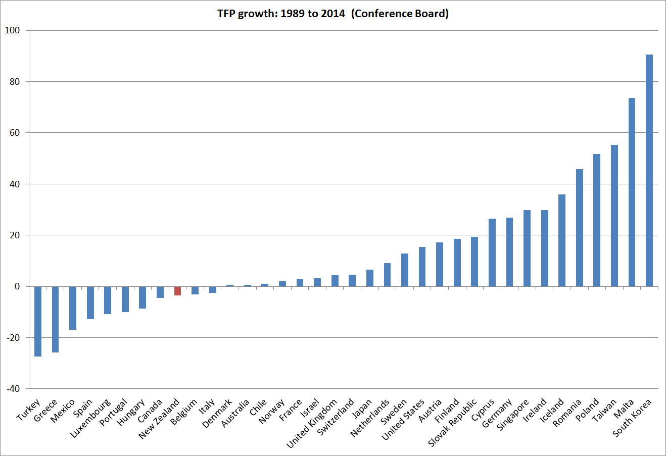
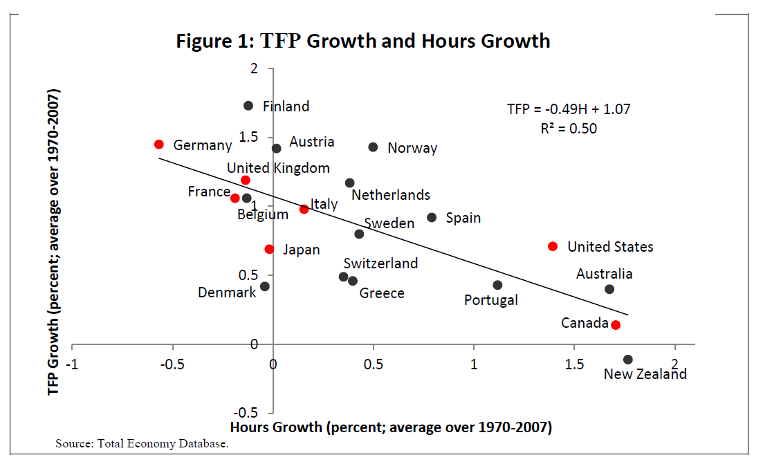
One possible reason why New Zealand’s interest rates might sensibly have been higher than those abroad would have been if New Zealand’s rate of productivity growth had been so strong that returns to large amounts of new investment in New Zealand were very high.  Profitable business opportunities might have abounded, and businesses had been rushing to invest to take advantage of those opportunities, while households might have been rationally anticipating future much higher incomes.

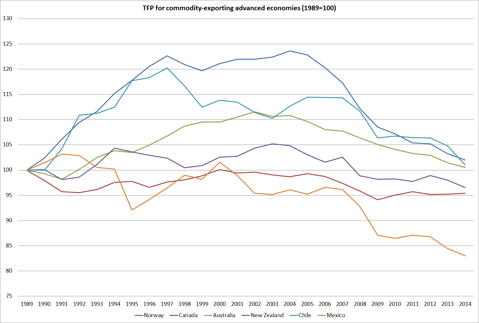
That doesn’t sound like New Zealand over the last 25 years.  In fact, our rate of business investment (as a share of GDP) has been one of the lower among OECD countries.   In recent days, I’ve shown a couple of charts drawn from the Conference Board’s TFP data.   Here is another.  For the advanced countries for which the Conference Board has estimates all the way back, it shows total estimated growth in TFP since 1989 (when the public data start). New Zealand hasn’t been the worst of these countries, but the record is pretty underwhelming.   And Greece, Spain and Portugal each look a bit worse than they deserve because there is so much excess capacity in those economies right now.

tfp since 89

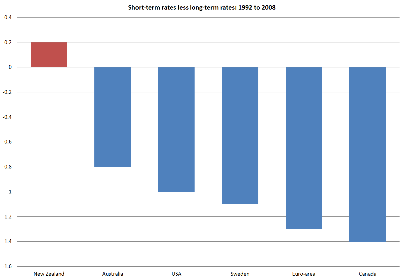
My other chart this morning is about the slope of the interest rate yield curve.  Very broadly speaking, yield curves are generally upward sloping.  That is, short-term interest rates tend to average a bit lower than long-term interest rates.  But New Zealand has been different.

As I showed the other day, long-term interest rates in New Zealand have been higher than those in other advanced countries.  But short-term interest rates have been even higher.   That is what this chart captures.  It uses OECD interest rate data,  The data aren’t ideal: the long-term interest rates are government bond rates, and the short-term rates are those on private sector securities.  But as that is so for each of the countries it shouldn’t materially complicate cross-country comparisons.

I’ve deliberately only drawn the chart to the end of 2008.  Since the near-zero lower bound on short-term nominal interest rates became an issue for an increasing range of countries, looking at the slope of the yield curve has not had the same meaning (since short-term rates can’t be cut as low as they otherwise would).

yield curve

Over that 17 year period –  in which each country had several interest rate cycles – New Zealand stood out.  If foreign investor concerns were at the heart of why interest rates were so high, long-term rates would be high relative to short-term rates (relative to what is seen in other countries).  That is the situation in Greece now.  But as the chart illustrates, in New Zealand it the other way round.  Our short-term interest rates averaged much higher relative to long-term interest rates than was the case in the other countries shown.  It suggests that we should be looking for things that drive short-term rates for our explanation as to why New Zealand interest rates have been persistently so high (again, relative to other countries’ rates).  It also nicely illustrates my observation the other day that New Zealand interest rates have long been regarded as unsustainably high, and not just by government officials and other pointy-headed analysts.  The slope of the yield curve is set in the market.   Private investors have expected our short-term interest rates to fall relative to long-term interest rates (whereas in these other countries there was no such expectation).  But those expectations have been wrong.  Persistent surprises in how long our interest rates have stayed up relative to those abroad can help explain why the exchange rate has been so persistently strong.  My former colleague, Anella Munro, covered some of this ground, in rather more technical terms, here.

And finally, some brief answers to a commenter’s question.  On Friday a commenter asked:

Michael, your analysis seems to make sense – that it’s more pressure on resources than risk premium that explains persistently high NZD interest rates
But it also raises, for me, some further questions.

My understanding is that when the NZ Government used to borrow in USD, back in the 1970s and 1980s,(when NZ was probably a worse credit risk than it is today), it did so at a rate only a small margin above the rate at which the US government borrowed. And I imagine that, today, NZ banks borrow USD at much the same rate as that at which US banks borrow. So if the only difference is in the currency of denomination (ie, the counterparties and the countries are the same) doesn’t that suggest that the explanation for the persistently high NZ interest rate has to have something to do with the currency?

Second, if there has been persistent pressure on resources, why would that not have been been closed by net imports?

Grateful for any responses you may be able to offer.

On the first question,  yes New Zealand credits borrow internationally in USD at much the same interest rates as similarly-rated borrowers from other countries do.  A AA-rated New Zealand bank is likely to pay much the same US interest rate on a bond issue as, say, a AA-rated Swedish bank might.  That certainly helps make the point that, whatever, is accounting for the differences between, say, New Zealand dollar and Swedish krone interest rates it is not the credit quality of the borrowers.    The credit ratings of our banks are as good as those anywhere.

But does that mean that it is all to do with the exchange rate?  Well, yes and no.  I would argue that it is the ability of the exchange rate to move that makes the material cross-country differences in interest rates possible[1].  Since expected risk-adjusted returns should be roughly equal across advanced countries, interest rates on New Zealand dollar assets  can only be higher than those on assets denominated in another currency (for similar quality borrowes) for any length of time, if the New Zealand dollar is expected to depreciate against that currency over time.  When the interest rate gap opens up, the New Zealand dollar tends to rise until it reaches a level that is not regarded as sustainable. At that point, the expected future deprecation more or less offsets the yield advantages.  There is an alternative story, in which the NZD is such a volatile currency that we have to pay premium interest rates to attract the foreign capital we need.  But again, if such  premia exist, and are material, they should result in a surprisingly weak exchange rate.  That hasn’t been the New Zealand story –  indeed, the only sustained period of weakness in the New Zealand exchange rate was around the turn of the century when our policy rate was quite low relative to those abroad (our OCR briefly matched the Fed funds target rate in 2000).   Such premia –  whether to do with the NIIP or a volatile exchange rate –  should tend to encourage resource-switching towards the tradables sector, in a (self-stabilising) manner that reduces future perceived vulnerability and any risk premia.   I scarcely need to point out that we’ve seen nothing of that sort over 25 years.

And just briefly, the second question was whether, if there has been persistent pressure on resources, why that would not have been closed by (net) imports.  The simple answer to that is because the economy can be thought of as made up of tradable bits and non-tradable bits.  If everything in the economy were fully tradable, then any excess demand in New Zealand could be expected to be fully met through imports.  Since tradables prices are set largely in world markets,  there would be no sustained domestic pressures on the inflation rate (and no real need for a domestic monetary policy, or our own currency).  Most of the interesting stuff arises from the fact that much of the economy is not freely tradable across borders, and tradables and non-tradables aren’t fully substitutable (I need a haircut, my mother needs rest-home care, and so on).  So when we see persistent incipient excess demand pressures, some of the pressure shows up in the current account, and some in interest rates.  As a result, despite a pretty strong government balance sheet, New Zealanders’ have run large current account deficits over the last 25 years, and we have had high interest rates relative to those in other advanced countries.  Excess demand pressures, arising domestically, largely explain both phenomena.

[1] As I illustrated in one of my very early posts, back in the 1890s, when the New Zealand government was very heavily indebted, but the exchange rate was fixed, the gaps between New Zealand and UK government bond yields were much smaller than those in recent decades.

TFP growth in commodity-exporting countries

On Friday, I took the Conference Board’s productivity data and looked at how New Zealand had done  on TFP growth relative to other advanced countries since 2007.  “Not that well” was the short answer.

The disappointing performance does need to be kept in some perspective.  New Zealand’s productivity growth has been disappointing for a long time. The Conference Board publishes TFP data only back to 1989.  However, a couple of years ago, some IMF researchers were given access to some unpublished Conference Board TFP data back to 1970.   Of the countries they looked at New Zealand had had the slowest TFP growth over the full period 1970 to 2007, and had grown more slowly than the median country in each of the four sub-periods they looked at.

tfp imf

Against that background, our slower than median TFP growth since 2007 perhaps looks slightly less discouraging  (not much less, given the decades of underperformance we might one day hope to start reversing).

As I noted on Friday, we had done a little better since 2007 than some of the other commodity-exporting advanced countries.  Commodity-exporting advanced countries have all had negative TFP growth over the last decade or so.  This chart shows TFP indexed to 100 in 1989 for each of the six commodity-exporting advanced (ie OECD member) countries.  Over 25 years, not one of them has recorded any material TFP growth (on this particular measure of TFP).  As ever, Mexico is the basket case.

tfp commodity

Weak TFP growth is not always and everywhere bad.  High commodity prices encourage producers of commodities to adopt different profit-maximising production techniques.  For example, poorer ore grades become economic to mine, but to do so takes more inputs.  That shows up as a fall in TFP, but presumably an increase in industry profitability.  In addition, massive investment programmes (as in Australia) to take advantage of high commodity prices do not boost output in the short-term (a project can take years to put in place), but involve the application of more resources to the industry.  That will also show up as lower TFP.    What about New Zealand?  We have not seen a business investment boom in response to the stronger terms of trade, but the dairy industry has altered its production processes, with more supplementary being used to produce more milk per cow.  Those choices were profitable, and sensible from the farmer’s perspective, but at the margin they involve using more inputs for each additional unit of output.  That shows up as a fall in TFP.

Quite how much these factors explain is debated , and requires a much more in-depth analysis of the national data to answer with any confidence.  But in New Zealand’s case, TFP is agriculture had flattened off well before the rise in the terms of trade, which didn’t really begin until around 2004.

tfp agric