New Zealand manufacturing since 2007

The quarterly manufacturing survey came out this morning.  Noticing that growth in the sector seemed to be levelling off I was curious as to how things looked relative to levels just prior to the recession.

As is well known, the manufacturing share of GDP has been falling for decades in most advanced countries.  China, for example, has picked up a big chunk of global manufacturing, and services have become progressively more important everywhere.

But this chart shows the volume of manufacturing activity (not as a share of GDP, not per capita, just the level) for a few countries/areas since 2007q4.  For the other countries, it is OECD data, while for New Zealand I’ve used the volume of manufacturing sales ex meat and dairy (the rather less noisy series SNZ also publishes).

manuf

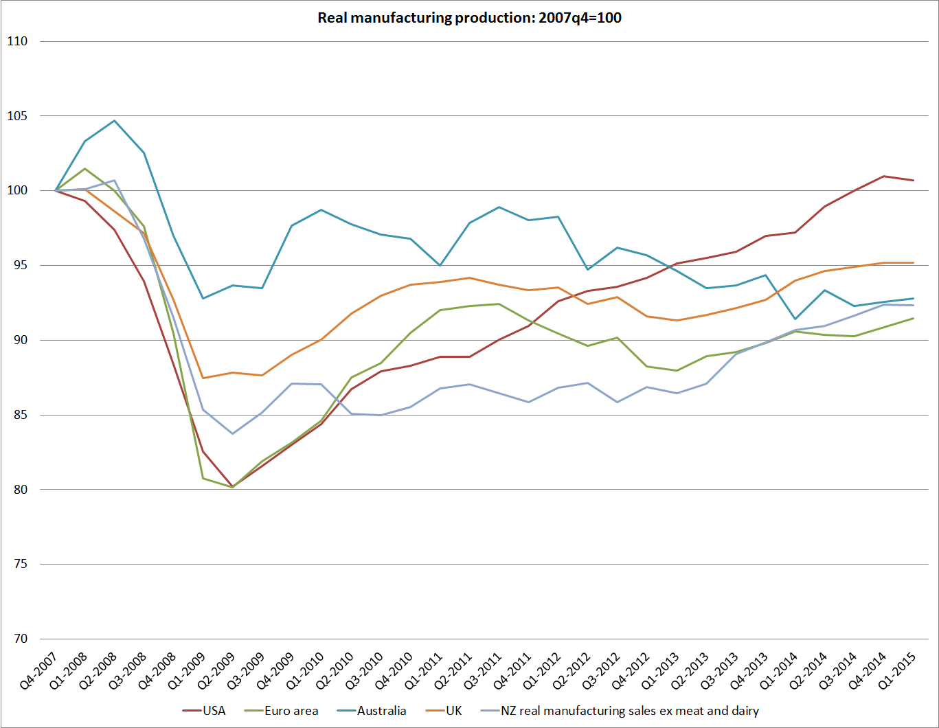
I haven’t been paying much attention to these data in the last year or two, but I was interested how far below 2007 activity levels New Zealand manufacturing still is.  As previous Reserve Bank work pointed out, once one strips out meat and dairy, a lot of the activity in New Zealand manufacturing is a derived demand off the back of construction-sector activity.  And the construction sector here has been pretty robust, particularly on the back of the huge volume of work in Christchurch.

But I was also somewhat sobered by how similar the path of manufacturing activity has been in New Zealand and in the euro-area as a whole.  Note that these are not per capita measures, and euro-area population is pretty flat while ours has risen 6 per cent of so since 2007.

The US performance looks relatively good, but in fact is still slightly less good than (flat to falling population) Germany.

I’m not one of those who thinks that the relative decline of manufacturing is a tragedy, but on the other hand I also don’t think that it is a matter of total indifference.  Most likely, the relatively weak manufacturing sector performance in recent years, despite the buoyant construction sector, is a reflection of the persistently high real exchange rate.  Like Graeme Wheeler, I think the real exchange rate is out of line with medium to longer–term economic fundamentals.  A more strongly performing New Zealand economy, one making some progress in closing the gaps to the rest of the OECD, would be likely to see a stronger manufacturing sector.  It might still be shrinking as a share of a fast-growing economy, but a manufacturing sector that has seen no growth at all in almost 20 years doesn’t feel like a feature of a particularly successful economy.

Using the same data series as above, I had a look at what has happened since 1995q1.  Six OECD countries have had weaker manufacturing sector activity than New Zealand.  At least three are current cyclical basket cases (Spain, Italy and Greece), and the gap between the growth rates in manufacturing volumes and in population has been weaker only in Italy, Spain, and France.

Numbers like this certainly don’t suggest immediate policy remedies, but they probably should continue to prompt thinking about just what explains New Zealand’s disappointing economic performance.

Growth 1995 to 2015
Manufacturing Population
Italy -17.6 7.8
Spain -10.7 20.2
France -5.3 11.3
Greece 0 3.3
Japan 0.2 1
UK 1.6 9.9
New Zealand 4.3 22.7

The terms of trade and NZ’s recent economic performance

As people often point out when I run charts like those in yesterday’s post, real or volume measures of value-added are all very well, but they don’t capture the direct effects of fluctuations in the terms of trade.  We can spend what we earn, and what we earn is a combination of volume and price.

For some purposes, ignoring the terms of trade effects can be more useful.  After all, a country like New Zealand is exposed to quite volatile terms of trade, and those terms of trade are almost wholly outside our control, year to year.  Some firms probably have price-setting power in world markets, and there is some evidence that New Zealand droughts have a short-term impact on world dairy prices, but our overall terms of trade are largely beyond our control.  By contrast, productivity measures (labour or multi-factor) are about what New Zealand (firms) do with the hands we are dealt, and the opportunities we make for ourselves.  It is exceptionally rare (probably unknown) for countries to get sustainably rich just  –  or even primarily –  on changes in the terms of trade.

But New Zealand’s terms of trade have done quite well over the last decade or so, reflecting a combination of falling real import prices and good prices, on average, for dairy products in particular.  Here is one chart showing changes in the terms of trade for the 43 advanced countries I discussed yesterday.  There are two different cuts here: the percentage change from 2007 to 2014 and the percentage change from the average level for 2005-2007 to the average level for 2012-2014.  On both New Zealand shows up as having done well.  Indeed, on the measure from 2007 to 2014, we’ve had the largest increase in the terms of trade of any of these countries (no doubt it will fall back somewhat in 2015).

tot crosscountry

How much difference does the terms of trade make? Well, we export and import amounts equal to around 30 per cent of GDP, so a 15 per cent boost to the terms of trade is roughly equivalent to an increase of another 5 percentage points, on top of any growth in the volume of output.  That is certainly a useful boost, but if you look at the first chart in yesterday’s post, it is hardly enough to dramatically transform our ranking.     Looking at the terms of trade does not materially alter the story of how disappointing our overall economy performance has been since 2007.

Statistics New Zealand produces a series of per capita Real Gross Disposable Income.  This series tries to estimate New Zealanders’ real purchasing power.  It takes account of both the direct effects of the terms of trade, and of changes in how much of what is produced here has to be paid to foreign providers of (mostly) capital.  Over the period since the recession New Zealand has enjoyed a strong terms of trade, and low interest rates –  as a country with a high level of external debt, we had an unexpected lift in purchasing power as the servicing costs of that debt fell sharply and stayed low.

Here is a chart of that RGDI series.  At present, RGDI per capita is still around 15 per cent below where it would have been if the 1991-2007 trend had continued.

rgdi

So far I’ve focused on the direct effects of the terms of trade.  But it is a little surprising that the strong terms of trade, boosting incomes and relative prices, has not provided more of a boost to real activity in the economy.  A rising terms of trade (and especially an unexpected lift) would typically be expected to stimulate business investment:  higher prices for the goods and services New Zealand firms sell will encourage more investment in those industries. As Daan Steenkamp has illustrated, the terms of trade boom in Australia helped prompt an enormous surge in business investment, which had no counterpart in New Zealand.  Of course, our exchange rate has been very strong, which might have offset much of any additional incentive to invest in the tradables sector in aggregate.  But the higher incomes (higher real purchasing power) might still have been expected to generate a significant boost to investment in the non-tradables sector.  We haven’t seen much sign of it.

As I’ve noted before, if the lift in the term of trade proves quite short-lived it might prove to be a boon that there was not an investment boom, putting in place long-lived projects on the back of a temporary lift in relative prices in our favour.  But most observers do not seem to expect New Zealand’s terms of trade gains of the last decade to fully unwind.

So I’m still puzzled as to why New Zealand has not done better given the very favourable terms of trade.  At the margin, overly tight monetary policy in the last few years has not helped.  And one other factor is the role of the Canterbury earthquakes and the associated repair and rebuilding process.  As the Reserve Bank recognised right from the start, this represented a major non-tradables shock, and all the more so because most of the cost was being covered by offshore reinsurers.  Real resources had to be devoted to the work in Canterbury, and for the most part we New Zealanders did not have to save more to pay for the work (we’d already paid the insurance premia).  Real resources –  especially labour –  can’t be used for two things at once.  Without the earthquakes and the subsequent repair process, those resources would have been freed up for other uses.  Lower interest rates would have been likely to have resulted in a lower exchange rate, improving the attractiveness of investment in New Zealand’s tradables sectors.

Is it enough to explain why New Zealand has not done better?  I don’t really think so, but the impact of the earthquake is certainly one constraint on New Zealand that Australia has not faced, and may be one reason why we have done less well than Australia on most measures since 2007.