Before I left the Reserve Bank a couple of months ago I had been working on a paper looking at how New Zealand’s economy had performed relative to those of other advanced economies over the period since 2007. The advanced world as a whole has done pretty badly over that period, but our interest was just in New Zealand’s relative performance. The Bank’s work has not been published, so I’m going to run some of the ideas and material here (drawing, of course, only on publically available material).
One obvious question is who are the relevant comparator countries. The member countries of the EU, of the OECD, and Singapore and Taiwan make a reasonable group. Data are readily available for almost all variables of interest for almost all these countries back to at least the mid-1990s. And around half of these 43 countries have higher GDP per capita than New Zealand, and half a lower. There is another group of countries at least as rich as New Zealand, but whose economic fortunes are almost totally shaped by oil. For these purposes I have set them to one side. But my comparator grouping does include several countries whose largest exports are commodity-based: New Zealand, Australia, Norway, Chile, Mexico, and Canada. No comparator group is ever ideal, and no two economies ever face the same set of conditions, but this group seemed large enough to be interesting and small enough to be tractable.
Another question is what period to look at. I’m focusing on the period since 2007 because 2007 was for most countries around the peak of the previous business cycle – and just before the financial crisis and global recession took hold in 2008/09. One could make a case for starting a few years earlier, but when I looked into starting in, say, 2005, it did not make much difference to the cross-country comparisons. For some things, I’m going to compare how economies have done over 2007-14 with how they did in the previous decade (1997 to 2007). Again, that choice is to somewhat ad hoc, but it does reflect (a) the limitations of data (for many of the eastern European countries data starts getting patchy any earlier), and (b) that for New Zealand at least 1997 was also a business cycle peak.
To anticipate one objection, many countries’ economies were stretched to the limit in 2007, running positive “output gaps”. So we should have expected weaker growth since then than in the previous decade. But (a) the slowdown in growth rates far exceeds anything that can be explained by initial output gaps, and (b) New Zealand’s output gap was not large (by international standards) in 2007.
As time permits, I will run a series of charts and offer some thoughts on New Zealand’s performance, again in an international context. As I’ve noted previously, New Zealand hasn’t done particularly well in recent years. A disappointing performance isn’t new, but New Zealand looked as though it had a number of things going for it in recent years.
So let’s have a look at how New Zealand has done?
The first chart is growth in real GDP per capita from 2007 to 2014 (total growth, not annual average growth). These data are drawn from the IMF WEO database, and are calculated in national currencies.

On this measure, New Zealand has done just a little better than the median country, and very similar to a bunch of countries from Japan to Canada. Of the commodity-exporting countries, however, only Norway did less well than New Zealand over this period.
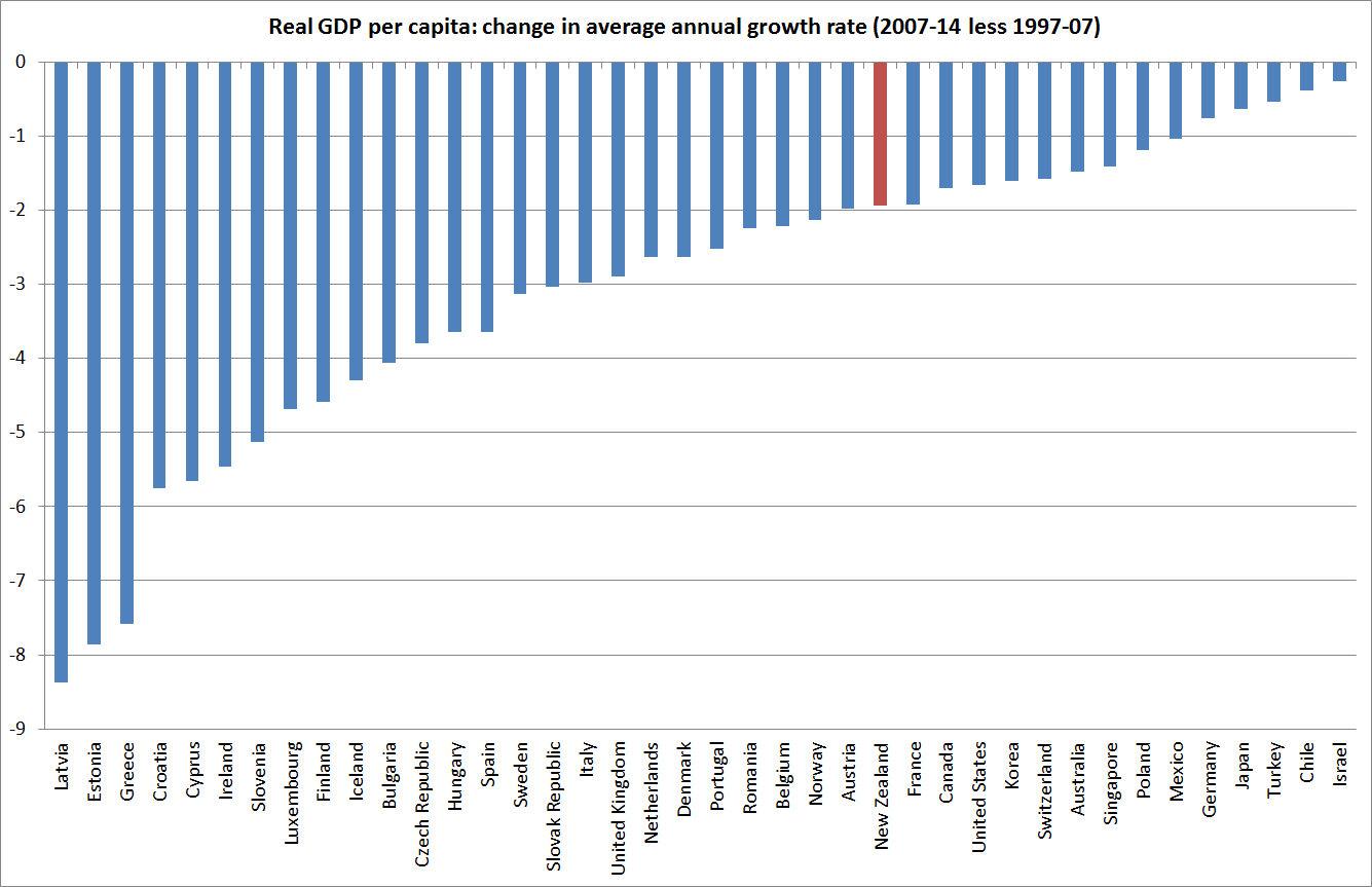
The second chart shows the change in annual average growth rates: how average growth over 2007 to 2014 compared to that for 1997-2007. Every single one of the countries for which the IMF has data back that far had slower growth in the more recent period than in the earlier period. New Zealand did just a little less badly than the median country, but again among the commodity-exporters we did better only than Norway.
Real GDP per capita is a useful measure for many purposes, and it is the most readily available such statistic. But it does get thrown around by recessions and booms. A country in a deep recession (such as Greece) might experience a big fall in its real GDP per capita, but the average productivity of its employed workers might be much less adversely affected. There are “distortions” even here. In recessions, relatively less productive workers are more likely to be out of work. But real GDP per hour worked measures are much less cyclically variable than real GDP per capita measures.
Hours worked per capita data are available for all the countries I’m interested in (except, for some reason, Croatia). I used them to generate real GDP per hour worked measures, again in national currency terms.
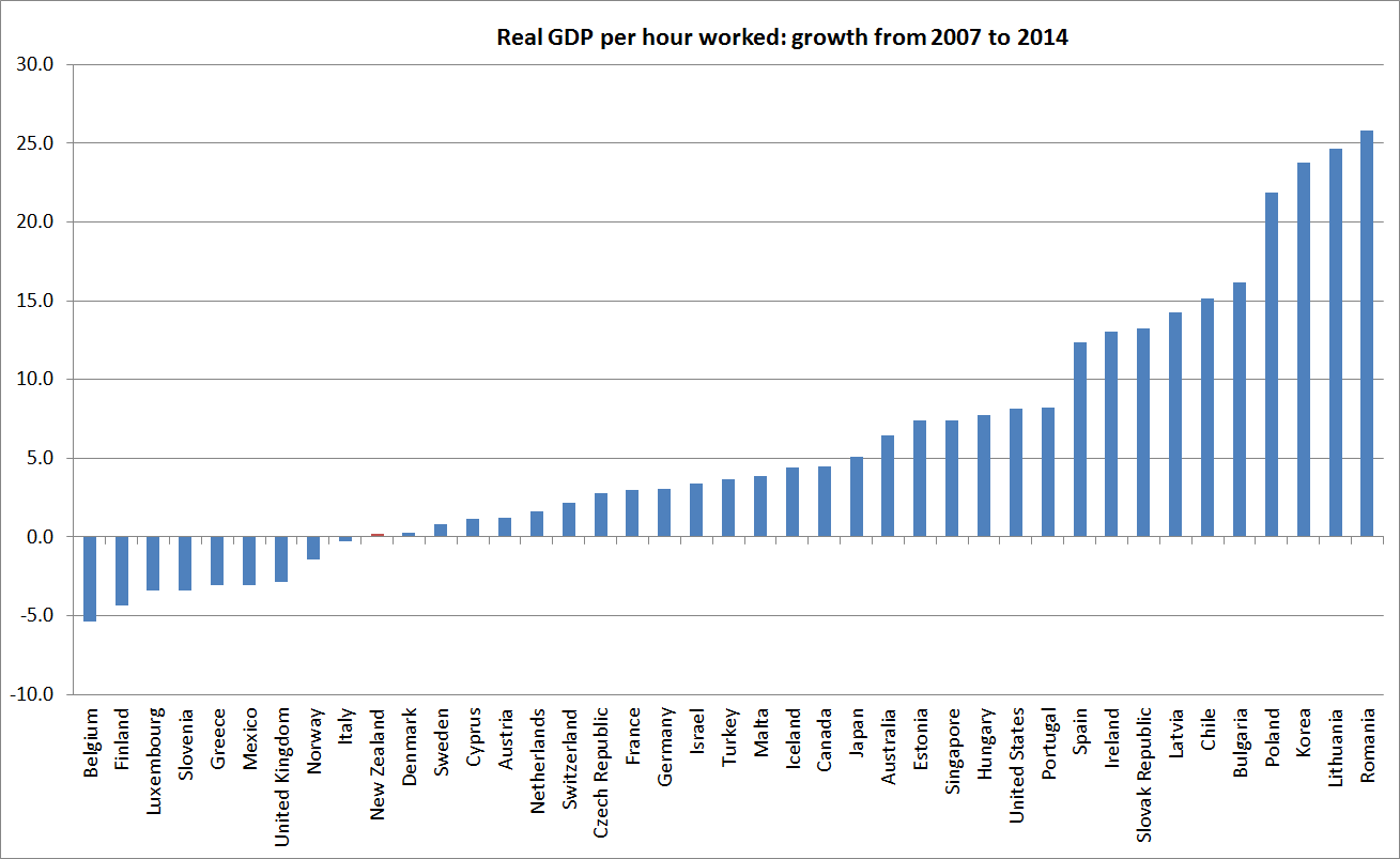
Here, unfortunately, the picture is much less favourable for New Zealand. Only nine of the countries did worse than New Zealand, and again among the commodity exporters only Norway was worse.
The reconciliation lies in what happened with hours worked per capita.
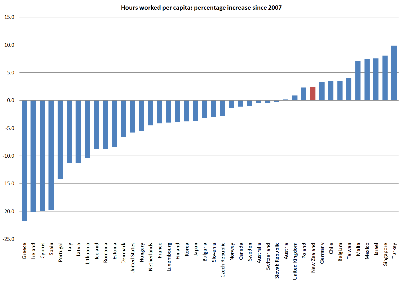
Only a small number of countries had more of an increase in hours worked per capita than New Zealand since 2007.
Hours worked are an input (which comes at a cost) not an output, so higher hours worked aren’t automatically a good thing. There are good dimensions to it, if (for example) people are coming off long-term welfare back into the workforce, or older people are keen and able to stay in the workforce. Hours worked per capita also gets affected by different demographic patterns – they will be lower in countries with lots of under-15s or over 70s. But, equally, part of the story of New Zealand in the last 25 years is that we have managed to limit the deterioration in our GDP per capita, relative to that in other countries, by working more. Productivity would be better.
Over the full period since 1990, here is the change in hours worked per capita for New Zealand and the other Anglo countries, countries with reasonably similar demographics to our own.

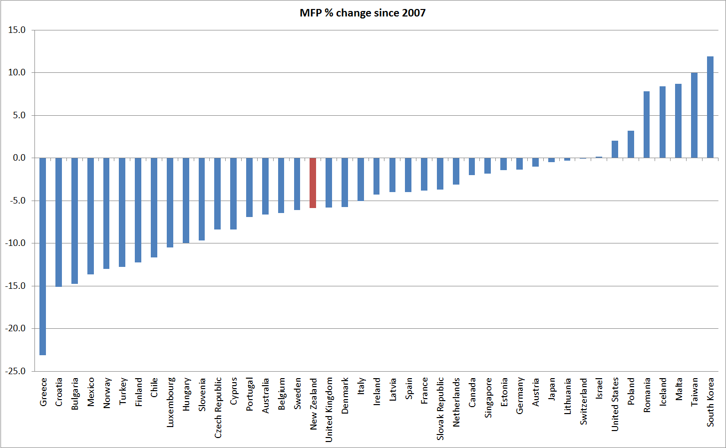
And, then of course, there is multi-factor (or total factor) productivity. On this measure, which I’ve shown before, most countries have had no MFP growth at all since 2007: