The Reserve Bank and housing collapses

In early December, the Reserve Bank published a Bulletin article, “House price collapses: policy responses and lessons learned”.  The article wasn’t by a Reserve Bank staffer –  it was written by a contractor (ex Treasury and IMF) –  but Bulletin articles speak for the Bank itself, they aren’t disclaimed as just the views of the author.   Given the subject matter, I’m sure this one would have had a lot of internal scrutiny.  Or perhaps I’ll rephrase, it certainly should have had a lot of scrutiny, but the substance of the article raises considerable doubt as to whether anyone senior thought hard about what they were publishing in the Reserve Bank’s name.

I’ve only just got round to reading the article and was frankly a bit stunned at how weak it was.    Perhaps that helps explain why it appears to have had no material media coverage at all.

The article begins with the claim that

This article considers several episodes of house price collapses around the globe over the past 30 years

In fact, it looks at none of these in any depth, and readers would have to know quite a bit about what was going on in each of these countries to be able to evaluate much of the story-telling and policy lessons the author presents.

Too much of the Reserve Bank’s writing about house prices tends to present substantial house price falls as exogenous, almost random, events: a country just happened to get unlucky.  But house prices booms –  or busts –  don’t take place in a vacuum.  They are the result of a set of circumstances, choices and policies.

And none of the Reserve Bank’s writings on housing markets ever takes any account of the information on the experiences of countries which didn’t experience nasty housing busts.  Partly as a result they tend to treat (or suggest that we should treat) all house price booms as the same.  And yet, for example,  New Zealand, Australia, the UK and Norway all had big credit and housing booms in the years leading up to 2008 but –  unlike the US or Ireland –  didn’t see a housing bust.  What do we learn from that difference?   The Reserve Bank seems totally uninterested.   Their approach seems to be, if the bust hasn’t already happened it is only a matter of time, but 2018 is a decade on from 2008.

One particular policy difference they often seek to ignore is the choice between fixed and floating exchange rates.  When you fix your exchange rate to that of another country, your interest rates are largely set by conditions in the other country.  If economic conditions in your country and the other country are consistently similar that might work out just fine.  If not, then you can have a tiger by the tail.  Ireland, for example, in the 00s probably needed something nearer New Zealand interest rates, but chose a currency regime that gave it interest rates appropriate to France/Germany.    Perhaps not surprisingly, things went badly wrong.

In the Bulletin article, the Bank presents a chart showing “house price falls in [10 OECD] selected crisis episodes” (surprisingly, not including Ireland).  But of those, eight were examples of fixed exchange rate countries (in several cases, the associated crisis led the country concerned to move to a floating exchange rate).   The same goes for all the Asian countries the author mentions in the context of the 1990s Asian financial crisis.     There can be advantages to fixing the exchange rate, but the ability to cope with idiosyncratic national shocks in not one of them.     And yet in the ten lessons the author draws in the article, there is no hint of the advantages of a floating exchange rate, in limiting the probability of a build-up of risk, and then in managing any busts that do arise.    It is a huge omission.  As a reminder, New Zealand, Australia, Norway, the UK, and Canada –  the latter a country that has never had a systemic financial crisis –  were all floating exchange rate countries during the 2000s boom and the subsequent recession/recovery period.

The author also hardly seems to recognise that even if house prices fall, house prices may not be the main event.   Even the Reserve Bank has previously, perhaps somewhat reluctantly, acknowledged the Norges Bank observation that housing loan losses have only rarely played a major role in systemic financial crises.   But there is no hint of that in this article.     Thus, in the severe post-liberalisation crises in the Nordics in the late 1980s and early 1990s, house prices certainly went up a lot and fell back a lot too, but most accounts suggest that those developments were pretty marginal relative to the boom and bust in commercial property, in particular development lending.  The same story seems to have been true for Ireland in the crisis there a decade ago.  Housing also wasn’t the main event in Iceland –  a floating exchange rate country not mentioned here that did have a crisis.  Even of the two floating exchange rate countries the article mentions –  Japan and the United States –  only in the United States could housing lending, and the housing market, be considered anything like the main event (and the US experience may not generalise given the very heavy role the state has historically played in the US housing finance market).

(And as I’ve noted here before,  even the US experience needs rather more critical reflection than it often receives: the path of the US economy in the decade since 2007 wasn’t much different to that of, say, New Zealand and New Zealand experienced no housing bust at all.)

Some of the other omissions from the article are also notable.  The author seems quite uneasy, perhaps even disapproving, about low global interest rates (without ever mentioning that inflation has remained persistently low), but there is no hint in the entire article that neutral interest rates may have been falling, or that global trend productivity growth may have been weak (weakening before the 2008/09 crisis showed up).   Thus, where economic activity is now –  10 years on –  may have little or nothing to do with the specifics of housing market adjustments a decade ago.   And although he highlights the limits of conventional monetary policy in many countries (interest rates around or just below zero), again he doesn’t draw any lessons about the possible need for policymakers to give themselves more room to cope with future downturns (by, for example, easing or removing the technological/legislative constraints that give rise to the near-zero lower bound in the first place.)

It is also remarkable that in an article on housing market collapses, there is only one mention of the possible role of land use restrictions in giving rise to sharp increases in house prices in the first place.   And then it is a rather misguided bureaucrats’ response: because supply may eventually catch up with demand the public need wise officials to encourage them to think long-term.  Perhaps the officials and politicians might be better off concentrating their energies on doing less harm in the first place –  whether fixing exchange rates in ways that give rise to large scale misallocation of resources, or avoiding land use restrictions that mean demand pressures substantially translate in higher land and house prices.

But in all the lessons the Bank (and the author) draw in the article, not one seems to be about the limitations of policy and of regulators.   There are typical references to short-termism in markets – although your typical Lehmans employee had more personal financial incentive (deferred remuneration tied up in shares that couldn’t be sold) to see the firm survive for the following five years –  than a typical central bank regulator does, but none about incentives as they face regulators and politicians (including that in extreme booms, an “insanity” can take hold almost everywhere, and even if there were a very cautious regulatory body, the head of such a body would struggle to be reappointed).

And nor is there any sense, anywhere in the article, as to when cautionary advice might, and might not, look sensible.  Alan Greenspan worried aloud about irrational exuberance years before the NASDAQ/tech bust –  someone heading his concerns then and staying out of the market subsequently would probably have ended up worse off than otherwise.   Much the same surely goes for housing.  In New Zealand, central bankers have been anguishing about house prices for decades.  Even if at some point in the next decade, New Zealand house prices fall 50 per cent and stay down –  the combination being exceedingly unlikely, based on historical experience of floating exchange rate countries, unless there is full scale land use deregulation –  that might not be much encouragement to someone who responded to Reserve Bank concerns 20 years ago.  (Oh, and repeated Reserve Bank stress tests suggest that even in a severe adverse economic shock of the sort that might trigger such a fall, our banks would come through in pretty good shape.)

The article concludes “housing market crashes are costly”.    Perhaps, but even that seems far too much of a reduced-form conclusion.  The misallocations of real resources that are associated with housing and credit booms are likely to be costly: misallocations generally are, and often it is the initial misallocation (rather than the inevitable sorting out process) that is the problem.  To me, it looks like an argument for avoiding policy choices that give rise to major misallocations (and all the associated spending) in the first place: be it fixed exchange rates (Nordics or Ireland), land use restrictions (New Zealand and other countries), or state-guided preferential lending (as in the United States).   Of the three classes, perhaps land use restrictions are most distortionary longer-term, and yet least prone to financial crises and corrections, since there are no market forces which eventually compel an adjustment.

It was a disappointing article on an important topic, sadly all too much in the spirit of a lot (but not all) of the Reserve Bank’s pronouncements on housing in recent years.

On housing, in late November, the Minister of Housing Phil Twyford commissioned an independent report on the New Zealand housing situation.   According to the Minister

“This report will provide an authoritative picture of the state of housing in New Zealand today, drawing on the best data available.

The report was to be done before Christmas and it is now 15 January.  Surely it is about time for it to be released?

Savings rates in international context

In putting together yesterday’s post, I stumbled on something I hadn’t noticed previously.  In yesterday’s post I showed only New Zealand saving rates –  in particular, net national savings (ie savings of New Zealand resident entities, after allowing for depreciation) as a share of net national income.  The net national savings rate has picked up quite a bit in the last few years, although not to historically exceptional levels.

But here are the New Zealand and Australian net national savings rates plotted on the same chart.

net nat savings nz and aus

For the last couple of years, the net savings rate of New Zealanders has been higher than that of Australians.  I wouldn’t want to make very much of a couple of years data, and over, say, the last 25 years, the average savings rate of New Zealanders has still been a little lower than that of Australians.  But even that average gap has been much smaller over that period than over, say, the previous 20 years.

It isn’t a story you would typically hear from those who argue that savings behaviour is at the heart of New Zealand’s economic challenges.   Some will point to the compulsory private savings system now in place in Australia (phased in from 1992).  There is no easy way of assessing the counterfactual –  what if the system had never been introduced? –  but there is no obvious sign that the system has led to a lift in national savings rates in Australia, whether absolutely or relative to New Zealand.  Others will (rightly) highlight the big tax changes implemented here in the late 1980s which materially increased the tax burden on income earned by savers (in a way pretty inconsistent with the recommendations of a lot of economic theory).  I don’t think those changes were appropriate, or even fair, and would favour a less onerous regime.  But in the decades since the changes were made, our savings rates have been closer to those in Australia (where a less onerous tax regime applies as well) than they were in the earlier decades.

One policy change that may have made a difference is overall fiscal policy: the improvement in New Zealand’s overall fiscal position (reduction in general government debt) has been larger than that in Australia (largely reflecting the fact that we were in a bigger fiscal hole 25 or 30 years ago).   Higher average rates of public saving may have lifted average national savings rates to some extent.

What about other countries.  In a paper I wrote some years ago for a Reserve Bank/Treasury conference, I illustrated that over time New Zealand’s savings rate hadn’t been much different from that of some other Anglo countries.  Here is a more recent version of that sort of chart.

net nat savings anglo

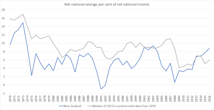
New Zealand’s national savings rates have typically been below those in the OECD group of advanced countries as a whole (and perhaps particularly some of the more economically successful of those countries –  whether by chance, cause, or effect).   But even on that score the last few years look a little different.   This chart compares New Zealand against the median of the 22 OECD countries for which there is consistent data over the full period.

net national savings oecd

It is quite a striking change, and the reasons aren’t at all clear (see yesterday’s post on the puzzles around the New Zealand data).  Perhaps in time some of the rise in the New Zealand savings rate will end up being revised away.  Perhaps the lift will prove real, but temporary (as, say, happened for a few years around 2000). But if not, the apparent change in the relationship between our savings rate and those in other advanced countries should help keep our real interest rates –  and our real exchange rate –  a bit lower than otherwise.  If sustained, that would be expected to lift our economic prospects a bit, all else equal.

But it is worth remembering that, all else equal, a country with materially faster population growth than its peers should typically expect to have a higher national savings rate over time than its peers.   All else is never equal of course, but New Zealand continues to have a population growth rate well above that of the median advanced country.


New Zealand savings rate trends

Making sense of savings behaviour (the bit of flow income not spent) in New Zealand is a bit of a challenge.  Perhaps that is true of other countries as well, but I know their individual stories less well.  In the New Zealand case, it isn’t helped by the rather limited historical data: we have an official estimate of national savings back only as far as the year to March 1972, we only have a sectoral decomposition of savings (household government, etc) back to 1987, and there is no official quarterly data.  Australia, by contrast, has all this data back as far as 1959.

Our sustained period of high inflation didn’t help either.   A significant chunk of any interest rate is typically compensation for inflation, and on the other hand in inflationary periods depreciation (typically on a historic cost basis) tends to be understated.  Decades ago, the Reserve Bank was pointing out that in that era, inflation was flattering our national savings figures.

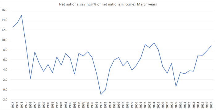
Here is the official series of net national savings expressed as a percentage of net national income (“net” in both cases being net of depreciation – or “consumption of fixed capital”, and “national” referring to the income and savings of New Zealand residents, as distinct from “domestic” –  as in GDP  –  being any activity occurring in New Zealand.)

net savings to nni jan 18

If your eye is anything like mine, you are probably drawn to those last few observations, suggesting quite a significant increase in the net national savings rate in the last few years.    It isn’t exceptional by historical standards –  the savings rate averaged just a little higher for several years in the early 2000s –  but is interesting nonetheless.   Of the other potentially interesting observations, I have no good story for why national savings rates were so much higher at the very start of the period (and thus can only lament the absence of a longer run of official data).   One thing is clear: the lowest points in the series (years to March 1992 and March 2009) coincide with severe recessions.   That probably isn’t too surprising.   But there isn’t anything really comparable on the other side: if savings rates have tended to be higher in cyclically stronger periods, the peaks certainly don’t coincide very strongly with cyclical economic peaks.   Perhaps the other thing to note is that for the last 40 years there has been no obvious trend in the series: fluctuations have been around a fairly constant average rate of 5 to 6 per cent.    Perhaps the reduction in the inflation rate masks an underlying modest trend improvement, but even if so, the high inflation era itself ended 25 years ago.

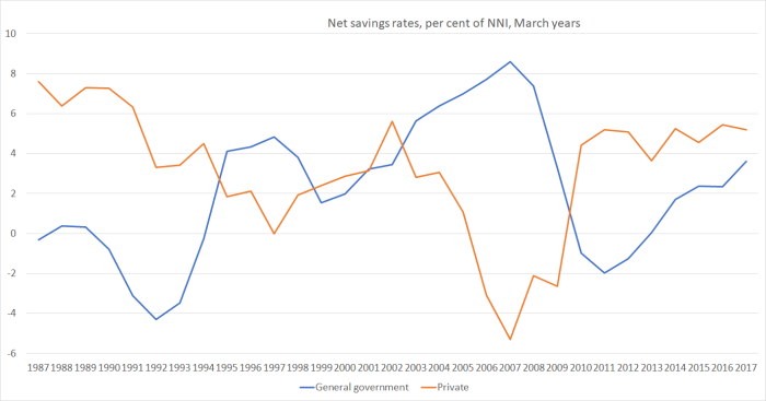
What about the sectoral breakdown of net national savings?   Here is the split between government and private savings.

savings rate jan 18

It is pretty well-recognised that there has been an inverse relationship between the two series.  Quite what that means, or why it occurs, is another question.    Some of it is about the automatic stabilisers built into the tax system (in particular).   Government tax revenue tends to increase more than proportionally in economic upswings, and vice versa (eg on the company tax side, many companies record losses in recession, and it may take a few years of a recovery before they start having a tax payment liability again).      Some may be about government spending taking the place of private spending: if the government suddenly starts paying for, say, childcare costs, households no longer have to and some of that money might now be saved.    Some might be about rational expectations of future fiscal adjustments –  not in some very long-term Ricardian sense, but just that political debate tends to compete to spend large surpluses when they do arise, and people may anticipate that they will soon have more money in their pockets (eg from tax cuts).   Whatever the reason, the pattern has been there over the last 30 years or so.  It is one reason to be a little cautious about the idea sometimes heard that, if raising national savings rates was some sort of national economic priority, it might be enabled by governments simply running larger surpluses.    History –  here and abroad –  suggests that such surpluses aren’t likely to be sustainable, at least when starting from a low debt position, and that the public will relatively quickly recognise that.

Having said that, it is interesting that over the last few years the increase in the national savings rate has been almost wholly reflected in a rise in government savings.  The private savings rate, by contrast, has been pretty stable for some years.

But what about the breakdown within the private savings rate.  This chart shows household and business savings separately, both as share of NNI.

savings rates jan 18 pte

It is useful to be reminded that for some decades now business (net) savings rates have been quite a bit larger than those of households.  Little commentary ever focuses on business savings rates.

Some commentators –  including, at times, the Reserve Bank –  tend to make quite a lot of the role of house prices in explaining household savings behaviour.   I’ve never really found that convincing, and suspect that fiscal policy may be more important an influence on the cyclical swings in the savings rate.  Why?   Well, consumption as a share of GDP has been remarkably stable over 30 years, in the face of huge increases in house prices, and quite substantial swings in house price inflation.   That shouldn’t really be a surprise: after all, higher house prices aren’t a net gain in the community’s real purchasing power, they just redistribute purchasing power a bit (to those just about the downsize and retire to the provinces, and away from those trying to purchase a first home).  And, as it happens, the low point in the household savings rate series came in the year to March 2003, just prior to the first great surge upwards in house prices.

And, of course, one keeps seeing talk –  typically from interested parties –  of the rising tide of Kiwisaver funds.  No doubt, there is a big increase in the stock of funds bearing a Kiwisaver label, but there is nothing in household savings data over the last decade that really suggests any material change in households’ overall rates of savings.   Those rates were very low when the government was running big surpluses, picked up somewhat when the government had big deficits (and the economic climate was uncertain) and have been falling off again in recent years as the budget moved back into (actual and prospective) larger surpluses.

As for business savings, I don’t know how to interpret the data at all.  There has been too little analysis (at least that I’ve seen) attempting to make sense of the swings in the years leading up to 2008 –  that really sharp fall in business savings rates well before the recession itself –  or of the extent of the subsequent recovery.    Terms of trade fluctuations, for example, don’t readily explain the patterns.    Of course, in the end  firms are ultimately owned by households, and the boundaries between the two may be somewhat permeable (and affected, for example, by tax changes and dividend distribution policies.)

I’m not one of those who is alarmed by New Zealand savings rates.   They are towards the low side in international comparisons (a topic for another day), but it isn’t obvious that that is because of specific policy distortions here which materially adversely affecting savings (and more so here than in other countries).   The government accounts have been fairly healthy for decades, our welfare and retirement income system discourages private savings less than those of many other countries, and although our tax system bears materially more heavily on institutional savings than the regimes of many other countries, one has to be cautious about putting too much weight on that argument: it is not, after all, as if savings rates have been materially lower since the late 1980s (when the tax system was markedly reoriented) than previously.   A highly successful economy would be likely –  based on international comparisons –  to see higher average savings rates, but that doesn’t mean that policies designed to boost savings rates could themselves do much to lift the performance of the economy (partly because policies designed to “boost savings” don’t themselves have a particularly good track record).   Rather, when firms are finding abundant investment opportunities, they will tend to be wanting to retain more in the business, and earning the rates of return that support those high business savings rates.

As a reminder, this post has been about flow savings rates.  Some people are keen to talk about asset revaluations, and gains in recorded wealth.     That is, largely, a different topic, but –  as already noted –  bearing in mind that we all have to live somewhere, higher house prices do not make us, as a community, better off.   Higher equity prices may well do so –  and thus US research used to find a stronger wealth effect on consumption from equity prices –  especially if those gains are reflecting underlying improvements in productivity etc.

Workers in a fool’s paradise

A couple of months ago I did a post highlighting some little recognised aspects of the New Zealand data on wages and labour income.   They suggested that, given the underlying relatively poor performance of the economy, workers hadn’t done badly at all. I was curious how the latest national accounts data had changed the picture.

The first chart that attracted my interest was the labour income (“compensation of employees”) share of GDP.   The data are only available annually, but they suggested quite a recovery in the labour share of GDP in the 00s, which had been sustained this decade to date.

COE

That was the picture on the previous iteration of data.     Here is the updated version.

COE jan 17

The picture is subtly different, and if anything the labour income share looks to have been shrinking gradually this decade, even if it is still well above where it was in 2001/2 (the historical low).

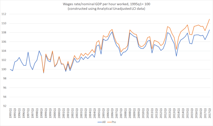
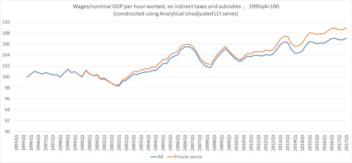
But the other chart, which I found more striking, was one in which I compared growth in nominal wage rates against growth in nominal GDP per hour worked.   I used the Statistics New Zealand Analytical Unadjusted Labour Cost Index series.  It isn’t widely referred to, but relative to the headline LCI series it is a pure wages series, not one in which SNZ has already tried to adjust for productivity, and relative to the QES, it is much smoother (the way economists typically think of wage-setting behaviour) and produces more sensible and plausible series (some of the problems with the QES were illustrated in the earlier post).

When I did the exercise earlier, on the old data, I found that cumulative wage inflation –  particularly that in the private sector –  had run quite a bit ahead of productivity (GDP per hour worked) since around 2002.    Here is the updated version of the chart.

wages and nom GDP phw jan 18

There is a lot of short-term noise in the series –  and wages last year were somewhat “artificially” boosted by the pay equity settlement – but if the extent to which wages have moved ahead of productivity is less than it was in the previous iteration of the data (GDP has been revised up, and wage rate data are unchanged), the trend I highlighted last year is still there.

In my earlier post, I noted that this chart had been done using GDP itslf, and that to be more strictly accurate I should have taken account of, eg, the 2010 change in GST (which boosted GDP but shouldn’t have affected wages).    Data on indirect taxes and subsidies are only available annually, so here is a smoothed (four quarter moving average) version of the chart, this time comparing wages against nominal GDP per hour worked excluding indirect taxes and subsidies.

wages and nom GDP phw ex taxes and subsides jan 18

What has been going on?   One possibility is that the Analytical Unadjusted wages data are just substantially wrong?   But they are series that have now been published by SNZ for more than 20 years, and I don’t have specific things I can point to suggesting that they are wrong.

If the data are picking up something real, what then might be the story?   Here was what I included in the earlier post.

My explanation is pretty simple: the (real) exchange rate, which stepped up sharply about 15 years ago and has never sustainably come down since.    When the exchange rate is high, firms in the tradables sectors make less money than they otherwise would have done.   The usual counter to that is that the terms of trade have risen.  But the increase in the real exchange rate has been considerably more than the higher terms of trade would warrant, and in any case much of the gains in the terms of trade have come in the form of lower real import prices, rather than higher real export prices.

And why has the exchange rate been so high?  Because the economy has been strongly skewed towards the non-tradables sector which –  by definition –  does not face the test of international competition.  Demand for labour in that sector has been strong, on average, over the last 15 years, and it is the non-tradables sector that has, in effect, set the marginal price for labour.  For those firms, in aggregate, the lack of productivity growth doesn’t matter much –  they pass costs on to customers.  But it matters a lot for tradables sector producers, who have to pay the market price for labour, with no ability to pass those costs on (while the exchange rate puts downward pressure on their overall returns).  Another definition of the real exchange rate is the price of non-tradables relative to those of tradables. Consistent with this sort of story, in per capita terms real tradables sector GDP peaked back in 2004 (levels that is, not growth rates).

It isn’t, to repeat, a story in which labour has done well absolutely.  As I illustrated the other day, over the last five years there has been about 1 per cent real productivity growth in total.  For decades, we’ve been slipping backwards relative to other advanced countries.   But given the weak overall performance, labour doesn’t look to have done too badly.   That isn’t a recommendation for the “economic strategy” the last two governments have pursued.  A climate in which firms don’t find investment attractive –  perhaps especially investment in the internationally-competitive tradables sector –  isn’t likely to be one that conduces to generating sustained high performance and strong medium-term income growth.

And here is the proxy for business investment (total investment less housing and government) as a share of GDP

bus inv jan 18

Despite some of the best terms of trade in decades, business investment has been poor this cycle –  following on from several decades when it has typically been well below that of the median OECD country (despite well above median population growth).  The notion that “investment has been weak in lots of countries”, even to the extent true, should be no consolation: we started so far behind there was (and is) plenty of scope for us to have caught up, not being so affected by financial crises, euro-area ructions, zero lower bounds or whatever.

It is a fool’s paradise model: non-tradables focused businesses (of which there are many) do just fine, supported by continuing rapid population growth, but there isn’t much net investment at all outside those sectors as New Zealand proves to be an increasingly unfavourable place to build and base internationally competitive businesses.  Productivity growth remains weak, perhaps even weakens further.   Wages might well outstrip productivity growth, but in the long-run only sustained productivity growth will support high material living standards here.   It isn’t a model that need end in crisis, but rather in mediocrity.  And New Zealanders could do so much better.


Reflecting on Jim Anderton

I have a pleasant memory of the only time I met Jim Anderton. One of his daughters was in the same class as me at Remuera Intermediate, and at the end of the year the Andertons hosted a class barbecue at their home just up the street from the school.   I was a youthful political junkie and Jim Anderton was running for Mayor of Auckland.  It was a pleasant evening and he seemed to be a lively and engaged parent (later struck by the awfulness of the suicide of another daughter).

Accounts suggest that Anderton did a good job of helping to revitalise the Labour Party organisation in the late 1970s and early 1980s.  He was, for the time, a moderniser, instrumental in helping reduce the direct influence of the trade unions in the party, and promoting the selection of some able candidates who hadn’t served time in the party (eg Geoffrey Palmer).  Various tributes talk of a personal, and practical, generosity.

I don’t suppose either that there was any doubt that he pursued causes he believed in, and that those causes were, more or less, what he regarded as being in the best interests of New Zealanders (perhaps especially “ordinary working New Zealanders”).   Probably most politicians do.  Sometimes they are mostly right about the merits of the causes they pursue, and sometimes not.    In Anderton’s case, even if one agreeed with the sort of outcomes he might have hoped for, his views on the best means seem –  perhaps even more so with hindsight than at the time –  to have been pretty consistently wrong.   And for all the public talk in the last few days about Anderton’s contribution to New Zealand, few (if any) of the things he opposed in the 1980s have been unwound/reversed, and few of the things he championed when he served later as an effective senior minister have done much for New Zealanders.

Take the 1980s when, upon entering Parliament in 1984, Anderton quickly isolated himself in caucus.  Even before that election, he’d opposed the CER agreement with Australia, and opposed Roger Douglas’s talk of a need for a devaluation and a reduction in the real exchange rate.  Even after the 1984 election, in circumstances of quasi-crisis, Anderton still opposed the by-then inevitable devaluation –  and in league with Sir Robert Muldoon sought to use a select committee to run a kangaroo-court inquiry, to undermine the choices his own government had made.   He was opposed to GST, and he was opposed to creating SOEs for state-trading operations.   He opposed privatisations, whether small or large.   Of the large, there was vocal opposition to the sale of the BNZ and of Telecom.  I suspect the list of reform measures, not subsequently unwound, that Anderton did enthusiastically support would be considerably shorter –  perhaps vanishingly so –  than the list of those he opposed.

As a pure political achievement, to have survived resigning from the Labour Party – in a pre MMP period –  was worthy of note.  But then Winston Peters did much the same thing –  and he’d had the courage to resign his seat and win a by-election to return to Parliament.  And the distinctive Jim Anderton party has long since disappeared, as Anderton returned to the Labour fold.

And what causes did he champion as a senior minister (for a time, deputy prime minister, in the fifth Labour government).   Probably the institution that will be always associated with Anderton’s name is Kiwibank: it certainly wouldn’t have existed without him.  But to what end?   Has Kiwibank changed the shape of New Zealand banking?  Not in ways I can see.  It remains a pretty small player, operating in segments of the market where there has always been plenty of competition.  It hasn’t come to a sticky end –  as many state-owned banks have here and abroad –  but we’ve never had the data to know whether, even on strictly commercial grounds, the establishment of the bank was a good deal for taxpayers (but the fact that no private new entrant has tried something similar suggests probably not).   If simply promoting competition in banking had been the goal, perhaps it would have been preferable to have prevented the takeover of The National Bank by the ANZ?

There has been talk in the last few days of Anderton’s contribution to “revitalising the regions”.  I’m not sure what this can possibly mean –  even allowing for a few government offices being decentralised (at some cost) around regional centres.   Generally, the real exchange rate mattters much more for the economic health of the regions than direct stuff governments do.   Anderton was Minister of Economic Development.  In that role, he was keen on using taxpayer money to subsidise yacht-building (which didn’t end well), and a champion of film industry subsidies.   In tributes this week, there has also been the suggestion that Anderton was one of those responsible for the creation of the New Zealand Superannuation Fund, something I hadn’t heard before.   If so, I guess he deserves some partial credit for the fiscal restraint the then Labour government exercised in its first few years.  Beyond that, what was created was a leveraged speculative investment fund –  not a model followed, as far as I can tell, in other advanced economy –   with returns that over almost 15 years now really only seem to approximately compensate for the high risks the taxpayer is being exposed to.  No doubt Anderton opposed the decision in 1989 or 1990 to start raising the NZS eligibility age from 60 to 65, and the same opposition to any further increase in the age beyond 65 –  even though it is a step many other advanced countries have taken, as life expectancies improved –  was presumably behind any involvement he had in the creation of the NZSF.  In so doing, once again his hand was involved in holding back sensible gradual reforms, and keeping New Zealand a bit poorer than it need be.

I suspect many of the tributes of the last few days are mostly a reflection of Anderton’s part in the Labour reconcilation.  The prodigal son returned –  having been one of the leading figures in fomenting the civil wars in the first place, before walking out of the party.   They were tumultuous years, and few things are nastier than civil wars.  Anderton doesn’t ever seem to have been a team player, but by the end of his career he seem to have found his place back alongside the team he started with.

But from a whole-of-nation perspective, what did Anderton accomplish?     If the reforms of the 1980s and 1990s haven’t produced the results the advocates hoped for –  we still drift, more slowly, further behind other advanced countries – that wasn’t for the sorts of reasons Anderton advanced.  Had we followed his advice, we’d most likely now be poorer still –  and many of the issues around equality and social cohesion that he worried about might have been no more effectively addressed.     In the end, Anderton is perhaps best seen as a belated figure from the New Zealand of the 1950s and 60s.  There was a lot to like about the New Zealand of those years –  some of the best living standards in the world then – for all the increasingly costly distortions to our economy.   There are parallels to Muldoon –  who famously told a TV interviewer of his goal to leave New Zealand no worse than he found it –  both in the genuineness of their concerns, and the wrongness of too many of their policy stances.  Both seemed to back very reluctantly into the future, with all too much willingness to trust our fortunes to the state, and the possible winners identified by politicians and officials, rather than to the market.

A very strong economy driven by the strong economic plan?

The latest quarterly GDP data came out just before Christmas, and they included substantial revisions to the data for the last few years, flowing on from the annual national accounts data released in November.

The actual level of GDP is now a bit higher than had previously been reported, but what caught my eye was the reported claim from the former Minister of Finance, Steven Joyce, that the new data suggested that there was no productivity growth problem after all.   You’ll recall that for some time I –  and others –  have been highlighting data suggesting that there had been basically no productivity growth at all in New Zealand for the last five years.

Here was Steven Joyce’s specific claim

Mr Joyce says the figures released today finally put to bed the fallacy that New Zealand was having a ‘productivity recession’.

and he went on to claim that

“These figures provide clear confirmation that the new Government has inherited a very strong economy driven by the strong economic plan of the previous Government.

So what do the productivity numbers look like on the revised GDP data?  You may recall that I’ve been calculating nine different measures of real GDP per hour worked (using the two quarterly measures of GDP, and the HLFS and QES hours data, and an average measure).    Since GDP for the last few years had been revised upwards and the hours numbers weren’t touched, productivity growth was inevitably going to be a bit stronger than previous estimates had suggested  (which was a relief, because the previous estimates had, if anything, suggested a modest fall in the level of productivity and that didn’t really ring very true).

Here is how the average measure of real GDP per hour worked has behaved over the almost 10 years since 2007 q4 (just prior to the 08/09 recession).

GDP phw worked NZ Jan18

Over the last 10 years (less one quarter), total labour productivity growth has been 6 per cent.    Over the last five years, New Zealand’s total productivity growth has been 1 per cent (ie about 0.2 per cent per annum).   It is a little better than the previous iteration of data has suggested, but……it isn’t much to boast about.

Using the same average measure, I calculated the average annual rate of productivity growth for a few historical periods:

  • Under the National-led governments in the 1990s,  average annual productivity growth was 1.2 per cent (quite dismal enough, given how far behind we had slipped),
  • Under the Labour-led governments of 1999 to 2008, average annual productivity growth was 1.0 per cent,
  • Under the National-led governments of 2008 to 2017, average annual productivity growth was 0.8 per cent, and
  • (as already noted), over the last five years, average annual productivity growth was 0.2 per cent per annum.

And here is the comparison with Australia, on the newly-updated New Zealand data.

AUs and NZ reaL gdp PHW

Australia’s numbers seems to have been flat for the last couple of years, but even over that short period we’ve done a bit worse than they have.

If these results are what Steven Joyce had in mind in talking of a “very strong economy driven by the strong economic plan” one can only really shake one’s head in despair.   If there was a plan to lift overall productivity performance, it clearly didn’t work.  Economic policy was simply misguided, and seems to have paid no attention to the severe limitations of our location.   Perhaps more depressing –  given that Joyce and his colleagues are in Opposition –  is that there is little sign that the new government has any more convincing a strategy  (and where is the deeply-grounded persuasive advice of MBIE and Treasury?).   One hopes –  but is that just against hope –  that they care.

On more mundane matters, I had cause to wonder about even the cyclical strength of demand when, over the holidays, one evening my wife and I walked from Epsom to Parnell and back, and were staggered by just how many empty shops there were in both Newmarket and Parnell.    Any reader insights into just what is going on (or not) in those up-market shopping districts would be of interest.


OIA obstructionism – yet more evidence for RB reform

Working my way through things that turned up while I was away, I stumbled on an impressive piece of public sector diligence.  At 3.44pm on the last working before Christmas – a time by which surely most office-bound workers had already left work for the holidays –  Angus Barclay, from the Communications Department of the Reserve Bank, responded to an Official Information Act request I’d lodged with the Bank’s Board several weeks earlier.   I was impressed that Angus had still been at work, but was less impressed with the substance of the response.

I’d asked the Board for copies of the minutes of meetings of the full Board and any Board committees in the second half of last year (specifically 1 July to 30 November).  It didn’t seem likely to be an onerous request: there would probably only have been four or five full Board meetings, and perhaps some committee minutes, all of which will have been readily accessible (in other words virtually no time all in search or compilation).    Perhaps the Board would have wanted to withhold some material, and (subject to the statutory grounds) that would have been fine.  But again, doing so shouldn’t have been onerous.   The Board, after all, exists mostly to monitor the performance of the Governor, on behalf of the public.   In an open society, it isn’t naturally the sort of material one should expect to be kept secret.

In fact, in the 22 December response I received I was informed that there were only five documents.  But I couldn’t have them.  Instead, the request was extended for almost another two months, with a new deadline of 19 February.   Oh, and they foreshadowed that they would probably want to charge me for whatever they might eventually choose to release.

Why was I asking?     After an earlier request to the Board, around the appointment of an “acting Governor”, it had come to light that there was no documentation at all around the process for the appointment of a new Governor (that had been underway in 2016, before Steven Joyce told them to stop), which in turn appeared to be a clear violation of the Public Records Act.    The process of selecting a candidate to be the new Governor is one of the Board’s single most important powers.   And yet the records showed that nothing had been documented –  to be clear (see earlier post), it wasn’t that material was withheld (for which there might well have been an arguable case), it just didn’t exist.   Following that post in May, I was interested to see whether the Board had sharpened up its act, and come into compliance with its statutory obligations.

I had some other interests, of course.   For example, in the five months covered by my request, Graeme Wheeler had finished his term, and I also wondered if there might be some insight in the minutes on the still-secret Rennie review on the governance of the Reserve Bank.

But instead I met obstruction.

There are two things that interest me about the response.  The first is that, although the request was explicitly made of the Reserve Bank Board –  which has a separate statutory existence, and whose prime function is to hold the Bank/Governor to account –  the response came from Reserve Bank staff, referencing only Reserve Bank policies and practices.  It is consistent with my longstanding claim that the Board has allowed itself to simply serve the interests of, and identify with, the Bank –  rather than, say, the Minister who appointed them, or they public whom they (ultimately) serve.

Thus, in respect of the charging threat, I received this line

The Ombudsman states on page 4 of the guidelines on charging that: “It may also be relevant to consider the requester’s recent conduct. If the requester has previously made a large volume of time-consuming requests to an agency, it may be reasonable to start charging in order to recover some of the costs associated with meeting further requests.”

I’m not precisely sure how many OIA requests I lodged with the Board last year, but I’m pretty sure it was no more than four (and one of those was to secure material that was in fact covered by, but ignored in the answer to, an earlier request).   Three of the four I can recall were simply requests for copies of minutes – with no substantial search or collation costs.  Given the uncertainty around the legality of the appointment of the “acting Governor”, major events during the year such as the Rennie review, questions around compliance with the Public Records Act, and the process of selecting a new Governor, it didn’t seem like an undue burden on the Board.

As the Ombudsman’s charging guidelines also note

Note, however, that some requesters (for example, MPs and members of the news media), may have good reasons for making frequent requests for official information, and they should not be penalised for doing so.

Since this blog is one of the main vehicles through which a powerful public agency –  Bank and/or Board –  is challenged and scrutinised, I’d say I was on pretty strong ground in my request for straightforward Board minutes.  (And just to check that the Board itself isn’t being overwhelmed with other requests, I lodged a simple further request this morning asking how many OIA requests the Board has received in each of the last two years, and copies of the Board’s procedures of handling OIA requests made of it.)

I can only assume that the Bank itself, which seems to be controllling the handling of requests made even to the Board, has gotten rather annoyed with me again, and decided to use the threat of charging as some sort of penalty or deterrent.  Longstanding readers may recall that we have been this way once before.  About two years ago, the Bank got very annoyed with me (and some other requesters) and started talking of charging left, right and centre.   Reaction wasn’t very favourable, and Deputy Governor Geoff Bascand even took to the newspapers with an op-ed defending the Bank’s stance.   There was talk of a “mushrooming” number of requests, but on closer examination even that didn’t really stack up –  the number of OIA requests the Bank received was much smaller than, say, those The Treasury received.     Explaining is (often) losing, and as I noted at the time, the Bank didn’t come out of the episode well.   As a refresher, the Bank released responses to 20 OIA requests in 2017.  The Treasury, by contrast, released responses to more than 80 OIA requests (in both agencies there will be have responses not posted on the respective websites).

But even in their defence a couple of years ago, Bascand asserted that the Bank –  no mention of the Board –  would be charging only when the requests were “large, complex or frequent”.  My latest request of the Board is neither large nor complex, and neither were the earlier requests.

Even though the Bank and the Board are not the same entities, they are clearly trying to conflate my requests to both entities.   But over the course of last year, my records suggest I lodged no requests at all with the Reserve Bank itself in the first five months of last year.    Between June and the end of the year, there seem to have been quite a few, but on topics as diverse as:

  • the new “PTA” signed by Steven Joyce and Grant Spencer,
  • the Toplis suppression affair,
  • assumptions about new government policies the Bank referred to in its latest MPS,
  • some data from an expectations survey that the Bank had not published
  • three old papers, each clearly-identified in the request,
  • a specific paper on RB governance issues explicitly mentioned in the Bank’s BIM, and
  • work on digital currencies that the Bank explicitly highlighted in a recent research paper.

All still seem like reasonable requests, of a powerful agency which has a wide range of functions.  It seems unlikely that many of them should have involved any material amount of time to search for, or collate (in fact, in response to several requests the Bank responded quite quickly and in full, prompting notes of thanks from me).   There are no requests that can reasonably be described as “fishing expeditions”, and no pattern of repeated requests for much the same information.  They seem like the sort of requests those who devised the Official Information Act might have had in mind.

Finally, it is worth noting what the Ombudsman’s guidelines suggest can and can’t be charged for (bearing in mind that very few agencies charge at all).    Agencies can, in appropriate circumstances, charge for things like

Search and retrieval 

Collation (bringing together the information at issue) 

Research (reading and reviewing to identify the information at issue) 

Editing (the physical task of excising or redacting withheld information) 

Scanning or copying

Five nicely-filed documents (Board minutes) will have taken mere minutes to retrieve, no time to copy (since they will exist in electronic form already) and no time to research.  It is conceivable that the physical task of redacting withheld information might take a little time –  but very little.

And what can’t agencies charge for at all?

Work required to decide whether to grant the request in whole or part, including:
– reading and reviewing to decide on withholding or release;

– seeking legal advice to decide on withholding or release;

– consultation to decide on withholding or release; and – peer review of the decision to withhold or release. 

Work required to decide whether to charge and if so, how much, including estimating the charge.

If the Reserve Bank or the Board think that trying to charge for five simple, easily accessible, documents is consistent with the principles of the Official Information Act, or of the sort of transparency they often like to boast of, things are even worse than I’d supposed.   And in the attempt, they will again damage their own image and reputation more than they inconvenience me.

If anything, it is further evidence of why a full overall of the Reserve Bank Act –  and of the institution –  is required.  You might have supposed that, with a review underway, the Bank and the Board would have wanted to go out of their way to attempt to demonstrate that there were no problems, no issues, in an attempt to convince the Minister to make only minimal changes, leaving incumbents with as much power and control over information as possible.  But no, instead by the words and actions they simply reinforce the case for reform, and indicate that they have little concept of what genuine public accountability means.   We should be looking for openness, not obtuseness and obstructiveness from the Bank –  whether the Governor (“acting” or permanent) or the Board, supposedly operating on our behalf to keep the Bank in check.  Once again, we don’t see what we should have the right to expect.

Perhaps, on reflection, the Bank or the Board will reconsider their wish to charge for some simple documents –  the sort of documents that should probably be pro-actively released as a matter of course.  If not, one can only assume they have something to hide.   The “good governance” former public servant in me is sufficiently disquieted about the evidence of weak or non-existent recordkeeping that I am thinking of taking further the apparent breach of the Public Records Act.  Options might include:

  • a letter to the chair of the Board, asking how the Board is assured that it is operating in compliance with the Act,
  • a letter to the Minister of Finance, asking whether (and how) he can be sure that his appointees (the Board) are operating in compliance, given past evidence of major gaps,
  • a letter to the minister responsible for the Public Records Act itself,
  • a letter to the Auditor-General expressing concerns about the evidence suggesting that the Board of the Reserve Bank is not meeting its statutory obligations under the Public Records Act.


Money and madness

On Monday morning we were driving home from holiday, with a car so chock-full that my eleven year old daughter had bet me I couldn’t get everything back in (she lost), when we got to Tirau and saw a sign advertising a book sale –  at $1 a book.  It was too much for us to resist.   Among the hall full of books, I spotted Street Freak: Money and Madness at Lehman Brothers, by one Jared Dillian.

Readers may recall Dillian.  He was the US-based commentator who late last year wrote a piece on forbes.com claiming that, with the election of the new government, New Zealand was about to “commit pointless economic suicide”.     I wrote about his column here (various other people had a go too).   Like others, I was pretty dismissive: perhaps, as Dillian suggested, there will be a recession here in the next few years (but in any three year period that is a non-trivial risk, including for factors quite outside New Zealand’s control).   And as for “pointless economic suicide” (I noted)

If there is a “suicide” dimension to economic policy in New Zealand, it is the wilful blindness of successive governments led by both main parties, who keep on doing much the same stuff, and either believe they’ll get a different and better (productivity) result, or who just don’t care much anymore.

I’d never heard of Dillian previously –  although on checking around I found that he was a regular markets commentator, and seemed to have people willing to pay for his views –  and had given him no attention since.   But on Monday I picked up his book anyway, for three reasons:

  • it was only $1 and I was just a little curious about the author,
  • the jacket suggested it wasn’t just another description of life in the financial markets, but was also a pretty honest and searing account of the author’s struggles with mental illness, and
  • the rave review on the back cover from the novelist Siri Hustvedt  (“Always vivid, by turns hilarious and sad, this is an electrifying memoir”).     It turns out that Hustvedt had spotted Dillian’s writing talent when she was helping with a programme in a psych unit when Dillian was at his lowest.

It is an excellent book.  I’m a bit of a sucker for (second hand) histories of American corporate takeovers, I have quite a few books about markets acquired when I shifted into the Reserve Bank Financial Markets Department 20+ years ago, and really big piles of 2008/09 financial crisis books.  Dillian’s is unlike any of them.  He had –  and offers –  almost no insights on the failure of Lehmans (though no doubt the name helped him find a publisher a few years after the failure). Dillian was a trader (latterly head trader for exchange traded funds) and knew little more about his employer’s travails –  and reckless real estate risks – than anyone could see (evenually) in the share price.  He’d developed his newsletter  –  and found an audience –  while still at Lehmans but then much of it was about the esoterica of market liquidity.

But it is simply an extraordinarily vivid book –   not sparing the vulgarity, or accounts of his alcohol excesses –  tracing Dillian’s desperate, obsessive, desire to make it in the financial markets (as a late entrant –  he’d been a US Coast Guard officer –  with a part-time MBA from a no-name university.  There are the highs and lows, the emotional intensity, of markets let alone of Dillian himself.  One is never quite sure how his wife coped with him, even before the mental illnesses came to the fore.   As the jacket notes

The extreme highs and lows of the trading floor masked and exacerbated the symptoms of Dillian’s undiagnosed bipolar and obsessive compulsive disorders, leading to a downward spiral that eventually landed him in a psychiatric ward

And that after an earlier suicide attempt, which he survived only because after taking a big dose of pills he –  as people sometimes do –  made a call, not for help but just to say goodbye.  After a family member went through years of serious mental illness I also have a pile of books on mental illness and the experiences of patients and families.  I’m tempted to shelve Dillian’s book with those works, even though most people buying it will probably be after the markets stuff.   Siri Hustvedt continues her endorsement suggesting that the book is “not only about money and madness, but the madness of money”, but I think that is both simply too cute, and wrong.   But it is a powerful account, full of insight, of one man’s experience of both.

What also interested me was Dillian’s career turn. Through much of the book his aspiration is to turn himself into a prop trader successful enough that he could work where he wanted, pretty much on his own terms  –  his example was a Lehmans prop trader then operating from Florida  And when I’d seen he’d previously been at Lehmans I assumed he’d lost his job in the failure, and after a time taken a different path.  His was a (much) braver call.  After the Lehmans failure, Barclays acquired many of the better bits of the business, and Dillian’s job was safe.   And yet he chose to walk anyway, leaving without severance or great wealth (and having lost all the value in his locked-in Lehmans shares) deciding he was going to pursue the vision of writing (and selling) his own newsletter.  That took guts in September 2008 as the crisis was heading towards its worst.

The book is well worth reading.  The author may, for now, have nothing useful or interesting to say about New Zealand economic policy or performance, but set that to one side.  He can certainly write, and it appeared that in his day he could trade and generate trade ideas.   The book is searingly honest –  at times almost uncomfortably so –  and the better for it.

As I say, Dillian can write.  I’ve even signed up now for his free weekly newsletter, The 10th Man . He’s a contrarian;

His free weekly newsletter isn’t called The 10th Man for no reason. It’s named after a strategy which states: if nine people agree on a particular action or plan, then the tenth must disagree in order to stir up alternatives to be considered.

Flicking through some of his past issues, I’m not sure I often agree with him (on things I know something about), but he makes one think and writes interestingly.  Perhaps one day he’ll even revisit New Zealand and there will be some nugget to think about.

A bauble for underperformance

As an Anglophile traditional conservative, the idea of the twice-yearly honours lists appeals to me.   It has deepish roots in our past  –  although not that deep (the Order of the British Empire, initial source of most of the awards to ordinary people who do good dates back only to 1917.)   Many societies have such awards in one form or another –  although the United States doesn’t.    All societies honour success –  however defined – and/or sacrifice in some way or another, and formalised state awards can be a part of such a system.  Perhaps the best forms of recognition emerge from below –  whether subsequently encapsulated in formal awards or not.

But if the idea of the honours lists has a certain appeal, the practice is much less satisfactory.   That is especially so in the higher reaches of the lists, where there seem to be too many awards in total, and far too many given to people who, at best, have done competently in highly-paid (or otherwise rewarded) roles.   In our most recent honours list seven knighthoods were awarded –  about a quarter as many as in the UK, for a country with less than one twelfth of the population of the UK.   Are there really 14 people each year of such exceptional merit in New Zealand?     (I’m not bothered about the Sir/Dame title –  hardly anyone knows who has been awarded the premier award in our system, the Order of New Zealand, and there seems to be some merit –  as well as historical continuity –  in the use of a title for the handful of people of exceptional merit.)

And many or most of the people in the upper reaches of the system have already, as it were, had their reward.  Even among the 19 members of the Order of New Zealand, at least half seem to have been rewarded largely for doing their job, typically for quite a long time.  Ken Douglas anyone?  Or Don McKinnon?  Jonathan Hunt, Ken Keith, Ron Carter, or even Richie McCaw.  Jim Bolger, Helen Clark, Cardinal Williams or Mike Moore.

And what of the seven new knights and dames in the latest honours list?   There are a couple of public servants, two former politicians (one successful, one much less so), one former president of a political party, a judge, a successful business person, and a former sportsman –  from the amateur era – who appears to have put a lot back into rugby.   Perhaps they’ve all done exceptionally well at what they did –  most of the names I don’t know well enough to tell –  but in most cases they seem already to have had their rewards –  whether in salary, status, power or whatever.  In most cases, they seem already have have been officially honoured previously too.   From what I can see, there might be a compelling case for a high honour –  titled or not – to perhaps two of these people.

Of the next tier down –  the eight recipients of the CNZM –  most (but not all) appear to have been rewarded for doing their day jobs, often again over long periods of time.   And this doesn’t appear to be unusual.  If I reflect back on people I’ve known who received honours over the years –  family members included –  most seem to have been honoured for doing their job.  In many cases, they probably did those jobs quite well, but not many seemed exceptional.  I suspect –  without doing the supporting analysis –  that there is a big difference between the upper and lower reaches of the honours list.  Probably most recipients of the QSM (eg this chap) are very worthy –  people who have poured their time and energies into some cause or community with little or no expectation of reward. In the higher reaches, that is much less common.  An acquaintance of mine won an award a year or two back for “services to the state”, which consisted of (paid) service on various government boards.  In this year’s honours list, David Smol –  recently departed head of MBIE –  picked up a QSO, simply for doing his job.   Perhaps he ran MBIE well –  but then he was well-paid to do so –  but when the citation suggests that

As Chief Executive of the Ministry of Economic Development from 2008 to 2012 and Deputy Secretary (Energy and Communications Branch) from 2003 to 2008, Mr Smol’s leadership has been critical to the New Zealand economy.

the words “gilding the lily” spring to mind, along with the debacle that is the New Zealand housing market, or an export sector that has been shrinking.  “Critical to the New Zealand economy”?  I think not.  Smol’s isn’t an egregious case –  it seems to be how the system works.

But if rewarding people with honours simply for doing competently a job they were well paid for sticks in the craw a little, rewarding people with high honours for doing a well-paid job rather badly simply shouldn’t happen.

I’ve written quite a lot about Graeme Wheeler, former Governor of the Reserve Bank.  After he left the Bank in September, I didn’t really expect to write about him again.  But then his name popped up in the New Year’s Honours List, as recipient of a CNZM.

In his single five year term –  so it wasn’t even a long-service award –  Graeme Wheeler exercised a great deal of power (the Governor is the most powerful unelected person in New Zealand), but generally neither wisely nor well.   Whether in stories when he left office, or in stories around the appointment of his successor last month, few seemed to much lament his passing from the scene.   So just a quick reminder of some features of Wheeler’s stewardship:

  • as sole monetary policy decisionmaker he materially misread inflation pressures, enthusiastically commencing a monetary policy tightening cycle which was soon widely recognised to have been unnecessary. The tightenings were fully reversed, but slowly and, generally, grudgingly,
  • as sole prudential policy decisionmaker he rushed into imposing LVR restrictions without any serious supporting analysis of the housing market or the nature of the risks to the financial system.  And then added greatly to regulatory uncertainty through repeated changes to the rules,
  • his public communications were poor.  Speeches were generally not very enlightening –  and at times at odds with policy moves shortly thereafter –  and he rarely if ever opened himself to critical scrutiny in the media (refusing all requests for interviews that might involve searching questions).
  • he adopted a consistently obstructive approach to the Official Information Act, all the while continuing to assert that he ran one of the most transparent central banks anywhere,
  • he oversaw systems that allowed an OCR decision to leak prior to the official release, and when reluctantly he finally had to acknowledge the leak he chose to praise the helpfulness of the media outlet responsible for the leak, and attempt to attack the person who brought the possibility of the leak to his attention (and that of the public),
  • his thin-skinned approach to debate and critical scrutiny reached a low point earlier this year when a leading bank economist got under the Governor’s skin to such an extent that Wheeler had his entire team of senior managers trying to censor or silence the economist.  The Governor himself –  regulator of the economist’s employer, the BNZ –  put in writing his attempt to have Stephen Toplis censored.

No wonder even the official citation lists no particular achievements, just offices held –  each and every one well-remunerated.    It is as if even Bill English and Steven Joyce knew there just wasn’t much there.  But they went ahead and tossed him a bauble anyway – comfirmed by the new Prime Minister and her deputy.   It is an award that reflects poorly on the system, on the recipient, and on those bestowing (or acquiescing in) the award.  It should be one more strand in the case for an overhaul of the system, perhaps even for disbanding all but, say, the QSM.  But no doubt Graeme Wheeler will enjoy his day out at Government House.

And thus I agree with much of the editorial in the Dominion-Post on honours lists that seems to have appeared a few days ago.

A few HYEFU thoughts

At the time the PREFU was published in August, I ran a short post illustrating that not even Treasury seemed to believe there was any prospect of increasing the export share of GDP in the next few years.  Their projections were that, on the then-government’s policies, the decline in the export share would continue unabated over the years to 2021.

The next set of Treasury forecasts were published in the HYEFU yesterday.  We have a new government  –  even a Minister for Export Growth –  so I was curious to see what the updated forecasts looked like.

This chart captures the actual export share of GDP, now through to the June 2017 year, and shows separately the PREFU and HYEFU forecasts.

exports hyefu

There is a bit of a lift between PREFU and HYEFU, but interestingly the downward trend is still in place in the last set of numbers.

What has changed?  Mostly the exchange rate.   Here are the assumptions/projections for the exchange rate in the two sets of forecasts.

TWI hyefu

Over the full forecast horizon, the exchange rate is now assumed to be around 5.5 per cent lower than was previously assumed –  more or less just treating the fall in the last few months as if it will be sustained.   Some of that fall will flow through into the domestic price level, but it is still a real exchange rate fall of around 5 per cent.    But even though that fall is assumed to be sustained for several years –  4.5 years to the end of the forecast horizon –  there is no sign of the decline in New Zealand’s export share of GDP being reversed.  Presumably it would need (policy changes that brought about) a much larger sustained decline to really begin to make a substantial difference.

I know some commentators think the exchange rate could soon fall quite a bit further –  after all if the US keeps on raising interest rates, they’ll soon have a Fed funds target rate equalling our OCR.   But Treasury doesn’t think that is likely: they still have large increases in the OCR (and 90 day rates) forecast for the next few years, far larger (and sooner) than anything in the Reserve Bank’s numbers.   Frankly that still seems unlikely, but these are the projections/advice of the government’s leading economic advisory agency.  On their numbers, the prospects for the tradables sector don’t look good.

There are other sobering aspects in the numbers.   Take this chart for example.

output gap hyefu

The solid line is the Treasury estimate –  on their numbers the output gap is still estimated to be negative, bringing to 10 years the period in which our leading economic advisers think the economy has been running below capacity.   When things like that happen –  and they shouldn’t –  it is usually an adverse reflection on macroeconomic management.  It also isn’t very clear why things should suddenly come right next year –  with a forecast of the biggest change in the output gap in the last decade, suddenly moving the economy into an excess demand situation.  We’ll see.

And there are also some heroic forecasts for productivity growth.  Recall that we’ve had no productivity growth at all for five years now.  Treasury don’t expect any this year either.  But then suddenly things come right, and over the subsequent four years growth in real GDP per hour worked is expected to exceed 1.5 per cent per annum.  On quite what basis –  other than wishful hope –  it isn’t really clear.  Apart from anything else, the optimistic assumption probably flatters the fiscal numbers.

But in some ways the biggest mystery in the entire document is the bottom line fiscal numbers themselves. As I noted before the election, I found it hard to conceive that people voting for a change of governmnet, for a left-wing government, were really voting for government spending as a share of GDP to keep on falling.  On the government’s – perhaps over-optimistic numbers, core Crown expenses in the last forecast year is expected to be smaller, as a share of GDP, than in any year of the previous National-led government.    To be sure, lower government spending will keep some pressure off the real exchange rate, but there are other ways to deliver that outcome.   And it is curious to think that the governing parties campaigned on the existence of all sorts of deficits in the provision of public services, and yet their fiscal numbers keep net debt (including the assets in the NZSF) dropping away to almost nothing.

net debt

I doubt it will happen: the economy is likely to be weaker (and it would be unprecedented if we got to 2022 without a recession) and spending pressures are likely to be greater than allowed for in these numbers, but these are plans the government is articulating and defending.  I’m not entirely sure why.

But that is something to speculate on next year.  This is the last post from me for the year.  I imagine I’ll have found interesting stuff to write about  –  and the urge to do so –  by the second week of January or even earlier, but it might depend on whether the glorious Wellington summer continues.