Immigration the source of Australia’s prosperity?

Late last year, veteran Australia journalist and author George Megalogenis’s new book Australia’s Second Chance was published.  Despite the single economic market, it is often hard to become aware of new Australian books, and not always easy to get hold of them either.  Somehow I stumbled on a reference to this book and read it a few weeks ago.

Megalogenis appears to be highly-regarded by the liberal-left in Australia, at least judging from the reviews of his previous book (which was launched by Prime Minister Julia Gillard) that are quoted on the inside cover of this one.   Wikipedia says he once was once married to the woman who is now Labour premier of Queensland and, whether because of that or despite it, he appears to have it in for Queensland –  not helped, it seems, by the large number of New Zealanders living there.

It is a well-written easily-read book, and for those who don’t know too many details of Australian history since 1788 it is full of interesting facts.  It is just a shame that the thesis that shapes the book is almost certainly almost totally wrong.

Megalogenis argues that immigration is what has made Australia rich, and is what will make it richer still in future –  if only the naysayers, sceptics, racists etc just get out of the way, and let Australia fulfil its manifest destiny.

You may think I am over-egging his story, but here are some lines from the last page of the book

Australia matters more than most nations because it remains a settlement with potential.  Our unique strengths…..come with a burden.  The rest of the world expects Australia to succeed, given our small population and resource endowment.  Our previous eras of poor performance were punished so severely because the world believed we had let it down.  This is the pragmatic argument for openness, because history tells us the alternative is an isolated belittled Australia.  A globally minded Australia will continue to thrive, because the world will project its best self on us.

and a page or two earlier, concludes that Australia’s

standard of living depends on the migrant

The test for Australia now, we are told, is “to keep them coming”.

It is really a very odd argument.

As one person I mentioned the book’s thesis to noted, in one sense it is clearly true.  Had there been no immigration to Australia since 1788, it seems most unlikely that per capita incomes of Australians would anything like as high as they are today.  They aren’t in, say, Botswana or Mongolia.

Then again, as far as we can tell from the historical estimates that are available, Australia’s per capita incomes were the highest in the world in about 1890.  Australia has not matched that performance in the 125 years since.

According to Megalogenis, Australia’s success has rested on repeated waves of immigrants, and when the flow slowed times were not typically good for Australians.  Mostly, it is a story that seems to reverse cause and effect.    Migrants are attracted to economic success and opportunities.  In the 19th  century it was hugely expensive to immigrate to Australia (or New Zealand) and people did so in large numbers either when someone else paid them to do (assisted migration) or when really good new opportunities (large expected income gains) opened up.

Early European Australia was a penal colony, hugely heavily subsidized by Britain, with few export opportunities and not particularly attractive as a place to relocate to (the total European population in 1820 was 33000).  The first big natural resource shock was the discovery of the natural pasturelands in western New South Wales in the 1820s.  In 1830, Australian wool accounted for 8 per cent of British wool imports (German states had been the dominant supplier), but by 1850 Australia accounted for more than half of a fast-growing market.  The associated income growth markedly boosted both the Australian colonies ability to support themselves, and to support a much larger population at the sort of living standards (or better) they might have been used to at home.

The gold rushes of the 1850s (and sustained high gold production for several subsequent decades) had a similar effect.   Whole new incomes could be generated in Australia, supporting high living standards (and associated imports) for a larger population.  Immigrants flooded in  –  as they did later to New Zealand in our gold rushes. Australian exports as a share of GDP rose to around 40 per cent –  a level never achieved since.  But there is nothing in the economic histories to suggest that the immigrants created the prosperity. Rather, the prosperity made Australia (and especially Victoria) attractive to immigrants.  Since the typical immigrants was a single male, content with a pretty rough standard of accommodation – so there weren’t huge initial capital stock requirements –  the standard result in Australian economic histories is that the huge inflow of immigrants dampened wages in Australia (relative to a counterfactual in which the gold discoveries had to be exploited only by people already there).

After a final gold rush in Western Australia in the 1890s, there were no great natural resource discoveries in Australia for decades.  Agricultural productivity gains continued to lift farm output –  and refrigerated shipping and new dairy technologies assisted Australia, although to a lesser extent than New Zealand –  but the best land was already taken.  Perhaps unsurprisingly, these weren’t great decades for remote Australia.  By global standards, it remained a rich and successful country, but no longer at the forefront-  indeed, on some of best measures around there wasn’t much per capita growth from 1890 until World War Two. Perhaps unsurprisingly, the rate of population growth wasn’t as rapid – European migrants weren’t quite so keen on coming as they had been (and, as in other settler countries, Asian migration was severely restricted).  For the first half of the 20th century, Australia was much like New Zealand –  an agricultural exporter, primarily to the United Kingdom.  Overall, the two countries generated rather similar living standards  –  and still had some of the faster rates of population increase anywhere in the advanced world.

Minerals began to come back to prominence in Australia from the 1960s.  Australia stopped doing stupid stuff to itself-  bans on iron ore exports were lifted, prospecting rights were improved etc –  and some combination of new discoveries and new opportunities (the rise of Asia) provided a whole new, increasingly large, income stream for Australia.  New foreign income opportunities support higher consumption demands from an existing population, and can sustain a higher population.  Mineral exports from Australia had been 1 per cent of total exports in 1951.  They were 18 per cent in 1974, 28 per cent in 1989, and 55 per cent in 2009.  And exports as a share of GDP were materially higher than they had been in the 1950s and 1960s.  New Zealand, of course, has had nothing similar (some argue that there is plenty of mineral potential, but if laws make it difficult or impossible to exploit, it doesn’t matter much whether the enthusiasts are right or wrong).

But, contrary to Megalogenis’s thesis, there is just nothing in the data to support the idea that the rapid (immigration-fuelled) population growth has been the basis for strong per capita income growth (over decades).  Rather it is the rapid total income growth –  particularly associated with mineral developments over the last 40 to 50 years –  that has enabled Australia to support pretty good incomes for a growing number of people.  Again, we in New Zealand had nothing similar on the income side, and so overall returns (eg GDP per hour worked) available to the growing number of people have continued to languish.

Now, to be clear, this is not some crude story in which physical resources inevitably make a country rich.  There are so many counter-examples I’m not going even going to attempt to list them.  But new physical resource discoveries, when combined with capable people, and strong institutions, have proved able to generate high per capita incomes for people in places where one might not otherwise have expected such good outcomes.  Norway is one example –  balancing all three components of that mix..  With more emphasis on the resources than the human capital or institutions, Brunei or Kuwait are other examples (or Equatorial Guinea and Gabon).   Australia is closer to the Norwegian end of the story –  the same North European combination of people and institutions, that have made for the most prosperous settled societies in history, augmented abundant natural resources (but spread over considerably more people than Norway).  Australia doesn’t seem like the sort of location that, natural resources apart, would easily generate top tier incomes –  never in its history has it looked like developing seriously internationally competitive manufacturing or services industries based in Australia.

Readers may be skeptical of the story I’ve been telling.  But don’t take my word for it.  Most of it (and most of the data I’ve quoted) is based on one of my favourite economics books Why Australia Prospered,  published in the prestigious Princeton Economic History of the Western World series, and written by the recently-retired leading Australian economic historian Ian McLean.  The value of the book is partly that he explicitly considers Australia through a comparative lens, looking at other settler economoies, including New Zealand.   I reread it after I’d read Megalogenis, and his story is essentially the one outlined in the previous paragraph.  There is no sense, anywhere in the entire book, that anytime in the entire modern history of Australia immigration has been an enabler –  allowing Australia to lift its per capita income above what it would otherwise have been.

And what of that bastion of careful economic analysis, the Australian Productivity Commission?  They produced a big report 10 years ago, that concluded that there were probably few or no benefits to Australians from modern immigration inflows.  And late last year, in response to another government request for a report on immigration, they produced another lengthy draft report.  I’d seen a few media reports suggesting that they had reached a positive conclusion on the benefits from immigration, but when I dug into the chapter on the economywide impacts of immigration (from p 263), I found that in their baseline scenario productivity growth and wages were lower in the scenario in which current immigration levels continued than in a scenario without immigration.  The differences are very small, and my only point here is that there is little or no support for the sort immigration-boosterism reflected in a book like Megalogenis’s.  The Productivity Commission do run an alternative more positive scenario – but essentially it amounts to “what if we just assume that skilled immigration materially boosts productivity growth”.  If one assumes gains going into the analysis, one gets gains out the other end.

Over the broad sweep of modern history Australia and New Zealand have had pretty similar approaches to immigration. And they’ve had similar institutions, and similar sorts of capable people.   In neither case is there any evidence that continued high rates of immigration have done anything to lift either country’s longer-term economic performance.  Rather successful economies successfully absorbed more people at little cost to their own people.  The big difference between the two countries in the last 100 years has been the discovery and exploitation of the vast mineral resources in Australia. That has enabled Australia to continue to offer fairly high incomes to a lot more people –  including many New Zealanders.  Without the new opportunities, products or markets, New Zealand has struggled to cope with its population growth, and continues to drift further behind the rest of the advanced world –  putting more people into a place with few natural advantages.

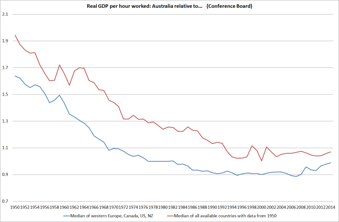
I described Australian incomes as “fairly high”.   And yet for all its huge natural resources, Australia’s real GDP per hour worked –  while a lot better than New Zealand’s – is no higher than the median of advanced countries.  For decades it fell relative to other advanced countries, and even over the last 20 years has done little better than hold its own.

aus real gdp phw relative

As a topic for another day,  might its people also have been better off without such rapid immigration-fuelled population growth?


New Zealand and Norway: a real exchange rate that hasn’t moved

On average, over time, one would expect the real exchange rate of a more poorly-performing country to depreciate against that of a better-performing country.

There is a whole variety of strands to a possible story about why one might expect to see such a relationship, and for why it would be helpful for the more poorly-performing country for such a depreciation to occur.  A less well-performing country will typically have found its firms less well able to compete in international markets (than those of the better performing country).  That, in turn might reflect a less attractive tax and regulatory environment, less real productivity growth, or changing demand patterns so that the world wants more of what the more successful country produces and less of what the less successful country produces.  Or it might even be about natural resource discoveries –  a country that discovers major new resources (eg oil and gas) just has more stuff that the rest of the world wants, and with good institutions such a country will tend to outperform other countries for a (perhaps quite prolonged) period.  And the citizens of a faster-growing country will rationally anticipate strong future income gains, increasing their consumption demand relative to the trajectory of consumption demand in the less well-performing economy.

I’ve illustrated previously that one of the striking stylized facts about New Zealand is that although our economic performance over the last 60 or even 100 years has been pretty disappointing by global standards, there has been no depreciation in our real exchange rate relative to those of other advanced economies.  No wonder our tradables sector has struggled.

This post is really just about illustrating the point by reference to one other particular small commodity exporting country, Norway.

For the first 100 years or more of modern New Zealand, no one doubted that per capita incomes in New Zealand were much higher than those in Norway.  New Zealand was one of the great economic success stories, while Norway struggled, and exported a lot of people, especially to the United States.  On the Maddison numbers, GDP per capita in New Zealand in 1870 was more than twice that in Norway.  By 1910, when New Zealand GDP per capita is estimated to have been the highest in the world, the margin was even more in our favour.

These days, GDP per capita in New Zealand is not much more than half that in Norway  (and the NNI per capita gap is even larger).  New Zealanders work long hours per capita, and our real GDP per hour worked is estimated to be only about 45 per cent of that in Norway.  Over the last few years, we’ve done a bit better than Norway, but the multi-decade trend has been strongly downwards.

Here, using the OECD database which has estimates back to 1970, is New Zealand GDP per capita relative to Norway’s (in current prices, using current PPP exchange rates).  These are really large declines.  Back in the early 1970s we had incomes about the same as those of Norwegians.

gdp pc nz and norway

Norway began to pull away from other OECD countries when its large oil and reserves began to move into production in the 1970s.  We, on the other hand, suffered in the 1970s from a deep decline in the terms of trade, and new access restrictions on our major export products.

And yet here is a chart showing New Zealand’s real exchange rate relative to that of Norway since 1970.  I’ve shown two, very similar, series –  one is the OECD’s relative consumer prices index, and the other is the BIS’s narrow real exchange rate measure.

rer nz norway

Our real exchange rate (in particular) has been quite variable –  Norway’s has mostly been materially more stable –   but over the whole period there has been no trend whatever in the ratio of our real exchange rate to theirs (and in the last few years, New Zealand’s real exchange rate has risen a lot relative to Norway’s).

Using the OECD’s relative unit labour cost measure produces a slightly more encouraging picture for New Zealand –  but if there has been a trend decline at all, it has been quite small, compared with the magnitude of the deterioration in New Zealand’s economic performance (productivity, GDP per capita, usuable natural resource endowments).

Why has it happened?  Well, it is Saturday and I’m not planning to write an extended essay.  But my thesis is that it is a combination of things Norway has done, and things we have done.

On the Norwegian side, wisely or otherwise, much of the oil and gas revenues –  mostly accruing to the Crown – were diverted into the Petroleum Fund, and saved for a later day.   Norway has net government financial assets of around 250 per cent of GDP –  a figure that was less than 50 per cent only 20 years ago.  And there hasn’t been a large private sector offset   Norway’s positive net international investment position is now some 200 per cent of GDP.

What that has meant is that quite a large proportion of the new income earned in recent decades has not been spent.  And income not spent does not put upward pressure on the prices of non-tradables goods and services relative to those of tradables (another definition of the real exchange rate).  Norway has experienced some of that pressure –  Oslo is an expensive city – but a lot less than they would have without the huge savings rates.

Since the early 1970s, our government debt position hasn’t changed much –  it has gone up and down –  but was pretty low at the start of the period, and is pretty low now.  Our NIIP position has gone in the opposite direction of Norway’s, even though they were earning lots of (initially unexpected) income, and we were experiencing repeated disappointment.  On best estimates, our NIIP position was around -10 per cent of GDP in the early 1970s, and has been fluctuating around -70 to -80 per cent of GDP for the last couple of decades.

The Norwegians haven’t spent a larger share of their income even as their growth prospects improved, and we haven’t saved a larger share of ours even as our growth prospects deteriorated.  Neither choice is necessarily better than the other, but their choice tended to weaken their real exchange rate (all else equal) keeping more non-oil tradables firms competitive, and our choices tended to strengthen our real exchange rate, making it hard for the tradables sector to grow much.  For us, it tends to reinforce our decline.

And then there are population choices.  When migration works well, it usually complements economic success that was already underway.  Rapid population growth, all else equal, tends to put upward pressure on a country’s real exchange rate –  it involves a high demand for non-tradables, putting upward pressure on non-tradables prices relative to those of tradables (set globally).  Norway’s population growth rate has increased quite a bit in the last decade, but over the full period since 1970, here is the chart showing the ratio of New Zealand’s population to that of Norway.

population nz norway

Our population –  in a country that has had one of the worst performances of any advanced country –  has grown materially faster than that of Norway, one of the most successful countries in the advanced world.  Not usually a recipe for success – in a family, or at a national level.

I don’t believe in population policy –  people should be free to have as many, or as few, kids as they can afford, and it should be no concern of governments –  but immigration policy is a different matter.  Our population has grown faster than that of Norway almost entirely because successive National and Labour governments have chosen to bring so many non-New Zealanders into the country (more than offsetting the upsurge in those leaving, mainly for Australia).  Doing so has helped impede the sort of the sustained downward adjustment in the real exchange rate one would have expected if governments had simply stayed out of the way.  It has made even harder for New Zealand to turn around the decades of economic decline.

It just looks like a wrongheaded policy, foisted on us –  at our expense, without seeking our endorsement –  by a succession of bureaucratic and political elites (different party labels or none, but similar ideologies and mindsets) who can offer barely a shred of evidence in support of the success of their strategy.

We can’t change the fact that Norway got oil or gas, and nor would we  wish to, or begrudge them their good fortune.  But it is pretty extraordinary that over 35 years when they’ve done so well and we’ve done so badly, there has been no change in our real exchange rate relative to theirs.  At our end of that relationship, it is as if governments have set out to stop the adjustment happening.   It wasn’t their conscious intent, but after this long lack of conscious intent makes them no less culpable.

Natural resources and economic performance: Anthony Trollope’s observation

The great Victorian novelist Anthony Trollope (and senior public servant in the British Post Office) visited Australia and New Zealand in 1871 and 1872.  His son had become a New South Wales sheep farmer, so the trip was partly about family, and partly an income-earning opportunity to write a book about the Antipodean colonies.

Much of the material from the New Zealand leg of the trip –  two months travelling from Bluff to Auckland –  was reproduced in With Anthony Trollope in New Zealand 1872, edited by A H Reed, and published in 1969.  I read the book over the weekend (having dipped into it, and found some quotes on railways and the incentives facing officials and politicians, here).

In 1872, it was only 32 years on from the Treaty of Waitangi  –  as close as 1984 is today to 2016.  All the New Zealand and Australian colonies were young –  it was only 84 years since the Sydney penal colony –  and whenever I read about the period I’m struck by how rapidly development occurred in many of these places.

By 1872 New Zealand had already been through some turbulent times.  The 1860s had brought the South Island gold rushes, and the huge influx of miners, but they were also the time of the worst of the land wars in the North Island –  where the burden on manpower and government finances was so severe that one sometimes wonders why the British government persevered. Trollope records contemporary British estimates that the New Zealand “wars with the Maoris…have been declared by competent authorities at home to have cost England twelve millions [and] have cost that colony nearly four millions and a half”.   Nominal GDP for New Zealand is estimated to have been only £4.4m in 1859 and £16 million by 1870.    Fortunately for the New Zealand taxpayer, Britain bore most of the fiscal cost.

One of the issues often debated is the role of natural resources in explaining the wealth of nations.  Natural resources alone don’t make a country prosperous –  think Bolivia, Angola or Iran –  but it can help a lot, especially in a country with a fairly small population –  think Equatorial Guinea, Kuwait or Brunei.  The natural resources have always been there, but it takes technology, management. and capital to utilize them, and really bad governance can impede all of that, and see any gains rapidly dissipated.  Among advanced countries, I think there is little doubt that Norway (in particular) and Australia would not have reached their current living standards without the natural resource endowments their people and institutions have enabled those countries to tap.  I’m going to come back to the case of Australia in the next few days.

Trollope was writing about the situation in 1872, and he included an interesting couple of paragraphs (pp38-39) about what we might term a “natural experiment” –  contrasting the performance of the province of Otago (which at the time had its own provincial government, with quite extensive powers) with that of the colony of Western Australia.

I will quote a few words from a printed dispatch respecting Otago, sent home by Sir George Bowen, the Governor of the colony, in 1871 – “after the lapse of only twenty-three years” –  from the first settlement of the province, – “I find from official statistics that the population of Otago approaches nearly to 70000, that the public revenue, ordinary and territorial, actually raised thereon exceeds  £520,000; that the number of acres farmed is above a million; that the number of horses exceeds 20000; of horned cattle 110.000; and of sheep 4,000,000.  The progress achieved in all the other elements of material prosperity is equally remarkable; while the Provincial Council has made noble provision for primary, secondary, and industrial schools; for hospitals and benevolent asylums; for athenaeums and schools of art; and for the new university which is to be opened in Dunedin in next year”.  I found this to be all true.  The schools, hospitals and reading-rooms, and university, were all there, and in useful operation; – so that life in the province may be said to be a happy life, and one in which men and women may and do have food to eat, and clothes to wear, books to read, and education to enable them to read the books.

The province is now twenty four years old…. Poor Western Australia is forty-five years old, and, with a territory so large, that an Otago could be take from one of its corners without being missed, it has only 25,000 inhabitants, and less than one million sheep, –  sheep being  more decidedly the staple of Western Australia than of Otago. I do not know that British colonists have ever succeeded more quickly or more thoroughly than they have in Otago.  They have had a good climate, good soil, and mineral wealth; and they have not had convicts, nor has the land been wasted by great grants…  And in Western Australia gold has not been found.  I know no two offshoots from Great Britain which show a greater contrast”

Western Australia was settled a little before Otago, and was materially closer to Britain (making it cheaper to immigrate to).  The cultural backgrounds of the settlers were very similar, and both operated under British law and institutions.  And yet Otago had prospered and Western Australia had underperformed.  There seems little real doubt that natural resource discoveries –  gold primarily – was the difference at the time.

Natural resources very rarely make a country or region rich forever –  usually only human skills and capability do that.  The South Island gold didn’t last long, on any scale, and in time Western Australia would become a major exporter of mineral products –  which couldn’t readily be exploited with 1860s technology.  Today, partly as a result, Western Australia has around 2.5 million people, and the Otago and Southland regional council areas (roughly the old Otago Province) have around 270000 people.

Why New Zealand languishes

Back in February when no one was aware of this blog, and I was just trying to work out how to use the software, I posted the entry below.

Why New Zealand languishes

A hawkish easing and a dovish tightening

A financial markets participant who lost money in the market moves following Thursday’s Monetary Policy Statement got in touch yesterday to ask where I ranked Thursday “hawkish easing” –  an OCR cut that actually tightened monetary conditions by prompting a 1.5 per cent increase in the exchange rate –  among policy mistakes.

He may well have had an international context in mind, but my mind went back to various episodes in New Zealand since I got closely involved in 1987.  As I pointed out to my correspondent, even if one counted Thursday as a mistake –  and I certainly thought the policy stance was wrong, and the communications pretty unconvincing –  there had been many worse over the years.  Making mistakes, either  in communications on the day or in the wider stance, is pretty much inevitable in the sort of discretionary monetary policy management most countries adopt.  Unfortunately the Reserve Bank of New Zealand seems to have more black marks against its name than most.  One could think of the MCI debacle in the late 1990s –  which led directly to the troublesome clause 4b of the PTA – or the two lots of policy reversals (tightenings that had to be unwound) since 2010.   Misjudging the overall appropriate stance of policy matters more (whether too tight or too loose) but it takes time for those errors to become apparent.  My mind went back specifically to a “hawkish easing” fifteen years ago, when the market’s adverse verdict was immediately clear.

By May 2000, the Reserve Bank had been tightening monetary policy quite aggressively for some time.  It was the first ever OCR cycle –  the OCR was only introduced in early 1999, and we’d been raising the OCR by 50 basis points at a time.    The OCR was at 6 per cent, the same as the Fed funds target rate –  which itself was raised to 6.5 per cent on the morning of our MPS.

The May 2000 Monetary Policy Statement was released on 17 May.  We raised the OCR by another 50 basis points to 6.5 per cent, and the projections foreshadowed the likelihood of another 75 basis points of increases over the next few quarters.

The exchange rate had been relatively low for some time by then (around 58 on the TWI as it is currently measured, but 54-55 on the index as it then was).    When returns on USD assets were basically equal to those in the NZD, that weakness was hardly surprising (it is the example I use to illustrate why I’m pretty sure that if our OCR ever gets cut to near-zero our exchange rate will have fallen a long way).

Running into the MPS release, the TWI had been weakening a little.  I was deputy head of the Financial Markets Department at the time, and I recorded in my diary the night before the release that we were “likely to see the TWI lower” following the release.

In those days, we met at 7:30am on the morning of the release, to give final advice to the Governor and enable him to confirm his OCR decision.   It was to be stressful day, but my diary records that at the meeting “just as well everyone, with more or less enthusiasm, on the OCR group endorsed 50bps –  and at our morning meeting at 7:30 no one expressed even the least qualms”.

As I went on, “I’d expected the exch rate to ease off –  not to 52.8.  Over the following day or two, it fell as low as 51.08 –  on a 50 point OCR increase, we saw the exchange rate fall by almost 5 per cent at worst, and around 4 per cent when things had settled down.  Our widely-expected tightening ended up materially easing monetary conditions.  We were more than a little flustered, and my diary records us hoping “without success, that one of the wire service reporters would ring so we could point him in Murray [Sherwin’s] direction for a [clarifying] comment”.

twi may 2000

What was going on?   Basically, the market (particularly offshore) did not believe us.  They took the view that if we continued to raise the OCR that aggressively we would “kill the economy and hence exacerbate the future easing”.  I was pretty sceptical at the time (as I imagine were my colleagues), but as it happened we tightened no further, and were cutting the following year.  And as it happened there was a “growth pause” in 2000 that we had not anticipated.  The exchange rate was to fall by a further 10 per cent over the following few months and headline inflation went briefly to 4 per cent by the end of the year.

The May 2000 OCR increase, and the hawkish path it continued to portray, was a pretty material misjudgement by the Reserve Bank.  But what made it particularly bad was the strength of the immediate adverse reaction.  We badly misjudged that reaction.  There were a couple of local economists who were more hawkish than we were, but the market as a whole spoke –  and it did not believe us, or believe that we would be able to carry through our envisaged policy.  Even politicians weighed into the debate (Prime Minister and Minister of Finance).

By contrast, the only way to read the overall reaction since Thursday, has been that Graeme Wheeler’s latest policy announcement, and flat forward track, has been treated as credible.  Only time will tell whether the OCR, and with it the exchange rate, will eventually have to go lower, but for now the Governor’s stance, that he does not envisage further cuts, is being taken seriously.  And although there are some sceptical commentators (including – at least – Westpac, your blogger, my correspondent, and some macro advisory firms), there has been no controversy in the local media, nothing very critical in the commentaries from the local bank economists, and no comment at all from politicians on either side.  If anything the tone of the questioning in the press conference was slightly sceptical of the need to have cut at all.  So if I were Graeme Wheeler, I’d probably have got to the end of Thursday a bit disappointed that the exchange rate had risen by 1.5 per cent, but thinking that overall the reaction hadn’t been bad at all.  After all, the (never very likely) alternative might have been that people treated the flat rate track, and end of the easing cycle story, as not very credible at all. If so, the exchange rate might have fallen significantly – an excessively hawkish stance increases the need for easing in the future.

Credibility matters a lot to decision-makers.  Since no one can be 100 per cent sure what the right policy is, having the consensus with him probably matters a lot. After May 2000, Don Brash didn’t.  For now, Graeme Wheeler does.


On peripheral share markets, and the mess that can still lie behind them

As the wild gyrations around the sharp decline in Chinese share prices dominate the business news headlines,  the chart of the Shanghai share price index was reminding me of another chart, from our own history.

The historical data are hard to come by so I’ve had to use this chart, which covers a rather long period, from a good Reserve Bank Bulletin article about past New Zealand financial crises (mostly, the 1890s and the 1980s). In China’s case, a 150 per cent increase in share prices in a year or so, most of which has now been given back in only a few months (of course, it is perhaps worth remembering that there was an even bigger boom, to even higher peaks, in 2006/07).   In New Zealand’s case, the boom in real prices was even larger – if it took a slightly longer period of time – and the bust was complete.

NZ share prices 80s

There is lots of discussion at present – often from US-centric people – about how the Chinese share market is somewhat peripheral to the economy. And, in some senses, no doubt it is. The share market has always been relatively peripheral to the New Zealand economy too, and market capitalisation as a share of GDP has typically been low. Between farms, farmer co-ops, wholly foreign-owned companies, and state-owned companies, most economic activity simply wasn’t represented by listed companies. Take state-owned companies as an example. In 1986/87, the government still owned several banks, insurance companies, the post and telephone system, the one TV company, the railways, the airlines, the largest petroleum company, and the steel mill. There were no New Zealand listed banks, and no vehicles for direct equity exposures to our largest export industries (sheep and dairy products).  Forestry was probably the only major export industry with material listed exposure.

And yet the market went crazy, and when it burst it was the start of some very tough years for New Zealand. The whole post-liberalisation mania has not been adequately documented (unlike, say, the Nordics booms and busts of much the same time), but it was characterised by much more than just crazy share prices for the minority of people with any material direct exposure to the market. These things rarely happen in isolation. We had a massive credit boom – private sector credit growing at 30 per cent per annum – and a massive commercial property boom, skewing real resources into places that proved not really to offer economic returns. The absurdity of some of what went on during that period was captured in the suggestion of one (brief) high flyer, that New Zealand had a comparative advantage in takeovers. Few bankers had any experience in disciplined credit risk analysis in a liberalised market economy – and nor did their shareholders (whether government or Australian private). And, in any case, bonuses weren’t being paid to people who stayed clear of the boom for long. Highly leveraged investment companies were all the rage – often the principal asset was overvalued shares in other investment companies.

As one illustration of what went on, here is the commercial property picture.  A 3 percentage point of GDP fall is huge, and of course the boom-times share of GDP has never been regained, suggestive of how overblown that market had become.

non-res 80s

As they often are, central bankers were slow to recognise what was going on. The section I managed wrote a paper to the Minister of Finance a few weeks before the crash arguing (as I recall) that the strength of the share market was a pointer to the underlying strength of the economy (and hence a reason to tighten monetary policy). A week or two after the crash, my boss and I were visited by a firm of economists we were often dismissive of – they urged us to recognise that a savage commercial property and banking shake-out was about to get underway. We were polite but pretty dismissive.

Those are the sorts of episodes that leave financial crises in their wake, and which often have nasty and prolonged real economic consequences. Some of us at the Reserve Bank might have initially been a little sceptical, but the liquidity stresses soon became very apparent. Within weeks we had acquiesced in a sharp fall in short-term interest rates (we didn’t directly set them then), which eventually totalled 400-500 basis points.  The exchange rate came down as well. And it still took years for the economy to really recover.

No two situations are ever quite the same. New Zealand was trying to vanquish double-digit inflation, a situation few countries these days find themselves in. But ill-disciplined credit booms, of the sort we had in the 1980s, and of the sort the Chinese have had – on a far larger scale and with fewer market disciplines – are often enormously damaging. Often there is an equity market mania dimension to these things, but the mania is often the epiphenomenon rather than the main event; symptoms of something deeper going on. And the timing will never be quite precise – we had a mania in 1986 around a company (investment and finance) whose shareholders, in their private capacity, were backing what appeared for a time likely to be a successful tilt at the yachting America’s Cup. Of itself, it probably did little or no real economic harm, but it was symptom of the excesses, and of the undisciplined nature of the times.

So count me as a little sceptical of the notion that because not many Chinese hold shares, we don’t need to worry about what is going on there. As here, it is a matter of looking to the phenomena behind the headlines – in their case, several years of one the largest, least-disciplined domestic credit and investment booms in history.

Oh, and there are simply no parallels between the 1987 New Zealand position – which brought down several major financial institutions, including our largest bank – and the New Zealand position now. I wrote about that (lack of) parallel a few months ago.

What legislation used to require of monetary policy

This was what section 8 of the Reserve Bank Act, and associated provisions, replaced.  It is easy to forget –  and for many younger readers, never to have been aware –  just how different things were.  Of course, we had a singe decision-maker back then too, although as Minister of Finance and an elected MP, the single decision-maker could be (and often was) tossed out of office.

8. Primary functions of Bank

(1) The primary functions of the Bank

shall be—

(a) To act as the central bank for New Zealand; and

(b) To ensure that the availability and conditions of credit provided

by financial institutions are not inconsistent with the sovereign right of the Crown to control money and credit in the

public interest; and

(c) To advise the Government on matters relating to monetary policy, banking, credit, and overseas exchange; and

(d) Within the limits of its powers, to give effect to the monetary policy of the Government as communicated in writing to the Bank under subsection (2) of this section, and to any resolution of Parliament in relation to that monetary policy.

(2) For the purposes of this Act, the Minister may from time to time

communicate to the Bank the monetary policy of the Government, which shall be directed to the maintenance and promotion of economic and social welfare in New Zealand, having regard to the desirability of promoting the highest level of production and trade and full employment, and of maintaining a stable internal price level.

(3) The Bank shall, as directed by the Minister, regulate and control on behalf of the Government—

(a) Money, banking, banking transactions, any class of transactions of financial institutions, credit, currency, and the borrowing and lending of money:

(b) Rates of interest in respect of such classes of transactions as may from time to time be prescribed:

(c) Overseas exchange, and overseas exchange transactions.

(4) The Bank shall make such loans to the Government and on such conditions as the Minister decides from time to time, in order to ensure the continuing full employment of labour and other resources of any kind.

For those interested in the history, and how the functions/objectives/powers provisions changed (as they repeatedly did –  this was the 1973 formulation) there is an interesting Bulletin article here by Christie Smith and James Graham.  In case anyone thinks my post this morning was a recantation of a commitment to monetary stability (which it certainly wasn’t) I remain proud of the fact that my grandfather’s cousin was the Minister of Finance who introduced the concept of a stable internal price level to the Reserve Bank Act, and removed the formal power for the Minister of Finance to direct the Bank.  Those changes didn’t last long.

Fiscal and monetary policy interactions: some New Zealand history

The role of fiscal policy has been much-debated in recent years. I think the consensus view now is that discretionary adjustments to fiscal policy make little difference to GDP in normal times, because monetary policy typically acts to offset any demand effects. By contrast, if interest rates can’t go any lower (or central banks for whatever reason are reluctant to take them lower) then discretionary fiscal policy adjustments can have quite material impacts on near-term GDP behaviour.

These debates focus on demand effects. If the government spends less, without changing tax policy, spending across the economy as a whole is likely to be dampened to some extent, all else equal. But there are also stories about confidence effects. If the overall economic and fiscal situation is sufficiently fragile, then in principle tough and credible new fiscal initiatives could lift confidence sufficiently that the confidence effects overwhelm the demand effects.  This was the vaunted “expansionary fiscal contraction”. I’m not sure I could point to any examples in advanced countries, but others read the evidence and case studies a little differently. I’m not wanting to buy into debates about Greece here – but “credible” was perhaps the operative word in the previous sentence.

Before 2008, there was a variety of historical episodes that people often turned to when looking at the effects of fiscal contractions.  The UK experience in the early 1980s and the Canadian experience in the mid-1990s got a lot of attention.  I think the best read on the Canadian episode (with more extensive treatment here) was that substantial fiscal contraction did not have adverse effects on the Canadian economy because interest rates fell sharply,the Canadian exchange rate fell in response, and the United States – Canada’s largest trading partner – was growing strongly.

And then there was New Zealand’s experience around 1990/91. After several years of significant fiscal consolidation (which had been sufficient to generate material primary surpluses), new fiscal imbalances had become apparent by late 1990. In a major package of measures in December 1990, and in the 1991 Budget, substantial cuts to government spending were made. In combination with the earlier efforts (which were probably more important), these cuts helped lay the foundation for the subsequent decade or more of surpluses.

Former director of the Business Roundtable, the late Roger Kerr, was prone to argue that it was an example of an expansionary fiscal contraction. I’ve repeatedly argued that it wasn’t. Certainly, the recession troughed at much the same time as the 1991 Budget and the subsequent recovery was pretty strong. And, as Kerr noted, the academic economists who publicly argued that the fiscal contraction could only depress the economy further and would prove largely self-defeating ended up looking a little silly.     But the recovery had much more to do with the very substantial fall in real interest rates – as inflation was finally beaten – a substantial fall in the exchange rate, and with the recoveries in other advanced economies than with any confidence effects resulting from the tough fiscal policy measures.   By mid-1991, the new National government’s political position was so fragile that no one could have any great confidence that the fiscal stringency that was announced would be sustained (and, indeed, several of the higher profile measures were subsequently reversed). The rest of the macroeconomic policy framework, including the Reserve Bank Act, were in jeopardy. Elected in October 1990 with a record majority, the National party was 15-20 points behind in the polls only a year later, and only scraped narrowly back into government in 1993.

A few years ago, there was renewed debate here around the appropriate pace of fiscal consolidation. At the time, the government had large deficits, and the exchange rate had risen uncomfortably strongly from the 2009 lows. Some argued for a faster pace of fiscal consolidation, arguing that to do so would ease pressure on interest rates and the exchange rate. It had been the thrust of Treasury advice, and some outsiders were also making the case. Among them was then private citizen Graeme Wheeler, who had had a meeting with John Key and Bill English and had reportedly cited the experience on 1991, noting that monetary policy could offset any demand effects of faster fiscal consolidation.   Reports of this conversation had been passed back to the Reserve Bank.

Not many people at the Reserve Bank knew much about that earlier period. Newly-returned to the Reserve Bank from a secondment to Treasury, I wrote an internal paper discussing the interplay between fiscal and monetary policy over 1990 and 1991, including addressing some of the “expansionary fiscal contraction” arguments. It drew extensively on previously published material, on the now-archived files I had maintained during the late 1980s and early 1990s (as manager responsible for the Bank’s Monetary Policy (analysis and advice) section, and from my private diaries.

The Reserve Bank finally released this paper yesterday, with a limited number of deletions (I have appealed these deletions to the Ombudsman, given that they relate to events of 25 years ago, and in some cases involve deleting quotes from my own private diaries). The Bank is obviously uncomfortable about the paper. Despite the fact that the paper draws extensively from contemporary records – most of which are in the Bank’s archives – and was run past (in draft) several of senior people from the Reserve Bank in the early 1990s, the Bank has included a disclaimer on each page suggesting that the paper is primarily based on my memories, which it can’t vouch for. But, to be clear, it draws primarily on contemporary records, trying to document and explain historical events, and then to interpret them to an audience used to different ways of conducting monetary policy. Different people may read the same evidence in different ways, and access to a fuller range of records could alter some perspectives. As an example, while my files had copies of many Treasury papers, and records of many meetings with Treasury officials, I did not have access to a full set of Treasury papers comparable to the collection of Bank papers I used. As background, Graeme Wheeler was the Treasury’s Director of Macroeconomics in 1991.

A copy of the paper is here (two separate links, as that is how I got it from them).

Memo to MPC – Fiscal policy, monetary policy and monetary conditions part 1

Memo to MPC – Fiscal policy, monetary policy and monetary conditions part 2

This was an extremely tense period. The Reserve Bank Act had come into effect on 1 February 1990, and although both main parties officially supported it, it was contentious in both caucuses. In the National Party caucus, Sir Robert Muldoon and Winston Peters had been the leading sceptics. The Labour Party was almost equally split, and Jim Anderton had left the party over the direction of economic policy. Going into the 1990 election, no one knew which wing would dominate the (probable) new National government, nor which tack the Labour Party would take once it was in Opposition. Economic times were tough, and patience with the Reserve Bank was wearing rather thin as the disinflationary years dragged on. It wasn’t helped by the system for implementing monetary policy that we were using (documented here) which at one point led to our efforts being described by Ruth Richardson in Parliament as comparable to those of Basil Fawlty in the comedy classic. (Treasury and the Bank were actively at odds over the implementation arrangements – they variously hankered after money base targets or, on occasion, exchange rate rules[1]).

Last night I reread some of my diaries from the period, and dipped into Ruth Richardson’s book, and Paul Goldsmith’s biography of Don Brash, and was reminded just how fraught the period was. We spent most of 1991 not knowing whether, or how long, the monetary policy framework would last, and whether the senior management would survive. Ruth Richardson records that even at the end of 1991 when the worst of the pressures were beginning to ease, the Prime Minister Jim Bolger, in a meeting of senior ministers, canvassed the possibility of changing the Reserve Bank Act to provide an impetus to growth.

The Bank had for some time publicly argued that there was no problem with the exchange rate. As a result the Bank’s position with the new government was not helped by a change of stance quite late in the piece: the new view was that a lower real exchange rate was likely to be required to rebalance the New Zealand economy. This was an important theme in the Reserve Bank’s 1990 post-election briefing, and took the incoming Minister of Finance quite by surprise. The Reserve Bank openly making the case for a lower exchange rate seemed to provide ammunition for some of her caucus and Cabinet colleagues who were less convinced of the overriding importance of macroeconomic stabilisation.

She would have been more aghast had she realised that until the very eve of the election the Reserve Bank had been planning to recommend stepping back from the 0-2 per cent inflation target itself. This had been the outcome of some mix of unease over how (excessively) mechanical the first Policy Targets Agreement had been, and a wish to allow room for the desired depreciation in the exchange rate. The suggestion had been to keep a medium to longer-term focus on a 0-2 target, or perhaps redefine it to 1-2 per cent, but to add a 0-4 per cent “accountability range”, within which inflation could fluctuate without triggering severe accountability consequences. We stepped back from that recommendation at the last minute, in large part because of the view that to have recommended that sort of change would have left Ruth Richardson out to dry, as the only defender of a 0-2 per cent target, exposing her to (in the words of my diary two days before the election) “Peters’ and Muldoon’s ridicule and Bolger’s incomprehension”.

In terms of the fiscal policy dimensions, one of the Reserve Bank’s deletions in from this extract from my diary a couple of days after the election:

We had a marathon session in Don’s office (from 8-11) going thru para by para agreeing on a text with DTB finally showing his impatience with the last minute chaos. Changed fiscal tack in favour of a tough stance now, to help cement-in any exchange rate depn and, as important as anything it seemed, to help the Richardson faction in Cabinet.

What this captures is the somewhat uncomfortable extent to which the Reserve Bank (and Treasury, as we shall see) in this period were focused on supporting, or at least not undermining, those political players supporting the sorts of frameworks and reforms that the Bank and Treasury favoured. In the Bank, senior management came to a view in 1991 that saving the framework (the Act) was, for now, more important than price stability itself (as least in the short-term). Sceptics of this stategy – I was one – caricatured it as “the Reserve Bank Act is more important than price stability”.

Even with the benefit of long hindsight, I’m not sure what to make of the approach taken at the time. On the one hand, it is somewhat distasteful – neither the Governor nor the rest of us were elected – but on the other hand, perhaps it is just what inevitably happens in any fraught and controversial period. As it happens, we probably gave quite unnecessary ammunition to the opponents of reform through this period. In small part this was because we communicated badly and ran an implementation system that – with hindsight – was pretty bizarre. But more importantly, we held monetary policy too tight for too long – not to make any points, or reinforce any positions, but simply because we misread how strong the disinflationary forces were by then. In a serious recession, that was black mark against the Bank (and I was one of the more hawkish people on the Reserve Bank side).

During 1991, the Treasury became very focused on supporting the political position of Ruth Richardson as Minister of Finance. Some of this is captured in the paper. But much of I didn’t include, since the focus of the paper had been on the fiscal/monetary interplay. On page 15 of the paper, the Bank seems to have deleted some of this extract from my 4 September diary”

David [Archer] and I had lunch with Graeme Wheeler and Howard [Fancy][2] and were treated to a litany of gloom, of how we needed to be supporting the macro policy mix and helping get the recovery going and being very concerned about the political risks. As GW said “I wouldn’t want history to look back on me as a policymaker and say that in my confidence about the framework I hadn’t taken adequate precautions” – referring to the Bank. He was going on about how we had a “near-perfect” mon pol framework for the medium-term but that at the moment we needed to be more flexible. Both were concerned to play down 0-2, with vacuous waffle about “best endeavours” but taking the view that, in effect, 2-4% inflation wouldn’t worry them. ….. Apparently Bolger is getting worried about 1981/1932 re-runs: mass demonstrations, violence in the streets etc.

Only a few months previously the Treasury had been openly sceptical that macro policy was sufficiently tight.  It wasn’t always clear how well Treasury was reading the politics either – I had a very good relationship with Ruth Richardson’s own economic adviser, Martin Hames, and on the evening of the deleted extract above I recorded a long conversation with Martin in which “he still claims there are no real threats: says things were a lot worse at times in Oppn”.

This has been become rather a long post. It is partly about providing some context for those who think about reading the whole paper. Here are a few of my bottom lines:

  • Had we been running a now-conventional system of monetary policy implementation, many of the less important of these tensions and ructions would not have arisen.  When demand and inflation ease –  whatever the source –  the OCR is generally  cut.
  • While, with the benefit of hindsight, New Zealand was probably always going to settle at a low inflation rate (all other advanced economies did) that wasn’t remotely clear at the time.  In particular, the initial passage, and the survival, of the Reserve Bank Act was a much closer-run thing than is generally recognised. Infant mortality was a real threat
  • Neither the Reserve Bank nor the Treasury covered themselves with glory through this period in their macroeconomic analysis and policy advice.

[1] Murray Sherwin presciently argued that we should adopt an OCR. I’m still embarrassed by the note I wrote in response to that suggestion.

[2] David was the Bank’s deputy chief economist, and Howard was Treasury’s macro deputy secretary.

Just how large a contribution has net migration made to population growth?

One of the challenges in discussing the impact of immigration in New Zealand is making sense of the data.  I’m running a story that says two (largely unrelated) things:

  • Given the severe land use restrictions in place, the high target level of non-citizen immigration (the bit directly amenable to New Zealand policy) is a major explanation for the upward pressure on house and urban land prices.  I’ve shown that, on one measure, all of New Zealand’s trend population growth is now resulting from immigration policy.
  • Given the modest rate of national savings, the high target level of non-citizen immigration is a major contributing factor to New Zealand’s persistently high (relative to other countries) real interest rates, the high average real exchange rate, and –  hence –  to the weak growth in productivity and the failure to reverse any of the decades-long decline in New Zealand incomes relative to those in other advanced countries.

We know the key policy parameters.  Specifically, there is a currently a government target of 135000 to 150000 permanent residence approvals on a rolling three year basis.  That isn’t all the non-citizen migration but it is the overwhelming bulk of trends in it.  There are lots of short-term flows, but my real interest is not in year to year fluctuations but in the contribution of immigration policy to the trend growth in New Zealand’s population.

When people turn to Statistics New Zealand data to analyse migration they most often look at the data on permanent and long-term (PLT) migration.  For any analysis about what is happening over short periods of time, it is the only sensible series to use.  The alternative is to use SNZ’s total migration data but (even when seasonally adjusted) it is hugely volatile in the short-term.  The noise swamps any signal.  Major sporting events –  eg Lions tours, or the rugby world cup – are an example of what muddies the water.

But the PLT data have their own limitations.  The total migration data are volatile, but they do count every person arriving in and departing from New Zealand, and so provide a highly accurate count of the cross-border contribution to the number of people in New Zealand at any one time.  By contrast, the PLT numbers are less volatile, but they rely on the self-reported intentions of travellers.  When someone arrives, or leaves, they fill in the arrival/departure card stating whether they intend to go/come for less or more than 12 months.  Those stating “more than 12 months” are treated as permanent or long-term movements.

But even if everyone answers the question honestly, plans change.  Some New Zealanders go to Australia in search of a better life, perhaps planning never to live here again.  But Australia doesn’t always live up to expectations, and some will come back to New Zealand a few months later.  Those people will have been PLT departures when they left, but returning short-term travellers when they come home.  Similarly, some foreigners come to New Zealanders planning to stay forever, but leave again a few months later.  Some New Zealanders go to Australia for a few months, but find a good job, settle, and don’t come back.  And some foreigners might arrive initially on short-term visas, but then end up staying permanently (most permanent residence visas these days are issued to people already in New Zealand).

You might suppose that the differences would be small, and would wash out over time.  To the extent that I had ever given the issue any thought, I suppose that was what I used to assume too.  In fact, there are large and persistent differences between the two series.  The difference was at its starkest in the 2002/03 migration boom, when the annual PLT inflow peaked at around 40000 and the total inflow peaked at almost 80000.  The differences didn’t just wash out the following year.

Statistics New Zealand has recognised the issue.  Late last year, partly prompted by my focus on the issue, they published a paper (which unfortunately got little or no coverage), reporting some experimental work they had done on trying to improve estimates of actual permanent and long-term migration (as opposed to self-reported intentions).  As one example of what they did, passport numbers were matched to check how many of those who (for example) said they were coming for less than 12 months were still here 12 months later.  Over the 2000s it was pretty clear that estimates of actual permanent and long-term migration could be materially improved.  Over 2002/03 “true” PLT flows appear to have been materially larger than self-reported PLT flows, and over 2010-12, true PLT flows were materially weaker than the self-reported flows.  In each case, trends in the total migration series were more reflective of what was going on than the self-reported PLT numbers.  This chart is from the SNZ paper.

plt-methods

SNZ has not backdated its experimental estimates prior to 2000, and apparently (and unfortunately) does not have funding to produce these estimates on an ongoing basis.  But over much longer periods of time these differences also appear to matter.   Infoshare has data that distinguishes PLT and total migration since 1921.  Here are the cumulative net inflows in the two series.
cumulative migration since 1921
The cumulative difference is 170000 people (total net migration is much larger than self-reported PLT) –  quite material in terms of thinking about changes in New Zealand’s population which, even now, totals only 4.6 million people.  And the difference is not just down to, say, the growth of tourism: SNZ report that at any one time there are around 150000 foreign visitors in New Zealand, and around 115000 New Zealand visitors in other countries.

The divergence since 1921 is large, but note the crossover point in the early 1980s.  Until the end of the 1960s, self-reported PLT immigration had been consistently larger than total net immigration.  In earlier decades, there wasn’t much short-term tourism or many foreign students in our universities.  Since the outflows of New Zealanders also weren’t large until late in the period, much of the difference was probably down to people getting here and deciding New Zealand wasn’t really for them and going home again.

Self-reported net PLT outflows from the mid 1970s were large.  The flow of non-New Zealanders was quite small in this period (policy having been tightened materially in 1974), while the big change was the upsurge in the outflow of New Zealanders.  But since the (accurate) measure of total inflows and outflows shows nothing as large as the recorded self-reported PLT outflows, my hypothesis is that many New Zealanders set out to go to Australia for the long-term but quickly came home again.  The differences are huge: PLT data suggest a net 250000 outflow from 1976 to 1990. But the total migration data suggest a net outflow of only a little over 100000.

What about the more recent period?  Immigration policy was reformed and materially liberalised from around 1990 (in a succession of changes).    Here is the chart for total migration and self-reported PLT migration since 1990.

cumulative plt since 1990b

There isn’t much difference in the first few years, but from the late 1990s there has been a material difference between the two series.  Even the direction of change isn’t the same each year in the two series.  If one takes the total migration series as a better representation of the migration flows contribution to population changes (and demand for accommodation) than the self-reported PLT series, there was little or no net migration over 2008 to 2013 taken together (the red line goes sideways for that period), before the population pressures resumed strongly from 2013.  That coincides with the resurgence of very high house price inflation in Auckland.  Quite what is accounting for the divergences in the two series recently isn’t clear.  The SNZ paper I linked to earlier does not distinguish between NZ passport holders and other passport holders (although presumably they have the data).  Plausibly, some part of the difference will be down to New Zealanders finding Australia tougher than they expected and returning to New Zealand within 12 months of leaving, and some part will be down to foreigners arriving short-term and finding legal ways to stay for a longer term.

Finally, a chart showing just how large the total migration net inflows have been.  SNZ reports total migration data since 1875.  Here is the chart showing rolling 15 year totals (which should largely abstract from purely cyclical effects).

total net migration

These aren’t scaled for population, but New Zealand’s population in 1960 was about half what it is now, and the net migration inflows recently have been about twice as large as they were in those early post-war decades.  In those post-war decades,New Zealand experienced persistent pretty extreme excess demand pressures.  They didn’t show up in high interest rates (which were controlled) or in the foreign debt (the private sector largely couldn’t borrow, and the government didn’t). Instead, it showed up in the extensive network of controls  – on credit, on building activity, on imports, on holidays abroad etc – that was needed to keep excess demand in check.  Economic historians writing about New Zealand’s post-war experience seem to have been pretty well agreed that immigration policy exacerbated those demand pressures, rather than alleviated them (as I documented in this file note  Economic effects of immigration and the New Zealand economic historians ).

My story is that much the same pressures have been apparent since the resurgence of immigration in the 1990s –  but this time they show up in real interest rates and in a large negative NIIP position (which would otherwise probably have shrunk considerably as the fiscal accounts moved strongly into surplus).

Long-term bond yield differences

I wrote the other day about the way that New Zealand’s real exchange rate had become (not just recently, but in the last 20-30 years) out of line with changes in our terms of trade and in our relative productivity performance. In that post I suggested that the large gap between New Zealand’s real  interest rates and those in other advanced countries was a big part of the explanation.  Not, of course, that interest rates are an independent factor just imposed on us, but that if we could understand what had driven such a wedge between our interest rates and those of the rest of the advanced world, we would be on the way to understanding what was resulting in such a persistent (albeit rational) misalignment of the real exchange rate.  In that post, I simply noted the current very large gap between the real yields on inflation-indexed bonds issued by the New Zealand and US governments respectively.  That gap is around 1.5 percentage points.  Over 20 years, that looks like a huge difference in expected returns.

Interest rate differentials can move around quite a lot.  Even for long-term bonds, cyclical differences in the health of the respective economies can make quite a difference[1].  Risk factors can matter too –  at times of heightened global risk, for example, US Treasury bonds still tend to be an asset of choice. My focus is not really on short-term movements in those differentials, but on what has happened on average over time, and that is the focus of this post.

The OECD publishes data on long-term bond yields for each of its member countries.  “Long-term” here generally means something close to 10 years, the usual benchmark for such comparisons.  The data are nominal, and of course over time differences in inflation rates should explain quite a lot about differences in nominal interest rates across countries.  So I restricted myself to the period from the end of 1991.  For New Zealand, that was the first quarter in which inflation had fallen inside the new inflation target range, and  most other of the older advanced countries had also broken the back of the high inflation of the 1970s and 1980s by then.  But I’ll come back and look at trends in inflation a bit later.

In this first chart, I’ve shown long-term bond yields for New Zealand, for the US and for the medians of several groups of countries.  I’ve looked at the median of all OECD countries (but at the start of the period there is no data for many of the former communist countries, and by the end of the period, half of all the countries were in the euro), of the G7 countries individually, and of a grouping of G7 currency areas (Canada, the US, the UK, Japan, and the euro-area).  Most of the time it does not much make difference which measure one looks at.  I’ve included them all so that you can see that I haven’t been cherry-picking.  My preferred series to compare New Zealand against is probably the G7 currency areas one.

interest1

Of course, the dominant story of the last 25 years is the dramatic fall in the level of interest rates everywhere.   Part of that is the fall in actual and expected inflation –  even in the G7 countries, inflation still averaged 4 per cent at the end of 1991 – but real interest rates have also fallen markedly.

But my main interest is in the differentials: how have New Zealand bond yields behaved relative to those of these other advanced countries.  It was notable in the first chart how the gap between New Zealand and other countries emerged over time.

Well, here is the chart of the differentials.  This time, to make the chart easier to read, I’ve shown only two series: New Zealand less the median of all OECD countries, and NZ less the median of the G7 currency areas.   It is easy to forget how low New Zealand interest rates were at the start of the period, relative to those abroad  (I was running teams at the Reserve Bank advising on monetary policy and doing the Bank’s macro forecasts, and I had forgotten).  At the start of the period, we were just emerging from two decades of very high inflation, and were only a few months on from the much-publicised threat by rating agencies of a double-downgrade to New Zealand’s sovereign credit rating.  We did, however, at the time have a very low inflation target –  even if political support for that target was fragile at best.

But I’m really interested in more recent periods.  Again, I partly started back in 1991 just to provide context.

interest2

Throughout the 1990s, there was a very strong expectation that New Zealand short-term and long-term interest rates would converge to those of the rest of the world[2]  Once we had low and stable inflation, much stronger fiscal accounts, and people were confident those things would last, then having become  integrated with global capital markets, it seemed a reasonable story.  Sure, there might be small differences – small New Zealand markets might always be less liquid –  but the differences weren’t thought likely to amount to much, especially when comparing us against other small advanced economies.

But that convergence has just never happened, and the fact that it has not happened –  that the interest gaps have been so large, through booms and busts – is one of the most striking features of what has happened in New Zealand in the last 20-25 years.  Day-to-day what happens internationally is a key influence on changes in New Zealand bond yields, and there is clearly a common factor at work in the long-term decline in real yields, but the levels remain completely different.

It is interesting to note where the two lines diverge materially, both in the period since 2007.  Nothing very interesting happens in the differential between New Zealand and G7 bond yields since 2007, but both during the 2008/09 recession, and again –  more starkly –  at the height of the 2011/12 euro-crisis, New Zealand bond yield differentials fall sharply relative to the median OECD country.   It is easy to see that effect in this chart, simply comparing New Zealand against a group of eight crisis countries (Iceland, Ireland, Greece, Spain, Portugal, Italy, Slovenia and Hungary).

interest3

As I noted earlier, differences in actual and expected inflation can affect the interpretation of nominal bond yield differentials.  We don’t have consistently-compiled cross-country measures of inflation expectations (and in most countries, indexed bonds are too recent or too patchy  –  the NZ story –  to provide much of a time series).  And so people tend to fall back on comparing actual inflation rates over time.  It has to do, since it is all we have, but it is worth remembering that even CPIs are compiled differently across countries, and across time even within individual countries.  In New Zealand, for example, until 1999 CPI inflation rates included the direct effects of interest rates, and section prices.

interest4

This chart just shows the average inflation rates for New Zealand, for a couple of individual countries, and for various country groupings since 2000.  New Zealand’s inflation rate has averaged a bit higher than inflation in the G7 countries, by around 0.6 percentage points, but has been very similar to that among OECD countries as a whole, and that in the United States.  At least since the mid 1990s, it doesn’t look as if there has been any particular change in the relativities, and at present New Zealand’s inflation rate is almost identical to that in the rest of the advanced world.

interest5

Historical differences in inflation outcomes might be thought to have warranted nominal bond yields in New Zealand perhaps 0.5 percentage points higher than those in the rest of the advanced world.  Looking ahead, however, New Zealand’s inflation target is very similar to those in the rest of the advanced world: our target is centred on 2 per cent, and while Australia’s in a touch higher, and the euro-area’s is a touch lower, taken as a group there isn’t much difference.  And yet our nominal bond yields have still been averaging 2 percentage points higher than those abroad.

What does explain it?  A common story is risk around the high level of net international indebtedness of New Zealand entities.  I don’t find that story persuasive at all, and will explain why in my next post.

[1] Using implied forward rates (the yield implicit in the second five years of a ten year bond) is a good way around this, but such data are less readily accessible).

[2] I documented this in a paper I wrote a few years ago for a Reserve Bank and Treasury workshop.  I would quite like to post it, but it would no doubt take at least 20 working days to extract it from the Bank.