One last post for the year

I wasn’t planning to write anything of substance today, but after my post yesterday an Australian reader pointed me in the direction of the Australian volume data on exports of services.

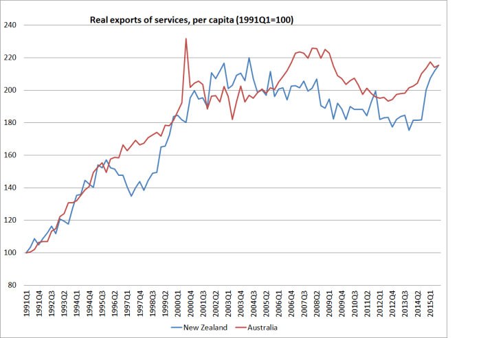
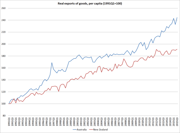
So here are two charts: one showing per capita exports of goods for New Zealand and Australia since 1991 (when the New Zealand quarterly population series begins) and the other showing services exports.

services x

In both countries, services export volumes have been fairly moribund for at least the last decade.  Tourism and education exports are the largest components of services exports, and both appear to be quite sensitive to the exchange rate.  But it is interesting that over the full period, real per capita services exports have grown at about the same rate in the two countries (a slightly different picture than in the nominal chart I showed yesterday).

goods x

The goods export picture is very different.  As I pointed out yesterday, total exports per capita have grown materially faster in Australia than in New Zealand. The difference is concentrated in goods exports.  Since 1991, real goods exports per capita from New Zealand have risen by 91 per cent, but those from Australia have risen by 144 per cent.

I’m not about to launch into a lengthy discussion of why, or what it means, but it is hard to get ahead –  or in New Zealand’s case to catch-up or even end the relative decline – when a country’s firms appear to have found it so difficult, and unremunerative, to increase their sales to the rest of the world.

This is my last post for the year.  Writing this blog has been a fascinating and rewarding experience, and I’m grateful to all those who have visited and read my stuff this year, and to those who have taken the time to comment.   Writing things down sharpens one’s own thinking, and I’ve enjoyed engaging with the ideas and people.   I’ll resume blogging at some stage in mid-January.

In the meantime, enjoy the summer break and Christmas celebrations.  For Christians, it is the festival celebration of a stunning truth: that God become man, in the form of a vulnerable child, to reconcile mankind to God.

In the beginning was the Word, and the Word was with God, and the Word was God.

And the Word was made flesh, and dwelt among us, (and we beheld his glory, the glory as of the only begotten of the Father,) full of grace and truth.


Exports: some trans-Tasman comparisons

One last post prompted  by the quarterly national accounts release last week.

I’ve shown charts highlighting how weak our per capita income growth has been, and how the volume of business investment per capita has only just got back to near pre-recessionary levels.

But what about exports?  In many respects they are the longer-term life blood of our economy –  the success New Zealand firms have in selling in the rest of the world shapes, over time, what we can afford to buy from the rest of the world.  And for a very small country, the rest of the world is most of the potential market.   I highlighted last week how little growth there has been in New Zealand’s export share of GDP over decades.

Real per capita exports in the September 2015 quarter were 8.5 per cent higher than they had been in December 2007, just prior to the recession.  In some ways, that doesn’t seem too bad –  plenty of components of GDP have been weaker.

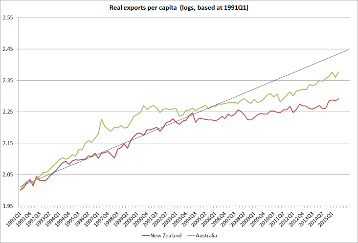
But here are real per capita exports for both New Zealand and Australia since the start of 1991.  The starting point is determined simply by when the SNZ quarterly population series for New Zealand begins.

exports real pc

The trend line shows the trend in New Zealand per capita exports from the start of the series to the end of 2003.  There is a visible fall in the trend rate of growth of exports after that point, but it also coincides with the sharp rise in New Zealand’s real exchange rate which has not been sustainably reversed since then.

What about the comparison to Australia?  Australia achieved faster growth in real per capita exports in the first decade (around 1 per cent per annum faster).    Australia’s real exports per capita then went sideways for a number of years (and more or less moved parallel to ours over perhaps 2002 to 2012) before once again growing materially faster than New Zealand’s exports over the last few years.  Over the whole period since 1991, Australia’s exports per capita have risen 21.8 per cent faster than New Zealand’s.

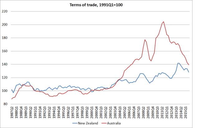
One story sometimes told is that if the terms of trade rises then a country doesn’t need to export as much (by volume) –  if prices do the work, real resources can be used for other purposes (economic life is about consumption, not exports –  which are just a means to an end).  A higher exchange rate, on the back of the stronger terms of trade, redistributes resources away from the export sector.

Even if there is something to this point in principle, in practice it doesn’t look as though it explains much of the difference between the New Zealand and Australian performance.    After all, Australia had a much bigger terms of trade surge than New Zealand did.  Even now,  whether we count from 1991 or from when the terms of trade started moving up strongly (around 2003/04) Australia has had a stronger terms of trade than we have.

tot nz and aus

Of course, Australia is still in the midst of an adjustment:  exports are growing quite strongly on the back of the huge investment boom in the resources sector.   But, on the other hand, the global prices of the commodities Australia exports are still falling, taking the terms of trade with it.  If the terms of trade continue to fall much further, and stay low, some (much?) of that Australian investment might yet be regretted by the firms that undertook it –  and might not, with hindsight, have helped Australia much.   Only time will tell.

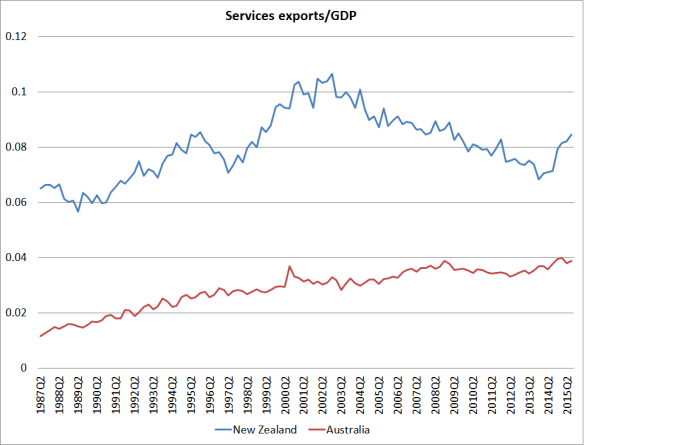
But lest anyone think Australia’s strong export performance is just about the resources sector, I found the chart comparing services exports in the two countries sobering (this reverts to nominal ratios to GDP because I couldn’t quickly find volume data for Australian services exports).  New Zealand –  the smaller country –  still has a higher foreign trade share of GDP.  But despite the way the terms of trade boosted the exchange rates in both countries (making for tough conditions for exporters of non commodity goods and services), services exports in Australia are now around the historic peak.  But in New Zealand –  despite the impressive surge in the last few quarters – services exports as a share of GDP are now barely 80 per cent of the previous peak.

services exports nz and aus

Not a particularly cheery note for the approaching Christmas season, but then in the church’s year it is still Advent, a solemn season of reflection, preparation, and self-examination.  So perhaps not so inappropriate after all.

Immigration is NOT causing poverty

I did an interview on Radio Live this morning on the economic impact of immigration.  When I went to listen to it afterwards, I found it was marketed under the heading “Immigration causing poverty”.  I’m not sure where they got that idea from what I’d said, but just to be clear my argument is that high rates of immigration to New Zealand over the last 60 or more years have worsened our overall economic performance. But even from my relatively pessimistic perspective, this is still one of the better off countries in the world.  And as readers will recognize, I reckon immigration, if anything, lowers unemployment rather than raises it –  ie puts more short-term pressure on demand than on supply.

In case anyone is interested, here is the link to the interview.

http://www.radiolive.co.nz/Immigration-causing-poverty—expert/tabid/506/articleID/110378/Default.aspx

UPDATE:  Thanks to Radio Live for changing the heading.

A perspective from the newly-released model

Somewhat belatedly, the Reserve Bank last month released a Discussion Paper outlining the features of the Bank’s relatively new forecasting and policy model, NZSIM.  I’m signed up to receive the email advisories when such papers are released, but it appears that on this occasion no advisory was sent out (an oversight apparently).  A commenter yesterday pointed me to the Discussion Paper.

The Reserve Bank has long prided itself on its formal macroeconomic models.   This dates back at least to the days of Roderick Deane, Chief Economist and later Deputy Governor of the Bank in the 1970s and early 1980s and one of the greatest figures in the history of the Reserve Bank.    The Reserve Bank was one of the early central bank adopters of formalised models, although most other advanced country central banks now use them in some role or another.  Historically, the Reserve Bank of Australia has tended to be towards the sceptical end on the role for economy-wide models in policymaking.

Maintaining such models has been a heavy investment for a small institution, especially as on at least a couple of occasions (over decades) the models have been junked almost as soon as they were finished.

And views on quite how large a role the models have ever played in the policy side of the Bank probably differ from observer to observer.  I was closely involved for a long time, and I tend towards the sceptical end.  The Bank had an unwarranted reputation for being somewhat in the thrall of whichever model it was using at the time.  I will always remember the time, fifteen years or so ago, when Glenn Stevens came over and spent several days observing our quarterly forecasting and policy round, and emerged commenting that he hadn’t realised that the Reserve Bank of New Zealand was really quite so pragmatic.

Structural models of the entire economy tend not to be overly useful for the sort of near-term forecasting (and backcasting and nowcasting) that largely shapes real-world monetary policy setting.  The current Deputy Governor, Grant Spencer, made this point well when, as an outsider speaking at a workshop to launch an earlier model in the 1990s, he noted that the technology was likely to be more useful for policy simulations (“what happens if we apply some shock to the system”) than for forecasting. There are simply too many institutional and data-related details that will be known to the forecaster at any particular time, but can’t be captured in a structural model, a deliberately stylised representation of the economy.  And that is even before one asks questions about anyone’s ability to forecast the economy more than a quarter or two ahead.

A good structural model captures the key features of how the designers think the economy works. But in an official agency, it is only likely to be useful if it reflects the key elements of how the decision-makers think the economy works   If it doesn’t, then over time either the model itself has to be adapted, or it will fall into disuse  (perhaps serving as an adding-up framework, and as a technology for generating nice charts and tables quickly –  which NZSIM was doing –  but with the structure of the model overridden pretty much all the time).  Obviously I’m no longer close enough to know what role NZSIM is playing in Graeme Wheeler’s deliberations (whether on forecasting or scenario analysis) but I’d be surprised if it was terribly large.  Apart from anything, for example, in this model, immigration is not explicitly treated, and fiscal policy changes never alter the deficit (any change in spending is automatically financed by a change in lump sum taxes)

Nonetheless, it is good to have the model Discussion Paper in the public domain.  As former Bank of England official Tony Yates has highlighted, (and here) the benchmark in this area remains the Federal Reserve

The Fed recently made its workhorse model FRB-US downloadable, with a dataset, code, everything you need to take a close look at what Governors say and what the staff have been doing for them.  The Bank of England should do the same.

Perhaps one could say the same about the Reserve Bank.  Having that additional material wouldn’t greatly interest me personally, but there are other people outside the Reserve Bank with considerable modelling background and experience for whom it could be useful, as part of further strengthening the external scrutiny of the Reserve Bank.   It can be useful to have a better sense of whether differences from the Bank arise because of different inputs (exogenous variables) or different assumptions about how the economy works.

But for now, I just wanted to highlight one chart in the Discussion Paper.  It shows the responses of a variety of variables to a 1 percentage point “monetary policy shock” –  roughly, a change in the policy rate of 100 basis points different than would the “policy rule” in the model would suggest.  There is nothing special about that particular policy rule –  indeed, I doubt it has ever been discussed in any detail at the Bank’s Monetary Policy Committee  – but also nothing especially objectionable about it.

impulse responses

But it is interesting because one could think of last year’s OCR tightenings as a 100 basis point monetary policy shock.  No doubt it won’t have been quite that in the formal model sense, but many people would now subscribe to the view that the tightening was largely (or completely) unnecessary.  Certainly, it has now been fully reversed, at least in nominal terms (real interest rates are still higher than they were when the tightenings began in March last year).

Within this model, a representation of the economy that the Bank is content to use in its internal processes and to describe as “the” new forecasting and policy model”, a 100 basis point monetary policy shock, that is unwound after a year or so, lowers inflation by about 0.2 per cent (roughly evenly split between tradables and non-tradables).  But it also has real economy effects:  after about five quarters, consumption is almost 1 per cent lower than it otherwise would be, and GDP is almost 0.6 per cent lower than it otherwise would be.

In a more formal way, it makes much the same point that the Minister of Finance was making the other day.

Finance Minister Bill English says the Reserve Bank raised interest rates “a bit too far” in 2014, contributing to slow economic growth at the start of the year.

“It’s one of the factors, along with dairy prices, that probably led to a much flatter 2015 than we had expected,” English told Bloomberg Television on Thursday evening.

“In retrospect, they lifted them a bit far” and “had to go back”, English said.

Graeme Wheeler’s experts might object to my characterisation of last year as a “monetary policy shock” in this sense, but the increases were clearly unnecessary and have been reversed.  Whether or not they could be justified at the time, the fact that they were unnecessary with hindsight means there will have been some short-term real economic cost.  The Bank’s model provides one way  –  using their view of how the economy works – of trying to get a plausible fix on the size of that cost. The model doesn’t have the unemployment rate within it, but  –  all else equal –  an additional 0.6 per cent of GDP might have been enough to have prevented the unemployment rate rising from 5.6 per cent in September 2014 to 6 per cent in September this year.

Bits and pieces

Having highlighted the Reserve Bank’s late Friday afternoon pre-Christmas release of the results of its “regulatory stocktake”, it will be interesting to see what other material government agencies slide out in the next few days, hoping for little or no sustained coverage.    I had a reply the other day to an Official Information Act request to Treasury, in which I’d asked about the basis for Treasury’s enthusiastic endorsement of TPP in the Joint Macroeconomic Declaration.  What they released wasn’t very interesting or useful (although if anyone wants it send me an email) but they did note “that the official government assessment of the final TPP agreement is contained in the National Interest Analysis, which will be publicly released soon”, which may also mean before Christmas.    That document should be interesting –  and hopefully it will get some coverage – although coming from those who negotiated the deal  it is no substitute for a serious independent analysis and evaluation carried out by, say, the Productivity Commission.

This morning’s Herald was a bit of a surprise.   The editorial ran under the heading “Rates rise may be first step to true recovery”.   Last week’s Fed Fund rate target increase is, according to our leading newspaper, “the first confirmation confidence is returning to at least one major economy since the global financial crisis”.

Of course, central banks don’t usually raise interest rates unless they think their own economies are doing reasonably well and that inflationary pressures might otherwise be about to start gathering.  Perhaps curiously, neither the word “inflation” nor the idea appeared in the Herald’s editorial at all.

But perhaps the leader-writers have forgotten about all those other advanced countries that have raised interest rates in the last six years, only to have to cut them again.  Central banks that have set out to tighten generally found that they had made a mistake (with the benefit of hindsight) and have had to reverse course.  And it isn’t just the tiddlers.  The ECB raised rates back to 2011, no doubt thinking that the crisis was behind them.  They were wrong.    Business, so we are told, is likely to draw confidence from the Fed’s action last week, and be more willing to invest.  It is an interesting nypothesis, but one which bears absolutely no relationship to what has been seen in the various countries that raised rates in recent years only to have to cut them again.  Investment rates around the advanced world remain low.  It gets tedious to keep mentioning New Zealand’s two policy reversals in the last six years –  but there is no sign that either of those ill-judged sets of tightenings did anything very positive for our economy.

Time will tell whether the Fed’s tightening last week was really warranted or desirable.  But even if it does prove to have been appropriate, it seems most unlikely that it will have been because higher interest rates and a higher exchange rate combine to give fresh impetus to the entrepreneurs and other investors in the United States.  Surely we deserve better analysis than the Herald provided today?

As I noted, investment remains pretty subdued around the advanced world.   New Zealand is no exception.

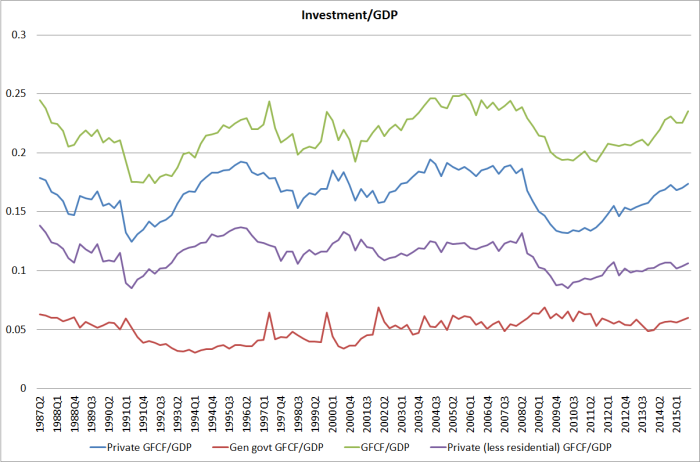
Here are a couple of charts drawn from last week’s national accounts release.  The first shows various cuts of gross fixed capital formation as a share of GDP: total, total private, total private excluding residential investment (ie a proxy for business investment) and general government.

nominal investment to gdp

With the exception of government investment, all of these series are well below their pre-recession peaks (typically in around 2006 and 2007).  In some respects that is really quite surprising.  New Zealand has had:

  • High average terms of trade, which should typically spark new investment to enable the economy to take full advantage,
  • The Christchurch repair and rebuild process (which doesn’t make us richer, but does add hugely to gross investment),
  • No serious domestic financial crisis to materially disrupt the credit allocation process, and
  • Much more rapid population growth than we had in the last few years prior to the recession.

New Zealand’s population is estimated to have grown at around 1 per cent in 2006 and 2007. By contrast, it is estimated to have increased by 1.95 per cent in the year to September 2015.  As I pointed out last week,  faster population growth rates would typically be expected to have big implications for investment, since the capital stock is around three times annual GDP.   More people require more capital, and getting that capital means a lot more investment.

For good or ill, government investment has remained quite strong, and will be boosted a bit further by last week’s announcement.  But my business investment proxy –  the purple line –  at around 10.5 per cent of GDP (and showing no sign of strengthening) is still two full percentage points lower than we saw through the later pre-recession years, when population growth rates were much lower than they are now.  And recall that even this measure includes the non-housing non-infrastructure rebuild expenditure.

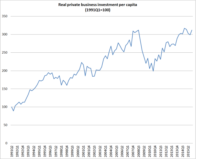
For analysis over time, I tend to focus on ratios of nominal investment to nominal GDP.  That is partly on the advice of Statistics New Zealand, who point out that deflator problems –  which are particularly serious for investment –  make ratios of real investment to real GDP quite problematic over time.  But for those with a hankering for real investment measures, here is real private investment (excluding residential investment) per capita.  Even now, this series has only just got back to pre-recessionary levels, eight years on.  And with the unexpected surge in the population, if everything was working well –  and especially if the Reserve Bank was right about supply effects of migration exceeding demand effects even in the short-term –  we should have expected to have seen this series at new highs.

business investment per capita

Businesses invest to the extent that the expected returns to investment look attractive. In New Zealand, at present, there just don’t seem to be that many projects that have been  passing that hurdle. Unfortunately, it isn’t obvious why things should be any better next year.


.

Predictable pre-Christmas bureaucrats

Bureaucrats are mostly rather predictable.

I’d been conscious that the Reserve Bank had not yet released the results of its “regulatory stocktake”, even though submissions had closed three months ago.  The Friday before Christmas seemed like a good day for a release by an institution that might want as little coverage as possible of its decisions.  So I kept an eye on my email yesterday, and sure enough at 4.35pm up popped the results of the so-called stocktake.  As far I can see, there has been no media coverage so far, and even if any of the relevant journalists are still around, readership interest in anything serious is rapidly waning.  NBR had covered the issues earlier, and it has already published its last paper for the year.

The stocktake was never a very serious exercise. I was still at the Reserve Bank when the terms of reference was determined, and the Governor was clear then that he did not want any serious issues addressed.  It seemed that it was as much an exercise in appeasing the Minister, to show that the Bank was willing to look afresh at its stock of regulation and perhaps even tidy up some small stuff.

There were, in my reckoning, three main issues dealt with in the consultation document:

  • Refinements to the disclosure regime, generally with a view to reducing public disclosure
  • Refinements to the “fit and proper” regime
  • Some reflections on the Bank’s own policy processes for bank regulation.

I made a submission to the stocktake, along with many of the banks and variety of fairly well-informed individuals including the former Governor, Don Brash.

As far I can tell from reading the document the Bank released yesterday, it had no real interest in any submissions other than those of the banks and of a single rating agency.    It does report the gist of some of those individual submissions, but there is no sign that any of them had any impact on the Bank’s thinking, nor an attempt to explain why the Bank regards the arguments made as unconvincing.   That is one of the problems in having a regulatory agency set policy as well as implement it –  insiders will tend to be defenders of the status quo, and if they are responsive to outside input at all it will tend to be to submissions from those they have most to do with (in this case, the regulated entities, the banks).

The Reserve Bank has been putting progressively less emphasis on public disclosure by banks over the last decade or so.  The Bank itself has been quite open that it does not now use the information in the disclosure statements for supervisory purposes, having replaced it with a variety of ‘private reporting’ returns that no one else has access to.  Note that the Bank is very enamoured of what it describes as a “non-zero failure regime” –  that is, the system is run to allow for the possibility of bank failures (rather than to prevent them all), and with the aim of ensuring that any losses fall, as far as possible, on shareholders and creditors (including depositors).  There is no deposit insurance in New Zealand, and the Bank is staunchly opposed to the introduction of deposit insurance.  In other words, in their vision the risks from any failure of a bank fall first and foremost on creditors, not taxpayers.  And yet those creditors do not get access to the information that the Reserve Bank regards as vital to assess the health of banks.  The disclosure statements are really, in effect, just a legacy of history –  probably of no real value to creditors (since it isn’t the information the supervisors themselves use).

I pointed this out in my submission, and suggested a rather simpler and cheaper approach which would better reflect the risks the system is designed around –  ie providing creditors much the same information as the central bank gets, when the central bank gets it.

The Bank has canvassed an option somewhat along these lines in its consultative document, raising the option of a “continuous disclosure” model, something like what stock exchanges impose on listed entities, for periods between six-monthly disclosure statements (at present, disclosure statements are quarterly).

The Bank did not respond to my suggestion at all.  It did respond to the partial continuous disclosure idea.  The first argument advanced against it was “banks did not support this option”, but with no statement of why –  and recall that we don’t have access to submissions made to the Reserve Bank.  The Bank’s own concern seemed to be that it might lead to “confusion in the market”,  but quite why it should lead to such confusion, and among whom, is not made clear.

The Bank appears to have settled on a halfway house, that might be workable, but continues to maintain a charade –  a disclosure regime that forces banks to disclose some information, but not the information that the Reserve Bank itself uses for supervisory purposes, and only then with a considerable lag.  Perhaps there is a good reason for maintaining this distinction, but in its release yesterday the Bank gives no sign of having thought hard about the issues at all.

There is further consultation to come on the Bank’s preferred “dashboard” option for 0ff-quarter disclosure, but a strong hint in the document that the Bank wants to consult only with banks.  The Reserve Bank needs to remember that banks are the regulated entities, regulated in the public interest.  Registered bank perspectives on cost and workability should be welcomed, but the rationale for supervision is that banks represent a risk to the rest of us, not those in whose interests regulation is undertaken.

On “fit and proper”, again the Bank showed no interest in asking or answering some of the more fundamental challenges some submitters posed (eg straightforward ones such as “is there any evidence that fit and proper tests, applied discretionarily by bureaucrats, have done any good, in promoting the soundness of the financial system?”.  I proposed a much simpler and cheaper option than what the Bank has been doing (or will be doing in future): ban anyone with a conviction for dishonesty in the past 10 years and require senior officers and directors CVs to be listed on the website of the regulated entity.  I’d be surprised if the Reserve Bank, with the best will in the world, could improve on that option, not being granted the gifts of insight or foresight greater than those of mere creditors and shareholders.    Again, the Reserve Bank gave no hint of why it thought this (quicker and cheaper) approach would lead to worse outcomes.

But there was modestly encouraging stuff to come out of the stocktake.  In their, still secret, submissions several banks (or perhaps the Bankers’ Association, to protect individual banks) had raised concerns about the Bank’s policy processes.

Various banks had complained that the typical consultation period was far too short, for often rather complex issues.  The Bank has agreed that in future its normal consultation period will be 6 to 10 weeks,   but this looks like a rather small gain as the Bank reserves the right to ignore this guideline when it suits them (eg when the Governor wants to rush in new LVR restrictions, on very limited evidence).

Various banks also appear to have raised concerns about the robustness of the Reserve Bank’s cost-benefit analysis in support of regulatory changes (unsurprisingly I’d have thought, as I don’t recall any quantitative cost-benefit analysis for this year’s investor finance restrictions) and of the Bank’s regulatory impact statements.  Of course, RISs are mostly a sick joke around much of the public sector, but it is good to keep the pressure up on individual agencies –  especially independent ones –  to improve their game.  The Bank doesn’t offer anything very specific in response, but seems conscious of the concerns.

One bank “asked for a requirement that the Reserve Bank publish a summary of submissions and responses (including rationalise) to viewpoints not accepted.”

The Reserve Bank responded that “we currently aim to publish summaries of submissions that take into account responses to viewpoints not accepted.  We would welcome specific feedback from industry in cases where they feel this insufficient.”.  As I noted, none of the views I and other expressed in this consultation were responded to specifically.  Then again, I guess I’m not “industry”.  The Bank  might want to note that “industry” are not the (only) stakeholders –  they are the regulated entities.

Dearer to my heart was this comment:

One bank also suggested that submissions should be available online, in addition to the Reserve Bank publishing the summary of submissions. This bank noted that this is the standard practice for public consultations run by other government departments (e.g. the Ministry of Business, Innovation and Employment).

This is a point I’ve made repeatedly.  And it isn’t only government departments. Submissions to Select Committees are public, submissions on City Council consultations are public, and submissions to the Productivity Commission are public. It is simply good practice, taking seriously the idea of open government.  Such submissions are not just public after all the decisions have been made, but while deliberations are going on.  The Bank has always been very resistant to such openness.  However, they have now shifted their ground somewhat:

Our current approach is based on our understanding that respondents prefer to keep their submissions confidential. Prior feedback indicated that banks, in particular, were reticent to share cost information and the Reserve Bank is concerned that the publication of submissions would impact the quality and detail of the submission feedback. On the other hand we also recognise the importance of transparency in the policy-making process, so we will return to this issue and consult on a revised approach under which the default position would be that all submissions are published on our website (although submitters could ask to have any confidential information in submissions redacted). We will add this issue our register of “Future Policy Work.”

I think this statement tells one a lot about the extent to which the Reserve Bank sees its clients as primarily the institutions it regulates, rather than the public the institution exists for.  I’m sure that banks would generally prefer to keep their submissions confidential, and it is precisely for that reason that their submissions, in particular, should be made public.  It is too easy for a cosy relationship to develop between the regulator and the regulated (Ross Levene among others have written extensively on this topic) ,and although I don’t think it has really happened to a great extent in New Zealand it is a risk that constantly needs guarding against.

In any case, kudos to the Bank for a modest step forward.  I’ll look forward to their consultation document on this issue to see whether it represents a serious move to the sort of consistent transparency other agencies adopt.  And I’ll be interested to see how they plan to get around the limitations of section 105 of the Reserve Bank Act –  which, as I noted a few months ago, really needs amending.

In the meantime, I lodged an OIA request months ago for the submissions on this consultation. I agreed with the Bank to delay the request taking effect until the results of the stocktake were published (otherwise they would just have declined it), so in the new spirit of openness I will look forward to a fairly comprehensive release  –  not just private individual submissions – in the New Year.  Given that they have had the submissions for months already, if they were serious about transparency they could release them right now (“as soon as reasonably practical” is what the Official Information Act says).

I will take some convincing that they are serious about transparency. Recall that in the course of this year they have already:

  • Refused to publish many of the submissions on the investor finance restrictions consultation (all of them initially)
  • Refused to publish most of the background material to the 2012 PTA (under threat of heavy charges)
  • Have still not published their forecasting model  [UPDATE: a commenter points out that the model has now been released, something I had missed]
  • Have refused to publish any of the substantive papers as part of their work programme on reforming governance of the Reserve Bank
  • Have refused to publish any minutes of meetings of the Governing Committee
  • Have refused to publish any material provided to the Bank’s Board as the basis for the Board’s evaluation of the September Monetary Policy Statement.

And then I had an email from them the other day about another request.  I had asked for copies of minutes of the Bank’s Board’s meetings for a couple of years in the late 1980s.  I wanted them for two, quite unrelated, pieces of work I was doing.  I assumed this would be uncontroversial –  it is material that is almost 30 years old, and not conceivably withholdable.  Actually, I had made a similar request for a couple of other years’ Board minutes when I was still at the Bank, and was told I was free to photocopy the relevant papers, which I did.

The Board papers are all nicely bound and properly stored, so there is no research or collation involved in meeting my request.  I deliberately just asked for all the minutes –  perhaps five pages a months, 11 months a year, rather than excerpts, to minimise any effort in meeting the request.  All it required was some undemanding photocopying or scanning, taking no more than hour in total.

But the Bank first took almost 20 working days to respond (“as soon as reasonably practicable”?), and even then has not determined whether the information is releasable at all.  And it is demanding $276 as a deposit to even begin determining whether the material could be released.   Note, by contrast, the easily availability of historical Board (equivalent) minutes at the Bank of England.

The Reserve Bank has announced:

The Reserve Bank has a policy of charging for information provided in response to Official Information requests when the chargeable time taken to provide the information exceeds one hour, and charging for copying when the volume exceeds 20 pages. Our charges are $38 per half hour of time and 20c per page for copying (GST inclusive).

Their stance appears to be technically legal, but hardly in the spirit of open government[1].  I’m curious how many people have been charged by the Reserve Bank under its policy, and am wondering whether I should now expect a bill for (a) the request for submissions on the regulatory stocktake, and (b) the request for information on the Reserve Bank’s volte face on the short-term impact of immigration.

The institution needs serious reform. Among other things, it needs to take on board the spirit of pro-active release.   It remains a bit puzzling why the Minister of Finance has closed down work on even reforming the governance provisions.  Occasional sideways or mildly critical comments about the Bank’s recent monetary policy mistakes are all very well, but they don’t seem to lead anywhere.


[1] And I’d happily come in to the Bank and photocopy the pages myself, and even cover the photocopying costs.
Living in an age of diminished expectations

The latest quarterly national accounts data were out yesterday.  These December releases are particularly helpful because they take full account of the new annual national accounts data released a few weeks ago.

Understandably, there is a lot of focus on what the quarterly data might, or might not, mean for monetary policy.  I’d have thought the answer was not much –  the September quarter was a bit stronger than many had expected, and only time will tell whether that is more than a one-off, or whether (as I suspect is more likely) the economy will settle back to something more like the very weak growth (per capita) recorded in the first half of the year.

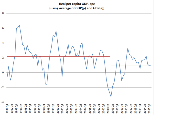
What about a slightly longer-term perspective?  Here is annual growth in real per capita GDP, for as long as Stats NZ has the quarterly data for.  I’ve used a series that averages the expenditure and production measures.

real gdp pc dec 15

Look how weak the recoveries since 2009 have been.  Peak growth was back in 2011, just after the double-dip recession.  Despite the record terms of trade, real per capita GDP growth got only briefly above 2 per cent at the end of last year –  even then only just reaching the average growth rate for the 17 years up to 2008.  For the year to September, per capita growth has fallen back to the average seen after 2008 –  and it would take another quarter at least as strong as September to stop that growth rate dropping even further in December.   (And as many commentators have highlighted, the more variable income measures have been falling in per capita terms, as real growth has slowed and the terms of trade have fallen.)

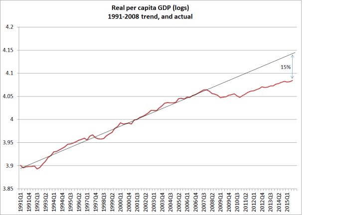
The second chart is similar to one I ran a few weeks ago.  It just puts a trend line through per capita real GDP for 1991 to 2008, and then compares how actual real per capita GDP has compared with that 1991-2008 trend.  The gap now is something like 15 per cent.

real gdp pc trend dec 15

Reasonable people might differ on where trend lines should be drawn – here I simply started at the start of the series, and choose the end of 2008 as the end since most people would reckon the output gap had closed by then.  But using almost any trend measure, the economic performance has been pretty disappointing.  Of course, it has been disappointing in most countries, but we’ve had the benefit of a record terms of trade and didn’t face the costs/distortions of a serious domestic financial crisis.

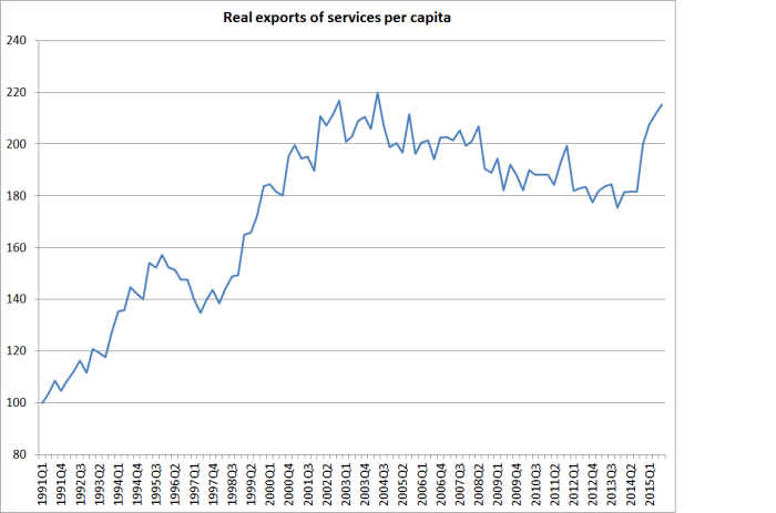
One of the striking aspects of the recent quarterly data has been the increase in the volume of services exports –  up by more than 20 per cent since the start of last year.  This seems to reflect both an increase in tourism volumes and in the number of foreign students.  Any exports increase resource pressures right now, and in an underemployed economy should generally be welcomed.  Nonetheless, it is worth keeping a longer-term perspective in mind.

services exports

Even after the dramatic increases of the last few quarters, real exports of services per capita have not even quite got back to the peaks reached more than ten years ago.

And one wonders just how much more good quality growth we can expect in this sector.   International guest nights data seem to have been going more or less sideways over the last few months, and it is difficult not to think that much of the growth in education exports (almost all at the bottom end of the market –  polytechs and PTEs) is resulting from the “export incentive” of the right to work in New Zealand and the desire to secure a residence visa –  the total number of which is more or less capped.


Immigration, convergence and history

Browsing on some blogs this morning, I stumbled on a nice brief article by Kevin O’Rourke, an Irish economic historian and professor at Oxford, about the role emigration from Europe in the 19th century may have played in enabling European populations to capture the benefits of the Industrial Revolution, and overcome the Malthusian limits, sooner than they might otherwise have done.

The article is worth reading, but my eye lighted on a single paragraph that summarized some results that I’d been meaning to write about for some time:

…emigration proved an invaluable safety valve. It was highest where wages were lowest relative to the New World, and where population growth was fastest, although poverty traps at first impeded migration from the poorest regions of Southern and Eastern Europe. And the beneficial effects on European labour markets and living standards were often very large. According to one estimate, between 1870 and 1910 emigration lowered the Swedish labour force by 20 per cent, and increased real wages by 7.5 per cent; the equivalent figures were 24 per cent and 10 per cent for Norway, 39 per cent and 28 per cent for Italy, and no less than 45 per cent and 32 per cent for Ireland.

These estimates aren’t by just anyone. They are the results of work done by  two leading academics, Alan Taylor and Jeffrey Williamson, both of whom have spent decades looking at these and related issues.

In other words, emigration from (in these cases) Sweden, Norway, Italy and Ireland left the people who stayed behind better off –  it contributed, in the jargon, to a process of factor price equalization, tending to narrow the gaps between wages in emerging Europe and places like the United States, Australia or New Zealand.  Looked at through the perspective of history, it should not be a remotely surprising result to anyone.  Wage differentials between New Zealand and the United Kingdom, for example, are estimated to have converged in the run-up to World War One, in response to the very large inward migration here.

But for some reason people get hesitant about applying the same logic to New Zealand’s experience over the last 40 years or so.  Over that period, a large gap has opened up between wages and material living standards between New Zealand and the rest of the advanced world.  But the gap has been particularly obvious in respect of Australia –  obvious both because the two countries had had fairly similar incomes throughout their modern history, and because of the relatively free labour mobility between the two countries.

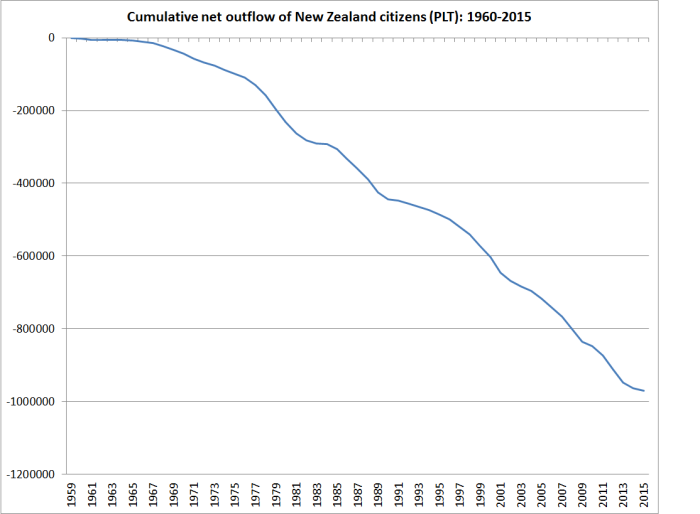
The cumulative net outflow of New Zealand citizens since 1960 is estimated to have exceeded 900000 people.

cumulative plt since 1960

If the average population over that period was around 3.5 million, the outflow is roughly equal to a quarter of our population –  so it has been on a scale similar to the countries in the extract above.  All else equal, we might have expected quite a degree of factor price equalization to have occurred as a result, just as those European countries experienced in the 19th century.    One wouldn’t have expected the process to be complete by any means –  after all, incomes in (former ) East Germany are still below those in the West, and not everyone has left the East.  But if economies were left to work normally, we’d have expected quite a lot of convergence.

But what really marked modern New Zealand out from 19th century Italy, Ireland, Sweden or Norway was immigration policy.   As returns abroad improved relative to those at home, authorities in none of those four countries/regions (Ireland was still part of the United Kingdom) had an active policy to bring in even more migrants from elsewhere than were leaving.

For many, the emigration must have been heart-rending –  breaking up families and depleting villages and regions.  But it was a process of responding to changing opportunities that, on average, improved living standards for those who went to the New World and those who stayed behind.  But the governments weren’t activist enough, or foolish enough, to prevent the adjustment working, or try to reverse it as a matter of policy.  You can’t expect to see factor price equalization occurring, working in ways that help the poorer country/region, when (net) there isn’t an outflow of factors from the poorer region.    If only New Zealand policymakers would recognize this rather basic, historically well-documented, point.


Why New Zealand languishes

Back in February when no one was aware of this blog, and I was just trying to work out how to use the software, I posted the entry below.

Why New Zealand languishes

More people need more capital

The government’s Budget Policy Statement and the Treasury’s updated forecasts were released yesterday.  I’m not going to comment on the Treasury forecasts in any detail –  it doesn’t help that Treasury produces the only PDFs I’ve encountered anywhere that somehow my computer won’t open – although I’d happily bet against their apparent view that the neutral nominal interest rate is still 4.5 per cent and that inflation is going to quickly get back to the middle of the target range.

But two policy initiatives warranted brief comment.  First, the resumption of contributions to the New Zealand Superannuation Fund (NZSF) is being deferred again.  Leveraged speculative investment funds don’t seem a natural activity for governments, and my only disappointment is that the NZSF isn’t being dissolved.  As Grant Robertson put it, the further delay will put pressure on future governments to review the age of eligibility for NZS etc.  Precisely.

The second initiative was the increase in the capital allowance by $1 billion for the coming financial year.   I’m rather sceptical of the quality of much of the government’s capital spending (Transmission Gully, Kiwirail) but this increase shouldn’t be surprising.  There are a lot more people in New Zealand than was forecast a few years ago, and people need places to live, schools, road, hospitals, shops, factories etc.  A significant chunk of the total capital stock is owned by the government (almost a sixth just by central government) and all else equal, if we have a lot more people more needs to be spent to provide the associated capital stock. That is true in the private sector –  houses, shops, factories, offices –  and in the public sector.   The latest official capital stock data show a net (of depreciation) central government capital stock of around $110 billion.  The population shock in the last few years will have been at least 1 per cent, so we shouldn’t be surprised by the need for additional public sector capital spending.  It shouldn’t be seen as some sort of discretionary fiscal stimulus or (according to the odd argument Graeme Wheeler ran last week) as a way of easing inflation pressures.  It is just something made necessary by the surprisingly strong population.  It is a concrete illustration of how demand effects from immigration surprises typically exceed supply effects in the short-run, again contrary to the new Reserve Bank view.

The net capital stock is almost three times annual GDP: each new worker needs the equivalent of three years production in additional capital (whether housing or factories or whatever)   New workers add to labour supply, of course but of themselves they don’t directly add to the capital stock.  And, as noted, the required addition to the capital stock is large relative to the additional new labour supply in the first year  –  typically several multiples of it.  And we have a new wave of migrants each year, each requiring further additions to the capital stock.    Real resources have to be devoted to putting in place that capital stock (we don’t simply import completed houses, roads, schools or office blocks).

None of this should be particularly controversial.  If a country’s population is growing faster then, all else equal, the amount (share of GDP) that has to be devoted to investment (capital stock formation) should tend to be larger than otherwise.  An acceleration of population growth should be expected to boost investment, and countries with faster population growth rates might be expected to have higher investment/GDP ratios than countries with slower population growth.  The differences should be quite stark: a country with 1 per cent per annum  population growth might be expected to devote around 3 percentage points of GDP more to investment than the average country with zero population growth.  That is just enough more so that the growth in the population would not adversely affect the capital stock per capita.    It is never going to be a precise relationship, since there is always a lot else going on.  And some countries have patterns of production that are less capital-intensive than others (eg the UK’s financial services industries are probably less capital intensive than Germany’s heavy manufacturing).

But, in fact, the relationship doesn’t look to have been there at all, either historically or more recently.

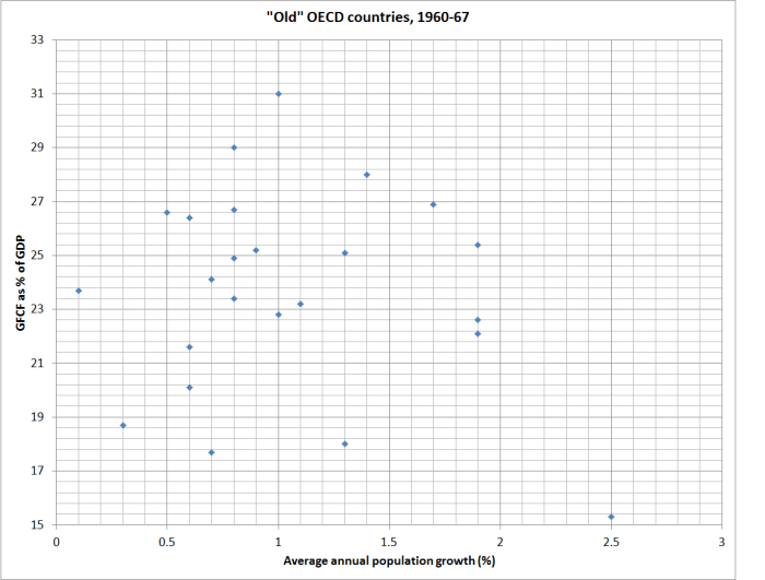
The OECD volume I had down the other day also had data for average annual population growth and gross fixed capital formation for the “old” OECD countries for the 1960 to 1967 period.  Here is the scatter plot, with a dot for each country.

gfcf and gdp old oecd 1960s

There is basically no relationship at all, and certainly nothing as strong as 3 percentage points more of GDP in investment for each 1 percentage point faster annual population growth.  It looks as though, across countries,, more rapid population growth tends to crowd out some investment growth. And since everyone needs to live somewhere, and governments have statutory command over resources and fewer market disciplines, the most likely investment to be crowded out is business investment.

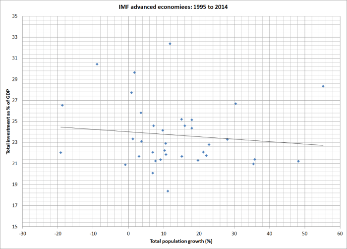
The 1960s is a long time ago.  So I also downloaded the same data from the IMF WEO database for each of the advanced countries for the last 20 years (1995 to 2014).  Here is the relationship between total population growth and the investment share of GDP.  The relationship is basically non-existent, and if anything (not statistically significantly) the relationship is the wrong way round.

gfcf to gdp 95 to 14

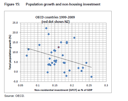
I didn’t have the energy to track down updated non-housing investment data, but I’ve shown previously that there has been a negative relationship between non-housing investment and the rate of population growth across advanced economies.

population and non-housing investment

According to the conventional story, this just should not be happening.  After all, our population growth is now largely the result of immigration policy, and high rates of skilled immigration are supposed to spark innovation, skills transfer, and new investment not just to maintain per capita capital stock but to capture the gains to the rest of us from the influx of capable people.  In fact, across countries and –  as far as we can tell –  across time faster population growth tends to squeeze out some business investment in the productive sectors.  Why?

There are two ways of articulating the story.  Strong demand, reflecting the desire to boost the capital stock to keep pace with the  population growth, tends to puts upward pressure on domestic interest rates (relative to those elsewhere).  That crowds out some of the desired investment (it just doesn’t happen), especially the return-sensitive business investment. It also tends to raise the exchange rate, providing a double-whammy adverse effect on investment in the tradables sector.     Growing per capita exports becomes harder.

The other way of looking at it, is to look at the relative prices of tradables and non-tradables.  Tradables prices are determined in world markets, and domestic demand doesn’t really affect them. But non-tradables prices are set in the domestic economy reflecting domestic demand (and underlying productivity growth).  High domestic demand associated with rapid population growth tends to raise the prices of non-tradables, and wages, while leaving tradables prices unchanged.  That makes it relatively more attractive to produce for the non-tradables sector, all the more so since all tradables production uses (now more expensive) non-tradable inputs.  External competitiveness is eroded and investment in non-tradables replaces, to some extent, investment in tradables.

Which brings us back to yesterday’s announcement.  The additional government capital expenditure was probably necessary, but at the margin, it will tend to be to squeeze out some other capital investment elsewhere in the economy.  The cross-country perspectives suggest that fast population growth will come at the expense of maintaining the per capita capital stock, and make it harder for New Zealanders to keep up, or close the gap on, the incomes of people in other advanced countries.

None of this is new.  It was the perspective of able New Zealand economists looking back on the post-war New Zealand experience.  Here, for example, is Professor Gary Hawke, writing in the last full economic history of New Zealand in the early 1980s.

the economic consensus is strong one. In essence it simply observes that productivity was highest in agriculture whereas population growth was catered for by the relative expansion of other activities. Population growth thus fostered expansion of relatively low-productivity activities and therefore tended to reduce average per capita income. The key assumption is that sectoral productivities would not have been even more unfavourable in the absence of population growth, and discussion of later chapters shows that assumption to be reasonable….Perhaps if less importance had been attached to full employment, or if a different exchange rate had been implemented, the sectoral productivity trends could have been changed. Perhaps so, but population growth made it more rather than less difficult to effect those changes in policy, even if they had been desired, and, in terms in which it was debated, the economic case against population growth in the post-war economy was always a strong one.

It still is in 21st century New Zealand.