The latest quarterly national accounts data were out yesterday. These December releases are particularly helpful because they take full account of the new annual national accounts data released a few weeks ago.
Understandably, there is a lot of focus on what the quarterly data might, or might not, mean for monetary policy. I’d have thought the answer was not much – the September quarter was a bit stronger than many had expected, and only time will tell whether that is more than a one-off, or whether (as I suspect is more likely) the economy will settle back to something more like the very weak growth (per capita) recorded in the first half of the year.
What about a slightly longer-term perspective? Here is annual growth in real per capita GDP, for as long as Stats NZ has the quarterly data for. I’ve used a series that averages the expenditure and production measures.
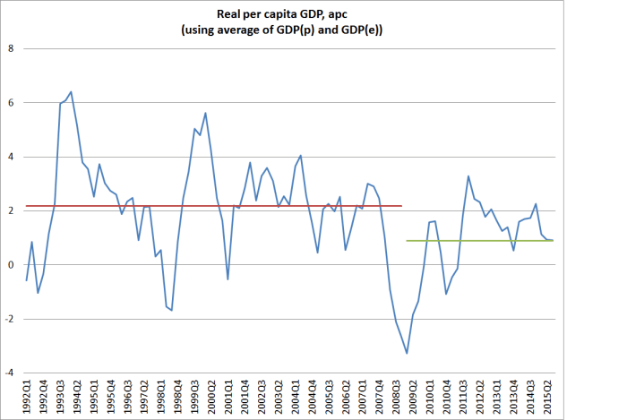
Look how weak the recoveries since 2009 have been. Peak growth was back in 2011, just after the double-dip recession. Despite the record terms of trade, real per capita GDP growth got only briefly above 2 per cent at the end of last year – even then only just reaching the average growth rate for the 17 years up to 2008. For the year to September, per capita growth has fallen back to the average seen after 2008 – and it would take another quarter at least as strong as September to stop that growth rate dropping even further in December. (And as many commentators have highlighted, the more variable income measures have been falling in per capita terms, as real growth has slowed and the terms of trade have fallen.)
The second chart is similar to one I ran a few weeks ago. It just puts a trend line through per capita real GDP for 1991 to 2008, and then compares how actual real per capita GDP has compared with that 1991-2008 trend. The gap now is something like 15 per cent.
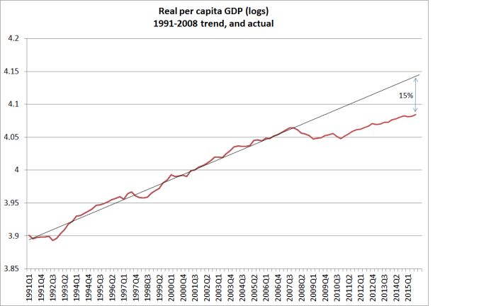
Reasonable people might differ on where trend lines should be drawn – here I simply started at the start of the series, and choose the end of 2008 as the end since most people would reckon the output gap had closed by then. But using almost any trend measure, the economic performance has been pretty disappointing. Of course, it has been disappointing in most countries, but we’ve had the benefit of a record terms of trade and didn’t face the costs/distortions of a serious domestic financial crisis.
One of the striking aspects of the recent quarterly data has been the increase in the volume of services exports – up by more than 20 per cent since the start of last year. This seems to reflect both an increase in tourism volumes and in the number of foreign students. Any exports increase resource pressures right now, and in an underemployed economy should generally be welcomed. Nonetheless, it is worth keeping a longer-term perspective in mind.
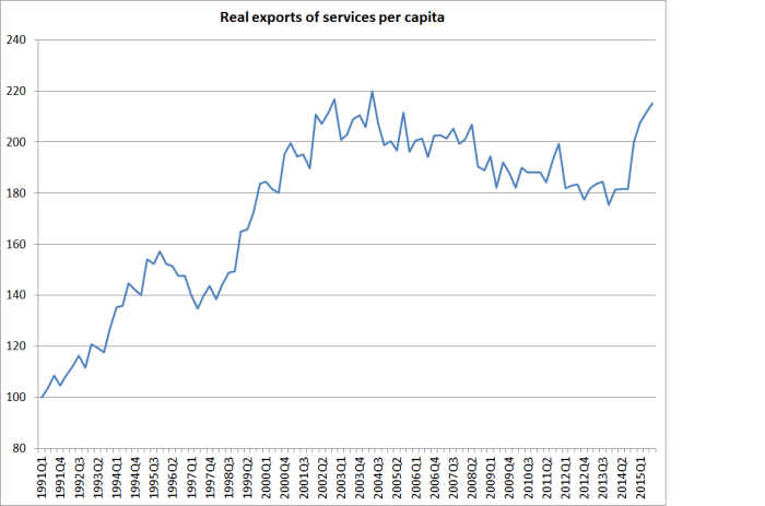
Even after the dramatic increases of the last few quarters, real exports of services per capita have not even quite got back to the peaks reached more than ten years ago.
And one wonders just how much more good quality growth we can expect in this sector. International guest nights data seem to have been going more or less sideways over the last few months, and it is difficult not to think that much of the growth in education exports (almost all at the bottom end of the market – polytechs and PTEs) is resulting from the “export incentive” of the right to work in New Zealand and the desire to secure a residence visa – the total number of which is more or less capped.