The annual national accounts data were released a few weeks ago by Statistics New Zealand. They got little media attention, which isn’t surprising, but I like fossicking in the spreadsheets. Apart from anything else, they provide an annual update on some of the longest official time series data we have. Australia has full national accounts data back to 1959, and the United States provides official data back to 1929, all on current methodologies. By contrast, we have real quarterly data only back to 1987, and annual nominal national accounts data back to 1972.
The (flow) national savings rate has had a lot of focus in the New Zealand debate over the years. Indeed, early in the term of the current government, there was even an official Savings Working Group. A lot of discussion focuses on household savings, but I prefer to focus on national savings (ie the savings of New Zealanders, New Zealand-owned companies, and the New Zealand government). It provides a good basis for international comparisons, and isn’t messed up by the somewhat-artificial boundaries between households, corporates, and governments.
I also prefer to use net savings data rather than gross savings (the difference is the estimate of depreciation, or “consumption of fixed capital”). Net savings is the real resources added to wealth. And if I’m using net savings data I need to use net national income data.
As I highlighted a few weeks ago, our national savings rate has been relatively low by the standards of the typical OECD country. And it is really quite low when compared with the net national savings rate in Australia – but it has been for decades, including the period well before Australia introduced compulsory private superannuation savings. On the other hand, our net savings rate has been strikingly similar to median of the other Anglo countries.
This is what the chart looks like, starting in the year to March 1972, and end in the year to March 2015.
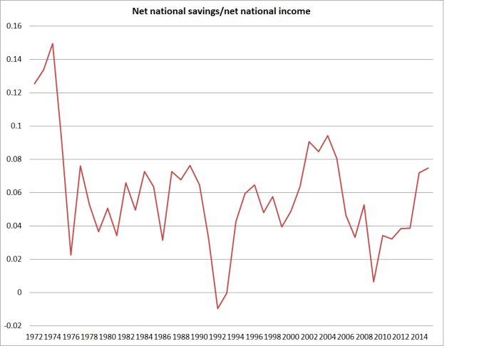
Of course, the sharp fall in the series at the start of the period really catches the eye. But the other thing that strikes me is just how stable average the savings rate has been over the subsequent 40 years, fluctuating around 5 per cent. As you’d expect, it falls quite sharply in recession (see 1991 and 2008/09) – corporate profits tend to fall in recessions, and fiscal deficits widen – but since 1975 there has been no trend in the series at all [1] .
Which creates difficulties for those looking for explanations for our relatively modest national savings rate:
• Some reckon tax incentives might help. But actually we had a very generous tax treatment of superannuation and life insurance until the late 1980s, and a rather ungenerous one (defenders would say “neutral”) since. But the difference isn’t visible in the aggregate data.
• Some reckon a liberal approach to New Zealand Superannuation might explain something. But in the years to March 1975 and 1976 we had a compulsory private scheme, then we had very liberal universal NZS at 60, then we had means-testing and a fairly rapid increase in the age of eligibility. None of it is very evident in the data.
• Some talk about “wealth effects” from rising house prices dampening savings. But the biggest house price bust in modern New Zealand history was after 1974, and the biggest boom was over 2003 to 2007. None of it is very evident in the data.
• The (non-superannuation) welfare state has got bigger over the period, while tertiary education went from being largely “free” for a small group of people, to really rather expensive for a huge number of people. None of it is very evident in the data.
• Some reckon financial liberalisation will have dampened savings, enabling people to bring forward consumption in ways they couldn’t previously. The real freeing-up of the system didn’t start until the mid 1980s. But the difference isn’t obvious in the aggregate data.
• Kiwisaver hasn’t been compulsory, but the take up was sufficiently large that if advocates had been told in advance that it would be that high most would have thought it would have boosted national savings rates. But neither in the more formal research nor in a simple chart like this is it particularly evident.
I’m not suggesting none of these factors made any difference. I’m sure in many cases they did, and (for example) the increase in the NZS eligibility age helped put the government in the position of running large surpluses in the years leading up to the 2008 recession (which was also the peak in the national savings rate). But it isn’t easy to point to a single factor, or even an identifiable set of factors, to explain New Zealanders’ savings choices. An alternative way of saying that is that it is not easy to point to what one might change if one were convinced (which I’m not) that the national savings rate is a policy problem. 40 years of a constant mean is really quite a long time. More-formal modelling might shed some light, but I wouldn’t be optimistic.
Discussions of savings often focus on households, and then secondarily on the government’s own finances. But they tend to ignore the role of business savings. I’ve wondered whether the modest rate of national savings partly reflects the perceived lack of profitable opportunities in New Zealand. As I’ve pointed out before, business investment as a share of GDP has been quite low in New Zealand for decades, and less than one might expect in a country with quite a fast-growing population (Austria or Belgium need to devote a smaller share of their income each year to adding new shops and offices etc than, say, New Zealand or Australia do). Firms might save more if the growth prospects were better – if, say, real interest rates were nearer those in the rest of the world, and if the real exchange rate had been lower. But in that case, savings rate wouldn’t be the cause of any problems, but just another symptom.
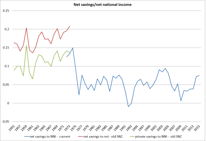
It is one of those areas where better data might help shed a little further light. What was going on with that fall in the national savings rate in 1974/75? It looks a lot like the impact of the collapse in the terms of trade. But the savings rate has never recovered, and we don’t even know if it was exceptionally high in the early 1970s. Contemporary estimates suggest that business savings were almost half of private savings – from perhaps a third a decade earlier. Unfortunately, the earlier estimates aren’t compiled on the same basis as the modern national accounts. For what it is worth, here is a chart for the full period since 1954/55, using data published in the New Zealand Official Yearbooks (in this case the 1975 one). There is a hint of national savings rates rising in the late 1960s and early 1970s, but it is hard to know, and hard to know whether the average savings rate for the last 40 years is really lower than it was in the earlier post-war decades.
Surely we should be funding Statistics New Zealand – or at a pinch some good academic researcher – to produce longer backdated series of our national accounts. Better data on its own probably wouldn’t answer all our questions about New Zealand’s longer-term economic performance, but it surely couldn’t hurt. Would it provide value to the plumber from Masterton? Hard to tell, but good data at least opens the possibility of better policy.
NB: Before anyone comments, this post is dealing entirely with the flow rates of savings from current income. It is not dealing, at all, with stock measures of wealth, or how they might aggregate to some sort of national balance sheet.
[1] In the years of high inflation and high public debt, the story is a little complicated because much of what is recorded as interest is in effect a principal repayment. Grant Scobie (and co-authors) looked at that effect here.
