Poor answer, poor economic performance

I don’t generally watch or listen to Parliament’s question time. But my teenage son has finished school for the year and, being a nascent political junkie, turns on the TV each afternoon to watch the jousting.

I was doing something else yesterday afternoon when this exchange caught my ear

Hon Paul Goldsmith: Isn’t the most relevant current economic indicator the fact that New Zealand has the highest terms of trade in recent modern history and we’re still growing very slowly and running a deficit?

Hon GRANT ROBERTSON: We can all pick our most relevant economic indicator, but the one I want to leave with the member is this: we, as a country, are growing faster than the UK, Australia, Canada, Japan, and the eurozone. No country with which we trade or compare ourselves is growing how they were two or three years ago. We are ahead of the pack and we’re doing well as a country.

…

Hon Paul Goldsmith: Which of the countries he listed in the answer to my previous question are we growing faster than, on a per-person basis?

Hon GRANT ROBERTSON: On a per-person basis, I don’t have the information the member asked for, but what I can tell the member is this: when we came into Government we ranked 34th in the OECD on GDP per capita, and we’ve improved that. We’re up to 32nd and we will keep moving forward. On another measure that the OECD has in terms of per capita on real expenditure, when we came into office we were at 30th and we’re now 18th, so we’re making good progress.

That “34th in the OECD” I knew to be wrong.    There are only 36 OECD countries and without even checking the others everyone knows Chile, Portugal, and Mexico are poorer than we are.  I had a very quick look at some data and put it in this tweet.

I checked the IMF numbers because –  with so many more members and countries in their data –  being 34th sounded about right.  Perhaps the Minister had his IMF and OECD confused: it certainly looked like a first for any Minister of Finance to be boasting that New Zealand was 34th (or 32nd) on anything in the OECD.

But out of curiosity I decided to take a closer look.  There are, after all, both constant price and current prices GDP per capita measures, each converted at respective PPP exchange rates.   And you’d have to be pretty sceptical of putting much weight on movements over just a year or two, give both measurement and conversion challenges.

The IMF numbers go back to 1980.  Here is how our rank looks on these two measures and across time (2019 being an estimate/forecast).

GDP per capita, PPP, New Zealand rank
Constant price Current price
2019 35 35
2018 34 34
2017 34 34
2012 37 37
2007 40 40
2000 34 35
1990 31 31
1980 29 29

On these measures we were indeed 34th in 2017 –  looks like that was what the Minister might have had in mind.  But, if anything, there is a little slippage in the last couple of years.    Over the longer run of data, there has been some improvement in our rank since 2007 –  back then subsequently crisis-hit places like Greece, Italy, and Puerto Rico had got ahead of us (and Equatorial Guinea too) –  but we are in much the same position we were in 2000.  The significant worsening in our ranking occurred in the 80s and 90s, and there has been no consistent improvement since.

But our more usual comparators –  the comparison the Minister claimed to be making –  is with the OECD countries.

GDP per capita, PPP, New Zealand ranking
Current prices Constant prices
2018 20 21
2017 20 20
2016 20 19
2012 20 20
2007 21 22
2000 22 21
1990 20 21
1980 20 17
1970 11 12

It is mostly a pretty similar story.   People most often focus on the constant price numbers.  Again, if anything there has been a little slippage in the last year or two, but on these numbers our ranking is broadly where it was as long ago as 1990, and the real drop down the rankings occurred in the 1970s and 1980s  (and no doubt earlier if the consistent data went back further).    Those long in the tooth will recall that in 1990 we were about half way through the extensive reform programme –  itself implemented in response to the deterioration in New Zealand’s economic performance –  that was going to be lift us back up the OECD rankings.  Shame about that.

But what about productivity?  It wasn’t what Paul Goldsmith was asking, but it is the foundation of all sustained improvements in material living standards.   Here is the OECD data for GDP per hour worked

GDP per hour worked, PPP, New Zealand ranking
Current prices Constant prices
2018 27 26
2017 24 25
2016 22 23
2012 22 21
2007 23 23
2000 22 21
1990 21 20
1980 19 17
1970 15 15

(I mostly refer to the constant price series, in all such international comparison on this blog this is “real GDP per hour worked”).

If I were a Minister of Finance I wouldn’t be boasting anything here.  Then again, if I were the Finance spokesperson for the other party that governed New Zealand for large chunks of this half-century I’d probably keep quiet too.

The data are what they are, for now.   That said, I don’t want to make much just yet of the apparent sharp fall in our ranking over the last couple of years (and even if it is for real, it isn’t yet this government’s fault any more than that of its predecessor –  it is 2018 data and policy, or the lack of it, works with a lag).    It both looks too bad to be true and we know that there are significant revisions being published tomorrow by SNZ which are expected to raise productivity growth a bit over the last few years.  In the grand scheme of things, the differences are unlikely to be very large but a levels shift of 2 per cent –  which might happen –  would be enough (just) to lift us from 26th to 24th on the constant price measure.

On the data as they stand today, here are the 10 OECD countries with the next highest productivity and 10 (all the rest) with the next lowest.
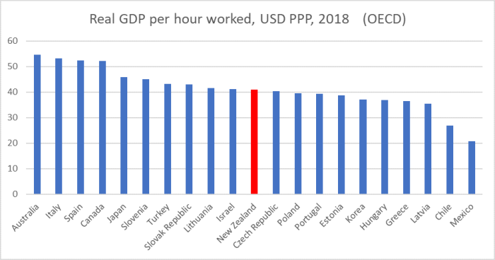
OECD real GDP phw 2018

Three former communist countries are now ahead of us, as is Turkey, and the Czech Republic and Poland have had recent productivity growth records that mean they will almost certainly go past us in the next couple of years (even with New Zealand data revisions).

So, to revert to where this all started, what about the Minister’s claims

We are ahead of the pack and we’re doing well as a country.

No

when we came into Government we ranked 34th in the OECD on GDP per capita, and we’ve improved that. We’re up to 32nd and we will keep moving forward.

No.  Hasn’t happened so far, and no sign things are about to improve.

And there was that final puzzling claim

On another measure that the OECD has in terms of per capita on real expenditure, when we came into office we were at 30th and we’re now 18th, so we’re making good progress.

I have no idea what he has in mind, but whatever he had in mind perhaps the Minister should keep in mind the old mantra that if a number sounds too good to be true it probably is.

Sure in cyclical terms the economy isn’t in a dreadful state.  But in any longer-term sense we are underperforming, have underperformed for decades, there is no sign of any structural improvement underway now, and neither main party shows any sign of serious policy thinking that might finally –  decades after those promises from both major parties –  make a difference for New Zealanders.   As things stand –  and by reference to that final chart –  if we just keep on doing policy as we have it isn’t inconceivable that in 2030 we could have the third lowest labour productivity in the entire OECD.   Convergence with Uruguay may still happen.


UPDATE: In the House this afternoon the Minister made clear that he had been talking about annual growth in real GDP per capita.  Per the OECD data –  as it stands today, before significant SNZ revisions to be published tomorrow – New Zealand’s growth rate did rise from 34th (of 36) in the OECD to 32nd (the latter for calendar 2018).  It seems very odd to boast about having the 5th worst per capita GDP growth among the OECD countries (and quite clarifying given the rhetoric the PM and Minister often use claiming New Zealand’s growth record is materially better than that of advanced countries we typically compare ourselves too).  Clearly –  given that this was an off-the-cuff response to a supplementary question – they’ve known the dismal (on official data) per capita picture all along.
 

The void where hope might have been

If, as I do, you’ve lived for almost 25 years 100 yards or so from the old Erskine College you have a fairly good sense of what National was on about in this snippet from their new “Building NZ, RMA Reform and Housing” policy discussion document released yesterday.

Objections to proposals for residential reuse of the old Erskine School site in Wellington held it up for more than 20 years. It involved claims that the decaying buildings had heritage value, as well as the routine RMA neighbour objections. Long after the school closed the buildings were red-stickered by Wellington City Council as being unsafe for occupancy. After two decades of costly objections and delays, development eventually started on the site providing 94 dwellings for families.

The school closed in 1985.  Some of the land was developed decades ago, but the main site is only now getting the first few occupants in the new (eye-wateringly expensive, at least on the advert I followed up) townhouses.

But if there seem to be some hints of some modest good things in the document, it is hard to be that positive  Every so often Opposition parties talk a good game about fixing (or rather, freeing) the housing market –  the one that results in such appallingly high price-to-income ratios, systematically skewing opportunity away from the young.   And then nothing very much that matters happens.  It has been that way for 30 years now, even as the problem has got worse and the imbalances more entrenched.

National talked a good game leading up to 2008.  And then accomplished almost nothing –  people from David Seymour to David Parker argue they made things worse – including when they had a clear absolute majority with ACT.  Some elements of Labour –  well, mostly just Phil Twyford – talked a good game prior to 2017.  Twyford can still give a pretty good speech on the subject, but are real house/land prices higher or lower than they were when Labour took office two years ago?  Higher of course.  And these are asset markets, that trade not just on how things are right now –  policymaking and legislating takes time – but on best credible expectations about the future.

And now we have National in Opposition again, trying to shape the best policies for New Zealand –  oops, the best policies they think they might win on –  heading towards next year’s election.  They seem to have given up already.

Oh, I know the headlines don’t say that.   They’ll report National talking of splitting the Resource Management Act in two, to have separate regimes for urban development and for wider environmental resource utilisation issues.  But then the current government is already looking at that option in one of their numerous working groups and consultative processes.    Have land prices on the edges of our cities been falling towards the value in the best alternative (agricultural?) use?  Not that I’ve noticed.  In principle, the idea of  splitting the Act sounds appealing, although with the caution that various experts have posed that there is a risk of creating huge uncertainty for a decade or two as courts define the implications and limits of a whole new regime.

But what is striking is how little specific there is about how differently things might actually operate under new National legislation.  National grappled with these issues in government for nine years, with ready access to experts inside and outside government.  They’ve now had two years in Opposition, with key former ministers (eg Amy Adams and Nick Smith) still on board, and yet nine months out from an election we have page after page of ideas from other people (notably the Environmental Defence Society) and discussions of how things are done in Scotland, South Australia, and Queensland, but little or nothing specific, and nothing that articulates any sort of National vision of a radically more functional future system.     And nothing that, for example, notes that Scotland has little population growth and the big cities in Queensland and South Australia have house price to income ratios well in excess of six –  classified in the annual Demographia rankings as “severely unaffordable” –  when both Brisbane and Adelaide not that many decades ago had price to income ratios of three.

And, sadly here I add an “of course”, there is not a single reference anywhere in the document to that myriad of thriving growing US cities where house price to income ratios today  –  10 years into an economic growth phase, with interest rates almost as low as those here now –  are anywhere from 2.5 to 4.    Or how we might be able to deliver those sorts of outcomes for New Zealanders.

I got to the end of the document last night and was rather struck by the lack of apparent ambition and by what appeared to be an avoidance of directly addressing the main issues.  So I checked the entire document and neither ‘land prices’ nor ‘house prices’ appear at all.   And yet every serious analyst knows that one of the key presenting issues is how large a share of the cost of an urban house+land is the price of the land under the house.  We aren’t short of land in New Zealand –  far from it.   Fly in and out of even Wellington or Auckland –  let alone most provincial cities –  and it is striking just how much land is close by the existing urban areas.  And yet our governments –  central and local –  have managed to create an artificial scarcity that often means that well over half the cost of a house+land in our cities is the price of the land.  It is crazy –  and we aren’t just talking close-in places like Mount Victoria or Parnell, with distinct locational advantages.   But it is worse than crazy, it is a chosen evil that governments do to our younger generations.    National can do all it likes –  and there looks to be good stuff that could and should be done –  but unless they end the artificial (government created and maintained) scarcity of (potentially) urban land, they will never make any serious inroads in fixing housing affordability.    There wasn’t even any sign in the document of National pushing back against the current proposal to worsen the situation around so-called “highly productive land”.    No hint of, for example, a flagship stake in the ground, promising (say) to enact a presumptive right to build two-storey housing on (almost) any land.

And so one comes away from the document with a sense that National really doesn’t care that much about severely unaffordable housing and rigged land markets, or they are scared and don’t trust themselves to actually be able to sell the case for change and what it might take to bring that change about.   Probably only they know the answer to which influence is more important, and perhaps not even they do (since the human capacity for barely conscious self-deception is pretty well-developed).    And so the government-created disaster, and all the attendant injustices, will go on.  It doesn’t make National any worse than the Labour-New Zealand First-Greens government, but what consolation is that to anyone (other than those sitting on existing artificially high-priced assets)?   On these issues –  as on so many –  they are really two sides of the same coin, largely protecting the status quo and wasting the offices of government which could be occupied by an –  as yet non-existent party –  that might be really willing to address the core issues to promise to get house and land prices a long way down, and perhaps even offer some sort of limited compensation scheme for those who –  largely through no fault of their own –  have taken on very large debts in recent years to get into any sort of home of their own.

Instead, all we get is small-target stuff, with nothing to scare the horses, no bold messages to sell, and little or no prospect of overdue real change and improvement.  Much like –  again from both parties –  the failure to even begin to get to grips with the decades-long productivity failure.  I’m guessing National – like Labour –  would be quite happy if several decades hence houses were once again affordable (perhaps three times income) more or less by accident.  But they won’t promise to get house and land prices down, they won’t do what it would take to fix this massive failure of our government.  And, so it seems, they’d mostly also be happy with just a bit of marginal product differentiation and just little enough action to keep the public angst (my children should be in the house market 10 years from now) more or less in check.


The mediocre performer across the Tasman

The other day, courtesy of the Twitter feed of the chair of our own Productivity Commission, I noticed a link to a speech by the chair of the Australian Productivity Commission, Michael Brennan, under the title “Economic Knowledge and the State” given to an ANU symposium last week with the same title.   That sounded intriguing.

In truth there was less there than I hoped there might be.   It was mostly an attempt to argue that economics has been a generally positive influence on policy in Australia in recent decades and can be expected to continue to be so.  But he was a bit modest about that, partly because it can be very hard to unpick quite how much difference economic analysis and the advice of economists made, and what the counterfactual might have been.

Brennan starts with a nice illustration of the power of productivity to make a difference in material living standards.

Average incomes in Australia today are 7 times higher than they were in 1900. To give you a tangible illustration of what this means, in 1900 we estimate that it would take an average worker over 500 working hours (a couple of months) to earn enough to buy a bicycle, which was then a staple form of transport.

For an average worker in the 21st century, it would take about a day. And of course, in 1900 you couldn’t buy anti-biotics, air-conditioning or a refrigerator.

But the focus of this post was Brennan’s short discussion of Australia’s overall economic performance.

In the post war period, Australia’s per capita GDP went from being nearly $6,000 above the OECD average in 1950, to below the average in 1990.

That is partly due to the comparator — several OECD nations converged rapidly towards US living standards in the post war era.

But there is no denying that Australia’s relative fortunes have improved since 1990.

Over that 30 year period, our real per capita GDP (that is, excluding population growth and terms of trade effects) has out-performed all of the G7 economies, and our incomes have risen back to being well above the OECD average.

It was the first part of that final sentence that caught my eye.  It is true –  using the OECD’s real per capita GDP numbers, Australia’s growth since 1990 has exceeded that of all the G7 countries.  I was a little surprised to learn that the UK had been (narrowly) the best of the G7 grouping over that period.

But lets unpick that a little.

First, the OECD data themselves only go back to 1970.  At that stage there were only (from memory) 22 member countries (not including Australia or New Zealand) but the OECD has data for 1970 for 27 of the countries that are now members (most of the others were then in the communist bloc, or weren’t yet separate countries at all).

Going back further, if we use the Conference Board Total Economy database for those 27 countries we get something like the margin Mr Brennan quotes (he may have used a slightly different comparator).  In 1950, Australia’s real GDP per capita was not only higher than the OECD average, but massively so: real GDP per capita in Australia was around 50 per cent higher than that for the average OECD country.

But how about the more recent decades.   As Mr Brennan implies, there were various countries still ravaged by war in 1950 that did quite a lot of catching up subsequently.  The OECD data start from 1970, which largely deals with that particular issue.

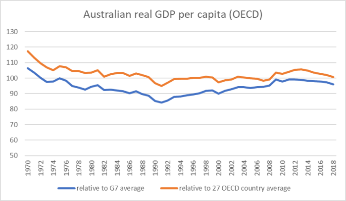
Here are two comparisons since 1970: first, Australian real GDP per capita relative to the G7 average, and second Australia relative to the average for the 27 (now) OECD countries for which there is complete data.

aus 19 1.png

As recently as 1970, Australia had real GDP per capita almost 20 per cent above the average in this core older group of OECD countries.   Now, it is almost bang on the average.   Relative to the G7 countries there has certainly been some recovery since 1990 –  Australia really has grown faster than each of those countries –  but (a) relative to the wider OECD grouping Australia now sits about where it did at the end of the 1980s, and (b) both lines have been falling fall, at least a bit, in the last half dozen years.

(Relative to the whole OECD –  the metric Brennan quotes –  Australia’s real GDP per capita is certainly above that of the average OECD country, but given the pace of convergence of many of the former eastern bloc OECD members that margin is narrower than it was in 1995 (when the complete data for all countries is available).

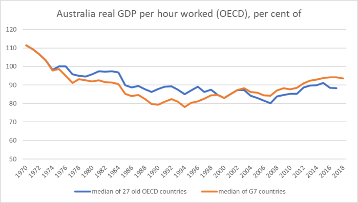
All those comparisons were about real GDP per capita.  But, as I noted, Brennan’s case had been about the power of productivity growth.  And yet there were no data in the speech about Australia’s productivity performance.

Those data are even less favourable.

aus 19 2.png

Whether the comparison is to the G7 countries or to the wider group of 27 OECD countries, average labour productivity in Australia is below the median of the other advanced countries.   There has certainly been some improvement relative to the G7 countries, but even then Australia does less well than it was doing in the early 1970s.

(Relative to the full OECD, for which there is data only from 2000 onwards, Australia is a little above the median, but has managed no improvement this century to date.)

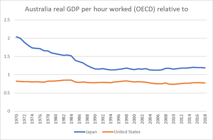
A little further on in his discussion, Brennan notes that Australia does not face the “stagnation of Japan”.   Well, maybe.  Here is a chart showing Australia’s real GDP per capita relative to that of Japan (and also relative to the US, a common comparator in Australian debate).

aus 19 3.png

1989 was the peak of the Japanese share market boom/bubble.    Australia’s productivity is no higher now, relative to that in Japan, than it was in 1989  (no higher relative to the US either).

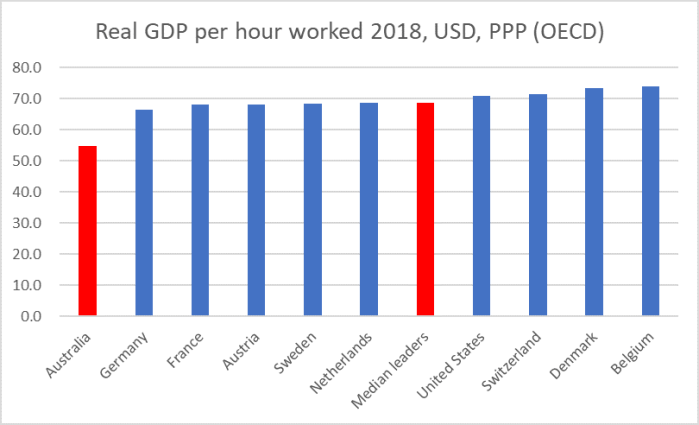
In various posts this year I’ve used as a comparator on productivity a grouping of leading OECD countries.  Here is how Australia compares.

Aus 19 4

It would take a 25 per cent lift for Australia to match the median of that leading bunch.

And all this against the backdrop of the abundant natural resources, new waves of which Australia has been able to begin to bring to market in the last decade or so.    I don’t show Norway in these “leading group” charts but it is the other advanced OECD country really blessed by nature with natural resources, and its real GDP per hour worked is almost another 15 per cent higher than that in Belgium.  In many respects, given what it had going for it, Australia’s productivity performance has been woeful.

I reckon there is a pretty straightforward explanation –  over and above all the normal areas any country could improve policy on –  around the interaction between distance (in an era when personal connections, integrated value chains etc have often become more important not less) and the renewed determination of Australian policymakers to drive up the population more rapidly than almost anywhere in the OECD.  But when he mentions geography is his speech, Mr Brennan refers only to the

mysterious but very real spill-over effects of agglomeration, particularly in large, dense cities.

perhaps not aware that, unlike the situation in typical (non natural resource dependent) OECD countries, in Australia real GDP per capita in the big cities –  Sydney and Melbourne –  barely matches that for the country as a whole.

Of course, writing from this side of the Tasman it behooves me to point out that New Zealand’s economic performance has been consistently materially poorer even than that of Australia, that the ability of hundreds of thousands of New Zealanders to move to Australia has helped many New Zealanders……and that Australia continues to have a consistently better cricket team.

But were I Australian I’d be a little uneasy at just how relatively poorly my economy had done, and is still doing, on the counts that matter –  productivity –  especially when the economy had been able to ride a mineral investment/export wave in a way open to few other OECD countries.  And I might be asking questions about the quality of the economic analysis and advice from leading official institutions.


More on Orr

It can be hard to know quite what to make of the Governor of the Reserve Bank, even setting aside the substance of his policy choices and formal policy communications.

I’ve been puzzled almost from the start.  When his appointment was announced two years ago this week, my post began with several positive aspects I saw in the appointment.  His communications skills were always both a potential plus but also quite a risk.

What of his communications skills?  He can be hugely entertaining, and quite remarkably vulgar (an astonishingly crude analogy involving toothbrushes springs to mind).   Just the thing –  perhaps –  in an old-fashioned market economist.  Not, perhaps, the sort of thing we might hope for from a Reserve Bank Governor.   …..No doubt he will rein in his tongue most of the time –  and perhaps he has calmed down a bit with age – but it is the exceptions that are likely to prove problematic.

And what happens when some journalist or market economist riles him?    Perhaps a journalist might ask him about how he would approach an episode like the Toplis affair?  You (and I) might like to hope things would be different, but I have in mind an episode from Orr’s time as Deputy Governor…..

There has been lots of flakey stuff over the 20 months he has been in office, including his run-in with Gerry Brownlee, the tree-god nonsense Orr has championed, and plenty more.

But the focus in the last year was the far-reaching proposals Orr came out with, having done nothing to lay the ground in advance, for greatly increasing minimum capital requirements for locally-incorporated banks.  Again, my focus here isn’t on the formal process or policy content –  although had those been done better the confrontations and style issues might never have come to the fore.

Over the course of the year we had reports of the Governor openly claiming anyone who disagreed with him was in the pocket of the banks, that any locals who knew something about the issue didn’t need to be listened to because they were “bought and paid for”. the shocking treatment of veteran journalist Jenny Ruth at a Bank press conference, reports of angry phone calls from the Governor to submitters who disagreed with him, and so on.  Much of this was captured in a series of articles by Stuff journalist Kate MacNamara, from which this snippet is taken

But other observers were not surprised. Details of [Victoria banking academic Martien] Lubberink’s experience were already circulating in Wellington and industry sources say they match a pattern of hectoring by Orr of those who question the Reserve Bank’s plan.

“There is a pattern of [Orr] publicly belittling and berating people who disagree with him, at conferences, on the sidelines of financial industry events,” said one source who’s been involved in making submissions to the Reserve Bank on the capital proposal.

There have also been angry weekend phone calls made by Orr to submitters he doesn’t agree with.

“I’m worried about what he’s doing.”

The source said some companies have “withheld submissions,” for fear of being targeted by Orr.

“They’re absolutely scared of repercussions. It’s genuinely disturbing,” he said.

The Governor has a great deal of formal and informal power over banks.

As I’ve noted previously, I hadn’t had any such encounters myself although last weekend the Herald’s Hamish Rutherford reported on these strange Orr comments at FEC from a while ago.

rutherford 1

The MacNamara articles and letters written to the Reserve Bank Board at about the same time by me and another former Reserve Bank official Geof Mortlock seem to have brought things to something of a head.

From the Governor’s side, there was first the weird press release he corralled his entire senior management team into issuing, apparently attempting to close down concerns about him by suggesting people were unfairly attacking Reserve Bank staff, when most of any concerns were about the Governor’s own stewardship.

Having previously been rather dismissive (the Board chair fobbing off the journalist with a “no formal complaints received” line), we know the Reserve Bank’s Board discussed the issues, including my letter, (without the Governor in attendance) at its meeting on 18 October.  The minutes indicate that the Board chair was to hold a separate meeting with the Governor after that.   There are unverified reports that the meeting was quite a fiery affair, but whatever the truth of those reports, there have clearly been some behavioural changes since.    As Hamish Rutherford reported, at FEC 10 days ago, Orr simply refused to answer a question about his own conduct

orr6.png

That seems pretty extraordinary from a senior public official, paid by the taxpayer, questioned by a parliamentary committee.  Doesn’t exactly speak of the transparency Orr sometimes (but only in generalities) talks about.

But there has clearly been some change. All observers have noticed that in the three press conferences he has done in the last six weeks, Orr has mostly been on his best behaviour (the odd grumpy aside apart).  Of course, he has mostly had it fairly easy, because on all three occasions the assembled journalists avoided asking uncomfortable questions about these conduct issues –  as if they saw the role of the media being to not discomfort the powerful.  But it was a different Orr on display.

And in conversation this week I learned that Orr had actually apologised for one of the more egregious episodes earlier in the year.  That deserves at least some credit.  If Orr has learned some lessons and altered his style, in an enduring way, that would be welcome, and would be good for him, for the institution, and for us.  There are, however, reasons to doubt that.

Last week, again in the Herald, veteran columnist Fran O’Sullivan ran an interesting piece on the Orr antics and the (alleged) way the Board had encouraged him to come him to heel.

Adrian Orr took a self-denying ordinance eight weeks ago and took a public back seat on the controversial bank capital debate as criticism from Australian banks, media, former Reserve Bank staffers and even a business think tank threatened to engulf him and fatally puncture his authority.

It was a timely move, and one the Neil Quigley-led Reserve Bank board had wanted to see. A cordon sanitaire was effectively wrapped around the Reserve Bank governor — and his deputy and an assistant governor thrust forward to continue the public discussion.

Her illustration was a particular event in late October, organised by INFINZ, where Orr had been due to speak.

The behind the scenes play became obvious to me when at short notice Orr pulled out of a discussion between him and Rob Everett — CEO of the Financial Markets Authority — which I was due to facilitate at this year’s Infinz conference.

There was no way the subject du jour of bank capital changes would have been avoided in a discussion focused on the “Regulators’ perspective and market reform”. Orr knew that and would not have expected otherwise.

The excuse for the no-show was unconvincing.

The event had been billed for weeks and knowing Orr (as I have over several decades) there was no way he would not have shuffled commitments to turn up unless a not-so-subtle choke chain had been applied.

Except that it may not have been so.

I had seen reports of this line that Orr had been muzzled and had pulled out of various events and didn’t know what to make of them.  So I lodged an Official Information Act request, asking the Bank for

details of any external speaking engagements, or contributions to written publications, where the Bank had initially indicated that the Governor would speak but which, during October 2019, were either rescheduled, cancelled, or assigned to some other Bank staffer.

The Bank was typically tardy in replying, extending beyond the statutory 20 days, but the reply finally came yesterday.    The full documents –  which includes other stuff-  is here

Orr concerns OIA December 2019

Included in the document is an email chain, involving the Bank and the Minister’s office about a meeting the Minister wanted, culminating in this extract from an email from Orr to the head of INFINZ, dated 17 October.

orr 5.png

Seems pretty conclusive to me.

And so, a detached observer with a generous cast of mind might reasonably have thought that what was going on was something like this:  perhaps after a discussion with the Board the Governor had privately reflected on the previous few months and concluded that perhaps he hadn’t been at his best –  not best serving either his interests or the Bank’s –  and had decided to adopt a more open, welcoming of challenge, stance, even expressing some regret for some of what had gone on earlier in the year.

But then there was the NBR article.   Earlier in the week I saw the NBR headline and tweeted it thus

But not having an NBR subscription, I didn’t give it any more thought.

But someone showed a copy of the article/interview to Eric Crampton of the New Zealand Initiative (who didn’t have a subscription either).   It turned out to be a fairly extraordinary attempt either to rewrite history, or to come clean at last, about the Governor’s reaction to the Initiative’s report, released early last year, on the performance of various regulatory agencies including the Bank.  That report had been based on a late 2017 survey of big business stakeholders (in the Reserve Bank’s case mostly banks).  You can read Eric’s post here.

As a reminder, the feedback on the Reserve Bank was pretty scathing (my summary –  including a few caveats of mine – here), notably in contrast to the feedback on the Financial Markets Authority.  But it related to a period before Orr was Governor and so should have been valuable input to the new Governor, and to the Board in holding the Governor to account.

And a few days later, it seemed that that might be exactly how the Governor was treating it.   When Hamish Rutherford asked Orr about the report, his response prompted a post from me, “Full marks to the new Governor”.

That is an excellent start: fronting and recognising the issue, to the public, to staff, and to the heads of regulated entities (people who completed the survey).

I’ve been critical enough of the Bank –  and have offered plenty of unsolicited advice as to how the place can be improved (by law and by culture/performance).  I’ve also been a little sceptical of Orr, prior to him taking up the role.   But this is an excellent start.  It is only a start of course, and perhaps he really had no choice but to adopt such an approach in response to feedback so dire.  And actions will need to follow, to change future outcomes. and that will take time and lot of commitment.   But I’m not going to grudge him praise today.

Well done, Governor.

But in that interview with NBR, as reported by Eric, Orr is now telling a quite different story.

“When I turned up as governor [in March last year] and I walked into this vacuum, the first thing I received was a NZ Initiative report on how we don’t ring, we don’t write, we don’t come to see you, we don’t explain … this damning report where they’d interviewed eight people.”

The report was the NZ Initiative’s Who guards the guards report from April last year, which found fault with the RBNZ’s governance.

“I felt the bank had almost become a free hit and it was fine just to criticise or throw things at the bank,” Orr. said

“So I deliberately removed the ‘free’ component of that to say ‘well hang on, if you say that, expect to be questioned’.

“We are humans behind this concept called the central bank. You can’t just abuse us. It’s hashtag not ok.

“That we wanted to be open, accessible, and not put up with abuse, came as the biggest shock to the usual customers or the usual behaviour.”

For a start, while the number of people surveyed for the Reserve Bank component of the survey was small, they were people from institutions with direct exposure to and experience of the Reserve Bank as regulator.  And it was a pretty careful survey, asking the same questions to people from businesses exposed to a wide range of regulatory institutions.  I talked to the lead author of the report at various stages, from planning to commenting on the draft report.  I knew the Initiative had some scepticism about the governance structures for the Bank, but I’m pretty sure they were surprised –  as was I –  by the depth and intensity of the feedback on the Bank.  It wasn’t just the reaction you expect the regulated to have to the regulator: the Bank stood out as a particularly poor performer, in the survey measures and in the specific comments.

And it wasn’t a matter of “abuse” either; these were specific concerns, sometimes about longserving key individuals, but much more about the entire regulatory culture of the institution (senior management empower and set the culture for the rest of the organisation).  The April 2018 Orr seemed to believe that, but now we have to wonder if he was simply making stuff up to sound good to Hamish Rutherford (and perhaps even the banks) when all the time his own instinct was that a dismissive counterpuncher.   If you are powerful public body, you have to expect, and be able to cope with and respond constructively to, criticism.  But Orr –  both here and in that earlier FEC quote –  seems to regard it as almost an act of lese-majeste.  They have laws against that in Thailand, but we are a free and open democracy, in which the powerful have to expect –  and ideally should welcome –  vigorous scrutiny.   And when the governance model is a single decisionmaker one –  as it still is on regulatory matters –  then inevitably a fair amount of criticism may come to focus on an individual.

And so as we end the year, I’m left with the impression that nothing has really changed.  Orr is as thin-skinned as ever –  full of bonhomie among those who willingly orbit his sun, but as unwilling (perhaps unable) as ever to cope with challenge, dissent, and alternative perspectives.    Instead of ever engaging with specific criticisms –  about tone, style, process, let alone content –  we just get repeated attempts to suggest that people are “abusing” him, or attempts to play distraction by suggesting that people are unfairly abusing his staff.  Sure, he seems to have mostly reined in his tongue for a month or two, but there is little sign that he has really learned anything much from the last year –  other perhaps than that he has mostly gotten away with it.  The Herald , after all, yesterday listed him as one of their five ‘business heroes’ for the year (strange on multiple accounts, but in case they hadn’t noticed the Reserve Bank is not much of a business).

Martien Lubberink of Victoria University, one of those who caught Orr’s ire earlier in the year, responded to Eric’s post about the NBR article this way

Orr will always be seen as the Governor with anger management problems, an aberration among his peers.

(I think he was meaning among international central bankers and supervisors.)

Sadly, that sounds about right.  There is little sign of the sort of gravitas, seriousness, intellectual heft or any of the other qualities we should look for in the holder of such a high and powerful office. Or that one would expect to see in other countries.

The Minister of Finance has gone on record, unprompted, as being right behind the Governor.  We are awaiting decisions on (a) the second stage of the Reserve Bank Act review, including issues around governance and (b) the new chair of the Reserve Bank Board –  both might emerge next week (Quigley’s term ends on 31 January and there aren’t many Cabinet meetings between now and then), but as he has reached those decisions I hope Grant Robertson and his colleagues have privately reflected on the quite severe limitations of the Governor Quigley and his colleagues –  rubberstamped by the Minister – have delivered us.

Easy to underestimate how far things may go

I was at a meeting earlier this week at which a funds manager from one of the leading firms in the New Zealand market was giving us a presentation on our money, their performance etc etc.  We had a light agenda and the presentation was basically over and I like to probe funds managers to see how they think about things.  So I asked him about the possibility of New Zealand getting to negative interest rates, deliberately phrased in  a fairly vague way (rather than, say, “what is the probability in the next 12 months?”).  You’ll recall that the OCR at present is 1 per cent.

Anyway, the funds manager’s response was that it was “highly unlikely”, going on to note that although a “couple of people” had been talking up the possibility that had been a while ago.  The implication was that those people had been, most likely, proved wrong.

I found it a really surprising answer.  Maybe many clients (at least on our fairly modest scale) don’t like talk about uncertainty, contingency etc and want to hear more definitive views from their funds manager.  If so, they are ill-advised.  The world isn’t like that.     And it isn’t 1990 when negative interest rates anywhere in the world might have seemed all-but inconceivable.

Closer to now and to home, even the Governor of the Reserve Bank has been quite open about the possibility of negative rates.

If someone asks me my question –  and they do from time to time –  my answer is along these lines: in many respects it would be surprising if we didn’t get to a negative OCR at some point in the next few years, just because the starting point is one per cent and we know so little about the future.  I often go on to add that after nine years since the last recession the chances of some fairly significant downturn at some point in the next few years must be quite high (statistically, the probability of a significant downturn in any particular year is never that low).

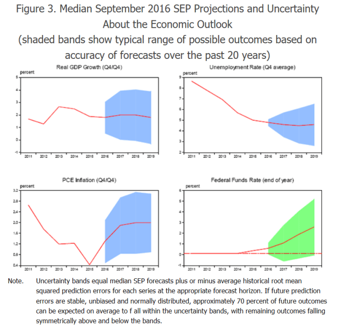
Fan charts are one of the techniques people use to illustrate the plausible ranges of uncertainty around macroeconomic (and similar) forecasts.  Here is an example, applied to the US, from an RBA Discussion Paper published a couple of years ago.

fan charts 1.png

Focus on the bottom-right chart.  Over a three-year ahead horizon, only 70 per cent of historical forecasting errors for the Fed funds target rate would be captured in a range five percentage points wide.

Our OCR system has only been running for 20 years, but I had a look at the historical record to see how much the OCR moved over a three year horizon. (One could do the exercise looking at outcomes vs RB forecasts, but that would be more time-consuming.)  The (absolute value) median change in the OCR over a three year horizon was 1.25 per cent.  Take a longer run of data and look at changes over three years in the 90 day bill rate since financial markets were liberalised here and the median change was 1.8 per cent.

Those are medians, so encompassing only 50 per cent of the changes.  From a starting OCR of 1 per cent, a reasonable description of the range of possibilities –  knowing precisely nothing about the macro outlook –  simply based on historical variability would be along the lines of a 50 per cent chance that the OCR three years hence would be in a range of -0.25 to 2.25 per cent, with a 25 per cent chance each that the OCR would be lower or higher than that the options encompassed by that range.     Simply based on historical variability, there might be something like a 30 per cent chance that the OCR would go negative, from this starting point, in the next few years.

Another way of looking at the issue is to look at how large the falls in short-term interest rates have been when the economy turned down.

For the pre-OCR period we had these examples:

1987 to 1989:   about 600 basis points

1991-1992:   about 700 basis points

1997-1998:   about 450 basis points

And since the OCR was adopted

2001:    175 basis points (not measured as a New Zealand recession)

2008-09:    575 basis points

Recessions in New Zealand look to have been associated with 500 (or more) basis points of cuts in short-term interest rates.

That isn’t particularly unusual: I was reading last night a recent speech by one of Fed Board of Governors who noted, in a quite matter-of-fact way, that the Fed has typically needed about 4.5-5 percentage points of policy leeway in recessionary periods in the last 50 years.

(Under current laws and technologies) the OCR can’t be cut by 500 basis points, but cut by 125 basis points from here and we would already be negative.

Of course, it might be reasonable to ask what is the appropriate starting point. The last time the OCR was raised was back in late 2014, and the OCR is already 250 points lower than it was then.   Since those OCR increases were never really warranted by the data (with hindsight –  and some with foresight – never really needed to meet the inflation target), perhaps 3.5 per cent isn’t really a sensible starting point.

But this year’s 75 basis points of OCR cuts have been in response to actual/forecast data on weakening economies and inflation pressures. If so, perhaps 1.75 per cent might be a reasonable starting point for comparison.  And if a recession hits in the next few years, historical experience suggests that (the equivalent) of 500 basis points of easing will be required.  Again, we can’t cut 500 basis points from 1.75 per cent, but we don’t need anything like that –  less than half in fact –  to get negative.

What are the chances of a recession in the next three years?   Well, no one can tell you with any great confidence.  But if we look at (a) the array of risks, locally but especially internationally, (b) the passage of time since the last recessions, and (c) the very limited conventional macro firepower authorities have at their disposal (and are known by markets to have at their disposal) it would be a brave forecaster –  or funds manager – who didn’t have such a possibility in their reasonable range of outcomes over the next few years.   One could add into that mix the fact that in most advanced economies inflation starts below target (quite different from, say, the New Zealand starting point in 2008).   With the best will (wishfulness?) in the world, I’d have thought a significant downturn, requiring a lot more macro policy support, had to be more than “highly unlikely”.

The Reserve Bank surveys professional expectations/forecasts of the OCR, but only a year ahead, and it only asks for point estimates, not (say) a band within which the forecaster would be fairly confident.  The latest survey has a range – for September next year –  of point estimates of 0.0 per cent to 1.25 per cent.  Even if the more pessimistic of the respondents might have pulled back their point estimates a bit, they aren’t responses suggesting negative rates in the next few years are “highly unlikely”.

I’m not sure whether anyone sells options on, say, bank bill futures in New Zealand.  If so, it would be interesting to know what the prices of those instruments are saying about the range of plausible outcomes for the next few years.

I suspect our fund manager was really just giving (a) his point estimate, and (b) implicitly at least, something about the next 12 months or so.  But the general point is independent of his specific comment: when the OCR is already 1 per cent and the economy is still relatively near a NAIRU (not deep in a downturn already), little or nothing from historical experience should give anyone grounds for confidently predicting that New Zealand will avoid a negative OCR at some point in the next few years.   Constantly thinking the OCR is as low as it will go has been a pretty consistent mistake of observers of New Zealand for 10 years now.

HYEFU thoughts

I don’t have that much to say about the HYEFU and the Budget Policy Statement released yesterday.  If governments are going to keep on with the insane and destructive (to the economic wellbeing/prosperity of New Zealanders) policy of supercharging population growth then, sooner or later, they are going to need to spend more on increasing the associated public “infrastructure” (roads, schools, hospitals etc).  One can, of course, question the quality of some of that expenditure –  baseline or projected –  but more people pretty reliably means a need for more capital.

That said, if the population is growing rapidly you’d usually expect to see all sorts of investment growing quite strongly.    As I illustrated in a post last week both government and business investment have been really rather subdued in recent years.  The Treasury doesn’t give us forecasts that separate out government and business investment, but here is a chart of their forecasts for total non-housing investment (public and private) as a share of GDP.   The first observation is an actual, the rest are forecasts.

inv hyefu 19

Note the scale.  These are not huge moves, but they are falls.  Treasury expects that non-housing investment will be a smaller share of GDP in the coming years than it has been in the recent past.    Something doesn’t seem right about the economic policy settings, at least if the governments cares about lifting average material living standards of New Zealanders.  Treasury forecasts on the basis of policy as it is, and (fiscal) policy changes the government has told them it will be making.

The picture in the forecasts also doesn’t look very good if we concentrate on trade with the rest of the world.  Here is exports as a percentage of GDP.

exports hyefu 19.png

When it first took office, the government occasionally used to talk about a more export-oriented economy and all that.   No sign that the Treasury thinks that policy settings are consistent with delivering that.  I didn’t include imports on the chart, but the fall in imports as a share of GDP over the forecast period is slightly larger than the forecast fall in exports.     Taking on the world and winning, consuming more of the best the world has to offer, it isn’t.

And it isn’t as if The Treasury is forecasting doom and gloom: they expect overall GDP growth to pick up and be running at around 2.75 per cent per annum.

You’d hope that, faced with projections like these, the Minister of Finance would be demanding from the Secretary to the Treasury –  and that the Secretary would be proactive in offering –  robust advice on what might, after all these years, begin to reverse New Zealand’s woefully poor long-term economic performance.    It doesn’t seem very likely, but the Secretary is new.  Perhaps she is genuinely shocked at how poorly New Zealand does.  Perhaps she is demanding answers, analysis, and advice from her staff.

On page 2 of the HYEFU I noticed this claim

The Treasury is in a unique position to focus on improving the way our economy can raise New Zealand living standards. Along with delivering first-rate economic and financial advice,

Treasury certainly is in a unique position.  They have a lot of staff, have had their budget increased, and have (or should have, if they are doing their job) ready access to Ministers and input across all major areas of policy.   And yet, the actual performance has been poor, and there is little visible sign of that “first-rate economic and financial advice”.  It might be bad if governments were consistently rejecting such advice, but that is their prerogative.   But there isn’t much sign that The Treasury has been offering hard-headed searching advice on the failures of overall economic performance, whether or not successive governments had been inclined to give it heed.

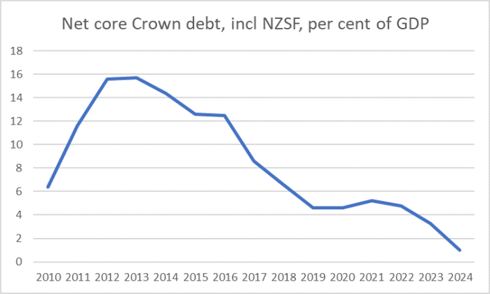
All that said, one can’t argue too much with the fiscal performance.    Here is a chart of the best of the debt indicators Treasury publishes forecasts for.

net core crown debt

Modern New Zealand governments manage debt and the aggregate public finances in a pretty responsible way (I’m not one of those who thinks low interest rates mean governments should take on more debt: rates are low for a reason), and government debt levels near zero seem pretty prudent given the way other government policies remove some of the need for private savings.   And while Treasury thinks we have a small positive output gap, my own inclination –  and the balance of the other estimates they quote –  is that things are a bit weaker than that.  Commodity prices are pretty high to be sure, which always flatters the public finances a bit, but overall I’m pretty comfortable if the operating balance is somewhere just either side of zero.

Successive governments have done aggregate fiscal management pretty well.  It is just a shame they’ve haven’t shown the same degree of interest, passion, commitment etc to fixing the longrunning productivity failures.  Overall fiscal management matters, but in terms of the long-term material living standards of New Zealanders, it is a bit akin to keeping the garden pretty and the fences well tended even as the house itself slowly –  ever so slowly but surely –  rots.


Labour share of income

I’m out of town today so just a short post.

I’ve written various posts over the years looking at the labour share of income and how that has changed over time in New Zealand, and how what has gone on in New Zealand compares with other OECD countries (eg here).  My story –  just using the official data –  has been a relatively positive one, if labour shares actually tell one much (one can envisage an alternative set of outcomes in which productivity growth has been much faster, the labour share of national income was lower, but most people were still better off than in the actual underwhelming economy we’ve lived in).

We don’t have these data quarterly, so the annual national accounts release a few weeks ago gave us the once a year update.   Here is total (economywide) compensation of employees as a share of three measures of the size of the economy.

labour share 2019.png

(The indirect tax and production subsidies adjustment is because, say, raising GST raises nominal GDP/GNI/NNI, but doesn’t generate any more production/value in the economy to share around.)

The picture no longer seems quite so encouraging.  When I first did charts of this sort three years or so ago, I focused on the share of GDP.  There had been an increase in the labour share and things now seemed to be holding steady.  For example

COE

But with subsequent revisions to the data to 2016, and the new provisional data for the more recent period there has been some slippage even in the labour share of (adjusted) GDP.    But GDP isn’t a good measure of effective income available to New Zealanders.   It includes depreciation, which is simply about maintaining the existing capital stock.  And includes the portion of the economy’s production that accrues to foreigners (mostly interest and profits).

It seems to me that the ratio of compensation of employees to net national income (NNI), adjusted for indirect taxes and production subsidies, is probably the most sensible whole-economy measure.  And on that measure there had been a pretty substantial increase in the labour share of New Zealanders’ net income in the 00s, but quite an unwinding again this decade.

I’ve previously shown charts illustrating that New Zealand wage rates appear to have been rising faster in New Zealand than nominal GDP per hour worked (the best quarterly proxy for the economy’s overall “ability to pay”). I argued that that was consistent with –  another way of expressing – the idea of a high, fundamentally overvalued, real exchange rate.   Since the quarterly GDP series is being substantially revised late next week, there is no point updating that chart right now.  But it will be interesting to have another look –  including at the annual version using, eg, the NNI data –  when the GDP data have been released.  Most likely, those data will show a bit more productivity growth in the last few years, but the “a bit more” is likely to pale in comparison with the extent of the productivity underperformance over decades.

Fix that –  which might involve the government, Opposition, and official agencies taking the problem seriously –  and most New Zealanders would be materially better off, whatever the aggregate labour share.

What does bank capital do?

Reflecting a bit further on the Reserve Bank Governor’s decision to increase very substantially the proportion of locally-incorporated banks’ balance sheets that need to be funded by capital, and on some of the points I’ve made over the year, I was trying to distinguish in my own mind quite how the Governor seems to see bank capital (the differences it can/does make) and how I see it.   This post is an attempt to jot some of that down, and to clarify a bit further some of my own thinking.

Loss absorption at or very near the point of failure isn’t really a point of difference.

Take a bank approaching the point of failure, with signs that the value of its assets might be less than the liabilities to creditors (including depositors).  If some fairy godmother suddenly injects a lot more capital, not only might the bank not fail at all, but if it does nonetheless fail the losses creditors will face will be greatly reduced.   Creditors/depositors generally like capital and will typically charge a higher price to lend their money to a bank that is perceived not to have very much of it.  That is a market process, and is how small entities (in a system with no deposit insurance, such as New Zealand at present) function routinely.

Government bailouts have the same sort of effect at/near point of failure, whether they take the form of guarantees that are paid out in liquidation (eg South Canterbury Finance under the deposit guarantee scheme) or a government recapitalisation of a bank as a going concern (eg, in a New Zealand context BNZ in 1990, or numerous more recent examples abroad).     The money taxpayers put in is a cost to them (us) and a gain to the creditors/depositors who would otherwise face losses.

The bailout transaction is a transfer: from the government (taxpayers) to the subset (large or small) of creditors and depositors.   If most creditors/depositors are locals that transfer doesn’t make New Zealanders as a group worse off; it largely just transfers resources to one particular class of New Zealanders.   As a society we might reasonably be unwilling to pay a high (permanent) costs, from newly intensified regulation, simply to avoid the possibility of such transfers once in a while.

You and I might not like such bailouts but the fiscal cost of them isn’t a good reason for much higher capital requirements.  Apart from anything else, it shouldn’t really be a concern of the central bank –  which isn’t a fiscal authority and was charged by Parliament with focusing on the possibility of “significant damage to the financial system” from bank failures, a proxy for potential damage to the wider economy.    If the potential fiscal cost of bank failures were to be a prime consideration, you might then expect the government (responsible for fiscal matters) to have some considerable and formal say in decisions around bank capital.  In doing so, they might evaluate the deadweight losses from slightly higher taxes to fund bailouts (if they happened) against the costs to the economy of higher minimum capital ratios and, in principle, decide which was less costly to society as a whole.    (Or they might look at the feasibility of tools like the OBR, which might allow losses to lie where they fall, potentially reducing the likelihood of bailouts.)

In fairness to the Governor, the Bank’s arguments for much higher capital ratios here have not rested heavily on fiscal cost arguments.  But it is something higher bank capital can (probably/largely) mitigate, at least if injected at/near what would otherwise be the point of failure.

Instead, the Bank/Governor have made much bigger claims for what much higher bank capital requirements can do, and they are really where the differences lie.

This paragraph is taken from the Bank’s decision document

It is an established finding in the economic and financial literature that shareholders invest less capital in banks than is socially optimal. This problem has been evident since the middle of the 20th century.  The problem arises in large part because shareholders and creditors expect governments to bail out banks that are at risk of failing and whose failure would bring widespread social and economic costs. The expectation of bail-outs means creditors are prepared to lend to banks when capital levels are low, generating socially sub-optimal levels of bank capital.

I think they overstate their case (“an established finding”) but as a theoretical point it seems fine: in an over-simplifed model, if everyone thinks governments will bail out large banks in trouble (without properly pricing that risk in, say, risk-adjusted deposit insurance premia), creditors will not insist on banks holding as much capital and failure events will be more common.  More risky lending is also likely to be done, since shareholders can capture the upsides, while downside risk to creditors is off-laid to the Crown.  Not everyone will behave that way and managers/Boards still have reputational risk to consider, but if bailout risk is real (which it demonstrably is, including here) and can’t be dealt with/limited directly (an open question, at least in a realpolitik world) it would be simply foolish not to have some sort of minimum capital regime.

But that doesn’t really help us, in thinking about what should be done right now.  It makes for good rhetoric perhaps, but only among people who aren’t aware (a) that regulatory minimum capital requirements have been in place for decades (in fact, even in the dim darks, double liability for bank shareholders was often a requirement –  the chair of the Reserve Bank Board wrote about such things earlier in his career), and (b) of the sorts of capital ratios maintained by intermediaries where there is little or no credible prospect of bailouts.  The Reserve Bank –  and their peers abroad – has made no attempt to show that, absent bailout risk, banks would operate with higher capital ratios than they have now.  Perhaps that is a more pardonable oversight in countries with comprehensive deposit insurance regimes, but it is much less excusable here.

And the rhetoric conveniently elides what is really a very important distinction.    Take government bailout risk out of the picture, and banks –  including their shareholders –  and their customers (“the market”) will work out financing structures and pricing that provide some reasonable balance of risk and return.  There would probably be a spectrum of types of institutions –  rock-solid ones offering lower interest rates to potential lenders, and more risky ones.  Individuals can make choices about which to deal with.   It is how things work in the rest of the private sector.  And there would be failures from time to time.  Shareholders would lose their money.  Creditors would lose (some of) their money.    Borrowers with revolving credit lines might face disruption to their ability to pay their bills.   Employees and managers would lose their jobs,  And so on.  But all those parties can (in principle) evaluate and price those risks, and choose different options if the particular risk on offer (job, deposit, or whatever) is too high for comfort.

The way government bailout risk affects bank’s own choices (“moral hazard”) is not really the central issue at all.    What is really going on in Reserve Bank thinking is the idea of externalities; the adverse effects of a bank failure on other people.  Effects that bank managers and shareholders have no incentive to take account of in making decisions about capital structures.  There are no market feedback mechanisms (or, more realistically, insufficiently strong ones) to encourage them to do otherwise.   What drives the Reserve Bank is a belief –  and it really is not much more than belief –  that (a) these potential externalities are very large, and (b) that much higher bank capital requirements can make a material and substantial difference in allevating them.   I think the evidence of economic history is that they are wrong on both counts.

Listen to the Reserve Bank or read their material and you will be presented with tales of woe, reminders of the 2008/09 crisis, and talk of huge economic and social costs.  Many of the numbers that are cited are shonky at best (I’ve touched on that in previous posts and may come back to the issue next week).  But what you won’t be presented with is any careful evidence or analysis to show how much higher capital ratios would have prevented these costs (not just alleviated them at the margin, but substantially prevented both the crisis itself and the costs the champions of change seek to highlight).

There is little or no engagement with economic history including the specifics of what was going on –  including elsewhere in policy –  in the lead-up to the (relative handful of examples of) advanced country financial crises.   And there is almost no recognition of the fact that financial crises (or, more specifically, major bank failures or near-failures, involving large credit losses) do not happen in isolation, because some uncontrollable unforeseeable thunderbolt hits a particular economy.      Rather the seeds of future crisis are laid in a succession of bad lending and borrowing choices –  borrowers here matter quite as much as lenders – typically over a period of several years.     Of course, in one sense the “badness” of those choices only becomes apparent later, when the losses happen, and thus the argument risks being a bit circular, but it can be framed this:   lending standards, and a willingness to borrow, become much freer and looser than the standards that prevail in more normal times.

If we look back over economic history and financial crises those mistakes seem to arise in a variety of contexts.  Sometimes it is when government regulations directly mess up the market.  One could think of the US housing finance market in that context.  Sometimes, governments skew important relative prices – in pursuit of other apparently worthwhile objectives.  Here one could think, for example, of small countries that previously had high interest rates entering the euro and finding (a) finance more readily available than usual, and (b) good times interest rates people hadn’t seen before for a long time.  In a similar vein, one could think of newly liberalised markets, where no one much (regulators, borrowers or lenders) really knows quite what they are doing and what risk and opportunity really look like in the new world (one could think of the late 80s New Zealand –  or Australia or the Nordics – in this vein).  Or of stunning new growth phases –  much of which might be genuinely well-grounded –  that create a pervasive (among governments, borrowers and lenders) air of optimism, a belief that the world is different, an uncertainty about just what will and won’t prove robust.  Perhaps Ireland and Iceland fitted in that camp to some extent –  some in New Zealand in the mid-late 80s thought that was us too.)

In these climates eager borrowers and eager lenders get together and make choices, that have very little to do with bank capital levels, that often prove, with time, to have been misguided.  But although neither side knows it, the damage is really done when the initial loans are written and resources used on projects that really aren’t economic. In this phase there are often what look and feel like positive externalities –  the extreme optimism and exuberance (and high incomes) that pervaded much of Ireland in the early 00s for example.  Some people probably got into houses –  and are still grateful for it –  who otherwise wouldn’t have done so in the housing finance boom in the US.

Higher bank capital might stop the eventual realisation of the losses falling directly on bank creditors and depositors (that redistributive effect, see above) but it won’t stop the losses themselves (on the bad projects that were funded), it won’t stop those particular markets seizing up and demand no longer being there (no one much wanted to build any more new offices in late 1980s Wellington after the scale of the incipient glut became apparent), it won’t stop people across the economy (lenders, borrowers etc) having to stop and reassess how they think the economy works, their view on what might really be viable projects and so.   And they won’t stop the realisation of wealth losses –  the wealth that was thought to be there has gone, the only question is who now actually bears the losses.

Perhaps if pushed Reserve Bank officials would concede these points, but since they haven’t been pushed  they continue to claim, and act a basis justified only if, all the economic and financial losses associated in time with significant bank failures (or near-failures) are (a) caused by those failures (or near-failures) themselves, and (b) relatedly, would be avoided if only capital levels were (much) higher.    Neither makes sense. Neither squares with the experience of history.  But in the process they massively over-estimate the economywide benefits of their regulatory interventions.

Quite possibly there are some adverse economic effects from the failure of a significant bank that aren’t already made inevitable by the bad lending (and borrowing) and misallocation of resources and misperceptions of opportunities that created the difficulties in the first place.  There is a fair degree of consensus on the desirability of avoiding the quite intense short-term disruption (and it is short-term, not reverberating decades down history) of the closure of a major retail bank – that was the logic of the OBR mechanism –  but there is no way that the cost of such a closure, conditioned on big credit losses having happened anyway, are anywhere near 63 per cent of GDP (the number used in the Reserve Bank’s analysis).  To believe otherwise is to (a) grossly overstate the power of policy (specifically bank capital policy) and (b) to seriously underweight the capacity of the market and private sector to adapt and adjust.

And in all this I’ve implicitly assumed –  as the Bank does – that much higher minimum bank capital ratios do not have other deleterious effects themselves.  For example, it isn’t impossible that higher bank capital ratios, imposed by regulators, will induce more risk-taking behaviour from at least some industry participants, trying to maintain previous target rates of return on equity.  It probably isn’t a dominant element of the story, where there are reasonable market disciplines as well, but there is some evidence of such behaviour.

Perhaps more concerning is the risk that by focusing very heavily on even higher capital ratios –  in systems that have already proved robust –  supervisors and regulatory agencies put their focus in quite the wrong place.    Recall the comment from the Bank’s own appointed academic expert, David Miles.

The RBNZ has adopted a principle of being conservative as regards bank capital to offset possible risks from its light-handed approach to supervision. That is a choice and one partly based on the view that having very large resources devoted to intrusive oversight of banks is not the most efficient road to go down. That is a conclusion that engineers and safety experts often apply when dealing with the design of structures. There is a choice between building bridges many times stronger than you expect them to need to be OR you having large teams of inspectors who pay frequent visits to examine all bridges and monitor flows of traffic over them.  It is clear that nearly all countries follow the first strategy.

That may be a useful guide for bank supervision.

If it really is sustained periods of greatly diminished lending standards that lead to most of the eventual costs the Bank is worrying about, it might be better for the Bank to be focusing more of its energy on understanding bank lending standards and how they are changing, and on understanding and drawing attention to important distortions in the policy or regulatory system that may be misleading borrowers and lenders alike, and so on.  I’m not that optimistic that bank regulators can really make that much difference –  for various reasons (including their own personal incentives) it is hard to imagine even the best central banks being that influential with governments, or being paid much heed by banks (let alone borrowers and investors not reliant on local credit).  But really high capital ratios have a substantial cost to the economy and it just not obvious that they are particularly potent as an instrument to limit the sorts of (overstated) costs the Bank worries about.  Other big policy distortions, messing up incentives, making it harder to lend or borrow well, might just be one of the messy facts of life.   High capital ratios will always appeal to central bankers –  when your only tool is a hammer, all problems tend to be interpreted as nails –  but they are costly for the economy and whatever gains (beyond the merely redistributive) they offer seem, from experience, likely to be slight.

And what we do need when things go badly wrong, and a whole of reassessment is taking place, is a robustly counter-cyclical monetary policy.  The worst costs of serious economic shocks and misperceptions crystallised are around sustained unemployment for the individuals affected.  Neither monetary or bank regulatory policy can do much about potential GDP growth or productivity, and they can’t prevent real wealth losses when bad choices have been made in the past,  but they can do a great deal to alleviate the adverse cyclical consequences, to keep unemployment as low as possible, consistent with price stability, and deviations from that (unobservable) point as short as possible.

Deputy Governor talking up the economy

On Friday afternoon a reader sent through a copy of a Bloomberg story quoting Geoff Bascand, Deputy Governor, on the health of the New Zealand economy.    As reported, it was pretty upbeat to say the least.   But the foundations for such an upbeat tone seemed more akin to sand than to solid rock.  Storms expose houses built on sand.

This was the opening section of the article

New Zealand’s central bank doesn’t expect its new bank capital rules to present a headwind for the economy, which looks to be near the point of entering a recovery, Deputy Governor Geoff Bascand said.

“We don’t expect major economic impacts” from banks raising their capital buffers, Bascand said in an interview Friday in Wellington. Furthermore, latest developments are “supportive of the story that we’re near or around that turning point” in the economic cycle, he said.

Bascand had been interviewed by Bloomberg’s local reporter, Matthew Brockett, following the announcement on Thursday of the final bank capital decisions: very big increases in required bank capital ratios, even if some portion of that can be met a bit more cheaply than the Governor’s initial proposal had envisaged.  So I guess we should expect spin.  Bascand’s day job is as the senior manager responsible for financial stability, banking regulation etc.  All the advice and the documents published on Thursday emerged from his wing of the Bank.  But he is also a statutory member of the Monetary Policy Committee, with personal responsibility –  with his colleagues –  for actual delivering inflation rates near target, something the Bank hasn’t managed for years now.  For most of that time, the Bank has been consistently too optimistic about the economy, and about the prospects for getting inflation back to target (fluctuating around the target midpoint, perhaps especially in core inflation terms).

I guess the characterisation “doesn’t expect its new bank capital rules to present a headwind for the economy” is the journalist’s, and there is quite a lot of leeway in Bascand’s own words: “we don’t expect major economic impacts”.  If “major” here means “singlehandedly tip the economy into recession” then I suspect everyone would agree, but that shouldn’t be the standard.   The Bank’s own numbers tell us that they think the base level of GDP –  absent crises –  will be lower as a result of the change in the capital rules.  And their modelling effort focuses on the long-term, not the transition.  The headline out of last week’s announcement was that the transition period had been stretched out, from five years in the consultative document to seven years.  But (a) in making decisions now, and in the next couple of years, people will sensibly factor in changes in the regulatory environment that have already been announced (and are final, in the Governor’s words) –  expectations matter, as the Bank often (and rightly) tells us, with its monetary policy hat on and (b) for the big banks a significant chunk of the policy change is frontloaded, because the change in rules to increase risk-weighted assets calculated using internal models to 90 per cent of what would be calculated using the standardised rules happens right at the start.  That change alone is equivalent to a 20 per cent increase in minimum capital.

And it isn’t as if there are no hints of effects already, even before the final decisions were made.  The Governor and Deputy Governor clearly prefer to avoid addressing these data, but the Bank’s own credit conditions survey showed not only that credit conditions (a) have already been tightening, (b) are expected to continue tightening, and (c) respondents ascribe much of that effect to the impact of regulatory changes.

credit 4

Perhaps the banks were just making it up when they responded to this survey?  Perhaps, but the Bank was happy to cite either components of the survey in its recent FSR, just not these awkward ones.

And why wouldn’t much higher capital requirements, in a world where there is no full MM offset (as the Bank itself recognises), no full or immediate scope for disintermediation to entities/channels not subject to the Bank’s rules, constrain credit availability to some extent, especially in the early stages of a multi-year transition period?   And, as the Bank also keeps telling us, the availability of credit is one of lubricants to economic activity.  If credit isn’t as readily available, all else equal economic growth is likely to be dented.

And what about Bascand’s other big claim that indicators are

“supportive of the story that we’re near or around that turning point” in the economic cycle,

Count me sceptical.     At best, what we’ve seen so far might support the possibility of an inflection point.  If you want a nice summary, with charts, I thought last week’s ANZ economics weekly was about right.

It is worth remembering just how subdued economic growth rates have been this decade –  headline, not even per capita –  and that the slowing has been underway for several years.

GDP growth

On the home front, business confidence and related measure seem to have bounced a bit, but aren’t outside the range we’ve seen over the last couple of years  (when actual growth has been falling and low).   Some agricultural products prices are doing very well, but (a) surely the best estimate is that many of these lifts will be shortlived, and (b) debt overhangs and tightening credit constraints locally will limit the extent to which near-term income gains materially increase activity.  Bascand makes quite a bit of the promise of fiscal stimulus, but recall that on the Treasury fiscal impulse indicator there was a fairly substantial fiscal stimulus in the year to June 2019, and growth was low and slowing.

And that is before we start on the rest of the world.  Here is an ANZ chart of growth in world trade and industrial production

ANZ trade

Data out of Europe, Australia, and the PRC (the latter two being the largest New Zealand export markets) have remained pretty downbeat, even as sentiment ebbs and flows at the margin.  The latest Chinese export data offered little encouragement,  And there isn’t much optimism about the US either, with a considerable chunk of US forecasters expecting a recession in the next two years.   And all this against a backdrop in which people (markets in particular) know that there are quite severe limits on how much macro policy can do if a new serious downturn happens.  That alone is likely to engender caution.

The TWI doesn’t move independently of all these domestic and foreign influences, but it is worth noting that it is now a bit higher than it was when the Bank surprised everyone with their 50 basis point OCR cut in August.

TWI dec 19

Perhaps time will prove the Deputy Governor right, but at present I’d suggest his claims should be taken with a considerable pinch of salt.  Things probably aren’t getting worse right now, but it seems heroic –  against the backdrop of both domestic and foreign constraints and headwinds (including those capital changes) to be talking up the idea of a turning point in the economy.    And rather concerning if this is the sort of sentiment shaping the Bank’s monetary policy thinking right now, after a decade in which things have kept disappointing on the downside.   It doesn’t have that “whatever it takes” sound about it, of which we heard quite a bit in the wake of the August OCR cut.  It sounds more like the sort of spin we hear repeatedly from the Minister of Finance and Prime Minister, who go on endlessly about headline GDP growth rates here and abroad, and never once mention how much faster population growth is here than in most advanced countries.

A few weeks ago I wrote a post about the sudden mysterious, but very welcome, appearance of inflation expectations as a factor in the Bank’s storytelling about policy.    For a few weeks the Governor was outspoken in his desire to act boldly to boost inflation expectations, and do what he could to minimise the risk of hitting lower bound constraints in the next downturn.

And then, like the morning mist, all that concern was gone again –  totally absent in the presentation of the latest MPS.   If anything, inflation expectations measures had fallen a bit further from August to November.

I don’t typically pay much attention to the Reserve Bank’s survey measure of household inflation expectations.  Neither, I expect, do they.  But it has been running for a long time now, and the latest numbers –  finally released late last month – look as though they should be a bit troubling for the Bank.

household expecs 19

This series is nowhere near as volatile as the ANZ’s household expectations survey (although, for what it is worth, recent observations in that series have also been pretty low).   It began in the far-flung days when the inflation target was 0 to 2 per cent (centred on 1 per cent) and yet this is the first time ever that household year ahead inflation expectations (median measure) have dropped below 2 per cent.  At one level, that might be welcome –  the series has historically had quite an upward bias –  but when household expectations are converging towards professional and market expectations, and all those are below the 2 per cent target midpoint it shouldn’t be a matter of comfort at all.    This is the sort of drop the Governor claimed (at least in August and September) he was trying to prevent.   In the same survey, respondents are also asked whether they expect inflation to rise, fall, or stay the same over the next year (probably easier to answer than a point estimate).  There too respondents have become less confident that inflation is going to pick up.

For a brief period a few months ago it looked as though the Bank, and the Governor, were really taking seriously the challenges we face, in a context where conventional monetary policy just does not have much more leeway.  More recently, they seem more interested in talking things up again –  keeping pace with the political rhetoric, and perhaps playing defence re the bank capital changes.  A more realistic tone would offer a better chance of getting through tough times with as little damage as possible, including by better preparing firms and households for the risks that arise if the global downturn intensifies, with little monetary policy leeway, the risk of significant policy-induced tightening in credit conditions, and inflation (and particularly at present inflation expectations) falling away.

We are getting very late in the business cycle and we’d be better served by a strongly counter-cyclical central bank, rather than one playing defence for its own (deeply flawed) other policies, and whistling to keep spirits up (and political masters, making decisions about the future of the Bank, happy).  With the sort of mindset on display at present they risk being blindsided by events, in a context where –  as the Governor himself put it only a few months ago –  the costs and consequences of being wrong the other way (inflation gets to say 2.3 per cent) are pretty slight and inconsequential after a decade of such low inflation.

Saving: New Zealand and Australia compared

In a post earlier this week looking at national saving rates across the OECD, I included this chart

net savings aus nz

For the last few years, national saving rates in New Zealand have been higher than those in Australia.  That isn’t the popular perception, and it hasn’t been common in the past –  although for now, the gaps are no larger or more persistent than those recorded for a few years in the 00s.

Before digging behind the numbers, at least a bit, a reminder:

  • these are flow saving rates we are looking at here (the share of the year’s net income accruing to residents of the country in question that is not consumed).   In the case of business savings, the concept is akin to retained earnings from the profits for the year in question
  • I am not looking at stock measures of accumulated wealth, financial assets or anything of the sort.

We can break down these saving rates for each country and see what has been happening in each of the broad sectors: households, governments, and business.   All the charts below are expressed as a share of NNI (rather than of the income of that particular sector).  In each of the charts below, New Zealand data are for March years and Australian data for June years.

First, lets have a look at general government savings

govt s

Every year but one the government savings rate (share of NNI) in New Zealand has been higher than that in Australia.

And that is so even though, diverting briefly to stock numbers, in every single year for which we have data, general government net financial liabilites (loosely, net debt) is larger, as a share of GDP/NNI, in New Zealand than in Australia.  There are probably two main factors at work: first, the size of government here is larger, as a share of the total economy, than in Australia, and second, New Zealand tends to have a relatively large amount of government investment (GFCF) as a share of GDP.

What about households?

Probably to no one’s surprise

household s 2.png

In all but one year, household (net) saving in Australia has been higher, as a per cent of NNI, than that in New Zealand.  The size of the gap between the two series hasn’t changed much over time, and there is little sign that the gap now is consistently larger than it was 30 years ago before the compulsory private savings scheme was introduced in Australia.  Both countries have had fairly rapid rates of population growth over these decades –  although the growth has been concentrated in different periods.  Over long periods of time, you’d expect a country with rapid population growth to have a higher household savings rate than one that doesn’t.   What is, perhaps, interesting about the Australian series is how far the household savings rate has dropped back again in the last few years.

And what about the business saving rate?  In aggregate the picture looks like this

business s.png

For the first decade or so of the data things are much as you’d expect.  Business saving in Australia averaged a bit higher than that in New Zealand, consistent with the fact that business investment rates tend to be higher (partly reflecting the Australian economy concentrating in quite capital intensive sector).  You can, loosely, see some cyclical effects: profits tend to fall away quite sharply in recessions and so, typically, will business savings rates.

But once one gets to this century things become harder to make sense of.  And the Australia numbers seem easier to make sense of than the New Zealand ones: in Australia as the terms of trade surged and huge new mining sector investment opportunities opened up you’d expect firms to be using higher profits and higher retained earnings to finance part of the huge surge in mining investment.  The Australian terms of trade peaked in 2011 and is much lower now.  Mining sector investment is also well past its peak.  Still, I was a bit surprised to see that overall business saving rates are now lower than they were, on average, in the 15 or so years before the terms of trade boom.

But what of New Zealand?  Why did business saving rates surge at the very start of the 00s, and then fall away so sharply –  the amplitude of that fluctuation is larger than for Australia more recently.  Some of it probably had to do with the exchange rate –  which reached a deep trough in 2000 at a time when commodity prices were high.  But it doesn’t really seem like a sufficient explanation.  And that trough was in the year to March 2007, more than a year before the recession really hit.

Despite my inclinations to look on the gloomy side, I’d almost be inclined to think positively about the recent rise in business savings rates –  higher now than they were at any other time in the 1990s –  except that there is little or no sign that these higher saving rates reflect any sense of an abundance of investment opportunities.  Business saving rates in New Zealand may well now be being boosted by the pressure on dairy farmers to use whatever earnings they can generate to pay down debt.

We can use official data to look a little further behind the business saving story, splitting the business saving rate into financial businesses and other businesses. I’m not sure why one would want to –  they are all businesses after all – but as it happened there are some interesting, but puzzling, differences uncovered by doing so.  Note that for New Zealand the data are not yet available for the March 2019 year.  And the New Zealand data are available only for the last 20 years.

Here is financial sector (net) saving

fin.png

and here is the non-financial business sector

non-fin.png

I just don’t know what to make of the earlier years: why would NZ financial sector saving (retained earnings) be so much lower than that in Australia, at precisely the same time non-financial sector business saving was materially higher.  Something doesn’t look quite right (but perhaps it is, and I’d be happy to have any authoritative explanations).

More recently, this decade, the financial sector savings rates have been very similar on both sides of the Tasman: rather what one might expect given that the biggest players here (banks) are also big Australian banks.  But if that is plausible and roughly right, it leaves the business saving rate in the rest of the business sector quite a bit higher here than in Australia.   Which is interesting, and not necessarily what I would have guessed without checking.

I don’t purport to have any particular insights to offer on quite what has been going on.   Digging any deeper would probably require more resources and data that I don’t have.  But it is interesting that the relationship between New Zealand government savings and Australian government saving, and New Zealand and Australian household saving, have been pretty stable for a long time.  The puzzles seem to rest in the business sector data, and unfortunately business saving is quite routinely overlooked when people talk,or think, about saving behaviour in New Zealand.   A Treasury, Reserve Bank or Productivity Commission note might be able to shed more light on developments that we probably should understand better than (at very least) I do.