Can the terms of trade explain Auckland’s apparent underperformance?

My post follow-up post yesterday on Auckland’s surprising weak performance in the regional nominal GDP data over the last 15 years prompted a reader to get in touch suggesting that changes in the terms of trade over the period were sufficient to explain why the provincial areas generally seemed to have done well, and Auckland and Wellington had not.

I had been conscious of the possible role for terms of trade changes in explaining the patterns –  these, after all, were nominal GDP data, and ideally we would have liked real series – but hadn’t gone much beyond that.

To see the issue, I’ve set up a very simple stylized version of New Zealand.  This New Zealand has just two, highly stylized, regions.  One produces all the foreign exports of the country (Region A), and the other (Region B) generates lots of domestic services, many of which are supplied to Region A.  You could think of these services as being banking, electricity generation, advertising or whatever.  And each region produces lots of stuff that is consumed within its own region, and each also assumes the same amount of foreign imports.  Both regions have GDP of 500, and Consumption of 500.  (For this little illustrative exercise, I’m just assuming away investment, and any current account deficits/surpluses.)

Region A Region B NZ
Consumption 500 500 1000
Exports 200 0 200
Services trade within country -100 100 0
Imports -100 -100 -200
Nominal GDP 500 500 1000

Now what happens if the terms of trade double?

It depends greatly on whether import or export prices change.

Export prices double:  Region A  Region B  NZ
Nominal GDP 700 500 1200

If foreign export prices double, then the value of region A’s exports will jump from 200 to 400, and the value of nominal GDP in region A will increase to 700.   Region B’s nominal GDP is unaffected (it doesn’t export anything internationally).  Over time, if the higher prices are sustained, it is likely that there will be other consequential changes: consumption in A will tend to rise, and with it both foreign imports and purchases from region B.  But the shock has clearly favoured region A, raising its nominal GDP relative to that of region B.

But what if the terms of trade double through a halving of import prices?

Import prices halve  Region A  Region B  NZ
GDP –  zero pass-through 550 550 1100
GDP – full pass-through 500 500 1200

The immediate impact depends in part on what happens to domestic prices.  If import prices halve, and none of that is passed through to consumers, nominal GDP in both regions will rise by 50 (the size of the reduction in the import spend).  If the lower import prices are fully passed through to consumers, nominal GDP won’t change at all  in either region (lower consumption prices will offset the lower import spend).  Again, over time the gain in the terms of trade will affect behavior (presumably there would be more consumption, and perhaps a higher volume of imports), but for these purposes all that matters is that the shock has hit the two regions equally.

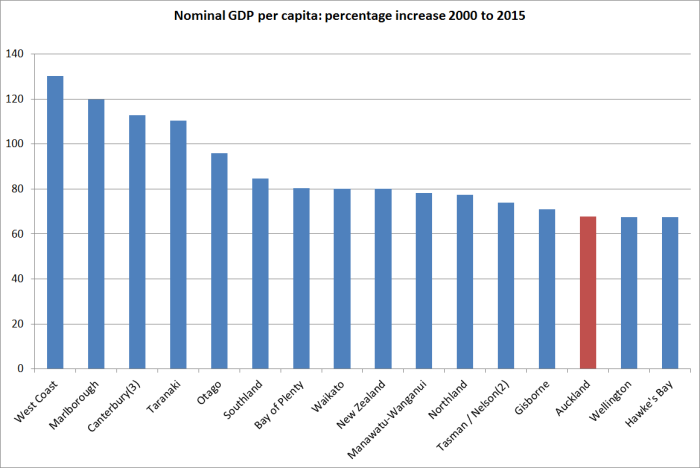
This is all deliberately highly stylized, and says nothing about actual New Zealand (although you might be thinking that somewhere like Auckland might resemble region B and Southland or Taranaki might resemble region A: in the most recent year for which we have detailed industry breakdowns, 13 per cent of Auckland’s GDP was from primary sectors and manufacturing, while 56 per cent of Taranaki’s was).

The terms of trade increased very substantially in New Zealand from 2000 to 2015 (March years), the period covered by the regional GDP data.  The increase over that period was 31.7 per cent.

But most of the gain has been realised in the form of lower import prices.  Export prices have increased, in New Zealand dollar terms (and the nominal GDP series are NZD series), by only about as much as the consumption and investment deflators.  What stands out is that import prices have fallen by 4 per cent over 15 years.  What has been going on?

national acs deflators

First, the real international prices of a lot of imports have been falling –  a beneficial effect of the rise of China and other emerging manufacturing centres.   And, second, the exchange rate has risen very substantially over that period (up 33 per cent on the Reserve Bank’s TWI measure).  Global prices of many of New Zealand’s exports certainly rose over that period, and New Zealand as a whole was better off as a result, but the higher exchange rate meant that, on average, export-focused regions didn’t get the gains of the higher terms of trade (nominal GDP in those regions wouldn’t have risen systematically faster than that in less export-oriented regions).  If we take the six components of the ANZ Commodity Price Index over the 2000 to 2015 period, meat and dairy prices rose modestly in real NZD terms, while the other components (horticulture, seafood, aluminium and forestry) saw falls in their real NZD prices over the full 2000 to 2015 period.    Much of this process is discussed at greater length in an Analytical Note published by the Reserve Bank a couple of years ago.

Instead, the terms of trade gains came mostly in the form of cheaper real import prices, benefiting people in all regions (including Auckland).

Ideally, we would still like to have region-specific GDP deflators.  In some regions with a heavy weight on dairy exports, the rise in the terms of trade may help explain with that particular region’s nominal GDP per capita has done quite so well relative to Auckland’s over this particular 15 year period but (a) the rises in real NZD dairy prices over the full period weren’t that large (around 15 per cent, if deflating with the private consumption deflator), and (b) even in the Waikato total agriculture is only around 10 per cent of GDP).  The differences in GDP per capita growth rates across regions (illustrated in yesterday’s post) swamp anything that can be explained largely by terms of trade effects.

Wellington-boosters (such as the dreadful Wellington City Council, its “economic development” agency, and the myriad of “booster” mayoral candidates) probably take some consolation from the fact that, according to the regional GDP data, if Wellington hasn’t been doing overly well, at least it hasn’t done much worse than Auckland.  I’m not sure they should take such comfort.  Over this 15 year period, the private consumption deflator has increased by 31 per cent, but the government consumption deflator has increased by 51 per cent.  The production of government consumption goods makes up a great deal of economic activity in Wellington  (“public administration, defence and safety”  is around 11 per cent of Wellington’s GDP and 3 per cent of Auckland’s).  If we had real per capita GDP data for the regions, Wellington might be lagging even more  –  and specifically further behind Auckland –  than the nominal data suggest.

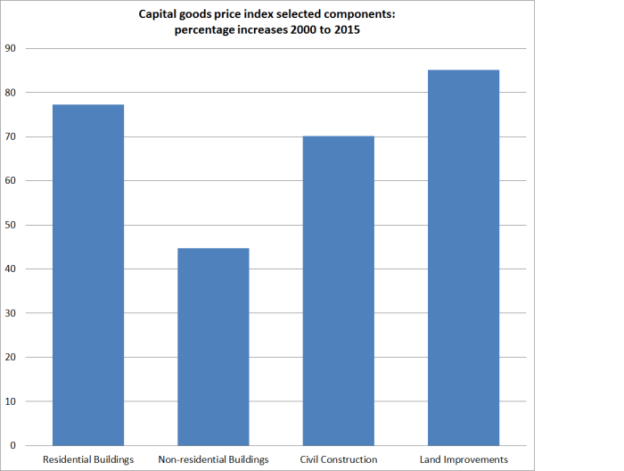
On the other hand, I wondered if there was at least one factor overstating Auckland’s performance.  In the national accounts deflators, the deflator for residential investment increased by 85 per cent over the 15 year period, while the private consumption deflator had increased by only 31 per cent.  And it isn’t just residential construction activity that has seen large price increases: here are the construction-related components from the Capital Goods Price Index for the same period.

cgpi

Surely, I thought, Auckland’s rapid population growth over this period (see earlier posts) would have meant a larger share of Auckland’s GDP was in construction-related activities.  If so, the higher inflation rates for these sectors would tend to boost nominal GDP.

We only have detailed industry breakdowns by region to 2013, but I was a little surprised that when I calculated the average share of construction in each region’s GDP over 2000 to 2013 this is what I came up with.

construction share of gdp

Auckland has certainly had a lot more construction activity (share of GDP) than Wellington, but beyond that I have no idea what to make of the results.  They don’t seem very plausible numbers,  but then SNZ collects the data.

There is no point putting too much weight on regional nominal GDP data.  But they do throw up some results that were unexpected (at least by me), and the apparent underperformance of Auckland over this particular 15 year period doesn’t seem easily able to be explained away simply by the effects of terms of trade changes. (Even if it could, it might be troubling that so many people were gravitating to a region that  – the market was signalling –  relative price changes were not favouring.)

And, to repeat a point I made yesterday, there is no necessary reason why simply putting more people in Auckland would raise the productivity of the city.  To those who assure me that agglomeration economies are real, I respond, well, yes, of course.  The question is not, and has never been, whether many (although not all –  see natural resource extraction) high value functions/industries/activities function most productively in big cities.  The economics of agglomeration helps describe why big cities exist.  But the question –  an analytical one, but one New Zealand practical policymakers need to think seriously about –  is whether Auckland is one of the places where firms undertaking many increasingly high value activities will increasingly choose to cluster.    There is no necessary reason why it should be.  Most places aren’t.  There are reasons why there aren’t half a million people in Invercargill or Launceston –  or Helena, Montana or Kearney, Nebraska .  Wishing it were otherwise does not make it so.

There seems to be a strong element of wishful thinking (or “build it and they will come”) about the policymakers’ (and their advisers’) Auckland story.  One could mount an argument –  not necessarily a fully compelling one, but one with substantial elements of truth to it –  that Auckland’s current relative size is largely a function of two big policy interventions.  The first was the high level of manufacturing protectionism that prevailed from the 1930s to the 1980s. Manufacturing firms all over the country benefited, but if one was producing things just for the local market, being in the biggest city made a lot of sense.  The South Auckland manufacturing base grew up during that period.  And the large scale immigration programmes ended up with the same effect, boosting Auckland’s population dramatically (particularly as immigration became increasingly non-Anglo), and generating a deal of economic activity in non-tradables sectors simply to support the infrastructural needs (broadly defined) of a rising population.  But there has never been any sign that Auckland is a location that has the economic opportunities that encourage the growth of new high –productivity industries successfully taking on world markets.  New Zealand’s export base remains overwhelmingly natural resource based –  dairy, wool, meat, fish, oil and gas, gold, wine, forestry, and tourism (most of the appeal is the landscape not the great art or glorious cathedrals).

I’d really like to be wrong, but where is the evidence that incredibly strong population growth in our major city, fuelled largely by immigration policy (New Zealanders, net, have tended to be leaving Auckland, not drawn to its great opportunities), is generating the national benefits the advocates would claim for it?  At present, it looks as though this Think Big strategy is perhaps even more flawed than the 1980s energy version (fortunately called to a halt quite quickly) was.


Big agglomeration gains in a growing Auckland? Or not.

A few weeks ago, when the annual regional GDP data were released, I used them as the basis for a post casting some doubt on whether we were seeing the widely-touted economic gains from the large and rapidly growing population in Auckland.

The data aren’t ideal by any means.  Among the other issues, they are only nominal, they only go back to 2000, and there are no regional hours worked data.  But they are what we have.  Since 2000, Auckland’s population –  already far and away the largest in New Zealand –  had grown rapidly, up 30 per cent, while the population in the rest of the country had increased by 13 per cent.

And yet, allowing for all the limitations of the data, GDP growth per capita in Auckland over that period had been among the lowest in any of the regional council areas in New Zealand.  Average GDP per capita in Auckland was still higher than in much of the rest of the country, but the gap had been narrowing.

nom gdp pc by region

On the face of it, it wasn’t a great advert for the success of immigration and other domestic policies centred on the belief that the growth of Auckland was the foundation of our future prosperity.

In the last few days, Peter Nunns, an Auckland transport economist, writing on the widely-read, and often stimulating, centre-left Transportblog, also used the regional GDP data, but in a post, “The contribution of agglomeration to economic growth in Auckland”, that drew quite the opposite conclusion.  His focus is on job density which, on the measure he uses, had also increased by 30 per cent since 2000.  Applying some estimates developed previously by Dave Mare and Daniel Graham (references in the Nunns post), he estimates that just over a tenth of all the (real) productivity growth in Auckland since 2000 is down to increased job density.

Nunns derives that share by estimating a real GDP per employee series for Auckland.  As he notes, the precise numbers are purely illustrative, since we don’t have regional GDP deflators.  And we also don’t regional hours worked data, and GDP per hour worked is typically a better measure of productivity.

Nunns doesn’t give any attention to how Auckland has done relative to the rest of the country of the period since 2000.  The chart above shows that nominal GDP per capita has grown less rapidly in Auckland than in most places.  Nunns focuses on GDP per employee.  Unfortunately, the HLFS employment data groupings are slightly different from those used for the regional GDP data, leaving us a smaller number of regions to compare with.

nominal gdp per employee growth

The hard to read label is Nelson/Tasman/Marlborough/West Coast combined.

Once again, Auckland has been among the more poorly-performing regions.  There may have been real and material gains from greater job density in Auckland –  as Nunns suggests –  but, if so, they must have had to offset really really weak other influences on economic performance in Auckland.

One of the commenters on Nunns’s article asked him how he responded to my earlier post, including the chart above.  This was his response (omitting the gratuitous slur on my motives etc)

Reddell’s confusing the signal with the noise. The signal is that agglomeration economies do enhance productivity. That’s an empirical fact, backed by lots of research from many places.

However, the “noise” is everything else that’s going on in the economy. That can make it hard to read the signal by looking at statistical aggregates like regional GDP. As I point out in the post, agglomeration economies account for perhaps 11-12% of Auckland’s recent economic growth – roughly one-tenth of a percentage point a year. While small gains compounded over long time periods add up to large numbers, they are often difficult to observe in the short term.

Finally, Reddell knows very well that productivity gains happen at the margin. Enabling agglomeration economies is one such “margin”, but there are a myriad of other “margins” that we should pursue. For example, New Zealand’s poor management practices inhibit productivity, as do its weak international connections and low investment in knowledge-based capital and R&D.

I don’t find that remotely persuasive.    This isn’t a single year’s data we are both looking at, but 15 years of data.  It would be great if we had a longer run of data but we don’t.  The more recent years data will no doubt be revised, but again for now this is what we have.  Over that period, in some years Auckland has done better than other places in New Zealand, and in others worse, but over 15 years there has been a non-trivial worsening in Auckland’s relative position (whether GDP per capita or per employee), despite that rapid growth in population and job density.    Frankly, his response seems (perhaps unfairly?) to amount to “agglomeration effects are real and important,  so it doesn’t really matter what the bottom line is, or how the top-down data look, I believe my model”.

And, of course, I agree with him that wealthier places tend to be denser  (but equally, as cities get wealthier they have tended to become less dense).  The issue isn’t whether the phenomenon of agglomeration economies is real, but whether those economic gains have existed in the specific instance of Auckland over the last 15 years.  There is simply no necessary reason why they should.  Density is typically an outcome of market processes (people finding it worthwhile to bunch together), but that doesn’t mean that simply pulling more people into an area by policy (which is effectively what our immigration policy does) , and then regulatorily constraining its physical footprint, will make the people in that area more productive.  If the longer-term economic opportunities in Auckland aren’t particularly good –  if, say, New Zealand impaired by distance can really only hope to compete strongly on natural resource based exports –  simply attracting more people into the confined space of Auckland could quite easily result in underperformance.  A couple of observations over 15 years isn’t remotely enough to prove the case one way or the other, but given Auckland’s underperformance over that period I think there is some responsibility on the champions of actively pursuing fast population growth and higher job density (central governments, MBIE officials, local councils, economists) to offer a good explanation for Auckland’s underperformance, not simply assert that “my model says the agglomeration effects matter in general, and hence they must have mattered here specifically”.  Perhaps there is such a good alternative story.  I would be very interested to look at it.

And, of course, there is no dispute that lots of good policies (or, typically, avoiding lots of bad policies) go into making a successful prosperous economy.  I wouldn’t agree with the Nunns list, but that is a debate for another day.

NB:  The rise in the terms of trade over the previous 15 years will explain part of the regional GDP differences, with more heavily export-oriented regions having benefited at the expense of the other regions, although much of the trend improvement in the terms of trade has been a result of falling world import prices, the effects of which should have been fairly evenly spread across the country.  Whether differential terms of trade effects are enough to reverse the rankings is another question.


Advisory “votes” on OCR decisions

Four weeks ago, commenting on his March OCR decision, the Governor of the Reserve Bank, Graeme Wheeler, was quoted telling the Herald

“I don’t think it’s a mystery that the Reserve Bank cut interest rates. In fact, we have 13 people who give advice to the governing committee who make these decisions and the advice from the 13 was unanimous.”

It was striking disclosure.  Not the fact that his advisers had been unanimous –  historically that isn’t uncommon – but the fact that the balance of advice, in numerical terms, was revealed at all, and only days after the OCR decision to which that advice related.  Neither Graeme Wheeler nor Alan Bollard or Don Brash prior to him had ever released that sort of specific information previously.  In fact, in the past the Bank has been almost obsessive about keeping secret almost anything to do with the OCR decision or the associated Monetary Policy Statement (there is a case being looked at by the Ombudsman now on just one recent example of that).  The Bank’s attitude tends to be that it is highly open and transparent about what it wants us to know –  eg the finished product, the Monetary Policy Statement –  and for the rest (“internal stuff”) it is really none of our business.  Fortunately that isn’t the law.

Following the Governor’s disclosure, I lodged this request with the Bank on 14 March

As the Governor has disclosed in the Herald this morning (page B3) the summary results of the OCR advice from members of the MPC for the most recent OCR decisions, I am requesting the same information (no names, just aggregate numbers favouring each rate option) for each OCR decision since mid 2013.

The statutory deadline for responding to that request is tomorrow (20 working days from the day they received the request).

I think it is safe to assume that the Bank is most reluctant to release this information.  It would have taken no more than a couple of hours to compile and check the information I asked for, and the Act requires (not suggests, requires) that agencies respond “as soon as reasonably practicable”.  Had the Governor’s remark to the Herald foreshadowed a new era of openness, I would have had the requested information weeks ago.  By law, I should have anyway.

We’ll see shortly whether they have decided to release some or all of the information, or to withhold it completely.  Regardless, I suspect there is some gnashing of teeth going on, and muttering beneath the breath that the Governor should never have told the Herald the voting numbers, leaving himself open to a request of the sort I have lodged.

But it is worth being clear what I am, and am not, asking for.  The request is simply for the numbers favouring each OCR option on each occasion in the previous 2.5 years.  Most of these advisory “votes” relate to decisions that occurred more than a year ago, and even the most recent request relates to the January 2016 OCR review, itself superseded by the March MPS, the results of which (and the advisory vote numbers) we already know.  All those participating are fairly senior people –  second and third tier managers, and external advisers.

I am not asking for:

  • the names of participants in the advisory group,
  • the “vote” of each participant to be identified by name,
  • copies of the one page analysis and advice each participant provides in support of his or her OCR recommendation.

All of that is official information, and could be subject to separate requests, but it isn’t what I asked for on this occasion.

Why might the Bank want to keep the information secret?  We can distinguish between their preferences and the law.

As I noted earlier, the Bank has long taken the view that the finished product is all that should be disclosed.  Anything else will only be “noise” to markets, confusing the messages, and so on.  And as it is a single decision maker model, only the Governor’s vote really counts anyway.  From within I repeatedly argued for more openness, and these were the standard lines used in response.  There is also likely to be some worry that disclosing even just the numbers favouring each OCR option, even with a lag (and recall that some of the dates I asked about are almost three years ago),  might undermine the willingness of some of the Governor’s advisors to offer advice different to the Governor’s own preference. A Governor who really didn’t want it known that a significant minority of his senior staff disagreed with him has plenty of leverage to discourage people from putting that disagreement on paper (including, but not limited to, simply tossing the person concerned off the advisory committee).

I don’t think these arguments have much merit.

First, it is now pretty common in countries with voting committees making monetary p0licy decisions for dissents/votes to be recorded, and to be disclosed pretty promptly (always with the names identified and sometimes with the reasons disclosed).  The Bank of England, the Federal Reserve, and the Swedish Riksbank are just three prominent examples.  It isn’t a universal practice by any means, but given the statutory presumption in favour of release of official information, it certainly isn’t obvious that great damage has been done to the effectiveness of policy (of policy formation/debate) in those countries where there is much fuller disclosure.

Second, it is not as if, in the nature of human affairs and especially those involving forecasts, there are many occasions when anyone is 100 per cent confident of the right thing to do.  An agency can try to present a monolithic front if it chooses, but everyone knows that behind any decision there is a weighing of pros and cons and the likelihood that some advisors will be more strongly convinced of the merits of a particular action than others.  Citizens –  and markets –  aren’t children.

Thirdly, all this information and more is already disclosed to the Reserve Bank Board, typically within days of it being offered. The Board receives all the background papers for each MPS, copies (without names) of the one page OCR advice provided by each member of the advisory group.  Board members, I’m told, can at times, and with experience, work out who provided which advice.    The Board gets copies of that material partly to assure themselves that the Governor really is being exposed to (a) good quality advice/analysis and (b) a range of views and perspectives.  If a Governor were really uneasy about it being known that some of his advisers at times disagreed with him (a) he is the wrong person for the job (in general we should be much more worried if no one ever openly disagreed with a Governor), but (b) he and his predecessors have long faced that incentive (since the Board is, after all, the group paid to monitor his performance, and able to recommend his dismissal or non-reappointment).

Monetary policy decisions have an important influence on the short to medium term path of the economy.  And they are decisions made under conditions of considerable uncertainty.  Parliament has given the power to make those decisions to a single individual, but part (a small part perhaps) of how we satisfy ourselves that he is exercising that power prudently is to be able to see, after the event, the balance of the internal advice he is receiving from his highly paid expert staff (and external advisers ).

Of course, nothing in law requires the Governor to seek formal or written advice from identified staff on where to set the OCR.  It is possible that the Bank could argue that if it is forced to reveal the advisory votes, even with a lag, the Governor would simply discontinue the practice of seeking such advisory “votes”.     But (a) the Governor has already revealed the votes on one particular occasion, with next to no lag, and (b) to do so would presumably not impress the Board, who would also lose one of their windows into the processes the Governor uses in making his OCR decisions.

But what about the law?  My request has to be decided not according to the Reserve Bank’s preferences, but under the provisions of the Official Information Act.

What are some of the relevant provisions?

First, the purpose of the Act

The purposes of this Act are, consistently with the principle of the Executive Government’s responsibility to Parliament,—

(a) to increase progressively the availability of official information to the people of New Zealand in order—

(i) to enable their more effective participation in the making and administration of laws and policies; and

(ii) to promote the accountability of Ministers of the Crown and officials, –

and thereby to enhance respect for the law and to promote the good government of New Zealand

And the statutory principle of availability.

The question whether any official information is to be made available, where that question arises under this Act, shall be determined, except where this Act otherwise expressly requires, in accordance with the purposes of this Act and the principle that the information shall be made available unless there is good reason for withholding it.

Are there any such good reasons?

The Act provides for both “conclusive reasons” for withholding information, and “other reasons”.

Take the conclusive reasons first.  Here they are

Good reason for withholding official information exists, for the purpose of section 5, if the making available of that information would be likely—

(a) to prejudice the security or defence of New Zealand or the international relations of the Government of New Zealand; or
(b) to prejudice the entrusting of information to the Government of New Zealand on a basis of confidence by—
  • (i) the Government of any other country or any agency of such a Government; or
  • (ii) any international organisation; or
(c) to prejudice the maintenance of the law, including the prevention, investigation, and detection of offences, and the right to a fair trial; or
(d) to endanger the safety of any person; or
e) to damage seriously the economy of New Zealand by disclosing prematurely decisions to change or continue government economic or financial policies relating to—
  • (i) exchange rates or the control of overseas exchange transactions:
  • (ii) the regulation of banking or credit:
  • (iii) taxation:
  • (iv) the stability, control, and adjustment of prices of goods and services, rents, and other costs, and rates of wages, salaries, and other incomes:
  • (v) the borrowing of money by the Government of New Zealand:
  • (vi) the entering into of overseas trade agreements.

I doubt the Bank would seek to invoke most of these.  Items (a) to (d) are clearly not relevant.

The Bank might seek to argue for the items under (e), since monetary policy decisions affect the exchange rate.  However, they would be on very weak ground to attempt to do so, because (e) refers to damage arising from prematurely disclosing decisions to change policy.  In other words, if I had asked for the Governor’s OCR decision after it was made but before it was released, he would have conclusive (and quite reasonable) grounds to refuse on these grounds – the decision would be disclosed prematurely.    But my request is not for information on a decision (only advice from non decision making advisers), and the request relates to advice on decisions which have already been released (in some case, several years ago).    One line of argument they might try is that the pattern of advisory “votes” might contain information about the future path of the OCR, but (a) they would have show that, not just assert it, and (b) since the decision is always the Governor’s, it doesn’t seem terribly persuasive, especially as the Bank already releases information about its own (the Governor’s) expected future path.

The Official Information Act also has a long list of other reasons for withholding, many of which I’ve repeated here.  In these cases, even if there is an argument made for withholding, that case has to be balanced against the wider public interest in disclosure.

(1) Where this section applies, good reason for withholding official information exists, for the purpose of section 5, unless, in the circumstances of the particular case, the withholding of that information is outweighed by other considerations which render it desirable, in the public interest, to make that information available.

(2) Subject to sections 6, 7, 10, and 18, this section applies if, and only if, the withholding of the information is necessary to—

………

  • (ii) would be likely otherwise to damage the public interest;

(d) avoid prejudice to the substantial economic interests of New Zealand; or

(f) maintain the constitutional conventions for the time being which protect—

  • (i) the confidentiality of communications by or with the Sovereign or her representative:
  • (ii) collective and individual ministerial responsibility:
  • (iii) the political neutrality of officials:
  • (iv) the confidentiality of advice tendered by Ministers of the Crown and officials; or

(g) maintain the effective conduct of public affairs through—

  • (i) the free and frank expression of opinions by or between or to Ministers of the Crown or members of an organisation or officers and employees of any department or organisation in the course of their duty; or
  • (ii) the protection of such Ministers, members of organisations, officers, and employees from improper pressure or harassment; or

(h) maintain legal professional privilege; or

(i) enable a Minister of the Crown or any department or organisation holding the information to carry out, without prejudice or disadvantage, commercial activities; or

(j) enable a Minister of the Crown or any department or organisation holding the information to carry on, without prejudice or disadvantage, negotiations (including commercial and industrial negotiations); or

(k) prevent the disclosure or use of official information for improper gain or improper advantage.

 Would disclosing the advisory “votes” on the OCR, with some lag, after release of the relevant OCR decision prejudice the “substantial economic interests of New Zealand”?  Hard to envisage, especially when there is already much greater disclosure in a variety of other advanced democratic countries.

The only argument I can see them trying to rely on is 2(g)(i), that to release the information I’m seeking would jeopardise  the “effective conduct of public affairs” by threatening the “free and frank expression of opinions” by staff of the Reserve Bank.   But, as the Bank’s own legal adviser used to tell us, officials (and especially senior ones) are expected to offer free and frank advice, and the mere fact that free and frank advice is offered is not in itself a reason to withhold the information requested.    More specifically, if I was asking for the advice of, say, Dean Ford, or Roger Perry, Willy Chetwin or Geoff Bascand individually it might be a different matter, but this request is simply for the number of votes on each side of an OCR decision.  Officials who would be feel constrained from offering free and frank advice on the appropriate level of OCR by the fact that the numbers favouring each option (jno names) would be published are in the wrong job.  Senior officials are paid to offer expert advice, and that advice is official information.  Aggregate information on the numbers in favour of each option should not be able to be kept secret, after the event, with the protection of the law.

We’ll see shortly if the Bank realizes that this is simply not the sort of information the Act is designed to protect, and makes a virtue of necessity, setting up a new protocol for the regular release of this information with a modest lag.  In fact I suspect they will decide to fight the issue anyway, relying on the delay (apparently shortening) in the Ombudsman’s processes to try to fend off disclosure for a while longer.  If so, it will reinforce a line I’ve used previously: we have a central bank quite happy to be open and transparent about stuff they know almost nothing about (what the OCR might be a couple of years hence) and not at all happy about being open (despite the law) about things they do know about, such as the policy processes they use in coming to decisions.

I will  write about the response when I receive it.  You might wonder about why I devoted so much space to the issue today.  The answer, at least in part, is to try to look at the issue in a relatively detached way, against both the statutory provisions and a former insider’s sense of what might, or might not, be strong arguments.  Sometimes the Bank’s responses to OIA requests simply annoy me, and my initial comments might be flavoured by a tinge of emotion/irritation.  In this post, I’ve tried to look for the arguments they might use, all the time half hoping that, albeit somewhat belatedly, they might finally choose to (follow up on the Governor’s one-off openness) and take some structural steps towards greater transparency.

And why does it matter?  The request was partly a matter of principle. I believe that this information should be a matter of public record, once the relevant OCR decision has been released.  But I also chose my dates carefully.  From the middle of 2013 (a time when I was still part of the advisory group) the Bank was preparing the ground for its ill-fated 2014 tightening cycle, which was only belatedly reversed over the period since June 2015.  I think we have a right to understand whether the Governor was acting alone, whether he has unanimous support from his advisers, and when any material divergences of view began to open up.  The last few years have been a somewhat inglorious episode in New Zealand’s monetary policy (and for the Reserve Bank), and the Board has done little to provide effective transparent accountability.  Fortunately, the Official Information Act is there to allow citizens to pose their own questions, with a presumptive right to access to official information to enable them to evaluate the performance of powerful officials and their agencies.


Deposit insurance

Late on Friday afternoon, Stuff posted an op-ed piece calling for the introduction of a (funded) deposit insurance scheme in New Zealand.  It was written by Geof Mortlock, a former colleague of mine at the Reserve Bank, who has spent most of his career on banking risk issues, including having been heavily involved in the handling of the failure, and resulting statutory management, of DFC.

As the IMF recently reported, all European countries (advanced or emerging) and all advanced economies have deposit insurance, with the exception of San Marino, Israel and New Zealand.   An increasing number of people have been calling for our politicians to rethink New Zealand’s stance in opposition to deposit insurance.   I wrote about the issue myself just a couple of months ago, in response to some new material from the Reserve Bank which continues to oppose deposit insurance.

Different people emphasise different arguments in making the case for New Zealand to adopt a deposit insurance scheme.  Geof lists four arguments in his article

  • providing small depositors with certainty that they are protected from losses up to a clearly defined amount;
  • providing depositors with prompt access to their protected deposits in a bank failure;
  • reducing the risk of depositor runs and resultant instability in the banking system;
  • reducing the political pressure on government to bail-out banks in distress – deposit insurance would actually make Open Bank Resolution more politically realistic.

Of these, I emphasise the fourth.  I’m not convinced that there is a compelling public policy interest in protecting depositors, small or otherwise (many schemes cover deposits of $250000, sometimes per depositor per bank).   There are plenty of other bad things in life that we don’t protect people from (the economic consequences of) –  job losses, fluctuating house values, road accidents, bad marriages and so on.  The ultimate state safety net is the welfare system, which provides baseline levels of income support.  Should “deposits” or “money” be different?  I’m not sure I can see good economic arguments why (although there are good reasons why in the market debt and equity instruments co-exist, and debt instruments generally require less day-to-day monitoring by the holders of those instruments).

And there is a  variety of ways of providing depositors with prompt access to funds following a bank failure.  A bailout is one of them.  OBR is another.  And deposit insurance, in and of itself, doesn’t ensure prompt access to funds; it just ensures that the insured amount is fully protected (minus any co-payment, or deductible).

I’m also not persuaded that deposit insurance reduces instability in the banking system.  International historical evidence has been that in many or most cases,  depositors can distinguish, broadly speaking, the weaker banks from the stronger banks in deciding whether to run (I would argue that the UK experience with Northern Rock is one recent observation in support of that proposition).  And anything that weakens, albeit marginally, market discipline (in this case, by reducing the incentive on deposits to monitor risk and respond accordingly) can’t be likely to contribute to greater stability in banking systems.  Deposit guarantees for South Canterbury Finance only postponed, and probably worsened, the eventual day of reckoning.

But I find the political economy arguments for deposit insurance (at least in respect of large banks) compelling.  I outlined the case more fully in my earlier post.  If we don’t want governments bailing out all the creditors of a failing bank (large and small, domestic and foreign), we need to build institutions that recognize the pressures that drive bailouts and take account of that political economy.  It is futile –  and probably costly in the long run  –  to simply pretend that those pressures don’t exist.  In its recent published material, the Reserve Bank again just ignores these arguments, but they know them.  In fact, I found a quote from Toby Fiennes, their head of banking supervision, who correctly observed a few years ago that

some form of depositor protection arrangement may make it easier for the government of the day to impose a resolution such as OBR that does not involve taxpayer support – in effect the political “noise” from depositor voters is dealt with,” said Fiennes

As I’ve noted previously, in the last thirty years:

  • The BNZ was bailed out by the government
  • Finance company (and bank) deposits were guaranteed by the government
  • AMI was bailed out by the government
And each of those bailouts/protections was done on the advice of the Reserve Bank and Treasury.  Two were put in place by National governments and the other (the 2008 deposit guarantee scheme) was done with the support of the then National Opposition.
We have let other institutions fail, and creditors lose their money.  Wholesale creditors of DFC lost material amounts of money in that failure (the few retail creditors were protected, mostly for convenience in dealing with the main creditors), various finance companies failed before the guarantees were put in place, and one other insurance company failed after the Christchurch earthquakes and was not bailed out.   So our governments have a track record of being willing to allow people to lose their money when financial institutions fail, if the number of people involved is quite small, or the creditors are foreign. But they have no track record of being willing to allow large numbers of domestic depositors/policyholders to lose money in the event of a financial institution failing –  and it is not as if these examples are all ancient history; two were resolved under the current government.

And it is not as if governments in other advanced countries have been any more willing to allow retail depositors to lose money.  Most of our major banks are Australian-owned, and Australia has relatively recently adopted a deposit insurance scheme, reinforcing the longstanding statutory preferential claim Australian depositors have over the assets of Australian banks.  In the event of the failure of an Australian-owned banking group, why should we suppose voters here will tolerate losing large proportions of their deposits when they see their counterparts in Australia –  in the same banking group –  protected?    The Australian government  –  in the lead in resolving such a failure – is unlikely to be receptive to such a stance either, and if they can’t force us to protect our depositors, there are lots of strands to the trans-Tasman relationship, and ways of exerting pressure if our government did choose to make a stand.

A deposit insurance scheme heightens the chances of being able to use OBR, and thus to impose losses on wholesale creditors, many of whom will be foreign.

But it doesn’t guarantee it.   I noticed that Geof’s article included this paragraph

Since the global financial crisis, many countries, including New Zealand, have developed policies that enable even large bank failures to be handled in ways that minimise the prospect of a taxpayer bail-out, by forcing shareholders, then creditors (including depositors), to absorb losses.

I am less optimistic than Geof here.  Countries have been moving in the right direction, of trying to establish resolution mechanisms that would enable bank failures to occur without taxpayer bailouts, and in which large and wholesale creditors would face direct losses.  But none of these mechanisms has really been tested yet.  I’m yet to be convinced that the authorities in Britain or the US would be any more ready to let one of their major banks fail, with creditors bearing losses, than they were in 2008.

I’m reminded of a story Alan Bollard once told us about his time as Secretary to the Treasury. Faced with the prospect of Air New Zealand failing, the Prime Minister of the time asked if Treasury could guarantee that if Air New Zealand failed the koru would be still be flying the following week.  Unable to offer any such assurance, the government decided on a bailout.  Faced with the prospect of the failure of one of our larger banks, the Prime Minister might reasonably ask the Reserve Bank and Treasury whether they could assure him that, if he went ahead and allowed OBR to be imposed, other New Zealand banks and borrowers would still be able to tap the international markets the next week.  At best, officials could surely only offer an equivocal answer.  Bailouts remain likely for any major institution (especially as, in our case, resolution of any major bank involves two governments).

I hope I am too pessimistic in respect of wholesale creditors.  And we shouldn’t simply give up because there is a risk that governments might blanch and bail out the entire institution.  But the best chance of governments being willing to impose losses on larger creditors in the event of failure, is to recognize that the pressures to bailout retail depositors will be overwhelming, and to establish institutions that internalize the cost of that (overwhelmingly probable) choice.  A moderately well-run deposit insurance scheme does that, by imposing a levy on banks for the insurance offered to their depositors.

As Geof notes, he has changed his stance on deposit insurance.   Looking around the web, I stumbled on  “Deposit insurance: Should New Zealand adopt it and what role does it play in a bank failure” a 2005 paper, by Geof and one of his colleagues (now a senior manager at TSB) on deposit insurance, which has been released under the OIA.   It is a useful summary of some of the counter-arguments.

One of the issues it covers is the question  of whether, instead of adopting deposit insurance, we could achieve much the same outcome by using the de minimis provisions in the OBR scheme.  Under those provisions (built into the prepositioned software) deposits up to a certain designated amount can be fully protected, and not subject to the haircut.

As I’ve noted previously, this provision might be useful if it was only a few hundred dollars –  effectively, say, protecting the modest bank balance of a very low income earner or superannuitant, who needed each dollar of a week’s income to survive.  It might be tidier to have all these small balances protected than to have all these people turning to food banks. It might also keep down the ongoing administrative costs of the statutory management, by keeping many very small depositors out of the net   But the de minimis provisions are not a serious substitute for deposit insurance, on the sort of scale that it is typically offered at.  Any preference for very small depositors comes at the expense of the rest of the creditors.  That might be tolerable for small balances in a large institutions with lots of funding streams.    It is much less so in a bank that is largely retail funded, and quickly becomes impossible in such banks once the level of protection rises above basic weekly subsistence levels.  And, of course, no one knows what the de minimis level is, so the risk (facing other creditors) cannot be properly priced.  By contrast, a deposit insurance scheme can be set, at priced, at pre-specified credible levels.

If we were to establish a deposit insurance scheme in New Zealand, there are many operational details to work through.  One, of course, is the pricing regime.   In his article, Geof notes that

‘the cost is small –  no more than a small fraction of a percentage point per annum on each dollar of bank deposit”

I’m less convinced that that is the correct answer.  There is a market price for insuring against the risk of bank failure, and associated losses on debt instrument.  That is what credit default swaps are for.  Historically, in the decade or so prior to the crisis, premia on Australian bank CDSs were very low.  We used them in setting the price for the deposit guarantee scheme in 2008, and from memory they had averaged under 10 basis points.  That isn’t so any longer,  and for the last few years the average premium has been more like 100 basis points (fluctuating with global risk sentiment) –  nicely illustrated here. Bank supervisors would, no doubt, tell us that these premia far overstate the risk of loss –  and I would probably agree with them (and certainly did in 2008, when we used historical pricing) –  but it is the market price of insurance.  Is there a good reason why government deposit insurance funds should charge less?

It is time to adopt a deposit insurance scheme in New Zealand –  not, in my view, because people necessarily should be insulated against losses, but because governments will do so anyway.  In the face of such overwhelming pressures (and track record here and abroad) we are best to build institutions that help limit and manage that risk, and which charge people for the protection that governments are offering them, while making it clearer and more credible that others –  outside that net –  will be expected to bear losses in the event of a bank failure.

A question for Steven Joyce

A reader pointed me to an article on the NBR website in which Science and Innovation Minister [isn’t there something wrong when we even have a government “innovation minister?]  was quoted as telling a business audience yesterday that:

more migration is the only way to bridge the current skills gap for ICT companies in New Zealand.

and

“That’s one of the reasons I’m leery of calls to halt immigration – apart from the fact there’s not much reason to because of the economic gains,” he said.

In the last fifteen years, we have had huge waves of immigration,  under both governments, and yet there is not the slightest evidence of economic gains accruing to the New Zealand population as a whole.  Tradables sector production per capita has gone nowhere in fifteen years, productivity growth has been lousy, and there is no sign of any progress at all towards meeting Mr Joyce’s own government’s (well-intentioned but flawed) exports target.

And yet the Minister’s answer is even more immigration.

My simple question to Mr Joyce would be along the lines of “what evidence can the Minister point to suggesting that the very high rates of immigration to New Zealand in recent decades have done anything to lift productivity in New Zealand, or lift the average per capita incomes of New Zealanders?”.

MBIE officials and Ministers of Immigration talk of immigration as a “critical economic enabler”, but in the papers they released last year, there was nothing remotely akin to evidence that the programme has enabled anything very much –  we have a bigger New Zealand as a result, but no evidence that it is a richer or more economically successful one.  Mr Joyce and the other MBIE ministers have huge resources, staff and budgets, at their disposal.  Surely they should be able to point to clear demonstrated economic gains for New Zealanders as a whole from such a large government intervention.  Our non-citizen immigration programme is already one of the largest (per capita) in the world.  Citizens might reasonably ask for evidence that such an outlier programme has benefited them before considering calls from Ministers for “even more immigration”.

In the last 100 years of New Zealand economic policy history there has been a weird disinclination to trust New Zealanders and their ability to take on the world and succeed themselves.  The Labour Party from 1938 put in place huge protective barriers, as if we could only prosper by turning inwards and producing everything from tennis racquets, TVs, and cars here just for the domestic market.  It took decades to unwind that policy.  And for the last 25 years, National and Labour governments have seemed discontented with the New Zealand population, and the skills, energies and expertise of our own people, turning instead to large scale immigration programmes as some sort of enabler/transformer.  25 years on, there is no more evidence that this unfortunate experiment has been much more beneficial to New Zealand than the protective barriers of earlier decades (or for that matter the Think Big programme of an earlier rather-too-interventionist National government).

But perhaps Mr Joyce can point us to the evidence that guides his interventions?

The Reserve Bank on immigration and the labour market

Four months ago, in the December Monetary Policy Statement the Reserve Bank indicated that they believed that the surge in immigration over the last few years had eased capacity pressures and contributed to a reduction in inflation.  That was a view quite contrary to their own past research, or to the historical consensus of New Zealand economists that – whatever the long-term economic effects of immigration –  in the short-term the demand effects outweighed the supply effects.

The Bank might be right, but they provided no analysis or background material in support of their change of view.  So I asked for the background material. Almost two months ago they refused to release any of that material.  I have appealed that decision to the Ombudsman, and was pleased have an indication from the Ombudsman’s office yesterday that they are about to investigate it (less than two months after the complaint was lodged, suggesting that the new Ombudsman really is making progress).   At the time, the Bank indicated that it had other material that might shed light on the Bank’s view on immigration that was being worked on with a view to later publication.

Two such papers were released finally yesterday, accompanying an on-the-record speech by the Bank’s Deputy Governor, Geoff Bascand, “Inflation pressures through the lens of the labour market”.  It was a little curious to have a speech on such a major economic topic given by someone who is, in effect, the Bank’s chief operating officer.  Bascand has responsibility for things like notes and coins, property and security, HR, IT,  and NZ Clear (and chairs the Bank’s ill-governed and troubled superannuation scheme).  But, of course, he does have a background in economics and, having taken a step downwards in becoming Deputy Governor, is generally assumed to see himself in the running to be the next Governor, perhaps as early as next September.

It was a curious speech. The accompanying press release –  designed no doubt to highlight the key messages – begins with the claim that “rapid growth in the workforce…has helped create strong economic growth over the past four years”.   GDP growth in the last four year has averaged 2.85 per cent per annum.  I know it is an age of diminished expectations, but if that is “strong”, I think my dictionary needs updating.

strong growth

Despite the (alleged) biggest immigration surge in 100 years, neither average nor peak growth got anywhere near the levels reached in the previous couple of cycles.

Between the speech, press release, and the Analytical Notes, the Bank is clearly going to great efforts to stress the line that this is “the largest recorded surge in migration in 100 years”.  In particular, they want to have us believe that this event is bigger than the surge of immigration over 2002/03.  But they know that is simply not true.  In some places they are more careful, and only claim that it is the largest net inflow of (self-recorded) permanent and long-term migrants, but even then they know that those numbers do not always represent very well the actual net inflow of people (total, or even just those who stay for more than a year –  the PLT vs visitor threshold).

Why do I make this point so strongly? Because when I was at the Bank, and with the full knowledge of senior Bank managers, in 2014 I prompted Statistics New Zealand to produce Alternative methods for measuring permanent and long-term migration.  The issue arose from something like this chart

movements-migration

It illustrates that over 2002 and 2003 in particular there had been a huge divergence between the self-reported PLT numbers and the (accurate) count of the overall net flow of people into New Zealand.  Many more people (net) came in –  all needing a roof over their head –  than had said they were intending to stay for a year or more.

Statistics New Zealand had done nice work, using several different methods, to estimate what actually happened  (eg did the person actually leave the country again, or come back, within 12 months, even though they said they were PLT).  And they produced this chart.

plt-methods

Net PLT inflows in  2002 and 2003 proved, using these techniques, to be 50 per cent higher than the initial monthly data had suggested.  New Zealand’s population was around 4 million in 2003, and is around 4.6 million now.  Even just focusing on PLT numbers, the population surge resulting from immigration was just as large then as it has been over the last year or two.

And yet there is not a single mention of this work, or this issue, in any of the material that the Reserve Bank put out yesterday.  It is unfortunate that (a) the estimates go back only to 2000, (b) they are only annual (c) that SNZ has no money to do this work on an ongoing basis, and (d) that inevitably these better estimates have a 12 month lag on them.  But it is simply materially better information about immigration over the last 15 years, produced by our national statistical agency, than is in the monthly data the Bank makes so much of.

The total (net) arrivals data are noisy –  eg changing timing of school holidays, and/or major events such as Lions tours or the Rugby World Cup can add a lot of noise –  but here are the PLT and total net arrivals series (rolling annual totals) for the last 20 years or so.

plt vs total

There isn’t a lot of noise around 2002/03, or in fact around the current period.  And the  patterns over time are not necessarily typically different.  But there were simply somewhat more people coming into New Zealand (net) in 2002/03 than there have been in the last couple of years, and as percentage of the population the difference is even larger.  The immigration surge in the last couple of years has been big, but 2002/03 was simply a bigger event.    Here is the same chart shown as percentages of the population.

plt vs total per cent of popn

The Reserve Bank knows all about this. It is strange, almost inexcusable, that it is not even mentioned.  Not explicitly recognizing the issue undermines the confidence we might have in the rest of their analysis and interpretation.

What of their two Analytical Notes?  The first, by Tugrul Vehbi, a recent recruit from Treasury (his bio says he joined in Dec 2015, so clearly this wasn’t analysis that fed into the December MPS view) tries to look at “The macroeconomic impact of the age composition of migration”.  Using data for only the period since 1994 (so in effect only about 2.5 cycles) he constructs a small model to look at how several key economic variables respond to net migration by, on the one hand, those aged 17 to 29, and on the other hand those aged 30 to 49.  It isn’t entirely clear why he divides the groups where he does (or, hence, whether any results are sensitive to slightly different classifications). Loosely, I suppose he is distinguishing between the “young” (but independent) and the “not young”.  For the same sized shock, he produces results which –  with wide error bounds – suggest that the net demand effects of increase in immigration of 17 to 29 year olds are less than those for the 30 to 49 year olds.  In the current cycle, there has been a disproportionately large increase in the net inflow of 17 to 29 year olds.

I have several problems with the analysis.

The first point relates to the earlier discussion, and the apparent material underestimation of the PLT inflow (in the monthly data the Bank uses) over 2002/03.  It is generally recognized that much of that issue related to students (typically in Vehbi’s younger age group).  As this chart shows, drawing from MBIE visa approvals data, there was a huge increase in the student visa numbers granted over that period.  Since his estimation effectively uses only a fairly short run of data, only 2.5 of so cycles, mis-measurement in the biggest of those cycles is a potentially severe problem.

student visas

Related to the small sample problem, the (one standard deviation) error bounds on his estimates are sufficiently large (see Figure 3 in the paper) that we can’t say with any confidence that the effects are different between the two age groups, even if all the immigration data are correctly measured.   Moreover, Vehbi runs an useful alternative estimation leaving out the last couple of years data, and although he describes the effects as “qualitatively similar” in the two runs (and no error bounds are shown for the alternative), for at least some of his series (residential investment and consumption) the quantitative effects are quite materially different.

But perhaps a more important effect still is that he simply looks at the two ages ranges 17 to 29, and 30 to 49.  In most cases, we can probably think of the actions of 17-29 year olds as being independent of other age groups (eg they won’t be coming with children –  or parents for that matter).  The same can’t be said of people in the 30 to 49 age group, many of whom will be bringing children with them.   You can see that in this chart, going all the way back to the 1970s, and simply using the PLT data (with all its weaknesses, as discussed above)

net plt by age

All the main age range groups cycle together to some extent, but the 17-29 year old group behaves materially different from the 0 to 16 and 30 to 49 age group in particular. In the early decades, most of the net migration outflow was young people, and right now much of the net inflow is.   But the key point is that when the 30-40 age group numbers increases there is almost always a very similar sort of increase in the inflow of 0 to 16 year olds (as one would expect, children mostly come with parents).  But if you test how the economy responded when 17-29 year old inflows increases and compare that with a same sized shock to the 30 to 49 age group, of course you should see large net pressures on resources from the older age group, because you are ignoring the fact that these people bring with them a lot more people (the kids).  Kids don’t add anything much to labour supply, but they need housing, schooling and the other basic necessities of life.  The model might be better rerun comparing, say, the impact of a shock in the 17 to 29 year old inflows with the impact of a shock to the other age groups taken together (or even just the 0 to 16, and 30 to 49 age groups together.

It is (always) good to have the Analytical Note out.  But the measurement problems around PLT numbers (which SNZ themselves recognize), the short sample, and the failure to allow for kids who accompany the older people means we can’t really have much confidence in the results at all.

Is it credible that the young (17 to 29, say) migrants could have a materially different impact on net capacity pressures than other age groups?  In principle, it is possible.  Take a scenario in which all the young were working 60 hours a work, living in extremely cramped conditions, and remitting most of their earnings home. In that scenario one would certainly expect quite weak pressures (perhaps even negative) on inflation. Perhaps that describes illegal Latin Americans in the US, or even the stereotyped Polish plumber in the UK?

But about as many of our young PLT migrants arrive as students, as come on work or residence visas (and many more shorter-term arrivals, all consuming and not able to work legally, are students).    The Reserve Bank makes quite a bit of the change in policy allowing students limited work rights in New Zealand, but even under that policy most students only have a legal right to work 20 hours a week, and then only under certain conditions.   But even if all the students could work, it is still only 20 hours week –  roughly half what a typical full-time worker will do (or the same as a couple raising kids, in which one parent works fulltime and another is at home).  And the students still have to live, pay tuition etc, all of which puts pressure on New Zealand resources (export earnings, so generally welcome, but demand nonetheless).

Perhaps the fact that our current migrants are disproportionately quite young does result in less net demand pressure per migrant. (And it is quite plausible that students put a bit less pressure on resources than they once did.)   But on the information presented so far, at best it is “case not proven”.

The other new  Analytical Note is “Why drivers of migration matter for the labour market”. One of the authors is Chris McDonald, author of a 2013 piece illustrating the way the net migration inflows to New Zealand have typically added materially to inflation pressure.

In the new paper, the authors set up a very small model in which they try to distinguish between net migration flows that result from fluctuations in the strength of the Australian labour market from those arising from other factors (eg changes in New Zealand immigration policy).  In their model, the latter sorts of flows have the conventional expected effect on domestic demand and inflation pressures – higher migration inflows, for example, lower the unemployment rate.  But

a higher Australian unemployment rate that generates positive net immigration [to New Zealand] typically coincides with a higher New Zealand unemployment rate.

But –  as the authors acknowledge as a possibility in their final paragraph –  mostly what this is telling us is that New Zealand and Australian economic cycles have tended to be quite correlated and that Australia affects New Zealand through a variety of channels.  Australia is our largest trading partner (and largest source of FDI) so that when the Australian economy is weak (proxied in this model by an “unemployment gap”) economic activity here is also, to some extent, adversely affected.   As I’ve noted here previously, it has never been clear what the net effects of an Australian slowdown on New Zealand are: we face some losses of demand in our direct trade (and probably investment, if Australian firms rein in their investment spending), but on the other hand when Australia slows we get fewer New Zealanders (net) going to Australia.  That adds to demand here.  The net effect is clearly different from, say, the net effect of an exogenous immigration policy change (say targeting 20000 more permanent residents from other countries), but it isn’t necessarily that the effects of the migrants themselves is any different. When they get here, they still need houses, schools, shops, roads, factories, and they can supply some labour. Capital stock requirements are typically more than a year’s labour, so generally short-term demand effects  from the migration choice typically exceed supply effects.  It isn’t clear to me that McDonald and Armstrong have really (even attempted) to show that those effects are different across the two classes of migrants.  Of course, if all they are saying is that there are offsetting shocks –  weakness in Australia’s economy offsets the demand effects of the resulting migration choices, then I can happily agree.

In the end there is little reason still to depart from the longstanding consensus of New Zealand economists, going back many decades, and of the Reserve Bank’s own past analysis (formal and otherwise) over more recent decades, that net migration inflows put more pressure on demand than on supply in the short-term.    But if major trading partners are weak at the same time, an upsurge in net immigration won’t typically be a basis for tightening monetary policy and worrying about inflation.

There is a more material on other topics in Bascand’s speech, and another whole Analytical Note on other labour market issues which I haven’t read yet. I might come back to them next week.


Kiwibank: a retrograde step

I wrote about Kiwibank last week, noting that there had never been a good economic reason for the Crown to have established it, and that there was not a good economic reason for the Crown to continue to own it.   Doing so undermines (modestly) the efficiency of the financial system, and poses unnecessary risks for taxpayers.

I take it that the Minister of Finance agrees.  Listening to him on Morning Report, unable to give any reason why the government should own a bank other than “it is government policy that we do so”, one almost felt a little sorry for him.  Then again, he is the Deputy Prime Minister.

What to make of yesterday’s announcement from New Zealand Post?  The plan is that NZ Post will sell 45 per cent of its stake in Kiwi Group Holdings (KGH) to ACC (20 per cent) and the New Zealand Superannuation Fund (25 per cent), at a price which values KGH at $1.1 billion.

In some ways, the price tells us what we need to know about Kiwibank.  The book value of shareholders’ equity in KGH as at 31 December 2015 was $1.304 billion, and yet the sale is going to go through at the equivalent of $1.1 billion (or perhaps lower if due diligence shows up some problems).   That is around 85 per cent of book value.

When I checked yesterday, the four Australian banks appeared to be trading on the stock exchange at anything from 1.2 to 2.1 times book value.  And the Reserve Bank of Australia ran this nice chart in their last Financial Stability Review

graph-1.17

Note where the Australian and Canadian banks have been trading.  By contrast, banks in much of the rest of the world, where there have been real doubts about asset quality or earnings potential have been trading at or below book value since the 2008/09 recession.

The deal also values KGH at eight times last year’s earnings ($137 million).  A quick check suggests that five listed Australian banks (the four operating here and the Bank of Queensland) are trading, on average, at prices around 11.5 times last year’s earnings.

Kiwibank just isn’t a very profitable bank.  Last week I showed this slightly-dated Treasury chart:

bank roa

But, of course, there are other reasons for a fairly low price:

  • Given the government’s determination not to privatize Kiwibank (even partially), there were no other possible takers.  ACC and NZSF no doubt knew that.
  • ACC and NZSF will, apparently, be locked in for the first five years (beyond the next two elections), unable to sell out, and yet without effective control (individually or jointly).  Some finance guru could no doubt value that (loss of) option, but I wouldn’t have thought it would be a trivial amount.

As Michael Cullen noted yesterday, if there had been a sale into private ownership it would have “almost certainly led to a higher price” for NZ Post.

At one level, the price of the transaction does not matter unduly, as all the buyers and sellers are ultimately owned by the New Zealand government.  In fact, the price should probably be the least of the worries.

The cleaner alternative approach to deal with Kiwibank (KGH) would have been for the government itself to have simply purchased KGH from NZ Post, and established KGH as a proper SOE, subject to proper SOE monitoring and accountability arrangements.  In the short-term, it would have made little or no difference to Kiwibank which option was chosen.  And it would have had the advantage of totally and immediately separating NZ Post and Kiwibank, enabling the directors and managers of NZ Post to focus solely on their troubled business.   But, of course, doing so would have involved immediate Crown cash outlays (to NZ Post, even if much of it came back shortly thereafter as a special dividend), while yesterday’s clever wheeze involves cash flowing into the Crown accounts (from those other government entities, ACC and NZSF) via the special dividend NZ Post will pay.  The cash flows don’t change the economic value to the overall Crown balance sheet.

Although the deal has been presented as making it easier for the owners to provide any future capital injections to Kiwibank that might be thought warranted (beyond what retained earnings –  the way most banks grow –  would allow), that isn’t an argument for the particular form of yesterday’s deal, as opposed to simply taking KGH directly into Crown ownership as an SOE.    After all, central government has considerably deeper pockets than either ACC or the NZSF.   At least on the basis of last year’s Annual Report, the proposed KGH investment (at $210m) will already be ACC’s largest single equity investment.

acc

It would also appear to be the largest equity holding for NZSF.  These don’t seem like organisations with sufficiently deep pockets that they would (or should anyway) be wanting much more exposure to a single entity, a minor (not overly financially successful) player in its own sector, than they will already have if this deal is completed.

I’m extremely wary of the state owning a bank, but if we are going to own it, I’d rather the question of any additional capital was being decided by the elected representatives of the owners, who we can kick out.

The deal has been presented by NZ Post as offering benefits to Kiwibank through the “long-term investment horizons” and “expertise” of ACC and NZSF investment managers.  For better or worse, the central government has actually tended to have a longer-term investment horizon than either institution (NZ Post in its current form was set up almost thirty years ago, the predecessor Post Office based bank ran under central government for well over 100 years).   And as for investment expertise, well, yes no doubt.  But Kiwibank is a retail bank, and neither ACC nor NZSF has any particular expertise in retail banking –  and nor would one expect, or want, them to (after all, as NZSF’s head of investment’s noted in last year’s Annual Report, NZSF is statutorily prohibited from having control of operational businesses).  Both ACC and NZSF are funds managers.  They seem to do that job moderately well (I’m much more skeptical of NZSF, but that is a topic for another day), through some mix of strategic asset allocation and tactical stock selection, but that isn’t the sort of expertise that helps generate a strong profitable retail bank.

Curiously, the sorts of expertise ACC or NZSF might have already seem rather well represented on the Kiwibank board, not one of whom has retail banking experience or apparent expertise.  Perhaps the Board will change under the new ownership, but why should we suppose that government funds such as ACC or NZSF will be better able to nominate suitable directors than NZ Post was (and in any case, for now NZ Post will retain the majority shareholding).

The paper-shuffling doesn’t have the feel of a long-term arrangement.  ACC, in particular, seems unlikely to be a natural holder of a 20 per cent stake in any company, and NZSF probably shouldn’t be.  A constant risk around NZSF has been that it would be used for political purposes: a large pool of money just waiting for people with “good ideas”  –  and a major ownership stake in a politically totemic, modestly performing,  bank is just an example of that sort of risk.

And so this deal has the feel of short-term opportunism.  Immediate cash inflows for the government rather than immediate cash outflows (with no difference in economic value between the two), and a way of making it perhaps just a little easier to privatize the bank if political conditions were to change.  No doubt for now, if ACC and NZSF wanted out, the Crown would repurchase the shares.  But if the political winds change a little, then, for example, the five year minimum holding periods could be waived if it suited the Crown to do so, and it might be rather easier for NZSF and ACC to dribble their shares out into private institutional hands gradually, at one remove from the decisions of politicians, than for politicians to choose a trade sale, or even a modest IPO.

I favour privatization, but also favour good government, and clear transparent lines of accountability.  This deal doesn’t look the way we should be running things.  We have a fairly good framework for Crown-owned operating businesses, the State-Owned Enterprises Act.  It should be used for Kiwibank (and KGH) and when the time comes the debate around privatization, partial or full, should be had directly and openly, between politicians, and citizens (as was done with the power companies, and all past privatisations), not by reshuffling holdings of major Crown assets into arms-lengths agencies that can offer little or nothing new to Kiwibank, and face neither market discipline, or effective public accountability themselves (indeed, in the case of NZSF, that lack of effective political accountability was the whole point of the governance structure).

Having said that the SOE Act has been a pretty good framework over 30 years for governing Crown-owned operating businesses, I was somewhat disconcerted to note yesterday how politicized the NZ Post press statement was.    The statement from Bill English and Todd McLay headed “Kiwibank to remain 100 per cent Govt owned” was fairly factual and descriptive in nature.   Michael Cullen’s statement, by contrast, was considerably more rhetorical: “Stronger circle of Crown owners proposed for Kiwibank”,  “these two Crown investors –  both essential parts of the New Zealand fabric”, “time to broaden the bank’s support base within the wider public sector”, “a rare opportunity”.      (Mind you, where the NZ Post statement really overstepped the mark for me was when they compared assets under management at ACC ($32bn) and NZSF ($28bn) with the sum of assets and liabilities of Kiwibank ($38 billion).  I’ve never heard anyone previously refer to the size of a bank by adding together than assets and liabilities.)

Overall, it seems like an unstable model (perhaps deliberately so).  We have a small underperforming bank that will be owned by three government owners, instead of one, none with any great expertise in the business the bank is actually undertaking.  One will still have effective control, but less so than previously.  And if things go wrong, no one of the direct shareholding parties will be able to call the shots to sort things out, and the risks are likely to fall back on central government anyway.

UPDATE: My unease has just been increased reading these comments from Bill English on the ending of the NZ Post guarantee.

“It wasn’t really an effective guarantee, but now that’s been replaced by an arrangement where the Government underwrites any capital requirements related to the bank coming under pressure,” he said.

“That’s yet to be finalised in detail, but there’ll be a capital facility there so that depositors know that if anything went wrong with Kiwibank then the Government is able to stand behind it,” he said.

“It’s a capital facility. It’s not like a deposit guarantee because in New Zealand we don’t have deposit guarantees, but it is a facility that Kiwibank can call on if in extreme circumstances it needed to repair its capitalisation,” he said.

Perhaps it just makes explicit the reality, and we will need to see the details (will this facility be priced?).  Better to have a properly priced deposit insurance scheme across the entire system, and get the state out of owning –  or underwriting the equity of – banks.


Productivity: where do we now stand?

This post is mostly a brief follow-up to yesterday’s, with its comparisons between the performances of Uruguay and New Zealand.  I concluded that post noting that it wasn’t obvious what would prevent our continued slow relative decline.

Comparisons of material living standards across time and across countries are fraught with measurement problems.  No one seriously questions that 100 years ago we had some of the very highest material living standards, and equally no one really questions that we are long way off that mark now (some want to focus instead on wellbeing indicators: that is a topic for another day, but a country that has as many of its own people leaving as New Zealand has had shouldn’t be seeking to rest on any sorts of laurels).

Historical estimates are fairly imprecise, and only available for a small number of variables (typically GDP per capita). For more recent periods, we have much more, and better-measured, data –  although always less than researchers and analysts might want – but even then we face problems in comparing outcomes from country to country.  All of which suggests one shouldn’t put much weight on small differences – they might just represent imprecise measurement and translation.

The most common comparative metric is still GDP per capita.  It has all sorts of problems, but one in particular is that there is huge variation across countries in how many hours the population works on average.  If people in one country on average work twice as many hours as those in another country then, all else equal, the people in the first country will have higher incomes.  That provides greater consumption opportunities, but isn’t much of a reflection of the productivity levels being achieved by firms in the countries concerned.  For that, the best indicator that is reasonably widely available is GDP per hour worked. It is also much less affected by business cycles than GDP per capita.  For international comparisons, one needs to convert the various estimates into a common currency, not at market exchange rates but at (estimated) purchasing power parity exchange rates.

For many countries there are no worthwhile estimates of GDP per hour worked.  But the OECD has data for all its member countries (and a few others) and the Conference Board produces estimates for a wider range of countries, going back a little further in history. For the most recent years, they now have estimates for 68 countries.   Here is a (long) chart of the 2014 estimates.

real gdp phw 2014 levels

I’ve highlighted New Zealand and the countries estimated to have had GDP per hour worked 10 per cent either side of us.  That range both recognizes the inevitable measurement imprecision, but also highlights the countries that have a broadly similar level of labour productivity to our own.   It is a mixed bag: Cyprus, Japan, Slovenia, Slovakia, Malta, Israel, Greece.  But none were ever –  well, perhaps not for a couple thousand years in Greece’s case –  world leaders.  (I haven’t shown the OECD version but the rankings are similar –  and Cyprus and Malta aren’t in the OECD).

If the New Zealand numbers are not perhaps quite “middle income” country levels yet, they seem uncomfortably close to them.  And they are a huge distance behind those (mostly Northern European) top-tier countries,  from Belgium to Switzerland.

If it had always been so, that might be one thing.  Many of the middling countries have always been middling countries.  But we weren’t.  GDP per capita isn’t GDP per hour worked, but it is fairly safe to assume that our productivity levels 100 years ago would have been among the highest in the world.  And much more recently than that, the Conference Board has estimates for a reasonable range of advanced and emerging countries going back decades.

real gdp phw 1960

By 1960, New Zealand experts were already writing serious reports on our disappointing productivity growth performance.   But then only United States and Venezuela (all that oil) were estimated to have had GDP per hour worked more than 10 per cent higher than New Zealand.  In the space of less than one lifetime –  and this is more or less my lifetime –  our productivity levels have gone from still among the best in world, to lost among the rest.  These sorts of declines aren’t normal phenomena.   They typically happen when countries mess themselves up badly –  think of Venezuela or Argentina, or even Zimbabwe.  And, critical as I am of economic policymaking in New Zealand over 50 years, we’ve been a moderately well-functioning country (stable democracy, rule of law etc).

It isn’t that nothing has been done in response to our decline.  We stopped doing a lot of what a commenter yesterday aptly called “dumb stuff” –  the protection and subsidies that shaped our economy from the late 1930s to the 1980s.  But we’ve done our share of other dumb stuff –  all well-intentioned.  The Think Big energy projects of the 1980s were an example.  I class throwing open the immigration doors again 25 years ago in that same category –  a new Think Big.  A catastrophic decline in relative productivity here was, surely, a signal for resources to go elsewhere –  and New Zealanders responded to that signal en masse (as, within New Zealand, people have moved away from places –  perfectly pleasant places – like Invercargill, Wanganui, or Taihape as the relative returns have changed).    So what possesses our bureaucratic and political elites to think that a path back to prosperity and higher productivity involved searching out and bringing lots and lots more people?  If it was perhaps a pardonable error 25 years ago, it is an inexcusable policy failure now.

And then there are the totally flaky ideas that never actually amount to much: turning New Zealand into a financial services hub, R&D subsidies, becoming rich on back of wealthy Europeans fleeing terrorism, and so on.  And if that looks like a criticism of the current Prime Minister, he isn’t obviously worse – more practically indifferent to the real issues –  than his predecessors, or his potential successors.  I watched Q&A interviews with James Shaw and Andrew Little at the weekend, and there was nothing there which gave me any hope that our political leaders even care much any more about our precipitous decline.  Bank-bashing seemed easier no doubt.

We can’t, and shouldn’t try, to turn back the clock to 1910, or even (worse) 1960.   But we shouldn’t lose sight of what we once had here, or give up believing that we can produce incomes for our people once again as good as those almost anywhere in the world.  Governments don’t make countries rich –  firms and individuals, ideas and opportunities do that –  but governments can stand in the way.    I’ve been asked a few times in the last few days what policy remedies I’d suggest.  There are lots of smaller issues, but here are my big three:

  • Stop bringing in anywhere near as many non-New Zealand migrants.  At a third of our current target for residence approvals, we’d still have about the same rate of legal migration as the United States.
  • Stop taxing business income anywhere near so heavily.  We need more business investment to have any hope of reversing our decline, and heavy taxes on returns to investment aren’t the way to get more of it.  The tax system should rely more on consumption taxes.
  • Stop stopping people using their own land to build (low rise) houses, pretty much as and where they like.

It is a mix that would produce lower real interest rates (relative to the rest of the world), a lower real exchange rate, a lower cost of capital, lower population growth, and lower house prices.  Plenty more innovative outward-oriented New Zealand firms –  I heard Steven Joyce talking about them on the radio this morning –  would find that a rewarding climate to invest and export, supporting better productivity and income prospects for all of us.  Will we match Belgium, the US, and Ireland (see first chart)?  Well, perhaps not, but who knows –  for all our locational disadvantages, we do plenty of things better than those countries.  But we certainly really  should be able to do much better than Cyprus, Malta, Slovenia and Greece, if we are willing to take the issue, and challenge, seriously.


Uruguay: one more angle on our dire long-term economic performance

I’d never given much thought to Uruguay until some time around the turn of the century when Struan Little, then at Treasury and now Deputy Commissioner at IRD, came over to the Reserve Bank and gave us a presentation on his thoughts on comparisons between New Zealand’s economic performance and that of two other small and relatively remote countries, Uruguay and Iceland.  At the time, Iceland counted as a success story, and Uruguay not.     Since then, I’ve used Uruguay as a bit of a benchmark of what could happen to us if our continued relative decline wasn’t reversed. It was, after all, an agriculture-dependent colony of European settlement.

100 years ago, New Zealand had some of the very highest material living standards in the world.  Uruguay look reasonably good too, with GDP per capita estimated to have been above those in many countries in Western Europe.  The historical estimates move around a bit from year to year, but over the couple of decades from 1890 to World War One, the relationships between incomes in the United States, Uruguay, and New Zealand were reasonably stable.  Here are the averages, drawing on Angus Maddison’s collection of data:

uruguay nz 1

We were level-pegging with the United States, and Uruguay had incomes around 60 per cent of those of the United States and New Zealand.  Both Uruguay and New Zealand had around one million people back then.

Here is much the same chart for the last five year, this time using the estimates reported in the IMF WEO database.

uruguay nz 2

The Uruguay/New Zealand relationship hasn’t changed much, but both countries have fallen a long way relative to the US.  Relative to the United States, New Zealand is now about where Uruguay was prior to World War One.  Very few advanced or semi-advanced countries have done worse over that period: Argentina and Venezuela are the two I’m aware of.

Unfortunately, even this comparison still flatters us.   For every 100 hours the average Uruguayan worked over the last five years, the average New Zealander worked 116 hours (the US is in the middle).  Our relative productivity performance (GDP per hour worked) is rather worse than our GDP per capita performance.

We don’t have GDP per hour worked data going back to the decades prior to World War One.    In fact, in Uruguay’s case I could find that data only back to 1990.   Here are the Conference Board estimates.

uruguay nz 3

Despite all those reforms we did, we’ve continued to lose a little ground relative to the United States.  And Uruguay, wedged between two troubled countries (Brazil and Argentina) and having got into so much difficulty fifteen years ago that they needed an IMF support programme, has been improving significantly, against us most dramatically, but even relative to the United States.  They have a long way to go to get incomes or productivity anywhere near 60 per cent of those in the United States –  where they were 100 years ago – but GDP per hour worked is already up to almost 70 per cent of New Zealand.

uruguay nz 4

It isn’t just a labour productivity story either.   Here is total factor productivity growth since 1989, again from the Conference Board.   The improvement in Uruguay has been staggering, even allowing for the fact that the starting point had been a pretty badly distorted economy (and some decades of serious political turmoil).

From what one reads of Uruguay, there is still a long way to go –  consistent with the fact that it is still materially poorer than poorly-performing New Zealand.   But they’ve begun to catch-up, while we seem to just work longer hours (per capita) –  and add more people to the mix.  As late as 1970, New Zealand and Uruguay had much the same sized populations, but now their population is only around three quarters of ours.

Contrary to the wisdom of Treasury and MBIE –  accepted by the political elite –  all that infusion of new people doesn’t seem to have done us much good.

Of course, continuing the slow path of relative decline doesn’t prevent New Zealand being a pleasant place to live for many. The sun shines, the beaches and mountains call, and so on. But Montevideo’s beaches look attractive too.    What the continuing slow relative decline tends to mean is a continuing loss of our people –  our children, siblings, friends, grandchildren –  and for those who stay, the struggle to sustain good quality health systems, cancer drugs etc.

Perhaps our leaders might focus on these basic issues instead of pursuing seats on the Security Council, the Secretary-Generalship of the United Nations or whatever.  It isn’t just a National government failure after all.  Perhaps in the 1990s there was a reasonable “the cheque is in the mail” argument, but for the last 15 years –  under both National and Labour governments –  it has been increasingly apparent that economic policy just wasn’t working, and New Zealand was continuing its relative decline.  And nothing serious has been done to address that failure.   We are no better now –  relative to the leading countries – than Uruguay was 100 years ago.  What is stop us drifting further back, towards where Uruguay is today?

Big banking systems and house prices

On Saturday afternoon I found myself in an email exchange with a couple of people about how the composition of bank lending had changed since 1984.  I wasn’t quite sure where the table I was responding to had come from, but when I eventually got to the business section of Saturday’s Herald I found the answer.  Brian Gaynor had devoted his column to a discussion of the changing significance of banks in recent decades, portentously headed  “Banks’ long shadow over New Zealand economy”.   I found myself agreeing with almost none of his interpretation.

My alternative story has two key strands:

  • the institutions we label “banks’ have become more important in the financial system as the incredible morass of restrictions built up since the days of Walter Nash were removed, first (too) slowly, and then in a great rush over 1984/85.  That has allowed the financial system to become much more efficient.  Financial intermediation is now undertaken mostly by those best placed to do it, rather than increasingly by those either subsidized by the government to do it, or just outside the network of controls and so still free to do it.
  • total credit to GDP (and especially the housing component) has risen mostly because of regulatory restrictions on building and, in particular, on urban land use. Higher housing credit is mostly an endogenous response to this policy-created scarcity.

There are all sorts of caveats to the story.  In some respects, banks are much more heavily and directly regulated now than they have ever been (and that burden is only getting heavier with LVR controls which threaten a new wave of disintermediation).  The “too big to fail” problem probably skews things a little too far towards banks (but adequately price deposit insurance and banks will still remain dominant), and at times banks get over-enthusiastic about increasing lending to particular sector and sub-sectors.  But, fundamentally, the rising importance of banks (relative to other intermediaries) has been a good thing not a bad one, and if one might reasonably be ambivalent or even concerned about the rise in household credit, that has been an almost inevitable consequence of artificial shortages created by central and local government.  Given the determination of our leaders to mess up urban land supply, in a country with a fast rising population, it would have happened in one form or another, and it is better that it has been done by efficient intermediaries.  Concerns should be addressed to central and local government politicians who keep the housing supply market dysfunctional, not to bankers.

At this remove, it is probably hard for many to appreciate quite what the New Zealand financial system was like in the heavily regulated decades.  Old New Zealand Official Yearbooks will give a good flavour, and the Reserve Bank published in 1983 a 2nd edition of its Monetary Policy and the New Zealand Financial System, which has lots of detail (the 3rd edition is a quite different book –  a weird confusion, which I take responsibility for).

In addition to the Reserve Bank  –  which lent, not just to its staff, but also to the major agricultural marketing bodies –  we had:

  • trading banks (each established by statute, with no new entrants for many decades)
  • private savings banks (savings banks subsidiaries of the trading banks, introduced in the early days of deregulation in the 1960s)
  • trustee savings banks (a different one in each region, some large and strong, some tiny)
  • the Post Office Savings Bank
  • the Housing Corporation (government mortgage finance)
  • the Rural Banking and Finance Corporation (govt rural finance)
  • the short-term official money market
  • finance companies
  • the PSIS
  • building societies (terminating and permanent)
  • life insurance and pension funds (large and fast-growing supported by a tax regime, and fairly large lenders)
  • the Development Finance Corporation
  • stock and station agents

And that was just the institutional entities –  almost all with different statutory and regulatory powers and restrictions.  And there was a very large non-institutional market in finance –  notably, the role of solicitors’ nominee companies in mortgage finance.

Trading banks had never been dominant providers of finance in New Zealand –  since they had not historically provided mortgage finance, whether to farmers or for households –  but even in their role as providers of, typically, short-term finance to business, they had been withering (under the burden of regulatory restrictions) for decades. As the Reserve Bank noted in its 1983 book, “trading bank loans and investments have fallen from being around 50 per cent of GNP in 1930 to around 25 per cent of GNP in 1981”.    As far as I can tell –  it was my impression back then, when writing an honours thesis on the disintermediation process, and it is my impression now –  that the only people who benefited from this state of affairs were the people running the entities subject to a lighter burden of regulation.  My schooling was mercifully free of so-called “financial literacy” education, but the one message I recall being drummed in repeatedly (reinforcing the one from my father) was that it was very difficult to get a mortgage, and one had to spend years building a track record that might allow one to go, on bended knee, to a lender, seeking as a special favour access to such credit.  But if you were on a lower income, the state would provide.  Alternatively, coming from a well-off family, or getting a job in an organization with concessional staff mortgages, was the way to go.  (Reserve Bank concessional loans were very good, although in the end I had one for only 2 months.)

Gaynor quotes statistics showing that trading bank housing lending was 14 per cent of total lending in 1984 and is 52 per cent now.  But look who did housing lending back then.  This chart is drawn from the 1984 New Zealand Official Yearbook, and shows the flow of new mortgages (on properties less than 2 hectares, so largely excluding farm mortgages) in the year to 31 March 1983.

mortgages 1983

Trading banks barely figure at all (and this includes their private savings bank loans, and loans to staff).  Most mortgages by then were being made through the Housing Corporation, within families, or through solicitors’ nominee companies.  Neither of the latter two offered much diversification, a key way of making available affordable finance.  Call me a relic of the 1980s if you like, but I count it as huge step forward that large and efficient private sector entities are now the main vehicle for residential mortgage finance.

I mostly want to focus on housing lending, but Gaynor also notes in support of his case

The first point to note is the huge fall in lending to the manufacturing sector, from 24.5 per cent of total bank lending 30 years ago to only 2.8 per cent at present. This reflects the deregulation and demise of manufacturing, which was also the result of policy initiatives by Sir Roger Douglas and the fourth Labour Government.

Yes, the relative importance of the manufacturing sector in the economy has shrunk –  perhaps more than it would have in a better-performing economy  –  but by my calculations drawn from Gaynor’s table, trading bank lending to manufacturing ($1.6 bn) was around 3.5 per cent of GDP in 1984 and at $11.4 bn is around 5 per cent of GDP now.  Across all the financial intermediaries that existed in 1984, the share would have been higher, but the overall picture is a quite different one from that Gaynor paints.

But what about housing lending?   Gaynor asserts that

The clear conclusion from this is that anyone who bought a house in the early 1980s has been extremely fortunate because aggressive bank lending has been a major contributor to the sustained rise in house prices over the past few decades.

Since 1980/81 was the trough of a very deep fall in real house prices, there is no doubt that it was an ideal time to have bought.  And there is also no doubt that there has been an aggressive (and almost entirely desirable) process of re-intermediation.  Some entities that weren’t trading banks became trading banks (or ‘registered banks’ as we now know them) – think of Heartland, SBS, ASB, PSIS –  or were directly purchased by banks (think of the United or Countrywide building societies, or Trustbank or Postbank), and in other cases banks just won market share away from other participants in the market (no need for a solicitor’s second or third flat (short-term interest only) mortgage when you could get a 80 per cent table first mortgage at the local bank branch).

But is there any evidence that “aggressive lending” by the financial sector (now mostly ‘banks’) has been a “major contributor” to the huge rise in real house prices in recent decades?    I think the evidence is against that claim.  Why?

First, “aggressive lending” usually ends badly.  It did for the banks when they lent on the massive commercial property and equity boom post-1984.   It did for the finance companies with aggressive property development lending in the years up to 2007.  It did for the banks with dairy lending (both in 2008/09 with a surge in NPLs and perhaps again now –  going even by the Reserve Bank’s own stress test).  Housing lending, by contrast, has not ended badly, even though the push by banks into housing lending has been going on now for more than 25 years, through several economic cycles and one very nasty recession.  It is easy to say “just wait”, but history is strongly against that proposition.  Inappropriately aggressive lending goes wrong much faster than that.

Second, while the lending terms of banks have become easier than they were 25 years ago –  when banks were just finding their way in this new market for them, and nominal interest rates were still extraordinarily high – they are not noticeably looser (at least in asset-based terms) than the terms applied by other housing lenders in earlier decades. 80 or 90 per cent 30 year mortgages from the Housing Corporation weren’t uncommon (or inappropriate for a young couple with decades of servicing capacity ahead).  Banks, including the Reserve Bank, had long lent those sort of proportions to their own staff.  And, on the other hand, we have not had any material amount of mortgage business written with LVRs above 100 per cent, or with terms of 100 years or beyond (things seen in various European markets at times).  Overall, credit conditions are probably easier than they were, but not in way that is self-evidently inappropriate or overly risky for either borrowers or lenders.  The Reserve Bank’s housing stress test backs that conclusion  – taking account of the joint risk of losses in asset values, and losses in servinig capacity (if unemployment were to rise sharply).

Third, there is a simpler explanation for high house and urban land prices.  Regulatory land use restrictions combined with population pressures (including policy-driven immigration ones) are a more persuasive story, including in explaining why house prices in Auckland have increased so much more than those elsewhere.  In New Zealand we have only one fairly large city, but think of the situation in the United States: there is a fairly unified financial system (albeit with some state level differentiation in restrictions) and yet we find huge increases in house prices in places like San Francisco (with tight land use and building restrictions) and very modest real increases in large and growing places such as Houston, Atlanta, Nashville and so on.  High house prices, and high house price to income ratios, are not an inevitable feature of a liberalized financial system.  They aren’t an inevitable feature of tight land use restrictions either, but the correlation across cities is pretty good.

demogrpahia 2016And if finance were primarily responsible, finance would also have brought forth lots of new supply.  That is way markets work –  it is part of the reason why credit-driven booms don’t last that long.  Instead, prices have been bid up largely as a result of regulatory constraints: there are not consistently excess profits lying around that developers can readily take advantage of.

Of course, higher house prices typically mean that buyers of houses need more credit than they otherwise did.  If house prices suddenly double because some regulatory change makes land scarcer, then with incomes unchanged either people can wait (much) longer to buy, saving a larger deposit, or they can borrow more to complete the purchase.  If the people who wanted to buy, but are reluctant to take on more debt, do hold back, someone else will buy the property.  And that person will need finance –  either debt or equity.  If banks are reluctant to lend on houses, then houses will tend to be owned by people who are least dependent on debt: those with large amounts of established wealth already.  All else equal, since few people get into the owner-occupied housing market without debt, that would be a recipe for even larger falls in owner-occupation rates than we have already seen.

Much of the overall increase in housing debt in New Zealand (and other similar countries) in recent decades has been the endogenous response to the higher house prices, rather than some independent factor driving up prices.  And these forces take a long time to play out.

In the chart below I’ve done a very simple exercise.  I’ve assumed that at the start of the exercise, housing debt is 50 per cent of income, house prices and incomes are flat, and people repay mortgages evenly over 25 years.  Only a minority of houses is traded each year, but each year the new purchasers take on new debt just enough to balance the repayments across the entire mortgage book.

And then a shock happens –  call it tighter land use regulation –  the impact of which is instantly recognized, and house prices double as a result.  Following that shock, house purchasers also double the amount of debt they take on with each purchase, while the (now rising) stock of debt continues to be repaid in equal installments over 25 years.

In this scenario remember, house prices rose only in year 1.  There is no subsequent increase in house prices or incomes.  But this is what happens to the debt to income ratio:

debt to income scenario

In this particular scenario, 100 years after the initial doubling in house prices, the debt to income ratio is still rising, solely as a result of the initial shock, converging (ever so slowly by then) to the new steady-state level of 1.  One could play around with the parameters, but a permanently higher level of real house prices will, in almost any of them, produce a permanently higher level of gross housing debt, and it will take many years to get to that new level.  The flipside, which I could also show, is the deposit balances of the other parts of the household sectors – the young who have to save for a higher deposit (even for a constant LVR) and the older cohorts who extract more money from the housing market when they downsize or exit the market.  Higher house prices do not, of themselves, require banks to raise more funding offshore.

This is deliberately highly-stylized, but it is designed to illustrate just two main points: higher debt ratios can be primarily a symptom of higher house prices (rather than any sort of cause) and the adjustment upwards in debt levels following an upward house price movement can take many years to work through.    And there is one more important point: this a process that mostly reallocates deposits and credit among participants in the housing market: it needn’t materially affect the availability of credit, or economic opportunities, in the rest of the economy.

None of which is to suggest that higher house prices, as a result of some combination of regulatory measures (eg land use restrictions and high non-citizen immigration), are matters of indifference.    They have appalling distributional consequences, and prevent the housing supply market working remotely efficiently.   But the banks aren’t the people to blame: that blame should be sheeted home, constantly, to the politicians responsible for the regulatory distortions.   We get bigger banks as a result –  more gross credit has to be distributed from one group in society to another –  but if we are going to mess up the housing and land supply markets, bigger banks are almost an inevitable, perhaps even second-best desirable, outcome. The alternative would be whole new waves of disintermediation, and a housing stock ending up (even more) increasingly owned by those not dependent on debt.

The preferable path would be one in which land use restrictions were substantially removed, and house and urban land prices once again reflected market economic factors rather than regulatory impositions.  That would be a path towards smaller banks –  but just as in my chart above, the adjustment would take many years.