Taxes

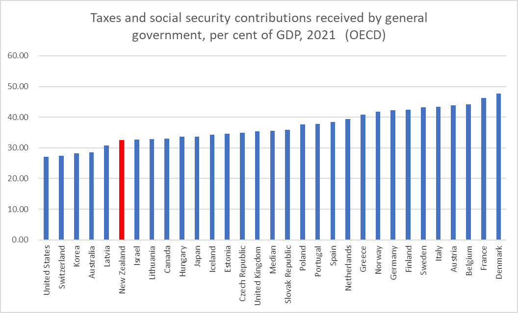
A conversation about the similarities and differences between taxes and social security contributions – my son is studying economics – prompted me to head off to the OECD website and get the data on total taxes and social security contributions as a share of GDP.

Here is what I found for 2021 (the OECD didn’t have this level of data for its Latin American members, and I omitted Ireland and Luxembourg, as their GDP numbers aren’t a suitable basis for these purposes).

That is the snapshot for the most recent year, 2021, and here is how New Zealand has compared to Australia and to the OECD median (countries in the first chart) for the period back to 1995 when the data are comprehensive.

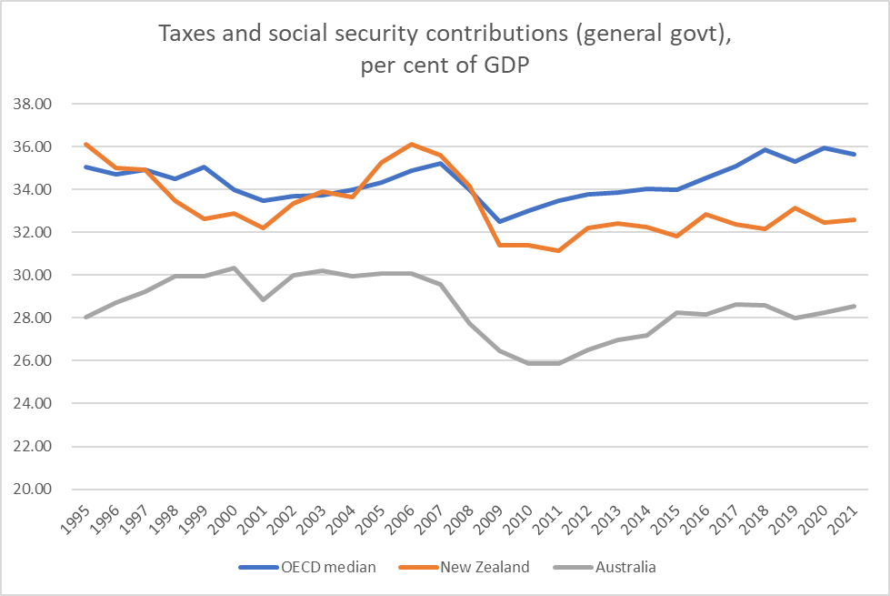
To be honest, I was a little surprised. I guess time passes and impressions need updating from time to time: the story I had been walking around with (probably formed a decade ago) was that New Zealand tax revenue as a share of GDP fluctuated around the OECD median. It used to but, whether under National or Labour-led governments, it hasn’t done so for some time now. It isn’t that taxes are trending down in New Zealand – as a share of GDP in 2021 they were about the same as in the first couple of years of the Clark government but (a) the contrast with huge surge in tax revenue in the 00s is striking, and b) the OECD median has been edging up.

Of course, Australia is an important comparator, given the number of New Zealanders who look at making – and often do make – the move to Australia, and there is not much consistent sign of a change in the relationship between the two countries’ tax/GDP shares. And the Anglo countries have tended to be lower taxers than continental Europeans, and of the five Anglo countries we were the median taxer in 2021. Whatever one thinks of the US, Australia is hardly some unliveable hellhole (certainly the New Zealanders who move there don’t think so), although neither is it some star productivity growth performer.

Opposition parties seem to be making a fair amount of noise about tax as we begin to head towards next year’s election. And in many respects I sympathise: I find it hard to think of a single one of the tax increases put in place in recent years that I thought there was a good economic case for, and the fiscal drag that results from not indexing income tax thresholds is just bad policy at any time. We tax business too heavily, whether under National or Labour.

But…..you have to identify the things you don’t want governments spending money on, and that is where our main Opposition party seems to struggle.

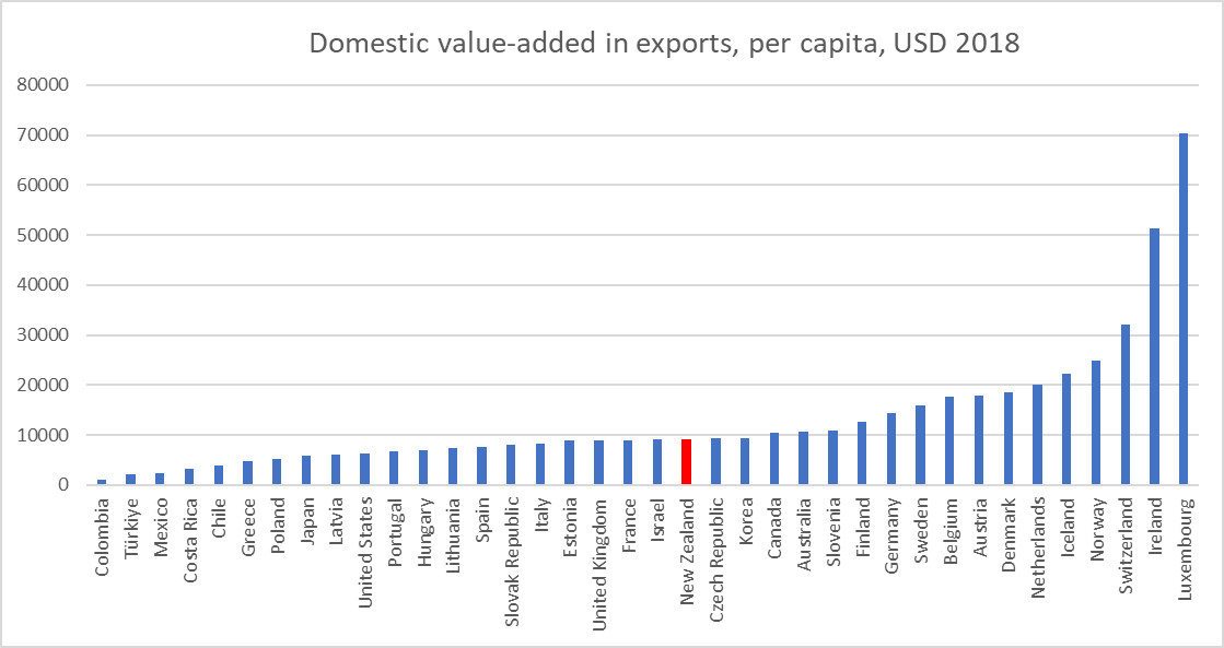
The picture is, if anything, a little more stark if we shift from taxes and social security contributions to total current revenue. Natural resources owned by the state are part of the picture here (see Norway in this chart vs the first one above)

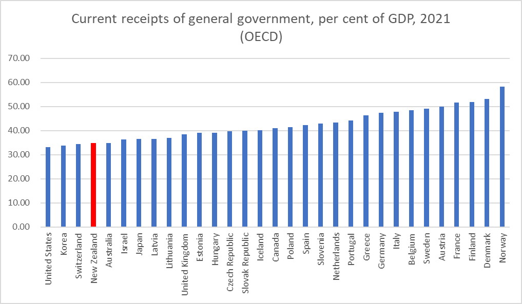
On this measure, we are even more firmly to the left of the chart.

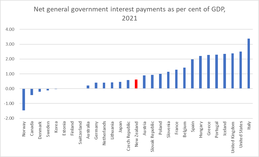
(Incidentally, there is a line – that I probably thought had merit – that we don’t need quite such high taxes because our public debt is low. But the OECD database had net interest data, and we turned out to have been the median country last year. (Low central government debt, but persistently high relative interest rates I guess)

All this data has been taken from the OECD. There is some IMF data, and for a wider range of advanced countries. I don’t put a great deal of trust in the IMF numbers (too often I find NZ numbers that look odd), but they do capture places like Singapore and Taiwan.

But here is the IMF’s total general government revenue data, for 2021

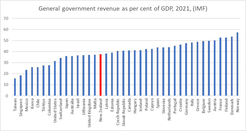
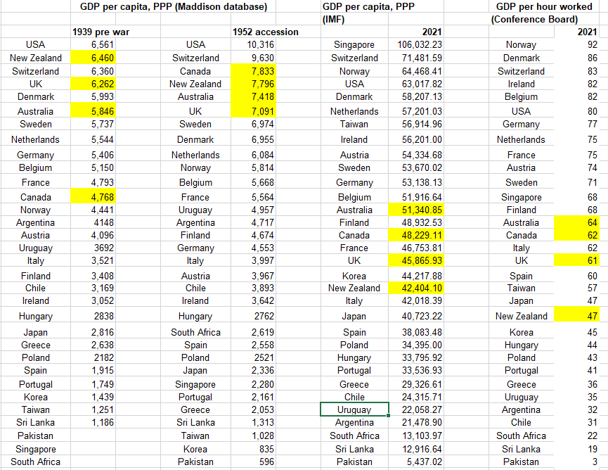
On this measure and this group of countries we are somewhat further from the left. And if (like me) you aren’t overly interested in underperforming Mexico, Chile, and Colombia, note nonetheless the really low revenue/GDP numbers for Taiwan and Singapore. One can have a highly productive economy (both countries now have materially higher GDP per capita than New Zealand) with a materially low overall share of government revenue and/or taxes.

I focused on taxes in this post because (a) that is where the political debate seems to be, and (b) because in 2021 government spending was much more thrown about by Covid one-offs than tax revenue was. In the longer-run, it is the level of spending that determines how high taxes eventually will need to be. Over the recent decades New Zealand governments have had a good record of returning to balance or surplus whenever shocks push the budget into deficit (which means we are one of a minority of OECD countries like that, and very unlike say the US and UK where deficits have been normalised). But note that – with an overheated economy, and thus cyclically high revenue – we are not projected to be at balance or in surplus this year.

(And to anticipate questions as to what I would cut were I granted a magic wand, here are the first five that come to mind: Kiwisaver subsidies, fees-free first year tertiary education, R&D subsidies, the accommodation supplement (having freed up peripheral land and collapsed house/land prices), and NZS (raise the eligibility age to 68 in the next five years not the next 25). But realistically I do not expect New Zealand wil operate with a lower tax or revenue to GDP share than it has now.)

Rodger Finlay: The Treasury’s incident report

Regular readers will recall that since June I’ve been on the trail of events surrounding the appointment of Rodger Finlay as, first, a “transitional board” member (attending actual Board meetings) and then a full Reserve Bank Board member, at the same time that he was chair of NZ Post, the majority owner of Kiwibank, an entity subject to Reserve Bank prudential regulation and supervision. From 1 July, the new Reserve Bank Board had legal responsibility for all the powers the Reserve Bank had on prudential policy and implementation. Finlay’s term as NZ Post chair was due to expire on 30 June, but processes were in train that saw Cabinet reappoint him on 13 June.

The most recent post was here. The story gets a little complicated, and there have been various documents (from the Minister of Finance and from The Treasury), and comments from the Minister or his office reported by the Herald. From that 31 August post

In the earlier documents, it was noted that the Secretary to the Treasury had asked for a report from her staff as to what had happened, how, and what if any process changes needed to be made. That report was released to me this afternoon and is here.

Treasury incident report on Rodger Finlay conflicts and appointments

This was the first stage

It reflects very poorly on The Treasury staff concerned (Treasury is after all responsible for monitoring reviewing the Bank), the Reserve Bank Governor and Board chair (who seem to have been more interested in some legalistic narrow definition than in either appearances or substance), and the interview panel, including the head of the Australian Prudential Regulatory Authority who, if the issue came up as Brian Roche says, should have been making the point that it should be unacceptable to have the chair of the majority owner of a bank sitting on the board of the prudential regulatory authority.

As I’ve noted before, it reflects poorly on Finlay too, who signed an application stating that he had no conflicts.

Treasury goes on to note that they did not advise the Minister of the potential conflict issue so that he could make his own informed choice, and nor were other political parties (who had to be consulted) advised.

They go on to note that in the process of planning to reappoint Finlay as NZ Post chair (a process that ran for some months) the issue of the potential conflict was also not advised to ministers.

And then we get this

I guess it is encouraging that Finlay belatedly raised the issue, even if he then let the bureaucrats convince him there wasn’t an issue.

Then there was this

From context, Project K is clearly the scheme to have the Crown buy out the existing (Crown bodies’) shareholdings in Kiwibank. Again, it is perhaps encouraging that Mr Finlay again broached the issue of potential conflicts. It also makes sense of this from the minutes of the RB “transitional board” on 9 June (which I had been puzzling over).

and the story rounds off here (Cabinet having made the NZ Post appointment on the 13th)

Which, as these things seem so often to do, again sheds particularly poor light on Grant Robertson as Minister of Finance, who was apparently totally unbothered by the actual or perceived conflicts even when Finlay himself had raised the issue – not even to accept the offer from Finlay to stand down from NZ Post until the Kiwibank deal was resolved (although as the RB was the regulator, if he was really serious he should have sought to take leave from that Board).

The report sums up

All of which is no doubt true, but it isn’t only (or even primarily) The Treasury’s reputation that should have been damaged by this (even if I now look on Finlay himself a little more charitably).

Anyone interested can read the rest for themselves, including the multi-page note on process improvements.

UPDATE:

It also reflects poorly on Robertson that (extract from my previous post) it is pretty clear that he actively misrepresented the situation to the Herald’s journalist.

Appointing an MPC

In my post yesterday I noted in passing that the Reserve Bank Board’s Annual Report had made no mention of their decision to recommend during the year the reappointment of two external MPC members (Bob Buckle and Peter Harris), notwithstanding the huge issues there appeared to be (inflation, and large monetary losses) around the handling of monetary policy. Perhaps it made sense to reappoint them, but the Board gave the public no sense of their reasoning or of what effort they had made to understand the contributions Messrs Buckle and Harris had made. Perhaps, after all, they had fought valiantly but fruitlessly to hold back the Governor’s excesses? (ok, just kidding, but you never quite know).

And then I remembered that months ago I had lodged an Official Information Act request with the Minister of Finance

and had not done anything with the response I had received in June.

There was 44 pages of material, but not very much insight on the externals (a fair amount of material related to the appointments of internal MPC members – the egregious Karen Silk appointment (having become Orr’s deputy for macro and monetary policy with absolutely no evident subject expertise or experience), the strange six month interim appointment of Adam Richardson, and then the uncontroversial appointment of Paul Conway, the new chief economist).

The reappointments of Buckle and Harris were not announced until February, shortly before their terms expired. However, it turned out that the Minister had accepted the recommendation from the Board back in October.

We don’t have the Reserve Bank report (my request was for 2022 material) but someone else requested the Board minutes from late last year, which are on the Bank’s website. In the minutes of the October 2021 meeting we find this

There is no sign of a paper, no sign of any re-interviewing of Harris and Buckle by the Board, no nothing. What is does reveal is a point I’ve been making since the 2018 reforms were passed that in this model it is the Governor who retains the utterly dominant position, even though formally the recommendation to the Minister comes from the Board. The best way not to get any awkward members on the MPC, anyone who might from time to time challenge a Governor, is to allow the Governor himself to recommend not just which staff should be on the committee, but which externals too. You will recall that in any case, Orr, Robertson and Quigley had previously agreed to bar from consideration anyone with an active ongoing interest in monetary policy or macroeconomic analysis and research (a prohibition that Robertson restated earlier this year).

We know – he keeps telling Parliament, the Board, the public – that even now Orr has no regrets about the handling of monetary policy. I guess that was even more so this time last year, when he was clapping his colleagues on the back and arranging for them to be reappointed. This was Orr and his then chief economist at the September 2021 Board meeting.

The complacency is almost breathtaking.

But that was September/October. The Minister of Finance did not take a paper to Cabinet’s Appointment and Honours Committee, advising his intention to make these reappointments, until February, but there is no sign of any greater scrutiny or reconsideration or questioning, even as the dreadful inflation outcomes emerged and the financial losses mounted. The relevant memorandum isn’t long (just a couple of pages). It has no discussion at all of the Bank’s handling of monetary policy or the contribution these external MPC members had made to undesired outcomes, no mention of the blackball on expertise, no consideration of fresh blood, but……..priorities priorities…..

Ah, and people wonder how Karen Silk came to be appointed……(between sex and her climate change enthusiasms).

In fairness, there was a sentence each about Buckle and Harris. Of Buckle APH was told

That would be welcome if true – and to be clear, Buckle is the least unqualified external MPC member – but of course neither we nor APH have any evidence of it. Buckle is barred (by the research blackball) from any ongoing work, has no particular academic history in monetary policy – more time series macro and tax – has not made a single speech in his time on the MPC or given a substantive interview, has never dissented from an MPC decision (members are in principle free to do so), and there has been no sign in the minutes of any distinctive scholarly insights or perspectives. But Adrian told the Board he was a good bloke, and the Board told Robertson, who told his colleagues. More likely, Buckle is an establishment figure who makes the odd geeky point and, most importantly, doesn’t rock the boat. After all, it is only 7.3 per cent inflation and $9 billion of losses on his watch.

What of Peter Harris, former political adviser in Michael Cullen’s office?

That first sentence is almost demonstrably empty. Harris had had almost no professional background in monetary policy ever. He too has given no speech, has never dissented, and has given one brief and unenlightening interview.

(One of the mysteries of these reappointments is that Harris was reappointed for only 18 months. It does make sense to stagger appointments, and people can only serve two terms, but the APH paper sheds no further light on why Harris’s appointment is set to expire on 30 September next year, most likely in the middle of the election campaign. 31 March 2024 would have seemed much more sensible.)

The following month there is a further APH paper re the internal MPC appointments (although there is an e-mail exchange suggesting it may never have been lodged). I’m not going bother with the overblown spin supporting the Richardson appointment (which was just interim), but here is how The Treasury and the Minister tried to bulk up Karen Silk’s qualifications for being on the MPC, making major macroeconomic stabilisation decisions for the next five years.

In other words, no relevant background at all. And she is the most senior person in the Bank (the deputy chief executive) responsible for its monetary policy and macroeconomic functions (there is the Governor of course, but he has the whole Bank to run, financial regulation etc).

I suppose that in a way one might almost feel sorry for Robertson: he couldn’t very easily refuse to appoint to the MPC the person Orr had chosen as his macro deputy, but…….Robertson appointed the Board, including the Board chair, and appointed Orr in the first place, and has never shown the least interest in holding the Governor, the Bank, or the MPC to account.

Ah, and of course that “representativeness” paragraph was there again

No mention of course that actual ongoing expertise is a disqualifying consideration, at least for the externals.

What of the future?

On that point, there was a mildly interesting snippet in the minutes of the very last meeting of the old Board, in June this year. They had a non-executive directors-only discussion, and for once recorded some of the material. In part that was to document their conclusion – for the Annual Report – that the MPC had done just fine, but there was also the bit I’ve highlighted.

Perhaps at the very end they were coming to regret going along with the Orr/Quigley/Robertson research blackball? By then, of course, a few days before their terms ended and their Board disbanded, their views counted for little (less than previously), but I suppose it was better than nothing.

With an even less-qualified Board, whose prime responsibilities are for other matters, we can only wait apprehensively to see what sort of names they come up with – no doubt led by the Governor, looking for tame members above all (at least if Orr is reappointed) – next year and beyond.

Oh, and in case you were wondering about the (previous) Board’s scrutiny of the external MPC members, there was also this in those June 2022 minutes

Not only is there no record of the substance (almost certainly a breach of the Public Records Act) but note the reference to an annual meeting. Presumably the previous one – the only one preceding the recommendation to reappoint – was around last June, when we can be almost certain no hard questions will have been asked (given the general complacency at the Bank at that stage).

It really isn’t good enough. We have a weak Board (old and new), under the thumb (at least on monetary policy) of a Governor who displays little expertise or interest in monetary policy, really dislikes alternative views or challenge, reappointing with little serious scrutiny external members who are barred from active, ongoing or future research or analysis, and who never seem to either speak or vote in ways that might establish some accountability. All involved share responsibility, but the prime responsibility rests with the Minister of Finance whose creation this system is, whose appointees these people are.

The clock is now ticking on the matter of Orr’s reappointment (or not). There are so many counts on which he should not be reappointed – not least of which is establishing some accountability, of the sort which might reasonably see few global central bankers reappointed at present (but a point warranted more for Orr than most, given his strong “I regret nothing” claims) – but it is now little more than five months until Orr’s term expires. Had he been told he would not be reappointed, or himself decided to seek greener pastures to pursue the things he seems really interested in, you’d think that would have to be announced very soon, if only to enable a proper search process for a replacement (there being no single obvious outstanding candidate to replace him).

Accountability document with no accountability

Decades ago when I was young Reserve Bank annual reports were – uninteresting accounts aside – mostly a bit of an essay on the economy (I got to write some of 1984’s and if I recall correctly one sentence survived to publication). Since the Bank had no independent authority over anything – power rested with the Minister of Finance – that model of Annual Report made a certain amount of sense. If there was any “accountability” involved, it was mostly about judging the fine line involved in offering some analysis without at the same time unduly upsetting the Minister of Finance. (The Bank was, at least in principle, accountable for analysis and advice offered to the Minister, but nothing much of that ever saw the light of day, the then recent innovation of the OIA notwithstanding).

These days, of course, the Reserve Bank is a power in the land, conducting monetary policy (with considerable discretion, but within the broad Remit set by the Minister of Finance), setting much of prudential regulatory policy (and implementing it all, with non-trivial discretion), and so on.

In recent years, both the size of the institution (staff numbers) and the size of the Annual Reports have both been growing rapidly.

The 2017 Annual Report was the last one pre-Orr.

But with all the people and all the pages, any serious sense of accountability and accounting for performance, seems to have diminished almost to the point of invisibility.

Over the years of this blog, I’ve written a series of posts about how the Reserve Bank Board – existing, per statute, primarily, to hold the Governor and Bank to account – had almost completely abdicated that responsibility. Twenty years ago Parliament required them to publish an Annual Report, and the hope had been that it might help, just a little, to sharpen accountability. Instead, the reports proved to be little more than show, mostly apparently designed to provide cover for management, rather than scrutiny and accountability for the public, the Minister, and MPs. Occasionally they showed signs of doing a slightly less bad job, but this year in their final report (the old Board and the old governance model were disbanded from 1 July) they slumped to new levels of quiescent inactivity. Perhaps – being about to head out the door – they no longer cared much, but since the chair (and one other member) were being carried over onto the new Board that shouldn’t have been an acceptable excuse for the contempt for the public that their silence and passivity display.

The full Annual Report is here. The Board’s report is on pages 6-9.

Over the last year, inflation has blown badly beyond the target range set for the Bank and the MPC. On the Governor’s own telling, that is so even if one focuses on the range of core measures. The deviation from target is by far the largest seen in the now 30+ year history of inflation targeting (and as a forecasting error would have been large even by the standards of earlier decades).

At the same time, the Bank’s speculative punt on the government bond market – the LSAP – turned very sour, and cumulative mark-to-market losses on the position are now in excess of $9 billion. The losses don’t fall to the Reserve Bank’s account – the government provided an indemnity upfront – but the losses (2.5% of GDP or so) were directly resulting from choices made by the Reserve Bank, the body the Board was responsible for monitoring and holding to account.

Oh, and during the year, two of the external MPC members were reappointed (by the Minister, on the recommendation of the Board). Given developments on the watch of those members (see above), you’d have hoped that some searching questions were asked, and some serious analysis and review undertaken by the Board. The Board might even have explained why they recommended one member’s renewed term should expire in the (likely) middle of next year’s election campaign.

As it is, not one of those issues was mentioned in the Board’s Annual Report. There is a full page devoted to monetary policy, and not once is inflation (or price stability, or the target band, or any cognate words) even mentioned. Just this

We learn that they looked at lots of papers, but nothing at all as to how they reached a conclusion that the MPC had adequately done its job (there might be a reasonable case to make, but they don’t even try).

The massive losses to the taxpayer get not a mention (again, perhaps there is a case to be made that – as the Governor claims – the benefits mean the costs were worth it), nor the reappointment of the external MPC members.

So no sign of scrutiny, no accountability. But if we heard nothing at all from the Board on such matters of substance, where the Bank has legal responsibilities, the Board was apparently keen to have us know of its other interests

But even then, no sign of evaluation, no sign of challenge? Not even (say) a suggestion that if there is going to a Central Bank Network for Indigenous Inclusion – the case for which is very far from obvious – perhaps the central banks of places like Iceland, Ireland, Poland, the UK, and France might be invited to join.

Reading this bumpf brought to mind this extract I spotted in a recent OIA release of Board minutes from a few months ago

So notwithstanding the limited tasks that Parliament has actually assigned to the Bank, the Board (which includes the Governor) thought it important that they shbould be free to used taxpayers’ time and money to decide their own priorities on things they have no statutory responsibility for. A platform for the interests and ideologies of management and board members (and recall that hardly any of the new and more powerful Board have any relevant expertise on subjects the Bank is actually responsible for).

Of course, it has long been easy to scoff at the old Board. Perhaps they were in an awkward position – most had little relevant expertise, they had no independent resources, and management controlled the papers they saw – but they still took the job (and the modest emoluments) without actually doing the job.

What of management who were, in effect, responsible for the remaining 150 pages of the report (of which much is the accounts)? (“In effect” since the new Board had legal responsibility, but hadn’t been around during the year under review).

The Governor never wastes an opportunity to claim that the Bank is very transparent (it is anything but) and so of course you’d suppose that in his Annual Report, in a year when monetary policy outcomes were so poor (inflation) and expensive (LSAP) there would be an extensive and nuanced treatment of the issues, making the best case no doubt for the Bank but at least engaging on the record. Well, no one who had ever watched Orr would actually expect that, but it is what one might have hoped for if accountability in the New Zealand public sector meant anything at all. It isn’t as if the Bank (or the MPC) has yet published much else serious on these issues, and the Annual Report is actually mandated by Parliament as a principal accountability document.

There are several sections where one might look for substance. This is the “year in review” bit on monetary policy (throughout the document you have fight your way through the tree gods imagery)

Under neither “key outcomes” or “key achievements” do actual inflation outcomes even get a mention.

There was this introductory section, about the environment they faced

It devotes one sentence to the biggest deviation from target in the history of NZ inflation targeting, but even then simply notes the fact.

And then right upfront there is the Governor’s own two-page statement, where this is all there is on monetary policy and inflation. You’d barely know from this that inflation was an outcome for which central banks were responsible, and that New Zealand inflation was an outcome Orr and the MPC had been responsible for.

No analysis, no reflection, no accountability.

Things aren’t much better on the LSAP losses, and the large bet on the bond market that is still open now. The losses do get a mention deep in the Financial Overview (they are a legal financial claim on the government) but there is nothing of substance in the policy sections, and they have the gall to run a “Balance Sheet Optimisation” section near the front of the report, which doesn’t even mention the scale of the bet ($50bn or so) they are continuing to take on future New Zealand bond rates.

By contrast, there are two pages on matters Maori (bear in mind that the Bank’s instruments – monetary policy and banking regulation – are whole economy ones, not differentiating between Catholics, Greens, lefthanders, stamp collectors, or….or…or Maori). And endless references to climate change. Eric Crampton did the comparison

Accountability – in the face, this time, of huge deviations from desired outcomes (whether the inflation or the losses) – is non-existent. The Bank is presumably confident it can get away with all this because there is no sign that the government cares either. Neither party is doing its job.

We’ve heard previously Orr boldly claim that he regrets nothing about the last couple of years. There is an arrogance to it that is almost breathtaking. Here, on which note I’ll stop, is the Reserve Bank Board minutetaker’s record of Orr articulating the same story to the Board itself in May

(Even that latter claim has now been overtaken by events as they now recognise that core inflation is even higher than they thought then).

No regrets…..not for the arbitrary redistributions of wealth (which is what unexpected inflation does), not for the grossly overheated labour market which itself has collapsed businesses and livelihoods, and not for the coming (and most likely) recession required to squeeze core inflation back out of the system.

Nothing.

Where will the OCR be in 10 years?

I don’t want to comment extensively on yesterday’s Reserve Bank announcement. It may prove to be the right call (or not), but in the data hiatus – 2.5 months since the last CPI, two months since the latest HLFS – they are to some extent flying blind (New Zealand really needs more frequent and timely key official macro data), and it would have been better to have rescheduled the announcements (adding one) as suggested in my post the other day. And the very brief, almost passing, mention of having considered a 75 basis point increase – which would have made a lot of sense this time last year – highlights again just how non-transparent and non-accountable New Zealand’s MPC is, We don’t know whether, in the end, any of the members actually favoured a 75 basis point increase, or did the Committee just toy with the idea briefly so that they could put a hawkish reference in the minutes? In places like the UK, Sweden, and the US we would have much greater clarity, and potential accountability – and potential accountability focuses the minds of decisionmakers who can, under the New Zealand system, collect their fee, turn up for lunch, and never have to do or say anything.

But looking for some other data I remembered an email from the Reserve Bank statistics group a few weeks ago indicating that they were finally going to publish some of the new data from the Survey of Expectations that they have been collecting for the last couple of years.

The survey has long asked about expected near-term policy rates (previously the 90-day bill rate as proxy, more recently the OCR) but in 2020 they added two new questions, asking respondents where they thought the OCR would be in 10 years’ time (describing that as a proxy for a neutral rate), and what they thought the average OCR would be over the next 10 years. I thought they – and especially the first question – were good additions to the survey (if we could get individual MPC members to give us their numbers, akin to the Fed’s dot-plot it would be even better).

Anyway, here are the results (despite the extraneous labels Excel added in these are quarterly data, beginning with the Sept 2020 quarter)

The blue line (expectations for the neutral nominal rate) really took me by surprise. The first observation would have been captured around the end of July 2020 (I filled mine in on 20 July), and the second three months later, about the time long-term bond yields reached their all-time lows (and talk was of a possible negative OCR in 2021). And yet responses in the last couple of surveys aren’t much different – 2.42 per cent in the September 2022 quarter and 2.43 per cent in the September 2022 quarter. If you’d asked me to guess before the question was instituted, I’d have expected a much more cyclical series of responses (consistent with the variability we see in implied forward bond yields). And since the question is about nominal rates I wouldn’t have been very surprised now to have seen expected future nominal rates rising even if the real rates respondents had in mind weren’t changing much (core inflation undershot the target midpoint for the last decade, but perhaps it won’t in future).

The orange line is much less surprising. Back in 2020 there was a general expectation that the OCR would be very low for several years. As it became apparent that wouldn’t be the case, naturally the average expected over the subsequent 10 years tend to rise (and the intense pandemic period passes out of the 10-year window too).

Both questions are about nominal rates. But the same respondents are also asked about their inflation expectations for periods one, two, five and ten years ahead. In this chart, I’ve taken the nominal responses (previous chart) and adjusted them for respondents’ inflation expectations: the 10 year ahead expectation for the blue line, and the average of the two, five, and 10 year ahead expectations for the orange line.

For what it is worth, this group of respondents still think the longer-term neutral real OCR is just barely positive, and their view has hardly changed since near the worst of the Covid shock (first observation), despite the recent huge upsurge in (core) inflation. Average expected real OCRs have increased this year as the OCR has been raised much more rapidly than was expected a year ago.

I don’t have a strong view on whether respondents are right or not (and, on checking, my own responses to the survey questions haven’t been consistently different from the average).

But…..these survey respondents seem to have very different views from the future rates implied by market prices.

In this chart I’ve taken the yields on the Sept 2030 and Sept 2035 government indexed bonds and backed out the implied real rate for the five year period between Sept 30 and Sept 35 – a period which encompasses the 10 years ahead OCR question for the period the Bank has been running the survey.

At the time of the most recent survey, respondents thought the real OCR 10 years hence would be about 0.3 per cent. At around the same time, the market prices suggested an implied future five year real bond rate of around 2.75 per cent. Sure there would usually be a term premium between OCR and a five year rate, but it wouldn’t typically be anywhere near that large. And our indexed bond markets aren’t the most liquid in the world, but the implied future rates in the chart don’t seem particularly out of line with (for example) implied future nominal government bond rates (using the May 2031, May 32, and Apr 33 bonds all currently yielding a little above 4 per cent), suggesting implied future nominal rates much higher than the 2.4 per cent (or thereabouts) survey respondents expect for the OCR 10 years hence.

I don’t have any answers to offer as to who is going to be proved right – most probably neither (there will be cycles next decade too, as well as whatever structural shocks might unfold) – but it is interesting to see such large gaps between survey responses and market prices. And kudos to the Reserve Bank for collecting (and belatedly publishing) the survey data.

Once an export (and import) powerhouse

We’ve been having a bit of conversation at home – my son doing a NZ history paper at university and me reading yet another old book – about the line that pops up in almost any old book about the New Zealand economy, that New Zealand once (pre-war) had consistently the highest exports (and imports) per capita of any country.

It isn’t really a surprising statistic. All else equal, small countries tend to sell abroad a larger share of their output than large countries (there isn’t much market at home and the world, by contrast, is big). And rich and productive countries tend to do more per capita of every component of GDP. 80-100 years ago we were small and we were rich – on standard comparisons, inevitably limited as they are, among the two or three richest countries on the planet.

All else equal, we also know that countries that are more physically remote do less foreign trade than those that are close to others – one of the costs of distance. New Zealand was (of course) very distant, but so successful was this small country/economy that our exports/imports were very high anyway.

I’ve done posts here (eg here) in years past comparing exports as a share of GDP more recently, but this time I thought I might just do the same raw comparison the old books did and look at exports per capita (imports per capita on average over time will show very similar pictures). Since Covid and border closures messed up trade in foreign travel (in particular), here I’m showing 2019 numbers for OECD member countries (Luxembourg is literally off the scale, which I’ve truncated for better readability).

Not only are we nowhere near the top of the table, we are now quite near the bottom. All the countries below us are either (and mostly) much much bigger (even Australia has five times our population) or much much poorer (Colombia, Chile, Costa Rica, Mexico).

That chart is mostly for the simple comparison with decades past. These days, much more than in years past, gross export numbers for many countries – and especially those close to neighbours – include a large imported component. A car that counts as a German gross export will typically include a lot of value that was actually added in nearby countries (Poland, Slovakia). The OECD has collated data that adjust for this effect, calculating the extent of domestic value-added in a country’s gross exports. It takes time to get that data together, so the most recent numbers appear to be for 2018.

(And here I would ignore the Luxembourg numbers, because much Luxembourg economic activity uses a labour force that works but does not live in Luxembourg)

On this chart, New Zealand does better, being just above the median, but it shouldn’t be much consolation. The only one of the really rich and productive OECD countries to the left of us on the chart is the US, which has by far the biggest domestic market. Big countries all else equal will typically do less foreign trade per capita and as a share of GDP than small ones. There are small countries to the left of us (Portugal, Hungary, Lithuania, Slovakia, and Estonia), but if most of them have had more impressive productivity growth performances than New Zealand this century, that has only brought them to about New Zealand’s distinctly mediocre levels of average productivity.

By contrast, the small countries that now really count as OECD productivity success stories – Sweden, Belgium, Austria, Denmark, Iceland, Norway, Switzerland, Ireland, and Luxembourg – all export far more domestic value-added than New Zealand does. As far as we can tell, that wasn’t the case when New Zealand was once of the richest countries on the planet.

To be clear, exports aren’t good or superior for their own sake, but really successful small countries/economies tend to be ones with firms that successfully sell lots of stuff to the rest of the world (and enjoy the purchasing opportunities from the rest of the world – high exports and high imports tend over time to go hand in hand).

The previous National government sort of had some inkling of this. They articulated a goal of getting gross exports up to 40 per cent of GDP (actual now nearer 25 per cent), but had no real ideas about the sort of economic policy that might lead to such a more successful outward orientation. It isn’t obvious that the current government – or today’s National in opposition – either know or care.

Towards this week’s OCR review

The Reserve Bank’s MPC will deliver their next OCR decision on Wednesday. The consensus seems to be (quite strongly, and I have no particular reason to differ) that the Bank will raise the OCR by another 50 basis points. At 3.5 per cent, the OCR would then be at the peak level it was (inappropriately) raised to in 2014, at a time when core inflation was well below the target midpoint and the unemployment rate was lingering high.

I’m less interested in what the MPC will do than in what they should do, and on that count I’m less convinced that the consensus call would be the appropriate one. In times like the last 2-3 years, no one should feel overly confident about any particular assessment of what monetary policy stance will prove to be needed: there is inevitably an aspect of feeling your way, knowing that when all the relevant data are available there is a fair chance you will be wrong one way or the other.

It isn’t the easiest situation in which to be making an OCR decision. We aren’t at the very start of a tightening cycle, rather the OCR has already been raised by 275 basis points since last October, and if that cumulative increase isn’t overly large by historical standards, the cuts in 2020 were also much smaller in total than in most prior easing phases (that would be so even if one included the 2019 cuts in a calculation). And most of the OCR increases have been really quite recent – it was only in mid April that the OCR was raised above the 1 per cent it had been when Covid hit, and we all know that monetary policy works with lags, often quite considerable ones.

But here, in some respects, the MPC has made a rod for its own back. At present, the most recent inflation data we have are for the June quarter. The midpoint of the June quarter (where the CPI is centred) was mid-May, a point at which (although more was expected over time) the OCR had only just been raised beyond 1 per cent. We’ll have the next release of the CPI on 18 October, and it would seem a great deal more sensible to have held off making the next OCR decision until then.

The annual cycle of OCR/MPS review dates was set a long time ago, and there used to be a view that the latest CPI didn’t often matter much so there wasn’t a particular problem with setting review dates just before the CPI release. But that was back in the days when the inflation rate was pretty stable (and low), not when it was well outside the target range, having been rising strongly (at least in annual terms for some time). It was even worse in July when the OCR review took place less than a week before the CPI was released.

Policymaking is suffering too from decades of underinvestment in macroeconomic data. Even when we get the September quarter CPI, that will have been centred in mid-August, and by then (eg) the United States will have had their September monthly data. I gather the Reserve Bank has now come round to wishing there was a monthly CPI – belatedly, since this was the same institution that frowned upon the idea 20 years ago when the then independent review of monetary policy, undertaken for the then government, by a leading overseas economist, highlighted the omission and recommended remedying it. Same goes for most of the labour market data: the June quarter data (latest we have) is centred (again) on mid May (although the new monthly employment indicator does represent some improvement in the New Zealand data in this area). We really need to be spending a bit more to get good quality monthly CPI and HLFS data, as almost all other OECD countries have. As it is, combining poor data with a weak MPC is not a recipe for good, robust, and trustworthy monetary policymaking.

And not too far down the track we will face again the MPC’s extended summer holiday, with no review of the OCR at all in the three months from 23 November to 22 February. That long holiday last summer almost certainly contributed to the OCR being increased more slowly than it should have been.

If it were me, I would have been postponing next week’s OCR review until a few days after the OCR review, delaying the next MPS until early December, and scheduling an additional OCR review at the end of January (after the December CPI data are available).

As it is, on the data we actually have to hand, I’m sceptical of the case for a 50 basis point OCR increase right now.

Some of the straws in the winds?

First, there was the relatively weak nominal GDP growth for the year to June (most recent we will have for quite a while yet) – the June quarter was 5.9 per cent higher than the June 2021 quarter, among the very lowest growth rates facing advanced country central banks. Nominal GDP is considerably easier to measure than real GDP, and is a relevant consideration in thinking about appropriate monetary policy.

Second, asset prices have been falling quite considerably. I’m not a great believer in wealth effects from house prices, but materially lower house prices will blunt the incentives for developers to continue to put in place new houses, and residential investment is one of the most cyclical components of the economy. There is a stronger argument for wealth effects from share prices, and share prices have also fallen back (eg the NZSE50 is below immediately pre-Covid levels), also dampening incentives for firms to undertake new business investment.

Third, if international New Zealand export commodity prices aren’t exactly weak, they are nothing like as strong as those in Australia (ANZ and RBA series respectively in the chart).

And then there are the core inflation measures. Much of the media and political attention has been (perhaps understandably) on the annual rate of inflation (complete with petrol tax cut distortions). That annual rate may well have fallen back a bit in September (petrol prices and all that), but it shouldn’t really be the focus. Ideally, we want to look at quarterly core meaaures – indicators of what is happening behind the headline “noise”. (And here the Reserve Bank’s factor model measures aren’t very useful, since they work on annual change data and thus often in effect function as lagging indicators in the face of big changes, even if they probably often provide the best medium-term and historical view.)

Here are the trimmed mean and weighted median measures (note that you cannot just multiply these by four to get an annualised rate)

and here are a couple of SNZ exclusion measures (CPI ex food and energy is most often used for international comparisons, simply because of data availability)

and here is one I’ve quoted a few times over the years, focused more (at least in principle) on the more domestically-generated bit of underlying inflation

Remember that all of these series are capturing prices as they were in mid-April, just short of six months ago.

There are a few potentially useful official monthly series. I’ve long kept an eye on these two from the Food Price Index

and there is the monthly rental data

Every single one of these series show a (not unexpected) trough in quarterly inflation in the June quarter of 2020 (the first, out-of-the-blue, “lockdown”). But more than a few also suggest that the sharpest increases in the inflation rate were occurring a year ago (perhaps 12-18 months on from the biggest fiscal and monetary stimulus), and that since then the quarterly inflation rates have been (high but) fairly stable or, on some measures have already fallen back a bit. And most of the most recent observations date from a time when the OCR was only just getting past 1 per cent.

If any hawkish readers are wanting to jump down my throat, can I take the chance now to stress that none of these inflation rates – from months ago – should be considered remotely acceptable. They are miles above the 2 per cent annual inflation the Reserve Bank is supposed to focus on delivering. We want inflation much lower than is evident in the most recent data.

But, again, monetary policy works with lags. And those lags may be particularly important to keep in mind when, as this year (and of necessity given how slow all central banks were to start) policy rates have been raised so sharply and quickly. Perhaps also relevant was the point in this nice post from a few days ago by Maurice Obstfeld, formerly chief economist of the IMF, highlighting that many advanced countries have (belatedly) been doing much the same thing, and those effects are likely to be mutually reinforcing. Recessions now seem unavoidable in a wide range of countries, and it isn’t clear that most central banks are taking other countries’ pending recessions into account in their own domestic policysetting.

As I said at the start of this post, only a fool would be overly confident about what monetary policy will prove to have been required over the coming year. And successful policy at this point will probably prove to have involved tightening at least a little more than, with hindsight, was strictly necessary. But on the data as they stand in New Zealand – long collection/publication lags and all – and if forced to make a decision this Wednesday (and the MPC is not forced to, the date is their choosing), I reckon there is a better case for a 25 basis point increase than for a 50 point increase. The key thing, of course, is to convey a sense that the MPC will do what it takes to deliver something near 2 per cent inflation before too long. But at this point it isn’t obvious that aggressive further OCR increases are really needed in New Zealand (Australia, the UK, or perhaps even the US may be in different positions, between even more belated starts to tightening cycles and positive shocks to demand from (eg) commodity prices or fiscal policy).

Decline and fall

I was always a bit ambivalent on the idea of a public holiday to mark the death (and life) of Her Late Majesty: there were (and are) better, cheaper, and more enduring things that could (have) been done. And the more so when the day chosen seems less to do with Queen Elizabeth (whose funeral and burial were a week ago) and more to do with the Prime Minister’s schedule. But here we are.

It seemed like a good day to potter in the old data and see how things went, in terms of relative economic performance, for the independent countries of which the Queen was monarch throughout her reign – the United Kingdom, Canada, Australia and New Zealand. Back in 1952 there were a few others – South Africa, Pakistan, and (as it then was) Ceylon. The other current realms (PNG, the Solomons, Belize, and so on) were not independent until later.

In the table below I started with Angus Maddison’s collation of historical GDP and GDP per capita (in purchasing power parity terms) estimates. I used the Western Europe and “offshoots” (NZ, Australia, Canada and the US), the east Asian countries that are now very prosperous (Singapore, Taiwan, Japan, and (South) Korea), included a few representative central European and South American countries, and included the other 1952 realms (South Africa, Pakistan, and Ceylon).

My main interest was comparing rankings from 1952 to those now. But if one starts from 1952, some people will make (not entirely unreasonable) objections about it being just after the war, and so the numbers may flatter countries that had little or destruction in World War Two, so I’ve also included 1939 numbers where (most cases) Maddison had them available. And for the most recent period I’ve included rankings for both GDP per capita and (my preferred focus) GDP per hour worked.

(UPDATE: This table replaces the original one in which I had inadvertently given Uruguay’s the US’s 2021 GDP and vice versa)

There are all sorts of extended essays one could write about relative growth performance over the decades/centuries for different groups of countries, but here my main interest is just in the four Anglo countries of which the Queen was monarch from 1952 until a couple of weeks ago. That picture is not a pretty one. 70 years ago all four countries were in the very top grouping, and these days not one of them is. Not in any way the fault of Her Late Majesty of course: she and her Governors-General act only on the advice of respective sets of ministers in each country, but a poor reflection on the countries concerned, and their successive respective governments nonetheless. New Zealand, sadly, has been by some margin the worst of them.

If I were inclined to be particularly gloomy – okay, I am – one could even note that the extent of the drop down the league tables for these stable democratic rule-of-law countries, isn’t materially different to the drop experienced by Uruguay, Argentina, and Chile, none of which enjoyed uninterrupted democratic governance over those decades. South Africa has had a similar drop down the league tables too.

I have my own stories about why most of the seven countries (Anglo and South American) have done poorly, but I don’t claim to have any particularly compelling tale about the UK and the extent of its continuing relative decline.

We deserve better

A few weeks ago there was the debacle of the government introducing one afternoon a bill that would have imposed GST on investment management fees, ministers defending that bill the next morning, but then by lunchtime the policy was gone.

The proposed law change seemed on the face of it perfectly sensible in principle. I even read the Regulatory Impact Statement that was published with the bill, and most of the reasoning and argumentation made sense there too.

But it contained this little section

Perhaps unsurprisingly, those big numbers got a fair amount of media and political attention. As an example, here was an RNZ story

I was a bit curious about this “modelling”, which was not published at the time the bill was introduced. It wasn’t described in the RIS, the numbers weren’t put in any sort of context, they were just baldly stated. Quite probably ministers don’t read RISs, but perhaps you might think that the political advisers in their offices would (looking for fishhooks and headlines if nothing else). And you might have hoped that officials (Treasury/IRD) might have done a bit more than drop big numbers into the RIS – numbers that might reasonably be seen as creating problems for a sensible rational tax reform – rather than just stick the numbers out there waiting for the first curious journalist or Opposition MP to find them.

My suspicion was that something very simple, and potentially quite misleading, had been done. After all, one wouldn’t normally look to the FMA to undertake any serious modelling (it is a regulatory implementation agency). So I lodged a request for the modelling, and got a reply back this afternoon.

It is a helpful reply. They have set out their assumptions clearly, and even offered that I could talk to the responsible senior manager if I wanted to discuss matters further.

And it was pretty much as I had expected. They had assumed (probably reasonably enough [UPDATE; but see below]) that all of any GST burden would be passed on to customers/investors, and thus that overall returns would be a bit lower. But then they simply assumed that all the additional tax went to the government, which sat on it, and neither the government nor the savers made any subsequent changes in behaviour……..over the subsequent 50 years. And thus, mechanically, future managed fund balances would be lower than otherwise (about 4.5 per cent lower)

It might be a reasonable approximate assumption for a first year effect. Just possibly it might even be valid for the KiwiSaver component, since KiwiSaver contributions are largely salary-linked. But it makes no sense over a 50 year horizon, across all managed funds (let alone all private savings) and especially as the only macro-like number to appear in the entire document.

Over a 50 year view surely it would be reasonable to assume that one modest tax change makes no difference to the fiscal outlook, and thus that what is raised with this tax won’t be raised by some other tax. Household income won’t really be changed, and since most of the evidence tends to be that household savings rates in aggregate aren’t very sensitive to rates of return (partly because there are conflicting effects – low rates of return on their own might discourage saving, but on the other hand people with a target level of accumulated savings in mind for retirement will need to save a bit more when returns are lower than they had previously assumed) neither will the overall rate of household saving. There is more sensitivity (to return) on the particular instrument people choose to put their savings in, so that if returns on investment management products are a little lower than otherwise, people might prefer, at the margin, to hold a bit more of some other assets. But what of it? Supporting investment management firms’ businesses is no part of a sensible government’s set of goals.

Surely the best assessment would have been that over anything like a 50 year view, a small tax change like this, affecting returns on one form of savings product, simply would not be expected to make any material difference to accumulated household wealth in 2070, with perhaps some slight change in the composition of household asset portfolios: a little less Kiwisaver, not much change in other investment management products, and a little more in other instruments.

The FMA were at pains to point out that they “had limited time to feedback to IRD as part of IRD’s policy consultation”, although it isn’t clear whether IRD/Treasury requested these numbers or the FMA took it upon themselves to do it. And thus in a way I don’t much blame the FMA. They tend to be enthusiasts for and champions of KiwiSaver, and simply do not have a whole-economy remit or set of expertise.

What disconcerts me is that neither IRD nor Treasury (the latter especially) seem to have been bothered by FMA’s numbers, and neither seems to have made any effort to provide any context or interpretation. There wasn’t any obvious reason why those FMA numbers had to be in the RIS, but if they had put them in with a rider “On the (unlikely) assumption that governments simply accumulate the additional tax revenue for 50 years and neither they nor households make any other changes in behaviour, then FMA ‘modelling’ suggests……”, it might have done materially less damage, through highlighting the sheer implausibility of the assumptions over a 50 year horizon.

Of course, you might also have hoped that ministers and their political staff would have noticed that something seemed odd.

What was proposed still seems as though it would have been a sensible tax change. Perhaps it will even happen one day. Perhaps it would have been derailed anyway, even if those FMA numbers – unqualified – had never made it into the document. But neither ministers nor officials really seem to have helped themselves.

UPDATE

A reader got in touch and suggested I might have been too generous in accepting the FMA view that all the GST would have been passed on to customers. With that reader’s permission, here are his comments

“Having owned a fund manager as part of a wider business, the GST exemption was a pain.  We could not recover GST on certain inputs and so therefore had to charge more – about 7.5% more because of this.  Plus we had an extra employee in the finance area that we could have got rid of.  It is not obvious to me that the fees would have gone up for this reason at all, except that the industry would probably have used it as an excuse to raise fees as it means that at some future point they could cut them and get a pat on the back from the FMA.”

A canary in the coalmine?

A couple of days ago, I put this chart and brief comment on Twitter

I added “I do not think nom GDP targeting is generally superior to inflation targeting for NZ, but recent outcomes (latest annual 5.9%) are at least one reason for a little caution about further aggressive OCR increases”.

There is a long history of people writing about nominal GDP targeting (it was being championed in some of the literature before inflation targeting was even a thing). I’ve written about it a few times (including here and here) and just this morning I noticed a new commentary from Don Kohn, former vice-chair of the Federal Reserve looking (sceptically) at some of the issues. No central bank has shifted to nominal GDP targeting (whether in levels or growth rates) but a fair number of people (including Kohn) will suggest that there may still be useful information in developments in nominal GDP – something to keep at least one eye on.

Almost every piece of economic data has been made harder to interpret over the last couple of years by Covid. In my chart, the eye immediately tends to go to the unprecedented fall (in 2020) and unprecedented rebound following that. But my eye next went to what wasn’t there: the most recent rate of increase (nominal GDP in the June 2022 quarter is estimated to have been 5.9 per cent higher than that in the June 2021 quarter) wasn’t at all out of line with typical experience in the last few decades. It is quite a different picture than we see with headline and core inflation measures. And although Covid has continued to affect economic numbers, last June quarter seemed relatively little affected by Covid here (the Delta outbreak was mid-August), and by the June quarter we were through the worst of the restrictions. Perhaps as importantly for what follows, the June quarter was pretty normal for most other countries too (and the June 2020 quarter was pre-Omicron disruptions).

One upside of New Zealand’s slow publication of macroeconomic data is that when our GDP numbers are finally published, pretty much everyone else’s are available for comparison. And although people often note (fairly) that nominal GDP numbers are published with a longer lag than inflation numbers, we are also now in the long New Zealand hiatus where it is two months since we last saw an inflation number, and another month until we get another one. The MPC makes its next OCR decision before that.

So how did New Zealand’s estimated nominal GDP growth for the year from the June quarter last year to the June quarter compare with the experience of other OECD economies? Here I’m focused on places having their own monetary policies, and so show the euro-area rather than the individual countries in that area. I’m also going to leave Turkey off my charts – mostly to keep them more readable, in a context where they are running a crazy monetary experiment and have recorded nominal GDP growth of 115 per cent in the last year.

Nominal GDP growth in (fairly low inflation) Norway went sky-high because the invasion of Ukraine etc has sent oil and (especially) gas prices very high.

But look at New Zealand: we had the fourth lowest rate of nominal GDP growth in that year among all the OECD countries (monetary areas). And two of those below us – Switzerland and Japan – had not only not eased monetary policy in 2020, but had spent years grappling with such low inflation they’d needed persistently negative policy interest rates.

Absolute comparisons like this can mislead a bit. Some countries have higher inflation targets than others – Chile, Costa Rica, Mexico, and Colombia for example target 3 per cent inflation, and have historically had somewhat higher nominal GDP growth rates consistent with those higher targets. But I could take the Latin American countries (poor enough that they are really OECD diversity hires) off the chart and it wouldn’t much change the picture as it affects New Zealand and the countries we often compare ourselves to. In Australia, for example, nominal GDP increased by almost 12 per cent in the year to June.

The last quarter before Covid was December 2019. Across the OECD as a whole (and in New Zealand) core inflation at the time was generally a bit under the respective (core) inflation targets, and many central banks had been cutting policy rates that year.

Here is nominal GDP growth (as now recorded – GDP revisions are a thing) for the same group of countries for the last pre-Covid year.

New Zealand’s rate of nominal GDP growth then was a bit higher than the median OECD country, perhaps consistent with the fact that our population growth rate was faster than those for most advanced countries. But our nominal GDP growth rate that year was also a bit higher than the average rate New Zealand had experienced in the previous decade or more. (Note Norway again; not even the staunchest advocates of nominal GDP targeting recommend it for countries with terms of trade shocks on that scale.)

The next chart shows annual growth in nominal GDP for the latest period less annual growth to the end of 2019. The idea is to see how much acceleration there has been (with the sort of lift in core inflation we’ve seen across most of the world all else equal one might expect to have seen quite a lift in nominal GDP growth).

Fair to say that New Zealand stands out somewhat. In the year to June 2022 New Zealand was the only OECD country to have had nominal GDP growth lower than in the immediate pre-Covid period. And if our terms of trade have fallen a bit in the last year, that was still in a context where (NZD) export prices were up 17 per cent in the most recent year, with import prices up even more.

I am genuinely not sure what to make of these pictures and the New Zealand comparisons specifically. If you look across that last chart you would have little hesitation in suggesting that a lot of monetary policy tightening (interest rate rises) has been warranted in the advanced economy world. For the median country, nominal GDP growth has accelerated by 6 percentage points. But in New Zealand, nominal GDP growth has slowed.

And if one were a champion of nominal GDP levels targeting, here is New Zealand’s nominal GDP over the last decade

Things have (inevitably) been bumpier in the Covid period, but there is nothing there suggesting things have gone off track in recent times (although the mix has changed, with less population growth and more inflation).

The usual fallback position when anyone invokes nominal GDP numbers is to note (entirely fairly) that revisions to GDP are very much to be expected. Perhaps we will find, five years hence, that nominal GDP growth in the year to June 2022 was really a couple of percentage points higher than SNZ currently estimate. That would be a pretty large change for a single year (as distinct from historical levels revisions as data collections and methodologies change). But – if every other country’s estimates didn’t change – one could revise up New Zealand’s rate of nominal GDP growth by 2 percentage points and we would still be equal lowest (with Japan – where they are still running avowedly expansionary monetary policy) on that chart showing the acceleration in the rate of nominal GDP growth.

Two other considerations are worth noting. It isn’t true that our Reserve Bank was particularly early in raising the OCR again – about six of these countries were ahead of them – but market interest rates had already risen quite a bit last year in anticipation and we had had one of the frothiest housing market during the Covid period, and are now somewhat ahead of the pack in seeing house prices and house turnover falling away. Even if – as I am – one is sceptical of house price wealth effects, housing turnover itself is one (modest) component of GDP. Either way, our subdued nominal GDP growth may be foreshadowing what could be about to happen elsewhere.

Monetary policy is avowedly run on forecasts – that would be true (or the rhetoric) even if one were targeting nominal GDP growth rather than inflation – and I guess it is always possible that we might see an acceleration of nominal GDP growth from here, that might support further Reserve Bank tightening from here. Perhaps, but it is difficult to see quite where this acceleration might come from.

I have been a little more sceptical than some in recent months of quite how much further the OCR is really likely to need to be raised, but I am not drawing strong policy conclusions from these data just yet. But they do seem like a straw in the wind that (a) warrants further investigation and (b) might make one somewhat cautious about championing further tightenings, especially in the absence of timely fresh inflation data. Subdued growth in nominal GDP is more or less exactly what one might expect to see if, with a lag, core inflation was already on track to slow, perhaps quite a bit.