The PRC and New Zealand: an Australian perspective

In response to my post yesterday about the Asia NZ Foundation roundtable on foreign interference/influence in New Zealand, I received this comment, which I’m elevating into a post of its own because of its source, and because otherwise only a small number of readers would now see it.

When officials are assuring you everything is under control, that’s the moment you know that everything is not under control. As a long-term New Zealand watcher I am deeply disturbed to see how the political and bureaucratic establishment in Wellington wants the problem of Chinese interference in domestic politics to be swept under the carpet.

The idea that the Australian debate on this topic is ‘unhelpful’ is simply ridiculous. Successive Australian governments have ignored the problem but now it has become so painfully obvious that Canberra has had no choice other than to take a stand and set some limits on Chinese Communist Party interference. I believe that a substantial reason why Canberra acted was because of the public focus on the problem.

China will continue to suborn the NZ political system unless your Government is prepared to push back. If the problem is not addressed in time this will become a serious problem for the NZ-Australia bilateral relationship.

My suggestion is that the Australian and NZ Prime Ministers should meet with their intelligence agency heads and have a frank, closed-door discussion about the extent of the problem of Chinese interference in both our countries. We can actually help each other here.

Pretending there is no problem, or failing even to utter Beijing’s name isn’t sophisticated statecraft, its just a failure to come to grips with a major problem for both our countries.

The comment is from Peter Jennings, who has been Executive Director of the Australian Strategic Policy Institute since 2012.

Peter has worked at senior levels in the Australian Public Service on defence and national security. Career highlights include being Deputy Secretary for Strategy in the Defence Department (2009-12); Chief of Staff to the Minister for Defence (1996-98) and Senior Adviser for Strategic Policy to the Prime Minister (2002-03).

I’ll leave his much-more-informed comment as it stands, just observing of his suggestion of a meeting of our two Prime Ministers etc, that for such an event to occur there would have to be a willingness and desire among political leaders on this side of the Tasman to acknowledge and confront the issue.  In fact, what we see in public is a desire to minimise, or to deny that there are, any serious issues, and to refuse to deal even with issues in plain sight.

Regressivity, petrol taxes, and ministerial PR

Someone around home mentioned this morning that there was a confused article on the Herald website about the progressivity (or otherwise) of the fuel tax increase.   I didn’t pay much attention until I read the paper over lunch, when I was a bit staggered by what I found.

This was the centrepiece chart

fuel tax

The line of argument from opponents has been that the fuel tax increase will fall more heavily on low income people.   But according to the Herald’s journalist, channelling Phil Twyford.

 in a startling revelation, the ministers claim that the wealthier a household is, the more it is likely to pay for petrol. They say the wealthiest 10 per cent of households will pay $7.71 per week more for petrol. Those with the lowest incomes will pay $3.64 a week more.

I still don’t understand what the journalist finds startling.  It is hardly surprising that higher income households spend more on petrol than lower income households do.  They spend more on most things.

But he goes on to claim

This is a complete reversal of the most common complaint about fuel taxes, which is that they are “regressive”. That means, the critics say, they affect poor people more than wealthy people.

The suggestion that these data are some sort of “complete reversal” of the claim the tax is regressive is itself just nonsense.  One would need to look at the impact of the fuel tax increase as a proportion of income.  And households in the top decile earn about ten times as much as households in the bottom decline, according to the same Household Expenditure Survey.

So I went and got the income by decline data for the June 2017 year from the Household Expenditure Survey.  The income data is presented in range form, so for each decile I used the average of the high and low incomes for that decile.  And then I took the Auckland fuel tax increases numbers in the right hand column of the table above, and calculated them as a annual percentage of annual household income by decline.  (The income numbers are for 2017, and the fuel tax increases phase in to 2020, so the absolute percentages will be different –  incomes will have risen – but what won’t change materially is that high income households earn a lot more than low income ones.)

fuel tax by decile

On the numbers the Herald themselves used, apparently supplied by the Ministry of Transport, the  direct burden of the fuel tax increase will fall much more heavily on low income people than on those further up the income scale.   The extremely high number for the lowest decile masks how significant these effects are even for other groups: the second and third deciles of household income will see an increase twice as large, as a percentage of income, as those in the 9th decile.

I’m driving to Auckland later this afternoon for a wedding, and planning to get out again on Sunday without having paid the increased Auckland fuel levy.

What the Bank tells you ten times, still isn’t true

“Just the place for a Snark! I have said it twice:
That alone should encourage the crew.
Just the place for a Snark! I have said it thrice:
What I tell you three times is true.”

(Lewis Carroll, The Hunting of the Snark)

This was only the new Governor’s second OCR announcement, but the pattern seems to be getting quickly re-established.

This was the Governor in May

The emerging capacity constraints are projected to see New Zealand’s consumer price inflation gradually rise to our 2 percent annual target.

And this was the Governor today

inflation is expected to gradually rise to our 2 percent annual target, resulting from capacity pressures.

But this was the former (but unlawful) “acting Governor” in March

Over the medium term, CPI inflation is forecast to trend upwards towards the midpoint of the target range

And this was Spencer in his first pronouncement last September

Non-tradables inflation remains moderate but is expected to increase gradually as capacity pressure increases, bringing headline inflation to the midpoint of the target range over the medium term.

And this was the former Governor a year ago

Non-tradables and wage inflation remain moderate but are expected to increase gradually.  This will bring future headline inflation to the midpoint of the target band over the medium term

In one form or another, in fact, it was the story he told throughout his five year term.

And yet it just hasn’t happened.  And, as I illustrated the other day, market prices still don’t suggest it is expected to happen.

In the real world, saying it over and over again doesn’t make it any more likely to happen.   It might happen nonetheless –  there is a great deal of uncertainty about macroeconomics – but the Reserve Bank still isn’t giving us a compelling story as to why, having been wrong for years, we should now believe they have it right.  As I noted at the time of the May MPS, those doubts were only increased by his enthusiastic endorsement of his predecessors’ record

Perhaps even more startling, was his response when asked a question in which it was noted that Graeme Wheeler had failed to hit the inflation target midpoint, and Orr was asked whether he would be happy to be judged on his performance against that metric.  That seemed to set the Governor off in defence of his predecessors, claiming that the economy was in near-ideal cyclical sweet spot, and that he could not imagine a better place to start from as Governor.  A bit later he chipped in that he thought the Bank had been doing a ‘remarkable” job in forecasting core inflation –  a variable that hasn’t been anywhere near the explicit 2 per cent target since that target was put in place by Bill English almost six years ago. 

One can’t expect a full story in a one page OCR announcement such as today’s, but there wasn’t anything much more compelling in the MPS either.  And three months into his term we have not had a single on-the-record speech from the Governor about monetary policy, which is still his prime statutory function.     Lots of chatty greetings, but not a great deal of substance.

And all in a global climate that seems to be getting much more hostile, and risky.

But it isn’t inconsistent with the Bank’s Statement of Intent the other day.  In it, we are told that

 we will promote a deeper understanding at the Bank of tikanga Māori and te Reo Māori.

with no obvious connection drawn, that I could see, with anything in the Bank’s statutory mandate.  It will no doubt win the Governor feel-good points with his political masters, as he fights turf battles in the months to come.  But there was still nothing at all on ensuring that the Bank, and New Zealand policymakers more generally, are ready when the next serious recesssion hits –  stuff at the heart of what we have a monetary policy and central bank for.

In his statement today, the Governor included this, largely meaningless, line

The Official Cash Rate (OCR) will remain at 1.75 percent for now. However, we are well positioned to manage change in either direction – up or down – as necessary.

Of course he can move the OCR up or down 50 basis points (to me, the data –  as distinct from the vapourware masquerading as economic forecasts – suggest down).  But the big problem is that if circumstances ever require him to cut the OCR more than say 250 basis points –  and something in excess of 500 basis points has been more normal in serious downturns, here and abroad –  he can’t do it.  He knows it, and the markets know it.       Failure to do anything meaningful to reduce or mitigate those risks, and to communicate those plans to the public and markets, risks accentuating any downturn when it comes.

(I’ll be away for the next few days, but will come back next week to write about the Bank’s speech earlier this week on digital currency, perhaps best summarised as “how best to serve the banks, rather than the public”.)


Foreign government influence, the PRC, and the Wellington establishment

Somewhat to my surprise, a few weeks ago an invitation dropped into my email inbox.   It was from the Asia New Zealand Foundation – a (almost entirely) government-funded entity, staffed at senior levels by former MFAT people, with a mission

to build New Zealanders’ knowledge and understanding of Asia. 

These are the people who occasionally run public surveys, the results of which are marketed to bewail how little people know about Asia.  I managed to get all the latest questions right –  including which (of 4) Asian countries the Mekong river didn’t flow through –  and did surprisingly well on one of their harder quizzes.  But I still can’t name which English counties the Severn river runs through, all the countries the Rhine flows through, or all the states the Mississippi runs through or between.  I don’t feel  particularly disqualified as a result.

The invitation?

You are invited to attend a roundtable discussion being hosted at the Asia New Zealand Foundation on the conversation around foreign influence in New Zealand.

It went on

After observing the unhelpful polarity in the discussion in Australia, the Foundation has given some thought to how it could support a constructive conversation in New Zealand, namely one which:

– encourages expert voices to speak freely;
– sets a constructive tone for challenging these assessments and perspectives, without acrimony.

It was to be what they described as a “Track 1.5” event (in this world, Track 1 apparently involves official to official dialogue, and Track 2 involves non-government people talking to counterparts, but this forum would involve both).   Senior officials would attend, and speak, while as for the others

this event will involve up to 20 members of the business, media and academic community who are thinking strategically about this issue.

We were told that “the Government is keen to hear participants’  views” on issues such as

How can government and others talk about foreign interference, and its response, in a way that is constructive and sends coherent messages to a wide range of stakeholders (ie government agencies, public, business, international partners and state actors)?

I was a bit surprised to be invited.  I don’t lay claim to any particular China expertise, but I am interested in New Zealand policy and politics, and I suppose I had been a little dogged (perhaps even annoying, including to some others who were on the invite list).  So, with a little trepidation and low expectations, I accepted the invitation.  Expectations were low because in the entire document that accompanied the invitation the People’s Republic of China didn’t rate an explicit mention, and because if anything the focus seemed to designed to be about all being nice to each other.

the purpose is to bring different voices to the table on what is a challenging but important issue for New Zealand – and to discuss how we would like to engage with each other moving forward.

The event was held under Chatham House rules.  And since they were rather sensitive on the point (even sending out a later reminder about letter and spirit), this is the explicit rule this post is written under

The Chatham House Rule will apply to this roundtable. This means that participants are free to use the information received, but neither the identity nor the affiliation of the speaker(s), nor that of any other participant, may be revealed. There will be no note or output of the discussions.

Of the attendees, perhaps all I can say is that it was a very Wellington audience –  a description, and a flavour, rather than a criticism.

Every though everyone in the room knew that meeting wouldn’t have been held were it not for the issues around the People’s Republic of China, there was a rather desperate desire apparent to avoid singling out the PRC.   Indeed, the meeting opened with a statement about wanting to “talk as much about the risk as about any risk actor”, and that together with a statement near the end about not talking about the “who” but the “what” tended to bracket the discussion.

We heard that the Prime Minister had said publicly that New Zealand had experienced Russian cyber-attacks, we heard reference to Russian use of chemical weapons, about “fake news” and RT, we heard about the US pulling out of the Paris climate agreement (which, last time I looked, was their perfect right) and about questionable new US tariffs.   On the other hand, National MP Jian Yang –  former member of the Chinese intelligence system, Communist Party member, someone who admits that he misrepresented his past to New Zealand immigration authorities because Beijing told him to –  would have been mentioned not at all, except that I mentioned him (to note the omission) late in the discussion.   Trade ties –  and the heightened exposure some New Zealand entities have created for themselves, knowing the risks, and in turn putting increased pressure on the New Zealand government to keep quiet –  also barely got a mention.   Specifics quickly get awkward and personal.

Speakers were keen to convince us that officialdom was right up with the play (the issue being “owned” overall by DPMC), and working hand in hand with our Five Eyes partners,  They weren’t, we were told, “naive and unprepared” but rather actively engaged in “detecting and countering interference” –  apparently some overseas partners are even envious of some of the telecommunications legislation implemented here a few years ago (an observation that should probably leave New Zealanders a bit nervous).  Any suggestion of a threat to our membership of Five Eyes is, we were told, “spurious”.  I presume that means “false”.

I guess I came away with the impression that officials think they are more or less on top of the outright illegal stuff.   One hopes they are correct.

My own concerns tend to be with stuff that is legal, or just overlooked.   And where political cravenness, fear, and good dose of pursuing short-term opportunities as if oblivious to the character of those being dealt with, seem to matter as much as any active direct PRC intervention here.  Stuff like, for example, the way our major political party presidents laud Xi Jinping or the CCP, or the way a major party campaigns with a Xi Jinping slogan, or the refusal of anyone prominent to ever say anything critical of the PRC in public.  Or the willingness of our public universities to take PRC funding for culture/language learning, with PRC controls over the sort of people allowed to teach (Falun Gong adherents need not apply, nor those pro-democracy, those favouring respect for Taiwan’s independence etc).  Or the way our trans-Tasman school of government is in partnership with the Chinese Communist Party.  Last week our political leaders went back and forward over what to say about the US border/illegal immigrant issues.  The political editor of our largest paper called for our leaders to show we had an “independent foreign policy”.  I’d have thought the treatment of the PRC was more of a test of that one.   South China Sea anyone?  Taiwan –  a prosperous democratic state increasingly menaced by a power we’ve signed up with in some “fusion of civilisations” vision –  anyone?

Or one might look for any sense of real concern for our own ethnic Chinese citizens –  especially those who despise the regime, or have few/no modern ties to the PRC –  whose media, whose cultural associations etc are increasingly in the thrall of regime-friendly United Front entities.  Or concern for the New Zealanders of Chinese ethnicity who face threats to families back in the PRC if they do make a stand, or speak out, on anything.

I’m not suggesting there were no direct references to the PRC at the roundtable, but it seemed awkward, rather than any sort of open or really honest conversation.  I’m sure everyone there knows the character of the PRC regime –  at home, abroad, and here.  But…it was clearly awkward to talk about, and no one wanted to name the PRC as one of the most awful regimes now on the planet –  between its external expansionism, defiance of international law, attempts to rewrite history, attempts to use diasporas to serve its purposes, domestic concentration camps (much of the province of Xinjiang), political and religious repression, organ harvesting, and so on, the Nazi Germany equivalent of our day.  If you won’t name the character of the bad actor, you are unlikely to be serious about resisting or responding.   It is hardly as if the goals of the PRC/CCP, including through the United Front organisations in (various) countries like ours, is any great secret.

Having said that, I was pleasantly surprised in a couple of areas.  There was clear unease, from people in a good position to know, about the role of large donations to political parties from ethnic minority populations –  often from cultures without the political tradition here (in theory, if not always observed in practice in recent decades) that donations are not about purchasing influence.  One person observed that we had very much the same issues Australia was grappling with (although our formal laws are tighter than the Australian ones).  Of ethnic Chinese donations in particular, the description “truckloads” was used, with a sense that the situation is almost “inherently unhealthy”.   With membership numbers in political parties dropping, and political campaigning getting no less expensive, this ethnic contribution (and associated influence seeking) issue led several participants to note that they had come round to favouring serious consideration of state funding of political parties.   I remain sceptical of that approach –  especially the risk of locking in the position of the established parties, or locking out parties the establishment doesn’t like – but it was sobering to hear.

There was also unease about the suborning of former politicians (jobs after politics), and the suggestion of a need for stand-down periods.  And there was something of a call for more open government engagement on these issues (not, obviously, direct intelligence matters).  One person contrasted the speech a few months ago by the Australian head of the Department of Foreign Affairs and Trade, highlighting some of the issues and risks, and the near-silence by our own senior officials and ministers.    But here I suspect there was a bifurcation between those who felt the government should be on the front foot playing down the issues, and those who felt it should be more open in recognising them and engaging in debate with New Zealanders about how best we should respond.  Of the taxpayer-funded China Council’s efforts in this area –  attempting to minimise or trivialise the issue – one participant observed that they had been “unsophisticated and unhelpful”.

I guess my sense was that few of the people at the roundtable were at all comfortable participating in wider public or political debate: many were or are bureaucrats, not accustomed to visibility or audibility.  And many of the non-government people had business or similar interests that would make speaking out difficult, and potentially threatening to finances and professional opportunities.  There wasn’t even much sign of robust debate around the table of the meeting itself –  occasional awkward observations typically being left to stand, with no response or debate (although this may partly have reflected time constraints).

Many seemed to feel a real distaste for the nature of the debate in Australia over the last 12 to 18 months.   One discussant pushed back, arguing that what was needed was a robust public debate, not just involving subject experts, but citizens, and that –  moreover –  some heat was often an inseparable part of shedding light, and that arguably the Australians had done the debate better.  I’m in that latter camp.   On the other side, someone plaintively quoted one of the participants in the Australian debate as accepting that he had occasionally overdone things on Twitter, but surely that is almost in the nature of the medium?   Civility is a considerable virtue, but it isn’t the only one, and sometimes civility and politeness can be a cover for avoiding really confronting issues.  It is fine to quote –  as someone did – the old line about playing the ball not the man, but people are the actors here:

  • Jian Yang, personally, is in our Parliament, is a former member of Chinese military intelligence, did misrepresent his past, is closely associated with the PRC Embassy,
  • Bill English and Simon Bridges (on the one hand) and Jacinda Ardern and Winston Peters on the other sit silently by,
  • Chris Finlayson did openly attack Anne-Marie Brady (none of whose significant claims has been overturned or substantively challenged) as some sort of racist xenophobe,
  • Raymond Huo is closely associated with United Front bodies, and did adopt a Xi Jinping slogan for Labour’s campaign among the Chinese community,
  • Peter Goodfellow and Nigel Haworth do laud and magnify Xi Jinping and the PRC,
  • successive foreign and trade ministers make up stuff about our economic reliance on the PRC, and keep very very quiet whenever any awkward issues arise.

No one makes these people do any of these things. They choose to.   There are explanations perhaps, but not justifications.

In the end, I appreciated the invitation to the roundtable, and I did learn a few things.  But it didn’t leave me really any more confident than I had gone in that the establishment was at all keen or willing to have New Zealand stand up and do things differently, not just safeguarding our formal institutions (which probably aren’t that threatened), but with some self-respect, standing up for the sort of the values countries like our own have long stood for, and which the PRC/CCP is –  in many cases –  the antithesis.   Roosevelt’s four freedoms, and things like that –  on all of which the PRC either falls well short, or seems to simply regard them as “not applicable here”.

Then again, the real issue isn’t advisers per se, but the reluctance of successive elected governments to do or say anything that might prove awkward with Beijing.  Implied threats  – to individuals or to the economy (economic coercion and the like) –  are interference, even if there is nothing direct for intelligence agencies and the like to pick up on, and even if –  as in the case of economic coercion –  politicians are often excessively fearful.  Political donations may be part of that story, I don’t think they are anything like the entire picture.  And yet none of that was discussed.


Some more real exchange rates

A couple of recent posts have highlighted the really significant sustained increase in New Zealand’s real exchange rate.  I illustrated that with this chart

ULC jun 18

which shows the OECD’s relative unit labour costs measure.

Measures such as this, working back from a nominal exchange rate index, tend to be quite cyclical (around whatever longer-term trends are underway).  But there is another approach to the real exchange rate, an internal measure that looks at developments in the prices of non-tradables relative to the prices of tradables.    A rise in the ratio of those two sets of prices suggests, all else equal, that the tradables sector of the economy is becoming relatively less competitive.

Unfortunately, good long-term series of tradables and non-tradables prices are pretty few and far between.  The official series in New Zealand only date back to 1999 (and the Reserve Bank doesn’t publish the earlier versions that we calculated ourselves using highly disaggregated SNZ data).    Here is the chart of that measure of the real exchange rate, and the same derived series for Australia.

internal RER 1

To look at that chart, one might suppose that non-tradables almost always increased in price faster than tradables (although even at the start of the series –  when both countries’ nominal exchange rates were very weak –  there are hints otherwise).

Fortunately, Australia has these data back to 1982.

internal RER 2

For the first 20 years of the series it was fairly flat –  the difference between tradables and non-tradables inflation rates was only around 0.5 per cent per annum.   Since around 2001, the annual difference has been more like 2.5 per cent per annum.   Such differences have come to be taken for granted, but it isn’t a normal state of affairs.

Another way of getting a fix on the internal real exchange rate was suggested a few years ago by former Victoria University academic Geoff Bertram, in his chapter on the modern economy for the New Oxford History of New Zealand.  His measures calculates the real exchange rate as the ratio of the GDP deflator (prices of all the stuff produced in New Zealand) relative to the average of export and import prices.   Stuff that is exported is captured in both the numerator and the denominator, but all the non-tradables are in the numerator only, so that this measure will rise (fall) when non-tradables prices rise faster (slower) than tradables prices.   For New Zealand there are estimates of all the relevant deflators back to 1914.   Here is the resulting chart.

internal RER 3

For 70 years, there was no trend in the series. On average, over that full period tradables prices and non-tradables prices seem to have increased by about the same amount.  The cycles were quite prolonged, but no trend was apparent.   And then everything changed, and the sort of appreciation we’ve seen on this measure over the last 30 years is unlike anything seen before.

What about Australia?  Here is the same chart, going back to 1900.

internal RER 4

Much the same sort of picture –  a flat trend for 80 years, and then a sharp sustained move upwards (although not quite as large a move as that for New Zealand).

(It isn’t a universal pattern: the official US data go back to 1929, and although there has been an increase late in the period, the current level is not even 10 per cent above the previous peak.)

To be honest, I’m not sure quite what is going on in New Zealand and Australia, although the numbers would be consistent with both countries having experienced very weak productivity growth in their non-tradables sector (thus economywide cost increases spill into prices).  In New Zealand, weak productivity growth translated into weak overall economic performance, while in Australia the windfall of huge newly-tapped mineral resources has kept their overall economic performance looking better.  It is, after all, a real income gain.

Export volume growth in the last 30 years as a whole has outstripped the growth in real GDP in both countries, but that margin has been far larger in Australia than in New Zealand.  In Australia, export volume growth over that period was almost twice as fast as real GDP growth.

I noted that even on those internal real exchange rate measures, the increase in New Zealand has been larger than in Australia.     The same thing shows up, much more starkly, with a simple calculation of a New Zealand/Australia real exchange rate, taking the nominal exchange rate and adjusting for inflation differentials.    This chart shows that measure going back to 1914.

rer nzd aud

Again, a reasonably flat trend for 70 years, and then the move up to the new much higher level from the late 1980s.   And this, even though our productivity growth has continued to drift further behind Australia’s.

And for those keen to fall back on terms of trade stories, they don’t help.  This chart shows the terms of trade for New Zealand and for Australia back to the early 20th century.

TOT aus and NZ jun 18

Over 100 years, the two countries’ terms of trade have done much the same thing, ending up almost in an almost identical place.

So Australia was able to bring to market huge new mineral resources, and managed much faster productivity growth than New Zealand, and yet New Zealand has had much the larger real exchange rate appreciation.

Beginning to make inroads on New Zealand’s dismal productivity performance seems almost certain to require getting to the bottom of what has given rise to such an appreciation –  on almost any measure one cares to look at, internal or external.

(Meanwhile our bureaucrats avoid the real issues, while looking busy.  Yesterday I stumbled on this on an MBIE website, touting a new panel of experts –  half academics, a third public service economists –  to help fix businesses.

It’s common for small businesses in New Zealand to be passionate about what they do, but pressed for time. So working “on” the business instead of “in” the business often stays at the bottom of a long to-do list.

Business owners and operators tell us they would love to improve their systems and processes to get better results, and to save time and money. But getting these up and running takes time they just can’t spare.

This lack of time to work “on” the business is one reason why New Zealand’s productivity is comparatively poor. This poor productivity is a problem, whether you want happier workers, bigger profits or a better work/life balance — or a combination of these goals.

To help Kiwi businesses find practical ways to improve their performance, we’ve brought together a panel of experts from New Zealand and around the world, and combined their insights with our own research with small businesses.

I suspect small business owners are often rather busy whichever country they are operating in (high productivity or low), that we are better off assuming that private sector people make the best of their opportunities, and that the answers to the question of why New Zealand now lags so badly behind lie rather more with the politicians and their public service advisers than with the private sector.  Skew the playing field, and it is hard to get a good game.  Perhaps –  as in areas of financial conduct –  the (self-proclaimed) physicians should “heal themselves” (fix things they are directly responsible for) rather than touting their alleged skills in fixing private businesses.  Apart from anything else, there are professionals running their own businesses offering advisory services, and they actually face a market test.)


Inflation bonds and breakevens

I spent a large chunk of Friday interviewing funds managers.  In the course of our conversations, talk turned to the yields on government inflation-indexed bonds (a sensible asset for funds offering indexed pensions) relative to the yields on conventional government bonds.  There are a lot more inflation-indexed government bonds on issue now than there used to be, and I was encouraged to learn that, as a result, bid-ask spreads are also tighter.

The gap between nominal and indexed bond yields is what is known as the “breakeven” inflation rate –  the actual inflation rate that, over the life of the respective bonds, would generate the same return whether one was holding indexed or nominal bonds.   It can be seen as a proxy for market inflation expectations.

As regular readers know, one of my favourite charts is this one, showing the gap between those yields in New Zealand for the last few years.

IIB breakevens June 18

10 years from now is June 2028, so something nearer the average of the two series is at present a reasonable fix on a 10 year inflation breakeven for New Zealand.  But whichever series you use, the numbers have been consistently well below 2 per cent for several years now.  By contrast, at the start of the chart, it looks as though 10 year inflation breakevens were around 2 per cent (10 years ahead then was 2024, so the blue line was the more relevant comparator).

You might expect that a chart like this one would bother the Reserve Bank (paid to keep inflation around 2 per cent).  Instead, they simply ignore it.   Their statements repeatedly claim that inflation expectations are securely anchored at 2 per cent, relying on surveys of a handful of economists.  They simply ignore the indications from market prices.

It isn’t as if what we see in New Zealand is normal.   Here is the chart of US 10 year breakevens for the same period.

US breakevens jun 18

At something a little above 2 per cent, US breakevens are around the US inflation target (expressed in terms of the private consumption deflator, rather than the CPI-  which the bonds are indexed to).

What about other countries?  Courtesy of Fisher Funds, here are a couple of charts.  First the 10 year breakevens for the last year or so.

global breakevens

“DE” here is Germany.  As Fisher noted to us, it seemed a little anomalous that New Zealand 10 year breakevens are lower than those in Germany (although the German economy is one of the stronger in Europe, and they have no domestic monetary policy).

And here are the 20 year breakevens

20 year breakevens

BEI 2035 and BEI 2040 are New Zealand.   I’ve always tended to discount the UK numbers, because of the different tax treatment of indexed bonds there, but both the US and Australian breakevens look a lot closer to the respective inflation targets (2.5 per cent in the case of Australia) than is the case here.

One of the fund managers we talked to on Friday made a throwaway comment about people simply looking at the last headline CPI number.    Maybe, but annual headline CPI inflation in New Zealand for the last six years has averaged 1.0 per cent.   The Reserve Bank’s favoured core measure has averaged 1.4 per cent over the same period.  And the Reserve Bank has never reached the limits of conventional monetary policy (the OCR hasn’t gone lower than 1.75 per cent) – inflation could have been higher had they chosen differently.  It might not be irrational for investors to treat the track record of the last several years as a reasonable pointer to the period ahead.  After all, the last six years has been a period with a strong terms of trade, and sustained (albeit moderate) growth.    Even if, as all the fund managers we talked to suggested, we are now in a “late cycle” phase when inflation might be expected to pick up, “late cycle” phases tend to come just before the end of the cycle.  There will be downturns in the next 10 or 20 years.

What of other possible explanations for these now persistently narrow New Zealand inflation breakevens?  In years gone by there was almost no liquidity in the indexed-bond market (for a long time there was but a single indexed bond).  All else equal, that might mean investors demanding a higher yield to hold the indexed bond (relative to a conventional bond), narrowing the observed breakevens relative to “true” market expectations of future inflation.

But if it was true once, it must be a less important story now.  There are four indexed bonds on issue, each with principal of several billion dollars.  As I noted earlier, if bid-ask spreads are still wider than those (a) on nominal bonds, and (b) on indexed bonds in say the US, they are tighter than they used to be.  It isn’t an attractive instrument for high frequency trading, but these are multi-month, even multi-year, trends we are looking at.

The other possible story I heard a while ago was the suggestion that the government had glutted the market by issuing too many indexed bonds.    It had an air of plausibility about it.  It isn’t as if there are many natural holders of these instruments –  there are no indexed bond mutual funds in New Zealand, they don’t count as a separate asset class in many mandates, and so on.  Then again, in a low yield (and yield hungry) global environment, these instruments offer a pretty juicy yield (the government has a AAA or AA+ credit rating, and its 2040 indexed bonds are offering just over 2 per cent real –  there isn’t much around to match that combination).  Here is the 10 year indexed bond yield chart (again from Fishers –  ignore the UK again).

real 10 year yields

Over the last few years, this is the proportion of New Zealand government bond sales that have been in the form of indexed bonds.

indexed bond share

About 24 per cent of New Zealand government bonds on issue are currently inflation-indexed.

I’m not sure how that compares generally with other countries, but in the UK –  long a keen issuer of inflation indexed government bonds – the share is also about a quarter.  The British also appear to be winding back their issuance –  to 21 per cent of new sales this year.  According to a  FT story from earlier this year

Robert Stheeman, chief executive of the UK’s Debt Management Office, said that “no other country regularly issues a quarter of its debt in inflation-linked bonds”, which “gives us pause for thought”. In contrast Italy — the continent’s largest issuer of inflation-linked bonds — raises just 13 per cent of its debt in this way, according to figures from the DMO.

It may well have been prudent then for our own government to have wound back its issuance plans for index-linked bonds.  But that news has now been out since the Budget last month, and there is still no sign that 10 year breakevens are more than about 1.5 per  cent –  still well short of the 2 per cent inflation target, that was recently reaffirmed by the new government.

There is an OCR review announcement later this week.  We don’t get much analysis in a one page press release, but as the Governor mulls his decision, and his communications, and looks towards the next full Monetary Policy Statement, it might be worth him inviting his staff to (a) produce, and (b) publish any analysis they have, as to why we should not take these indications from market prices as a sign that inflation expectations are not really anywhere close to the 2 per cent the Bank regularly claims.  Perhaps there is a good compelling alternative story. If so, it would be nice of them to tell us.  But given the actual track record of inflation, it would be a bit surprising if breakevens persistently below 2 per cent were not telling us something about market expectations (right or wrong) of inflation.

Exports of services: a dismal picture

In my post yesterday, I highlighted the pretty stark divergence in the performance of the tradables and non-tradables parts of the economy.  As the key chart in yesterday’s post illustrated, in the 1990s and into the early 2000s both the tradables and non-tradables sectors were growing strongly, even in per capita terms.   Since then, the non-tradables sector has continued to grow pretty strongly, but there has been no growth at all in per capita tradables sector GDP –  in fact, the current level is almost 10 per cent below the 2004 peak.

One element of the tradables sector that is commonly supposed to be doing well is exports of services: tourism, export education, and the rest.   The government has indicated that it hoped the ICT component would surge ahead and, on some definition or other, be the “second largest contributor to our economy by 2025”.

But how have services exports  actually being doing, as a share of the economy?  Here is the New Zealand chart.

services X june 18

There was really strong growth over the 15 years or so to the peak (marked) in around 2002.  Services exports lifted from less than 7 per cent of GDP to in excess of 10 per cent.  Since then, the trend has been back downwards again –  the current level only a touch above 8 per cent.  And, at that, one of the largest components –  export education – is, in effect, quite subsidised, by being bundled together with the ability to get work rights and residency points.

How have other advanced countries done?

Here is a chart, using annual OECD data, showing (a) New Zealand, (b) the median for those small OECD countries with complete data since 1986, and (c) the median for six small former Communist eastern and central European OECD countries, countries engaged in the sort of catch-up that New Zealand was supposed to experience.

services X 2 june 18

I don’t fully understand what was going in the former Communist countries in the first few years of the century, although since in many there was a big boom in domestic demand and credit, the export sectors (especially the bits not involving FDI) were probably under pressure.   Whatever the story for those countries then, both lots of small advanced countries have seen rising shares of their economies accounted for by services exports over the past decade.  We haven’t.

Here is another way of looking at our experience, looking at the percentage point change in the services exports share of GDP since our peak in 2002.

services x 3 june 18

There were two –  of 34 – OECD countries that saw a slightly larger fall in the GDP share of services exports.  In one case, the growth in goods exports more than offset the fall.  In the other –  Chile –  both goods and services exports shrank as a share of GDP, as happened in New Zealand.

As ever, foreign trade isn’t everything.  But when your per capita incomes and productivity are so far behind the leading countries in the OECD, the typical way in which a country would undergo a sustainable lift would involve a larger share of the economy accounted for by both exports and imports  That just hasn’t happened in New Zealand –  and, of course, neither has there been any catch-up.   Which isn’t surprising when, on the measure I illustrated yesterday, the real exchange rate over the last 15 years has averaged 27 per cent higher than the average level in the previous 15 years.

That higher real exchange rate didn’t get there by chance.  It was the consequence –  mostly unwitting – of deliberate government choices.

On which note, it is nine months today since the election.  In other words, a quarter of the government’s term has gone.  And, as far as I can see, there is nothing in policy announced, or foreshadowed, likely to do anything to close the productivity gaps,  materially alter the real exchange rate, narrow the large average interest differentials, or sustainably increase the export share of our economy so that in turn we can support a larger import share.  Oh, and market prices suggest no confidence that the manifest evil that is the housing market is on the way to being fixed either.

An old familiar, still depressing, chart

I’m tied up in a meeting all day, so just a quick post to update one of my standard charts, following the release yesterday of the quarterly GDP numbers.

In this chart, initially developed by an IMF mission to New Zealand 14 or so years ago, GDP is fairly crudely allocated between tradables and non-tradables sector.  Tradables consist of primary industries and manufacturing, with exports of services added in.  Non-tradables is the rest of GDP.  Flourishing economies tend to have a strong tradables sector: local firms doing well taking on the world (whether as exports or import-substitutes).  It isn’t that one type of activity is inherently superior to the other, but when your tradables sector lags behind it usually isn’t a promising sign.

Here is the chart, expressed in per capita terms with both series indexed to 1991q1 when the official quarterly population series starts.

GDP T and NT june 18

Tradables sector activity performed quite strongly in the 1990s, and even up to 2004.  But the current level of real per capita activity was first reached in 2000, 18 years ago.  The current level of real per capita tradables sector GDP (on this measure) is almost 10 per cent lower than it was at peak in 2004.

There are plenty of sceptics of this chart, and it isn’t entirely kosher to add together bits of production GDP and bits and expenditure GDP.  So here are the individual components of the tradables GDP indicator.

tradables jun 18

Over 27 years, there has been no growth at in real per capita GDP in agriculture, forestry and fishing, in mining (includes oil and gas –  see the spike up in 2007), or in manufacturing.    There has been growth in real per capita exports of services, but almost all that growth was in the 1990s and early 2000s –  really strong growth back then, and very little, overall, since.

What changed 15 or so years ago?  The (real) exchange rate did.

ULC jun 18

27 per cent higher, on average, over the last 15 years than in the previous 15 years.   And it isn’t as if the increase has resulted from the superb performance of the tradables sector of the economy.

Real exchange rates aren’t exogenous instruments that governments (or central banks) can change at will.  But if the authorities care at all about getting to the bottom of our economic underperformance, they really need to get to the bottom of what pressures have resulted in such a marked increase in the real exchange rate, sustained now for so long (hint: the terms of trade is at best a small part of such a story).   15 years ago it was almost possible to believe that the New Zealand economy had been turning a corner, becoming more productive and more outward oriented, that it might even begin to close the gaps with the OECD peers.  But no longer….and that is before the oil and gas exploration sector was summarily given notice, before net zero carbon emissions targets looked like becoming a real factor.

A successful economy will, almost inevitably be a more outward-oriented one, in which more and more firms operating here are successfully taking on the world.  At present, nothing in government policy suggests any improvement, any reversal of the 15 years of sliding backwards, reliant ever more on “taking in each other’s washing” –  the (population-driven) domestic non-tradables sector.  It is simply not a robust foundation for a more prosperous future.


Putting a price on the hair shirt

A couple of weeks ago I wrote about the government’s consultative document on its proposal to target net-zero emissions by 2050, and particularly the commissioned modelling NZIER had undertaken on the likely consequences of each of several options for future real GDP.    As the consultative document itself put it

The analysis by NZIER suggests that GDP will continue to grow but will be in the range of 10 per cent to 22 per cent less in 2050, compared with taking no further action on climate change.

Those are breathtakingly large numbers (future GDP gains) for a government to simply propose walking away from.  As one comparison, high end estimates of the GDP gains from preferential trade agreements (such as CPTPP or the proposed new one with the EU) tend to be about 1 per cent each.

A couple of days ago NZIER’s final report itself was released, making it a bit easier to make sense of the reported modelling results.    There is a great deal of detail (the report is 90 pages), a considerable number of (necessary and inevitable) caveats, as well as quite a bit of editorial advocacy for their client’s wishes.

The centrepiece remains this table which I ran in the earlier post.

emissions NZIER

From reading the final report, and a few exchanges with NZIER, they would encourage people to focus on the final three columns.   In those scenarios, relative to the baseline (the first column, which is built from The Treasury’s longer-term economic projections/assumptions), the net-zero target sees productivity growth fall quite substantially, such that average annual GDP growth falls by 0.3 percentage points.  Over 33 years, that cumulates to a sacrifice of about 10 per cent of GDP  (real GDP –  per capita, since the population assumptions don’t change – in 2050 is about 10 per cent lower than it otherwise would be).     These are serious numbers: 10 per cent of today’s GDP is about $28 billion.  And the loss isn’t just for one year.  Depending on various possible assumptions, the cumulative loss the next generation would experience could easily be a couple of hundred billion dollars (in today’s dollars).

(Perhaps encouraged by their client) NZIER try to play down these numbers a bit by encouraging people to focus only on the difference between the third to last and last columns.  They argue that the 50 per cent net reduction is already government policy, and so the relevant metric is the marginal additional losses from moving to net zero.   But, of course, actual policies to deliver the previous government’s own vapourware objective (the 50 per cent reduction by 2050) aren’t in place, and that target itself is not binding in any real sense.

Some readers might think that a 10 per cent loss of future GDP isn’t too bad –  big as it is. it certainly isn’t as large as the 22 per cent loss referred to in that quote above.

But the 10 per cent of GDP annual cost by 2050 (the final scenario in the final column of the table) relies on some really rather optimistic assumptions  (and assumptions they all are, as is clearly identified in the NZIER report).

First, they assume quite a lot of technological innovation in some sectors that might be most exposed to a higher carbon price.  For example, it is assumed that by 2030 methane vaccine is readily available, commercially viable, and widely used, which would reduce methane emissions by 30 per cent.  It is also assumed that global demand for dairy and sheep/beef products falls quite substantially (even though, all else equal, this would make New Zealand poorer, it would make farmers more ready to shift away from emitting-animals).  It is also assumed that much faster improvements in energy efficiency are achieved and that (without subsidies or regulation) electric vehicles make up 95 per cent all light vehicles on the road in 2050 and 50 per cent of all heavy vehicles.

No doubt a much higher carbon price (globally) would encourage additional R&D in affected sectors, and so some of these innovations may well occur.  But in my earlier post, I described these assumptions as assistance from the “magic fairy”, because while it is probably fine to assume that big changes in relative prices, imposed by governments, will foster innovation to economise on what is being taxed more heavily, it is unreasonable to assume –  as is done here –  no offset in the rest of the economy.   On these assumptions (presumably developed jointly by MfE and NZIER) a government-driven huge change in the structure of the economy (driven away from the market baseline) is a net positive source of new economic innovation.  It doesn’t seem very likely.  It isn’t at all obvious what precedents could be cited in support of such an assumption.  On that basis, for example, putting on import licensing and exchange controls after 1938 might have been hugely positive for business innovation in New Zealand.   Enthusiasts at the time probably hoped so, but the typical reading of the evidence would suggest not.

In the consultation document these “assume innovation” scenarios were all described solely as technological innovations (as described above –  and the text is reproduced in my earlier posts).  But what becomes clear, and quite explicit, in the full NZIER report is that much of what is going on in these “assume innovation” scenarios is in fact different assumptions about increased sequestration of emissions by a permanent increase in land used for forestry.  The model can’t cope with generating increased afforestation endogenously, and so assumptions have simply had to be imposed.

In the net-zero scenario (far right column), so much additional sequestration is assumed that the authors state that it would require a 140 per cent increase in the land area devoted to forestry (a really big increase, and the baseline presumably includes not just plantation forest but forests in, eg, national parks).  The big step up in the assumed forestation between the 75% and net-zero columns is the reason why the GDP growth rates are the same in the two scenarios.

It does seem reasonable to suppose that a much higher carbon price (and in the NZIER modelling, the carbon prices goes very high on some scenarios) there will be changes in land use in favour of forestry.  But here again, the magic fairy is at work.

We assume that additional forestry planting does not materially reduce the amount of productive land available for other uses. This could be seen as assuming that additional planting occurs on scrub land, rather than substituting for sheep and beef or dairy land.
If afforestation occurs on productive land, the economic costs of imposing emissions targets will increase, as the productive capacity of the agricultural and horticultural industries will decrease, which will also have negative flow-on effects for downstream primary processing industries.

In other words, NZIER is assuming that a big change in relative prices (the carbon price) makes economic a whole lot of resource that has not hitherto been used for anything much.  I’m sure there is such land – a considerable portion probably Maori land, with all the issues around title/collateral that make it difficult to use  – but is it reasonable to assume that all, or even most, of the land newly devoted to forests will be land that wasn’t previously being used for anything?  Why, for example, wouldn’t one assume that land that has been converted from forestry to dairying in recent decades (eg much between Taupo and Tokoroa, and Taupo and Rotorua) be among the first that would be converted back to forestry?  If so, as NZIER acknowledges, there will be additional real economic losses.

As in the Productivity Commission’s draft report, this NZIER modelling makes no allowance for the possibility of a lower population growth rate (by lowering our annual immigration approvals targets).  It is quite an extraordinary omission, given the cross-country data I’ve shown previously illustrating (the rather obvious point) that more people tends to mean more emissions.  If they are your own people, there isn’t much governments can do about it, but in New Zealand a large (and increasing) part of trend population increase is about discretionary immigration policy.

One would need to have NZIER rerun their models to get really good estimates (and since they ran and published sensitivities on a variety of other alternative assumptions, there is no good reason not to have done so as regards population growth –  although no doubt to have done so would have been unwelcome at MfE and in the Minister’s office).  But since the increased afforestation assumptions are a bit like a free lunch (raise the carbon price, and a whole lot of previously unused land is brought into play, sequestering carbon emissions), one can get a sense of what a difference a similar free lunch assumption might make.  Lowering the projected population growth by 0.7 per cent per annum (the difference lowering residence approvals from 45000 to 15000 per annum would make) would reduce expected future emissions enormously, without needing the see the carbon price driven sky-high.  Perhaps then a net-zero target –  on this definition – might really be feasible with a 10 per cent sacrifice of annual GDP per capita, or perhaps even something a bit smaller.

However, even then there are areas where the NZIER numbers are underdone if the government is really serious about a true net-zero goal.  I checked the Labour Party’s and Green Party’s climate change policies, and the net-zero goal is there in a pretty stark and unqualified way.  There is no suggestion that they are only interested in net-zero emissions on some UN definition –  and fair enough, for them this is a moral cause, not a bureaucratic one.

But what isn’t always appreciated among the wider public is that emissions associated with international aviation, real and substantial as they are, are not included in the UNFCCC (UN framework convention on climate change) definitions (neither is international shipping).   This wasn’t because of any high science.

The international aviation and shipping sectors are not included in the recent Paris Agreement, which was negotiated under the United Nations Framework Convention on Climate Change (UNFCCC). The precedent for excluding these sectors from global climate agreements was set in 1998, when both sectors were excluded from national targets established under the Kyoto Protocol. This was largely due to a lack of agreement on how emissions should be attributed to particular States.

From the planet’s perspective, it doesn’t appear to matter whether the emissions comes from your car, or from Air New Zealand’s aeroplane.  In the UNFCCC numbers –  the base NZIER uses for their modelling –  it does.  But if you “care about the planet”, and want to give a strong “moral lead”, in the way the governing parties claim to, surely you need to offset international aviations as well.   Domestic aviation is included in the ETS – so I learned, New Zealand was among the first to do so –  but not international aviation.

There was a government document published on this issue a couple of years ago.  As it points out, at present the numbers aren’t unduly large

Domestic aviation accounts for 1.1 percent of New Zealand’s total emissions.

and international emissions are about 2.5 times domestic

aviation 1

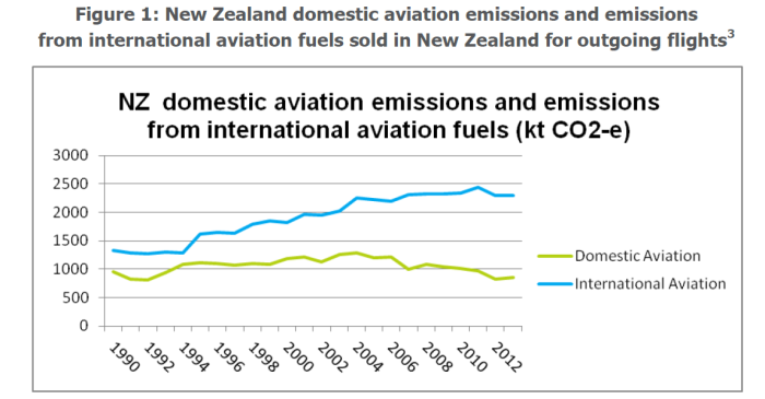
International tourism has been booming since then.   And here are Ministry of Transport projections.

aviation 2

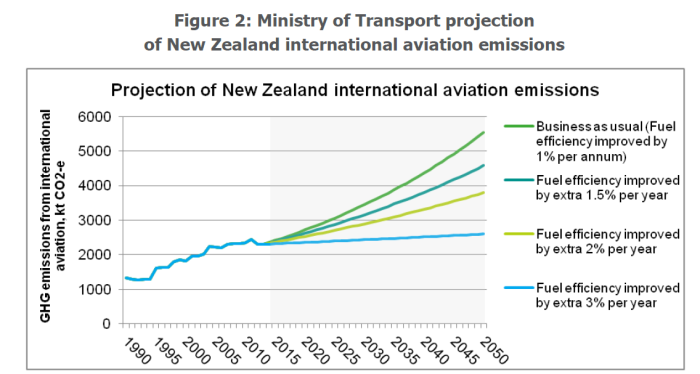
Even if we take the middle two lines, international aviation emissions would almost double by 2050.

Remember too that fuel costs are a very large proportion of airline operating costs (especially for long-haul operations) and that tourism spending is quite price-sensitive (you might be determined to take a holiday, but price affects location choice).  If the government is really serious about a moral crusade for net-zero they can’t but include international aviation in the framework (and in the goal) –  and if others were to follow their moral lead, the industry will have to have been included globally by 2050.  And what will that do to the viability of our international tourism industry –  almost everywhere is closer for almost everyone than New Zealand is, and we don’t have many unique offerings?   Given a choice between taking your electric vehicle to the Croatian coast or flying to New Zealand, the economics won’t favour New Zealand.

In other words, if the government is serious about a genuine net-zero target, they really need to start factoring in international aviation emissions, especially as these are set to rise absolutely and (especially) as a share of total emissions.  Perhaps they can just assume into existence some more forests, at no cost to other production, but it would seem highly risky to just do so.

For all these reasons, the 10 per cent sacrifice (a deliberately chosen act) of annual GDP estimated by NZIER seems to be very much at the low end of the plausible range, especially if they are serious about offsetting all emissions, not just ones that international convention negotiators happened to agree on.  The 22 per cent number comes from MfE and NZIER and doesn’t seem implausible.  Of course, any modelling, and any estimates, are inevitably highly imprecise.  Something could turn up to set all these costs at naught, but it would seem rash –  to say the very least –  to set out upon such a journey in the idle hope that something will turn up, and if not well –  never mind –  our children will simply be up to a quarter worse off than otherwise.    Productivity growth in New Zealand hasn’t been rapid in recent decades, but lopping a quarter off future incomes would be the equivalent today of simply giving up all the economic gains (in real GDP per hour worked) of the last 20 years.  Simply breathtaking.   And meanwhile people lament child poverty concerns, constraints on the health system, and so on.   Productivity is about new possibilities.  Are we really happy to give up such possibilities for the next few decades?

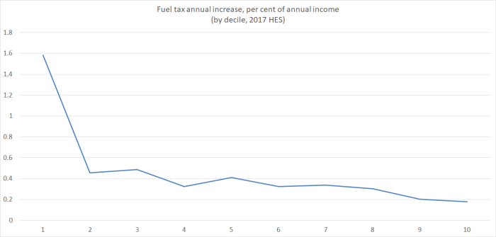
There is a lot of other interesting stuff in the NZIER report, but I wanted to end with the chart on the estimated distributional impact.   In my previous post, I quoted the MfE text

Our modelling suggests the households that are in the lowest 20 per cent bracket for income may be more than twice as affected, on a relative basis, than those households with an average income.

Which is quite bad enough. But it is all the more stark when you see the chart in the NZIER report, drawn from some work done for them by Infometrics  (in this chart they are looking only at the additional estimated losses from moving from the 50 per cent target to a net-zero target).

emissions distribution

Specifically, people in the bottom two income quintiles will be hit six times as hard as people in the top quintile.    Like MfE in the consultation document, NZIER rush to the client’s defence and suggest that redistribution policies could alleviate this.   You wouldn’t thought that sort of advocacy was their role –  having been commissioned to do modelling –  but more importantly, they should know as well as anyone that when governments adopt policies to materially shrink the economy, it is even harder than usual to persuade voters in the upper quintiles to agree to give up even more to mitigate the losses the worst off are exposed to.   Redistribution tends to win more favour when everyone is getting better off.

Has any government anywhere ever consulted on policy objectives that, if seriously pursued could cut future GDP per capita by anything from –  on their own numbers –  10 to 22 per cent?  If so, I can’t imagine when.  It is a huge price to propose for what seems to be mostly a moral crusade –  hence the title about pricing the hair shirt.  If you doubt that interpretation, check out Labour climate change policy.

New Zealand must do its part, along with the rest of the world, in reducing climate pollution. It is not good enough to say we are too small to matter – most countries individually could claim the same. We must take our share in the effort however small, just as we did when dealing with CFCs, or opposing apartheid, or fighting fascism. Kiwis are not shirkers. 

Opposing apartheid will have cost almost nothing to New Zealand GDP (albeit some utility losses for some rugby supporters) –  same goes no doubt for opposing French nuclear testing in the Pacific.  And I’ve never seen any large estimates for the cost of dealing with CFCs.

What of the World War Two comparison?  I alluded to it in the my earlier post observing

Wars, of course, come at a very considerable cost –  and sometimes are worth fighting –  but again, I doubt any democracy (or perhaps even any tyranny) ever entered a war thinking that as a result of doing so they would be so much poorer 30 years on.  

Awful as wars are –  and with staggering losses of life in some countries –  there is simply no way that any of the Anglo countries, that voluntarily entered the war to resist Hitler, were 10 per cent poorer, let alone 22 per cent poorer, thirty years on as a result.

Perhaps there is a legitimate moral cause at work here, but the government is inviting citizens to offer up a fearsome price –  in lost incomes and opportunities –  all while refusing to even consider the lowest cost option for substantially reducing the volume of emissions in New Zealand.   For a country that has done so badly as regard productivity, under successive governments over many decades, it seems breathtakingly reckless.  It seems all the weirder to be proposing to take some global moral lead in a country where, as even the IPCC reports have noted, there are both gains (eg better crop yields in many areas) and losses apparently on offer from rising global temperatures.


Another champion of regional development policy

Yesterday the Productivity Commission hosted a seminar at which the Maxim Institute’s Julian Wood presented his ideas on regional development policy.  The Maxim Institute is a policy think-tank, often seen as towards the conservative end of the spectrum, based in Auckland, and over recent months they have published a couple of papers on related issues.  The second of these Taking the Right Risks: Working Together to Revitalise our Regionswas the focus of yesterday’s presentation.

(The seminar ran under Chatham House rules, which means I can’t name the person who championed the success of planning in Auckland, and lamented that we don’t yet have such a plan in Wellington.)

Wood –  a former Department of Labour researcher and policy analyst –  began his presentation with this chart from the first of the two papers.

wood popn

The first panel highlights the TLAs where population has been static or is estimated to have fallen between 2013 and 2018, and the second panel is the projections in 25 years time (2038 to 2043) from the SNZ subnational population projections.  On those numbers, the national population will still be growing quite a bit, but most TLAs would be seeing flat or falling populations.   These numbers apparently excite a lot of interest in provincial New Zealand –  or at least in the local authorities and local “economic development” agencies.  There is, we are told, much gnashing of teeth.

It isn’t entirely clear why.  In most cases, the places with (projected) flat or falling population 25 years hence, “flat” is more accurate a description than falling, and most of the projected falls are pretty small (eg a couple of per cent over five years).   Taking the full 30 year period, from 2013 to 2043, TLAs that have currently less than 5 per cent of New Zealand’s population are expected to shrink in population over the 30 year horizon.  And given that New Zealand fertility rates are now well below replacement (about 1.81 children per woman), a future of fairly flat or falling populations seems like one that New Zealanders individually are happy to contemplate.  It is, after all, the situation now in much of the advanced world.   There is a handful of TLAs where the population falls projected do look quite stark – eg Kawerau, Opotiki, South Waikato –  and there may be some specific issues for local authorities in those area (especially dealing with central government infrastructure mandates), but it hardly looks like a case for widespread concern.  And it isn’t as if isolated substantial falls in population are a new phenomenon: Taihape’s population now is about half what it was in the 1960s;  Hokitika’s population is not much more than half what it was in the 1860s.

Not only is population decline not a new phenomenon –  even in New Zealand –  but we can, when we look abroad, see that it also isn’t inconsistent with productivity growth and improved material living standards.  Most eastern and central Europe countries have flat or falling populations, and those countries are typically doing rather well economically (Japan’s population is also flat or slightly falling, and South Korea’s is rapidly getting to that point, both countries that continue to rack up productivity growth.)

It also wasn’t clear whether Wood was framing his proposed policy responses around the prospect of falling populations in some of these areas or around some perception of poor economic outcomes in some regions at present.   And the two don’t seem well-aligned.  Thus, if we look at the regional GDP numbers, the regional councils with the lowest average per capita GDPs are Northland and Gisborne.  And yet on the SNZ projections, the population of Northland is expected to be 20 per cent higher in 2043 than it was in 2013, and the population of Gisborne is expected to be 6 per cent higher (although falling a bit by the end of the period).  Whatever the issues in those two regions, population doesn’t seem set to be one of them (unless, arguably, too little outward migration to regions offering better opportunities).

But whatever the precise motivation, –  and some of it simply seems to be the advent of Provincial Growth Fund and a dedicated Minister of Regional Development –  Wood (and Maxim) seem keen on the potential of regional development policy (or “customised regional development pathways” harnessing “the great potential benefits of spatial policy tools”).   I came away from the seminar –  and from reading their paper –  no more convinced than I was by the evangelical spiel offered up by a former MBIE staffer at a Treasury lecture on this stuff last year.

There was, as far as I could see, no analysis at all of what the market failures were, and why then there might be a role for active targeted measures, whether taken by central or local government.  And even though one of his key themes was that locations matter, it was striking that the overwhelming bulk of the hundreds of studies he drew from were of experiences in Europe.  Thus, featuring prominently in the paper was a table described as a checklist of indicators of regional growth and decline, explicitly stated as being drawn from European experience.  Among the items on the “indicators of decline” were “an economic base founded on resource exploitation and/or the primary processing of this exploited resource”.   Not only does that substantially describe New Zealand (and Australia) as a whole, but it also specifically describes Taranaki –  the region with the highest average GDP per capita in New Zealand –  and Western Australia (highest GDP per capita in Australia) and Alberta (highest GDP per capita in Canada).   Marlborough –  without oil or coal – had much the same average GDP per capita as Auckland last year (the sort of relative performance one doesn’t see in any EU country).

The author has been around long enough to have a certain scepticism.  As he notes

Spatial policy introduces “serious risks” like “misallocating resources, creating a dependency culture and favouring rent-seekers over innovators.” Even the Minister of Regional Economic Development has outlined that the new Provincial Growth Fund is a “bloody big risk…”

But in any rational calculus, big risks require a reasonable prospect of big rewards to make the punt worthwhile.   And nothing in the report suggests any real basis for confidence that such rewards are in prospect, no matter how well targeted, designed, and governed the interventions are.   The author knows the pitfalls –  and so he can write sensibly about the need for clear and explicit goals, for a heavy investment in evaluation, for a governance model that blends top-down and bottom-up perspectives, and also about the need to recognise that any experimentation involves allowing for the possibility of individual failures.

But as I listened to him talk, and as I read the paper later, I was still at a loss to know what he really favoured.  There was enthusiastic talk of R&D tax credits –  including by reference to Israel, a country with as poor a productivity performance as our own –  but nothing to indicate why such a measure was particularly suited to regional development (let alone any analysis of why firms don’t find spending on R&D more attractive).    There seemed to be some enthusiasm for immigration, although he knows some of the caveats there.  Weirdly, the concluding paragraph of his entire “smart growth” section is all about labour supply –  which seems mostly to put the cart before the horse, as people will typically be ready to move to where the opportunities are (indeed if the opportunities are in the provinces, more of their own talented young people will stay or come back).  And any policy approach which includes as one of its key items –  as this one does –  requiring local authorities to include even more pages in their long-term planning documents (vapid enough anyway) will struggle to be taken seriously, at least outside government departments.

My own take on these issues is that people who talk about regional development –  whether under the previous government or the current one –  are usually looking in the wrong place.  There seems to be a knee-jerk political need to “do something” and to be seen to do something, even when the action isn’t based on robust analysis specific to New Zealand (and thus the laudable call for good governance, careful targeting etc is mostly a forelorn hope, whistling in the wind).    I searched both Maxim documents and was struck (if not greatly surprised) to find no reference at all to the way in which the real exchange rate –  persistently high even in the face of our relative productivity decline  and itself a reflection of domestic demand pressures –  has reallocated resources away from the regions (generally with quite export-oriented production bases) to Wellington and (in particular) Auckland.   A real exchange rate that was 30 per cent lower  –  and that is the sort of change implied by real interest differentials –  would make a huge difference to the relative prospects of places like Hawkes Bay, Nelson, Otago, Southland, Gisborne, and so on –  orders of magnitude more so than the best of the smart active initiatives Maxim seems to be calling for.   (I was also struck by the fact that although there were numerous references to tax incentives and R&D tax credits, there was nothing at all about the basic rates of business taxation –  if you want more of something, tax it less heavily.)

But as I look at the New Zealand data, I’m also struck by the way there isn’t an overall New Zealand regional story, and even to the extent there is, the differences between the richest parts of the country and the poorest seem no larger (and generally smaller) than those elsewhere.    I had a look through the EU regional data this morning.  GDP per capita in London, for example, is 150 per cent above that in regions like Durham, South Yorkshire, Lincolnshire, and West Wales.   The margins are almost as large between Paris and some of the outer French regions.   Margins of 100 per cent seem pretty common looking across EU countries.   And what of New Zealand?    Northland and Gisborne last year had average GDP per capita of almost 65 per cent of that of Auckland (and 58 per cent of that of Wellington) –  ie Auckland is about 50 per cent higher than them.   And as I noted above, Marlborough had much the same GDP per capita as Auckland –  and there is nowhere in provincial France, UK or Germany with anything like the average GDP per capita of Paris, London, or Hamburg respectively.

Regional development policy, however cleverly designed or governed, isn’t what this country needs –  arguably it never has been (and Maxim has a nice appendix on past failures).  What it needs is hard-headed policy focused on lifting overall economic performance, notably productivity growth, based on a compelling and carefully scrutinised narrative that explains how we got where we are, not just grabbing bits from some generic OECD handbook, from a need to do something/anything.  In practice, that approach –  adopted in New Zealand for a quarter of a century now, at least –  responds to symptoms not causes, and if it sometimes seems to produce benefits (albeit rarely) it is by chance rather than by the inherent merits of the policy approach.  I suspect that a better-designed set of policies in New Zealand would tend to boost the regions relative to Auckland and Wellington, but that wouldn’t (and shouldn’t) be the goal: the goal should be lifting opportunities for better material living standards for all New Zealanders, and enabling New Zealanders to move to take advantage of those opportunities wherever they are to be found.