A couple of recent posts have highlighted the really significant sustained increase in New Zealand’s real exchange rate. I illustrated that with this chart
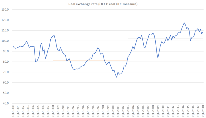
which shows the OECD’s relative unit labour costs measure.
Measures such as this, working back from a nominal exchange rate index, tend to be quite cyclical (around whatever longer-term trends are underway). But there is another approach to the real exchange rate, an internal measure that looks at developments in the prices of non-tradables relative to the prices of tradables. A rise in the ratio of those two sets of prices suggests, all else equal, that the tradables sector of the economy is becoming relatively less competitive.
Unfortunately, good long-term series of tradables and non-tradables prices are pretty few and far between. The official series in New Zealand only date back to 1999 (and the Reserve Bank doesn’t publish the earlier versions that we calculated ourselves using highly disaggregated SNZ data). Here is the chart of that measure of the real exchange rate, and the same derived series for Australia.
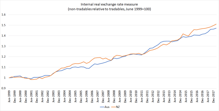
To look at that chart, one might suppose that non-tradables almost always increased in price faster than tradables (although even at the start of the series – when both countries’ nominal exchange rates were very weak – there are hints otherwise).
Fortunately, Australia has these data back to 1982.
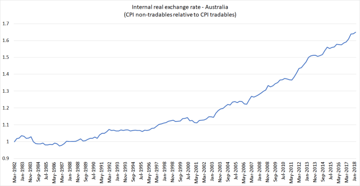
For the first 20 years of the series it was fairly flat – the difference between tradables and non-tradables inflation rates was only around 0.5 per cent per annum. Since around 2001, the annual difference has been more like 2.5 per cent per annum. Such differences have come to be taken for granted, but it isn’t a normal state of affairs.
Another way of getting a fix on the internal real exchange rate was suggested a few years ago by former Victoria University academic Geoff Bertram, in his chapter on the modern economy for the New Oxford History of New Zealand. His measures calculates the real exchange rate as the ratio of the GDP deflator (prices of all the stuff produced in New Zealand) relative to the average of export and import prices. Stuff that is exported is captured in both the numerator and the denominator, but all the non-tradables are in the numerator only, so that this measure will rise (fall) when non-tradables prices rise faster (slower) than tradables prices. For New Zealand there are estimates of all the relevant deflators back to 1914. Here is the resulting chart.
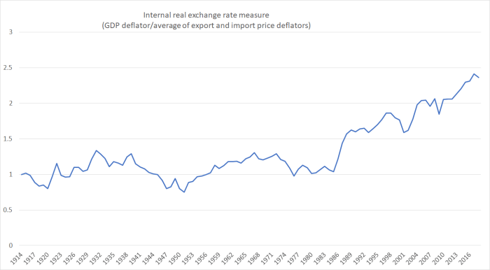
For 70 years, there was no trend in the series. On average, over that full period tradables prices and non-tradables prices seem to have increased by about the same amount. The cycles were quite prolonged, but no trend was apparent. And then everything changed, and the sort of appreciation we’ve seen on this measure over the last 30 years is unlike anything seen before.
What about Australia? Here is the same chart, going back to 1900.
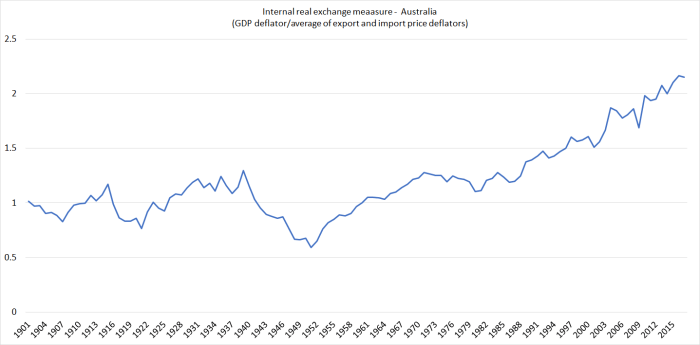
Much the same sort of picture – a flat trend for 80 years, and then a sharp sustained move upwards (although not quite as large a move as that for New Zealand).
(It isn’t a universal pattern: the official US data go back to 1929, and although there has been an increase late in the period, the current level is not even 10 per cent above the previous peak.)
To be honest, I’m not sure quite what is going on in New Zealand and Australia, although the numbers would be consistent with both countries having experienced very weak productivity growth in their non-tradables sector (thus economywide cost increases spill into prices). In New Zealand, weak productivity growth translated into weak overall economic performance, while in Australia the windfall of huge newly-tapped mineral resources has kept their overall economic performance looking better. It is, after all, a real income gain.
Export volume growth in the last 30 years as a whole has outstripped the growth in real GDP in both countries, but that margin has been far larger in Australia than in New Zealand. In Australia, export volume growth over that period was almost twice as fast as real GDP growth.
I noted that even on those internal real exchange rate measures, the increase in New Zealand has been larger than in Australia. The same thing shows up, much more starkly, with a simple calculation of a New Zealand/Australia real exchange rate, taking the nominal exchange rate and adjusting for inflation differentials. This chart shows that measure going back to 1914.

Again, a reasonably flat trend for 70 years, and then the move up to the new much higher level from the late 1980s. And this, even though our productivity growth has continued to drift further behind Australia’s.
And for those keen to fall back on terms of trade stories, they don’t help. This chart shows the terms of trade for New Zealand and for Australia back to the early 20th century.

Over 100 years, the two countries’ terms of trade have done much the same thing, ending up almost in an almost identical place.
So Australia was able to bring to market huge new mineral resources, and managed much faster productivity growth than New Zealand, and yet New Zealand has had much the larger real exchange rate appreciation.
Beginning to make inroads on New Zealand’s dismal productivity performance seems almost certain to require getting to the bottom of what has given rise to such an appreciation – on almost any measure one cares to look at, internal or external.
(Meanwhile our bureaucrats avoid the real issues, while looking busy. Yesterday I stumbled on this on an MBIE website, touting a new panel of experts – half academics, a third public service economists – to help fix businesses.
It’s common for small businesses in New Zealand to be passionate about what they do, but pressed for time. So working “on” the business instead of “in” the business often stays at the bottom of a long to-do list.
Business owners and operators tell us they would love to improve their systems and processes to get better results, and to save time and money. But getting these up and running takes time they just can’t spare.
This lack of time to work “on” the business is one reason why New Zealand’s productivity is comparatively poor. This poor productivity is a problem, whether you want happier workers, bigger profits or a better work/life balance — or a combination of these goals.
To help Kiwi businesses find practical ways to improve their performance, we’ve brought together a panel of experts from New Zealand and around the world, and combined their insights with our own research with small businesses.
I suspect small business owners are often rather busy whichever country they are operating in (high productivity or low), that we are better off assuming that private sector people make the best of their opportunities, and that the answers to the question of why New Zealand now lags so badly behind lie rather more with the politicians and their public service advisers than with the private sector. Skew the playing field, and it is hard to get a good game. Perhaps – as in areas of financial conduct – the (self-proclaimed) physicians should “heal themselves” (fix things they are directly responsible for) rather than touting their alleged skills in fixing private businesses. Apart from anything else, there are professionals running their own businesses offering advisory services, and they actually face a market test.)
