In their Financial Stability Report the other day, the Reserve Bank suggested that low interest rates are a significant part of the story as to why house prices have risen so much, and are so high. I showed this snippet in an earlier post.
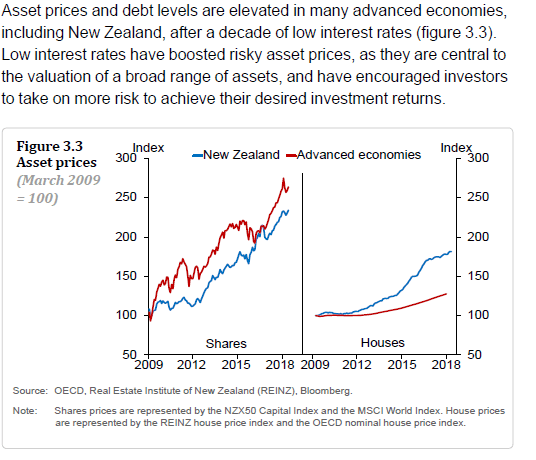
Not only was there no sign of any analysis of the reasons why interest rates remain low – they aren’t just some random variable delivered to us from on high, but arise from the interplay of real economic forces – but they started their analysis from the trough of the financial crisis and (just to compound things) showed asset prices in nominal terms.
The Reserve Bank indicated that they were using the OECD house price index, so I had a look at that data. Conveniently, the OECD presents the data in real terms, and they provide individual country data for most member states.
In this chart, I’ve shown three lines – each starting from 2007q4, just prior to the international (and domestic) downturn beginning. It wouldn’t materially change the chart if I started a year earlier (the peak in US house prices was 2006q4. Here I’m showing real house prices for New Zealand, for the median of the 30 or so OECD countries for which there is complete data, and the OECD total series (the real equivalent of the line the Reserve Bank showed).

Over the full ten year period, real house prices in the advanced world as a whole have barely changed, while in New Zealand real house prices are now 40 per cent higher than they were at the previous peak (having already risen more than in the typical OECD country in the previous surge). Not one of these countries – well, there is a possible exception of Turkey, in the midst of a currency crisis at present – has interest rates anywhere as high as they were 10 years earlier.
In this chart, I’ve just shown the individual country data.
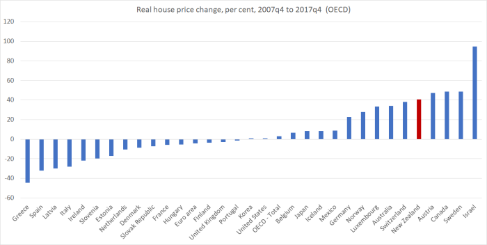
New Zealand’s experience isn’t uniquely bad by any means, but it isn’t representative either. It didn’t have to be this way, but it was a predictably awful outcome once one knew that land-use laws weren’t being materially altered, and the sheer scale of the population pressures government policy has contributed to. The combination has been toxic, especially for young people who were already struggling to get into the market.
It isn’t even some sign of general success either. Your eye might go to Greece and Spain at the far left of the chart. But other countries to the left of us include, for example, the group of central and eastern European countries that I’ve written about previously, who’ve been catching-up and achieving consistently better productivity growth than New Zealand (the Czech Republic and Poland aren’t on the chart because the data for each doesn’t cover quite the full period – but on the data we have both would also be well to the left of New Zealand). Our house price debacle has been a disaster all of our own – well, our central and local politicians’ – making. It just didn’t need to be that way.
