In yesterday’s post, I was a bit critical of the relatively superficial analysis in much of the Reserve Bank’s Financial Stability Report.
Here is one example
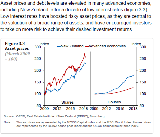
A snippet which seems to contain three problems in just a few lines. First, the Bank runs their asset price charts from the bottom of the international financial crisis and recession in 2009. Of course, equity prices have risen strongly since then. Second, all these series are shown in nominal terms: in the case of OECD house prices (red line in the second panel) there will have been hardly any increase at all in real prices over the nine years. And thirdly, they are attempting to argue that low interest rates have been a major causal influence on debt levels and asset prices without (a) looking back at whether trends are more pronounced this decade than they were in the previous – higher interest rate – decade (hint: they aren’t) and (b) without giving any apparent consideration to the reasons why interest rates might have been persistently low. For a central bank, that really is inexcusable sloppiness.
Take household debt, for example. Here is the Reserve Bank’s chart
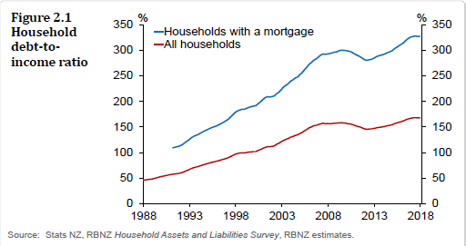
It is interesting to see the breakdown between households with a mortgage and the all-households number. Perhaps even more interesting is the snippet they include in the text that “only 8 per cent of households own investment properties, but they account for 40 per cent of housing debt” (although it would be interesting, in turn, to know how that share has changed over, say, the last decade).
But what I’ve always found striking about charts like Figure 2.1 is how small the increase in household debt ratios has been over the last decade or so. In the previous house price boom, household debt to income ratios rose much more sharply than they have in the most recent boom. Among households with mortgages, the ratio rose by 90 percentage points of income from the cyclical low in real prices in mid 2001 to the peak, but that same ratio has risen by less since 30 percentage points from the previous peak to now. On the more familiar metric – total household debt to total household income – the comparable numbers are 47 and 10 percentage points respectively.
Another way of looking at the data – which I prefer, for various reasons including that all national income ultimately belongs to households – is to look at the ratio of household debt to GDP. Here is the chart of that series.

Household debt as a share of GDP is lower now than it was a decade ago. Even if you make allowance for the fact that the previous peak itself was during the recession (when GDP had dipped), the current ratio of household debt to GDP has barely changed since the previous peak in real house prices in mid 2007. In many ways, this is extraordinary.
(And recall, of course, that banks’ housing loan portfolios came through the last recession – a pretty serious recession, with a fall in nominal house prices – unscathed.)
Here is the chart of real house prices (the QV index deflated by the CPI), expressed in log form.

Real house prices are much higher than they were at the peak of the last cycle, and have risen by about 60 per cent from the 2011 low.
As the chart in log form illustrates, the percentage rate of increase in house prices has been less this time round than in the previous phase of the boom (2001 to 2007) when real prices rose by 87 per cent on this measure.
But that shouldn’t be any comfort. If real house prices go from $250000 to $500000 in one period, and then from $500000 to $750000 in a subsquent period, the percentage increase is lower in the second period. But if real incomes haven’t changed, one $250000 increase is just as burdensome as the other.
And that is pretty much what has happened with New Zealand house prices. Relative to a base of 100 in mid-2001, real house prices increased by 84 percentage points from 2001 to mid 2007. From mid 2011 to the present (Dec 2017 data being most recent) the increase, again relative to a base of mid-2001 prices, has been 94 percentage points. Real incomes have increased a bit, to be sure, but actually the rate of increase (whether simple percentage increases, or relative to the 2001 base) in real GDP per capita was smaller in the more recent period.
None of that should be very surprising. In both periods we had really large, unexpected, population pressures, and in both periods we’ve had binding land use restrictions (not factors featuring in the Bank’s discussion). Interest rates, of course, have been much lower in the second period than the first, but it doesn’t look as though one needs some exogenous interest rate story to explain another bout of house price increases of similar size to the one that happened when interest rates were a lot higher.
But it all leaves the debt to income (household income or GDP) charts a little puzzling. As I’ve illustrated before – and is pretty obvious with a moment’s reflection – debt increases occur over a much longer period of time than house price increases do. If house prices double today, the only people who will have been taking on more debt right now will have been the small minority of people transacting in houses in this particular short period. But now that house prices are higher, even if they rise no further, every new purchaser will be needing to finance the new higher prices. Since the housing stock can take decades to turnover fully, the increase in the debt to income (or GDP) ratios can be expected to lag quite a bit behind house prices.
Here is a very simple stylised example of what I mean. In this scenario, house prices have been unchanged for a long time, and debt stock is steady. The aggregate debt to income ratio is about .5 (roughly what it was in New Zealand 30 years ago). Now assume that some exogenous factor (call it “new land use regulation”) doubles house prices today. Even if new entrants to the market borrow the same proportion of the purchase prices that their predecessors did when prices were low (on the same 25 year mortgages), it will take decades for the associated lift in the aggregate debt to income ratio to occur (35 years for even two-thirds of the adjustment to occur).

And yet, in real world New Zealand, despite an equally big house price increase since 2011 as we saw from 2001 to 2007, there has been little or no increase in household debt ratios in the last decade (even though the aggregate ratios should still have been adjusting to the earlier price shock).
I’m not sure quite what the explanation is. One explanation might be that (real) house prices have risen to such levels that a larger share of the houses are being purchased by more cashed-up buyers. That would be consistent with the decline in the owner-occupation rate. Perhaps regulatory financial repression is also playing a part – successive waves of unprecedented LVR restrictions (grounded in gubernatorial whim rather than robust analysis) may have made some difference, not necessarily in a good way. But it seems like an issue that we might have expected the Reserve Bank to explore in a document like an FSR.
Similarly, when the Reserve Bank talks up risk
The high level and concentration of household sector debt in New Zealand is the largest single vulnerability of the financial system. …..This risk has not changed materially since the last Report. Growth in household debt has slowed and house price inflation has stabilised, but significant vulnerabilities remain.
you might expect them to discuss:
- the way rather similar levels of household debt performed in the last severe recession,
- the Bank’s successive stress tests which suggest bank housing lending is not a systemic threat even under very severe (often unrealistically severe – around unemployment) scenarios, and
- their own capital requirements on banks, which are – we are told – calibrated to take account of the relative riskiness of different types of loans (even within an overall framework that has further increased capital requirements per unit of risk weighted assets).
But, as far as I could see, there was none of that in the document itself, and nothing of it in the Governor’s remarks at his press conference. In the meantime, we have distortionary LVR controls kept in place – on one man’s whim – when, if anything, there appears to be less credit outstanding than one might reasonably have expected given the way other regulatory distortions have lifted house prices.
In a similar vein, I noted a story on Newsroom this morning, reporting the Governor’s appearance at the Finance and Expenditure Committee yesterday. He was reported thus
But he told the select committee he would much rather the Reserve Bank, as banking regulator, could trust banks and borrowers to be prudent.
“I would love to not have to be active in that space. If banks had true long-term horizons, if the consumers were fully aware and myopia didn’t exist across borrowers, all the different foibles that people have, then you wouldn’t need the regulatory imposts.”
Talk about “nanny state” – the Governor wishes he could trust us. I wish we could trust him and his colleagues.
But, more specifically, the Governor here asserts again that banks are too short-term in their operations, that borrowers are myopic, and we need Reserve Bank intervention (he was talking of LVR and DTI restrictions) to save us from ourselves. Par for the course, the Governor offered no evidence for his proposition (and there was none advanced in the FSR), it just seems to be some sort of new gubernatorial whim (as Graeme Wheeler came with the scarring experience of living through the US crisis, in this case Orr comes with an NZSF perspective – neither grounded in specific analysis of the New Zealand banking system). I’ve lodged an OIA request this morning for any Reserve Bank analysis in support of these propositions.
I could have added, but overlooked doing so, a request for any evidence that – the private sector being inevitably flawed (by nature of being human) – that government regulators (also being human) can consistently improve on the outcomes of the market. In a banking system (New Zealand, but Australia as well) where the only financial crisis in more than 100 years arose in the transition as heavy controls were being removed – and neither the private sector nor the regulators really knew what they were doing – you might suppose some presumption of responsibility and capability might be accorded to the private sector. But not, it appears, by this Governor, or this Reserve Bank. When a big ego and extensive statutory powers combine in a single person, the lack of serious supporting analysis itself becomes a threat, including to the efficiency of the financial system.

…all debt, ultimately, has to be repaid via income so would agree that post crisis, logic would imply affordability constraints have kicked in for households with relatively lower income and wealth levels plus assuming the banks are putting greater emphasis on stress testing serviceability for higher interest rates; that said, composition of debt seems more important than aggregate ratios, though, even there I think the RBNZ has shown, higher income housholds tend to make up a higher share of the debt which may be less of a concern – I guess this chimes with the skew noted in the txt; be good to see a bit more detail for sure – tend to think it is the liability side of the banking system that requires further digging.
LikeLike
Michael, could one reason for the lack of expected associated build up in debt be the assumed massive capital flight from China (and other nations) paying with cash with little need to borrow domestically.
LikeLike
That could be a part of the explanation (one subset of the more cashed-up buyers I referred to), although I’m still a little sceptical of claims that a large share of NZ house purchases in recent years were the result/reflection of PRC capital flight. (I accept that there was a small share, as in other cities abroad, and with fixed supply those purchases could have affected prices here.)
LikeLike
Hi – A novice but an interested one. Find all the discussions here most illuminating, if a bit sobering. Found the RB report and their new bank dashboard, and that didn’t provide me with any great comfort (although I don’t pretend to understand much of it, and I guess it is comforting to know all this stuff is being monitored). The proportion of debt to assets in these record profit making institutions is frightening (to me).
I was surprised that 40% of the household debt was held by 8% of the population, and (if I understand the wording of the report) that this 8% are the only (?) ones with investment properties. I find this hard to believe – I would have thought that way more households would have an investment property. Wonder if the figures include trusts & companies associated with trusts (I’d guess many folk with investment property would hold them in trust). I’m also a bit (naively?) shocked that such a small proportion of the population could have such a high level of indebtedness, which potentially adversely affects the rest of us plebs (they’re putting us all at risk, but we’re not benefiting at all – seems unfair). It would be interesting to know how much equity the 8% hold – should be massive if it’s associated with 40% of the mortgage debt. Cheers
LikeLike
Yes, I’s be interested to know more about that “8% – the investors – hold 40% of the debt” claim. They don’t provide a reference for where the data come from, but I presume the RB now has private information on banks’ own loan portfolios. Remember that households include lots of young people just starting out, and lots of elderly widows living alone supported by NZS and some bank deposits, so even 8% would be a much larger share of the prime age population. Bear in mind too that if 30% of houses are owned by private landlords then if the average investor had, say 3 properties (the median will be lower than the average) that would only leave 10% of households owning investment properties.
I’d be wary of the claim that these people are puting us all at risk. What the Bank rarely tells you is that in systems where the govt isn’t directly messing up financing structures, residential mortgage rates rarely play a central role in financial crises (the US market, for example, is highly distorted by govt interventions of various different types, while the NZ, Aus, UK and Scandinavian markets are pretty free).
LikeLike
Thanks Michael – what’s not reported is often as or more important as what is.
LikeLike
There looks to have been a build up of household cash deposits since the GFC bottomed according to RBNZ (faster than growth in GDP or income). Despite low interest rates on savings.
Maybe suggests typical kiwi financial myopia. Limited investment alternatives and tax advantages means buy property. Then when prices get very high volumes drop and people hoard cash.
I also wonder whether you do end up reaching an aggregate debt ceiling. Ie easier to double debt levels from a low base than when you are overleveraged. Also leads to lower transaction volumes which are evident.
One thing that has grow exponentially is column inches dedicated to Mr Orr. I counted 3 separate photo caption articles in today’s NBR. Surely that’s a record?
LikeLike
Some of the build up of bank deposits is probably also people having to save large deposits to buy their first house given the large increase in house prices (mainly in Auckland)
LikeLike
Remember that most of the deposit growth is just the counterpart to the credit creation. Each new loan simultaneously creates a new deposit, During the last boom, we ran a very big current account deficit so many of the deposits went abroad (imports) transforming into the foreign wholesale finance that funded so much of bank balance sheets. Demand pressure has been much weaker this time around.
For each house buyer with a new mortgage there is a house seller with either a reduced mortgage or newly increased deposits.
Yes, I too was struck by that succession of NBR photos. In fairness to the Governor, unlike his predecessor he continues to make himself available for interviews.
LikeLike