After my post yesterday I had a few people get in touch, spanning the positions from what one might call extremely dovish to extremely hawkish. My key chart in that post was this one.
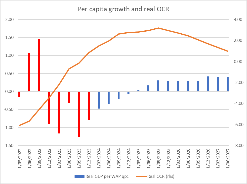
Pretty much any way one looked at real interest rates they (a) had been rising, and (b) on the Bank’s forecasts were set to continue to rise for another year or more, and yet – on those same forecasts – growth was set to return. It might not look like spectacular per capita growth next year, but on these numbers we are set to get back to slightly above average (for the pre-Covid decade) per capita growth before there have been any OCR cuts at all (in a period when fiscal policy is likely to be contractionary and the migration boost to demand and activity is expected to shrink). It was, and is, a puzzle.
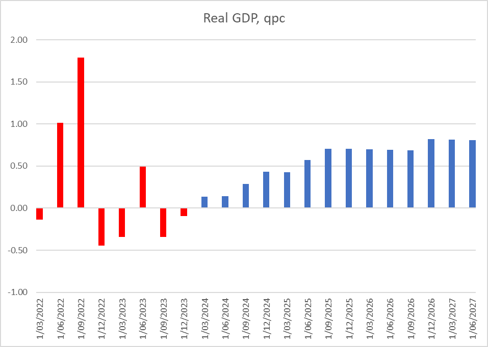
One person objected to the use of per capita measures of GDP. As it happens, the pattern looks much the same, just a bit less marked, if one uses headline changes in real GDP. We go from an average quarterly contraction over the last five published quarters of -0.15% to quarterly growth of about 0.7% even as real interest rates rise and before the first OCR cut occurs in August next year.
The objection to using per capita numbers reflected a view – that some international agencies seem to like (the then chief economist of the OECD tried it out here a few years ago) – that it was almost inevitable that immigration surges would initially dampen GDP per capita, which would then recover over time as the migrants were absorbed. Perhaps there is something to this sort of model where many migrants are irregular or refugees, but this is New Zealand, where most migrants arrive on pre-approved work visas. Refugee numbers here are small, and illegal arrivals (as distinct from people overstaying visas) smaller still.
The New Zealand experience, over many decades, has tended to be that immigration shocks add more to demand (including derived demand for labour) than to supply in the short-run. And the experience of the last couple of years doesn’t seem inconsistent with that. There was a big unexpected influx, and yet there was no temporary dip in the ratio of employment to working age population: as it happened the absolute peak in the employment rate was in the same quarter as the estimated net migration peak (note that the Reserve Bank’s output gap estimate in fact peaked a few quarters earlier).

So I’m sticking with there being a puzzle. Where is this growth rebound supposed to be coming from, as monetary conditions tighten, fiscal policy tightens, net migration falls (further) and the world economy is assumed to jog along much as it has been?
But the real prompt for another post was looking at the output gap estimates themselves. In this week’s MPS there has been quite a big revision to the Bank’s estimates of the output gap (for the most recent estimated quarter, March 2024) and through all last year. On these numbers, only in the March quarter does the Reserve Bank think the economy crossed over to having (very slightly) excess capacity.
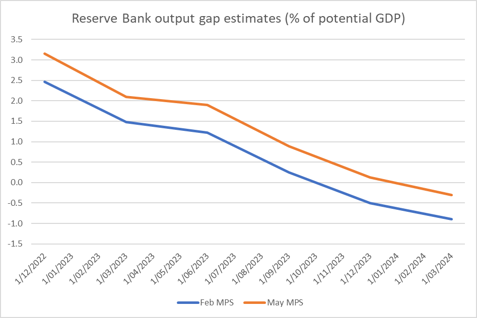
One could argue that it is consistent with their (prior) view that inflation has become more problematic than they realised, and harder to get down. One might also argue that perhaps the latest estimate lines up with the latest unemployment rate which, at 4.3 per cent, is probably around economists’ estimates of the NAIRU. Correct or not, a few more deeply negative GDP per capita quarters would quickly take the output gap deeply negative (monetary policy – and any other influences – has already taken the output gap down by 3 full percentage points of GDP in just 18 months.
But my interest is more in what the Reserve Bank’s revisions are now saying about just how overheated the New Zealand economy actually got in 2022. Here is a chart of the Bank’s output gap estimates over time.
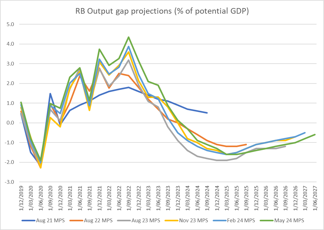
As late as (say) August 2022 they thought the excess demand had peaked in late 2021 at under 3 per cent of GDP (large enough by any historical standards). Now, after successive revisions, not only is the (estimated) peak much later (September quarter of 2022) but it is much larger (4.3 per cent of GDP). All the quarters either side of that peak have also been revised up quite materially.
So big revisions upwards. But how do those estimates now compare with history? This is a chart of the Bank’s current output gap estimates this century

The economy was overheating in the mid 00s, and core inflation got a bit above 3 per cent. But it was nothing like as serious as the (now) estimated overheating in 2021 and 2022. And this was what the Bank simply totally failed to recognise for far too long (recall it was not until February 2022 that the OCR had even been raised back to the level it was just prior to Covid). Even now it is revising up its view of the extent of its own misjudgement and resulting policy mistakes. It was by far the biggest monetary policy mistake in the 34 years of Reserve Bank operational autonomy…..and no one seems to have paid any price at all (Governor and MPC members were all reappointed).
18 months or so ago the Bank came out with a review of its own performance, which unsurprisingly wasn’t very critical at all. Yes, we were told, it was clear with the benefit of hindsight they should have started tightening earlier, but it might only have been by a quarter and wouldn’t really have made much difference to outcomes. It was implausible even at the time – failing to grapple with the severity of the misread of the economy and associated capacity pressures. It has become literally incredible as time has gone on. Did others make similar misjudgements? Of course. But others weren’t delegated the power to run monetary policy, and the responsibility to get it right. No one forced them to take the job, purportedly delegated to people of real expertise.
A common response is some mix of claims that (a) other central banks were just as bad, and b) the Reserve Bank of New Zealand was relatively early in starting tightening. Even if the first claim were correct, it is no excuse: central bankers abroad also voluntarily accepted a mandate and failed to deliver. But it also isn’t really true. It is hard to get consistent output gap estimates across time and across countries, but the IMF is one source
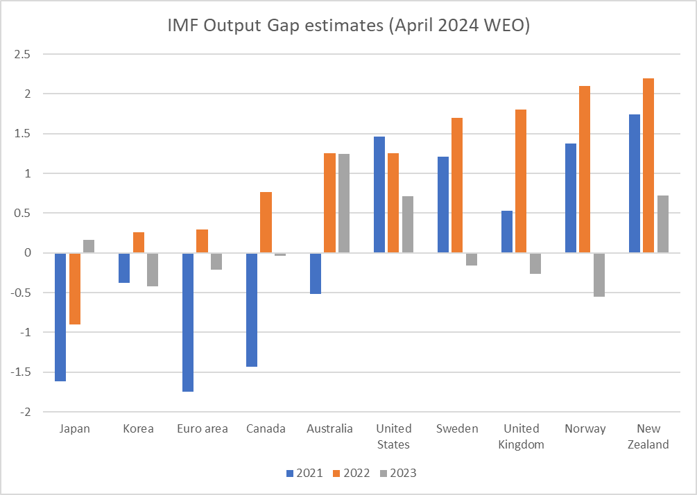
On their current estimates – presumably different techniques to the RBNZ’s estimates – in both 2021 and 2022 New Zealand had the largest positive output gap of any of the advanced economies for which the IMF produces numbers. Imbalances of that extent occur because our Reserve Bank got it (rather badly) wrong, acting late and (for too long) sluggishly relative to the inflation pressures in our own economy (and even among this group of countries, the RBNZ was only the 3rd to start tightening; among OECD central banks it was 7th).
But accountability doesn’t appear to be something that mattered either to the previous government (concerned perhaps that suggesting the Bank had done poorly would reflect poorly on them who appointed the MPC) or to the current one (which tends to play down any role for the Bank, presumably to tar Labour with the blame for the high inflation, while claiming the credit for themselves when inflation settles down again).
And just one final (puzzling) chart. I noticed a few quarters ago (last August) that the Bank’s then output gap projections had about as much space above the zero line as below (probably a bit more below as it still hadn’t got back to zero by the end of the projection period). But this time – and it has been transitioning towards this over the last couple of MPSs – and focusing on the orange line (this week’s estimates), there is far more space above the zero line than there is below. In other words, on these numbers, we got to enjoy the excess output but don’t pay any sort of equivalent or commensurate price in lost output.
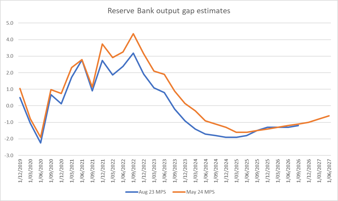
It doesn’t make a lot of sense (and would be something very different than we saw in the previous cycle, after 2008). Perhaps there really wasn’t quite as much excess demand at peak as they now think? Perhaps more pain (lost output relative to potential) will be required than they are saying (which might well come about quite easily if the implausible growth rebound they are projecting just doesn’t occur over the next few quarters).
I’m really not sure what is going on. But it doesn’t leave one with any more confidence that the Bank knows what it is doing than we can have now about how they handled the period from mid 2020 to mid 2022, which delivered us this persistently high inflation – and attendant arbitrary wealth redistributions – in the first place.

Yes, not only a puzzle but a mess. One that I don’t see anything but downside and pain for quite some time.
LikeLike
When looking at the output gap, one needs to be careful in talking about the unemployment rate. Based on a simple OLS regression, the unemployment rate lags the RBNZ output gap by two quarters, with a remarkably good fit. Two points pop out of the regression. Firstly, unemployment at 4.3% should give no one comfort as the output gap the Bank currently forecasts sees unemployment race above 5% over the coming year, and if the output gap at zero is consistent with a stable economy, the NAIRU is about 4 8%.
I won’t make any strong arguments about what potential GDP growth is and whether the Bank is right, or wrong. Its unobservable so you get into all sorts of modelling and econometric questions. But I do believe their forecast of an imminent recovery is poppycock. We may see a post-election bounce in Q1, but pretty much all the leading indicators, and monetary and fiscal settings suggest no recovery for some time, perhaps not until 2026 if the Bank holds to their forward guidance.
By which time, the negative output gap will be huge, and unemployment will probably have a six handle. And core inflation? Smoked…
Which suggests to me that their forward guidance is inconsistent with their forecasts. Which, incidentally, is what my model of their reaction function, based on their research, and their forecasts, is telling me.
LikeLike
Thanks Peter. You may not have seen the latest underwhelming lines from Paul Conway, in the article shown here
LikeLike
I wondered about the appropriateness of Real OCR on the original chart. If I understand correctly, it is the current OCR less the CPI for the last year, and thus measuring a current setting against something that may have happened up to a year ago? Given the OCR is attempting/expecting to influence the CPI in the future, I wonder if including a real OCR using RBNZ expectations for CPI in 18 months would be useful?
LikeLike
Yes, one could play around with various measures of real interest rates (I used the one I did mostly because I could get some forecast numbers). I guess what is pretty much unchallenged is that (a) real interest rates have been rising over the last year (inflation itself and all inflation expectations measures have been falling) and (b) if the OCR is held until next August, real rates will rise further from here (because no one really doubts inflation will fall further , the only issue is how fast/far). That would be so using the measure you suggest too.
LikeLike
On b), yes, and with CPI expectations lower than current CPI actuals, a chart of the real OCR against expectations would be even higher than the real OCR against current actuals?
LikeLike
Yes, altho the slope may be more important than the level in this context
LikeLike