I’m tied up in a meeting all day, so just a quick post to update one of my standard charts, following the release yesterday of the quarterly GDP numbers.
In this chart, initially developed by an IMF mission to New Zealand 14 or so years ago, GDP is fairly crudely allocated between tradables and non-tradables sector. Tradables consist of primary industries and manufacturing, with exports of services added in. Non-tradables is the rest of GDP. Flourishing economies tend to have a strong tradables sector: local firms doing well taking on the world (whether as exports or import-substitutes). It isn’t that one type of activity is inherently superior to the other, but when your tradables sector lags behind it usually isn’t a promising sign.
Here is the chart, expressed in per capita terms with both series indexed to 1991q1 when the official quarterly population series starts.
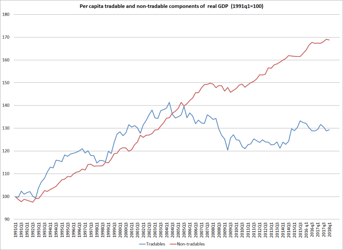
Tradables sector activity performed quite strongly in the 1990s, and even up to 2004. But the current level of real per capita activity was first reached in 2000, 18 years ago. The current level of real per capita tradables sector GDP (on this measure) is almost 10 per cent lower than it was at peak in 2004.
There are plenty of sceptics of this chart, and it isn’t entirely kosher to add together bits of production GDP and bits and expenditure GDP. So here are the individual components of the tradables GDP indicator.
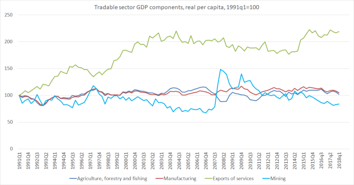
Over 27 years, there has been no growth at in real per capita GDP in agriculture, forestry and fishing, in mining (includes oil and gas – see the spike up in 2007), or in manufacturing. There has been growth in real per capita exports of services, but almost all that growth was in the 1990s and early 2000s – really strong growth back then, and very little, overall, since.
What changed 15 or so years ago? The (real) exchange rate did.
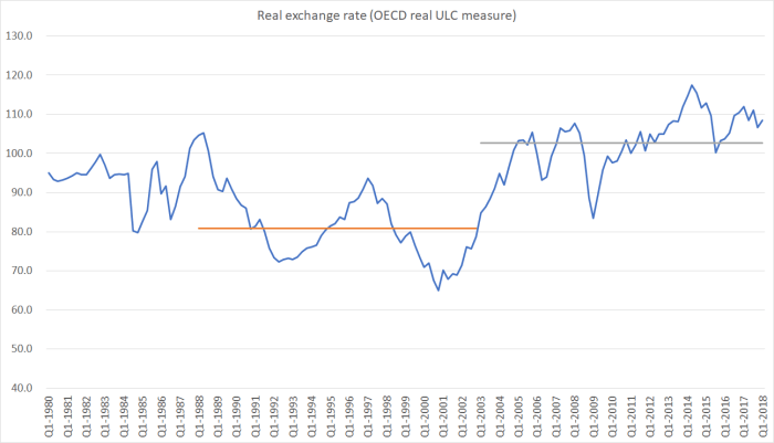
27 per cent higher, on average, over the last 15 years than in the previous 15 years. And it isn’t as if the increase has resulted from the superb performance of the tradables sector of the economy.
Real exchange rates aren’t exogenous instruments that governments (or central banks) can change at will. But if the authorities care at all about getting to the bottom of our economic underperformance, they really need to get to the bottom of what pressures have resulted in such a marked increase in the real exchange rate, sustained now for so long (hint: the terms of trade is at best a small part of such a story). 15 years ago it was almost possible to believe that the New Zealand economy had been turning a corner, becoming more productive and more outward oriented, that it might even begin to close the gaps with the OECD peers. But no longer….and that is before the oil and gas exploration sector was summarily given notice, before net zero carbon emissions targets looked like becoming a real factor.
A successful economy will, almost inevitably be a more outward-oriented one, in which more and more firms operating here are successfully taking on the world. At present, nothing in government policy suggests any improvement, any reversal of the 15 years of sliding backwards, reliant ever more on “taking in each other’s washing” – the (population-driven) domestic non-tradables sector. It is simply not a robust foundation for a more prosperous future.
